Georges Pichard: Throwing Curves

In 1946, Georges Pichard (not sure who he is? Visit our Pichard’s Distressing Damsels for an overview of his later work), heretofore toiling in a marketing agency, started his career as an illustrator. He worked for various French magazines and newspapers (like Le Rire, Fou-Rire and Les Veillées des Chaumières), providing them with covers, cartoons and pin-ups in black-and-white or gorgeous watercolour until the mid 70s, when he switched gears somewhat and dedicated himself to erotic bandes dessinées.

I left image imperfections (due mostly to yellowing of paper over time) and hand-written captions (when available) as is, as I find they provide pleasant texture and context. The jokes are really lame, but we translated them, anyway.

The following three cartoons were published in Le Rire. This first one saw print on the cover of Le Rire no. 22 (nouvelle série, July 1953).

George-Pichard-Sketch2

This one was featured on the cover of Le Rire no. 66 (nouvelle série, March 1957).

GeorgePichard-sketch

George-Pichard-sketch3
« I’m the sort of guy who’s kind of like an iceberg, the main part is beneath the surface. » The man in question looks very much like a V.I.P. type.

The following are all from Fou-rire:

GeorgesPichard-FourireA
Cover of Fou-rire n°12, mid-50s. « It’s not because I’m playing the bagpipes that you have to take me for a gallant shepherd! »
GeorgePichard- LERIRE76- janvier 1958.
Cartoon from Fou-Rire n° 76, early 60s. « Please be assured, my dear friend, that we are all here quite touched by your wife’s endeavours to set a mood… ».
GeorgePichard=1962
Cartoon from Fou-Rire n° 118, early 60s.  « It would be prudent to seal up your chimney, because when I tell the boss about this… »
GeorgePichard-1961---1962;-French-Magazine-Le-Rire
Fou-Rire n° 118, mid 60s. « And to think that I’ve mislaid the key to this chest full of outfits, each more decent than the last… »

Finally, a couple of pretty loose ends:

GeorgePichard-Jarredor
Original art from Le Rire magazine, 1960s. « But the funniest part happened before I ran into the police officer! »
GeorgePichard-V60
Early 60s.

~ ds

Treasured Stories: “The Servant of Chan” (1975)

« Followers in death: Attendants and relatives who were killed so they could be buried in the tomb with the person (normally someone very important or wealthy) who had died. » — The British Museum

Let’s face it, Gold Key’s would-be-spooky comics rarely lived up to their habitually fine painted covers (mostly courtesy of hard-working George Wilson, with Vic Prezio, Luis Domínguez, Jesse Santos or Jack Sparling occasionally chipping in); as with most things, there were exceptions: I’ve raved earlier about a particular issue of the generally ho-hum Grimm’s Ghost Stories, namely issue 26, boasting, along with the usual Paul S. Newman sleep aids, two excellent yarns from the undervalued Arnold Drake (co-creator of The Doom Patrol, Deadman, and the original Guardians of the Galaxy).

Ah, but today, we’re celebrating Drake’s co-conspirator, the prolific Argentine master (yes, another one) Luis Ángel Domínguez, reportedly born ninety-five years ago to the day (Dec. 5, 1923), and still among the living… as far as we know. I like to envision him warmly surrounded by several generations of loved ones and well-wishers, an impish gleam in his eye.

Without further foot-dragging, here’s a vintage tale of quick wits in ruling class hubris from beyond the grave, The Servant of Chan, by that dastardly duo, Drake and Domínguez.

ServantChan01AServantChan02AServantChan03AServantChan04AServantChan05AServantChan06A

GrimmsGhost26CoverA
George Wilson’s cover highlights a dramatic scene from our little story. This is Grimm’s Ghost Stories no. 26 (Sept. 1975, Gold Key).

Some further details on historical context, from Ancient China for Kids (!):

« Slavery in ancient China was not a pleasant experience. The lives of slaves were filled with hardship. Many were abused. Many slaves were children.

Most people who were slaves worked in the fields, alongside of peasants. They did the same job, and had the same hours, and pretty much the same clothing and food, as free farmers. But they were not treated with the same respect given to farmers. Some slaves built roads. Some worked in government.

But slaves who worked for the emperor, the royal family, and sometimes the nobles, had the worst of it. They could only do what they were told to do. They were treated in any way that their master and his family felt like treating them. Many were treated with great cruelty. When their master died, they were killed, and buried with their master in his tomb, so they could continue to serve their master after his death. »

Brr. All the same, if you’ve enjoyed this yarn, check out Arnold Drake’s other contribution to this issue, The Anti-13, which we enthusiastically featured some time ago.

¡Feliz cumpleaños, Señor Domínguez… wherever you may be!

-RG

Tentacle Tuesday: The Golden Age of Grabbery

For today’s Tentacle Tuesday post, I’d like to highlight some comic book artwork from the Golden Age, which is to say the period between the early (or late, depending on who you ask) 1930s and 1956, the year Showcase #4 was published, heralding the new era of superhero comics. (Our other TT post dedicated to the Golden Age was about Planet Comics; visit it here).

BlueBoltVol1-#5
Blue Bolt vol. 1 no. 5 (October 1940), cover by W. E. Rowland. The series was created by Joe Simon, who promptly enlisted Jack Kirby’s help. This cover story, «War in the Fourth Dimension»,  is by the Simon-Kirby team. Read the issue here.

The Blue Bolt gets tangled up in quite a few (crushing, of course) tentacles. Art by Jack Kirby.

Blueboltvol1#5-detail

And a few pages later….

BlueBolvol1#5-detail2-JackKirby

TentacleTuesdayIcon

It might be surprising to see the Shadow in the grip of an octopus, but there’s probably not that many creatures he *hasn’t* grappled with!

When a radio show was introduced in 1930 to boost the sales of Detective Story Magazine, the company (Street & Smith Publications) wasn’t expecting its freshly-minted narrator, The Shadow, to hog the limelight – but that he did, as listeners found this sinister character far more compelling than the stories he was narrating.

ShadowVol3No6
Shadow Comics vol. 3 no. 6 (September 1943), cover by Vernon Greene. Just imagine the possible drama of this cover – the swordfish is actually the octopus’ friend, but he’s forced to become an instrument of his death by the merciless Shadow (only he would descend to the depths of the ocean to fight “devils” in full suit-and-cape regalia).

As his fans kept requesting copies of The Shadow magazine (which didn’t even exist at the time), Street & Smith obliged and The Shadow Magazine was born in 1931. The Shadow’s step-father is Walter B. Gibson, writing under the pen-name of Maxwell Grant. He wrote « more than 300 novel-length » Shadow stories to meet the demand of a public greedily clamouring for its hero, although at some point several writers were hired to lighten Gibson’s ridiculous workload. The Shadow soon slunk beyond the confines of pulp novels and into comics: a syndicated daily newspaper comic strip (written by Gibson and illustrated by Vernon Greene), preceded (by a month) by a comic book published by Street & Smith, which was supposed to attract a younger audience to pulp magazines (101 issues, from 1940 to 1949).

Shadow Comics v5#5
Shadow Comics vol. 5 no. 5 (August 1945), cover by Charles Coll. Everybody is making puppy eyes at the Shadow, but will he choose the pretty girl or the pretty octopus?

Speaking of heroes, Wiki calls The Shadow « a film noir antihero in every sense »; now, I’ll concede the film noir, but I’ll balk at calling him an anti-hero, at least in this incarnation, as *that* term is defined as « a character who lacks conventional heroic qualities such as idealism, courage, and morality », all of which The Shadow has abundant reserves of. He’s a bit laconic and brusque with this conspirators, but that’s understandable when he had to destroy peace-threatening crime rings and bring brilliant crime-perpetrators to ruin at least twice a month.

TentacleTuesdayIcon

Who’s that handsome guy shooting commercials for Crackety-Wackett Cereal? Why, it’s Lars of Mars, the debonair Martian! In between fighting his communist arch-enemy (it was the 50s, what can I say?) and robots harassing women, Lars likes to relax by grappling with tentacled creatures.

LarsofMars11
This lovely cover is Lars of Mars no. 11 (July-August 1951), painted by Allen Anderson (or Norman Saunders, according to another source, though Anderson seems likelier). What’s inside? Jerry Siegel scripts and Murphy Anderson art (and one story by Gene Colan). Yummy!

Lars of Mars was created by Siegel in 1951 for Ziff-Davis. There are only two issues (bizarrely numbered 10 and 11). The art for Lars of Mars, done by Murphy Anderson, is very nice indeed, but you don’t have to take my word for it. Feast your orbs on the first two delightfully nonsensical LoM stories on Pappy’s Golden Age blog.

LarsofMars
Now, is that any way to address a many-tentacled creature?

TentacleTuesdayIcon

« Scarlet’s adventures are never run-of-the-mill. Instead she enters into every phase of American life – whether on the baseball field or in a night club – always finding a way to help her clients, aid the forces of law and order… and bring plenty of thrills and laughs to her readers. »  Apparently « every phase of American life » includes being on the ocean’s floor, trying to stab an octopus with only 5 arms. Hmm…

Harvey Comics Hits #59
Harvey Comics Hits no. 59, 1952. Art (probably) by Al Avison. Interestingly, the fish is nibbling on the hand of the monster, when it could be partaking of the delicious flesh of the blub-guy. Tales of the Invisible reprints a bunch of Scarlet O’Neil stories from Black Cat, topped off with an introduction titled « Meet Russell Stamm » (the creator).

Incidentally, Invisible Scarlet O’Neil is supposed to be the first heroine with superpowers (well, one superpower: invisibility).

If I may be excused for going off-tentacle-topic,  « Blood of a Monster », the title story that takes up half of this issue, is surprisingly good (though it doesn’t really contain tentacles aside from a minor mention of cephalapoda at the beginning). The art (by the aforementioned Russell Stamm) is moody and quite unhinged in places.

Harvey Comics Hits #59-detail1-RussellStamm

I enjoyed « Grave of Greed », the second half of the issue, even more, because it involves mushroom picking as part of the plot!

Harvey Comics Hits #59-detail

Read the full issue here – it’s worth the detour, I think!

Stay tuned for our next Tentacle Tuesday post! In the meantime, visit our previous TTs (we’re getting to have quite a backlog) for your tentacle fix.

~ ds

Helen Case: Girlie Cartoonist With a Twist

« At one time, I sold general cartoons to some of the men’s magazines, the girlies — until I went into a newsstand one day and looked at one. » — Betty Swords

If female cartoonists were fairly uncommon in the American mainstream magazine field for much of the twentieth century, they were doubly so within the so-called girlie mags.

« During the 1950s, Abe Goodman — brother of Marvel Comics publisher Moe ‘Martin’ Goodman — was the largest buyer of cartoons in the world. Publishing out of New York City under the Humorama banner, Goodman churned out scores of cheap digest-sized magazines boasting inventive titles like Romp, Stare and Joker that featured hackneyed jokes, cheesecake photos and the publications’ bread and butter, single panel pin-up cartoons.

These magazines were an unlikely proving ground for neophyte gag cartoonists as well as a welcomed alternative to the daily grind of comic book sweatshops. In the 1950s and 1960s, these digests featured the likes of Playboy’s Jack Cole, Archie’s Dan DeCarlo and glamour girl legend Bill Ward. »

While I can unreservedly recommend Alex Chun and Alex Covey’s The Pin-Up Art of Humorama (Fantagraphics, 2011), I’m frankly puzzled as to its wholesale snubbing of Helen Case, who might have brought a welcome bit of variety to the all-male revue. God knows some lesser lights did make the cut.

While feminist cartoonist Betty Swords would likely have dismissed Case’s protagonists the way she did Barbara Shermund‘s, as « gold diggers, dames — amateur prostitutes », Case’s cartoons (I’m afraid I don’t know whether she wrote and illustrated, or simply illustrated… at Humorama’s pauper’s rates, the former is somewhat preferable) provide a refreshing female perspective to the battle of the sexes. To quote Betty Swords again (from R.C. Harvey‘s excellent Insider Histories of Cartooning (2014, University Press of Mississippi): « I remember one editor who shuffled through my cartoons then tossed them on the desk and said, ‘You gal cartoonists are all alike — you don’t attack and hit hard enough! »

While scant information is available regarding Ms. Case (she appears to have lived in Kingston, New York in the early 1960s), at least online, much of her work survives, which surely has to count for something. We present some of the finer cuts, and if the gags aren’t transcendentally great, they are a brace o’ notches above the average knuckle-dragging drollery pervading the pages of Breezy, Snappy or Eyeful of Fun. Most of these gags were drawn and initially published (Humorama’s cheapskate policy was to print, reprint, and reprint again) between 1960 and 1964. Enjoy!

CasePlatonicACaseSecondHusbandACaseIdentitiesACaseNoItAllAHelenCaseDumbbellACaseFortunetellerACaseBathingSuitACaseBoysEarlyACaseNewRegulationsA

-RG

Tentacle Tuesday: Tenta-come-lately

I have this tendency to overlook comics published more recently than 20 years ago. It’s not a conscious bias on my part (aw, who are we kidding?), and yet…  Why would I waste precious time trying to find something “modern” (which is a flexible concept, anyway) that’s half-decent instead of enjoying the bounty of excellent comics produced in the 60 (if not 70) years preceding the 2000s?

Having said that, tentacles are more popular than ever in the comics field – a panacea for a number of storytelling foibles, a piquant ingredient to offset blandness, a freaking deus ex machina. Unfortunately, almost all of the post-2000 comics graced by the appearance of tentacles are of the butt-ugly persuasion – for a number of reasons, although I could probably narrow them down to three or so (piss-poor anatomy, a cold metallic gleam over everything, terrible colours). Modern comics also have the lovely feature of having like a bazillion variant covers for each issue.

I could go on with covers like this one all day:

GrimmTalesofTerror6
Grimm Tales of Terror no. 6 (January 2015), pencilled by Giuseppe Cafaro and inked by Simone Di Meo.

That’s not ugly enough for you? The pretty girl is knocking out all capacity for rational thought? Are you forgiving the artist for thinking fabric needs about a thousand crinkles and folds to look, ahem, realistic? Okay, how about something like this?

Action Comics #6
A panel from “When Superman Learned to Fly”, published in Action Comics no. 6 (April, 2012). Pencilled by Andy Kubert and inked by John Dell.

Everybody knows that if you’re going to combat tentacles, you should make sure your stance is wide enough to be completely impractical and then fight them off with your crotch. While you’re doing that, your cape will develop a mind of its own and will start lifting off your shoulders. That is normal and aids in battle. Throw some terribly witty dialogue in, triple check that the men have their hands curled up in manly fisticuffs even if they’re not really connected to their wrists, and you’re all set for an Action Scene!

Okay, okay, I’ll wrap up my rant now. Let’s look at some… decent comics.

“Doctor Lovecraft” made me do a serious eye-roll, but at least the story is interesting. Read the issue here. Note the teal-and-orange in this one:

Afterlifewith-archie6
A page from « Betty R.I.P. Chapter One – Witch in the Dream House », published in Afterlife with Archie no. 6 (October 2014). Scripted by Roberto Aguirre-Sacasa, art by Francesco Francavilla.

I’m going to throw a spoiler your way with the following splash. It’s from the same issue as the previous page, so guess who gets to be bride of Cthulhu. (A more-than-slightly absurd thought. What would a Great Old One want with a human female, even if she’s a witch?) For more spoilers, head over to the Afterlife with Archie: the 13 Scariest Moments. I am aaalmost considering picking up the series. Maybe. As soon as I’m done with the piles of comics covering pretty much every surface of my office.

AfterlifewithArchie6-Cthulhu

Moving on: I never thought I’d be posting *anything* from My Little Pony franchise, but the “pastels” of this scene are rather well done. Also, these freaking ponies are annoying, so seeing them strangled is somewhat satisfying.

Mylittlepony-FrienshipIsMagic-27
My Little Pony: Friendship is Magic no. 27 (January 2015). Cover by Andy Price.

It’s even more preposterous that I should be sharing a Star Wars page, for fuck’s sake, but I like the art (pray note: more blue and orange!).

StarWarsSpecial-C3PO-Number1
«The Phantom Limb» is scripted by James Robinson and drawn by Tony Harris, and was published in Star Wars Special: C-3PO no. 1 (June 2016). Figure out why a tentacled monster is interested in a robot here.

~ ds

Dateline: Frontline – The Cary Burkett Interview, Part 2

« A reader has the right to ask for all the facts; he has no right to ask that a journalist or historian agree with him. » — Herbert Matthews

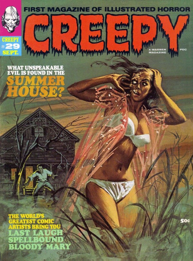
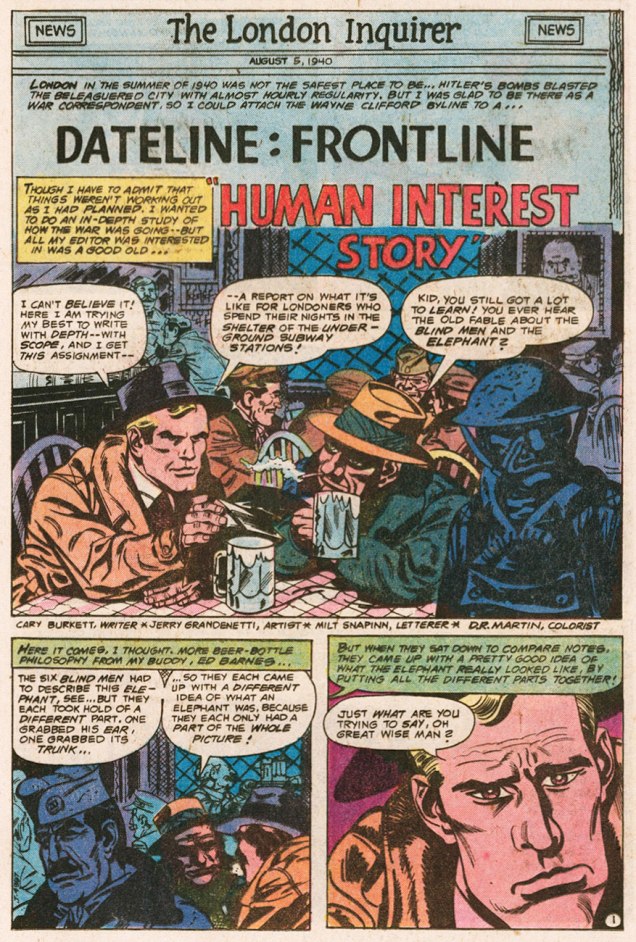
And we’re back with part two of our examination of Cary Burkett and Jerry Grandenetti‘s Dateline: Frontline (we’re not forgetting the famously-ambidextrous Ric Estrada, who took over illustrative duties in the second half of the series). In part one, Mr. Burkett graciously opened for us a window on the series’ genesis. In light of these privileged behind-the-scenes gleanings, as well as a reading of the series’ springboard text, Phillip Knightley’s The First Casualty, I formulated  a series of follow-up questions, of which we present the first half, along, of course, with Mr. Burkett’s insightful and modest responses, followed by chapter 2 of the first D:F trilogy.

Who’s Out There: Was there much deliberation on your part regarding the specific setting of the series?

Cary Burkett: I vaguely recall that in an early meeting with Paul Levitz we mentioned the possibility of setting the series during the Vietnam war. Or rather, I think he may have mentioned it. But I never had any interest in that from the beginning. That war was too close at the time, and I didn’t think I could do it. Research was a lot harder to do in those days, and I was too green as a writer to want to tackle that controversy.

If my memory is right, I think he left it up to me, and I very quickly settled on the World War II setting. There were a lot of reasons in my mind for that, including the wealth of research material available.

But the biggest thing was the fact that the U.S. started out as “neutral” in that war. I felt a story arc right away of a young reporter who began as a “neutral” observer, wanting to be an objective journalist, but over a series of events finding himself unable to keep from being drawn in and taking sides, despite his proclaimed neutrality.

At the time I didn’t know how long the series might last, but it was my intention to gradually move Wayne Clifford from a naïve journalist with laudable ideals into a conflicted character grappling with the very gray areas of war reporting and the messy questions of patriotism and propaganda.

WOT: In writing the series, did you ever find yourself at odds with the, er, ‘official record‘ of history?

CBI wouldn’t say that exactly. The truth is, I had only a sketchy knowledge of World War II history, and little idea of what the “official record” said. So I set about to educate myself.

One really good current documentary at the time was The World at War narrated by Laurence Olivier. I watched a number of episodes of that. What I realized from watching it was how much the history I had heard and read was centered on how the U.S. and England had won the war. This documentary was one of the first western pieces which really pointed out the importance of the Russian contribution.

That led me to other research and made me want to do a series of stories set in Russia. Of course, the insane difficulties of trying to report the truth during a war in the middle of Russia appealed vastly to me and provided a lot of opportunities for conflict on a lot of levels. I felt I barely scratched the surface in those Russia stories.

One thing about doing research; you start to get interested in all the little details. You want to include much more than you really can. You have to be careful to let the story reveal the details when it is important to the story, but not to let the research itself become the story.

I struggled with that in writing those Russia stories, because much of what I was finding out was really eye-opening to me. What I knew about the war in Russia I had learned mainly from watching Hogan’s Heroes. In that TV comedy, the Nazis all feared being sent to the Russian front, so you knew it was cold and terrible. But that’s about all I knew.

When I began to read about the scope of the tragedy and brutality of the war in Russia, I wanted to bring the reality of it into my stories. I wanted to shove it all in somehow. But my stories were a mere 6 pages long in each issue, so I had to just try to give little glimpses that implied a lot more.

Stephen King’s advice to writers is to “kill your darlings”, that is, to get rid of your pet favorite bits so they don’t bog down the story. Those Russia stories were ones where I felt I had to keep killing those “darlings” over and over.

WOT: Was there any friction with DC’s brass, or was the series too far under the radar for them to notice? If so, did that allow you more leeway?

CBWe were definitely way under the radar, but I don’t think that the stories would have caused any stir even if they had been noticed. I don’t think there was anything subversive or strongly controversial about them. They were different from the usual comic book war stories, but not in a way that would cause any issues.

The lead stories of the books featured Gravedigger, or later, The Unknown Soldier. These were the stories that were there to sell the book, and these would have gotten more scrutiny. They were the typical action-oriented comic book war stories, sometimes just a step away from fantasy. Sometimes not even a step.

With a long-running lead character in a war series, you have to be a bit looser with timelines in the war. I suppose it’s a convention of the genre that the character might pop up in Okinawa in one story, then many issues later have a story related to D-Day, even though D-Day would have happened well before Okinawa.

Maybe it’s because the main character was a journalist who was dedicated to getting the facts right, but I decided that my timeline was going to be accurate. The series would start with the U.S. as a neutral country, and we would later see the USA join the war, and all of the historical events would follow in the order they occurred.

WOT: Was the rotation of backup features decided from the start? Was it some sort of commercial compromise?

CBI don’t really know. I think the idea was mainly to have variety in the backups. It was a common template for older DC titles like Action Comics or Adventure Comics in the ‘60’s. One issue would have a Green Arrow backup, the next maybe Aquaman.

My own speculation is that as an editor, Paul was drawn to that kind of setup, and felt it gave the reader a little something extra. That’s just my own thought, he never told me that. But I know he was a comics fan, and I think he was glad to have a place where Enemy Ace could still fly through the pages of a DC Comic.

WOT: Given the wealth of material you dug up in the course of your research, it must have required considerable effort of concision to craft such spare chapters. Did you go through a lot of drafts?

I did struggle to find ways to get my stories into the six-page frame and did quite a few re-writes, trying to balance the pace so the story didn’t seem rushed but also had enough meat.

There were compromises, for sure. In what I considered to be one of the key stories, Clifford, still a neutral reporter, takes a rifle and kills an Axis soldier attempting to kill his English friend. I had been leading up to this decision since the beginning of the series. Here he is forced to admit that he is neither neutral nor objective as he thinks of himself.  I would have loved to have had a bit more room to let that sequence play out with more significance.

No doubt, I could have done a better job even in the space I had. In the end, I felt that it came out a bit weak and contrived.

WhoThereLogotype

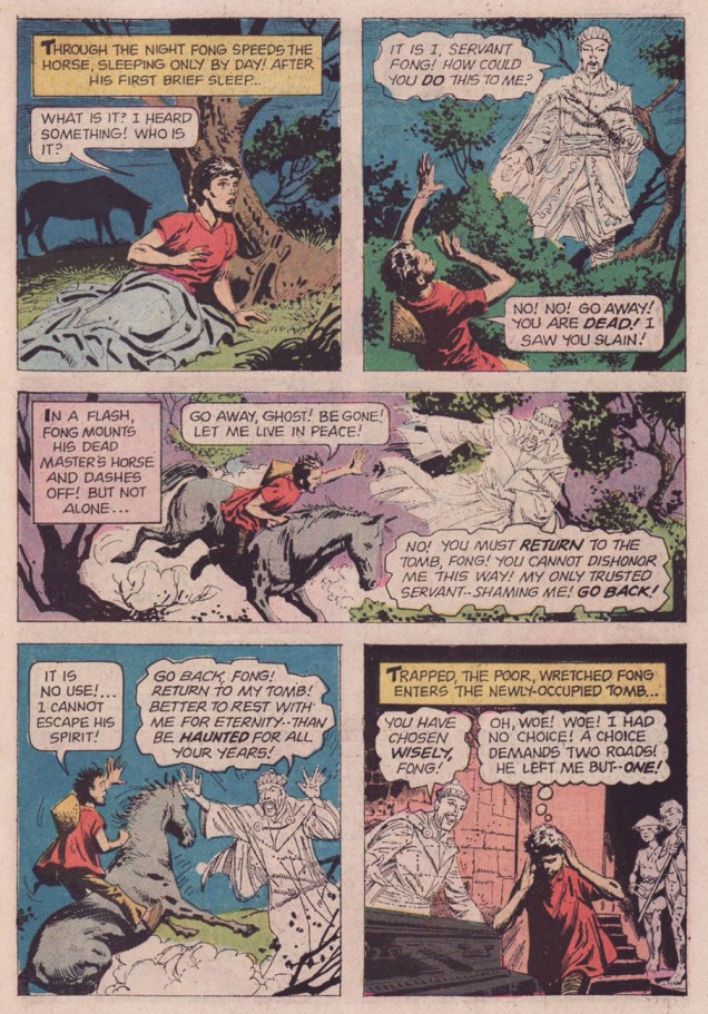
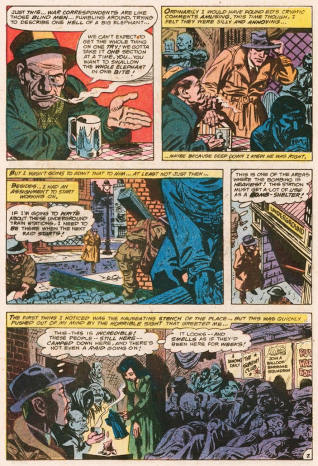
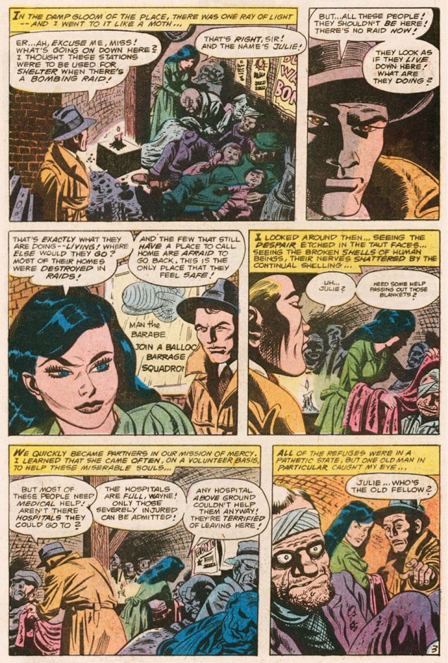
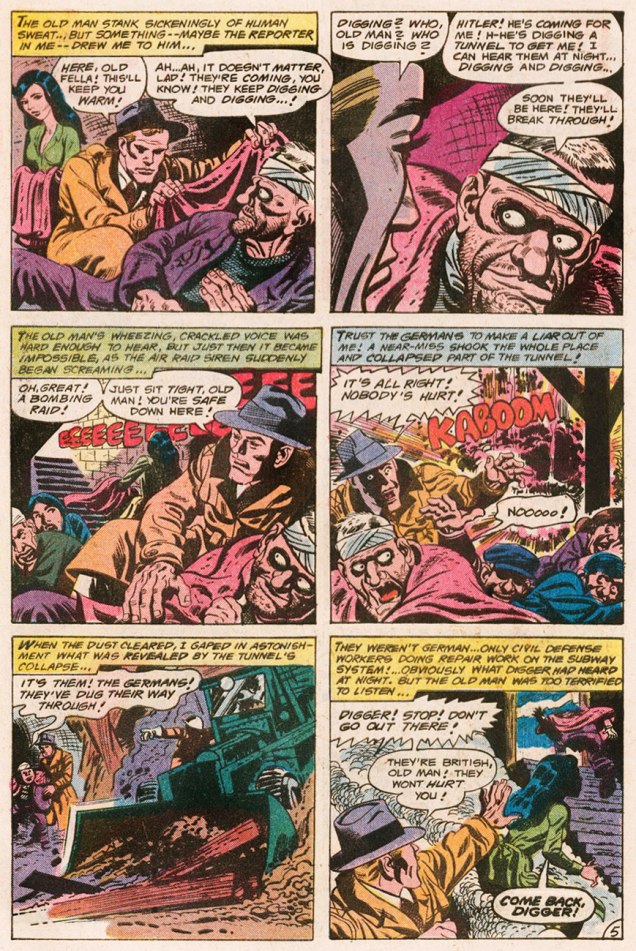
Now, let’s rejoin Wayne Clifford and his buddy Ed Barnes, who were, when we saw them last, off to the pub…

Dateline2London01ADateline2London02ADateline2London03ADateline2London04ADateline2London05ADateline2London06A

That’s it for now! Stay tuned for the conclusion of our talk with Cary Burkett, along with part three of Dateline:Frontline’s London trilogy.

-RG

Vic Prezio at Warren, Part Two

« These dreams? Hallucinations… or whatever you call them! It was on a business trip… in the middle of nowhere… I’ll never forget it! » — Alex Colby, who swears he saw them.

When people talk about Warren magazines cover artists, the name of Vic Prezio is rarely brought up. Well, someone has to, and it might as well be me. It doesn’t help that he only painted a handful of covers for Warren, but hell, I love them all in their pulpy glory.

Prezio is better known for his over-the-top men’s adventure magazine covers and, to a lesser extent, his Magnus: Robot Fighter covers for Gold Key. Mostly anonymous work, though. It’s a filthy business.

In Part One, we looked at Prezio’s Creepy Covers. As it’s « age before beauty », Cousin Eerie now gets his turn to bow.

PrezioEerie13A
« Don’t you dare presume to tell me what I can and can’t do, Sheldon! » Some guys turn mean when their male pattern baldness spreads to their entire face.

An inspiring reminder of why you shouldn’t let the naysayers drag you down (even six feet under). Be all that you can be, on this side of the grave and beyond!

Eerie no. 13, Feb. 1968. This issue features an adaptation, by Russ Jones and Frank Bolle, of one of H.P. Lovecraft and August Derleth‘s posthumous (in H.P.’s case) collaborations, Wentworth’s Day, another emprunt from Christopher Lee’s Treasury of Terror (Pyramid Books, 1966).

Intrigued? Check it out here: http://thehorrorsofitall.blogspot.ca/2010/06/wentworths-day-hp-lovecraft.html

PrezioEerie14A
This alien encounter is *not* going to turn out all fuzzy-friendly.

Prezio’s painting conveys vividly the high paranoia of Archie Goodwin and Alexander Toth‘s The Stalkers, reprinted in this issue from Creepy no. 6, just a couple years old by then. Warren Publications were *not* in good shape at the time, having lost more of their key talent and left to the bare minimum of original material, including, thankfully, the covers. The out-of-left-field success of Vampirella would swoop in and save the enterprise in 1969. Close call!

PrezioEerie15A
Possibly the lesser entry amongst Prezio’s Warren pieces, but still an attractive cover, if not exactly terrifying. Somehow, it brings to mind Aurora model kit art more than it does a Warren cover (still, comparison to early-ish James Bama should hardly be considered a slag.)
PrezioEerie21A
« AAAAAAAAAGAH! What is it? » I’ve often pondered that very question myself, sometimes while perusing this “throbbing” issue.

Another striking (if a bit rushed-looking) Prezio cover, this time representing Slight Miscalculation by writer Bill Parente and artists Bill Fraccio and Tony Tallarico. The much-maligned Fraccio and Tallarico often worked together under the joint nom de plume of Tony Williamsune (it is said that Tallarico pulled most of the weight.)

Here’s a really nice job they created for issue 16 of Charlton’s Haunted (June, 1974.) I love the boldness of that heavy brush, swirly style: http://fourcolorshadows.blogspot.ca/2013/04/come-see-our-ghost-tony-williamsune-1974.html.

PrezioEerie22A
This time out, the cover story is H2O World by Larry Ivie, Al Williamson, and his Fleagle Gang acolyte and mentor Roy G. Krenkel, a reprint from Creepy no. 1 (1964).

The girl looks familiar, though…

JaneRussell_Underwater 1955A
From a 1955 film poster…
ColliersAug20_1954A
… itself swiping heavily from a 1954 Collier’s cover painted by Bill Baker. « You’ll find skin-diving now from Maine to California, wherever there is enough water for a person to plunge into. Divers, like the spearfishing pair on our cover, have made it America’s fastest-growing sport. » I’ll bet she’d rather dive with her husband, armed with a spear, than in the darkness with overly-friendly monsters.
PrezioEerie24A
Prezio’s final Eerie cover (he would paint a couple of beauties for FMOF the following year), this lugubrious tableau from the bone-chilling month of November 1969, is likely my favourite Prezio. It illustrates Bill Parente and Michael Royer‘s Head for the Lighthouse!

Warren seemed, at this point, without a decent in-house copy editor. Witness the cover’s “Scavanger” Hunt, and inside, a story mistitled « The Wrong Tennant ».

Tennants
« Wrong Tennant? You don’t say! I’d read *that*! »

All tomfoolery aside, this wraps up our survey of Mr. Prezio’s work at Warren. Hope you enjoyed the ride!

-RG

Mordillo’s Flights of Fancy

Guillermo Mordillo (1932 – 2019), known simply as Mordillo, was an Argentine artist of  Spanish parentage. Through his long and productive career, he released more comic albums than you could shake a stick at… and at 86, was still active in the comics field. His easily recognizable style, love of bright colours and oft-surreal humour make his work memorable despite his persistent profligacy.

It would be impossible to provide an overview of his body of work in one post, but it is my pleasure to furnish a fun sampling of his œuvre. Most images below have been gleaned from Opus 5 (Glénat, 1984) and Safari (Glénat, 1990), unless indicated otherwise.

MordilloChauve-SourisA

MordilloLabyrintheA

MordilloMontagneA

Mordillo-PirateShip

MordilloChaperonA

MordilloOiseauxA

MordilloSkiA

The following two images were scanned from early 1970s issues of Pif Gadget.

MordilloEiffelA

MordilloTennisA

In the mid-70s, Mordillo’s cartoons were used by Slovenian artist Miki Muster to create Mordillo, a series of cartoon animations that ended up being 400 “episodes” long (for a total of 300 minutes – each episode is under a minute). These droll snippets were broadcast in over 30 countries between 1976 and 1981. Should you have a few minutes to spare for a chuckle or two, have a look at this video (recorded by somebody in Germany on VHS tape in the 90s and, many years later, uploaded to Youtube – what lovely, contorted pathways some of these things take).

Visit Mordillo’s website here. More cartoons? More animated cartoons?

Mordillo-Argentina

~ ds

Tentacle Tuesday Masters: Brian Bolland

« Or… uh, huh… with the severed neck of a dead ostrich… Yow! Tentacles! Long wriggly tentacles! Woo-WOO! »

Ah, Brian Bolland, the British artist that generally comes to mind when one mentions Judge Dredd. This was certainly *my* introduction to him, and my so-called initiation went over with a bang! (Which is to say, I fell in love with his art instantly. It took me a little longer to learn to appreciate Judge Dredd stories illustrated by other artists.) His crisp line adorns many, many comic titles, and I’m not going to enumerate all the pies he’s had his fingers in. I can, however, kill two birds with one stone by combining Wonder Woman Tentacle Tuesday part 2 (part 1 can be found here) with Bolland tentacles along other lines.

Actually, DC’s 1987 Wonder Woman series is a treasure trove of tentacles even without Mr. Bolland. However, some of these covers are frankly too ugly to feature here (I have high standards, in case you hadn’t noticed), while he can be relied on to always provide us with eye candy and an engaging composition.

BollandWW75A
Wonder Woman no. 75 (June, 1993).

Bolland is reputedly fond of his work on Wonder Woman covers, marking that it was “one of the few occasions he actually sought work rather than being sought for work.”

WonderWoman86-BrianBolland
Wonder Woman no. 86 (May, 1994).

A bonus WW illustration as a special treat, albeit a follicular extension of the definition of a tentacle, I confess. Well, it *is* Movember.

BrianBolland-WonderWoman-vs-EggFu
A pin-up published in Wonder Woman no. 120 (April, 1997): Wonder Woman vs Egg Fu!

TentacleTuesdayIcon

Moving on from the powerful, intrepid Wonder Woman to smaller crawfish, we have this maiden in an incredibly silly costume, which Bolland managed to somewhat redeem, mostly by hiding the stupid bow and differently-coloured boot on her left leg.

BrianBollandOutsiders45A
Adventures of the Outsiders no. 45 (May 1987). Mechanical tentacles are all well and good, but it’s Duke of Oil‘s inane grin I like best.

The maiden’s name, by the way, is Looker (!), presumably because the team who created her (Jim Aparo and Mike W. Barr) couldn’t think of a better moniker for a woman who went from a mousy bank teller to a cocotte (oh, sorry, I meant “coquette”) with superpowers. Pardon me going off-topic, but I really must illustrate: here’s what her costume looks (oh, har har) like in its full frontal glory.

BatmanandtheOutsiders31
Batman and the Outsiders no. 31 (March 1986), cover by Alan Davis.


And a last piece of balderdash:

« Her original costume was manufactured from a material unique to Abyssia; one way fabric, which was invisible from one side. This allowed her to keep her costume handy but not visible. She would turn the clothing out to make it visible. »


Moving on to classic Bolland with creepy-crawlies, fatal beauties and grotesque sub-humans, we have this delightful poster:

BrianBolland-peoplelikeusv2
An advert Mr. Bolland created for Forbidden Planet, « London’s Newest Science Fiction and Comics Book Shop! » in the early 80s. You can admire it (and other designs) in action, so to speak.

And a last madcap entry, amusingly full of non-sequiturs:

BrianBolland-AxelPressbutton
A page from « Silver Sweater of the Spaceways », featuring Zirk, and published in Axel Pressbutton no. 1 (November, 1984), scripted by Steve Moore and illustrated by… well, you know.

~ ds

Vic Prezio at Warren, Part One

« Stop that whimperin’, Emma — or I’ll lay into ya like a butcher in a cowpen! » — Raymond Marais, Rescue of the Morning Maid

The mysterious, but nonetheless well-remembered journeyman pulp illustrator, Vic Prezio, though chiefly associated with the infamous Men’s Sweat adventure magazines (« Weasels Ripped my Flesh! ») also produced notable work for Dell (The Outer Limits, Kona, Naza, Brain Boy, Frogmen…), Gold Key (Magnus, Robot Fighter) and Warren, and that’s just the tip of the iceberg. I did say he was a journeyman.

In all, Prezio produced, for the Warren Magazine line, six covers for Famous Monsters of Filmland, some of them classics, four for Creepy and six for Eerie. And that’s not all: Prezio painted a pair of covers for FMOF companion title Monster World (no. 2, Jan. 1965, and no. 4, June 1965); these would have been his earliest Warren contributions. Thanks to eagle-eyed Michael Prince for bringing these last to my attention!

Today, we’ll admire Uncle Creepy’s dodgy wares, and reserve Cousin Eerie’s mouldy goodies for part two. The FMOF issues regrettably fall outside our purview, but for the record, these are numbers 35, 36, 38, 39, 67 and 68. Check ’em out.

PrezioCreepy18A
Oh, it’s just your lousy luck: you finally get your best girl alone on your raft, then along comes this humongous critter to put a damper on the romantic mood. Prezio brings the scene to life for issue 18 of Creepy (Jan. 1968)… but I can’t quite shake the feeling that said scene looks sort of familiar…
AmazingStoriesJune1926A
Ah, that must be it. I see there used to be two snakes involved.
PrezioCreepy19A
« I say, are you the chap that’s been short-sheeting my bunk every night? » 
Mr. Prezio’s nasty (in a good way) cover painting gives us a glimpse of Rudyard Kipling‘s (by way of Craig Tennis & Johnny Craig) The Mark of the Beast (1890), reprinted from Christopher Lee’s Treasury of Terror (Pyramid Books, 1966).
PrezioCreepy19ORIG_A
A look at the original painting, which thankfully survives. Can’t take such things for granted.
PrezioCreepy28A
« Good Lord! » I wonder what that ‘one thing’ is. Prezio’s cover for Creepy no. 28 (Aug. 1969) is based on Archie Goodwin and Dan Adkins‘ story The Doorway, reprinted in this issue. Read it here, if you must.
PrezioCreepy28ORIG_A
Some editorial second-guessing went on, as evidenced by the most consistent colour scheme of the original painting. It’s a great piece, so it works all the same.
PrezioCreepy29A
« Come back, baby! Sure, my saliva’s a bit… corrosive, but you’ll get used to it! »
Vic Prezio’s twist on the then-prevalent gothic romance trope of the gorgeous, scantily-clad damsel-in-distress running away from some castle or mansion. This is Creepy no. 29 (Sept. 1969).
PrezioCreepy29ORIG_A
Now, Vic’s original painting: the image was flipped for publication (as if you couldn’t tell), which was probably a sound decision. Left to right motion is more visually natural and dynamic.

Well, that’s it for now. Next time, we’ll check out Mr. Prezio’s Eerie covers, so stay tuned.

-RG