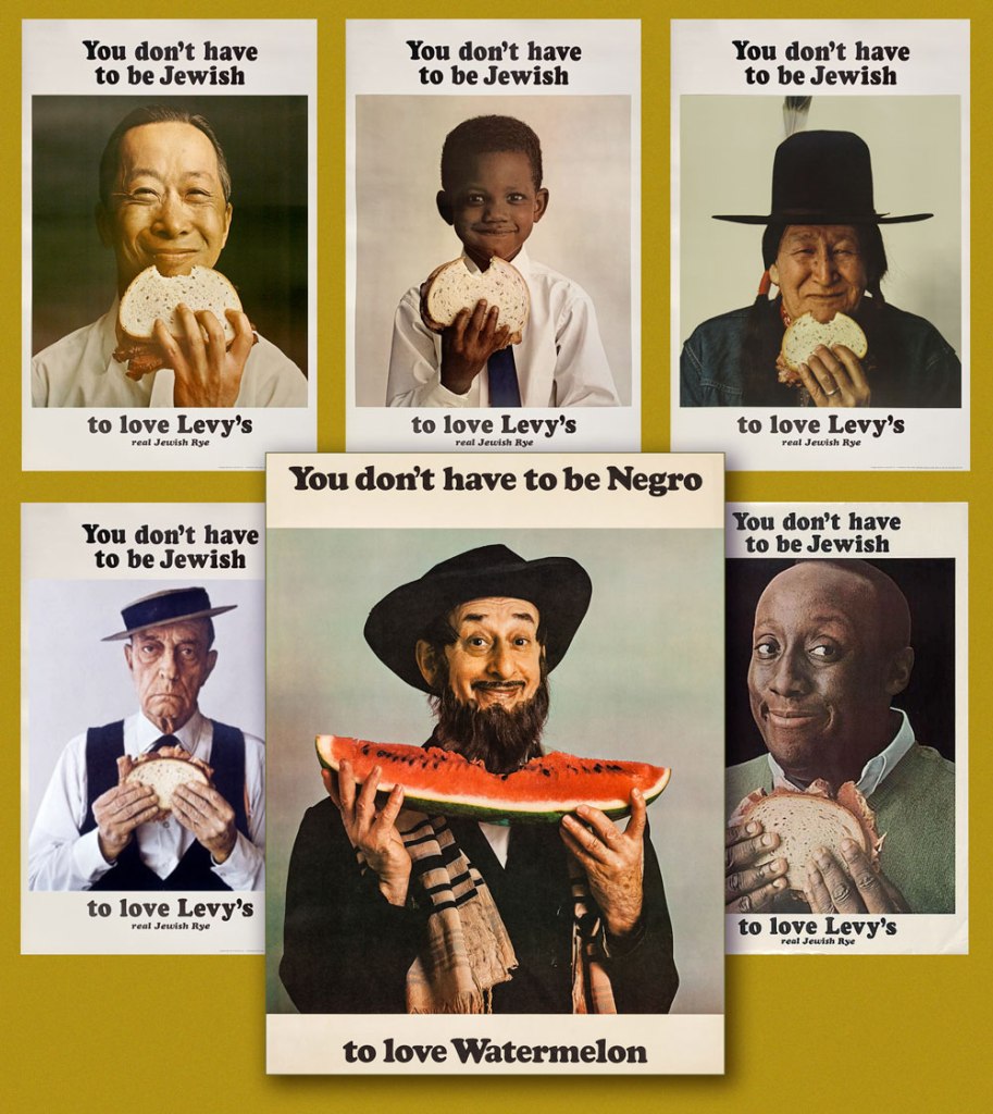
« To prevent enabling oppression, we demand that black people be twice as good. To prevent verifying stereotypes, we pledge to never eat a slice a watermelon in front of white people.* » — Ta-Nehisi Coates
On a scorching day last week, we were at home digging into a particularly tasty watermelon.
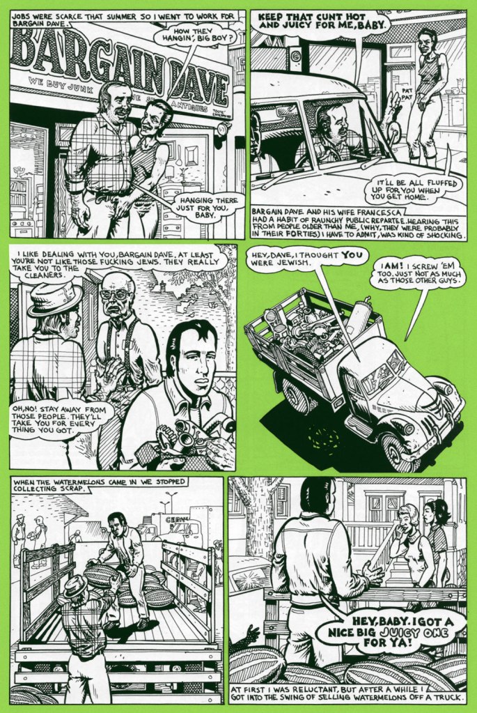
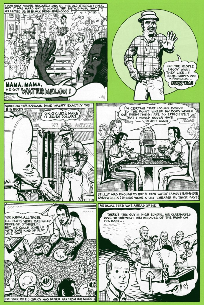
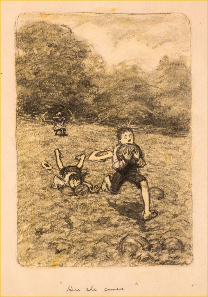
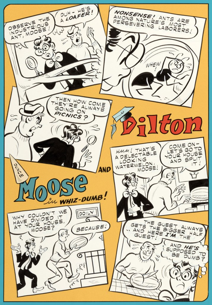
As neither of us grew up in the U.S. of A., the simple act of eating juicy pastèque has not been tainted, as it has for many, by racism and stereotypes. We’ve been allowed to appreciate the watermelon for itself, as a healthy, refreshing, tasty treat. A lightbulb came on as I recalled a relevant sequence in one of Spain Rodriguez‘s ‘Fred Toote’ stories, set in the 1950’s Buffalo of his youth — and so here it is:


And that’s not all: a few days later, a friend’s news feed presented me with a most insightful, eye-opening *and* heartbreaking tweet:

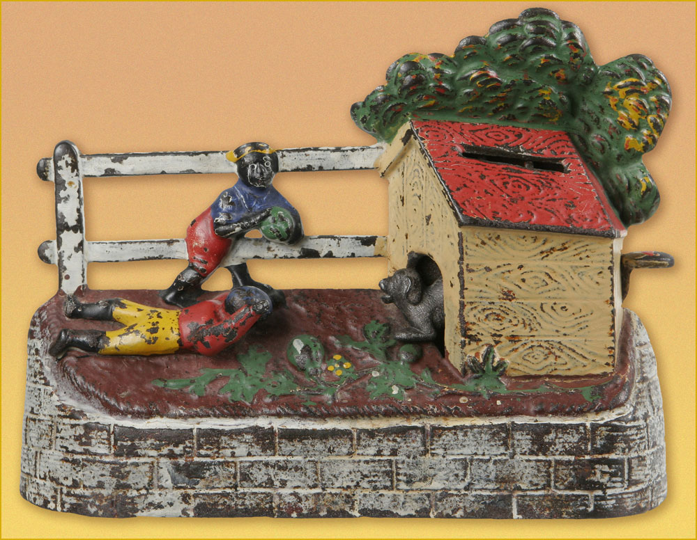

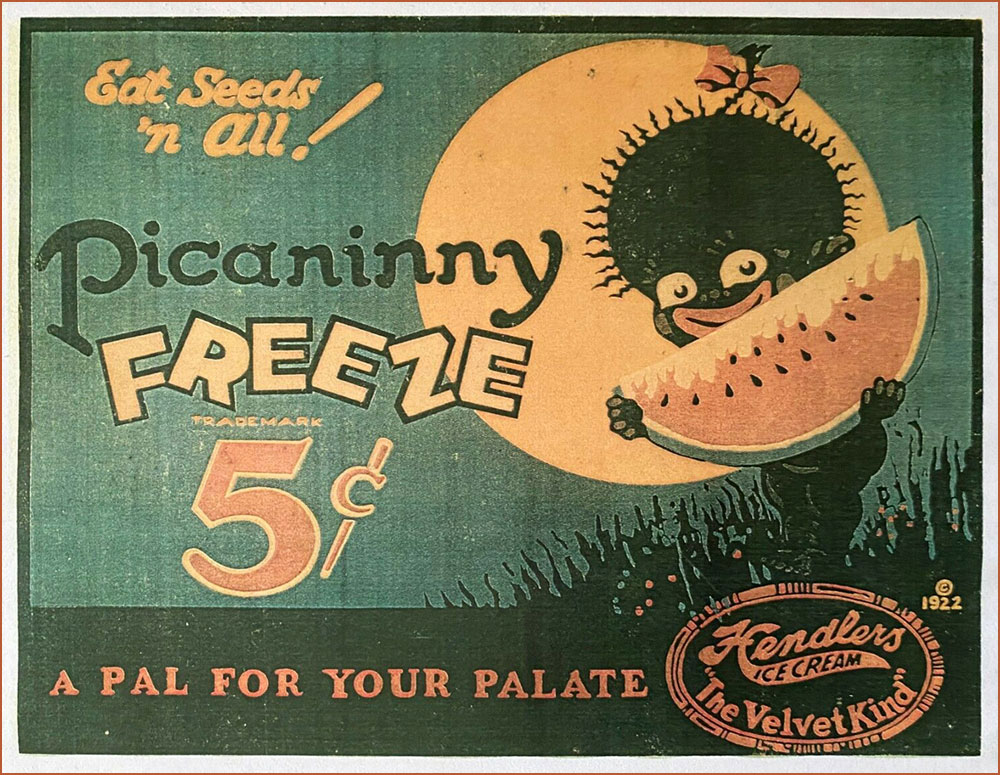
Pickaninny. A black child. Thus, from a book that was being sold in 1987 in order to raise money for the state of California’s observance of the bicentennial of the United States Constitution. ” If the pickaninnies ran naked it was generally from choice, and when the white boys had to put on shoes and go away to school they were likely to envy the freedom of their colored playmates” (Fred Albert Shannon, essay on slavery, 1934, in The Making of America, W. Clean Skousen, ed., 1985).
Pickaninny arose among slaves in the West Indies, where it was recorded as early as 1653. The original users based the term either on the Portuguese pequenino, little child, or its Spanish equivalent. They employed the term affectionately, of course, and, on the evidence of Captain Frederick Marryat, who was a sensitive recorder of language, applied it to little children generally, regardless of color, e.g. “And den, Mass Easy, you marry wife – hab pickaninny — lib like gentleman” (Mr. Midshipman Easy, 1836).But no white person can get away with this today. The essential informality of the word makes it seem too condescending, too offensive, to most modern sensibilities. The California Bicentennial Commission, in fact, halted the sale of The Making of America, and issued a formal apology for having authorized it in the first place, after this use of pickaninny was called to their attention (along with other matters, the text also concluding that “slave owners were the worst victims of the system [of slavery].”


-RG
*He’s not even slightly exaggerating: the heinous stereotype just won’t die.


