In the spirit of saluting our heroes while they’re still around to get a boost from it…
A few weeks ago, I got wind of a delightful bit of news: that local favourite Russell Kommer Myers now holds, according to Guinness, the world record for Longest running daily cartoon strip by a single author. Perhaps because of his chug-along consistency, the prodigious Myers is generally taken for granted. Well — I’m happy to say — not in these parts: see our tribute post from a while back, Growing Old Gracelessly With Broom-Hilda, for further, abundantly illustrated praise.
Here’s some of what the folks at Guinness (not the Dublin ones) had to say:
« The longest running daily cartoon strip by a single author is “Broom-Hilda” by Russell Myers (USA), which has been in continuous publication for 53 years 292 days since first published by the Chicago Tribune Syndicate on 19 April 1970, as of 5 February 2024.
Russell was born “BT” (before television) and fell in love with comics and cartooning as a child. He started a collection of over 2,000 comic books, which he still has.
After years of having other comic strips rejected, Russell sold “Broom-Hilda,” which became an overnight success. He is a “one-man shop,” writing and drawing every strip himself, over 19,710 as of the 54th anniversary. »
For a little perspective, here’s what Lambiek had to say on the subject:
« He leaves previous record holders behind, like Frank Dickens (‘Bristow’, 51 years), Charles M. Schulz (‘Peanuts’, 49 years) and Marc Sleen (‘Nero’, 45 years). Yet Myers is still behind Ed Payne (‘Billy the Boy Artist’, 56 years), Fred Lasswell (‘Barney Google & Snuffy Smith’, 59 years), Jim Russell (‘The Potts’, 62 years) and Russ Johnson (‘Mr. Oswald’, 62 years, though this was a monthly comic). » Honestly, one is inclined to gently bring up the touchy, controversial issue of, ahem… assistants.
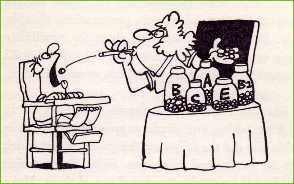
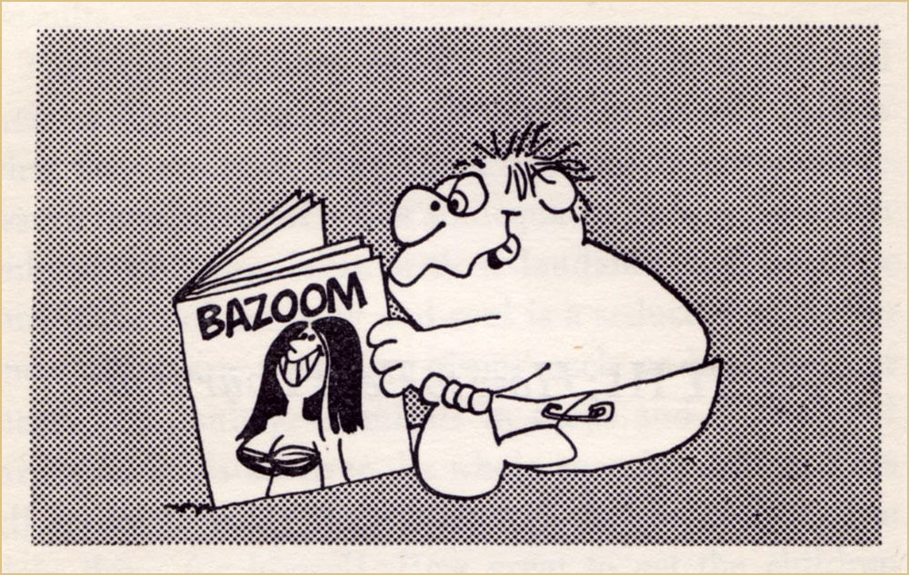
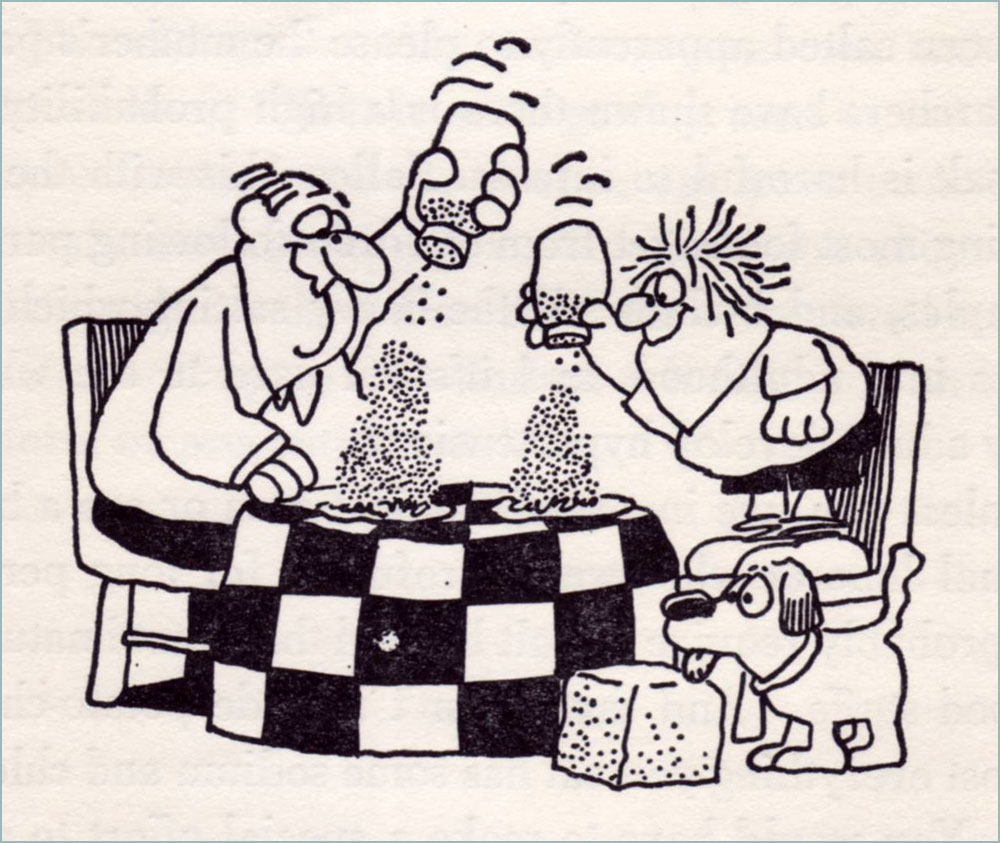
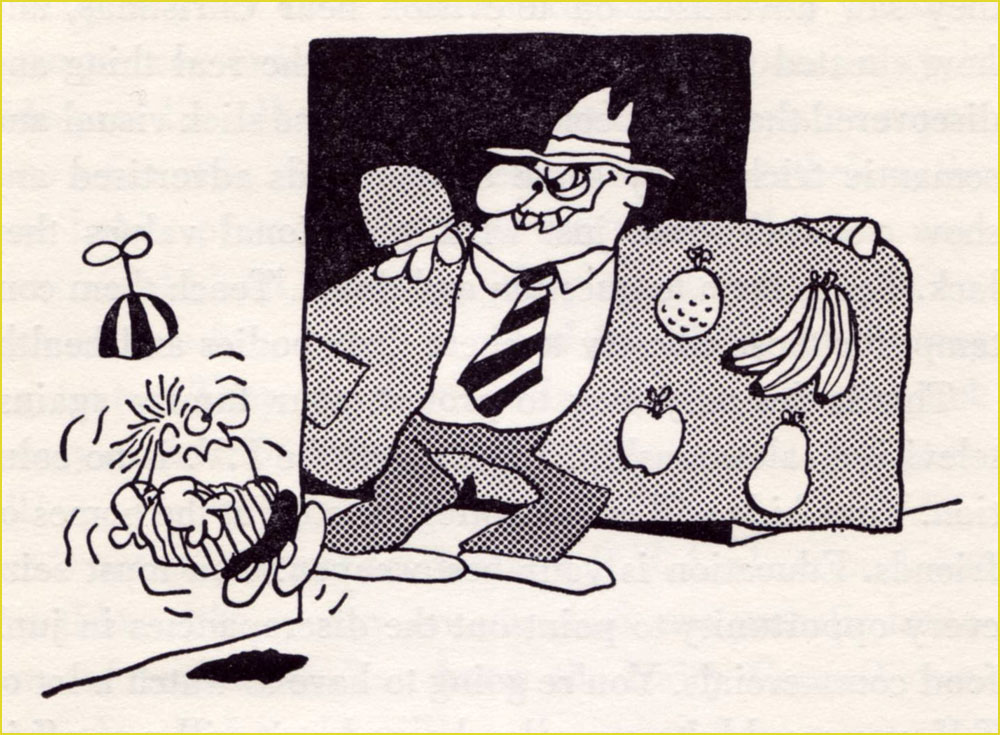
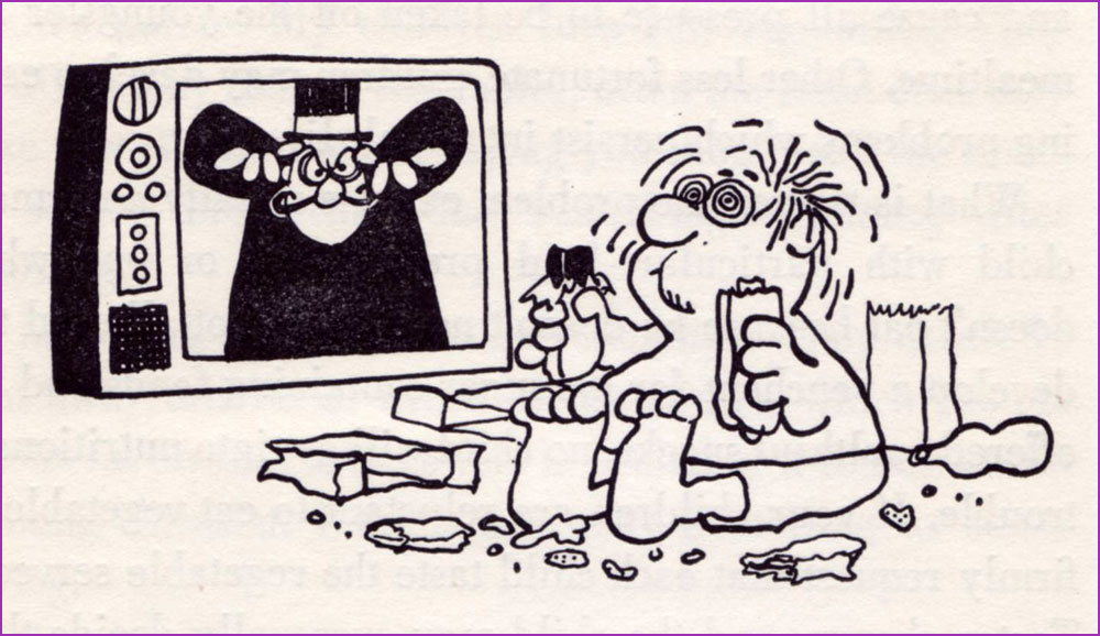
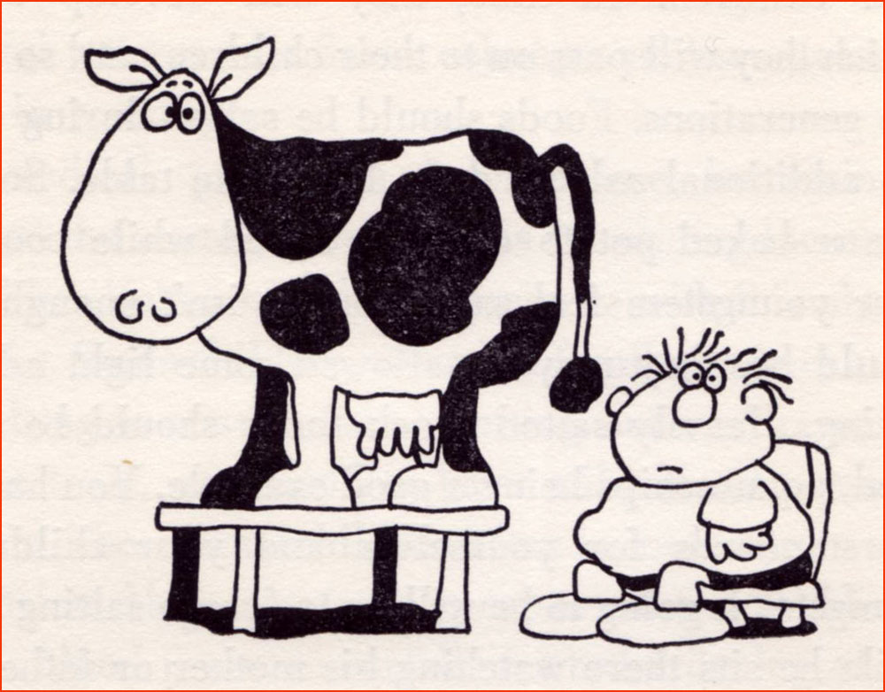
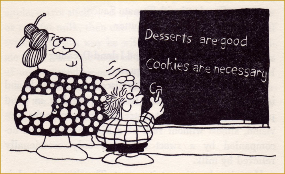
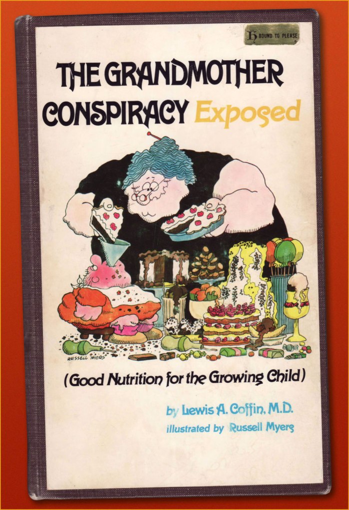
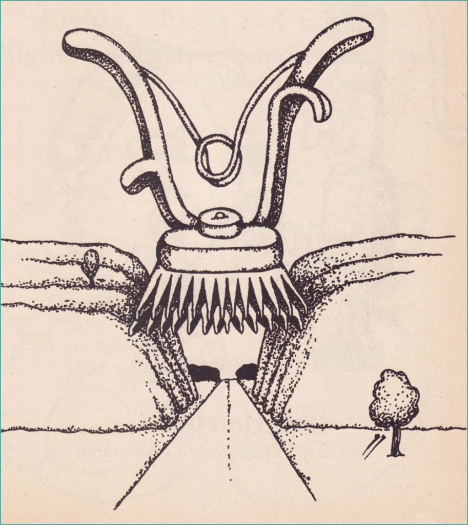
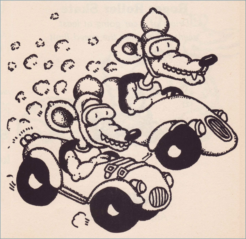
Having already dealt with Broom Hilda, let’s dig a little deeper. In 1974, early in his strip’s run, he contributed illustrations to California paediatrician Lewis A. Coffin’s book, The Grandmother Conspiracy Exposed (Good Nutrition for the Growing Child)… and did a lovely job. Given the ever-fickle nature of the dietary business — to say nearly nothing of its oft-political ramifications — Coffin’s book now seems of its time and place, but he was pretty progressive, and put forth a lot of sound notions. Here are some of Mr. Myers’ fun chapter illustrations:
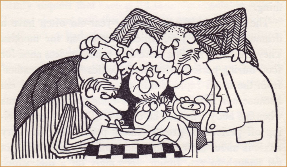
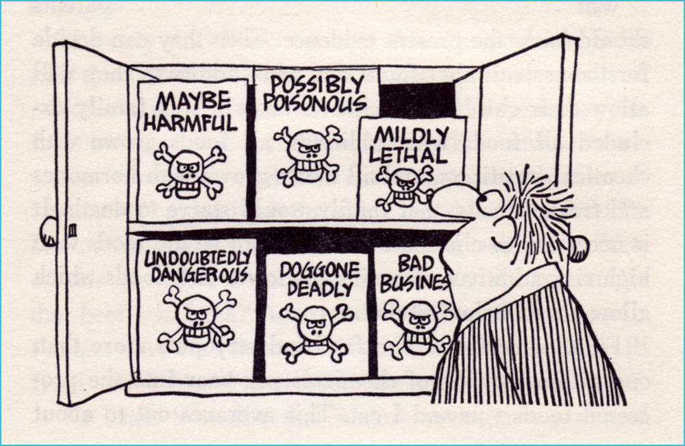
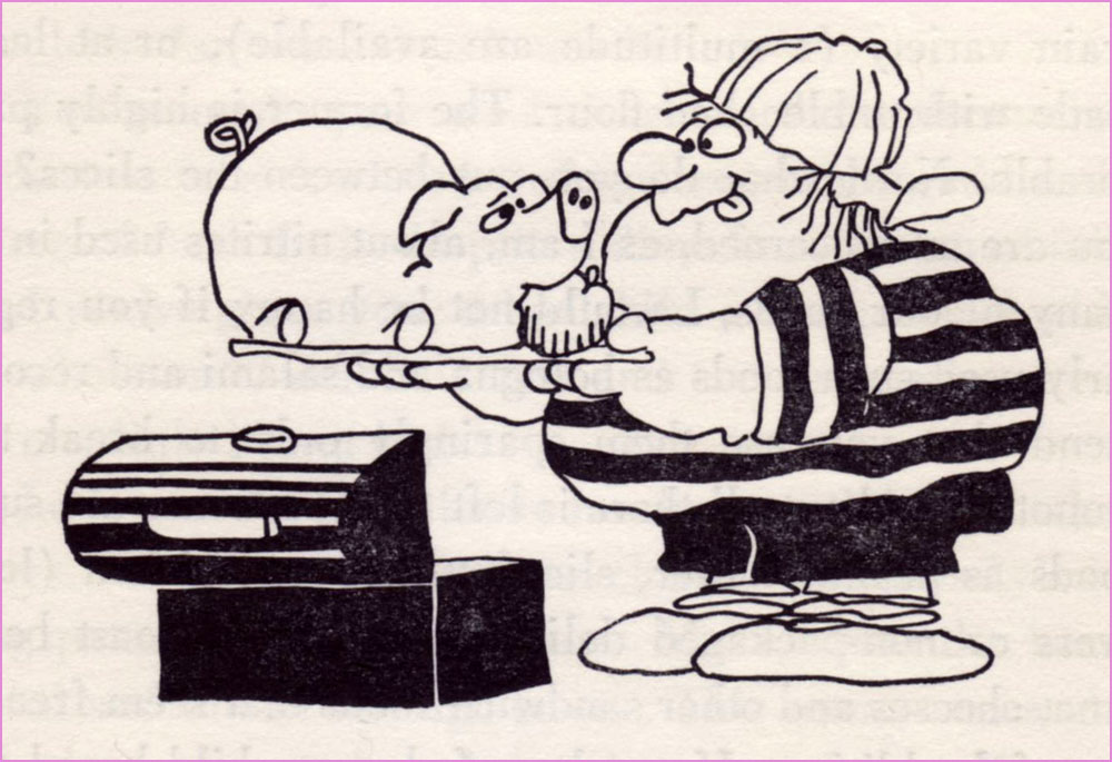
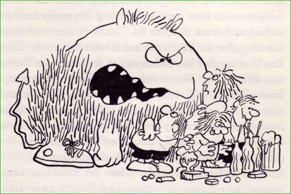
« The best way to get vitamins is to eat foods which contain them. »« The advantages of breast feeding are well known: lack of preparation, sterility, natural warmth, ready availability, proper nutritional balance of ingredients, prevention of anemia, attractiveness of container design, transfer of protective factors against disease, apparent lower incidence of allergic disease, relative absence of intolerance to milk, and all the emotional gain for both mother and child. » « Unless you live in a semi-tropical area or are a heavy manual labourer who sweats profusely for long periods, you probably require no salt beyond that found naturally in food stuffs. »« I believe that a person who has felt a sun-warmed, firm but ripe tomato in his hand, lifted it up to his nose and savoured the deep, earthy aroma, and tasted the full, tart-sweet taste, juice and seeds dripping down his chin, will never forget the look, feel, smell or taste of that real tomato, and will know how to pick out the best tomatoes in the supermarket, because he will have that supreme standard to measure them against. »« My children love raw vegetables. They dislike many cooked vegetables, often the same ones they like raw. While I’m not saying you should sell the stove, it seems they sense that something’s missing after cooking. » « For many years Americans felt secure in the belief that the government and, more specifically, the Food and Drug Administration was constantly screening all processed food for harmful additives. It has finally become evident that this is not the case. » « Most school systems have completely abdicated the responsibility for nutritional education and have totally misused their most potent teaching tool, example, in the name of economy. » « Your children will sneak around your back and gorge at the neighbour’s house, or will slither down to the local store and furtively cram candy-bars and soft-drinks down their deprived throats. »« It wasn’t until television came along that the finely honed art of brain-washing children came to full flower. »« … we know that the majority of peoples in the world not only don’t drink milk, but they would be quite ill if they did. »« You would naturally assume that your local school’s lunch program was nutritionally a good one. »And here’s my durably bound copy of this lovely tome, discarded early this century from the library of Alma College, a private Presbyterian liberal arts college in Alma, Michigan.
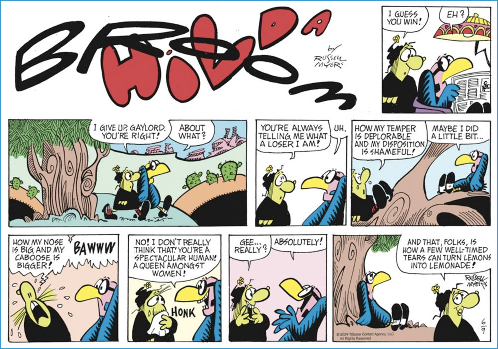
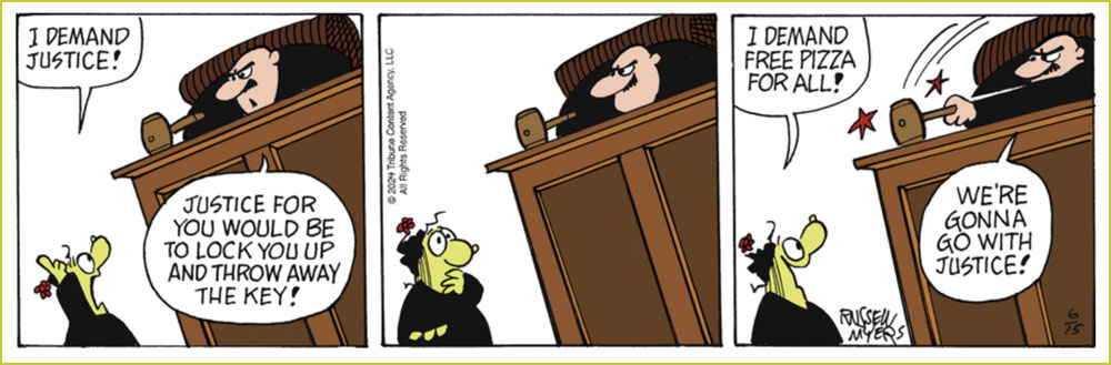
And since I’ve touched upon Mr. Myers’ Broom Hilda achievement, I would be remiss in not giving our readers a look at what he’s been up to lately. After all, an endurance record means little if the work itself has scant remaining merit. If you ask me, his timeless charm has weathered the years admirably well.
A Sunday strip from June 9, 2024.And a daily from June 15, 2024. Pretty sharp for a guy in his mid-eighties!
« Fascism will come to America wrapped in a flag. » — Sinclair Lewis
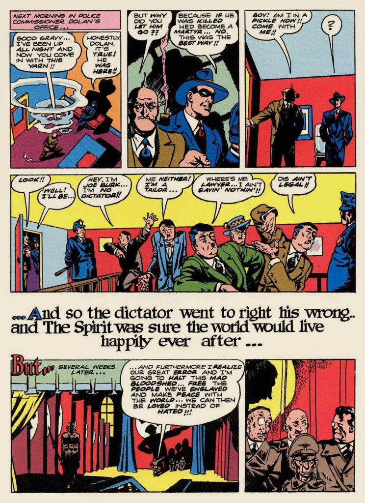
With the exception of its daily strip incarnation (1941-44), principally ghosted by Jack Cole, the early years of Will Eisner’s The Spirit never drew me in. Next to the work Eisner produced upon his return from WWII, the first years seemed tentative and inchoate. It didn’t help that the original artwork — or even quality photostats — of the material had not survived, and so reprints were consequently hobbled by dodgy reproduction.
The other day, a most generous friend presented me with the second volume of Will Eisner’s The Spirit Archives — he had a spare copy — and, not wishing to look a gift horse in the mouth, I duly proceeded to read it. I should state that DC Comics’ complete reprinting of Eisner’s magnum opus is a definitive one, so the pill was far easier to swallow this time.
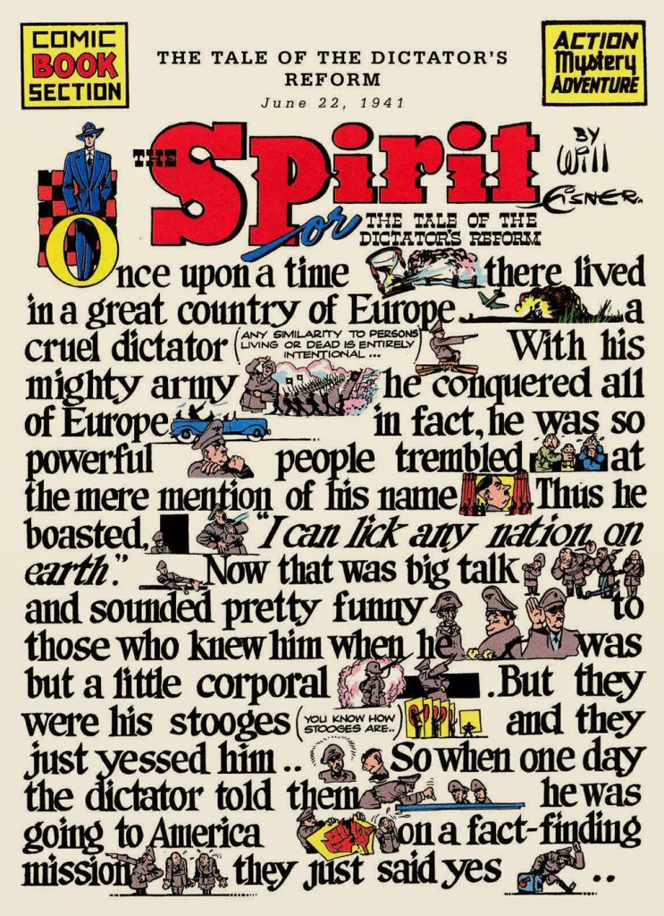
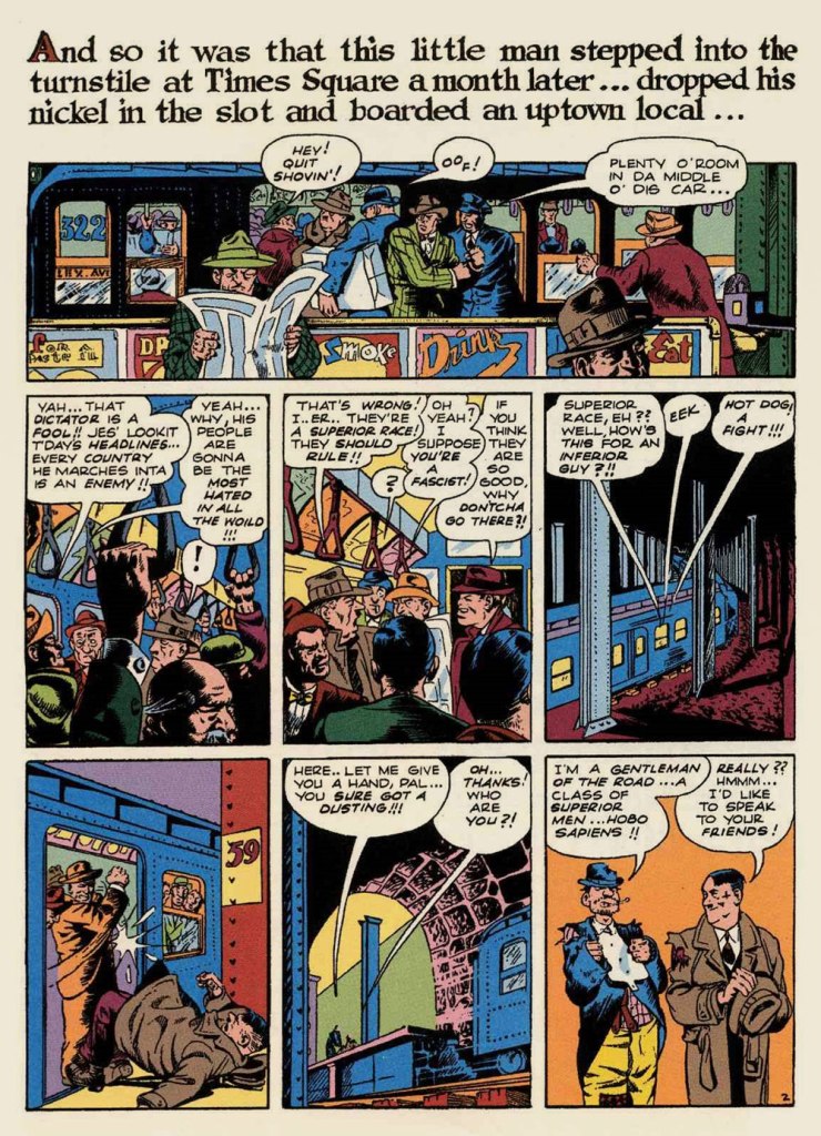
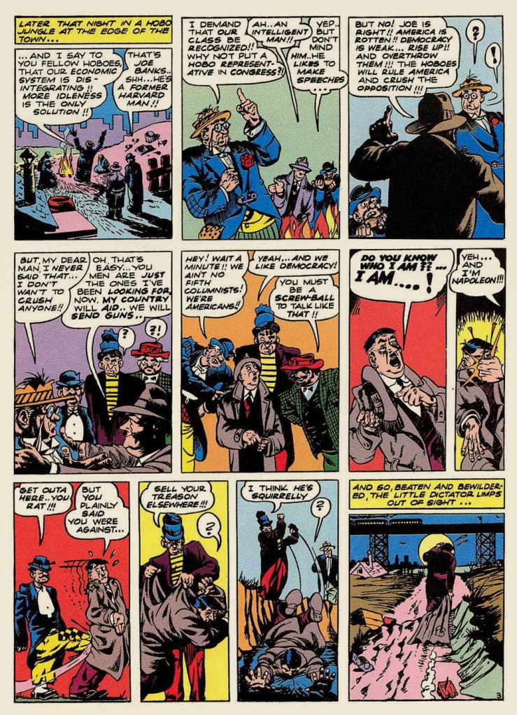
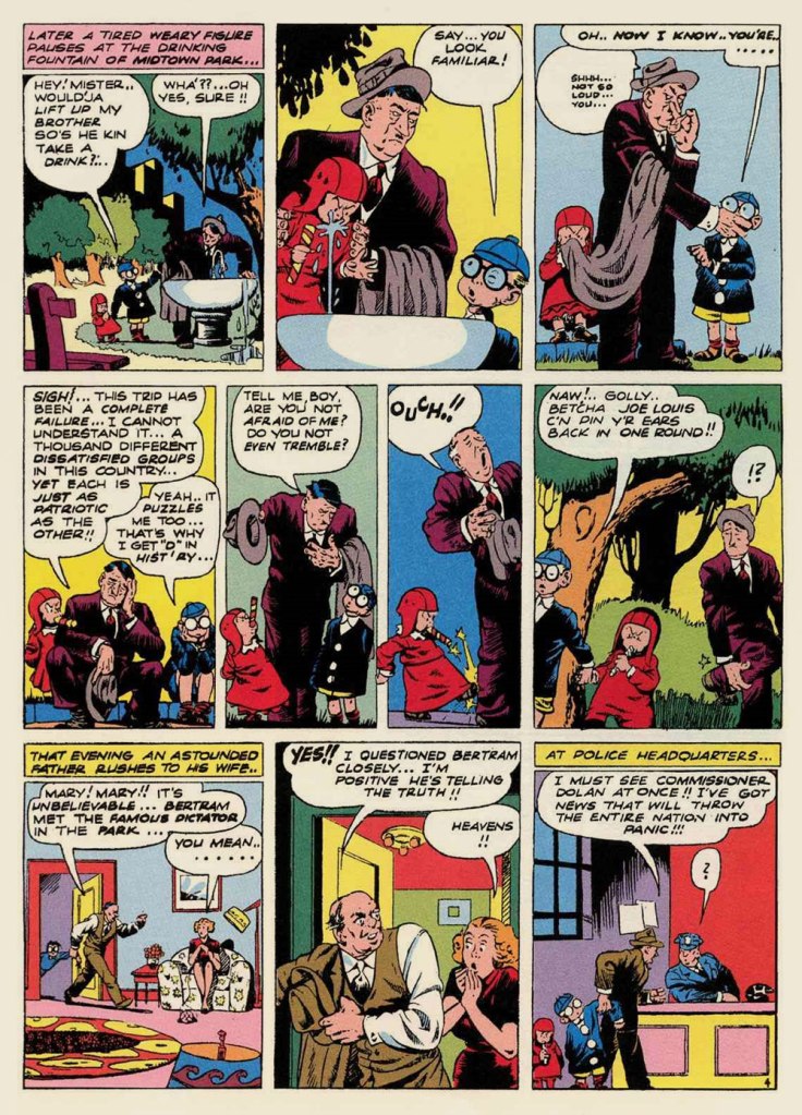
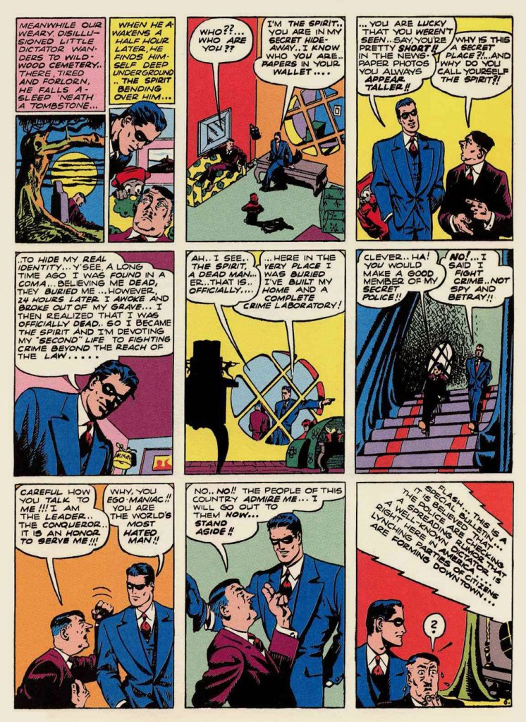
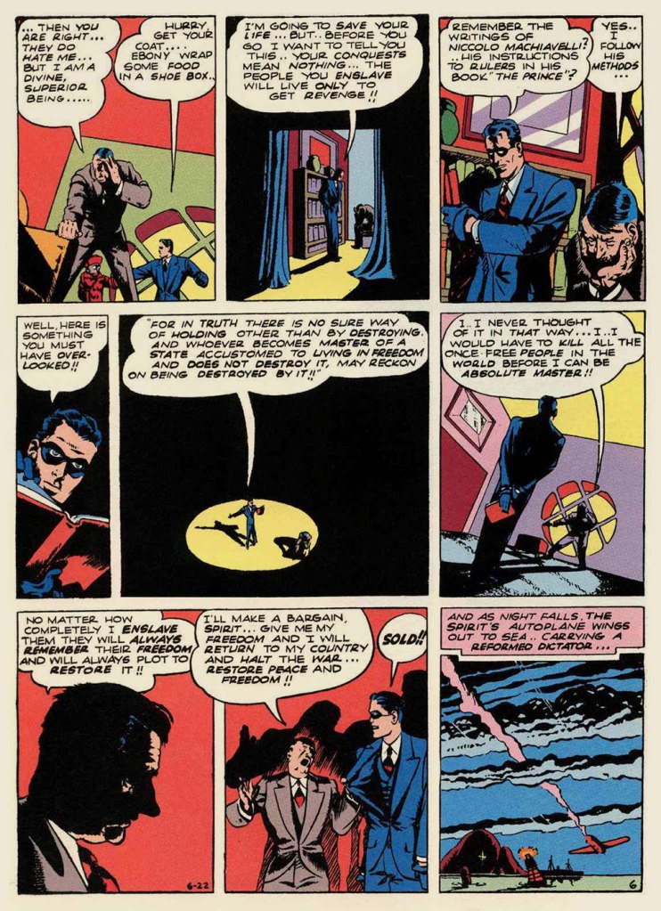
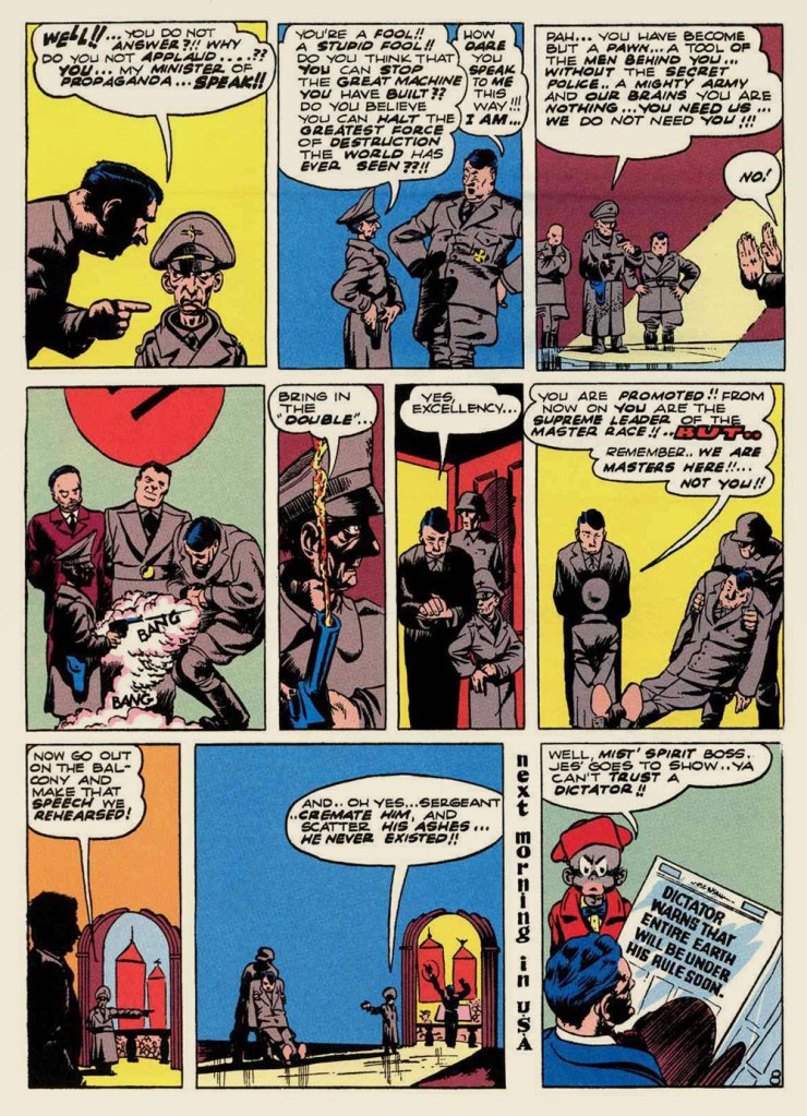
I was particularly taken with one gem near the end of the volume. And since America is currently awash in fascists and Brownshirts, Eisner’s political parable seems unnervingly apropos. See what you think!
Like it says at the top of page one, The Tale of the Dictator’s Reform was originally published on June 22, 1941. The United States’ December 9th entry into the war was still several months away.
This episode was cited as a solid favourite of his lone surviving The Spirit assistant*, the mighty Jules Feiffer (born 1929) in his pioneering work of comics history, 1965’s The Great Comic Book Heroes. Mr. Feiffer wrote: « Eventually, Eisner developed story lines that are perhaps best described as documentary fables — seemingly authentic when one reads them, but impossible, after the fact. There was one about Hitler walking around in a Willy Lomanish middle world: subways rolling, Bronx girls chattering, street bums kicking him around. His purpose in coming to America: to explain himself, to be accepted as nice guy, to be liked. Silly when you thought of it, but for eight pages, grimly convincing. »
When the story finally was reprinted — some sixteen years after Feiffer’s tantalising plot summary — in Will Eisner’s The Spirit no. 32 (Dec. 1981, Kitchen Sink), associate editor Cat Yronwode added: « Indeed, the story is all that Feiffer said of it and more. He forgot to mention that The Spirit fixed Der Fuehrer a nice bag lunch, for instance, and obligingly flew him home after his American sojourn. It’s been a long time coming, but at last we can proudly bring you this little gem, possibly the most eccentric political homily ever produced in the comics form. Enjoy it, but don’t ask for more of the same. It’s unique. »
-RG
*the next-to-last Spirit assistant, Don Perlin, passed away earlier this month. He had pencilled three stories over Feiffer’s layouts in 1951, late in The Spirit’s run.
« Our Betty Cooper is still the girl next door – she literally lives next to Archie. And she’s the blonde all-American girl; she’s so sweet and forgiving, gives people the benefit of the doubt and second chances, wears her heart on her sleeve. But she’s also incredibly broken on the inside, for many different reasons. » — Lili Reinhart
As a whole, comic book artists are not a happy lot, and for good reason. During the Golden Age, at least, there were countless publishers, so one could move around if unsatisfied with the working conditions.. even if meant finding out that things were rotten all over. After the mid-1950s, when the field violently contracted — you know the story — leaving scant players standing, you pretty much had to take the work, and the abuse, as they came. And certain publishers frowned upon ‘their’ creators playing what little remained of the field.
Kurt Schaffenberger had steady work at DC, but presumably — and understandably — sought to keep his options open, so he moonlighted for ACG, often under a pseudonym, probably unaware that the ‘competitor’ was covertly owned (at least in part) by DC co-founder and co-owner Harry Donenfeld. One can imagine Kurt’s distress when ACG folded in 1967. From what I can surmise, he did, in 1970, a lone, inexplicable cover for Stanley Morse… wildly outside his range but still kind of awesome. And then… he quietly boarded a bus to Riverdale.
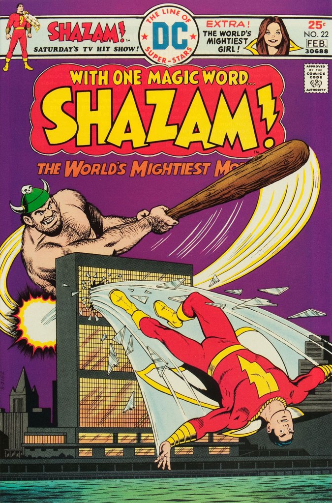
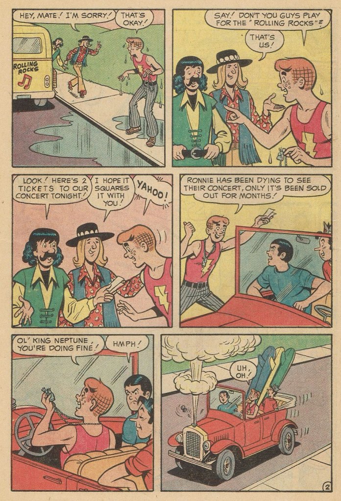
A page from Voice of Doom; script by Frank Doyle, pencils by Schaffenberger, inks by Jon D’Agostino. Published in Archie’s TV Laugh-Out no. 16 (Dec. 1972, Archie).The, er… punchline from Peace of Mind. Script by Frank Doyle, pencils by Schaffenberger, inks (likely) by Chic Stone; published in Archie’s TV Laugh-Out no. 18 (Mar. 1972, Archie).Drawing for Archie wasn’t too much of a stretch for Kurt; whether it was Reggie or The Big Red Cheese getting knocked on his ass, he had his stock posture. This is Shazam no. 22 (Jan-Feb. 1976, DC). Pencils and inks by Mr. Schaffenberger.
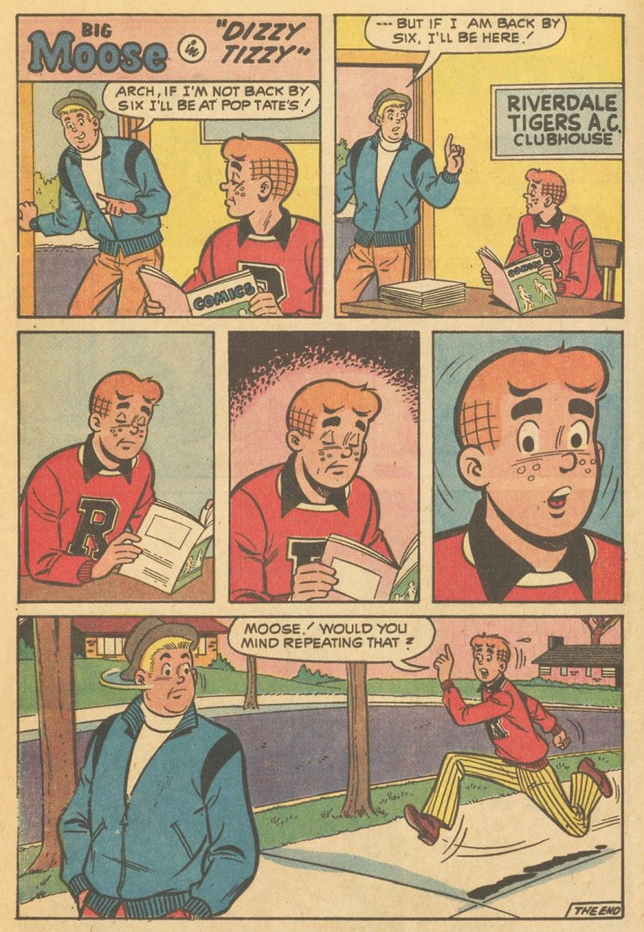
A couple more samples from Mr. Schaffenberger’s all-too-brief Archie period — solid, well-paced, ably-designed and economical storytelling:
A slightly surreal one-pager from Archie’s Joke Book Magazine no. 150 (July 1970, Archie).A page from Luck Struck, published in Archie’s Pals ‘n’ Gals no. 73 (Oct. 1972, Archie); note the Captain Marvel tank top young Mr. Andrews is sporting!
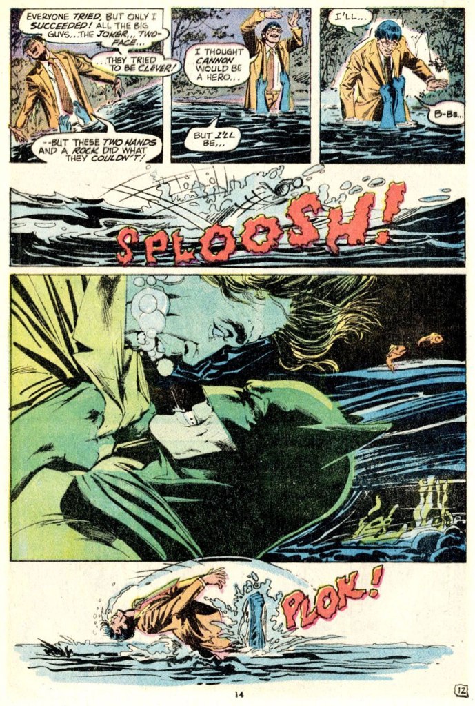
And then, there’s the case of Sal Amendola, a Neal Adams protégé whose reputation in comic books largely rests on a single Batman story, 1974’s ‘Night of the Stalker’, a highly praised tale whose chief conceit is that Batman never utters a word and weeps bitterly at the end. I’d apologise for the spoilers, but honestly, it’s been half a century, what mystery is there to dispel?
An excerpt from Detective Comics no. 439 (Feb.-Mar. 1974, DC); I’ll rarely say this, but Dick Giordano’s inks are an asset in this case, not a liability. The story’s scripting credits are at once hilarious and a bit sad: Steve Englehart, script; Vin and Sal Amendola, plot; and… “from an incident as described by Neal Adams.” Yeah, Neal; that’ll surely earn you a Pulitzer.
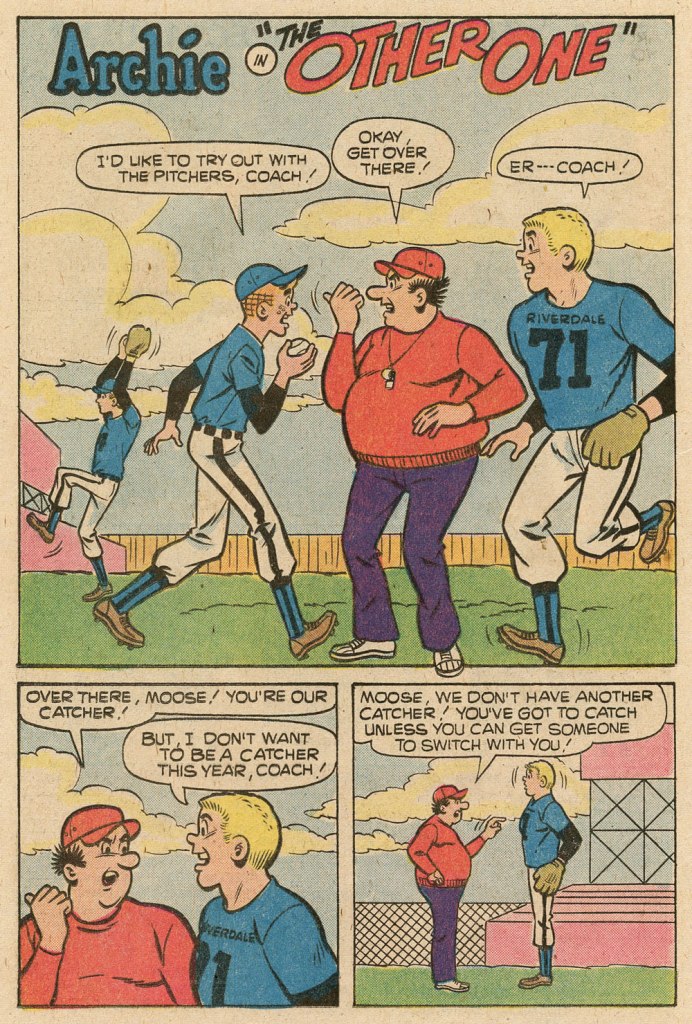
Anyway, after his turn in the Bat-spotlight and 1975’s Phoenix, one of the short-lived Atlas-Seaboard‘s more daring titles, Amendola turned up at… Archie. And it was not a good fit.
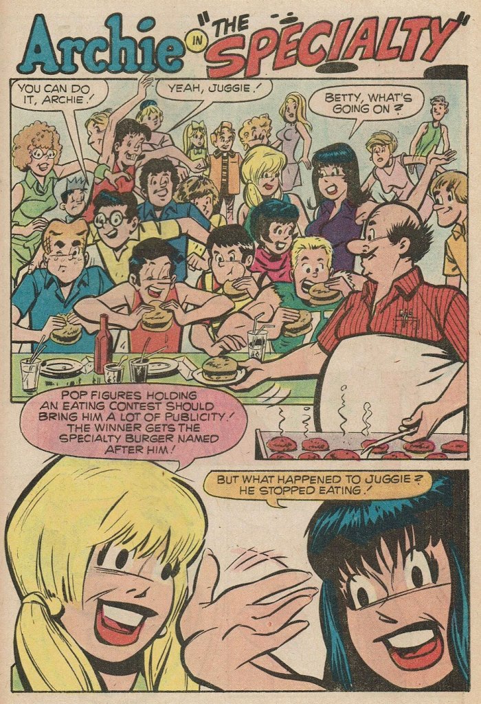
This, in fact, was the springboard for this post: a couple of years ago, I encountered an Archie story that so grotesquely missed the mark — stylistically speaking — that it bordered on the fascinating. You guessed it, Sal Amendola, utterly out of his element, not to mention, surprisingly… his depth.
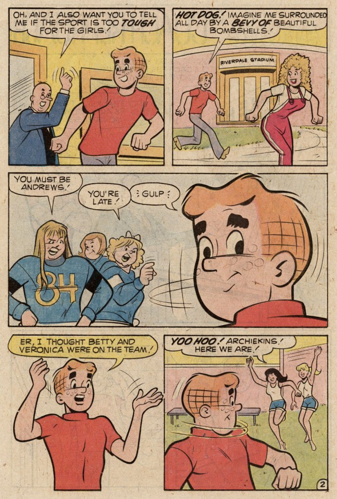
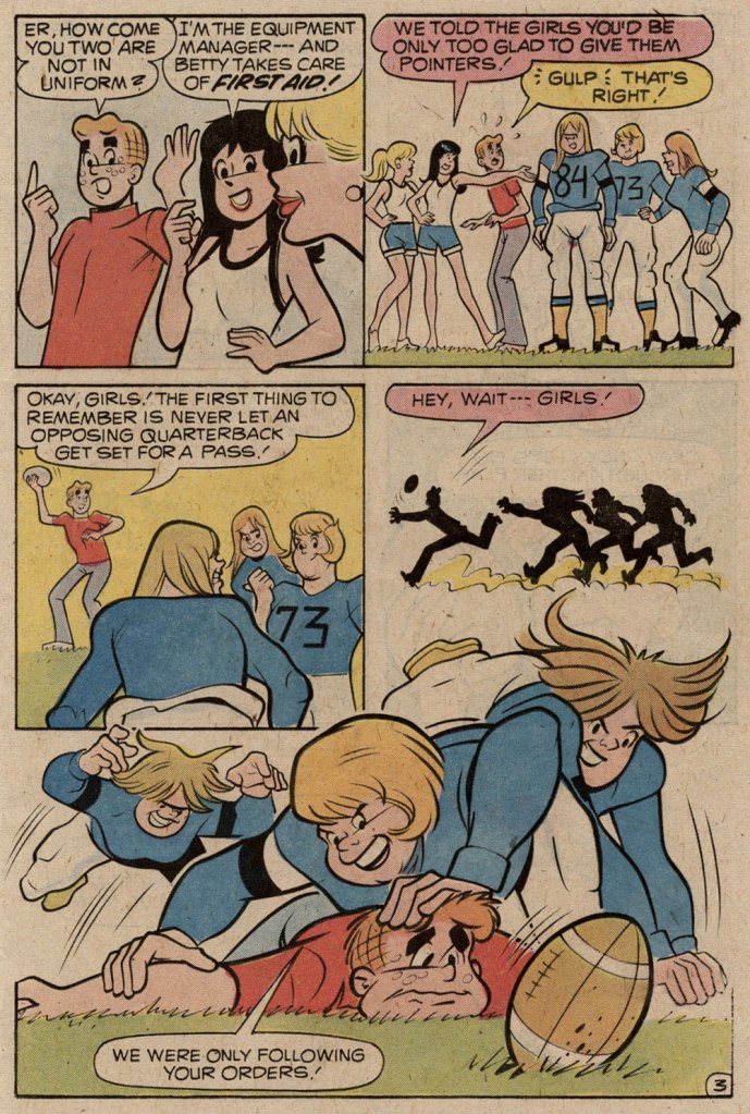
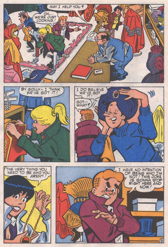
Here are a pair of pages from Coach Reproach, published in Everything’s Archie no. 71 (Dec. 1978, Archie), script by George Gladir, pencils by Amendola, inks by Jon D’Agostino.
Where to begin? In the first panel, you give Archie a stiff, unnatural pose and you follow it up by repeating it on a background character in the very next panel. And Arch is due for a nasty case of whiplash if he keeps trying to make like Linda Blair.At this point, I’m thinking Sal had learned plenty from his mentor on how to utterly fail at comedy.If what I’ve observed about pitching stances is worth anything, Archie’s about to get brained by a baseball. Ginger boy is also looking right past Coach Kleats. Despite the low bar — issues of quality control were rampant at Archie in the 1970s — this is impressively incompetent storytelling,What happens when you never learn basic inking principles: one creates depth by using thinner lines — and less detail — on background characters, otherwise… visual chaos ensues, as demonstrated here. And Sal’s Betty and Veronica sorely need a brand of shampoo that won’t leave their hair so oily and limp… but the anatomy is beyond help. This is the opening page of The Specialty, from Pep no. 342 (Oct. 1978, Archie).
Schaffenberger’s fellow Golden Age veteran, Gene Colan, also found himself moonlighting in the 1960s. In his case, it was for Marvel, under the alias of ‘Adam Austin’, but also for Dell (just a couple of covers mid-decade) and more significantly for Warren Magazines. In the 1970s, he concentrated on Marvel and was, in the chaos that was the so-called ‘House of Ideas’ at the time, the single most reliable artist in the maelström: surely none can match his seventy consecutive — and meticulously detailed — issues of Tomb of Dracula, in addition to lengthy runs on Howard the Duck, Daredevil, Captain America, Doctor Strange and so forth.
« When writer Jim Shooter became Marvel’s editor-in-chief in the late ‘70s, the tension between Colan and the younger authors came to a head. By 1980, Shooter and Colan were totally at odds with one another over Colan’s approach to storytelling. »
« [Shooter] was harassing the life out of me. I couldn’t make a living,” Colan said. “He frightened me, he really did. He upset me so bad I couldn’t function.” Just as she had urged Colan to quit one job [in] the 1960s, wife Adrienne begged him to leave Marvel in 1980. After delivering his resignation, Colan was asked to sit down and seek resolution with Shooter and publisher Mike Hobson. Colan agreed to the meeting, but declined any overtures to stay at Marvel. “Shooter was in the same room,” Colan recalled, “and I said, ‘That man’s not gonna change. He is what he is. Whether it’s six days, six months or six years, it’s not going to be any different, so I’m not going to put up with it for another minute.‘ » [ source ]
He then scampered over to DC for a few years. His production there was hit-and-miss, but his Batman run (1981-86) was outstanding, pairing him with some of the rare inkers who could do his nuanced pencils justice: Klaus Janson, Tony De Zuñiga (to my amazed delight!) and especially Alfredo Alcala.
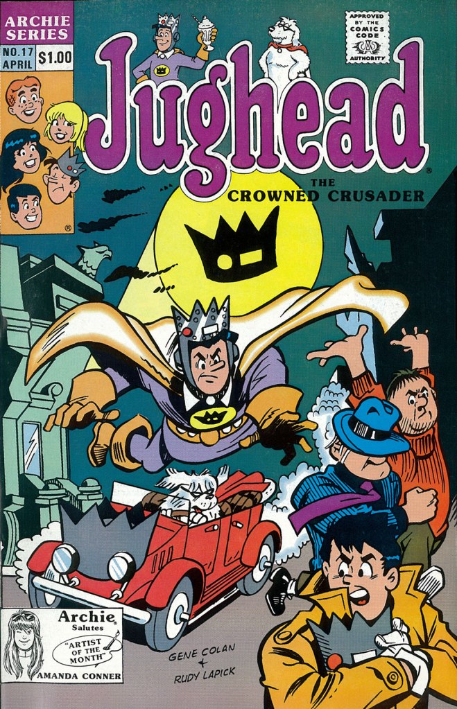
But once his contract ran out, he was out knocking on doors again. Against all odds, Archie beckoned.
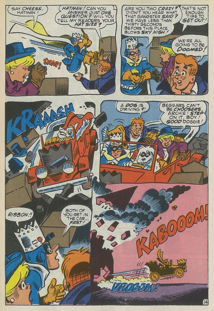
This is the cover — dreadful, I’m afraid — of Jughead no. 17 (Apr. 1990, Archie), reviving the opportunistic, Batman TV show-derived ‘Riverdale Gang as superheroes’ de trop move of the mid-1960s, with even less aplomb. But then the Archie folks were plumbing an especially low point with such ‘experimental’ titles as Jughead’s Diner, Archie 3000, Dilton’s Strange Science, Jughead’s Time Police, Archie’s R/C Racers, Explorers of the Unknown, and of course The Adventures of Bayou Billy.An action-packed — and Colan-shambolic — excerpt from that issue’s Hatman saga, written by Robert Loren Fleming, pencilled by Colan and inked by Rudy Lapick. Notwithstanding his sticking out like the proverbial sore thumb, Colan clearly had a ball working on his Archie stories. He brought some urgently needed chutzpah to a perilously stale formula.A page from Will the Real Archie Please Stand Up!, published in Life with Archie no. 273 (July 1989, Archie), wherein Archie is mistaken for his doppelgänger, a foreign prince named Kafoufi… but of course. Pencilled *and* scripted by Colan, which is most unusual. Oh, and inked by Mr. Lapick, who doesn’t quite know what to do with those ol’ Colan worm-fingers, seen wriggling in panel five.
« Len Norris portrays rather the little man in his everyday complications, and by showing us his, and our own predicaments, he helps relieve us of the burden of the daily toll of bloodshed and terror we see in the news pages. » — Stu Keate
Here’s to a semi-forgotten Canadian legend.
In my long-ago teen years, when I began haunting second-hand bookstores, single-author collections of political cartoons were everywhere, dirt-cheap, largely interchangeable to the untrained eye.. and evidently hard to dispose of.
Most common were collections of The Daily Express’ Ronald “Carl” Giles (1916 – 1995), AKA Giles — but this being Canada, we saw plenty from The Montreal Gazette’s Terry Mosher AKA Aislin and the Vancouver Sun’s twin cartooning stars, Roy Peterson and Len Norris. Peterson is the one that first caught my eye — Vancouver was a long way off — thanks to his quarter-century run illustrating Allan Fotheringham‘s back page column in Maclean’s Magazine. However, I shelled out folding kale for but a single one of these collections, and it was the one comprising the cream of Norris’ 1960-61 output; it turned up in a long-neglected chest at my folks’ place last month, and so it’s ripe for rediscovery.
Here’s a bit of background on the man… born in 1913 in London, England…
« Norris came to Canada with his family when he was 13, growing up in Port Arthur, Ont. (now Thunder Bay). He moved to Toronto during the Great Depression, where his artistic talents landed him jobs in ad agencies. Before he joined The Sun, he was the art director for Canadian Homes and Gardens Magazine.
Norris didn’t become a full-time cartoonist until he joined The Vancouver Sun in 1950.
Norris was a sensation out of the box, picking up a National Newspaper Award for Top Canadian Cartoonist in 1952. His work was so popular that 27 collections of his cartoons were published.
He produced an estimated 8,000 cartoons during his 38 years at The Sun. He officially retired in 1979, but kept producing two cartoons a week until he finally hung up his pen in 1988, at age 75. He died in 1997 at 83. » [ source ]
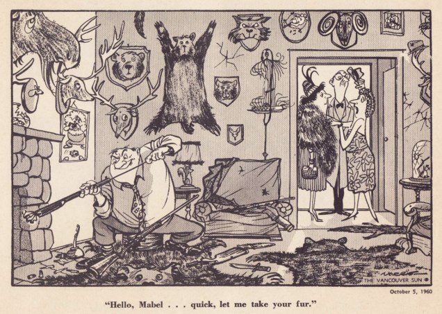
Ah, those quaint Colonials… « The phrase “the natives are getting restless” emerged from racist colonial origins. It sets up a scenario where wise, cool minds are overseeing and running things. And there is a more “savage,” “uncivilized” set of local people, the natives, who are seen as subordinate. Who deserve to be ruled by the lighter-skinned European colonists. »Quite timeless, that one — regrettably.Unlike a couple of these political parties, the Shrine Circus is still around — so it might have been the savvier investment after all. You can take the Englishman out of England, but… it’s snap to picture this appearing in the pages of Punch instead of a North American newspaper.Note that each and every child has his or her own ambulatory posture. Now that’s draftsmanship. Clearly, in Norris’ case, the verisimilitude of each detail, every gesture, springs from a deep well of visual observation — and he was no slouch with the verbal either. Like many a cartoonist, Norris was unambiguously on the side of the animals.I can relate far more readily with this gag since I’ve acquired a home with both a septic tank and lots of greenery.While the point might be a tad obvious — though still worth making — the expert composition is what makes this one special.Speaking of that Punch spirit: with this particular cartoon, Norris gleefully wanders into Rowland Emett‘s garden patch.I love how Norris didn’t stack the deck, where a lesser light surely would have: the members of the academic body on the right are still recognizably educators.Ah, poor Laika. Such a heartbreaking tale. Though she notably inspired a monument in Moscow, an outstanding Finnish rock band, a moving verse of a Divine Comedy song, and this cartoon, it’s a given that the poor doggie would have rather lived her life in peace than die alone and terrified.
The next two make it thanks to bravura use of compositional space. Such chops!
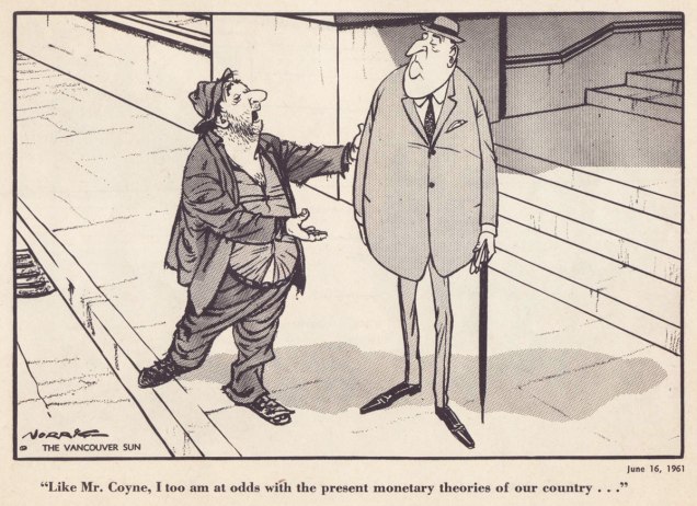
With a population of 3,985 — and rising — Grand Forks, BC, “is Boundary Country’s largest city”. All kidding aside, it does look like a very nice place to visit.Dig if you will the artist’s mastery of volume and gesture, of costume and body language. The Mr. Coyne alluded to is James Elliott Coyne (1910-1979), who was the Bank of Canada’s second Governor, from 1955 to 1961. He resigned in the aftermath of what was known as The Coyne Affair.
His Vancouver Sun colleague Trevor Lautens eloquently depicted the Norris he knew: « Len limned not the pompous event, but the pompous event’s effect on ordinary people. He seemed a small-c conservative, but look and you will find that his drawings were blandly subversive. The bureaucrats were black-suited, pince-nezed satraps. Pietistic Social Crediters wore haloes and walked on fluffy clouds. The Victoria Conservative Club was populated by dozing, look-alike, pear-shaped gents with walrus moustaches. »
For a deeper burrow into Norris’ œuvre and legacy, here’s a fine documentary film on the subject.
« I was a peaceful sedentary man, a lover of a quiet life, with no appetite for perils and commotions. But I was beginning to realise that I was very obstinate. » — John Buchan
Over the course of several posts, I’ve extolled at length Carmine Infantino‘s skill as a cover designer. Yet the ability to envision and execute a single static image does not automatically translate into the skill of clearly and tidily breaking down a story into a suite of sequential panels, in much that same way that a superbly dexterous surgeon may be incapable of writing legibly. It pleases me to declare that Mr. Infantino’s no one-way specialist.
Infantino describes the evolution of his visual thinking: « The use of negative and positive shapes inside the panel had to mean something. So, to me, if the shapes didn’t draw the eye in, then they weren’t worthwhile. I had to move and change the shape to make it work for me. And that’s what I did. For me beforehand, the figure was the most important thing, and nothing else in the panel mattered. But later on, I found out that it was the total figure I had to worry about. » (all Infantino quotes excerpted from The Amazing World of Carmine Infantino: an Autobiography (2000, Vanguard Productions; edited by J. David Spurlock)
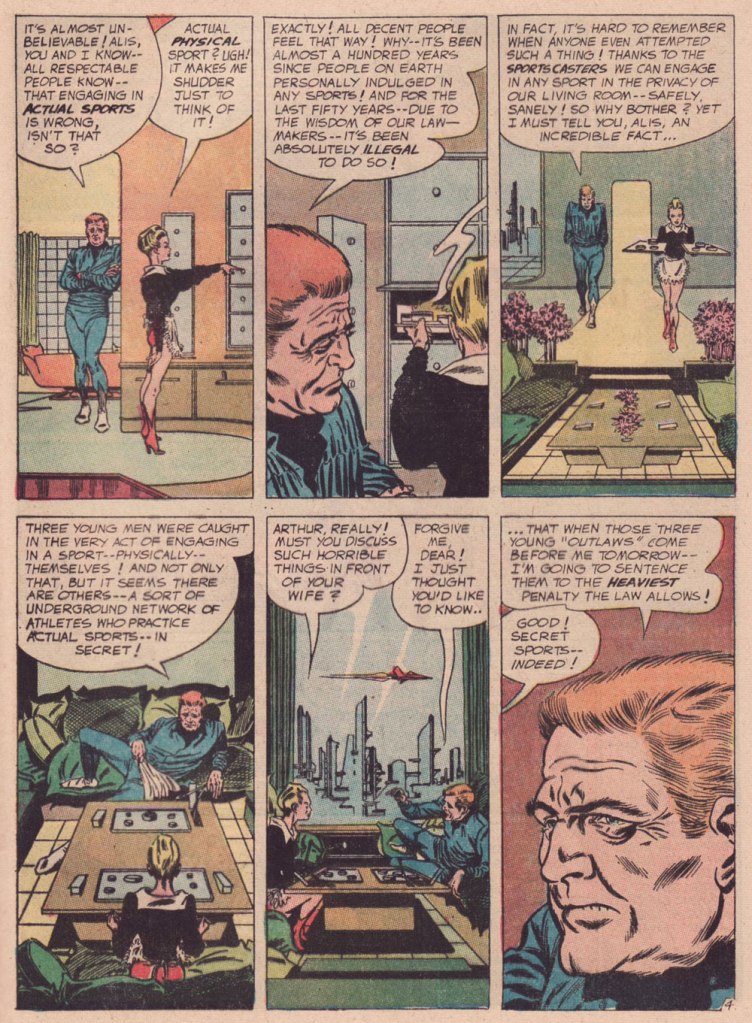
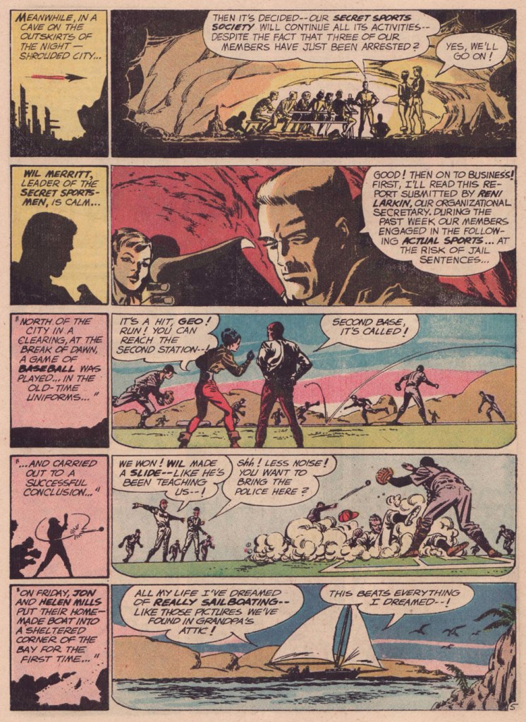
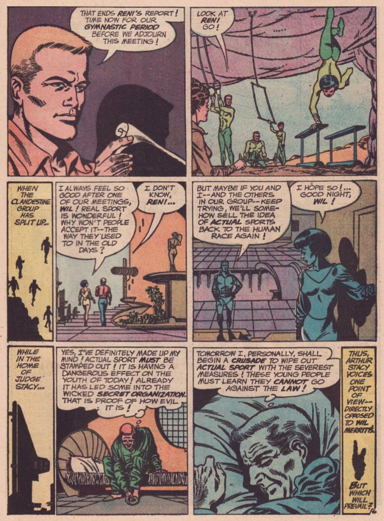
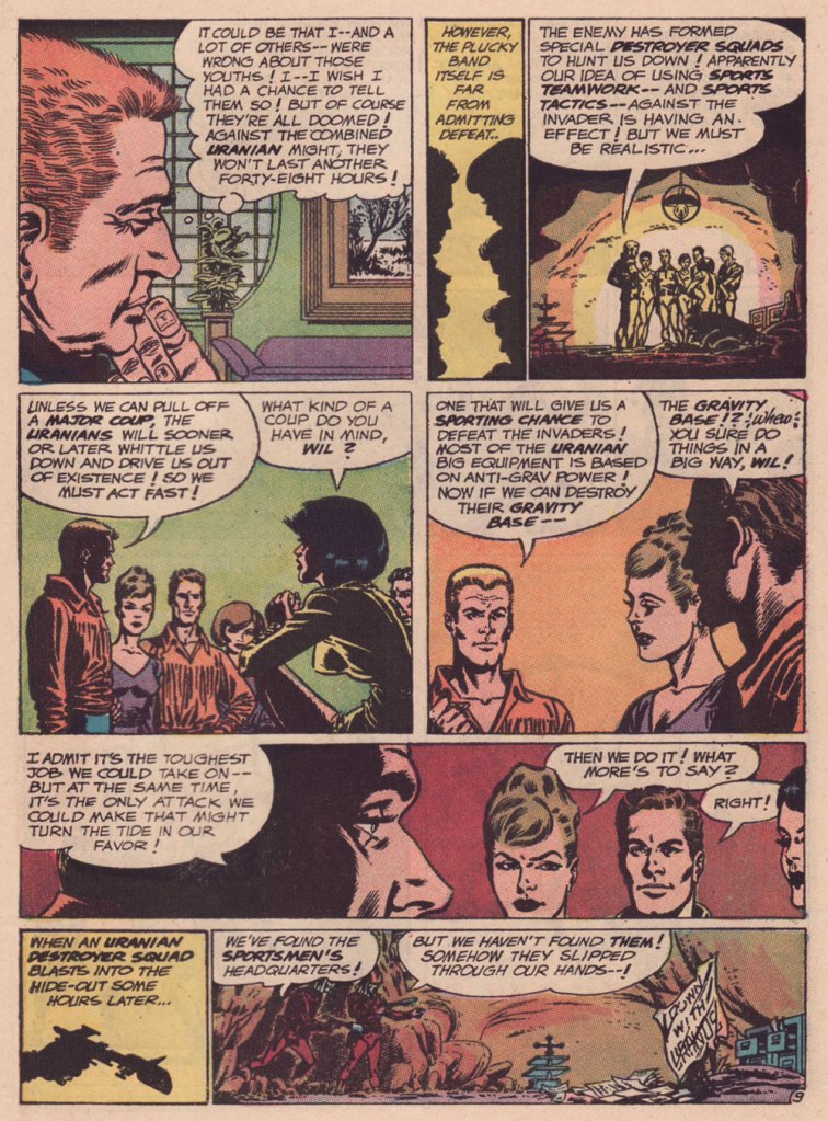
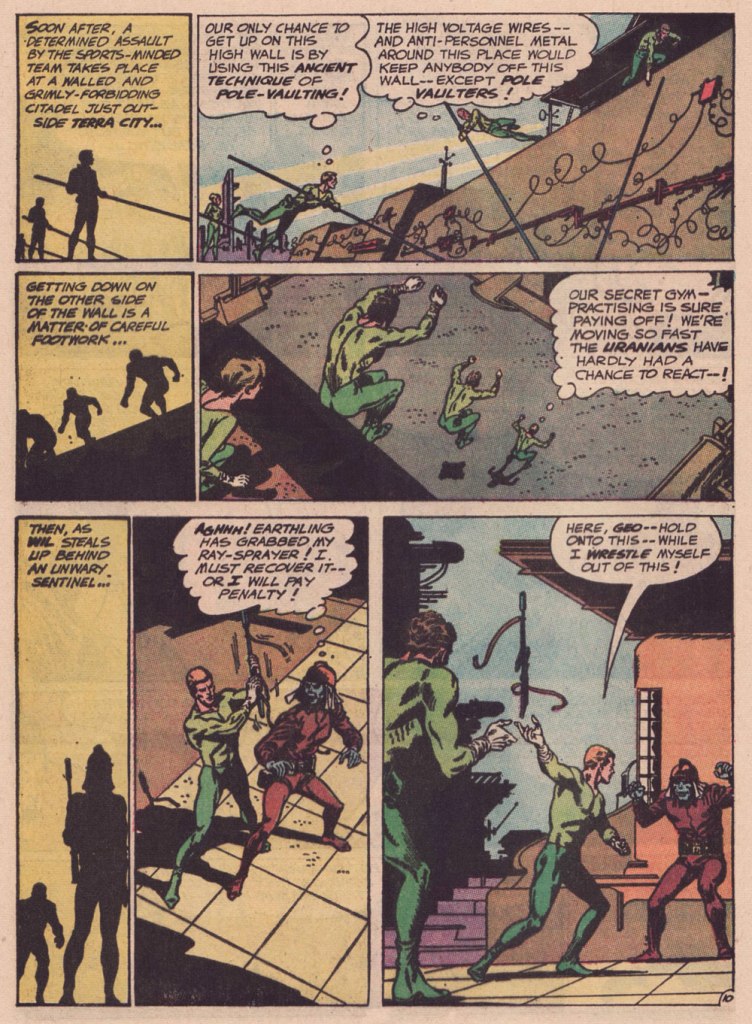
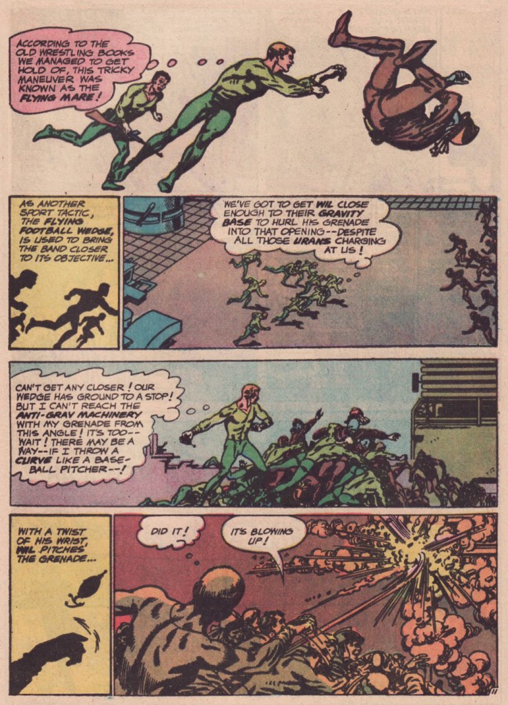
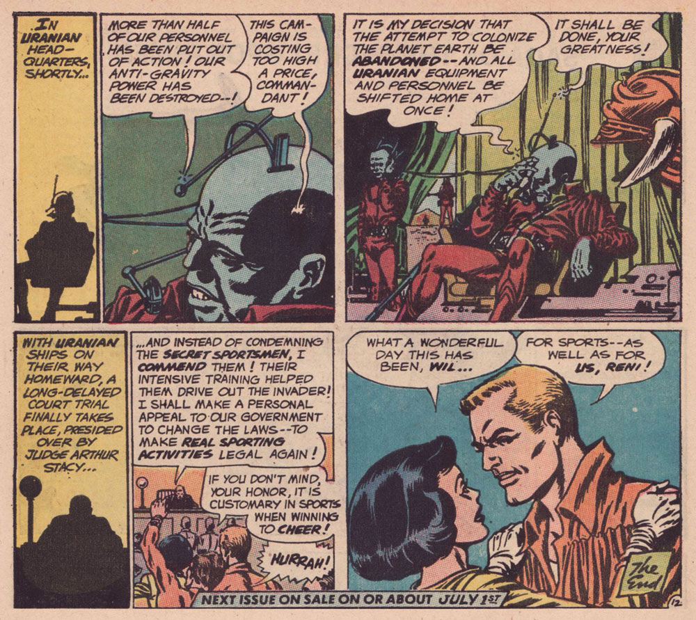
I’ve long wanted to feature this particular tale… for both script and artwork reasons. However, my copy was in Mysteries in Space: The Best of DC Science Fiction Comics (Apr. 1980, Simon and Schuster/Fireside; Michael Uslan, editor)… and I’d be all-but-guaranteed to destroy this beloved book in any attempt to scan from it. But — aha! — I’ve recently acquired a copy of DC Special no. 13 (Jul.-Aug. 1971), which granted the tale its first encore. Game on!
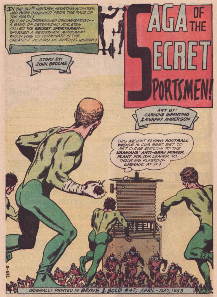
Someone slightly goofed here : The Brave and the Bold no. 47 was published in April-May 1963, not 1953.
.
« The silhouettes I used in ‘Strange Sports Stories‘ [featured in The Brave and the Bold nos. 45-49] were innovations. Julie [editor Julius Schwartz] gave me the script and said, ‘We want this book to look different.” That’s all he said, and I went home and what I devised to make it look different was by using silhouettes as a dramatic device. The action starts in the silhouette, and then you go to the conventional panel, and the action follows through. One might almost call it an animated treatment. »
.
.
.
.
.
.
.
.
.
As smooth and effective as the Infantino-Anderson pairing looks, there was some friction behind the scenes. Infantino explains: « I was beginning to experiment at the time and I threw anatomy out in favor of a higher level of design. Murphy was an excellent draftsman and I’d try to explain what I was trying to achieve to him but this was quite contrary to his own sensibilities. The more stylized I became, the more he thought the work had to be ‘fixed up‘. At one point, he asked for a raise because he had to change my work so much. What he thought he had to ‘fix‘ was the new style I was most excited about. »
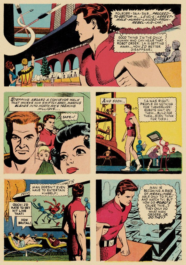
Our featured story shares a central perspective with Russ Manning‘s rightly celebrated Magnus, Robot Fighter, whose inaugural issue had come out a mere two months earlier — though with that close a gap, it’s most likely a simple case of coincidence.
A relevant page from Magnus, Robot Fighter 4000 A.D. no. 1 (Feb. 1963, Gold Key); story and art by Manning, with input from editor Craig Chase, who initially pitched the idea of a SF hero to the publisher.
Are we getting less physically able with every succeeding generation, as our elders have been claiming for eons? Is it just a mistaken, shallow assessment arising from tone-deaf obduracy and bad faith — or have our forerunners all been correct about a general and ongoing decline?
« Arrows of neon and flashing marquees out on Main Street / Chicago, New York, Detroit and it’s all on the same street / Your typical city involved in a typical daydream / Hang it up and see what tomorrow brings » — Robert Hunter
Among the foremost pleasures of a brick-and-mortar bookstore is the increased odds of stumbling upon an item whose existence you never suspected: case in point, another cheap (one buck!) gem I scooped up in Ellsworth, ME’s The Big Chicken Barn last Autumn.
Now — I’ve long been a huge fan of the pseudonymous Cecil Adams‘ sassy syndicated answer column The Straight Dope (1975-2018), in no small part thanks to resident — all the merry way! — illustrator Michele ‘Slug’ Signorino‘s waggish accompanying cartoons, rendered in what he colourfully called his ‘smudge-a-dot technique’.
And so, last October, I grabbed a lovely Scholastic publication that had until now ably eluded my radar — 1978’s Junior CB Picture Dictionary, compiled and edited by Joan Downing and dexterously illuminated by the aforementioned Mr. Signorino. I was delighted to discover that he’s still happily active well into his Eighties: « he still works and does not intend to retire. “This isn’t work,” he said. »
This slim-but-priceless tome happens to tick several of my pet boxes: a somewhat (but not quite!) passé communication technology; a lively, singular species of jargon; a merrily anarchic illustrative style… and so forth. Let’s sneak a peek, then!
Checking My Eyelids for Pinholes: Tired; getting sleepy.City Kitty: Local police.County Mounty: Sheriff or county police.Draggin’ Wagon: Wrecker or tow truck.Eatem Up Stop: A truckstop.Flagwaver: Road construction worker.Haircut Palace: A low bridge or overpass. There’s one of these a couple of blocks up the street from where I used to live, but I suppose every big city has to live with that problem. In Boston, MA, the phenomenon is particularly colourful, as is called ‘Storrowing‘. Mama Bear: Female police officer.Mixing Bowl: Highway cloverleaf.Motor Mouth (Also: Ratchet Jaw): One who talks too much.Rat Race: Traffic during rush hour.Skating Rink: Road slippery from ice, snow, or rain.Super Skate: Sports car.Truckin’ Teenybopper: Young hitchhiker. The bulk of my first-hand experience with CB came from hitchhiking in my youth so I indeed was a truckin’ teenybopper myself! I’m still warmly grateful for the longest ride I ever got: from Portland, OR, to Long Beach, CA, thanks to a friendly truck driving man. He was actually headed for San Diego, but I was already over three thousand miles from home… and had to get back in time for college.Wall to Wall and Ten Feet Tall: Good CB reception. A visual reference to famous pooch ‘Nipper‘. Window Washer: Rain. Is that you, Dirty Danny?
For more dirt on the magnificent Signor Signorino, feast your peepers on this lovely 2022 profile. And in case you’re wondering “Does Slug have a book about his career?”, why yes, he certainly does!
I’ll let Steve Earle have the last jab at this one: « Everybody told me you can’t get far/On thirty-seven dollars and a Jap guitar/Now I’m smokin’ into Texas with the hammer down*/And a rocking little combo from the Guitar Town**. »
« We all know interspecies romance is weird. » — Tim Burton
It’s Bill Ward‘s birthday! No, not Black Sabbath’s Bill Ward — that’s on the 5th of May — save the date, as the suits say. It’s also Will Eisner’s anniversaire, but as he holds a category of his own, let’s let ol’ Bill have his turn, shall we?
Now, while most of the attention devoted to Ward (1919-1998) centres on his enormous output for Marvel founder (and Stan and Larry‘s uncle) Moe ‘Martin’ Goodman, I’m more intrigued by the brief period of his career when he truly seemed invested in his work, namely his passage at Quality Comics, where his craft rivalled that of such illustrious stablemates as Eisner, Jack Cole, Reed Crandall and Lou Fine.
While he worked on such features as Blackhawk and Doll Man, Ward clearly preferred — was it ever in doubt? — depicting beautiful women dressed to the nines, a passion most readily indulged in romance comics, a genre then in its infancy, Joe Simon and Jack Kirby having just set it on its way with 1947’s Young Romance.
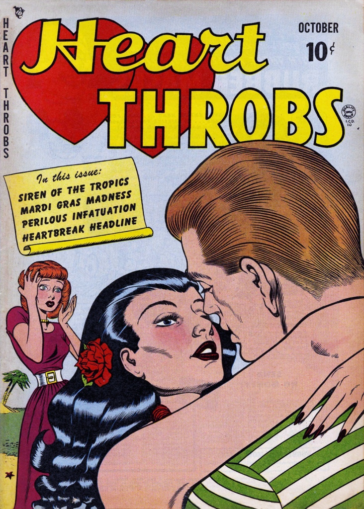
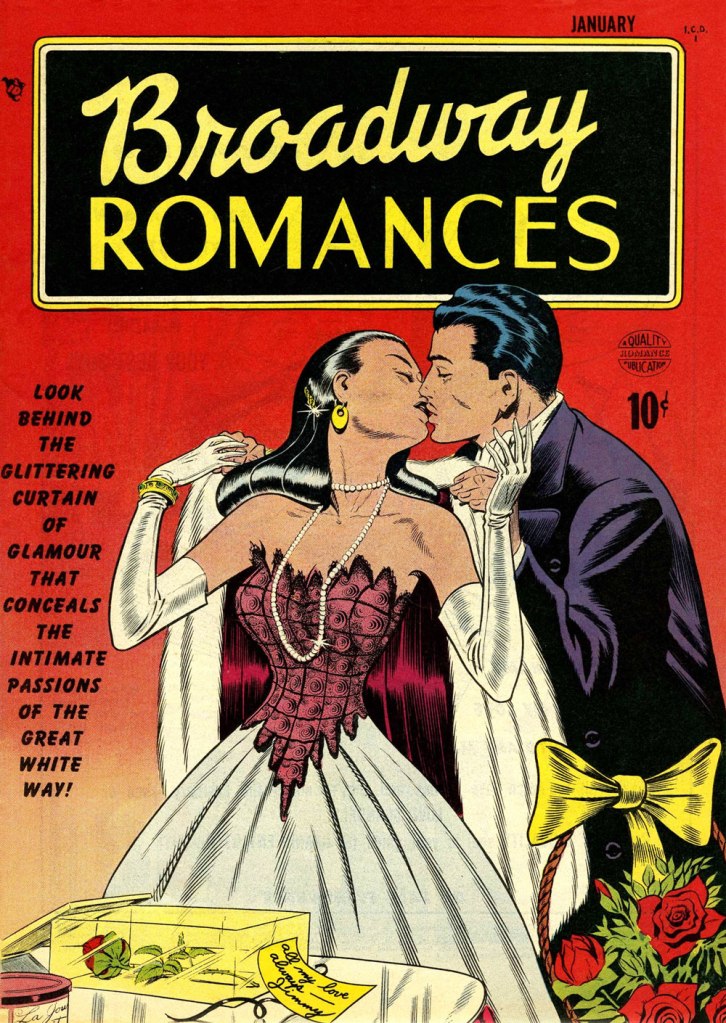
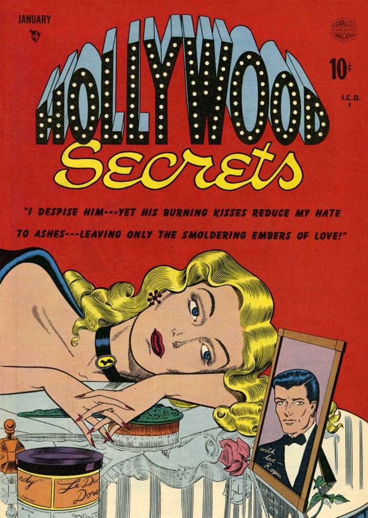
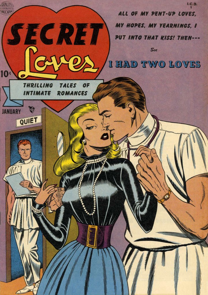
This is Heart Throbs no. 1 (Aug. 1949, Quality). Ever the fetishist, Bill never could resist a well-fitted pair of opera gloves.This is Heart Throbs no. 2 (Oct. 1949, Quality). Quality’s flagship romance title, Heart Throbs lasted one hundred issues, 46 published by Quality, and an even hundred by DC (1956 to 1972) after they picked up what remained of the publisher’s assets, among them Blackhawk, Plastic Man, Doll Man, Uncle Sam, Phantom Lady, and some war (G.I. Combat) and romance titles.This is Hollywood Secrets no. 1 (Nov. 1949, Quality). An unusual colour scheme!This is Campus Loves no. 1 (Dec. 1949, Quality).This is Flaming Love no. 1 (Dec. 1949, Quality). The gloating guy is the prototypical Ward creep.This is Broadway Romances no. 1 (Jan. 1950, Quality). It’s so refreshing to see Ward devote the same level of attention to detail to background items as to the female figure and her accoutrements.This is Hollywood Secrets no. 2 (Jan. 1950, Quality).This is Love Letters no. 2 (Jan. 1950, Quality). Interesting how all these romance covers — the majority of Ward’s production in that genre — all came out within the span of a year or so.This is Secret Loves no. 2 (Jan. 1950, Quality). Ward liked his women to have tiny, needle-like digits — I mean, just compare the lovers’ respective paws!This is Torchy no. 5 (July 1950, Quality), Ward’s signature creature. With the years, as his women grew ever more buxom, his men became ever more grotesque — these are some of the archetypes, but noses got longer, legs got skinnier and shorter, bellies more bulging — until men and women in no way seemed to belong to the same species. While that device of exaggeration was a mainstay of « girlie » art, Ward took it further than just about anyone.
Over the years, things got more… pneumatic. And then some more.
One from an issue of Zip (1967, Marvel); that particular cartoon had probably been around the block a few times by then… it sure doesn’t scream ‘1967!’
Incidentally, the elaborate background textures found in Ward cartoons were achieved by a technique called rubbing, or frottage, « … a reproduction of the texture of a surface created by placing a piece of paper or similar material over the subject and then rubbing the paper with something to deposit marks, most commonly charcoal or pencil. » Not to be confused with the *other* kind of frottage, although, come to think of it, that’s also quite relevant to Ward cartoons.
One of Ward’s ‘Phone Girls’, she saw print in Snappy no. 24 (1958, Marvel)… and likely numerous times thereafter.
« We can lick gravity, but sometimes the paperwork is overwhelming. » — Wernher von Braun
The other day, I was digging through my to-read pile, and came upon a 1950s Charlton science-fiction title I’d picked up for a song during a trip to the Maritimes (that’s New Brunswick in this case), last Fall. Its second story struck me as slight but quite fun, which is pretty much the best one could hope for in those strict, early years under the Comics Code’s oppressive authority. Despite the quickly executed job under overpowering Colletta varnish, I surmised I could identify the penciller’s style: none other than Matt Baker, whom I wrote about almost exactly a year ago, in Matt Baker’s Disquieting Romance. I’d advise you to begin there.
In his review of Matt Baker: The Art of Glamour (2012, TwoMorrows), cartoonist Eddie Campbell provided a useful bit of context: « A final phase, in which Baker had a hard time getting any work at all, is also examined briefly. Between 1955 and ‘59 he mostly pencilled for Vince Colletta, who was somehow well enough placed to pick up as much work as he could handle from Atlas and Charlton. He farmed a great deal of it out to others to pencil, leaving the inking for himself, which is one way to make a living and I’ve never had any problem with it. Colletta is a figure that comic book fans love to vilify. There’s him, Fredric Wertham, and the Red Skull, making the triumvirate of evil. »
But enough telling for now, time for some showing!
This is Mysteries of Unexplored Worlds no. 14 (Aug. 1957, Charlton); cover art by Charles Nicholas and Vincent Alascia. Yes, there was a time when the profligate Alascia was a decent inker.
*
*
*
*
*
Though uncredited, the story was evidently written by Joe Gill. Typical of him, the story is driven by straightforward but purposeful dialogue, in which much is intimated between the lines. It takes the rare gift of economy that tell such a story — and make it work — in just a handful of pages.
So what was in it for Vince Colletta? Basic economics aside — it’s easier to ink well-executed layouts — perhaps he harboured sympathy for this massively talented Black man who couldn’t get work, as all but a few did — regardless of talent — after the massive contraction of the comics field in the mid-Fifties. As a native Sicilian, it couldn’t be far from Colletta’s mind that in America, his own people, not so long before, were forcibly excluded from the ‘Whites’ club.
As Brent Staples wrote in How Italians Became ‘White’ (The New York Times, Oct. 12, 2019): « Italian immigrants were welcomed into Louisiana after the Civil War, when the planter class was in desperate need of cheap labor to replace newly emancipated black people, who were leaving backbreaking jobs in the fields for more gainful employment.
These Italians seemed at first to be the answer to both the labor shortage and the increasingly pressing quest for settlers who would support white domination in the emerging Jim Crow state. Louisiana’s romance with Italian labor began to sour when the new immigrants balked at low wages and dismal working conditions.
The newcomers also chose to live together in Italian neighborhoods, where they spoke their native tongue, preserved Italian customs and developed successful businesses that catered to African-Americans, with whom they fraternized and intermarried. In time, this proximity to blackness would lead white Southerners to view Sicilians, in particular, as not fully white and to see them as eligible for persecution — including lynching — that had customarily been imposed on African-Americans. »
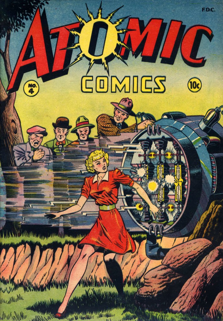
Baker didn’t delve much into the science-fiction genre, but here’s one such case: this is Atomic Comics no. 4 (July-Aug. 1946, Green Publishing). Read it here!Another rarity in Baker’s œuvre: blackness — despite being undermined by the colourist here. This is Amazing Ghost Stories no. 15 (Dec. 1954, St. John). On comicbookplus.com, where you can read this entire issue, a reader commented approvingly: « There are a lot of horror comics set in Haiti. This is the first one I’ve read where it looks like the author did some research on the history of Haiti. »
« There will be no questions asked if I kill you here, gringo! » — Bad hombre Alejandro Roja
On February 5, 2024, versatile veteran cartoonist José Delbo (born in Buenos Aires, Argentina, on December 9, 1933) left us at the most respectable age of ninety. Comics fans of a certain age will no doubt recall him chiefly from his long stint on DC’s Wonder Woman (1975-1981, issues no. 222-286), but to my mind, that’s hardly his finest hour: he wasn’t done any favours there, hobbled as he was by pedestrian (or worse) writing and indifferent (or worse) inking. Same goes for his run on Batgirl (1976-82) in Batman Family and Detective Comics.
For a detailed rundown of his remarkably long and varied career, you can’t go wrong with this excellent bio.
This post’s title gave away my candidate for Delbo’s magnum opus, such as it is; but I would be remiss in failing to also note his charming work on Dell’s The Monkees (fifteen issues), where he got to demonstrate his deft hand at humour; and his winningly bizarre collaboration with Tony Tallarico, Geronimo Jones (nine issues, 1971-73, plus one that remains unpublished).
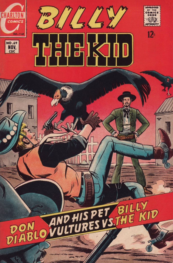
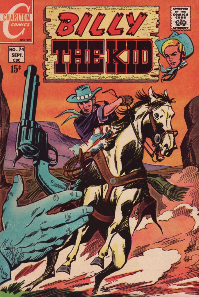
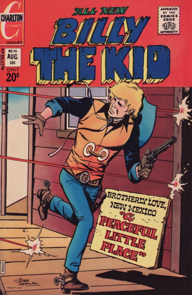
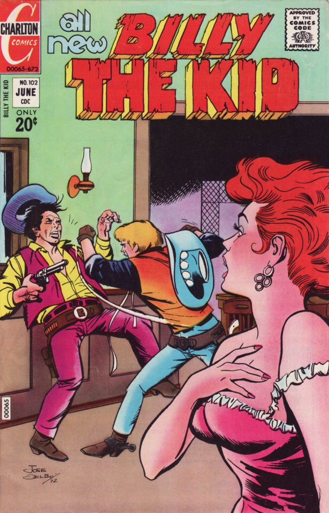
This is Billy the Kid no. 58 (Nov. 1966, Charlton), Delbo’s second issue on the title but his first cover. After this one, he would go on to pencil and ink the subsequent fifty or so covers and most of the inside features. When you find an artist who can draw horses, you hold on to him (or her)! How many, among the current generation, could successfully handle that particular mission?
Incidentally, Billy’s distinctive steed appears to be an Appaloosa: « The Appaloosa’s eye-catching pattern comes from the spotted horses brought into the Americas by Spanish Conquistadors. Known as the Dalmatian horse breed, it was bred in the mid-18th century by the Native American Nez Percé people. Its name comes from the Palouse River that flows through what used to be Nez Percé territory. » [ source ]
Charlton Comics’ flagship western title, Billy the Kid (153 issues, 1955-1983, including its first five as “Masked Raider”), endured as long as it did for good cause: notable runs by accomplished artists, among them John Severin, Rocco Mastroserio, Luis Domínguez, Delbo, and finally Warren Sattler. Yet, for my money, it’s Joe Gill’s spare but psychologically consistent and highly humane scripting that holds the enterprise together.
This is Billy the Kid no. 69 (Nov. 1968, Charlton).This is Billy the Kid no. 74 (Sept. 1969, Charlton).This is Billy the Kid no. 80 (Sept. 1970, Charlton).This is Billy the Kid no. 94 (Aug. 1972, Charlton); I love the clever signpost integration of the featured title.This is Billy the Kid no. 98 (Jan. 1973, Charlton). Readers accustomed to Marvel and DC-style hype may notice how light on text these covers are. A lot of shouting isn’t what sells a cover: an arresting visual will do that.This is Billy the Kid no. 102 (June 1973, Charlton).This is Billy the Kid no. 103 (Aug. 1973, Charlton).This is Billy the Kid no. 106 (Dec. 1973, Charlton). The foxy villainess Billy’s tussling with is La Duquesa, featured in “Slave of Beauty”.
Happy trails, and gracias for everything, Señor Delbo!
« Advertising – A judicious mixture of flattery and threats. » — Stephen Leacock
It’s long been established that one can scarcely be too skeptical in the face of advertising, and the sooner one starts questioning its wooly claims, the better. In the early 1950s, Harvey Kurtzman‘s Mad shone the giddily harsh light of truth on, well, just about everything, but Madison Avenue‘s tactics were a favourite and frequent target, and for good reason. In 1956, Kurtzman heatedly left his creation after a mere 28 issues; while it retained much of its cultural influence as its reach increased, it degenerated into rigid formula in the hands of his too-cautious successor at the helm, Al Feldstein.
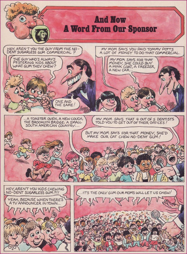
Fast-forward to 1974, and Dynamite Magazine‘s sixth issue. Readers presumably too young for Mad could now receive their monthly inoculation against the advertising industry’s tainted baloney.
From 1974 to 1981, the feature was illustrated by Calvin Sanford “Sandy” Huffaker, Sr. (1943 – 2020); then the reins were passed into the able paws of future Mad art director (small world!) Sam Viviano. But that’s a tale for another day.
Since Huffaker was only credited for illustrating the feature, it stands to reason that it was written in-house, and that narrows it down to two main candidates: editor Jane Stine or Linda Williams Aber (aka “Magic Wanda”); my money’s on Aber, who also wrote Count Morbida’s Puzzle Monthly Puzzle Pages.
As Dynamite’s ‘Inside Stuff’ table of contents always billed it, here’s « A Dynamite look at BADvertising »!
The feature’s inaugural entry, from Dynamite no. 6 (Dec. 1974, Scholastic). The voracious oldster lampooned here is Euell Gibbons, who shilled for Post Grape-Nuts (which contain neither grapes nor nuts!) in this vintage commercial.From Dynamite no. 7 (Jan. 1975, Scholastic). You might recognize Nancy Walker, aka Rhoda’s mom Ida, and future director of Can’t Stop the Music! (trigger warning: Steve Guttenberg); here she is, pre-orange hair, in a Bounty Paper Towel spot from the Me Decade.From Dynamite no. 9 (Mar. 1975, Scholastic). Here’s a 1971 Bufferin vs. Aspirin ad. Place your bets!From Dynamite no. 19 (Jan. 1976, Scholastic). You just may be familiar with the object of this parody.From Dynamite no. 25 (July 1976, Scholastic). Here’s another ‘wonderful, quick‘ Jell-o recipe from those gelatin-happy days.From Dynamite no. 26 (Aug. 1976, Scholastic). Remember Morris? Here’s the famously fussy feline in a 1974 Nine Lives ad.From Dynamite no. 27 (Sept. 1976, Scholastic). Here’s a Hamburger Helper commercial of the corresponding vintage.From Dynamite no. 28 (Oct. 1976, Scholastic). Here’s our pal Poppin’ Fresh in a 1972 commercial.From Dynamite no. 37 (July 1977, Scholastic). On that topic, here’s our look at the 1970s bubble gum explosion!This subscription ad appeared in Dynamite no. 26. I suspect it was a draft for issue 28’s more focused Laverne and Shirley cover, which had been previewed in ads as a photo cover.From 1971, young Sandy wears his Ed Sorel influence a little heavily, but he was learning fast and from the best! For those who may not know — or who’ve forgotten — David Frye was possibly the nation’s premier Tricky Dick Nixon imitator. Was he? Listen here and judge for yourself!
Thanks to his versatility and ability to nail a likeness, Huffacker was among the most sought-after illustrators of the 1970s. Quoting from the Chattanoogan.com’s obituary:
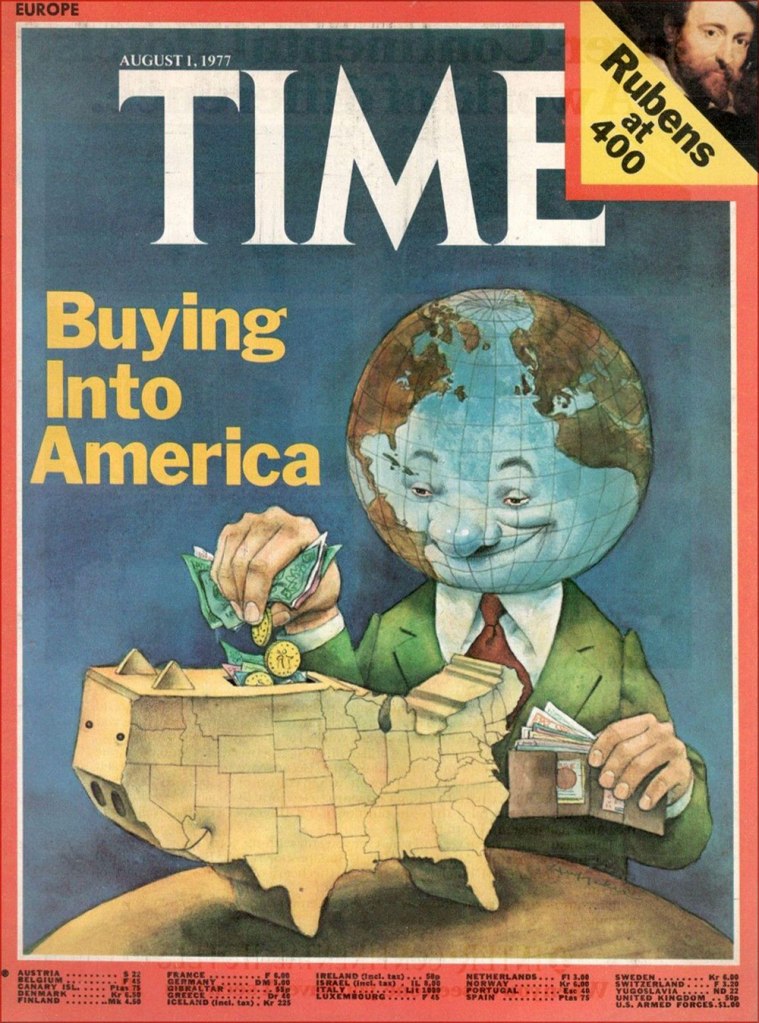
« Huffaker was a highly acclaimed political cartoonist who started his career with The Birmingham News and the Raleigh News and Observer. He later moved to New York City and illustrated covers and articles for such publications such as Time Magazine, The New York Times, Sports Illustrated, Businessweek, People and Fortune Magazine. Some of the accolades awarded for his artwork include two Page-One Awards from the New York Newspaper Guild, three nominations for Cartoonist-of-the-Year by the National Cartoonists Society, A Desi Award of Excellence (Graphic Design Magazine), 20 Award of Merit citations from the Society of Illustrators, and was twice nominated for a Pulitzer Prize for illustration. »
Here’s one of his aforementioned Time covers.
In a 2012 interview, he recalled those halcyon days: « During one week at the peak of his career as an illustrator, Sandy Huffaker had assignments from Time, Sports Illustrated and Businessweek. He had to turn down a fourth assignment that week from Newsweek. “I just didn’t have time.” »