Tentacle Tuesday: Justice League of America

JLA’s roster has rotated throughout the years, but for the sake of this post, only the seven original members will get cephalopod tussling privileges! Here they are, with the conspicuous absence of Batman and Superman who are no doubt rushing behind the scenes to rescue everybody (but don’t worry, we’ll get to them as well):

The Brave and Bold no. 28 (February-March 1960, DC). Cover pencilled by Mike Sekowsky and inked by Murphy Anderson.

I’ll start with Superman, otherwise he’ll get offended – you know how susceptible he can be. Rather, a double whammy of Superman and Flash, who stumble upon some rather adorable (aside from their propensity to eating people) tentacled aliens. Of course our superheroes decide to make a race out of it, because concentrating on saving some planet or other is clearly not exciting enough – and Batman just happened to be hanging around to give the starting signal. Some afternoons are just that quiet. Race to Save the Universe!, scripted by Denny O’Neil, pencilled by Dick Dillin and inked by Joe Giella, was published in World’s Finest Comics no. 198 (November 1970, DC).

Nevertheless, this dynamic duo does allow itself to get distracted from its marathon, just long enough to defeat this green cutie:

Don’t underestimate kittens.

Incidentally, Superman already has a Tentacle Tuesday all to himself (Tentacle Tuesday: It’s a Bird! It’s a Plane! It’s a Tentacle!) Still, here he is collaborating (more like ‘rescuing’) Jimmy Olsen from an intriguing green (why must they always be green?) monstrosity with worm-like tentacles. Ugh, not the most appealing. These pages are from The Voyage of the Mary Celeste II!, scripted by Jerry Siegel, pencilled by Curt Swan and inked by George Klein and published in Superman’s Pal, Jimmy Olsen no. 75 (March 1964, DC).

DC’s “Big Three” – its most iconic and popular – are of course Superman, Batman and Wonder-Woman. As far as the latter is concerned, as much as I love this character, seeing as we already have two Tentacle Tuesdays posts in her honour – Tentacle Tuesday: H.G. Peter and Wonder Woman lend a hand and Tentacle Tuesday: More Golden Age Wonder Woman Wonders! – I think I’ve said everything I had to say on the subject. Thus, we move on to Batman, albeit briefly because there is also Tentacle Tuesday: All Aboard the Batmarine! to peruse. He’ll have to share the stage with Superman, but I’m sure he’ll be a good sport about it.

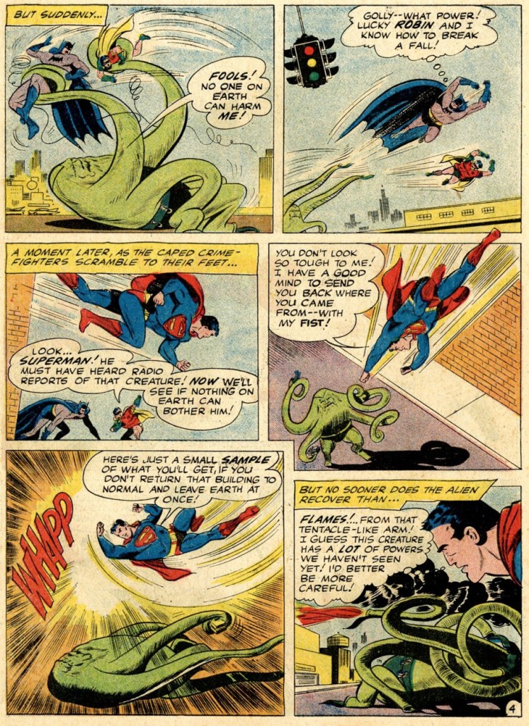
World’s Finest Comics no. 110 (June 1960, DC). Pencilled by Curt Swan and inked by Sheldon Moldoff.

The cover story is The Alien Who Doomed Robin, scripted by Jerry Coleman and inked by Sheldon Moldoff.

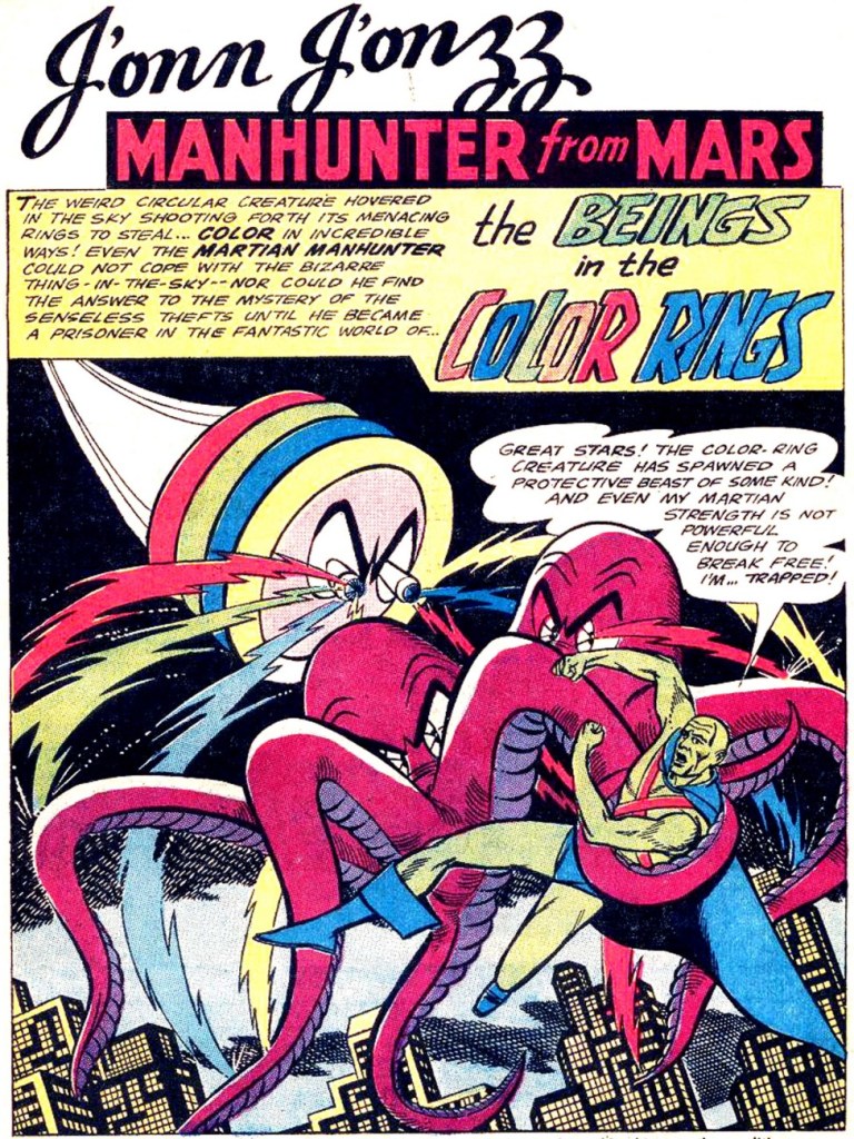
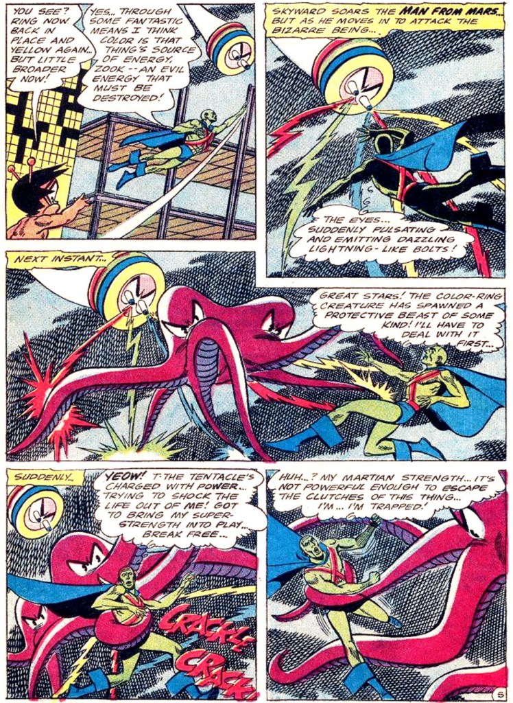
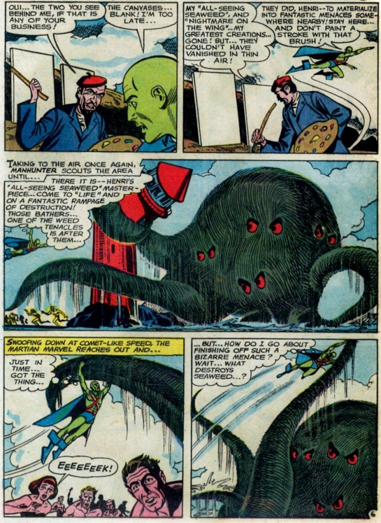
Our next JLA member is the Martian Manhunter, whom I have a strange soft spot for. It’s well known that girls just can’t resist green skin! In honour of this bias, here are not one, but two excerpts from stories featuring tentacles front and centre.

First, two pages from The Beings in the Color Rings, scripted by Dave Wood and illustrated by Joe Certa, published in House of Mystery no. 148 (January 1965, DC).

And for dessert, a page from The Supernatural Masterpieces!, scripted by Dave Wood and illustrated by Joe Certa, published in House of Mystery no. 150 (April 1965, DC).

Naturally, Aquaman has encountered more than a handful of octopuses in his long undersea career – I went on about that in some length in Tentacle Tuesday: Aquaman and his Octopus Sidekicks. I have plenty more where that came from, so there surely be a part II to that particular tale… in the meantime, here is a rather striking cover that didn’t make it into that post.

The Brave and the Bold no. 73 (August-September 1967, DC). Cover pencilled by Carmine Infantino and inked by Charles Cuidera.

The cover story is Glag the Destroyer, scripted by Bob Haney, pencilled by Howard Purcell and inked by Sal Trapani.

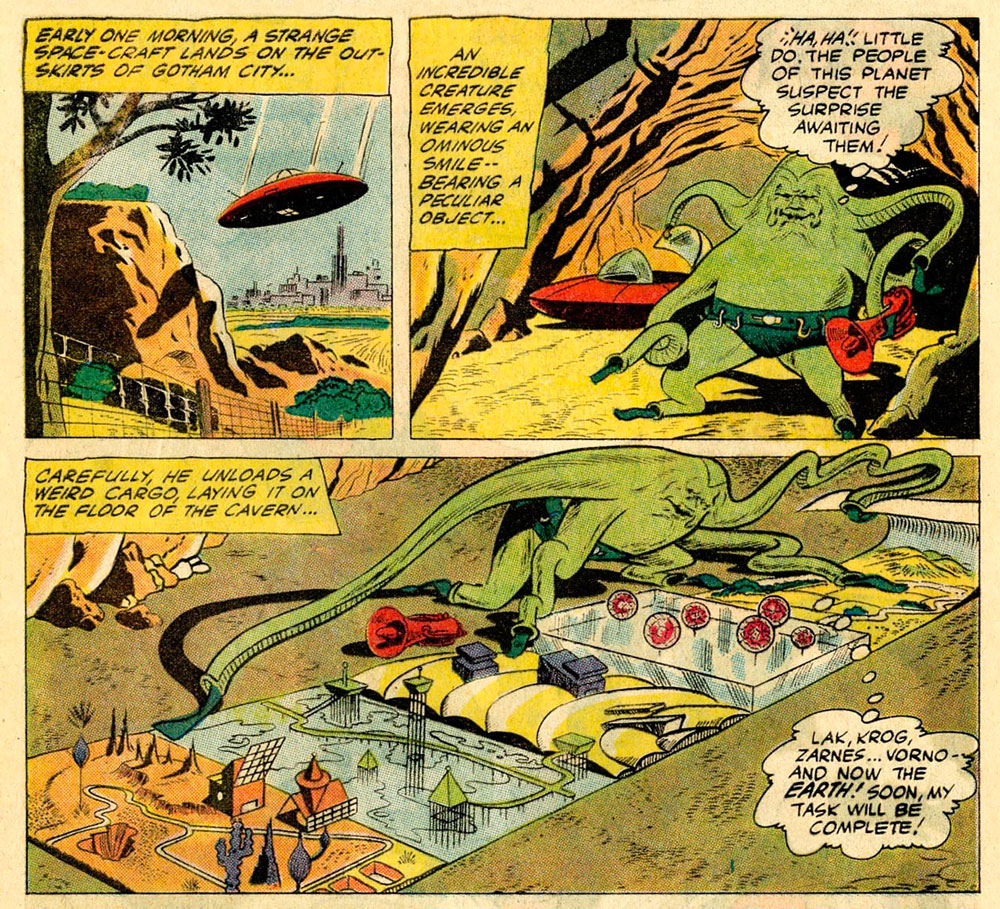
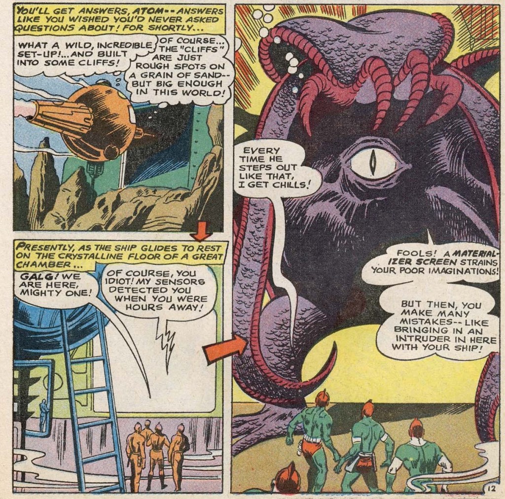
Last… and maybe least, because I could never warm up to him… is Green Lantern. The following pages are from a story pencilled by Gil Kane, who doesn’t generally get glowing reviews from WOT. Nevertheless co-admin RG wrote an ingenious post combining our common dubiousness about Kane and percolated it through specifically Green Lantern covers – the result is Hot Streak: Gil Kane’s Green Lantern, which impressed, if not quite convinced, me.

Funny Thing Happened on the Way to Earth!, scripted by John Broome, pencilled by Gil Kane and inked by Vince Colletta, was published in Green Lantern no. 70 (July 1969, DC).

I hope you enjoyed this overview of the Justice League of America as filtered through the rather eccentric lens of tentacles.

~ ds

Odious Rumours: Arachnid-Enhanced Bubble Yum

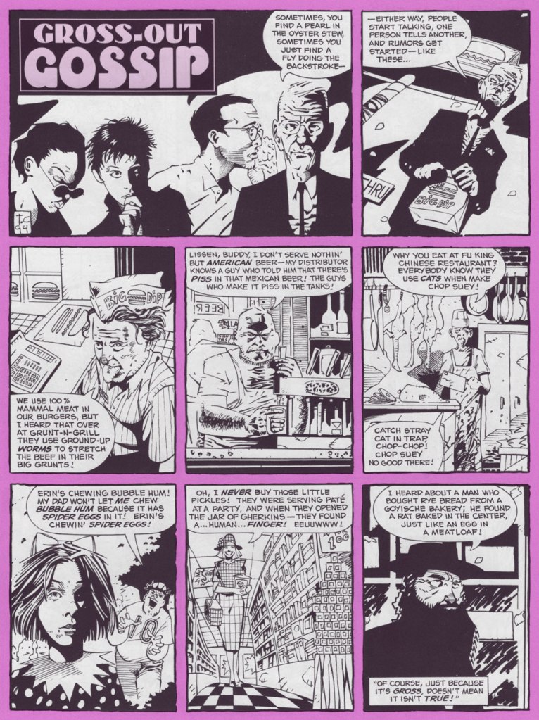
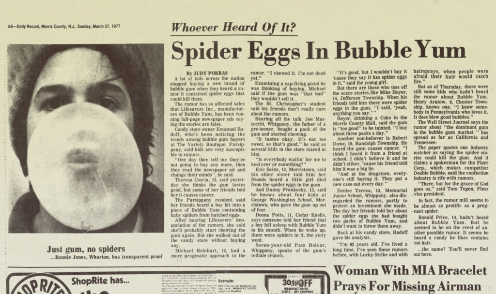
« A kid one time fell asleep chewing Bubble Yum, and he woke up with his mouth full of spider eggs. » — Some nameless rumour-monger

The other day, a neighbour was asking me whether it was a safe for his Golden Retriever puppy to eat the worms it was digging up (I was impressed), the guy presuming that said worms were quite filthy and rife with germs. I replied that no, it’s probably all the rooting through the trash and gobbling up whatever it finds that’s giving the pup gastric distress. Worms, in fact, are considered a delicacy in many a culture, including some European ones. Not that I’ve indulged: just like The Kinks’ Apeman, I’m a strict vegetarian.

This brought to mind those 1970s rumours of earthworms serving as filler in McDonald’s burgers (never mind that worms are a far costlier ingredient than is beef). Which led in turn to the equally-outlandish notion that the secret of Bubble Yum’s softness (introduced in 1975 by Life Savers, it was the first soft bubble gum ever concocted) lay in its containing spider eggs. Again, steady procurement would have proved quite a daunting challenge.

Art by Tomm Coker, from The Big Book of Urban Legends (1994, Paradox Press/DC); edited by Bronwyn Carlton Taggart and featuring the most inconstant levels of skill and talent you’re ever likely to encounter in a professional comics publication: a couple dozen or so versatile cartoonists, and over a hundred superhero hacks and/or photo tracers utterly out of their depth, a reminder of just how shallow the talent pool is. This isn’t one of the good pieces, but it’s nowhere near the bottom.
A trade ad from 1977, the year of Bubble Yum’s national (and international, as this Canadian can attest) rollout.

But the bubble was about to burst (or at least deflate somewhat), as reported by The New York Times (March 29, 1977):

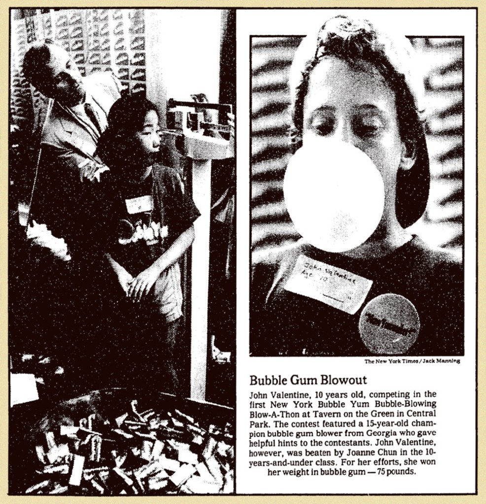
The Great Spider Egg Mystery remains unsolved but it may yet have several happy endings. The mystery concerns Bubble Yum, a popular new bubble gum that has, in a year, overtaken such symbols of earlier childhoods as Dubble Bubble and Bazooka. A few weeks ago came toil and trouble: the unexplained spread of lurid rumors among children in the New York area that, gasp!, Bubble Yum contained spider eggs (or, according to haughtier youthful accounts, caused cancer). Stores which had up to then been unable to stock enough to meet demand suddenly saw sales plummet. Last week, the manufacturer, Life Savers, Inc., took out full‐page ads in 30 area newspapers to combat the rumors.

This is not the first time the bubble gum business has been beset by evil rumor. When Jimmy Carter was a boy, youngsters in Sumter County, Georgia, were scared off by reports that bubble gum was made with snake oil —until they were reassured by an ad in the Americus Times‐Recorder. Nor is bubble gum normally regarded as the stuff of moral lessons. Its history, since it was invented by Walter Diemer in 1928, is marked by such milestones as packaging it with baseball cards (1933) or making it squeakless (1953).

But there is something more significant, and appealing, in the open way in which Life Savers has chosen to deal with its problem. We hope the spider egg rumors are expunged as successfully now as the snake oil rumors were then. And there will be a happier ending still if the subject is properly understood to be not bubble gum but canard. No consumer is too young to learn the malign effects of rumor or to understand that there will always be someone, not always in youthful innocence, eager to raise the cry—whether about Communists in government, environment, energy or bubble gum—of “spider eggs.”

From Morris County, NJ’s Daily Record, March 27, 1977 edition.

Susan M. Smith wrote, in her 1989 thesis, Consumer Rumors and
Corporate Communications
:

Whether the rumor is isolated or widespread, the company must select media that reach the rumor’s community of interest, and particularly, its influential leaders. The importance of this is shown by what happened after a rumor episode in New York City for the Life Saver’s Company. The company conducted an all-out attack to combat a rumor in 1977 that the company’s innovative, new soft chewing gum. Bubble Yum, contained spider eggs. It sought publicity, inserted full-page newspaper ads, and sent letters with a copy of the ad to the city’s PTA groups, school principals, and retail outlets.

The campaign successfully stopped the rumor, but Bubble Yum’s New York sales did not recover for many years. It turns out that even though the company had blanketed the city with its rumor denial, it never spoke directly to product users, the school-age children, to bolster confidence in the product. The selection of inappropriate media makes the refutation message miss the rumour’s public allowing the rumor to continue to spread or delaying recovery from the rumor.

Speaking of advertising: Marvel’s knockoff of Scholastic’s Dynamite, Pizzazz (1977-79), which included lots of ads, featured this piece in its 6th issue (March 1978, Marvel). This gives you a sense of Bubble Yum’s success, as the product was, in its field, what’s termed a disruptive innovation. Chewing gum no longer had to be hard.
Inevitably, the imitators came! Smooooth N’ Juicy, Hubba Bubba, Bubblicious, the oddball Freshen Up, and so on. Marvel switched its advertising allegiance to Topps. This is from Pizzazz no. 11 (Aug. 1978, Marvel). The art looks to me to be the work of Mad magazine veteran Jack Rickard (1922-1983).
A few issues later, (Pizzazz no. 14, Nov. 1978, Marvel), in a brazen display of corrupt insincerity, came this so-called Consumer Guide (note that only Topps products are pictured). Really, is Bubble Yum “the hardest, toughest gum our testers had to chew“? Surely anyone who’s ever tried to chew something from the Bazooka family knows better. My jaw aches just from the memory.
The company continued efforts to restore its reputation in the New York market, where the rumours had caused the most harm. A piece from The New York Times‘ Tuesday, July 22, 1980 edition.
This ad ran in Adventure Comics no. 487 (Nov. 1981, DC) and several other titles in the following months.
Now that’s better: in 1982, they turned to the incomparable Jack Davis to illustrate one of their print ads. Given his prodigious speed, he couldn’t have spent more than an hour on this specific piece, but it works far better than its predecessors. Incidentally, the ‘Super Yum’ thing (replacing Soft ‘n Juicy) appears to have been a move to block a competitor from using the appellation.

But I suppose all this controversy merely seems quaint now, what with all today’s heavy weaponizing of misinformation. Besides, the bubblegum market has been rather moribund in the past few decades, since apparently Nobody Likes to Chew Gum Anymore.

For a bit of sugar high nostalgia, I’ll leave you with a pair of vintage Bubble Yum ads: 1976’s brand introduction, featuring The Flavor Fiend;

And 1988’s spot co-starring a young Leonardo DeCaprio, which shows us he was clearly born with that insufferable smugness, or at least had honed it to perfection by his teens.

-RG

Tentacle Tuesday: Dive Right In, Boys and Girls!

Being in the throes of a heatwave is no fun. Given that I currently feel like my brain is melting, I shall keep this post to a minimum of text and a maximum of visual thrills. Luckily, today’s little collection of pretty forgotten comic book covers is quite fun, with covers that tantalize and mystify. Some of them also involve a lot of splashing around, which is a distinctly enjoyable thought right now. Let’s dive in, shall we?

Detective Eye no. 2 (December 1940, Centaur). Cover by Frank Thomas. It’s anything, and everything, goes on this cover! A lively party, indeed.
Funny Pages no. 36 (April 1940, Centaur). Cover by Harold DeLay. Note how the woman’s traditional, yet strangely tight and semi-transparent garb highlights her figure.
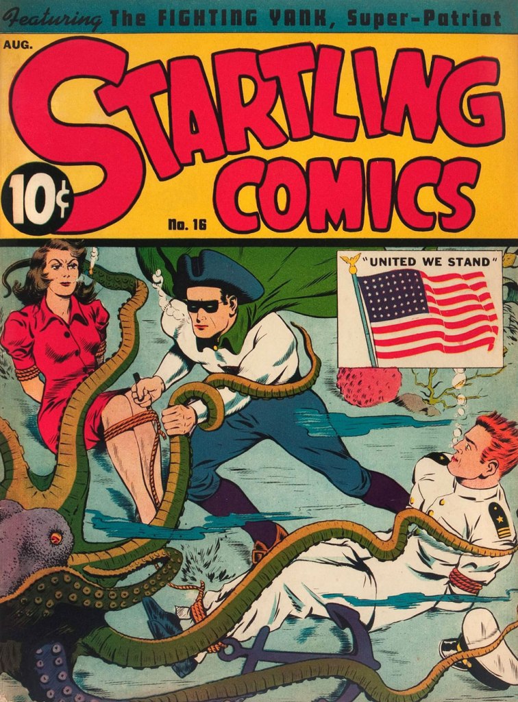
Startling Comics no. 16 (August 1942, Pines). Cover by Jack Binder. The woman is clearly fed up with all this silly boy nonsense and this is the last time she goes anywhere with these two.
Sparkler Comics no. 47 (September 1945, United Feature). Cover by Burne Hogarth. I always wonder about these tight leopard shorts – made out of leopard skin with some elastane mixed in, no doubt!
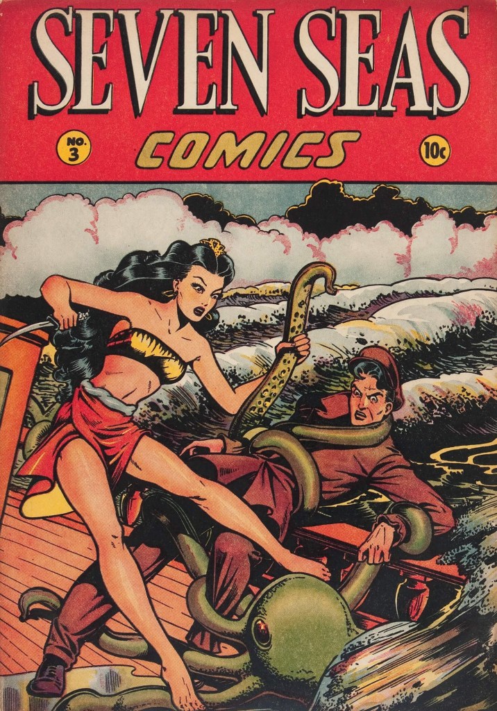
Seven Seas of Comics no. 3 (1947, Iger). Cover by Matt Baker. It is highly unusual for the octopus to grab the man instead of the woman; it must have something specific in mind.

More tentacular covers from the 40s can be seen in Tentacle Tuesday: Golden Age Superheroics, Tentacle Tuesday: The Golden Age of Grabbery or even Tentacle Tuesday: These Were Your Grandparents’ Tentacles.

~ ds

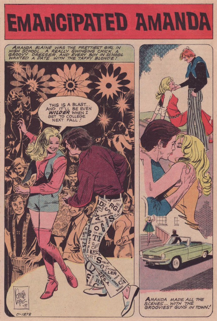
Treasured Stories: “Emancipated Amanda” (1971)

« The history of men’s opposition to women’s emancipation is more interesting perhaps than the story of that emancipation itself. » — Virginia Woolf

It has dawned on me that we’ve been neglecting the romance genre of late, and so the time has come to remedy this regrettable situation. To that end, I’ve opted to spotlight some early work by Spanish-Argentine master José Luis García-López (born 1948, Pontevedra, Spain).

If you ask me, Mr. García-López is far under-appreciated. His graceful but unassuming virtuosity, and the seeming ease with which he wields it, makes it too easy to take him for granted. And while he’s tackled just about every major character (and many a minor one) in the DC Comics stable, much of it has been behind the scenes, in the way of style sheets and promotional artwork.

Meanwhile, in comic books, he’s mostly made pedestrian scripts* shine more brightly than they deserved. But there’s only so much, er… polishing one can do.

As it stands, my favourite portion of his œuvre is the romance comics he illustrated for Charlton early in his career, roughly 1968-74, before he moved to New York to launch his North American phase. While my predilection for his romantic material is a minority opinion, I’m not alone in this, I’m relieved to report.

It seems to me that, as a man who can clearly draw anything at all, JLGL’s chops are largely squandered on superheroes and such. But, in comics as in life, romance is hard. As Mr. García-López confirmed in the definitive interview he granted in 2010 to the championne of romance comics, Sequential Crush‘s Jacque Nodell: « Even now, I consider romance stories the most difficult genre to illustrate properly. » Bingo.

If you’ve at all read comics from the early 70s, romance or otherwise, you’ll have noticed that clothing and hair fashions can generally be termed (charitably) ‘of their time’. Not so much here. Have we come full circle, or does JLGL have a secret? He confides (do read the full entrevista… it’s well worth it):

« In those years we also had photo-novel magazines (like the foto-romanzo or fumetti in Italy) and they were very useful to design the characters and for the romantic scenes. Doing a good kiss without a good reference was very hard, honest. Besides, I was lucky to have two kindly girl friends that helped me with fashion advice and suggestions and even posed for me. That period was full of learning experiences – there is no better way to learn to draw than from a living model. »

Where can I get myself a pair of those snazzy Letraset pants?
Writer unknown, incidentally. Which is a shame.

Now, artwork aside, why am I fond of this particular story?

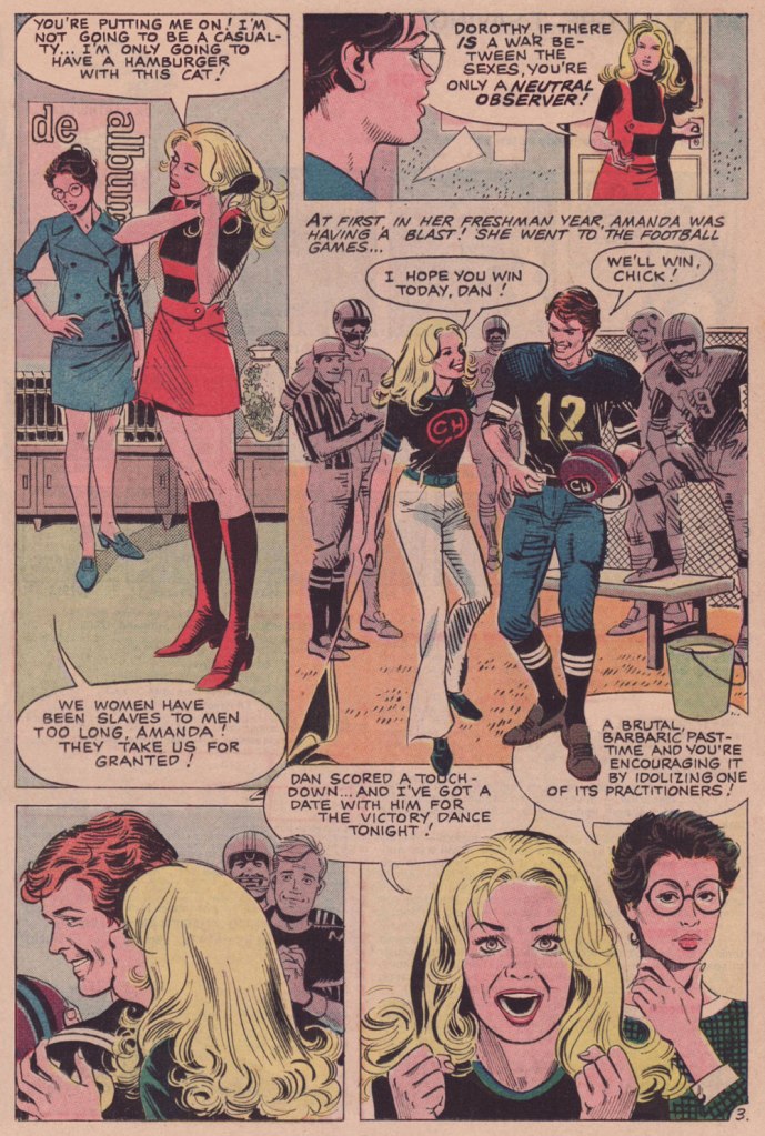
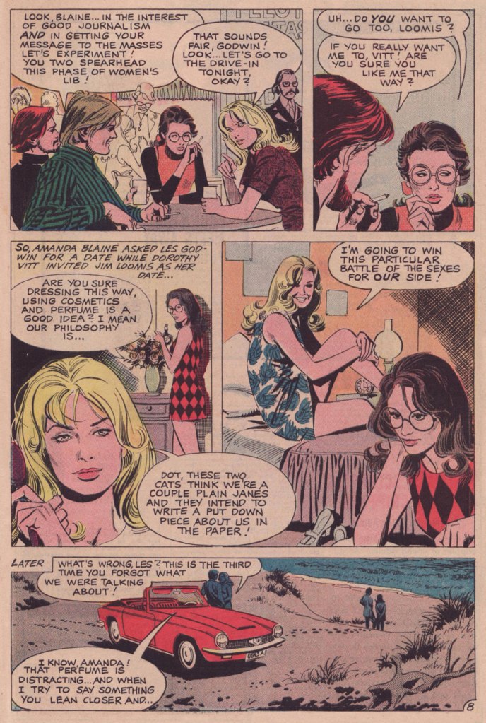
I love the mise-en-scène: characters are introduced in the background and without dialogue before they enter the stage. Namely Dorothy in the first panel of page 2 and ‘that beanpole’, Jim Loomis in the first panel of page 6. His first line comes in the final panel of page 7, but he and Dorothy have been staring holes into each other from the start. That’s great staging, not to mention something that, arguably, only the comics medium can achieve effectively.

I also enjoy the evolution of Amanda and Dorothy’s friendship; at first testy and tentative, Amanda’s calling her roommate ‘Dot’ by page 7. And they learn from, and support, each other. No cheap betrayal in this one.

It’s a lovely change of page for the genre that, once gridiron ‘hero’ and BMOC Dan Sruba commits his inevitable transgression… he’s gone (save for a passing mention from Les): no ‘second chance’, no confrontation, no revenge, no melodrama.

Despite the headline, I’m reading this as the story of Dot and Jim’s romance. Amanda’s interest in Les, beyond playing matchmaker for her roommate, is uncertain.

My wife was disappointed in the ending, and I can certainly see why: will Dorothy lose her fire and her beliefs? I prefer to think not — she was looking for an equal, respectful relationship, and I do think she’s found it with Loomis. And she had him well before word one, and she was clad in glasses, picket sign and dungarees. The guy seems like a keeper to me. They’re both quiet, thoughtful observers, for the most part. I like their odds.

There are a few glitches here and there, but given that the script had to first be translated into Spanish (Mr. García-López claims to still not speak English to this day… technically) to be illustrated, there may have been here and there a nuance missed, a description gone astray. Loomis isn’t quite a beanpole, and neither is Dorothy, for that matter. And ‘Plain Janes’? (page 8) And I scarcely think that Les and Jim were planning a hatchet piece (given Jim’s evident interest in Dorothy, for one), no-one would mistake these two for Plain Janes. Well, that’s always been a systemic weakness of the romance genre, in comics and elsewhere: the plain one, the skinny one, the rejected one? Still gorgeous.

This is I Love You no. 95 (Jan. 1972, Charlton). For a variety of factors, distance chief among them, Garcia-Lopez never drew an original cover for Charlton, but the publisher often creatively recycled story panels, a task handled exceptionally well in the present case.

What’s that? Oh, right. Fine, here’s that « FREE Pin-Up Poster of David Cassidy » already.

Art by Don Sherwood. For more David Cassidy (the good stuff, which is to say Sururi Gümen‘s), check out our earlier spotlight Farewell to David Cassidy, pop star… and Charlton Comics hero.

-RG

*as a well-scripted exception, I submit the opening chapter of David V. Reed‘s The Underworld Olympics ’76!, in Batman no. 272 (Feb. 1976, DC).

Tentacle Tuesday: Leaps and Bounds

Today’s Tentacle Tuesday doesn’t have an over-arching theme, other than featuring some bits and bobs I’ve accumulated – from something drawn in 1942 to a cartoon created by computer in 2020. In a sense, this way of proceeding is much closer to the way my brain works, jumping from theme to theme and adding brackets within brackets. This is somewhat off topic, but incidentally, if that’s the way your brain works, too, I highly recommend David Foster Wallace‘s non-fiction material (read 27 of his articles and essays here!) and The Good Soldier Švejk and His Fortunes in the World War by Jaroslav Hašek for a deliciously rambling approach to story telling and arguments.

If you’re not already following WOT’s favourite cartoonist Roger Langridge on Instagram, I highly recommend doing so: his daily slice-of-life strips provide an interesting glimpse into the author’s family life, inner dialogue, and artistic endeavours. You can also support him on Patreon (he has a measly 54 supporters right now – compare that to the thousands of subscribers boasted by some considerably less talented comics artists, who shall remain nameless). The following daily from December, 2020 features the aforementioned introspection, a glimpse at the artistic process, Garfield and tentacles.

Speaking of Garfield, I recommend Garfield Minus Garfield, if you haven’t come across it already.

Texan cartoonist Sam Hurt is the creator of Eyebeam, and I say that with a similar reverence that one would employ in talking about some deity that has concocted a self-governing universe. It is a strange, a bitter-sweet, topsy-turvy place with its own impeccable logic, to which our world remains criminally indifferent. Tackling the problem of talking about Eyebeam, which is both the name of the protagonist and the title of the comic strip, is something we haven’t yet had the courage of doing on this blog. Still, co-admin RG bravely dipped his toe in these waters and talked about a connected comic series – read his All Hail Peaches, Queen of the Universe! and admire his courage. I will also add that Sam Hurt is a great painter, and that I am lucky to have one of this paintings hanging on my office wall (best Christmas gift, ever).

A blushing octopus in a hat? Won’t somebody introduce us, please?

From its humble beginnings around 1978, Eyebeam has grown and survived (with some interruptions) to this day! Strips from 1996 until now are available on GoComics. Someday, fortified with some Dutch courage, we will do a proper post about it, we promise.

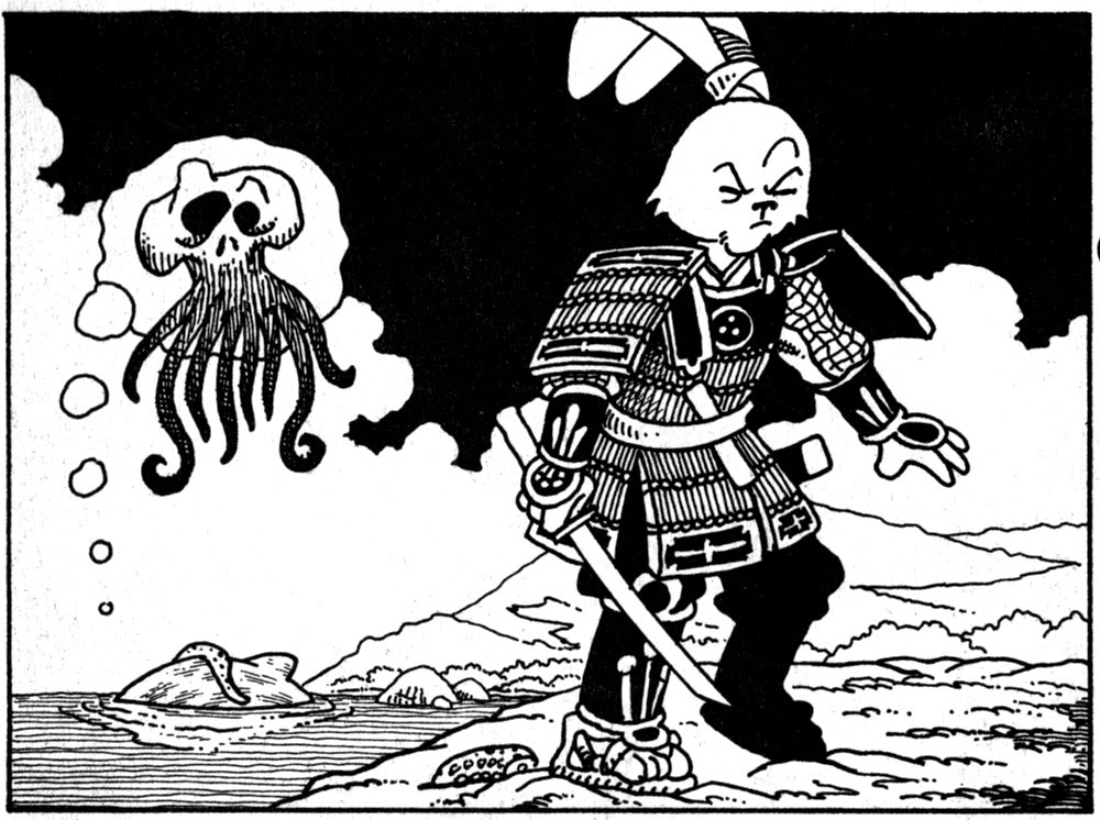
I’ve never actually read Usagi Yojimbo, the eminently popular rōnin comic book epic by Stan Sakai. Rolling Stones’ slapdash list of best graphic novels, insultingly titled The 50 Best Non-Superhero Graphic Novels (which immediately makes one feel that they consider non-superhero comics somehow inferior), places it at 43. I will doubtlessly get around to at least reading one volume or two at some point – Sakai is definitely a talented artist, and I have nothing against anthropomorphic animals when they’re well-drawn. However, a dedication to reading the whole series is not for the faint-hearted: there are 35 books in total, which have been collected into nine omnibus volumes in more recent years, a considerable time commitment.

‘Usagi Yojimbo’ literally means something like ‘rabbit bodyguard’, which is what the main character, Miyamoto Usagi, is. Here he is fighting an octopus or two!

Usagi Yojimbo no. 27 (March 1991, Fantagraphics). Cover by Stan Sakai, with colours by Tom Luth.
Panel from My Lord’s Daughter, published in Usagi Yojimbo no. 27 (March 1991, Fantagraphics).
This was drawn by Sakai during the Lucca Comics and Games Convention (2015) for a fan.

Theodor Seuss Geisel, far better known under the pen name of Dr. Seuss, was not only the author of famous books for children, but also a perceptive political cartoonist. Between 1941 and 1943, he was working for PM, a New York daily newspaper, and this is when he produced a series of satirical cartoons about the Policy of Appeasement, the British policy makers’ attempt at avoiding a war with Germany by conceding to some of Hitler’s demands.

I hope you enjoyed this somewhat random stroll through years and styles! For dessert, I would suggest The Cooking Cartoonist: Guilt-Free Ways to Prepare Octopus by Farley Katz. A bite-sized preview:

~ ds

Felines and Moonshine: Two by Lee Marrs

« Moonshiners put more time, energy, thought, and love into their cars than any racer ever will. Lose on the track, and you go home. Lose with a load of whiskey, and you go to jail. » — Junior Johnson

Lee Marrs (b. 1945) is not your typical « underground » cartoonist, though to be fair — what would a typical undergrounder be? The movement’s whole raison d’être was ‘vive la différence‘, wouldn’t you say?

Hers is not a prolific career, perhaps, but look at the gloriously idiosyncratic path she followed: newspaper comic strip assistant (Hi & Lois, Prince Valiant, Little Orphan Annie…), underground (Wimmen’s Comix, Pudge, Girl Blimp, The Compleat Fart and Other Body Emissions), and mainstream cartoonist — well, even better: she was a regular contributor to DC’s justly-fabled (but yet to be reprinted, ahem) Plop!; she appeared in Marvel’s Mad knock-off Crazy; she even scripted, in the early 90s, a Viking Prince (yes, Kanigher and Kubert’s 1955 creation) epic, illustrated by Bo Hampton, and even a bit of Batman (‘Stalking‘, with Eddy Newell, in 1998). But that’s merely scratching the surface: here’s a more comprehensive rundown of her captivating journey.

Ah, don’t you love a happy ending? Originally published in Weird Mystery Tales no. 18 (May 1975, DC), edited by Tex Blaisdell.
This is The Compleat Fart and Other Body Emissions (Jan. 1977, Kitchen Sink); colours by Pete Poplaski. Featured front-and-centre, doing his thing, is Joseph Pujol, France’s fabulous Pétomane!
Originally published in Wimmen’s Comix no. 7 (Dec. 1976, Last Gasp). This is underground storytelling at its finest: uncompromising, political, passionate, personal, at once witty, moving and instructive. And that whole gamut gets run through in a mere four beautifully-drawn, expertly-paced pages.

And I’m delighted to report that the scintillating Ms. Marrs is still active today, her verve and talent undimmed and undiluted. By all means, check out her website for the undeniable evidence!

-RG

Tentacle Tuesday: SpongeBob Goes Squish!

That SpongeBob would encounter a lot of tentacles in his day-to-day life is not at all surprising – he’s a sea sponge. What still surprises me, however, by is how much fun SpongeBob comics can be. Between 2011 and 2018, a respectable 85 issues were published by Stephen Hillenburg‘s production company, United Plankton Pictures (what a great title) and distributed by Bongo Comics.

No tentacles yet, but I couldn’t resist sharing this colourful, spook-tastic spread from SpongeBob Comics No. 25 (October 2013). Art by Andy Rementer.

The formula was similar to Simpsons Comics spin-off Treehouse of Horror: plenty of famous (and talented!) cartoonists having fun with the characters. Between the roster for the regular comics and the special-themed supersized issues, quite a few artists who participated are WOT favourites, and some are Tentacle Tuesday masters, to boot: Hilary Barta, Tony Millionaire, Al Jaffee, Ramona Fradon, Michael T. Gilbert… in 2017, Stephen R. Bissette even broke up out of retirement to work on a special Hallowe’en issue. I think this post is a decent sampler of the different styles and storytelling techniques involved – I’ve concentrated on prominent tentacles, and ignored all the trimmings (the recurring jellyfish tentacles, pumpkins sprouting grabby vines, etc.)

The tentacle fun starts right off with the first issue! Mermaid Man and Barnacle Boy vs. the Octopus King, written by James Kochalka and illustrated by Hilary Barta, was published in SpongeBob Comics No. 1 (February 2011):

A page from Serpents & Sealords, written and illustrated by Corey Barba and published in SpongeBob Comics no. 51 (December 2015).

The following glorious illustration at the tail end of SpongeBob Comics no. 50 (November 2015) is by Jim Woodring:

Given that Stephen Hillenburg (the creator of SpongeBob) was a marine scientist and teacher, it does not come as a surprise that the recurring feature Flotsam and Jetsam was used to talk about all manner of nautical critters and their habits. Here are a few:

Flotsam and Jetsam: Ocean Facts – The Mimic Octopus, written and illustrated by Maris Wicks and published in SpongeBob Comics no. 52 (January 2016).
Flotsam Fables: Legends of the Deep – The Kraken, written by Karen Sneider and illustrated by Vanessa Davis), was published in SpongeBob Comics  no. 62 (November 2016).
Flotsam & Jetsam – Ocean Facts: Sea Stars, written by Julie Winterbottom and illustrated by Nate Neal, published in SpongeBob Comics no. 71 (August 2017).

~ ds

Joe Maneely, Atlas of Versatility

« The cemeteries are full of irreplaceable people who were all replaced. » — Georges Clemenceau

Commercially and creatively, the 1950s held some of the best and the worst years for the American comic book industry. Basically, the first half was a glut and the second, a massacre. This is all well-trod ground. Today, we’ll stick to one artist and his main employer.

In his one intensely-prolific decade as a professional cartoonist, Joe Maneely (1926 – 1958) produced the overwhelming bulk of his work for publisher Abe ‘Martin’ Goodman’s Timely/Atlas, which would become Marvel Comics by the decade’s end.

The artist at his table. Herb Trimpe lets us in on the secret of Maneely’s prodigious speed (said to produce up to six pages a day, pencils and inks): « his pencils [were] almost nonexistent; they were like rough, lightly done layouts with no features on the faces … It was just like ovals and sticks and stuff, and he inked from that. He drew when he inked. That’s when he did the work, in the inking! ». Talk about unerring confidence!

Atlas historian Dr. Michael J. Vassallo sums up the Tao of Goodman (and, by and large, Marvel’s):

« As one genre faded, another would add titles to compensate. It didn’t matter if the new titles were basically redundant titles with new names. Goodman followed all trends in the comic book industry and the publishing industry in general.

A savvy businessman, he rarely led, mostly followed, but had the resources to follow with gusto, overwhelming competitors with product. »

As Ger Apeldoorn tells it, Maneely was a mere thirty-two years of age and at his frenetic artistic peak when tragedy struck:

« … on June 7, 1958, after going out for the night (with old-time friends John Severin and Walt Kelly assistant George Ward) he stepped out on the balcony of the train to get some air, fell between two trains and died. For a long time the story was that he had been drunk, but according to Dan Goldberg* he had lost his glasses earlier that week and that may have been a contributing factor. »

If the inspiring story of Joe Maneely, and its heartbreaking and sudden end is at all remembered these days, it has chiefly been through the diligent efforts of aficionado-historians such as Jim Vadeboncœur Jr. and the aforementioned Dr. Vassallo. Now why would an artist of such calibre fade so swiftly from memory? Since that happens all of the time (what one might term ‘invisible evidence‘), let’s move past the realm of the rhetorical and be more… specific. But first, some samples of the late Mr. Maneely’s goodies.

This is Outlaw Fighters no. 2 (Oct. 1954, Atlas).
This is Jungle Action no. 1 (Oct. 1954, Atlas). With spandex yet to hit the market (and even then), Leopard Girl’s costume must have been quite… stifling.
This is Mystery Tales no. 23 (Nov. 1954, Atlas).
This is Two-Gun Kid no. 18 (Nov. 1954, Atlas). I doubt anyone’s going to land comfortably. Particularly those poor horses.
This is Journey Into Mystery no. 22 (Feb. 1955, Atlas).
Oh, Stan — you’re so butch!” This is Rugged Action no. 2 (Feb. 1955, Atlas). To my eye, the bottom panel evokes Harvey Kurtzman‘s early style (think Two-Fisted Tales at EC); ironic, given that Maneely was as confident and speedy in his drawing as Kurtzman was painstaking and slow.
This is Apache Kid no. 15 (Aug. 1955, Atlas). The publisher also had in its roster Arizona Kid, Kid Colt, The Kid from Dodge City, The Kid from Texas, Kid Slade, The Outlaw Kid, Rawhide Kid, Ringo Kid, Texas Kid, Two-Gun Kid, The Gun-Barrel Kid… did someone say ‘redundant’? Why, yes, someone did.
This is Police Badge #479 no. 5 — the sole issue, really; its numbering picked up from Spy Thrillers… and went no further (Sept. 1955, Atlas). Maneely was another of that rare breed who could draw anything… because they enjoyed drawing everything. Dig all that well-observed detail!
Atlas published, in quick succession, no less that four short-lived Mad clones: Crazy, Riot, Snafu and Wild, each lasting from three to seven issues. None were particularly funny either, even if they did look quite good. This is Riot no.4 (Feb. 1956, Atlas) featuring what is termed, in comic book circles, an ‘infinity’ cover.
This is Melvin the Monster no. 4 (Feb. 1957, Atlas); Dr. Vassallo writes, in his in-depth Maneely overview for Alter Ego magazine (no. 28, Sept. 2003): « Stan Lee and Joe Maneely’s Melvin the Monster… duplicated everything they could about Hank Ketcham’s Dennis the Menace — art style, comic strip format, even upper-&-lower-case lettering style — everything except the warmth and innocence.»
This is Kid Colt Outlaw no. 69 (Feb. 1957, Atlas). Along with everything else, I love his way with flora and fauna. Incidentally, most of these covers were coloured by Stan Goldberg.

And so… why have Maneely’s star and memory dimmed so? It has been proposed, and I agree, that it’s because he just didn’t draw superheroes (a couple of Sub-Mariner covers being the lone exceptions), and Marvel itself hardly lifted a finger, over the years, to preserve the reputation of one of its principal architects.

The artist’s promotional letterhead illustration, circa 1948.

There’s been much idle speculation as to what course comics history would have taken had Maneely lived. Stan Lee wrote, in his usual disingenuous way, that:

« How I wish the world (and I) could have seen what he’d have done with the F.F., Spidey, Thor and all the other Marvel super-heroes! It’s a true tragedy that we’ll never have the chance. »

Let’s be honest here: Maneely was an incredible artist, and he made Stan look good, but Joe wasn’t a writer, and certainly not a world-builder in the fashion and class of Jack Kirby, Steve Ditko, Walt Kelly, Carl Barks, John Stanley, Basil Wolverton… and precious few others. Without Kirby, the so-called Marvel Age never would have come to pass. Not to mention that Maneely, with a wife and three daughters to feed and support, had just begun to work for one of DC’s friendliest editors, Murray Boltinoff**. He would have been unlikely to drop a better-paying, likely secure gig to drop everything and return to Marvel’s uncertain prospects. Ah, and I see Mark Evanier views it along the same lines.

Oh, and I’ve mentioned in the past Maneely’s likely influence (mostly in the inks) on his contemporary Rocco Mastroserio. Take a look at this gallery of his covers and see if you agree.

-RG

*Stan Goldberg, actually.

**as a matter of fact my first encounter — as a child — with Maneely’s work was through a reprint of one of his DC stories: The Doomsday Drum (House of Secrets no. 9, March-April 1958).

Tentacle Tuesday: Into the Cephalopodic Underground

 « Slursh squirch! »

Greetings to saddle sniffers, subterranean dwellers and lovers of nasty fun! Today we take a little trip into the underground, where tentacles squirm in anticipation! Through some quirk, all of today’s covers involve aliens and spaceships – underground artists clearly also liked to speculate about the possibilities of inter-planetary travel.

If you’re a fan of those wild years of cartooning, visit out MEANWHILE, IN THE UNDERGROUND category!

Tentacle Tuesday opens up with a Nicola Cuti cover, whose cutesy style, albeit not particularly original, is pretty recognizable (for example, take a look at his Weirdlings, which has really grown on me over the years). His big-breasted, doe-eyed « intergalaxtic nymph » was not devoid of charm, although she only appeared in three issues (and issue no. 3 had a print run of a hundred copies, so I don’t think many people have seen it…) For more details about Moonchild Comics, consult the ever-useful Comixjoint.

Moonchild Comics no. 1 (1968, Moonchild Productions). Cover by Nicola Cuti.

Next up this lively cover by Spain Rodriguez, a WOT favourite. We haven’t posted that much about him, but co-admin RG did a lovely post about a surprisingly touching story from SR’s youth in Treasured Stories: «Tex’s Bad Dream or ‘The Egg Lady’s Revenge’» (1988).

Gothic Blimp Works no. 4 (Spring 1969, East Village Other). Cover by Spain Rodriguez.

The next cover is on a similar theme: mostly naked female, tentacled alien, the shaboodle, with an interesting choice of perspective to boot. And by “to boot” I mostly mean that it looks like somebody gave her a good kick on the shapely derrière.

Real Pulp Comics no. 1 (January 1971, The Print Mint). Cover by Roger Brand, who tragically died at 42 – read a heartfelt panegyric from Kim Deitch in A Lousy Week for Woods (Remembering Roger Brand).

Staying with the same publishing house (The Print Mint was a major publisher/distributor of underground comix in their heyday in the San Francisco Bay Area!) and the same theme, another damsel in the clutches of a (pretty cute, actually) alien. She’s wearing red, which of course is the traditional colour for cephalopod attacks.

Yellow Dog no. 20 (July 1971, The Print Mint). Cover by Trina Robbins, who designed the original Vampirella costume.

~ ds

Jean-Jacques Sempé’s Caustic Heyday

« When I grow up I would like to be an artist in France. » — Keith Haring

The other day, while weighing the idea of producing this post, I asked my wife: “Is Sempé too obvious a choice?”, to which she wisely replied: “To whom?”. To add another few grammes of perspective, I’m reminded of how, a decade-or-so ago, I was helping out a friend by manning his business phones while he took a vacation. One caller identified herself as Mme Sempé. I immediately asked whether she was related to the cartoonist. She was (they’re second cousins), but rather shockingly, this was the first time anyone had ever brought up the subject with her. Okay, so not so obvious after all.

If you only know Jean-Jacques Sempé‘s work through his cover illustrations for The New Yorker, well, you’ve missed his finest. Sempé (born August 17, 1932, in Bordeaux, France; died August 11, 2022, just a few days short of his 90th birthday) was recruited in the late 70s, in the twilight of editor William Shawn‘s tenure (1952-87) with the magazine. To be quite frank, Sempé’s New Yorker work is his weakest, comprising almost invariably mawkish scenes of the dying arts: little girls practicing scales at grand pianos, ballet rehearsals and grand operas. And the work has only grown more anachronistic and sentimental with time; I’d say he’s the least compelling cover artist currently working for the magazine, with the exception of art director Françoise Mouly‘s little chouchou, the stiff and bland Adrian Tomine, he of the lifeless line and emetic palette. Ahem.

But there was a time…

In 1968, a decade-and-a-half into Sempé’s career, ever-lucid Belgian writer and historian Jacques Sternberg perceptively summed up the artist’s appeal:

« But Sempé’s humour has earned the favour of a very wide audience. Without a doubt because he’s able to observe with a playful — but rarely sadistic — eye the drawbacks and peculiarities of our daily lives, and that his reader feels — mistakenly — reassured by this vision.

Sempé has, in fact, a way with an impressive setting, with meticulous detail, of the mise en scène that sugarcoats the bitter pill and of the lyrical flight that dampens the ferocity of the content. The miracle occurs as if by magic: Sempé, who is rather scathing, seduces rather than worries his readers. »

A cartoon that first saw print in the pages of Ici Paris in 1958.
This cartoon appeared in France Dimanche, circa 1957.
Another one that ran in France Dimanche in 1957.
The signs say, from left to right: “They’re mocking us“; “No more demagoguery“; “Freedom First!“; “End the abuse“, “Down with…” and… “We have found this glove“.
From France Dimanche (1957). This one strikes close to home for me. Makes me think of the sort of barbarians always seeking to ‘improve upon’ nature. A passage from friendly gadfly and crime writer Carl Hiassen‘s brilliantly scathing polemic, Team Rodent: How Disney Devours the World (1998) comes to mind:

« Disney is so good at being good that it manifests an evil; so uniformly efficient and courteous, so dependably clean and conscientious, so unfailingly entertaining that it’s unreal, and therefore is an agent of pure wickedness. Imagine promoting a universe in which raw Nature doesn’t fit because it doesn’t measure up; isn’t safe enough, accessible enough, predictable enough, even beautiful enough for company standards. Disney isn’t in the business of exploiting Nature so much as striving to improve upon it, constantly fine-tuning God’s work.

Lakes, for instance. Florida’s heartland is dappled with lovely tree-lined lakes, but the waters are often tea-colored from cypress bark. For postcard purposes, tea-colored water was deemed unsuitable for Disney World’s centerpiece, Bay Lake, so in the early 1970s Team Rodent sprang into action—yanking out many of the cypresses, draining the lake, scraping out the bottom muck, replacing it with imported sand, then refilling the crater. All this was done to make the water bluish and therefore more inviting to tourists. For good measure, Disney even added beaches.» [ read it here ]
Naturally, I don’t dislike *all* of his New Yorker covers. This one, from the November 24, 1997 issue, is a peach.

-RG