An octopus has crept into the following pages. Can you spot it before the year ends?*
*I realize this is an extremely easy assignment, but given the state of things these days, one should seek out a minor sense of accomplishment wherever one may find it!
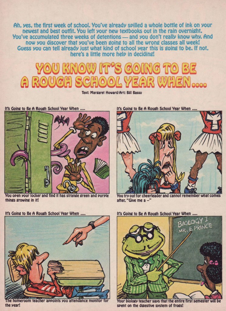
Page from Bananas no. 13 (1975, Scholastic), a kids’ magazine from the 70s. Somewhat similar to its older brother Dynamite, Bananas had (even) more of a focus on celebrities. Art by Bill Basso.
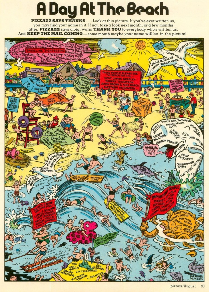
Pizzazz, published by Marvel Comics from 1977 to 1979, was pretty much a rip-off of Dynamite, and, as co-admin RG points out, rather tiresome to read with its constant insertions of Marvel plugs. From Pizzazz no. 11 (August, 1978, Marvel), this elaborate scene is by Graham Hunter – visit Hallowe’en Countdown, Day 27 for more from this great artist!
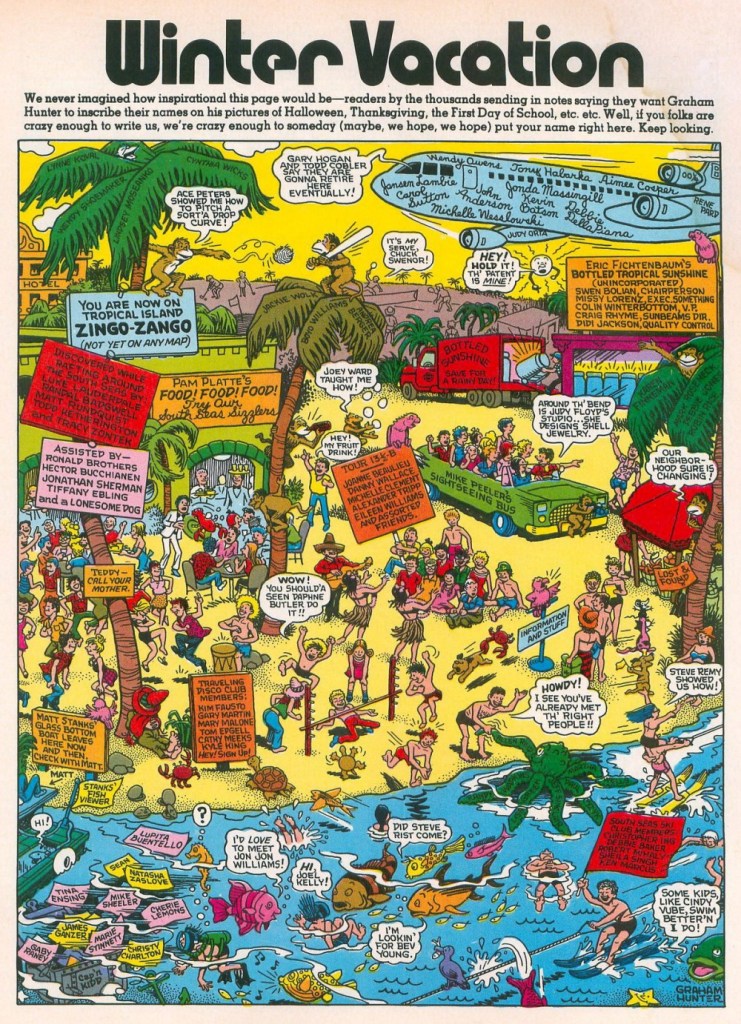
From the mag’s final issue, Pizzazz no. 16 (Jan. 1979, Marvel).
I have plenty more tentacles saved up, but after four years of weekly cephalopods, I am growing rather weary of this topic. While I endeavour to rekindle this old love of mine, I will move on to other interesting things, so this is not only the last Tentacle Tuesday of the year, but the last TT for a bit. See you on newer, fresher pastures!
« Talk about cheap – on Christmas Eve, my neighbor shoots off three blanks and tells his kids Santa Claus just committed suicide.» — Milton Berle
We hope this Christmas day finds you healthy and happy, whether you’re spending it quietly with the nearest and dearest, or stranded far from your family. We all do the best we can.
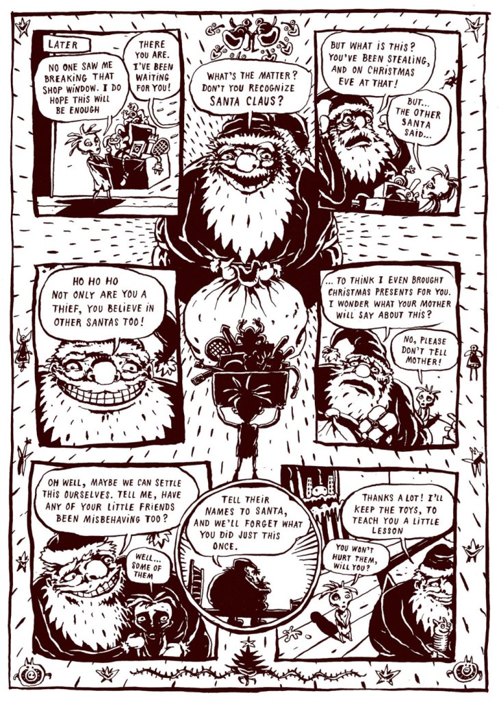
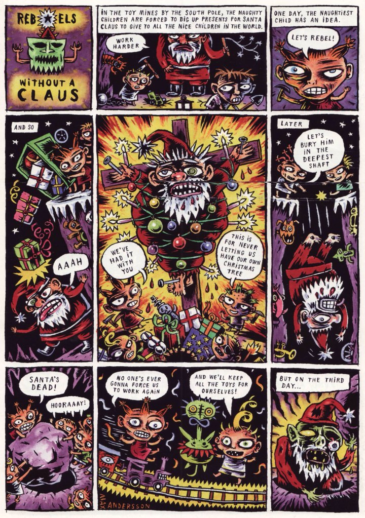
In a slightly different, yet somehow appropriate, vein… the following Christmas story by Max Andersson is a bracing antidote to the usual syrupy cheer of December 25th. As co-admin RG aptly put it*, in Andersson’s world, malevolence is the status quo, and this Jekyll-and-Hyde version of Santa Claus will fluff up the fur of the staunchest anti-Christmas reader.
Good Claus Bad Claus was published in Zero Zero no. 7 (Jan-Feb 1996, Fantagraphics).
As a bonus, we are including the no less cynical, but quite satisfying, back page of Death & Candy no. 1 (December 1999, Fantagraphics). Santa had it coming!
Ho-ho-ho (down the shaft), merry Christmas to all of our kind readers!
« Everything that happened to Archie happened to me in school, except that Archie always seemed to get out of it. » — Bob Montana
Despite the hundreds, if not thousands, of variably-abled hands that have toiled in the Archie Comics salt mines, the most important set of mitts devoted to the task was also the very first.
Archie creator Bob Montana* (1920-1975) knew what he was doing from the git-go. After all, he rubbed shoulders with the characters’ real-life counterparts from the Class of 1940: according to a 1989 Associated Press story, his buddy ‘Skinny’ Linehan became Jughead, football hero Arnold Daggett became Big Moose Mason; principal Earl MacLeod gave us Mr. Weatherbee and school librarian Elizabeth Tuck inspired Miss Grundy… and so on.
Montana was also that rare cog in the Archie machine: an autonomous writer-artist. This served him well in the newspaper strip world: he débuted the Archie feature in 1946 and remained in charge, dailies and Sundays, until his 1975 passing. I do prefer Samm Schwartz’s Jughead, but Montana drew the definitive version of every single other member of the Riverdale ensemble. In particular, as you’ll witness, Betty and Veronica were never slinkier.
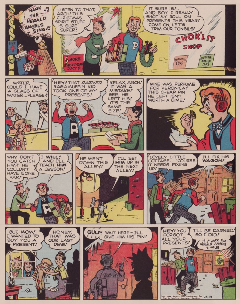
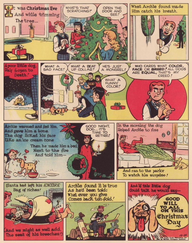
The Sunday, December 22, 1946 strip.The Sunday, December 21, 1947 strip.The Sunday, December 19, 1948 strip.The Sunday, December 26, 1948 strip.The Sunday, December 25, 1949 strip.
And a bonus New Year’s-themed one for the road!
The Sunday, December 28, 1947 strip.
And with this… Merry Christmas, everyone!
-RG
*On the Archie plantation, as with the Harvey gulag, we can safely dismiss the founders’ specious and strident claims of having created their cash cows. In this case, Archie “creator” John Goldwater‘s original mandate to Montana was essentially to riff on popular radio show The Aldrich Family (1939-1953).
Today’s Tentacle Tuesday is going to be short and sweet, as the week before Christmas, complicated traveling plans, and pandemic scares do not incite one to write long posts.
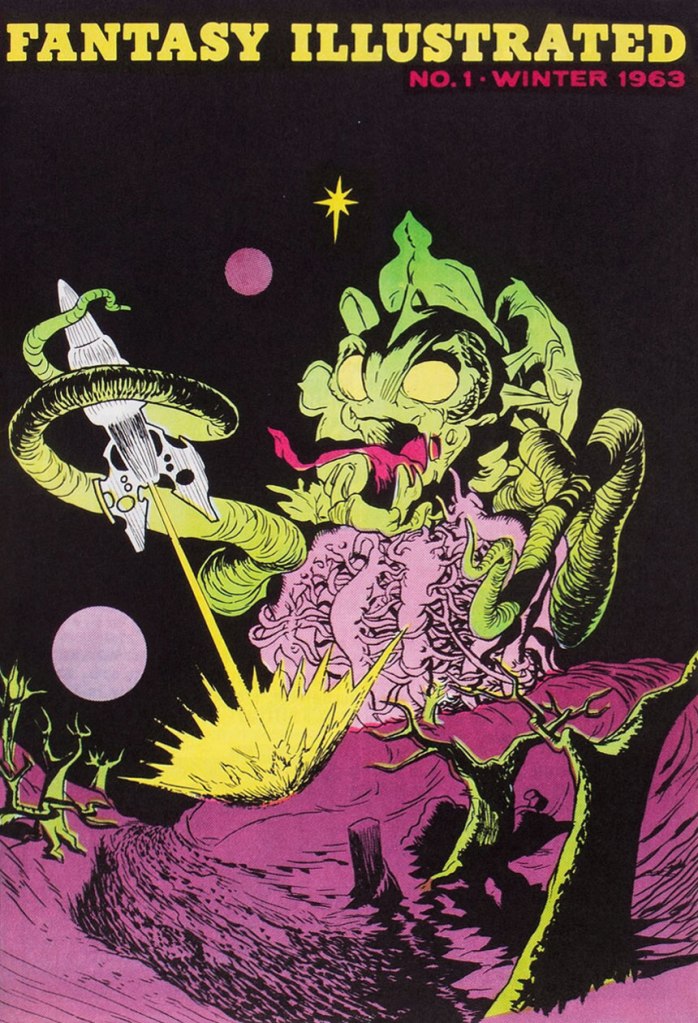
Bill Spicer, a then-letterer for Western Publishing, launched Fantasy Illustrated in 1964, after gathering some contributors through a want ad in a science-fiction fanzine. The introduction (with issue 4) of a Spicer-penned column titled ‘Graphic Story Review’ heralded a shift from the initial graphic adaptation of stories to a focus on articles and interviews, and what used to be Fantasy Illustrated continued as Graphic Story Magazine by issue 8 in 1967. GSM may have been somewhat short-lived (it lasted another 9 issues), but thanks to Spicer’s sensitive and literate editorial direction, it had a lasting impact on the minds of astute readers through pioneering in-depth interviews with comics creators (notably Basil Wolverton, Bernard Krigstein, Howard Nostrand…). GSM would later morph into the equally-excellent, but with a broader scope, Fanfare (5 issues, 1977-83).
Fantasy Illustrated no. 1 (Winter 1963). Cover by Landon Chesney.
Fantasy Illustrated no. 6 (Summer/Fall 1966). Cover by future Jack Kirby inker D. Bruce Berry (Kamandi, OMAC, Manhunter).
The back of Fantasy Illustrated no. 6 (also by Douglas Bruce Berry).
« Like everyone in his right mind, I feared Santa Claus. » — Annie Dillard
’twas 1982, and DC’s mystery anthology titles were dead or dying (the last one standing, The House of Mystery, had but a year or so left to go), and The Unexpected, published since 1956, was a mere two issues away from cancellation. Latter-day editor Dave Manak had done a fine job with the means at his disposal, wisely engaging Joe Kubert (1926-2012) to grace close to ten issues with his ever-elegant artwork.
This is perhaps the finest of the lot, a wistful, old-fashioned cover that dispenses with most of the clichéd Holiday iconography.
This is The Unexpected no. 220 (March 1982, DC). Pencils and inks by Joe Kubert with extra-fine lettering by Gaspar Saladino (1927-2016), truly a key element of the cover’s visual appeal. “Drive carefully, darling!” Is that woman worried about *everything*? Talk about fretful. Insurance agents must adore her. From the Fairhaven and Bon Marché allusions, one may presume that the events are set in the state of Washington.To give credit where credit is due, the unexplained bit with Santa’s hand on the phone is the story’s subtlest touch. He’s the one who phoned in the tip — anonymously, one presumes. Santa does not abide off-brand competition.
The issue’s lead, Holiday-themed story, boasts gorgeous art by powerful and versatile Puerto Rican cartoonist Ernie Colón (1931-2019), and it’s unusually well-coloured for the era (not to be confused with well-printed!), in that the shadings convey projected light and ambiance, not merely the prevalent, simplistic colour-by-numbers approach.
The writing, on the other hand…
Santa Is a Killer! is an artless hodge-podge of tropes, a kiddie rehash of Johnny Craig’s timeless “… and All Through the House” (Vault of Horror no. 35, Feb. 1954, EC), dressed up with the done-to-death-and-then-some “That — wasn’t *you*? Then — it must have been the –*choke* — real ghost / Satan / Santa Claus / Carlos Santana / Tooth Fairy / Larry “Bud” Melman!) “twist”. Did I mention that I love the art?
Since we strive to avoid repetition, and as my partner-in-mischief ds has already featured this legendary cover in her How do you like *your* Christmas? post, here instead is the original 1954 Silverprint proof, a colour guide for the printer’s edification and coloured by hand, presumably by EC’s resident chromatic conjuress, Marie Severin (1929-2018). Cover art by Johnny Craig.
It’s a little-known fact that VoH35’s dear, doomed wife’s peignoir was later snapped up for a pittance at an estate sale by a young rake by the name of Danny Rand. Soon, with a few minor alterations, he had himself a nifty (and silky!) crime-fighting ensemble. Just don’t ask ‘is that a ladies’ nightgown you’re wearing?‘ if you don’t want your features rearranged. This is Iron Fist no. 8 (Oct. 1976, Marvel). Cover art by John ‘Booster Cogburn‘ Byrne and Dan Adkins. And though « The Canadian Government has apologized for Bryan Adams on several occasions » (and presumably for Céline Dion and Justin Bieber also), I say it’s high time Canuck honchos proffered their excuses as to cuddly Mr. Byrne.
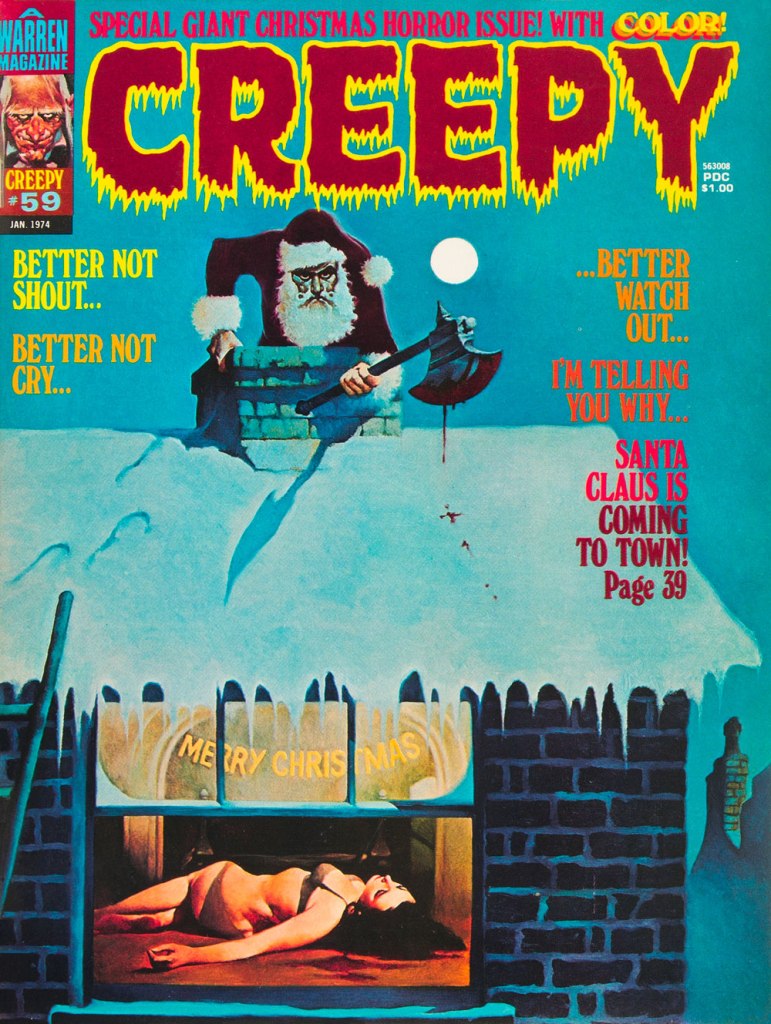
To give you some idea of how prevalent the ‘Santa as homicidal maniac’ notion was by the 1970s, here’s another semi-famous instance: this is Creepy no. 59 (Jan. 1974, Warren); cover by Spain’s Manuel Sanjulián (b. 1941). A year later, writer-director Bob Clark (Porky’s, A Christmas Story) would unleash his influential Black Christmas.
« Let’s just say you weren’t born to be an octopus… only a poor fish! »
Salutations on this most diverting day of the week, Tentacle Tuesday! Today, we take a little trip to the 60s… but perhaps not the 60s as you remember them, those who were around back then.
Rip Hunter… Time Master no. 3 (July-August 1961); pencils by Ross Andru, inks by Mike Esposito.
Rip Hunter was created by Jack Miller and Ruben Moreira – the “Time Master” part is explained by Hunter’s invention, the Time-Sphere, that allows him (obviously) to travel through time. Other characters in Rip’s world include his girlfriend, Bonnie Baxter, and Bonnie’s kid brother Corky (who’s being grabbed by a tentacle on this cover). Maybe Corky was spotted as an imposter because he’s wearing jeans instead of yellow pantaloons? Fashion can be quite goofy in some of these far-away, long-long-ago kingdoms…
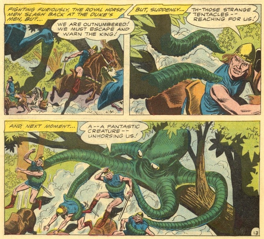
Page from The Duke with the Creature Powers, scripted by Jack Miller, pencilled by Ross Andru and inked by Mike Esposito.
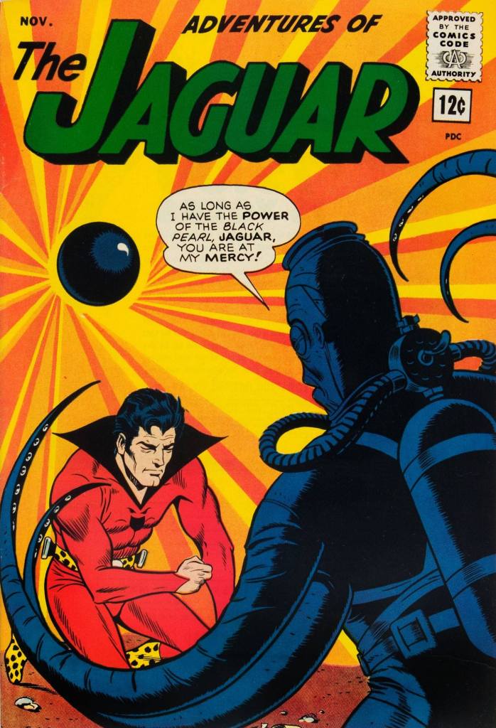
When The Jaguar gets into trouble with The Human Octopus, you know the Jag is going to come up trumps, mostly due to the fact that he has all powers of the animal kingdom at his disposal, whereas the Octopus has to make do with some unconvincing tentacles and an evil stare. The Jaguar (or zoologist Ralph Hardy, in his everyday life) was created by Robert Bernstein and John Rosenberger as part of Archie’s “Archie Adventure Series”.
This is the last issue of this series: Adventures of the Jaguar no. 15 (November 1963, Archie), with a cover by John Giunta.
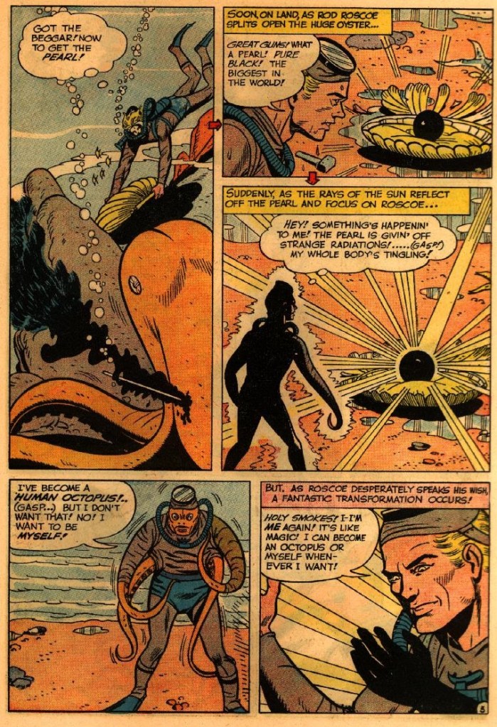
Some fodder for your nightmares? Of course!
Who wouldn’t want to become a HUMAN OCTOPUS!…? The Jaguar versus the Human Octopus! was scripted by Robert Bernstein and illustrated by John Giunta.
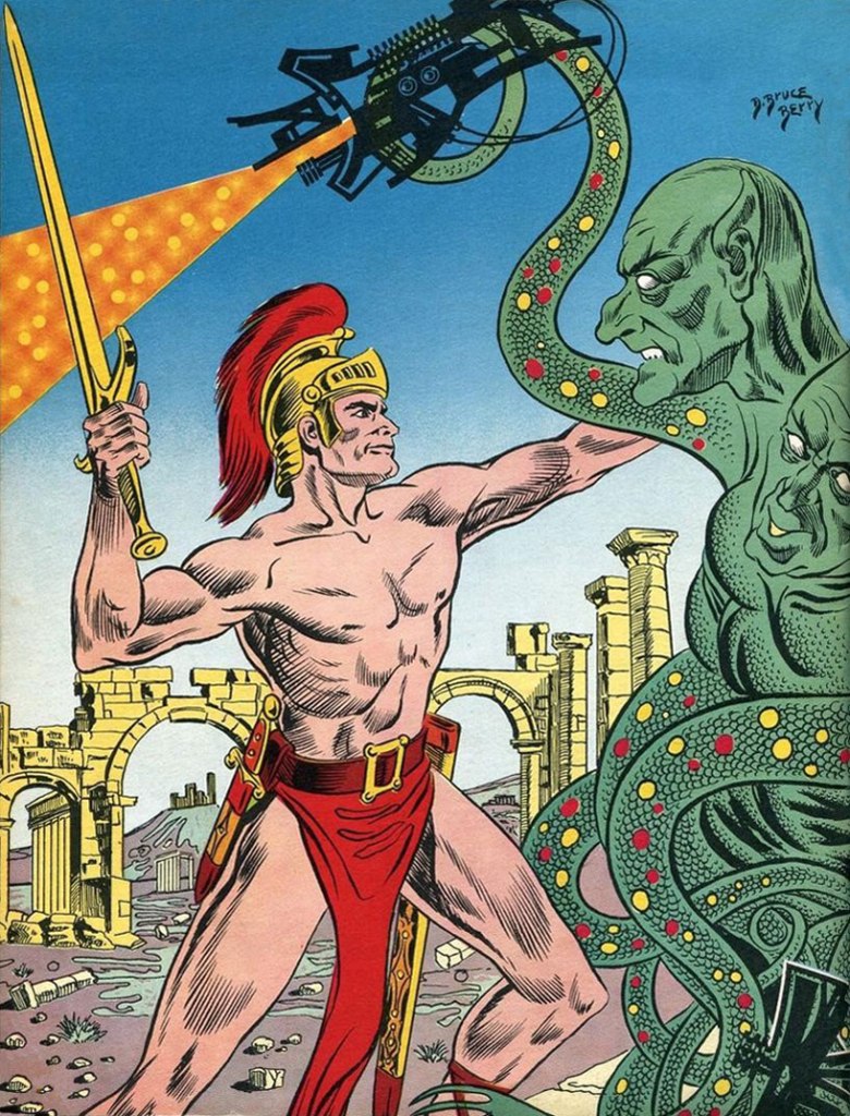
I believe Hawkman needs no introduction (although I will mention that he was created by Gardner Fox and Dennis Neville!), and we don’t have time for one, anyway, seeing as he’s currently stuck between a dragon and some tentacled nest-creature.
« The working class is revolutionary or it is nothing. » — Karl Marx
Pif le chien was introduced to the world on March 26, 1948, in the French Communist daily L’Humanité. His strip was intended to replace that of Felix the Cat, who was deemed too bourgeois, what with his magic bag and invisible means of financial support. On the other paw, Pif, early on, was even a stray, homeless and starving. In time, he was taken in by a humble working-class family (as late as 1957, it was the outhouse and public baths), and that’s when the elements clicked into place.
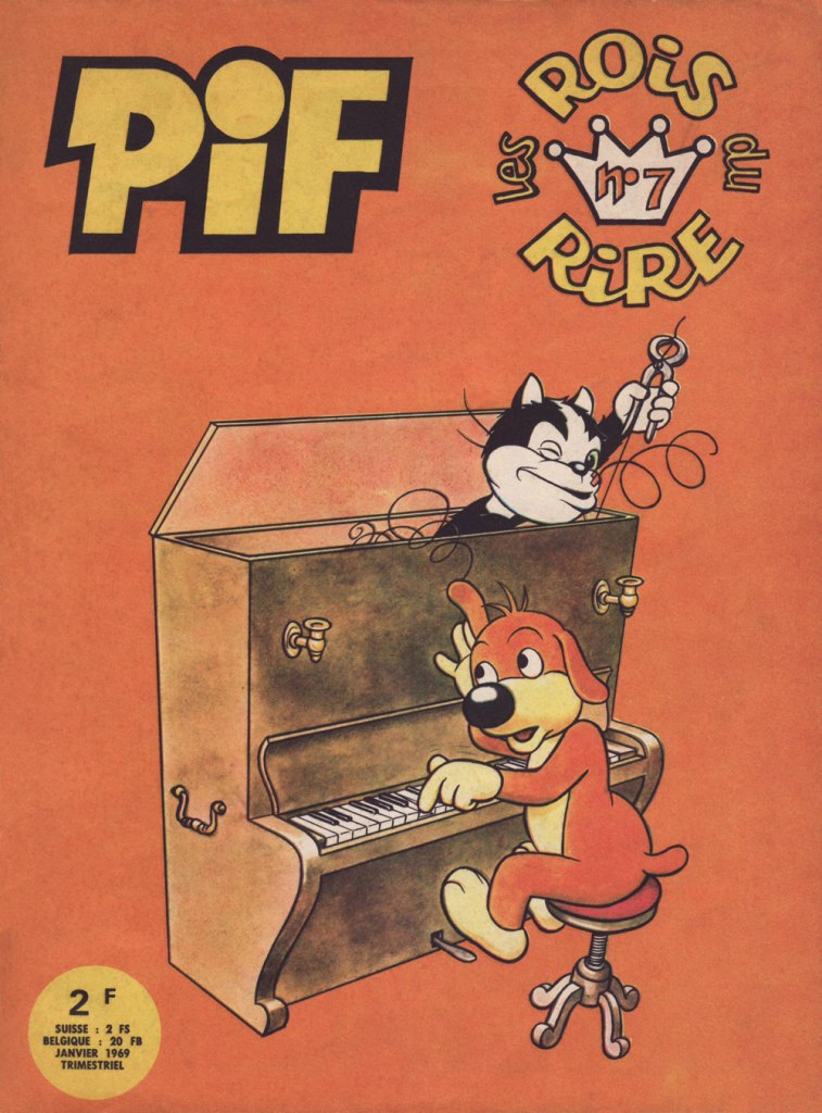
This is Les rois du rire no. 7 (Jan. 1969, Vaillant), a rotating anthology title gathering, in this case, two-pager Pif strips from the pages of Vaillant. Cover art by Pif’s creator, José Cabrero Arnal (1909-1982).
While I greatly admire and enjoy the work of Pif pater José Cabrero Arnal — and trust me, his is a story worth the telling: fought the Fascists in Spain, spent four years in a Nazi Stalag in Austria before being liberated by the Soviets, never quite recovered from the ordeal of his captivity, and remained fragile for the rest of his days. Consequently, in 1953, he handed Pif’s leash over to the truly indefatigable Roger Masmonteil (1924-2010).
Of Masmonteil (who signed R. Mas.), historian Hervé Cultru writes, in his Vaillant, 1942-1969 : La Véritable histoire d’un journal mythique (2006, Vaillant Collector):
« The problem is that, once he got his finger caught in the gears of the freelancing engine, he couldn’t just yank it out! Because giving life to the Césarin family is practically a vocation: one must provide the daily strip, six a week. Over thirty years, Masmonteil, aka Mas, crafted over eleven thousand of them. There are also the Sunday strips, the pages for Vaillant, solo Pifou stories, Léo, created for Pif Gadget. It never ceased. By his career’s end, he had racked up some 45,000 gags or so. »
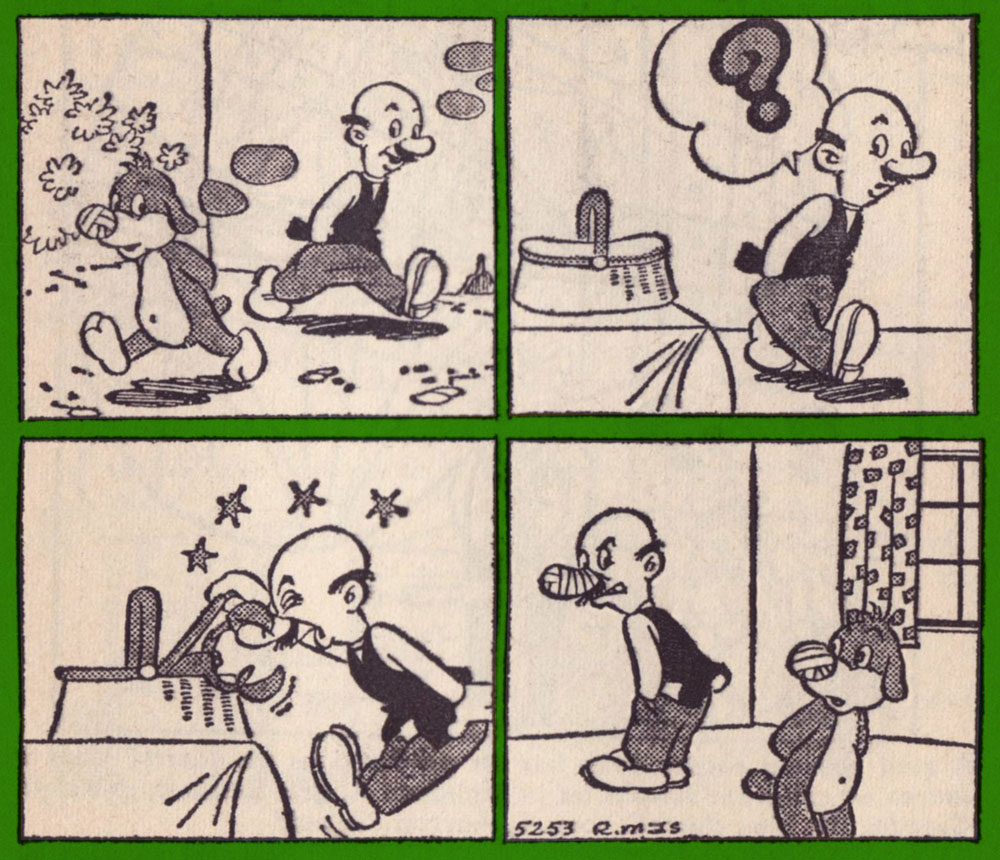
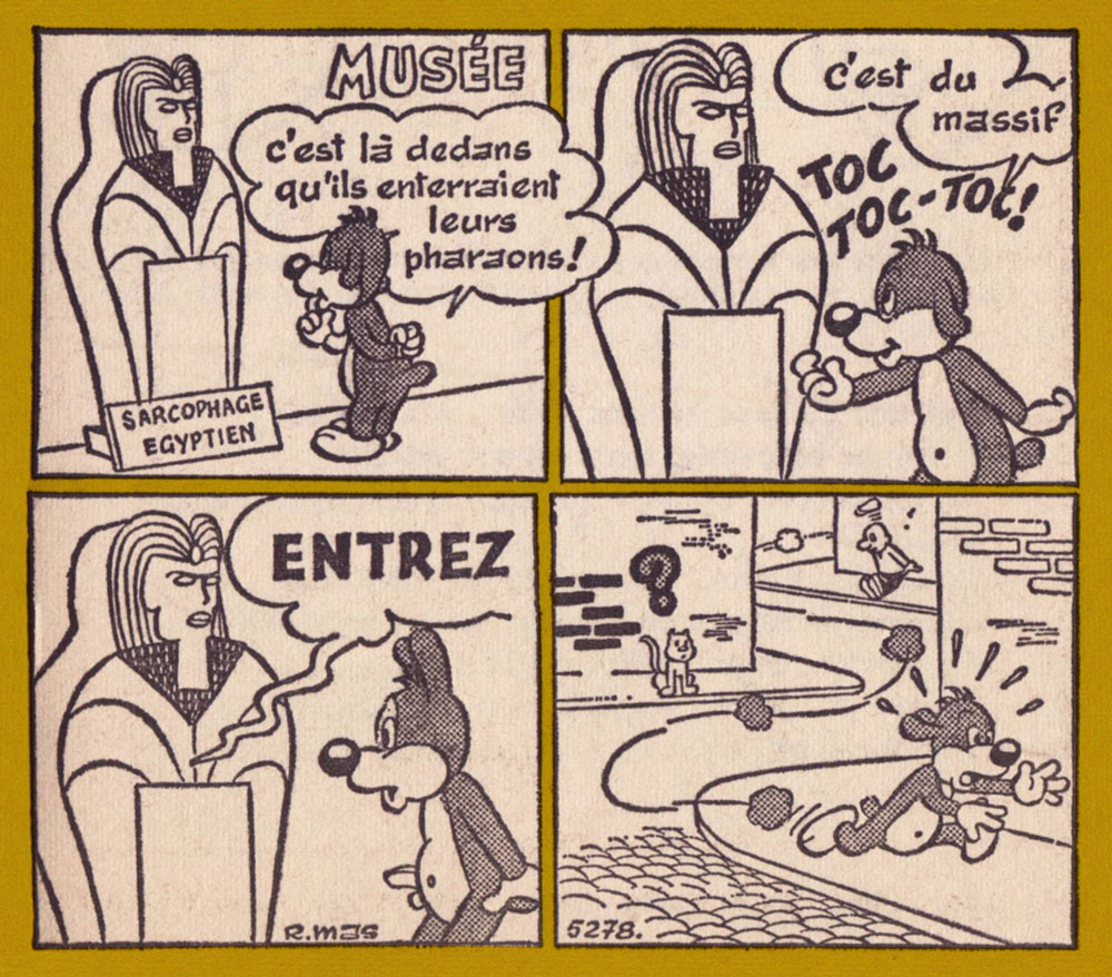
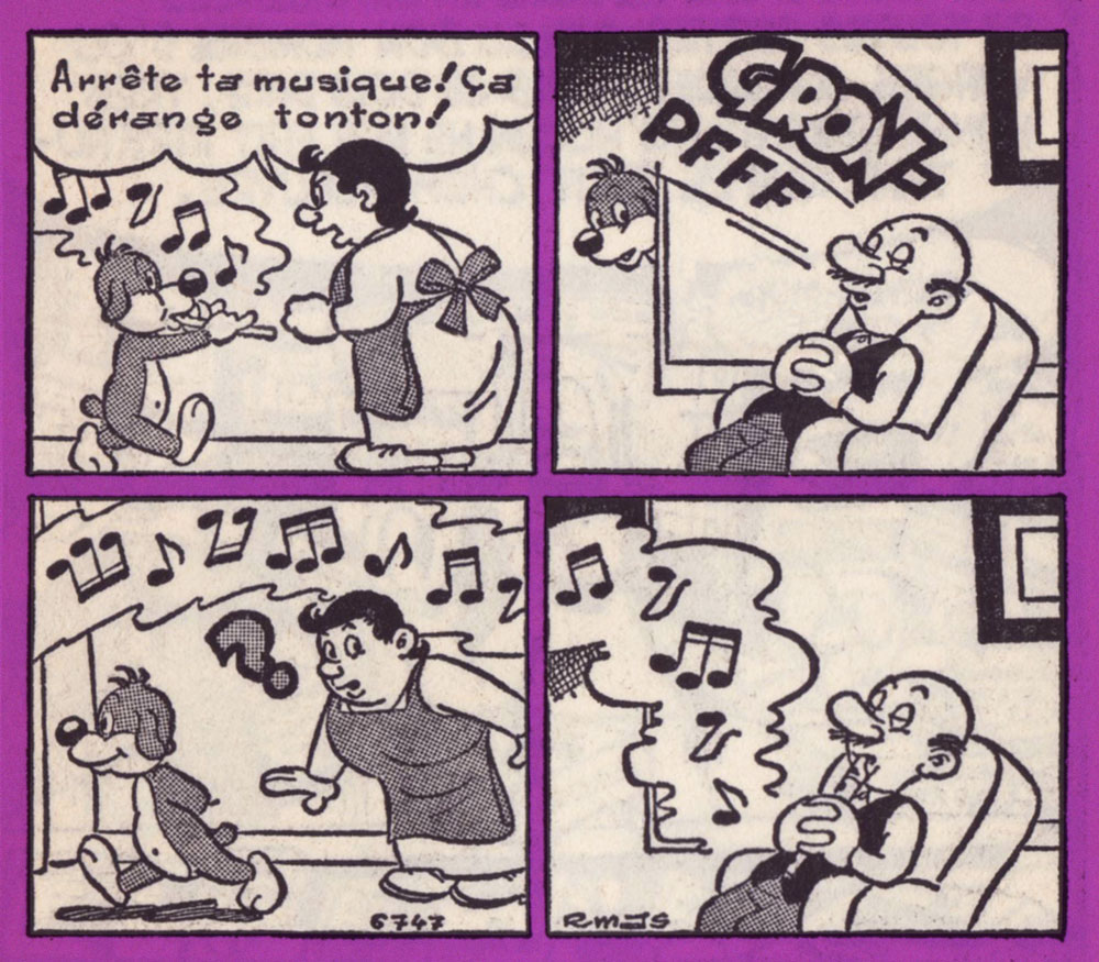
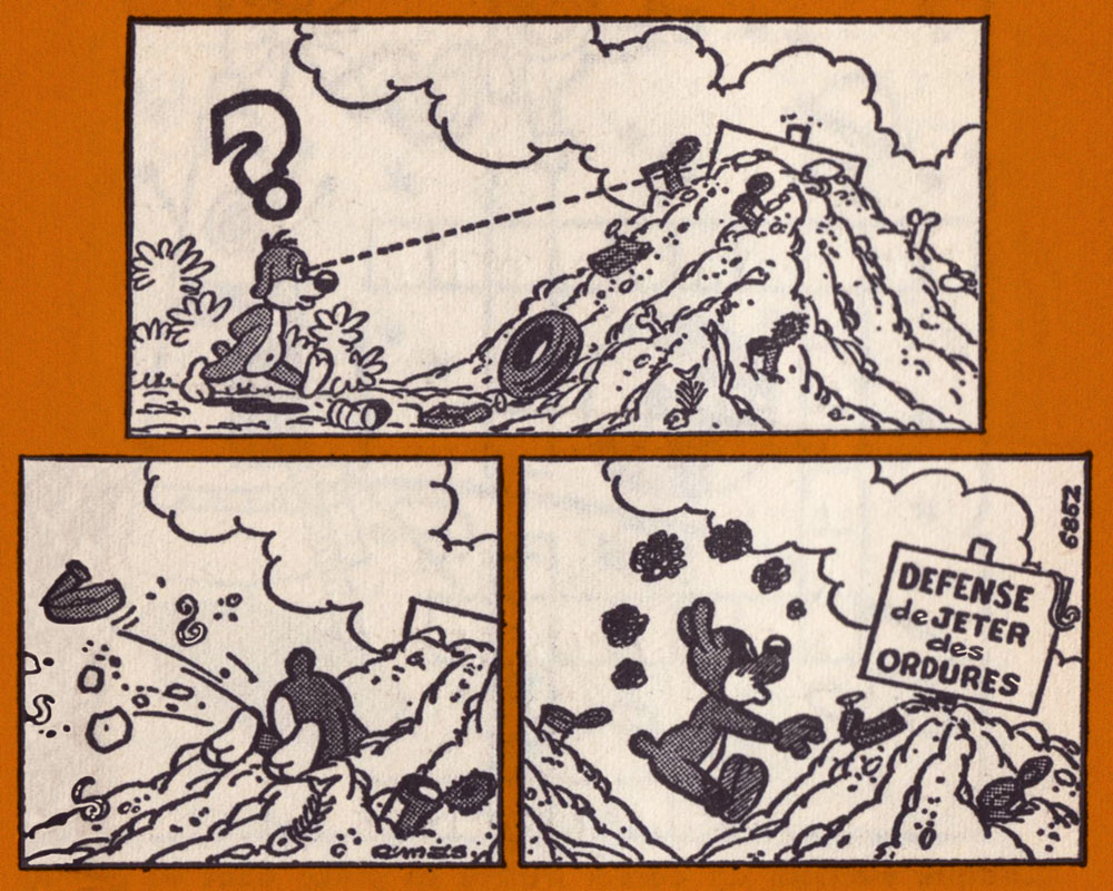
« Unlucky me, I’ve smashed the vase! » « Out of sight, out of mind! » « Bleh! What a revolting aroma! » « I’m found out! »« When the sea is too far, one makes do with a little corner of the Seine! » « I’m the back-float king ! » “Sur mer” (“On-Sea” would be the English equivalent) is a popular suffix to denote a town or resort’s coastal location. The Seine’s toxicity borders on the legendary, but things have actually improved in recent decades.I love a good pantomime gag. And every look is a sideway glance, which makes it even more special.« It’s in these things that they buried their pharaohs! » « That’s solid stuff! » « COME IN ». What most impresses me here is the final panel, with its expert use of a tiny space to convey depth, distance and setting. That’s the cartoonist’s art!« Quit your music! It bothers tonton! ».« And a-one! » « Brr! Doesn’t it cause him pain when you remove the hook? » « Not at all… it’s designed not to hurt… » « Next! » « Quiet! It’s designed not to! » Up yours, René Descartes!A slice (ouch!) of politico-historical guillotine humour.A dollop of social criticism. The sign says, naturally, « No Littering ».Pif’s archenemy, Hercule, at work. « Who’s going to get a good soaking? The Pif, that’s who! » « Failed! »
I’m inclined to admire Mas for the same reasons I hold Nancy’s Ernie Bushmiller in the highest regard: the uncanny ability to find humour in any and every place or situation, to distill and express it in a pared-down visual language made all the more potent by its universal simplicity. But it’s hard work, even if geniuses make it look easy. As Hervé Cultru explains, in Mas’ case:
« … Pif gets the last word in: at night, he haunts Mas’ dreams. The point at which he’s about to doze off is actually one of intense creativity. He constantly keeps a notepad and pencil at his bedside, to jot down ideas straight away, because if he neglects this precaution, all is forgotten by morning. »
An ad from L’Humanité, circa the late 1950s.Our cast: Tante ‘Tata’ Agathe and Oncle César ‘Tonton’ Césarin, Doudou, Pif, Hercule, and Pif’s son, Pifou. This is my copy of Album Vaillant no. 8— 4th series (comprising issues 952 to 960, August to October 1963), its rather fragile spine helpfully reinforced by a previous proprietor. I long wondered why on earth the French call wrestling ‘catch’. Turns out it’s their shorthand version of the forgotten 19th century appellation of the sport as ‘catch-as-catch-can‘.
In April 1967, Mas walks away from the Pif feature in Vaillant (four pages a week!), maintaining the daily in l’Humanité and Pifou’s solo strip. Pif returns briefly to Arnal, who still can’t handle the workload; Pif then passes into other, and decidedly far lesser hands.
Mr. Cultru, again:
« In 1968, the team takes umbrage with the repetitive and by far too ‘domestic’ character of the adventures.It feels that the working class household, typical of certain post-war values, that serves as a setting, has become obsolete, if not grotesque, and that it no longer fits the social context of the times. »
So they methodically excised everything that made Mas’ Pif special, and turned him into another Mickey Mouse, which is to say the familiar mascot or standard-bearer of a company, but one whose adventures nobody reads or truly gives a hoot about. Oh well — you still had a good run, Pif!
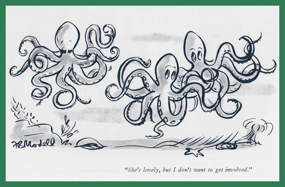
Today’s lovely crop comes to us courtesy of co-admin RG, who located these in various cartoon anthologies and scanned them. Lucky me!
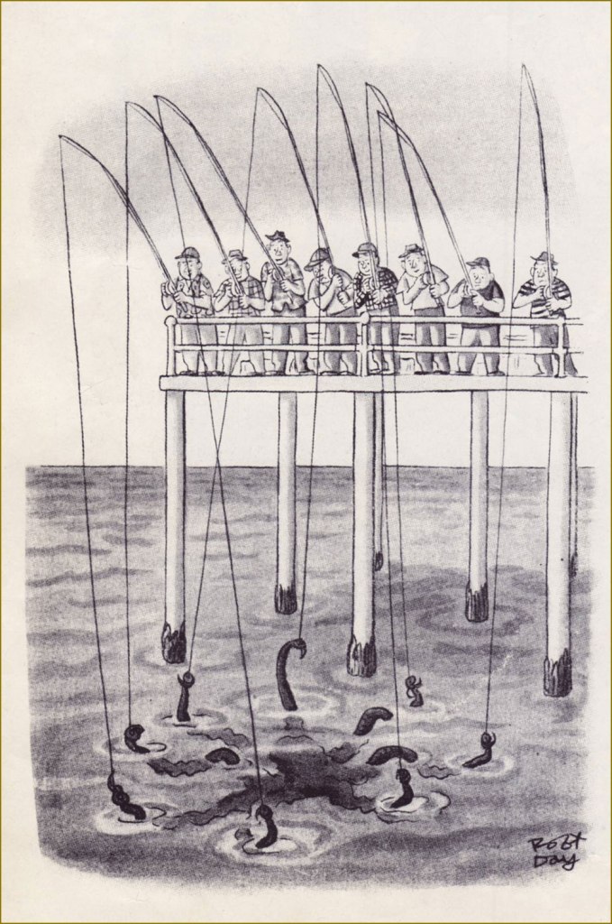
A sly cartoon by the prolific Robert Day (1900-1985), a frequent contributor to The New Yorker. That octopus will have a hefty supper!
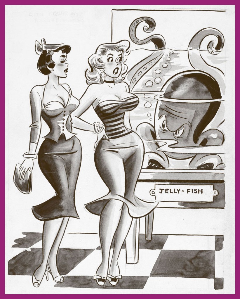
Dan DeCarlo’s pulchritudinous beauties visit the aquarium. Don’t forget to take a gander at RG’s Dan DeCarlo at Humorama (1956-63) post! Also, ‘jelly-fish’?! I am appalled. This cartoon had two captions, both equally lame – for example, ‘That reminds me, Jack is calling for me tonight…’ I don’t think DeCarlo was too interested in fleshing out the background, either.
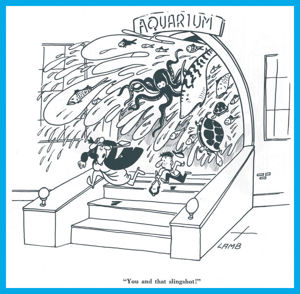
Another aquarium vignette (this time without shapely damsels, but with a turtle or two… or three..) by Clyde Lamb (1913-1966).
False eyelashes pay dividends in this cartoon by Frank Modell (1917-2016). He has contributed more than 1,400 cartoons to The New Yorker – « customarily, he said, “of angry men and sexy women and dogs”».
« Painting is the art of hollowing a surface. » — Georges Seurat
If you’ll forgive me the venial but gauche sin of quoting myself… three years ago, I posited:
« Luís Ángel Domínguez, reportedly born ninety-five years ago to the day… and still among the living… as far as we know. I like to envision him warmly surrounded by several generations of loved ones and well-wishers, an impish gleam in his eye. »
I found it sadly infuriating that such an important and accomplished artist’s latter-day whereabouts and circumstances were so shrouded in mystery… and largely, it would seem, indifference. The usual story: he didn’t really do superheroes.
Neither Lambiek nor the Grand Comics Database have anything to add on the subject, but a spot of digging turned up that he indeed was still alive until recently, though purportedly afflicted with Alzheimer’s in his waning years. Then I found what may well be his… very basic obituary, placing his date of birth exactly one month off (unsurprisingly, since accounts have long varied) and his date of death as July 1st, 2020, in Miami, FL. Unless something more definitive comes along, it’ll have to do.
I think we can all agree that ninety-six years is a pretty good run, even with the doleful decline near the end. Let’s look back on what’s surely his peak decade in comics, the 1970s. My picks have nothing to do with ‘key’ issues, character débuts or popular crossovers. I’ve judged these on artistic merit, keeping the pernicious influence of nostalgia at arm’s length.
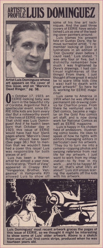
First, a little biographical background! This helpful piece appeared in the pages of Eerie no. 44 (Dec. 1972, Warren), which also boasted a Domínguez cover… albeit reproduced too small.
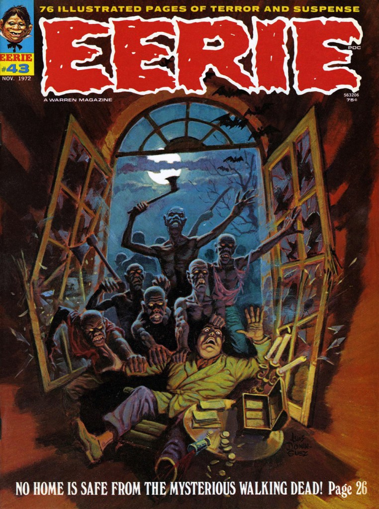
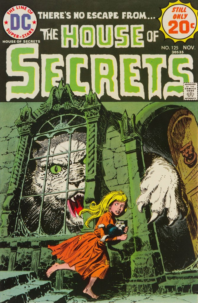
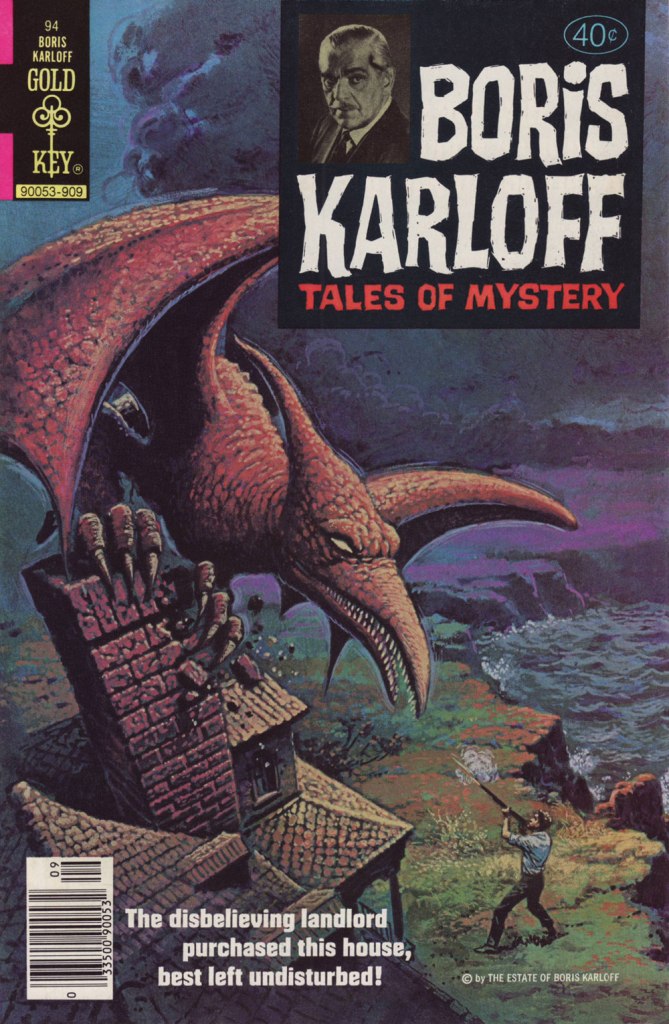
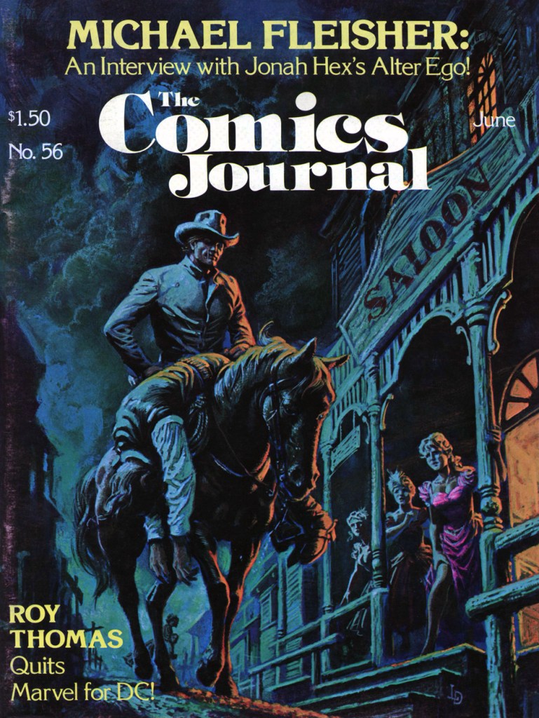
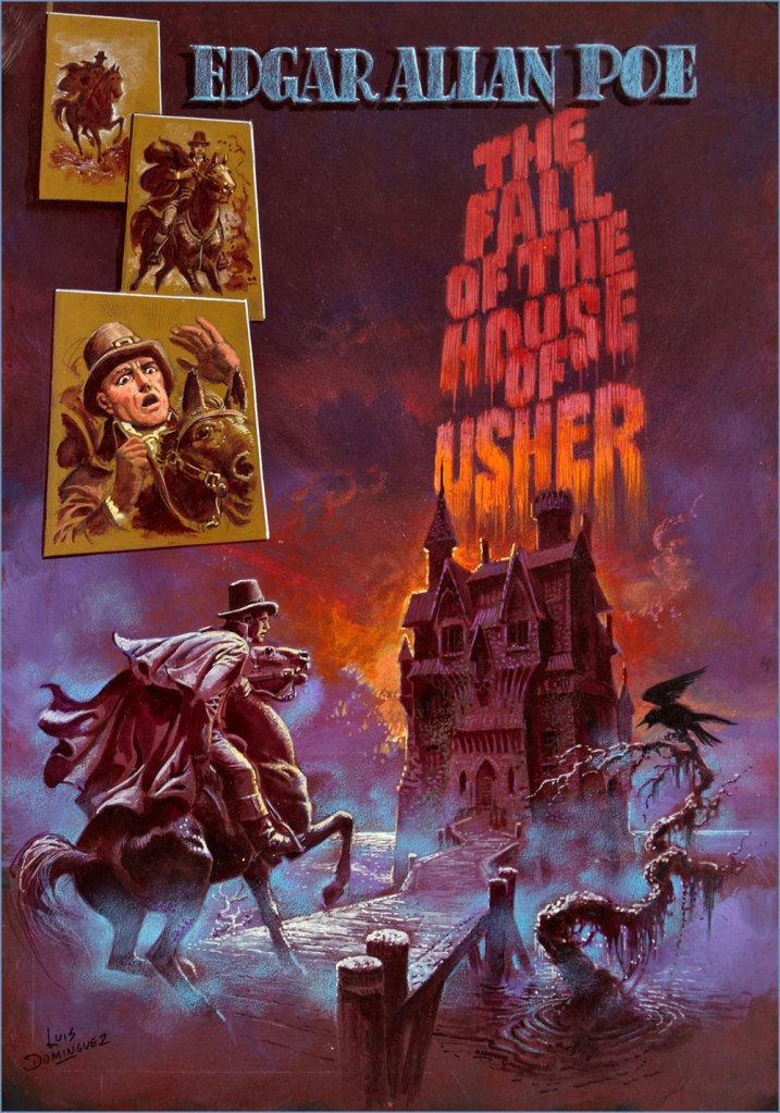
The folks at Warren were apparently first in North America to recognise and call upon señor Domínguez’s masterly painting skills. This is Famous Monsters no. 93 (Oct. 1972, Warren).My personal favourite of his too-few Warren covers, this is Eerie no. 43 (Nov. 1972, Warren).While Luís had been steadily working on the insides of Gold Key comics since 1967, it wasn’t until 1974 that they gave him a crack at a cover. That was either this one, Space Family Robinson no. 40, or Boris Karloff Tales of Mystery no. 55, both cover-dated July, 1974… (incidentally, the GCD misattributes to him several of his colleague George Wilson‘s paintings).DC hardly ever used painted covers, but they did keep Domínguez busy as a cover artist. I assure you, this ambitiously-muted cover must have been a printer’s nightmare. This is The Phantom Stranger no. 32 (Sept. 1974, DC), a great issue that features Arnold Drake and (returning to the Stranger after a 27-issue absence!) Bill Draut‘s It Takes a Witch! and a gorgeous Michael Fleisher–Nestor RedondoBlack Orchid backup.This is House of Secrets no. 125 (Nov. 1974, DC). For once, Domínguez also illustrates the cover-featured story, E. Nelson Bridwell‘s Catch as Cats Can!Then of course, Marvel soon after got in on the act. This is Dracula Lives no. 9 (Nov. 1974, Marvel). I would have picked the even better previous issue, but I’ve already featured it, so you get to enjoy both!The printed version of this piece, featured as the cover of UFO Flying Saucers no. 5 (Feb. 1975, Gold Key) pales in comparison with the surviving original art, so that was an easy choice.This issue’s original art also survived, and seeing both versions is most instructive as an insight into production manager Jack Adler’s methods. This is House of Mystery no. 235 (Sept. 1975, DC), and the original can be viewed here. As an aside, this issue’s The Spawn of the Devil, written by Maxene Fabe and drawn by Ramona Fradon, is the only DC horror story I ever found scary. Perhaps editor Joe Orlando should have hired women more often!Another one whose printed version fails on the reproduction front, this is Mighty Samson no. 31 (Mar. 1976, Gold Key), the title’s final issue. Let’s again rejoice at the original art’s survival!This is Boris Karloff Tales of Mystery no. 94 (Sept. 1979, Gold Key); I hold that Dominguez’ three finest consecutive covers came near the end of Gold Key’s Karloff anthology and, wouldn’t you know it? … we have already featured the other two. You’ll find issue 92 here, and issue 93 (and its original art) in one of ds’ posts, which also showcases another top-flight contender, which I couldn’t use for reason of… tentacles, Dagar the Invincible no. 11. This is The Comics Journal no. 56 (Fantagraphics, May 1980). According to masthead notes, « Luís Dominguez’s painting was originally scheduled for the fourth issue of DC’s Digest Comic, “Jonah Hex and Other Western Tales“, but the title was cancelled with no. 3. » The magazine’s larger size certainly affords us a better view of this richly detailed scene.And as bonus, this mysterious, undated, possibly unpublished cover painting to Edgar Allan Poe‘s famous tale. Acrylic on board, 36 x 50 cm (14″ x 20″). The corners confirm that Domínguez worked from dark to light (which largely accounts for his marvellously luminous colours) and faint lines (on this and other works) indicate that he used a grid to scale up his preliminary sketches accurately.
For more Domínguez delights, just click on this link and explore away! I daresay that I only managed to keep it to an even dozen (difficult!) choices because we’ve already spotlighted many of his finest covers.
Today we play a game: yes, those long slithery things are wrapped around somebody’s ankle… but are they tentacles, or worms?
In real life, worms (even predatory) don’t really wind around their prey or suffocate them. A biologist could tell us whether they ever ‘hunt’ in huge numbers, but I think we can be fairly certain that the scenes depicted below have never happened in real life. If disbelief must be suspended, I’d rather string it up for a cephalopod invasion, rather than a worm onslaught (ick)… But the characters of this post have had to deal with both kinds of threat. Let’s get on to it!
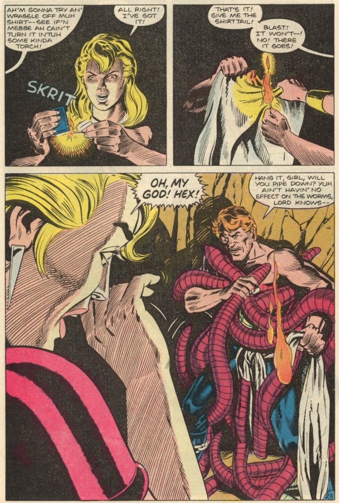
Worm or tentacle? Well, these have eyes at the end of… of whatever it is… and they seem like individuals, so probably worm. Hey, those who have read this issue before, no spoilers, please!
The Saga of Swamp Thing no. 6 (October 1982, DC). Cover by Tom Yeates.
Let take a look inside this issue…
Page from Sins on the Water, scripted by Martin Pasko, pencilled by Tom Yeates and inked Tom Yeates.
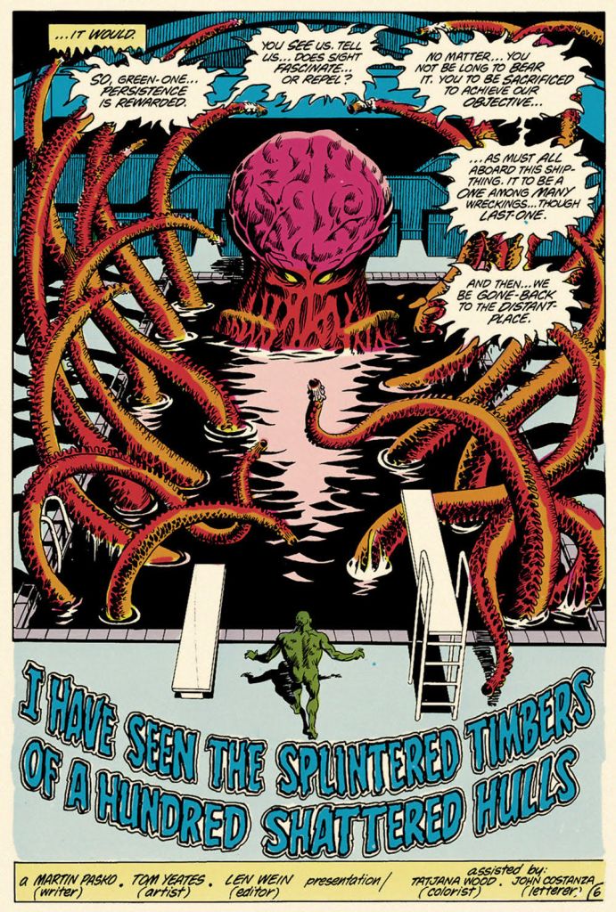
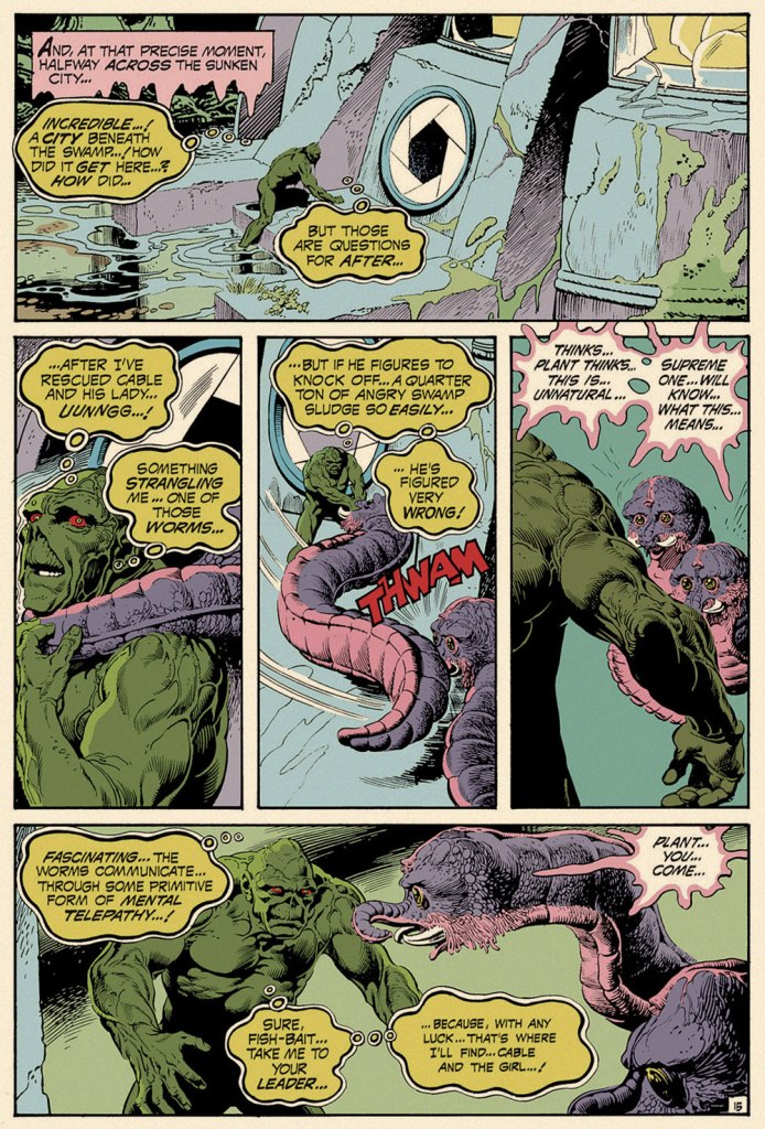
What do you think? These seem to originate from the same source. Let’s peek at the next issue – cephalopod confirmed!
Page from I Have Seen the Splintered Timbers of a Hundred Shattered Hulls, scripted by Martin Pasko and pencilled by Tom Yeates. This story was published in The Saga of Swamp Thing no. 7 (November 1982, DC).
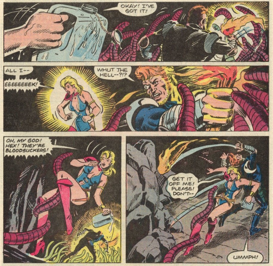
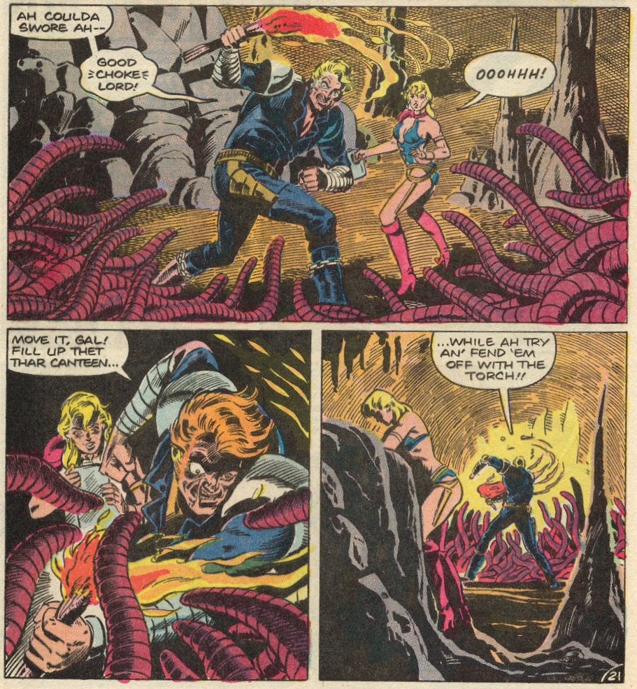
Moving on to our next puzzle! Those are surely tentacles, belonging to some cephalopod monstrosity with a thousand arms:
Moving on! With a texture distinctly reminiscent of some sort of slug, the following whatchamacallits could be either… but the planet that hungers is using its tentacles, and not worms, to feed. Ping! Correct. This makes the following scene no less disquieting – oh, somebody bring me back to the normal, sea-faring octopus…
This is Battlestar Galactica no. 10 (December 1979, Marvel). Cover pencilled by Pat Broderick and inked by Terry Austin.
Let’s have one last go. This cover so clearly depicts Abby getting grabbed by some underwater tentacled monster, that it regularly appears in tentacle-related searches…
Swamp Thing no. 11 (July-August 1974, DC). Cover by Luis Dominguez (speaking of whom, co-admin RG has a treat for you later this week!)
And yet! The cover is the self-explanatory The Conqueror Worms!, scripted by Len Wein and illustrated by Nestor Redondo. The star creatures of this story are actually pretty adorable, especially their mini-trunks and moist, sensitive eyes:
When somebody killed one of those things, I was seriously peeved.
I hope some of these examples gave you pause, even if for just a little bit!