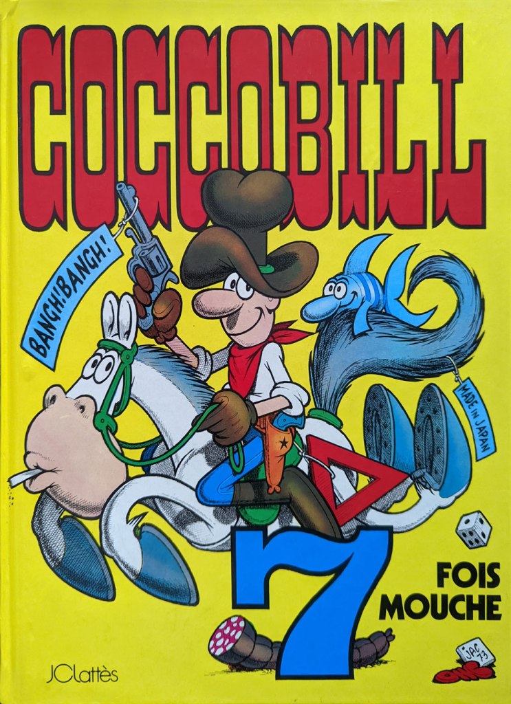
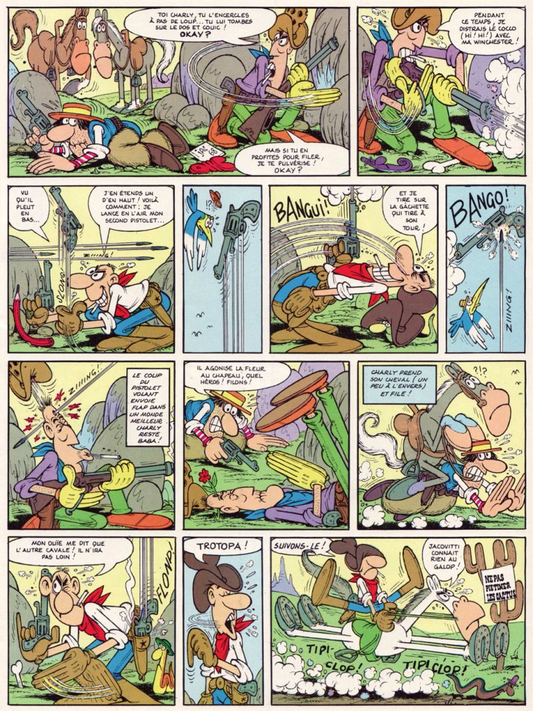
This is 7 fois mouche (1975, JC Lattès, France), originally serialised in Corriere dei Piccoli as “Cocco Bill fa sette più”, 1968-69. In Italy, it was actually number twenty in the series.
With Wolverton, Jacovitti (1923 – 1997) shares an animist sort of predilection for cramming every square centimetre of the panel with absurdist details, facetious sound effects, recurring motifs and symbols and, naturally, gags. It’s a most noble cartooning tradition that runs the course of the medium’s history, from Bill Holman through Kurtzman and Will Elder (chicken fat!) and merrily endures to this day in Dan Piraro and Wayno‘s oft-sublime Bizarro.
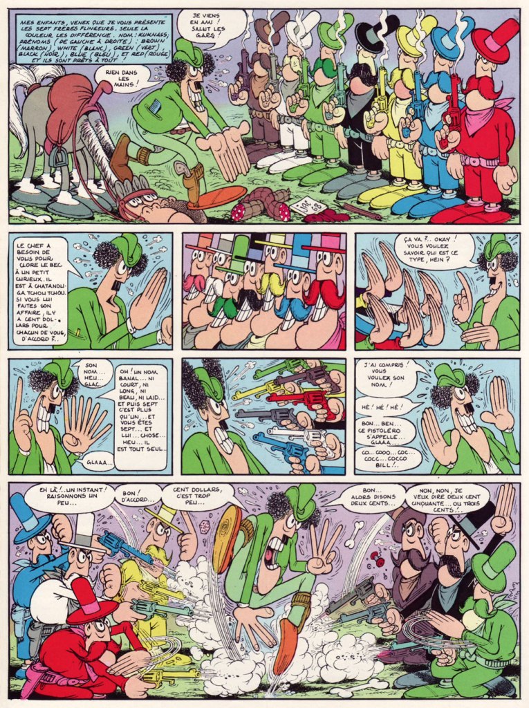
Here’s a two-page ambush sequence that gives you a sense of how handy — and deadly — our protagonist is with a pair of irons.
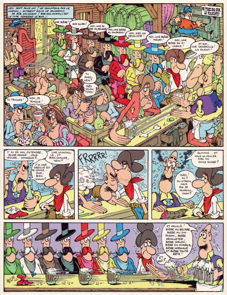
The sign says: “Do not trample the cacti“. The surviving bushwacker is put out of his misery by the gang’s second-in-command, the Chaplinesque Kruel; you know he’s a villain of substance because he rides a double horse. Pray note the lovely SALOOOOOOOOOOOOOOOOOOON sign with its behatted snake carvings.Meet hired guns the Kuknass Brothers: Brown, White, Green, Black, Yellow, Blue and Red, of course. Like the idea, Quentin? Note the extra digits (the better to count with, panel five). It’s easy to imagine Jacovitti having some influence on Mad’s Don Martin… In the manner of many a pure-hearted cowboy, Cocco Bill’s brew of choice is alcohol-free; his poison is chamomile tea, a drink with numerous health benefits! With sugar and lemon, but hold the paprika, thank you! Note: Don’t Shoot the Piano Player!This is Sur les rails (1975, JC Lattès, France), originally serialised in Corriere dei Piccoli as “Cocco Bill sulle rotaie”, 1969. In Italy, it was number twenty-one in the series.The train meets the stagecoach, and how! A page from Sur les rails.
Last month, my co-admin ds reported, in the course of her spotlight on Massimo Mattioli, that Jacovitti is said to be the Italian cartoonist best known internationally. I have no idea how such popularity is measured, but I do enjoy the idea of a palmarès headed by cartoonists I love, for once. I do, however, suspect that the global reach of animation frequently contributes more to a cartoonist’s name recognition than does his printed work (think Guillermo Mordillo). Case in point: while Cocco Bill strips have been translated and reprinted in several countries, these efforts have been, more often than not, patchy and sporadic. On the other hand, the Cocco Bill TV series (2000-04) ran a healthy 104 episodes. And it looks great, which didn’t hurt. Check out the pilot episode, ‘Cocco Augh‘. For a creator, it’s assuredly a classier calling card than a bunch of sordid sex ‘comedies’.
I’d like to dedicate this post to the fond memory of a departed cartooning colleague, Patrick ‘Henriette Valium’ Henley (1959-2021), since Cocco Bill was, I’ve heard tell, his favourite bédé.
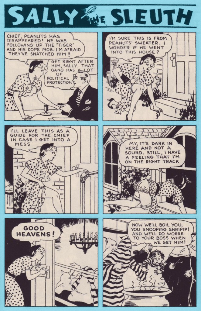
She’s audacious, savvy, and she’s always cheerful. Here she is, the infamous Sally the Sleuth by Adolphe Barreaux*. First things first, to give us a timeframe: this strip was published in “pulp” magazine Spicy Detective Stories between 1934 and 1943, then moved to Speed Detective Stories in a new format** until 1950 then, finally, to Crime Smashers until the comic’s demise in 1953.
Sally the Sleuth features a tightrope act that’s not that easily achieved: fearless, self-sufficient Sally is so adept at spotting (and landing into the middle of) trouble that she frequently requires outside help to be rescued in the nick of time, with the role of the rescuer oft being played by her boss, the Chief, who usually bursts in through the door. What’s interesting is the way this rather typical damsel-in-distress set-up does not take anything away from our sense of Sally as a take-charge, go-getting kind of gal. She does not hesitate to bat her eyelashes or flash a gam when needed, but she’s neither the usual femme fatale archetype that appeared so often in contemporary comics, nor the innocent-yet-gorgeous victim. When captured, she spits (sometimes literally) in the face of her would-be killers; when she gets rescued, it was because she left instructions with Peanuts, her kid assistant, or schemed to leave the Chief enough clues to locate her if she hit a bad patch.
Strategic panty drop! Page two from “Tourist Trade” (June 1938, Spicy Detective Stories).
It may surprise a modern reader that an American comic from the mid-thirties (1935! consider this number again if it hasn’t sunk in yet!) should be so casual about a topless female when present-day consumers of culture freak out at the very sight of a nipple (and that goes for male nipples as well). Of course pulp magazines and comics weren’t read by staunch defenders of High Morals and Propriety, but it was nevertheless a hugely popular medium, and Spicy Detective Stories, where Sally got her débutante ball, certainly abounded in unclad women in tales of booze, butchery and concupiscence.
The cover of Spicy Detective Stories no. 4 (June 1935), in which The Tiger’s Lair (see below) appeared.
Which brings me to my next point: tension created by the play between the predictable and the unforeseen. Sally always, always ends up in a state of advanced déshabillé. That is an enjoyable given. Much like panties drop to the floor if a woman should be carrying celery, Sally’s dress and underwear fly off at the gentlest of tugs. However, just how it is accomplished varies wildly from week to week. One wouldn’t think that were so many interesting ways of getting accidentally undressed. And these stories are harsh, no doubt about it: scenes of torture and murder vary from the comparatively sedate (getting whipped, slapped, shot) to sensationalist (death by venomous snake or spider) to viscerally uncomfortable (cannibalism with more than a dash of necrophilia, being boiled alive, impalement).
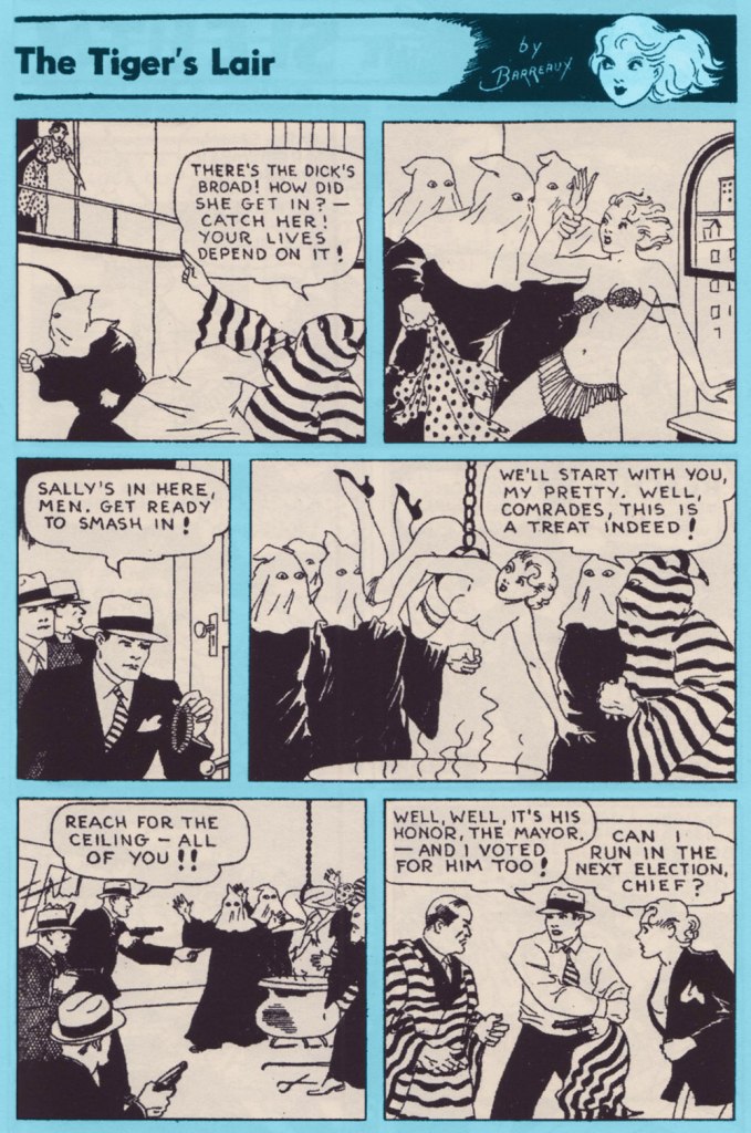
The complete “The Tiger’s Lair” (June 1935, Spicy Detective Stories).
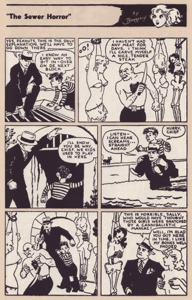
Sally’s stoicism as she’s about to be carved up is nothing short of miraculous. Page two from “The Sewer Horror” (December 1937, Spicy Detective Stories).
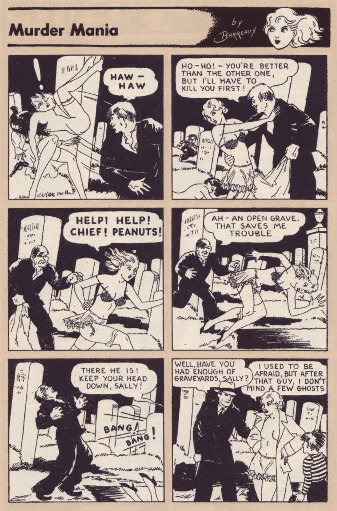
Page two from “Murder Mania” (April 1935, Spicy Detective Stories).
Page two from “The Missing-Models Mystery” (April 1937, Saucy Detective Stories).
Though of course it’s the nudity is sexualised, I love the ease with which Sally does it, completely unperturbed by having a bare chest whether she’s surrounded by hoodlums, talking to her boss, or racing through a crowded hotel. There’s a certain innocence in it, as if we were watching a frolicking Dedini nymph. Despite being so frequently assaulted, she does not at all come off as a victim.
Some top-rate lassoing from Peanuts! They’re trying to make it look like a suicide, but I’m not sure why a woman would want to jump off a roof naked. Page two from “Love Nest Loot” (September 1935, Spicy Detective Stories).
Earlier-day Sally (1934-1943) is supposedly ‘ditzy and naive’ (source), but I think one should not mistake cheerfulness or pragmatism for naïveté. She navigates the seedy parts of town with aplomb and talent, efficiently following clues, taking on many roles to infiltrate criminal organisations or simply glean information. Sally may have to rely on the Chief to extricate her from yet another predicament, but he is a sort of handsome stock figure with little personality, mostly sitting around his office and agreeing when Sally says ‘I should investigate this!’
Page two from “Coke for Co-eds” (January 1938, Spicy Detective Stories).
Sally also doesn’t judge other women; her moral compass is firmly pointed to bringing all manner of crooks to justice, but she’s a no-nonsense kind of girl when it comes to standards of female behaviour. Page two from “Sin Ship” (October 1936, Spicy Detective Stories).
Page one from “Toy of Fate” (January 1937, Spicy Detective Stories).
Sally the Sleuth has historical importance, if only for the panel borrowed by Frederic Wertham for his Seduction of the Innocent report from a Sally the Sleuth: Death Bait (1950) story. In the wonderfully written introduction to the Sally the Sleuth Collection, comics historian Tim Hanley goes a step further, saying “without Sally the Sleuth, there would be no Superman. Without the pulp heroine with a penchant for solving crimes in a state of undress, there would be no Batman either.” It can be (and has been) argued that he is giving this strip too much credit***, but there will be no argument that Sally is an important figure. Because I’m a philistine, what’s most important to me… is that it’s a great read.
~ ds
* As far as Barreaux, born Adolphus Barreaux Gripon, is concerned, there are much better places to read about his biography than on this blog, mostly due to the fact that biographies kind of bore me. I specifically direct you here for a detailed biography, and here for more information about Barreaux’ mixed heritage and the variety of genres he illustrated.
** This post only includes strips from the earlier, 1934-1943 version, because I by far prefer it to what came later, although I may be in the minority. The art got arguably better once Sally moved to Speed Detective stories, and stories also got longer, allowing for more elaborate plots. However, Sally was now some sort of international spy, travelling to ‘exotic’ countries and having to contend with native Hula dancers, superstitious savages in Indian jungles, Nazis, Japanese master-minds, and so on. She got disrobed less frequently, but the charming innocence of the strip, despite its violence and simple but effective art, is what makes Sally so appealing to me.
*** Hanley has been clearly reproached for this by some readers, and so elaborated on his blog:
My introduction begins with the grandiose claim that there would be no Superman without Sally the Sleuth, but it’s true. Long before Harry Donenfeld launched DC Comics, he was a publisher of pulp magazines that featured lurid crime stories. Sex was a major focus, and the dirty stories were a popular product. In 1934, Adolphe Barreaux convinced Donenfeld to expand outside of prose and add some comics to his books, and the “Sally the Sleuth” strip in Spicy Detective was their first attempt. It proved popular and more followed. Eventually, Donenfeld got into the comics game full time in the late 1930s, first with Detective Comics and later with Action Comics. Once Superman and Batman took off with young readers, more series followed and the comic book business became Donenfeld’s priority. But it all started with Sally.
« From the body of one guilty deed a thousand ghostly fears and haunting thoughts proceed. » — William Wordsworth
Today’s selection is an early, early favourite of mine. I first encountered it in French, in the pages of Capitaine America no. 8 (Aug. 1971, Les Éditions Héritage); back in those days, Québécois printer-packager Payette & Simms would reprint, in black and white, recent Marvel comics in their ‘Format Double’ package, a terrific deal at 25 cents: you got two issues’ worth, no ads, plus a bonus short story. P&S’ paper stock and printing were better than Marvel’s — but their lettering and translation work generally left much to be desired*.
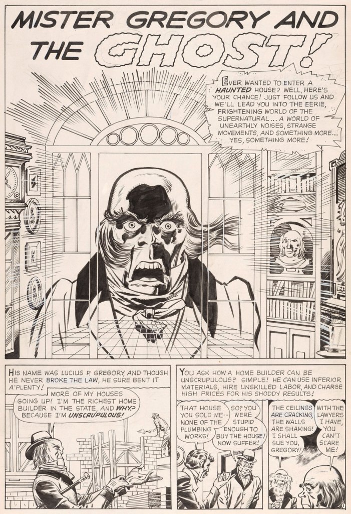
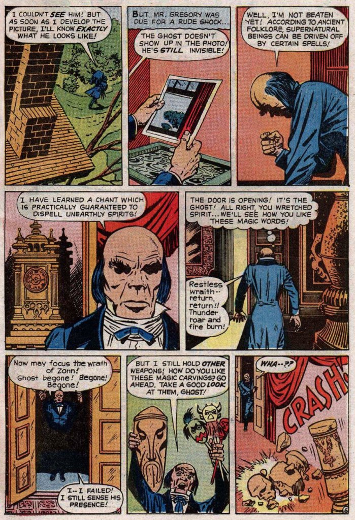
In this case, despite the allure of the slickly sumptuous Gene Colan / Joe Sinnott artwork, the issue’s out-of-nowhere high point was (you guessed it!) a modest little story plucked from the predawn of the so-called ‘Marvel Age’, Mister Gregory and the Ghost!, from a pre-Thor issue of Journey Into Mystery (no. 75, Dec. 1961). Many may disagree with me on this one, but boy, those post-Kirby issues of Cap’n ‘merica just serve to demonstrate what happens without a perpetual motion plot engine like Jack Kirby to propel and guide the series: when you try to introduce new foils for the hero, you get bonehead non-ideas like biker gangs, a jealous scientist in the body of a gorilla, or in issue 123’s Suprema, the Deadliest of the Species!, a brother-and-sister hypnosis act who drive around a gadget-filled tanker truck that magnifies Suprema’s power by way of a *very* 70’s medallion her brother wears around his neck. Then Cap feels its vibrations (“Ping!”) through his shield, and … oh, I won’t spoil the thing’s idiotic charms any further for you: read it here.
This is Journey into Mystery no. 75 (Dec. 1961, Marvel); pencils by Jack Kirby, inks by Dick Ayers, colours by Stan Goldberg.
Ahem — back to Mister G and his Ghost. It’s not exactly a masterpiece of writing either (Larry Lieber?), but it presents Kirby at his moody, understated best. Upon seeing it in colour, I realised how providential my monochromatic encounter had been. While the story’s been reprinted a few times (in 1966, 1971, and in 2020 in a fancy and pricey hardcover omnibus), the printing’s always been pretty shoddy. As you’ll see.
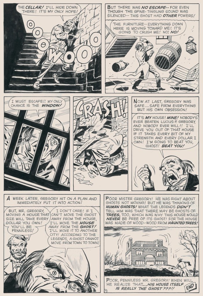
But… it seems that most, if not all of the original art survives, so we’ll make the most of the situation and mix our sources as needed — hope the effect isn’t too jarring!
I find Kirby’s layout for this page to be especially ingenious and interesting.I’ve used the recoloured reprint from Fear no. 4 (July, 1971, Marvel), which was an improvement over JIM75’s, albeit a slight one.
-RG
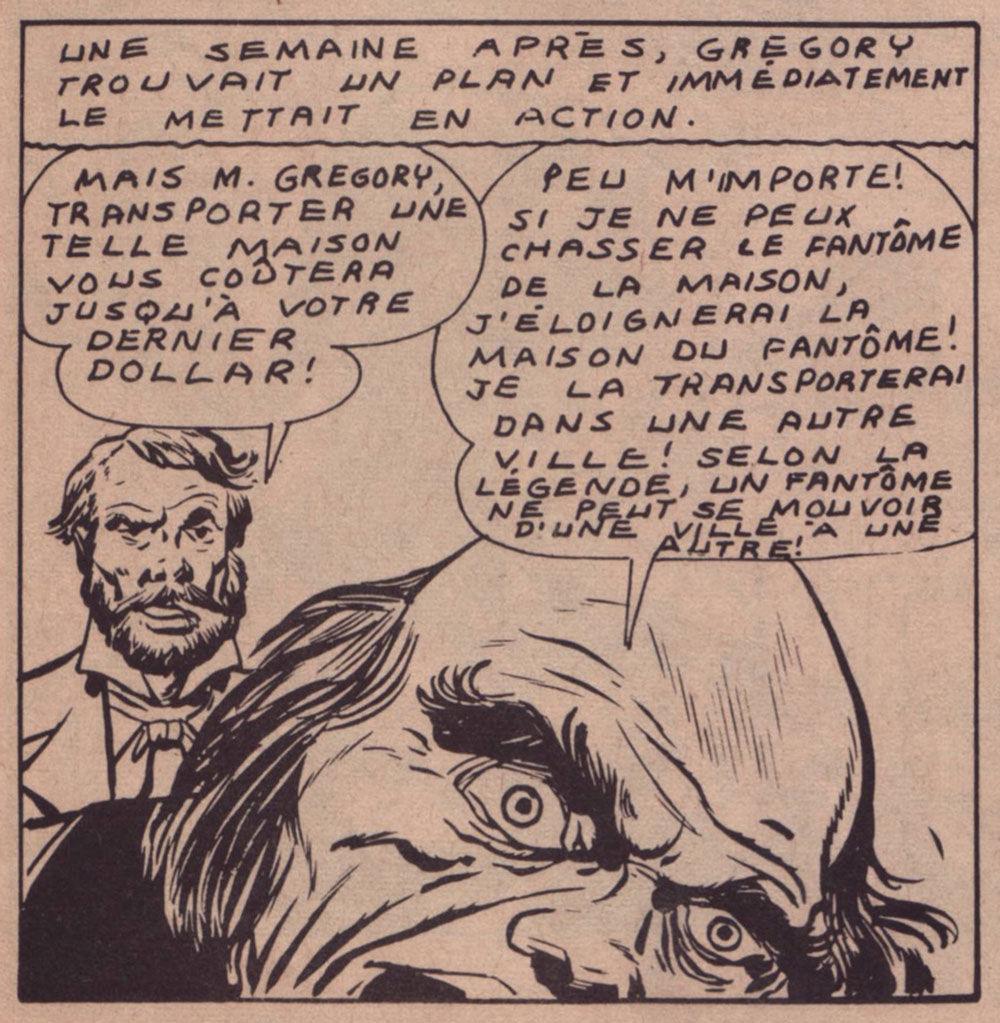
*here’s an example of Éditions Héritage’s lovely calligraphy, from this very story:
I admit it’s rare for me to discover a new present-day cartoonist I really like, so I was quite thrilled to stumble upon Ben Sears and the adventures of friendly robot Hank and goggles-sporting Plus Man. Sears’ style reminds me of claymation (one of my soft spots), and he is not afraid of bright colours or playfulness – such a contrast to the many ‘serious’, sepia-coloured comics that are just dull as dishwater (although apparently the latter is now an in-demand hair colour).
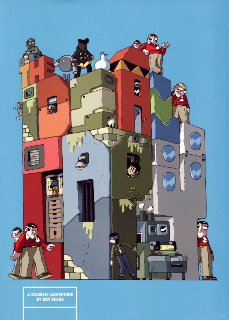
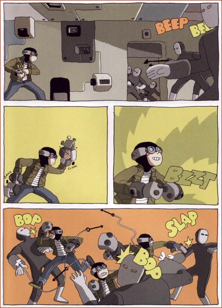
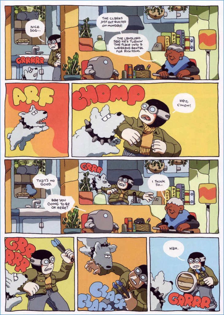
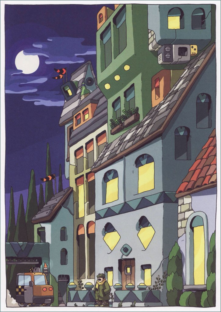
The four ‘A Double Adventure +’ comics Sears has given us so far (Night Air, 2016; Volcano Trash, 2017; The Ideal Copy, 2018; and House of the Black Spot, 2019), published by Koyama Press*, brim with interesting details – plants are everywhere, rooms are full of intriguing trinkets, and cats are perched on counters and rooftops. This is a world not devoid of danger (Hank and Plus Man keep getting pulled into murder mysteries, ominous conspiracies, hive-mind henchmen skirmishes, etc.), but there’s also an appealing domesticity about it, as we often get to visit their apartment or tag along as they hang out in a friends’ kitchen. The fight scenes are viscerally satisfying (who doesn’t want to see bad guys’ asses kicked in a most expedient manner?), but there is also clever team work, friendship, and occasionally a moral dilemma or two. My favourite of the four is House of the Black Spot, so things are clearly going in the right direction!
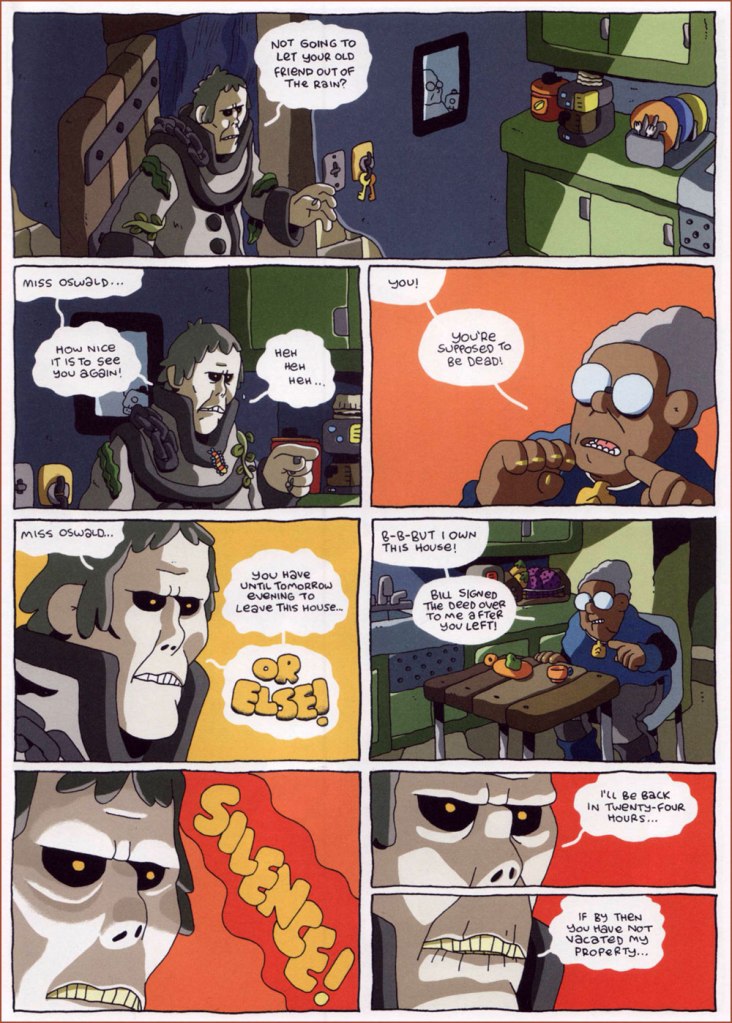
The Ideal Copy features a villainous gaggle of creepy white men, all eerily dressed in the same red sweater + beige pants-pulled-up-to-armpits** uniform:
The nasties have convenient number badges pinned to their sweaters (perhaps they also get confused).
Volcano Trash features some enjoyably fast-paced fight/daring escape scenes, but I think its heart lies in its quietly emotional sequences. Sears’ dialogue is perfectly functional, sometimes even fun, but he doesn’t over-clutter his pages with words, excelling at mute scenes in which body language says a’plenty. When looking through his website recently, I was happy to discover he has a few pantomine self-published comics (featuring a trash cleanup robot, a cat and a bird!) I’d never heard of. You can order them here.
A discussion about friendship mostly takes place through sighs and gestures – not much needs to be said in words.
Finally, here are some excerpts (or extracts, as the Brits would say) from House of the Black Spot, the lushest, latest installment of Hank & Plus Man’s adventures:
You can read an (otherwise unpublished, as far as I know) Double+ Adventurehere.
I keep reading reviews in which comparisons are made between Sears’ work and Hergé’s Tintin, which supposed resemblance I admit I don’t see at all. On the other hand, I’ve never read a full Tintin album, and to be perfectly honest have no intention of ever undertaking such a tedious task.
~ ds
* Toronto-based Koyama Press shut down its operations in 2021, so Ben Sears’ new book, Young Shadow, was published by Fantagraphics. I haven’t read it yet, but am looking forward to it, once I get my hands on a copy! You can read a review of it over at The Comics Journal.
** The question of why older men tend to wear their pants somewhere below their armpits still baffles me. Hypotheses have been made to the effect of beer-bellied folks having to decide whether the pant waistline lies above a bulging stomach or under it, and opting for the former option, but I have seen plenty of instances of pants being pulled up when the wearer had a relatively flat stomach…
« A black cat crossing in front of a person signifies that the animal is going somewhere. » — Jack Oakie
Oftentimes, tackling such a milestone as Bill Holman‘s Smokey Stover (1935-1972) comic strip is simply too daunting a task. Judging from the evidence (and evidence of absence), I’m not alone in being so cowed: despite the feature’s undeniable and pivotal importance, there hasn’t been a reprint collection solely devoted to it* since 1985, when San Diego Comic-Con founder Shel Dorf and Blackthorne Publishing issued a humble volume in their Comic-Strip Preserves series. Humble it was, but packed to the rafters with Holman’s delightfully surreal wit and screwball genius. A mere 72 pages in the comic book format, but hours of reading, thanks to the astounding density of their contents.
If one were to take Wikipedia at its word, one might loudly rejoice at Hermes Press’ 2012 release of Smokey Stover and Spooky the Cat: The Collected Sundays. But, as an Amazon reviewer archly quipped, circa 2017, « It’s difficult to write a review when the book has not been published. » The ensuing five years have not improved the panorama one bit.
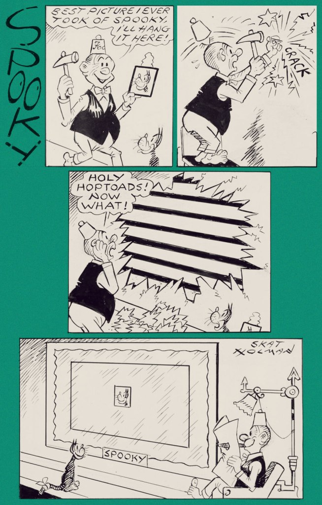
Well, I’m not going to explore Smokey Stover on this occasion… but will instead sneak a squint at its equally delightful ‘topper‘, Spooky the Cat. Since you rightly might ask:
« A topper in comic strip parlance is a small secondary strip seen along with a larger Sunday strip. In the 1920s and 1930s, leading cartoonists were given full pages in the Sunday comics sections, allowing them to add smaller strips and single-panel cartoons to their page. »
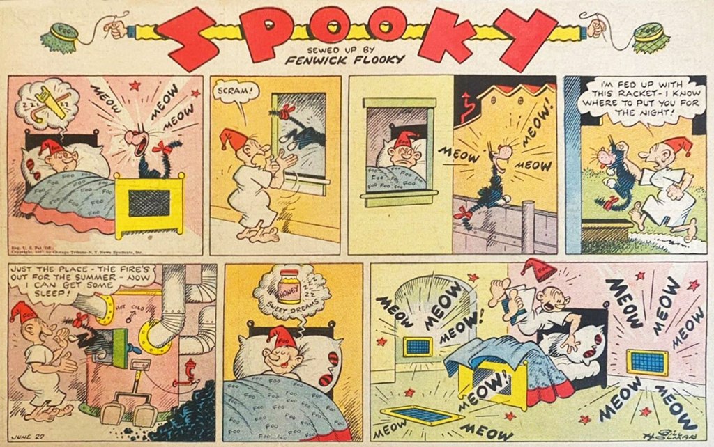
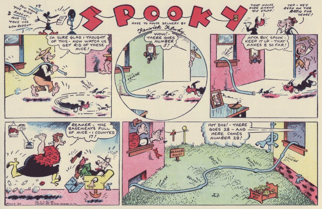
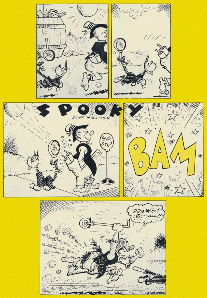
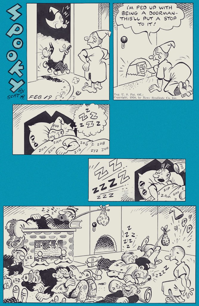
An ad from the syndicate promoting Smokey Stover (and its topper); it saw print in trade magazine Editor & Publisher’s August 21, 1937 issue.From Sunday, June 27, 1937. From Sunday, January 24, 1943. From Sunday, Fooly, er, July 20, 1941. From Sunday, July 4th (of course!), 1948. From Sunday, September 12, 1948. From Sunday, February 19, 1950. Ah, one of the classic cartooning archetypes: the hobo, complete with trusty polka-dot bindle and stick (which technically makes him a ‘bindlestiff’).From Sunday, July 6, 1952. I could swear Holman meant to call the man Prof. Larynx, but then he wasn’t what you’d call a spelling whiz. From Sunday, July 20, 1952. Incidentally, Spooky’s fez-sporting owner is Fenwick Flooky. There — now you’ve been introduced. From Sunday, July 27, 1969. Gotta love a guy who’s kind to his animal companion, not to mention resourceful in doing so.Sorry, date unknown! However, its original art was thus dedicated to a peer by the artist: “To my genius friend Alpo Q. Jaffee, fire-ever – Bill Holman ’76“.
The credibly devoted student of the comics would be ill-advised to underestimate the size of Holman’s footprint in the field: were they still around, it’s a cinch that Basil Wolverton, Jack Cole, Boody Rogers and Harvey Kurtzman would be quick to confirm Holman’s influence on their work. And that’s just some of his more-or-less contemporary peers.
Well, Kurtzman did in fact explicitly go on the record on that point, in the course of his introduction to the Blackthorne collection:
« Those outrageously outrageous and the nonsense words that appeared in no particular place for no particular reason. ‘Foo!’ ‘Notary Sojac.‘ Could it be that that’s what inspired me to ‘Potzrebie‘ and ‘furshlugginer‘? Was it Holman’s technique, those ‘tchochkas‘ in all corners of the panels? Picture portraits, with the portraits come to life, jumping out of their frames? Could that have been what inspired us to fill our MAD Magazine panels with those nonsensical details? Could that have been it?
I think so, Bill Holman. I think that you stamped my young, impressionable, brain with your indelible ink. So ‘Foo’ to you and many more ‘Notary Sojacs’, Bill Holman. You made me what I am today, I hope you’re satisfied. »
A clear Spooky prototype, down to the tail bandage, from Judge‘s January, 1935 issue.
-RG
*I may be too old-fashioned to quite take into account print-on-demand reprint collections, but let’s face it, sometimes that’s all you get.
« Marc Hempel (born May 25, 1957) is an American cartoonist/comics artist best known for his work on The Sandman with Neil Gaiman. » And with this sentence starts my diatribe.
In an ideal universe, any blurb about Marc Hempel would open with a mention of his solo work (Gregory, Tug & Buster), or, if one must discuss joint efforts off the bat, his excellent work with Mark Wheatley on Breathtaker and Mars would also rate highly on the list of comics worth alluding to. This universe, as you have surely noticed, is sorely lacking in perfection. However, this is a microcosm of ne plus ultra our blog, so please bear with me while I gush about Hempel’s lovely ink lines and his talent for humorous repartee while throwing a snide sidelong look at Gaiman, a sort of a persona non grata here at WOT. Oh, don’t boil over, kind reader – the latter has an army of fanboys to rush to his defense.
Once upon a time, in a kingdom far, far away (I kid, though 1995 simultaneously feels like ten years and half a century ago) there was a hilarious yet poignant series called TUG & buster, spanning seven issues published between 1995 and 1998.
TUG: a brain-dead hunk (Hempel himself used ‘mildly retarded’ as a descriptor), lethally attractive to full-bosomed babes, despite dubious personal hygiene and a highly-flammable pompadour.
buster: a shrimp of a kid with an abysmal case of hero worship and no chest hair whatsoever to speak of.
The original art for Tug & Buster no. 1 (1995) borrowed from Hempel’s Tumblr. Leaving the watermark on, as removing it seems distinctly impolite!
The capitalisation was presumably meant to emphasise Tug’s larger-than-life stature, while Buster’s lower case seems to poke fun at the kid’s weeness, both physical and emotional. Overcompensating for Tug’s laconic nature (he does not utter a single word), Buster prattles on like a broken record about manliness and nookie, simultaneously functioning as a sort of inner monologue narrator for Tug. That the latter most likely doesn’t have an inner monologue is irrelevant.
I dare you to read ‘my mizzen mast is hoisted’ without giving at least one snort:
If one were to disengage Buster from his general obsession with Tug – a truly painful process which would require more than one scalpel – and peek under the crackling veneer of his machismo, one would discover that he’s actually not nearly as dopey as he seems. He just has a very precise (and very wrong) idea of what constitutes a man.
Not untypically, my favourite characters are not the protagonists, but two weirdos who complete the main cast: the hilariously, uncomfortably inappropriate Genital Ben and lost soul, over-analytical Stinkfinger (real name John).
Every time someone says ‘just a suggestion!’ I can’t help but think of this scene. I love the florid, delicate handwriting Hempel uses for Ben’s… stream of off-colour commentary.
A longer sequence of Stinkfinger stagnating in his apartment ends on a positive note, with him venturing outside after a claustrophobic hallucinatory episode.
If I’ve managed to sufficiently intrigue you, I recommend purchasing the lovingly printed, hard-cover collection, The 4-Fisted Misadventures of Tug & Buster (1998, Graphitti Designs; Image Comics for the softcover edition). However, that has been out of print for a while, so an interested party on a tight budget might consider acquiring single issues of T&G which are, for the most part, two bucks a pop at mycomicshop.
Some never-seen-before Tug & Buster vignettes leaked over to humour anthology Naked Brain, advertised as ‘subversive satire!’ and ‘sublime silliness!’ (I hesitate to slap the label of ‘sublime’ on anything, but otherwise, it is as advertised). Hempel stuffed these three issues (ushered into the world in 2002) full of odds and ends, both inedited or previously published on Sunny Fundays. I think we’ve covered enough T&B ground for now, so here’s a peek at a different type of material:
Page from Naked Brain no. 2 (2002).
Naked Brain no. 3 (2002). Hempel is very good with colour.
Page from Naked Brain no. 3 (2002).
Page from Naked Brain no. 3 (2002). This particular episode reminds me of Shel Silverstein‘s very brief play ‘Bus Stop’, which you can read here, starting from page 12.
Page from Naked Brain no. 3 (2002). Not relevant in the slightest to today’s America.
« I was told a couple of bishops had given up Punch when I started drawing for them. » — Beryl Antonia Botterill Yeoman
Ever since I featured my very favourite of her cartoons, way back in October of 2019 — how different the world was then! — I’d intended to return to the topic of Australian-English cartoonist Beryl Antonia Botterill Yeoman (1907-1970) for a more sustained and substantial look… and now I have.
The Anton nom de plume has a rather storied history: at first — their professional collaboration began in 1937 — Beryl and her brother Harold were a two-headed cartoonist who signed ‘Anton’. In 1949, Harold dropped out of the partnership, owing to the rigorous demands of running an advertising agency, and thereafter Antonia and Anton were one and the same, a left-handed (not by birth or choice, having lost two fingers on her right in her teens), female cartoonist in a decidedly male-dominated field.
All of today’s selections first saw print prior to 1952 in the august pages of Punch (1841-2002); it’s entirely possible that Harold had a hand in some of them.
Ah, that reminds me of a certain song: « And tomorrow’s show will say / what they left out yesterday / And that gives me one good reason I should live. »In case you’re puzzled, this one requires knowledge of a certain English nursery rhyme, which went: Jack Sprat could eat no fat, His wife could eat no lean; And so betwixt them both, They lick’d the platter clean.
Should you find yourself down Somerset way, drop by The Crown at Wells, a 15th century inn (featured in 2007 in Edgar Wright’s Hot Fuzz!) that houses Anton’s Bistrot, whose venerable walls are adorned with some choice Anton original art.
This must be the place — order us a couple of pints, won’t you?
« You’ve got to go pretty far back in the woods for good backwoods humor. »
Contemplating Norman Pettingill‘s life brings to mind Henry David Thoreau in his secluded cabin – « I long for wildness, a nature which I cannot put my foot through, woods where the wood thrush forever sings, where the hours are early morning ones, and there is dew on the grass, and the day is forever unproved, where I might have a fertile unknown for a soil about me. » Most of us living in high density urban centers have bittersweet moments of pining for the ‘natural’ lifestyle of the woods, perhaps fishing and hunting for modest yet satisfying sustenance, quietly sitting on the porch in the evenings and thinking philosophical thoughts with the backdrop of nocturnal animal sounds.
Judging from Pettingill’s cheeky illustrations of just such a natural life, quietude doesn’t actually come into much – instead, he presents us with a sort of vaudeville cast of bears bent on mayhem, drunk old-timers and pipe-smokin’ grannies, women emphatically pursued by wild fauna harbouring thoughts a holy man would blush at, crazy surgeons and gung-ho sturgeons (oh, there was no specific indication of the many fish nibbling on tender parts being sturgeons, but Wisconsin boasts two species).
Norman Pettingill (1896-1991) was born and raised in Wisconsin to be a hunter, fisher and trapper, just like all men around him, and although he took well to these activities (it seems he was a very good hunter/fisher/gatherer), his favoured interests lay elsewhere. I’m not sure how inviting this, err, virile environment would be to a boy who delights in drawing caricatures instead of chopping wood or shooting rabbits, but at any rate nobody seems to have dissuaded young Pettingill from his artistic pursuits.
His drawings with pen and ink can easily be divided into categories. The first consists of his quiet and beautifully detailed forest scenes, with varied animals poised as if about to dash away.
Then there are his bawdy, sometimes grotesque, and frequently unhinged caricatures of his fellow men (and women) and the stuff they get up to. To be fair, there is something sweet in his mockery – only an insider could observe the vernacular of language and behaviour with such bite and yet affection. I especially favour group scenes with more riotous action and ribald skirmishes than one could shake a hunter’s gun at.
Other times, group shots give way to a more focused approach, whether it’s a woman approached by a bear who seems to be bent on inter-species action, or an inept hunter running at full speed from what was supposed to be his prey.
These pictures have been taken from Norman Pettingill: Backwoods Humorist (Fantagraphics, 2010). The images themselves were drawn between 1947 and 1959.
« Auto racing began five minutes after the second car was built. » — Henry Ford
This post comes to you nearly seven days late, as I was sidelined rather abruptly by a nasty inner ear infection for the better part of last week.
I was inspired to write it by a mournful headline about the passing of an institution, Brooklyn, NY’s slot-racing emporium Buzz-a-Rama, founded in 1965… and now, with the death last year of its owner, Frank “Buzz” Perri, presumably closed for good. Here’s the story. And there’s even a documentary!
My own experience with slot-car racing was limited to miniature sets in boardwalk amusement parks, often powered by water pistols. Even then, it was clear that particular cars were better performers, and that there were preferable lanes. These were always occupied, seemingly on a permanent basis.
Slot-car racing knew its heyday in the 1960s and 1970s, and I suppose its slow twilight somewhat mirrored that of such classic, once-ubiquitous pastimes as model railroading and model building, though surely the latter’s glamorous sideline, airplane glue huffing, will always be popular with the kids.
And what about comics? We’ve got that covered, so bear with me. Today, we wave the checkered flag in salute to Jack Keller (June 16, 1922 – January 2, 2003), who enjoyed a long career in comics beginning in 1941 with Dell, followed by a stint assisting Lou Fine on The Spirit while Will Eisner was serving in the war, then some work with Fiction House. A pretty spiffy résumé already!
As a staff artist for Atlas, Keller added to his body of work and his versatility. In 1953, he took over Kid Colt, Outlaw, one of his longest stints — 1953-67! By the late 1950s, he was also freelancing for Charlton Comics.
Eventually, Charlton managing editor Dick Giordano offered Keller an exclusive contract, and so he had to pick between Marvel and Charlton… while the Derby, CN publisher offered a lower page rate than Marvel’s, it offered steadier, more plentiful work, as well as near-complete autonomy. No arbitrary, unpaid re-dos and revisions, and full credit for all of his work*. Quite significantly, Keller would be free to devote himself to his favourite genre, racetrack opera. Easy choice!
Here’s a perfectly à propos story starring Scot Jackson and the Rod Masters*, Keller creations introduced in Teenage Hotrodders no. 1 (April 1963, Charlton).
Now, now, Flip. There’s simply no call for such callous racial epithets, even if there’s a war on. Especially if there’s a war on, one might argue. While they play but a small role in this particular tale, Motors McHorn and his cousin Wellington McHorn were worthy assets to any ensemble. The big lug was amusingly introduced in Hot Rod Racers no. 6 (Nov. 1965, Charlton) “I’m 6 feet 8 and weight 665 pounds — and my ma says I’m still growin’…“Over the years, Keller’s characters grew older and evolved. While it was a good thing for most of them, the superbly-named Shifty Gears became so bitter over years of (often self-inflicted) humiliation and defeat at the hands of Scot and the Rod Masters that he escalated from childish hi-jinks to near-homicidal sabotage. And in the series finale, The Passenger (Drag n’ Wheels no. 59, May 1973), Scot suffers a dreadful accident that lands his broken body (and spirit!) in the hospital for several weeks, and he struggles with severe depression and loss of confidence.
From the late 1950s to the early 1970s, Keller handled the bulk of the main stories in Charlton’s stable of hot rod titles: Hot Rods and Racing Cars, Teenage Hotrodders, Drag-Strip Hotrodders, Hot Rod Racers, Top Eliminator, Drag ’n’ Wheels, Grand Prix, World of Wheels, Surf ’n’ Wheels… crafting gripping and meticulously-researched gear-head sagas injected with just the right dose of hi-test humour for the win. Speed demons Clint Curtis, Rick Roberts, Scot Jackson, Ken King and The White Angels got the real deal when Keller chronicled their full-throttle antics. Curtis and Jackson even faced off in Match Race! (Hot Rod Racers no. 10, Sept. 1966, Charlton).
Finally, when Charlton dropped its last two hot rod titles in 1973 (HR&RC and Drag ’n’ Wheels), Keller called it a career, left comics and went off… to sell cars.
« The Street Racers », written, penciled, inked and lettered by Keller, originally appeared in Teenage Hotrodders no. 20 (Oct. 1966, Charlton); edited by Dick Giordano.
– RG
*if you think that sounds like a porn name, what about early Hot Rods and Racing Cars protagonist “Buster Camshaft, Screwball of the Hot Rods”?
**Here’s the sort of Mighty Marvel experience that befell none other than Wallace Wood (and as we know, he wasn’t alone in this: « I enjoyed working with Stan [Lee] on Daredevil but for one thing. I had to make up the whole story. He was being paid for writing, and I was being paid for drawing, but he didn’t have any ideas. I’d go in for a plotting session, and we’d just stare at each other until I came up with a storyline. I felt like I was writing the book but not being paid for writing. » [ source ]
What are you doing givin’ a raccoon a sugar cube? / What are you doing? What are you doing? How rude. / Cuz you can’t tell me you don’t know what he does with his food. ~ The Sugar Cube Blues
I learned a long time ago that there is little connection between the popularity of something and its quality. An author well remembered is not necessarily more talented than one whose work has been buried under the monolith of time (squish!), and what manages to claw its way into the public consciousness, much like a raccoon out of a trash can, is often more of a question of luck than some sort of intrinsic worthiness.
Mad Racoons no. 1 (July 1991, MU Press)
Occasionally, I feel like casting a spotlight on comics long forgotten… assuming that there was some memory to be forgotten in the first place, which is often not even the case. American comics artist and illustrator Cathy Hill set loose seven issues of her charming series Mad Raccoons between 1991 and 1997, but how many have made friends with these raccoons? Her absence on Wikipedia (surely today’s litmus test for fame?) underlines the obscurity of her work. I located a link to a Cathy Hill art exhibition… which seemed promising, as I know that Hill was predominantly a painter who has also drawn covers for SF novels as well as posters for a wide variety of events. Well, it was the wrong Cathy Hill – this one was British. So the cookie crumbles.
Mad Raccoons has a cast of highly entertaining characters. Virgil, for example, is a rambunctious racoon, liable to burst into poetic soliloquies as befits his name. He’s also subject to random temper tantrums (especially when somebody mentions cousin Oddfuzz, with whom he is perpetually at war), that typically end in a total melt-down accompanied by his trademark EEAAIIIEE!! scream.
Mad Raccoons no. 2 (September 1992, Mu Press).
Speaking of tantrums – here are the concluding three pages of Virgil’s Visitor, in which Virgil is visited by the dire-raccoon of comeuppance (published in Mad Raccoons no. 2):
And he does indeed have to endure the cruel games of the dire-dragon of delinquency, three issues later:
Mad Raccoons no. 6 (July 1996Mu Press).
As entertaining as Virgil’s outbursts can be, I prefer to bask in glimpses of the world he inhabits, peopled (raccooned?) by characters young and old. The Natural Raccoon (published in no. 1), featuring Grandpa Prickle (which I tend to call Grandpa Pickle) and nursery of youngsters, makes for a choice example.
As someone who has very much a chicken scrawl of a handwriting, I reserve special admiration for folks with a steady hand and patience enough for calligraphy. Hill’s lettering is an important part of the dynamic art of her stories, and the following pages from Raccoons and Music (published in no. 2) allow one to really admire a fancier version of it:
A keen eye may note that 1988 appears at the bottom of the last page, whereas no. 2 was published in 1992. Indeed, Hill’s original idea was for a series of humorously informative stories about raccoons (such as Raccoons in Music, Raccoons in Art, Raccoons in Literature…), all of which were to be published in The Raccoon Booke. That never came to pass, but at least all (as far as I know) of these stories landed between the pages of Mad Raccoons. This earlier material has a different (although still recognizably Hill’s) art style; I would be hard-pressed indeed to decide which I like better.
Mad Raccoons no. 5 (August 1995, Mu Press). Virgil lives in perpetual fear of being mocked (or at least not taken seriously). He’s clearly one of Hill’s favourite characters, and so frequently rates the cover feature.
There’s also my favourite, Uncle Erf, who’s also his own wife Pansy and his son Furley, depending on which personality has control at any given moment – and things can shift pretty damn fast. This poor tormented beast is more than just the butt of jokes – Erf/Pansy/Furley is a walking repository of all human foibles, but with something really vulnerable and innocent peeking through the endless ‘family’ conflicts. In Woover’s Day Out (published in no. 5), a new member of the family, a dog named Woover, joins the team. Poor raccoon!
Thanks to the intercession of a friend, aside from having the individual seven issues, I am the proud guardian of The Mad Racoons Collection (signed, yet!), which gathers issues 1 to 4, the preface to which is probably the only place one can glean some information about the series and its author. I’d like to think that Cathy Hill is still out there somewhere, with friendly raccoons continuing their adventures inside her mind.