« Fistfightin’ may not be your style, Marshall Earp! If you want to crawl, I’ll let ye off easy! » « Crawl, Irish John? I’m going to tie a knot in your cauliflower ears! » — ‘Hired to Die’ (1965)
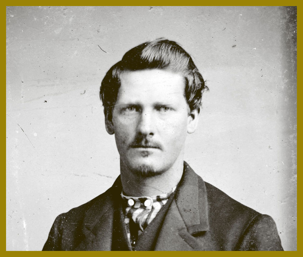
Happy one hundred and seventy-fourth birthday to Wyatt Berry Stapp Earp (March 19, 1848 – January 13, 1929), bison hunter, teamster, bouncer, saloon-keeper, gambler, brothel owner, pimp, miner, boxing referee, constable, city policeman, county sheriff, and, lest we forget, comic book hero… for several publishers at once!
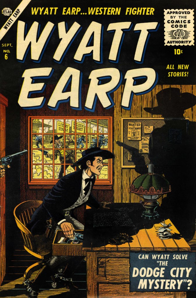
This is Wyatt Earp no. 6 (Sept. 1956, Atlas); ultra-detailed cover by Bill Everett, colours by Stan Goldberg.This is Wyatt Earp no. 9 (March 1957, Atlas); cover by John Severin, colours by Goldberg.This is Wyatt Earp no. 11 (May 1957, Atlas); cover by John Severin, colours by Goldberg.This is Wyatt Earp no. 15 (Feb. 1958, Atlas); cover by Joe Maneely, colours by Goldberg.To cash in on the success of The Life and Legend of Wyatt Earp (1955-61) tv series, Dell also threw their Stetson into the ring. This is Hugh O’Brian, Famous Marshal Wyatt Earp (sheesh!) no. 13 (Dec. 1960-Feb. 1961, Dell), the final issue.
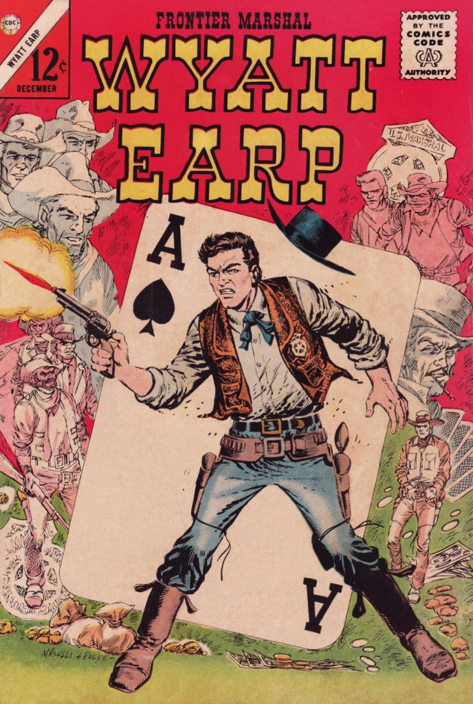
Mr. Earp had an especially notable run at Charlton (and by far the best title logo), with sixty-one issues of his very own title published between 1956 and 1967. And with Joe Gill scripts, so it’s solid stuff. This is Wyatt Earp, Frontier Marshal no. 61 (Dec. 1965, Charlton); cover by Pat Masulli and Rocco Mastroserio. I’d saved this one for this occasion, having withheld it from my M/M showcase The Masulli-Mastroserio Cover Deluge of ’65!
This is Wyatt Earp, Frontier Marshal no. 64 (July 1966, Charlton); cover by Mastroserio, lettering by Jon d’Agostino.This is Wyatt Earp, Frontier Marshal no. 69 (June 1967, Charlton); cover by Mastroserio.This is Wyatt Earp, Frontier Marshal no. 72 (Dec. 1967, Charlton), the fiery finale of *that* run. Another effective cover by Mr. Mastroserio, who passed away a few months later, aged a mere 40.And here’s a shot of the real-life Mr. Earp. Don’t look so glum, hombre — it’s your birthday!
“Oh, another cutesy animal comic”, you may sigh upon glimpsing the preview for this post. Indeed, today’s exhibit A abounds in puns and features a cast of almost every kind of animal one could think of. However, under its cute façade lurks surprising savagery and a kind of philosophical resignation to life’s little foibles.
We’re talked about a number of comics published within the pages of Pif Gadget, here’s another one to join the gang: La jungle en folie, written by Christian Godard and illustrated by Mic Delinx. The title of the series was selected as a nod to Walt Disney’s 1967 animated film The Jungle Book, then at the height of its popularity in France. The pivotal events of 1968, known as May 68, a period of civil unrest in France that paralyzed its economy and marked the minds of the authors and their fellow citizens, surely had something to do with the cynicism of this strip:
«André Glucksmann recalled May 1968 as “a moment, either sublime or detested, that we want to commemorate or bury…. a ‘cadaver,’ from which everyone wants to rob a piece.” His comments sum up the general cynicism and ambivalence of many on the French left when it comes to May ’68: “The hope was to change the world,” he says, “but it was inevitably incomplete, and the institutions of the state are untouched.” Both student and labour groups still managed to push through several significant reforms and win many government concessions before police and De Gaulle supporters rose up in the thousands and quelled the uprising (further evidence, Anne-Elisabeth Moutet argued this month, that “authoritarianism is the norm in France”). »
Just like fairy-tales, animal fables are often quite brutal (whether Aesop’s or La Fontaine’s, to name two widely-known sources), but it’s not easy to get this of mixture to rise just right: too much brutality, you sink into a quagmire of sadism; too much fluff, and it’s just a filler in a magazine. I would argue that LaJungle en folie hits the right balance: the right amount of wit with plenty of nastiness snuck in. Escapism this isn’t, not quite. The doctor is talented but has no issue with sending patients to their death. The inspector is obsessed with finding the guilty party even if it means putting innocents behind bars. Taxmen snatch their (literal) chunk of fur from the backs of unionized workers. Office workers search for the meaning of life (and fail to find it). Wives throw stuff at their husbands’ heads, talentless troubadours are all in love with the same frigid coquette. This world is a very recognizable one, even if it’s a tiger conversing with a worm (or a rhinoceros with a trout).
As for nastiness, one story immediately comes to mind – when Eustache the elephant gets a proboscis-otomy to shorten his trunk (he dreams of having a ‘Greek profile’), the cut-off part ends up at the butcher’s, as the latter buys chopped-off body parts from the doctor to resell as meat. The trunk is sold to Gros Rino as sausages, and by the time Eustache realizes he was better off with his old appendage and looks for it, it is too late, alas – the ‘sausages’ are being grilled over an open fire, and Gros Rino refuses to part with his breakfast, anyway…
Pif Gadget no. 159 (March 1972). Vegetarian tiger Joé (he only eats apples) and food-fixated Gros Rino are best pals.
The first, one-page strip was published in Pif no. 34 (October 13th, 1969). The strip was a quick success, even making it to some covers starting with issue no. 56 (March 1970). After a hiatus in 1974, during which La jungle en folie continued to be published in ‘albums’ by Belgian publishing house Rossel, the strip returned to Pif in 1977 and stayed until 1986, while albums continued to be regularly published until 1988, for 20 published albums overall. They have now been collected in six volumes of Intégrale; the pages below are all taken from Intégrale 1, which includes Les aventures de Joé le tigre, Salut la compagnie! and La conquête de l’espace.
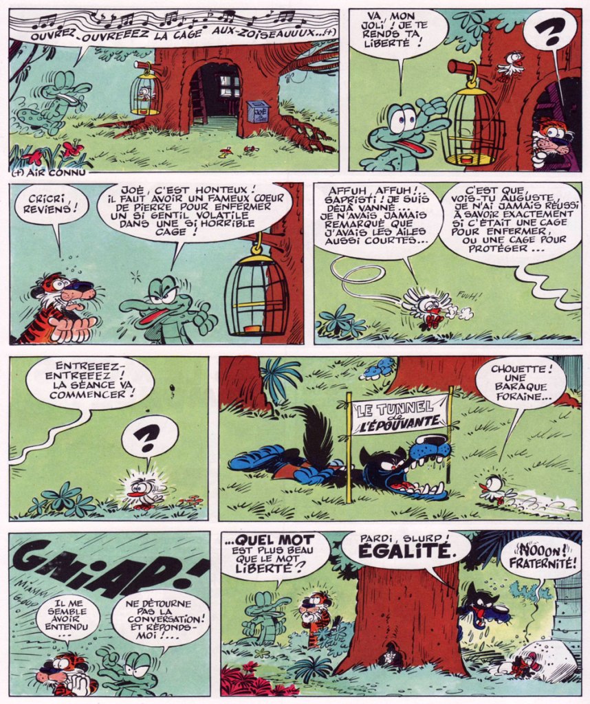
Cage et masti-cage. ‘Cage‘ is self-explanatory, and ‘masticage‘ is the act of chewing (think ‘mastication’). In this story, Auguste the crocodile decides to free Joé’s winged pet, explaining that no bird is made to be imprisoned. ‘You see, Auguste,’ pensively says Joé, ‘I’ve never exactly figured out whether it’s a cage to imprison, or a cage for protection…’ The naive bird gets eaten by a wolf (who lures it into his gaping maw by lying under a ‘the tunnel of horror’ sign). In the final panel, a discussion takes place: what’s the most beautiful word? Liberty, equality or fraternity? Take your pick…
Médor debout (Médor is a typical French name for a dog, the French ‘Fido’). The two pooches take turns walking each other, with the moral (delivered by the noisy magpies – les pies – who always get the last word at the end of the story) of ‘you can make anybody walk on all fours for a few compliments’.
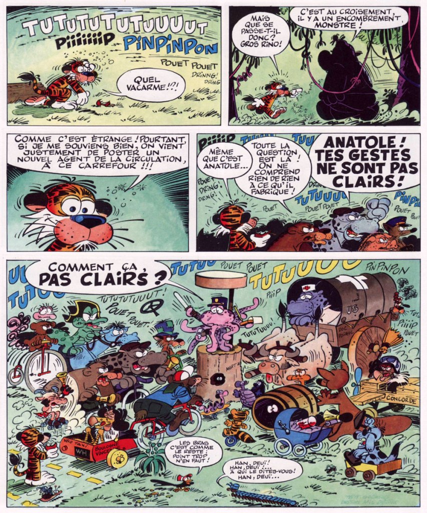
Klaxonneries (klaxonner means to honk one’s horn). Anatole the octopus is a very dutiful agent de circulation (traffic officer)… but the clarity of his gestures leaves something to be desired. I like the variety of animals and means of transport.
Horreurscope (horroscope), probably my favourite strip. After asking Gertrude the trout for her astrological sign (she’s Pisces, of course), Joé reads her horoscope: it speaks of the possibility of dangerous accidents, especially asphyxiation. Skeptical Gertrude thinks it’s ridiculous that a fish should worry about asphyxiation… but in the end, can one escape destiny? Joé decides not to intervene – and suggests Gros Rino should cook her ‘à l’étouffée‘.
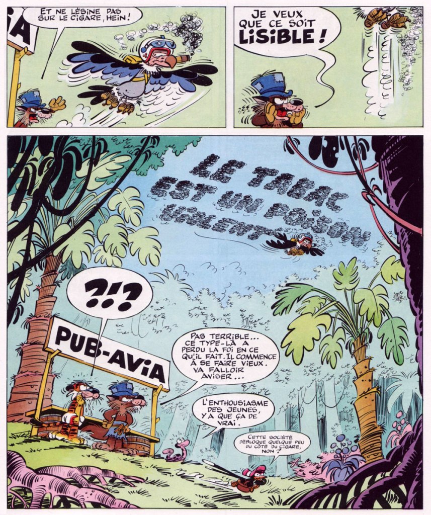
I associate La jungle en folie with one-page strips, but it’s worth taking a little detour into longer stories. The next two pages are Coup de tabac, in which the doctor and Joé try to convince vulture Adhémar to quit smoking. Adhémar is adamant, however: for him, smoking is a question of survival. We learn why in the next page…
‘Here’s today’s advertising message, try to not make spelling mistakes’, says his boss, and Adhémar flies into the skies to write a message in cigar-smoke – “tobacco is poison”.
‘Not great… this guy lost faith in what he’s doing. He’s getting old. I’ll have to look into it…’ says the wolf-boss, as Mortimer the snake remarks ‘a young man’s enthusiasm, it’s all that’s real and true!’
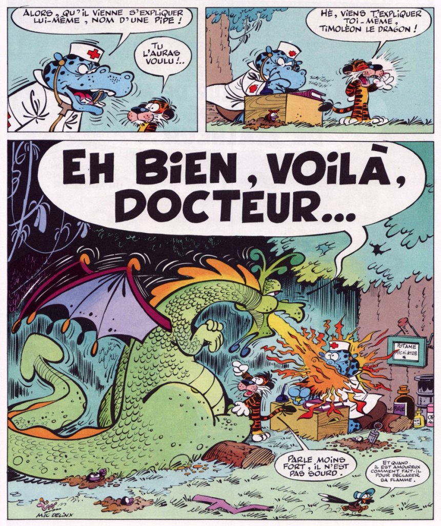
The next two pages are Bouche-dégout, a pun on ‘bouche d’égout‘, drain (dégoût means disgust). Potame le toubib, the doctor, won’t listen to Joé’s explanation of what ails his friend the dragon, jumping to medical conclusions and insisting that Timoléon should speak for himself – with blazing results.
« The best thing for rich people to do is become Batman. » — Karl Heinrich Marx*
So we’ve got another dour, dark, mumbly, violent, grim ‘n’ gritty Batman movie making the rounds. I’ll pass — I’m afraid that’s not my Batman of choice. But I’m certainly game to provide an alternative view.
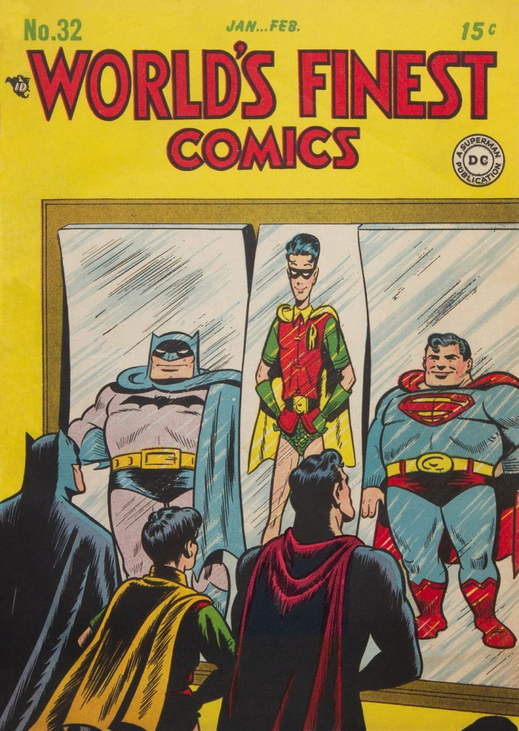
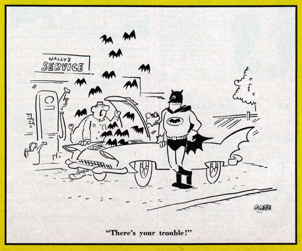
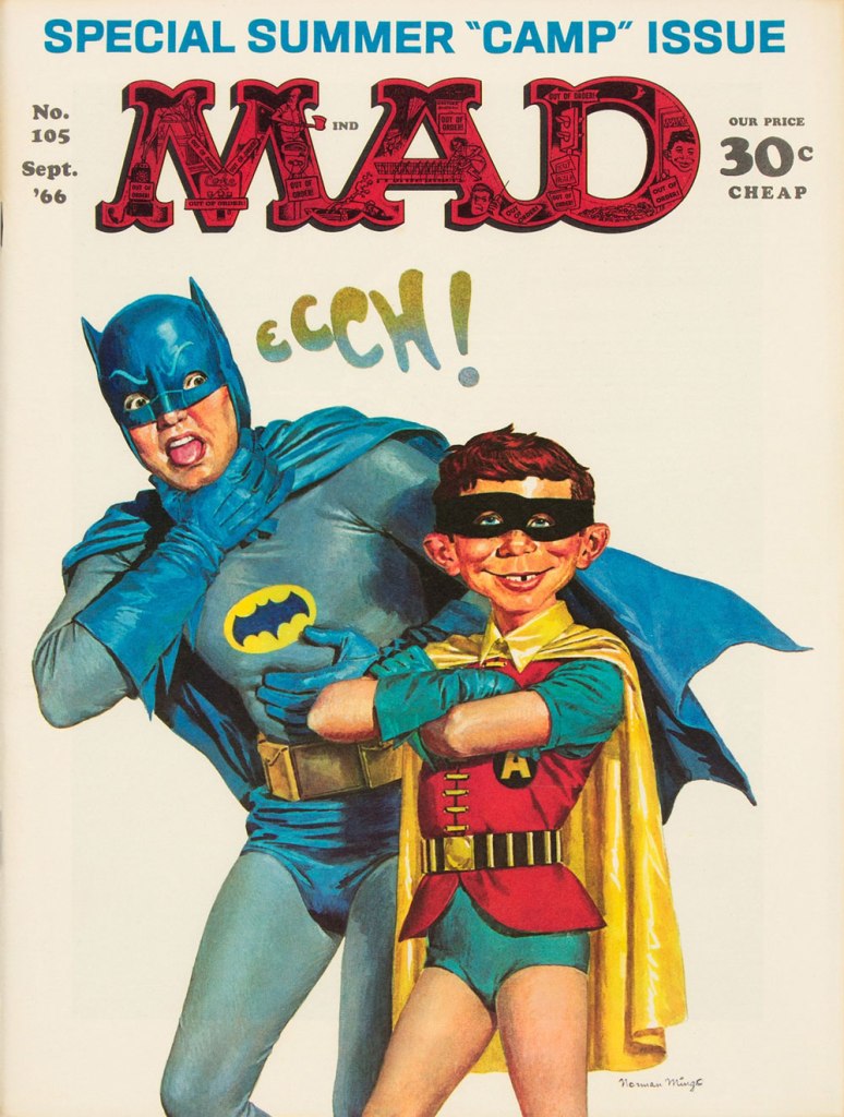
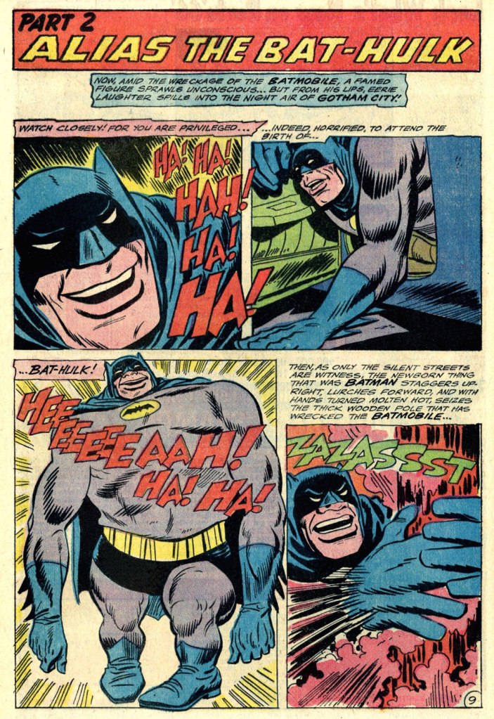
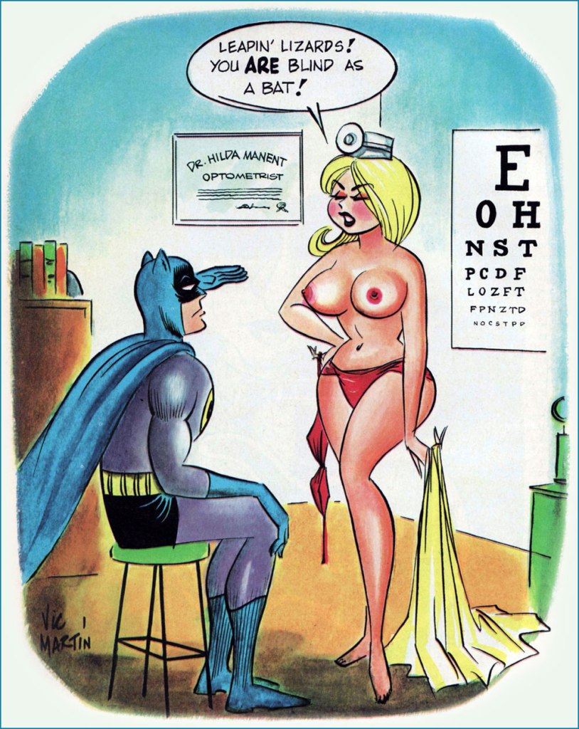
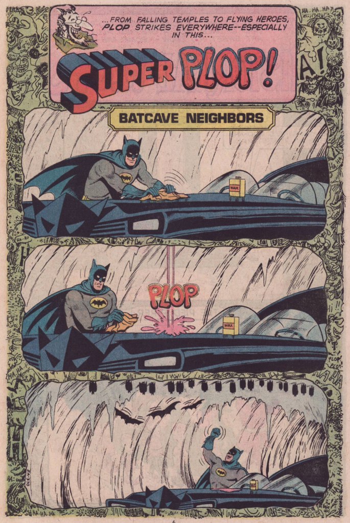
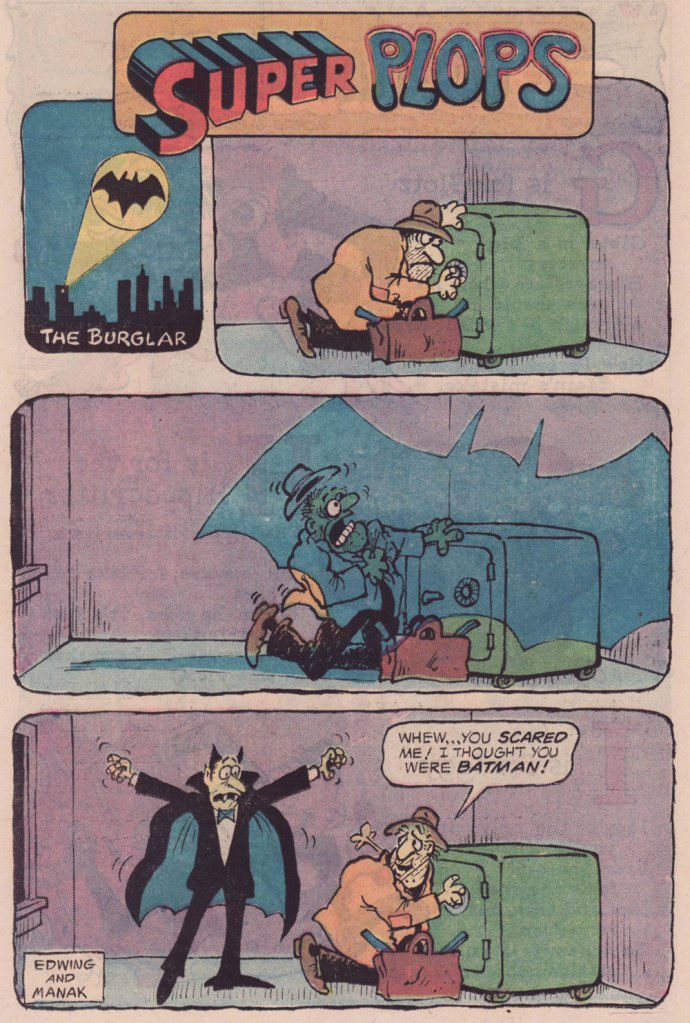
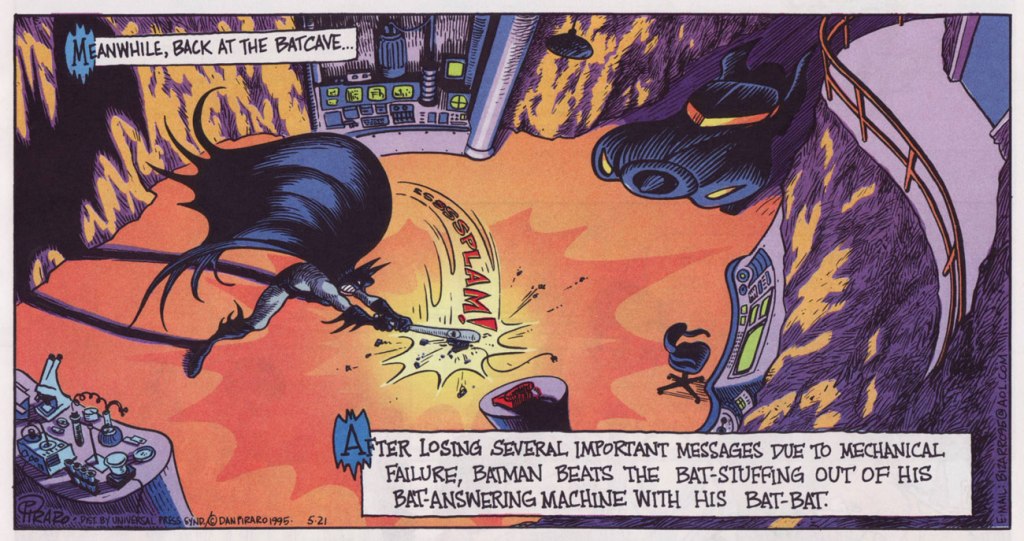
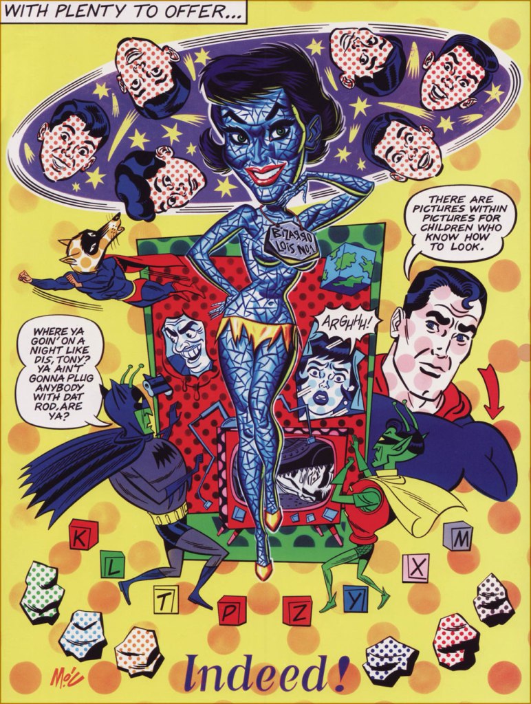
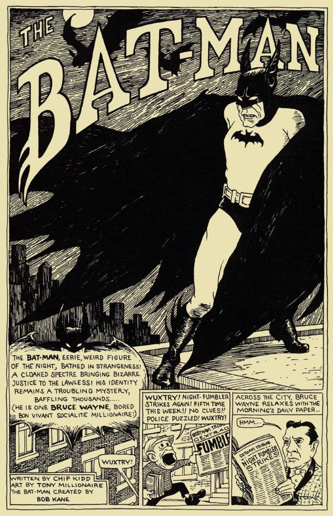
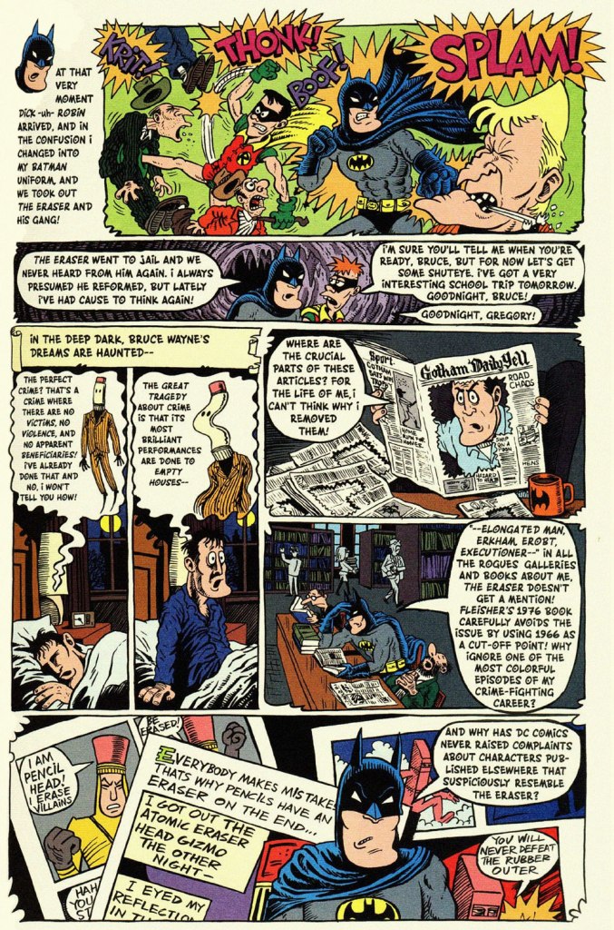
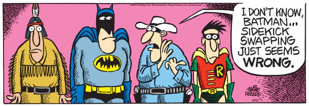
This is World’s Finest no. 32 (Jan.-Feb. 1948, DC); cover art by Hamilton, Ontario’s Win Mortimer (1919-1998), just one in a long, memorable series of frequently goofy scenes featuring this heroic trio.A cute one from John Gallagher (1926 – 2005), twice (1957, 1971) the winner of the National Cartoonists Society ‘Best Gag Cartoonist‘ Award and elder brother of Heathcliff creator George Gately Gallagher. It was published in scouting monthly Boys’ Life‘s July, 1966 issue, smack dab in the heart of Batmania. We ran another bit of bat-drollery from John in an earlier post.This is Mad Magazine no. 105 (Sept. 1966, EC); cover by Norman Mingo (1896-1980).A pivotal page from ‘Alias the Bat-Hulk’ written by Bob Haney, pencilled by Mike Sekowsky and inked by Mike Esposito, from The Brave and the Bold no. 68 (Oct.-Nov. 1966, DC), edited by George Kashdan. We’re featured the issue’s fabulously batty cover in our earlier tribute to Mike Sekowsky. Bless you, gentlemen — you truly understood what fun meant and what comics should be.Prolific Argentine cartoonist Vic Martin (in his homeland, he drew the strip “Salvador” for Medio Litro magazine) moved to the US in the early 1950s, crafting a respectable body of work in the comic book field, chiefly for Ziff-Davis, before migrating to men’s magazines and girlie digests. By the 1970, he’d found a home with Cracked Magazine (He handled the Hudd & Dini feature), while also freelancing for Sick and Crazy. Everything but Mad, really. This particular cartoon comes from the March, 1967 issue of Avant Publishing’s “Escapade”. As Pat Masulli is listed under “production” in the masthead, a Charlton connection is more than likely. And speaking of “Leapin’ lizards!“, Martin would later (1973-74) work on the Little Orphan Annie comic strip.From Plop no. 9 (Jan.-Feb. 1975, DC); Writer unknown, art by Kurt Schaffenberger.This one’s from Plop! no. 20 (Mar.-Apr. 1976), DC); idea by Don ‘Duck’ Edwing, art by Dave Manak.Dan Piraro‘s May 21, 1995 Bizarro Sunday strip. Between Piraro and his canny accomplice, Wayno, there have been scores of excellent bat-japes over the years. I must confess that the term ‘bat-bat’ triggers other associations. « To the Man-Mobile! »This is Pictures Within Pictures, a 1998 watercolour by Mitch O’Connell (not to be confused, of course, with this beloved, near-homonymous fella — yes, I can just hear Beavis and Butthead chortling). The piece is full of references to various Golden Age comics made infamous by Fredric Wertham‘s Seduction of the Innocent. For instance, er… Batman‘s speech balloon quotes from this particular comic book‘s opening splash. On a sobering note, let’s not forget that the 1950’s furore over comic books, as absurd as it may have seemed, still has relevance today.In a more deadpan vein, here’s the opening splash of Chip Kidd and Tony Millionaire‘s madcap homage to the very earliest of Batman’s exploits, with nods a-plenty to the 1943 film serial. “The Bat-Man” originally appeared in Bizarro Comics (Aug. 2001, DC).Another most decidedly dynamic duo, Eddie Campbell and Hunt Emerson, assembles to concoct an affectionate, thoughtful and yes, funny look at one of Batman’s most bizarre-yet-neglected members of the Bat’s rogues’ gallery, Lenny Fiasco, aka The Eraser, introduced in Batman no. 188 (Dec. 1966, DC) with The Eraser Who Tried to Rub Out Batman! This sequel, Who Erased the Eraser? also made its original appearance in Bizarro Comics (Aug. 2001, DC), edited by Joey Cavalieri.Here’s one (June 12, 2014) from Pulitzer Prize-winning (1981) editorial cartoonist Mike Peters (b. 1943). It’s from his unevenly written but always gorgeous comic strip Mother Goose and Grimm (created in 1984 and still going strong in over 800 newspapers worldwide). Like his colleagues Piraro and Wayno, Mr. Peters can scarcely resist a good bat-gag, so this is just one in a crowd of many.Everyone’s familiar with the famous playground song and staple of crooner Robert Goulet’s répertoire, right? The web is rife with visual adaptations, but this was my favourite, the work of Matthew S. Armstrong and available as a handsome t-shirt.
-RG
*the second-funniest Bat-related thing I encountered online this week is this attribution of a Batman (created in 1939) quote to Marx (1818-1883).
The funniest was the following deeply ironic quote from pathological liar and glory hog Bob Kane: « How can an article about me or the Batman be the true story when I am not consulted or interviewed? »
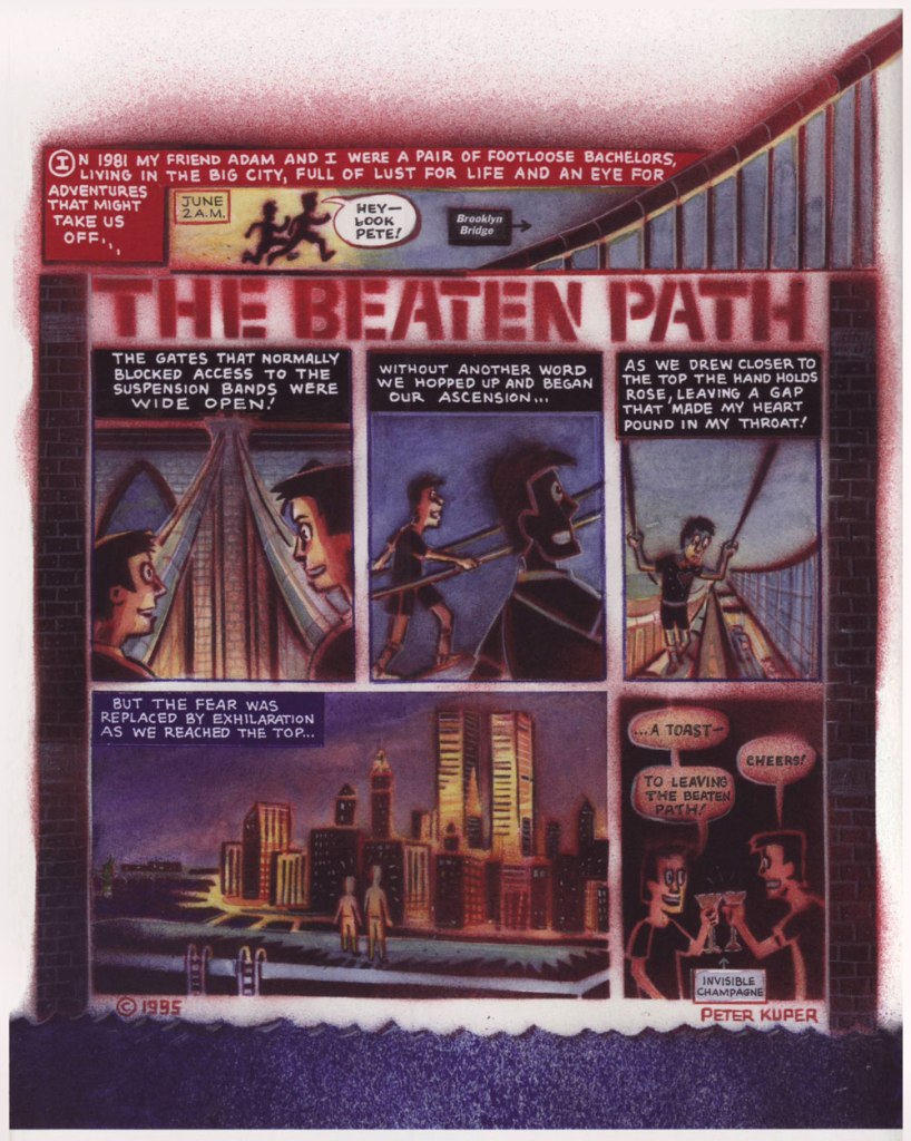
« In the summer of 1977, New York City was bankrupt. Times Square was run-down and dangerous at night, subways were decrepit, with floor-to-ceiling graffiti and no air-conditioned cars in the underground roast. A garbage strike left mountains of uncollected trash and evil-looking rats scurrying underfoot. A serial killer, Son of Sam, terrorized the city and when a blackout hit in July, looters tore up the town. I was in heaven. »
I first encountered American artist Peter Kuper (b. 1958) through Mad’s Spy vs. Spy feature, which he took over as scripter and illustrator with Mad Magazine no. 356 (April 1997). At that point, I had only seen creator Antonio Prohías‘ take on that strip, and I was impressed with Kuper’s style and energy.
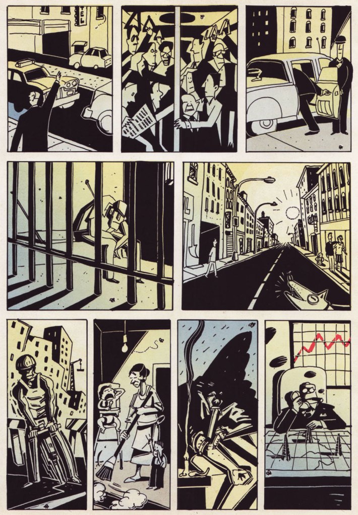
But my favourite of his books is Drawn to New York: an Illustrated Chronicle of Three Decades in New York City (2013, PM Press), both for the wide variety of styles used in this loosely-themed collection of strips, doodles and sketches, and for its beating urban heart. It captures a part of New York City that I love – not its glamour nor its electricity-guzzling lights, and definitely not its famous fops and varnished coquettes, but its boisterous mix of cultures and the seedy, scaly alligator underbelly. It’s not the same city it was in the mid 70s and early 80s – the era of Kuper’s reminiscences on the subject – but you can still spot remnants of the past in older neighbourhoods.
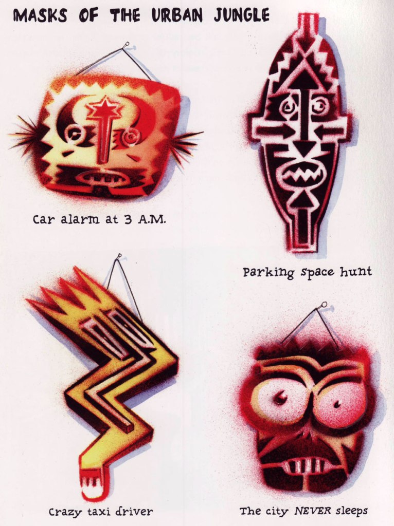
As mentioned earlier, Kuper executes a number of styles with ease, but he is most easily recognized by that ‘spray-painted stencil thing’ he does so well, as well as his favourite palette of dark reds:
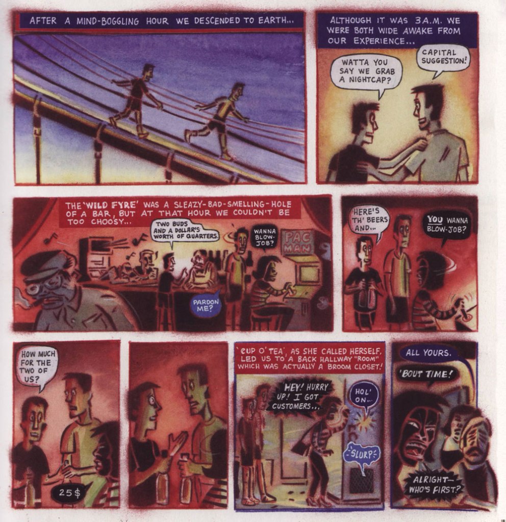
One of the more memorable stories of Drawn to New York is the following three pager, following the nocturnal adventures of Peter and his friend Adam as they scale a bridge and awkwardly navigate the social etiquette involved in engaging the services of a blowjob prostitute:
The healing and restorative powers of a view from a sky-high bridge at night cannot be overestimated.
Here’s one of the many cynical pieces:
The following is a page from the mute Twenty-Four Hours, which chronicles the strikingly different lives of NYC denizens as they go about their day:
All the above images are excerpted from Drawn to New York, but I’d also like to include a bonus: a strip published in Bleeding Heart no. 5 (August 1993, Fantagraphics) which fits today’s theme rather well.
« Ward’s beautiful buxotics operate in a strange separate universe, in which all women are gorgeous voluptoids, all men oafish, saucer-eyed drooling dupes. » — Chris ‘Coop‘ Cooper
Well, I certainly wasn’t planning to hog all the blogging this week, but there were birthdays and other hopefully mitigating factors. While today is the great Will Eisner‘s birthday, it’s likely to overshadow that of a fellow Golden Age toiler, one with an equally intriguing career, but with a trajectory quite divergent from Eisner’s own.
Bill Ward (1919 – 1998) was also born on this day, one hundred and three years ago. Ward started out in comics with the Jack Binder shop, turning out material for Fawcett’s line of characters (Captain Marvel and his family, Bulletman…); he soon found himself working for Quality Comics, most notably on Blackhawk (an Eisner co-creation, it should be noted). He inched closer to his true passion when assigned to Quality’s romance line.
Ward’s cover for Love Diary no. 1 (Sept. 1949, Quality). Artistically speaking, this is what a fully committed Ward can produce.
In the mid-50’s, when came the brutal, censorship-induced compression of the comic book industry, Ward smoothly shifted to producing girlie cartoons for Abe Goodman’s Humorama line, becoming its star and most prolific performer, thanks to his popularity and prodigious speed. He was aided in this by his choice of tool and technique: the conté crayon on newsprint. While everyone else was working on 8″ x 12″ illustration board, Ward was using a soft, beige paper of a size (18″ x 24′) and texture familiar to any art student who’s taken a life drawing class. With this type of stock, he could produce texture rubbings and achieve smooth, sensual sheens ideal for rendering highlights of hair and stockings. Said Ward: « It didn’t take me long to figure out that the quicker you could do the work… the more money you could make. » Over the course of a quarter-century, he wound up producing around 9,000 drawings for the Humorama line.
As Ward recalled of his early training in Binder’s studio, « [Binder] trained me to do layout, which is the most difficult part of art. » To wit, layout never counted among Ward’s strengths. A lot of his pinup work is undermined by poor staging, often grotesque proportions, and absolutely minimal attention to non-erotic detail.
A typical example of a Ward girlie cartoon produced using the conté crayon. This one first turned up in Comedy no. 51 (Jan. 1960, Marvel); in a typical work-for-hire arrangement, for a flat fee (in Ward’s case, 7 dollars a cartoon, topping out at the princely sum of $30 near the end of his 25-year run), Goodman retained all reprint rights (and reprint he did, liberally) and kept the original art, which he sold to collectors for several times its original cost, naturally. Nowadays, these pieces exchange hands for several thousand dollars.
Now, had I ever wondered what Ward’s pencils would look like, if inked by Bill Everett? I readily confess I hadn’t. But upon learning that such a momentous collision once occurred, my mind was set slightly reeling.
Another weathered fellow combatant in the trenches of the Golden Age, Everett (1917-73), unlike Ward, always gave his best, whatever the conditions. Right to the end, despite his rapidly declining health, Everett was, incredibly, producing top-flight work.
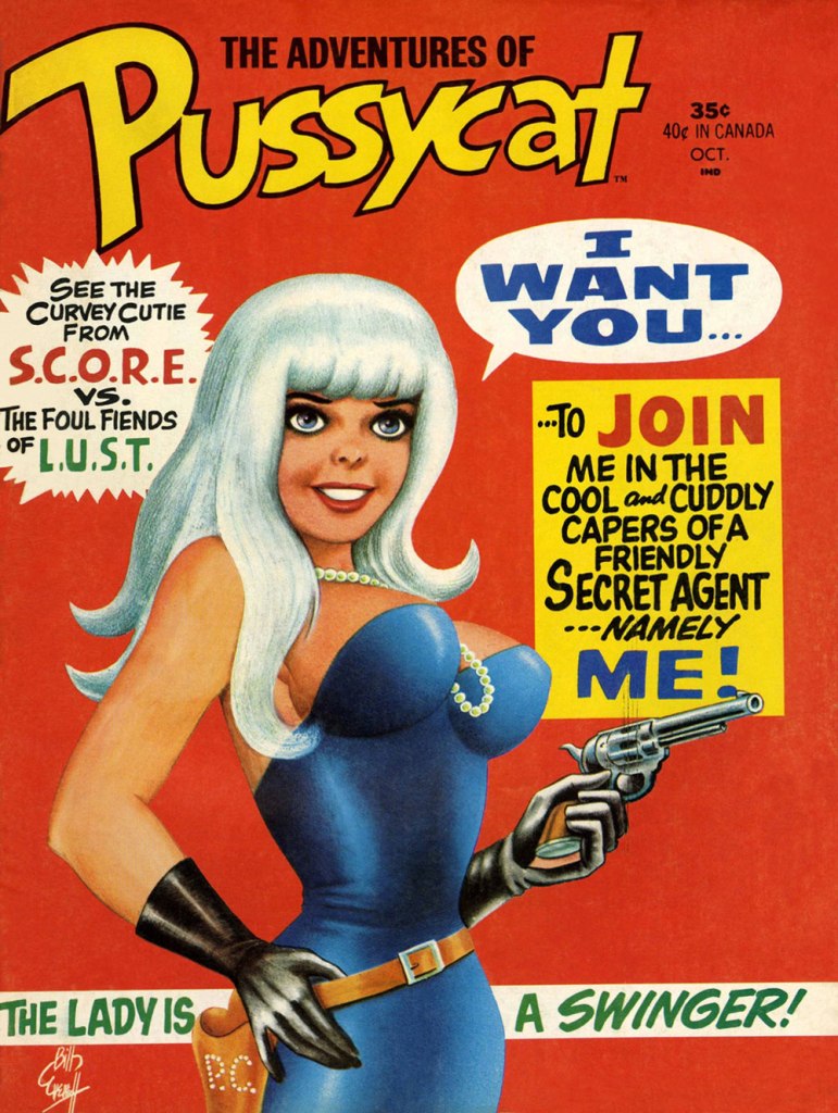
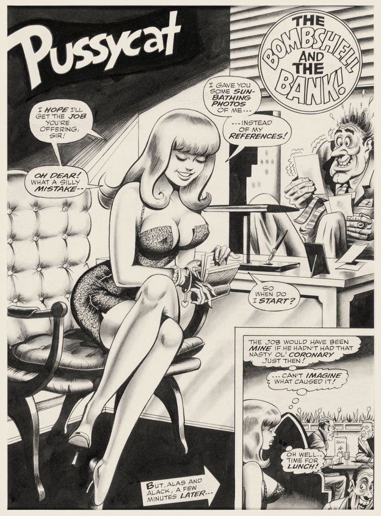
This is The Adventures of Pussycat no. 1 (Oct. 1968, Marvel). Cover by Bill Everett. Highly sought after today, this scarce, magazine-size one-shot is merely a reprint collection of some of Pussycat’s ‘adventures’ from various Goodman Playboy knockoffs, and one of a gazillion contrived acroynym-based attempts to cash in on the ubiquitous 007 craze of the 60’s. It does contain the first Pussycat tale, illustrated by Wally Wood, who would soon go on to his own entry in the super-spy stakes, Tower’s T.H.U.N.D.E.R. Agents. Concentrate on the artwork. The less said about the writing (was it Stan the Man or Larry the Lieber? We’ll likely never know), the better. As usual, any American attempt at French is mangled, even at a mere two words and two syllables (for the record, it should read either “C’est fini!” or “C’est la fin!“). Pensively squinting while adjusting his pince-nez, a ‘curator’ at Heritage Auctions made this uproarious whopper of a claim: « The figures of Pussycat look to be by Bill Everett and everything else is Bill Ward. » So you think Bill Ward drew everything… except the one thing he was interested in drawing? These folks don’t seem to know how comics are produced.“The Bombshell and the Bank!“, never reprinted, saw print in Male Annual no. 6 (1968).This is The Mighty Thor no. 171 (Dec. 1969, Marvel). Jack Kirby pencils, Bill Everett inks. Coming late in Kirby’s run, what a vigorous breath of fresh air after years of lazy erasures!
In the 60’s, Ward also provided covers for various soft-core novels, such as this one from Satellite Publications’ ‘After Hours’ imprint. He even wrote some of them, notably under the alias of ‘Bill Marshall’. His fellow Quality Comics alumnus Gil Fox also penned many of these potboilers under a staggering array of aliases.
This is Side Street (1966, After Hours). I’ve noticed over the years that certain artists of a more single-minded frame of mind can’t be bothered to devote much attention to anything but the object of their obsession. Such was the case with Bill Ward, and with the passing years, ever increasingly so. Exhibit A: has Ward ever seen an actual dog?Which reminded me of this classic, by another ‘can’t be bothered’ master of ‘Good Girl’ art, Alberto Joaquin Vargas Chavez (1896-1982). Another howler from the comedians at Heritage: « This early masterpiece, one of the greatest pin-ups the artist ever painted, was reproduced as a full-color double-page spread in Vargas, Taschen, 1990. Alberto Vargas thought so highly of this lot and the following two stunning paintings that he retained them in his personal collection. » I wouldn’t presume to criticise Vargas’ depiction of the female form, but on the other hand, this is Exhibit B: has Vargas ever seen an actual cat? Don’t worry, Alberto, you’re not alone in this affliction: neither has Neal Adams.
« Theodor Geisel spent his workdays ensconced in his private studio, the walls lined with sketches and drawings, in a bell-tower outside his La Jolla, California, house. Geisel was a much more quiet man than his jocular rhymes suggest. He rarely ventured out in public to meet his young readership, fretting that kids would expect a merry, outspoken, Cat in the Hat-like figure, and would be disappointed with his reserved personality. » — Susan Cain
Today, we honour Theodor Seuss Geisel (1904-1991), born one hundred and eighteen years ago and better known under his nom de plume of Dr. Seuss (one of several, such as Dr. Theophrastus Seuss, Dr. Theodophilus Seuss, Theo LeSieg, L. Pasteur, D.G. Rossetti, and Rosetta Stone. The man loved a good pseudonym.) And no, he wasn’t actually a doctor, though he contributed to more people’s well-being than most physicians could dream of. His alma mater, Dartmouth College, did bestow upon him an honorary doctorate, in 1956. Furthermore, it renamed, in 2012, its medical school (fourth oldest in the United States, founded in 1797) Geisel School of Medicine at Dartmouth in recognition of the good man’s financial contributions over the years. Cool, uh?
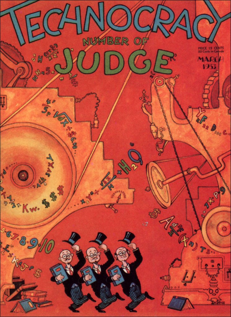
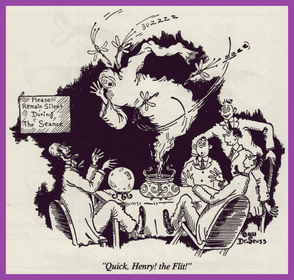
It certainly did in my case — when I wanted to learn English as a kid, his books were the ones I reached for. Results!Geisel’s cover for Judge‘s March, 1933 issue. A sample of his 1930’s magazine work. Dang — now I can’t get that song out of my head.And another. Teetotallers may not know (or they may know too well, hence the abstinence) that DT stands for the latin delirium tremens, or alcohol withdrawal-induced delirium. As for these beasts, you’ll have cause to worry if you should See Them Everywhere, and not merely aboard Goah’s Ark.« Long before his success as Dr. Seuss, Theodore Geisel (Dartmouth Class of 1925), designed advertisements for Flit, Standard Oil Company’s wildly popular spray-pump insecticide which later contained DDT. Over the course of 17 years, Geisel’s humorous advertisements helped make Flit a household name throughout the 1930s and 1940s. At the time, liberal spraying of pesticides around people, animals, and crops was highly encouraged with little regard to potential environmental impacts. » [ source ]. This particular ad hails from 1930. Given the scope of Geisel’s genius and the length of the ad campaign, there are many, many highlights. More like ‘Bug Game Hunter’!
Over the years, these ads came in every format.
A 1941 poster for Flit. The casual, harum-scarum use of dangerous chemicals may seem quaint to our jaded modern eye, but it goes on, all right. Personally, I cringe when I encounter ads for Procter and Gamble’s Febreze, for instance. Seems a tad irresponsible to me, given the risks.
This is the opening installment of Hejji, Geisel’s very short-lived (April 7 to June 23, 1935, twelve episodes in all — read them all here) Sunday comic strip, the man’s sole entry into the syndicated comic strip arena, preceding by a couple of years the publication of his first book, And to Think That I Saw It on Mulberry Street (1937). Hejji was oh-so-briefly published by William Randolph Hearst’s King Features Syndicate. Fickle, fickle!
« In these pages Dr. Seuss was already introducing us to his wonderful talent for creating unusual and delightful creatures. Hejji and his master “The Mighty One” would meet many an odd creature like Bearded Bees, Wombats, and the great Pitzu bird. All of these would be encountered in the attempt to impress the object of “Mighty One’s love, “The Fair One”. Unfortunately, as the legend goes, Seuss was let go during great depression job cuts by William Randolph Hearst. Of course Seuss would later go on to create his extraordinary children’s books including Cat in the Hat, and The Grinch that stole Christmas. Hejji pages are some of the rarest and most sought-after on the comic-strip market. Printed exclusively as Tabs and only carried in a few newspapers, their rarity is as great as the popularity of their creator. As a result, each and every page carries the highest premium. » [ source ]
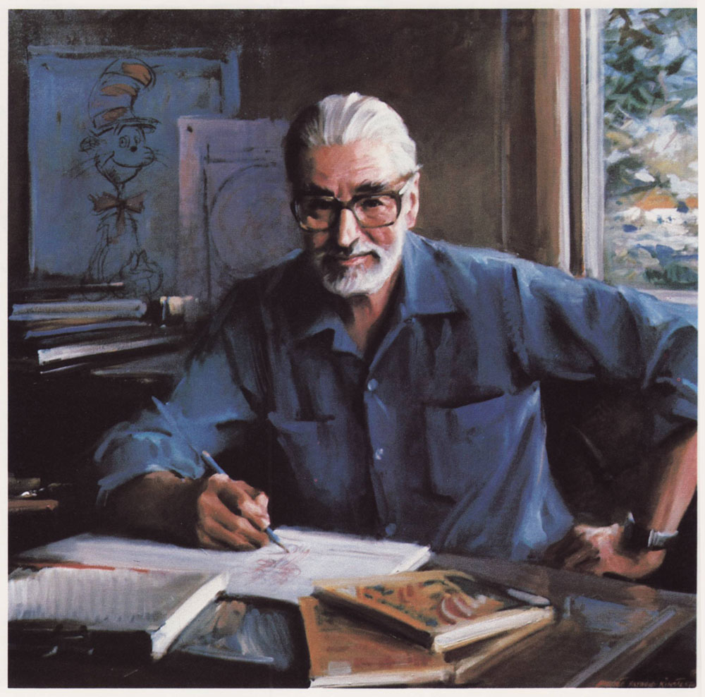
In 1982, Darmouth College commissioned none other than Everett Raymond Kinstler to paint this portrait (oil on canvas) of his esteemed colleague.
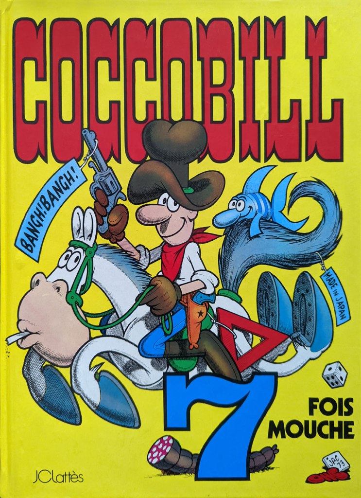
This is 7 fois mouche (1975, JC Lattès, France), originally serialised in Corriere dei Piccoli as “Cocco Bill fa sette più”, 1968-69. In Italy, it was actually number twenty in the series.
With Wolverton, Jacovitti (1923 – 1997) shares an animist sort of predilection for cramming every square centimetre of the panel with absurdist details, facetious sound effects, recurring motifs and symbols and, naturally, gags. It’s a most noble cartooning tradition that runs the course of the medium’s history, from Bill Holman through Kurtzman and Will Elder (chicken fat!) and merrily endures to this day in Dan Piraro and Wayno‘s oft-sublime Bizarro.
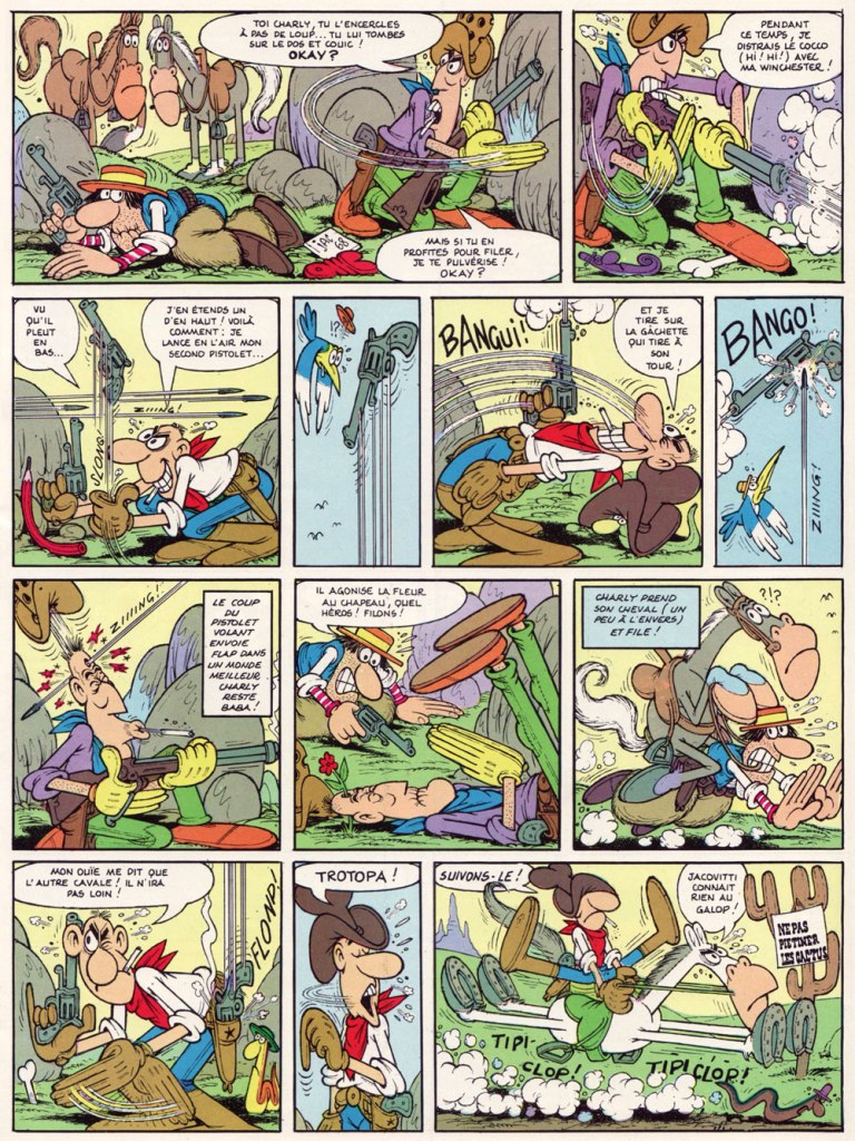
Here’s a two-page ambush sequence that gives you a sense of how handy — and deadly — our protagonist is with a pair of irons.
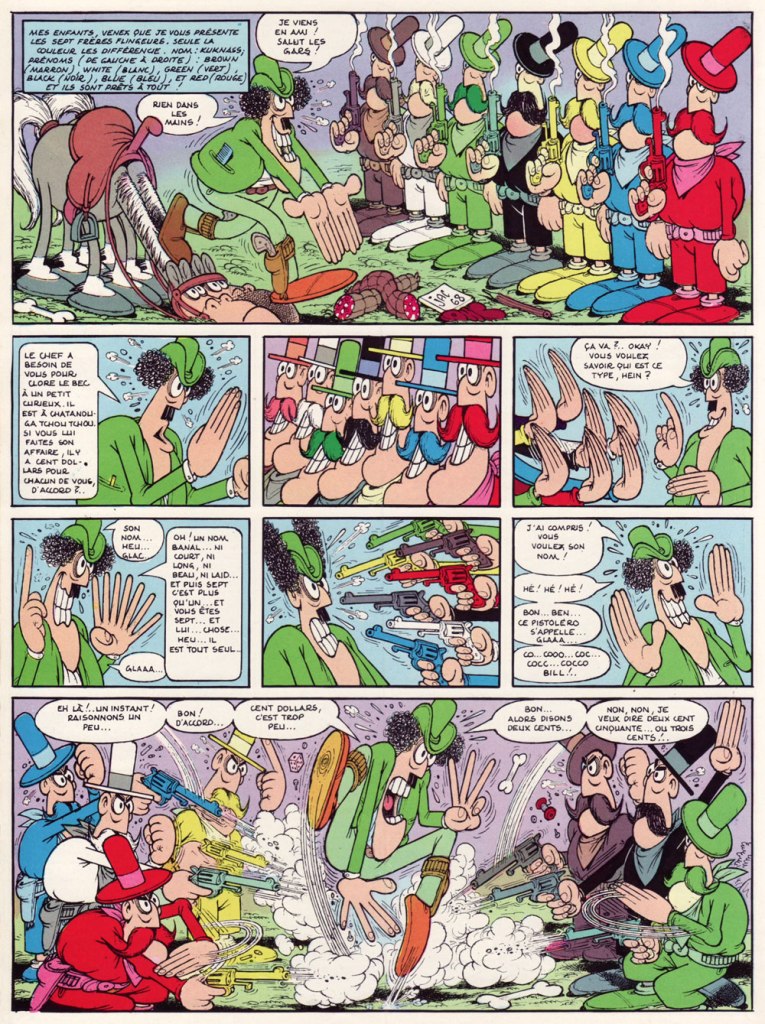
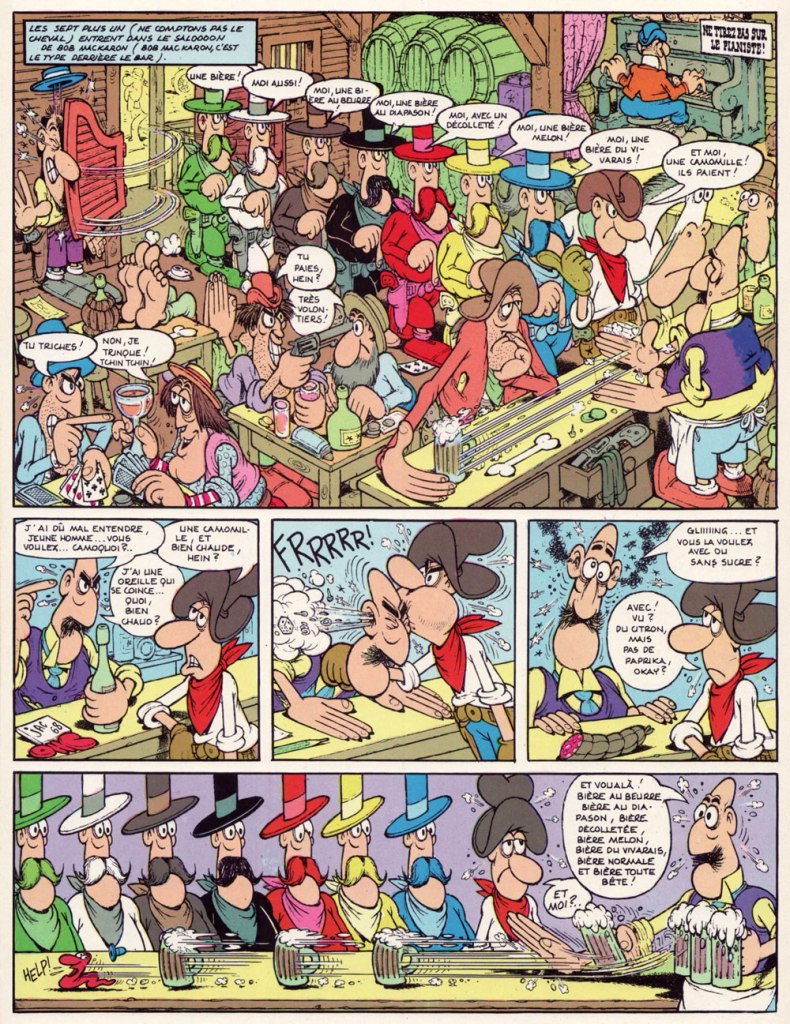
The sign says: “Do not trample the cacti“. The surviving bushwacker is put out of his misery by the gang’s second-in-command, the Chaplinesque Kruel; you know he’s a villain of substance because he rides a double horse. Pray note the lovely SALOOOOOOOOOOOOOOOOOOON sign with its behatted snake carvings.Meet hired guns the Kuknass Brothers: Brown, White, Green, Black, Yellow, Blue and Red, of course. Like the idea, Quentin? Note the extra digits (the better to count with, panel five). It’s easy to imagine Jacovitti having some influence on Mad’s Don Martin… In the manner of many a pure-hearted cowboy, Cocco Bill’s brew of choice is alcohol-free; his poison is chamomile tea, a drink with numerous health benefits! With sugar and lemon, but hold the paprika, thank you! Note: Don’t Shoot the Piano Player!This is Sur les rails (1975, JC Lattès, France), originally serialised in Corriere dei Piccoli as “Cocco Bill sulle rotaie”, 1969. In Italy, it was number twenty-one in the series.The train meets the stagecoach, and how! A page from Sur les rails.
Last month, my co-admin ds reported, in the course of her spotlight on Massimo Mattioli, that Jacovitti is said to be the Italian cartoonist best known internationally. I have no idea how such popularity is measured, but I do enjoy the idea of a palmarès headed by cartoonists I love, for once. I do, however, suspect that the global reach of animation frequently contributes more to a cartoonist’s name recognition than does his printed work (think Guillermo Mordillo). Case in point: while Cocco Bill strips have been translated and reprinted in several countries, these efforts have been, more often than not, patchy and sporadic. On the other hand, the Cocco Bill TV series (2000-04) ran a healthy 104 episodes. And it looks great, which didn’t hurt. Check out the pilot episode, ‘Cocco Augh‘. For a creator, it’s assuredly a classier calling card than a bunch of sordid sex ‘comedies’.
I’d like to dedicate this post to the fond memory of a departed cartooning colleague, Patrick ‘Henriette Valium’ Henley (1959-2021), since Cocco Bill was, I’ve heard tell, his favourite bédé.
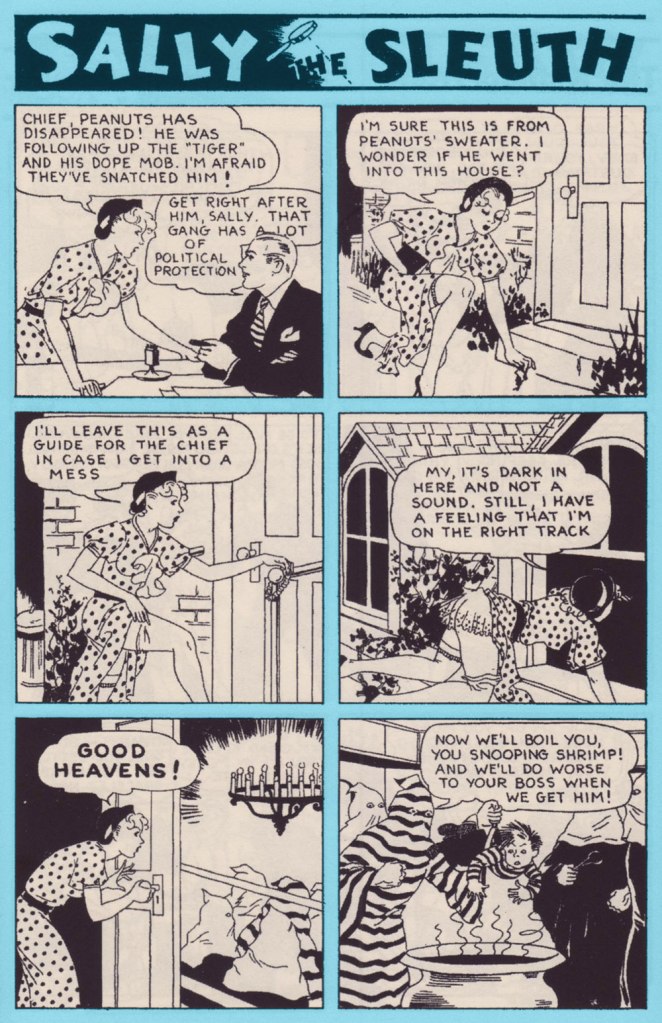
She’s audacious, savvy, and she’s always cheerful. Here she is, the infamous Sally the Sleuth by Adolphe Barreaux*. First things first, to give us a timeframe: this strip was published in “pulp” magazine Spicy Detective Stories between 1934 and 1943, then moved to Speed Detective Stories in a new format** until 1950 then, finally, to Crime Smashers until the comic’s demise in 1953.
Sally the Sleuth features a tightrope act that’s not that easily achieved: fearless, self-sufficient Sally is so adept at spotting (and landing into the middle of) trouble that she frequently requires outside help to be rescued in the nick of time, with the role of the rescuer oft being played by her boss, the Chief, who usually bursts in through the door. What’s interesting is the way this rather typical damsel-in-distress set-up does not take anything away from our sense of Sally as a take-charge, go-getting kind of gal. She does not hesitate to bat her eyelashes or flash a gam when needed, but she’s neither the usual femme fatale archetype that appeared so often in contemporary comics, nor the innocent-yet-gorgeous victim. When captured, she spits (sometimes literally) in the face of her would-be killers; when she gets rescued, it was because she left instructions with Peanuts, her kid assistant, or schemed to leave the Chief enough clues to locate her if she hit a bad patch.
Strategic panty drop! Page two from “Tourist Trade” (June 1938, Spicy Detective Stories).
It may surprise a modern reader that an American comic from the mid-thirties (1935! consider this number again if it hasn’t sunk in yet!) should be so casual about a topless female when present-day consumers of culture freak out at the very sight of a nipple (and that goes for male nipples as well). Of course pulp magazines and comics weren’t read by staunch defenders of High Morals and Propriety, but it was nevertheless a hugely popular medium, and Spicy Detective Stories, where Sally got her débutante ball, certainly abounded in unclad women in tales of booze, butchery and concupiscence.
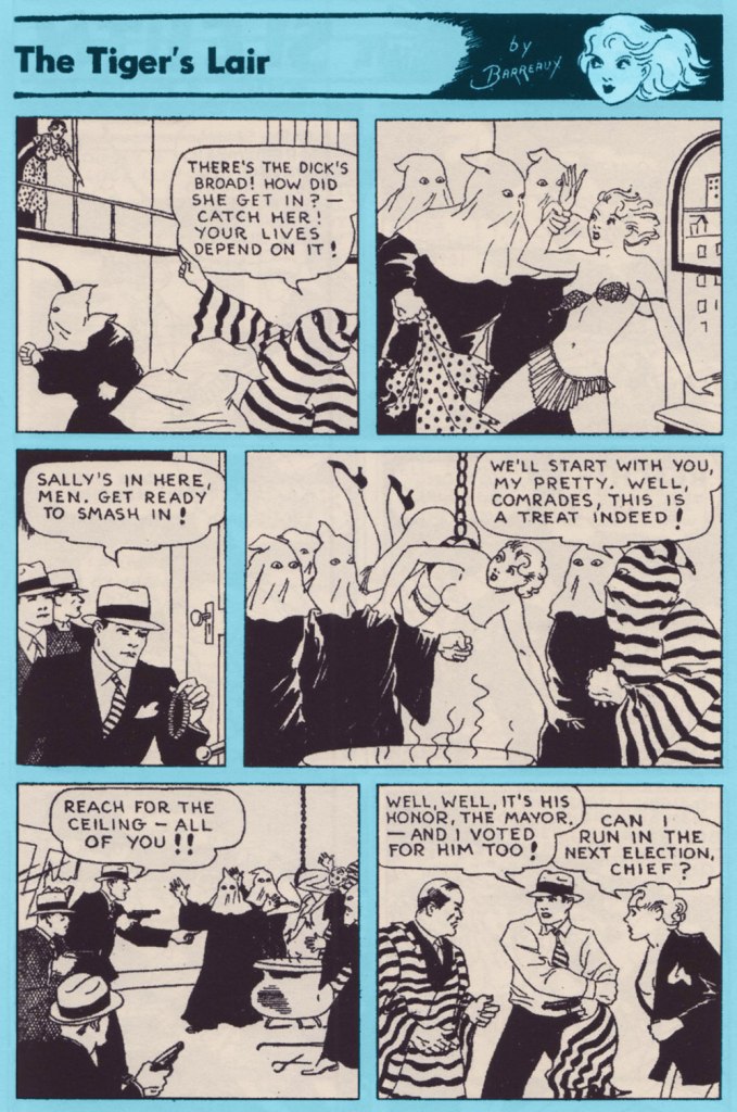
The cover of Spicy Detective Stories no. 4 (June 1935), in which The Tiger’s Lair (see below) appeared.
Which brings me to my next point: tension created by the play between the predictable and the unforeseen. Sally always, always ends up in a state of advanced déshabillé. That is an enjoyable given. Much like panties drop to the floor if a woman should be carrying celery, Sally’s dress and underwear fly off at the gentlest of tugs. However, just how it is accomplished varies wildly from week to week. One wouldn’t think that were so many interesting ways of getting accidentally undressed. And these stories are harsh, no doubt about it: scenes of torture and murder vary from the comparatively sedate (getting whipped, slapped, shot) to sensationalist (death by venomous snake or spider) to viscerally uncomfortable (cannibalism with more than a dash of necrophilia, being boiled alive, impalement).
The complete “The Tiger’s Lair” (June 1935, Spicy Detective Stories).
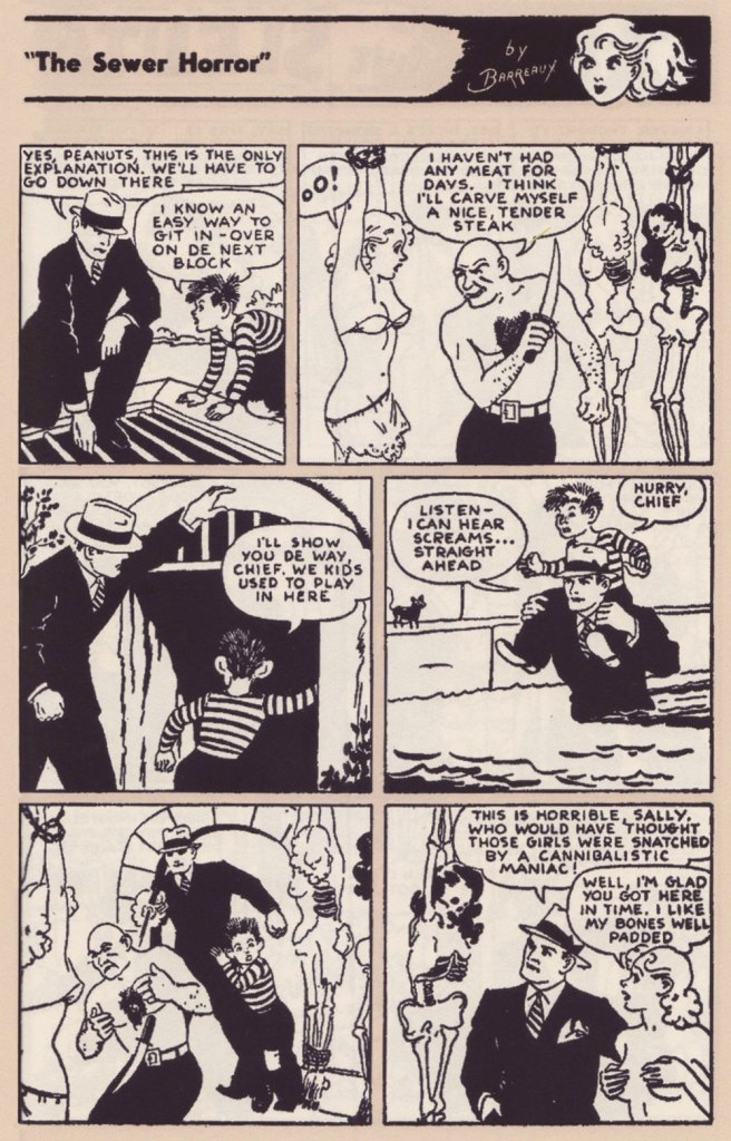
Sally’s stoicism as she’s about to be carved up is nothing short of miraculous. Page two from “The Sewer Horror” (December 1937, Spicy Detective Stories).
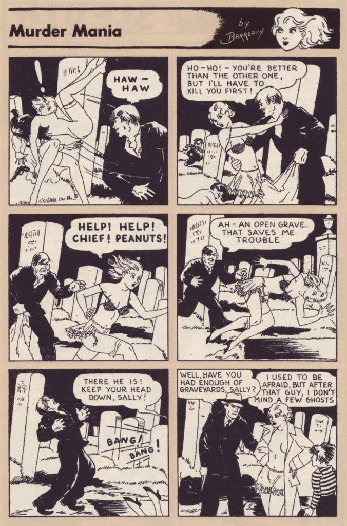
Page two from “Murder Mania” (April 1935, Spicy Detective Stories).
Page two from “The Missing-Models Mystery” (April 1937, Saucy Detective Stories).
Though of course it’s the nudity is sexualised, I love the ease with which Sally does it, completely unperturbed by having a bare chest whether she’s surrounded by hoodlums, talking to her boss, or racing through a crowded hotel. There’s a certain innocence in it, as if we were watching a frolicking Dedini nymph. Despite being so frequently assaulted, she does not at all come off as a victim.
Some top-rate lassoing from Peanuts! They’re trying to make it look like a suicide, but I’m not sure why a woman would want to jump off a roof naked. Page two from “Love Nest Loot” (September 1935, Spicy Detective Stories).
Earlier-day Sally (1934-1943) is supposedly ‘ditzy and naive’ (source), but I think one should not mistake cheerfulness or pragmatism for naïveté. She navigates the seedy parts of town with aplomb and talent, efficiently following clues, taking on many roles to infiltrate criminal organisations or simply glean information. Sally may have to rely on the Chief to extricate her from yet another predicament, but he is a sort of handsome stock figure with little personality, mostly sitting around his office and agreeing when Sally says ‘I should investigate this!’
Page two from “Coke for Co-eds” (January 1938, Spicy Detective Stories).
Sally also doesn’t judge other women; her moral compass is firmly pointed to bringing all manner of crooks to justice, but she’s a no-nonsense kind of girl when it comes to standards of female behaviour. Page two from “Sin Ship” (October 1936, Spicy Detective Stories).
Page one from “Toy of Fate” (January 1937, Spicy Detective Stories).
Sally the Sleuth has historical importance, if only for the panel borrowed by Frederic Wertham for his Seduction of the Innocent report from a Sally the Sleuth: Death Bait (1950) story. In the wonderfully written introduction to the Sally the Sleuth Collection, comics historian Tim Hanley goes a step further, saying “without Sally the Sleuth, there would be no Superman. Without the pulp heroine with a penchant for solving crimes in a state of undress, there would be no Batman either.” It can be (and has been) argued that he is giving this strip too much credit***, but there will be no argument that Sally is an important figure. Because I’m a philistine, what’s most important to me… is that it’s a great read.
~ ds
* As far as Barreaux, born Adolphus Barreaux Gripon, is concerned, there are much better places to read about his biography than on this blog, mostly due to the fact that biographies kind of bore me. I specifically direct you here for a detailed biography, and here for more information about Barreaux’ mixed heritage and the variety of genres he illustrated.
** This post only includes strips from the earlier, 1934-1943 version, because I by far prefer it to what came later, although I may be in the minority. The art got arguably better once Sally moved to Speed Detective stories, and stories also got longer, allowing for more elaborate plots. However, Sally was now some sort of international spy, travelling to ‘exotic’ countries and having to contend with native Hula dancers, superstitious savages in Indian jungles, Nazis, Japanese master-minds, and so on. She got disrobed less frequently, but the charming innocence of the strip, despite its violence and simple but effective art, is what makes Sally so appealing to me.
*** Hanley has been clearly reproached for this by some readers, and so elaborated on his blog:
My introduction begins with the grandiose claim that there would be no Superman without Sally the Sleuth, but it’s true. Long before Harry Donenfeld launched DC Comics, he was a publisher of pulp magazines that featured lurid crime stories. Sex was a major focus, and the dirty stories were a popular product. In 1934, Adolphe Barreaux convinced Donenfeld to expand outside of prose and add some comics to his books, and the “Sally the Sleuth” strip in Spicy Detective was their first attempt. It proved popular and more followed. Eventually, Donenfeld got into the comics game full time in the late 1930s, first with Detective Comics and later with Action Comics. Once Superman and Batman took off with young readers, more series followed and the comic book business became Donenfeld’s priority. But it all started with Sally.
« From the body of one guilty deed a thousand ghostly fears and haunting thoughts proceed. » — William Wordsworth
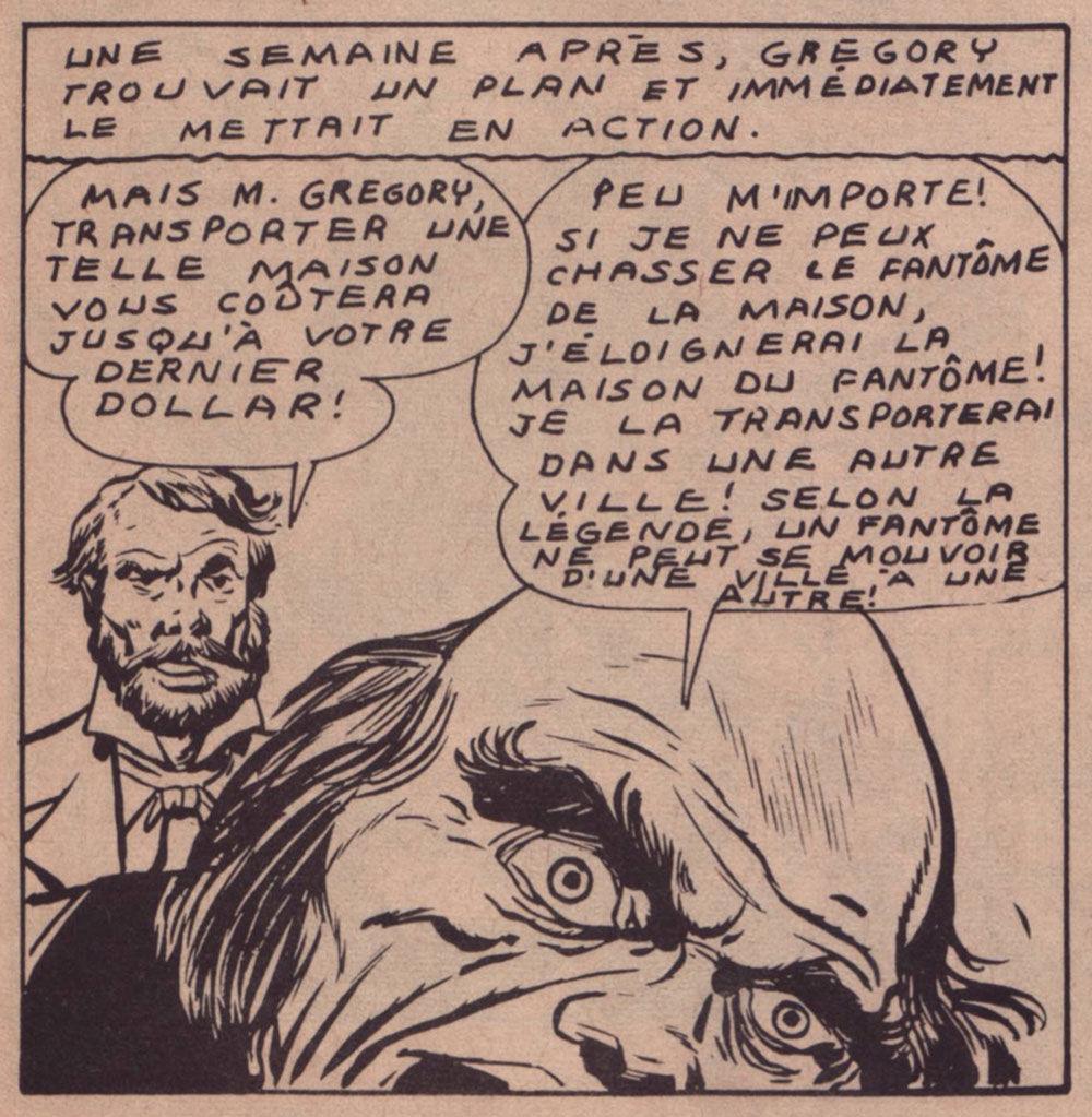
Today’s selection is an early, early favourite of mine. I first encountered it in French, in the pages of Capitaine America no. 8 (Aug. 1971, Les Éditions Héritage); back in those days, Québécois printer-packager Payette & Simms would reprint, in black and white, recent Marvel comics in their ‘Format Double’ package, a terrific deal at 25 cents: you got two issues’ worth, no ads, plus a bonus short story. P&S’ paper stock and printing were better than Marvel’s — but their lettering and translation work generally left much to be desired*.
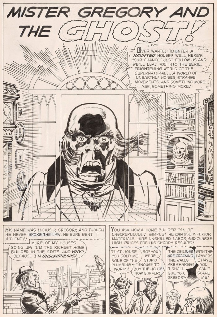
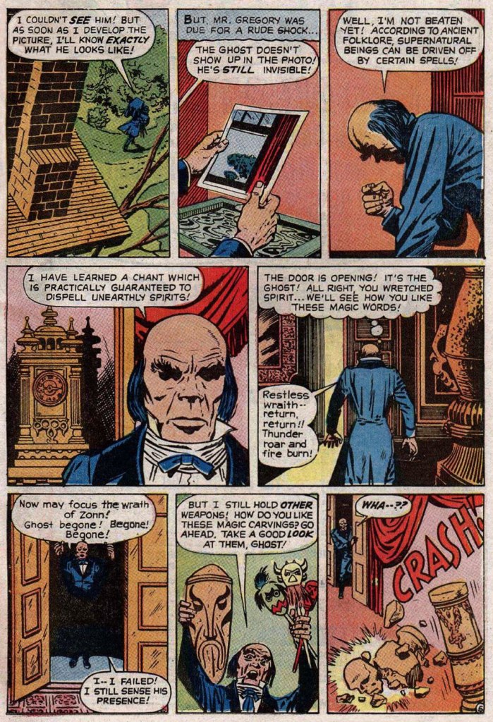
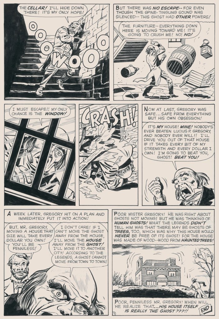
In this case, despite the allure of the slickly sumptuous Gene Colan / Joe Sinnott artwork, the issue’s out-of-nowhere high point was (you guessed it!) a modest little story plucked from the predawn of the so-called ‘Marvel Age’, Mister Gregory and the Ghost!, from a pre-Thor issue of Journey Into Mystery (no. 75, Dec. 1961). Many may disagree with me on this one, but boy, those post-Kirby issues of Cap’n ‘merica just serve to demonstrate what happens without a perpetual motion plot engine like Jack Kirby to propel and guide the series: when you try to introduce new foils for the hero, you get bonehead non-ideas like biker gangs, a jealous scientist in the body of a gorilla, or in issue 123’s Suprema, the Deadliest of the Species!, a brother-and-sister hypnosis act who drive around a gadget-filled tanker truck that magnifies Suprema’s power by way of a *very* 70’s medallion her brother wears around his neck. Then Cap feels its vibrations (“Ping!”) through his shield, and … oh, I won’t spoil the thing’s idiotic charms any further for you: read it here.
This is Journey into Mystery no. 75 (Dec. 1961, Marvel); pencils by Jack Kirby, inks by Dick Ayers, colours by Stan Goldberg.
Ahem — back to Mister G and his Ghost. It’s not exactly a masterpiece of writing either (Larry Lieber?), but it presents Kirby at his moody, understated best. Upon seeing it in colour, I realised how providential my monochromatic encounter had been. While the story’s been reprinted a few times (in 1966, 1971, and in 2020 in a fancy and pricey hardcover omnibus), the printing’s always been pretty shoddy. As you’ll see.
But… it seems that most, if not all of the original art survives, so we’ll make the most of the situation and mix our sources as needed — hope the effect isn’t too jarring!
I find Kirby’s layout for this page to be especially ingenious and interesting.I’ve used the recoloured reprint from Fear no. 4 (July, 1971, Marvel), which was an improvement over JIM75’s, albeit a slight one.
-RG
*here’s an example of Éditions Héritage’s lovely calligraphy, from this very story:
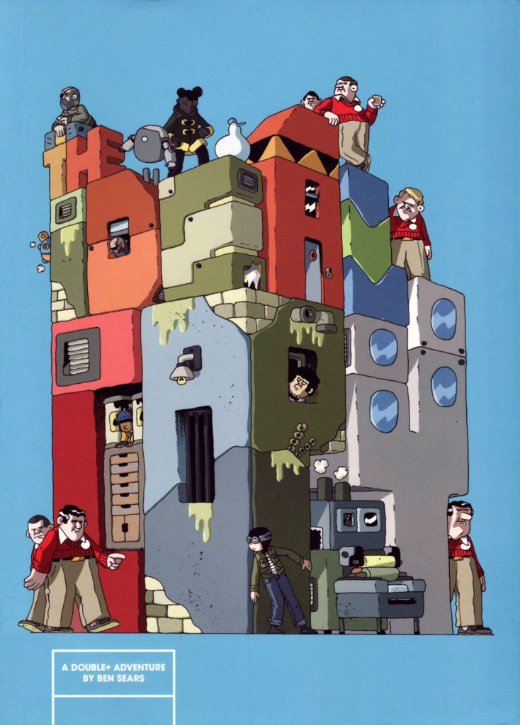
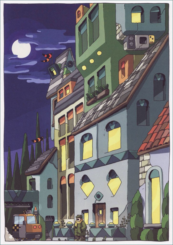
I admit it’s rare for me to discover a new present-day cartoonist I really like, so I was quite thrilled to stumble upon Ben Sears and the adventures of friendly robot Hank and goggles-sporting Plus Man. Sears’ style reminds me of claymation (one of my soft spots), and he is not afraid of bright colours or playfulness – such a contrast to the many ‘serious’, sepia-coloured comics that are just dull as dishwater (although apparently the latter is now an in-demand hair colour).
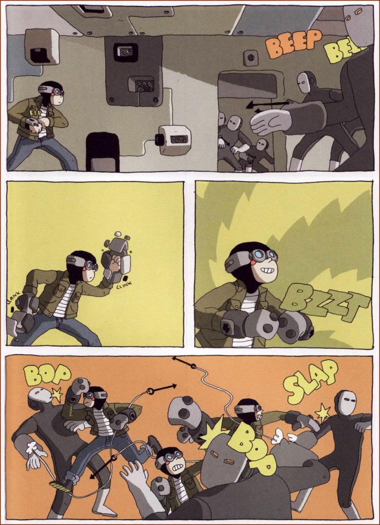
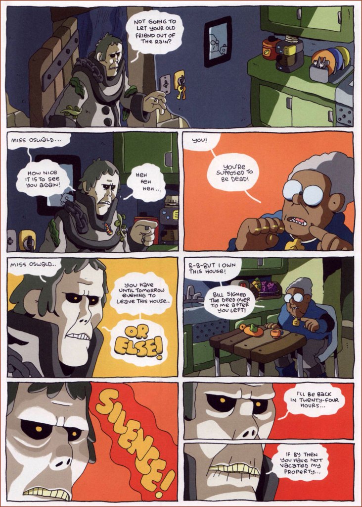
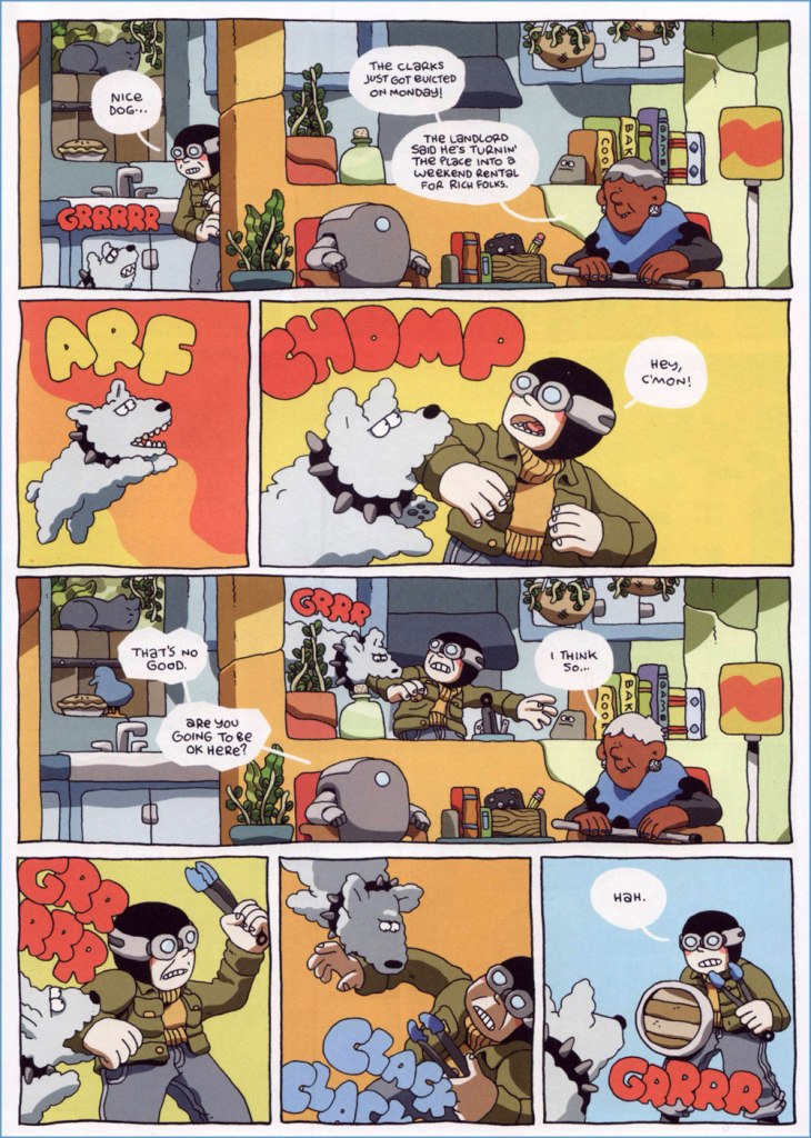
The four ‘A Double Adventure +’ comics Sears has given us so far (Night Air, 2016; Volcano Trash, 2017; The Ideal Copy, 2018; and House of the Black Spot, 2019), published by Koyama Press*, brim with interesting details – plants are everywhere, rooms are full of intriguing trinkets, and cats are perched on counters and rooftops. This is a world not devoid of danger (Hank and Plus Man keep getting pulled into murder mysteries, ominous conspiracies, hive-mind henchmen skirmishes, etc.), but there’s also an appealing domesticity about it, as we often get to visit their apartment or tag along as they hang out in a friends’ kitchen. The fight scenes are viscerally satisfying (who doesn’t want to see bad guys’ asses kicked in a most expedient manner?), but there is also clever team work, friendship, and occasionally a moral dilemma or two. My favourite of the four is House of the Black Spot, so things are clearly going in the right direction!
The Ideal Copy features a villainous gaggle of creepy white men, all eerily dressed in the same red sweater + beige pants-pulled-up-to-armpits** uniform:
The nasties have convenient number badges pinned to their sweaters (perhaps they also get confused).
Volcano Trash features some enjoyably fast-paced fight/daring escape scenes, but I think its heart lies in its quietly emotional sequences. Sears’ dialogue is perfectly functional, sometimes even fun, but he doesn’t over-clutter his pages with words, excelling at mute scenes in which body language says a’plenty. When looking through his website recently, I was happy to discover he has a few pantomine self-published comics (featuring a trash cleanup robot, a cat and a bird!) I’d never heard of. You can order them here.
A discussion about friendship mostly takes place through sighs and gestures – not much needs to be said in words.
Finally, here are some excerpts (or extracts, as the Brits would say) from House of the Black Spot, the lushest, latest installment of Hank & Plus Man’s adventures:
You can read an (otherwise unpublished, as far as I know) Double+ Adventurehere.
I keep reading reviews in which comparisons are made between Sears’ work and Hergé’s Tintin, which supposed resemblance I admit I don’t see at all. On the other hand, I’ve never read a full Tintin album, and to be perfectly honest have no intention of ever undertaking such a tedious task.
~ ds
* Toronto-based Koyama Press shut down its operations in 2021, so Ben Sears’ new book, Young Shadow, was published by Fantagraphics. I haven’t read it yet, but am looking forward to it, once I get my hands on a copy! You can read a review of it over at The Comics Journal.
** The question of why older men tend to wear their pants somewhere below their armpits still baffles me. Hypotheses have been made to the effect of beer-bellied folks having to decide whether the pant waistline lies above a bulging stomach or under it, and opting for the former option, but I have seen plenty of instances of pants being pulled up when the wearer had a relatively flat stomach…