Matt Baker at No. 9, Swanson Street

« We can lick gravity, but sometimes the paperwork is overwhelming. » — Wernher von Braun

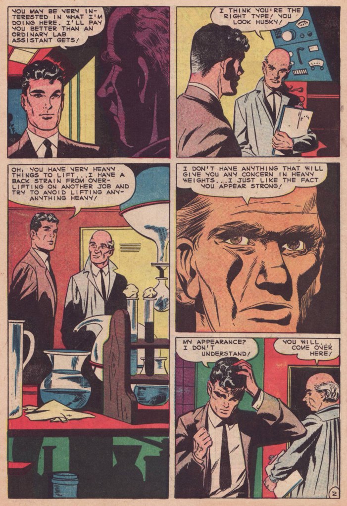
The other day, I was digging through my to-read pile, and came upon a 1950s Charlton science-fiction title I’d picked up for a song during a trip to the Maritimes (that’s New Brunswick in this case), last Fall. Its second story struck me as slight but quite fun, which is pretty much the best one could hope for in those strict, early years under the Comics Code’s oppressive authority. Despite the quickly executed job under overpowering Colletta varnish, I surmised I could identify the penciller’s style: none other than Matt Baker, whom I wrote about almost exactly a year ago, in Matt Baker’s Disquieting Romance. I’d advise you to begin there.

In his review of Matt Baker: The Art of Glamour (2012, TwoMorrows), cartoonist Eddie Campbell provided a useful bit of context: « A final phase, in which Baker had a hard time getting any work at all, is also examined briefly. Between 1955 and ‘59 he mostly pencilled for Vince Colletta, who was somehow well enough placed to pick up as much work as he could handle from Atlas and Charlton. He farmed a great deal of it out to others to pencil, leaving the inking for himself, which is one way to make a living and I’ve never had any problem with it. Colletta is a figure that comic book fans love to vilify. There’s him, Fredric Wertham, and the Red Skull, making the triumvirate of evil. »

But enough telling for now, time for some showing!

This is Mysteries of Unexplored Worlds no. 14 (Aug. 1957, Charlton); cover art by Charles Nicholas and Vincent Alascia. Yes, there was a time when the profligate Alascia was a decent inker.
Though uncredited, the story was evidently written by Joe Gill. Typical of him, the story is driven by straightforward but purposeful dialogue, in which much is intimated between the lines. It takes the rare gift of economy that tell such a story — and make it work — in just a handful of pages.

So what was in it for Vince Colletta? Basic economics aside — it’s easier to ink well-executed layouts — perhaps he harboured sympathy for this massively talented Black man who couldn’t get work, as all but a few did — regardless of talent — after the massive contraction of the comics field in the mid-Fifties. As a native Sicilian, it couldn’t be far from Colletta’s mind that in America, his own people, not so long before, were forcibly excluded from the ‘Whites’ club.

As Brent Staples wrote in How Italians Became ‘White’ (The New York Times, Oct. 12, 2019): « Italian immigrants were welcomed into Louisiana after the Civil War, when the planter class was in desperate need of cheap labor to replace newly emancipated black people, who were leaving backbreaking jobs in the fields for more gainful employment.

These Italians seemed at first to be the answer to both the labor shortage and the increasingly pressing quest for settlers who would support white domination in the emerging Jim Crow state. Louisiana’s romance with Italian labor began to sour when the new immigrants balked at low wages and dismal working conditions.

The newcomers also chose to live together in Italian neighborhoods, where they spoke their native tongue, preserved Italian customs and developed successful businesses that catered to African-Americans, with whom they fraternized and intermarried. In time, this proximity to blackness would lead white Southerners to view Sicilians, in particular, as not fully white and to see them as eligible for persecution — including lynching — that had customarily been imposed on African-Americans. »
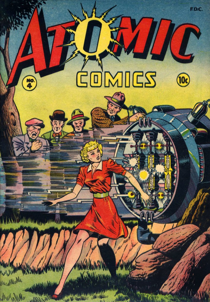
Baker didn’t delve much into the science-fiction genre, but here’s one such case: this is Atomic Comics no. 4 (July-Aug. 1946, Green Publishing). Read it here!
Another rarity in Baker’s œuvre: blackness — despite being undermined by the colourist here. This is Amazing Ghost Stories no. 15 (Dec. 1954, St. John). On comicbookplus.com, where you can read this entire issue, a reader commented approvingly: « There are a lot of horror comics set in Haiti. This is the first one I’ve read where it looks like the author did some research on the history of Haiti. »

-RG

Fungus Friday: Meet… The Mushroom Man

Every once in a while, we celebrate the end of the working week with a leisurely walk through fungal pastures. This week’s installment is a bit on the spooky side, so if you are troubled by a little case of mycophobia, an affliction many suffer from, stick around for a spine-tingling experience. Me, I was definitely rooting for the mushrooms 🍄

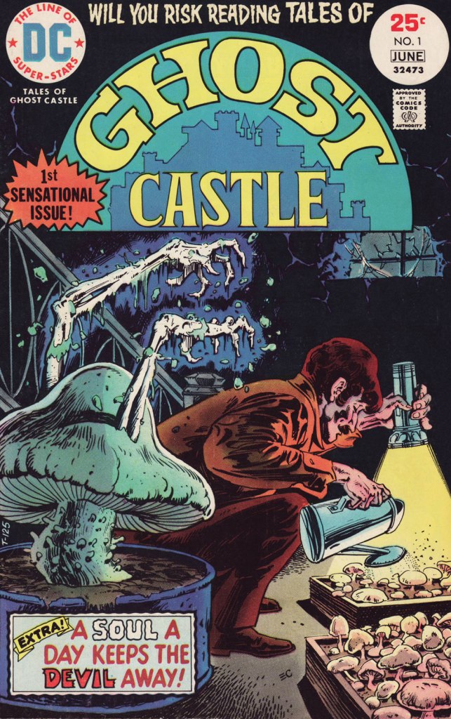
The cover of this issue promised some mushroom goodies, so of course my interest was piqued, even though it makes no sense whatsoever to have skeletal arms protruding out of a fungus. Tales of Ghost Castle no. 1 (May-June 1975, DC). Cover by Ernie Chan; Tex Blaisdell, editor.

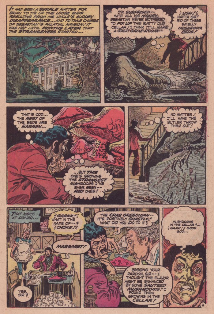
The cover story – 5-pager The Mushroom Man, plotted by David Michelinie, scripted by Martin Pasko, and illustrated by Buddy Gernale – is a tad more mycologically convincing.

Knowing that the fungus fancier is dead right from the beginning depressed me a little bit. However, starting at the scene of the crime to pursue in mushroomy flashbacks makes for good storytelling.
It’s possible for a mushroom to degrade super quickly (see, for example, shaggy manes aka Coprinus comatus that can deliquesce into a puddle of black goo in less than 24 hours after popping up), though 3 hours is pushing it a bit. ‘Nightdreamer’ sounds distinctly psychedelic, so we can take a guess about what kinds of ‘gourmets’ the uncle is referring to.
Did no-one wonder what happened to the uncle?
It’s not a ratty cellar, it’s an appropriately dark and humid cellar, you philistine. A ‘simple matter to tie up loose ends‘? Maybe the police had mycophobia, too, to let the matter drop so easily. One might add that cooking random mushrooms growing in the cellar is not recommended.
Hello, scene from Last of Us.

We are the champignons, my friends! Quite literally, in the case of this money-grabbing, murderous nephew.

~ ds

José Delbo and Billy the Kid’s Long, Dusty Trail

« There will be no questions asked if I kill you here, gringo! » — Bad hombre Alejandro Roja

On February 5, 2024, versatile veteran cartoonist José Delbo (born in Buenos Aires, Argentine, on December 9, 1933) left us at the most respectable age of ninety. Comics fans of a certain age will no doubt recall him chiefly from his long stint on DC’s Wonder Woman (1975-1981, issues no. 222-286), but to my mind, that’s hardly his finest hour: he wasn’t done any favours there, hobbled as he was by pedestrian (or worse) writing and indifferent (or worse) inking. Same goes for his run on Batgirl (1976-82) in Batman Family and Detective Comics.

For a detailed rundown of his remarkably long and varied career, you can’t go wrong with this excellent bio.

This post’s title gave away my candidate for Delbo’s magnum opus, such as it is; but I would be remiss in failing to also note his charming work on Dell’s The Monkees (fifteen issues), where he got to demonstrate his deft hand at humour; and his winningly bizarre collaboration with Tony Tallarico, Geronimo Jones (nine issues, 1971-73, plus one that remains unpublished).

This is Billy the Kid no. 58 (Nov. 1966, Charlton), Delbo’s second issue on the title but his first cover. After this one, he would go on to pencil and ink the subsequent fifty or so covers and most of the inside features. When you find an artist who can draw horses, you hold on to him (or her)! How many, among the current generation, could successfully handle that particular mission?

Incidentally, Billy’s distinctive steed appears to be an Appaloosa: « The Appaloosa’s eye-catching pattern comes from the spotted horses brought into the Americas by Spanish Conquistadors. Known as the Dalmatian horse breed, it was bred in the mid-18th century by the Native American Nez Percé people. Its name comes from the Palouse River that flows through what used to be Nez Percé territory. » [ source ]

Charlton Comics’ flagship western title, Billy the Kid (153 issues, 1955-1983, including its first five as “Masked Raider”), endured as long as it did for good cause: notable runs by accomplished artists, among them John Severin, Rocco Mastroserio, Luis Domínguez, Delbo, and finally Warren Sattler. Yet, for my money, it’s Joe Gill’s spare but psychologically consistent and highly humane scripting that holds the enterprise together.

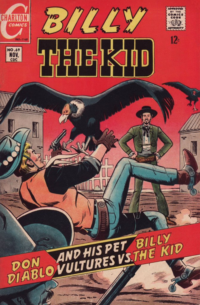
This is Billy the Kid no. 69 (Nov. 1968, Charlton).
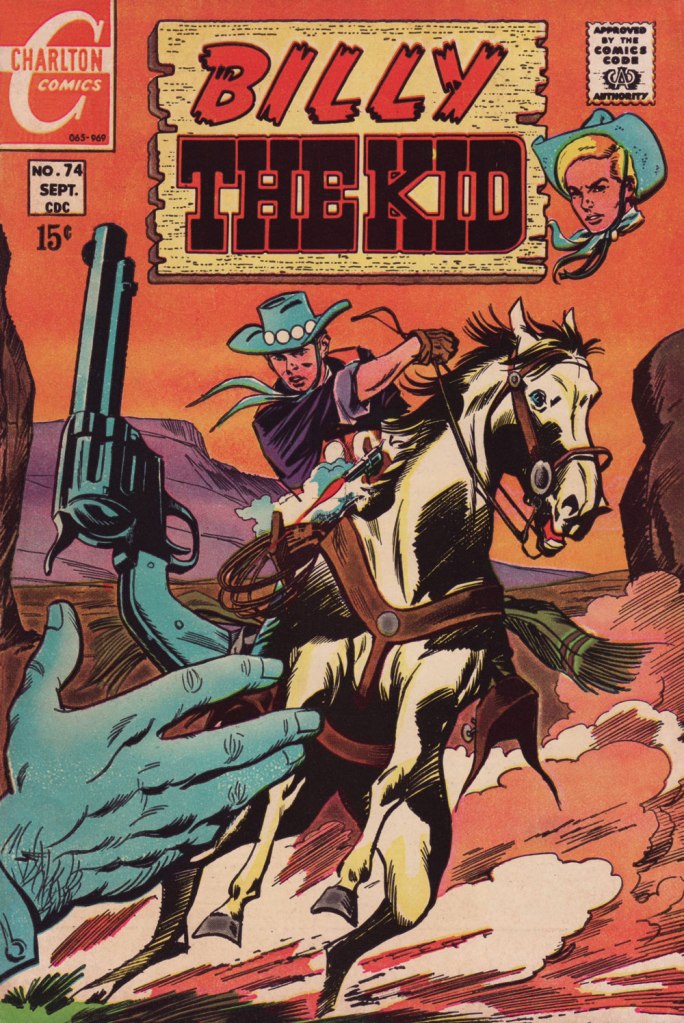
This is Billy the Kid no. 74 (Sept. 1969, Charlton).
This is Billy the Kid no. 80 (Sept. 1970, Charlton).
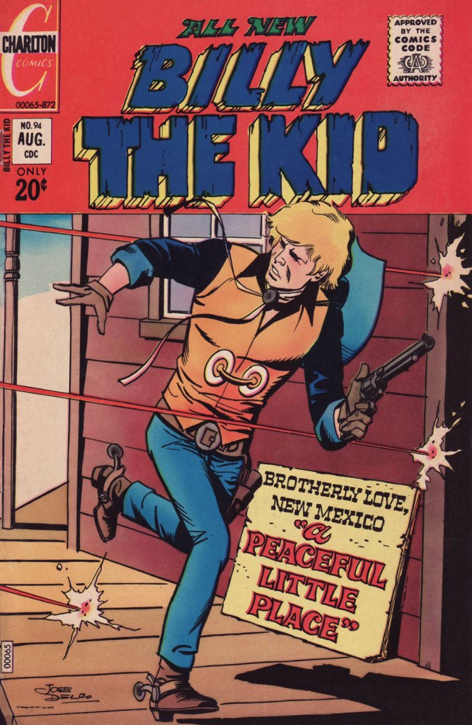
This is Billy the Kid no. 94 (Aug. 1972, Charlton); I love the clever signpost integration of the featured title.
This is Billy the Kid no. 98 (Jan. 1973, Charlton). Readers accustomed to Marvel and DC-style hype may notice how light on text these covers are. A lot of shouting isn’t what sells a cover: an arresting visual will do that.
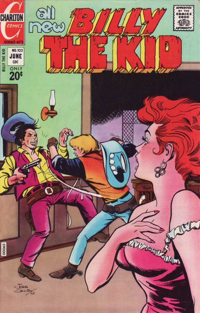
This is Billy the Kid no. 102 (June 1973, Charlton).
This is Billy the Kid no. 103 (Aug. 1973, Charlton).
This is Billy the Kid no. 106 (Dec. 1973, Charlton). The foxy villainess Billy’s tussling with is La Duquesa, featured in “Slave of Beauty”.

Happy trails, and gracias for everything, Señor Delbo!

-RG

Folk-Artist: Hua Junwu and the National Style

Hua Junwu (華君武, 1915-2010) hailed from Hangzhou. He was born during a hectic epoch — life tossed him around quite a bit, but unlike a lot of his contemporaries, he was able to navigate through these changing times with dry feet. He had been drawing since his school days, but the seeds of his artistic career were sown around the time he moved to Shanghai to become a student at Utopia University, where he first began submitting his cartoons to magazines for publication, as well as meeting like-minded artists.

A year after the Second Sino-Japanese War started, in 1938, he left the Japanese-occupied Shanghai for Yan’an (the seat of the Communist government at that time) and worked at the Lu Xun Academy of Literature and Art, also contributing anti-Japanese propaganda cartoons to publications like Jiefang Daily. Japan formally surrendered in 1945, but the same year saw an escalation of the struggle for power between the Nationalists and the Communists, which signalled the start of the Third Chinese Revolutionary Civil War. Hua travelled through Northeast China, working as a reporter and cartoonist for Northeast Daily. 1949 saw the founding of the People’s Republic, and Hua joined People’s Daily as the head of its art department, and the China Artists Association as its Secretary-General in 1953.

In his introduction to Selected Cartoons of Hua Junwu (New World Press, 1984), Hua credits German artist E. O. Plauen (see Circus Acrobats of Life: E. O. Plauen’s Father and Son) as one of his main artistic influences. I was amused that the other artist who had Hua’s utmost admiration was Georgi Sapojnikov, a former officer of the Russian Imperial Army who occupied the spot of daily cartoonist in North China Daily News, working under the pseudonym Sapajou*.

There was considerable difference between rural Yan’an and sophisticated Shanghai, and this change of scenery is what shaped the artist’s style into its distinctive form. To quote Hua, « Shanghai in the 1930s was a cross between a colonial and feudal society, a special territory where Chinese and foreigners lived cheek by jowl. As I had learned so much from foreigners’ cartoons, my own cartoons were inevitably rather foreign in flavour. Fortunately, the only people who paid any attention to cartoons in the Shanghai of those days were, I suppose, a few intellectuals who were also foreign influenced, so I was able to get by. » After his move to Yan’an in the late 40s, Hua found his audience changing from the aforementioned ‘few intellectuals’ to a readership of mostly peasants, who found his foreign-based style alien and hard to understand. Feeling like ‘a round peg in a square hole’ and heavily influenced by the writings of Mao Zedong, Hua adopted a philosophy of ‘national style’, ‘the Chinese style and spirit which the common people of China love‘, for which he is now fondly remembered.

This collection, as noted on the cover, is bilingual – the cartoons in Chinese are included on the left, with their English translations on the right (Hua Junwu drew the English letters himself, to keep their Chinese flavour). However, in interests of intelligibility, we are just including the translated versions.

I just wanted to share some fun cartoons, but this post once again dragged me into the 20th century and its bloodshed, as well as the history of communism (this time from a Chinese perspective). Some topics are rich veins to mine, full of interesting filaments that lead to their own story.

~ ds

* The story of ‘White’ Russian refugees fleeing to Shanghai during the civil war between Bolsheviks and Tsarists is a fascinating topic in itself. Of more relevance to this post is this quote from Citizens of No State: Daily Life of Shanghai White Russians, 1920s-1930s: « A man endowed with the gift of reducing the complexities of Chinese politics to a single image and of capturing the ebullient, chaotic nature of Shanghai without sentimentality or cynicism, Sapojnikov worked for the newspaper for more than two decades. » I think a post about Sapajou is needed at some point in the future…

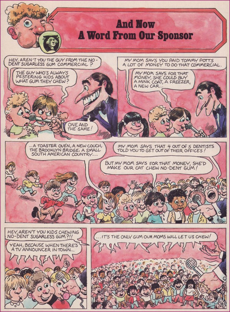
And Now a Word From Our Sponsor

« Advertising – A judicious mixture of flattery and threats. » — Stephen Leacock

It’s long been established that one can scarcely be too skeptical in the face of advertising, and the sooner one starts questioning its wooly claims, the better. In the early 1950s, Harvey Kurtzman‘s Mad shone the giddily harsh light of truth on, well, just about everything, but Madison Avenue‘s tactics were a favourite and frequent target, and for good reason. In 1956, Kurtzman heatedly left his creation after a mere 28 issues; while it retained much of its cultural influence as its reach increased, it degenerated into rigid formula in the hands of his too-cautious successor at the helm, Al Feldstein.

Fast-forward to 1974, and Dynamite Magazine‘s sixth issue. Readers presumably too young for Mad could now receive their monthly inoculation against the advertising industry’s tainted baloney.

From 1974 to 1981, the feature was illustrated by Calvin Sanford “Sandy” Huffaker, Sr. (1943 – 2020); then the reins were passed into the able paws of future Mad art director (small world!) Sam Viviano. But that’s a tale for another day.

Since Huffaker was only credited for illustrating the feature, it stands to reason that it was written in-house, and that narrows it down to two main candidates: editor Jane Stine or Linda Williams Aber (aka “Magic Wanda”); my money’s on Aber, who also wrote Count Morbida’s Puzzle Monthly Puzzle Pages.

As Dynamite’s ‘Inside Stuff’ table of contents always billed it, here’s « A Dynamite look at BADvertising »!

The feature’s inaugural entry, from Dynamite no. 6 (Dec. 1974, Scholastic). The voracious oldster lampooned here is Euell Gibbons, who shilled for Post Grape-Nuts (which contain neither grapes nor nuts!) in this vintage commercial.
From Dynamite no. 7 (Jan. 1975, Scholastic). You might recognize Nancy Walker, aka Rhoda’s mom Ida, and future director of Can’t Stop the Music! (trigger warning: Steve Guttenberg); here she is, pre-orange hair, in a Bounty Paper Towel spot from the Me Decade.
From Dynamite no. 9 (Mar. 1975, Scholastic). Here’s a 1971 Bufferin vs. Aspirin ad. Place your bets!
From Dynamite no. 19 (Jan. 1976, Scholastic). You just may be familiar with the object of this parody.
From Dynamite no. 25 (July 1976, Scholastic). Here’s another ‘wonderful, quickJell-o recipe from those gelatin-happy days.
From Dynamite no. 26 (Aug. 1976, Scholastic). Remember Morris? Here’s the famously fussy feline in a 1974 Nine Lives ad.
From Dynamite no. 27 (Sept. 1976, Scholastic). Here’s a Hamburger Helper commercial of the corresponding vintage.
From Dynamite no. 28 (Oct. 1976, Scholastic). Here’s our pal Poppin’ Fresh in a 1972 commercial.
From Dynamite no. 37 (July 1977, Scholastic). On that topic, here’s our look at the 1970s bubble gum explosion!
This subscription ad appeared in Dynamite no. 26. I suspect it was a draft for issue 28’s more focused Laverne and Shirley cover, which had been previewed in ads as a photo cover.
From 1971, young Sandy wears his Ed Sorel influence a little heavily, but he was learning fast and from the best! For those who may not know — or who’ve forgotten — David Frye was possibly the nation’s premier Tricky Dick Nixon imitator. Was he? Listen here and judge for yourself!

Thanks to his versatility and ability to nail a likeness, Huffacker was among the most sought-after illustrators of the 1970s. Quoting from the Chattanoogan.com’s obituary:

« Huffaker was a highly acclaimed political cartoonist who started his career with The Birmingham News and the Raleigh News and Observer. He later moved to New York City and illustrated covers and articles for such publications such as Time Magazine, The New York Times, Sports Illustrated, Businessweek, People and Fortune Magazine. Some of the accolades awarded for his artwork include two Page-One Awards from the New York Newspaper Guild, three nominations for Cartoonist-of-the-Year by the National Cartoonists Society, A Desi Award of Excellence (Graphic Design Magazine), 20 Award of Merit citations from the Society of Illustrators, and was twice nominated for a Pulitzer Prize for illustration. »

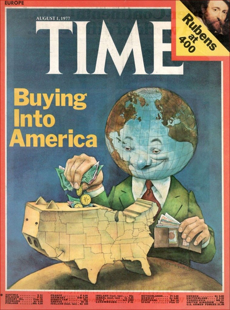
Here’s one of his aforementioned Time covers.

In a 2012 interview, he recalled those halcyon days: « During one week at the peak of his career as an illustrator, Sandy Huffaker had assignments from Time, Sports Illustrated and Businessweek. He had to turn down a fourth assignment that week from Newsweek. “I just didn’t have time. »

-RG

Death to Global Imperialism: D. Moor and the Bolsheviks

D. Moor may not ring like a convincingly Slavic name, but it is the nom de plume of Russian illustrator Dmitry Stakhievich Orlov (1883-1946). Why the D. abbreviation was picked is obvious; as for the family name, he plucked it from The Robbers, a 1781 play by German Friedrich Schiller about two brothers, one of whom Orlov thought he resembled in temperament.

Orlov adopted his pseudonym in 1907, when he switched careers from typography to political cartooning after one of his caricatures was printed in a newspaper. His biting sense of humour was not always well received by the Tsarist régime, and occasionally censored, which provoked the passionate Orlov into even more acerbic mockery. In these years he also designed posters for silent films, which in a way forecast his future as an affichiste. After the Russian Revolution of 1905, Orlov joined the ranks of those actively working in favour of an uprising; when in 1917 Russia fell into civil war that would lead to the formation of the USSR, D. Moor put to good use his aggressive anti-religious stance and talent for caricaturing politics.

‘Three Russian attractions: Tsar bell, Tsar cannon, and Tsar Nicholas. Tsar bell doesn’t ring, Tsar cannon doesn’t shoot, Tsar Nicholas doesn’t reign…’, 1917
Orlov’s poster for Убійца (1910)*

He was responsible for creating much in the way of striking agitprop, and is often cited as the father of the Soviet propaganda poster. His most famous poster** was not only aped by other illustrators during Orlov’s lifetime, but also acquired great popularity after the USSR fell apart***.

The Solemn Promise (1919)
Death to Global Imperialism (1919)
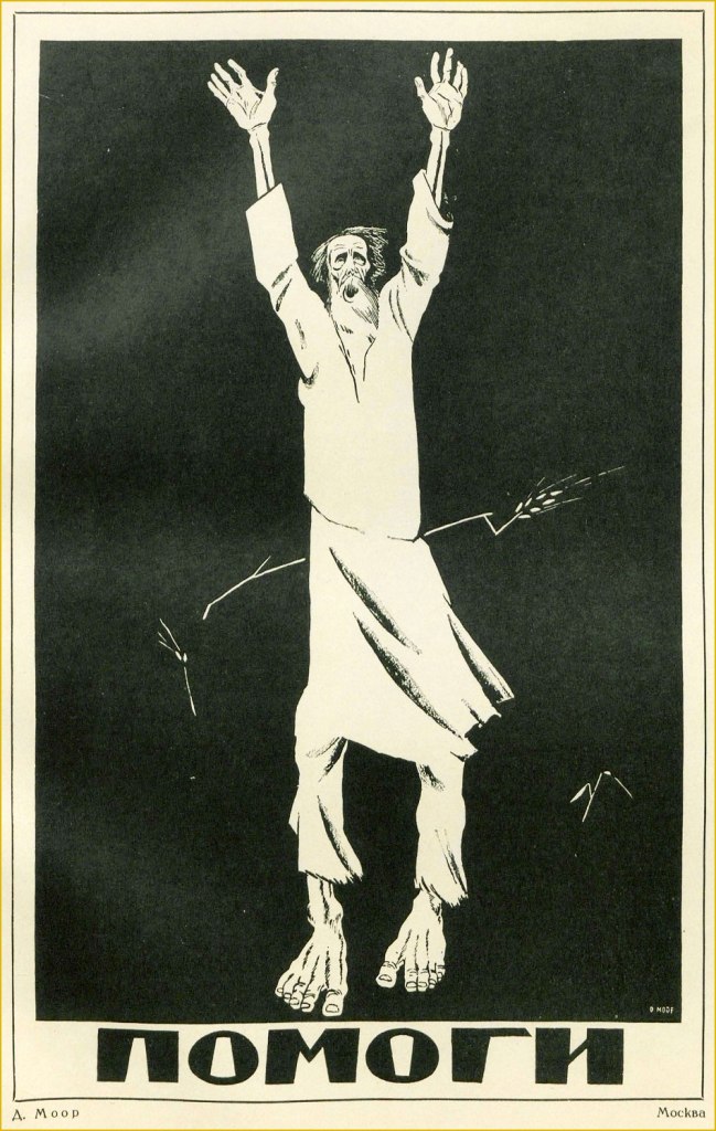
Help (1921). This is one of D. Moor’s most striking posters, and refers to those affected by the Povolzhye famine, which began in 1921 and lasted until 1922, killing an estimated six million people. Note the starving peasant being pierced by a single stalk of wheat.

I may be somewhat straining the definition of ‘comics’ by writing this post, yet some of D. Moor’s posters clearly feature linear graphic storytelling.

Labor (1920)
The White Guards and the Deserter (1919)
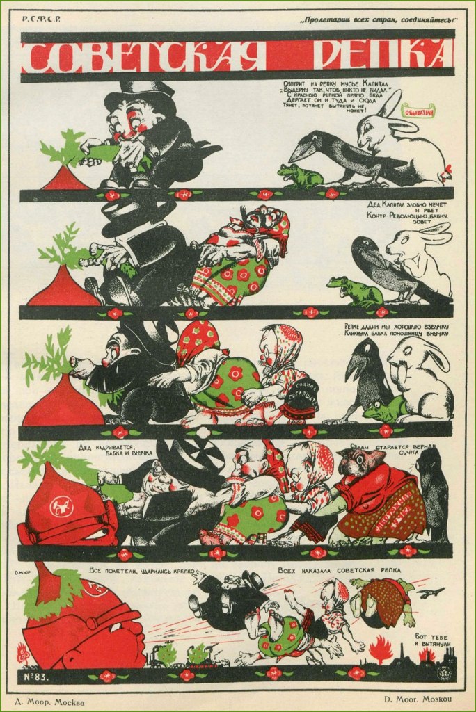
The Soviet Turnip (1920). This alludes to a classic fairytale in which a family is collectively trying to rip out a big turnip from the ground, even involving the help of the dog, the cat, and the mouse.
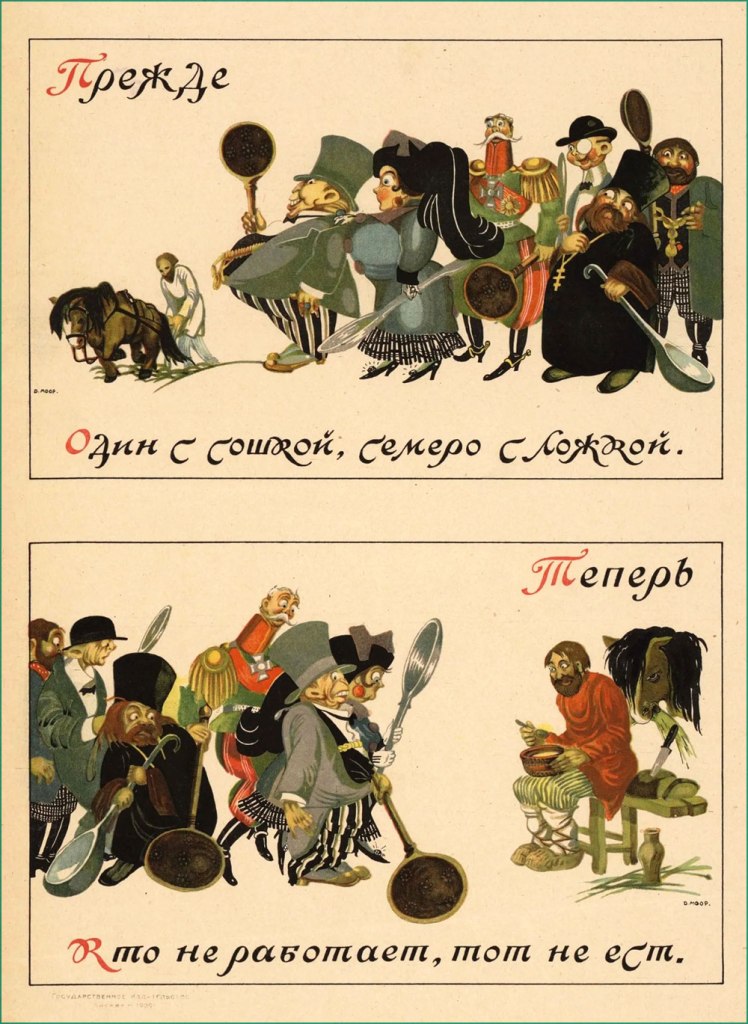
This uses two proverbs to make its point – under ‘Before’, ‘One with a plow, seven with a spoon’ and under ‘Now’, ‘The idle don’t get to eat’. (1920)

Alongside his active production of posters, D. Moor continued his career as a political caricaturist, publishing his anti-religious work in The Godless at the Workbench magazine (Безбожник у станка) — nice title, isn’t it? — and regularly contributing to various satirical magazines and communist newspapers, such as Pravda or Krokodil.

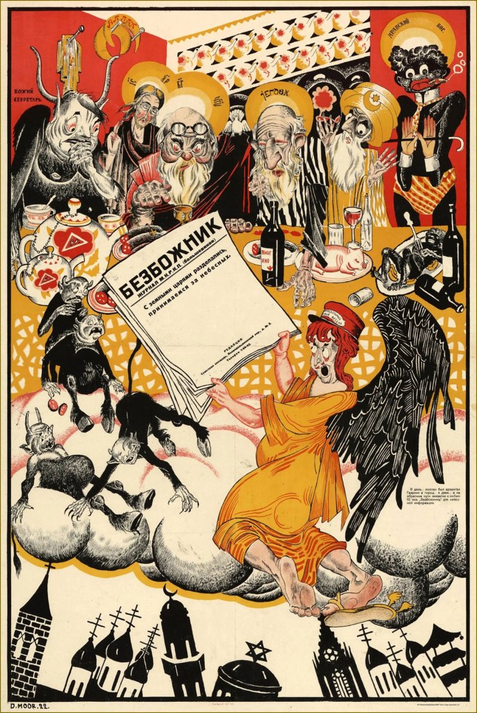
« We’re done with earthly kings, now comes the turn of heavenly ones », 1922
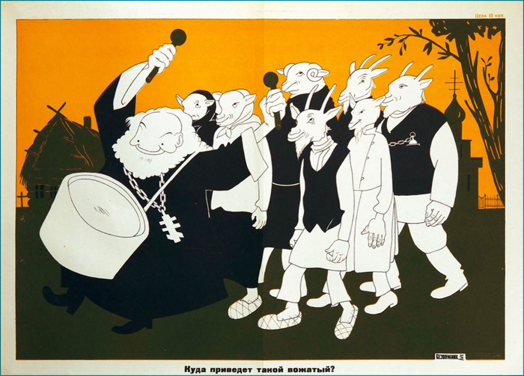
« Where will such a leader guide you? » (1930)

During World War II, Orlov of course supported anti-Nazi efforts (well, once Germany launched an invasion of the Soviet Union, at any rate).

1941. This is kind of untranslatable, but in Russian Hitler and Himmler are spelled with a hard ‘G’, not an H, leaving us with the quartet of Himmler, Göring, Hitler and Goebbels all starting with G… as well as the word for ‘shit’ (govno, говно).

Throughout his life Orlov also taught art at several institutions, and historical accounts indicate that he was a warm and talented teacher adored by his students. Did Orlov enthusiastically embrace the censorship-happy Soviet system, or was he just another artist trapped in a moment of history? I don’t have an answer for this, as one gets a very different perspective depending on which biography one consults and in which language – some emphasise his fervour for Soviet labour, and some philosophically note that he was anti-Soviet ‘like any self-respecting honest intellectual’.

You can take a look at more posters here, or head over here (perhaps with the help of google translate) to take a peek at caricatures poking (careful) fun at some Soviet figures.

~ ds

* An especially interesting thing for me was that his work spans the years of the orthographic reform in Russian. The reform was planned long before 1918 to combat the peasants’ illiteracy, so it wasn’t tied to the revolution per se, but since it came into effect in 1918, it was instilled by the Bolsheviks. The movie title, for example, is written with the letter ‘і’, which was kicked out of the alphabet.

** I am not including it for reasons of ubiquity, but take a look here.

*** Plenty of ex-Soviets feel an irresistible nostalgia about the USSR years, as if their memory can only conjure rose-coloured memories and erases everything unsavoury. The « Have you registered as a volunteer? » poster has been aped and parodied in social media.

Jean-Michel Folon: Just Another Belgian Genius?

« Less is more. » — Ludwig Mies van der Rohe

Once again, my initial instinct when I hit upon the notion of showcasing the work of Jean-Michel Folon was: « is he too obvious a subject? ». Then reason stepped in with: « to whom, exactly? »

Which brings me to my own tiny Folon anecdote: about twenty years ago, I was helping out a friend, who usually took off the month of January to travel. As it happened, it was usually the worst month for art freelancers, at least in my experience, so he was helping me out too.

Anyway, instead of working from home or some ad agency’s offices, I would work from his boutique, manning the four telephone lines while his regular employees handled the in-person traffic. One day, I took an order from a nice lady who, while I was filling out the relevant papers, gave her last name as Folon. « Like the illustrator? », I asked. « Yes indeed, he’s my cousin! », she replied, clearly delighted. « I’ve been living here in Canada for thirty years, and you’re the first person who’s ever asked! ». Which goes to show that one should think twice before extrapolating from one’s familiarity with a given subject. Or to put it simply, just because you’ve heard of someone, don’t assume everyone else does… whether they should have or not.

I can’t make mention of Folon without bringing up his strongest formative influences, Saul Steinberg (1914-1999) and André François (1915-2005); we’ll return to these gentlemen in due time.

To put it succinctly, Steinberg brought greater graphic and thematic purity to the gag cartoon… by dispensing with the gag, at least in the traditional sense. Not everyone dared to follow that perilous path, but Folon did, and similarly thrived.

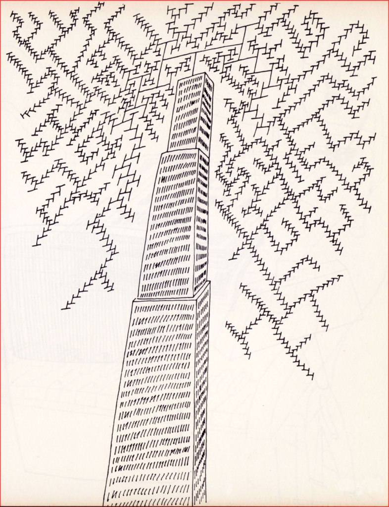
Born in Brussels in 1934, Folon initially studied architecture, but soon detoured into drawing and never returned to his early vocation, though he certainly erected his share of edifices… on paper. He timidly began submitting drawings in 1957. A decade later, he had scaled and conquered the lofty North American market, landing cover assignments with The New Yorker, Esquire and Fortune, among others.

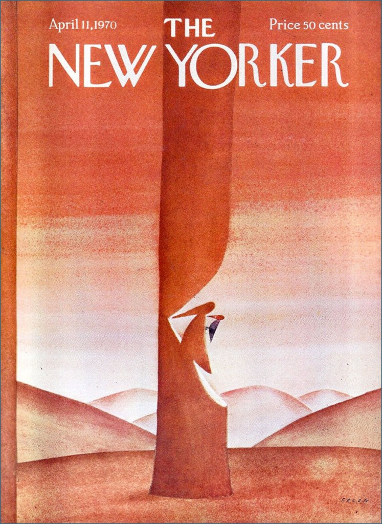
For example, this model of witty understatement from the week of April 11, 1970.

He turned his confident, limpid vision across all printed media, but also sculpture, tapestry, stained glass and animation. He passed away in 2005, but not before designing and establishing his own museum. Be sure to check this stunning place out!

Such a multifaceted career and œuvre being too gargantuan in scope for a simple blog post, I’ll mostly stick to a sampling of some of Jean-Michel’s drawings, produced during his first decade as a professional artist.

And here’s some of his later work:

This is Folon’s jacket for the 45 RPM single issue of Michel Colombier’s music (his adaptation of a baroque adagio by composer Alessandro Marcello). It had originally been recorded in 1971 for his US debut album, Wings (for Herb Alpert and Jerry Moss’ A&M label), which bore a variation of this Folon image as its European cover; the North American one was, to put it mildly, hideous.

Colombier, incidentally, belonged to that coterie of poor souls who did all the heavy lifting while their ‘collaborator’, Serge Gainsbourg, received and happily hogged all the credit.

In 1975, Colombier recycled the recycled adagio as the opening and closing theme for French public national television channel Antenne 2’s daily programming, accompanied by an appropriately graceful animated sequence by Folon.
Another local connection: Folon handled the artwork for this 1979 LP by musical whiz Jean Robitaille, who’d recently co-written the lovely 1976 Summer Olympics’ theme song. But my favourite Robitaille song has to be his duet with beloved songstress Renée Claude (1939-2020), St-Jovite, a fiendishly clever song about a singular sort of voodoo.
I must say I’m gobsmacked at the idea of the French post office selecting a Belgian artist to illustrate its stamp commemorating the 1989 bicentennial of the French Revolution. But what do I know? Folon did a great job.
When I state that Belgium seems to truly value its artists (see another example here), this is the sort of thing I mean: in 2010, five years after his passing, his native land issued a set of ten postage stamps saluting “The Magic of Folon”. ’nuff said.

-RG

Tomie and Soichi’s Snowy Winter Vacation

There are some weather phenomena one quickly learns to associate with specific plots – fog denotes something creepy or mysterious, rain evokes haunting melancholy, wind howls like the souls of victims. Snow is a bit less obvious, though its connotations often run the gamut from coziness to isolation. Manga artist Junji Ito (see Tentacle Tuesday: Junji Ito’s Remina) often uses weather to mirror his characters’ emotions, so it is no surprise that he has a few snowstorm stories under his belt. I welcome snow — in this part of the world, we were lucky enough to finally get a white landscape just in time for New Year’s — but I definitely not want to be trapped in the wintry world depicted by Ito!

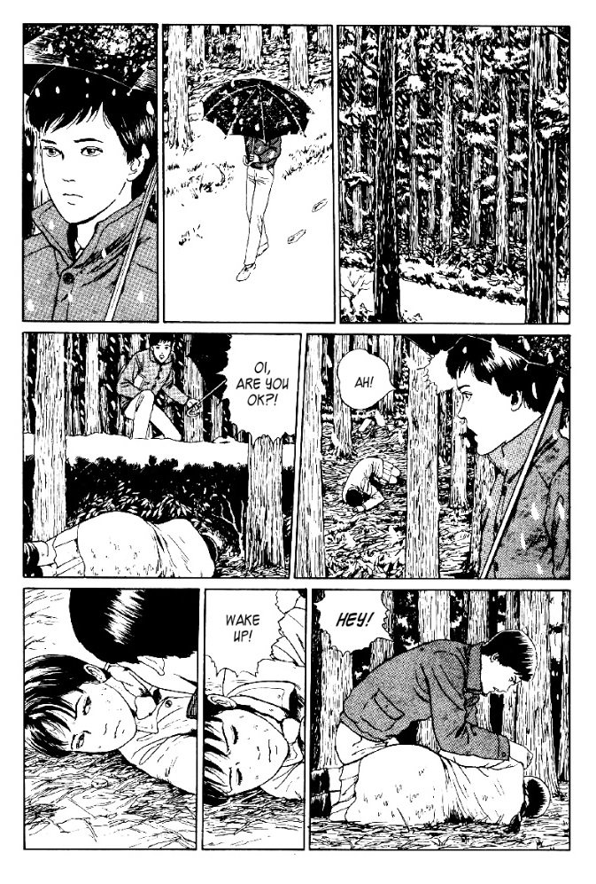
Here are a few pages from Fun Winter Vacation, a chapter/self-contained story from Souichi’s Diary of Delights (1997). Souichi is a little creep with more than a slight penchant for the occult, so weird shit happens whenever he is present. That’s him hiding behind the tree in the first panel – fetching lad, isn’t he? One might say he brings people’s darkest thoughts out into the open. You can read the full story here (remember to read right to left!) I’ve heard some readers complain that this narrative doesn’t quite make sense… welcome to Ito’s dreamlike logic. These episodes are meant to be absorbed like a nightmare one can’t quite wake up from, not dissected in the manner of an A leads to B equation.

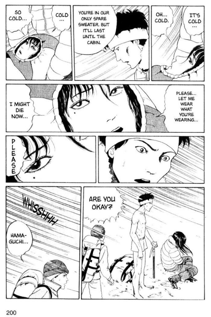
Revenge, originally published in the June 1993 issue of manga magazine Monthly Halloween, is standard Ito fare, and concerns itself with a woman so beautiful that she drives people to madness… in this case, the notorious Tomie, who dispatches a few new victims and nibbles on a wee bit of human flesh in this snowbound vignette.

Read Revenge in full here, and of course support Ito by purchasing his books. Publisher Viz Media is currently issuing plenty of them in a handsome hardcover format, including stories never previously translated to English.

~ ds

André Franquin: a Centenary in Ten Images

« The first hundred years are the hardest. » — Wilson Mizner

Having just learned this morning that today marks a century since the birth of André Franquin (1924-1997), I again pushed my planned post to the back burner. So, instead of writing about a celebrated Belgian genius, I’ll write about *another* celebrated Belgian genius.

Spirou’s ‘Albums’ were a handy way to dispose of unsold copies of the weekly magazine by collecting a trimester’s worth of issues in an attractive hardcover format. This one’s from March 1948, just to give you an idea of Franquin’s early style.
A panel from Le dictateur et le champignon (1953). The ripe banana-coloured critter with the long tail, if you don’t already know, is Le marsupilami, Franquin’s homage to Elzie Segar‘s Eugene the Jeep (introduced in 1935 and known as ‘Pilou-Pilou’ in French Europe).
This panel took my breath away as a kid when I first saw it, and it still does. It’s from Spirou et Fantasio no. 8, La mauvaise tête (1954). How many contemporary artists could pull off such a scene — let alone the entire sequence, wherein Fantasio ends up winning the race cycling backwards — at all convincingly?
I’ve been reading, for the first time, Franquin’s collected Modeste et Pompon (1955-59). After Franquin was tricked into surrendering his creation to Tintin magazine publisher Les Éditions du Lombard, M&P became just another long-running mediocre domestic strip in many successive pairs of (necessarily) lesser hands… but seeing Franquin bring it to life is a most refreshing pleasure.
A dynamic Modeste et Pompon sample from near the end of Franquin’s run. During Franquin’s relatively brief passage at Tintin magazine, he set a new standard of graphic freedom, opening a breach for his successors that Georges “Hergé” Rémi himself did *not* welcome. Tintin’s papa, in fact, deemed Franquin’s supple and organic line ‘vulgar’.
Album Spirou no. 70 (March 1959, Dupuis), gathering issues 1081 to 1091 and depicting a scene from Le Prisonnier du Bouddha.
Album Spirou no. 96 (April 1965, Dupuis), collecting issues 1395 to 1407. Gaston Lagaffe*, like Le Marsupilami before him, was a minor character introduced by Franquin to relieve the tedium of setting down the adventures of Spirou et Fantasio. The popularity of both these would-be background creations wound up dwarfing that of the intended protagonists.
Franquin’s original painted artwork for the cover of Album Spirou no. 100 — well, duh — (March 1966, Dupuis), containing issues 1447 to 1459.

In 1977, a depressed yet inspired Franquin, suffocating within the confines of his much-imitated (at his publisher’s clueless insistence) style, created — with kindred confederate Yvan DelporteIdées noires (Black, or perhaps more fittingly Bleak notions) as an outlet. It first appeared in the short-lived* Spirou mag supplement Trombone illustré, then moved to the more welcoming pages of Fluide glacial. An English-language edition, entitled Die Laughing, was published by Fantagraphics in 2018. Check it out here.

Here are a couple of Idées noires punchlines, which should give you an idea of their tone.

Marcel Gotlib wittily hijacked/paraphrased Sacha Guitry‘s bon mot about Beethoven : « After reading a page of Idées noires by Franquin, we close our eyes, and the darkness that ensues is still Franquin’s. »
In countless instances, Franquin even used his signature to expressive comic effect.

-RG
*These days, thinking about Gaston Lagaffe puts me in an ugly mood, I’m afraid. Franquin had expressly, and all along, requested that his creation be put to rest with him. But did his publisher – having built an empire upon Franquin’s creations — honour his wishes? No more than usual. Another arrogant slap — post-mortem this time — in the face of a genius exploited and mistreated his entire adult life. In this world, the interest of the characters… oops, pardon my French, ‘properties’ obviously trumps that of the flesh-and-blood creators. Every time. For there’s always some scab hack or other backstabber (and they *always* claim to be huuuge fans, as Miller said to Eisner, betraying him with a kiss) to aid and abet venal publishers. That’s how we got a pointless Sugar and Spike revival and all those Watchmen prequels. Hopefully, Monsieur Franquin’s daughter will prevail in her lawsuit against Dupuis to settle the matter in a just and fitting manner. [ Update: it didn’t end well. The suits won. ]

**« It is upon the publication of a Franquin article that the supplement is cancelled. In his piece, the fervently antimilitarist Franquin takes to task Thierry Martens, Spirou’s then editor-in-chief, for running articles about Nazi war plane models. » (translated quote from L’histoire de la bande dessinée pour les débutants by Frédéric Duprat, p. 131, Jan. 2011)

Hoping to See Your Face Again Next Year: Donald McGill’s Saucy Holiday Cheer

New traditions appear very easily – do something for a second time, and hey presto, it’s a tradition! Since last December was enlivened by some mushroom postcards — see Fungus Friday: Amanita New Year (To Get Over This One) — this year I’m bringing back English master Donald McGill, King of Saucy Postcards for an old-yet-new-to-us crop of festive offerings from some hundred + years ago (the following are from the 1910s and 1920s).

These run the gamut from cheeky to raunchy to creepy, in the classic vein of ghosts for Christmas*. Speaking of Christmas, it may now be over, but the spirit of holiday cheer sure isn’t gone (despite the total absence of snow in these normally snow-covered lands of ours), so let’s have a look!

Some involve all sorts of hivernal mishaps —

The consequences of pre-holiday, er… cheer.

Some of the usual daydreams brought about by possibly too many spirits**

— and the aforementioned ghosts, somehow especially startling when they’re born under McGill’s pen.

I’ve kept my absolute favourite for last: this revenant is so sad yet grotesque. I’d like to see the faces of people who got mailed this particular card!

~ ds

* As per another lovely tradition, we’ve recently been rewatching Christopher Lee’s Ghost Stories for Christmas. Highly recommended! Some are available on Youtube, like for example Number 13.

** As somebody who attended the Christmas office party this year, I can attest to the funny influence alcohol has on a bunch of normally restrained people when it comes to romantic advances.