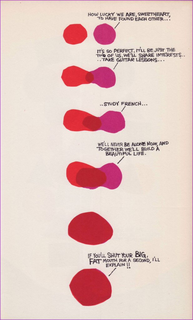
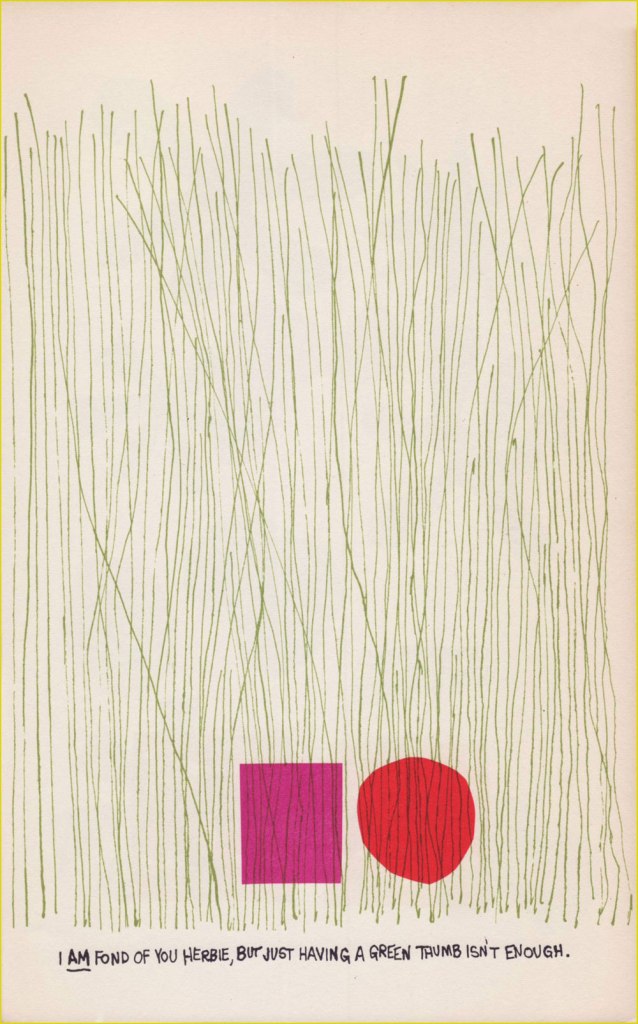
Inhabiting the same topography and timeline as Jules Feiffer‘s Village Voice strips, Bill Manville’s Saloon Society, and, dare I say, even Rod McKuen’s youthful reminiscences, The Conformersby Jack Wohl* (‘who has been, at various times, a child, a larger child, a musician, a composer and creative consultant and art director for our advertising agencies‘, helpfully notes the blurb on the back) is a charming little book with colourful squares and circles for characters. Like many other publications whose existence I previously ignored, I found it in a used bookstore that assigned it the somewhat random price of seven dollars, 41 cents, which was pretty good, considering that the employees probably didn’t know what it was or how to price it.**
Published in 1960, the book consists of ‘shapes cut out of colored paper with scissors‘, cheekily described in the introduction by Roger Price*** as Wohl’s psychiatrist’s idea. These blobs may be firmly situated in NYC’s Greenwich Village, but no matter how technologically advanced we get, most human preoccupations are the same some 60+ years later… so most readers will be able to effortlessly recognize themselves in the lives of Harriet (red circle), Howard/Herbie (purple square) or Arthur (green square).
** No shade is intended towards used bookstores in general, which are places I love being in, but this particular bookstore has staff that seem to wildly overprice most things without consideration for their condition or the simple question of ‘who in their mind would buy this at that price?‘.
*** As the author of Droodles, Price was particularly well positioned to write an introduction to The Conformers.
« Arrows of neon and flashing marquees out on Main Street / Chicago, New York, Detroit and it’s all on the same street / Your typical city involved in a typical daydream / Hang it up and see what tomorrow brings » — Robert Hunter
Among the foremost pleasures of a brick-and-mortar bookstore is the increased odds of stumbling upon an item whose existence you never suspected: case in point, another cheap (one buck!) gem I scooped up in Ellsworth, ME’s The Big Chicken Barn last Autumn.
Now — I’ve long been a huge fan of the pseudonymous Cecil Adams‘ sassy syndicated answer column The Straight Dope (1975-2018), in no small part thanks to resident — all the merry way! — illustrator Michele ‘Slug’ Signorino‘s waggish accompanying cartoons, rendered in what he colourfully called his ‘smudge-a-dot technique’.
And so, last October, I grabbed a lovely Scholastic publication that had until now ably eluded my radar — 1978’s Junior CB Picture Dictionary, compiled and edited by Joan Downing and dexterously illuminated by the aforementioned Mr. Signorino. I was delighted to discover that he’s still happily active well into his Eighties: « he still works and does not intend to retire. “This isn’t work,” he said. »
This slim-but-priceless tome happens to tick several of my pet boxes: a somewhat (but not quite!) passé communication technology; a lively, singular species of jargon; a merrily anarchic illustrative style… and so forth. Let’s sneak a peek, then!
Checking My Eyelids for Pinholes: Tired; getting sleepy.City Kitty: Local police.County Mounty: Sheriff or county police.Draggin’ Wagon: Wrecker or tow truck.Eatem Up Stop: A truckstop.Flagwaver: Road construction worker.Haircut Palace: A low bridge or overpass. There’s one of these a couple of blocks up the street from where I used to live, but I suppose every big city has to live with that problem. In Boston, MA, the phenomenon is particularly colourful, as is called ‘Storrowing‘. Mama Bear: Female police officer.Mixing Bowl: Highway cloverleaf.Motor Mouth (Also: Ratchet Jaw): One who talks too much.Rat Race: Traffic during rush hour.Skating Rink: Road slippery from ice, snow, or rain.Super Skate: Sports car.Truckin’ Teenybopper: Young hitchhiker. The bulk of my first-hand experience with CB came from hitchhiking in my youth so I indeed was a truckin’ teenybopper myself! I’m still warmly grateful for the longest ride I ever got: from Portland, OR, to Long Beach, CA, thanks to a friendly truck driving man. He was actually headed for San Diego, but I was already over three thousand miles from home… and had to get back in time for college.Wall to Wall and Ten Feet Tall: Good CB reception. A visual reference to famous pooch ‘Nipper‘. Window Washer: Rain. Is that you, Dirty Danny?
For more dirt on the magnificent Signor Signorino, feast your peepers on this lovely 2022 profile. And in case you’re wondering “Does Slug have a book about his career?”, why yes, he certainly does!
I’ll let Steve Earle have the last jab at this one: « Everybody told me you can’t get far/On thirty-seven dollars and a Jap guitar/Now I’m smokin’ into Texas with the hammer down*/And a rocking little combo from the Guitar Town**. »
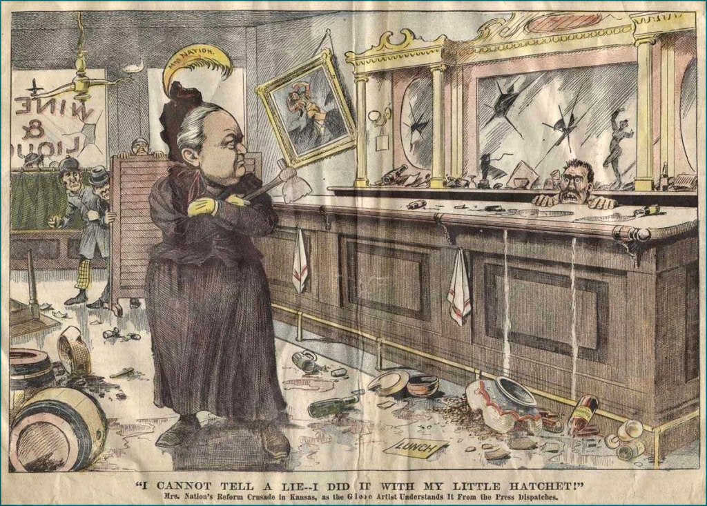
« In 1900, she bought from a Medicine Lodge hardware store the implement that became both her weapon and her symbol — a hatchet — and at the age of fifty-four sallied forth on a smashing campaign that carried her across the country, shouting: ‘Smash! Smash! For Jesus’ sake, Smash!’ »
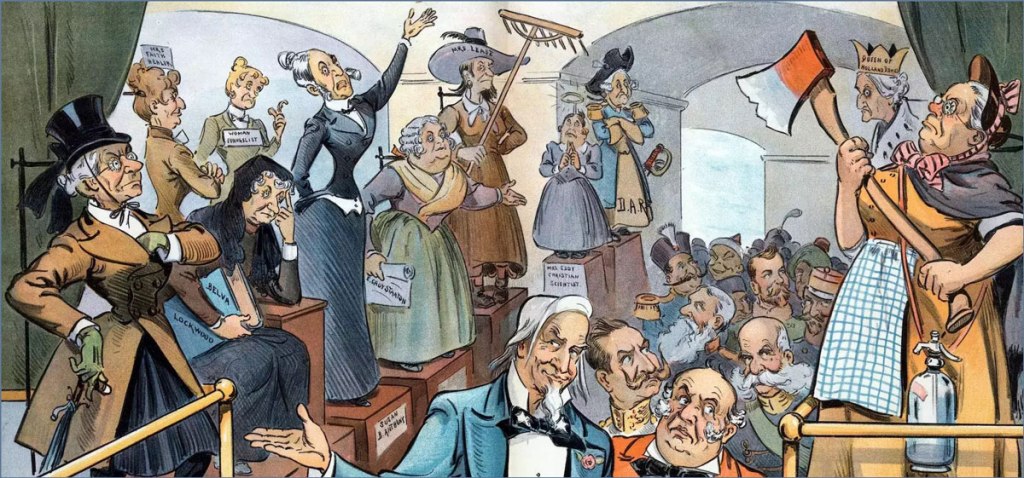
These days I’ve been reading Ardent Spirits: The Rise and Fall of Prohibition (1973) by John Kobler. I didn’t know much about the temperance movement in general, but what surprised me most is how intimately it was tied to suffragette activism. It’s in Ardent Spirits that I came across the fascinating character of Carry Nation*, ‘a bulldog, running along at the feet of Jesus, barking at what He doesn’t like’. She seems a very fitting figure for a post on this March 8th, International Women’s Day.
Whether she was a total barmpot or a blazing visionary is up for some debate; I must give credit to Kobler, who cobbled together a fairly well-balanced portrait of her while many historians tended to quickly dismiss this hatchet-wielding devotee as a crazed lunatic. While basic facts remain the same (disagreement about Nation’s height notwithstanding), interpretation of events and motivations varies wildly. This can be quickly demonstrated by comparing two modern articles of some depth: Carry Nation is described as ‘a flamboyant, theatrical and completely outrageous woman at nearly 6 feet tall [..] smashing barrels on stage and singing her temperance songs to enthusiastic audiences who howled for more‘ (Carrie Nation: American Woman by Richard Behrens) but also as ‘a fearless populist progressive just over 5 feet tall** […] fighting tirelessly for good governance, women’s rights, civil rights, and cleaning the corruption out of the body politic‘ (Hatchet Nation by Mark Lawrence Schrad).
One of six postcards published in 1905 depicting Nation’s ‘hatchetations’: On the Warpath; Raiding a Public House; Addressing Cigarette Fiends; Smashing a Pub; In a Restaurant; In a Pub.
Nation went through an arsenal of weapons (aside from rocks and incidental objects, a sledgehammer) before settling on her beloved hatchet and coining the term ‘hatchetations’ to describe her saloon smashings. It comes as no surprise that she grabbed cartoonists’ imagination, even taking into account that real juicy conflict remains unillustrated (and this was a ruthless war between temperance advocates and their opponents). Just picture this colourful scene — a woman, garbed in the usual constrictive dress of early 19th century, marching into a bar and smashing up bottles, mirrors, chairs, slot machines with her trusty little axe. This striking image is likely why Nation’s name is first to spring up when the topic of prohibition arises in modern conversation.
A bit closer to the present day, here’s a 1960s cartoon by bon vivant Eldon Dedini, who hypothesizes Ms. Nation’s likely reaction to a Playboy Club (the first one opened in Chicago, circa 1960). The caption? « Hi! ».
Happy Women’s Day (and Women’s History Month) to all readers!
~ ds
* This original name came about when Carry Moore, named Carry by a semiliterate father, married David Nation. She preferred to spell her name as ‘Carrie’, until she married David, yielding the grandiose full name Carry A. Nation (A. stood for Amelia), ‘carry a nation for temperance’.
** This question of height intrigues me, for most articles describe Nation as tall and powerful. Mark Lawrence Schrad, who just portrayed her as being just over 5 feet tall, has also written another article in which he calls her ‘imposing in stature, prone to violence and—claiming God spoke to her, urging her to attack saloons—slightly unhinged‘.
« We all know interspecies romance is weird. » — Tim Burton
It’s Bill Ward‘s birthday! No, not Black Sabbath’s Bill Ward — that’s on the 5th of May — save the date, as the suits say. It’s also Will Eisner’s anniversaire, but as he holds a category of his own, let’s let ol’ Bill have his turn, shall we?
Now, while most of the attention devoted to Ward (1919-1998) centres on his enormous output for Marvel founder (and Stan and Larry‘s uncle) Moe ‘Martin’ Goodman, I’m more intrigued by the brief period of his career when he truly seemed invested in his work, namely his passage at Quality Comics, where his craft rivalled that of such illustrious stablemates as Eisner, Jack Cole, Reed Crandall and Lou Fine.
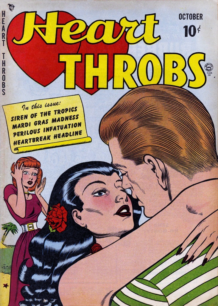
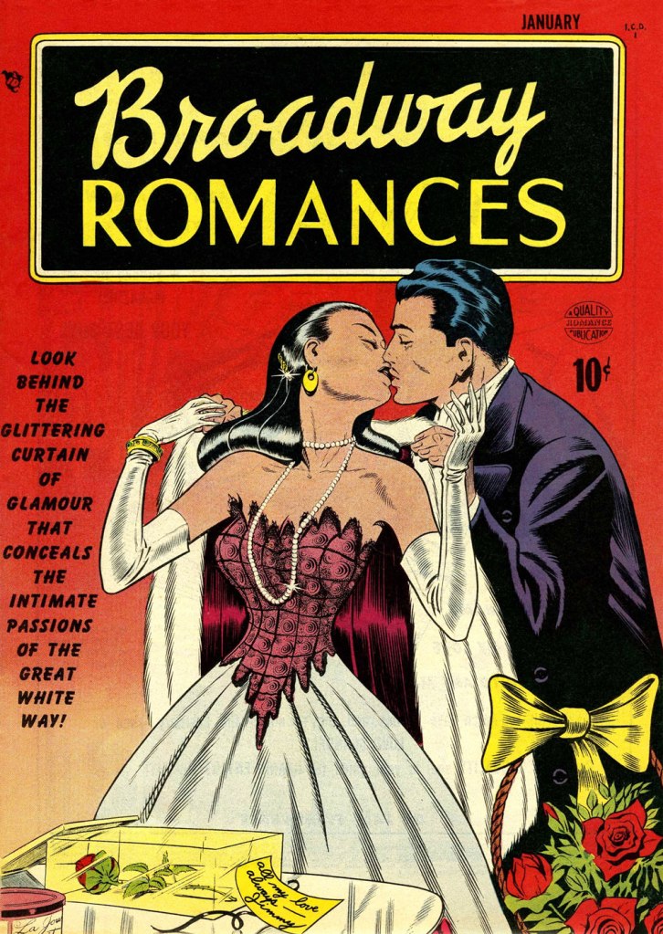
While he worked on such features as Blackhawk and Doll Man, Ward clearly preferred — was it ever in doubt? — depicting beautiful women dressed to the nines, a passion most readily indulged in romance comics, a genre then in its infancy, Joe Simon and Jack Kirby having just set it on its way with 1947’s Young Romance.
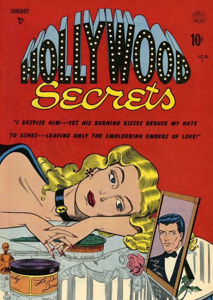
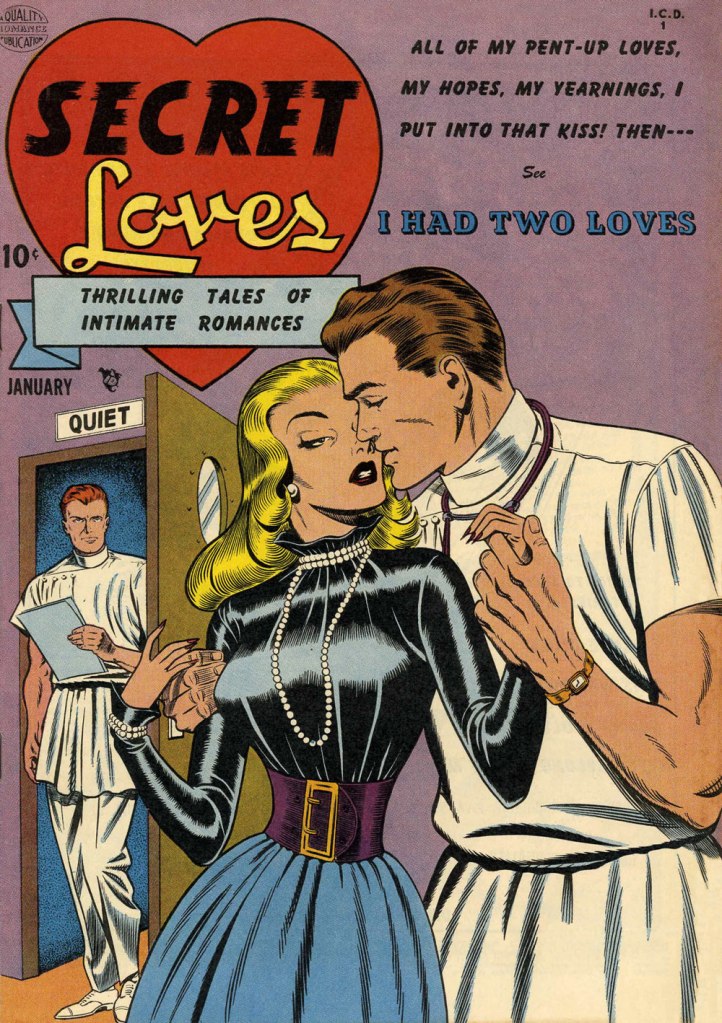
This is Heart Throbs no. 1 (Aug. 1949, Quality). Ever the fetishist, Bill never could resist a well-fitted pair of opera gloves.This is Heart Throbs no. 2 (Oct. 1949, Quality). Quality’s flagship romance title, Heart Throbs lasted one hundred issues, 46 published by Quality, and an even hundred by DC (1956 to 1972) after they picked up what remained of the publisher’s assets, among them Blackhawk, Plastic Man, Doll Man, Uncle Sam, Phantom Lady, and some war (G.I. Combat) and romance titles.This is Hollywood Secrets no. 1 (Nov. 1949, Quality). An unusual colour scheme!This is Campus Loves no. 1 (Dec. 1949, Quality).This is Flaming Love no. 1 (Dec. 1949, Quality). The gloating guy is the prototypical Ward creep.This is Broadway Romances no. 1 (Jan. 1950, Quality). It’s so refreshing to see Ward devote the same level of attention to detail to background items as to the female figure and her accoutrements.This is Hollywood Secrets no. 2 (Jan. 1950, Quality).This is Love Letters no. 2 (Jan. 1950, Quality). Interesting how all these romance covers — the majority of Ward’s production in that genre — all came out within the span of a year or so.This is Secret Loves no. 2 (Jan. 1950, Quality). Ward liked his women to have tiny, needle-like digits — I mean, just compare the lovers’ respective paws!This is Torchy no. 5 (July 1950, Quality), Ward’s signature creature. With the years, as his women grew ever more buxom, his men became ever more grotesque — these are some of the archetypes, but noses got longer, legs got skinnier and shorter, bellies more bulging — until men and women in no way seemed to belong to the same species. While that device of exaggeration was a mainstay of « girlie » art, Ward took it further than just about anyone.
Over the years, things got more… pneumatic. And then some more.
One from an issue of Zip (1967, Marvel); that particular cartoon had probably been around the block a few times by then… it sure doesn’t scream ‘1967!’
Incidentally, the elaborate background textures found in Ward cartoons were achieved by a technique called rubbing, or frottage, « … a reproduction of the texture of a surface created by placing a piece of paper or similar material over the subject and then rubbing the paper with something to deposit marks, most commonly charcoal or pencil. » Not to be confused with the *other* kind of frottage, although, come to think of it, that’s also quite relevant to Ward cartoons.
One of Ward’s ‘Phone Girls’, she saw print in Snappy no. 24 (1958, Marvel)… and likely numerous times thereafter.
« Before the incalculable capacity of the Internet to answer nearly any question put to it while allowing a legion of pedants to hold forth without constraint, getting the facts of the matter took some effort. »
Weekly column ‘Why Things Are‘ ran in The Washington Post from 1990 to 1996. During these diverting (at least as far as the common topic is concerned) years, WOT favourite cartoonist Richard Thompson tackled such various brain bafflers as ‘what does the inside of your nose smell like?’ or ‘why does overdrinking cause a hangover?’ These, at any rate, were the questions posed by Joel Achenbach, staff writer for TWP, questions from which Thompson bounced into sometimes altogether unexpected directions. « The column was fundamentally zany », explains Achenbach in the introduction to the collection of Why Things Are, «though larded with real information and interviews. Richard, it turns out, had crammed his brain over the decades with all manner of esoteric information. The cartoons sang – and sing to this day – with the perfect pitch if the slightly demented intellectual. » There are few things closer to my heart than a non-sequitur with a pedantic bent!
Here is a selection of cartoons from the aforementioned collection, published in 2017 by Picture This Press. While these illustrations need no further accompaniment, the questions submitted to (or by) Achenbach are included under each image. Enjoy!
Why do sexual turn-ons vary so greatly from person to person? Undated (circa 1990-1992).
Why is some cholesterol good for you? Undated (circa 1990-1992). The cholesterol chap looks Klibanesque if not in line, then in spirit.
Why do beer companies brag that their products are ‘cold-filtered’ or ‘beechwood-aged’ or ‘drybrewed’ or ‘genuine draft’ even though no one knows what these terms mean? October 31st, 1993. Given the influx of shitty ‘artisanal’ beer produced by huge companies, I think modern society really needs an official term like ‘Pabst-smeared’.
Why do some people think watching birds is fascinating? February 6th, 1994. When one hits thirty, one is supposed to acquire a set of hobbies only appropriate for people who have suddenly waded into the category of ‘vaguely old’ – gardening, knitting, and, yes, bird watching. I plead guilty to all three.
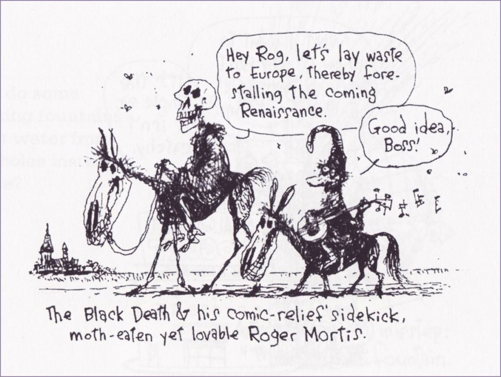
Why didn’t the Black Death kill everyone in Europe in the fourteenth century, rather than just a third of the population? Undated (circa 1990-1992). I couldn’t resist the adorable Roger Mortis.
Why is rain sometimes dreary and depressing, and other times wonderfully romantic? April 18th, 1993.
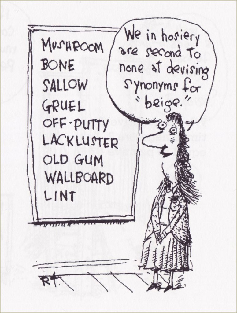
Why can’t they invent pantyhose that don’t run? May 30th, 1993. I recently stumbled across a ‘new’ colour, ‘greige’, a beautiful amalgamate of grey and beige. In a world where several shades of grey are on offer for items from radios to cars (battleship grey, steel grey, stormy grey…), I am not sure we needed this particular variation. As for rip-free tights, they do exist, but you pretty much have to sell one of your kidneys to get your hands on a pair.
Why did people once upon a time believe in vampires? Undated (circa 1990-1992). This guy reminds me both of our last company-wide meeting with an uplifting speech from the CEO and, in more pleasant associations, of Daniel Pinkwater‘s Vampires of Blinsh (illustrated by Aaron Renier).
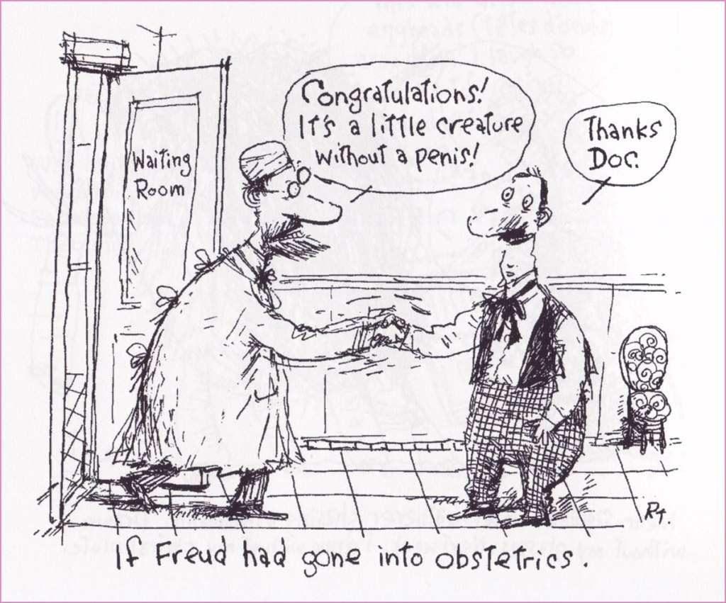
Why did Freud think women suffer from ‘penis envy’ when that is obviously absurd? January 16th, 1994. Well, that’s easy…
Why do owls seem to turn their heads 180 degrees without turning their bodies? August 1994. A lot of owls can actually turn their heads 270 degrees!
Why do the ‘f’ and the ‘s’ and the ‘p’ and the ‘t’ sound so similar over the phone? February 26th, 1995.
December 4th, 1994. If you’re not yet aware of the great and deliberate lemming fraud, just read this… or go jump off a cliff.
Why does hot water freeze faster than cold water in an ice-cube tray placed in the freezer? April 9th, 1995. Tax season is fast approaching – have you prepared your family-size package of prosciutto?!
« We can lick gravity, but sometimes the paperwork is overwhelming. » — Wernher von Braun
The other day, I was digging through my to-read pile, and came upon a 1950s Charlton science-fiction title I’d picked up for a song during a trip to the Maritimes (that’s New Brunswick in this case), last Fall. Its second story struck me as slight but quite fun, which is pretty much the best one could hope for in those strict, early years under the Comics Code’s oppressive authority. Despite the quickly executed job under overpowering Colletta varnish, I surmised I could identify the penciller’s style: none other than Matt Baker, whom I wrote about almost exactly a year ago, in Matt Baker’s Disquieting Romance. I’d advise you to begin there.
In his review of Matt Baker: The Art of Glamour (2012, TwoMorrows), cartoonist Eddie Campbell provided a useful bit of context: « A final phase, in which Baker had a hard time getting any work at all, is also examined briefly. Between 1955 and ‘59 he mostly pencilled for Vince Colletta, who was somehow well enough placed to pick up as much work as he could handle from Atlas and Charlton. He farmed a great deal of it out to others to pencil, leaving the inking for himself, which is one way to make a living and I’ve never had any problem with it. Colletta is a figure that comic book fans love to vilify. There’s him, Fredric Wertham, and the Red Skull, making the triumvirate of evil. »
But enough telling for now, time for some showing!
This is Mysteries of Unexplored Worlds no. 14 (Aug. 1957, Charlton); cover art by Charles Nicholas and Vincent Alascia. Yes, there was a time when the profligate Alascia was a decent inker.
*
*
*
*
*
Though uncredited, the story was evidently written by Joe Gill. Typical of him, the story is driven by straightforward but purposeful dialogue, in which much is intimated between the lines. It takes the rare gift of economy that tell such a story — and make it work — in just a handful of pages.
So what was in it for Vince Colletta? Basic economics aside — it’s easier to ink well-executed layouts — perhaps he harboured sympathy for this massively talented Black man who couldn’t get work, as all but a few did — regardless of talent — after the massive contraction of the comics field in the mid-Fifties. As a native Sicilian, it couldn’t be far from Colletta’s mind that in America, his own people, not so long before, were forcibly excluded from the ‘Whites’ club.
As Brent Staples wrote in How Italians Became ‘White’ (The New York Times, Oct. 12, 2019): « Italian immigrants were welcomed into Louisiana after the Civil War, when the planter class was in desperate need of cheap labor to replace newly emancipated black people, who were leaving backbreaking jobs in the fields for more gainful employment.
These Italians seemed at first to be the answer to both the labor shortage and the increasingly pressing quest for settlers who would support white domination in the emerging Jim Crow state. Louisiana’s romance with Italian labor began to sour when the new immigrants balked at low wages and dismal working conditions.
The newcomers also chose to live together in Italian neighborhoods, where they spoke their native tongue, preserved Italian customs and developed successful businesses that catered to African-Americans, with whom they fraternized and intermarried. In time, this proximity to blackness would lead white Southerners to view Sicilians, in particular, as not fully white and to see them as eligible for persecution — including lynching — that had customarily been imposed on African-Americans. »
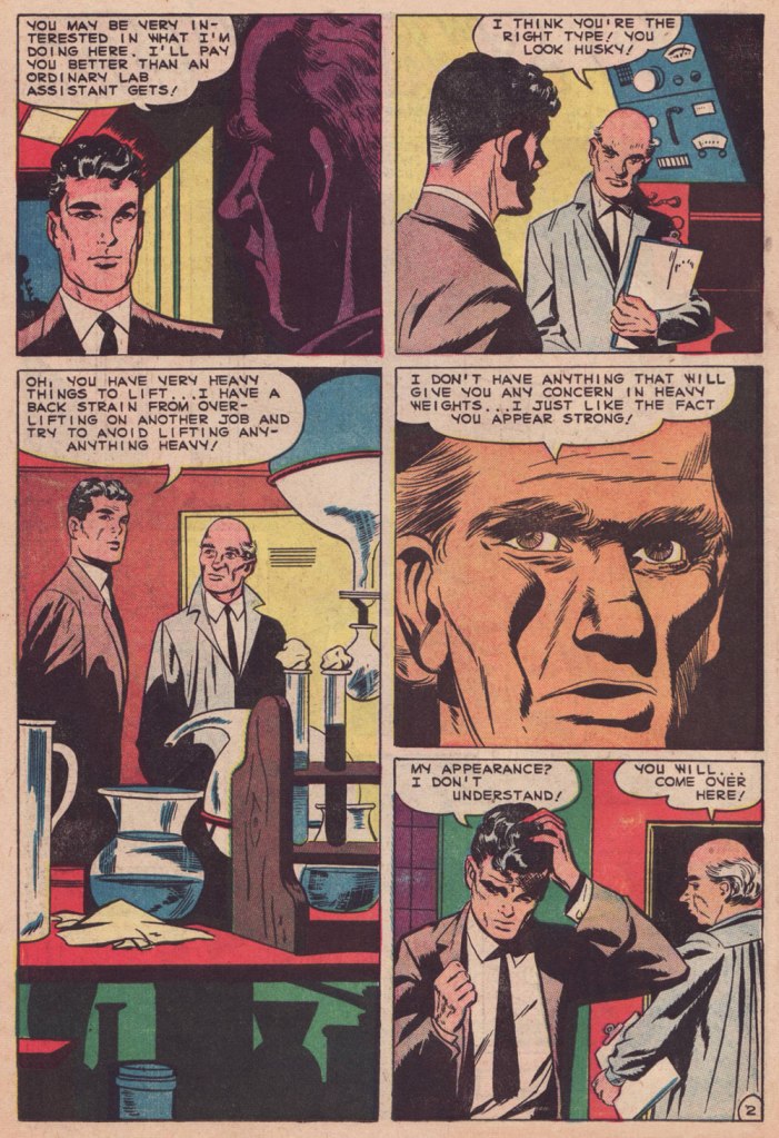
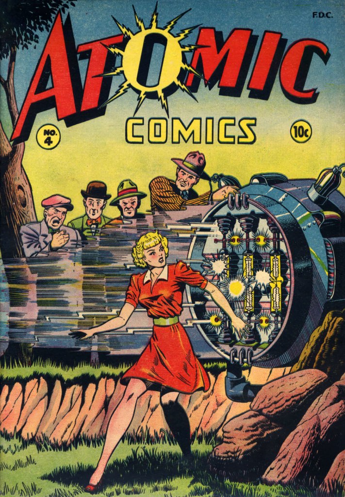
Baker didn’t delve much into the science-fiction genre, but here’s one such case: this is Atomic Comics no. 4 (July-Aug. 1946, Green Publishing). Read it here!Another rarity in Baker’s œuvre: blackness — despite being undermined by the colourist here. This is Amazing Ghost Stories no. 15 (Dec. 1954, St. John). On comicbookplus.com, where you can read this entire issue, a reader commented approvingly: « There are a lot of horror comics set in Haiti. This is the first one I’ve read where it looks like the author did some research on the history of Haiti. »
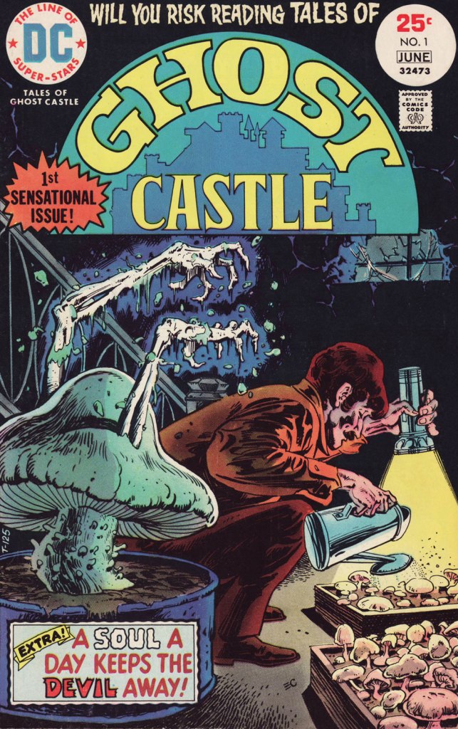
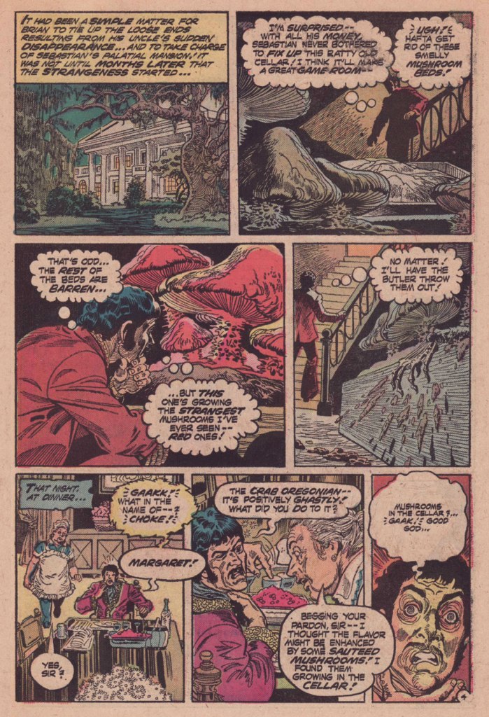
Every once in a while, we celebrate the end of the working week with a leisurely walk through fungal pastures. This week’s installment is a bit on the spooky side, so if you are troubled by a little case of mycophobia, an affliction many suffer from, stick around for a spine-tingling experience. Me, I was definitely rooting for the mushrooms 🍄
The cover of this issue promised some mushroom goodies, so of course my interest was piqued, even though it makes no sense whatsoever to have skeletal arms protruding out of a fungus. Tales of Ghost Castle no. 1 (May-June 1975, DC). Cover by Ernie Chan; Tex Blaisdell, editor.
The cover story – 5-pager The Mushroom Man, plotted by David Michelinie, scripted by Martin Pasko, and illustrated by Buddy Gernale – is a tad more mycologically convincing.
Knowing that the fungus fancier is dead right from the beginning depressed me a little bit. However, starting at the scene of the crime to pursue in mushroomy flashbacks makes for good storytelling.
It’s possible for a mushroom to degrade super quickly (see, for example, shaggy manes aka Coprinus comatus that can deliquesce into a puddle of black goo in less than 24 hours after popping up), though 3 hours is pushing it a bit. ‘Nightdreamer’ sounds distinctly psychedelic, so we can take a guess about what kinds of ‘gourmets’ the uncle is referring to.
Did no-one wonder what happened to the uncle?
It’s not a ratty cellar, it’s an appropriately dark and humid cellar, you philistine. A ‘simple matter to tie up loose ends‘? Maybe the police had mycophobia, too, to let the matter drop so easily. One might add that cooking random mushrooms growing in the cellar is not recommended.
« There will be no questions asked if I kill you here, gringo! » — Bad hombre Alejandro Roja
On February 5, 2024, versatile veteran cartoonist José Delbo (born in Buenos Aires, Argentine, on December 9, 1933) left us at the most respectable age of ninety. Comics fans of a certain age will no doubt recall him chiefly from his long stint on DC’s Wonder Woman (1975-1981, issues no. 222-286), but to my mind, that’s hardly his finest hour: he wasn’t done any favours there, hobbled as he was by pedestrian (or worse) writing and indifferent (or worse) inking. Same goes for his run on Batgirl (1976-82) in Batman Family and Detective Comics.
For a detailed rundown of his remarkably long and varied career, you can’t go wrong with this excellent bio.
This post’s title gave away my candidate for Delbo’s magnum opus, such as it is; but I would be remiss in failing to also note his charming work on Dell’s The Monkees (fifteen issues), where he got to demonstrate his deft hand at humour; and his winningly bizarre collaboration with Tony Tallarico, Geronimo Jones (nine issues, 1971-73, plus one that remains unpublished).
This is Billy the Kid no. 58 (Nov. 1966, Charlton), Delbo’s second issue on the title but his first cover. After this one, he would go on to pencil and ink the subsequent fifty or so covers and most of the inside features. When you find an artist who can draw horses, you hold on to him (or her)! How many, among the current generation, could successfully handle that particular mission?
Incidentally, Billy’s distinctive steed appears to be an Appaloosa: « The Appaloosa’s eye-catching pattern comes from the spotted horses brought into the Americas by Spanish Conquistadors. Known as the Dalmatian horse breed, it was bred in the mid-18th century by the Native American Nez Percé people. Its name comes from the Palouse River that flows through what used to be Nez Percé territory. » [ source ]
Charlton Comics’ flagship western title, Billy the Kid (153 issues, 1955-1983, including its first five as “Masked Raider”), endured as long as it did for good cause: notable runs by accomplished artists, among them John Severin, Rocco Mastroserio, Luis Domínguez, Delbo, and finally Warren Sattler. Yet, for my money, it’s Joe Gill’s spare but psychologically consistent and highly humane scripting that holds the enterprise together.
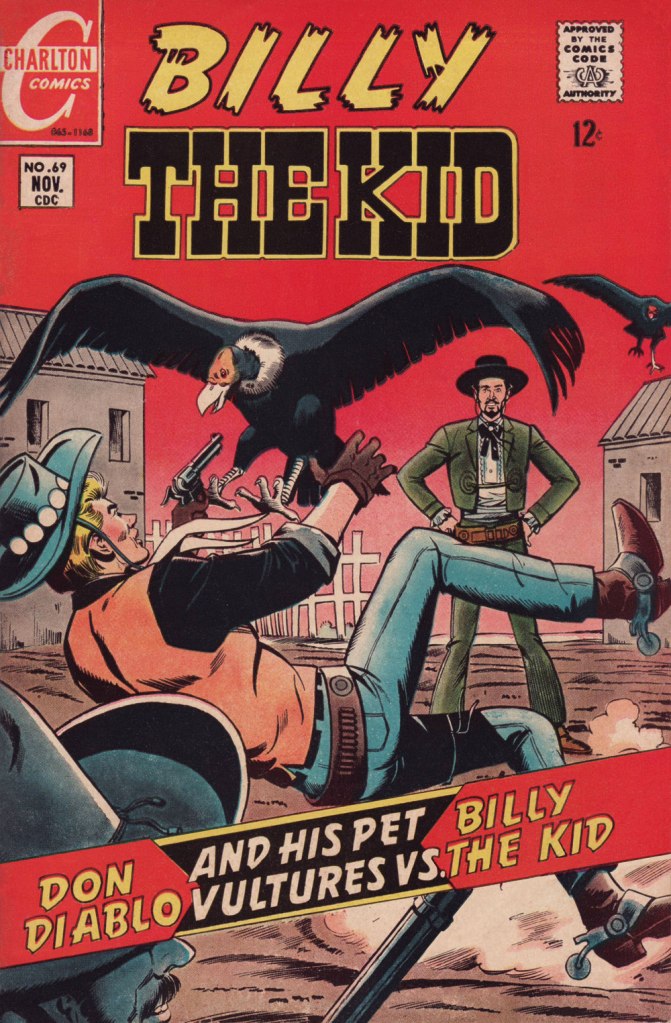
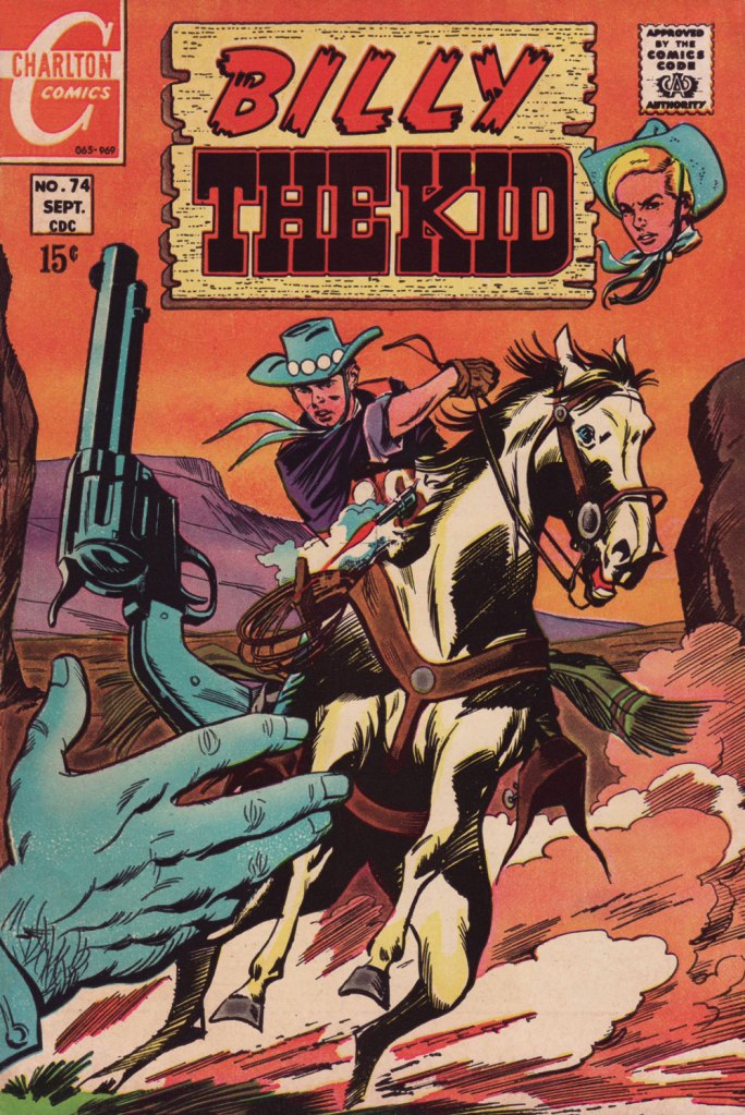
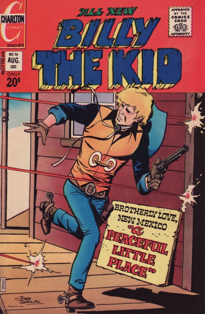
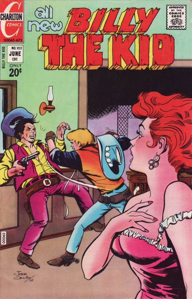
This is Billy the Kid no. 69 (Nov. 1968, Charlton).This is Billy the Kid no. 74 (Sept. 1969, Charlton).This is Billy the Kid no. 80 (Sept. 1970, Charlton).This is Billy the Kid no. 94 (Aug. 1972, Charlton); I love the clever signpost integration of the featured title.This is Billy the Kid no. 98 (Jan. 1973, Charlton). Readers accustomed to Marvel and DC-style hype may notice how light on text these covers are. A lot of shouting isn’t what sells a cover: an arresting visual will do that.This is Billy the Kid no. 102 (June 1973, Charlton).This is Billy the Kid no. 103 (Aug. 1973, Charlton).This is Billy the Kid no. 106 (Dec. 1973, Charlton). The foxy villainess Billy’s tussling with is La Duquesa, featured in “Slave of Beauty”.
Happy trails, and gracias for everything, Señor Delbo!
Hua Junwu (華君武, 1915-2010) hailed from Hangzhou. He was born during a hectic epoch — life tossed him around quite a bit, but unlike a lot of his contemporaries, he was able to navigate through these changing times with dry feet. He had been drawing since his school days, but the seeds of his artistic career were sown around the time he moved to Shanghai to become a student at Utopia University, where he first began submitting his cartoons to magazines for publication, as well as meeting like-minded artists.
A year after the Second Sino-Japanese War started, in 1938, he left the Japanese-occupied Shanghai for Yan’an (the seat of the Communist government at that time) and worked at the Lu Xun Academy of Literature and Art, also contributing anti-Japanese propaganda cartoons to publications like Jiefang Daily. Japan formally surrendered in 1945, but the same year saw an escalation of the struggle for power between the Nationalists and the Communists, which signalled the start of the Third Chinese Revolutionary Civil War. Hua travelled through Northeast China, working as a reporter and cartoonist for Northeast Daily. 1949 saw the founding of the People’s Republic, and Hua joined People’s Daily as the head of its art department, and the China Artists Association as its Secretary-General in 1953.
In his introduction to Selected Cartoons of Hua Junwu (New World Press, 1984), Hua credits German artist E. O. Plauen (see Circus Acrobats of Life: E. O. Plauen’s Father and Son) as one of his main artistic influences. I was amused that the other artist who had Hua’s utmost admiration was Georgi Sapojnikov, a former officer of the Russian Imperial Army who occupied the spot of daily cartoonist in North China Daily News, working under the pseudonym Sapajou*.
There was considerable difference between rural Yan’an and sophisticated Shanghai, and this change of scenery is what shaped the artist’s style into its distinctive form. To quote Hua, « Shanghai in the 1930s was a cross between a colonial and feudal society, a special territory where Chinese and foreigners lived cheek by jowl. As I had learned so much from foreigners’ cartoons, my own cartoons were inevitably rather foreign in flavour. Fortunately, the only people who paid any attention to cartoons in the Shanghai of those days were, I suppose, a few intellectuals who were also foreign influenced, so I was able to get by. » After his move to Yan’an in the late 40s, Hua found his audience changing from the aforementioned ‘few intellectuals’ to a readership of mostly peasants, who found his foreign-based style alien and hard to understand. Feeling like ‘a round peg in a square hole’ and heavily influenced by the writings of Mao Zedong, Hua adopted a philosophy of ‘national style’, ‘the Chinese style and spirit which the common people of China love‘, for which he is now fondly remembered.
This collection, as noted on the cover, is bilingual – the cartoons in Chinese are included on the left, with their English translations on the right (Hua Junwu drew the English letters himself, to keep their Chinese flavour). However, in interests of intelligibility, we are just including the translated versions.
I just wanted to share some fun cartoons, but this post once again dragged me into the 20th century and its bloodshed, as well as the history of communism (this time from a Chinese perspective). Some topics are rich veins to mine, full of interesting filaments that lead to their own story.
~ ds
* The story of ‘White’ Russian refugees fleeing to Shanghai during the civil war between Bolsheviks and Tsarists is a fascinating topic in itself. Of more relevance to this post is this quote from Citizens of No State: Daily Life of Shanghai White Russians, 1920s-1930s: « A man endowed with the gift of reducing the complexities of Chinese politics to a single image and of capturing the ebullient, chaotic nature of Shanghai without sentimentality or cynicism, Sapojnikov worked for the newspaper for more than two decades. » I think a post about Sapajou is needed at some point in the future…
« Advertising – A judicious mixture of flattery and threats. » — Stephen Leacock
It’s long been established that one can scarcely be too skeptical in the face of advertising, and the sooner one starts questioning its wooly claims, the better. In the early 1950s, Harvey Kurtzman‘s Mad shone the giddily harsh light of truth on, well, just about everything, but Madison Avenue‘s tactics were a favourite and frequent target, and for good reason. In 1956, Kurtzman heatedly left his creation after a mere 28 issues; while it retained much of its cultural influence as its reach increased, it degenerated into rigid formula in the hands of his too-cautious successor at the helm, Al Feldstein.
Fast-forward to 1974, and Dynamite Magazine‘s sixth issue. Readers presumably too young for Mad could now receive their monthly inoculation against the advertising industry’s tainted baloney.
From 1974 to 1981, the feature was illustrated by Calvin Sanford “Sandy” Huffaker, Sr. (1943 – 2020); then the reins were passed into the able paws of future Mad art director (small world!) Sam Viviano. But that’s a tale for another day.
Since Huffaker was only credited for illustrating the feature, it stands to reason that it was written in-house, and that narrows it down to two main candidates: editor Jane Stine or Linda Williams Aber (aka “Magic Wanda”); my money’s on Aber, who also wrote Count Morbida’s Puzzle Monthly Puzzle Pages.
As Dynamite’s ‘Inside Stuff’ table of contents always billed it, here’s « A Dynamite look at BADvertising »!
The feature’s inaugural entry, from Dynamite no. 6 (Dec. 1974, Scholastic). The voracious oldster lampooned here is Euell Gibbons, who shilled for Post Grape-Nuts (which contain neither grapes nor nuts!) in this vintage commercial.From Dynamite no. 7 (Jan. 1975, Scholastic). You might recognize Nancy Walker, aka Rhoda’s mom Ida, and future director of Can’t Stop the Music! (trigger warning: Steve Guttenberg); here she is, pre-orange hair, in a Bounty Paper Towel spot from the Me Decade.From Dynamite no. 9 (Mar. 1975, Scholastic). Here’s a 1971 Bufferin vs. Aspirin ad. Place your bets!From Dynamite no. 19 (Jan. 1976, Scholastic). You just may be familiar with the object of this parody.From Dynamite no. 25 (July 1976, Scholastic). Here’s another ‘wonderful, quick‘ Jell-o recipe from those gelatin-happy days.From Dynamite no. 26 (Aug. 1976, Scholastic). Remember Morris? Here’s the famously fussy feline in a 1974 Nine Lives ad.From Dynamite no. 27 (Sept. 1976, Scholastic). Here’s a Hamburger Helper commercial of the corresponding vintage.From Dynamite no. 28 (Oct. 1976, Scholastic). Here’s our pal Poppin’ Fresh in a 1972 commercial.From Dynamite no. 37 (July 1977, Scholastic). On that topic, here’s our look at the 1970s bubble gum explosion!This subscription ad appeared in Dynamite no. 26. I suspect it was a draft for issue 28’s more focused Laverne and Shirley cover, which had been previewed in ads as a photo cover.From 1971, young Sandy wears his Ed Sorel influence a little heavily, but he was learning fast and from the best! For those who may not know — or who’ve forgotten — David Frye was possibly the nation’s premier Tricky Dick Nixon imitator. Was he? Listen here and judge for yourself!
Thanks to his versatility and ability to nail a likeness, Huffacker was among the most sought-after illustrators of the 1970s. Quoting from the Chattanoogan.com’s obituary:
« Huffaker was a highly acclaimed political cartoonist who started his career with The Birmingham News and the Raleigh News and Observer. He later moved to New York City and illustrated covers and articles for such publications such as Time Magazine, The New York Times, Sports Illustrated, Businessweek, People and Fortune Magazine. Some of the accolades awarded for his artwork include two Page-One Awards from the New York Newspaper Guild, three nominations for Cartoonist-of-the-Year by the National Cartoonists Society, A Desi Award of Excellence (Graphic Design Magazine), 20 Award of Merit citations from the Society of Illustrators, and was twice nominated for a Pulitzer Prize for illustration. »
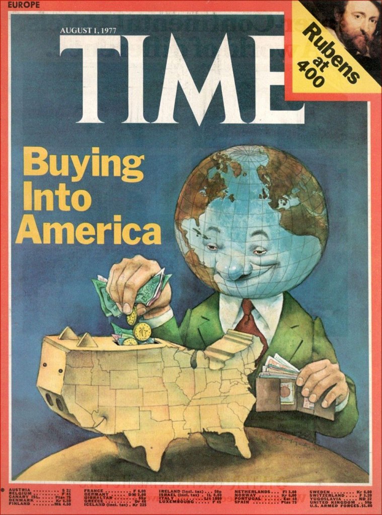
Here’s one of his aforementioned Time covers.
In a 2012 interview, he recalled those halcyon days: « During one week at the peak of his career as an illustrator, Sandy Huffaker had assignments from Time, Sports Illustrated and Businessweek. He had to turn down a fourth assignment that week from Newsweek. “I just didn’t have time.” »