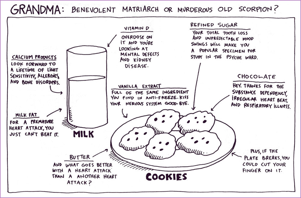
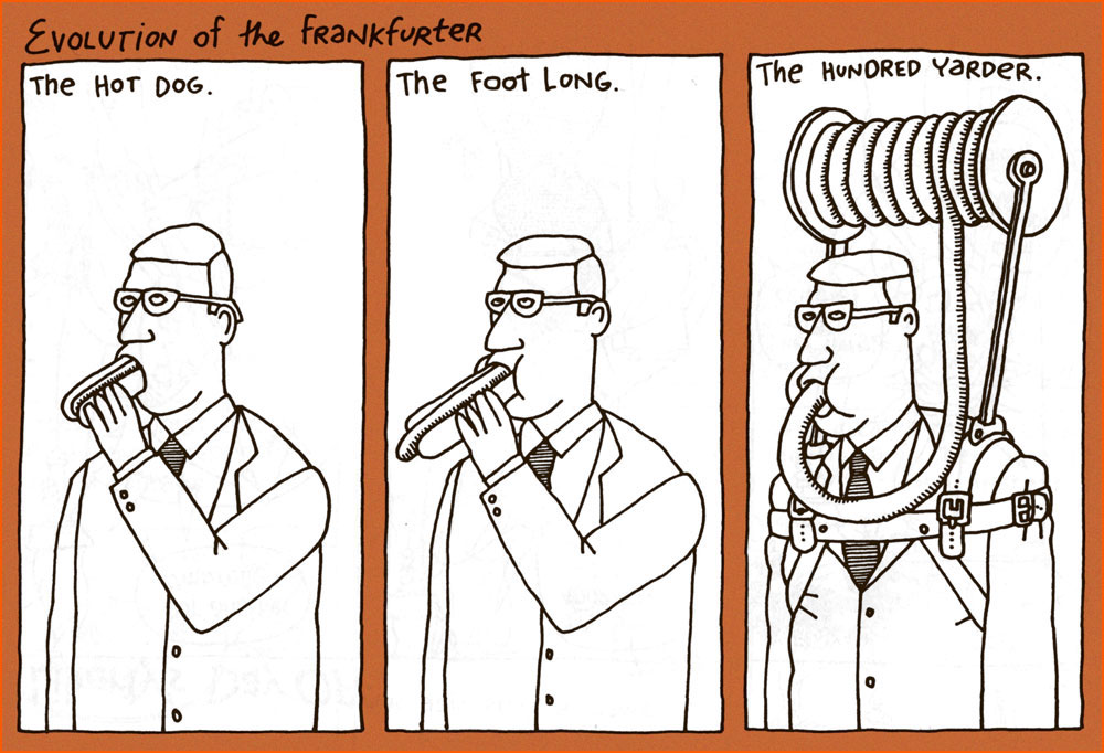
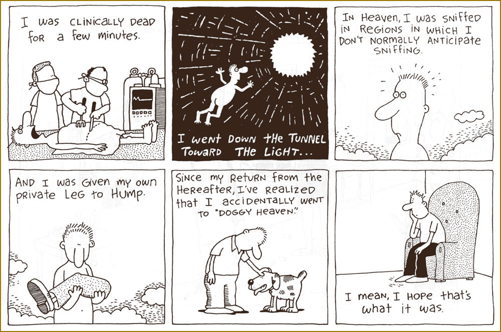
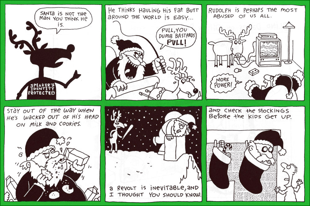
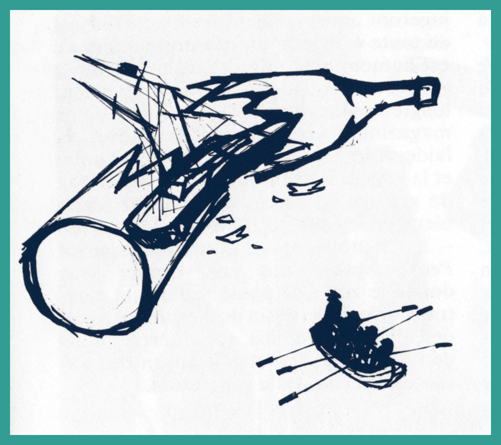
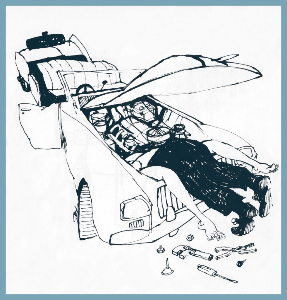
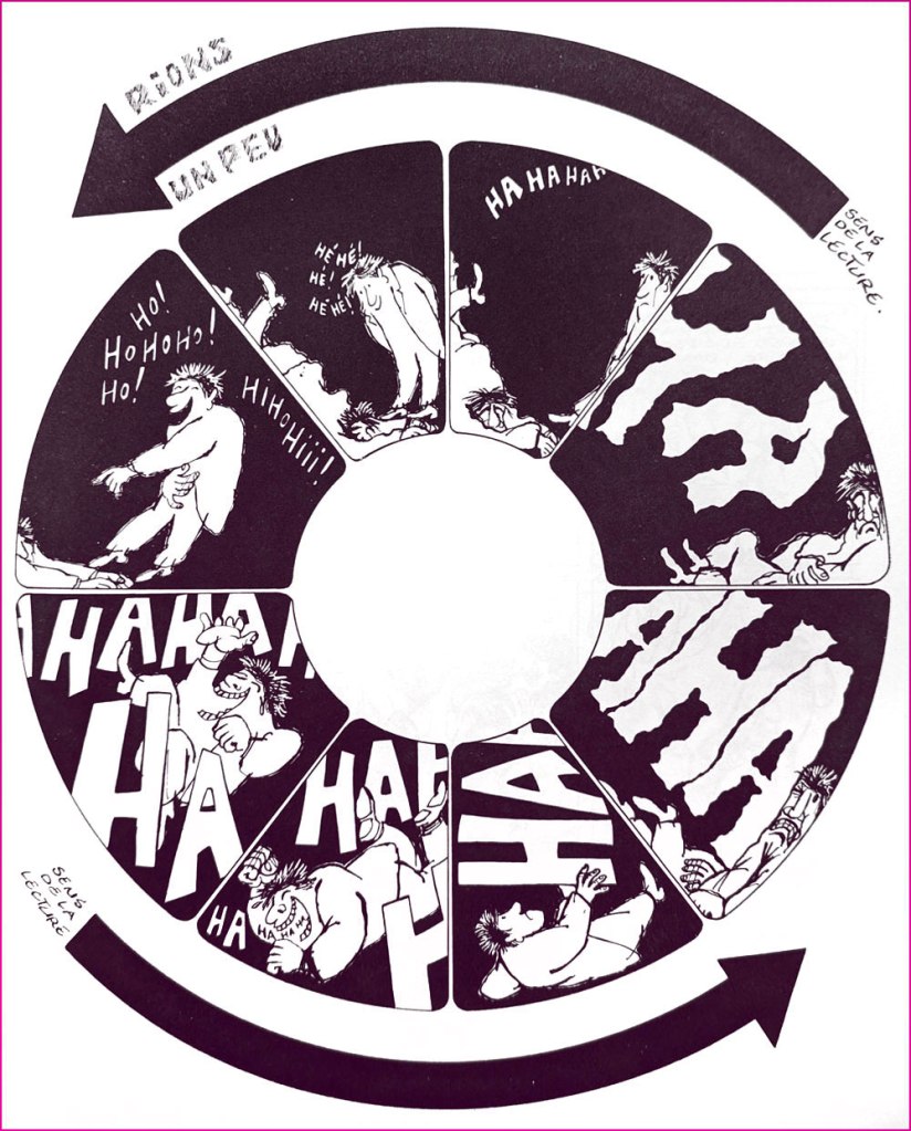
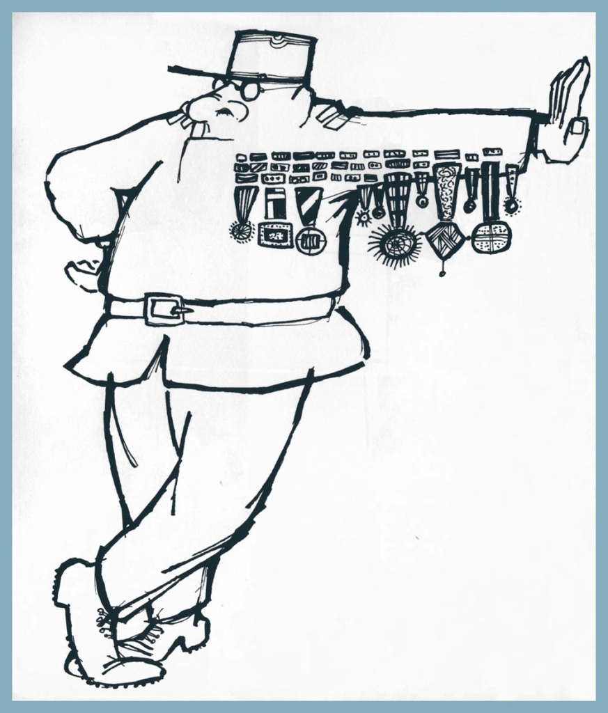
« … while there are lines of taste that many cartoonists will not cross, Mr. Gross leaped over them, doused them with gasoline and lit them on fire, cackling as he did. » — Daniel E. Slotnik, from Gross’s NYT obit.
A couple of weeks ago, we lost yet another of our remaining cartooning titans, hardly a surprising turn of events given the march of time… but this growing void diminishes and impoverishes both the field and the world.
Gross has been eulogised all over the place, notably in obituaries in the New York Times and The New Yorker, his Lambiek entry is lovingly detailed, so there are precious few blanks left to fill in.
All this adulation and appreciation… and yet, all of his books are out of print, so far as I can ascertain. While this does not bode well, I like to think that some savvy publisher will soon make use of Gross’ fastidiously organised files, reportedly comprising over thirty thousand individual cartoons.
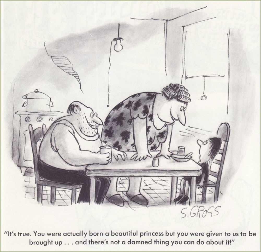
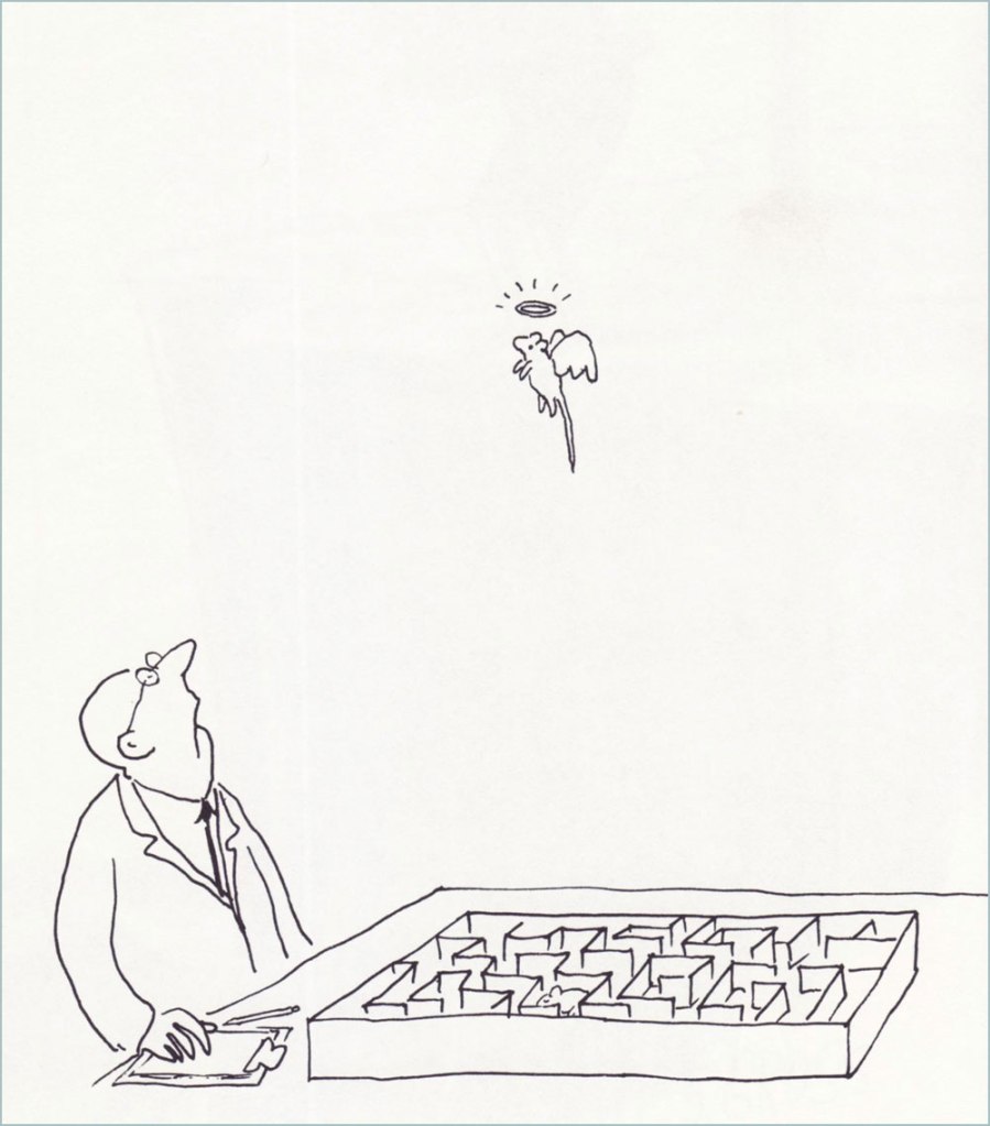
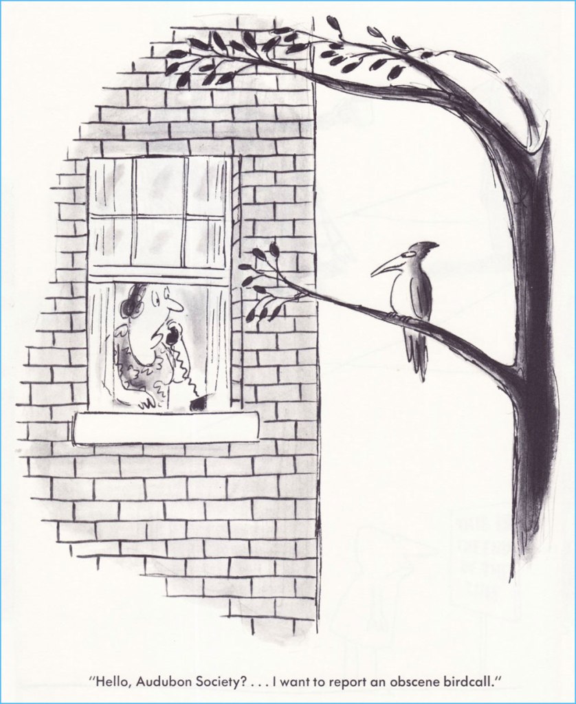
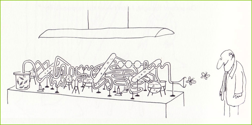
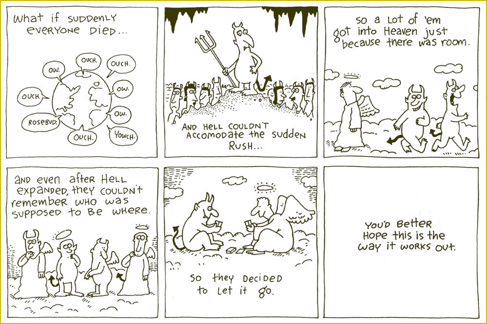
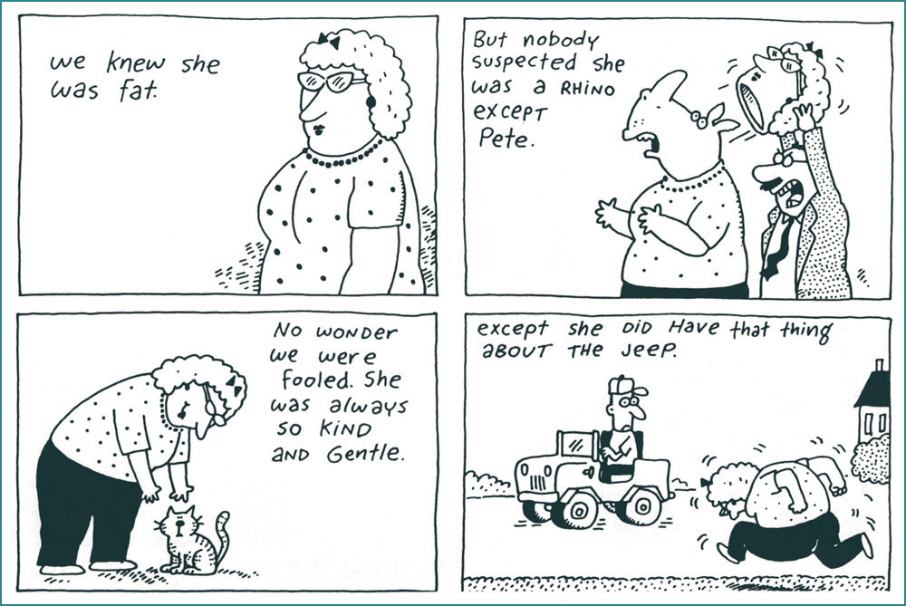
For this small homage, I’ve pulled some of my favourites from his most famous (the most infamous being We Have Ways of Making You Laugh: 120 Funny Swastika Cartoons*), 1977’s I Am Blind and My Dog is Dead. Picking favourites is plenty laborious enough, I wasn’t going to slog through seven decades of material, indeed not.
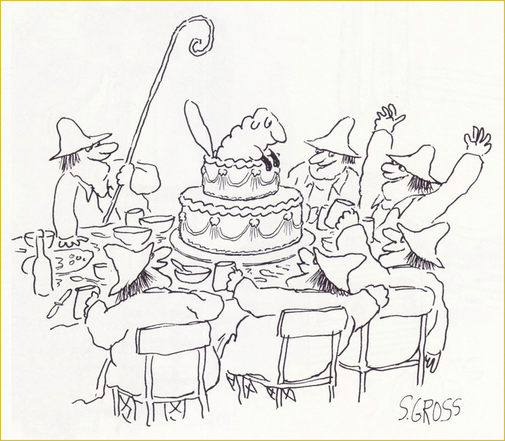
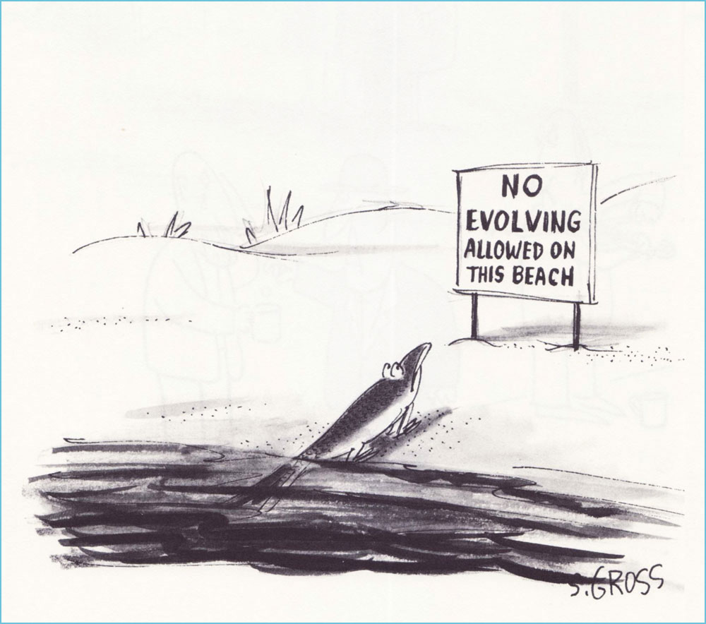
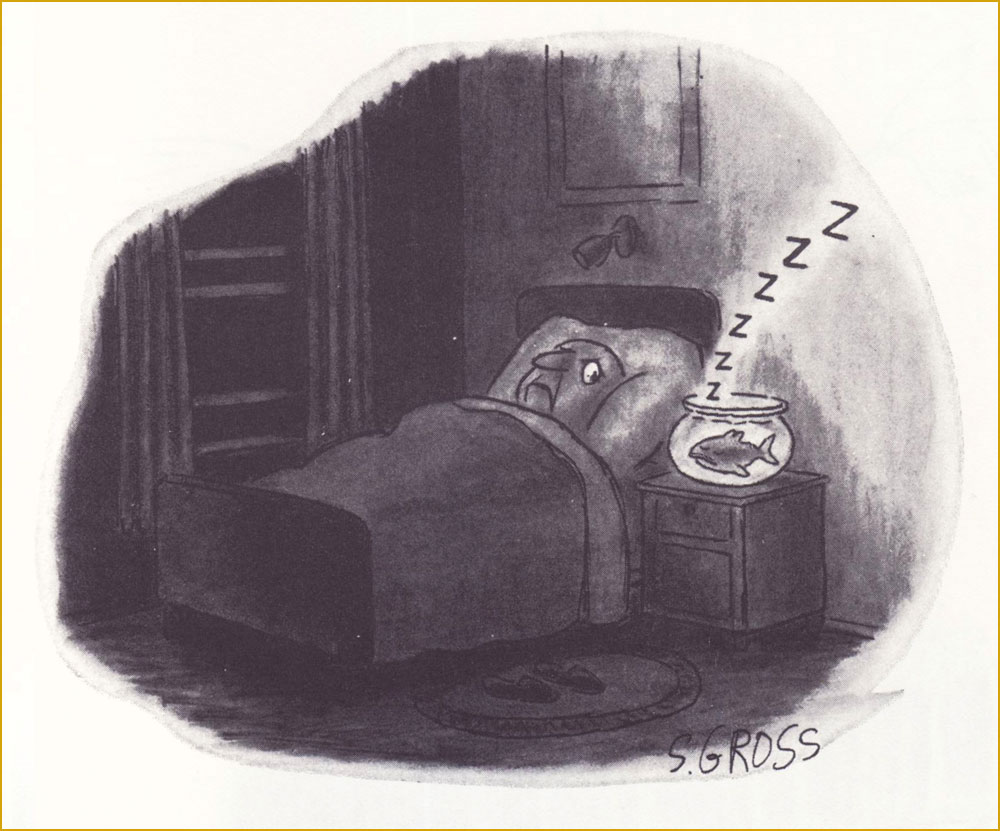
Originally published in Saturday Review.The only way this could have been funnier is if it had been published in the Audubon Society’s magazine… which did publish several of his cartoons — but not this one.Originally published in Saturday Review.One of the great perks of Gross’ range is that this cartoon can be viewed as totally cute and innocent or you’re-going-straight-to-hell filthy. It’s a fairly safe bet that this particular beach is in Florida. I was thinking that this one could have just as well been a Charles Addams cartoon… then recalled that Gross, early in his career, actually sold gag ideas to The New Yorker for Addams to illustrate. This one, interestingly, saw print in Ladies’ Home Journal.Our most recent entry appeared in the pages of The American Bystander no. 3 (Fall, 2016), where he held his own reserved nook, ‘Sam’s Spot‘. Bless ’em.
In closing, this fabulous anecdote from his National Lampoon colleague Larry “Ratso” Sloman:
« After five years, I left the Lampoon and a new executive editor took over. He called Sam into his office. “From now on, I want pencil sketches from all the artists before they do anything,” he told Sam.
“Pencils! Cartoonists don’t do no stinkin’ pencils. Rodrigues will tell you to go fuck yourself rather than show you a pencil,” Sam said. “Oh, and by the way, you can go fuck yourself.” His tenure as cartoon editor was finished. But the funny thing is, Sam was still selling cartoons to the Lampoon long after that editor had been penciled out of his own job. »
-RG
*From Gross’ first-rate 2011 Comics Journal interview, conducted by Richard Gehr: « His doorbell sports an old family name because he doesn’t want to be hassled by anyone who might have been offended by his 2008 book We Have Ways of Making You Laugh: 120 Funny Swastika Cartoons. »
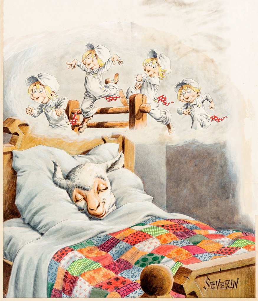
Long before Cracked* was ‘America’s Only Humor Site’ deluging its readers in hit-or-miss listicles (5 Stupid, Stupid Things Humanity Has Shot Into Space, 15 Bonkers Crossovers That Somehow Happened, and so on), it was a satirical mag consciously aping Mad Magazine‘s schtick. I don’t know if anybody is actually hanging on to fond memories of it – Fantagraphics’ Kim Thompson famously quipped ‘I don’t think I’m alone in thinking of CRACKED for most of its run as “a bunch of crap, and John Severin” – but it’s undeniable that quite a few great artists have contributed to it over the years (including the aforementioned Severin, who was a powerhouse** whatever you may think of his art).
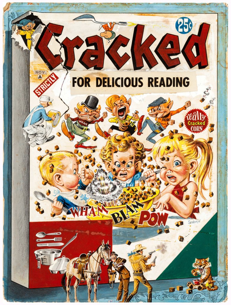
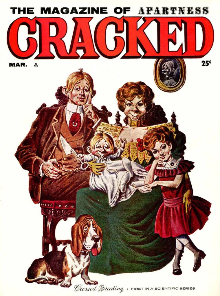
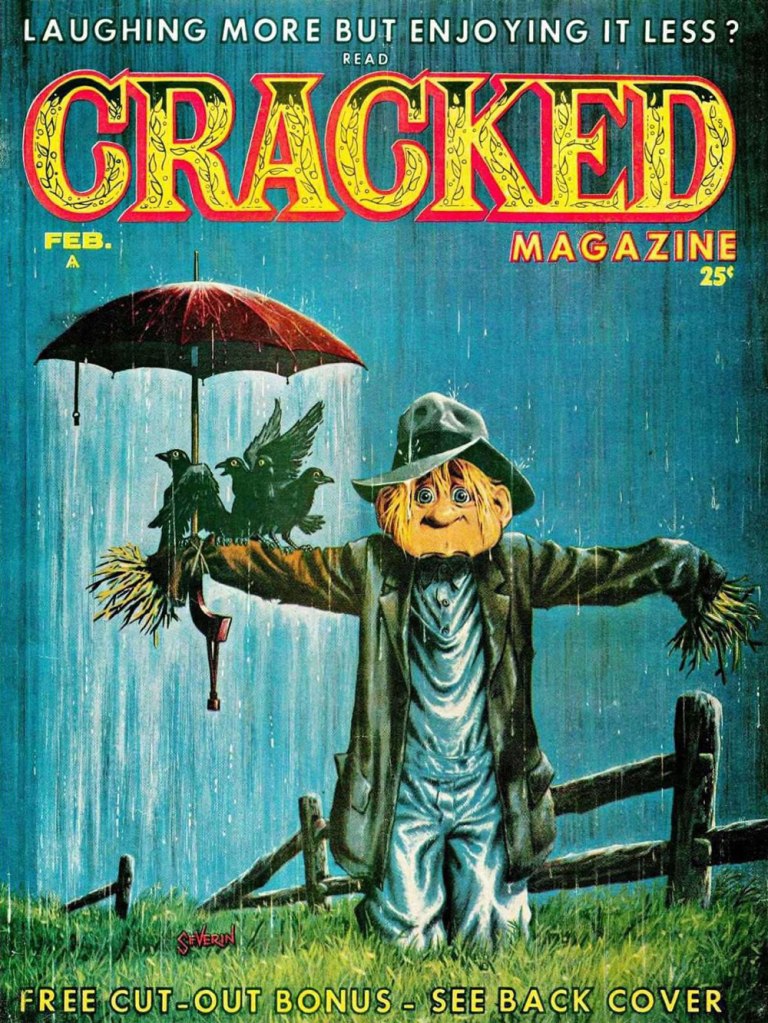
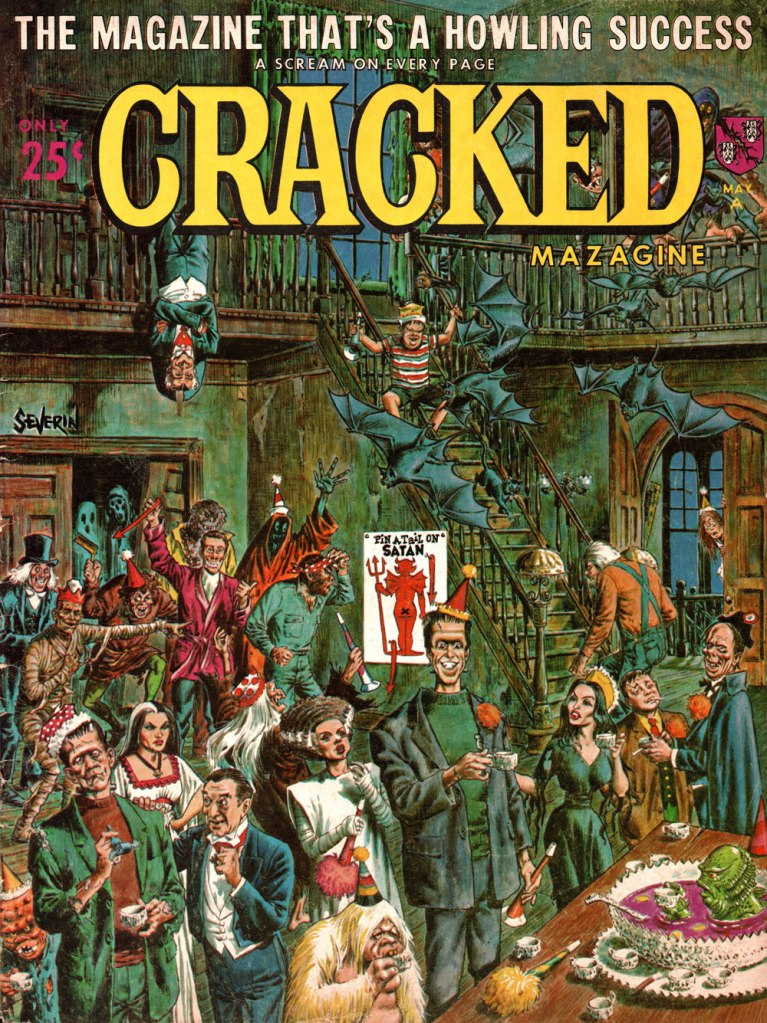
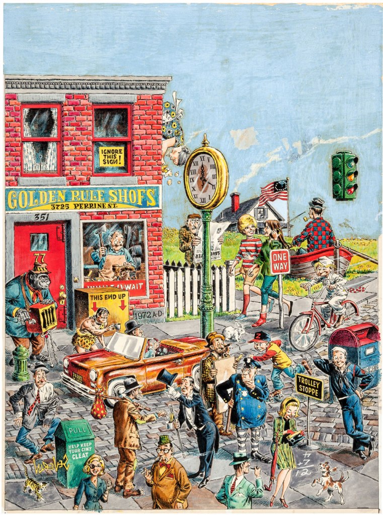
Cracked was born in 1958 and shuddered its last in 2007 (more about said demise later). Here are a few Severin covers I like!
The original art for the cover of Cracked no. 5 (published in October, 1958). How cute/feral is the tiger in the bottom right corner?
Cracked no. 9 (May, 1959). Severin really excelled at these action-packed melée scenes.
Cracked no. 13 (March, 1960)
Cracked no. 28 (February, 1963). You may note that Cracked’s mascot Sylvester P. Smythe is meant to remind one of another country bumpkin-ish mascot… though I like Alfred E. Neuman‘s mug better.
Cracked no. 43 (May, 1965). This party looks like serious fun!
Original art for Cracked no. 49 (January, 1966). The printed version invited the reader to « Find the mistakes on this cover ». Won’t you give it a whirl?
The original art for the cover of Cracked no. 90 (January, 1971). In order to make the scene more properly nocturnal, a blue tone was judiciously added to the final version.
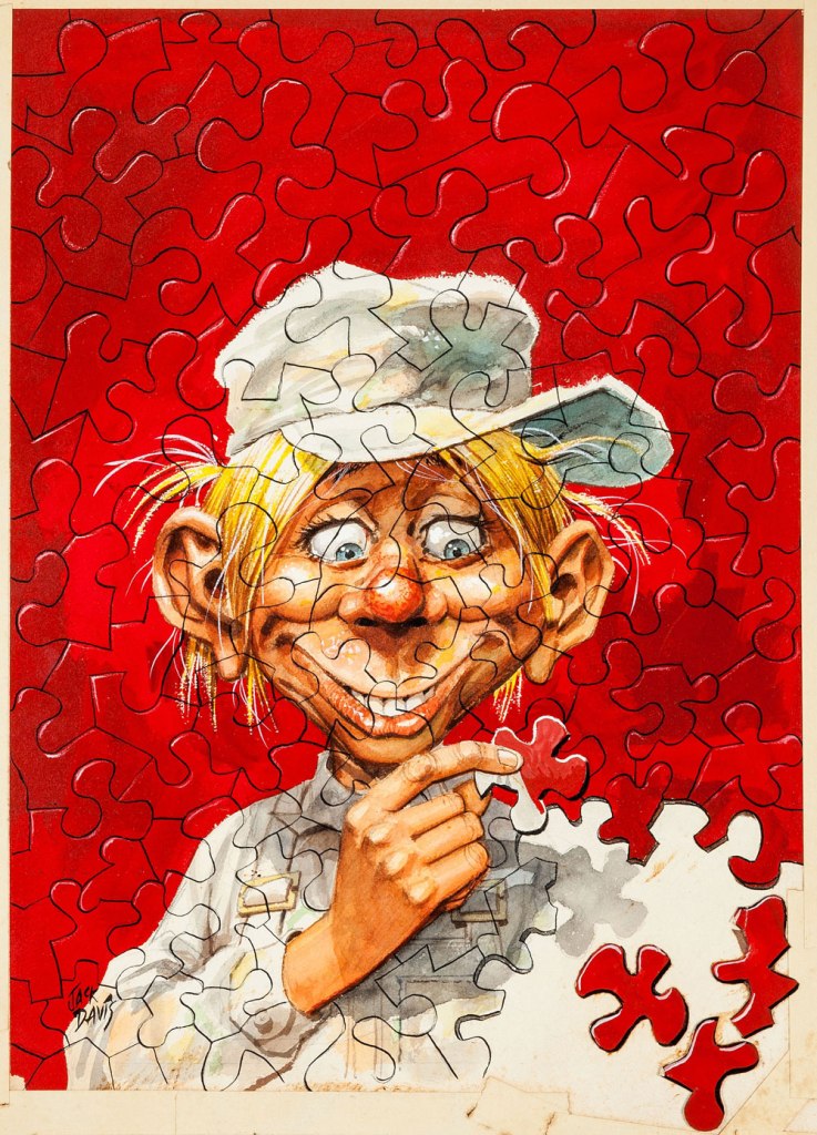
As a bonus, here is ‘Phooey’ Smythe as depicted by the amazing Jack Davis for the cover of Cracked no. 12 (January, 1960).
Head over Mort Todd’s website for a more extensive look at Severin’s contribution to Cracked!
~ ds
* When Cracked Magazine was sold to a group of investors in 2005, it was supposed to return in force with a new design à la ‘lad mags‘ like Maxim. Website Cracked.com launched several months later, outdid its parental unit, and when the magazine folded in 2007 (new design and all), the website stuck around, gaining popularity in exponential numbers. My only interest in it is the fact that Winston Rowntree occasionally contributes articles.
**«After being one of the founding artists for Mad, he began working for the Mad imitation Cracked in the late ’50s and stayed there for nearly 40 years, because he was paid as well as the Mad contributors and was allowed to contribute several features in every issue. In addition to the mountain of work he produced for Cracked, he was simultaneously working for Marvel, Warren and DC. Severin was the consummate professional who editors and art directors knew could draw anything, from a Roman legionary to Cracked mascot Sylvester P. Smythe, and everything in between. Like fellow EC colleagues Jack Davis and Frank Frazetta, Severin could crank out great humor comics with the same facility he drew war, Western and historical tales.» [source]
« Bonnie and Pepsi are obsessed with sex, but they’re not there for the male gaze. Their desire is frank and straightforward and more than a little demented, and it’s depicted with a bracing honesty that feels less like a political statement and more like Flenniken is reporting from the front lines with no filter, no safety net, and no intention of telling anything but the truth.»*
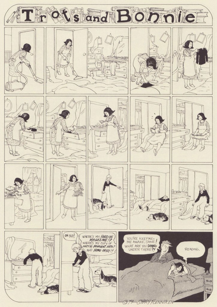
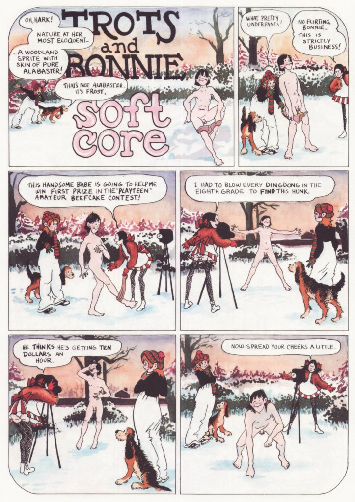
I first came across a Shary Flenniken‘s Trots and Bonnie strip in some random issue of National Lampoon. I can’t even really narrow down the decade**, as it ran within its pages from 1972 all the way to 1990. I was intrigued, but not enough to pursue it.
When New York Review Comics published a Trots and Bonnie collection in 2021, gathering 160 strips in a handsome hardcover volume, I was happy to finally be able to partake of T&B in a more organized fashion. One perplexing thing about this collection is that some strips were omitted due to concerns of misinterpretation***. It was apparently feared that some topics would be too controversial, or that the modern reader has lost the ability to interpret things in context. I would have liked the possibility of deciding what has or hasn’t aged well for myself. As it stands, this collection features strips offering a most varied list of topics to horrify the easily triggered (rape, racial epithets, kids getting shot, electrocuted and castrated – albeit by other kids – and pedophilia), so I am truly curious what the censored strips were about. I guess I am now doomed to collect National Lampoon issues (to be fair, the latter was home to many a great cartoonist – Rick Geary, M.K. Brown, Stan Mack, etc.)
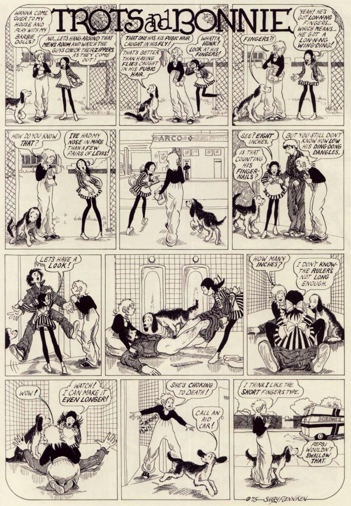
Trots and Bonnie is a hilarious strip, and it’s also quite unsettling in the best of ways. While both cartoonists would surely be offended by this comparison, it makes me think of some of Charles Rodrigues’ work (see Charles Rodrigues’ Pantheon of Scabrous Humour) – the same electrifying unwillingness to shy away from difficult topics, although Flenniken was doing it to make a point, and Rodrigues would do it for sheer perversity. More than once while reading T&B I would start wondering how far a certain storyline would go – and it went all the way to its logical (call it immoral, call it stomach-churning…) conclusion. Just take the Dr. Pepsi’s Vasectomy Clinic from 1974, a panel from which made it as the cover of the collection –
«Two youngish girls, dressed as medical professionals, appear to be playing doctor with a young boy, who lies under a sheet, grinning blankly at the viewer while one of the girls, brandishing a pair of scissors, cheerfully communicates something to the other one. A sweet-looking dog with fancy eyelashes lies at their feet. It’s only once you know the particular strip it comes from, in which Pepsi (the shorter firecracker) and Bonnie (the taller girl) attempt to give neighbor kid Elrod a vasectomy and wind up referring to themselves as a sex-change clinic, that you blanch a bit at the art choice. There you go. That’s “Trots and Bonnie” in a nutshell. » [source]
Boys are sometimes disconcerted by Pepsi’s aggressive style of lechery, but they’re mostly on board. To once again quote Emily Blake, ‘what Flenniken understands and brings gleefully to the page is that adolescent girlhood is positively feral and that teenage girls are both threatened and threats themselves.’ Given that highschools are breeding grounds for boys cruelly bullying flat-chested girls, I can see why Flenniken decided to flip the tables.
There’s so much to unpack here – Trots as the voice of the male gaze, female camaraderie, the hilarious but tragic response of the woman to the suggestion of cream (eliciting a sort semi-guffaw, semi-yelp from this reader), a hint at social unrest caused by police brutality, and that’s just skimming the surface. Flenniken says, ‘You might say I was taking the subject lightly here, but at least I was introducing this to an audience that wasn’t going to see anything like this anywhere else‘. Amen.
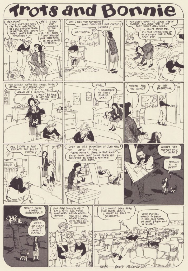
It’s also a charming strip, with a heroïne who is refreshingly in no hurry to grow up (despite being prodded into it by her early bloomer friend Pepsi, ‘dressed in incongruously childlike pinafore paired with fishnets, a perfect metaphor for the terrifying underage sex fiend she is’). Bonnie dresses like a tomboy, hates going out with her parents, and collects sex magazines and prophylactics like other kids collect marbles. In a world of sleazy men with a creepy predilection for pre-adolescent flesh, she somehow manages to remain an innocent, and shrug off any unpleasantness in favour of a wide-eyed curiosity about everything, be it boys’ cock sizes or sci-fi movies.
I can 100% relate to the thrill of first seeing a naked man (well, maybe not a dead one, though), and at that age I would probably be running around with a jar of lymph nodes as well, given half a chance.
I’ve included more ‘innocent’ strips to showcase that Bonnie is a normal kid with a normal (if staid as hell, especially for the 70s) set of parents. It seems that Flenniken’s friend Mark Evanier suggested Trots’ punchline.
Will men find this strip as hilarious as I do? No idea. But it reminds me of today’s conversation with a (male, gay) colleague, in which he learned that women usually have two or three categories of underwear and spent the rest of the day marvelling at this fact.
I find it charming that there’s someone for everyone in this scene – neither group is focussing on the one best-looking member (accidental pun) to the exclusion of everybody else, but developing an inclusive cloud of lust.
‘I’m partial to gay male porn. And so is Bonnie’s mom now. If you can’t figure out why, you don’t need to know.’
The ridiculous (and lascivious, yuck – Bonnie’s body language makes it clear she is very much creeped out) approach of the psychiatrist is tempered by the punchline – Trots really can talk!
In case that isn’t clear, I heartily recommend purchasing the Trots & Bonnie collection.
~ ds
* This strip is hard to write about and do justice to, and I could not do any better than Emily Flake’s truly excellent introduction to the T&B collection.
** I found it – it was Women’s Erotic Art Gallery, published in 1975.
*** Flenniken explains, ‘the things that I did that we omitted here in this book, I think we looked at those and went, “oh, that might hurt somebody’s feelings or something.” That was me being naïve when I wrote those. A lot of times I was just exploring a subject rather than having a definitive stance. People are pretty darn outrageous today, more so than me. What has changed is what people think is offensive.‘
« I’m not saying I’m cool. That’s your job. » — Happy Bunny
When it comes to Jim Benton‘s work, it seems I got in on the ground floor, thanks to a friend’s shrewdly chosen gift of the man’s first cartoon collection, ‘Dealing With the Idiots in Your Life‘, twenty-nine years ago this Christmas. Yikes!
In a way, Benton’s nearly too obvious a subject for a post: his work is everywhere you turn, but such a large audience seems to have been reached at the cost of relative anonymity. In other words, people know his work, but they may not know his name. I’m sure his name does, however, enjoy some currency with a couple of generations of younger readers familiar with his Dear Dumb Diary (nearly 10 million sold!) and Franny K. Stein (over five million sold) series.
Given his intimidatingly formidable output, I’ll stick to material from his first collection, which I like best anyhow… which is not to say, echoing what all and sundry tell Sandy Bates in Stardust Memories, that I strictly prefer “the early, funny ones“. Mr. Benton is possibly even funnier — or at least more sophisticated — today than he was at the dawn of his career, but these early cartoons are less ubiquitous than this century’s crop.
At this stage, Benton’s style — both in concept and execution — still wore some heavy influences, namely that of Bernard Kliban.It wouldn’t surprise me one bit if this cartoon had near-universal appeal, given the fearful hold of cognitive dissonance: after all, most of us think others have a tenuous grasp on reality.Cute Citizen Kane reference.A timeless and oddly poignant state of affairs.Some of you will likely have occasion to muse over this very question during the Holidays.This one’s *very* Kliban-esque.In this one, I see a bit of his fellow Scholastic alum Tom Eaton‘s touches. All for the good.More Kliban (surely intentional!) but with sprinklings of Nicole Hollander and perhaps Scott Adams. Taking Will Rogers’ famous bon mot to its, er… logical conclusion. Here’s a jolly one for the season.
In closing, a bonus one from quite recent days. While I’m less fond of the digital tablet aesthetic of his latest work, his writing has acquired some even sharper edges. Sadly, this strip will likely be relevant only to medieval citizens of the German town of Hamelin, right?
« Crosses and gallows – that deadly historic juxtaposition. » — Howard Zinn
Bonsoir, mesdames et messieurs…
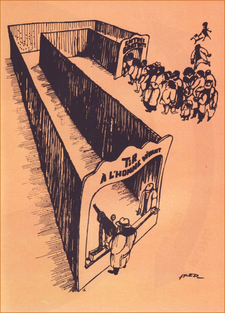
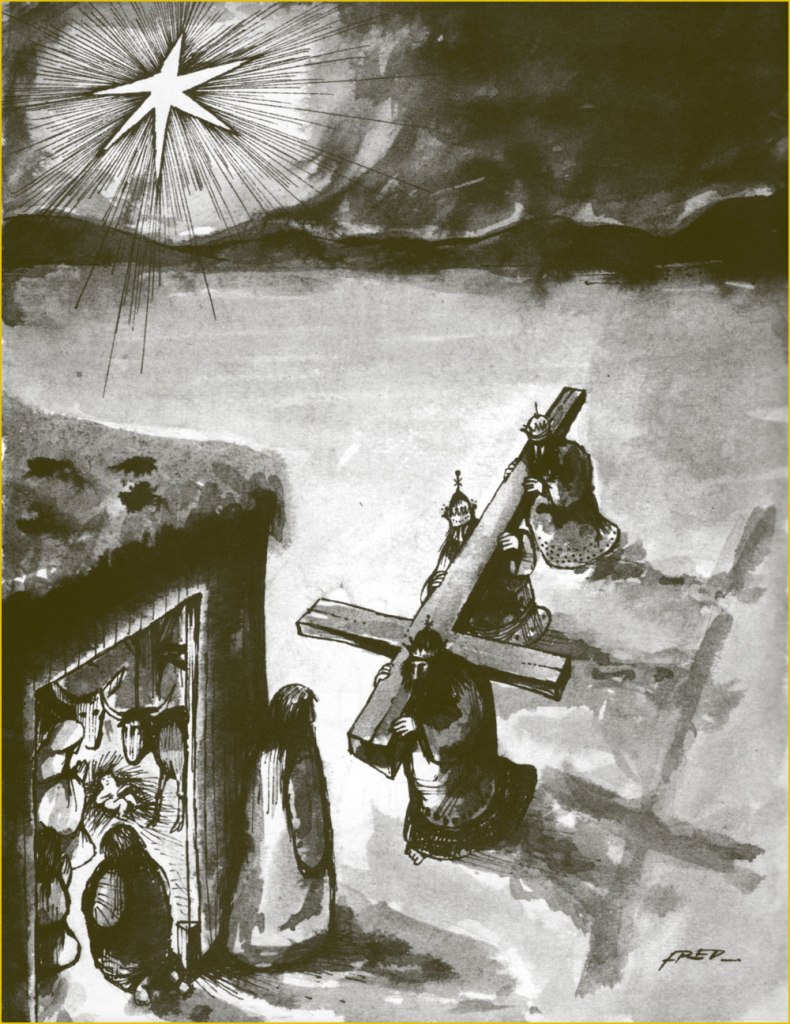
All right, time for me to tackle (though a bit sideways, I’ll explain) another of my daunting heroes. This time out, it’s Frédéric Othon Théodore Aristidès (1931-2013), better — and more simply — known as ‘Fred’.
A compulsive and constant scribbler, he attended no institute of artistic learning but his own (and didn’t bother to complete his secondary education), and made inroads into the field by the dawn of the 1950s, landing in Ici Paris, France-Dimanche, Le Rire, Paris-Presse, France-Soir, Punch, and even as a gagman (uncredited!) for The New Yorker (others, among them Otto Soglow, would illustrate the gags for publication).
Mid-decade, he began his long and fruitful association with Pilote, launching, with the magazine’s 300th issue (July 22, 1965, Dargaud) his undeniable masterpiece, Philémon. And this is where my ‘sideways’ loophole comes in: I’m truly not ready to tackle the overflowing poetic cornucopia that is Philémon. By way of introduction, I’ll stick to the margins and showcase instead some of Fred’s ‘brutish and nasty’ (a rough translation of Hara-Kiri’s motto) panel cartoons and short pieces. There’s a lot to this guy.
Which reminds me of a time, a couple of decades ago, when Montreal’s FIFA (Festival international des films sur l’art/International Festival of Films on Art) presented a series of TV shows showcasing individual cartoonists, among them Chris Ware, Art Spiegelman… and Fred. I recall that Messrs Ware and Spiegelman were just as miserable and neurotic as expected, there was also this Manga master that felt trapped as a cog in an assembly line. Meanwhile, in sharp contrast to the existential angst, Fred was brimming with evident delight and joie de vivre at his good fortune to be a working cartoonist*, grinning and scribbling in his sun-dappled studio, leisurely strolling through his village, charming the ladies, enjoying a glass of wine and a wedge of fine aged cheese… I concluded that here was an eloquent encapsulation of the respective cartooning cultures of a few nations. Regrettably, I haven’t been able to track down this documentary series, not even in the FIFA archives. Nevertheless, here’s a short visit with the dear man, by then living in Paris.
As life tends to imitate art, so has this more or less come to pass.Obviously, you can’t nag anyone into quitting. This ingenious collage strip appeared in Pilote no. 670 (Sept. 1972, Dargaud). An example — quite literally — of gallows humour. Too much of a good thing can kill you — or ‘You may come to rue your mockery’.If one looks for common ground between the more… mordant of French cartoonists, you’ll find their shared, blistering contempt for their nation’s Military brass.The title is a French idiom which roughly translates to “There’s a nip in the air”. This collection of short pieces Fred wrote and drew for Pilote was published in early 1973 by Dargaud.At one end, “Live Human Shooting”; at the other, “Free Admission”.You want it darker? Oh, and also seasonal? Well, your wish is my command.
-RG
*this is serious, though: when Fred stopped drawing comics in the late 1980s, he fell into a deep depression and wound up in a psychiatric hospital. The cure? A return to creating comics. Surely there’s a lesson in this.
« I love the scents of winter! For me, it’s all about the feeling you get when you smell pumpkin spice, cinnamon, nutmeg, gingerbread and spruce. » — Taylor Swift
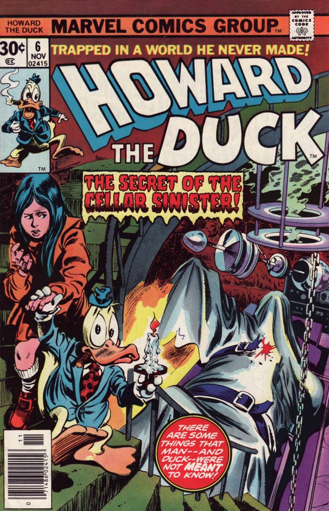
It occurred to me, just the other day that I’d failed to feature, over the course of five and three-quarters countdowns, anything by Gene Colan. And this despite the fact that I’ve always enjoyed his work and his undeniable adroitness within the horror genre.
Still, I decided to sidestep the obvious touchstone, his monumental run on The Tomb of Dracula, and opted instead for another of his big series at Marvel: Howard the Duck.
I was a fervent fan of the series as a kid, but I honestly haven’t returned to it in decades. Which is not to say that I’ve forgotten it. There’s no doubt that I should give it a fresh look — I’d probably get more of Steve Gerber‘s jokes than I did as a twelve-year-old — but in the interim, let’s focus on a couple of pertinent issues.
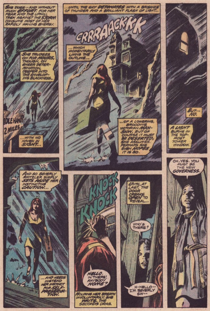
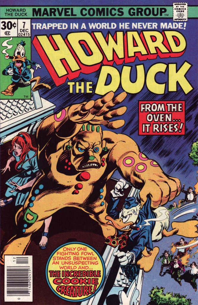
This is Howard the Duck no. 6 (Nov. 1976, Marvel); cover pencils by Gene Colan, inks by the recently departed Tom Palmer (1941-2022).Colan’s style meshes surprisingly well with Mr. Gerber‘s madcap comedy… he plays it straight, and that’s why it clicks. Savvy move.I wasn’t sure about Steve Leialoha‘s appropriateness as a Colan inker at the time, but I really don’t see what I could have objected to. Let’s see, what have we here? The Addams Family, Shelley’s Frankenstein, gothic romances, Nathaniel Hawthorne, religious sects… in this case the reverend Sun Myung Moon‘s Unification Church, better known as The Moonies…
I won’t leave you in suspense! On to the following issue…
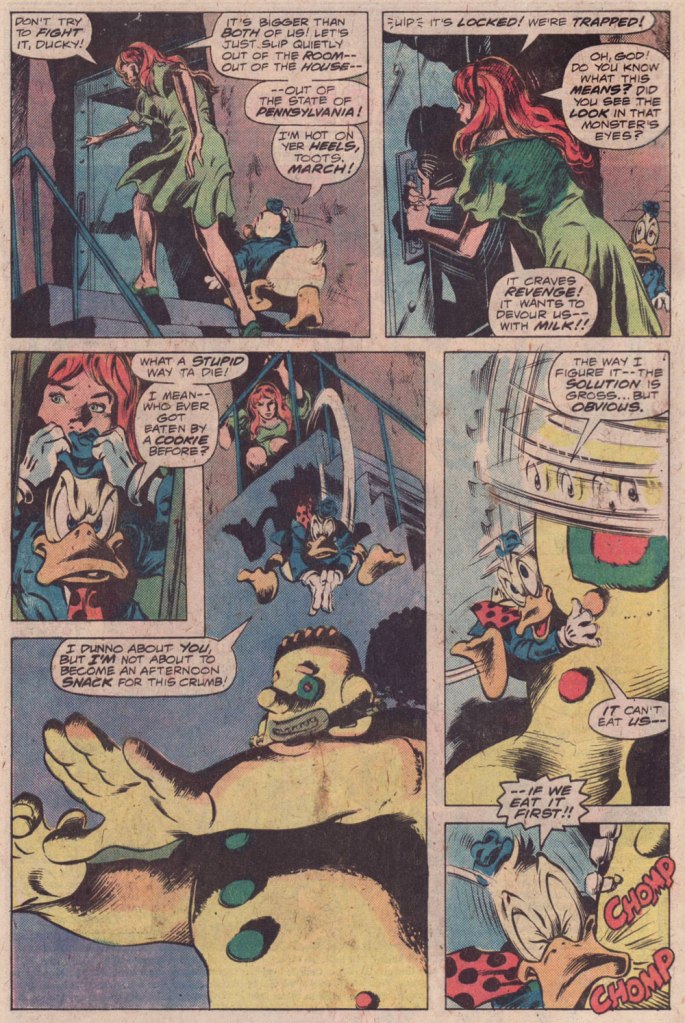
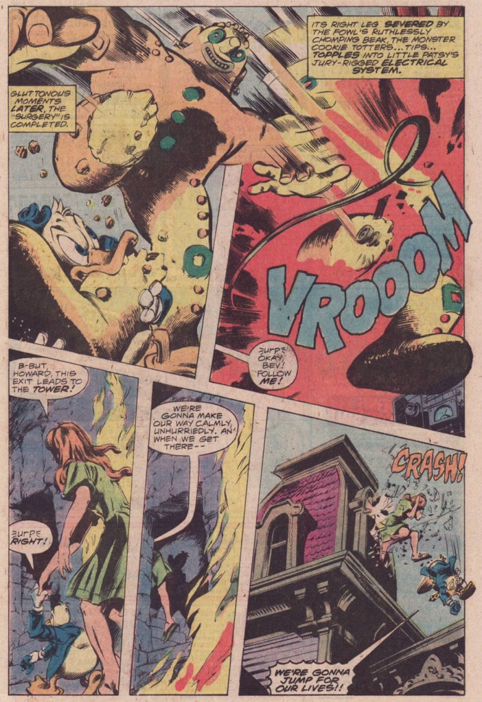
This is Howard the Duck no. 7 (Dec. 1976, Marvel); pencils by Colan, inks by Palmer.
And that’s it! Steve Gerber had a refreshing knack for subverting and upending the Marvel formula: instead of some drawn-out, epic standoff, Howard disposes of the threat — a threat worth two cover features! — in a couple of panels, then the story moves on… to another range of targets.
Hey, it’s Saturday night, we let our hair down, and we’ve all — presumably — better things to do than to linger and moulder at the computer. Here, then are some lovely (under) things by Tentacle Tuesday Master Rich Larson, none of them featuring grasping octopodian appendages. I became aware of Mr. Larson‘s work through some fine covers and stories he illustrated for Charlton’s line of ghost comics in its 1970s heyday. After Charlton more or less gave up the ghost in 1976, he smartly forged his own singular path, generally in collaboration with the equally talented Steve Fastner.
Is everyone ready, then, for a visit to… the Haunted House of Lingerie?
Volume one’s recto.And its verso.Then came a sequel — thank goodness! Front…… and back.To give you a sense of the breakdown in tasks, here’s a sample of Mr. Larson’s pencils.
Your mileage may of course vary, but what I find most remarkable about Larson’s work is how its wit and joie de vivre, its good-natured enthusiasm, keep the results from ever seeming crass or tawdry, whatever the topic. Hats off, gentlemen.
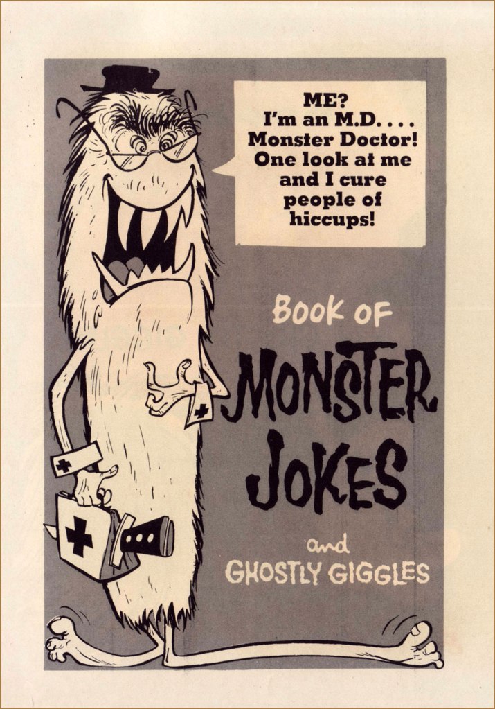
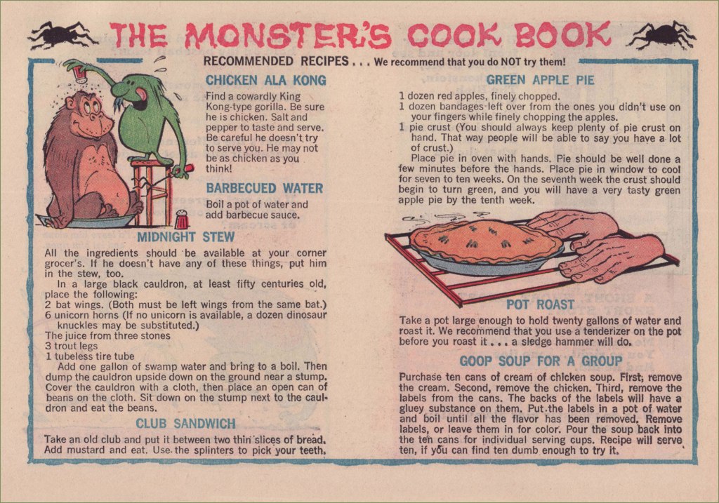
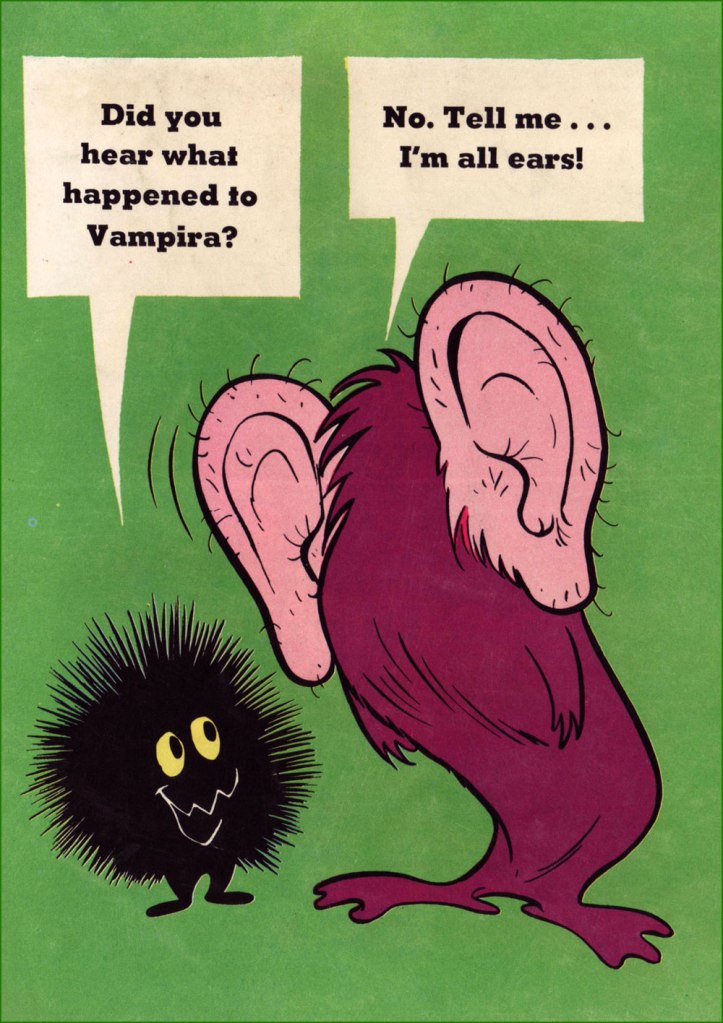
I’ve always had a soft spot for Gold Key’s The Little Monsters, who dwell within a cleverly designed and unaccountably comforting, topsy-turvy world; we’ve featured them back in the third edition of this countdown. This entry, however, isn’t strictly a return visit: I’ll be focussing on the back pages of ‘Orrible Orvie and Awful Annie’s antics. Last year, I picked up an issue I’d been missing, and was delighted with a surprise section, which I’ll happily share with our readers.
This is The Little Monsters no. 5 (July, 1966, Gold Key). Cover artist unknown, sigh.
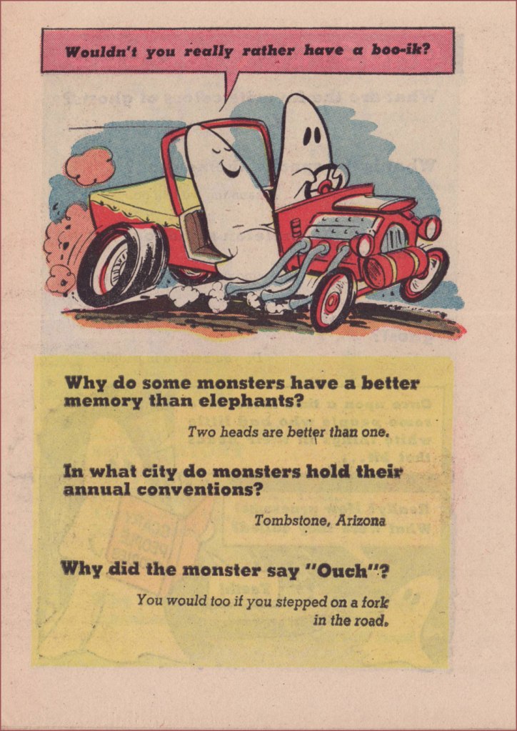
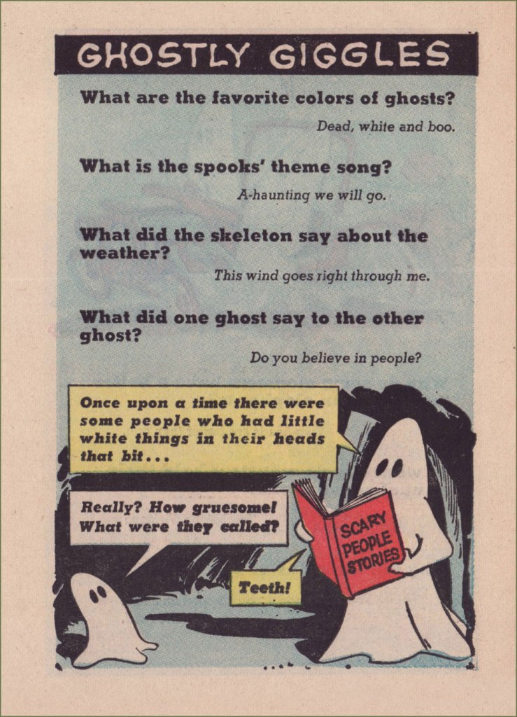
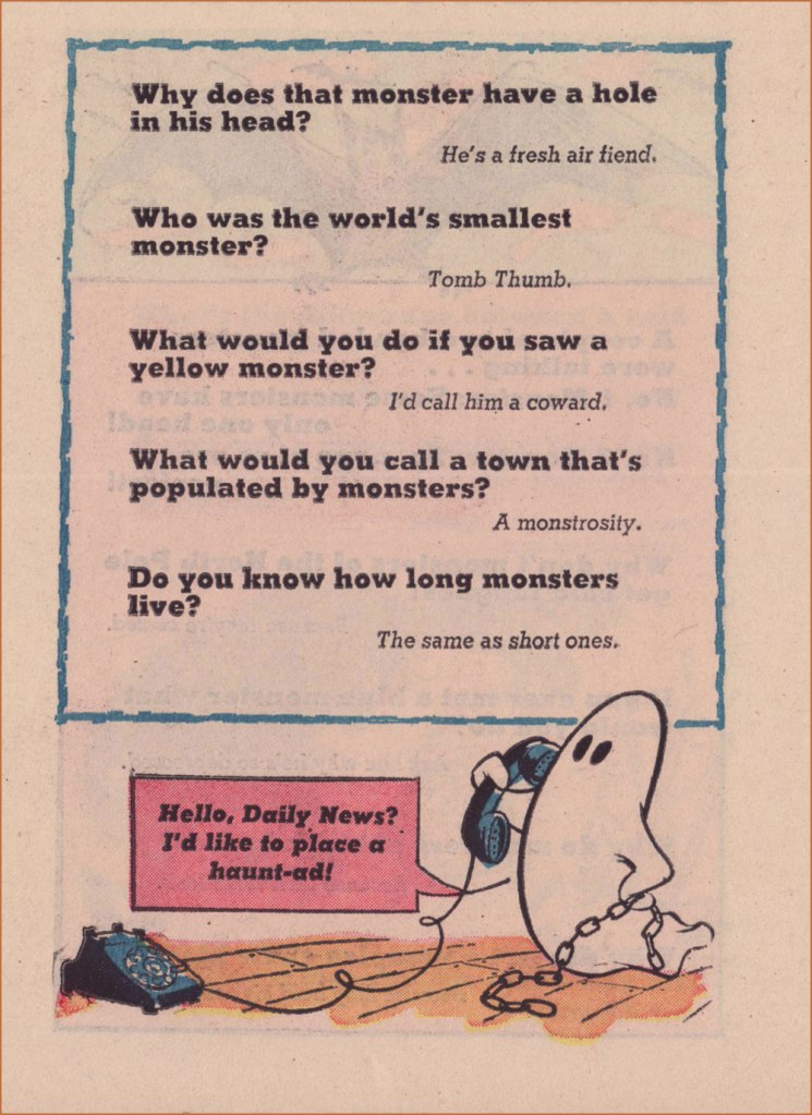
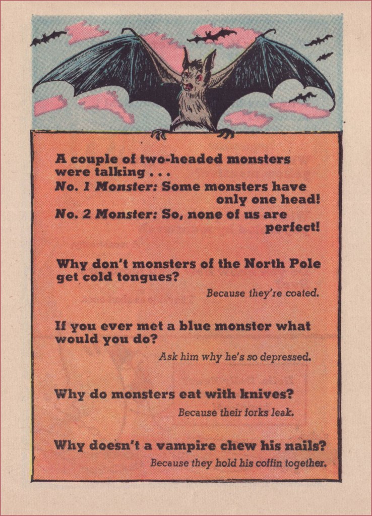
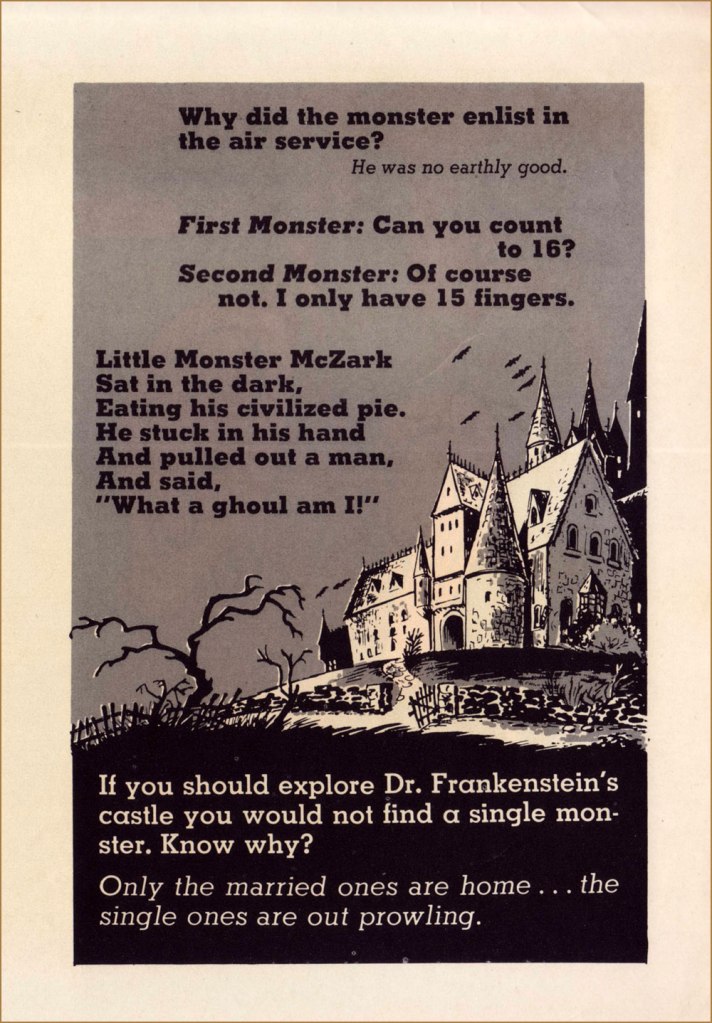
What do you say we take a peek at that Extra Bonus Book of Monster Jokes?
Another uncredited, unacknowledged and unknown artist. Why, thank you, Gold Key!
… and there you have it, and you didn’t even have to destroy a comic book (preferably someone else’s) to assemble it. The jokes are corny — what did you expect? — but I can’t help but find the whole thing quite adorable. Sometimes that’s precisely what one needs.
As a bonus, here I am holding the piece of Little Monsters original art (Page 2 from issue no. 12’s ‘Stormy Weather‘) I was fortunate enough to get my mitts on. Back in the day, comic book artists worked *large*!
« To me, freedom entitles you to do something, not to not do something. » — Shel Silverstein
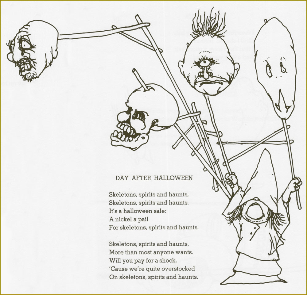
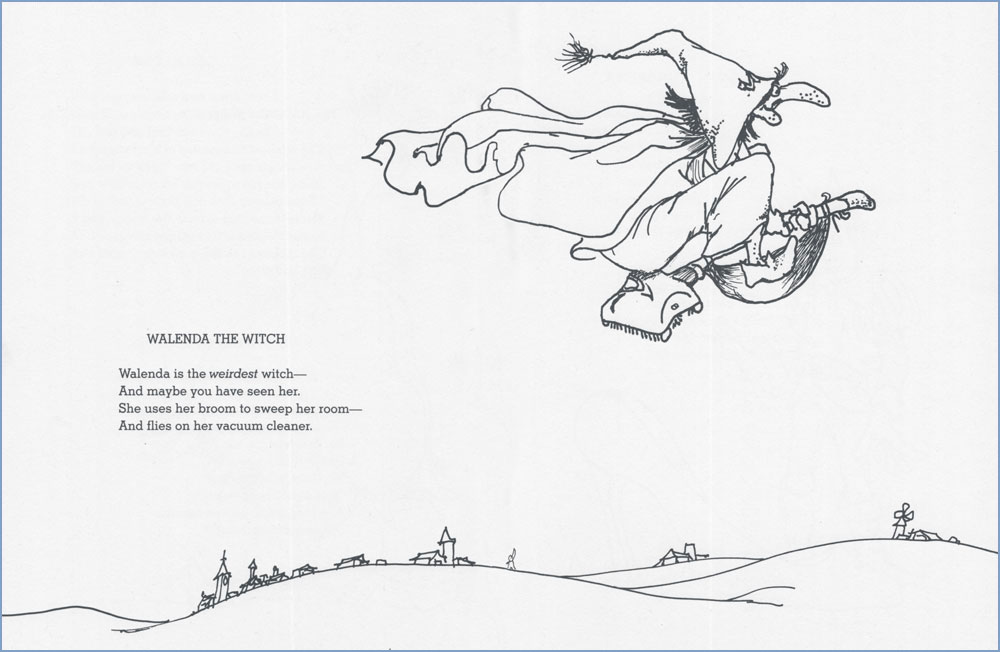
If you’re a regular reader of this blog, you’re likely to be aware of the warm place in our flinty hearts that we reserve for the wonderfully subversive and multi-talented Shel Silverstein! If not, check out Shel Silverstein: Without Borders or Take Ten With Shel Silverstein and you’ll get our drift.
This time, we turn our attention to Shel’s wildly successful illustrated poetry for kids (of all ages). Our first three selections hail from 1974’s Where the Sidewalk Ends.
ENTER THIS DESERTED HOUSE But please walk softly as you do Frogs dwell here and crickets too.
Ain’t no ceiling, only blue Jays dwell here and sunbeams too.
Floors are flowers — take a few. Ferns grow here and daisies too.
Whoosh, swoosh — too-whit, too-woo, Bats dwell here and hoot owls too.
Ha-ha-ha, hee-hee, hoo-hoooo, Gnomes dwell here and goblins too.
And my child, I thought you knew I dwell here… and so do you.
THE WORST When singing songs of scariness, Of bloodiness and hairyness, I feel obligated at this moment to remind you Of the most ferocious beast of all: Three thousand pounds and nine feet tall — The Glurpy Slurpy Skagagrall — Who’s standing right behind you.
The following trio come from 1981’s A Light in the Attic. A bit of controversy eventually ensued: « Attempts have been made to ban the book from some libraries in the United States, parents claiming that the poem “How Not to Have to Dry the Dishes” encourages messiness and disobedience. The poem “Little Abigail and the Beautiful Pony” resulted in criticism for describing the death of a little girl whose parents refuse to buy her a pony. This resulted in the book being banned by the Fruitland Park Elementary School in Lake County, Florida. The decision, however, was later reversed by an advisory committee of parents and teachers. » Ah, good old reliable Florida. [ source ]
It’s too early, and too sad, to think of November the 1st.
Here’s a couple from 1996’s Falling Up:
ROTTEN CONVENTION They had a Rotten Convention And everyone was there: Hamburger Face and Gruesome Grace And the Skull with the slimy hair.
There was Mr. Mud and the Creepin’ Crud And the Drooler and Belchin’ Bob, There was Three-Headed Ann — she was holdin’ hands With the Whimperin’ Simperin’ Slob.
The Unpronounceable Name, he came, And so did Saw-Nose Dan And Poopin’ Pete and Smelly Feet And the Half-Invisible Man.
There was Sudden Death and Sweat-Sock Breath, Big Barf and the Deadly Bore, And Killin’ Dillon and other villains We’d never seen before.
And we all sat around and told bad tales Of the rottenest people we knew, And everybody there kept askin’… Where were you?
HAUNTED I dare you all to go into The Haunted House on Howlin’ Hill Where squiggly things with yellow eyes Peek past the wormy window sill. We’ll creep into the moonlit yard, Where weeds reach out like fingers, And through the rotted old front door A-squeakin’ on its hinges, Down the dark and whisperin’ hall, Past the musty study, Up the windin’ staircase — Don’t step on the step that’s bloody — Through the secret panel To the bedroom where we’ll slide in To the ragged cobweb dusty bed Ten people must have died in. And the bats will screech, And the spirits will scream, And the thunder will crash Like a horrible dream, And we’ll sing with the zombies And dance with the dead, And howl at the ghost With the axe in his head, And — come to think of it what do you say We go get some ice cream instead?
And finally, this one’s from the posthumously published Every Thing On It (2011).
Thanks for everything, dear Mr. Silverstein! You’re an unceasing source of inspiration and wonder.
« There is never enough horsepower… just not enough traction. » — Carroll Shelby
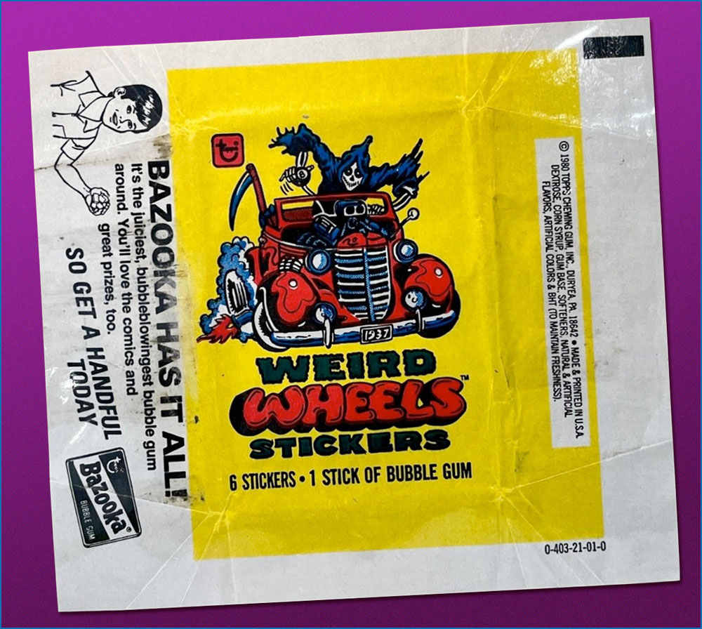
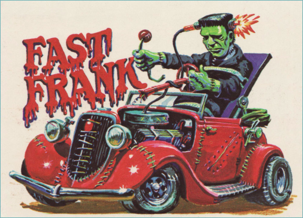
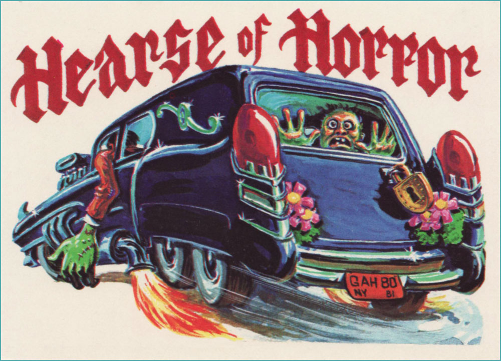
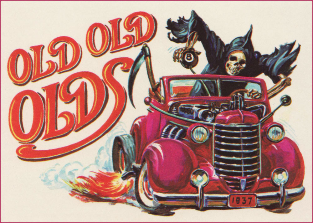
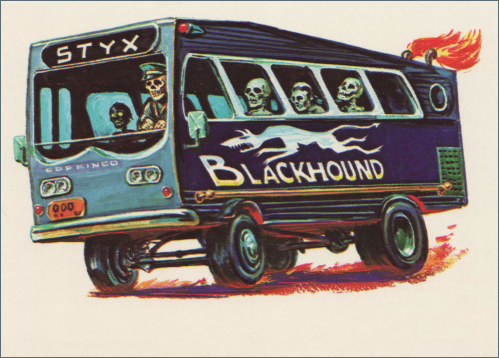
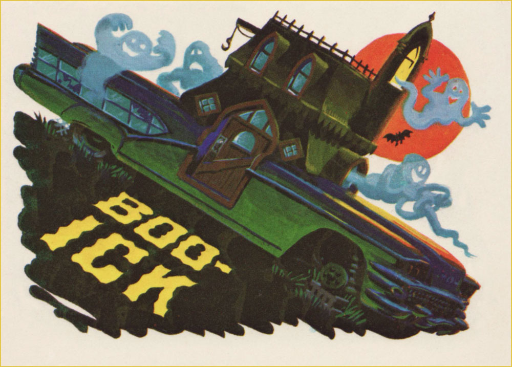
While my co-admin ds has already touched upon the circumstances of Topps’ Weird Wheels in her Purple Tentacle Tuesday post, she was of course thematically constrained there… while I’m free to drill down deeper into the set’s considerable riches. I won’t recount the set’s history, as that haunted ground has long ago been exhaustively explored and trod upon by the mighty Kurt Kuersteiner, monster gum card historian and also owner, operator and distinguished curator of the Jack T. Chick Museum of Fine Art. Peruse at your peril his fine account of what went down when Weird Wheels came down.
No one can claim this didn’t constitute an attractive package!
And now, on to the cards… my favourites, anyway. From what’s known, the art duties were shared by Norman Saunders and Gary Hallgren.
Card no. 1. Note the belfry engine.Card no. 4.Card no. 9.Card no. 17.Card no. 18. Held together, of course, by surgical stitching.Card no. 22.Card no. 23. This one, without question, was painted by Gary Hallgren… note the licence plate.Card no. 26.Card no. 27.Card no. 45. Here’s the ideal soundtrack for this scene.Card no. 54. I love that this heap isn’t going anywhere: it’s on bricks.