« Gamma rays are the sort of radiation you should avoid. Want proof? Just remember how the comic strip character “The Hulk” became big, green, and ugly. » — Neil deGrasse Tyson
It may seem a counterintuitive notion, but some artistic virtuosi, while draftsmen supreme, may be sorely lacking in pure design chops, while some otherwise unremarkable craftsmen design splendidly. The same general principle applies to a colour sense, or handwriting. As the cliché goes, the most skilled brain surgeon’s penmanship may just yield sloppy gibberish, what’s wittily described as chicken scratch writing.
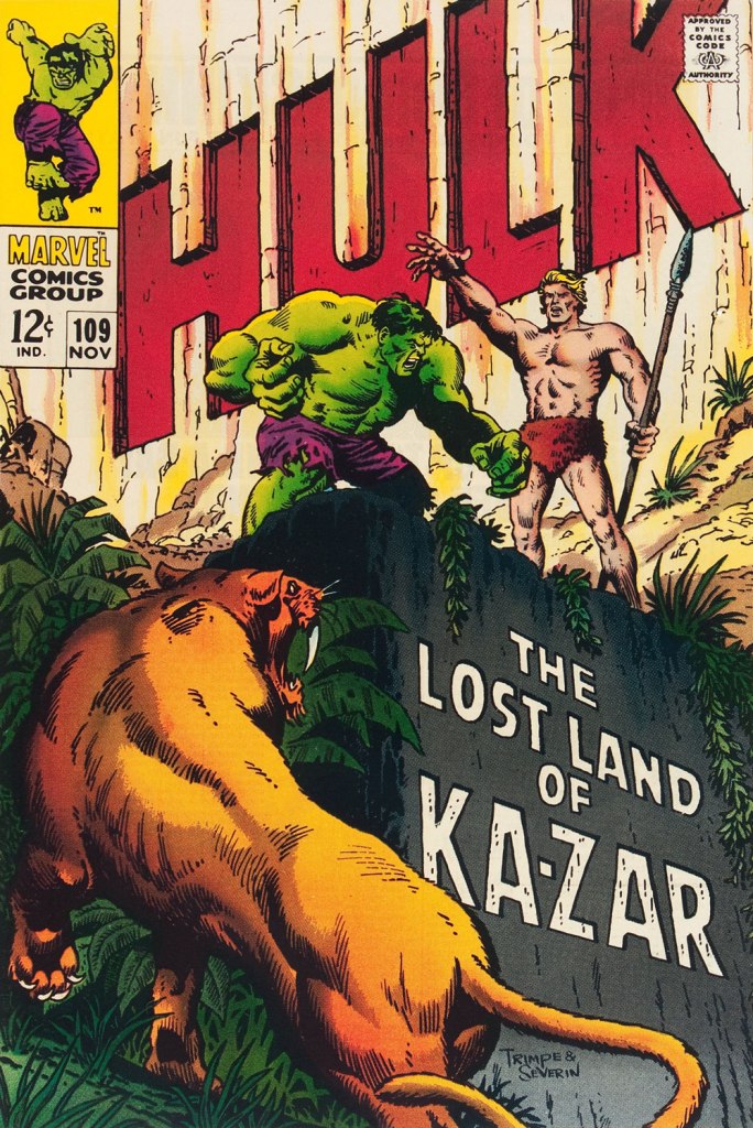
My point in this case is that, while Herb Trimpe (1939-2015) has never ranked among the comics industry’s glory boys, I consider him one of its finest cover artists. It’s a special skill and quite a scarce one…
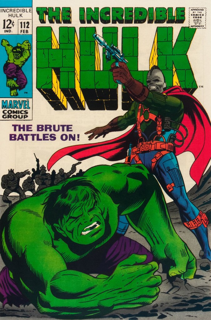
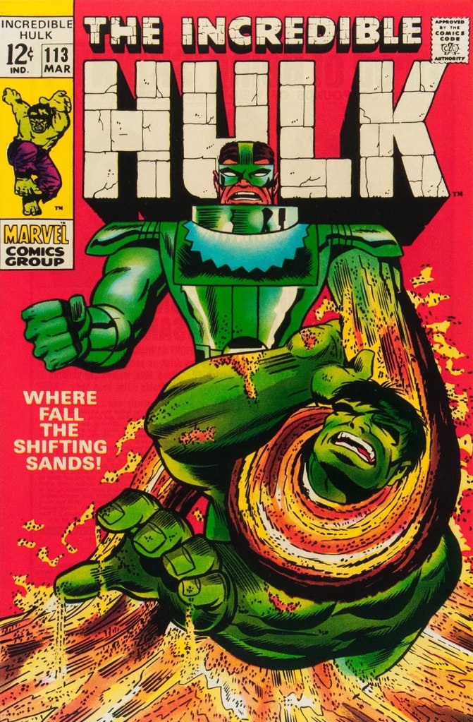
Herb’s streak begins with The Incredible Hulk no. 109 (Nov. 1968, Marvel), his first cover for the series. And yes, being seconded by one of comics’ all-time finest inkers (and cover artists!) didn’t hurt, but this is flawless layout work in the first place. This is The Incredible Hulk no. 110 (Dec. 1968, Marvel), again boasting John Severin inks (and quite likely Marie Severin colours).This surviving piece of production art grants us the opportunity to admire the splendid inks. I honestly don’t know what Ka-Zar was hoping to achieve here, though. Trimpe also produced another, rejected, version of this cover (scroll down, it’s near the bottom) the action tackled from quite a different angle. Featured in IDW’s ultra-fancy, signed-and-numbered limited run in the ‘where can I fit this damn monster?’ Artist’s Edition format in 2015, it demonstrates just how tight Trimpe’s pencil work was.This is The Incredible Hulk no. 111 (Jan. 1969, Marvel). Dan Adkins takes over the inker’s chair. This is The Incredible Hulk no. 112 (Feb. 1969, Marvel). Notice how innocent of hype and verbiage these covers are? This is The Incredible Hulk no. 113 (Mar. 1969, Marvel). I always preferred the simplicity of The Sandman’s garb as envisioned by his creator, Steve Ditko. He was depicted as a bully in a striped green and black sweater, which was fine for a guy able to turn his body into sand. When Jack Kirby redesigned him, he gave him a cool-looking, but frankly rather impractical getup.
And that’s where this streak ends, as far as I see it: the following few issues feature decent covers, but nothing outstanding. But there were scores of excellent Trimpe Hulk covers to come. The blocky dynamism of his visuals, so easy to underrate, made his covers a reliable breath of fresh air in the mire of formulaic and overwritten Marvel 1970s covers (et tu, Gil Kane?)
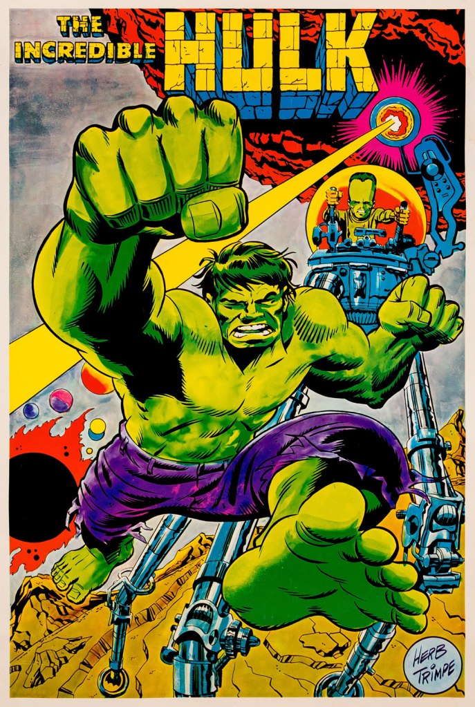
As a bonus, here’s a 1970 Marvelmania poster, one in a series of products exclusively available through mail-order. Nowadays, any of them routinely fetches princely sums. If you think Herb’s perfectly nailed the King Kirby aesthetic with this one, you wouldn’t be far wrong, but there’s a twist. The drawing was designed and pencilled by Kirby, then in the process of leaving Marvel for DC. Trimpe was asked to ink the drawing, redraw the Hulk’s face in his own style, and delete Kirby’s signature. I forget just where I read about this, but Trimpe had some heavy moral qualms about being made a party to this petty act of malice.
I was all set to write about a certain topic… but one hurdle stopped me cold: having recently moved, we are (mostly me, I confess) still somewhat living in boxes. So… where’s that other book? In any one of a hundred or more boxes. Fortunately, I try to always have a backup plan.
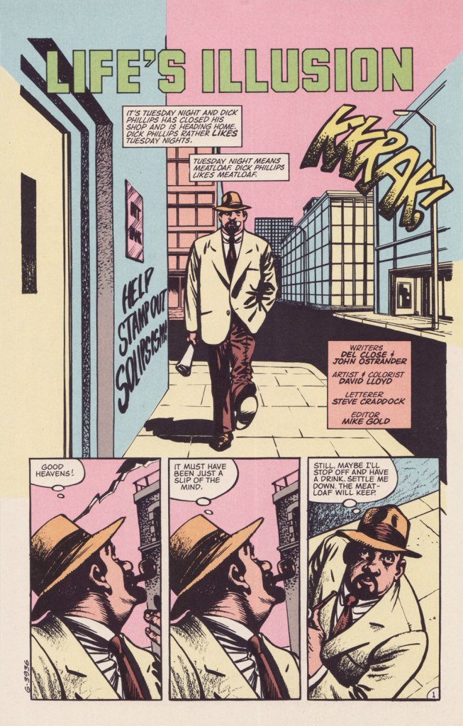
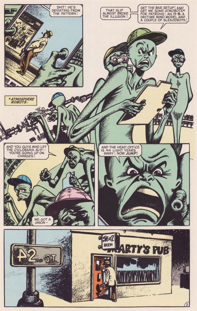
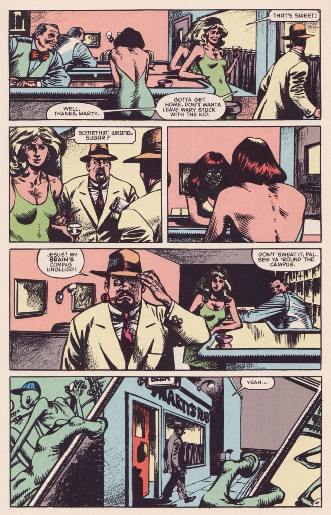
This isn’t the first time I draw attention to an offering from DC’s ambitious but ill-fated Wasteland (1987-88) under the Treasured Stories rubric. See also Foo Goo and American Squalor for more details and to (beware!) suffer a case of thematic whiplash. Whatever warts and blemishes Del Close and John Ostrander‘s Wasteland creations may have borne, they weren’t interchangeable.
Today’s yarn is a spot-on homage to author Philip K. Dick (1928-82), down to the name and occupation. The ‘real’ PKD may have been fond of meat loaf as well, for all I know.
Possibly a reference to PKD’s 1966 novel The Crack in Space?Another cute detail: « From 1948 to 1952, he worked at Art Music Company, a record store on Telegraph Avenue » (in Oakland, CA). Oh, and Robin Williams was a Del Close fan… and vice versa.Life’s Illusion appeared in the final semi-decent issue of Wasteland, no. 10 (Sept. 1988, DC)… beyond that point, it was a painful slide into the abyss. Anyway, I love how this story is able to deftly juggle its elements of comedy, tragedy and Dickian metaphysics without dropping the ball. Poor Mary.
PKD had been on my mind lately. Last fall, while rambling around town, I came upon a Little Library housing one of his books, a French-language edition of 1964’s The Three Stigmata of Palmer Eldritch. I’d read the original paperback edition in 1992, but wasn’t sure I quite grasped its dénouement, and had no-one to compare notes with.
Somewhere, eons ago, I’d read that Dick’s manuscripts for his 1960s paperback originals were abridged (i.e. gutted) to fit the publishers’ format and predetermined page count. But this might be apocryphal. As it stands, I can find no trace of such a claim. The story went on to say that publishers in Belgium and France, where the author was more of a draw than in North America, based their renditions upon Dick’s unexpurgated manuscripts, leading to, unusually for translations, results hewing closer to the writer’s intent. It helps that Dick, not given to extravagant stylistic flourishes, is relatively easy to translate.
« This is an illusion ». Here’s the tome in question, published in 1977 by Belgium’s Éditions Marabout, using Guy Abadia’s 1969 translation. Despite the fact that the book’s been retranslated since, I’ve no quibble with this version, save for the lack of credit for the cover illustrator.
I’m currently halfway through, and so far all is clear; I may have to confer with my younger self to explain the plot to him, poor thing.
« It’s quiet snow that I remember best… snowfall and Brahms on November nights. » — Rod Mckuen, Midnight Walk
While Autumn is easily my favourite season, much of its magic and colours are gone by the purgatory that is the month of November, and I find myself longing for snow to brighten the relentlessly longer and gloomier evenings.
And then, yesterday, as I was still mulling over this post, I woke up to this view from my front door.
Well, then! This post consists of a(nother) gallery of Warren Kremer‘s delightful Harvey covers, this time with a snowy theme. Never truly ‘ha ha’ funny, they get along on charm and crafty, limpid conception and execution.
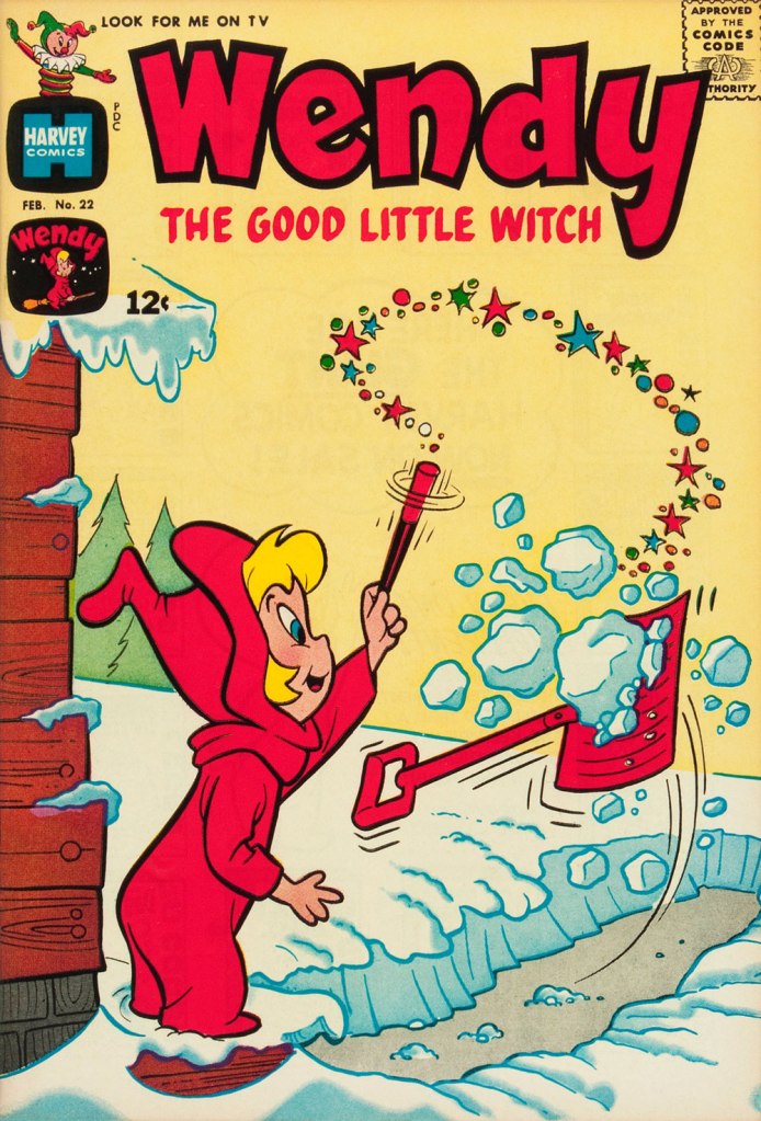
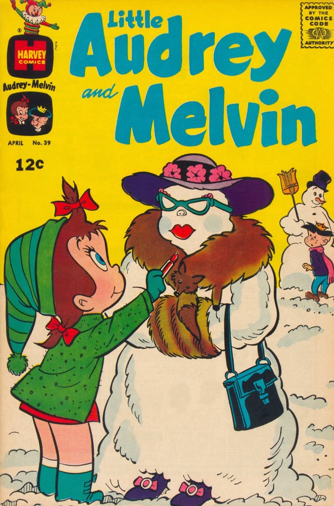
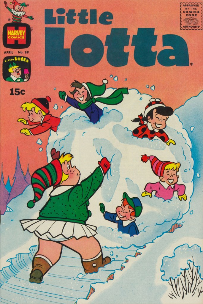
This is Little Dot no. 15 (Jan. 1956, Harvey). While most of Harvey’s efforts were channeled into their ‘Big Two’, Casper and Richie Rich, I always found these too bland (in the former’s case) or kind of deplorable (in the latter’s). I was more attuned to the line’s (slightly) bad boys, Spooky and Hot Stuff (Donald Ducks to Casper and Richie’s Mickey Mice), but really, the genuine interest resided in art director Kremer’s nimble design gymnastics and thematic acumen on Little Dot covers. By this time, these have improbably (but happily) inspired designers all over the globe. Nevertheless, a big juicy pox on the article’s author for failing to acknowledge Warren Kremer even once.This is Spooky no. 73 (Apr. 1963, Harvey). Those 1960s Harveys were so beautifully uncluttered in their design, with the bonus of Kremer’s marked and ongoing contempt for the Comics Code Authority stamp. Oh, and here’s our earlier selection of Spooky covers.This is Wendy, the Good Little Witch no. 22 (Feb. 1964, Harvey).Richie Rich no. 23 (May 1964, Harvey). What have you been eating, Richie?This is Little Audrey and Melvin no. 23 (Mar. 1966, Harvey). As you can see, Audrey’s sidekick Melvin shares a former fedora with our dear friend Forsythe Pendleton ‘Jughead’ Jones. That particular chapeau is called a Whoopee Cap. This is Richie Rich no. 55 (Mar. 1967, Harvey).This is Casper, the Friendly Ghost no. 116 (Apr. 1968, Harvey). Variations on skiing through solid objects is quite the cartooning wellspring.This is Little Audrey and Melvin no. 39 (Apr. 1969, Harvey). This is Hot Stuff, the Little Devil no. 93 (Oct. 1969, Harvey). For more Hot Stuff covers, check out Who Will Change the Devil’s Nappy?This is Little Lotta no. 89 (Apr. 1970, Harvey). And they didn’t find the local children’s mangled bodies until the following spring thaw.
« Clocks in disagreement are worse than no clock at all. » — David Mitchell
There’s simply nothing that gets me more into the proper Hallowe’en spirit than a spectral Joe Gill – Steve Ditko yarn.
Back in 1999, Mr. Ditko shared this intriguing insight about his most frequent — and preferred — collaborator:
« Joe Gill is one comic book story/script writer who understands a comic panel. Many other writers believe a single panel is a long, continuing strip of a movie film, containing numerous, changing, point-of-view frames. »
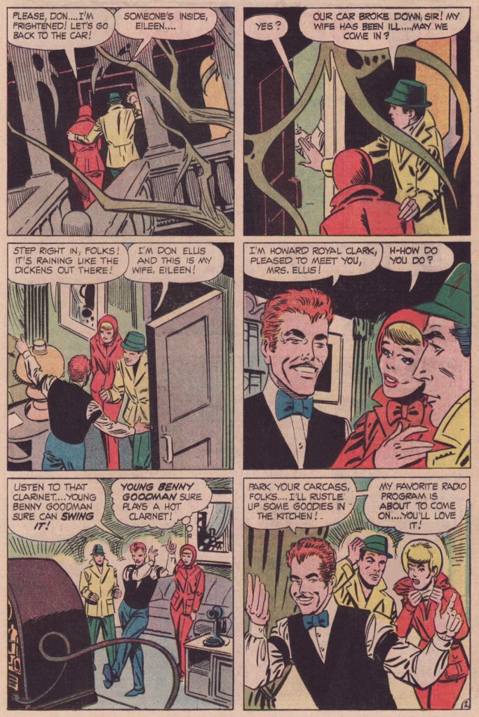
Here, then, is a moody tale that originally saw print in Haunted no. 7 (Aug. 1972, Charlton).
I could be wrong, but this, to my recollection, is the only Charlton ghost story wherein Ditko gave us a full-page splash.Incidentally, the pint-sized ghostly narrator is Impy, a Ditko creation who later had the dubious honour of being evicted from his own book (with issue 21, Apr. 1975) by one Baron Weirwulf. Bah, I liked Impy better.
A few notes: The title design is among the best I’ve seen from Charlton; it wasn’t generally their forte.
I’m wondering whether I’m just imagining the Benny Goodman / Don Ellis jazz subtext. Joe Gill is just the type of guy to surreptitiously toss that into the mix. Goodman, the ‘King of Swing’ was an paradigm of the big band school of jazz, while Ellis, though he began his career with Glenn Miller’s band, soon fell in with the avant-garde side of things. I see a natural dichotomy at work here… though I’m a fan of both myself.
Also, this seems to me like another instance of the suave villain / obnoxious hero setup (think Night of the Demon)… I mean, who would you rather spend an evening with, dapper Howard R. Clark, or with those two boorish, meddlesome stuffed shirts? Oops, I think I’ve given my bias away.
For a bit of mood setting, listen to some of those fabulous Lights Out radio shows that Mr. Clark so rightly digs.
And here’s a swingin’ Miller performance, circa 1937, of the Louis Prima standard Sing, Sing, Sing. And to balance things out, here’s Don Ellis performing his Bulgarian Bulge in 1969. Now, now.. can’t we all just get along?
So we’re done, countdown-wise, for another year. If that’s not enough to satisfy your odious cravings, take a stroll through our voluminous-by-now archives, at this point one hundred and eighty-six posts strong (or at least long!):
« It is a privilege to be the master of destinies, and director of every urge and event in the lives of such a group of folks. They may be dream folks, but the responsibilities are real because I know these characters are real to many thousands of readers. » — Frank King
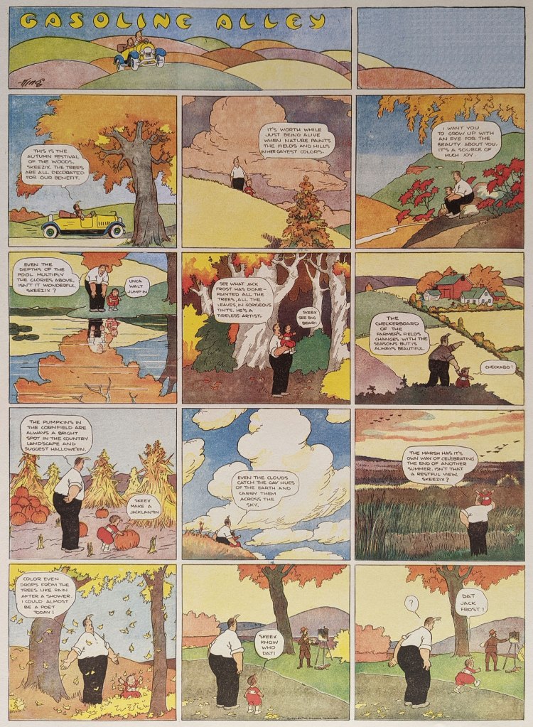
This post is but a simple sequel: a couple of countdowns ago, I shared some of Frank King‘s Halloween and Autumn-themed Gasoline Alley Sundays… but it turned out that, King manifestly being a fiend on the topic, there were more of these placidly poetic beauties. And so here are some of them.
The November 30, 1921 strip.The October 21, 1923 strip.The October 28, 1923 strip.The November 1st, 1925 strip.The October 29, 1933 strip. Horsepower!
Pray note that, as these were originally published at a rather gigantic size — especially if you compare it to the lilliputian space allotted in newspapers for today’s comic strips — I consequently posted these images in a larger format than is my custom. And so, open in a separate tab to get the larger (and fuller) picture!
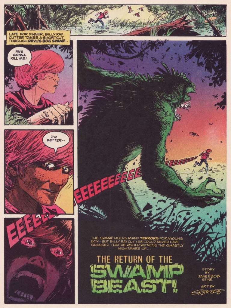
« I’m alone with the ghost of the swamp, somewhere near the weeping willows. » — Steven Herrick
Today, we pull on our wellies and boldly venture into the depths of the mysterious swamp, but not entirely unprepared: on this occasion, I turn the microphone over to an acknowledged expert en la matière visqueuse, Mr. Stephen R. Bissette. I queried Steve about his early work for Scholastic and he most munificently lifted the veil on those wild days of youth:
« Well before my stint on Swamp Thing, I drew two swamp monster stories (one of which I’d also scripted) for Weird Worlds for Scholastic Magazines back in the day. The magazine’s editors were Bob and Jane Stine (Bob aka R.L. Stine), who wrote the first of the two stories; the magazine art director was Bob Feldgus, who was always a joy to work with, and trained me well.
The story titles are counter-intuitively reversed, in a way. “The Return of the Swamp Beast” was originally published in Weird Worlds no.3 (October 1979) in black-and-white, colored for its reprint in Yearbook no.1 (and only, 1986). Enjoy! »
The Return of the Swamp Beast was coloured by Brendan McDonough.
« These were among my favorite early freelance gigs, and remain my favorite magazine account and people I was fortunate enough to work with and for. The Stines and Bob Feldgus extended the best, most gracious, most responsive relations with this freelancer of any I had in those formative early years; it also was the best-paying of all the early freelance gigs, extending the greatest freedom for me to do the work itself, and they boasted the best production and printing of any publisher I worked for then (even better than Heavy Metal).
My entry into the Scholastic freelance pool was via a one-shot horror story for Scholastic’s then-new zine Weird Worlds. Joe Kubert brought me into his studio/office in the Baker Mansion (which has long since been the dorm for the Kubert School rather than its headquarters and main building, as it was during its first few years) and asked if I’d be willing to draw a short (three pages, if memory serves) horror story for a magazine intended for schools; I would be doing the whole art job working from a silly but fun script by Bob and Jane Stine, co-editors of the zine, and my name would not go on the job, it would be credited to The Joe Kubert School of Cartoon and Graphic Art, Inc. Fair enough! I was still a student after all, and this was my shot at doing something different.
I was overjoyed to have the shot, and did my best on it. Part of the appeal, mind you, was drawing a horror comic for schools. During my early ’60s childhood, any comics brought to school were verboten and usually confiscated, horror comics above (or beneath, in the minds of my teachers) all. So, drawing a horror story that was intended for distribution to junior high students—sanctioned horror comics for school!—was a hoot and a bit of karmic comeuppance I was happy to be part of.
Joe was delighted with what I did with the script, as was Scholastic. I wanted to do more. One of (many) great acts of generosity Joe extended my way was gifting me with the account with Scholastic when I graduated in the spring of 1978 from the Kubert School, and thus began my happy few years of working with Scholastic—an account that often paid the rent and kept me working when work in comics was hard to come by.
Scholastic treated me like a prince. They paid well, paid promptly upon delivery of the finished pages, and were always a joy to work with. Like all good things, this passed: Weird Worlds was cancelled after a few issues, and after a couple of jobs for Bananas I moved on to other things, including pencilling Saga of the Swamp Thing beginning in 1983. But I always loved working with and for Bob and Bob, and I miss ’em both. I eventually collected some of my work for Scholastic for two comicbooks in the late ’80s, and did so with Scholastic’s permission. »
That source, Bissette & Veitch’s Fear Book (Apr. 1986, Eclipse) is the one we tapped for this post, and the most affordable solution should one crave more of these sharp little tales. Here’s another, this one a Bissette solo (including the colouring), originally from Weird Worlds no. 7 (Jan. 1981, Scholastic).
« Who remembers these magazines? Bananas and Weird Worlds seem to be lost in the limbo of all school zines; no comics sites acknowledge them or offer back issues for sale (none I can find, anyway), and general online searches turned up little. Back in 1995, The New York Times ran an interview/article on Bob Stine when his Goosebumps TV series was about to debut, making mention of Bananas magazine. There’s a number of online sites dedicated to Stine’s famous and beloved Goosebumps books series, but Bananas and Weird Worlds are less than footnotes in the long shadow of Goosebumps.
There’s a handful of affordable back issues of Weird Worlds available on various online venues and auction sites; I’m in almost every issue. One cautionary note: If you go looking on eBay, though, don’t confuse the Scholastic media zine Weird Worlds with the lurid, gore-splattered Eerie Publications 1970s newsstand horror comic magazine Weird Worlds. Those are fun in their way, too, but you won’t find me in there—just my eye-tracks from reading ’em three decades+ ago.
I’ve long wished to convince Scholastic to consider a collected edition of this body of work, but each & every attempt to engage has fallen on deaf ears. I’m still proud of this work, and as a precursor to the very successful R. L. Stine Goosebumps franchise & Scholastic graphic novels of today, can still hope that one day someone at Scholastic will have the “lightbulb” moment… »
I truly can’t thank Steve enough for this bounty of information — you just can’t beat going straight to the source, particularly with a source this friendly and eloquent!
« Now these men have no need for words… they know! » — Anonymous
Now I won’t claim that Dick Ayers (1924-2014) was all that great an artist. In the early Sixties at Marvel, as an inker of Jack Kirby’s pencils, he was at best neutral, more likely than not to defuse much of the explosive excitement of the King’s pencils*.
However, Ayers’ chief strengths lay elsewhere: it was demonstrated time and time again that he could quickly put together dynamic and easy to parse — don’t laugh, it’s no cakewalk — layouts, and if you paired him with a dominant inker (such as John Severin (on Sgt. Fury) Alfredo Alcala (on Kamandi), Jack Abel (on Freedom Fighters) or Gerry Talaoc (on The Unknown Soldier), you’d get some quite presentable results — and quickly at that. Guys like Ayers should be saluted instead of dismissed, because they were the glue that held the funnybook business together and operating more or less smoothly.
I won’t claim either that Eerie Pubs’ product was anything but shoddy, shlocky goods, but I won’t deny that it can be fascinating… in small doses. While still working for Marvel, Ayers produced a memorable bunch of stories for a pair of former Timely/Atlas colleagues, publisher Myron Fass and editor Carl Burgos (creator of the Golden Age Human Torch). This is Ayers’ first published effort for those rascals. It appeared in Horror Tales v.2 no. 1 (Jan. 1970, Eerie Pubs). Brace yourselves!
«… Dick Ayers understood what ‘Carl and Myron’ were asking for and gave it to them in spades. They wanted gore? They got it! Ripped-off limbs, lolling tongues, gouts of blood and oh my… those popping eyes! Ayers’ trademark was the eye-poppin’. Socket just couldn’t contain ’em! » — from Mike Howlett‘s definitive study The Weird World of Eerie Publications (2010, Feral House).
« House of Monsters » is a Grand Guignol remake of « The Castle of Fear », from Weird Mysteries no. 3 (Feb. 1953, Stanley Morse). Read it here! Myron Fass held the rights to a lot of old inventory, so he had the old stories touched up or redrawn, some of them multiple times. Grotesqueness aside, I do prefer the original version. It had a better monster and a stronger ending… but you be the judge!
I came across this saucy bit of Ayers carnage in 1976, in one of the first Eerie Pubs mags to surface following a hiatus imposed by a severe contraction of the black and white horror mag market (thanks, Marvel). At the time, it just seemed like the oddest item: at once something of another, earlier time (it was an all-reprint affair), but also extremely garish in its goriness, even by slack contemporary standards.
Here’s my beat-up original copy of Weird vol. 9 no. 3 (Sept 1976, Eerie Pubs). Cover by Bill Alexander. I didn’t realise at the time that it was a bit of an Eerie’s Greatest Hits collection, so every other Eerie mag subsequently encountered rather paled in comparison.
-RG
*But then, with the splendid exception of Steve Ditko (and that was a waste of precious resources), I’d argue that virtually all of the inkers he was saddled… er, paired with before Joe Sinnott were rather underwhelming.
« I was already doing a lot of splendid research reading all the books about ghosts I could get hold of, and particularly true ghost stories – so much so that it became necessary for me to read a chapter of Little Women every night before I turned out the light – and at the same time I was collecting pictures of houses, particularly odd houses, to see what I could find to make into a suitable haunted house. » — Shirley Jackson
This one’s from the department of historiated text. What text? “those fiction pieces that nobody read” in comic books, prose pages mandated by the United States Postal Service. The USPS insisted that comic books «… have at least two pages of text to be considered a magazine and qualify for the cheaper magazine postage rates. »
By the Sixties, most of these pages consisted of letters to the editor, but not every company followed this practice. After EC pioneered the letters page idea in the early 1950s, ACG, DC, Archie and Marvel followed suit. But not Dell/Gold Key, Harvey and Charlton.
For its mystery titles, Gold Key naturally opted for a ‘unusual history’ format, enlisting, to provide spot illustrations, veteran cartoonist Joe Certa, best known for his co-creation of and long run (1955-1968!) on J’onn J’onzz, the Martian Manhunter and his stylish run on Gold Key’s Dark Shadows comic book series (1969-76). While Certa started out with a pretty mainstream approach, as the Sixties wore on, his style got increasingly angular, spare and expressive. Personally, I love it… but I know it’s not for all palates.
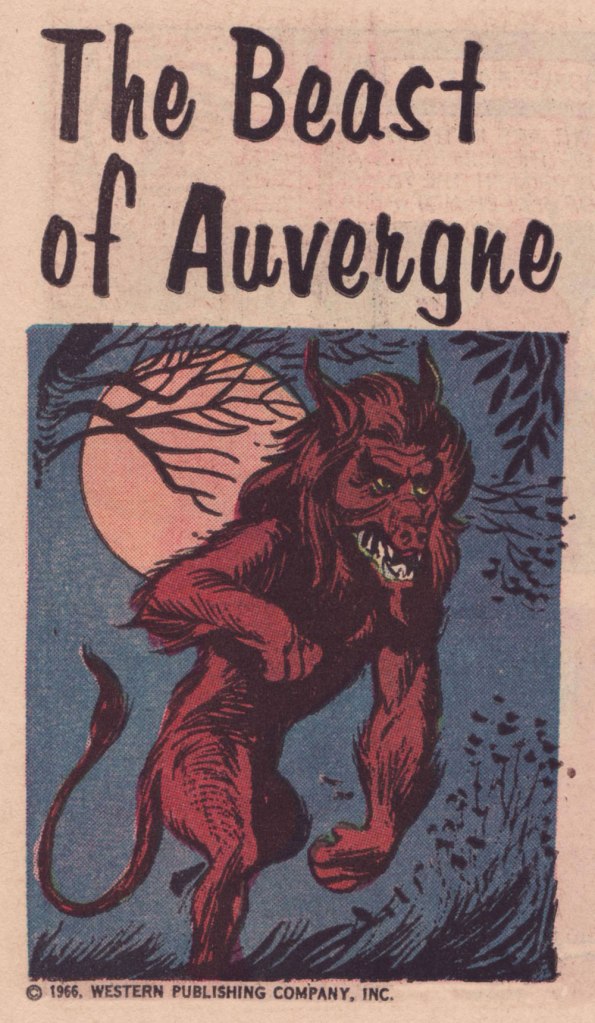
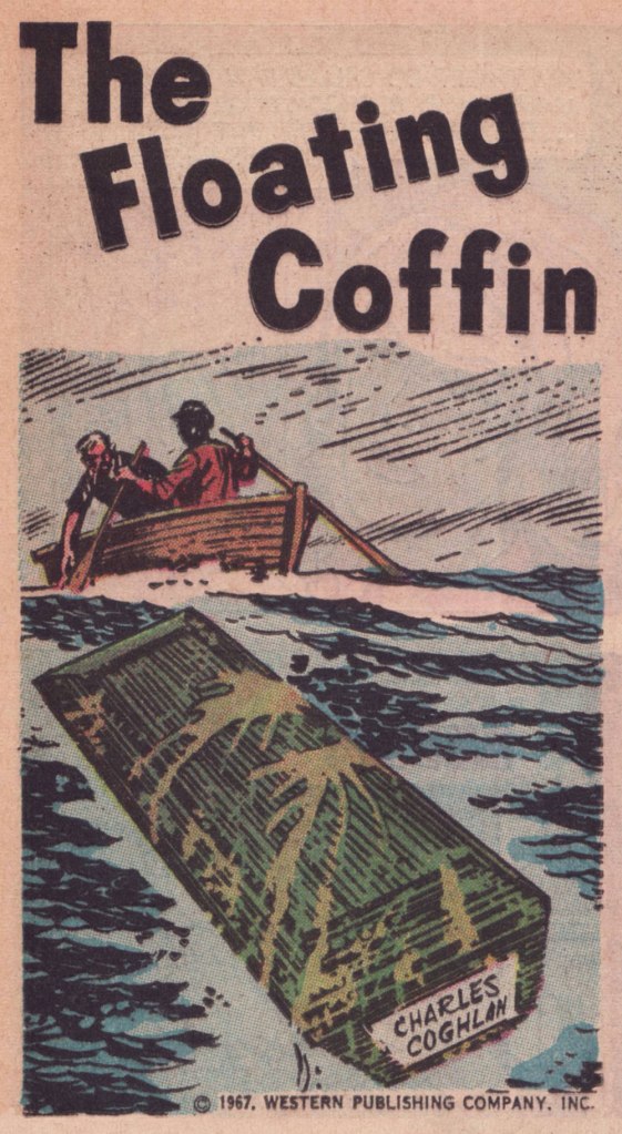
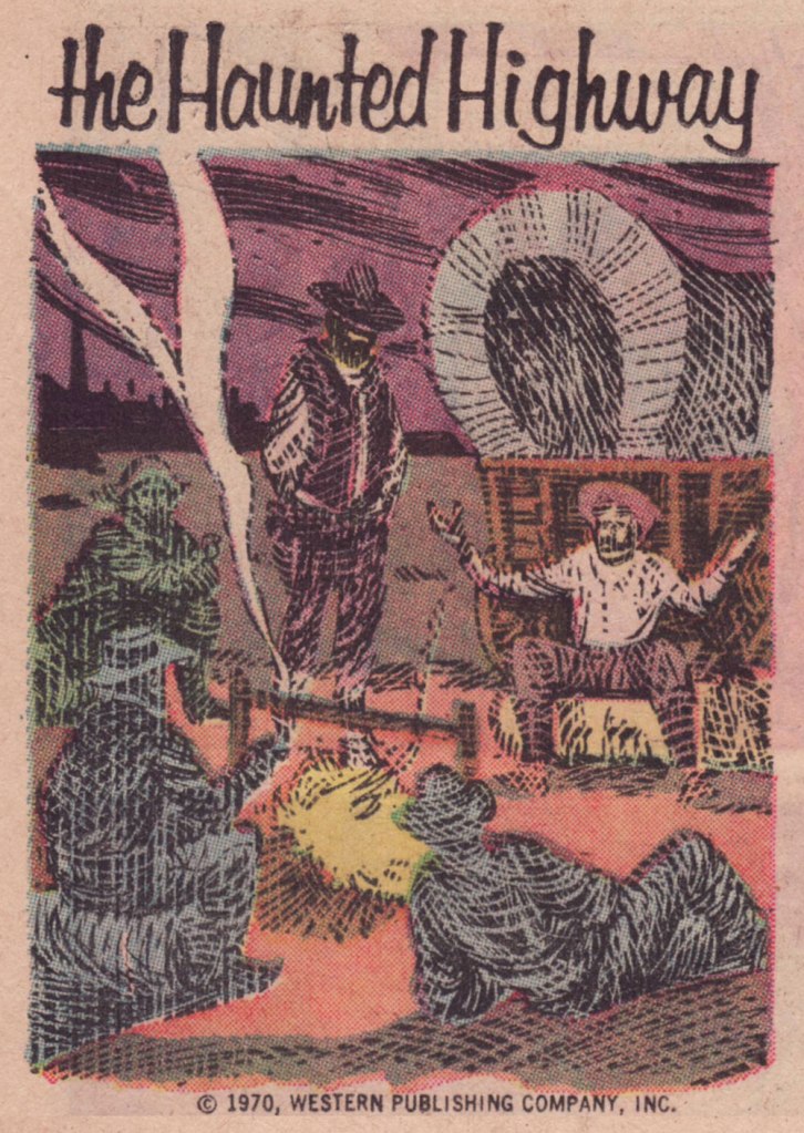
This one appeared in Boris Karloff Tales of Mystery no. 17 (Mar. 1967, Western); « It was more than two centuries ago when the monstrous creature known simply as ‘the Beast’ appeared in the province of Auvergne, in France. » Perhaps you’ve seen the action-packed, *slightly* fictionalised cinematic account of the events, 2001’s Le pacte des loups, aka Brotherhood of the Wolves.This one’s from Boris Karloff Tales of Mystery no. 28 (Dec. 1969, Western); « When Gustave Labahn appeared in Munich, Germany in 1890, he was indeed a man of mystery. Nothing was known of his except that he was tall, lithe and powerful, with strangely hypnotic eyes, and a possessor of unlimited wealth. »This one, from Boris Karloff Tales of Mystery no. 28 (Dec. 1969, Western) states: « He was a man of a hundred names and countless identities. No one knew his true origin. It was said he was descended from an evil medieval warlock. Others said he was a reincarnation of the Count de St-Germain… a man who claimed to be more than 2,000 years old. He called himself Raoul Plessy, but his followers he was known as La bête… The Beast. »Appearing in Boris Karloff Tales of Mystery no. 50 (Oct. 1973, Western), this one concerns the 1793 murder of French revolution leader Jean-Paul Marat by Charlotte Corday. Exceptionally, the art on this one is the work of John Celardo, a lovely, delicate composition.One from Grimm’s Ghost Stories no. 5 (Aug. 1972, Western). The cat’s name is Satan, we are told.From Ripley’s Believe It or Not! no. 8 (Feb. 1968, Western), this piece tells the story of a coffin that found its way home to one of my favourite places, Canada’s Prince Edward Island. Here’s a more sober account of the legend.From Ripley’s Believe It or Not! no. 15 (Feb. 1968, Western), this one concerns the purported haunting of Scotland’s Meggernie Castle.A cozy one from Ripley’s Believe It or Not! no. 21 (Aug. 1970, Western): « In the northeastern corner of Mississippi, near the town of Aberdeen, lies a stretch of deserted country road which has lately become known as one of the most haunted spots in the United States. »A great drawing from Ripley’s Believe It or Not! no. 41 (July 1973, Western); The text opens with « Ash Manor House in Sussex, England, was over six hundred years old when bought in 1934 by a man named Keel. Mr. Keel did not believe in ghosts. Neither did his attractive wife. »This hails from Ripley’s Believe It or Not! no. 42 (Aug. 1973, Western). The piece recounts anecdotes about such thespians as Burl Ives, Jackie Gleason, Rudolph Valentino and our beloved Vincent Price.And here are a couple of samples of full pieces to give you an idea of how they looked in print. This thoroughly seasonal one saw print in Grimm’s Ghost Stories no. 6 (Nov. 1972, Western).
One more? Here’s a favourite from The Twilight Zone no. 42 (Mar. 1972, Western):
« The thing to do was kill it. Obviously. » — Ira Levin, Rosemary’s Baby
Last year, in the course of my post celebrating Luís Dominguez’s life and covers, I noted in passing, about The House of Mystery no. 235 (Sept. 1975, DC), that it held the only DC ‘horror’ story I ever found actually scary.
Since I’d hate to just leave you with such a tease, here it is, so you can be your own judge of the yarn’s merits (or its failings, however the chips may fall).
Don’t ever fall for the notion that cartoony and scary are inversely proportional. Brr.
That poor, fragile, lonely woman! It’s not enough to be trapped in a loveless marriage with the world’s coldest fish, but any sympathy and hope she seems to receive from anyone is mere pretence in the process of gaslighting her. Of course, the plot is redolent of Rosemary’s Baby and The Exorcist and other, and much needed, contemporary critiques of the obligations and ambivalences of motherhood — unthinkable in earlier days — but it has its own points to make.
This is, to my knowledge, one of the few horror stories in mainstream comics of that period to be both written and illustrated by women: Maxene Fabe and Ramona Fradon, respectively. While Fradon is justly celebrated for her defining work on Aquaman in the 1950s and on Metamorpho in the 1960s, Ms. Fabe’s is likely a less familiar name to most comics readers. In the 1970s, she wrote around twenty-five scripts for DC comics, almost exclusively short horror and humour pieces for editor Joe Orlando. Of these, four are Fabe and Fradon collaborations: the (almost) equally dark conte cruelLast Voyage of the Lady Luck in House of Secrets no. 136 (Oct. 1975, DC); the more conventional The Swinger in Secrets of Haunted House no. 3 (Aug.-Sept. 1975, DC), working from a plot by Mike Pellowski, and finally, the sardonically humorous Bride of the Pharaoh in House of Mystery no. 251 (Mar.-Apr. 1977, DC).
« I love the scents of winter! For me, it’s all about the feeling you get when you smell pumpkin spice, cinnamon, nutmeg, gingerbread and spruce. » — Taylor Swift
It occurred to me, just the other day that I’d failed to feature, over the course of five and three-quarters countdowns, anything by Gene Colan. And this despite the fact that I’ve always enjoyed his work and his undeniable adroitness within the horror genre.
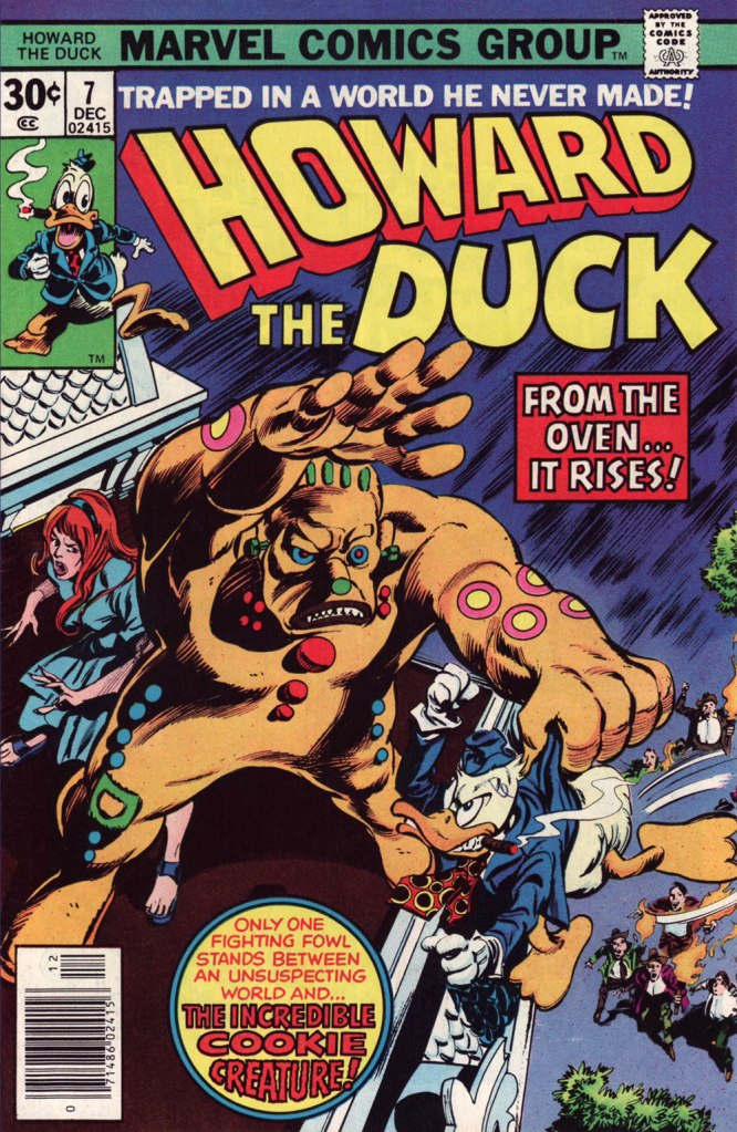
Still, I decided to sidestep the obvious touchstone, his monumental run on The Tomb of Dracula, and opted instead for another of his big series at Marvel: Howard the Duck.
I was a fervent fan of the series as a kid, but I honestly haven’t returned to it in decades. Which is not to say that I’ve forgotten it. There’s no doubt that I should give it a fresh look — I’d probably get more of Steve Gerber‘s jokes than I did as a twelve-year-old — but in the interim, let’s focus on a couple of pertinent issues.
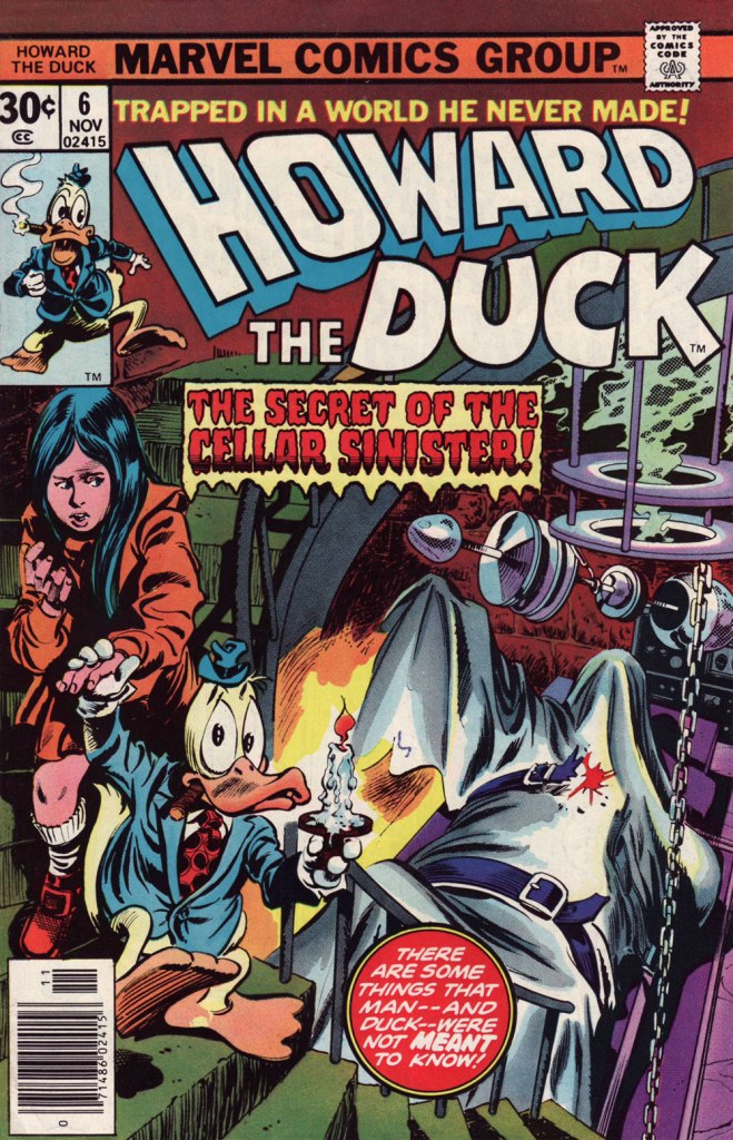
This is Howard the Duck no. 6 (Nov. 1976, Marvel); cover pencils by Gene Colan, inks by the recently departed Tom Palmer (1941-2022).Colan’s style meshes surprisingly well with Mr. Gerber‘s madcap comedy… he plays it straight, and that’s why it clicks. Savvy move.I wasn’t sure about Steve Leialoha‘s appropriateness as a Colan inker at the time, but I really don’t see what I could have objected to. Let’s see, what have we here? The Addams Family, Shelley’s Frankenstein, gothic romances, Nathaniel Hawthorne, religious sects… in this case the reverend Sun Myung Moon‘s Unification Church, better known as The Moonies…
I won’t leave you in suspense! On to the following issue…
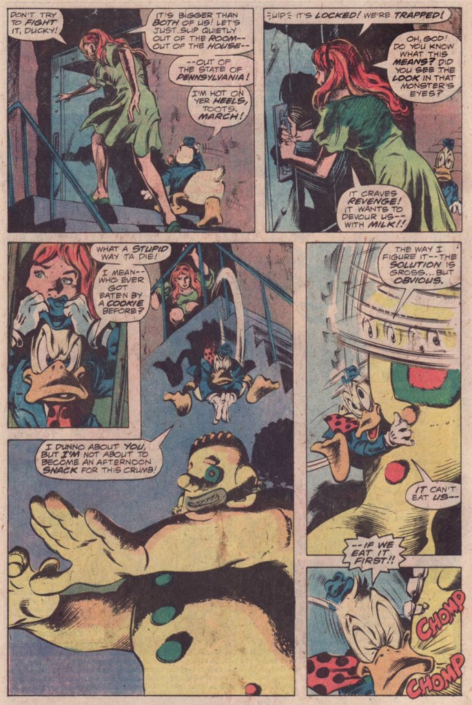
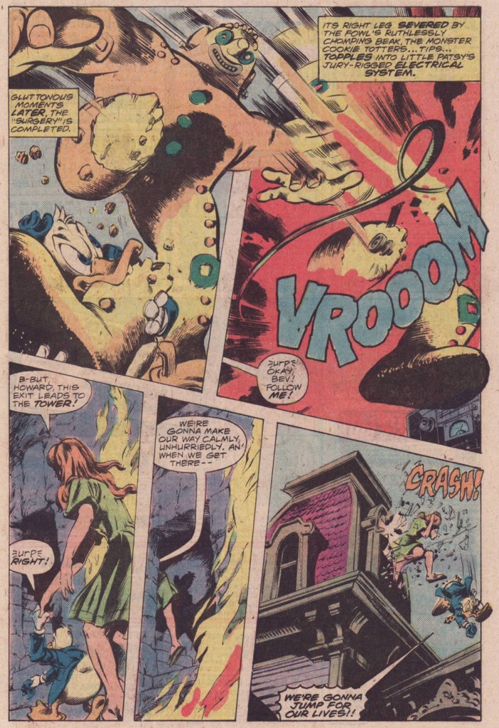
This is Howard the Duck no. 7 (Dec. 1976, Marvel); pencils by Colan, inks by Palmer.
And that’s it! Steve Gerber had a refreshing knack for subverting and upending the Marvel formula: instead of some drawn-out, epic standoff, Howard disposes of the threat — a threat worth two cover features! — in a couple of panels, then the story moves on… to another range of targets.