« I can resist anything except temptation. » — Oscar Wilde
A master from the Golden Age of comics, Matt Baker (1921-1959) is surprisingly well-remembered today. Part of it stems from his singular biography — he was a successful African-American cartoonist, an especial rarity in that era — but his posterity chiefly rests on the quality of his comic book covers.
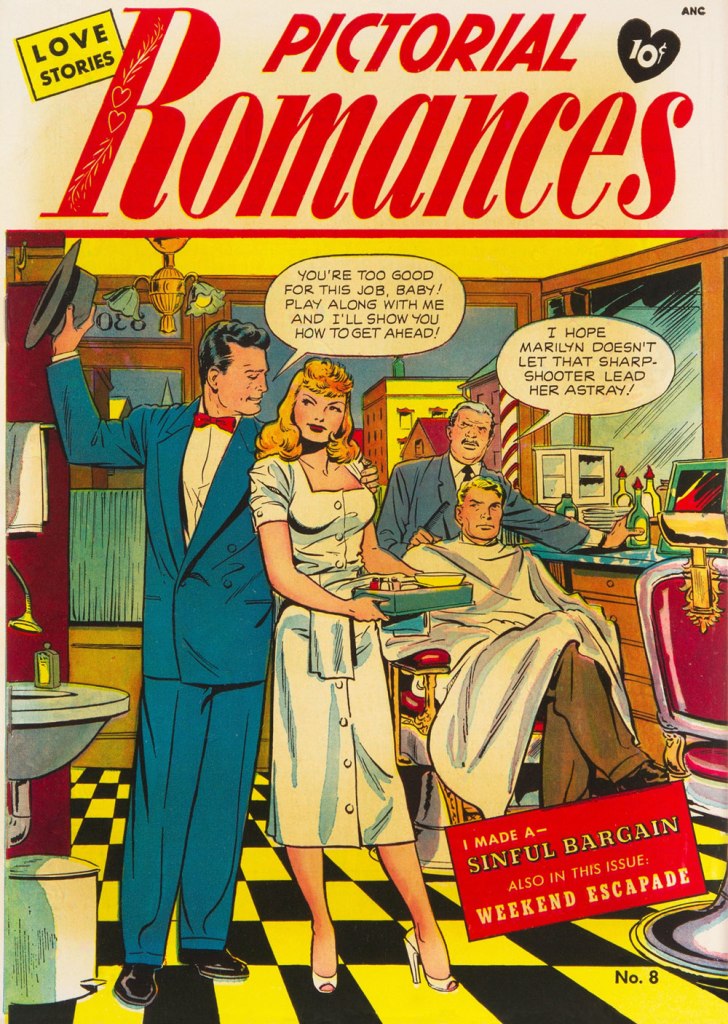
Looking around, I see that much has been written about him in recent years. But I don’t see any mention of what strikes me about his work: in essence, it creeps me out. But I understand: Baker, as a black man, must have observed and experienced affairs of the heart from a different perspective.
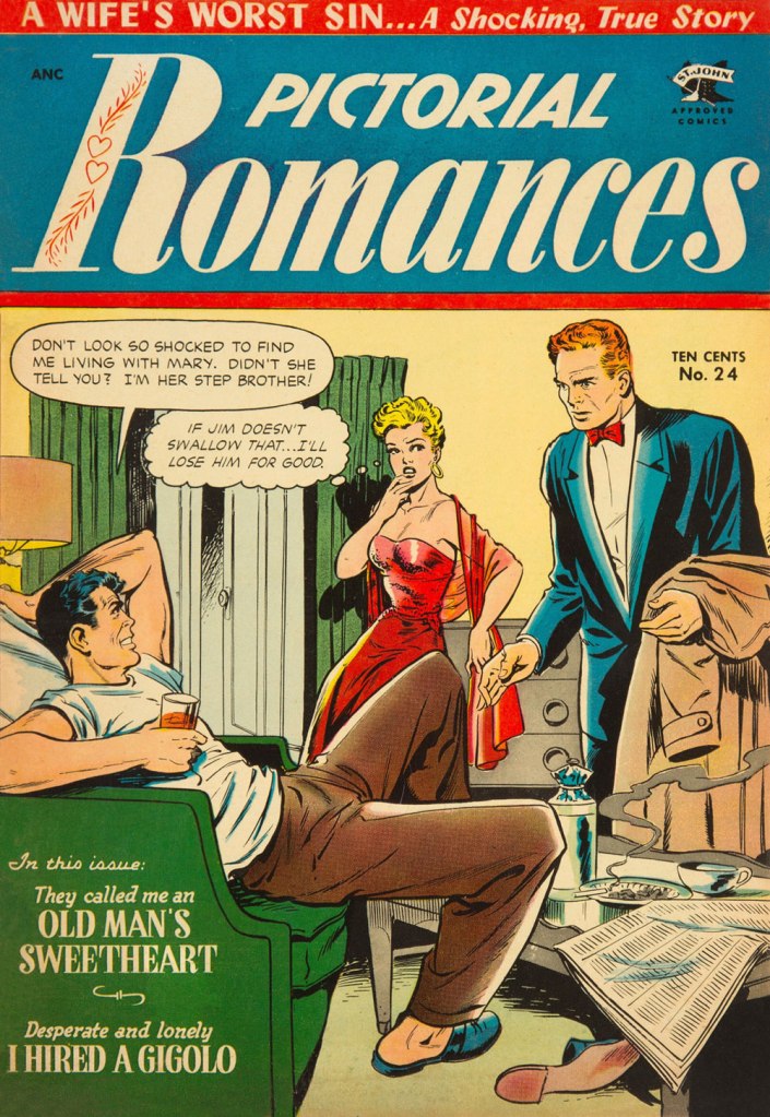
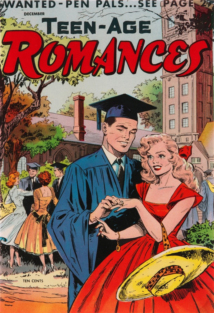
Don’t get me wrong: it’s technically superb, of course. But it’s the tone that I find jarring. Baker’s covers stand out by virtue of their darkly cynical realism. A lot of these situations could only end in tragedy, from unwanted pregnancy to Black Dahlia scenarios. These comic books bore generic tag lines about ‘exciting romances’, ‘love stories’ and ‘romantic adventures’, but Baker’s covers instead feature entrapment and extortion, blackmail, rape and other forms of illicit sex, procuring and corruption…
Perhaps I’m reading too much into these yellowing bits of old paper. But there stands the fact that inside these comic books, the tone changes: we receive the usual tidy moral homilies at the conclusion of every story. Yet the covers, with their unresolved scenarios, retain their haunting power.
Here’s my evidence. See what you think!
This is Pictorial Romances no. 8 (July 1951, St. John). Read the issue here.This is Wartime Romances no. 2 (Sept. 1951, St. John). Hilda seems to basically behave like Baker’s Canteen Kate, a character that makes me cringe in much the same way as Katharine Hepburn’s character in Bringing Up Baby, even without the mannered accent. This is Teen-Age Temptations no. 2 (June 1953, St. John). I sense a case of Section 2423 about to transpire. Read the issue here.This is Diary Secrets no. 18 (June 1953, St. John). Soliciting is evidently far less demeaning than going on welfare. Read the issue here.This is Teen-Age Romances no. 32 (July 1953, St. John). Oh, that Pat’s a keeper.This is Diary Secrets no. 19 (Aug. 1953, St. John). In 1953, a twenty dollar bill could buy you two hundred comic books, not to mention a jailbait date or twelve. Read the issue here.This is Wartime Romances no. 17 (Sept. 1953, St. John). No respect for the wingman. A rare case of two creeps who deserve one another. Read the issue here.This is Pictorial Romances no. 24 (Mar. 1954, St. John). Read the issue here.This is Teen-Age Temptations no. 8 (June 1954, St. John). For once, the cover matches the inside story. Read the issue here.This is Cinderella Love no. 25 (Dec. 1954, St. John). Drunk gringos slumming it over the border, down México way… what could go wrong? At least we can rest assured that the whole ‘waking up in a tub full of ice cubes, short one kidney‘ is an urban legend. But the plot of Elton John and Bernie Taupin’s 1975 classic, Grow Some Funk of Your Own, remains a distinct possibility.This is Teen-Age Romances no. 40 (Dec. 1954, St. John). With the Comics Code looming, the scenes depicted on St. John’s covers got sanitised into looking like any other romance comic book of the era. But I daresay Baker’s work was better than ever — I mean, look at that delicate, yet confident and expressive line. Read the issue here.A portrait of the dapper artist. Regrettably, work became scarce during the post-Code years, and Baker was reduced to hacking out page fillers for Vince Colletta’s studio. It’s an honest living, sure, but a waste, since nothing looks more like a dashed-out Colletta-inked romance than another dashed-out Colletta-inked romance.
Baker, cursed with a heart ailment, died tragically young at age 38 in 1959.
« The whistle of the old steam trains … could conjure up visions of bleak distances with one solitary wail. » — M.C. Beaton
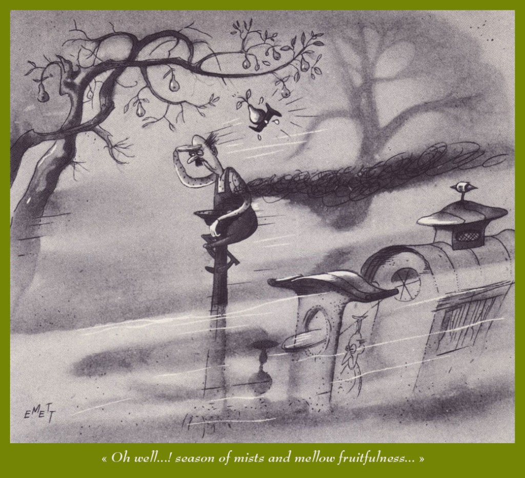
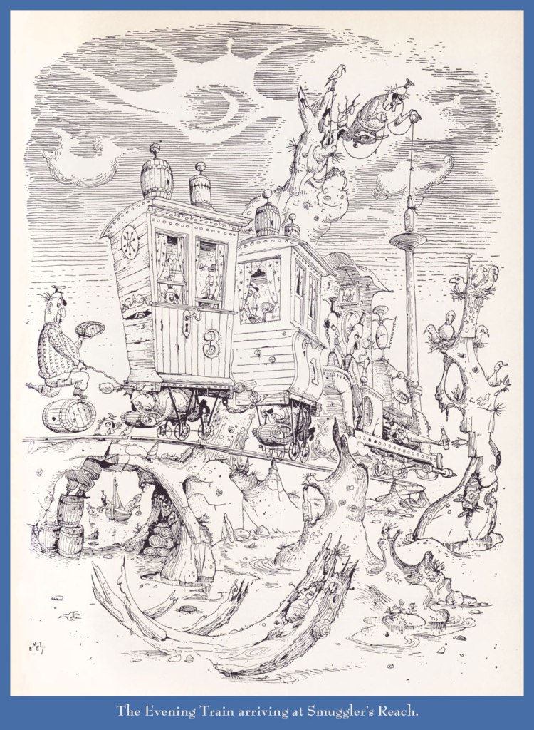
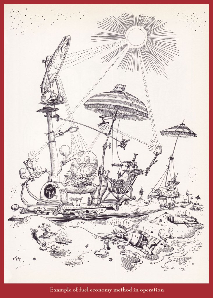
A couple of years back, I gave our readers an introductory sample of the genius (hardly too strong a word in his case) of Rowland Emett (1906-1990), and vowed I would return with a fuller, more lingering look.
Since I got the biographical trimmings out of the way that time, today, I’ll merely offer you an even dozen of my favourites.
Can’t tell a trébuchet from a catapult from a ballista? This handy guide will steer you right!Prof. Lightning’s moniker is evidently well-earned.Another inventive step in the harnessing of solar power.While this particular train route sadly does not exist (as an editor once wrote, “the great Emett, whose crazy world seems so much saner than our own…”), there are some lovely birding tours available throughout that green and pleasant land, from Land’s End to John o’Groats. Said nationalisation took place in 1948. Here’s a bit of background on that historic endeavour.
Ah, the nineteen seventies… and their Satanic panic, in which we can recognize so closely the roots (or at least relatives) of today’s disinformation maelstrom, before the politicisation and weaponisation of septic paranoia and lies had become honed to such an anti-science. In a lot of sordid ways, Lawrence Pazder was an Andrew Wakefield of his day.
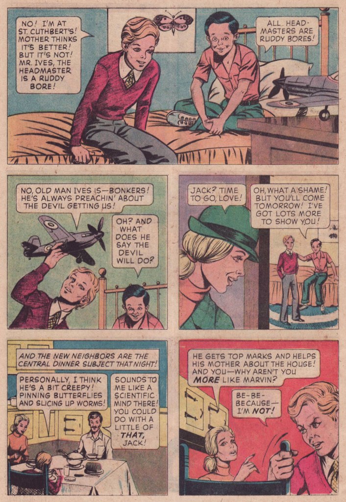
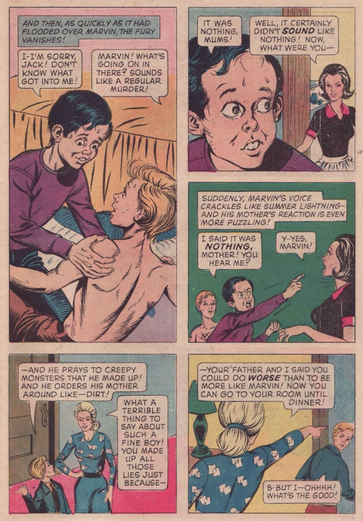
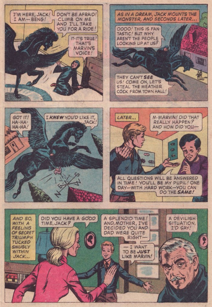
Here’s a story that I first encountered around the time of its release, remembered, but didn’t revisit until a couple of weeks ago, when a good friend (merci, Keith!) helpfully snapped up a copy for me. This deceptively dark tale was created by writer Arnold Drake (I surmise), penciller John Celardo and mysterious inker Wanda Ippolito, who may have a been a spouse or relative of Celardo’s. It’s odd to find someone else inking Celardo, as this was his chief, most enduring and distinctive strength. For comparison’s sake — and presumably, reading enjoyment — here’s another Drake-Celardo outing, The Anti-13!
I won’t make any claims that this is great art: by this time, Gold Key’s printing was shoddy, they barely bothered with the colouring (straight Magenta and Cyan and Yellow everywhere — how lazy can you get?)… but I treasure this one because of the story. Given its moral — what moral? — it’s hard to imagine The Comics Code Authority giving this one a pass, as it merrily violates several of its key precepts. I’ve got another such blasphemous entry in the pipeline… this one duly Code-Approved! Just you wait…
I had a childhood friend who was a lot like Marvin (minus the devil worship — for all I know)… he was incredibly talented, but also scarily unpredictable, and not in a good way. One day, he just disappeared.
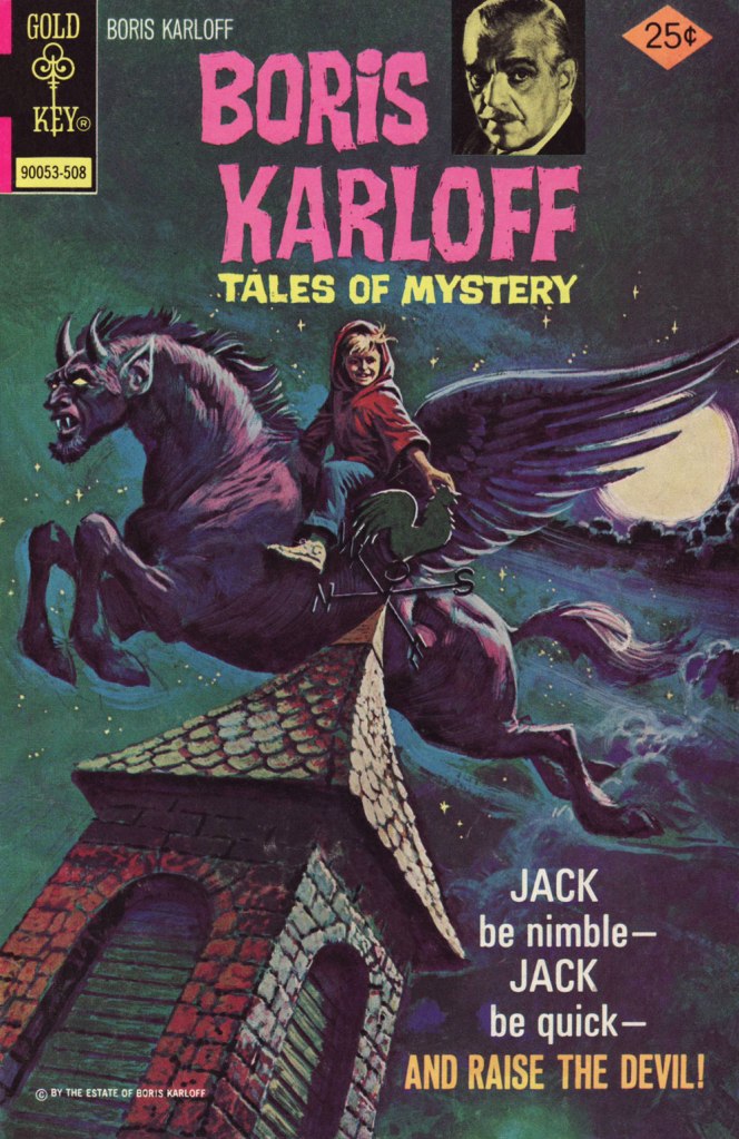
On the other hand, the accompanying cover is spectacular.
« Why Can’t You Be More Like Marvin? » originally appeared in Boris Karloff Tales of Mystery no. 63 (Aug. 1975, Gold Key), which bore this masterfully disquieting cover by Luis Domínguez. It would have made it into my Domínguez retrospective, Luis Domínguez (1923-2020): A Farewell in Twelve Covers but for the fact that I didn’t own a decent copy of the issue.
And as (nearly) always, a bonus for context: Celardo had a long and fruitful career, and I’m sure one of its highlights was to number among Fiction House’s elite cadre of cover artists. I’ve said it before, but despite their mind-numbing repetitiveness, FH covers were tops in the Golden Age in terms of draftsmanship and production values.
Aw, poor Ka’a’nga — always left at home to feed the jackals while Ann Mason goes off on escapades with her other boyfriends. And who insisted on adopting them in the first place? Ann, that’s who! This is Jungle Comics no. 98 (Feb. 1948, Fiction House). Judging from his ability in the jungle antics genre, it’s no wonder that Celardo was picked to illustrate the real thing (at least comics-wise): the Tarzan comic strip, from 1954 to 1968, between Bob Lubbers (another FH cover artiste!) and Russ Manning. And here’s one of Celardo’s Tarzan Sundays (March 27, 1954, United Feature Syndicate).
« I’ve never been to Texas but I’ve heard Willie Nelson Sing. » — Mark Ballard
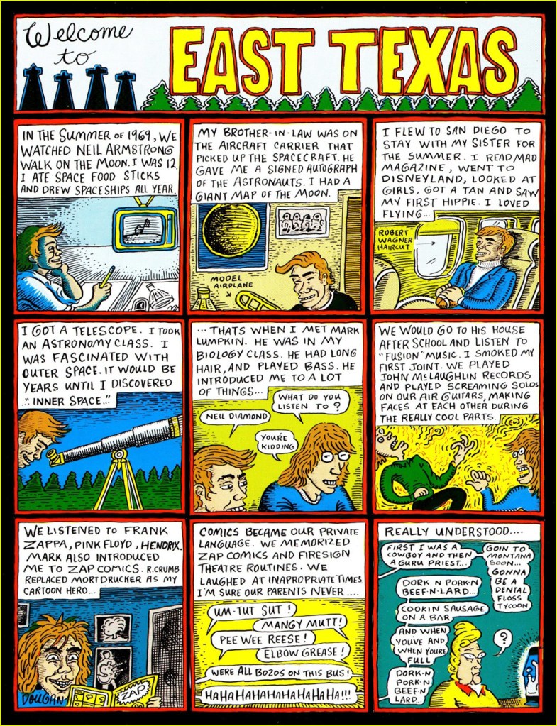
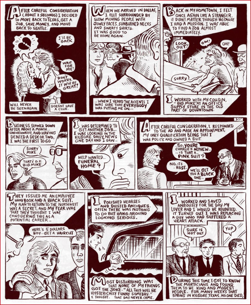
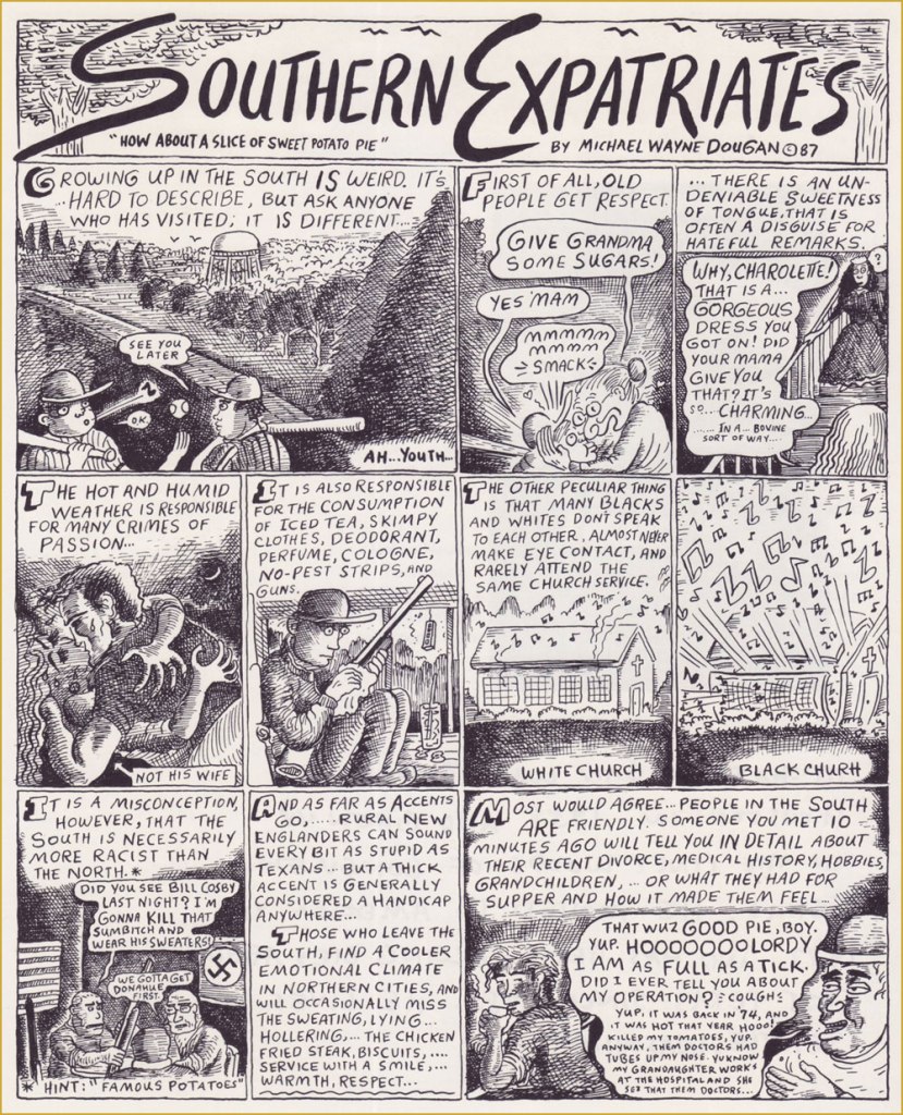
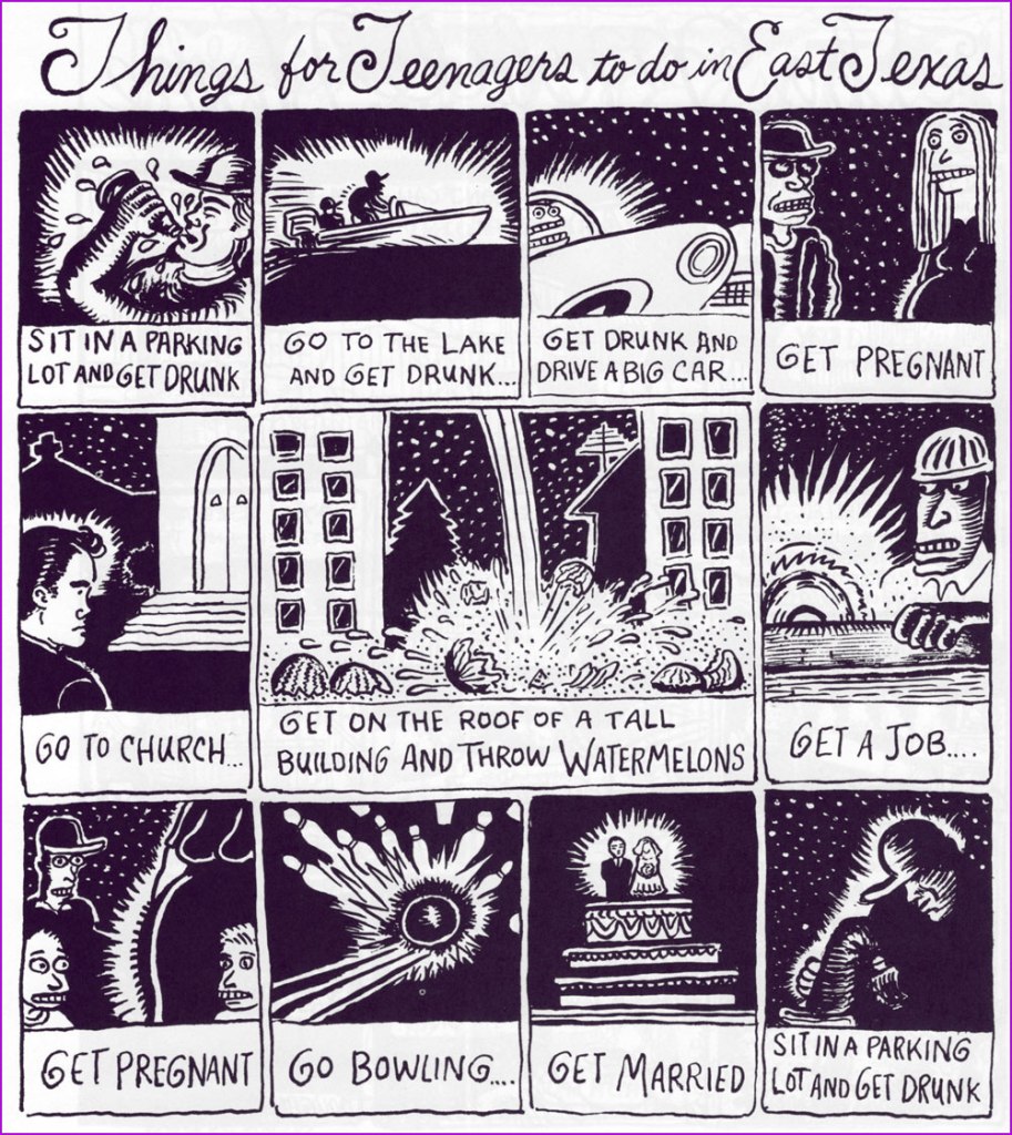
I’ve just heard of the recent, untimely passing of cartoonist Michael Dougan (1958-2023). Well, perhaps former cartoonist would be more accurate, but if so — he said his piece, made his mark, and moved on — and that’s cool. But can cartooning truly ever be left behind?
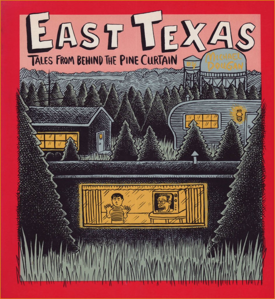
Dougan made his début in comics on the back cover of my very favourite issue of Weirdo, no. 17 (Summer 1986, Last Gasp), which also housed my pick for Robert Crumb‘s greatest short-form achievement, The Religious Experience of Philip K. Dick, and a cover among his finest *and* most provocative. See both story and cover here!Dougan’s first collection appeared the following year, published by Seattle’s fabled The Real Comet Press. The back cover was festooned with eloquent-upon-eloquent quips from his peers. For instance, Gary Panter wrote: « Dougan’s work is clear and he is not afraid. He is a big storyteller and a good liar. In East Texas the wire fences, orange colored tufts of grass, pine trees, tire tracks, piles of wood, and water towers are the best parts. The stories are about human desperation, a funny kind of desperation, an air-conditioned kind of desperation. »
And here are a few excerpts from its pages:
Dougan’s second and final collection, from 1993, was published by Penguin, no less! It featured longer, more ambitious pieces.Kentucky Fried Funeral would have to be my first pick for Dougan’s masterpiece. Unfortunately, it’s around 20 pages long, so it was unfeasible to present it here. Still, here’s the opening splash.A detail, perhaps, but worth noting, I think: Dougan preferred handling his own lettering, finding, like many a visual artist, the look and texture of mechanical text too… well, mechanical. Lovely!
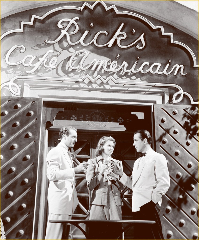
In 2017, some twenty years after his last cartoon (that I’m aware of… Double Booked?, in Fantagraphics’ Zero Zero no.17, June, 1997) Michael and his wife moved to Japan and opened a café-restaurant. Read Michael’s own account of the saga.
This must be the place.Of course, Dougan named his place after Bogie’s in Casablanca, but not without adding a couple of typos, for that modern touch.
Creative types often get restless, and Michael found himself a little niche answering people’s mostly, and sometimes incredibly, inane questions on Quora, with a potent mixture of withering sarcasm with a side of snide, all the while providing helpful information — whenever possible. Check out his feed, but let me caution you: it’s a bit of a frazzling rabbit hole (or warren, more accurately).
I’m hoping that, once news of Michael’s passing trickles over to his native land, that The Comics Journal will provide a detailed obituary of this notable artist. Farewell, Mr. Dougan.
«“Good grief!” yelled the ones that had stars at the first. “We’re still the best Sneetches and they are the worst. But, now, how in the world will we know,” they all frowned, “if which kind is what, or the other way round?” » — Dr. Seuss‘ The Sneetches (1961)
A few days ago, this news item piqued my interest: « The assistant director of communications for Olentangy Local School District abruptly stopped the reading of the Dr. Seuss book “The Sneetches” to a third-grade classroom during an NPR podcast after students asked about race. »
Naturally, since this sorry episode made its way around the world and rightly gave rise to quite the furore, the school district has since thrown its patsy under the bus.
This mention of Dr. Seuss’ timeless classic The Sneetches made me think of another slightly earlier parable of systemic racism, Bill Gaines, Al Feldstein and Joe Orlando‘s Judgment Day (1953), and the similarly telling reaction would-be guardians of bluenose morality had to it.
Initially, I thought posting such an already eminent story as ‘Judgment Day’ was a trifle too obvious. But then again, how famous can a standalone comic book story published seventy years ago be, in the true scale of things? Really, it can never be famous enough.
In the course of an excellent article, CBR.com’s Brian Cronin summed up the skirmish (spoiler alert! you may want to read the story first if you haven’t already):
« The last traditional comic book produced by EC Comics was 1955’s Incredible Science Fiction (a series that had just begun a few months earlier, taking over the numbering from Weird-Science Fantasy) #33.
The last story in the issue, “Eye for an Eye,” had to be pulled at the last minute due to objections by the Comics Code Authority.
So Gaines and editor Al Feldstein decided to reprint “Judgment Day” in its place.
However, Gaines and Feldstein were then told that this replacement story ALSO violated the Comics Code.
Judge Charles Murphy (administrator of the Code) said that they would have to change the astronaut from black to white if they wanted it to be included. This was not part of the Code at the time. Feldstein and Gaines felt that Murphy was just deliberately messing with them.
After being told that, clearly, the color of the astronaut’s skin was practically the whole point of the story, Murphy backed down a bit, but said that they would at least have to get rid of the perspiration on his skin. It could possibly be that Murphy felt that it was exploitative. I do not know, and neither did Feldstein nor Gaines, who only had their suspicions that they were being screwed with.
Feldstein and Gaines both refused to comply (I believe the terms they used included at least one use of the word “fuck“), and Gaines threatened a lawsuit and/or a press conference to shine a light on why exactly the story was objected to.
The story ran as is. »
And so here it is (boasting superior reproduction, thank you, technology):
Originally published in Weird Fantasy no. 18 (Mar.-Apr. 1953, EC). Beautifully understated, it’s easy to understand why its creators considered it a high point of their respective careers.
As is generally the case with such anecdotes, there are other accounts and explanations:
« At least three versions of the story about Gaines’ dispute with the CMAA exist. In an interview, Gaines said a story showing a black astronaut with sweat on his face was rejected because the code forbid ridicule of any religion or race. When he threatened to sue, the code administrator backed down. A second version of the story suggests that Gaines was not able to get approval for the comic, but printed it with the seal anyway. A third account, told by Gaines’ business manager, said the EC story was rejected because it featured robots, which challenged Code Administrator Charles Murphy’s religious beliefs that only man was granted the ability to think. »
I like that, no matter which angle or reality we consider, Judge Murphy never fails to, er… rise to the occasion.
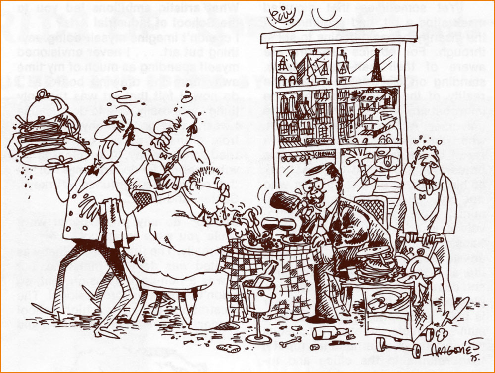
In closing, here’s a scrumptious cartoon anecdote about Messrs. Orlando and Gaines.
« Here’s Sergio Aragones‘ version of one of the many outings Joe Orlando and his publisher/pal Bill Gaines made to the best restaurants in Paris. While on one of the now famous MAD trips, Joe and Bill would eat 4 or 5 times a day! They went from restaurant to restaurant, always ordering the specialty of the house — with appropriate wines, of course! Yep — they’ve been on a very strict diet since (… but it hasn’t helped!) » Originally published in The ‘Special Joe Orlando Issue‘ of Amazing World of DC Comics (no. 6, May-June 1975, DC).
« A shaggy mane, odd, steel-rimmed little glasses, a get-up owing rather more to personal fancy than to the edicts of fashion, a candid gaze, the smile of a malicious dunce, that’s Le Grand Duduche… and it’s also Cabu. » — René Goscinny
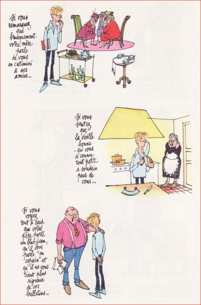
On this significant day, I will spotlight Jean Cabut (b. 1938, d. 2015) alias Cabu, and his wondrous Le Grand Duduche series, begun in 1963 and concluded in 1982, published in Pilote, Hara-Kiri, Charlie Hebdo and Pilote Mensuel. An absurdly massive collection of the entire series (672 glossy pages!) was published by Vents d’Ouest in 2008. Even as a hardcover volume, the thing’s so big and heavy it can barely bear its bulk, and is therefore virtually unreadable. It should really have been three books in a slipcase. But hey, the reproduction is first-rate… for what it’s worth.
Duduche is a gangly lycéen (high school student, sort of) wending his way through classes and student life, doing as little work as possible but expanding a maximum of ingenuity. It’s most certainly not about the plot.
The strip displays a fantastic level of graphic bravura and formal experimentation, while retaining 20/20 narrative clarity. I felt it was a fool’s errand to try singling out a “typical” example, since every page is unique — so here’s a sampler. Amazing, and yes, highly recommended, even if you can’t read the (marvellous and abundant) text.
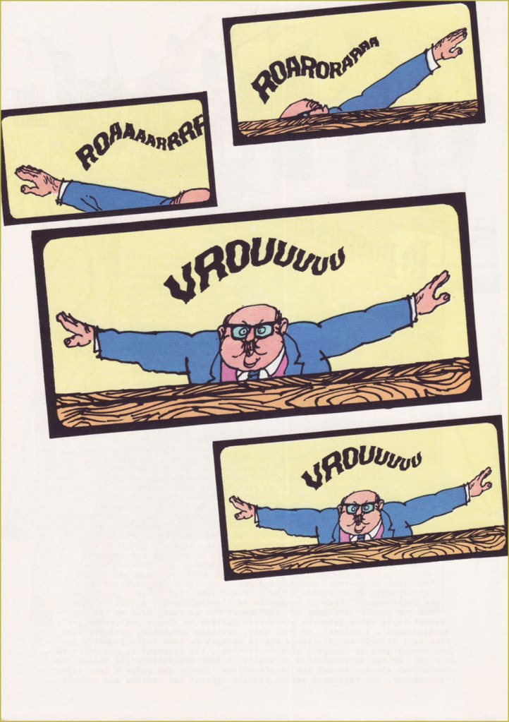
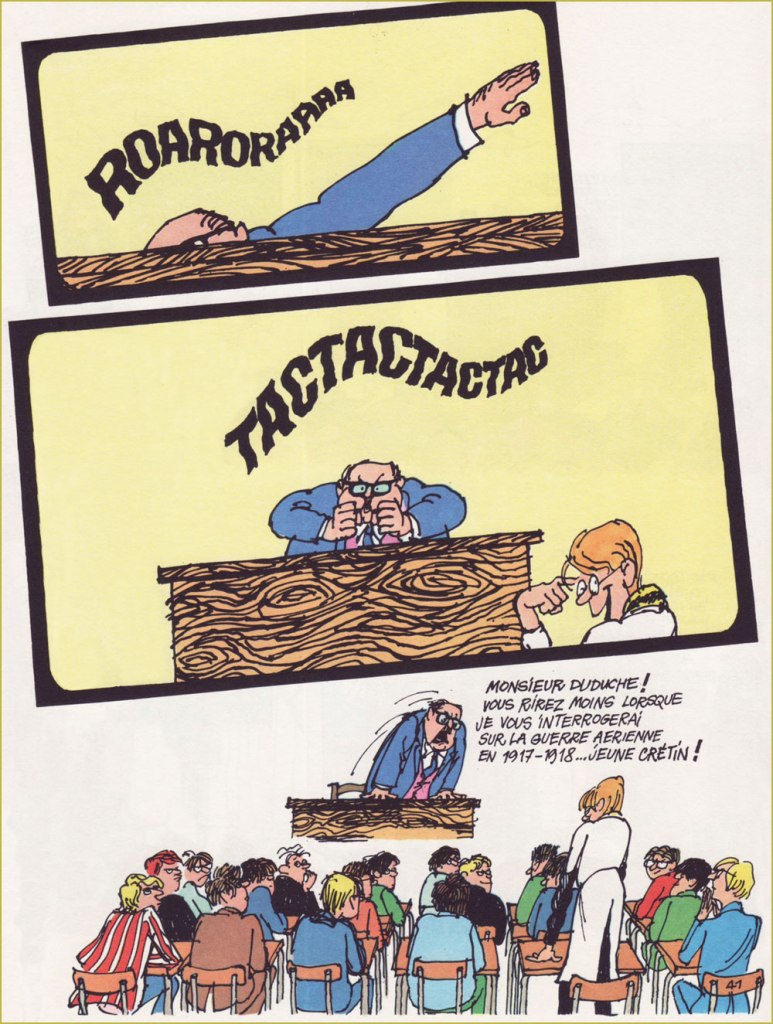
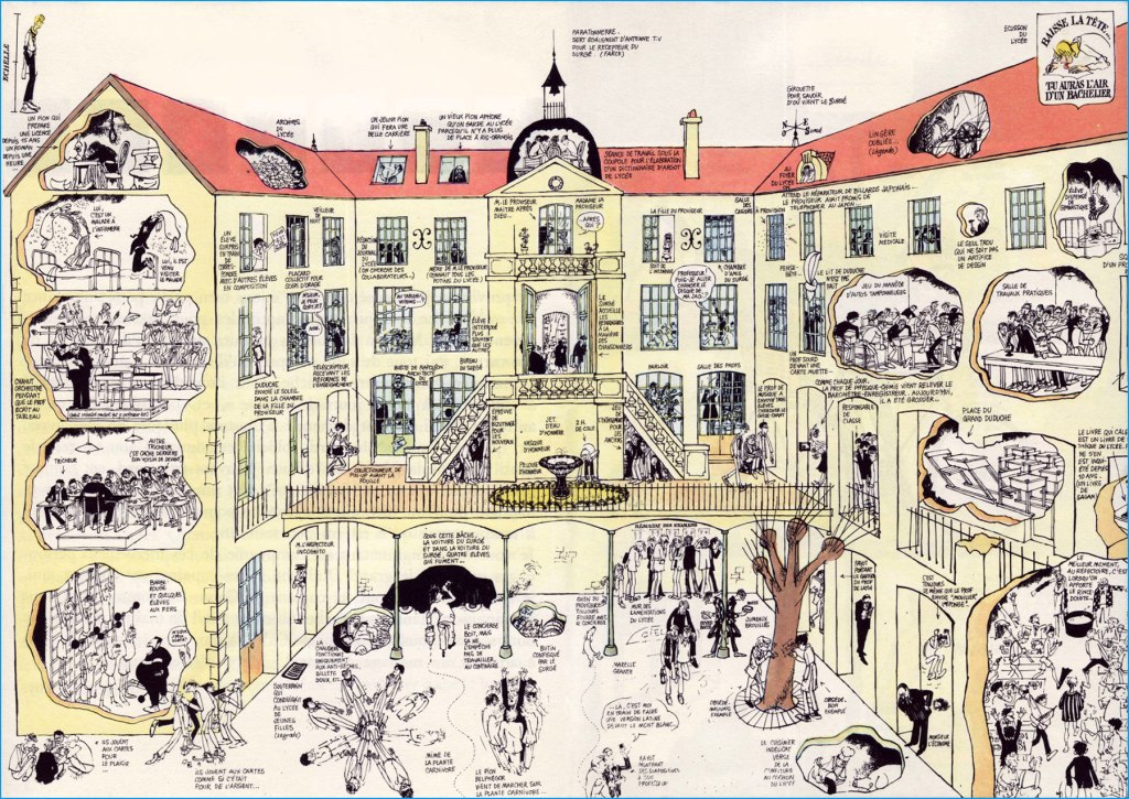
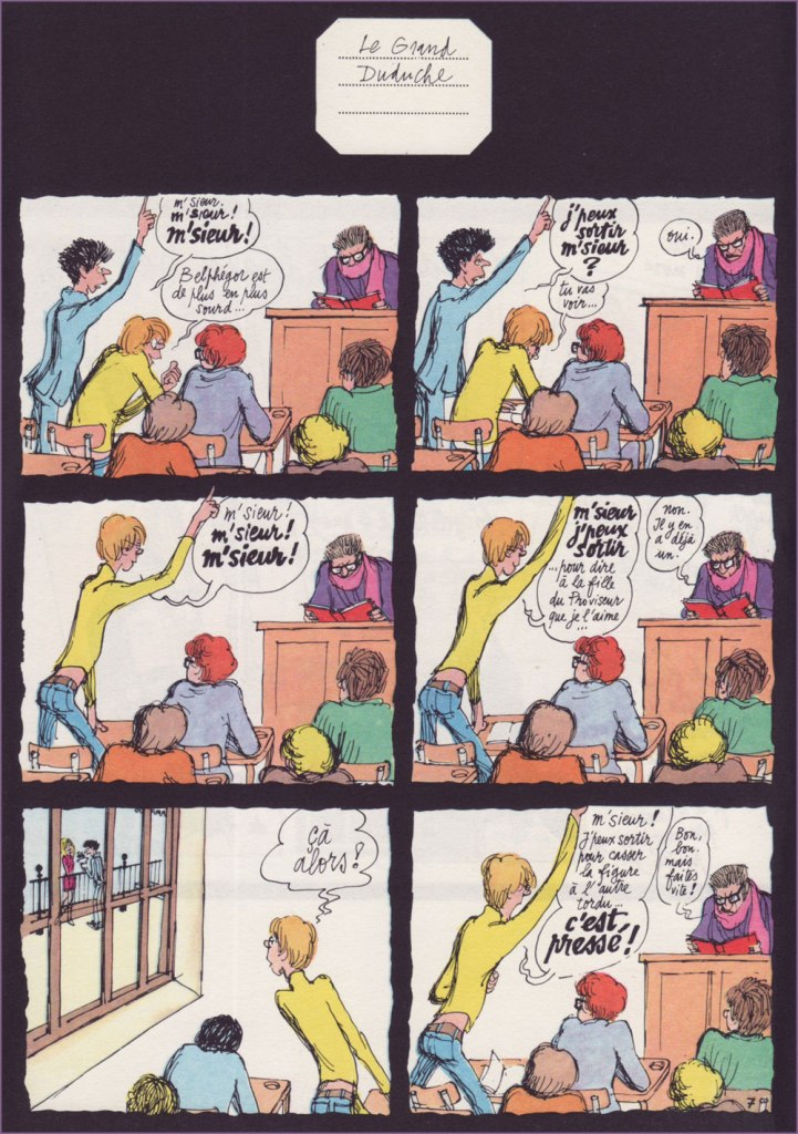
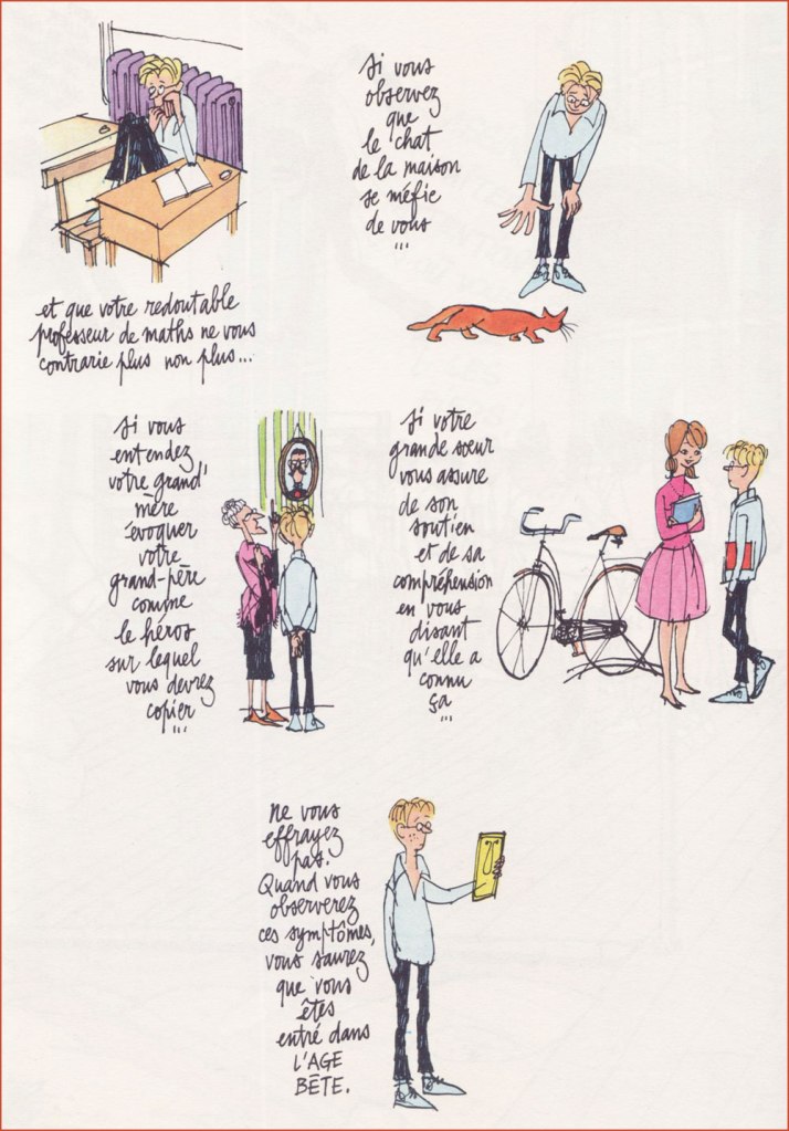
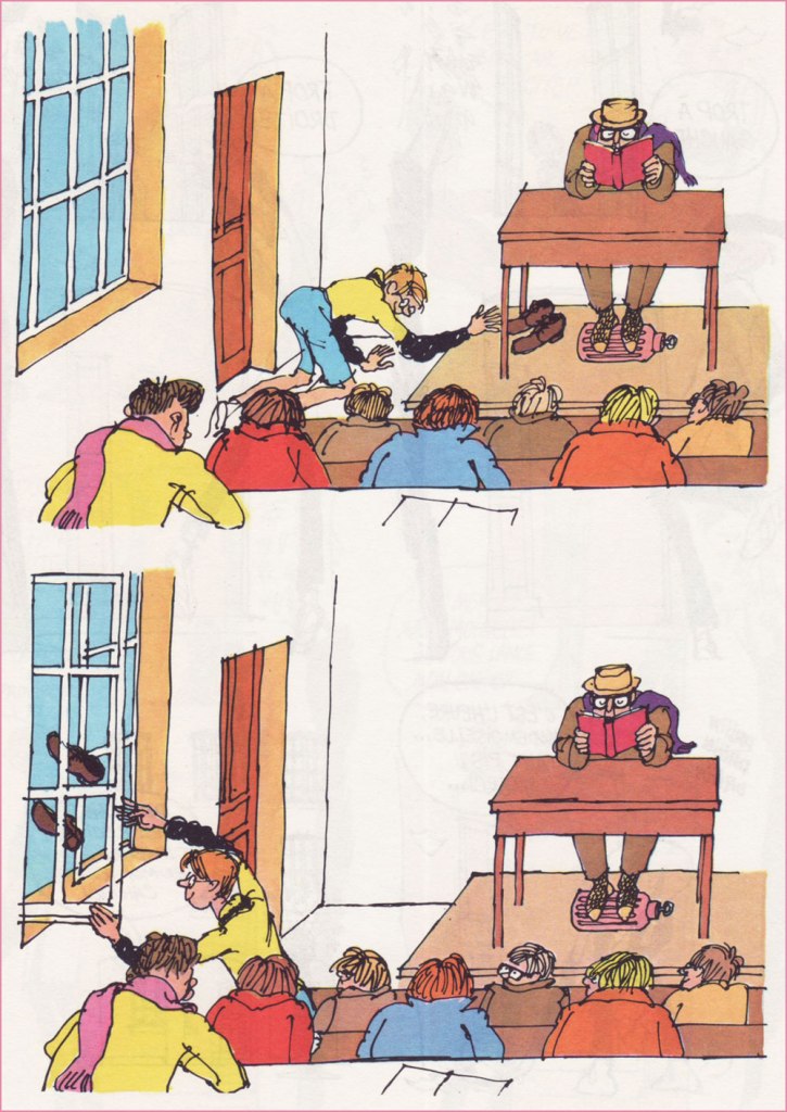
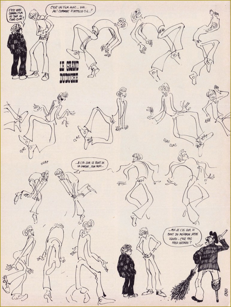
Ah, remember cursive?Little Duduche has to give away his cat’s latest litter, with deplorable results. « A female cat can have up to 20,000 descendants in just a span of five years. If you don’t want to take care of tons of cats or feel responsible for many homeless ones, it’s a good idea to spay or neuter your cat. » It’s just common sense, folks.Expressive, varied lettering is another crucial asset in the toolkit of the complete artist. « Mister Duduche! You will no longer find it quite so droll when I quiz you on aerial warfare of 1917-18! » Okay, this was hell to scan and reassemble (do open it in a separate tab to see the glorious details). But I felt it essential to showcase Cabu’s mastery of scale, perspective, architecture and general cohesion. Once in a while, Cabu would pull out one of these ambitious strips with over a hundred distinctive and identifiable figures, in service of a couple of dozen individual or entwined jokes. It is a rare breed of genius that can conceive such an array of moving parts and keep them all under control. 1- “Sir! Sir!Sir!” ” “Belphegor is getting deafer by the day...” 2- “May I go out, sir?” “Yes.” “Watch this…” 3- “Sir! Sir! Sir!” 4- “Sir, may I go out… to tell the principal’s daughter that I love her?” “No. There’s already another.” 5- “Well, I never!” 6- “Sir! May I go out to smash the other freak’s face in… it’s urgent!” “Okay, okay. But make it quick!““If you notice that the elderly maid, who’s known you all your life, is suddenly afraid of you…“Duduche catalogues the telltale signs of his entrance into ‘the awkward age’. “If you notice that the house cat is now wary of you…“Interesting: I had no idea until just now that the country fair game of ‘Chamboule-tout’ was known as ‘Coconut Shy‘ in English. Live and learn!Duduche’s utter inability to keep a poker face can be a bit of a liability. I love the well-observed detail of the study monitor keeping his feet warm with a hot water bottle. In French, the lovely, evocative term for that item is ‘bouillote‘.Here’s one from Pilote no. 590 (Feb. 1971, Dargaud). Though Cabu could be much, much acerbic than his American colleague, he and Jules Feiffer had a lot in common. “What’s on tonight at the film society?” “It’s a flick with, ah, what’s his name again… ?” “It’s on the tip of my tongue, his name…” “… I’ve got his name on the tip of my stump, your weirdo… isn’t it Fred Astaire?“
Coming back around to what makes this a ‘significant day’… Eight years ago to the day, Cabu was among those viciously murdered during the terrorist assault on the Charlie Hebdo offices. Honestly, I can’t bear to talk about it, but it’s crucial that this horrible event not be forgotten, and not merely because one of my artistic heroes was slaughtered that day.
« When she visits the gravesite of her late husband in Châlons-en-Champagne, Véronique Cabut-Brachet can witness just how much the French have not forgotten him: locals and fans come regularly to reflect (“It’s Cabu’s grave that people are looking for, and some people come just for it: nearly one a day, yes!” and for the past five years, according to the caretaker of the Cimetière de l’Ouest, interviewed by France Bleu). The artist’s gravestone is copiously covered in flowers but, especially, pencils in jars, a touching homage and the most beautiful of symbols. » [ source ]
« Italy hasn’t had a government since Mussolini. » — Richard M. Nixon
Today, let’s bask in some purely visual glory. Let’s take a gander at a small corner of the mind-boggling œuvre of Averardo Ciriello (1918 – 2016). As you can see from these dates, he was a long-lived fellow, and I’m delighted to report that he was healthy, hearty and active well into his nineties.
He was one of those illustrators who truly delighted in their craft, and so produced an enormous body of work that bore every sign of inspiration and enthusiasm. Since my plan is to focus on a specific period of his career, I’ll skip most of his early work — though it’s well worth returning to — and give you a couple of famous pieces to give you as a sense of his success and importance in his field.
It’s fair to say that Ciriello excelled across the board, likenesses included. This is the Italian poster for 1956’s Forbidden Planet. And this one for 1965’s Bond adventure Thunderball. Since the Bond movies were as much Italian as British production (if not moreso), it’s no surprise that producer Cubby Broccoli did not scrimp, tapping Ciriello for the series’ Italian promotional campaign.
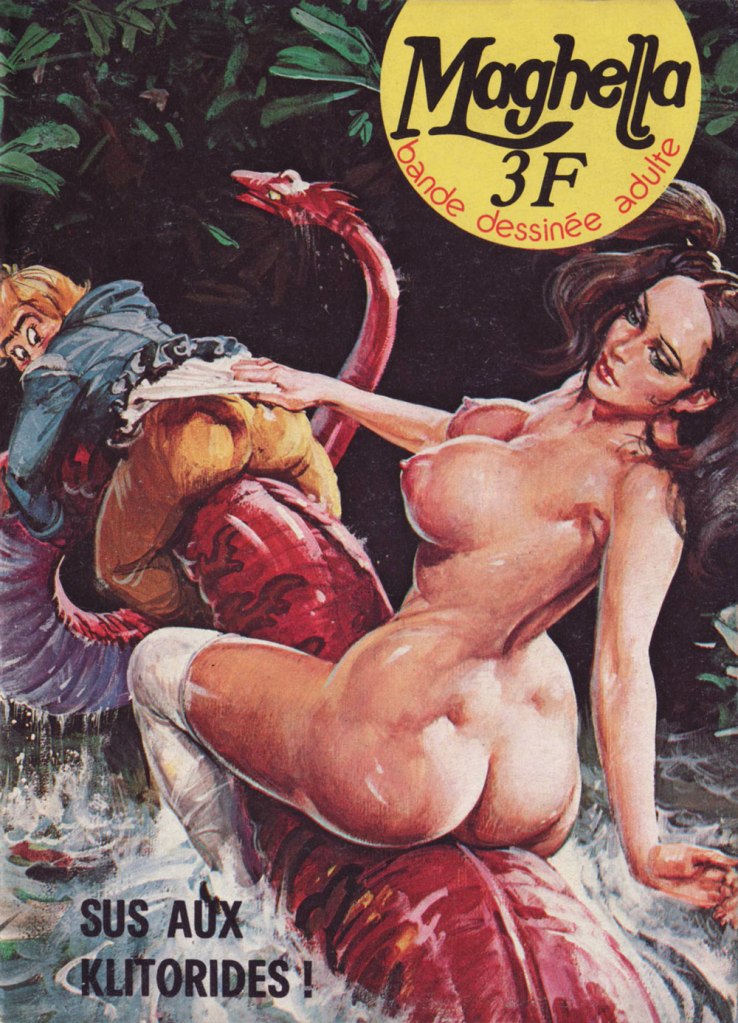
Now for the heart of it: I frankly marvel at Ciriello’s willingness to provide hundreds of cover paintings for cheap, mass market erotica fumetti. The way I see it, it’s evidence that he greatly enjoyed the assignment, and that the money was but a secondary concern at best. We’ve briefly touched upon the Maghella series (in our all-time most popular post, as it happens), but here’s some more.
This is Maghella no. 1 (Nov. 1974, Elvifrance).This is Maghella no. 15 (Oct. 1975, Elvifrance).This is Maghella no. 22 (Mar. 1976, Elvifrance). ‘Gode’, aside from being a city in Ethiopia and a species of fish, is the abbreviation of godemichet, which is to say… a dildo.This is Maghella no. 24 (Apr. 1976, Elvifrance).This is Maghella no. 41 (Apr. 1977, Elvifrance). Since you’re bound to ask, here’s a recipe for Salade russe, which actual Russians call ‘Salade Olivier‘. DS made it for lunch a couple of days ago, and it was delicious.This is Maghella no. 42 (May 1977, Elvifrance). Unlike most artists specialising in ‘erotica’, Ciriello could draw anything, in any style, and effortlessly mix sensuality with comedy with horror with angst. A true master — sorry, maestro. This is Maghella no. 66 (Jan. 1979, Elvifrance).This is Maghella no. 77 (Feb. 1980, Elvifrance). I assure you, those pun-based titles are utterly untranslatable.Censorship inevitably got into the act. Here’s one of several instances, the before (with imposed editorial revision indicated) and after of Maghella no. 110 (Sept. 1978, Publistrip); said censorship seems to have driven up the cover price, to boot. This precious bit of info gleaned from a lovely monograph of the artist, Gianni Brunoro and Franco Giacomini’s Ciriello: Una Vita per l’illustratione(2016, Edizioni Di).
« We never knew his name; we only knew him as “the good artist”. But his style spoke for him. He was instantly recognizable despite his anonymity — at once different from the other funny animal artists and better. » — Dwight R. Decker
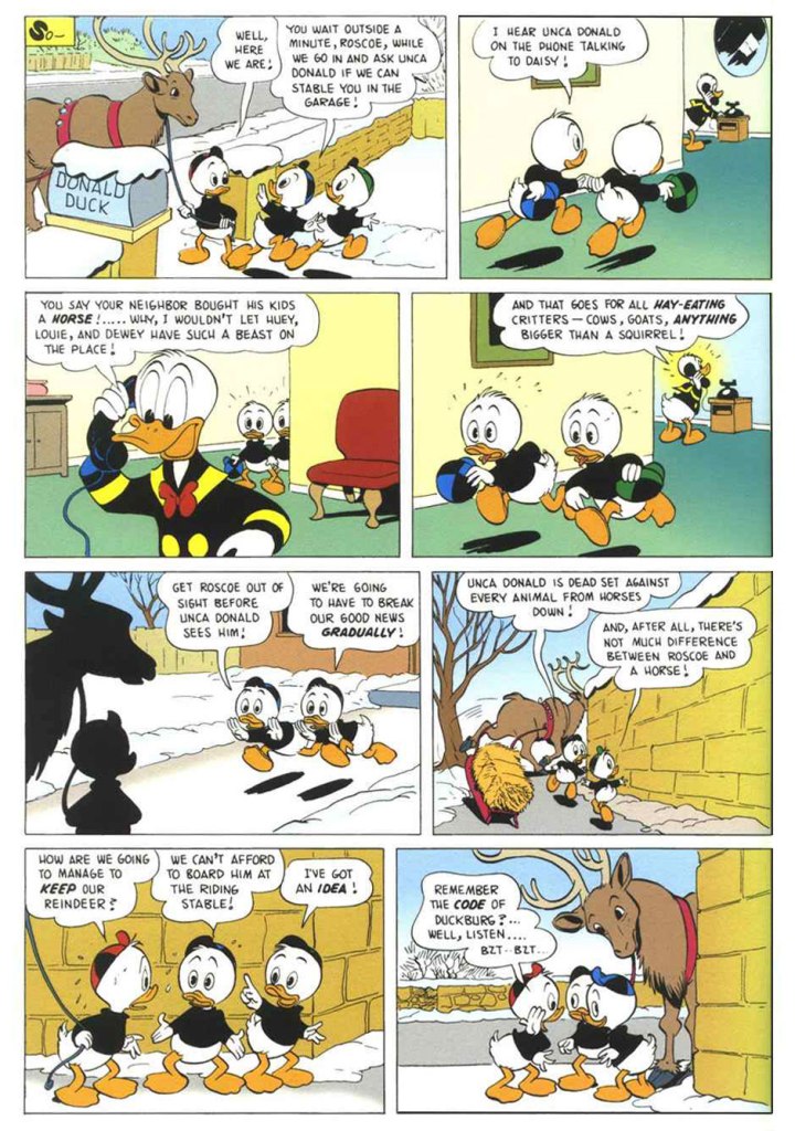
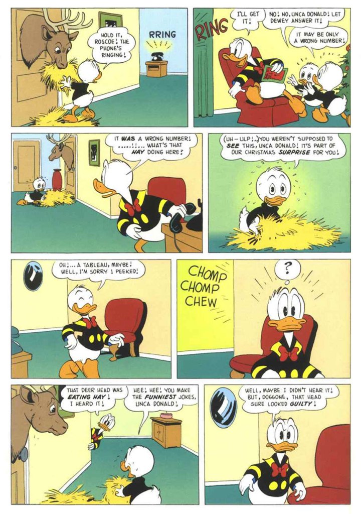
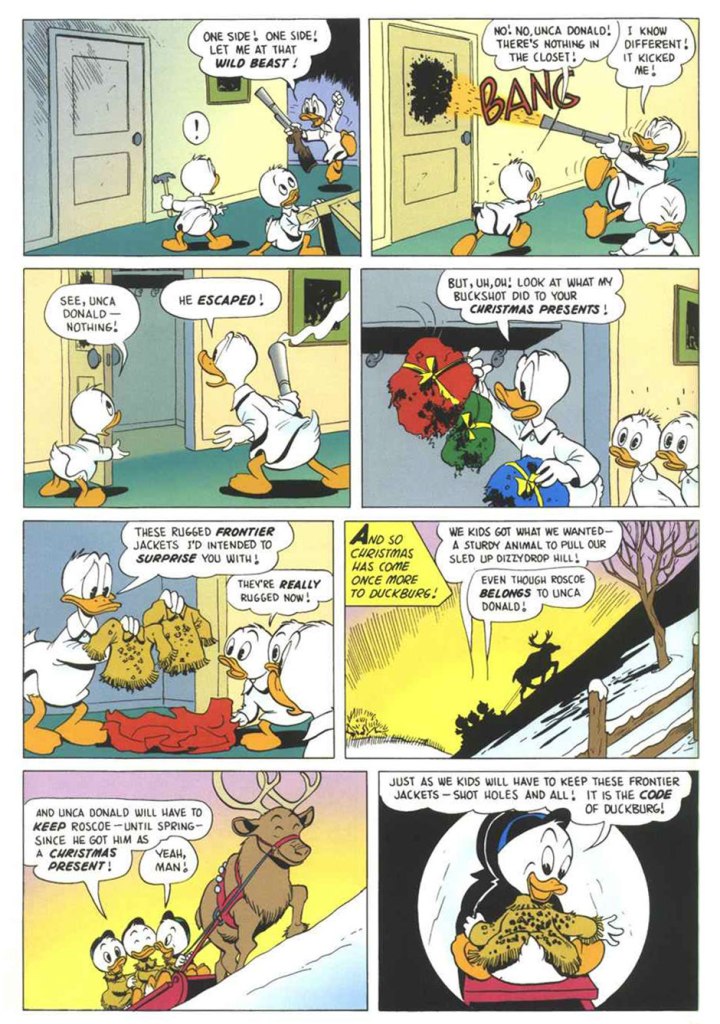
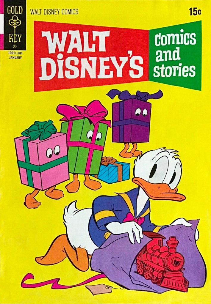
The great Duck Man, Carl Barks, despite having little interest in the holiday, drew over two dozen Christmas-themed stories featuring Donald and his relatives (and wrote the bulk of them). Now, so very much has been written and said about Barks that I won’t bother to add much here. I’ll just let his work speak for itself and breathe. I opted for a lesser-known ten-pager, not coincidentally one of my favourites. “The Code of Duckburg” originally saw print in Walt Disney’s Comics and Stories no. 208 (Jan. 1958, Dell), but I’m using a more contemporary issue boasting better printing and a commendably tasteful colouring job, from Walt Disney’s Uncle Scrooge no. 317 (Jan. 1999, Gladstone). It must be said that the folks at Gladstone did right by the ducks — it was more of a labour of love than a strictly commercial venture.
Here’s a closer peek at a panel from page 3: just look at the joy on Roscoe’s face. Unlike Donald, his nephews are unfailingly kind to (other) animals, great and small. That’s what makes them such sterling exemplars of the Junior Woodchucks. The issue of WDC&S where our story first appeared didn’t have a Holiday-themed cover, but this one reprinting it did. This is Walt Disney’s Comics and Stories no. 376 (Jan. 1972, Western); pencils by Tony Strobl and inks by Larry Mayer.
And as a bonus (there has to be a bonus!), here’s a look at a Barks model sheet. « The Barks sense of whimsy extended even to the model sheets he drew for other artists to follow. » I made it a larger image so that all the small details remain discernible. Happy Holidays, everyone!
« I’m not saying I’m cool. That’s your job. » — Happy Bunny
When it comes to Jim Benton‘s work, it seems I got in on the ground floor, thanks to a friend’s shrewdly chosen gift of the man’s first cartoon collection, ‘Dealing With the Idiots in Your Life‘, twenty-nine years ago this Christmas. Yikes!
In a way, Benton’s nearly too obvious a subject for a post: his work is everywhere you turn, but such a large audience seems to have been reached at the cost of relative anonymity. In other words, people know his work, but they may not know his name. I’m sure his name does, however, enjoy some currency with a couple of generations of younger readers familiar with his Dear Dumb Diary (nearly 10 million sold!) and Franny K. Stein (over five million sold) series.
Given his intimidatingly formidable output, I’ll stick to material from his first collection, which I like best anyhow… which is not to say, echoing what all and sundry tell Sandy Bates in Stardust Memories, that I strictly prefer “the early, funny ones“. Mr. Benton is possibly even funnier — or at least more sophisticated — today than he was at the dawn of his career, but these early cartoons are less ubiquitous than this century’s crop.
At this stage, Benton’s style — both in concept and execution — still wore some heavy influences, namely that of Bernard Kliban.It wouldn’t surprise me one bit if this cartoon had near-universal appeal, given the fearful hold of cognitive dissonance: after all, most of us think others have a tenuous grasp on reality.Cute Citizen Kane reference.A timeless and oddly poignant state of affairs.Some of you will likely have occasion to muse over this very question during the Holidays.This one’s *very* Kliban-esque.In this one, I see a bit of his fellow Scholastic alum Tom Eaton‘s touches. All for the good.More Kliban (surely intentional!) but with sprinklings of Nicole Hollander and perhaps Scott Adams. Taking Will Rogers’ famous bon mot to its, er… logical conclusion. Here’s a jolly one for the season.
In closing, a bonus one from quite recent days. While I’m less fond of the digital tablet aesthetic of his latest work, his writing has acquired some even sharper edges. Sadly, this strip will likely be relevant only to medieval citizens of the German town of Hamelin, right?
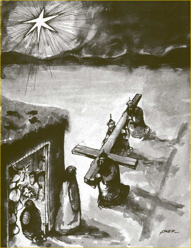
« Crosses and gallows – that deadly historic juxtaposition. » — Howard Zinn
Bonsoir, mesdames et messieurs…
All right, time for me to tackle (though a bit sideways, I’ll explain) another of my daunting heroes. This time out, it’s Frédéric Othon Théodore Aristidès (1931-2013), better — and more simply — known as ‘Fred’.
A compulsive and constant scribbler, he attended no institute of artistic learning but his own (and didn’t bother to complete his secondary education), and made inroads into the field by the dawn of the 1950s, landing in Ici Paris, France-Dimanche, Le Rire, Paris-Presse, France-Soir, Punch, and even as a gagman (uncredited!) for The New Yorker (others, among them Otto Soglow, would illustrate the gags for publication).
Mid-decade, he began his long and fruitful association with Pilote, launching, with the magazine’s 300th issue (July 22, 1965, Dargaud) his undeniable masterpiece, Philémon. And this is where my ‘sideways’ loophole comes in: I’m truly not ready to tackle the overflowing poetic cornucopia that is Philémon. By way of introduction, I’ll stick to the margins and showcase instead some of Fred’s ‘brutish and nasty’ (a rough translation of Hara-Kiri’s motto) panel cartoons and short pieces. There’s a lot to this guy.
Which reminds me of a time, a couple of decades ago, when Montreal’s FIFA (Festival international des films sur l’art/International Festival of Films on Art) presented a series of TV shows showcasing individual cartoonists, among them Chris Ware, Art Spiegelman… and Fred. I recall that Messrs Ware and Spiegelman were just as miserable and neurotic as expected, there was also this Manga master that felt trapped as a cog in an assembly line. Meanwhile, in sharp contrast to the existential angst, Fred was brimming with evident delight and joie de vivre at his good fortune to be a working cartoonist*, grinning and scribbling in his sun-dappled studio, leisurely strolling through his village, charming the ladies, enjoying a glass of wine and a wedge of fine aged cheese… I concluded that here was an eloquent encapsulation of the respective cartooning cultures of a few nations. Regrettably, I haven’t been able to track down this documentary series, not even in the FIFA archives. Nevertheless, here’s a short visit with the dear man, by then living in Paris.
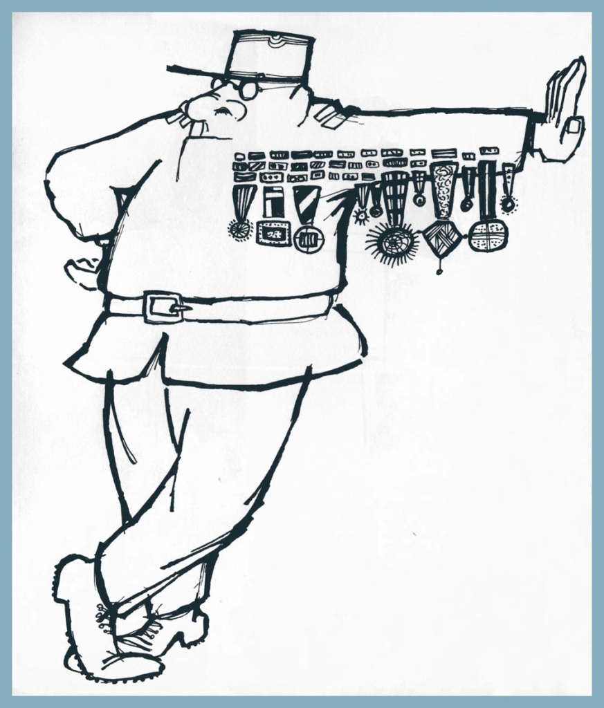
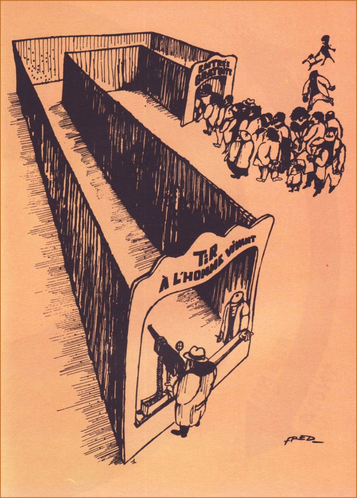
As life tends to imitate art, so has this more or less come to pass.Obviously, you can’t nag anyone into quitting. This ingenious collage strip appeared in Pilote no. 670 (Sept. 1972, Dargaud). An example — quite literally — of gallows humour. Too much of a good thing can kill you — or ‘You may come to rue your mockery’.If one looks for common ground between the more… mordant of French cartoonists, you’ll find their shared, blistering contempt for their nation’s Military brass.The title is a French idiom which roughly translates to “There’s a nip in the air”. This collection of short pieces Fred wrote and drew for Pilote was published in early 1973 by Dargaud.At one end, “Live Human Shooting”; at the other, “Free Admission”.You want it darker? Oh, and also seasonal? Well, your wish is my command.
-RG
*this is serious, though: when Fred stopped drawing comics in the late 1980s, he fell into a deep depression and wound up in a psychiatric hospital. The cure? A return to creating comics. Surely there’s a lesson in this.