« With pen and ink, I can achieve a scratchy, foggy effect that is appropriate. It was a continual process of learning. » — Nick Cardy
While WOT? favourite Nick Cardy (1920-2013) — who would turn one hundred and four years old today! — spent a lot of time chronicling the undersea adventures of Aquaman, his lingering true love, despite his busy schedule as DC’s premier cover artist, was the Teen Titans — he contributed, either as penciller, inker… or cover artist — to all forty-three issues of the original series.
And what I loved most about editor Murray Boltinoff‘s books is that they were packaged as horror books even when they nominally featured superheroes, a welcome respite. The costumes seemed an afterthought, a most unusual and refreshing attitude. Here, then, is a gallery of Mr. Cardy’s moodiest, most sinister Teen Titans cover artwork.
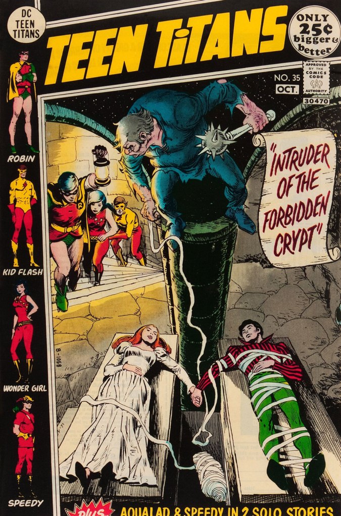
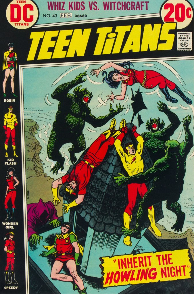
This is Teen Titans no. 33 (May-June 1971, DC). This is Teen Titans no. 34 (July-Aug. 1971, DC). Lettering by Ben Oda.This is Teen Titans no. 35 (Sept.-Oct. 1971, DC).This is Teen Titans no. 36 (Nov.-Dec. 1971, DC).This is Teen Titans no. 41 (Sept.-Oct. 1972, DC).This is Teen Titans no. 42 (Nov.-Dec. 1972, DC).This is Teen Titans no. 43 (Jan.-Feb. 1973, DC).
« Physics should represent a reality in time and space, free from spooky action at a distance. » — Walter Isaacson
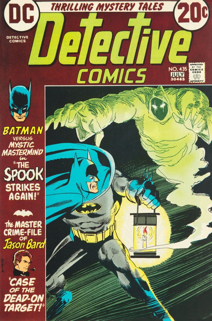
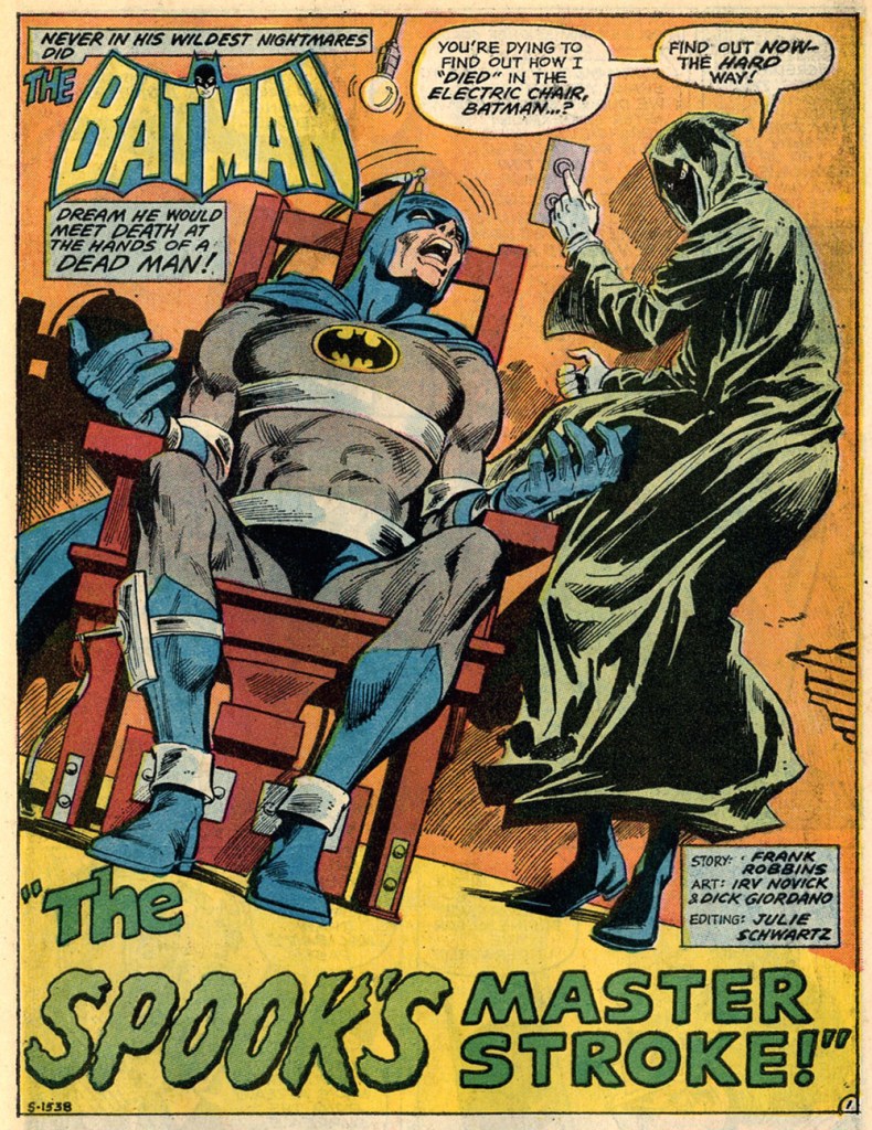
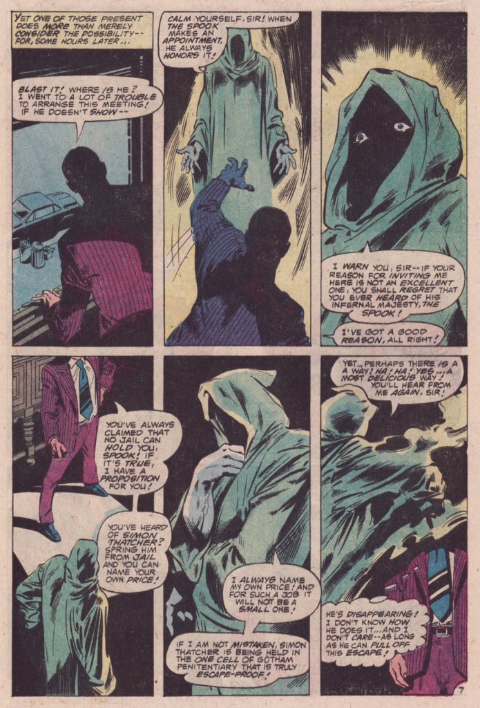
Who’s my favorite Batman foil? Why, The Spook, of course! A brilliant and patient (but twisted, natch) planner, engineer, escape artist and… businessman Val Kaliban was a most worthy opponent for the Batman in detective mode. Let’s sneak a gander at his earliest and most significant appearances.
This is Detective Comics no. 434 (Apr. 1973, DC). A middling cover, certainly not Michael Kaluta‘s best Batman cover… nor his worst. I mean, what’s Batman’s left leg doing exactly?
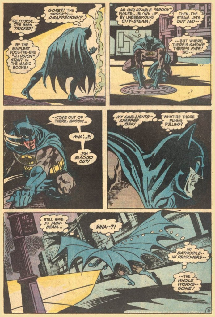
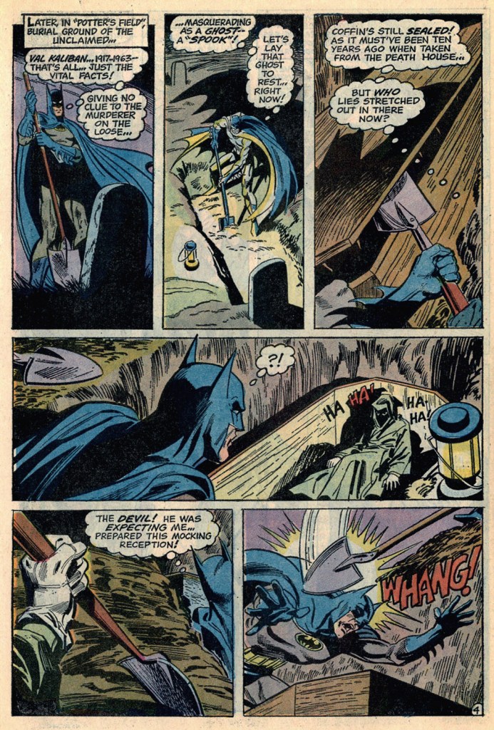
Here’s a fun sequence from the issue’s The Spook That Stalked Batman, scripted by Frank Robbins, pencilled by Irv Novick and inked by Dick Giordano.
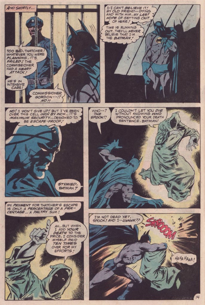
This is Detective Comics no. 435 (June-July 1973, DC); an okay cover by Dick Giordano.Ah, finally… The Spook gets a cover worthy of his mettle. This is Batman no. 252 (Oct. 1973), cover design by Carmine Infantino, pencils and inks by Nick Cardy, and lettering by Gaspar Saladino (well worth mentioning!)
A pair of pages from the issue:
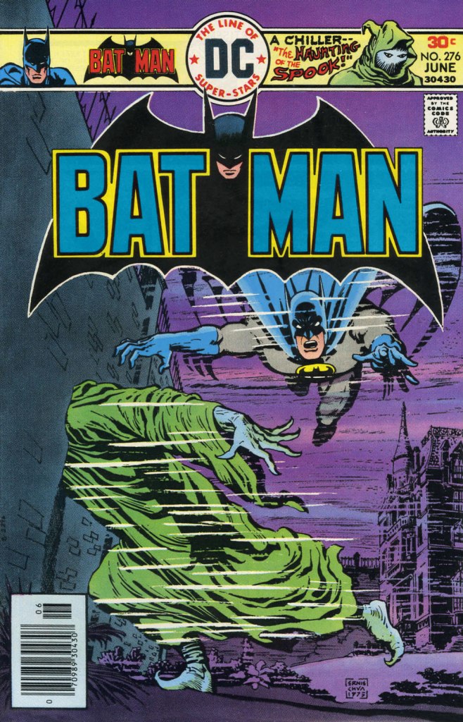
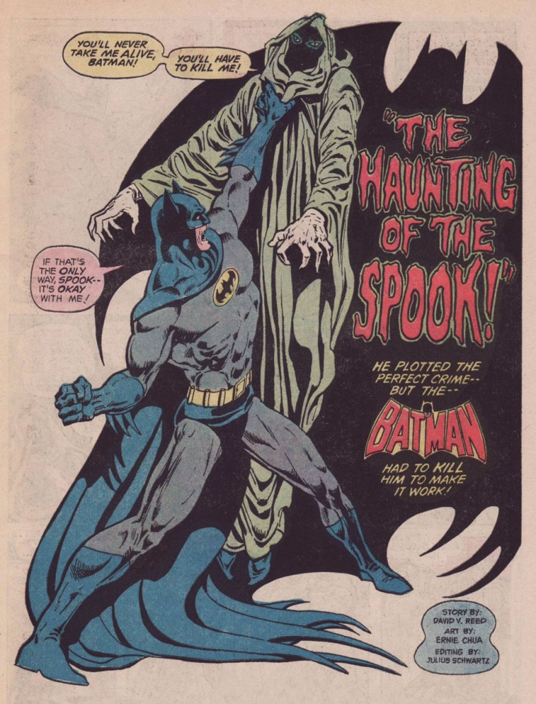
This is Batman no. 276 (June 1976, DC). For the first time, someone other than his creator, Mr. Robbins, handles The Spook. Fortunately, it was talented scribe David Vern (writing as David V. Reed), quite possibly my favourite Batman writer. A fine, moody cover by Ernie Chan.The Spook’s following appearance, in which Dick Giordano demonstrated he could come up with a crappy Andru-Giordano cover… all on his own. This is Detective Comics no. 488 (Feb.-Mar. 1980, DC).
The Spook’s Death Sentence for Batman, written by Cary Burkett, pencilled and inked by the splendid team of Don Newton and Dan Adkins, was a worthy send-off for this fine character. Beyond that… I don’t much care. The Spook is a difficult personage to write for, but he got three solid writers to chronicle his exploits, and that suits me just fine.
« You should be ashamed, Mr. Lash! Making such noises in front of the children! »
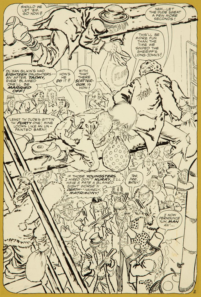
Bat Lash was introduced with issue 76 (August, 1968) of DC’s launching pad title Showcase, wedged between the respective débuts of Hawk and Dove and Angel & the Ape. At various stages of his conception, the character of Bartholomew “Bat” Aloysius Lash reportedly went through the hands of Carmine Infantino (who designed or at least supervised all of the following covers), Joe Orlando, Sheldon Mayer and Sergio Aragonés. Sergio plotted and thumbnailed the mise en scène, Dennis O’Neil added dialogue, then Nick Cardy pencilled and inked. For such a product-by-committee, Bat Lash is quite remarkably good — but then consider the talent involved!
Mind you, I make no claims of originality for Bat — he was distinctly a product of the times, when the vogue of Spaghetti Western had peaked* and ironically left its (off)brand on its model. By the time — in 1968 — its market reached its apex, the Italian Oater idiom threatened to congeal into a morass of clichés, becoming, as these things tend to go, (over)ripe for self-parody. Intentional and otherwise.
I surmise that the key model for Bat Lash was the ever-charming Mario Girotti**, reportedly enlisted thanks to his resemblance to the intense but one-note Franco Nero, even replacing the latter in his star-making, titular role of Django (1966) for a 1968 sequel, Prepare a Coffin, Django.
Ripe for its time it may have been, but I suppose that American audiences were still quite allergic to jarring tonal shifts in their entertainment (now commonplace), and would be for some time — just ask, say, John Carpenter. So the blend of light comedy and dark drama that Bat Lash proposed must have been difficult to market.
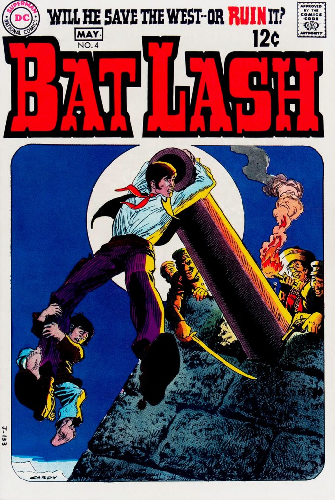
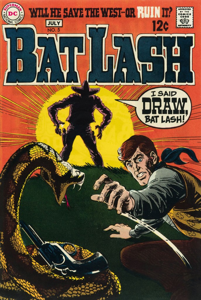
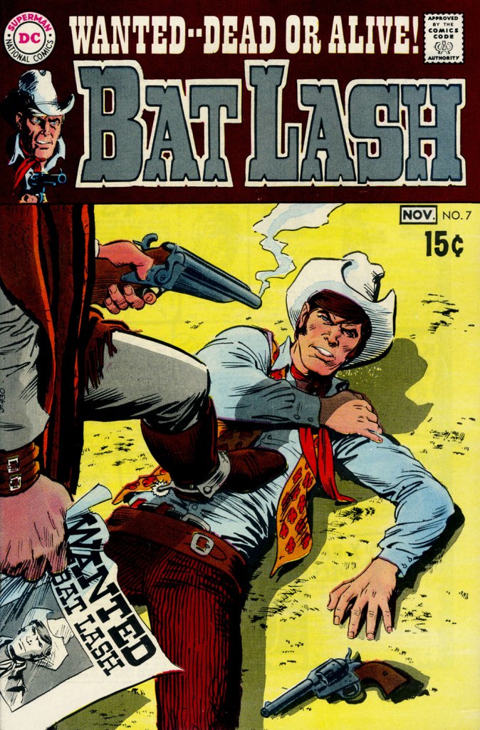
Our streak begins with Bat Lash no. 2 (Dec. 1968-Jan. 1969, DC) since the covers of Showcase no. 76 and Bat Lash no. 1 were good, but not — imho — great. I daresay this one is, in fact, the finest of the lot, with Cardy at his most Tothian.A peek inside the same issue, for contrast: lively and loose inking over rock-solid pencilling, and miles away from the tone of the cover. My guess is that some people weren’t happy.Bat Lash no. 3 (Feb.-Mar. 1969, DC) highlights the comedic side of the feature, which all but evaporated by the last two issues.This is Bat Lash no. 4 (Apr.-May. 1969, DC). Dig Cardy’s expert use of the ‘drybrush‘ technique on the stones.This is Bat Lash no. 5 (June-July 1969, DC). I’m reminded of a similar, later cover featuring one of Bat’s successors, Jonah Hex. The price goes up and the comedy… just goes. This is Bat Lash no. 6 (Aug.-Sept. 1969, DC).… and there goes the original tagline. This is the final issue, Bat Lash no. 7 (Oct.-Nov. 1969, DC)… and so must end this particular hot streak.
And now, some choice bonuses!
From issue 7, editor Orlando gives us some cheeky insight into the creation of an issue of Bat Lash.And plotter Aragonés provides some visual direction. To give you a sense of the less flippant, but not altogether grim, tone of the later issues, this is page two from issue 7. DC Comics of that period were quite ambitious with the limited means of the four-colour reproduction process, using plenty of backlighting and projected light… quite another level.
I was *delighted* to see ol’ Bat Lash turn up in the Weird Western Tales of DC’s outstanding Justice League Unlimited animated series, , along with some of his distinguished colleagues. In the usual order: Ohiyesa ‘Pow Wow’ Smith, El Diablo, Bat Lash, Jonah Hex.
-RG
* “In 1968, the wave of spaghetti Westerns reached its crest, comprising one-third of the Italian film production, only to collapse to one-tenth in 1969.” [ source ]
Somehow, after yesterday’s rather epic (or at least time-consuming) post, I thought I’d breathe a little easier today, but no… these things have a way of imposing themselves, complications and all.
When I was a young collector, say under the age of fifteen, when I still gave a hoot about what comics were ‘worth’, financially speaking, I enjoyed leafing through the Overstreet Price Guide. Not so much out of greed, but rather of curiosity about the past. One title that piqued my imagination was Pines’ The Unseen. I mostly saw tiny, tantalising postage-stamp-size reproductions of its covers, but they lived up to my expectations. Lots and lots of talented folks toiling on the insides, too!
So I thought I’d collect them for your viewing pleasure, with two exceptions: the initial one, by Ross Andru, is kind of lame, so I’ll skip it; the final one, number fifteen, was featured in last year’s countdown.
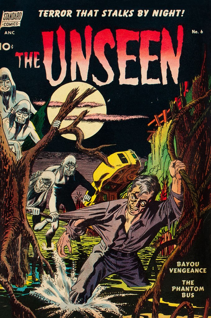
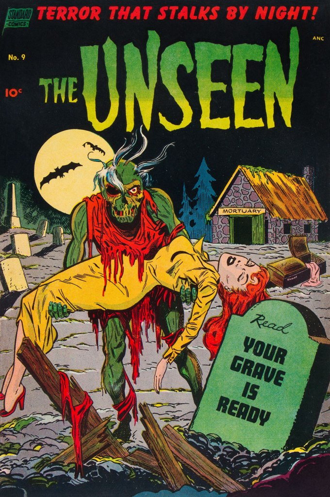
This is The Unseen no. 6 (Sept. 1952, Pines); cover by George Roussos. Read it here!From the thumbnail version of this cover, I always wondered what ol’ Adolf Hitler had done (a rhetorical question) to be stalked by vampires. Seeing it full size, the question remains. This is The Unseen no. 7 (Nov. 1952, Pines); cover by John Celardo. Read it here! This is The Unseen no. 8 (Jan. 1953, Pines); cover (possibly) by Nick Cardy. Read it here!It’s the Combover Cadaver, run for your lives! This is The Unseen no. 9 (Mar. 1953, Pines); cover (possibly) by Art Saaf. Read it here!The Spaghetti Mummy strikes! This is The Unseen no. 10 (May 1953, Pines); cover by Jack Katz. Read it here!This is The Unseen no. 11 (July 1953, Pines); cover by the fascinating Jack Katz. Read it here!This is The Unseen no. 12 (Nov. 1953, Pines); cover by Nick Cardy. Read it here!Aw, that’s sweet. This is The Unseen no. 13 (Jan. 1954, Pines); cover by Alex Toth. Read it here!Aw, give it a chance — try the cocktail, at least. This is The Unseen no. 14 (Mar. 1954, Pines); cover by Mike Peppe. Read it here!
« I lived on a houseboat in Amsterdam for a year. It was intense, and it’s possible that I even had a few blackouts. » — Wolfgang Beltracchi
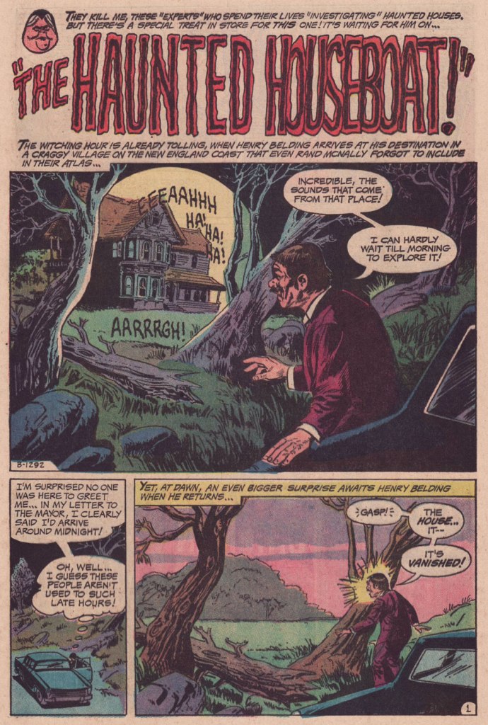
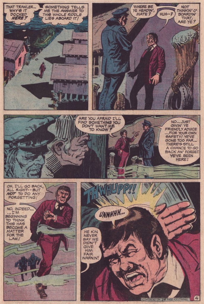
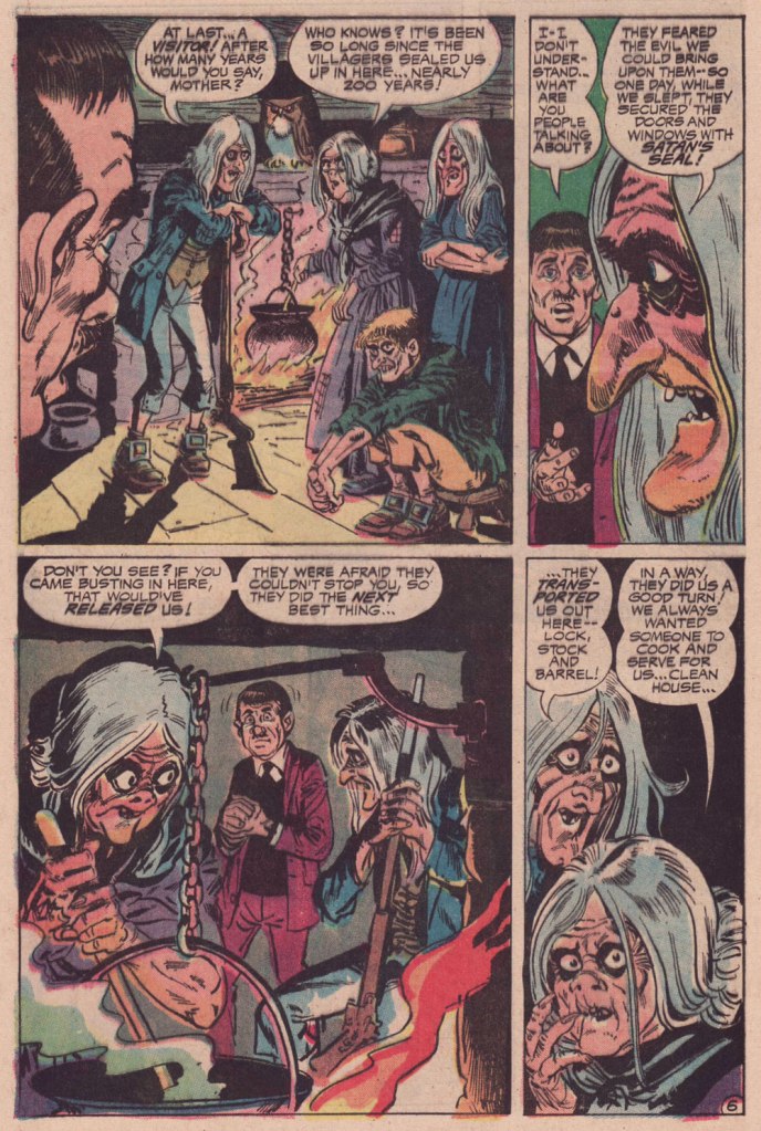
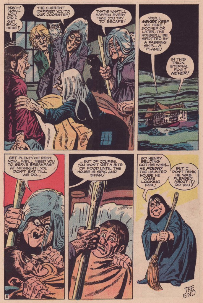
Today’s featured tale is an old favourite illustrated by one of American comics’ perennial mal-aimés, the much-maligned Jack Sparling (1916-1997), a prolific, reliable, distinctive stylist who toiled for just about every publisher on the block. Of course, he’s persona non grata with the superhero set (a compliment in my book!) but his chief strengths lay just about everywhere else, in humour, horror, crime and adventure… you name it.
I love how cosy — that pervasive, foggy ambience! — yet harrowing this tale is. Nice to see one of those insufferable, know-it-all ‘ghost busters’ get his bitter requital. And who knew that some witches were so neat, so domestically inclined? Work that mop, boy!
The writer’s uncredited, and that’s a shame, because this is anything but formulaic — and DC’s mystery books were formulaic to a fault, especially under Joe Orlando‘s guidance. I suspect the author to be editor Murray Boltinoff — he often pitched in, under sundry bynames.This is It’s Midnight… The Witching Hour!no. 21 (June-July 1972, DC), edited by Murray Boltinoff and with cover art by Nick Cardy.
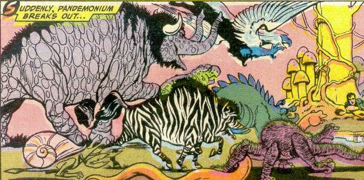
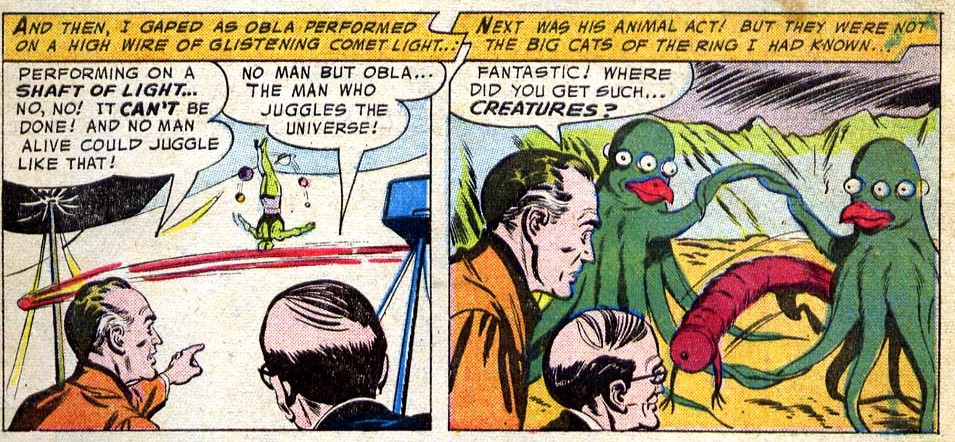
DC’s Tales of the Unexpected offer quite a ménagerie of strange looking creatures! Any peculiar combination of animals you can think of, you’ll find somewhere within the pages of this series. This possibly deserves its own post, as it’s quite entertaining to see artists combining, say, an elephant with a tiger. That being said, I tend to get annoyed at artists who can’t visualize anything truly alien-looking, thus resorting to carving up earth animals and stitching different body parts together… but that’s a different conversation.
Art by Lou Cameron.
Occasionally the artists will also add tentacles, a sure shortcut to make something mundane look properly alien, and this is today’s area of interest! For more questionable monsters, have a gander at Tentacle Tuesday: Convoluted Critters.
And now, onto ‘unexpected’ tentacles, even if the result of this ends up looking like badly-made puppet with a tacked-on beak…
The Strangest Show on Earth, illustrated by Jim Mooney, was published in Tales of the Unexpected no. 10 (February 1957).
Of course one can’t discount the lasting power of classic vine-tentacles.
The Earth Gladiator, illustrated by Nick Cardy, was published in Tales of the Unexpected no. 20 (December 1957).
Whereas these mini-planets gone bonkers with tentacles-cum-hair bring to mind, but anticipate, something by Junji Ito.
The Alien Earthmen, illustrated by Ruben Moreira, was published in Tales of the Unexpected no. 62 (June 1961).
The idea of an interplanetary veterinarian makes little sense for its assumption that life on other planets would have similar physiology to ours (even limiting the scope of action to only planet earth would be too ambitious – ask a doctor to treat a sick jellyfish and see how well he would do), but here we have the satisfaction of a sweet little scene of inter-species succor.
Creature Doctor of Space, illustrated by George Roussos, was published in Tales of the Unexpected no. 63 (July 1961).
Some 30 issues later, we have another case of rabid tree-tentacles… this time composed of rubber (or something that behaves like rubber, at any rate).
Prisoners of Hate Island, illustrated by George Roussos, was published in Tales of the Unexpected no. 93 (Feb-March 1966).
Finally, this tentacled purple gorilla (so his tail is more dinosaur than gorilla, so what?) will no doubt please a regular reader of this blog!
Tales of the Unexpected no. 71(June-July 1962). Cover by Bob Brown.
« Suffering sea snakes! Can this really be happening, Aquaman? » — Aqualad has a query.
I just realised, a few days ago, that I’d left something hanging for too long: nearly two years ago, I turned the spotlight on a series of Aquaman covers, casually (in my debonair way) letting it be known that there existed another, earlier, and even longer (well, by one) run of exemplary Aquaman covers. The time has come to see whether I was talking through my hat… or not.
Now, at the risk of repeating myself, it must be stated that, since we’re dealing with DC’s late Silver Age, there’s more to any given cover than a signature. DC’s recently-ascended art director, Carmine Infantino, had a hand in designing virtually every DC cover between late 1966 and early 1976. How strong a hand varied from cover to cover, of course. A good designer sometimes knows when to hold back and be invisible, or just about.
Infantino always strove to improve himself and update and hone his skills. Well into his career (he’d started in 1940 at Timely), he pulled an unexpected (and very smart) move. As he recalled it in The Amazing World of Carmine Infantino (2000, Vanguard Productions):
« Around 1960, I went back to school again, this time to study under a gentleman named Jack Potter at the School of Visual Arts. What Jack taught me about design was monumental, and I went through a metamorphosis working with him. I’d sit there confused and he’d tear the work apart. But then it was a light bulb going off – bam! – and I’d understand everything he was getting at.
After studying with Potter at the SVA, my work started to grow by leaps and bounds. I was achieving individuality in my work that wasn’t there before.
I threw all the basics of cartooning out the window and focused on pure design. Everything I did was design-oriented. That was quite the challenging task. But that’s where Potter’s teaching took me.
… I started putting hands in captions, that was decorative. He taught us to do everything decoratively. I’d always found captions very dull. So I thought I’d break the captions into smaller paragraphs and use hands to get people to read them. I regularly pushed design and perspective to the extreme. »
And speaking of reinvention, I must also salute Nick Cardy’s own mid-career creative burst. Prior to the mid-60s, Cardy had always been one of those genteel, tasteful but entirely unexciting journeymen, the way most DC editors liked ’em. I can think of precious few long-timers that managed to convincingly reinvent themselves and greatly raise their game, well into their career, without utterly misplacing their original identity (that disqualifies you, Keith Giffen) in the process. Alex Toth, Jerry Grandenetti and perhaps Sheldon Mayer come to mind…
At any rate, when Infantino got together with Cardy on those covers, all hell broke loose, in the best possible way.
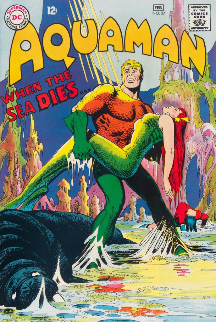
This is Aquaman no. 37 (Jan.-Feb. 1968, DC). The despondent walrus, bottom left, is family pet ‘Tusky’. Oh, and my apologies for ever-so-slightly poaching some potential Tentacle Tuesday material.
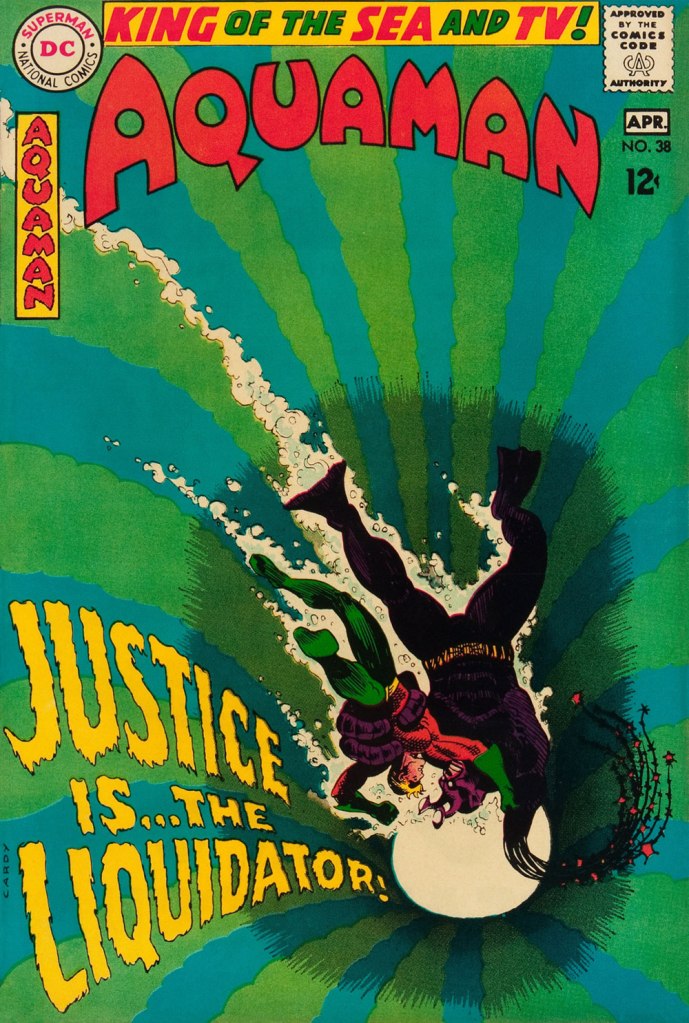
This is Aquaman no. 38 (Mar.-Apr. 1968, DC). I wonder what’s up with the redundant vertical logo, top left.
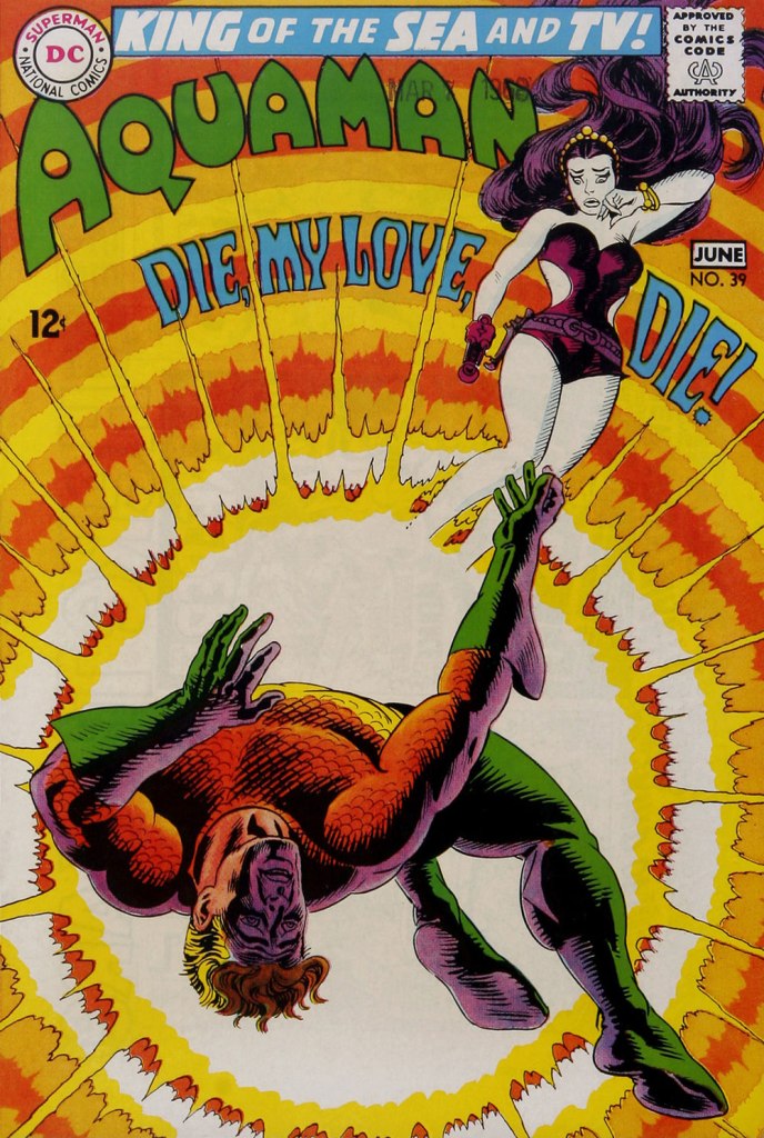
In case you’re wondering about Aquaman’s expanded regal duties (“and TV!“), they were showing repackaged reruns of his half of the previous year’s Superman / Aquaman Hour of Adventure. A Filmation production, so don’t expect too much if you haven’t seen it. But back to the comic book: this dazzling scene announces the saga of “How to Kill a Sea King!”, as our amphibious hero seeks to thwart a hostile Venusian takeover of Earth and sea. Script by Bob Haney, art by Cardy. This is Aquaman no. 39 (May-June 1968, DC). Oh, and the hottie? That’s “Aliena”. A real bolt of ‘inspiration’ there, Mister Haney.
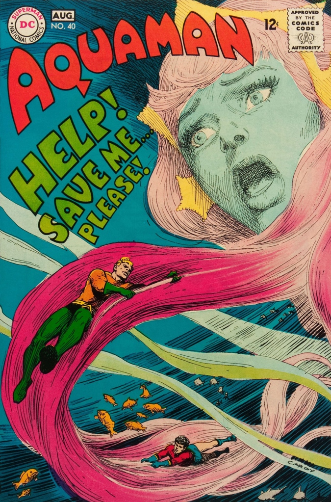
This is Aquaman 41, (July.-Aug. 1968, DC). Such dynamically-designed fun! This is where the new creative team of Stephen Skeates and Jim Aparo joins new editor Dick Giordano (his second issue), but Cardy remains on covers… because Aparo, who resided a couple of states over, couldn’t attend the cover conferences.
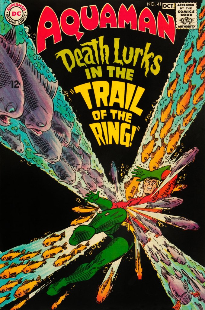
This is Aquaman 41, (Sept.-Oct. 1968, DC), a highlight among highlights from the redoubtable team of Infantino (publisher-designer), Cardy (penciller-inker), Giordano (editor), Jack Adler (production manager and colourist), and, inside, Skeates (writer) and Aparo (penciller-inker-letterer). There’s a texture to the colour work (most evident on the foreground piraña… a freshwater fish, incidentally) that’s unusual for comics of that period. I wonder how it was achieved…
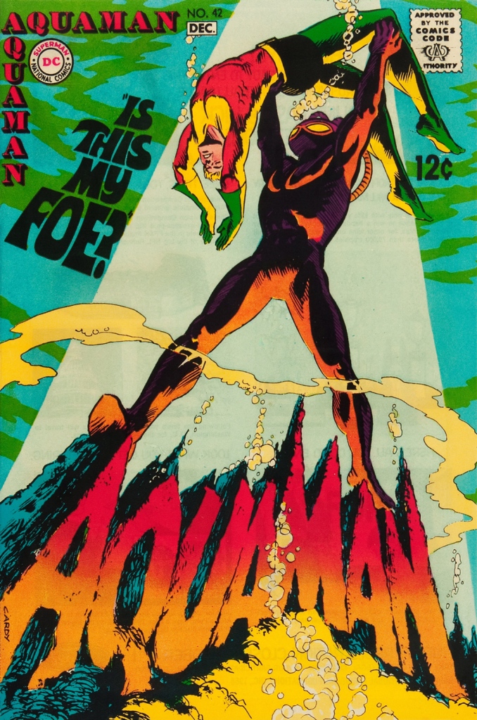
This is Aquaman no. 42 (Nov.-Dec. 1968, DC).
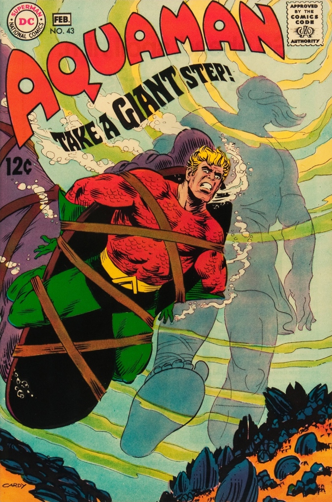
This is Aquaman no. 43 (Jan.-Feb. 1969, DC). Face-first in a bed of mussels, with several tons of pressure? Yikes.
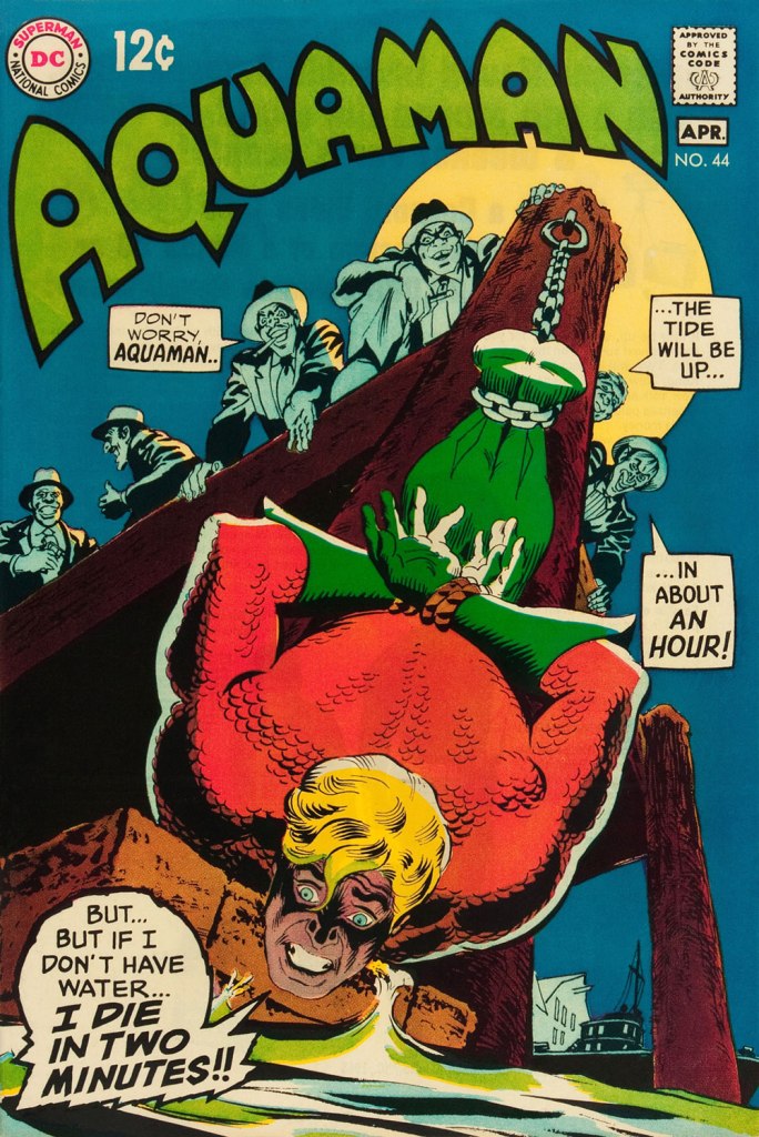
This is Aquaman no. 44 (March-April 1969, DC). I love how, despite the gravity of the situation, the mobsters are kind of cartoony. Cardy would most fruitfully mine this tragicomic vein in the brilliant but short-lived western Bat Lash (1968-69).
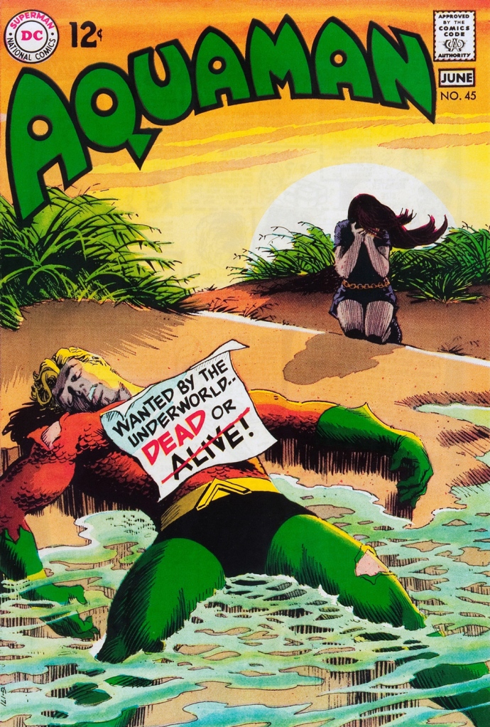
This is Aquaman no. 45 (May-June 1969, DC), concluding Skeates and Aparo’s two-parter, the self-explanatory “Underworld Reward”. An undeniably epochal cover by Mr. Cardy. To wit, so compelling and mysterious is this scene that it’s merited an astute blogger’s impressively in-depth analysis… well worth a peek.
« I don’t know what’s wrong with him! He’s in hellish torment! » — there’s witchery afoot, clearly
I’ll grant you in a heartbeat that Nick Cardy‘s (and, to a lesser extent, Neal Adams’) earlier The Witching Hour (full original title: It’s 12 O’Clock… The Witching Hour!, hence its twelfth day appearance) covers beat out subsequent entries on the overall quality front, but this particular beauty, in my opinion, takes home the terror tiara as the very creepiest of the bunch. Is it the otherwise-innocuous daytime setting, the tension between the pastoral and the grotesque? In the end, it induces shivers, and that’s what counts.
Though it comes as the tail end of their involvement, Carmine Infantino and Cardy still had a hand in, as publisher and art director, and took an active rôle in the design of each DC cover of the era.
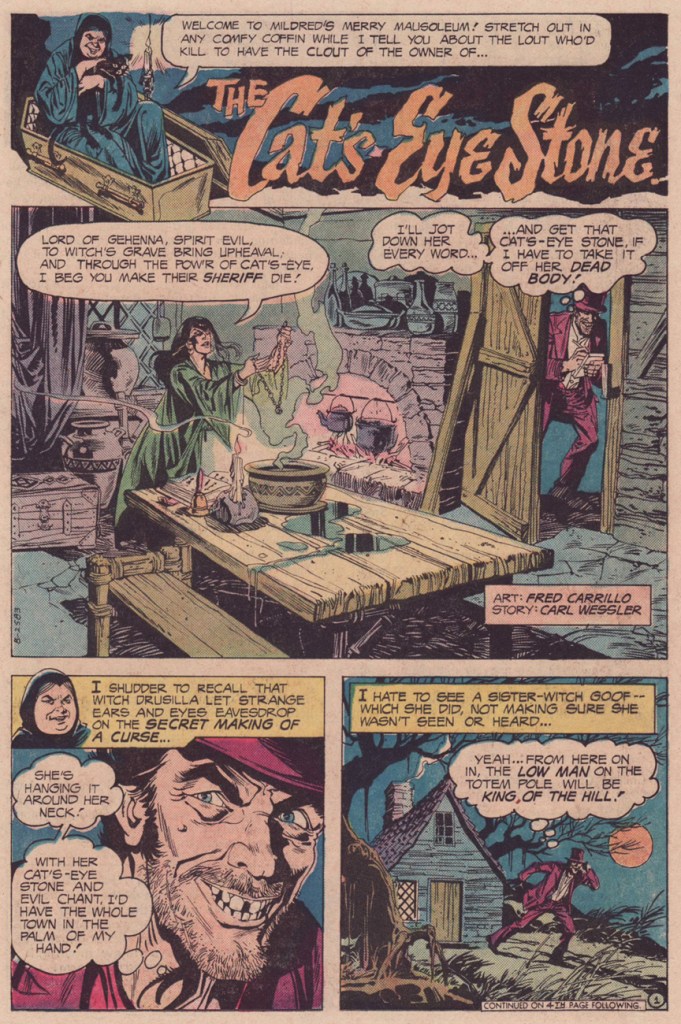
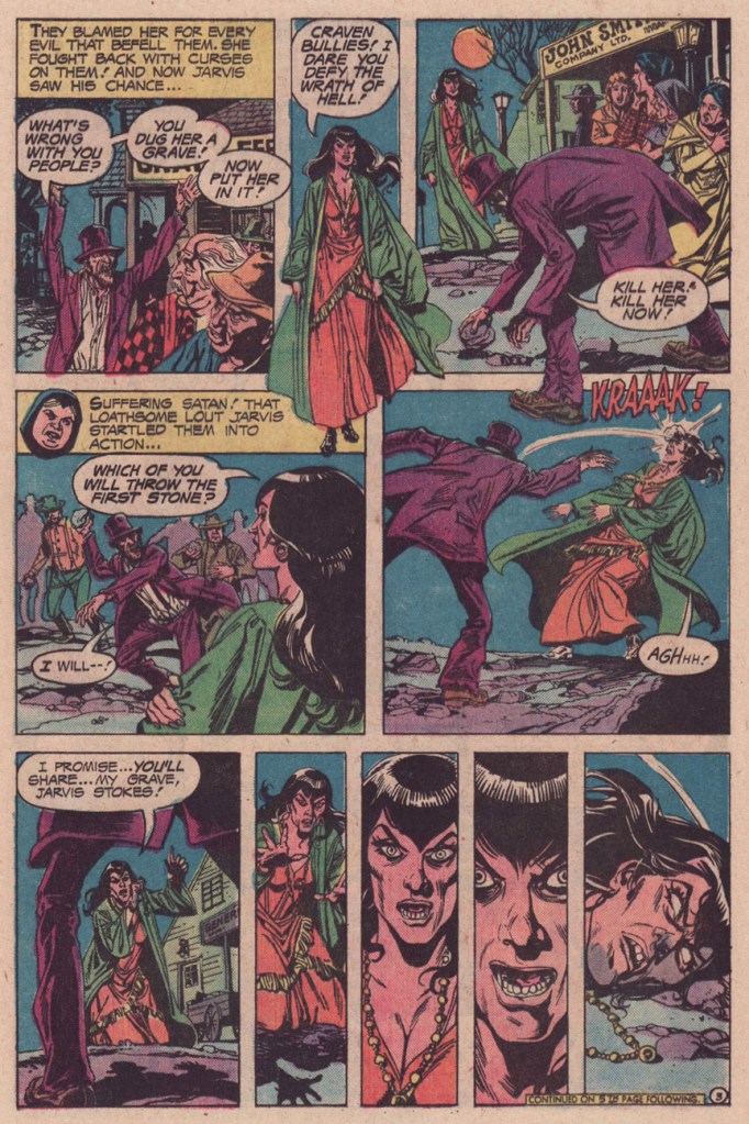
This is It’s Midnight… the Witching Hour no. 62 (Feb.-Mar 1976, DC). Edited by Murray Boltinoff. Argentine grand master Luis Dominguez’s cover art is loosely based on Carl Wessler and Fred Carrillo’s The Cat’s-Eye Stone. That aside, is it actually a picnic that Mr. Romantic has in mind, what with a “picnic place that no one will ever find“? Suspicious, to put it mildly.
And so — why not? — here’s the full tale, so that you may judge for yourself.
One small quibble: doesn’t Drusilla’s witch’s brew count for something in the spell? Surely the words won’t suffice…
For a devil-worshipper, she’s pretty biblical (‘cast the first stone’). Or maybe that’s the point.
This story anticipates the shock ending of Carrie by almost a year. Or had this twist already made the rounds? Perhaps the cycle began with Let’s Scare Jessica to Death… but I’m not sure.
Wilfredo Limbana ‘Fred’ Carrillo (1926–2005) was an underrated Filipino artist who produced some quite fine work for DC Comics’ mystery titles in the 1970s. I was particularly fond of his work on The Phantom Stranger, when he illustrated both the titular feature and its worthy backup, The Black Orchid, at the tail end of the title’s run.
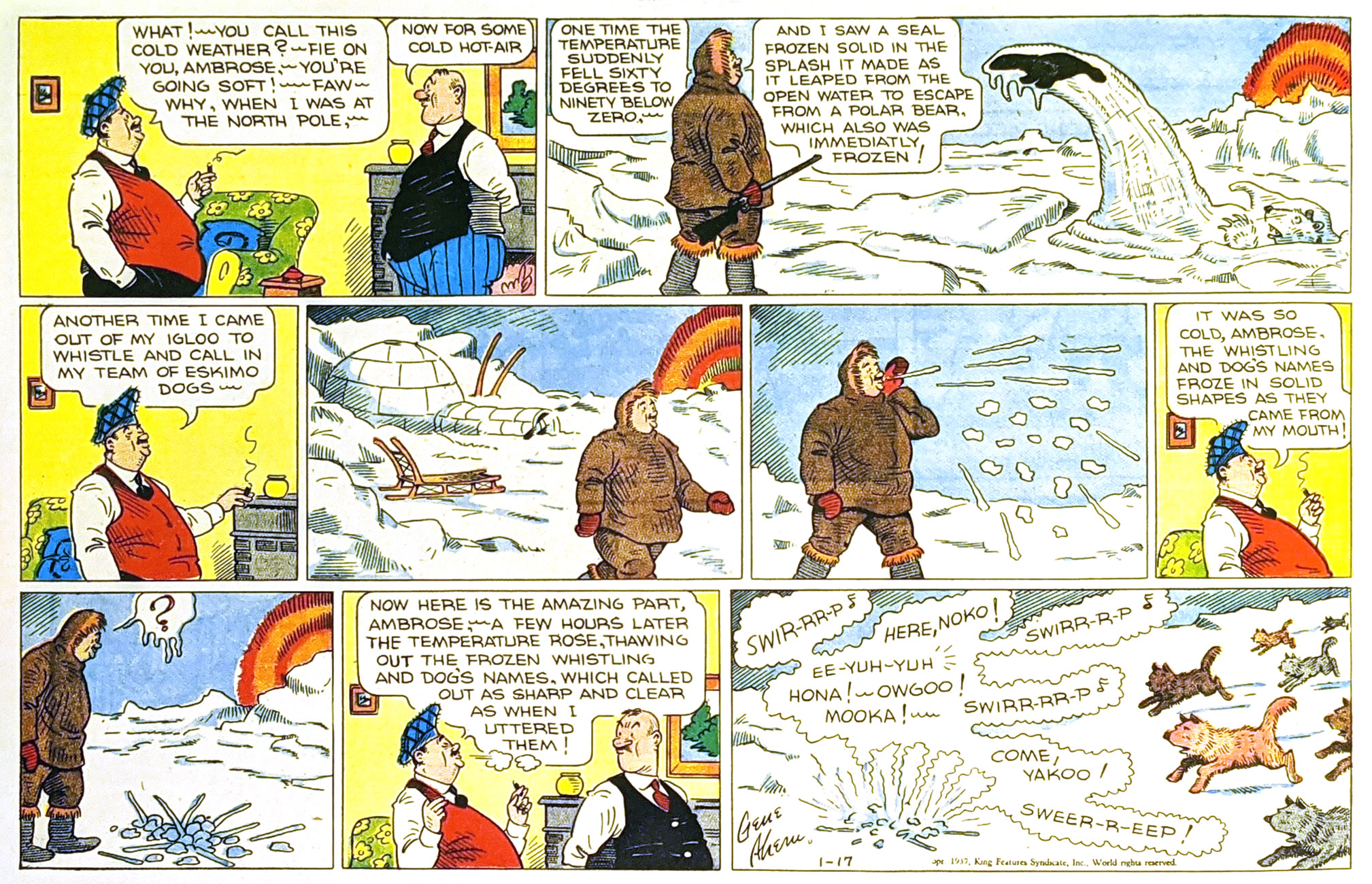
« Polar exploration is at once the cleanest and most isolated way of having a bad time which has been devised. » ― Apsley Cherry-Garrard, The Worst Journey in the World (1922)
Gene Ahern‘s Room and Board (March 17, 1937, King Features).
Of course, it’s all piffle and bunk, but it brought to mind a passage from a favourite article on weather peculiarities in Siberia, Marcel Theroux‘s The Very, Very, Very Big Chill(published in Travel & Leisure in 2000):
« Local people told me that at minus 60 and below, a dense fog settles in the streets, and pedestrians leave recognizable outlines bored into the mist behind them. A drunkard’s tunnel will meander and then end abruptly over a prone body. At minus 72, the vapor in your breath freezes instantly and makes a tinkling sound called ‘the whisper of angels.’ »
Then I thought: « all very nice, but that makes for a rather meagre post »… so I decided to toss in a few bonus images featuring that venerable recurring motif… and got carried away.
This is Astonishing no. 36 (Dec. 1954, Atlas), the title’s penultimate pre-Code issue… not that Atlas ever crossed the line into gruesome. The cover-featured yarn is The Man Who Melted!, an amusing load of utter rubbish you can read here. Cover art by Carl Burgos.
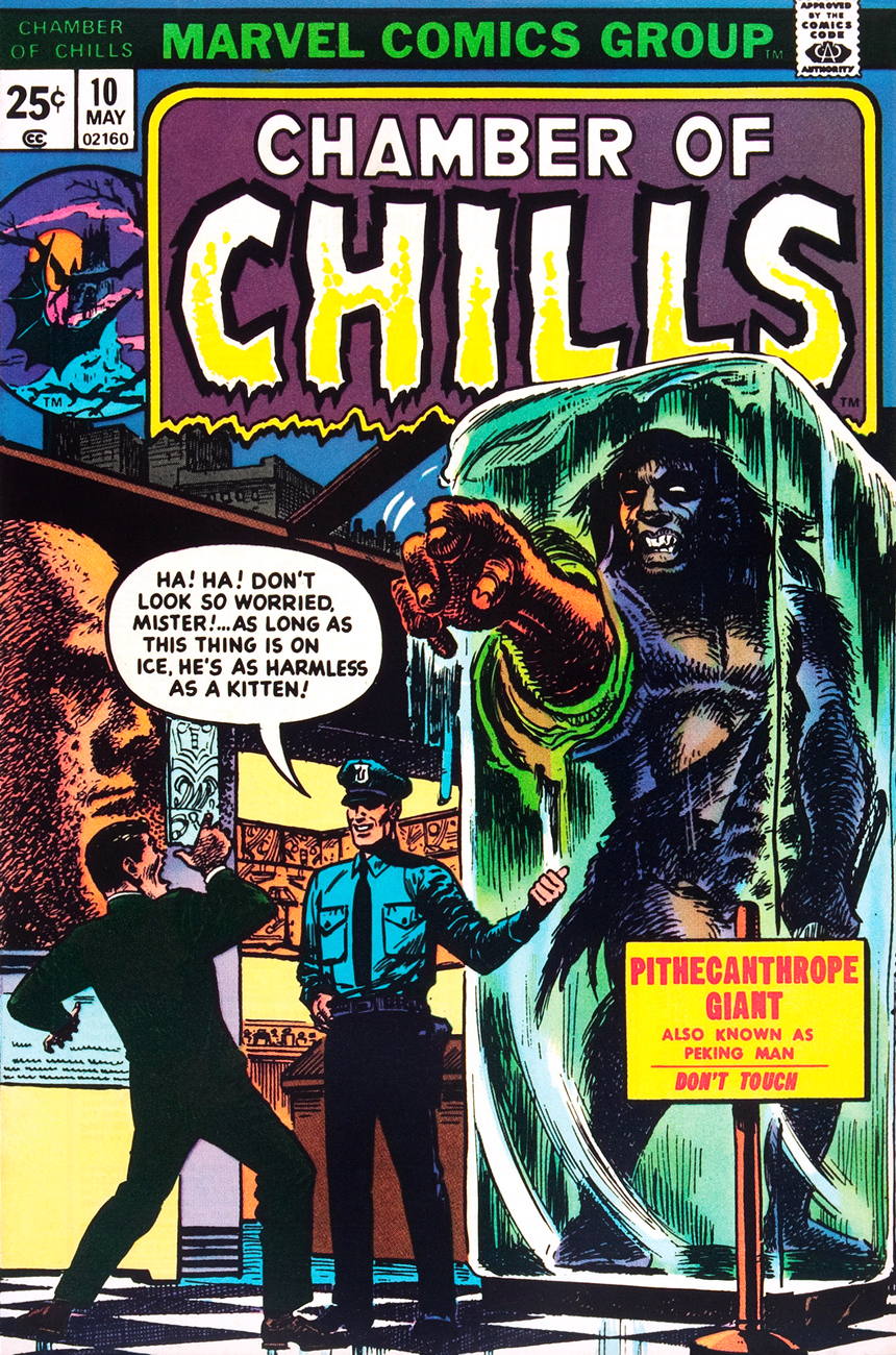
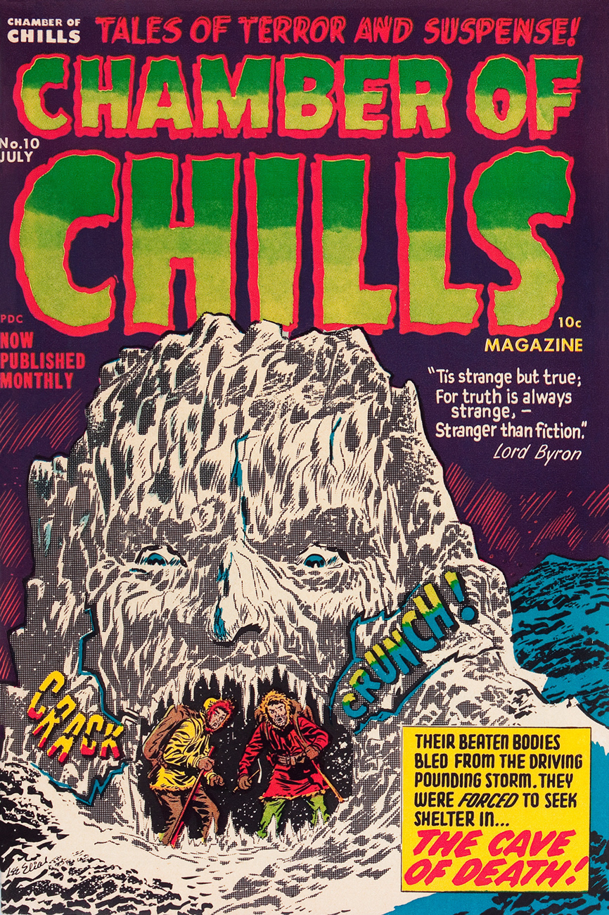
This is Chamber of Chills no. 10 (May, 1974, Marvel), and most everything’s the same, save for the colour palette and the now-hostile expression on the caveman’s mug.
And this is alsoChamber of Chills no. 10 (July, 1952, Harvey)… the original, whose title Harvey Comics left curbside for Marvel to recycle when they went all kid-friendly in the Comics-code-ruled Silver Age. Cover designed and art-directed by Warren Kremer and illustrated by Lee Elias. For some insight into these collaborators’ working methods on the horror titles, here’s our post on that very topic. Incidentally, what’s up with the hifalutin Lord Byron quote, Harvey folks? This wacky fare is quite plainly fiction… what’s your point? [Read it here.]
This is Tales of The Unexpected no. 101 (June-July 1968, DC). Layout and pencils by Carmine Infantino, inks by George Roussos. Infantino, promoted the previous year to editorial director (he would soon rise to the rank of publisher), brought in the versatile Nick Cardy to serve as his right-hand man on the artistic front; together, they designed all of DC’s covers until both men stepped down in 1975.
This is House of Mystery no. 199 (February, 1972, DC), illustrating Sno’ Fun! a rare (possibly unique, really) collaboration between Sergio Aragonés (script) and Wally Wood (pencils and inks). Cover designed by Infantino and Nick Cardy, pencilled and inked by Neal Adams and coloured by Jack Adler.
This is Unexpected no. 142 (Dec. 1972, DC); cover art by Nick Cardy.
This is Unexpected no. 147 (June, 1973, DC); cover art by Nick Cardy.
This is Unexpected no. 150 (Sept., 1973, DC); cover art by Nick Cardy.
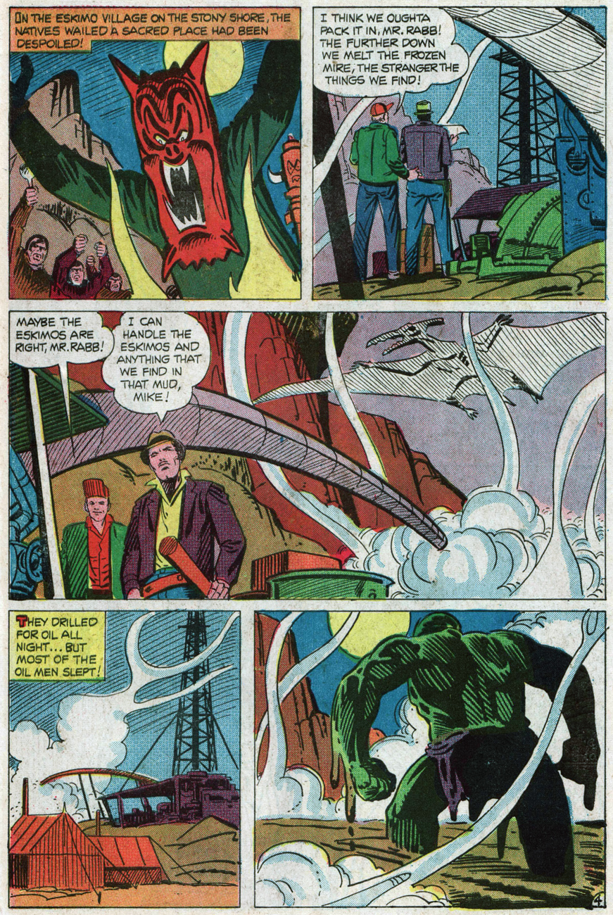
« Hey, look! The critter is frozen whole… it’s in pretty good shape! » Tom Sutton vibrantly sells Joe Gill and Steve Ditko‘s cautionary tale of arctic drilling gone awry, The Ancient Mine. Also in this issue: Steve and Pete Morisi‘s Surprise!, and Gill and Fred Himes’ touching Pipe Dream. This is Haunted no. 37, (Jan., 1974, Charlton), presented by the publisher’s blue-skinned, green-haired answer to Nana Mouskouri, Winnie the Witch.
« … that face haunts me… was it a man or a beast? » Ah, the Seventies. Left dazed and frazzled by his whirlwind life of slow-mo violence, glamorous excess and substance abuse, not to mention radiation poisoning, the inevitable occurs: The Hulk wanders onto the wrong set, as well as the wrong publisher’s! Against all odds, he handles the rôle with aplomb and commendable gravitas. A page from Gill and Ditko’s The Ancient Mine. Read it here!
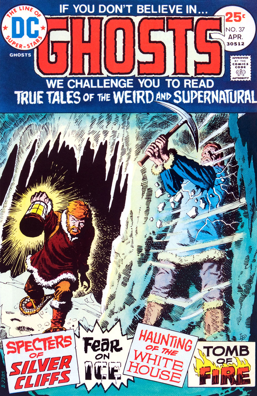
This is Ghosts no. 37 (April, 1975, DC), featuring Luis Dominguez‘s first (or many) cover for the title, a passing of the torch from Nick Cardy, who’d handled nearly every one of the preceding three dozen…. minus two: number 7’s cover was the work of Michael Kaluta and number 16‘s that of Jack Sparling.
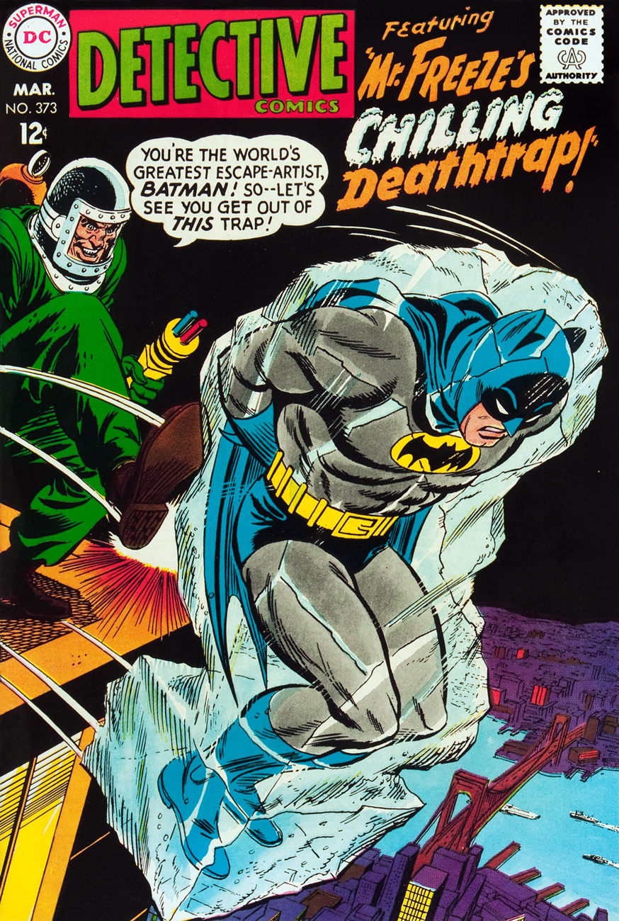
Oh, and since I wouldn’t want any of you superhero aficionados to think I’m freezing you out, here’s another demonstration of Mr. Infantino‘s “encased in ice” idée fixe.
Mr. Freeze, who first popped up in Batman no. 121 in 1959, initially known as, er… Mr. Zero (Celsius, Fahrenheit or Kelvin?) before being revamped and renamed for the mid-60s Batman TV show, a makeover that carried over to the comics, but tragically didn’t include his outfit. This is Detective Comics no. 373 (March, 1968, DC); layout by Infantino, finishes by Irv Novick. [ read it here!]… and I can just about hear the « but what about Cap? » troops tromping down the hall, so…
Namor goes all First Commandment on some poor Inuits (surely they’ve seen frozen bodies before?), displaying an unseemly level of insecurity for someone of his standing. This recap hails from King Kirby’s sensational feat of deadline rescue on the behalf of a tardy Jim Steranko (to be fair, it was worth the wait). George Tuska‘s inks are a surprisingly good fit! This is Captain America no. 112, Lest We Forget! (April 1969, Marvel). [ read it here!]My co-admin ds was just telling me yesterday about a client who, upon remarking to a succession of winter-kvetchers that actually, we’d had a pretty mild January, was invariably met with goggling bafflement, as if he’d just then grown a second head. In related news, it was just announced that said month of January was, indeed, the planet’s warmest on record. There is, naturally, an xkcd strip about this sort of circular denialism.
« Our dried voices, when we whisper together are quiet and meaningless as wind in dry grass or rats’ feet over broken glass in our dry cellar. » — T.S. Eliot, The Hollow Men(1925)
It’s with a bittersweet little shiver that I wrap up this year’s WOT Hallowe’en countdown. In light of my fond feelings for the holiday, I didn’t want to go out with a massive fireworks display of a post, but opted instead for a quiet, succinct coda.
Nick Cardy‘s illustration impeccably epitomizes the spirit of Hallowe’en. No, it’s not about the candy collection ritual nor about the motley, garish masquerade… truly, it’s much as Ray Bradbury summed it up in his preface to his The October Country, « … that country where it is always turning late in the year. That country where the hills are fog and the rivers are mist; where noons go quickly, dusks and twilights linger, and midnights stay. That country composed in the main of cellars, sub-cellars, coal bins, closets, attics, and pantries faced away from the sun. That country whose people are autumn people, thinking only autumn thoughts. Whose people passing at night on the empty walks sound like rain… »
You can practically hear the echoes of sinister cackling drifting on the chill October breeze.
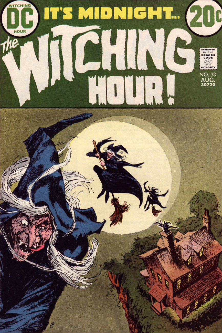
How’s this for perfectly-composed, uncluttered graphic majesty? A wisely understated palette, from top-to-bottom, holds it all together. One has to understand that this sort of soft-sell, muted grace could not make it to market without a tremendous amount of trust, cooperation and… no second-guessing. This is It’s Midnight… The Witching Hour! no. 33 (Aug. 1973, DC), edited by Murray Boltinoff. That lead witch looks quite… lusty. Where’s she off to, and why is the Comics Code Authority not stepping in?
This seldom-seen Nick Cardy cover graces quite an issue, by my reckoning: the blackly ironic Four Funerals, drawn by Ruben Yandoc and probably written by editor Boltinoff; George Kashdan‘s cynical Cold Ashes — Hot Rage, drawn by Alfredo Alcala (what, him again?); and Carl Wessler‘s convoluted A Choice Seat for… Doomsday!, illustrated by the mighty Jerry Grandenetti. Read it right here!
… and Happy Hallowe’en, one and all!
-RG
p.s. before I forget: how cool is it that the witches exit through the chimney?