In the spirit of saluting our heroes while they’re still around to get a boost from it…
A few weeks ago, I got wind of a delightful bit of news: that local favourite Russell Kommer Myers now holds, according to Guinness, the world record for Longest running daily cartoon strip by a single author. Perhaps because of his chug-along consistency, the prodigious Myers is generally taken for granted. Well — I’m happy to say — not in these parts: see our tribute post from a while back, Growing Old Gracelessly With Broom-Hilda, for further, abundantly illustrated praise.
Here’s some of what the folks at Guinness (not the Dublin ones) had to say:
« The longest running daily cartoon strip by a single author is “Broom-Hilda” by Russell Myers (USA), which has been in continuous publication for 53 years 292 days since first published by the Chicago Tribune Syndicate on 19 April 1970, as of 5 February 2024.
Russell was born “BT” (before television) and fell in love with comics and cartooning as a child. He started a collection of over 2,000 comic books, which he still has.
After years of having other comic strips rejected, Russell sold “Broom-Hilda,” which became an overnight success. He is a “one-man shop,” writing and drawing every strip himself, over 19,710 as of the 54th anniversary. »
For a little perspective, here’s what Lambiek had to say on the subject:
« He leaves previous record holders behind, like Frank Dickens (‘Bristow’, 51 years), Charles M. Schulz (‘Peanuts’, 49 years) and Marc Sleen (‘Nero’, 45 years). Yet Myers is still behind Ed Payne (‘Billy the Boy Artist’, 56 years), Fred Lasswell (‘Barney Google & Snuffy Smith’, 59 years), Jim Russell (‘The Potts’, 62 years) and Russ Johnson (‘Mr. Oswald’, 62 years, though this was a monthly comic). » Honestly, one is inclined to gently bring up the touchy, controversial issue of, ahem… assistants.
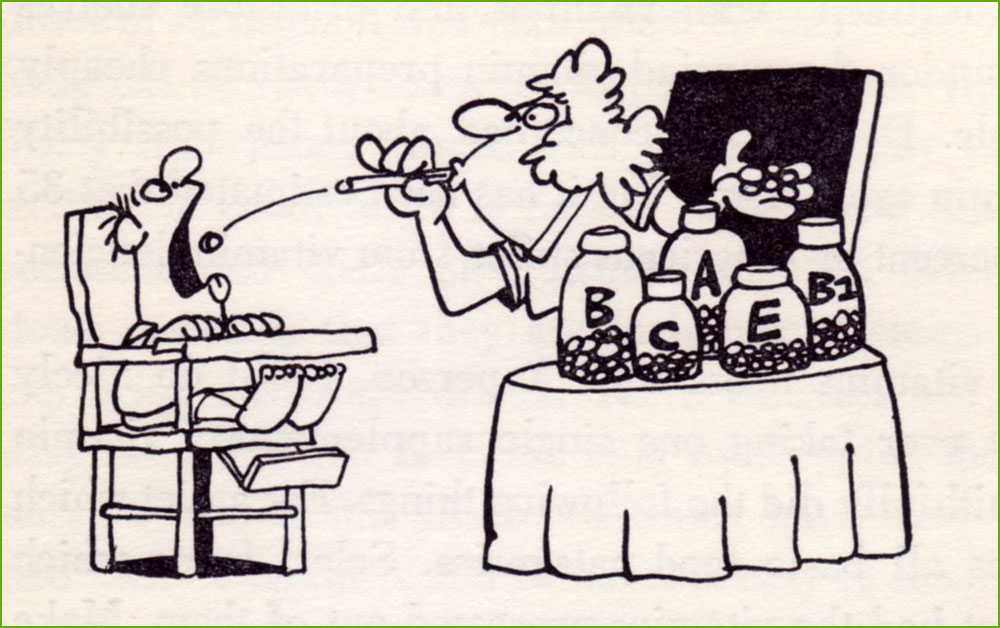
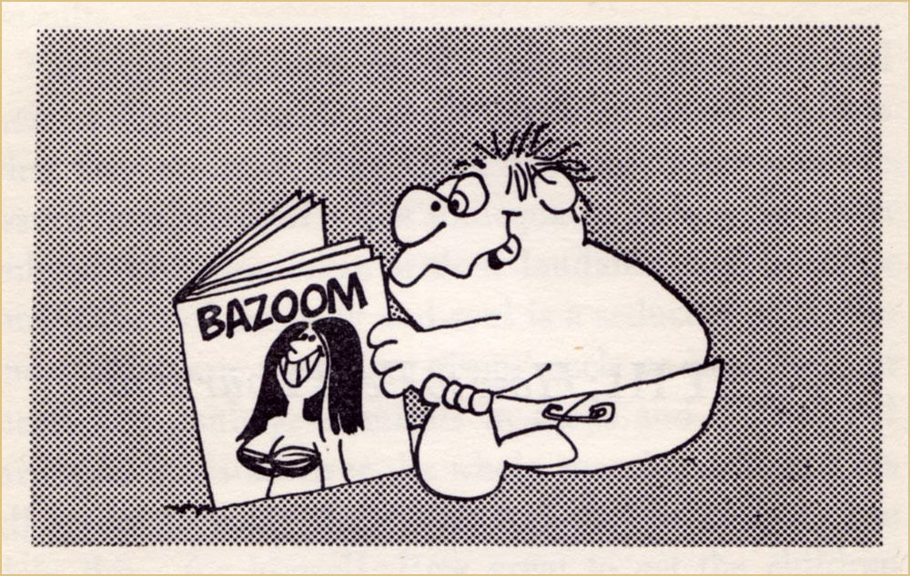
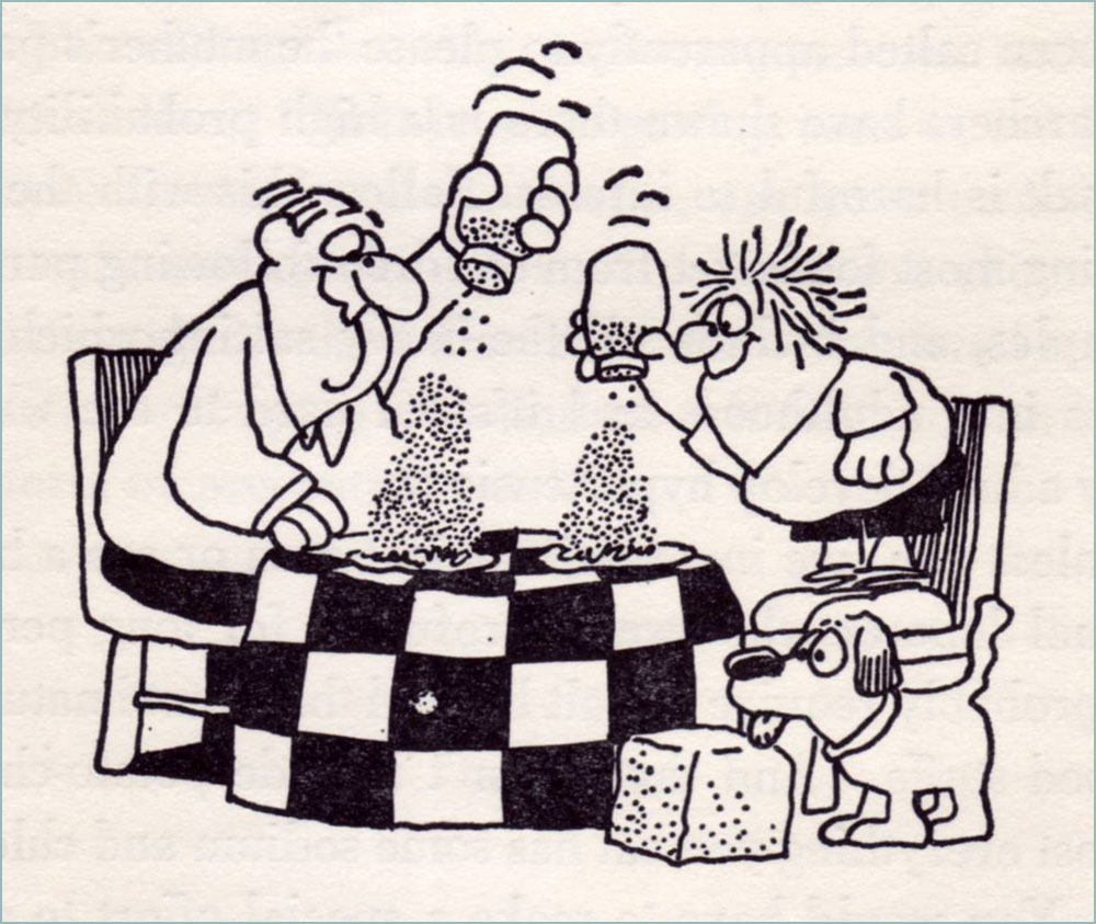
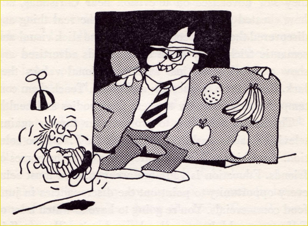
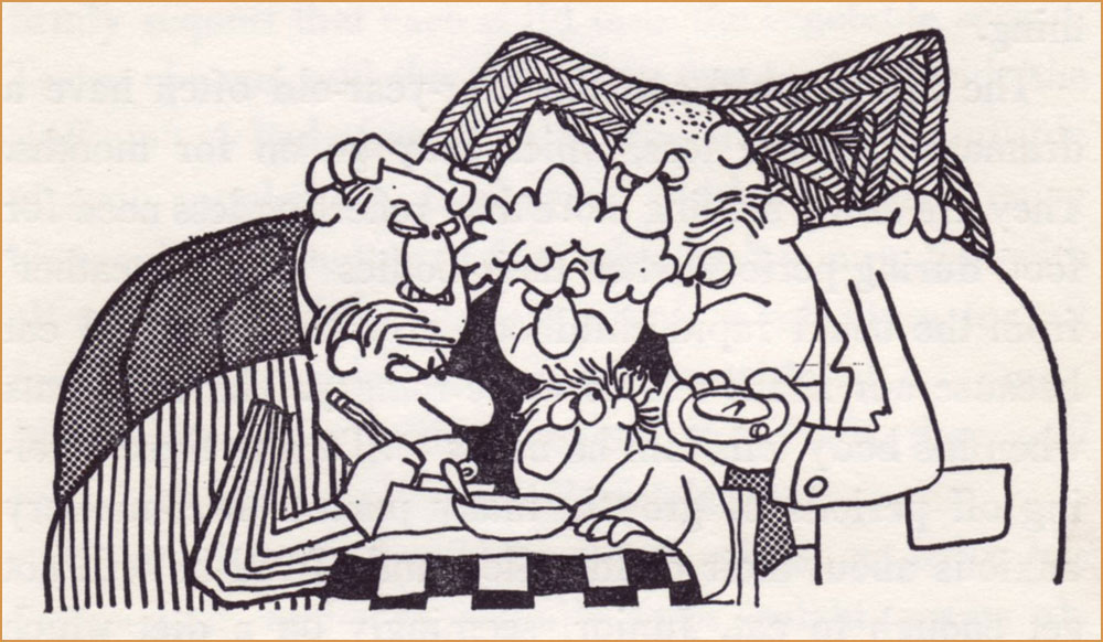
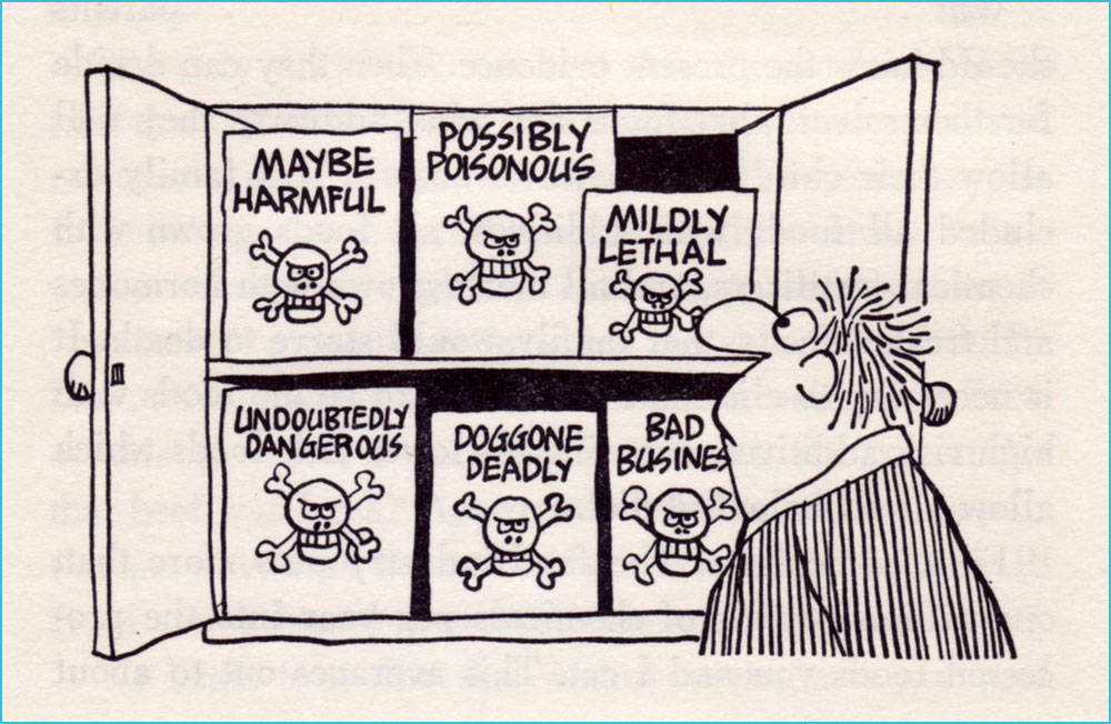
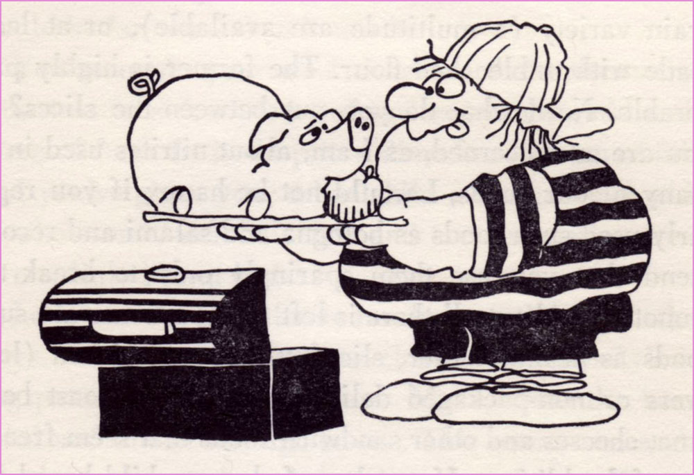
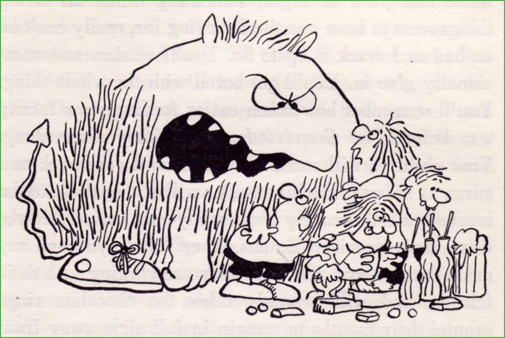
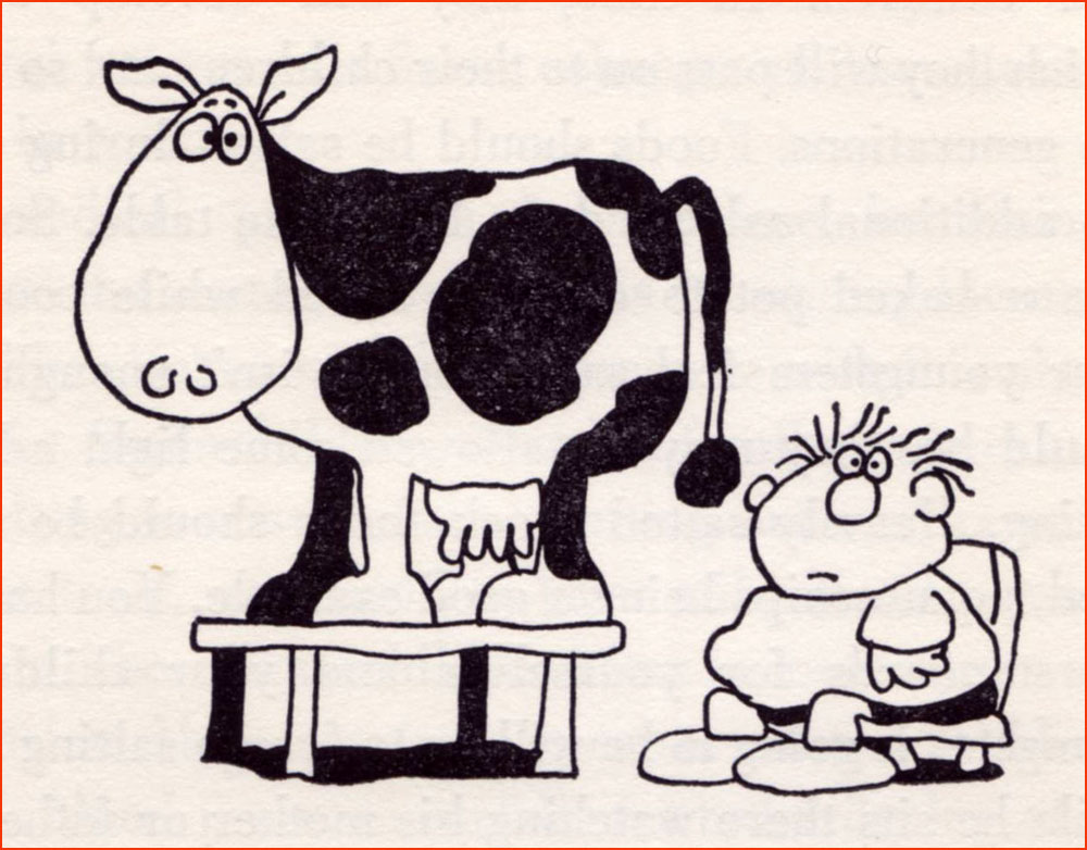
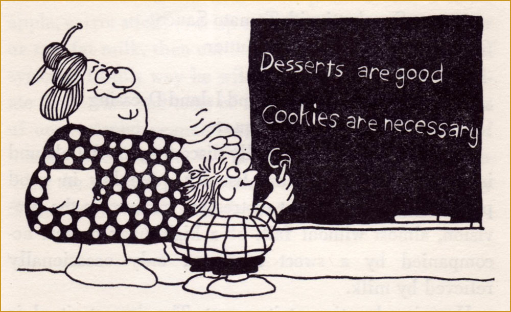
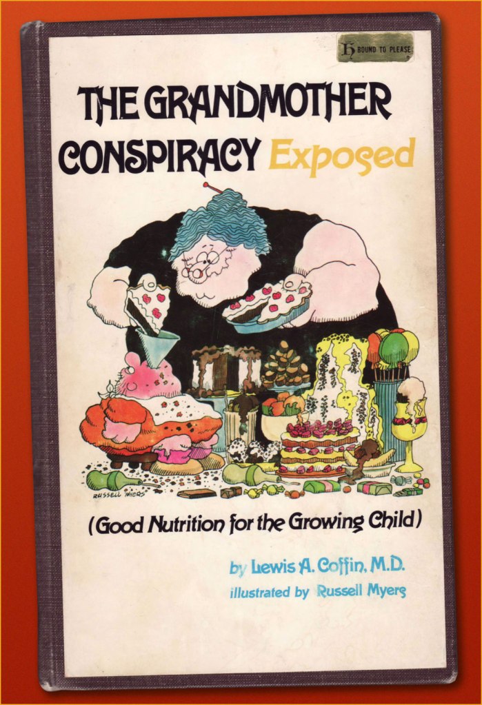
Having already dealt with Broom Hilda, let’s dig a little deeper. In 1974, early in his strip’s run, he contributed illustrations to California paediatrician Lewis A. Coffin’s book, The Grandmother Conspiracy Exposed (Good Nutrition for the Growing Child)… and did a lovely job. Given the ever-fickle nature of the dietary business — to say nearly nothing of its oft-political ramifications — Coffin’s book now seems of its time and place, but he was pretty progressive, and put forth a lot of sound notions. Here are some of Mr. Myers’ fun chapter illustrations:
« The best way to get vitamins is to eat foods which contain them. »« The advantages of breast feeding are well known: lack of preparation, sterility, natural warmth, ready availability, proper nutritional balance of ingredients, prevention of anemia, attractiveness of container design, transfer of protective factors against disease, apparent lower incidence of allergic disease, relative absence of intolerance to milk, and all the emotional gain for both mother and child. » « Unless you live in a semi-tropical area or are a heavy manual labourer who sweats profusely for long periods, you probably require no salt beyond that found naturally in food stuffs. »« I believe that a person who has felt a sun-warmed, firm but ripe tomato in his hand, lifted it up to his nose and savoured the deep, earthy aroma, and tasted the full, tart-sweet taste, juice and seeds dripping down his chin, will never forget the look, feel, smell or taste of that real tomato, and will know how to pick out the best tomatoes in the supermarket, because he will have that supreme standard to measure them against. »« My children love raw vegetables. They dislike many cooked vegetables, often the same ones they like raw. While I’m not saying you should sell the stove, it seems they sense that something’s missing after cooking. » « For many years Americans felt secure in the belief that the government and, more specifically, the Food and Drug Administration was constantly screening all processed food for harmful additives. It has finally become evident that this is not the case. » « Most school systems have completely abdicated the responsibility for nutritional education and have totally misused their most potent teaching tool, example, in the name of economy. » « Your children will sneak around your back and gorge at the neighbour’s house, or will slither down to the local store and furtively cram candy-bars and soft-drinks down their deprived throats. »« It wasn’t until television came along that the finely honed art of brain-washing children came to full flower. »« … we know that the majority of peoples in the world not only don’t drink milk, but they would be quite ill if they did. »« You would naturally assume that your local school’s lunch program was nutritionally a good one. »And here’s my durably bound copy of this lovely tome, discarded early this century from the library of Alma College, a private Presbyterian liberal arts college in Alma, Michigan.
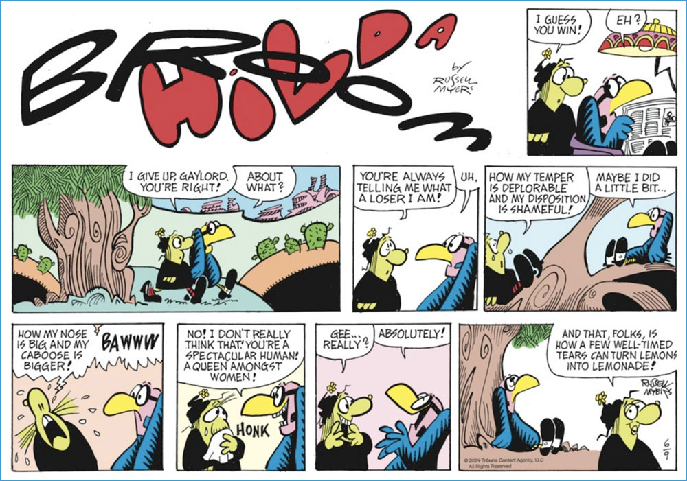
And since I’ve touched upon Mr. Myers’ Broom Hilda achievement, I would be remiss in not giving our readers a look at what he’s been up to lately. After all, an endurance record means little if the work itself has scant remaining merit. If you ask me, his timeless charm has weathered the years admirably well.
A Sunday strip from June 9, 2024.And a daily from June 15, 2024. Pretty sharp for a guy in his mid-eighties!
Despite the online abundance of all manner of cat cartoons, the work of Russian artist Vasya Lozhkin (the nom de plume of Alexei Kudelin, born in 1976, lawyer by profession) stands out. Passed around on social media with equal enthusiasm by housewives looking for a giggle, journalists foraging for a satirical cartoon to supplement an article, and art lovers with a penchant for the feline, his paintings run the gamut from wistfully sentimental to quite scary, often in some combination thereof.
One can argue whether Lozhkin is actually an Artist or not (capital A intended) — he himself says that he loves painting, but is no painter. As far as I’m concerned, his eye for colour and striking compositions compensate for whatever deficiency may exist in terms of actual drawing talent. He’s unabashedly prolific, returning again and again to the same themes, populating his world with an addictive medley of orange tomcats, grannies of a threatening disposition, sad Slavic bears and grey bureaucrats of ill intent… as well as good sprinkle of ‘ordinary’ people gone mad, with or without the presence of alcohol. There’s a lot of alcohol.
‘I’m an artist! I have a certificate!’ The author posing next to one of his paintings.
It is Lozhkin’s cats that mostly grab the public’s fickle heart, thus providing their creator with what must be a fairly steady income from knick-knacks of all kinds, à la Kliban*. I’m glad. If it didn’t involve ordering stuff from Russia, I’d be first in line for, say, a mug or two. He has produced something like five thousand paintings so far, exhibiting no shyness whatsoever about recreating particularly successful canvases. He notes that ‘I like cats, but so does my audience. Since my job is to feed my family, I feed it with cats.’ His pragmatism strikes one as being almost defensive.
« Life is a merry carnival »
«Smile, and this world will smile back at you! »
« Talking about the ideas behind Lozhkin’s paintings is like explaining a joke — the explanation will not make it funnier or clearer. His metaphysical world is a sort of peculiar successor to the classic Lubok, where a highly amusing image with a straightforward caption is filled with philosophical meaning. Grotesque buffoonery is aimed to the public exposure of a man’s self, his hidden aspirations and his dreams. The Skomorokh makes an absurd mockery of events, turns the innermost self inside out, so that Man can see his soul — see it and laugh at the absurdity of its ideals. » [source in Russian]
«Stuffing your face while Motherland is sleeping? »
«Improving the marketable appearance »
«Freemasons invent rock’n’roll in order to wreck USSR »
« Each sees what he wants to see. And hears what he wants to hear. But with the sense of smell, this trick does not work: if one early morning you go stand in the middle of a field, knee-deep in manure, squint your eyes and take a sniff, you’re certainly not going to smell violets. » On the topic of sweet violets…
«Learn to play guitar, and all broads will be yours! »
«Get down, fool! »
« Glamour cockroaches got into Petrovich’s head by accident »
‘Cockroaches in the head‘ is a popular idiom, meaning somebody’s mind is messy or full of idiomatic eccentricities. Do professional art critics ignore Lozhkin’s cats et al because this isn’t high art, or because they’re perplexed? Occasional exhibitions, if not very well attended, are distinctly enthusiastically attended by ‘people with cockroaches in their heads’.
«A soul’s suffering will be healed with love »
Komsomolskaya Pravda (the ‘Komsomol truth’) included Lozhkin in its series of ‘Best Contemporary Artists’, dedicating its 15th volume to his art. On one hand, he is now amusingly rubbing elbows with Edvard Munch (volume 6) or Salvador Dali (volume 30)…. currently the series is up to 34 (Pablo Picasso, and no, I don’t understand which logic these choices are governed by, either). Lozhkin was amused by this, apparently. From this end of the world, having anything to do with a pro-Putin newspaper** with Soviet roots is disturbing, but then again… I don’t have to survive in that climate.
Veer to the right towards the traditional Slavic bear family for ‘Motherland’, stray to the left for ‘Abroad’, with its circus of horrors and immoralities. Internet denizens are scarily divided about this painting – is this satire, or brainwashing? I’ll let the reader decide, based on the rest of Lozhkin’s oeuvre as glimpsed in this post.
In an interview, Lozhkin said that the fairy tales he creates always have a happy ending, despite heavy elements of psychosis. He also mentioned that lately he’s been trying to accentuate on the positive, to evoke pleasant emotions from his audience. I admire the motive, but I’m not sure he believes in it himself — there is little doubt that the darkness deepens.
« Each one of us, if you look carefully, has this bottomless depth; everything is in there, the icy horror, this hopeless darkness, gray hopelessness and green melancholy, as well as terrible laughter, pandemonium, devils, animals, cockroaches… »
« Fascism will come to America wrapped in a flag. » — Sinclair Lewis
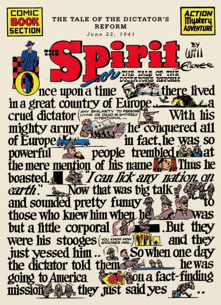
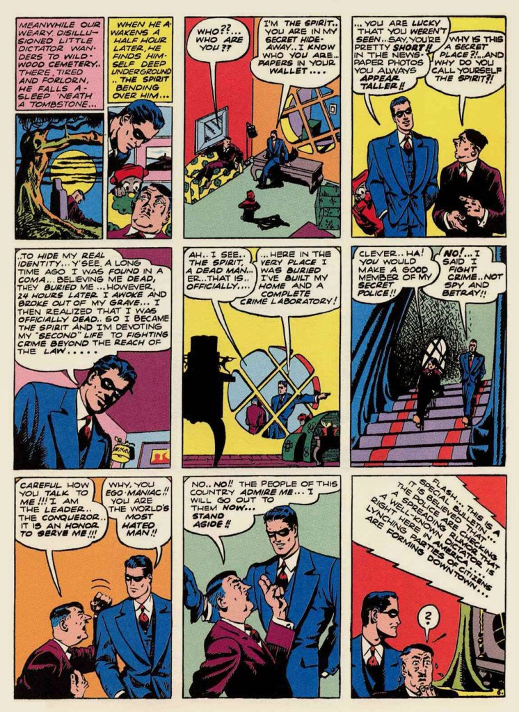
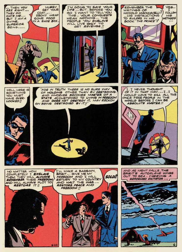
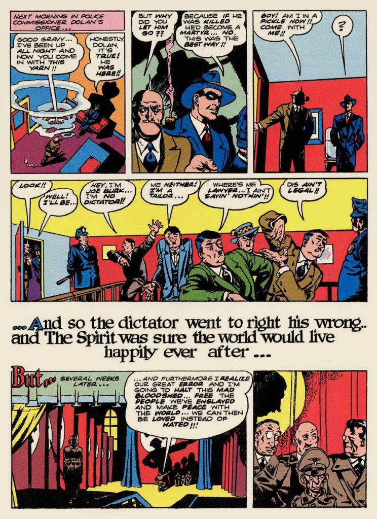
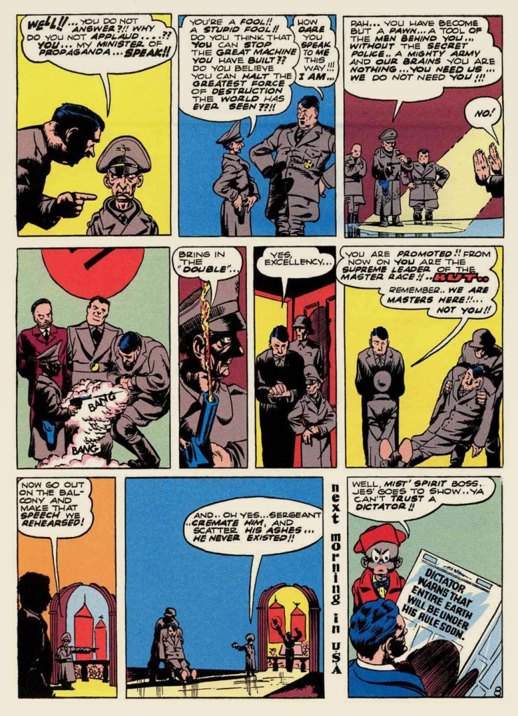
With the exception of its daily strip incarnation (1941-44), principally ghosted by Jack Cole, the early years of Will Eisner’s The Spirit never drew me in. Next to the work Eisner produced upon his return from WWII, the first years seemed tentative and inchoate. It didn’t help that the original artwork — or even quality photostats — of the material had not survived, and so reprints were consequently hobbled by dodgy reproduction.
The other day, a most generous friend presented me with the second volume of Will Eisner’s The Spirit Archives — he had a spare copy — and, not wishing to look a gift horse in the mouth, I duly proceeded to read it. I should state that DC Comics’ complete reprinting of Eisner’s magnum opus is a definitive one, so the pill was far easier to swallow this time.
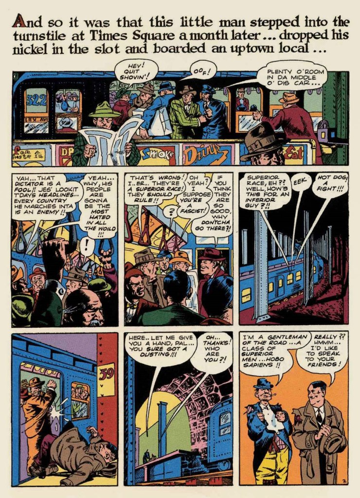
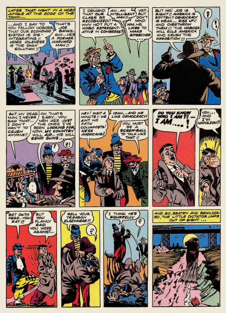
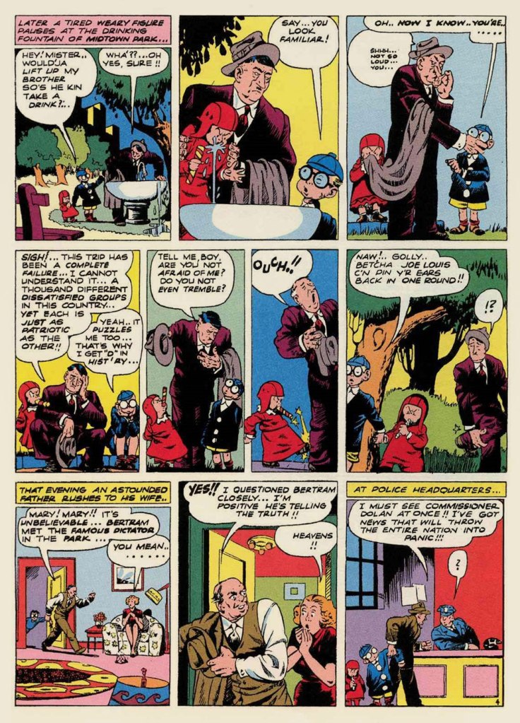
I was particularly taken with one gem near the end of the volume. And since America is currently awash in fascists and Brownshirts, Eisner’s political parable seems unnervingly apropos. See what you think!
Like it says at the top of page one, The Tale of the Dictator’s Reform was originally published on June 22, 1941. The United States’ December 9th entry into the war was still several months away.
This episode was cited as a solid favourite of his lone surviving The Spirit assistant*, the mighty Jules Feiffer (born 1929) in his pioneering work of comics history, 1965’s The Great Comic Book Heroes. Mr. Feiffer wrote: « Eventually, Eisner developed story lines that are perhaps best described as documentary fables — seemingly authentic when one reads them, but impossible, after the fact. There was one about Hitler walking around in a Willy Lomanish middle world: subways rolling, Bronx girls chattering, street bums kicking him around. His purpose in coming to America: to explain himself, to be accepted as nice guy, to be liked. Silly when you thought of it, but for eight pages, grimly convincing. »
When the story finally was reprinted — some sixteen years after Feiffer’s tantalising plot summary — in Will Eisner’s The Spirit no. 32 (Dec. 1981, Kitchen Sink), associate editor Cat Yronwode added: « Indeed, the story is all that Feiffer said of it and more. He forgot to mention that The Spirit fixed Der Fuehrer a nice bag lunch, for instance, and obligingly flew him home after his American sojourn. It’s been a long time coming, but at last we can proudly bring you this little gem, possibly the most eccentric political homily ever produced in the comics form. Enjoy it, but don’t ask for more of the same. It’s unique. »
-RG
*the next-to-last Spirit assistant, Don Perlin, passed away earlier this month. He had pencilled three stories over Feiffer’s layouts in 1951, late in The Spirit’s run.
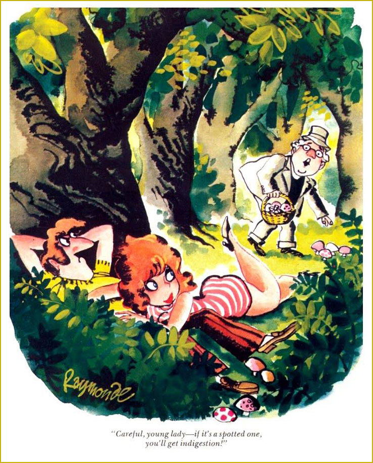
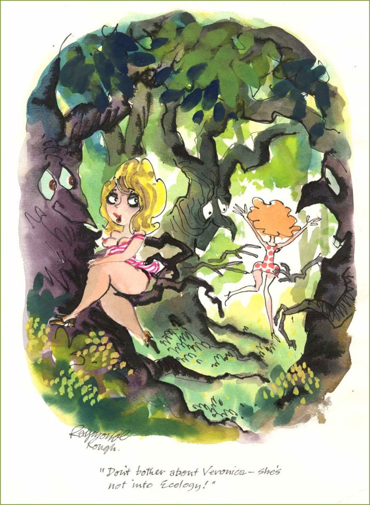
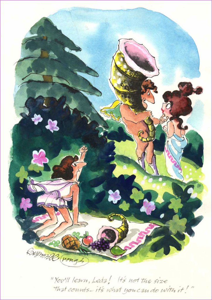
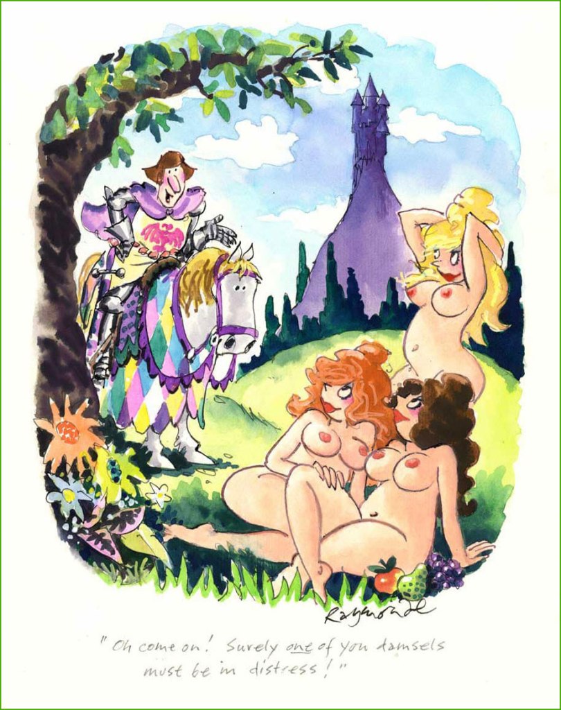
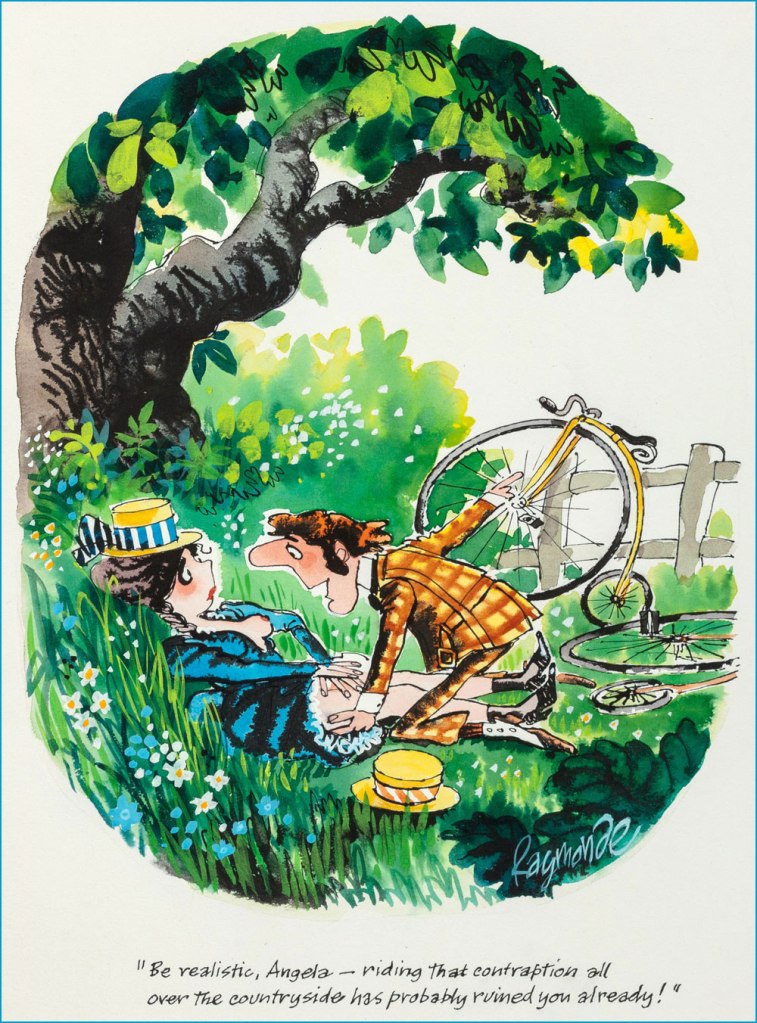
British cartoonist Roy Stuart Raymonde, who died in 2009 at 79 years old, first intrigued me with vivid watercolours and episodes oftimes set in mushroomy forests or secluded glens dotted with babbling brooks. Our anglophilically-minded readers may recall his work for Punch Magazine, and the rest of us will recognize him from the pages of Playboy, to which he contributed a monthly full-colour page for some 30 years.
The rambunctious Raymonde started out in advertising, cushioning his finances by freelancing as a cartoonist, mostly notably for Tit-Bits, a British tabloid-type magazine with an amusing name which reminds me of this George Carlton sketch. By 1960, Raymonde had amassed enough contacts to become a full-time cartoonist.
A collection of Raymonde cartoons published in 1961. Head over here to see some of the insides.
July 1974. This is the cartoon that first attracted my attention… with mushrooms, naturally.
I didn’t know this until writing this post, but delightfully Raymonde was friends with WOT favourite Gerard Hoffnung (see co-admin RG’s posts Gerard Hoffnung’s Constant Readers and Off to the Isle of Cats — and Back by Teatime!), whom he met at the Harrow School of Art (a subdivision of University of Westminster) in 1944, when RR was but 15. The two became lifelong friends, with Hoffnung, then a junior tutor (on his way to becoming a schoolmaster) a mere four years his senior, playing the role of Raymonde’s mentor. This friendship was cut abruptly short by Hoffnung’s premature death, so they were not able to re-enact Simon & Garfunkel’s Bookends, alas. I wasn’t able to find the exact source of this quote, as various websites just parrot the same paragraph over and over, but it seems that Raymonde was nearly expelled after adding funny captions to one of Hoffnung’s instructional drawings, a story hopefully as true as it is hilarious. Hoffnung (never bereft of a sense of humour) came to his defense and argued that this act was a sign of talent.
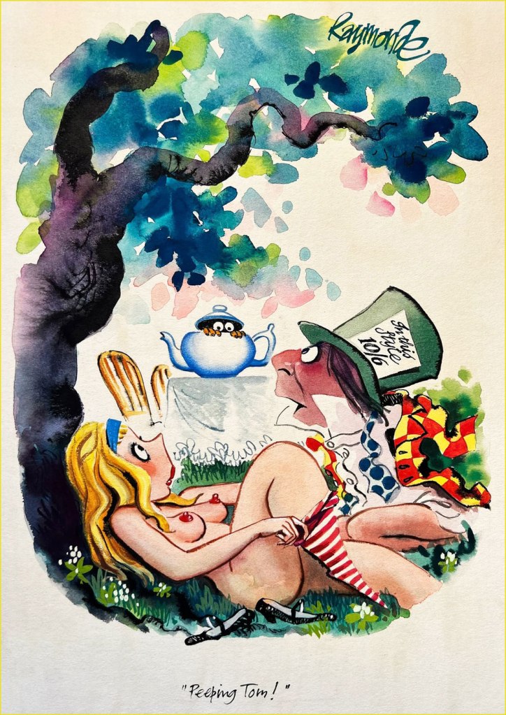
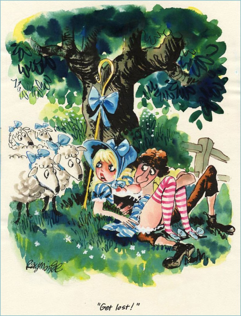
September 1972. What kind of Brit cartoonist worth his Yorkshire Pudding hasn’t spoofed Alice in Wonderland?
1973.
Preliminary sketch of unknown vintage.
Another preliminary sketch.
Given his evident love for the outdoors, I wasn’t surprised to find out that Raymonde bought a thatched cottage at the age of 34 and lived there for the rest of his life, voyages to Japan (where his work was very appreciated, to the point of winning the Gold Prize at the Kyoto International Cartoon Festival in 1996) and such notwithstanding.
1997.
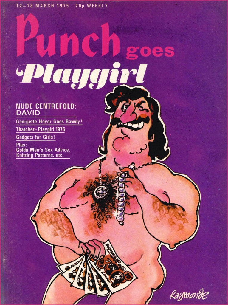
Punch Does Playgirl, March 1975. Raymonde created quite a few covers for Punch… as to the guy depicted, he’s like something out of a Charles Rodrigues sketchbook (see Charles Rodrigues’ Pantheon of Scabrous Humour).
July 1974.
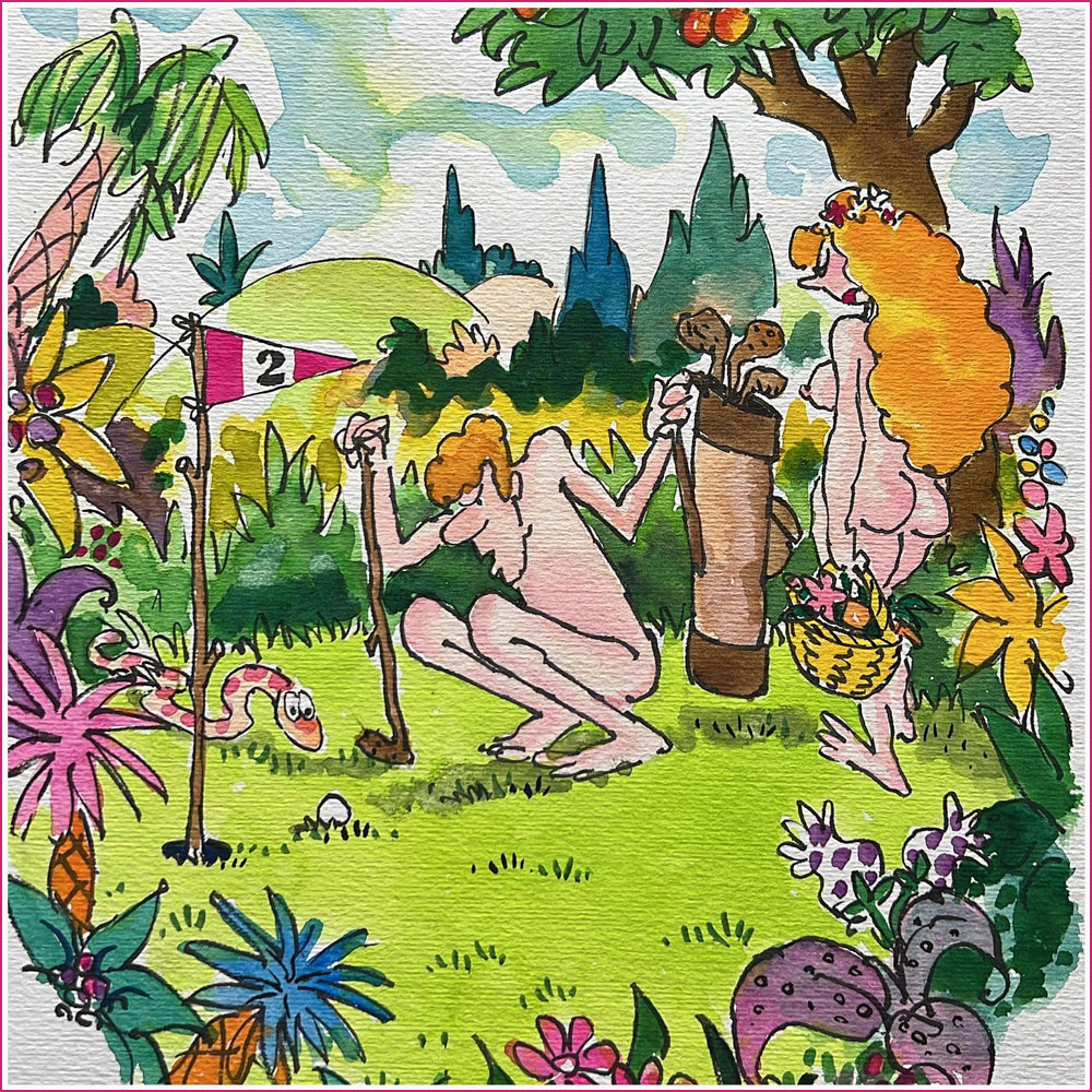
A cartoon used in Fore Play: The Very Best of Playboy’s Classic Golf Humor Paperback (January 1, 1995).
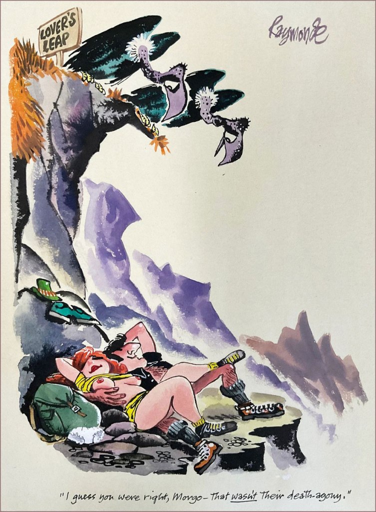
Want to see more? Head over here… and don’t forget to rest your weary head in some spring grass while you’re at it (perhaps with a friendly companion).
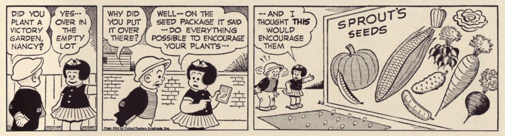
This time of the year is special (and harried) for would-be gardeners – plants carefully nurtured from seed are carefully hardened off (or being plonked into the outdoors soil, for those in the warmer regions), which involves a lot of running back and forth clutching pots and bags of soil, and brandishing favourite raking and digging implements.
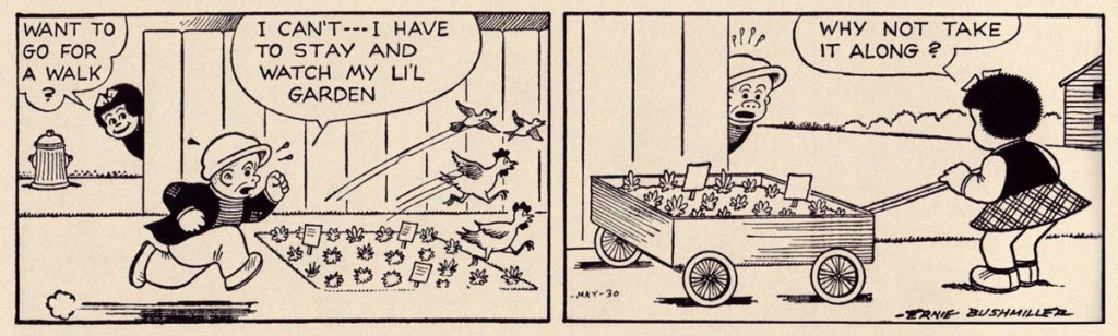
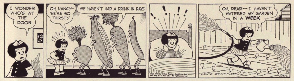
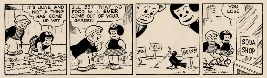
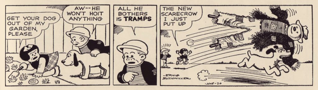
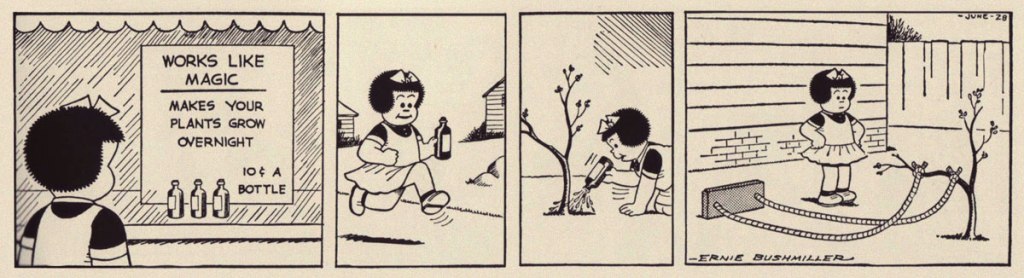
I was spoiled for choice when it comes to strips featuring gardening front and centre, so this theme shall be broken up into several installments. Part I: Nancy! We’ve mentioned Nancy a few times… sort of — see here, except that this John Stanley’s Nancy, and here, a post about an unexpected gem co-admin RG dug up from Nancy creator Ernie Bushmiller. Speaking of co-admins, thanks to the aforementioned RG for locating and scanning these strips. Frankly, my arms are elbow-deep in soil and I’m (w)ra(c)king my brain trying to remember what I planted and where, so mental capacity is sorely depleted.
Strip from May 17th, 1944.
In case the term is new to you, victory gardens were encouraged by the government during wartime — to supplement rations, but mostly boost civilian morale. While the intention was a bit manipulative, surely most would agree that growing one’s own food is immensely rewarding, which reminds me of this meme:
Strip from May 30th, 1950. Given concerns about going away for even a few days (‘who’s going to mind the plants?!’), Nancy’s plan sounds good to me.
Strip from June 15th, 1951.
Strip from June 2th, 1944. I wondered why Nancy was planting sausages in her garden, when I realized that’s probably a green bean…
Strip from June 16th, 1948.
Strip from June 20th, 1951.
Strip from June 28th, 1943.
Strip from July 2nd, 1945. The size of the foliage does not hint at the size of the carrot 😉
« Our Betty Cooper is still the girl next door – she literally lives next to Archie. And she’s the blonde all-American girl; she’s so sweet and forgiving, gives people the benefit of the doubt and second chances, wears her heart on her sleeve. But she’s also incredibly broken on the inside, for many different reasons. » — Lili Reinhart
As a whole, comic book artists are not a happy lot, and for good reason. During the Golden Age, at least, there were countless publishers, so one could move around if unsatisfied with the working conditions.. even if meant finding out that things were rotten all over. After the mid-1950s, when the field violently contracted — you know the story — leaving scant players standing, you pretty much had to take the work, and the abuse, as they came. And certain publishers frowned upon ‘their’ creators playing what little remained of the field.
Kurt Schaffenberger had steady work at DC, but presumably — and understandably — sought to keep his options open, so he moonlighted for ACG, often under a pseudonym, probably unaware that the ‘competitor’ was covertly owned (at least in part) by DC co-founder and co-owner Harry Donenfeld. One can imagine Kurt’s distress when ACG folded in 1967. From what I can surmise, he did, in 1970, a lone, inexplicable cover for Stanley Morse… wildly outside his range but still kind of awesome. And then… he quietly boarded a bus to Riverdale.
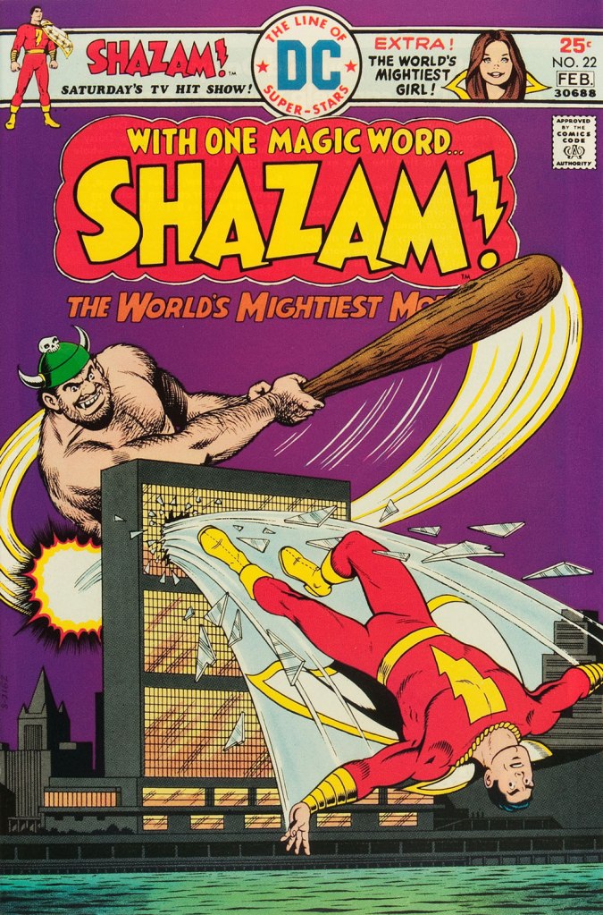
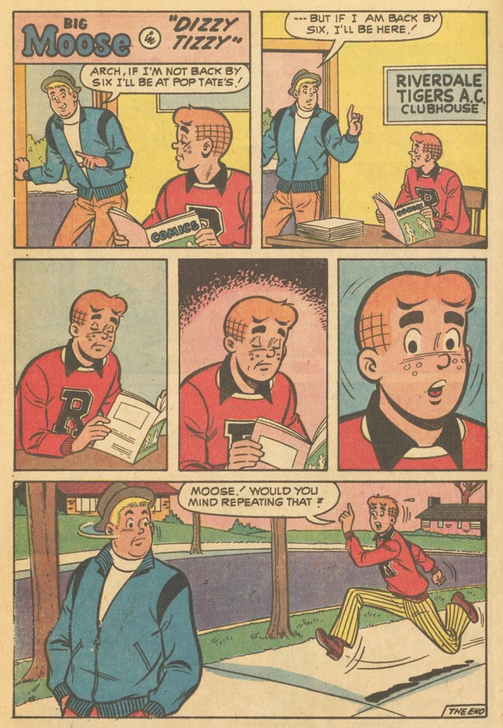
A page from Voice of Doom; script by Frank Doyle, pencils by Schaffenberger, inks by Jon D’Agostino. Published in Archie’s TV Laugh-Out no. 16 (Dec. 1972, Archie).The, er… punchline from Peace of Mind. Script by Frank Doyle, pencils by Schaffenberger, inks (likely) by Chic Stone; published in Archie’s TV Laugh-Out no. 18 (Mar. 1972, Archie).Drawing for Archie wasn’t too much of a stretch for Kurt; whether it was Reggie or The Big Red Cheese getting knocked on his ass, he had his stock posture. This is Shazam no. 22 (Jan-Feb. 1976, DC). Pencils and inks by Mr. Schaffenberger.
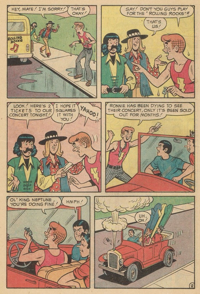
A couple more samples from Mr. Schaffenberger’s all-too-brief Archie period — solid, well-paced, ably-designed and economical storytelling:
A slightly surreal one-pager from Archie’s Joke Book Magazine no. 150 (July 1970, Archie).A page from Luck Struck, published in Archie’s Pals ‘n’ Gals no. 73 (Oct. 1972, Archie); note the Captain Marvel tank top young Mr. Andrews is sporting!
And then, there’s the case of Sal Amendola, a Neal Adams protégé whose reputation in comic books largely rests on a single Batman story, 1974’s ‘Night of the Stalker’, a highly praised tale whose chief conceit is that Batman never utters a word and weeps bitterly at the end. I’d apologise for the spoilers, but honestly, it’s been half a century, what mystery is there to dispel?
An excerpt from Detective Comics no. 439 (Feb.-Mar. 1974, DC); I’ll rarely say this, but Dick Giordano’s inks are an asset in this case, not a liability. The story’s scripting credits are at once hilarious and a bit sad: Steve Englehart, script; Vin and Sal Amendola, plot; and… “from an incident as described by Neal Adams.” Yeah, Neal; that’ll surely earn you a Pulitzer.
Anyway, after his turn in the Bat-spotlight and 1975’s Phoenix, one of the short-lived Atlas-Seaboard‘s more daring titles, Amendola turned up at… Archie. And it was not a good fit.
This, in fact, was the springboard for this post: a couple of years ago, I encountered an Archie story that so grotesquely missed the mark — stylistically speaking — that it bordered on the fascinating. You guessed it, Sal Amendola, utterly out of his element, not to mention, surprisingly… his depth.
Here are a pair of pages from Coach Reproach, published in Everything’s Archie no. 71 (Dec. 1978, Archie), script by George Gladir, pencils by Amendola, inks by Jon D’Agostino.
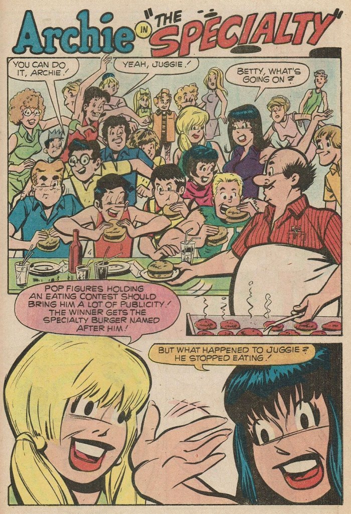
Where to begin? In the first panel, you give Archie a stiff, unnatural pose and you follow it up by repeating it on a background character in the very next panel. And Arch is due for a nasty case of whiplash if he keeps trying to make like Linda Blair.At this point, I’m thinking Sal had learned plenty from his mentor on how to utterly fail at comedy.If what I’ve observed about pitching stances is worth anything, Archie’s about to get brained by a baseball. Ginger boy is also looking right past Coach Kleats. Despite the low bar — issues of quality control were rampant at Archie in the 1970s — this is impressively incompetent storytelling,What happens when you never learn basic inking principles: one creates depth by using thinner lines — and less detail — on background characters, otherwise… visual chaos ensues, as demonstrated here. And Sal’s Betty and Veronica sorely need a brand of shampoo that won’t leave their hair so oily and limp… but the anatomy is beyond help. This is the opening page of The Specialty, from Pep no. 342 (Oct. 1978, Archie).
Schaffenberger’s fellow Golden Age veteran, Gene Colan, also found himself moonlighting in the 1960s. In his case, it was for Marvel, under the alias of ‘Adam Austin’, but also for Dell (just a couple of covers mid-decade) and more significantly for Warren Magazines. In the 1970s, he concentrated on Marvel and was, in the chaos that was the so-called ‘House of Ideas’ at the time, the single most reliable artist in the maelström: surely none can match his seventy consecutive — and meticulously detailed — issues of Tomb of Dracula, in addition to lengthy runs on Howard the Duck, Daredevil, Captain America, Doctor Strange and so forth.
« When writer Jim Shooter became Marvel’s editor-in-chief in the late ‘70s, the tension between Colan and the younger authors came to a head. By 1980, Shooter and Colan were totally at odds with one another over Colan’s approach to storytelling. »
« [Shooter] was harassing the life out of me. I couldn’t make a living,” Colan said. “He frightened me, he really did. He upset me so bad I couldn’t function.” Just as she had urged Colan to quit one job [in] the 1960s, wife Adrienne begged him to leave Marvel in 1980. After delivering his resignation, Colan was asked to sit down and seek resolution with Shooter and publisher Mike Hobson. Colan agreed to the meeting, but declined any overtures to stay at Marvel. “Shooter was in the same room,” Colan recalled, “and I said, ‘That man’s not gonna change. He is what he is. Whether it’s six days, six months or six years, it’s not going to be any different, so I’m not going to put up with it for another minute.‘ » [ source ]
He then scampered over to DC for a few years. His production there was hit-and-miss, but his Batman run (1981-86) was outstanding, pairing him with some of the rare inkers who could do his nuanced pencils justice: Klaus Janson, Tony De Zuñiga (to my amazed delight!) and especially Alfredo Alcala.
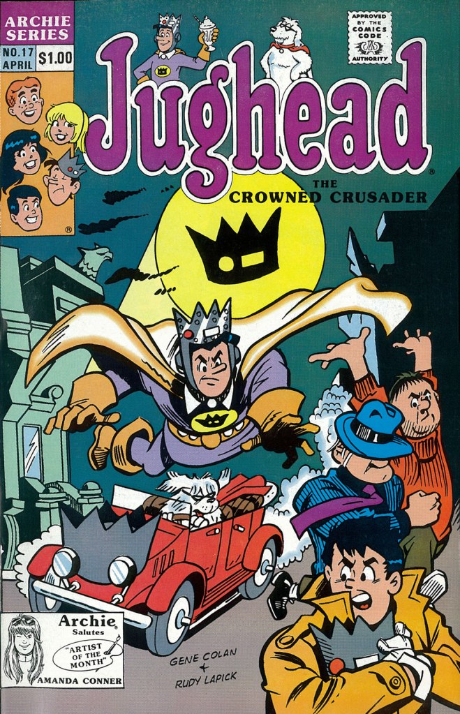
But once his contract ran out, he was out knocking on doors again. Against all odds, Archie beckoned.
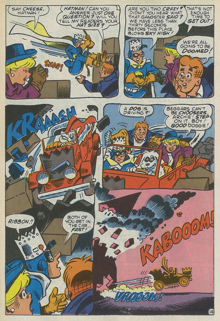
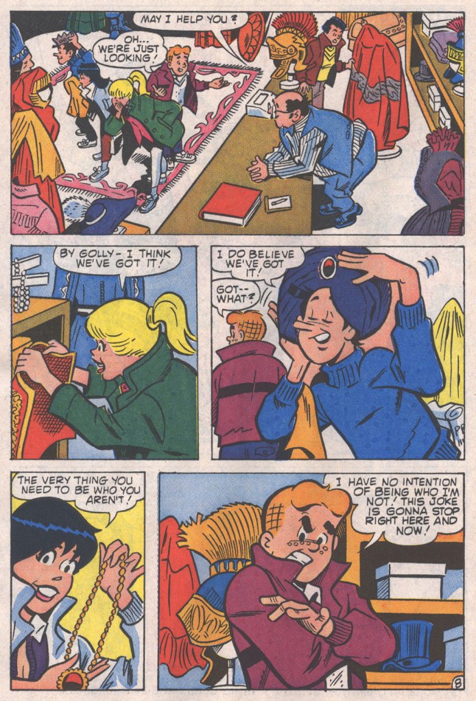
This is the cover — dreadful, I’m afraid — of Jughead no. 17 (Apr. 1990, Archie), reviving the opportunistic, Batman TV show-derived ‘Riverdale Gang as superheroes’ de trop move of the mid-1960s, with even less aplomb. But then the Archie folks were plumbing an especially low point with such ‘experimental’ titles as Jughead’s Diner, Archie 3000, Dilton’s Strange Science, Jughead’s Time Police, Archie’s R/C Racers, Explorers of the Unknown, and of course The Adventures of Bayou Billy.An action-packed — and Colan-shambolic — excerpt from that issue’s Hatman saga, written by Robert Loren Fleming, pencilled by Colan and inked by Rudy Lapick. Notwithstanding his sticking out like the proverbial sore thumb, Colan clearly had a ball working on his Archie stories. He brought some urgently needed chutzpah to a perilously stale formula.A page from Will the Real Archie Please Stand Up!, published in Life with Archie no. 273 (July 1989, Archie), wherein Archie is mistaken for his doppelgänger, a foreign prince named Kafoufi… but of course. Pencilled *and* scripted by Colan, which is most unusual. Oh, and inked by Mr. Lapick, who doesn’t quite know what to do with those ol’ Colan worm-fingers, seen wriggling in panel five.
Contemporary Russian cartoonist (and colourist) Alexey Gorbut, born in Yekaterinburg, had been drawing (by his own admission) since babyhood. When asked in an interview to describe his work in three words, he said ‘I’m always drawing’. As clearly seen from his art, he is a great fan of Golden and Silver age comics, an devotee of old horror comics (he specifically mentions Chamber of Chills* and Tales from the Crypt as favourite anthologies in this interview), with a special affection for Steve Ditko and Alex Raymond. While he wears these influences on his sleeve, his work still boasts plenty of Slavic trimmings, which makes for a really fun blend of styles and perspectives.
Gorbut mostly self-published his stories until 2016. Alexey Volkov spotted his work while looking for an illustrator for a project requiring a Kirby-esque hand, and, smitten with Gorbut’s style and his proclivity for drawing on paper instead of a tablet, offered him to collaborate on a book to be published by Jellyfish Jam. The Alexeys’ first book together was «Победителиневозможного » (2017), a sort of Metal Men seen through the lens of Soviet sci-fi. A team comprising four members who possess fantastical powers, two men, one woman and an android, is on the search — to exact revenge — for their creator, a mysterious time traveller.
The cover of «Победители невозможного » (2017), which translates to something like ‘Vanquishers of the impossible’. “Krackle” notwithstanding, the result actually did not come out Kirby-esque at all — you can see some inside page samples here.
Their next significant collaboration was «Вор теней» (Thief of Shadows), plotted by Volkov and Kirill Kutuzov, who were old childhood friends and partners in comic crimes. The first four issues were published in 2019 by aforementioned Jellyfish Jam, with publishing rights picked up by Bubble Comics on issue 5 and onwards. The series is still going strong, and the Kutuzov, Gorbut and Volkov trio became such a steady team in readers’ minds that they were even assigned an unofficial acronym, KGV (which of course brings to mind ‘KGB’).
Page from Вор теней no. 1: Вор теней и час волка (May 2019, Jellyfish Jam).
The cover of the first collection gathering the first five issues, published in 2020 by Bubble Comics.
« Майор Гром 1939 » (‘Major Thunder 1939’), a seven-story collection, came into being in 2019, a successful stab at recreating a golden age comic with ‘old-school’ storytelling and wackiness.. and far more interesting than Bubble’s Major Grom franchise it sprang from, if you ask me. Volkov and Gorbut took the main series’ characters and transferred their raison d’être to the Soviet era, cooking up a delirious blend of parody with a heavy sprinkling of American comic influences defused by Soviet lifestyle snippets. Titillating details abound, like corrupt billionaire Plague Doctor becoming the Plague Physician, a child of noblemen murdered by the Bolsheviks.
Майор Гром 1939 no. 1… October 1939, I mean 2019, published by Bubble Comics.
Alternate cover for no. 1. If it looks familiar…
… it’s because it should!
Detective Comics no. 31 (September 1939), cover by — or at least credited to — Bob Kane.
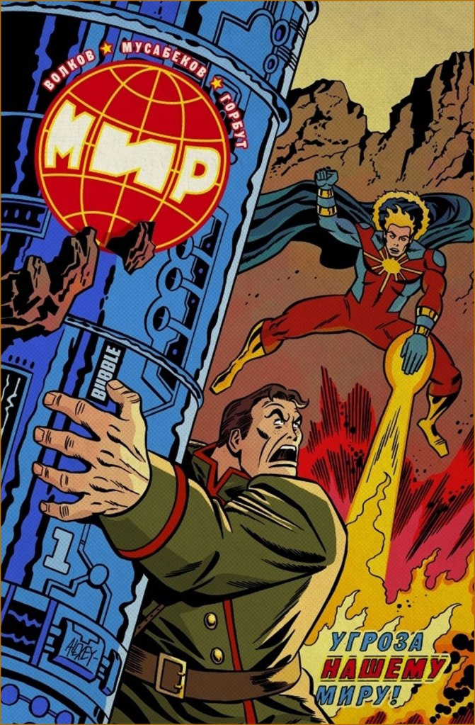
Superhero/sci-fi series «МИР» (2020 and ongoing) is written by Volkov and illustrated by Madibek Musabekov, with the former drawing “real-life” action and the latter, dream sequences and such. Musabekov has a perfectly ordinary, dull, tablet-drawn style devoid of any personality, and he also draws all the covers so that’s one series I’m not going to touch… but Gorbut’s alternate covers can be nice.
МИР no. 1 (August 2020, Bubble Comics)… on the other hand, now ‘Kirby-esque’ has caught up.
More recently Gorbut has adapted Nick Perumov‘s «Кольцо Тьмы» (The Ring of Darkness) fantasy novel series. If it looks like a Lord of the Rings rip-off, that’s because it’s purposefully set in Tolkien’s word, with a hobbit protagonist (not that it makes it less of a rip-off, mind). As it happens, I recently read a novel (from another fantasy cycle) by Perumov, and co-admin RG can confirm that I kept swearing at its prose throughout, though I still finished it out of a sort of morbid fascination. Gorbut’s art is nothing to sneer at, just too bad it’s tied to something so trite. Here is the cover of Volume 1, « Кольцо Тьмы: Эльфийский клинок» (2022, Alpaca), as well as some inside pages:
Those trees in the background are rather Bilibin-esque, which I really like.
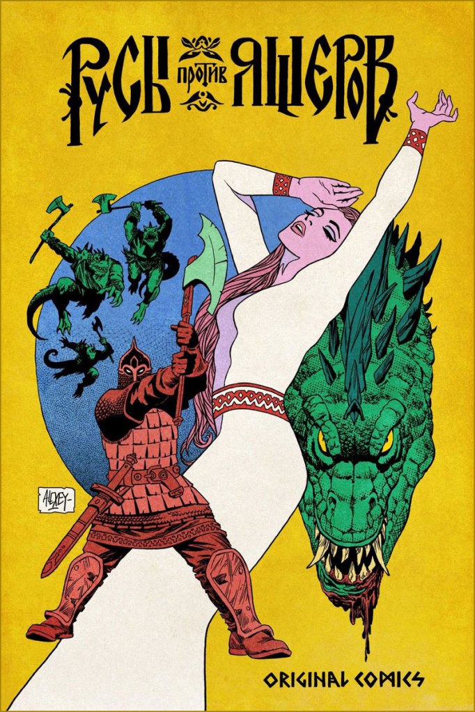
Finally, for more of a Slavic effect (though not devoid of certain European influence!), here are two comics covers created for « Русы против Ящеров » (Lizards Must Die), a videogame released in 2023.
~ ds
* While from the context it’s clear he meant the 1950s Harvey anthology, I think it’s safe to assume he’s equally fond of the 1970s Marvel one.
« Len Norris portrays rather the little man in his everyday complications, and by showing us his, and our own predicaments, he helps relieve us of the burden of the daily toll of bloodshed and terror we see in the news pages. » — Stu Keate
Here’s to a semi-forgotten Canadian legend.
In my long-ago teen years, when I began haunting second-hand bookstores, single-author collections of political cartoons were everywhere, dirt-cheap, largely interchangeable to the untrained eye.. and evidently hard to dispose of.
Most common were collections of The Daily Express’ Ronald “Carl” Giles (1916 – 1995), AKA Giles — but this being Canada, we saw plenty from The Montreal Gazette’s Terry Mosher AKA Aislin and the Vancouver Sun’s twin cartooning stars, Roy Peterson and Len Norris. Peterson is the one that first caught my eye — Vancouver was a long way off — thanks to his quarter-century run illustrating Allan Fotheringham‘s back page column in Maclean’s Magazine. However, I shelled out folding kale for but a single one of these collections, and it was the one comprising the cream of Norris’ 1960-61 output; it turned up in a long-neglected chest at my folks’ place last month, and so it’s ripe for rediscovery.
Here’s a bit of background on the man… born in 1913 in London, England…
« Norris came to Canada with his family when he was 13, growing up in Port Arthur, Ont. (now Thunder Bay). He moved to Toronto during the Great Depression, where his artistic talents landed him jobs in ad agencies. Before he joined The Sun, he was the art director for Canadian Homes and Gardens Magazine.
Norris didn’t become a full-time cartoonist until he joined The Vancouver Sun in 1950.
Norris was a sensation out of the box, picking up a National Newspaper Award for Top Canadian Cartoonist in 1952. His work was so popular that 27 collections of his cartoons were published.
He produced an estimated 8,000 cartoons during his 38 years at The Sun. He officially retired in 1979, but kept producing two cartoons a week until he finally hung up his pen in 1988, at age 75. He died in 1997 at 83. » [ source ]
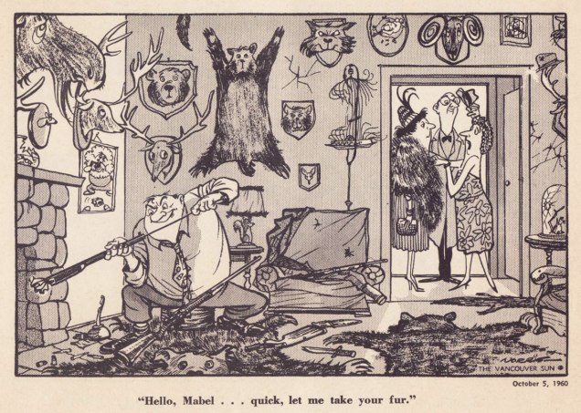
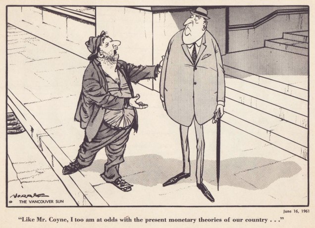
Ah, those quaint Colonials… « The phrase “the natives are getting restless” emerged from racist colonial origins. It sets up a scenario where wise, cool minds are overseeing and running things. And there is a more “savage,” “uncivilized” set of local people, the natives, who are seen as subordinate. Who deserve to be ruled by the lighter-skinned European colonists. »Quite timeless, that one — regrettably.Unlike a couple of these political parties, the Shrine Circus is still around — so it might have been the savvier investment after all. You can take the Englishman out of England, but… it’s snap to picture this appearing in the pages of Punch instead of a North American newspaper.Note that each and every child has his or her own ambulatory posture. Now that’s draftsmanship. Clearly, in Norris’ case, the verisimilitude of each detail, every gesture, springs from a deep well of visual observation — and he was no slouch with the verbal either. Like many a cartoonist, Norris was unambiguously on the side of the animals.I can relate far more readily with this gag since I’ve acquired a home with both a septic tank and lots of greenery.While the point might be a tad obvious — though still worth making — the expert composition is what makes this one special.Speaking of that Punch spirit: with this particular cartoon, Norris gleefully wanders into Rowland Emett‘s garden patch.I love how Norris didn’t stack the deck, where a lesser light surely would have: the members of the academic body on the right are still recognizably educators.Ah, poor Laika. Such a heartbreaking tale. Though she notably inspired a monument in Moscow, an outstanding Finnish rock band, a moving verse of a Divine Comedy song, and this cartoon, it’s a given that the poor doggie would have rather lived her life in peace than die alone and terrified.
The next two make it thanks to bravura use of compositional space. Such chops!
With a population of 3,985 — and rising — Grand Forks, BC, “is Boundary Country’s largest city”. All kidding aside, it does look like a very nice place to visit.Dig if you will the artist’s mastery of volume and gesture, of costume and body language. The Mr. Coyne alluded to is James Elliott Coyne (1910-1979), who was the Bank of Canada’s second Governor, from 1955 to 1961. He resigned in the aftermath of what was known as The Coyne Affair.
His Vancouver Sun colleague Trevor Lautens eloquently depicted the Norris he knew: « Len limned not the pompous event, but the pompous event’s effect on ordinary people. He seemed a small-c conservative, but look and you will find that his drawings were blandly subversive. The bureaucrats were black-suited, pince-nezed satraps. Pietistic Social Crediters wore haloes and walked on fluffy clouds. The Victoria Conservative Club was populated by dozing, look-alike, pear-shaped gents with walrus moustaches. »
For a deeper burrow into Norris’ œuvre and legacy, here’s a fine documentary film on the subject.
« Mushrooms are different. They are not only raw material for the kitchen, they are a theme for endless discussion. They are ever present in our minds, even when we are not discussing them. »
I am not particularly interested in psychoactive mushrooms, though I get asked about them a lot. They may seem like the central topic of today’s post, but I prefer to think of them as an aside to ethnomycology, a word whose roots make it easy to decipher even if you’re not familiar with it. Mainly, the post is about the delightfully psychedelic world of Brian Blomerth. But let me start from afar…
Like any fandom with a very specific pool of knowledge, mycology has its gatekeepers* and its resident celebrities. A cursory glance at mainstream mushroom literature will quickly yield the name of Paul Stamets, mytho (and myco) -logical figure of authority, intrepid entrepreneur, spiritual guide or hack prone to bouts of pseudoscience, depending on whom you ask.
Parsing social media commentary, one might be forgiven for getting the impression that he’s some sort of cult leader. His fan base is arguably loopier than the man himself, but it’s hard to deny that Stamets likes to take basic facts and spin them into a web of conjecture presented as evidence. Add a tendency to proffer medical advice and present mushrooms (especially of the magic kind) as a panacea, not to mention his brisk trade in heavily watered-down mushroom supplements (check it out here), and the sobriquet of “Elon Musk of Mycology”** no longer seems that harsh. Stamets indeed has a lot of research on psycho-active mushrooms under his belt, and as an active advocate for mycology, he may have inspired a number of people to get interested in the topic… but his messianic persona has long eclipsed his early years as a scientist. I’ll have my mushrooms without a side of semi-religious ravings, thank you.
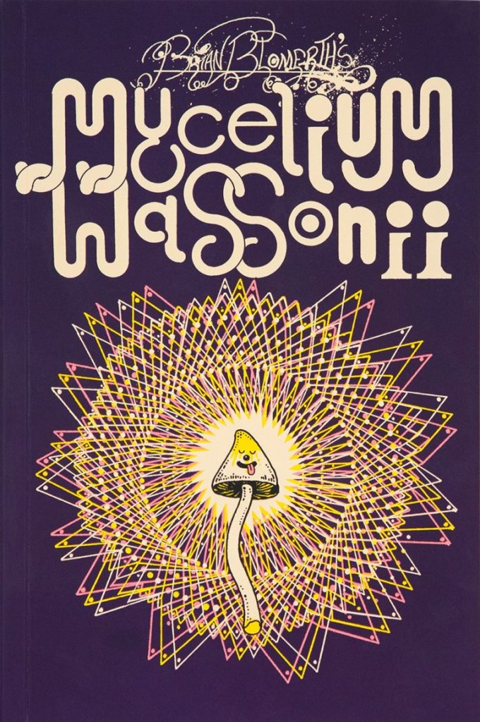
Moving on to the actual topic at hand (believe it or not, I hadn’t set out to write an essay on Stamets), I recently stumbled upon Brian Blomerth’s Mycelium Wassonii and fell in love with the artwork. Then I noticed that Paul Stamets was somehow involved and had an ‘oof’ moment, but fortunately his contribution is simply a (great, admittedly) 2-page introduction, though he shows up in search results alongside Blomerth with the persistence of a cat who wants to be let out. Besides, small contribution or not, I was clearly not passing up the chance to delve into the internal politics of mycology. This is a verbose post, scroll on to the images if you’re so inclined.
The front cover of Brian Blomerth’s Mycelium Wassonii (2021, Anthology Editions).
Anyway, this graphic novel chronicles the mycological adventures of Russian-born pediatrician Valentina Pavlova Guercken and her American husband Robert Gordon Wasson. When Valentina met Gordon, he was of the opinion that mushrooms were ‘putrid’, but his mycophilic wife’s enthusiasm for picking and consuming them so vividly piqued his interest that the two embarked on a series of ethnomycological field studies soon after their honeymoon in 1927. This culminated in the publication of Mushrooms, Russia and History in 1957. 1955 in particular was a pivotal year. During the Wassons’ trip to Mexico, G. Wasson became the first documented Westerner to participate in Velada, a Mazatec mushroom ritual involving the intake of psilocybin. Both Wassons were deeply affected by their Mexican sojourn. Gordon wrote an account of his experiences for Life Magazine, a photo essay titled Seeking the Magic Mushroom. Six days later, This Week published an interview with Valentina wherein she suggested the use of Psilocybe mushrooms as a psychotherapeutic agent, as well as a potential treatment for mental disorders and a way to mitigate pain in terminal diseases. The brouhaha created by these pieces, as well as the samples the Wassons brought back from Mexico that wound up in the hands of Albert Hofmann (‘father’ of LSD), paved the way to a magic mushroom culture.***
‘What do you do with this gross thing?’, asks Gordon. Despite her enthusiasm for psychedelic mushrooms for medication and treatment, Valentina was clearly first interested in them from a gastronomical perspective. I can relate.
Valentina tells the story of how, as a child, she was sent out to get some boletes (Boletus Edulis, ‘borovik’ in Russian) by her mother, but she kept bringing back the wrong thing. I love how Blomerth gives his mushrooms little speech bubbles, like they’re saying something in an alien language to the people going by.
After their honeymoon, Gordon, now a convinced mushroom lover (what did you think honeymoons are for?), the couple returns to NYC and their day jobs. Yet mushrooms are never far from their minds (a familiar affliction), and as they compile recipes, the impulse to collect them in a mushroom cookbook grows.
Gradually, the idea of mycophobic societies as represented by Gordon and mycophilic societies as represented by Valentina takes hold, and the cookbook expands into a treatise about mushroom culture. Ethnomycology is born.
While it can be argued that Gordon’s interest in the Mazatec mushroom culture and subsequent publications about it were motivated by his desire to expand human knowledge, it’s undeniable that he behaved in a less than exemplary way from the onset. The Mazatec wise woman María Sabina (pictured above) who allowed him to be part of the sacred ritual did so because Gordon lied to her about a lost son. He also took a picture of her on the condition of never publishing it, but then revealed her name, location and community in volume 2 of Mushrooms, Russia and History, which led to all manner of tragic and violent repercussions on her life.
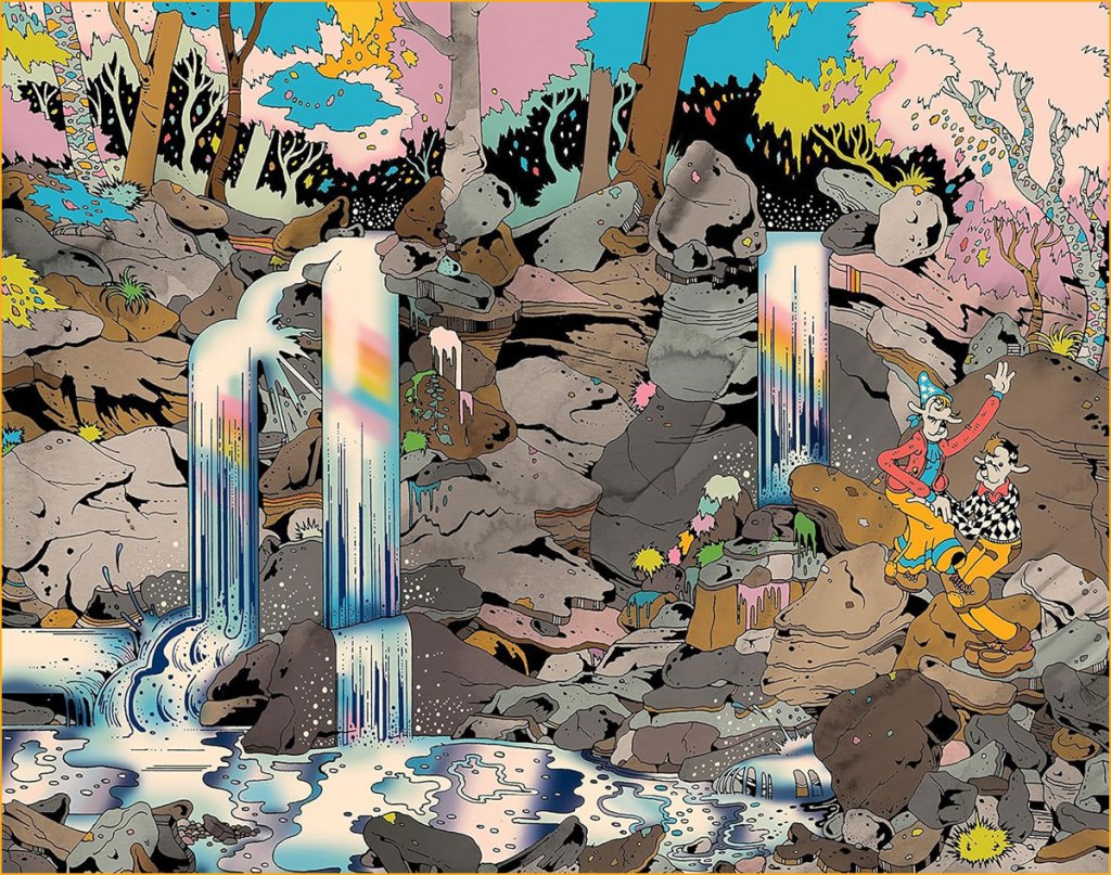
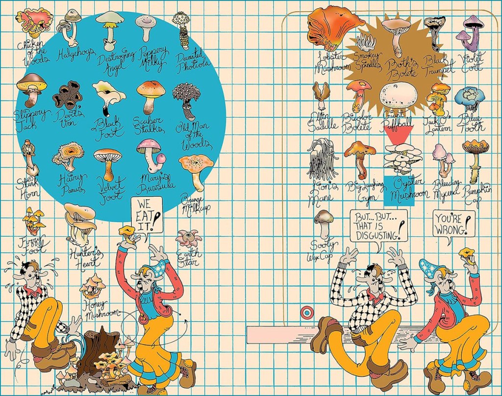
Blomerth deserves many accolades for this book, above and beyond his colourful and cartoony art. He managed to tease a coherent yet detailed storyline out of a topic that reminds me of a Lernaean hydra – pull on one narrative thread, and many more threads spring up. Unsavoury moments are not glossed over, and yet one leaves with an invigorating impression of mycological passion that connects to a general lust for life. Finally, Blomerth draws mushrooms accurately – one can recognize specific species from his drawings.
Head over to his website for some gorgeous t-shirts. Fans of the above material may also be interested in Blomerth’s other mind-expanding (he, he) graphic novel, Bicycle Day, involving the aforementioned Albert Hofmann.
Returning to the topic of fungal superstars, I recommend David Arora as an examplar of a knowledgeable, passionate mycologist who also doesn’t take himself too seriously.
– How did this whole mushroom thing start?
– I’m not entirely sure… I think I just loved my wife.
~ ds
* In this particular case, said gatekeeping is motivated by nobler motives, namely those of keeping people safe. Some of these fungal newbies throw themselves in headlong, disregarding the very possible and palpably lethal outcomes of misidentification.
** Someone on Facebook coined this term and I had a good chuckle. On an even pettier note, Stamets chose, for his website, a white font on a blue background… and my eyes do not appreciate it.
*** Here I am somewhat constrained by space, as I have already ventured far off the field of actual comics. I haven’t even touched upon the subject of people (proto-hippies?) who travelled to Mexico in order to locate María Sabina and/or magic mushrooms (famously, John Lennon et al.) or the CIA’s involvement with the Wassons.
« I was a peaceful sedentary man, a lover of a quiet life, with no appetite for perils and commotions. But I was beginning to realise that I was very obstinate. » — John Buchan
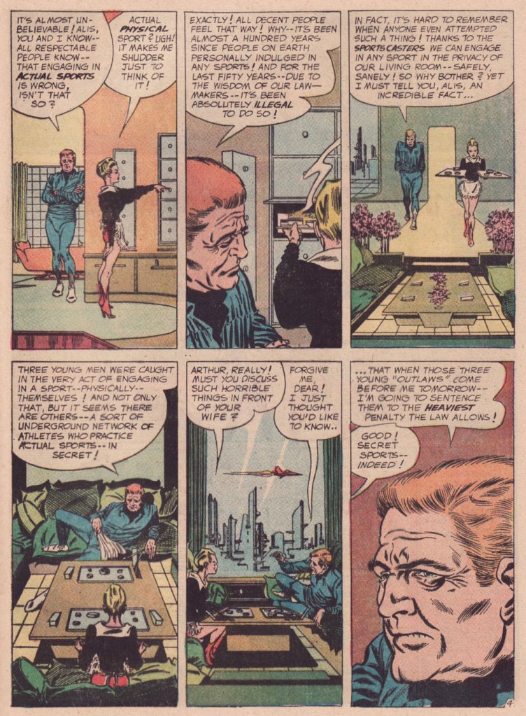
Over the course of several posts, I’ve extolled at length Carmine Infantino‘s skill as a cover designer. Yet the ability to envision and execute a single static image does not automatically translate into the skill of clearly and tidily breaking down a story into a suite of sequential panels, in much that same way that a superbly dexterous surgeon may be incapable of writing legibly. It pleases me to declare that Mr. Infantino’s no one-way specialist.
Infantino describes the evolution of his visual thinking: « The use of negative and positive shapes inside the panel had to mean something. So, to me, if the shapes didn’t draw the eye in, then they weren’t worthwhile. I had to move and change the shape to make it work for me. And that’s what I did. For me beforehand, the figure was the most important thing, and nothing else in the panel mattered. But later on, I found out that it was the total figure I had to worry about. » (all Infantino quotes excerpted from The Amazing World of Carmine Infantino: an Autobiography (2000, Vanguard Productions; edited by J. David Spurlock)
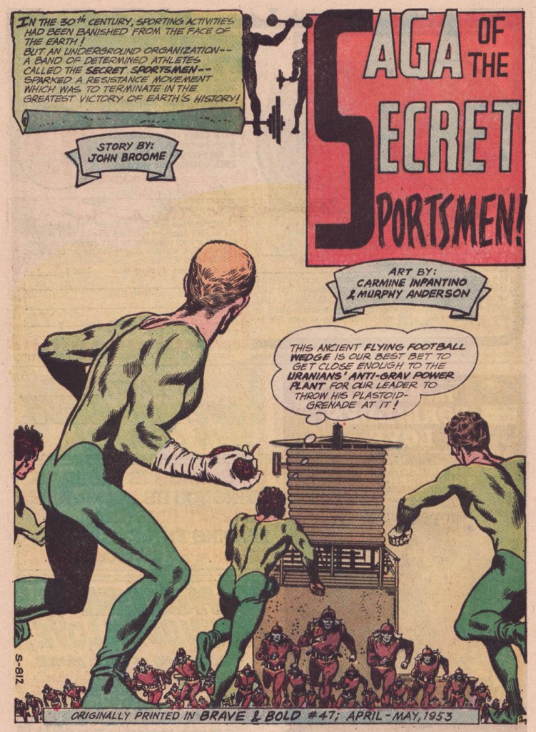
I’ve long wanted to feature this particular tale… for both script and artwork reasons. However, my copy was in Mysteries in Space: The Best of DC Science Fiction Comics (Apr. 1980, Simon and Schuster/Fireside; Michael Uslan, editor)… and I’d be all-but-guaranteed to destroy this beloved book in any attempt to scan from it. But — aha! — I’ve recently acquired a copy of DC Special no. 13 (Jul.-Aug. 1971), which granted the tale its first encore. Game on!
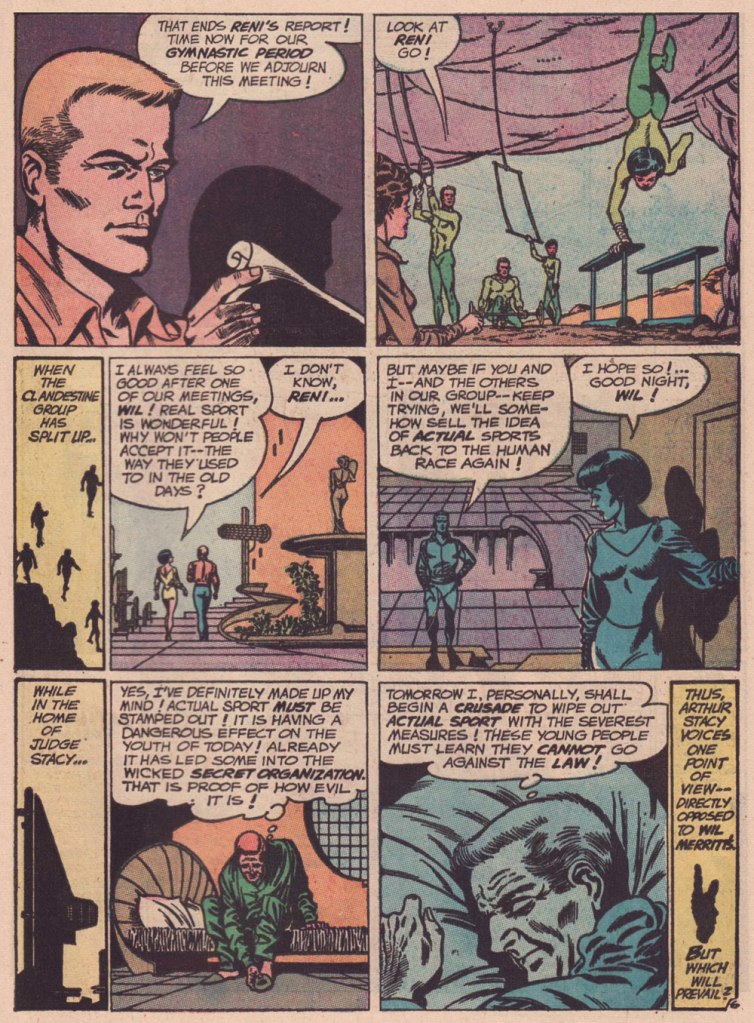
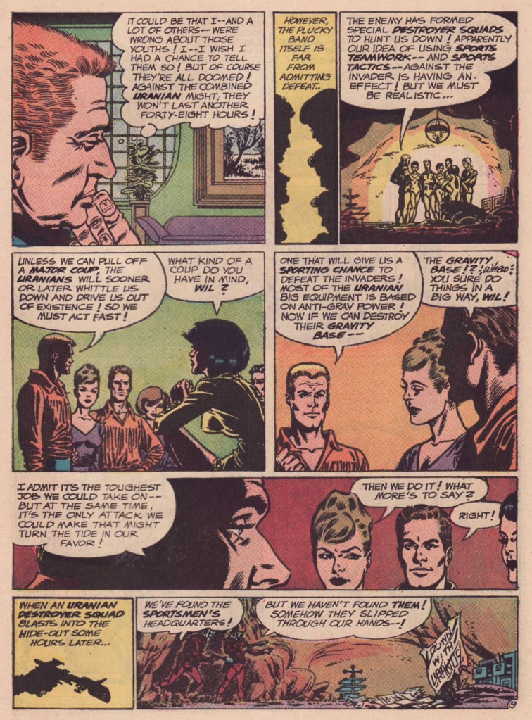
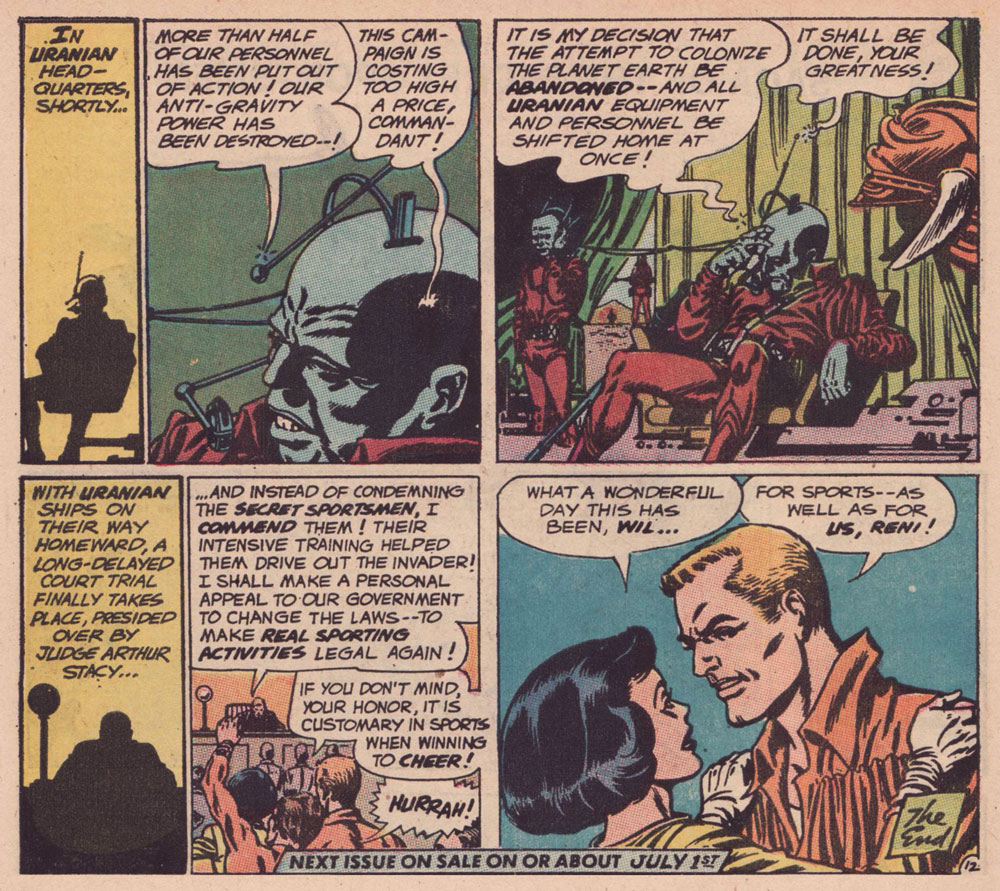
Someone slightly goofed here : The Brave and the Bold no. 47 was published in April-May 1963, not 1953.
.
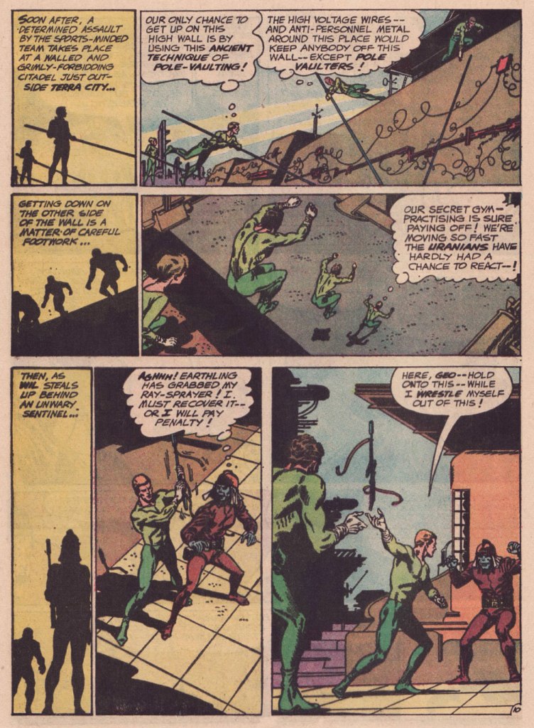
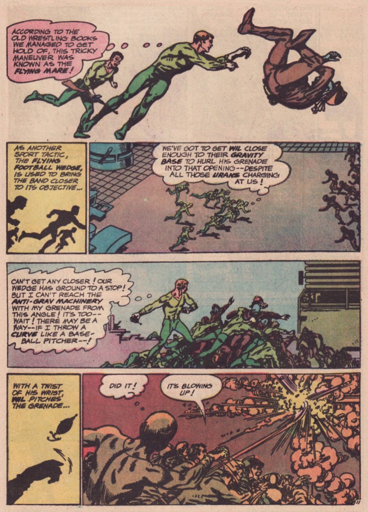
« The silhouettes I used in ‘Strange Sports Stories‘ [featured in The Brave and the Bold nos. 45-49] were innovations. Julie [editor Julius Schwartz] gave me the script and said, ‘We want this book to look different.” That’s all he said, and I went home and what I devised to make it look different was by using silhouettes as a dramatic device. The action starts in the silhouette, and then you go to the conventional panel, and the action follows through. One might almost call it an animated treatment. »
.
.
.
.
.
.
.
.
.
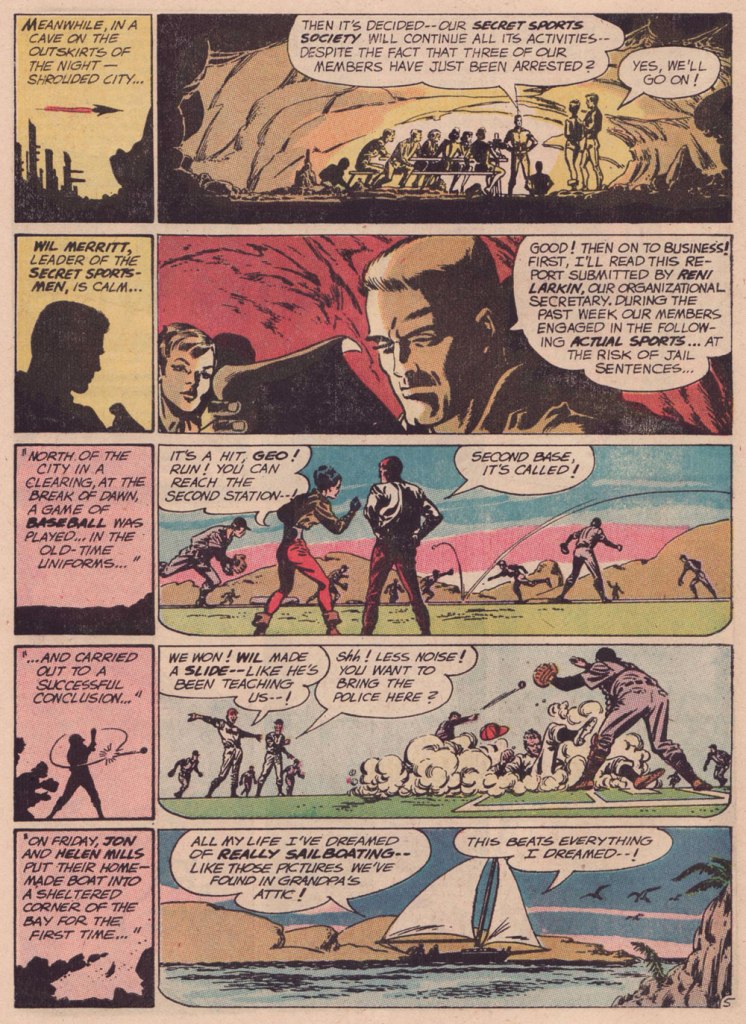
As smooth and effective as the Infantino-Anderson pairing looks, there was some friction behind the scenes. Infantino explains: « I was beginning to experiment at the time and I threw anatomy out in favor of a higher level of design. Murphy was an excellent draftsman and I’d try to explain what I was trying to achieve to him but this was quite contrary to his own sensibilities. The more stylized I became, the more he thought the work had to be ‘fixed up‘. At one point, he asked for a raise because he had to change my work so much. What he thought he had to ‘fix‘ was the new style I was most excited about. »
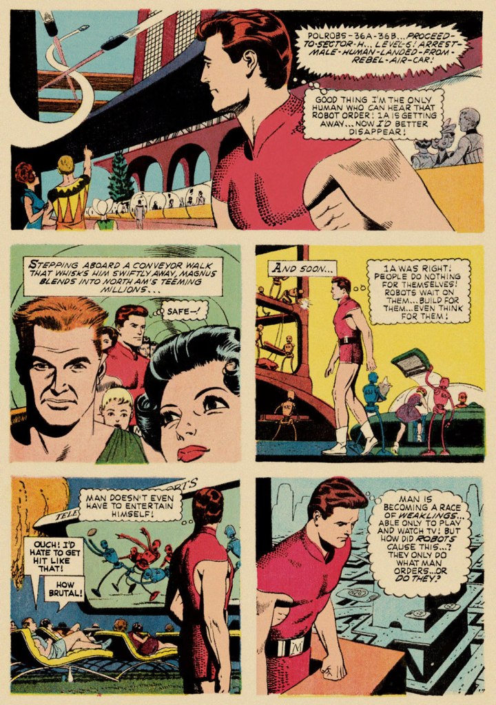
Our featured story shares a central perspective with Russ Manning‘s rightly celebrated Magnus, Robot Fighter, whose inaugural issue had come out a mere two months earlier — though with that close a gap, it’s most likely a simple case of coincidence.
A relevant page from Magnus, Robot Fighter 4000 A.D. no. 1 (Feb. 1963, Gold Key); story and art by Manning, with input from editor Craig Chase, who initially pitched the idea of a SF hero to the publisher.
Are we getting less physically able with every succeeding generation, as our elders have been claiming for eons? Is it just a mistaken, shallow assessment arising from tone-deaf obduracy and bad faith — or have our forerunners all been correct about a general and ongoing decline?