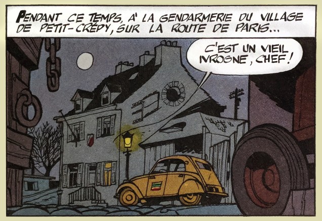
« Plenty of nocturnal ambiance in this book… It stems, I suppose, from an old childhood reminiscence. When I was little, gaslit street lamps were still around, and they created, in the evening, rather extraordinary effects of light. That slightly sinister element stuck with me, and I love to recreate this sort of thing. » – Maurice Tillieux
Private detective Gil Jourdan finds the proper spot from which to conduct a nocturnal stakeout, in his fourth (and possibly finest) investigation, « Les cargos du crépuscule », originally serialized weekly in issues 1113 to 1137 of Spirou magazine, back in 1959-60.
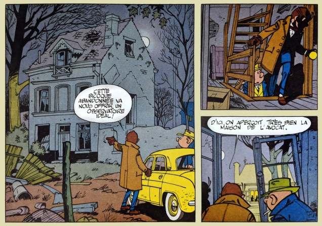
Story and art by Maurice Tillieux (1921-1978), one of the truly great European masters of…well, everything he handled: humour, atmosphere, pacing, local colour, dialogue...
Ah, but this time, non-French-fluent readers won’t be left out in the cold. The late Fantagraphics co-publisher Kim Thompson was a lifelong fan of Tillieux’s work, and was quite willing to put words into action and bleed some money in the process. Before his passing in 2013, he had time to publish a pair of twofer volumes of Jourdan (slightly renamed Gil Jordan*) adventures, « Murder by High Tide » (which contains this tale, entitled here « Leap of Faith ») and « Ten Thousand Years in Hell ». Fans of clever and suspenseful noir should not miss these babies.
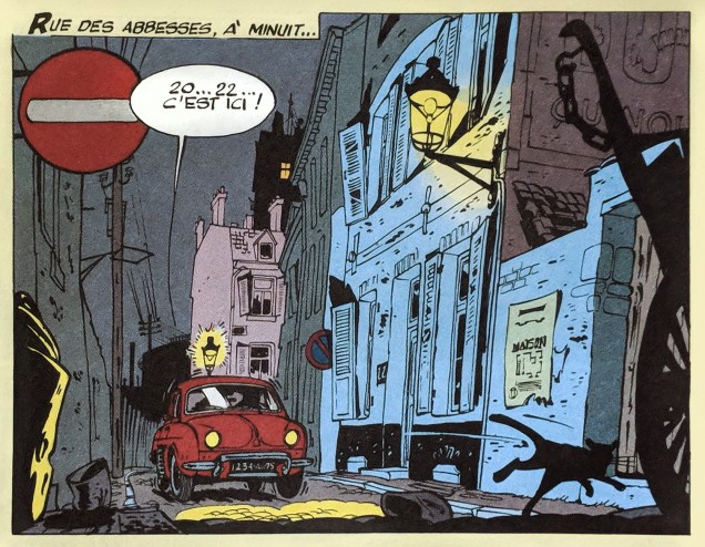
Fudging a bit here, this is a panel from « La voiture immergée », aka « Murder by High Tide ». Please forgive this old sinner.
This being a Hallowe’en post, I’ve squarely put the emphasis on mood rather than action, but let me assure you that these bédés contain plenty of action, and of the highest calibre. Fantagraphics’ promotional blurb gets it right (except that the Hergé comparison is perhaps a bit lazy, but probably necessary given the audience): « Another never-before-translated classic from the Golden Age of Franco-Belgian comics, finally brought to American readers. Imagine the beautifully crisp images of Hergé (Tintin) put in service of a series of wise-cracking, fast-paced detective stories punctuated with scenes of spectacular vehicular mayhem (including in this volume a dockside pursuit via car and bulldozer) and you’ll see why 50 years later Gil Jordan is still considered a masterpiece in Europe. »
– RG
*I can’t help but think that the detective’s renaming to « Gil Jordan » was a bit of a Fantagraphics inside joke, given that the publisher employed, for a couple of decades or so, a news correspondent/translator/editor by the name of… Gil Jordan. It’s not as if « Jourdan » is such an unknown name to Americans.
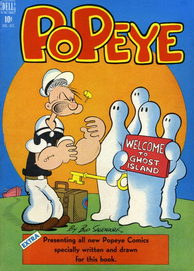
« Greetings, friends. Did we catch any of those horrible ghosts in my famous ghost traps? » – J. Wellington Wimpy, up to no good as usual
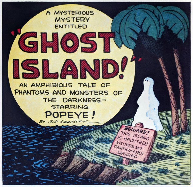
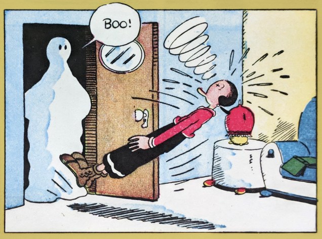
I absolutely adore how, in Popeye the sailor’s salty vernacular, revenants are referred to as « ghosks ». Aww… Let’s meet a few of these spooks, who most often, to this reader’s regret, turn out to be mere goons in sheets. Oh well.
This is Popeye no.3 (Aug.-Oct. 1948, Dell). As the cover states, story and art by Bud Sagendorf, Thimble Theatre creator Elzie Segar‘s assistant and eventual successor.Here, then, a few highlights from Popeye 3’s cover story.
Crude but effective.The facts speak for themselves.
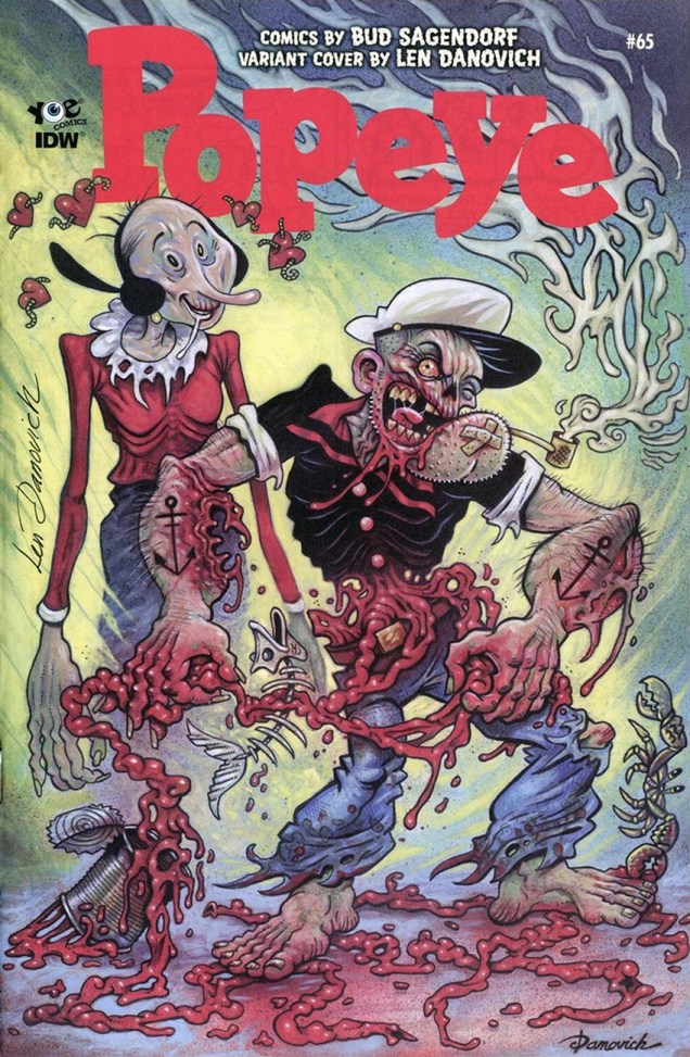
Dell published 65 issues of Popeye, then Gold Key took over… long story. This is Gold Key’s second issue, Popeye the Sailor no. 67 (Jan. 1963). Say, is that Patcheye’s Ghosk? Well, blow me down, it is! Story and art presumably by Forrest Cowles “Bud” Sagendorf. In a rather more modern, yet still topical… vein, here’s Len Danovich‘s striking variant cover to the most recent issue of IDW’s Classic Popeye (no. 65, Dec. 2017), quite a rarity and now commanding some rather formidable prices, from what I’ve observed. Is this to be the final issue of Classic Popeye, now that the end of the Dell run has been reached? Nearly a year on, the question still remains. Mr. Yoe?
Pacific Comics have already been part of our Tentacle Tuesday line-up (see here), but I’d like to finish what I started. Our intrepid team (read: me and husband) has gone through a bunch of PC comics to save you the trouble of looking for tentacles where there’s none to be found (sniff, sniff). The result? (Only) two covers, and a horrifying (in its implications) inside story.
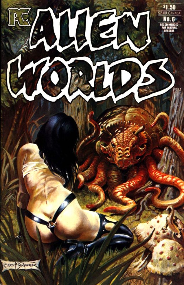
Have you ever seen a Rhunk? That’s the friendly (*too* friendly, as we’ll see later) creature with a snout and a full set of tentacles you see below.
Alien Worlds #6 (February 1984), cover by Frank Brunner.
“Pride of the Fleet” (written by Bruce Jones, pencilled by Frank Brunner and inked by Mike Mignola), published in this issue, is a chilling story, but not because of the alien creature that threatens the swordmistress and her highly impractical costume. Have I already mentioned that Bruce Jones can get seriously nasty?
“Methodically, as if confident of the helplessness of its prey, it advanced on her, muscles riding in sensuous rhythm along its shoulders, tentacles twitching in anticipation. Sheffield felt her blood turn to ice…”
This is the story of a highly intelligent but “funny-looking” man who wanted Dejah Thoris (our heroine) so badly that he transformed himself into a rhunk (and tricked her into doing the same) just so he could rape her. To which I’ll add that she trusted and admired him, and considered him a (platonic) friend. Talk about a horror story about one of those prototypical “nice” guys. Ouch.
I really hope she’ll have the satisfaction of dismembering him at some point, but it seems unlikely. You can read the story here.
I realize that it’s anticlimactic – some straightforward spiky plant tentacles after the previous mindfuckery – but to get PC over with, one more cover:
« It was the town dandy! That spiffy cigar-store indian! Within the impact of a second I knew what I had to do! » – Ron gets it wrong.
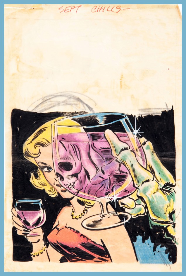
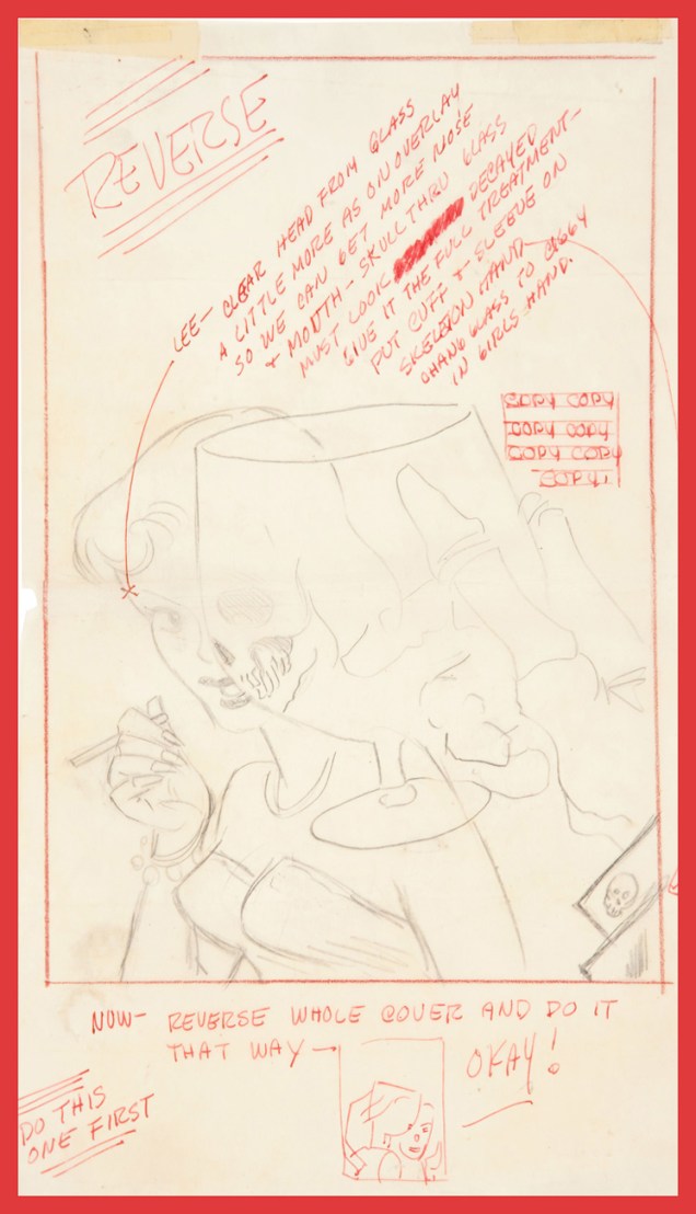
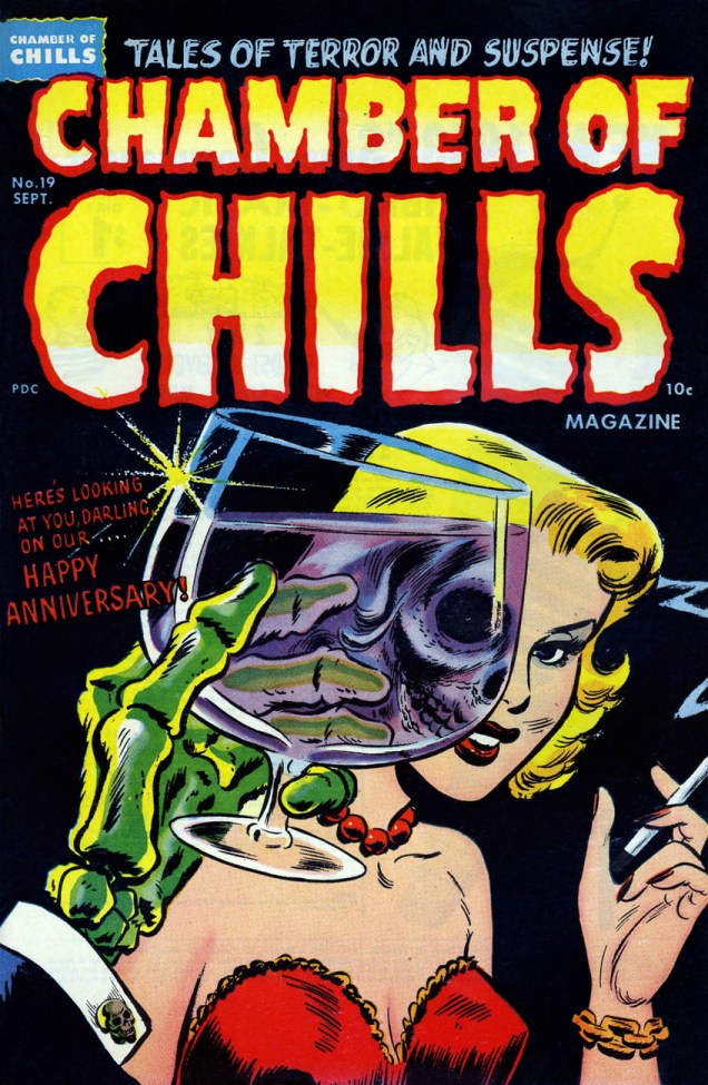
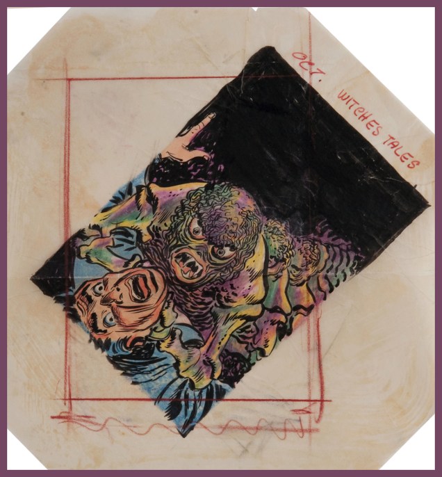
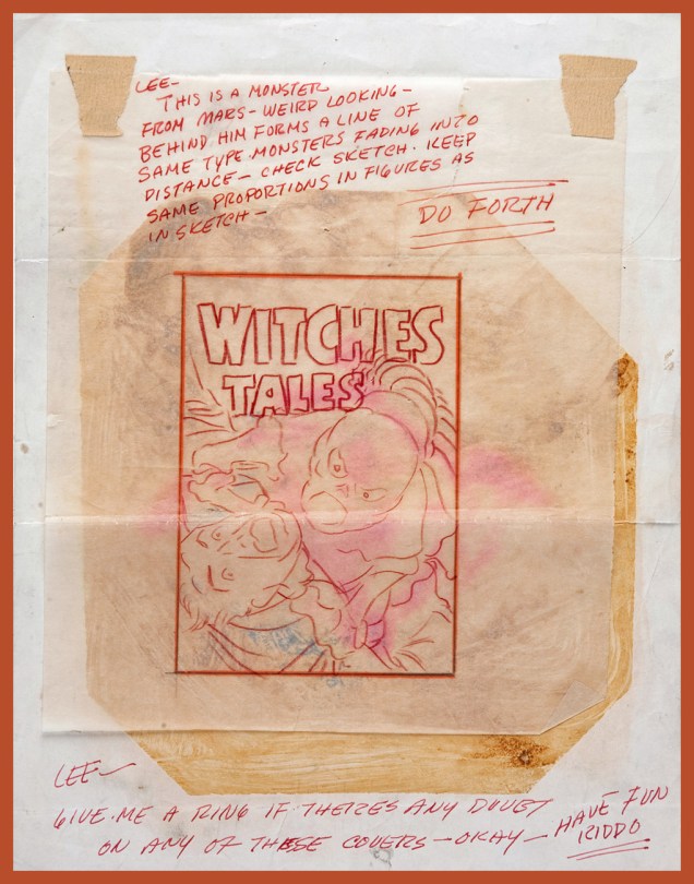
It’s become a historical footnote that, before fully settling into their (for a time) winning formula of lighthearted, cartoony monomania with Casper, Richie Rich, Little Dot and their ilk, Harvey Comics had published, pre-Code, some of the most, er… transgressive horror comics in the field. And before he settled down to designing and pencilling the lion’s share of Harvey Comics‘ admittedly inventive and arresting covers, art director Warren Kremer had fulfilled many of the same in-house duties in the more daring and diverse pre-Code years. A remarkably inventive and versatile artist, Kremer’s true worth has historically been obscured by his retiring, behind-the-scenes status, as well as the Harvey family’s plantation mentality. Today, let’s take a peek at the nuts and bolts of his collaborative partnership with cover artist Lee Elias, who would go on to become one of DC’s most straight-laced artists (though his talent remained undimmed.) It would seem, and it’s quite understandable, that a lot of artists who’d merrily produced horror comics in the early 1950s got burned by the ensuing censorious witch hunt / backlash… and became quite timid thereafter.
Warren Kremer’s original cover sketch and colour guide.… and his instructions to the final artist, in this case Lee Elias.As it appeared in print, this is Chamber of Chills Magazine no. 19 (Sept. 1953.) Marvel borrowed the title in the 1970s… Harvey clearly had no further use for it.
Another one? But of course!
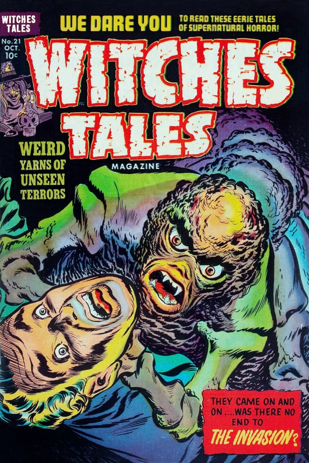
Kremer was evidently a believer in the « tilt the drawing to make it more dynamic » rule of layout (as DC’s Carmine Infantinonotoriously was)Kremer to Elias, again. An illustrator is quite blessed indeed when he gets to work with such a talented, insightful and friendly art director.Elias’ finished version, as it appeared on the stands. This is Witches’ Tales Magazine no. 21 (Oct. 1953).
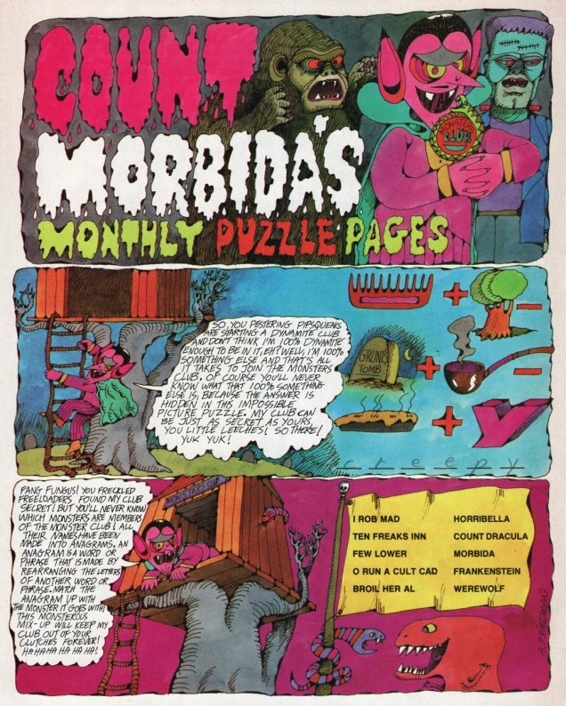
« Grave grunge! You giggling squigglers wriggled around my fashion foul-up and found the store’s name! » – Count Morbida, vowing revenge
Jumping Jellyfish! Here’s the ghoulishly lovely and eerily colourful poster you got with your March 1976 issue of Dynamite magazine, numero 21, cover-featuring Bill Cosby, Sidney Poitier and Jimmy Walker, stars of the recently-released sequel to Uptown Saturday Night, the honestly-titled Let’s Do It Again.
Said poster features dapper Count Morbida (and friends, er, fiends), lovingly rendered by Arthur Friedman (hopefully no relation to evil crank Milton).
The cranky-but-adorable Count hosted his own Monthly Puzzle Pages in Dynamite, and even if the challenges were child’s play, they rarely failed to entertain on the verbal and visual level. Linda Williams Aber (aka Magic Wanda) ably juggled the bons mots.
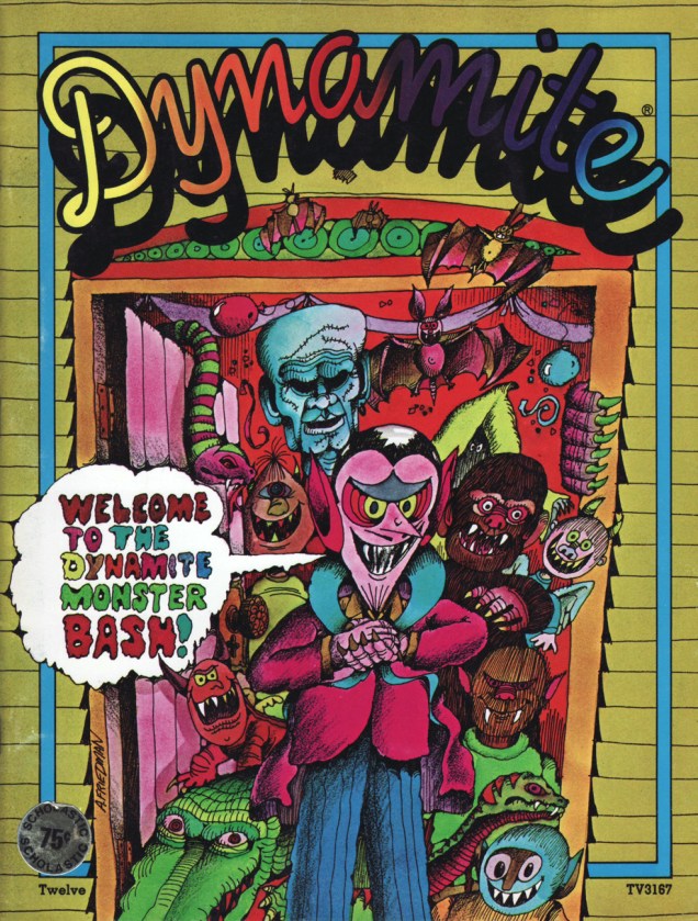
Despite his unrepentantly evil ways, the crafty nobleman accrued sufficient popularity to glom cover-feature honours a few times, as well as a spinoff book or two. Case in point: Dynamite 12 (June, 1975, Scholastic).
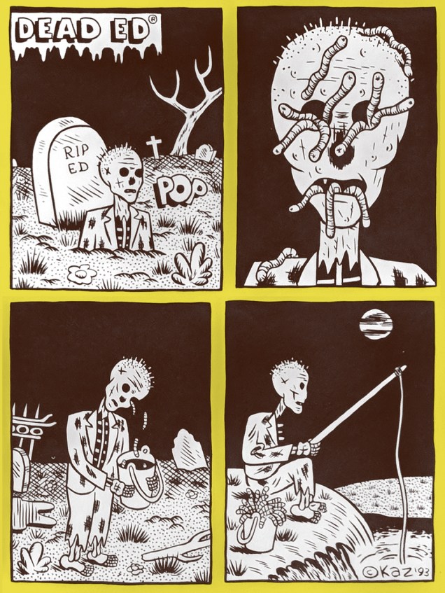
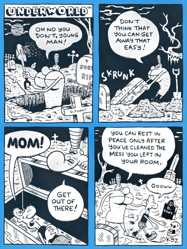
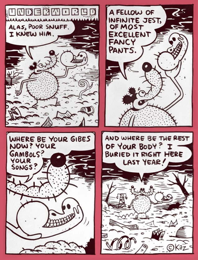
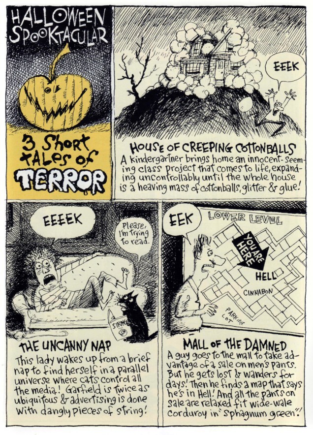
Underworld is the rabid brainchild of American cartoon god (néKazimieras Gediminas Prapuolenis in 1959) alias (for some reason) Kaz. Underworld has been appearing in various alternative weeklies since 1992. But none in my neck of the woods, naturally. Grr.
Fortunately, the discerning folks at Fantagraphics have thus far issued five Underworld collections, plus, a couple years back, an imposing omnibus, each of them wonderful, surreal, morbid and unnaturally comforting. Perfect Hallowe’en reading? You bet. Skrunk!
« Within this general framework of unbridled insanity, we got in our digs at corporate culture. » – Jay Lynch (1945-2017)
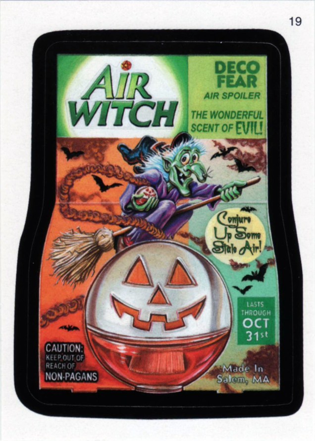
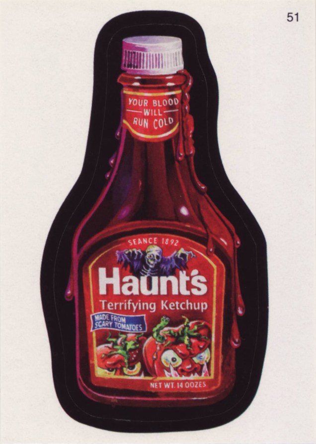
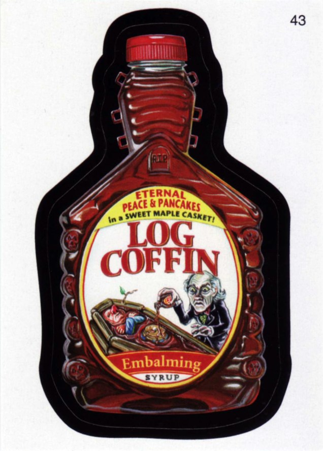
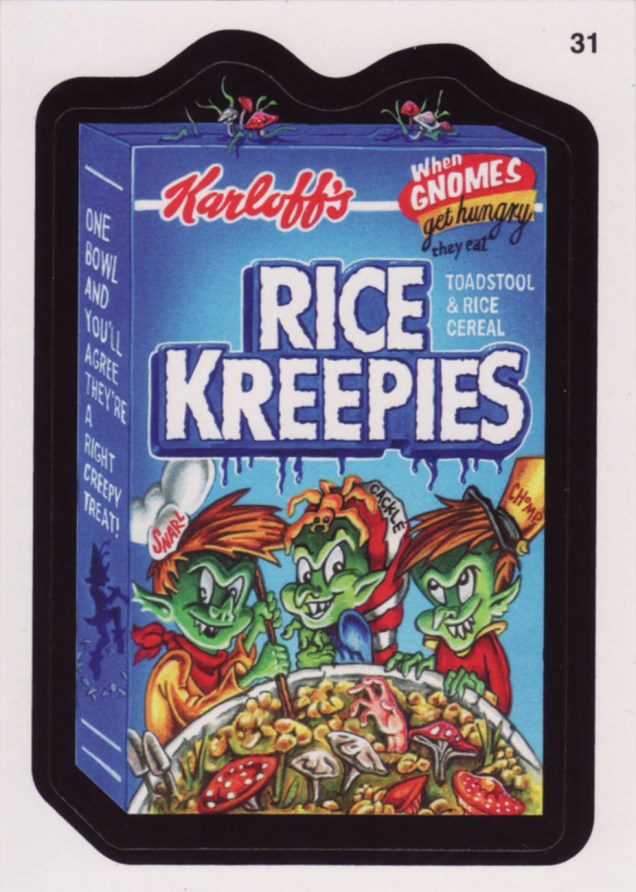
One could be reasonably forgiven for thinking that most cultural staples of one’s youth had just gone away after they slipped beneath one’s radar, or the craze fizzled out. Not so with Topps’ resilient Wacky Packages… they go away for a few years, then resurface in times of greater need. One does have to wonder what their exact audience is, though: some of these jokes and allusions take direct aim at adult sensibilities. Case in point: 2006’s « Brokeback Mountain Duo, The Drink You Wish You Could Quit » (courtesy of twisted masterminds Jay Lynch and John Pound).
Without further ado, instead of the old stickers you fondly but perhaps dimly recall, here are some recent ones you most likely haven’t encountered (though the objects of parody will be familiar), with the properly spooky thematic accent, of course.
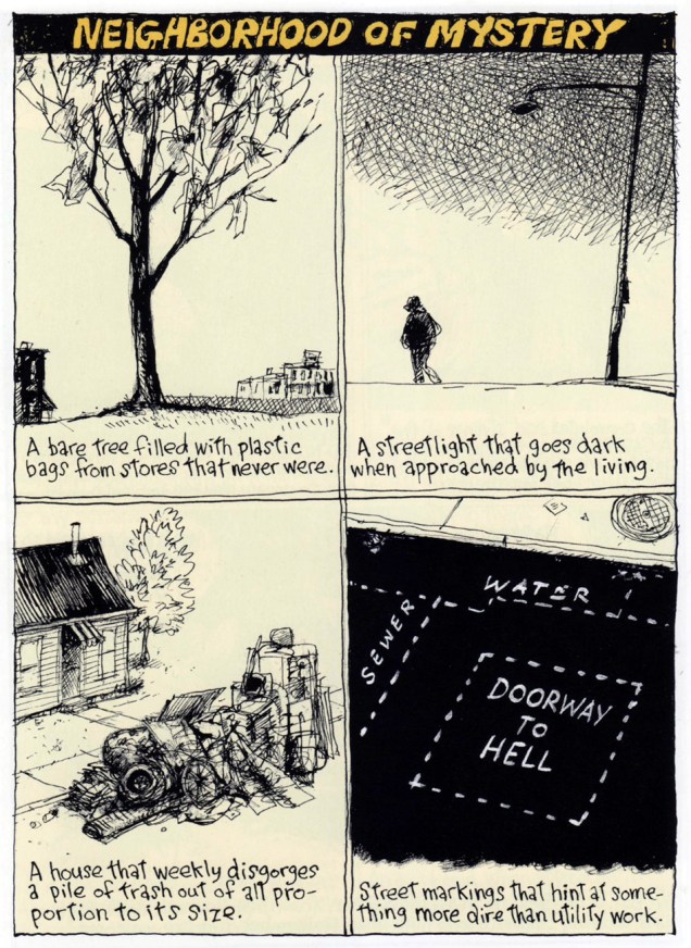
Here, then, is a trio of seasonally-and-thematically pertinent excerpts from his Richard’s Poor Almanac, a feature that made its august début in The Washington Post in 1997. Mr. Thompson is somewhat better known for his (other) masterpiece, the beyond-brilliant suburban family comic strip, Cul de Sac (2004-2012).
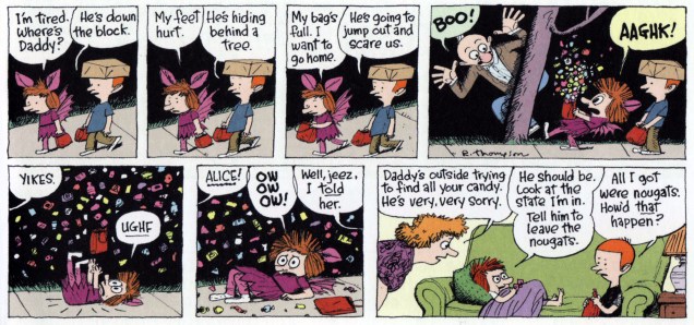
And since I brought up Cul de Sac, and insolently pilfered a panel from it for this post’s preview image, I would be remiss in my duties were I to not include the strip in its entirety. Here you are.
This one originally saw print on Sunday, October 26, 2008.
For more of Mr. Thompson’s Almanac, check out, if you will, this earlier post on the topic.
« Despite his actions, there is to me a sadness about Dracula, a brooding, withdrawn unhappiness. He is in this world, but he is not of this world. He is a demon, but he is above all a man. » — Christopher Lee, from his foreword.
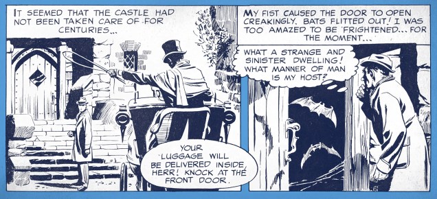
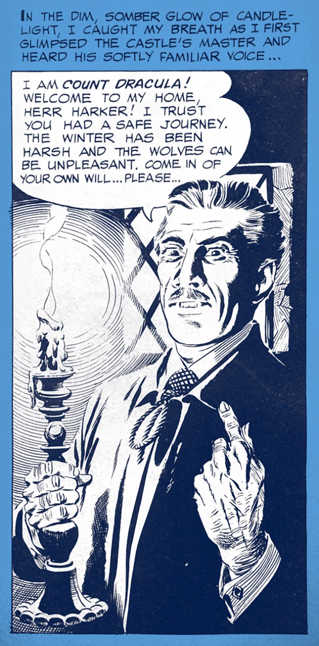
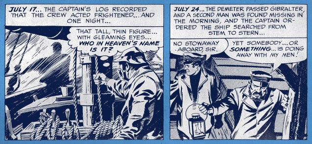
In 1966, Russ Jones (Creepy Magazine’s founding editor) sold Ballantine Books on an « Illustrated comic strip » (redundant, I know… the term ‘graphic novel’ had yet to be coined) adaptation of Bram Stoker‘s notorious Dracula, first published in 1897. For this purpose, Jones assembled the team of writers Otto Binder and (future The Love Boat scripter) Craig Tennis and illustrator Alden McWilliams (Rip Kirby, work for Warren, Gold Key, Archie and DC).
The story’s opening splash. The choice of Alex Raymond disciple McWilliams to bring visual life to this literary chestnut may not have been a daring one, but it certainly was a solid one.Jonathan Harker’s journey ends at Castle Dracula.A certain sanguinary nobleman introduces himself.A snapshot from The Demeter’s doom-laden journey to England.McWilliams has no difficulty in conveying the more… erotic facets of Stoker’s novel.
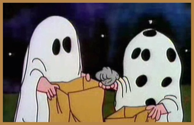
« Charlie Brown’s bad luck trick-or-treating earned him a lot of sympathy amongst young viewers, to the extent that some mailed candy for Charlie Brown to the TV channels that aired the special. In recent years, many fans have viewed the gag as disturbing, viewing it as a conspiracy among the adults to torture Charlie Brown by denying him candy. »
Interestingly, the gag about Charlie Brown’s inadvertent rock collection was introduced here, not in the strip, though it was alluded to in the November 1st, 1975 strip, a whole nine years down the line. Found it in my copy of « Think Thinner, Snoopy » As a bonus, here’s a clever modern update on the classic sequence, from the long-defunct ifyouseesomething.net.