Unsettling Lands Between Girlhood and Womanhood: Trots and Bonnie

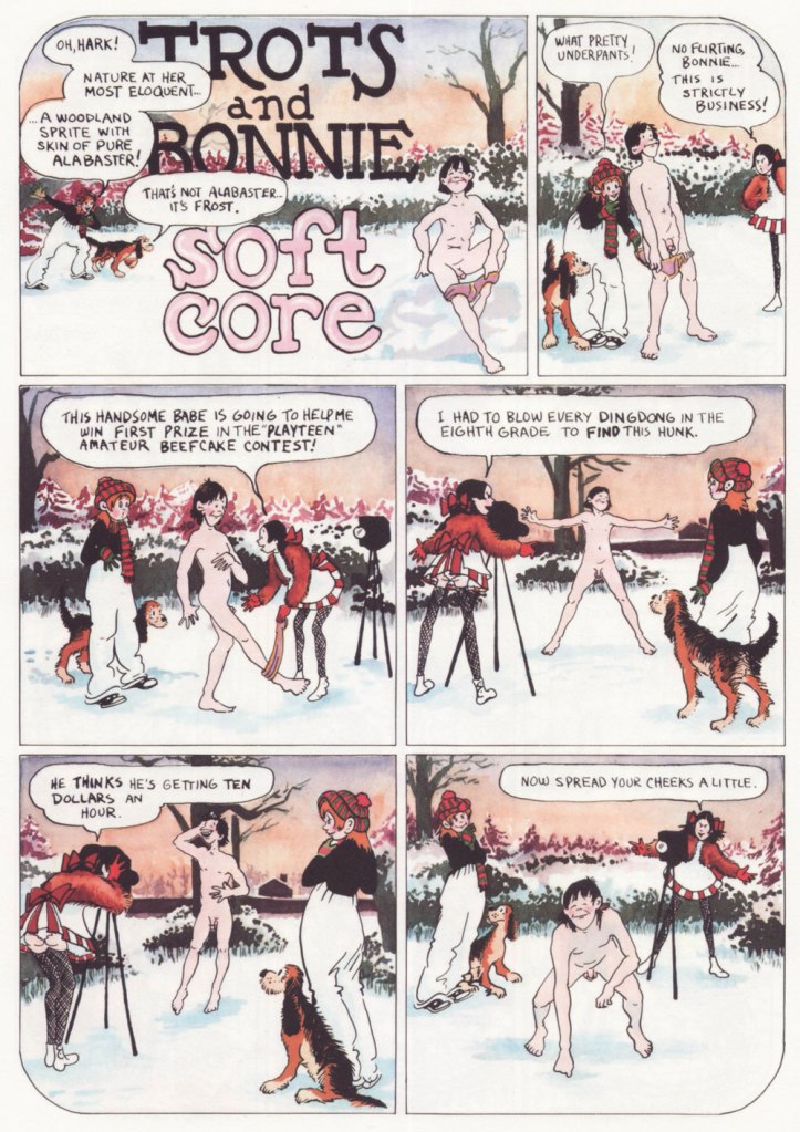
« Bonnie and Pepsi are obsessed with sex, but they’re not there for the male gaze. Their desire is frank and straightforward and more than a little demented, and it’s depicted with a bracing honesty that feels less like a political statement and more like Flenniken is reporting from the front lines with no filter, no safety net, and no intention of telling anything but the truth. »*

I first came across a Shary Flenniken‘s Trots and Bonnie strip in some random issue of National Lampoon. I can’t even really narrow down the decade**, as it ran within its pages from 1972 all the way to 1990. I was intrigued, but not enough to pursue it.

When New York Review Comics published a Trots and Bonnie collection in 2021, gathering 160 strips in a handsome hardcover volume, I was happy to finally be able to partake of T&B in a more organized fashion. One perplexing thing about this collection is that some strips were omitted due to concerns of misinterpretation***. It was apparently feared that some topics would be too controversial, or that the modern reader has lost the ability to interpret things in context. I would have liked the possibility of deciding what has or hasn’t aged well for myself. As it stands, this collection features strips offering a most varied list of topics to horrify the easily triggered (rape, racial epithets, kids getting shot, electrocuted and castrated – albeit by other kids – and pedophilia), so I am truly curious what the censored strips were about. I guess I am now doomed to collect National Lampoon issues (to be fair, the latter was home to many a great cartoonist – Rick Geary, M.K. Brown, Stan Mack, etc.)

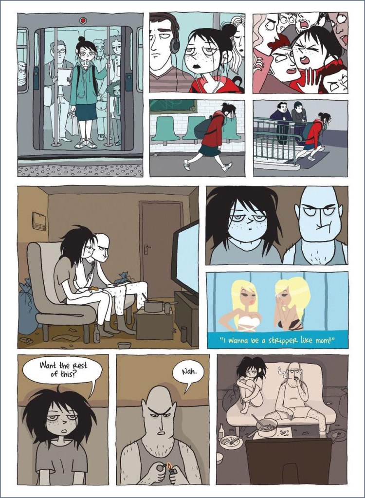
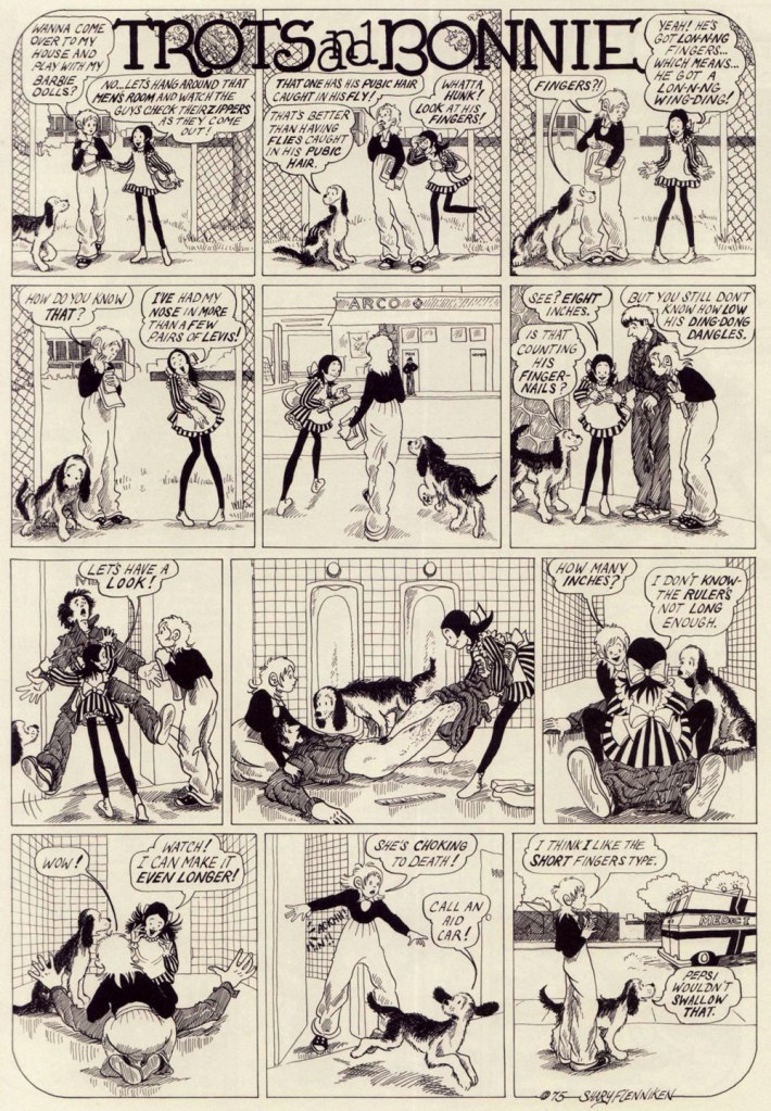
Trots and Bonnie is a hilarious strip, and it’s also quite unsettling in the best of ways. While both cartoonists would surely be offended by this comparison, it makes me think of some of Charles Rodrigues’ work (see Charles Rodrigues’ Pantheon of Scabrous Humour) – the same electrifying unwillingness to shy away from difficult topics, although Flenniken was doing it to make a point, and Rodrigues would do it for sheer perversity. More than once while reading T&B I would start wondering how far a certain storyline would go – and it went all the way to its logical (call it immoral, call it stomach-churning…) conclusion. Just take the Dr. Pepsi’s Vasectomy Clinic from 1974, a panel from which made it as the cover of the collection –

« Two youngish girls, dressed as medical professionals, appear to be playing doctor with a young boy, who lies under a sheet, grinning blankly at the viewer while one of the girls, brandishing a pair of scissors, cheerfully communicates something to the other one. A sweet-looking dog with fancy eyelashes lies at their feet. It’s only once you know the particular strip it comes from, in which Pepsi (the shorter firecracker) and Bonnie (the taller girl) attempt to give neighbor kid Elrod a vasectomy and wind up referring to themselves as a sex-change clinic, that you blanch a bit at the art choice. There you go. That’s “Trots and Bonnie” in a nutshell. » [source]

Boys are sometimes disconcerted by Pepsi’s aggressive style of lechery, but they’re mostly on board. To once again quote Emily Blake, ‘what Flenniken understands and brings gleefully to the page is that adolescent girlhood is positively feral and that teenage girls are both threatened and threats themselves.’ Given that highschools are breeding grounds for boys cruelly bullying flat-chested girls, I can see why Flenniken decided to flip the tables.
There’s so much to unpack here – Trots as the voice of the male gaze, female camaraderie, the hilarious but tragic response of the woman to the suggestion of cream (eliciting a sort semi-guffaw, semi-yelp from this reader), a hint at social unrest caused by police brutality, and that’s just skimming the surface. Flenniken says, ‘You might say I was taking the subject lightly here, but at least I was introducing this to an audience that wasn’t going to see anything like this anywhere else‘. Amen.

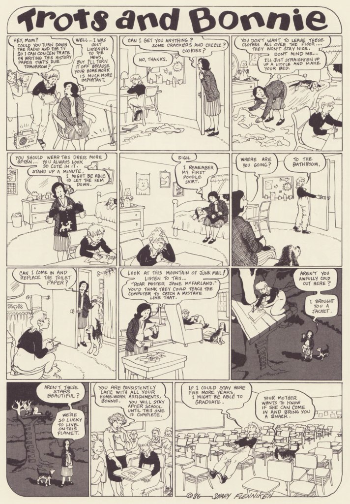
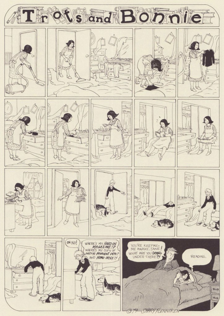
It’s also a charming strip, with a heroïne who is refreshingly in no hurry to grow up (despite being prodded into it by her early bloomer friend Pepsi, ‘dressed in incongruously childlike pinafore paired with fishnets, a perfect metaphor for the terrifying underage sex fiend she is’). Bonnie dresses like a tomboy, hates going out with her parents, and collects sex magazines and prophylactics like other kids collect marbles. In a world of sleazy men with a creepy predilection for pre-adolescent flesh, she somehow manages to remain an innocent, and shrug off any unpleasantness in favour of a wide-eyed curiosity about everything, be it boys’ cock sizes or sci-fi movies.

I can 100% relate to the thrill of first seeing a naked man (well, maybe not a dead one, though), and at that age I would probably be running around with a jar of lymph nodes as well, given half a chance.
I’ve included more ‘innocent’ strips to showcase that Bonnie is a normal kid with a normal (if staid as hell, especially for the 70s) set of parents. It seems that Flenniken’s friend Mark Evanier suggested Trots’ punchline.
Will men find this strip as hilarious as I do? No idea. But it reminds me of today’s conversation with a (male, gay) colleague, in which he learned that women usually have two or three categories of underwear and spent the rest of the day marvelling at this fact.
I find it charming that there’s someone for everyone in this scene – neither group is focussing on the one best-looking member (accidental pun) to the exclusion of everybody else, but developing an inclusive cloud of lust.
‘I’m partial to gay male porn. And so is Bonnie’s mom now. If you can’t figure out why, you don’t need to know.’
The ridiculous (and lascivious, yuck – Bonnie’s body language makes it clear she is very much creeped out) approach of the psychiatrist is tempered by the punchline – Trots really can talk!

In case that isn’t clear, I heartily recommend purchasing the Trots & Bonnie collection.

~ ds

* This strip is hard to write about and do justice to, and I could not do any better than Emily Flake’s truly excellent introduction to the T&B collection.

** I found it – it was Women’s Erotic Art Gallery, published in 1975.

*** Flenniken explains, ‘the things that I did that we omitted here in this book, I think we looked at those and went, “oh, that might hurt somebody’s feelings or something.” That was me being naïve when I wrote those. A lot of times I was just exploring a subject rather than having a definitive stance. People are pretty darn outrageous today, more so than me. What has changed is what people think is offensive.

Matt Baker’s Disquieting ‘Romance’

« I can resist anything except temptation. » — Oscar Wilde

A master from the Golden Age of comics, Matt Baker (1921-1959) is surprisingly well-remembered today. Part of it stems from his singular biography — he was a successful African-American cartoonist, an especial rarity in that era — but his posterity chiefly rests on the quality of his comic book covers.

Looking around, I see that much has been written about him in recent years. But I don’t see any mention of what strikes me about his work: in essence, it creeps me out. But I understand: Baker, as a black man, must have observed and experienced affairs of the heart from a different perspective.

Don’t get me wrong: it’s technically superb, of course. But it’s the tone that I find jarring. Baker’s covers stand out by virtue of their darkly cynical realism. A lot of these situations could only end in tragedy, from unwanted pregnancy to Black Dahlia scenarios. These comic books bore generic tag lines about ‘exciting romances’, ‘love stories’ and ‘romantic adventures’, but Baker’s covers instead feature entrapment and extortion, blackmail, rape and other forms of illicit sex, procuring and corruption…

Perhaps I’m reading too much into these yellowing bits of old paper. But there stands the fact that inside these comic books, the tone changes: we receive the usual tidy moral homilies at the conclusion of every story. Yet the covers, with their unresolved scenarios, retain their haunting power.

Here’s my evidence. See what you think!

This is Pictorial Romances no. 8 (July 1951, St. John). Read the issue here.
This is Wartime Romances no. 2 (Sept. 1951, St. John). Hilda seems to basically behave like Baker’s Canteen Kate, a character that makes me cringe in much the same way as Katharine Hepburn’s character in Bringing Up Baby, even without the mannered accent.
This is Teen-Age Temptations no. 2 (June 1953, St. John). I sense a case of Section 2423 about to transpire. Read the issue here.
This is Diary Secrets no. 18 (June 1953, St. John). Soliciting is evidently far less demeaning than going on welfare. Read the issue here.
This is Teen-Age Romances no. 32 (July 1953, St. John). Oh, that Pat’s a keeper.
This is Diary Secrets no. 19 (Aug. 1953, St. John). In 1953, a twenty dollar bill could buy you two hundred comic books, not to mention a jailbait date or twelve. Read the issue here.
This is Wartime Romances no. 17 (Sept. 1953, St. John). No respect for the wingman. A rare case of two creeps who deserve one another. Read the issue here.
This is Pictorial Romances no. 24 (Mar. 1954, St. John). Read the issue here.
This is Teen-Age Temptations no. 8 (June 1954, St. John). For once, the cover matches the inside story. Read the issue here.
This is Cinderella Love no. 25 (Dec. 1954, St. John). Drunk gringos slumming it over the border, down México way… what could go wrong? At least we can rest assured that the whole ‘waking up in a tub full of ice cubes, short one kidney‘ is an urban legend. But the plot of Elton John and Bernie Taupin’s 1975 classic, Grow Some Funk of Your Own, remains a distinct possibility.
This is Teen-Age Romances no. 40 (Dec. 1954, St. John). With the Comics Code looming, the scenes depicted on St. John’s covers got sanitised into looking like any other romance comic book of the era. But I daresay Baker’s work was better than ever — I mean, look at that delicate, yet confident and expressive line. Read the issue here.
A portrait of the dapper artist. Regrettably, work became scarce during the post-Code years, and Baker was reduced to hacking out page fillers for Vince Colletta’s studio. It’s an honest living, sure, but a waste, since nothing looks more like a dashed-out Colletta-inked romance than another dashed-out Colletta-inked romance.

Baker, cursed with a heart ailment, died tragically young at age 38 in 1959.

-RG

The Brave Josef Lada

When I looked up Czech painter-caricaturist Josef Lada (1887-1957), I was surprised to find him called ‘one of the best-loved Czech painters of all time‘. There’s no question that Lada’s work remains immensely popular among Czechs, but I suppose the question for context would be « how many painters from that corner of the world are well known outside of outside of the Czech Republic and ex-USSR countries » (probably not many). Lada doubtlessly deserves his lasting fame, at any rate.

My familiarity with his style comes from his illustrations for Jaroslav Hašek‘s sardonically hilarious novel The Good Soldier Švejk, a favourite family book from which we can all quote at length, and which I own in several Russian editions (thanks to inheriting my grandfather’s copy). There have been many adaptations of Švejk, but I can only imagine him the way Lada depicted him. Visit BibliOdyssey for a glimpse of the good soldier.

While his renown is assured thanks to his work on Hašek’s magnum opus, the entirely self-taught Lada is also fondly remembered for his illustrations to children’s books (which he occasionally wrote himself), as well as paintings of pastoral life, probably inspired by his childhood in the small village of Hrusice. For a fuller biography, head over to The Genius of Josef Lada, the most complete source of information that I could find online in English.

Here’s an assortment of images from various books – among others, Ezopské bajky (The Fables of Aesop) from 1931; Kocour Mikeš (Tomcat Mikeš), written and illustrated by Lada between 1934 and 1936, and being a sort of a take on Puss in Boots; Nezbedné Pohádky (Naughty Fairy Tales) from 1946 – as well as some postcards and aforementioned village illustrations.

A typical pub night, 1929.
Winter Pleasures, 1936.

« In the first year of his life, [Lada] had a life-altering accident – he fell on his father’s knife and the injuries sustained permanently blinded his right eye. Some art historians later attributed the artist’s flat-perspective painting style to this incident.»

Lada’s depiction of ‘vodnik‘, an evil water spirit.
A page from Zvířátka (which translates to ‘beasts’ or ‘animals’), a book comprising a dozen animal illustrations.
A New Year postcard from 1928.
A collection of Lada’s caricatural cartoons – ‘A Hundred Cheerful Drawings’ – published in 1970. I found this little volume in a used bookstore, and was delighted to find what was clearly the work of the artist who illustrated Švejk – I didn’t know Lada by name, back then. I don’t speak Czech, but it’s still plenty fun to leaf through.

For more Lada art, visit the Notes From a Superfluous Man blog!

~ ds

Rowland Emett’s Ramshackle Poesy in Motion

« The whistle of the old steam trains … could conjure up visions of bleak distances with one solitary wail. » — M.C. Beaton

A couple of years back, I gave our readers an introductory sample of the genius (hardly too strong a word in his case) of Rowland Emett (1906-1990), and vowed I would return with a fuller, more lingering look.

Since I got the biographical trimmings out of the way that time, today, I’ll merely offer you an even dozen of my favourites.

Can’t tell a trébuchet from a catapult from a ballista? This handy guide will steer you right!
Prof. Lightning’s moniker is evidently well-earned.
Another inventive step in the harnessing of solar power.
While this particular train route sadly does not exist (as an editor once wrote, “the great Emett, whose crazy world seems so much saner than our own…”), there are some lovely birding tours available throughout that green and pleasant land, from Land’s End to John o’Groats.
Said nationalisation took place in 1948. Here’s a bit of background on that historic endeavour.

-RG

Pénélope Bagieu… and Her Cohorts

Today we foray into the land of semi-autobiographical, prototypically ‘female’ chronicles – you know the thing, jokes about dieting and weight gain, a never-ending quest for the right boyfriend, hoary chestnuts about opening jars and eating ice cream when sad. The focus may vary a bit – some characters are stuck in humdrum drudgery, potty-training children and husbands, and some are bouncing around on sexy outings (and all of them fretting about becoming their mothers). While I am not automatically dismissive of this genre, it’s difficult to pull it off in an interesting way. For every Sylvia, there are many, many Cathys*.

Anyway, lately French cartoonists who go down that road have tended to opt for a very similar drawing style, similar to the point where one starts wondering who has ripped off whom. One of the artists who stands out a bit more to me is Pénélope Bagieu, whose work, while adopting a lot of tropes inherent to this category, also provides some genuinely interesting moments.

Bagieu might be best known for her 2016 webcomic-turned-best-selling-book Les Culottées (Brazen: Rebel Ladies Who Rocked the World in English) that tells stories of exceptional women of different eras and nationalities. It’s a great idea… that I am not interested in, which can also be said about California Dreamin’, her biography of Mama Cass. However, two of her graphic novels are definitely worth seeking out.

Exquisite Corpse (translated from the French Cadavre exquis, published in 2010, Gallimard) does a great job of depicting the depressing life of Zoe, who shuffles between a mind-numbing job and a lackluster relationship, growing more desperate by the day. Her life takes an altogether different turn when she accidentally meets a recluse who turns out to be a famous author. I don’t want to give any spoilers about the set-up of the ending, but I did not see it coming at all.

Her other graphic novel I like, La page blanche (2012), was written by Boulet and remains untranslated into English. It opens with a young woman sitting on a bench, having no idea how she got there or who she is. The interesting thing is that her amnesia never goes away — she never gets to remember anything about her past life, or discover who she was. All she finds was an apartment full of books that everybody reads and movies everybody watches, as well as shallow friends who are not really friends.

More in ligne with the aforementioned ‘woman seeks partner, settles for ice cream instead’, here are a few pages from the first volume of Joséphine, a series of three albums published between 2008 and 2010:

Joséphine’s only weapon against her holier-than-thou sister is sarcasm.

Since I made a point of mentioning artists with similar styles, here’s an example. The following pages have been scanned from La célibataire, written by Quebecoise India Desjardins and illustrated by French Magalie Foutrier (although given how light in storytelling content this book is, and how very French it is, too, I’m not really sure what Desjardins actually contributed):

Making pâté chinois from scratch… or not.
One of my favourite storylines in this book, about a cat she finds on her balcony one autumnal afternoon. Not sure why she’s bathing it, though. Unlike the very human Joséphine, this gal is always impeccably dressed and perfectly coiffed.

Despite its lack of originality, I like La célibataire a lot for its the bright colours and textured art. Sometimes, ‘it’s pretty’ is a justification to keep something despite multiple attempts at purging the books one doesn’t really need. This one has survived every purge, so far.

That was two examples I actually like — for kind-of-similar-but-no-thank-you, check out Margaux Motin or Nathalie Jomard.

~ ds

*On Hating Cathy over at The Comics Journal is a worthwhile read, though I disagree with its conclusion.

Treasured Stories: “Why Can’t You Be More Like Marvin?” (1975)

« The devil’s most devilish when respectable. » — Elizabeth Barrett Browning

Ah, the nineteen seventies… and their Satanic panic, in which we can recognize so closely the roots (or at least relatives) of today’s disinformation maelstrom, before the politicisation and weaponisation of septic paranoia and lies had become honed to such an anti-science. In a lot of sordid ways, Lawrence Pazder was an Andrew Wakefield of his day.

Here’s a story that I first encountered around the time of its release, remembered, but didn’t revisit until a couple of weeks ago, when a good friend (merci, Keith!) helpfully snapped up a copy for me. This deceptively dark tale was created by writer Arnold Drake (I surmise), penciller John Celardo and mysterious inker Wanda Ippolito, who may have a been a spouse or relative of Celardo’s. It’s odd to find someone else inking Celardo, as this was his chief, most enduring and distinctive strength. For comparison’s sake — and presumably, reading enjoyment — here’s another Drake-Celardo outing, The Anti-13!

I won’t make any claims that this is great art: by this time, Gold Key’s printing was shoddy, they barely bothered with the colouring (straight Magenta and Cyan and Yellow everywhere — how lazy can you get?)… but I treasure this one because of the story. Given its moral — what moral? — it’s hard to imagine The Comics Code Authority giving this one a pass, as it merrily violates several of its key precepts. I’ve got another such blasphemous entry in the pipeline… this one duly Code-Approved! Just you wait…

I had a childhood friend who was a lot like Marvin (minus the devil worship — for all I know)… he was incredibly talented, but also scarily unpredictable, and not in a good way. One day, he just disappeared.

On the other hand, the accompanying cover is spectacular.

« Why Can’t You Be More Like Marvin? » originally appeared in Boris Karloff Tales of Mystery no. 63 (Aug. 1975, Gold Key), which bore this masterfully disquieting cover by Luis Domínguez. It would have made it into my Domínguez retrospective, Luis Domínguez (1923-2020): A Farewell in Twelve Covers but for the fact that I didn’t own a decent copy of the issue.

And as (nearly) always, a bonus for context: Celardo had a long and fruitful career, and I’m sure one of its highlights was to number among Fiction House’s elite cadre of cover artists. I’ve said it before, but despite their mind-numbing repetitiveness, FH covers were tops in the Golden Age in terms of draftsmanship and production values.

Aw, poor Ka’a’nga — always left at home to feed the jackals while Ann Mason goes off on escapades with her other boyfriends. And who insisted on adopting them in the first place? Ann, that’s who! This is Jungle Comics no. 98 (Feb. 1948, Fiction House). Judging from his ability in the jungle antics genre, it’s no wonder that Celardo was picked to illustrate the real thing (at least comics-wise): the Tarzan comic strip, from 1954 to 1968, between Bob Lubbers (another FH cover artiste!) and Russ Manning.
And here’s one of Celardo’s Tarzan Sundays (March 27, 1954, United Feature Syndicate).

-RG

Visit Katropolis With Kim Deitch!

Underground comix artist Kim Deitch probably doesn’t need much of an introduction, other than perhaps to mention that he’s the son of amazing illustrator/animator Gene Deitch, about whom we have talked before (see Back When ‘Hipster’ Wasn’t a Dirty Word: Gene Deitch’s The Cat). For the most part, I respect more than enjoy K. Deitch’s work, appreciating his style and attention to detail, but unable to maintain more than a passing interest in the dream logic of his tales. The story we are sharing today charmed me, as it combines his typical soaring and detail-driven landscapes with a really fun ‘what if?’ plot and a clear appreciation for cats, always an advantage for an artist, in my book.

These Cats Today! comes from the pages of Big Fat Little Lit (2006, Puffin), which collects most material from the three volumes of Little Lit, Art Spiegelman and Françoise Mouly’s anthology that featured comics created for children by a varied roster of artists (a lot of whom have collaborated with Spiegelman on RAW), as well as some Golden Age additions by the likes of by Walt Kelly, Crockett Johnson, and Basil Wolverton. School Library Journal described it as ‘a sensational introduction to traditional literature for a visually sophisticated generation‘. If by ‘traditional literature’ they mean ‘traditional folk tales’ (before they got bowdlerized*), then sure. The stories of Big Fat Little Lit are cynical and pleasantly warped; people get beheaded, eaten, and transformed, and often find that what they thought would bring them happiness just engenders its own problems.

Actually, it was quite difficult to select which story to run, as this anthology is packed with wicked goodies, but this whimsical tale won out (my other favourites are by Kaz, Maurice Sendak, Richard Sala and Joost Swarte, and may yet pop up in another post). Note that if you look beyond the surface of These Cats Today!, you’ll find plenty of cruelty in this fun narrative – dogs enslaved to power up the majestic and glittering Katropolis, force-fed stuffed mice**, these details are briefly mentioned, yet in plain view for those perceptive enough to notice. Truly, for its seeming gentleness, this story belongs into the Little Lit line-up.

~ ds

* See Grimmifaction as a reverse process.

** Not sure about Deitch himself, but his wife Pam Butler appears to be a vegetarian.

Michael Dougan, From Houston to Tōno

« I’ve never been to Texas but I’ve heard Willie Nelson Sing. » — Mark Ballard

I’ve just heard of the recent, untimely passing of cartoonist Michael Dougan (1958-2023). Well, perhaps former cartoonist would be more accurate, but if so — he said his piece, made his mark, and moved on — and that’s cool. But can cartooning truly ever be left behind?

Dougan made his début in comics on the back cover of my very favourite issue of Weirdo, no. 17 (Summer 1986, Last Gasp), which also housed my pick for Robert Crumb‘s greatest short-form achievement, The Religious Experience of Philip K. Dick, and a cover among his finest *and* most provocative. See both story and cover here!
Dougan’s first collection appeared the following year, published by Seattle’s fabled The Real Comet Press. The back cover was festooned with eloquent-upon-eloquent quips from his peers. For instance, Gary Panter wrote: « Dougan’s work is clear and he is not afraid. He is a big storyteller and a good liar. In East Texas the wire fences, orange colored tufts of grass, pine trees, tire tracks, piles of wood, and water towers are the best parts. The stories are about human desperation, a funny kind of desperation, an air-conditioned kind of desperation. »

And here are a few excerpts from its pages:

Dougan’s second and final collection, from 1993, was published by Penguin, no less! It featured longer, more ambitious pieces.
Kentucky Fried Funeral would have to be my first pick for Dougan’s masterpiece. Unfortunately, it’s around 20 pages long, so it was unfeasible to present it here. Still, here’s the opening splash.
A detail, perhaps, but worth noting, I think: Dougan preferred handling his own lettering, finding, like many a visual artist, the look and texture of mechanical text too… well, mechanical. Lovely!

In 2017, some twenty years after his last cartoon (that I’m aware of… Double Booked?, in Fantagraphics’ Zero Zero no.17, June, 1997) Michael and his wife moved to Japan and opened a café-restaurant. Read Michael’s own account of the saga.

This must be the place.
Of course, Dougan named his place after Bogie’s in Casablanca, but not without adding a couple of typos, for that modern touch.

Creative types often get restless, and Michael found himself a little niche answering people’s mostly, and sometimes incredibly, inane questions on Quora, with a potent mixture of withering sarcasm with a side of snide, all the while providing helpful information — whenever possible. Check out his feed, but let me caution you: it’s a bit of a frazzling rabbit hole (or warren, more accurately).

I’m hoping that, once news of Michael’s passing trickles over to his native land, that The Comics Journal will provide a detailed obituary of this notable artist. Farewell, Mr. Dougan.

Update: I see that TCJ has not let me down. Here’s their first piece in tribute to Michael. And this definitive oral history homage.

Further update: The Seattle Times has just published a moving obituary by his friend, former The Rocket Editor Charles R. Cross.

-RG

Adopting the Gauld Standard

« Quake in the presence of the stack of bedside books as it grows taller! Gnash your teeth at the ever-moving deadline that the writer never meets! Quail before the critic’s incisive dissection of the manuscript! And most important, seethe with envy at the paragon of creative productivity! »

I hesitated a bit about writing this post, as it seems to me that everybody already knows (and likes) Scottish cartoonist Tom Gauld and therefore it’s a bit like launching into a review of a Beatles album (vaguely embarrassing, and completely unnecessary). I have also previously talked about him in Tentacle Tuesday Masters: Tom Gauld (and you can head over that way, if you want some biographical details of his life). That being said, his art is not nearly as ubiquitous as it deserves to be.

I happily received his latest book, Revenge of the Librarians* (2022, Drawn & Quarterly**), as a Christmas present, and I remain impressed by the scope of Gauld’s wit and his instantly recognisable style. He also has an impeccable sense of composition; each drawing is perfectly framed, often sneakily implying something happening almost out of sight, hinted at by a chunk of wall just at the edge of the panel, a partially seen open door, an alluring bit of tentacle. He’s funny but poignant. I can only imagine how many of his cartoons are pasted over the doors of professors in all fields and walks of research (it’s something people still do, right?) I can consume Gauld’s perfect little microcosms like semechki, but try to read only a few every day to prolong the enjoyment.

It was really difficult narrowing down today’s selection to ‘just’ 12 strips (I didn’t want to annoy my master-scanner co-admin RG too much). The following have been scanned from the aforementioned Revenge of the Librarians, as well as You’re All Just Jealous of My Jetpack (2013) and Department of Mind-Blowing Theories  (2020). Enjoy this sampling, whether you are already a Gauld convert or have never heard of him!

Po-tay, po-tah-toh…
One of my very favourite Gauld strips, though I couldn’t explain why.
A very typical Gauld strip, complete with many options of something that starts out grounded in real life and shoots off into funny social commentary.
There was no way I could skip over this one, given my mushroom leanings… Have I mentioned Gauld’s expert use of colour to highlight important details in an otherwise subdued palette?
In case someone is unfamiliar with The Owl and the Pussy-Cat.
The first Gauld strip I became consciously aware of, after somebody shared it on Facebook.
Given the war in Ukraine, this one hits especially hard…

Want more? Head over to The Guardian.

~ ds

* French edition La revanche des bibliothécaires (from Editions Alto and Editions 2024) has been chosen for the 2023 Selection officielle of the Angoulême comics festival.

** That makes it two worthwhile things that Drawn & Quarterly has published… or is the process of publishing, the other being Tove Jansson’s Moomin stories.

Of Sneetches and Robots, Orange and Blue

« “Good grief!” yelled the ones that had stars at the first.We’re still the best Sneetches and they are the worst. But, now, how in the world will we know,” they all frowned, “if which kind is what, or the other way round?” » — Dr. Seuss‘ The Sneetches (1961)

A few days ago, this news item piqued my interest: « The assistant director of communications for Olentangy Local School District abruptly stopped the reading of the Dr. Seuss book “The Sneetches” to a third-grade classroom during an NPR podcast after students asked about race. »

Naturally, since this sorry episode made its way around the world and rightly gave rise to quite the furore, the school district has since thrown its patsy under the bus.

This mention of Dr. Seuss’ timeless classic The Sneetches made me think of another slightly earlier parable of systemic racism, Bill Gaines, Al Feldstein and Joe Orlando‘s Judgment Day (1953), and the similarly telling reaction would-be guardians of bluenose morality had to it.

Initially, I thought posting such an already eminent story as ‘Judgment Day’ was a trifle too obvious. But then again, how famous can a standalone comic book story published seventy years ago be, in the true scale of things? Really, it can never be famous enough.

In the course of an excellent article, CBR.com’s Brian Cronin summed up the skirmish (spoiler alert! you may want to read the story first if you haven’t already):

« The last traditional comic book produced by EC Comics was 1955’s Incredible Science Fiction (a series that had just begun a few months earlier, taking over the numbering from Weird-Science Fantasy) #33.

The last story in the issue, “Eye for an Eye,” had to be pulled at the last minute due to objections by the Comics Code Authority.

So Gaines and editor Al Feldstein decided to reprint “Judgment Day” in its place.

However, Gaines and Feldstein were then told that this replacement story ALSO violated the Comics Code.

Judge Charles Murphy (administrator of the Code) said that they would have to change the astronaut from black to white if they wanted it to be included. This was not part of the Code at the time. Feldstein and Gaines felt that Murphy was just deliberately messing with them.

After being told that, clearly, the color of the astronaut’s skin was practically the whole point of the story, Murphy backed down a bit, but said that they would at least have to get rid of the perspiration on his skin. It could possibly be that Murphy felt that it was exploitative. I do not know, and neither did Feldstein nor Gaines, who only had their suspicions that they were being screwed with.

Feldstein and Gaines both refused to comply (I believe the terms they used included at least one use of the word “fuck“), and Gaines threatened a lawsuit and/or a press conference to shine a light on why exactly the story was objected to.

The story ran as is. »

And so here it is (boasting superior reproduction, thank you, technology):

Originally published in Weird Fantasy no. 18 (Mar.-Apr. 1953, EC). Beautifully understated, it’s easy to understand why its creators considered it a high point of their respective careers.

As is generally the case with such anecdotes, there are other accounts and explanations:

« At least three versions of the story about Gaines’ dispute with the CMAA exist. In an interview, Gaines said a story showing a black astronaut with sweat on his face was rejected because the code forbid ridicule of any religion or race. When he threatened to sue, the code administrator backed down. A second version of the story suggests that Gaines was not able to get approval for the comic, but printed it with the seal anyway. A third account, told by Gaines’ business manager, said the EC story was rejected because it featured robots, which challenged Code Administrator Charles Murphy’s religious beliefs that only man was granted the ability to think. »

I like that, no matter which angle or reality we consider, Judge Murphy never fails to, er… rise to the occasion.

In closing, here’s a scrumptious cartoon anecdote about Messrs. Orlando and Gaines.

« Here’s Sergio Aragones‘ version of one of the many outings Joe Orlando and his publisher/pal Bill Gaines made to the best restaurants in Paris. While on one of the now famous MAD trips, Joe and Bill would eat 4 or 5 times a day! They went from restaurant to restaurant, always ordering the specialty of the house — with appropriate wines, of course! Yep — they’ve been on a very strict diet since (… but it hasn’t helped!) » Originally published in The ‘Special Joe Orlando Issue‘ of Amazing World of DC Comics (no. 6, May-June 1975, DC).

-RG