Hi there! Co-admin RG asked for some assistance with his Halloween count-down (admittedly, 31 posts in a row is a bit much), so I’m here each Tuesday for the month to come, a throw-back to the Tentacle Tuesdays of yesteryear.
As you probably noticed, we like supposed bad omens around here, and lean into superstitions, too. I consider a black cat crossing my path is as a definite stroke of luck, as is having one of those beautiful silky beasts at home at all times (we are blessed with one such beast). The anglophone world has long had a tortuous relationship with black felines. Harbinger of luck or malevolent pawn of Satan? Flip a coin. Nevertheless, in the 20th century black cats seemed to have had a charmed streak, and appeared in many postcards as definite auguries of good luck. For my own self, I am sympathetic to witches (though not to the point of actually believing in their existence) and also of anarchism, of which the black cat has been adopted as a symbol from the late 19th century. Whatever way you look at it, black cats are cool.
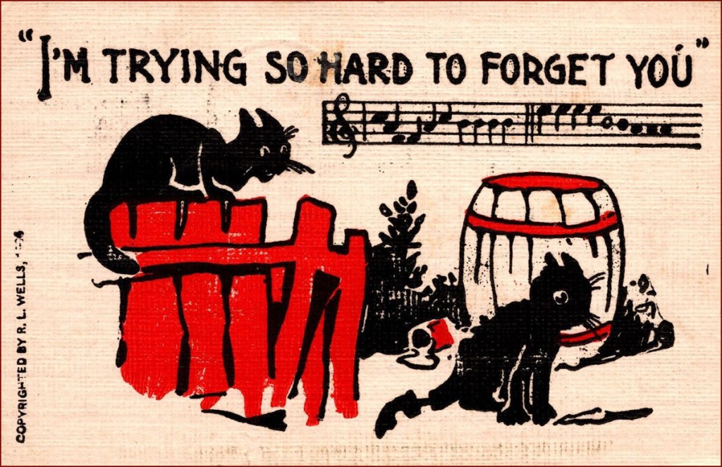
Here are some postcards from the very early 20th century, say around 1905-1906. Unfortunately I cannot say who R. L. Wells is, other than noting that they have a very district style and seem to have created a wide array of postcards.
Our very own silky black beast. My camera usually has trouble focusing on his blackness, so this is a rare decent — and most recent! — photo.
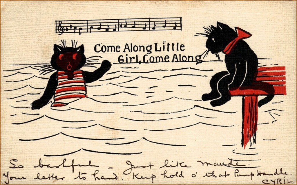
And the following postcards are by the equally mysterious H. M. Rose (or is my Google-fu weak as water, today?), from 1913.
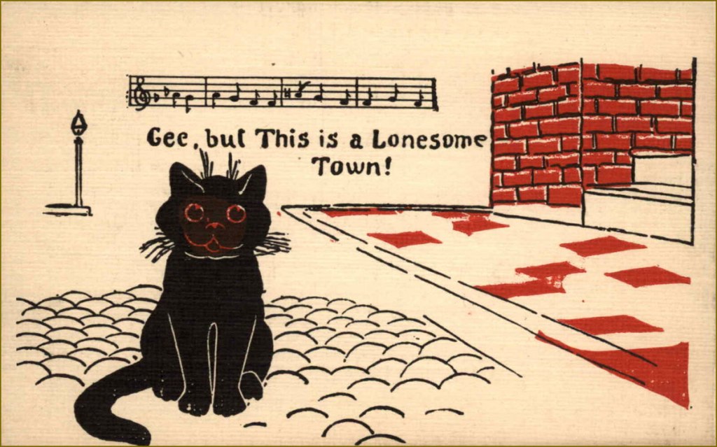
For a great selection of vintage black cat postcards, affix your peepers on this collection, among which is found this cat, my absolute favourite for its strangely human teeth and dazed expression of sorrow mixed with euphoria.
« Master of puppets, I’m pulling your strings / Twisting your mind and smashing your dreams / Blinded by me, you can’t see a thing / Just call my name ’cause I’ll hear you scream / Master, master! » — Metallica
I’ve never been a Jim Mooney (1919-2008) fan, though he’s undeniably had a long and respectable career as a penciller (Tommy Tomorrow, Supergirl, Dial H for Hero, Omega the Unknown) and inker (Spiderman, Thor… and countless others). I’ve always found his work a bit stodgy and lightweight.
As these things usually go, however, if you keep an open mind, you’re bound to come up with exceptions, and here’s one.
While Atlas’ pre-Code horror comics were generally saddled with indifferent or nonsensical writing, the artwork on offer was often surprisingly wild. I mean… they even got straight-laced Joe Sinnott to go downright weird on a couple of occasions.
Here’s a short story that’s compellingly sombre, sinister and paranoid, and Mooney perfectly conveys its oppressive mood.
The ending is daft… and at the same time, inspired lunacy that takes it to another level. While I’m drawing from a 1974 reprint, here’s the cover from its original publication, Spellbound no. 13 (March 1953, Atlas); cover pencilled and inked by Carl Burgos, colours by Stan Goldberg. Working in the Goodman Family salt mines (in this case, the Humorama line of ‘girlie’ digests, at ten bucks a cartoon, writing included), Mooney was probably more in his element, nimbly bridging the cartoonish and more academic semi-realism, not a common skill!
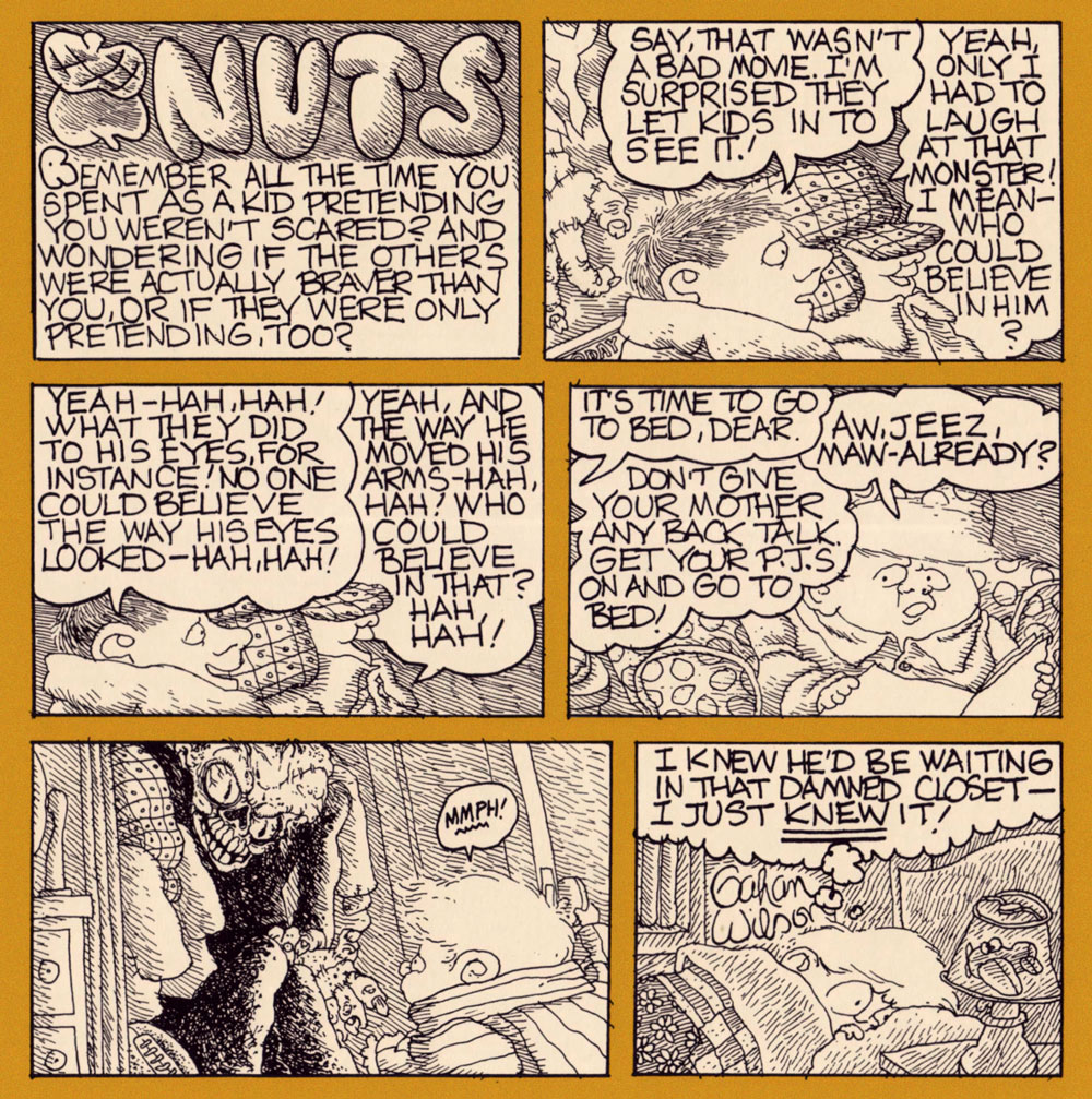
« They wanted me to do something that would be absolutely horrific, and so I was thinking silly monsters and putting all kinds of political twists on it. Then I began thinking, what is really, really scary and hasn’t been faced? I thought of being a kid. » — Gahan Wilson
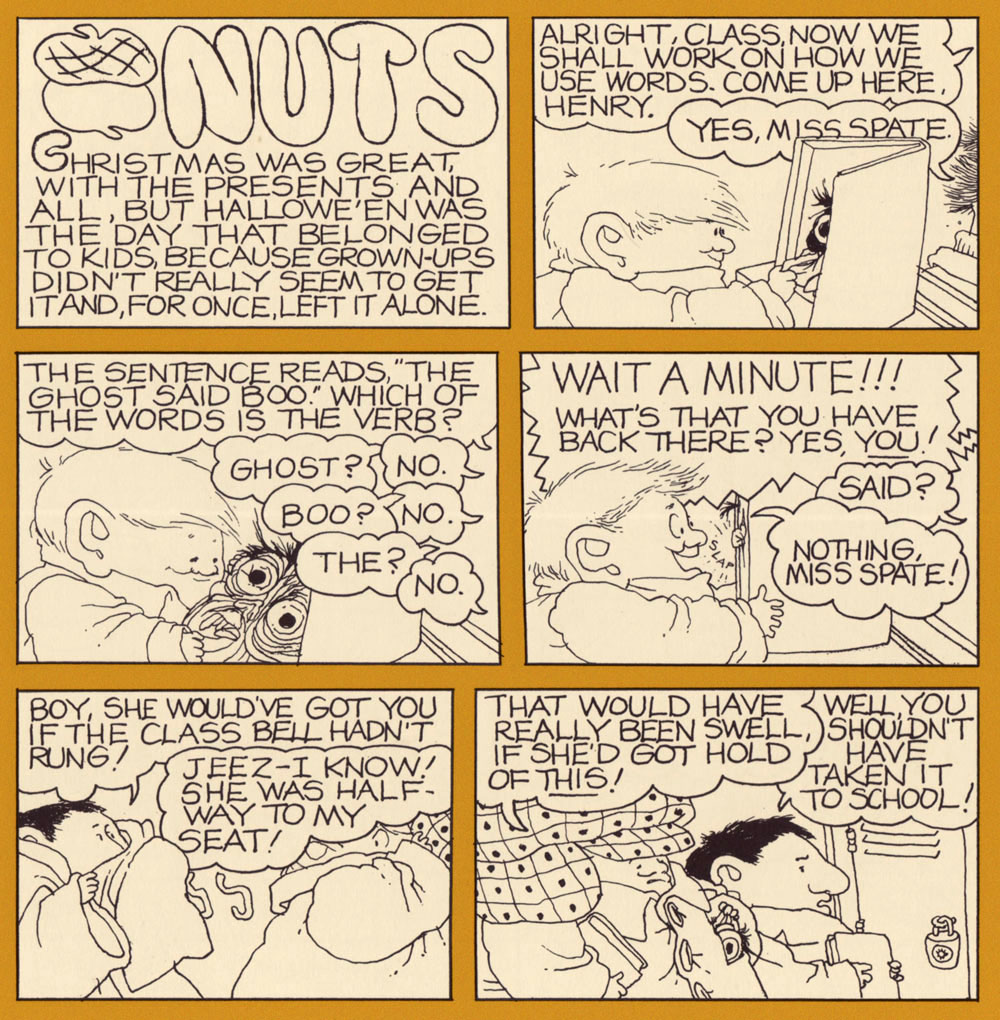
Gahan Wilson (1930-2019), who else? I’ll gladly confess that it’s always a bit daunting to pick the opening and closing salvos of a countdown… especially the opener.
I’m fairly confident there’ll be no controversy as to my decision to bestow the inaugural spot to one of Mr. Gahan Wilson’s creations.
After all, Gahan was truly one (along with colleagues Addams and Gorey, to name but an obvious pair) of those gnarly souls — bless and/or curse them all — who made each day Hallowe’en… in the finest way.
« Remember how confusing it was, being a little kid? Remember trying to make sense of the weird rules grownups always made you follow, and how you always guessed wrong and which ones they’d figure were really important?Remember how small you were and how brave you had to be to get through it all? »
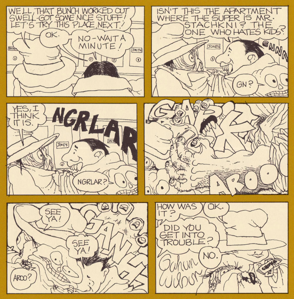
Oh, what the heck. Here’s a bonus strip, still a perfect fit for the occasion:
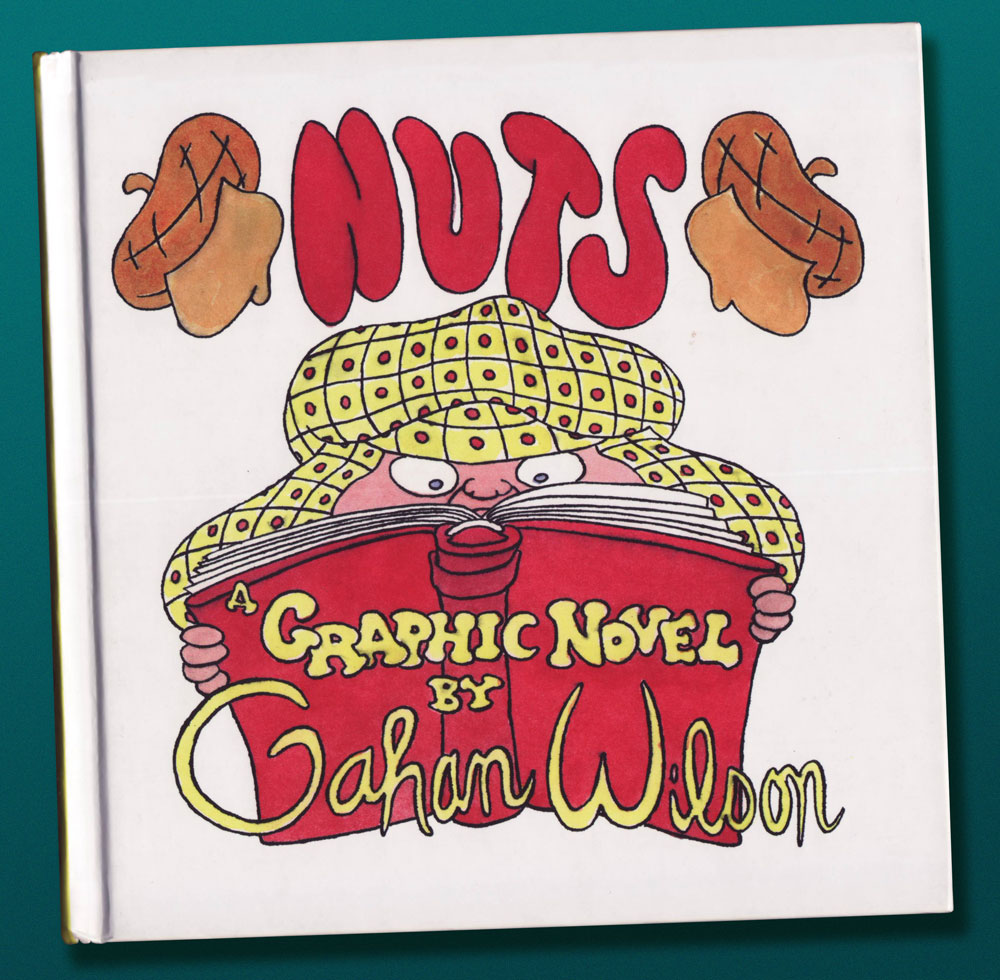
Incidentally, for those entirely unfamiliar with it, Nuts was Mr. Wilson’s first sequential strip, and it was published in the pages of The National Lampoon between 1972 and 1986.
… I bring you a of ‘clip show‘ of sorts: excerpts from past entries of this blog, but with a slight twist. For, unlike your textbook clip show, I’ll be drawing from episodes you’re probably unfamiliar with. After all, while this is my 500th piece, this is our blog’s eight hundred and fortieth: quite enough of a tangle to get hopelessly disoriented in.
I have culled from the earliest days of WOT?, when we had precious few readers — each one precious! Five picks from the lot seems a reasonable ratio: neatly one per hundred.
While many of our posts from those days have since, one way or another, found their audience (or vice versa), these dispatches have languished in obscurity — deservedly or not, who can say?
Here they are, in chronological order and everything:
This one was a gathering of English fantasy artist Patrick Woodroffe (1940-2014)’s covers for Warren Magazines. You may have seen his fabulous cover for Judas Priest’s 1976 LP Sad Wings of Destiny.
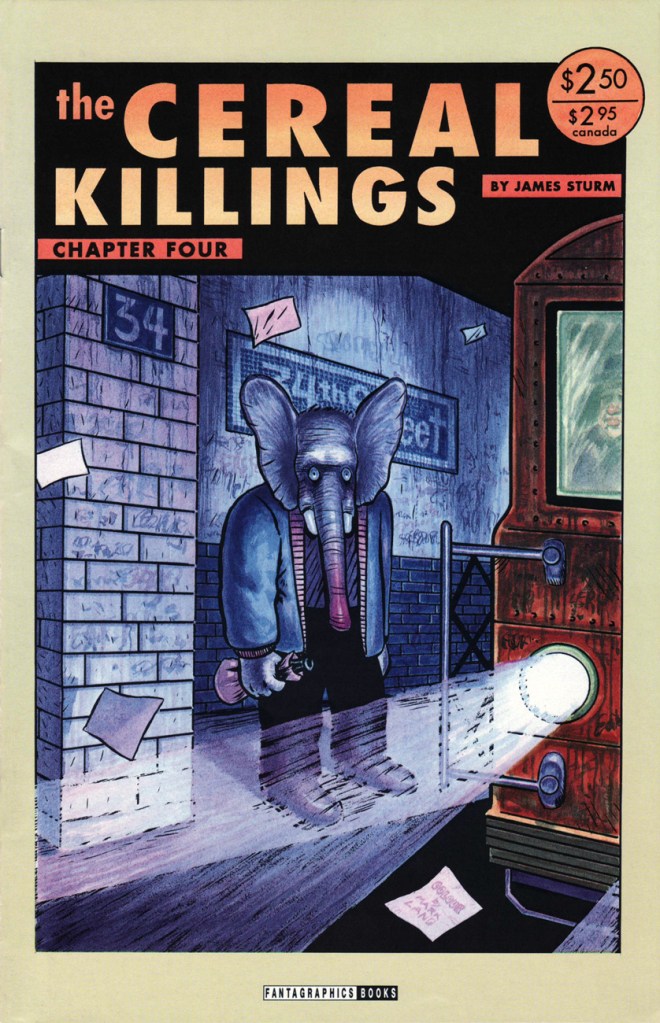
A ghoulish and gloriously fitting backup feature for Pat Mills’ unhinged Death Race 2020 (1995-96, Roger Corman’s Cosmic Comics). I collected them all so you don’t have to!
Incidentally, this is all you’ll be seeing of me this month — it’s not a case of burnout: I’m just furiously cobbling together this year’s Hallowe’en Countdown, and that takes time. Thanks for your patience and loyalty, and see you in October!
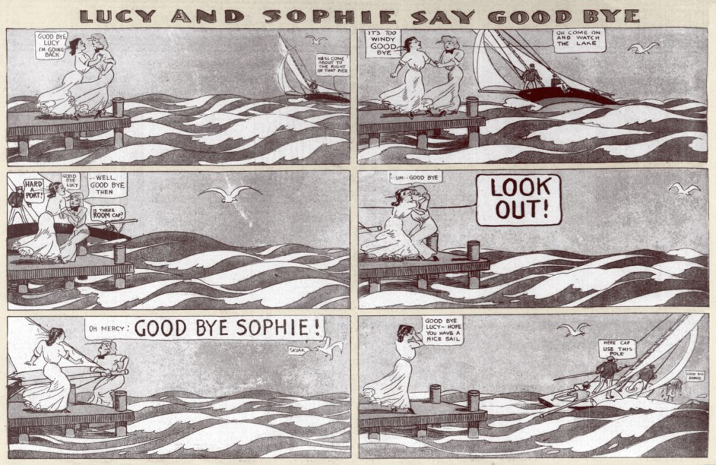
I hesitated about doing a post about Lucy and Sophie Say Good Bye because it seemed too obvious. Then I thought, obvious to whom? Surely a comic from 1905 can’t be all that widely recognized, a century hence. Besides, there’s a cool little bonus: the mystery surrounding the artist of this strip.
Some think that this mystery has been solved. Case in point, in 2021, the intrepid Eddie Campbell and Ron Evry of Mister Ron’s Basement made great use of their eagle eyes and spotted the similarity between Lucy and Sophie Say Goodbye and Cholly Cashcaller, both strips running almost concurrently in The Chicago Tribune. When Campbell pinged Barnacle Press, its sleuthing team (after some tracking down signatures, styles, and historical details) decided that the heretofore anonymous author was Robert James Campbell (1873-1938)*. Read the story here.
Chapter closed? Not quite. Kevin Cooley argues (and quite persuasively**) that this was a hasty and incorrect assumption, and that the artist is actually George O. Frink (1874? – 1932). Given that people far more erudite than I have spent years studying this topic, I’m resolutely staying away from having an opinion on the subject, but it’s all rather fascinating. Suffice it to say that Cooley has written a highly perceptive analysis of this strip and I highly recommend reading it (here)…. but that I tend to trust Campbell’s judgment, given that he’s not only an excellent cartoonist, but also a comics historian.
Has this strip gained traction and garnered interest in recent years because lay people (as opposed to comic historians) are titillated by the idea of two women kissing in a newspaper strip from the very early 20th century? That goes without saying. Yet this historical importance doesn’t take anything away from the art or humour of this strip. Besides, most people will be able to relate to the feeling of being s̶o̶ ̶i̶n̶ ̶l̶o̶v̶e̶ such close friends that the outside world fades into nonsignificance, even as horses collide, waves crash, and a crowd gathers.
I picked some of my favourites, but you can see more of these over at Barnacle Press.
*
**
*
*
*
As you may have noticed, Lucy is often bodily torn away from her companion by some passing contraption, be it a boat or a montgolfière . As mentioned earlier, Cooley wrote a detailed analysis on the subject, from which I will now quote:
« Lucy and Sophie’s fears are not in vain. One of these threats is ultimately carried out, and it cannot be dodged, ignored, or avoided. In the strip’s final installment on October 15th, 1905, the lovers are carted off by sinister mustachioed men in brown trench coats. “Say we got two crazy ones send the wagon,” says one. The women are wrestled into separate streetcars and held apart as they say their final goodbye. A young man in typical newsboy hat, papers and bell tucked under his arm, says “Gee dats der finish.” »
~ ds
* I don’t know how many Campbells are running around this world, but presumably quite a few.
** Speaking of being persuasive, I’d be remiss in not including part of Campbell’s rebuttal, at least in part — read the full thing in the comments section of The Lucy and Sophie Cartoonist – Another Look (Updated with Part Two – A George Frink Profile). Co-admin RG (himself a cartoonist) has often argued that artists have a different, deeper perception of other artists (as compared to those not at all versed in the craft/art of comics), enabling them to recognize someone’s style, even if it’s, say, subtle pencils buried under someone else’s forceful inking. Campbell’s point is similar, I think.
« I’ve been thinking about this strange affair today and it occurs to me now that K. Cooley doesn’t understand that there are some who are well versed in the study of cartoon art who can recognize an artist’s voice, or personality, by looking at a comic, the way one recognizes a friend’s voice on the telephone. Being told a more or less persuasive story doesn’t change the situation that the Frink comic he shows, with its depth of field and crackly angles and energy, all typical of Frink, is incompatible with the balloony lines and easy-going patterns of the Lucy and Sophie compositions. There are two distinct artistic personalities at work, one of whom is Frink and the other of whom shares a multitude of qualities with Robert Campbell, who drew many pretty ladies adorning the Sunday magazine pages of the same issues of the newspaper, all of whom had a tendency to look exactly like Lucy and Sophie. “One” does not ascribe works according to artists’ complicated backstories, or at least not until the primary issue of the looks of things have been analyzed. »
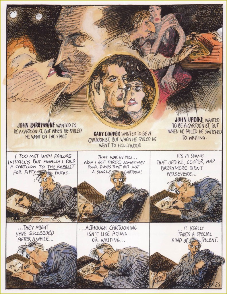
« If you take drawing seriously, you never quite feel you’ve arrived. » — Ed Sorel
This time out, I’m pinch-hitting for my co-admin ds, who’s burning the midnight oil these days.
Just about a month ago, when I wrote a piece about Seymour Chwast (b. Aug. 18, 1931), it occurred to me that I should also devote post-haste (just in case) some column space to his fellow surviving Push Pin Studios co-founder, Edward Sorel (b. March 26, 1929). Let us celebrate the living while we can. The dead don’t appreciate nearly as well such gestures .
Opting for a freelancing career, Sorel left Push Pin, just a few years after its founding. He made it, all right, becoming one of the greatest caricaturists of the century. But he was every bit as accomplished a writer, which elevates his work above the ‘merely’ visual.
I’ve always been blown away by how deceptively easy he makes it all look, and that’s what’s so impressive: very loose on the surface, but with an underlying, laser-sharp precision. I could easily go on at some length, but Sorel’s career and art are well-documented themes. Check out, for instance, The Enigmatic Edward Sorel(From The Comics Journal), or this fine New York Times review of his recent memoir (circa 2021), Profusely Illustrated.
And now, some of the man’s work:
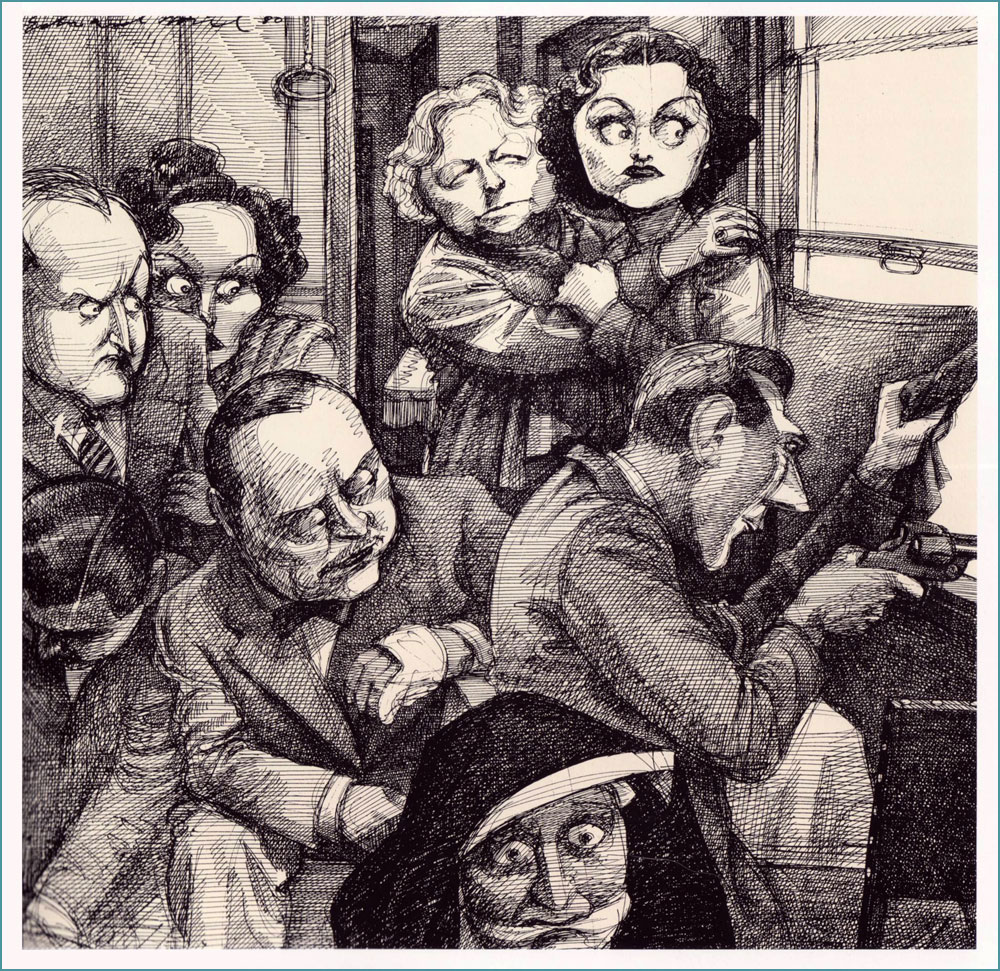
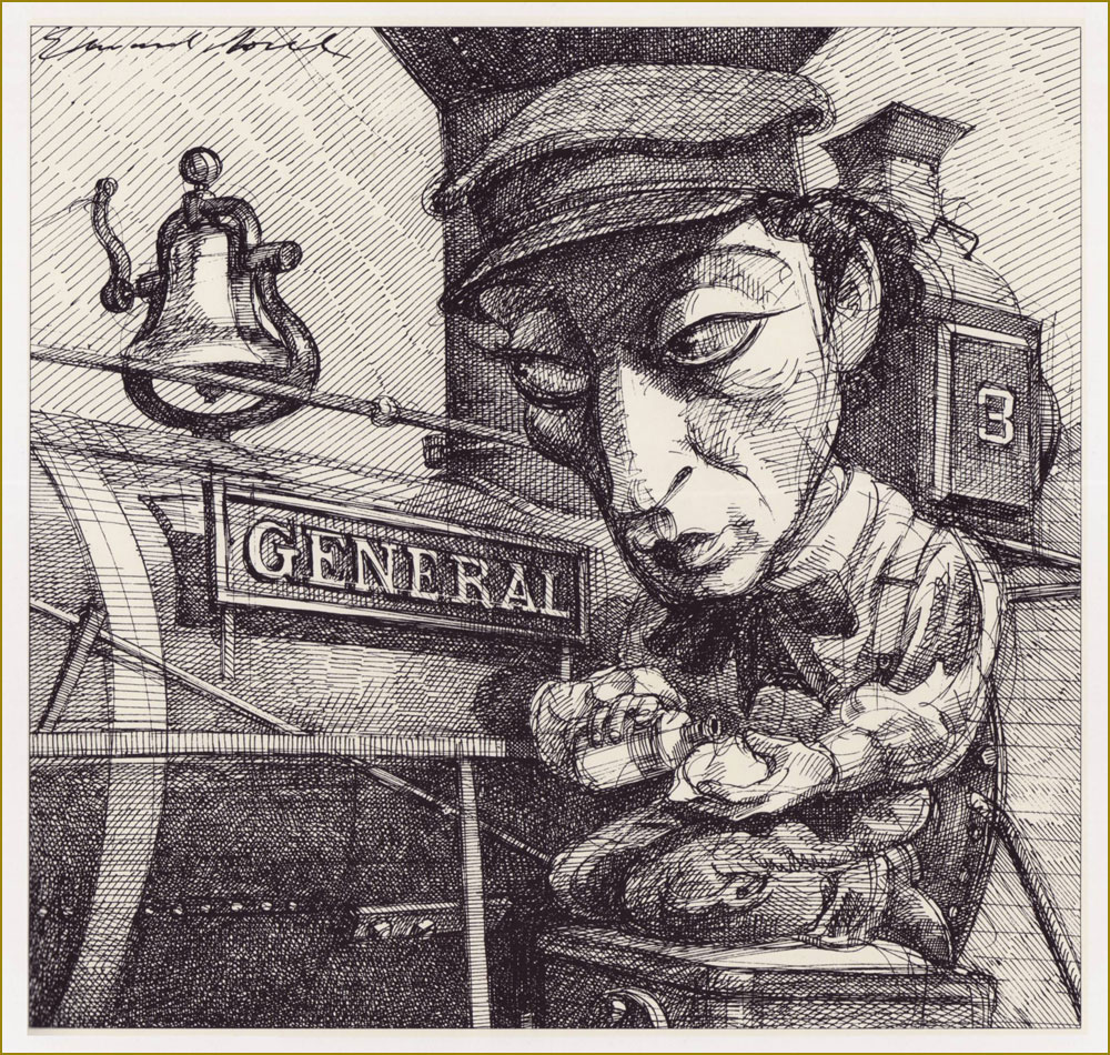
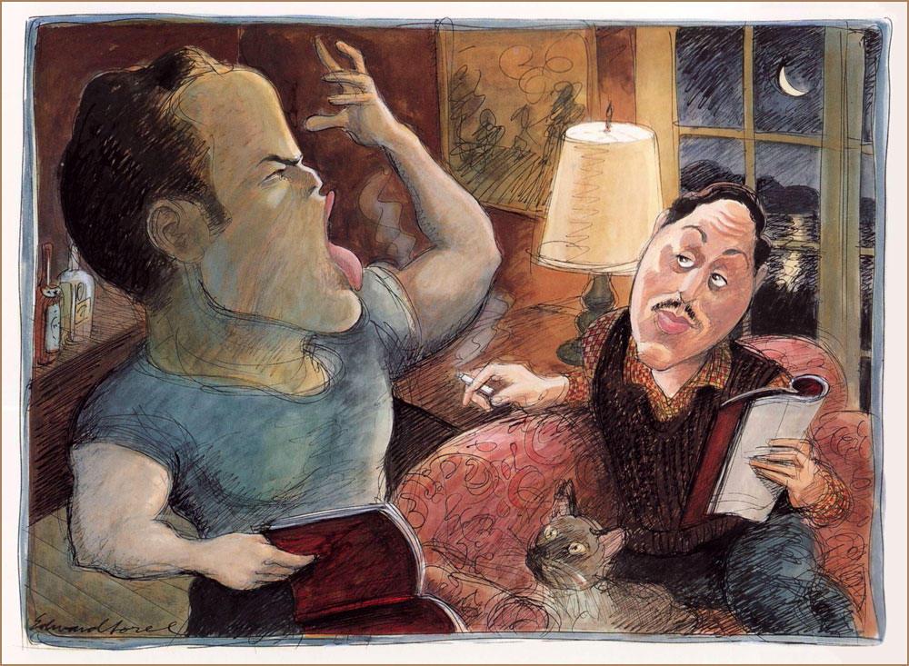
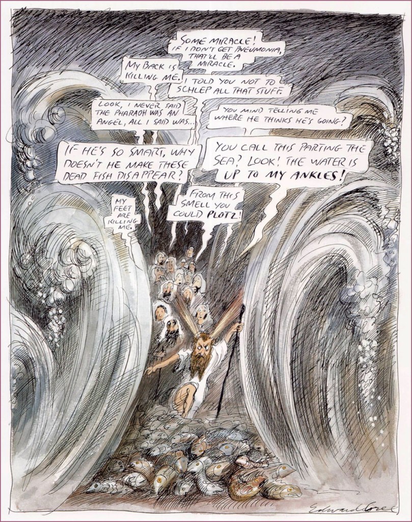
« My long association with Penthouse was unique. They bought every idea I submitted to them, and never changed anything except my spelling. This solipsistic strip appeared in 1990. »He can draw *anything*! This one appeared as The New Yorker‘s Jan. 31, 1994 cover illustration.I suppose every cinephile has his favourite Hitchcock film; mine’s The Lady Vanishes (1938). An entry in Sorel’s “Movie Classics” series, published in the March, 1981 issue of Esquire. « The General, starring Buster Keaton, is the only silent movie I included in my “Movie Classics” series. Based on an actual incident in the Civil War, it often has the look of a Mathew Brady photograph. » From Esquire, Dec. 1980.« Tenor Enrico Caruso is a guest at the St. Francis Hotel when the 1906 earthquake hits San Francisco. He vows *never* to return to a city “where things like this are permitted”. From Sorel’s pictorial essay “Keyhole History” (GQ, Oct. 1984).More rollicking blasphemy for Penthouse (Dec., 1992). Ah, yes. « The 1973 Academy Awards are remembered for Marlon Brando’s refusal to accept his Oscar for The Godfather. His emissary, Apache tribe member Sacheen Littlefeather, explained that Brando’s rejection of the award was to protest Hollywood’s depiction of Native Americans. Backstage, John Wayne was apoplectic. As John Lahr wrote in his article “The Birth of the Oscar“, “The Duke, who had dispatched many an Apache on film, didn’t take kindly to Brando’s protest… Wayne had to be restrained by six men from yanking Littlefeather off the stage.” From The New Yorker, March. 21, 1994. And speaking of Brando… « Marlon Brando is sent up to Cape Cod to read the part of Stanley Kowalski in A Streetcar Named Desire for Tennessee Williams‘ approval. First he fixes the nonfunctioning electricity and plumbing, then he auditions. His performance was stellar in every role. From Sorel’s “First Encounters” series, this entry appeared in Atlantic Monthly‘s July, 1994 issue. Note the kitty’s rapt expression.« Exodus revisited: an educated guess as to what Moses endured as he led his people through the Red Sea. A cartoon for Penthouse, the only mass-circulation magazine to welcome my blasphemy. » Penthouse (like the man said), Apr. 1995. Oh, and Plotz: To burst from strong emotion; often used humorously to express minor shock or disappointment (פּלאַצן, platsn, ‘crack’; cf. German: platzen;) and Schlep: To drag or haul (an object); to walk, esp. to make a tedious journey (שלעפּן, shlepn; cf. German: schleppen;).« Another of my egocentric ramblings, this one a rationalization for not becoming a great artist. » It appeared in the Aug. 21/28 issue of The Nation.« How Was I Supposed to Know? », from The Nation, Sept. 24, 1990. Oh, the sequels just write themselves.Here’s a rather famous one: « Back in the mid-sixties, my friend George Lois had an idea for an Esquire cover that couldn’t be done with photography. He asked me to do it, and I panicked — i.e. I tightened up. When I handed him my finish, he rolled his eyes and said he’d give me until the next morning to do it over. I went beyond panic, but nevertheless did a drawing we were both happy with. » It appeared on the cover of Esquire’s April, 1966 issue, with the caption of “The problems of power for Frank Sinatra”.« Director Michael Blakemore, at a rehearsal of Woody Allen’s one-act contribution to Death Defying Acts, watches in horror as Allen scribbles copious stage directions for him to execute. (Caricaturing Woody Allen is so easy that after drawing him, many an amateur comes to think of himself as a pro.) » From The New Yorker, June 3, 1996. Look at that pen move!
« I know you’re lookin’ for a ruby in a mountain of rocks, but there ain’t no Coupe de Ville hidin’ at the bottom of a Cracker Jack box. » — Jim Steinman
Crumpets!
It began with crumpets. I was picking up a couple of packages of those scrumptious British griddle cakes at the only store in our small town that carries them — as far as I can tell. Glancing about, I noticed on a nearby shelf something I’d never encountered: packages of Cracker Jill*.
I’d been toying with the notion of a Cracker Jack post, but this surely was a sign. When I got home, the merest bit of research turned this up:
« Introducing Cracker Jill™! After more than 125 years with our iconic Sailor Jack mascot, we’re adding Jill to the team to celebrate the stories of the women and girls who are breaking barriers in sports. With her tenacity, vibrancy, and strength, Cracker Jill™ takes inspiration from the women that change the game on the playing field, and beyond.
Join us in supporting the next generation of athletes by donating to the Women’s Sports Foundation through CrackerJill.com. With a $5 donation or more, we’ll send you a bag of Cracker Jill™ while supplies last. Remember, keep an eye out for Cracker Jill™ in baseball stadiums around the country. »
It’s a most worthy cause, obviously, but a) Jack the Sailor (and his pooch Bingo) has only been the brand mascot since 1916. A mere 107 years, so the math’s off. And b) “Introducing”? There was already a Cracker Jill. Exhibit A, this product from 1977:
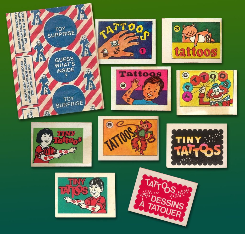
Prudently keeping in mind that this is a huge topic, with reams of historical ramifications, I’ll narrow my focus on a tiny area of the map: the four Cracker Jack prizes I’ve held on to for decades, and that turned up in a box I was browsing through the other day.
« Prizes were included in every box of Cracker Jack beginning in 1912. One of the first prizes was in 1914, when the company produced the first of two Cracker Jack baseball card issues, which featured players from both major leagues as well as players from the short-lived Federal League. Early “toy surprises” included rings, plastic figurines, booklets, stickers, temporary tattoos, and decoder rings. Books have been written cataloging the prizes, and a substantial collector’s market exists. » [ source ]
Like many a cartoonist (just ask Chip Kidd, Charles Burns, Mark Newgarden, Ben Katchor, Wayno, Chris Ware…), I’ve always been irresistibly drawn to the anonymous sprouts of advertising and industry: the artwork adorning matchbooks, cheap novelties and their packaging, beer coasters, liquor labels… so much toil that surely paid peanuts (and perhaps popcorn), unsigned and unappreciated. But a surprising portion of that work, ubiquitous and yet invisible, was created by skilled craftsmen. There’s a necessary economy of means, a simplicity of line — saving time and allowing for crappy, ‘it’ll do’ reproduction, but also effective design and a certain timeless je ne sais quoi.
Back when The Cracker Jack Company was its own entity, a lot more care and attention were bestowed upon minute details. Most of these tattoo booklet cover designs predate the company’s 1964 acquisition by dairy company Borden. The bottom right booklet is a Canadian variant from the late 1970s-early 1980s.
And so, here’s the cream, so to speak, of my small collection of Cracker Jack temporary tattoos. Enjoy!
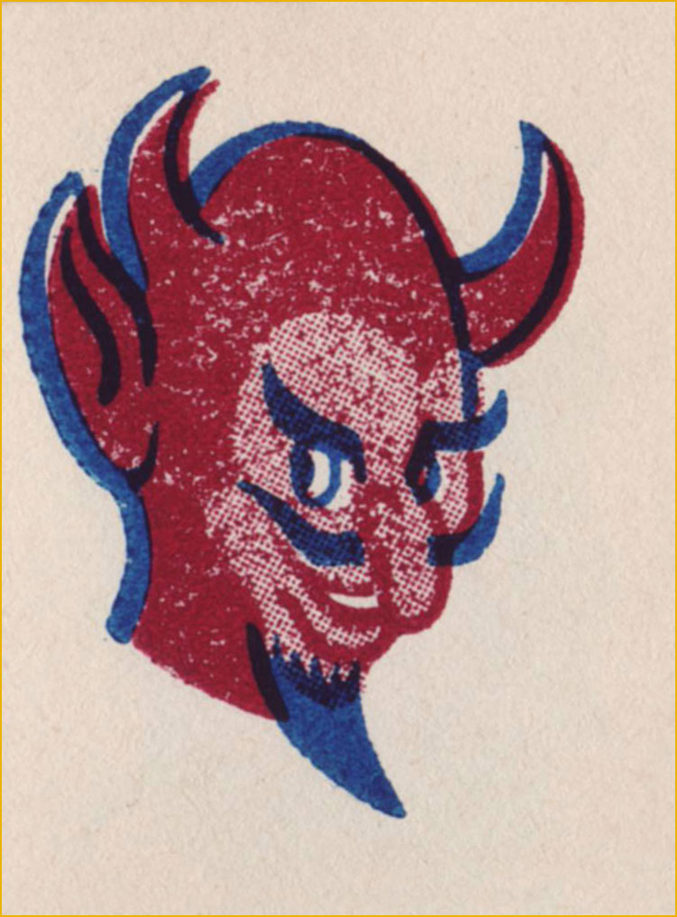
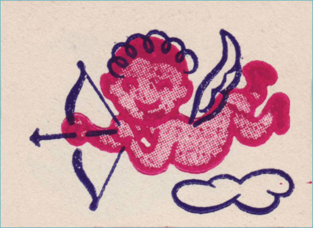
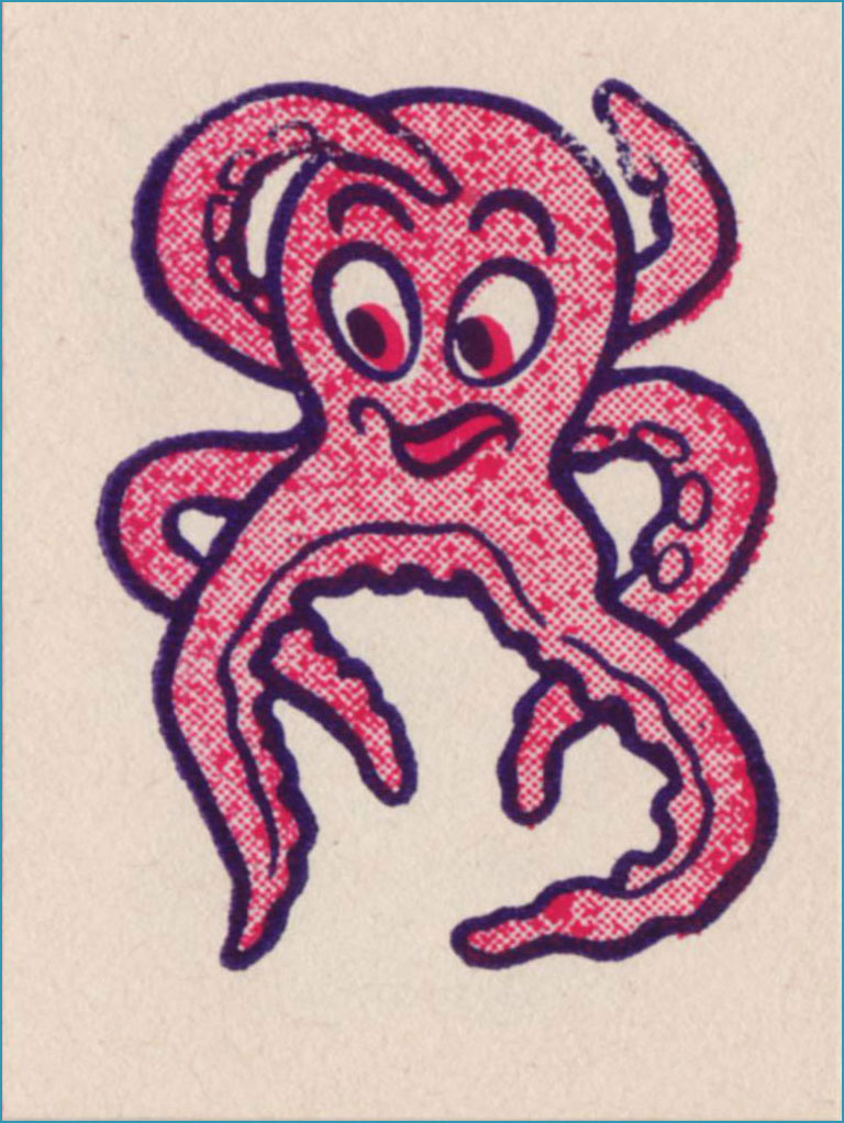
I’m picturing some Bible Belt toddler proudly sporting this one on his arm and giving grandma a massive coronary.Terrible reproduction, obviously, but this line work is splendid. Does the grin make this one less bad-ass… or more?I just love the sheer randomness of some of these entries. I presume no-one was really paying attention.Surely Dan Clowes must have encountered this one. You never know what’s going to linger in your DNA.Well, they got all the accents right in the French text, though the execution, I’m sure you’ll agree, could have been more elegant.Since our Tentacle Tuesday feature is currently on hiatus, I can use this charming pair of cephalopods.He’d make a fine sports team logo… well, not nowadays, since all the humour, joy and brightness have been painstakingly excised from pro sports design. Gotta look *tough*!This this not need a second colour. As a tattoo, I’m sure it was a murky fiasco. But it’s a nice bit of drawing.
-RG
*I’m only a year behind the news on this item, which isn’t too bad in my case.
In his introduction to Isolation and Illusion (2003, Dark Horse), a collection of short stories illustrated and sometimes scripted by Philip Craig Russell between 1977 and 1997, Will Pfeifer argues that ‘thekey to Craig’s art – what really brings it to life – is the small stuff‘.
I would rephrase that to ‘personal stuff’. Russell’s own stories (such as Breakdown on the Starship Remembrance or La Sonnambulaand The City of Sleep A Fragment of a Dream that appeared in Night Music no. 1 and no. 2 published by Eclipse Comics in 79 and 85) blew me away when I first encountered them. Imagine my initial enthusiasm when I finished reading them and anticipated exploring Russell’s bibliography… to find myself amidst seemingly endless comic book adaptations of Wagner and Mozart operas and traditional fairy tales. His work with Neil Gaiman did not spark any further curiosity on my part.* Artistically speaking, almost all Russell draws is impeccable, majestic, and ambitious in scope — but what is the pleasure in all this splendour without an emotional connection? Again and again he deploys a lush romantic carpet upon which innocent youths frolic… but it is a walk, alas, through a rose garden in which everything is scentless.
Today we’re running The Insomniac (originally published in Night Music no. 1, February 1985), one of my favourite Russell stories. It also makes for a great showcase of his artistic abilities as well as his landmark celestial landscapes. His favourite main character, a wide-eyed young man, is present and accounted for, but he’s not nearly as doe-eyed as usual, instead presented as a squinty, vaguely nerdy type, with no classical musculature with a proud Roman profile in sight.
Russell explains: «The Insomniac was conceived in 1979 and realized in 1984. Its walking/dreaming shifts in tone enabled me to work in various visual styles. From the early 80’s sketchbook surrealism to record album covers to photorealism, it incorporated about 15 years of drawing into a 12-age story. »
There’s something Eddie Campbell-esque in these panels of everyday life… As for the aforementioned celestial landscapes, they bring to mind the music of Jon Lucien (for example).
~ ds
*This is not a pro-Neil Gaiman household, unless the cats are hiding their proclivities on that subject.
« You should be ashamed, Mr. Lash! Making such noises in front of the children! »
Bat Lash was introduced with issue 76 (August, 1968) of DC’s launching pad title Showcase, wedged between the respective débuts of Hawk and Dove and Angel & the Ape. At various stages of his conception, the character of Bartholomew “Bat” Aloysius Lash reportedly went through the hands of Carmine Infantino (who designed or at least supervised all of the following covers), Joe Orlando, Sheldon Mayer and Sergio Aragonés. Sergio plotted and thumbnailed the mise en scène, Dennis O’Neil added dialogue, then Nick Cardy pencilled and inked. For such a product-by-committee, Bat Lash is quite remarkably good — but then consider the talent involved!
Mind you, I make no claims of originality for Bat — he was distinctly a product of the times, when the vogue of Spaghetti Western had peaked* and ironically left its (off)brand on its model. By the time — in 1968 — its market reached its apex, the Italian Oater idiom threatened to congeal into a morass of clichés, becoming, as these things tend to go, (over)ripe for self-parody. Intentional and otherwise.
I surmise that the key model for Bat Lash was the ever-charming Mario Girotti**, reportedly enlisted thanks to his resemblance to the intense but one-note Franco Nero, even replacing the latter in his star-making, titular role of Django (1966) for a 1968 sequel, Prepare a Coffin, Django.
Ripe for its time it may have been, but I suppose that American audiences were still quite allergic to jarring tonal shifts in their entertainment (now commonplace), and would be for some time — just ask, say, John Carpenter. So the blend of light comedy and dark drama that Bat Lash proposed must have been difficult to market.
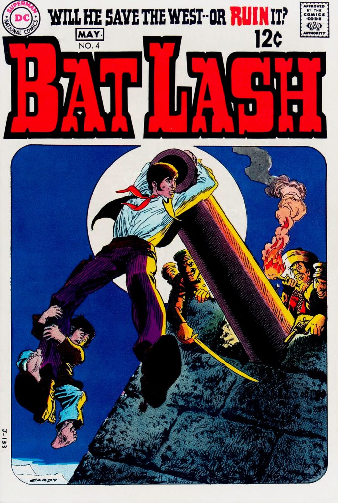
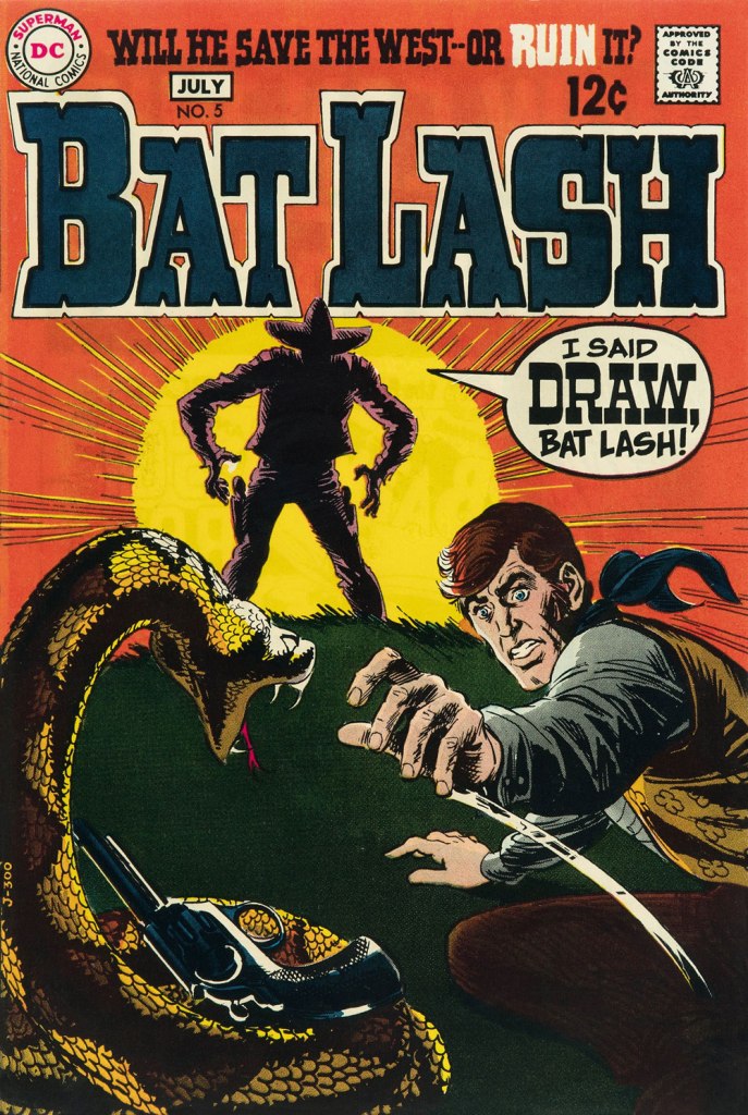
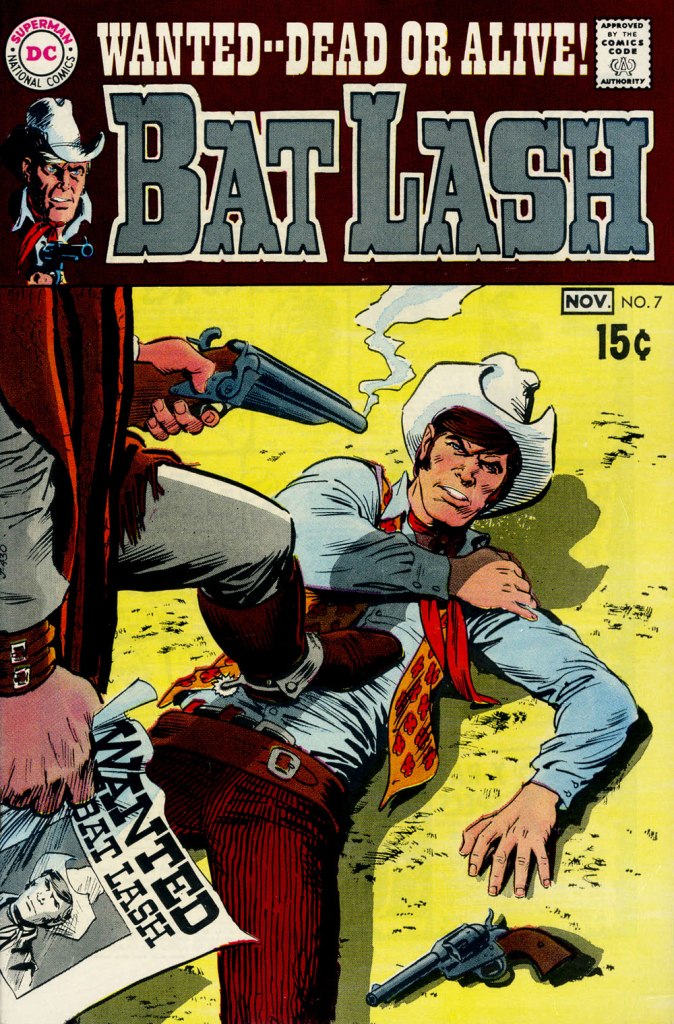
Our streak begins with Bat Lash no. 2 (Dec. 1968-Jan. 1969, DC) since the covers of Showcase no. 76 and Bat Lash no. 1 were good, but not — imho — great. I daresay this one is, in fact, the finest of the lot, with Cardy at his most Tothian.A peek inside the same issue, for contrast: lively and loose inking over rock-solid pencilling, and miles away from the tone of the cover. My guess is that some people weren’t happy.Bat Lash no. 3 (Feb.-Mar. 1969, DC) highlights the comedic side of the feature, which all but evaporated by the last two issues.This is Bat Lash no. 4 (Apr.-May. 1969, DC). Dig Cardy’s expert use of the ‘drybrush‘ technique on the stones.This is Bat Lash no. 5 (June-July 1969, DC). I’m reminded of a similar, later cover featuring one of Bat’s successors, Jonah Hex. The price goes up and the comedy… just goes. This is Bat Lash no. 6 (Aug.-Sept. 1969, DC).… and there goes the original tagline. This is the final issue, Bat Lash no. 7 (Oct.-Nov. 1969, DC)… and so must end this particular hot streak.
And now, some choice bonuses!
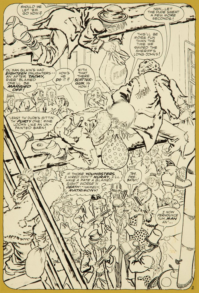
From issue 7, editor Orlando gives us some cheeky insight into the creation of an issue of Bat Lash.And plotter Aragonés provides some visual direction. To give you a sense of the less flippant, but not altogether grim, tone of the later issues, this is page two from issue 7. DC Comics of that period were quite ambitious with the limited means of the four-colour reproduction process, using plenty of backlighting and projected light… quite another level.
I was *delighted* to see ol’ Bat Lash turn up in the Weird Western Tales of DC’s outstanding Justice League Unlimited animated series, , along with some of his distinguished colleagues. In the usual order: Ohiyesa ‘Pow Wow’ Smith, El Diablo, Bat Lash, Jonah Hex.
-RG
* “In 1968, the wave of spaghetti Westerns reached its crest, comprising one-third of the Italian film production, only to collapse to one-tenth in 1969.” [ source ]
Today’s featured strip was once immensely popular in its native Germany, but who now remembers the name of Erich Ohser (1903 – 1944) or his nom de plumeE. O. Plauen*? Sic transit gloria mundi, alas.
Cartoonist and illustrator Ohser belonged to a set of three Erichs, the other two being Erich Kästner, a satirist and journalist, and Erich Knauf, a newspaper editor and poet. The three met in Leipzig and found in each other sympathetic souls with a common aesthetic and worldview. The Erich trifecta moved to Berlin at the end of the 1920s, where Knauf became the editor of publishing house Büchergilde Gutenberg, which published Ohser’s cartoons and illustrations as well as volumes of Kästner’s poetry.
All Erichs were ardently opposed to the emerging scourge of Nazis, but Ohser’s caricatures were particularly biting and ‘depicted [HItler and Goebbels]’ cohorts as gangs of dull-witted thugs, employing all the weapons of caricature: exaggeration and distortion, one-sided emphasis and intentional grotesquerie‘**. When Hitler came to power in 1933, Ohser’s work opportunities dried up completely as he was not admitted to the Reich Chamber of Culture, which meant that he couldn’t work at all. Fortunately, the editor of Berliner Illustrirte Zeitung finagled a special permission from the Ministry of Propaganda – Ohser could continue working, as long as he used a pseudonym and stayed firmly away from political material. Such was the birth, in 1934, of the weekly strip Vater und Sohn and the sobriquet ‘e.o.p.’, later expanded more officially to E. O. Plauen.
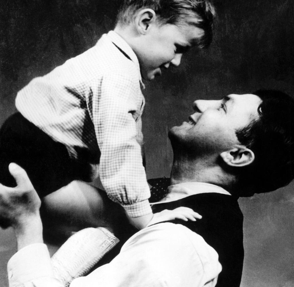
Ohser and his son Christian, who was surely an inspiration for the strip.
Father and Son won Ohser public acclaim, as well as financial success, but also many copycats and some inevitable appropriation – to Ohser’s chagrin, the strip’s characters were used to advertise Nazi charity drives and political events. Ohser ended the strip in 1937, probably because he felt that his creation was being misused by other hands, but he continued to work on cartoons and illustrations under the same pseudonym. He also had to put his talent at the service of the reviled enemy to survive, producing caricatures of anti-Nazi figures such as Churchill and Roosevelt for Nazi weekly newspaper Das Reich.
«‘I draw against the Allies – and not for the National Socialists’: This is how Ohser justified his disturbing caricatures of the 1940s to a friend of his, the writer Hans Fallada. He drew Russia as a murderous bear beast, America as a greasy, greedy capitalist, England as a bloodthirsty colonial ruler – it’s hard to believe that the same man gave the world the touching ‘Father and Son’ picture stories. » [source]
This uncomfortable position of living a sort of double life screeched to a halt when Ohser and Knauf were arrested in 1944 after being denounced by their roommate for anti-Nazi sentiment. Ohser committed suicide in his cell the night before the hearing. Knauf was killed a month later after being sentenced to execution by the court.
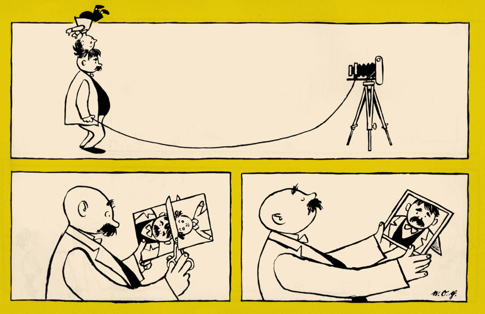
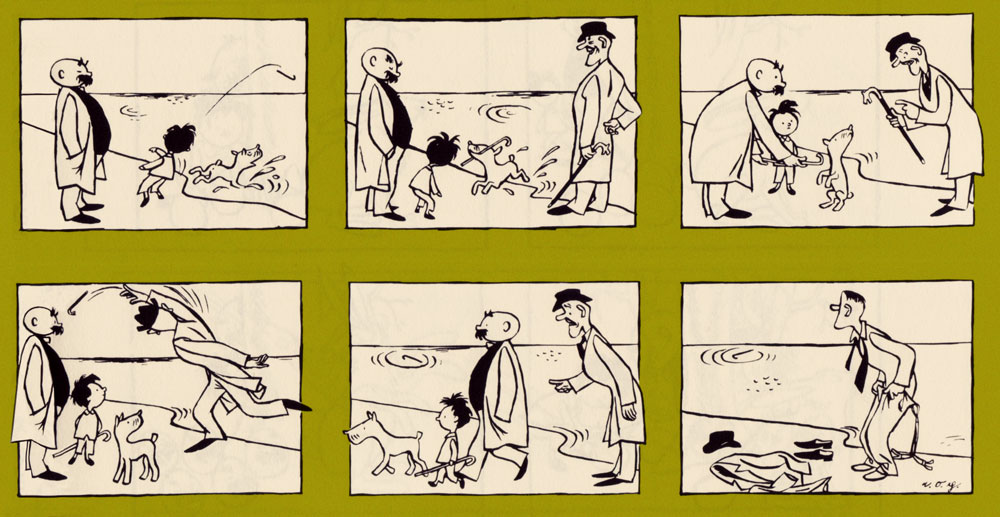
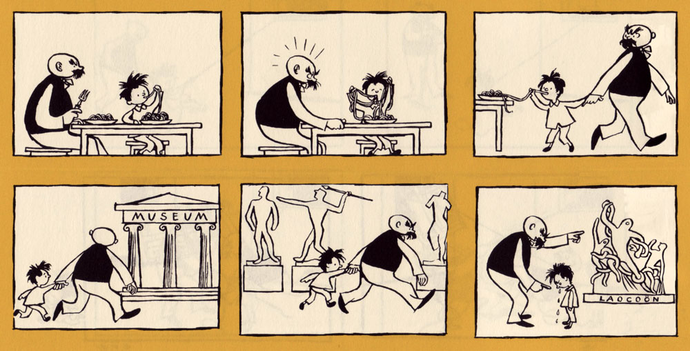
There are a few collections in various languages drifting about, but the definitive English-language one was published in 2017 by New York Review Comics. Here are a few excerpts from the latter, lovingly colorised (as is often the case around here) by co-admin RG. I also limited my selections to one-pagers, which leaves out (for example) the pleasantly surreal episode spanning many weeks when Father and Son get stranded on a desert island.
« Resemblance ».Ohser and his son Christian were regulars at the Berlin Zoo, which is reflected in a lot of strips, as is Ohser’s clear love and respect for animals.
« Nicely cropped»
« Unsuccessful overture »
« Too bad!»
« Cautionary example »
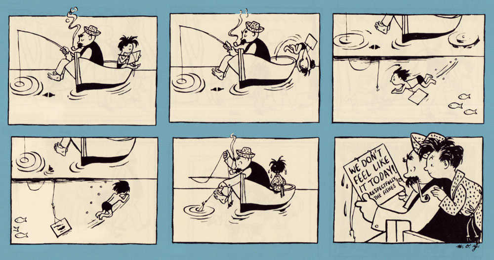
« A letter from the fishes »
« The birthday surprise »
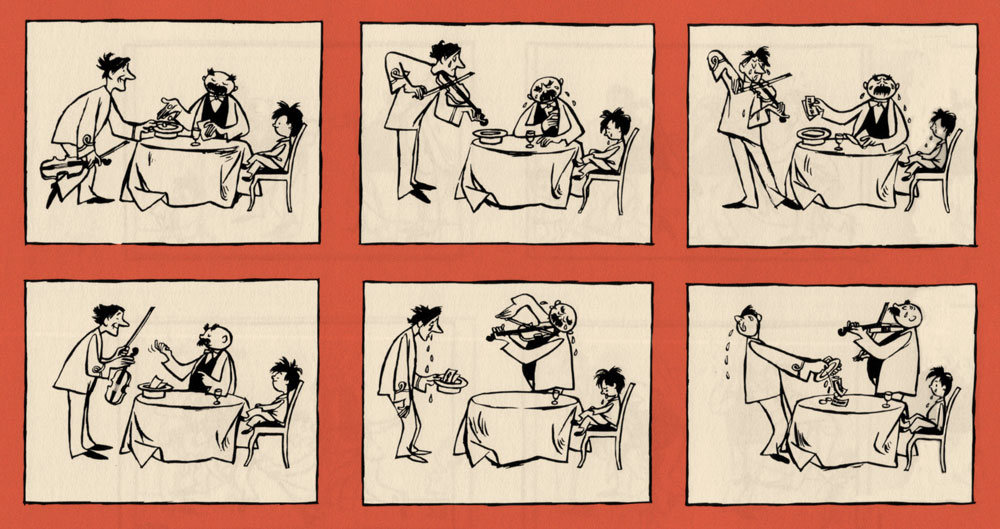
« Trading sobs »
« Occupation: inventor »
Ohser’s son Christian holding a collection of Father and Son strips.
~ ds
*Plauen is the name of the town where Ohser grew up.
** From the afterword to Vater und Sohn (2015) by Elke Schulze, translated to English.