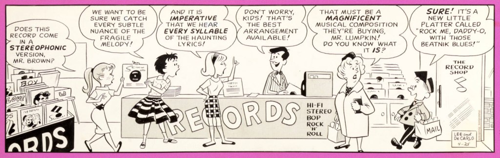
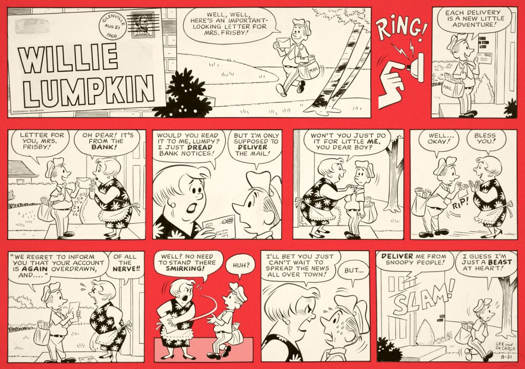
Willie Lumpkin was created by Dan DeCarlo and Stan Lee when Harold Anderson, the head of Publishers Syndicate (which merged into Hall Syndicate, which was eventually purchased by Hearst and is now part of King Features…) wanted a ‘bucolic’ newspaper strip set in some small town. The ‘friendly mailman’ idea is supposed to be Anderson’s, the family name Lee’s.
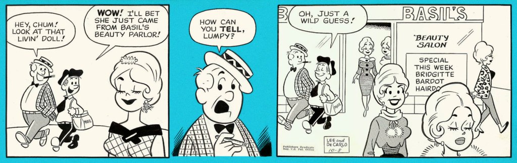
I cannot say that it’s a very funny strip (well, it was written by Lee, need we say more?), but it has a certain charm, and DeCarlo’s art is highly enjoyable, even though one occasionally feels like one has stumbled into an Archie story. DeCarlo liked drawing cheesecake, and we enjoy looking at it (for the heavy guns, visit RG’s Dan DeCarlo at Humorama (1956-63)), but in this case it is the other characters I am interested in, the kids with dirt behind their ears, spinster aunties in funny glasses, and of course the adorably bookish Lumpkin, the glue that holds the denizens of this small town together.
The strip ran from December 1959 to May 1961. Here are a few pickings —
I stayed mostly away from the aforementioned cheesecake, but here is an example of it:
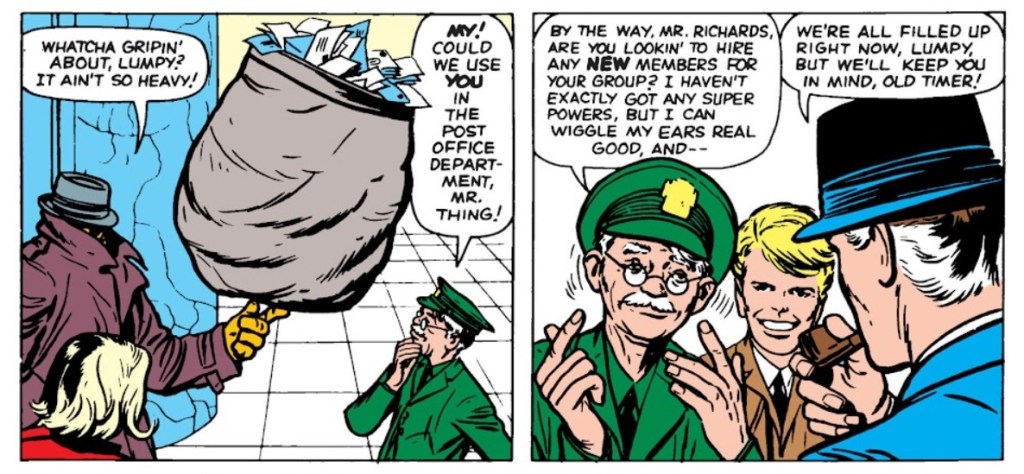
If the name Lumpkin rings some sort of different bell for you, it might be because he got incorporated into the Marvel universe in 1963 – a much older Lumpkin became the Fantastic Four‘s mail carrier with issue no. 11 (February 1963):
Pencilled by Jack Kirby and inked by Dick Ayers.
Over his Marvel years, his back story expanded and expanded, reminding me of the Russian expression ‘a stopper for every barrel’. He seemed to have been shoved into every plot that needed some secondary character to do something, delivering letters left and right, getting wounded multiple times during various epic battles, and accidentally ending up immortal (as of 2019). Same old, same old. I bet he preferred his quieter days among courting teenagers and middle-class families.
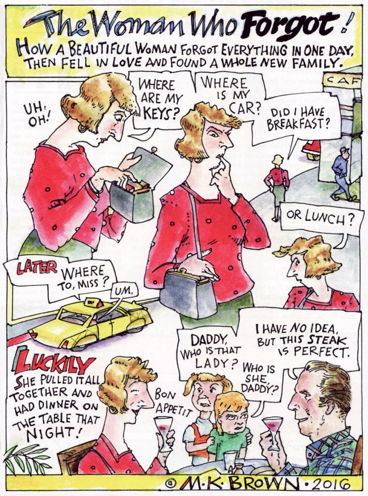
« Women: what do they want? They might want to float into the sky while hosting a brunch party. They might want a couple of handsome cops to come over and get rid of a snake problem. They might seek a doctor’s treatment for ‘wise-ass disease‘ or fantasize about revenge and forgiveness at the dentist’s office. And what about men? Mr. Science just wants to carry out his pointless experiments. Earl D. Porker, Social Worker, converses with household items and forgets the cat food. One fellow’s head is a basket of laundry. »
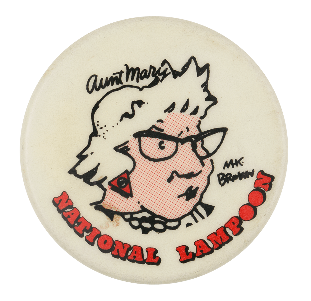
Not much is known about the personal life of the mysterious M. K. Brown*. From her official website, we know that she grew up in Connecticut and New Brunswick, but that’s pretty much it. On the other hand, details from her long and prolific career abound**: she was a mainstay at the National Lampoon Magazine between 1972 and 1981 (including the regular series Aunt Mary’s Kitchen); a frequent contributor to various magazines, most notably Playboy, The New Yorker, and Mother Jones; creator of the animated series Dr. N!Godatu, which ran in the Tracey Ullman Show in 1987 for a mere 6 episodes (two more remain unaired) until it was supplanted by the Simpsons; illustrator of children’s books… and so it goes.
In more recent years, Brown has been hanging out at The American Bystander, which I discovered by accident when co-admin RG (whose intuition for quality is fairly unfailing) picked up an issue of this magazine. A delightful surprise.
Despite the scope of her oeuvre and her very recognizable style, she’s not nearly as well known as she deserves to be. Fantagraphics, coming, as usual, to the rescue, published a sort of best-of in 2014, titled Stranger Than Life: Cartoons and Comics 1970-2013. Interestingly, this collection did little to dispel the clearly purposefully cultivated mystique. Whereas usually one expects an introduction with the author’s birth date and a quick summary of their childhood and proclivities, in this case M.K. Brown remained firmly ensconced within her initials*** and shrouded in pleasant mystery.
* I will mention straight away that she was married to equally eccentric cartoonist B. Kliban (another WOT favourite), not because a woman’s worth is in being a wife to her husband, but because ‘M.K. Brown married to B. Kliban’ has a harmonious ring to it.
** From the category of things not entirely related to her career, she is also an enthusiastic horse owner and rider [source].
*** Her name is Mary Kathleen, which I first found on the Wiki page for B. Kliban, later confirmed through a podcast she was featured on (more about this later).
The first episode of Dr. N!Godatu. Janice’s voice (for those on a first-name basis!) is provided by Julie Payne.
Brown is clearly a female cartoonist, in the sense of never eschewing topics that a doltish reader would expect a woman to talk about just because it’s a ‘female’ leitmotif. She can start with something mundane like a hostess organizing a party, put a surreal spin on it, pepper it with playful language, and end up with a concoction that’s devilishly acerbic, quite strange, and very funny. Bill Griffith put it well – she ‘makes the personal universal, makes the universal personal‘. The result seems quite polarising; it’s the sort of thing you instantly click with, or something so foreign that it’s unappealing. Is any of it dated, as I’ve seen some people suggest? Not in the slightest. Human relationships haven’t changed much over the years, though we like to pat ourselves on the back for being so much more evolved. Focusing on the fact that someone is wearing a suit with shoulder pads (which are, by the way, coming back into fashion) to decide it’s no longer relevant to modern life is daft.
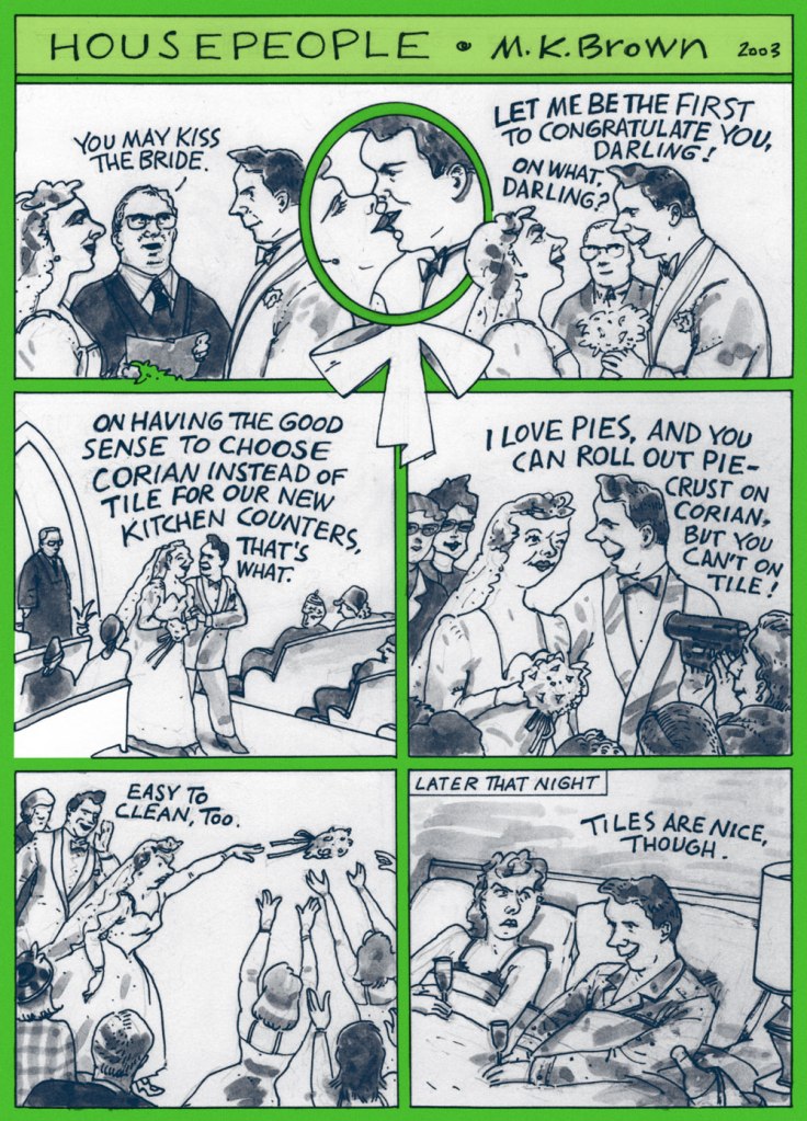
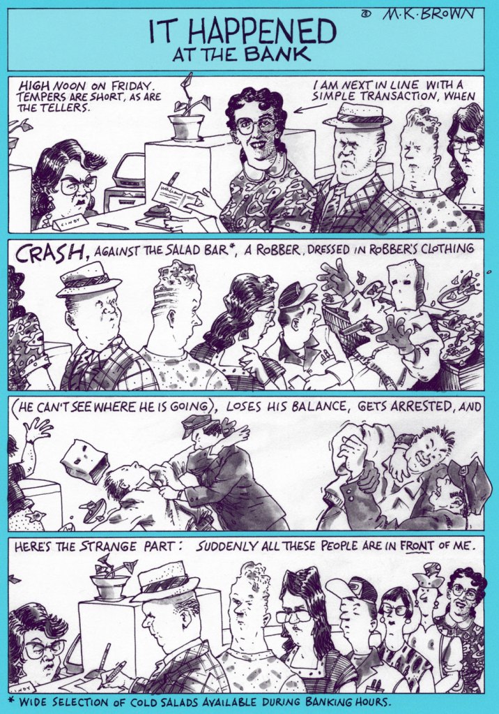
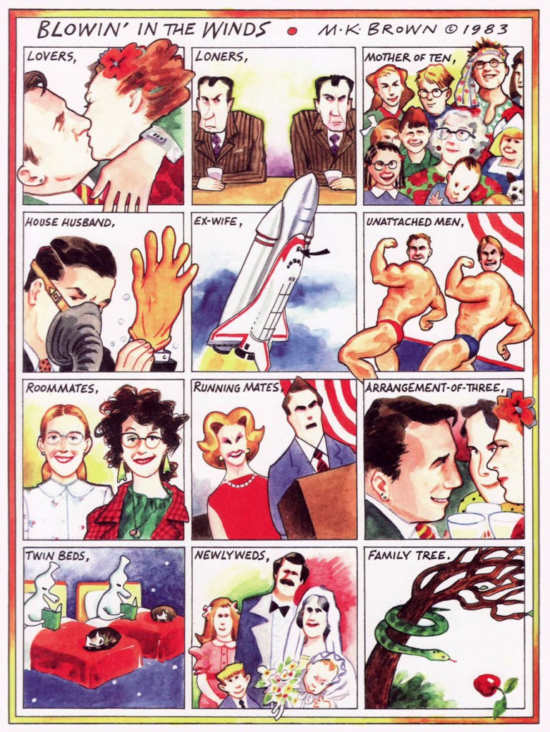
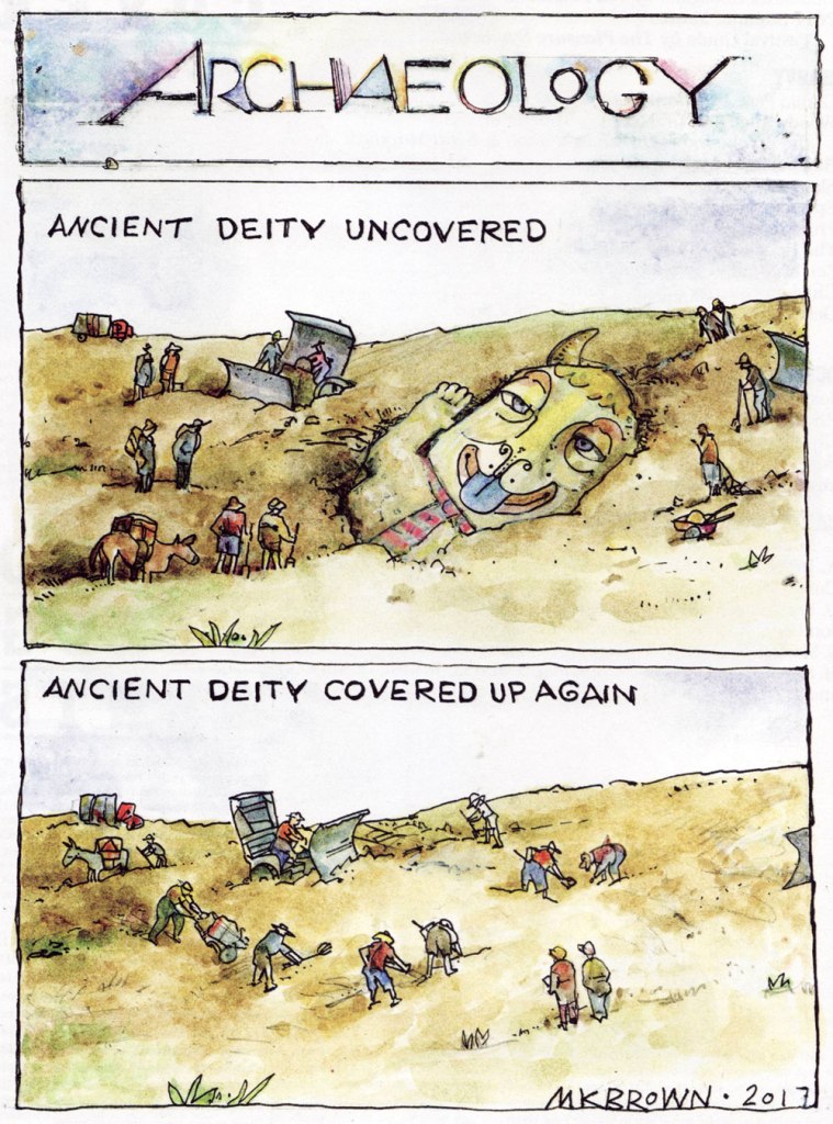
Here are some examples scanned from Stranger than Life of different vintages, lightly colourized by co-admin RG.
This one features Brown’s alter-ego, ‘White Girl’. « She can’t dance or sing the blues, but cluelessly does both anyway. It’s fun to speak through this character. I’m very fond of her. »
Here are three pages from more recent years, which also showcase Brown’s watercolours:
Published in The American Bystander no. 1 (Fall, 2015).
Published in The American Bystander no. 2 (Spring, 2016).
Published in The American Bystander no. 5 (Summer, 2017).
The American Bystander conducted a fun, hour-long podcast with Brown in 2016. I am a visually oriented person, and have immense trouble sitting through a podcast, so I had to tell myself I had to listen for the sake of this blog post – I hope you appreciate this sacrifice. It was a pleasure to listen to Brown, who sounds exactly like I pictured it, though I was somewhat underwhelmed by some of the softball questions she was asked – questions interviewer (in this case, Gil Roth) usually asks of a cartoonist, ‘what were your art influences?’, ‘what explains your sense of humour?’ I believe this has more to do with me than with the actual interview – I by far prefer to glean some understanding of a person through their work, as opposed to discussions about their work (which is a slightly strange stance for a blog writer). There is, however, a fun anecdote about how she used to put up her paintings on the walls to work on them, and had to cover her sleeping nocturnal husband and the bed he was on with plastic not to splatter him with paint. Brown also mentions that she has a stash of drawings which she could never get published because they’re too risqué – oh, how we would all love to see those! Click here if you’d care to listen to it!
«— Pickin’ flowers, Lucy? — No, you simple-minded piece of cream cheese – I’m filling the coal scuttle with apple sauce.»
My first exposure to a Rube Goldberg machine was through The Incredible Machine, a DOS game from 1993. I didn’t know at the time who Goldberg was, but I really liked the idea of setting up a chain of events triggering one another in the most convoluted-yet-satisfying of ways.
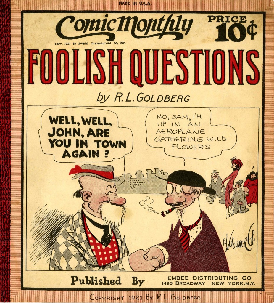
The machine was of course named after Rube Goldberg (Reuben Garrett Goldberg, 1883-1970), cartoonist, inventor, sculptor, et j’en passe. Given his lasting contribution to culture, it is interesting to consider that in the early days of his career, when he was a struggling cartoonist, Goldberg almost changed his family name to hide his Jewish roots – ultimately deciding that he couldn’t live with himself, had he followed his colleagues’ counsel. ‘Then I realized it was idiotic to even consider such a thing; that I would be ashamed of it all the remainder of my life; and that, if a man’s achievements are no bigger than the sound of his name, it doesn’t much matter what his name may be‘, he later wrote.
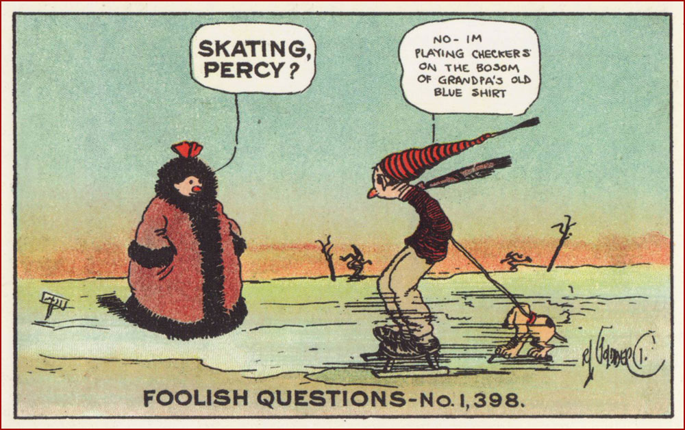
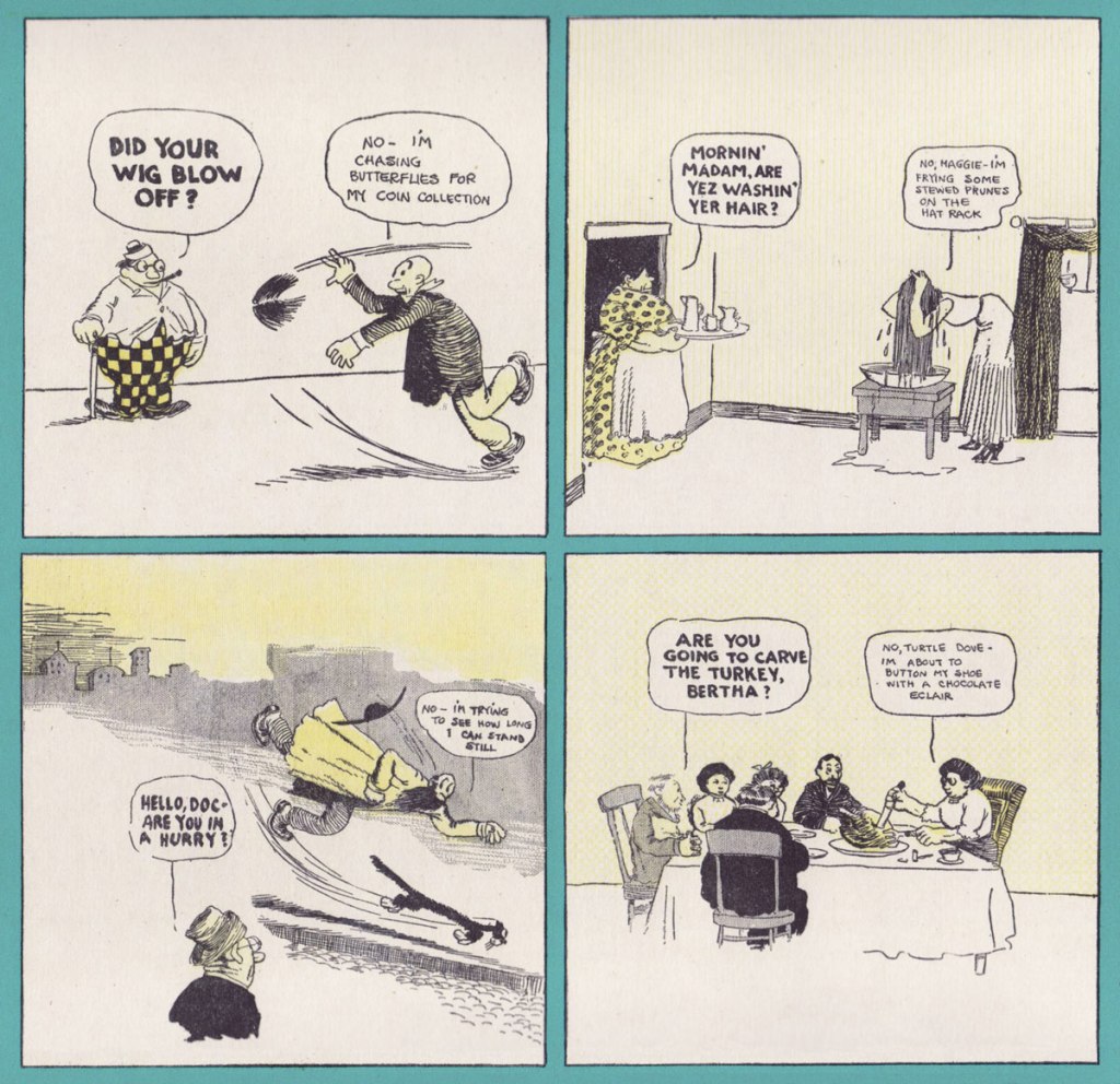
While Goldberg had a degree in engineering and worked for a short while for the San Francisco’s Water and Sewers Department (which perhaps honed his sense of the absurd, if anecdotes about a city’s treatment of sewage are anything to go by), his ambitions lay in the direction of cartooning from a very early age. His first comic, after a couple of years of being a sports cartoonist, was The Look-A-Like Boys, published at the beginning of the century (1907-1908) by the World Color Syndicate. In parallel, he was also working for the New York Evening Mail, for which he created the short-lived Reincarnation, a goofy, modern-day take on historical characters. His next attempt at a series is what initially made him famous (after which he went on to even greater fame): he produced around 450 Foolish Questions between 1908 and 1910; the very first one, published on October 23, 1908 was prosaically titled ‘Foolish Question No. 1’. Questions remained as witless as ever, but the answers got kookier and more surreal over the years!
FQ continued all the way into 1939 with plenty of enthusiasm from readers (who started sending in their own daft questions). It even inspired a song by Billy Murray. Here are some postcards:
In 1909, Goldberg expanded the FQ world into a Sunday strip, Don’t Some People Ask the Biggest Fool Questions?, which collected previously published strips by grouping them into tiers (and occasionally padding this format out with new artwork). In 1912, he went on to unleash the madcap inventions he’s remembered for today upon the world in the shape of The Inventions of Professor Lucifer Gorgonzola Butts, A.K., then shifted to political cartooning (for which he won a Pulitzer Prize in 1948) in 1938, and then recycled himself as a sculptor in the 1960s. Truly a life filled to the brim with adventure!
The examples below have been scanned from Foolish Questions & Other Odd Observations (Early Comics 1909-1919), published by the wonderful Sunday Press in 2017. I highly recommend it; abounding in bonus materials, it also has two introductions for the price of one, namely one by Goldberg’s granddaughter Jennifer George, and another written by comics historian Paul C. Tumey (author of the equally magnificent tome, SCREWBALL! The Cartoonists Who Made the Funnies Funny – read a review of it by Eddie Campbell* here). Goldberg’s sense of the absurd is truly a delight, and I dare you to not giggle while perusing these.
~ ds
* Another WOT favourite that we never really got around to talking about. I will, however, refer you to this interesting discussion about comprehending/perusing comics, in which Cambpell conjures an entertaining mental image, relating to his appearance on TV to talk about why ‘some people just can’t read comics’: «My blather would have been mercifully cut because I launched into an insane mimicry of a theoretical middle-aged woman in tears from not being able to interpret the TV guide.»
« All my life I’ve been torn between frivolity and despair, between the desire to amuse and the desire to annoy, between dread-filled insomnia and a sense of my own goofiness. Just like you, I worry about love and sex and work and suffering and injustice and death, but I also dig drawing bulgy-eyed rabbits with tragic overbites. » — Matt Groening
Unlike most of my peers, I didn’t grow up absorbing The Simpsons, probably because I only watched cartoons on videocassettes instead of actual TV. I also somehow managed to skip Futurama (catching up with it years and years later, with great enjoyment). So the work of Matt Groening* (who probably needs no introduction, but you can get one here) was not really familiar to me at all when co-admin RG introduced me to The Big Book of Hell, though of course I was aware of the Simpsons aesthetic, as one would truly have to live under a rock not to be acquainted with it to at least some degree.
*Here’s how to pronounce ‘Grœning’ correctly and impress all your friends.
Life in Hell crept into the world in 1977 as a self-published book that Groening, freshly moved to Los Angeles from Portland to pursue his ambition of becoming a writer, would give out to friends. He also sold it for two bucks a pop in Licorice Pizza, one of a chain of record stores operated by James Greenwood. As is often the case, Groening’s cartoonist/writer/producer/animator career kicked off by way of serendipity: in 1978, an editor from the charming WET: The Magazine of Gourmet Bathing liked Life in Hell enough to print a few of its strips. From then on, the strip’s popularity snowballed slowly but steadily (from its first regular weekly appearance in the Los Angeles Reader in 1980, to the huge success of a compilation of LIH’s love-centric cartoons, titled Love Is Hell, in 1984, to the strip’s presence in over 250 newspapers by 1986), which eventually led to The Simpsons. Speaking of the latter, I am now shamelessly going to plug a previous post, namely Tentacle Tuesday: Treehouse of Tentacular Horror.
Here’s a selection from several out-of-print anthologies co-admin RG had handy, namely from Love Is Hell (1984), Work Is Hell (1986), School Is Hell (1987), Childhood Is Hell (1988), and How to Get to Hell (1991).
Personal favourites Akbar and Jeff were apparently introduced so that Groening could incorporate real-life conflicts he had with his girlfriend into the strip without it being too obvious about who was who. When we noticed a couple living across the street (two men always dressed in matching, brightly coloured sportswear) we instantly nicknamed them Akbar and Jeff.
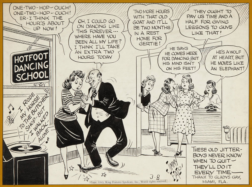
In the beginning of time… or rather the end of the 1930s, which may feel like a similar thing to some… there was Jimmy (James) Hatlo‘s They’ll Do It Every Time, a popular King Features newspaper cartoon with an impressively long run (1929 all the way until 2008, although no longer under Hatlo’s direction since 1963 due to Hatlo’s fairly early demise at 66). Hatlo, a sports cartoonist working for The San Francisco Call-Bulletin, stumbled upon the greatest success of his career by accident – scrambling to fill a void left by a shipped-yet-misplaced package of cartoons that for some reason didn’t make it to the office in time*, he drew the first couple of strips as a bouche-trou, only to find himself with an instant hit. The old problem of running out of ideas was creatively solved – Hatlo asked his readers for suggestions, and the readers, « brimming with seemingly small observations about mundane yet captivating matters, but lacking a way to tell anyone outside their own circles of friends about it » (as Bob Green described it in his Wall Street Journal epitaph A Tip of the Hat to Social Media’s Granddad), were happy to oblige. Hatlo acknowledged every submission with a ‘tip of the Hatlo hat’ – the thrilled reader would get his or her name and hometown displayed prominently in the bottom right corner of the strip.
* Jimmy Hatlo—Man of Many Hats, a detailed article by Ed Black I wholeheartedly recommend, offers another version of this story: « His managing editor, Edgar T. ‘Scoop’ Gleason, was frantic: He had a hole to fill in his comics page when Hearst abruptly ordered him to pull Billy DeBeck’s Bughouse Fables so it could run in the Examiner. Gleason prevailed upon Hatlo to produce something, pronto. »
Strip from sometime in August, 1931 (exact date unknown).
Strip from May 31st, 1939.
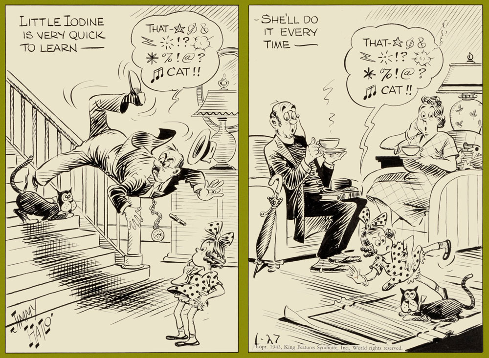
Strip from January 27th, 1943. The character of Little Iodine, born in the pages of They’ll Do It Every Time, « the embodiment of all brats I knew… naughty as hell — and still likable », according to Hatlo, spun off into her own strip, which ran from 1943 to 1983. La petite Iodine, a French translation, first appeared in Saturday editions of Québécois weekly La Patrie in 1945 and 1946, and also made it into some other Québec newspapers later on, where co-admin RG eventually came across it in his youth.
Strip from March 8th, 1943.
Presumed November 30th, 1945.
Strip from August 7th, 1961.
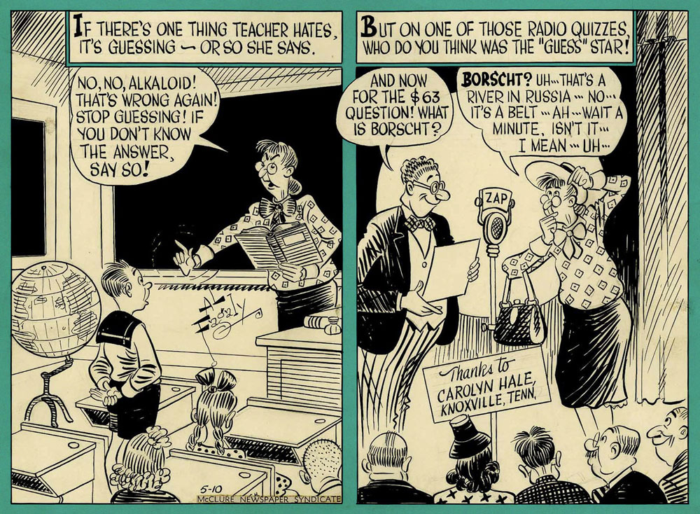
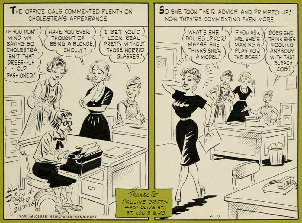
Some twenty years later, in 1948, a ‘blatant’ knock-off – There Oughta Be a Law! – was launched by the McClure Newspaper Syndicate, disturbingly similar in look and tone to the strip it was imitating. It was created by writer Harry Shorten and artist Al Fagaly. Whereas Hatlo’s strip brought him fame, There Oughta… didn’t do much for its creators – though Fagaly (creator of Archie Comics‘ Super Duck) needed no padding on his already impressive (with more to come) résumé. Just like with They’ll Do It Every Time, Fagaly died in 1963 (it was a bad year for cartoonists, it seems), and Warren Whipple took over the illustration duties. Interestingly, Whipple is supposed to have also worked on TDIET at some point (according to this source, and Wikipedia, which copy-pasted it), though I can’t find more information about it.
After a respectable run of 36 years (it ended in 1984), There Oughta Be a Law sank into relative obscurity. One could argue that Hatlo could have sued, had he sufficiently resented the copycat strip – maybe he was too cool a cat for such austerity, maybe imitation is flattery, or They’ll Do It Every Time was sufficiently well-established and popular enough not to have to worry about competition. Hatlo certainly set it up for success, evidence of which is how it ran like a well-oiled machine long after his death. Upon reflection, I prefer the art of TDIET – crisper and more dynamic, it immediately grabs the eye, making these strips enjoyable not only for their humorous observations, but also for their style. I will, however, note that Fagaly had a really fun signature. What do you think, reader?
All of the below strips are circa the 1950s.
I had to include this one, as I am appalled somebody could be unfamiliar with borscht. No, I’m not going to provide a link, look it up yourselves.
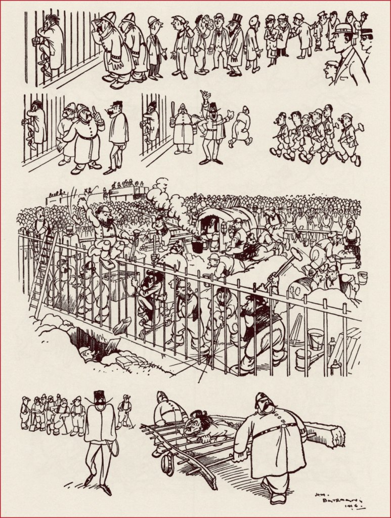
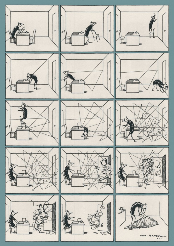
Henry Mayo Bateman (1887-1970) was a British cartoonist now frequently described as ‘the most innovative cartoonist of his generation’. His main claim to fame is the ‘The Man Who…‘ cartoons; as it often happens with when the popularity of a creation goes far beyond what the artist originally had in mind, Bateman himself was ambivalent about it, and felt constrained by its acclaim. Be as it may, a lot of his cartoon collections (most of them hopelessly out of print) are named according to this template: Man Who Drew 20th Century (1969), The Man Who Was H. M. Bateman (1982), H. M. Bateman: The Man Who Went Mad on Paper (2012)… The one I have in my collection broke away from this mold –it’s a French collection titled Mimodrames, with all text inside, including the titles of cartoons, in both French and English. Strangely, the French cartoon captions seem more à propos than the English ones.
Case in point: this was called ‘Prisoner when arrested clung to the railings‘, which in French was translated to ‘Le protestataire qui se cramponna aux grilles à l’arrivée de la police‘, and yet protestataire is more like ‘protester’, not ‘prisoner’, which I think is more fitting.
Bateman seemed to be predestined for his career; having decided at the ripe old age of 13 to dedicate his life to becoming an artist, he spent all his free time drawing and sold his first cartoon at 14 (!) Though his father was adamant that his sole male offspring should follow his footsteps and become a respectable businessman, Bateman’s small yet steadily increasing income from his cartoons and the growing demand for them by halfpenny weekly comic papers finally forced his pa to grudgingly agree to his son pursuing a career in art. Bateman was 16 at the time.
‘The Man who filled his fountain pen with the hotel ink’
Bateman continued to sell cartoons throughout his studies; by 1906, his work was in demand by many publications much fancier than the inexpensive comic papers he started out in. Percy Venner Bradshaw, fellow artist and founder of the Press Art School, meeting him that year for the first time, found a ‘quiet, shy, delicate boy who was much more interested in colour than in line work, and who could only with difficulty be induced to talk about either‘. A fitting description of a man who appeared quiet and reserved, who felt things more keenly than his peers or his colleagues – a swift glance at his best work dispels an impression of similarity between him and the rowdier cartoonists. Not that Bateman couldn’t be funny – but something lurked behind the chuckle, some dark cloud lingering over his characters. As Anthony Anderson (not the American actor, nor the British murderer; all I was able to find out about him is that he’s listed as an editor of many books) notes in the introduction to Mimodrames:
« The more one examines his drawings the more one feels that, despite his conservatism, Bateman’s sympathies lay not with the offended but with the offender, a sympathy for the underdog, the little man. Indeed, in many of his cartoons, especially during the war, the little man was often Bateman himself – a clear self-portrait. »
This sensitivity comes loud and clear through Bateman’s writing as well – to quote, for example, his description of a medical examination undergone in 1916, when conscription for WWI was in full swing:
«In company with other doubtfuls, I was made to hop naked and submit to a bombardment of tests before a glaring army doctor sternly ordered me to ‘go away and get some clothes on’, as if I was responsible for appearing before him in that condition. And in return for my afternoon’s exhibition I was handed an unhealthy looking card bearing the magic symbol of C.3. I had done what I could to convert myself to cannon fodder. I just wasn’t fit for it. »
This description reminds me of Brel’s Au suivant (for those who don’t speak French, Scott Walker’s Next).
‘The Maid who was but human’, or ‘La bonne avait de l’humour’ (something like ‘the maid had a sense of humour).
‘The Man who broke the tube’
I would also be remiss in failing to mention his work for satirical magazines Punch and the Tatler (the famous ‘The man who…’ cartoons ran in the latter, often in glorious colour double-page spreads). According to Anderson, Bateman became the highest paid cartoonist in Britain around the 1920s and 1930s.
‘The editor of a yellow newspaper receiving news of a horrible murder committed in circumstances of the most revolting atrocity’
Bateman’s dearest ambition throughout his life seemed to have been to become a serious, dedicated painter. When he was 46, he set his lucrative career aside, and went to Spain and France to paint. Anderson ends the introduction with the nicest epitaph I’ve read in a while:
«He spent the next three decades gradually shedding more and more of his old life, retiring to a small house on the edge of Dartmoor, travelling extensively and on his own […], always with his sketch books, his paints and his fishing rod. He became peaceful, solitary, content. He died on the island of Gozo in 1970, still painting every day, living in a small hotel with very few possessions but in the room with the finest view. »
Another source mentions that Bateman fought long and hard with Inland Revenue, so perhaps his self-exile to Gozo, an island in Malta, was not as poetic as it sounds. I wasn’t able to find much information about that, other than his obvious dislike of taxmen (exemplified by cartoons such as The Income Tax Official in Hades) – but taking periodic stabs at the taxman is a traditional cartoonist sport, so it doesn’t really prove anything.
‘The Income-Tax Worm at Work’
These were some of my favourite Bateman pages, I hope you enjoyed them!
« Any claim to fame I might have I owe to diligent swiping right and left and staying sober at the drawing board. »
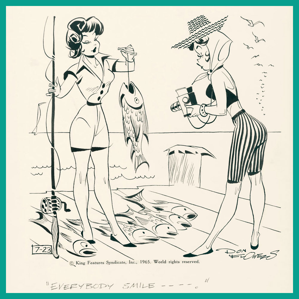
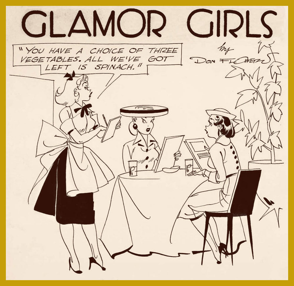
I’ve already talked about cartoonist Don Flowers (1908–1968): see Don Flowers, Sadly Neglected Cartoonist, although I wish I had given it a snappier title. I’ve been slowly ripening (like a pear, that subsequently falls off the tree with a wet, squishy thump) for a follow-up, but biding my time until I finally receive my copy of Glamor Girls of Don Flowers (2006, Fantagraphics). That goal is now (nearly) realized, and since spring seems like the perfect time for this sort of post, shall we strap on our travelling gear and fly back to the beginning of the 1930s?
To recap, Don Flowers created the alliterative Modest Maidens (later renamed into Glamor Girls) for AP Newsfeatures in 1931. The ‘modest’ epithet in the title may seem like a misnomer, or a tongue-in-cheek allusion to the girls’ open-minded mores, but as comic historian-cum-cartoonist Coulton Waugh aptly observed in his The Comics (1947)*, a book acknowledged as the first comprehensive analysis of comic strips*, « sexy they are, and yet, despite every display, somehow they always do remain modest maidens. » This is something one often encounters in cartoon depictions of female pulchritude – the standard male audience seems best attracted to women with a sort of innocent sexuality, borderline unaware of the effect they are producing despite making a calculated effort to produce it. In other words, however disrobed these maidens may be, they are never vulgar or sexually purposeful; they’re not doing, they’re being done to.
The batch of images in my previous post about Flowers focuses more on the usual scenarios – women dating rich guys, alluring dancers in various states of undress, and so on – so today’s array is in a slightly different vein.
An interesting aspect of Flowers strips is that they often feature an interaction between several women with nary a man in sight; and not only that, but they’re not even discussing men.
Even when barefoot, these girls hold their feet as if they were still strapped down in some extravagant heels. On the other hand, high heels deform the foot over time, although nobody wants to be reminded of that in this context.
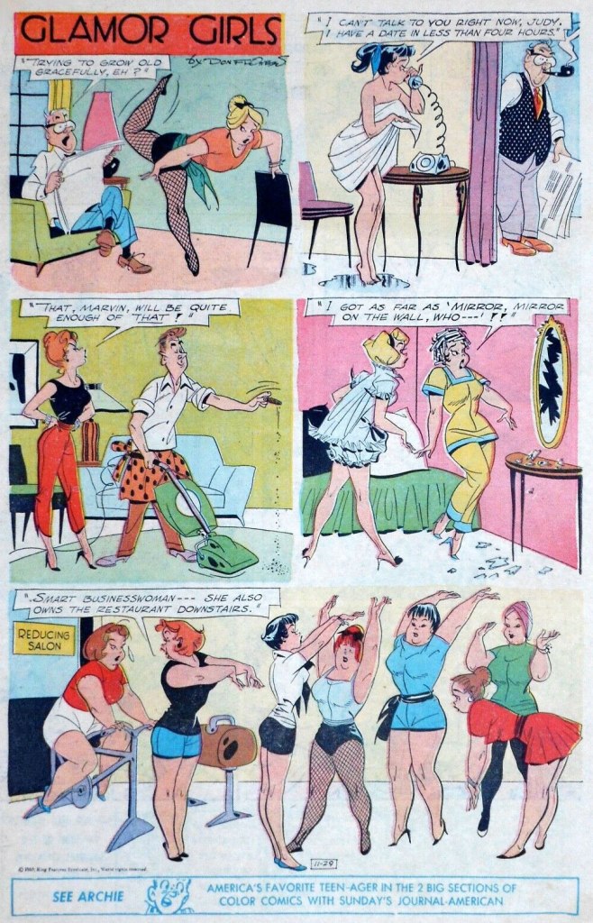
What the full published page of Glamor Girls looked like (November 29th, 1959).
Much has been said about Flowers’, well, flowery line (and ‘by much’, given that his popularity distinctly waned over decades, I mean ‘not really a lot’). It reminds me mostly of Hank Ketcham‘s style, he of Dennis the Menace fame. For example, add a little scruffy kid in the corner of this strip, and see what you think:
In the meantime, Waugh puts Flowers in the clan of Pattersonites, artists who followed the footsteps of illustrator Russell Patterson (1893-1977). « The Flowers girls [are] a long-legged creation. They have a a real rhythm running through them; they are, in this respect, somewhat more relaxed and graceful than the Patterson product, although the pattersonites can claim a vitality and sparkle on their side. » I would say that the Patterson girls have stronger wills, an independent streak that you can see in the slightly insolent look they give the men who ogle them. For comparison’s sake, the following three are by Patterson:
Sometimes self-defense is necessary.
~ ds
*You can read in full here; the first edition from 1947 goes for a lump sump of money these days. There is an affordable reprint from 1991, but it cannot beat the original cover:
« The best thing for rich people to do is become Batman. » — Karl Heinrich Marx*
So we’ve got another dour, dark, mumbly, violent, grim ‘n’ gritty Batman movie making the rounds. I’ll pass — I’m afraid that’s not my Batman of choice. But I’m certainly game to provide an alternative view.
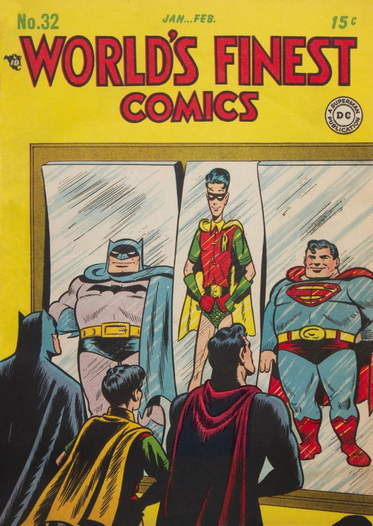
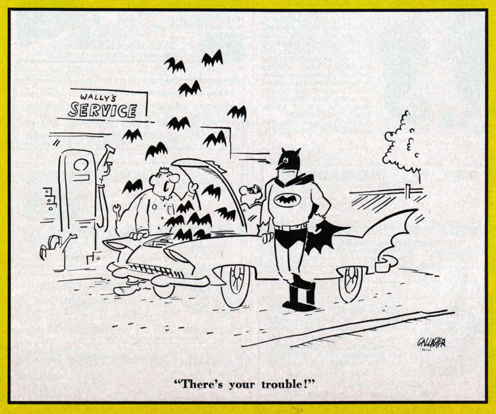
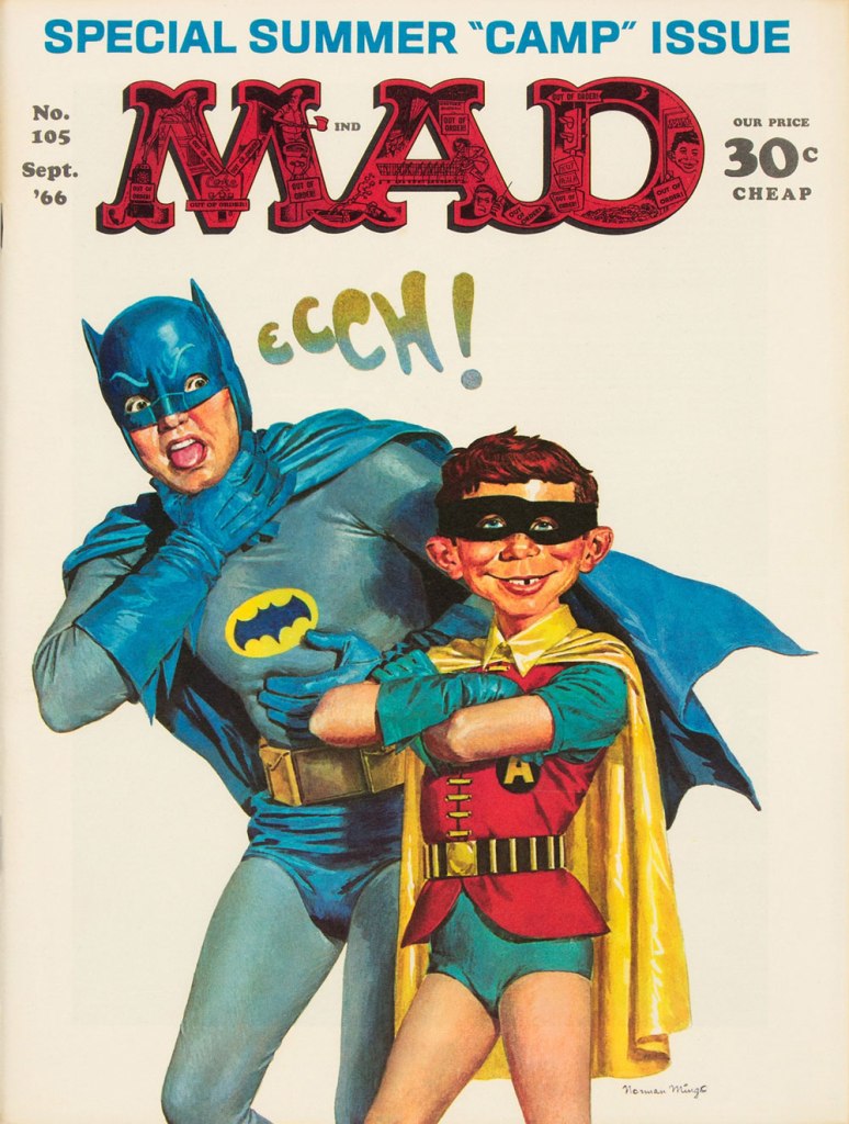
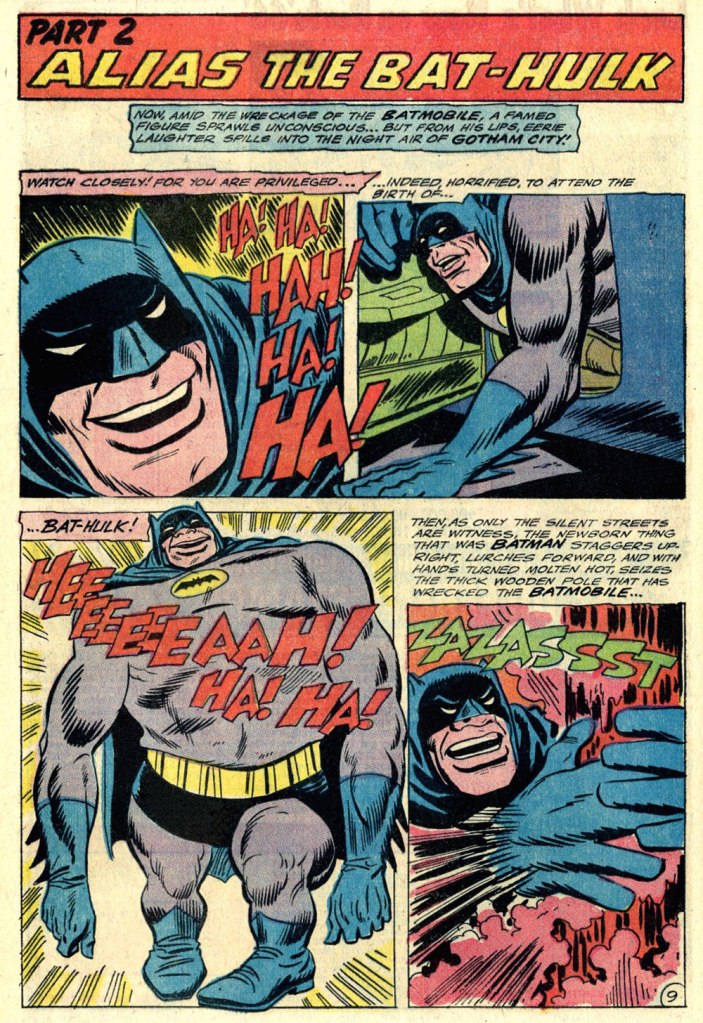
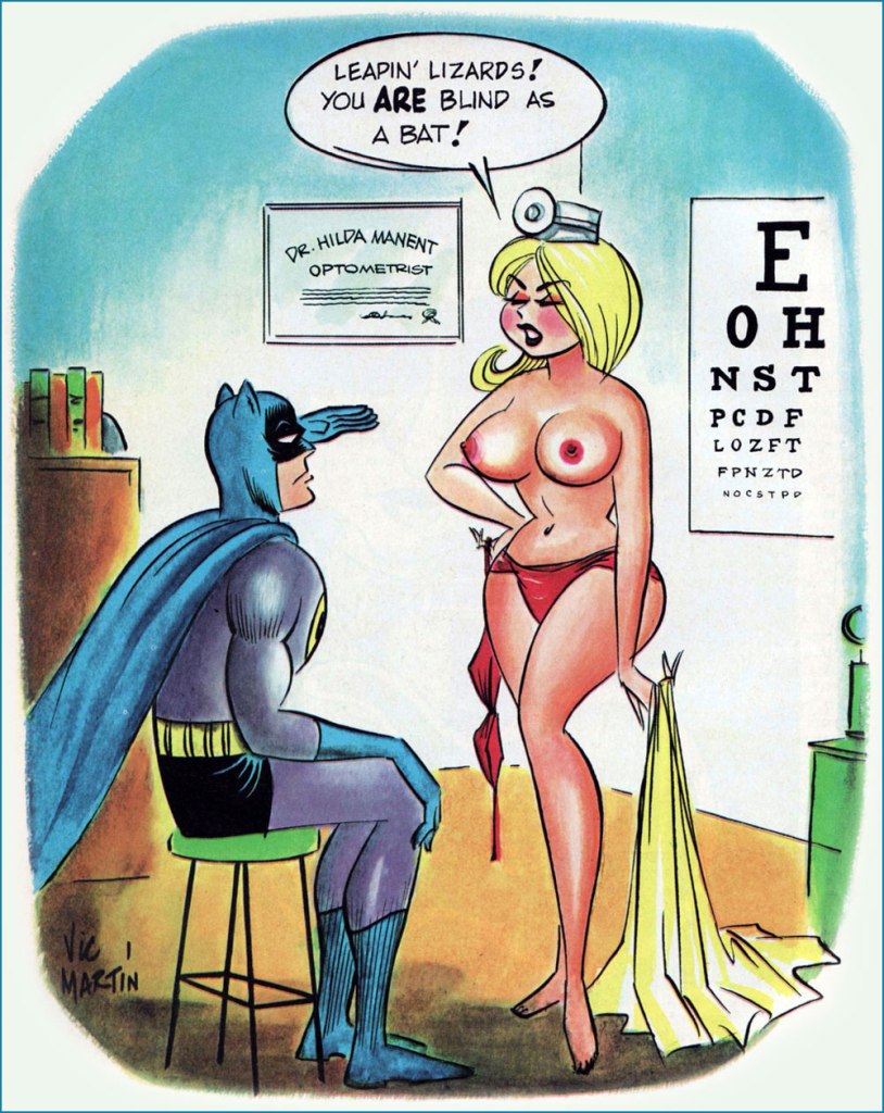
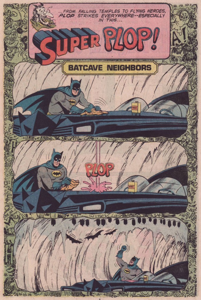
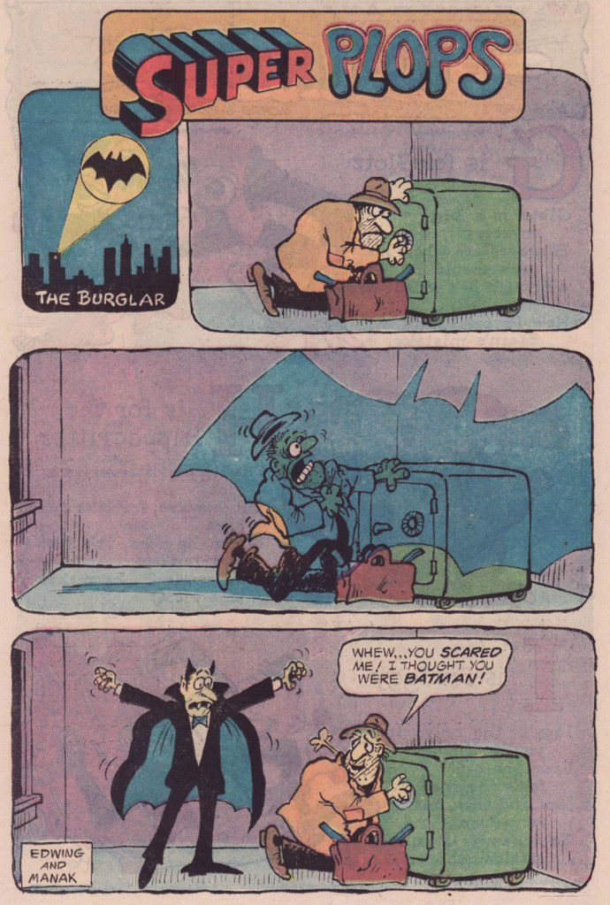
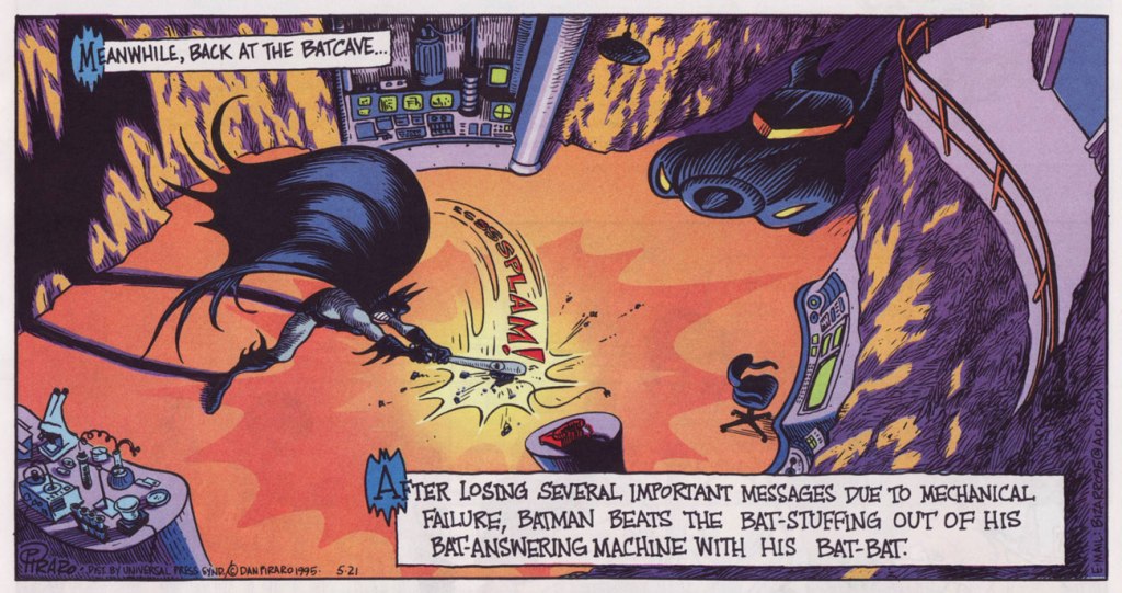
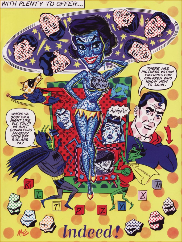
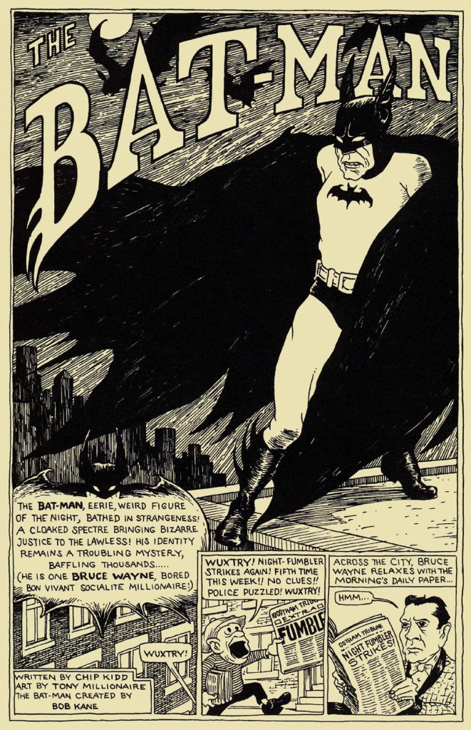
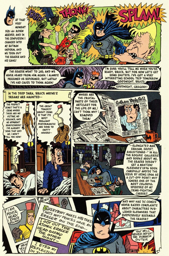
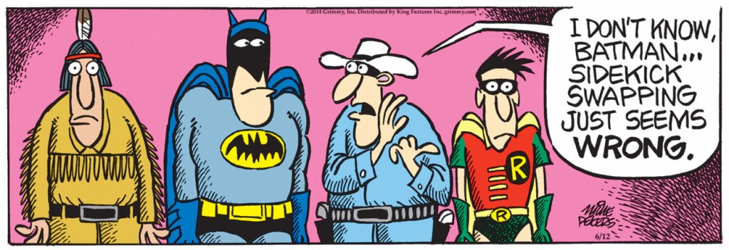
This is World’s Finest no. 32 (Jan.-Feb. 1948, DC); cover art by Hamilton, Ontario’s Win Mortimer (1919-1998), just one in a long, memorable series of frequently goofy scenes featuring this heroic trio.A cute one from John Gallagher (1926 – 2005), twice (1957, 1971) the winner of the National Cartoonists Society ‘Best Gag Cartoonist‘ Award and elder brother of Heathcliff creator George Gately Gallagher. It was published in scouting monthly Boys’ Life‘s July, 1966 issue, smack dab in the heart of Batmania. We ran another bit of bat-drollery from John in an earlier post.This is Mad Magazine no. 105 (Sept. 1966, EC); cover by Norman Mingo (1896-1980).A pivotal page from ‘Alias the Bat-Hulk’ written by Bob Haney, pencilled by Mike Sekowsky and inked by Mike Esposito, from The Brave and the Bold no. 68 (Oct.-Nov. 1966, DC), edited by George Kashdan. We’re featured the issue’s fabulously batty cover in our earlier tribute to Mike Sekowsky. Bless you, gentlemen — you truly understood what fun meant and what comics should be.Prolific Argentine cartoonist Vic Martin (in his homeland, he drew the strip “Salvador” for Medio Litro magazine) moved to the US in the early 1950s, crafting a respectable body of work in the comic book field, chiefly for Ziff-Davis, before migrating to men’s magazines and girlie digests. By the 1970, he’d found a home with Cracked Magazine (He handled the Hudd & Dini feature), while also freelancing for Sick and Crazy. Everything but Mad, really. This particular cartoon comes from the March, 1967 issue of Avant Publishing’s “Escapade”. As Pat Masulli is listed under “production” in the masthead, a Charlton connection is more than likely. And speaking of “Leapin’ lizards!“, Martin would later (1973-74) work on the Little Orphan Annie comic strip.From Plop no. 9 (Jan.-Feb. 1975, DC); Writer unknown, art by Kurt Schaffenberger.This one’s from Plop! no. 20 (Mar.-Apr. 1976), DC); idea by Don ‘Duck’ Edwing, art by Dave Manak.Dan Piraro‘s May 21, 1995 Bizarro Sunday strip. Between Piraro and his canny accomplice, Wayno, there have been scores of excellent bat-japes over the years. I must confess that the term ‘bat-bat’ triggers other associations. « To the Man-Mobile! »This is Pictures Within Pictures, a 1998 watercolour by Mitch O’Connell (not to be confused, of course, with this beloved, near-homonymous fella — yes, I can just hear Beavis and Butthead chortling). The piece is full of references to various Golden Age comics made infamous by Fredric Wertham‘s Seduction of the Innocent. For instance, er… Batman‘s speech balloon quotes from this particular comic book‘s opening splash. On a sobering note, let’s not forget that the 1950’s furore over comic books, as absurd as it may have seemed, still has relevance today.In a more deadpan vein, here’s the opening splash of Chip Kidd and Tony Millionaire‘s madcap homage to the very earliest of Batman’s exploits, with nods a-plenty to the 1943 film serial. “The Bat-Man” originally appeared in Bizarro Comics (Aug. 2001, DC).Another most decidedly dynamic duo, Eddie Campbell and Hunt Emerson, assembles to concoct an affectionate, thoughtful and yes, funny look at one of Batman’s most bizarre-yet-neglected members of the Bat’s rogues’ gallery, Lenny Fiasco, aka The Eraser, introduced in Batman no. 188 (Dec. 1966, DC) with The Eraser Who Tried to Rub Out Batman! This sequel, Who Erased the Eraser? also made its original appearance in Bizarro Comics (Aug. 2001, DC), edited by Joey Cavalieri.Here’s one (June 12, 2014) from Pulitzer Prize-winning (1981) editorial cartoonist Mike Peters (b. 1943). It’s from his unevenly written but always gorgeous comic strip Mother Goose and Grimm (created in 1984 and still going strong in over 800 newspapers worldwide). Like his colleagues Piraro and Wayno, Mr. Peters can scarcely resist a good bat-gag, so this is just one in a crowd of many.Everyone’s familiar with the famous playground song and staple of crooner Robert Goulet’s répertoire, right? The web is rife with visual adaptations, but this was my favourite, the work of Matthew S. Armstrong and available as a handsome t-shirt.
-RG
*the second-funniest Bat-related thing I encountered online this week is this attribution of a Batman (created in 1939) quote to Marx (1818-1883).
The funniest was the following deeply ironic quote from pathological liar and glory hog Bob Kane: « How can an article about me or the Batman be the true story when I am not consulted or interviewed? »
« Ward’s beautiful buxotics operate in a strange separate universe, in which all women are gorgeous voluptoids, all men oafish, saucer-eyed drooling dupes. » — Chris ‘Coop‘ Cooper
Well, I certainly wasn’t planning to hog all the blogging this week, but there were birthdays and other hopefully mitigating factors. While today is the great Will Eisner‘s birthday, it’s likely to overshadow that of a fellow Golden Age toiler, one with an equally intriguing career, but with a trajectory quite divergent from Eisner’s own.
Bill Ward (1919 – 1998) was also born on this day, one hundred and three years ago. Ward started out in comics with the Jack Binder shop, turning out material for Fawcett’s line of characters (Captain Marvel and his family, Bulletman…); he soon found himself working for Quality Comics, most notably on Blackhawk (an Eisner co-creation, it should be noted). He inched closer to his true passion when assigned to Quality’s romance line.
Ward’s cover for Love Diary no. 1 (Sept. 1949, Quality). Artistically speaking, this is what a fully committed Ward can produce.
In the mid-50’s, when came the brutal, censorship-induced compression of the comic book industry, Ward smoothly shifted to producing girlie cartoons for Abe Goodman’s Humorama line, becoming its star and most prolific performer, thanks to his popularity and prodigious speed. He was aided in this by his choice of tool and technique: the conté crayon on newsprint. While everyone else was working on 8″ x 12″ illustration board, Ward was using a soft, beige paper of a size (18″ x 24′) and texture familiar to any art student who’s taken a life drawing class. With this type of stock, he could produce texture rubbings and achieve smooth, sensual sheens ideal for rendering highlights of hair and stockings. Said Ward: « It didn’t take me long to figure out that the quicker you could do the work… the more money you could make. » Over the course of a quarter-century, he wound up producing around 9,000 drawings for the Humorama line.
As Ward recalled of his early training in Binder’s studio, « [Binder] trained me to do layout, which is the most difficult part of art. » To wit, layout never counted among Ward’s strengths. A lot of his pinup work is undermined by poor staging, often grotesque proportions, and absolutely minimal attention to non-erotic detail.
A typical example of a Ward girlie cartoon produced using the conté crayon. This one first turned up in Comedy no. 51 (Jan. 1960, Marvel); in a typical work-for-hire arrangement, for a flat fee (in Ward’s case, 7 dollars a cartoon, topping out at the princely sum of $30 near the end of his 25-year run), Goodman retained all reprint rights (and reprint he did, liberally) and kept the original art, which he sold to collectors for several times its original cost, naturally. Nowadays, these pieces exchange hands for several thousand dollars.
Now, had I ever wondered what Ward’s pencils would look like, if inked by Bill Everett? I readily confess I hadn’t. But upon learning that such a momentous collision once occurred, my mind was set slightly reeling.
Another weathered fellow combatant in the trenches of the Golden Age, Everett (1917-73), unlike Ward, always gave his best, whatever the conditions. Right to the end, despite his rapidly declining health, Everett was, incredibly, producing top-flight work.
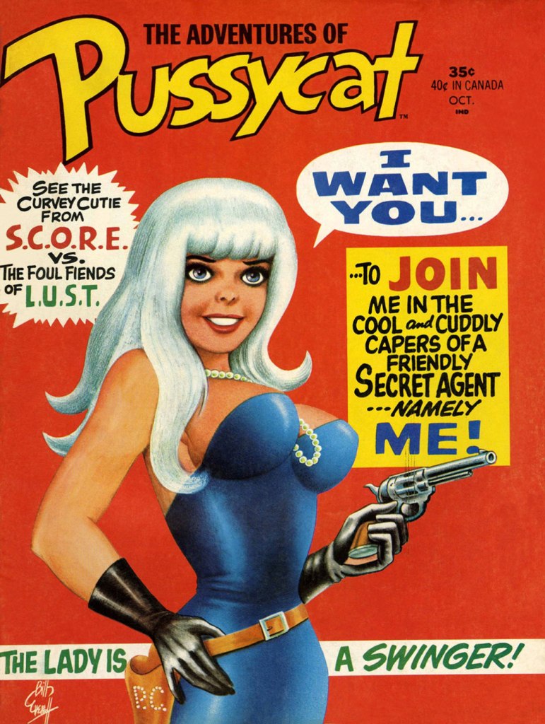
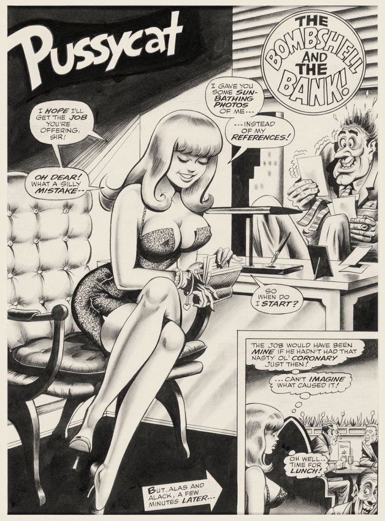
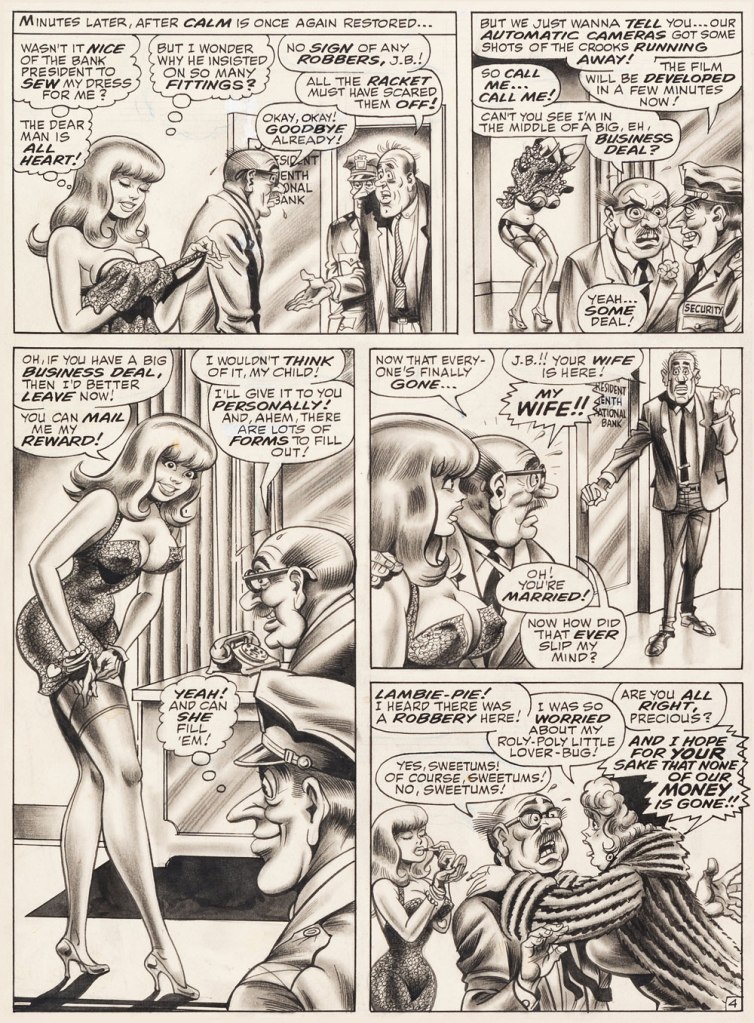
This is The Adventures of Pussycat no. 1 (Oct. 1968, Marvel). Cover by Bill Everett. Highly sought after today, this scarce, magazine-size one-shot is merely a reprint collection of some of Pussycat’s ‘adventures’ from various Goodman Playboy knockoffs, and one of a gazillion contrived acroynym-based attempts to cash in on the ubiquitous 007 craze of the 60’s. It does contain the first Pussycat tale, illustrated by Wally Wood, who would soon go on to his own entry in the super-spy stakes, Tower’s T.H.U.N.D.E.R. Agents. Concentrate on the artwork. The less said about the writing (was it Stan the Man or Larry the Lieber? We’ll likely never know), the better. As usual, any American attempt at French is mangled, even at a mere two words and two syllables (for the record, it should read either “C’est fini!” or “C’est la fin!“). Pensively squinting while adjusting his pince-nez, a ‘curator’ at Heritage Auctions made this uproarious whopper of a claim: « The figures of Pussycat look to be by Bill Everett and everything else is Bill Ward. » So you think Bill Ward drew everything… except the one thing he was interested in drawing? These folks don’t seem to know how comics are produced.“The Bombshell and the Bank!“, never reprinted, saw print in Male Annual no. 6 (1968).This is The Mighty Thor no. 171 (Dec. 1969, Marvel). Jack Kirby pencils, Bill Everett inks. Coming late in Kirby’s run, what a vigorous breath of fresh air after years of lazy erasures!
In the 60’s, Ward also provided covers for various soft-core novels, such as this one from Satellite Publications’ ‘After Hours’ imprint. He even wrote some of them, notably under the alias of ‘Bill Marshall’. His fellow Quality Comics alumnus Gil Fox also penned many of these potboilers under a staggering array of aliases.
This is Side Street (1966, After Hours). I’ve noticed over the years that certain artists of a more single-minded frame of mind can’t be bothered to devote much attention to anything but the object of their obsession. Such was the case with Bill Ward, and with the passing years, ever increasingly so. Exhibit A: has Ward ever seen an actual dog?Which reminded me of this classic, by another ‘can’t be bothered’ master of ‘Good Girl’ art, Alberto Joaquin Vargas Chavez (1896-1982). Another howler from the comedians at Heritage: « This early masterpiece, one of the greatest pin-ups the artist ever painted, was reproduced as a full-color double-page spread in Vargas, Taschen, 1990. Alberto Vargas thought so highly of this lot and the following two stunning paintings that he retained them in his personal collection. » I wouldn’t presume to criticise Vargas’ depiction of the female form, but on the other hand, this is Exhibit B: has Vargas ever seen an actual cat? Don’t worry, Alberto, you’re not alone in this affliction: neither has Neal Adams.
« A black cat crossing in front of a person signifies that the animal is going somewhere. » — Jack Oakie
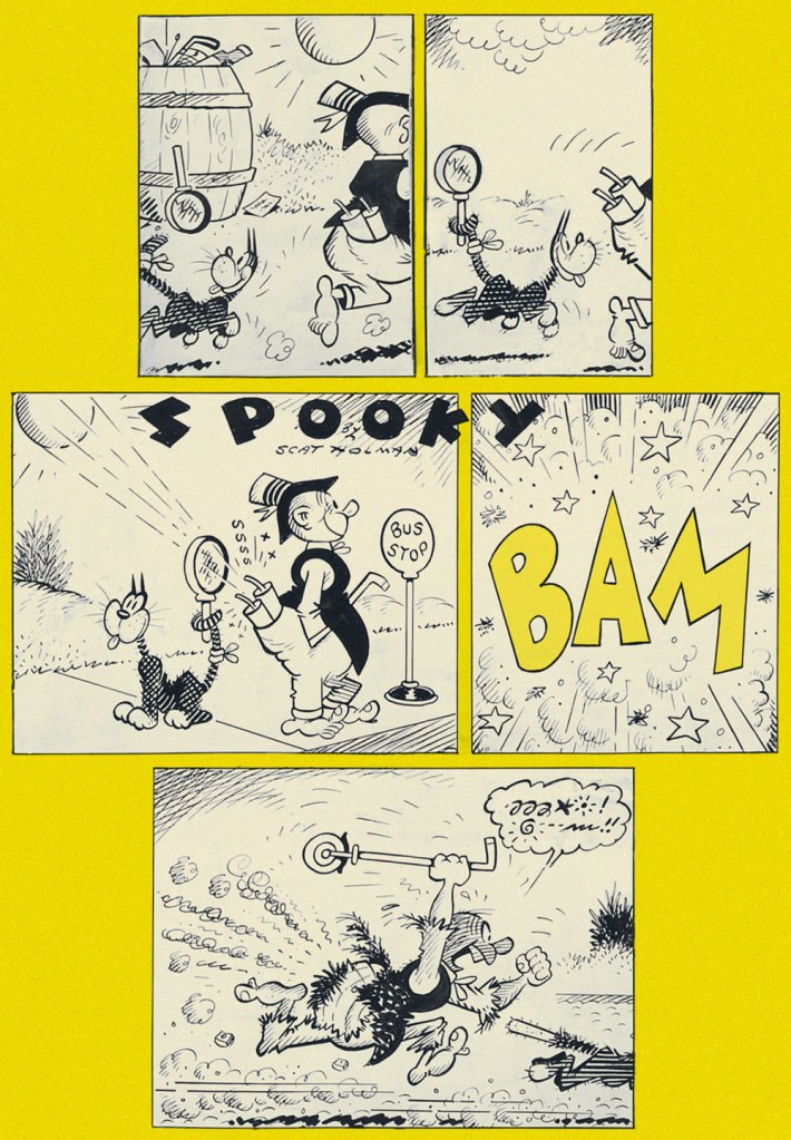
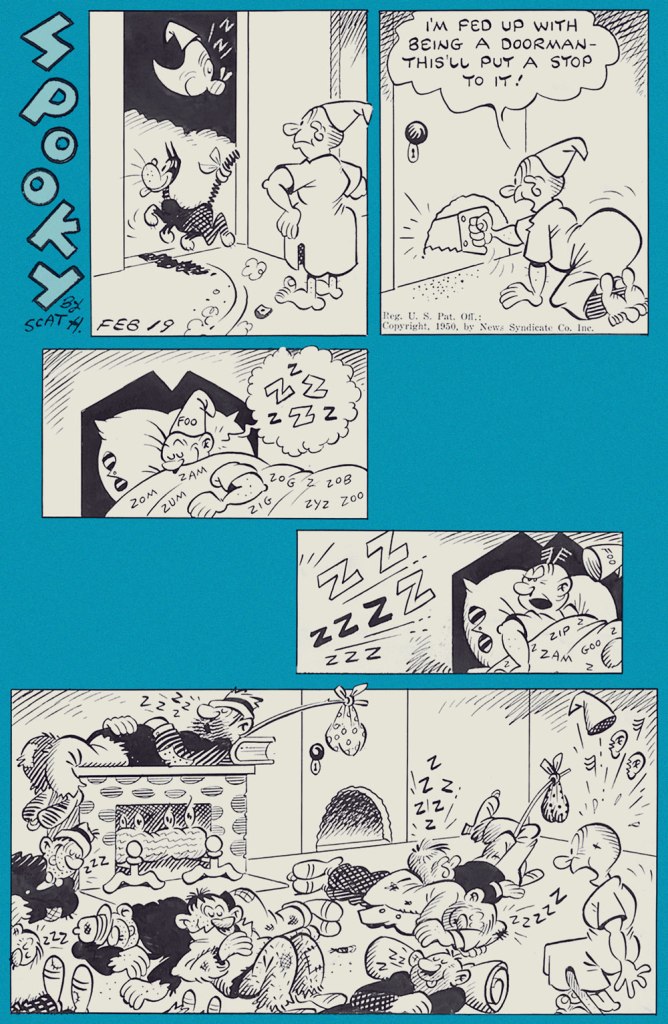
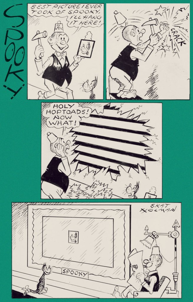
Oftentimes, tackling such a milestone as Bill Holman‘s Smokey Stover (1935-1972) comic strip is simply too daunting a task. Judging from the evidence (and evidence of absence), I’m not alone in being so cowed: despite the feature’s undeniable and pivotal importance, there hasn’t been a reprint collection solely devoted to it* since 1985, when San Diego Comic-Con founder Shel Dorf and Blackthorne Publishing issued a humble volume in their Comic-Strip Preserves series. Humble it was, but packed to the rafters with Holman’s delightfully surreal wit and screwball genius. A mere 72 pages in the comic book format, but hours of reading, thanks to the astounding density of their contents.
If one were to take Wikipedia at its word, one might loudly rejoice at Hermes Press’ 2012 release of Smokey Stover and Spooky the Cat: The Collected Sundays. But, as an Amazon reviewer archly quipped, circa 2017, « It’s difficult to write a review when the book has not been published. » The ensuing five years have not improved the panorama one bit.
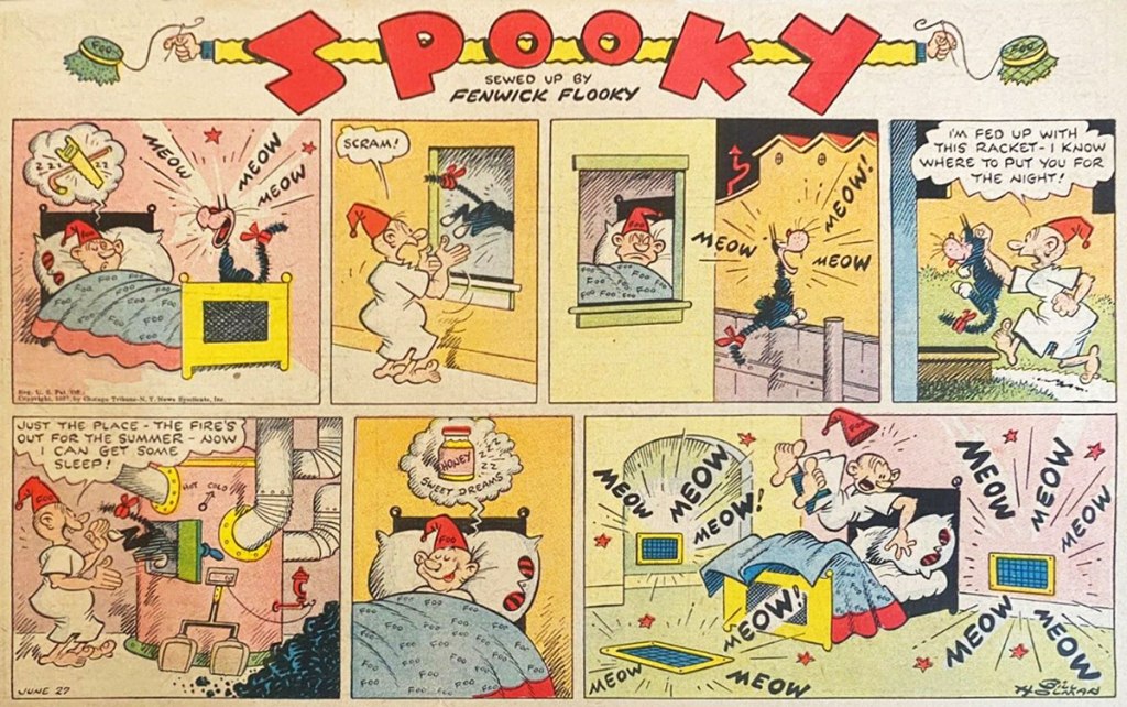
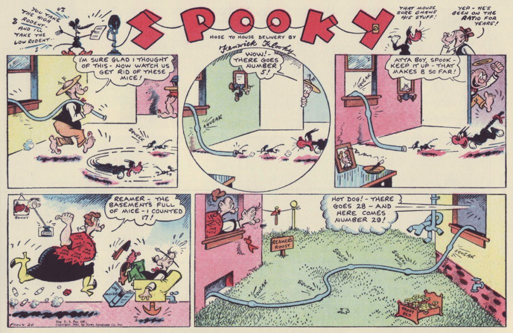
Well, I’m not going to explore Smokey Stover on this occasion… but will instead sneak a squint at its equally delightful ‘topper‘, Spooky the Cat. Since you rightly might ask:
« A topper in comic strip parlance is a small secondary strip seen along with a larger Sunday strip. In the 1920s and 1930s, leading cartoonists were given full pages in the Sunday comics sections, allowing them to add smaller strips and single-panel cartoons to their page. »
An ad from the syndicate promoting Smokey Stover (and its topper); it saw print in trade magazine Editor & Publisher’s August 21, 1937 issue.From Sunday, June 27, 1937. From Sunday, January 24, 1943. From Sunday, Fooly, er, July 20, 1941. From Sunday, July 4th (of course!), 1948. From Sunday, September 12, 1948. From Sunday, February 19, 1950. Ah, one of the classic cartooning archetypes: the hobo, complete with trusty polka-dot bindle and stick (which technically makes him a ‘bindlestiff’).From Sunday, July 6, 1952. I could swear Holman meant to call the man Prof. Larynx, but then he wasn’t what you’d call a spelling whiz. From Sunday, July 20, 1952. Incidentally, Spooky’s fez-sporting owner is Fenwick Flooky. There — now you’ve been introduced. From Sunday, July 27, 1969. Gotta love a guy who’s kind to his animal companion, not to mention resourceful in doing so.Sorry, date unknown! However, its original art was thus dedicated to a peer by the artist: “To my genius friend Alpo Q. Jaffee, fire-ever – Bill Holman ’76“.
The credibly devoted student of the comics would be ill-advised to underestimate the size of Holman’s footprint in the field: were they still around, it’s a cinch that Basil Wolverton, Jack Cole, Boody Rogers and Harvey Kurtzman would be quick to confirm Holman’s influence on their work. And that’s just some of his more-or-less contemporary peers.
Well, Kurtzman did in fact explicitly go on the record on that point, in the course of his introduction to the Blackthorne collection:
« Those outrageously outrageous and the nonsense words that appeared in no particular place for no particular reason. ‘Foo!’ ‘Notary Sojac.‘ Could it be that that’s what inspired me to ‘Potzrebie‘ and ‘furshlugginer‘? Was it Holman’s technique, those ‘tchochkas‘ in all corners of the panels? Picture portraits, with the portraits come to life, jumping out of their frames? Could that have been what inspired us to fill our MAD Magazine panels with those nonsensical details? Could that have been it?
I think so, Bill Holman. I think that you stamped my young, impressionable, brain with your indelible ink. So ‘Foo’ to you and many more ‘Notary Sojacs’, Bill Holman. You made me what I am today, I hope you’re satisfied. »
A clear Spooky prototype, down to the tail bandage, from Judge‘s January, 1935 issue.
-RG
*I may be too old-fashioned to quite take into account print-on-demand reprint collections, but let’s face it, sometimes that’s all you get.