… I bring you a of ‘clip show‘ of sorts: excerpts from past entries of this blog, but with a slight twist. For, unlike your textbook clip show, I’ll be drawing from episodes you’re probably unfamiliar with. After all, while this is my 500th piece, this is our blog’s eight hundred and fortieth: quite enough of a tangle to get hopelessly disoriented in.
I have culled from the earliest days of WOT?, when we had precious few readers — each one precious! Five picks from the lot seems a reasonable ratio: neatly one per hundred.
While many of our posts from those days have since, one way or another, found their audience (or vice versa), these dispatches have languished in obscurity — deservedly or not, who can say?
Here they are, in chronological order and everything:
This one was a gathering of English fantasy artist Patrick Woodroffe (1940-2014)’s covers for Warren Magazines. You may have seen his fabulous cover for Judas Priest’s 1976 LP Sad Wings of Destiny.
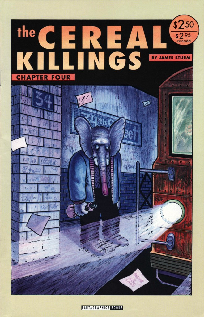
A ghoulish and gloriously fitting backup feature for Pat Mills’ unhinged Death Race 2020 (1995-96, Roger Corman’s Cosmic Comics). I collected them all so you don’t have to!
Incidentally, this is all you’ll be seeing of me this month — it’s not a case of burnout: I’m just furiously cobbling together this year’s Hallowe’en Countdown, and that takes time. Thanks for your patience and loyalty, and see you in October!
« I don’t understand retiring. I don’t know what I’d do. I don’t play golf. I have to sit at a drawing table or else it’s a wasted day. The nature of the work can change here, but I have to be doing something, especially with my hands. » — Seymour Chwast
Nobody really expects those we deem “immortals” to actually live forever… but I suspect some part of us does, or at least hopes so.
I haven’t yet reached that fateful age when reading the paper largely consists of scanning the obituary column to learn which of your friends (and possibly enemies) have died, but I fully grasp the concept… and shudder in sympathy.
And so on to my point: it’s easy to take genius (or mere talent, for that matter) for granted, and so I generally endeavour to salute valued creators while they’re still around, instead of paying belated lip service to their greatness once reminded of their existence by news of their passing.
For years, I’ve been meaning to devote a post to Seymour Chwast… and dragging my feet. He’s had such a long, inspiring — and daunting — career. But the other day, when Tony Bennett died, aged 96, I took it as a sign not to reserve my tribute for Mr. Chwast’s next birthday (that’s late next month). Here goes.
First, an amuse-gueule. This mute but highly rhythmical piece hails from issue 69 (October, 1977) of Push Pin Graphic, the fabled design studio’s showcase magazine. The issue’s theme is “House Nice”, parodying interior decorating fixture House Beautiful Magazine. Written and drawn by Mr. Chwast.
Design historian Steven Heller explains: « Push Pin’s principal cofounders, Seymour Chwast (b. 1931) and Milton Glaser (b. 1929), two native New Yorkers who met while attending Manhattan’s Cooper Union, brought distinct tastes and preferences — as well as chemistry — to their unique partnership. Chwast savored American comic strips and pop culture while Glaser studied etching in Italy and was passionate for Italian Renaissance painters. The former injected a cartoonist’s abandon into his artwork, the latter introduced a sublime elegance. Despite their formal differences, both shared the conviction that postwar design and illustration should not be limited to prevailing practices — either sentimental realism or reductive simplicity. They rejected rote methods and rigid styles while concocting incomparable ways of transforming old into new… »
The following encapsulates even more succinctly the duo’s boundless contribution: « Seymour Chwast and Milton Glaser are legendary graphic designers who founded Push Pin Studios, where they rebelled against the swiss style establishment – blending illustration with design. » [ source ]
Amen: from my standpoint as an art student back in the early 1980s, I’ll say one thing about Swiss design: that shit was oppressive.
To sidestep the perils of losing my way amidst such a gargantuan topic, I’ve opted to focus on a favourite entry in the Chwast œuvre.
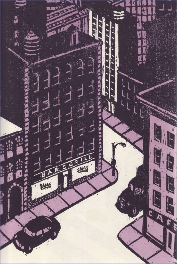
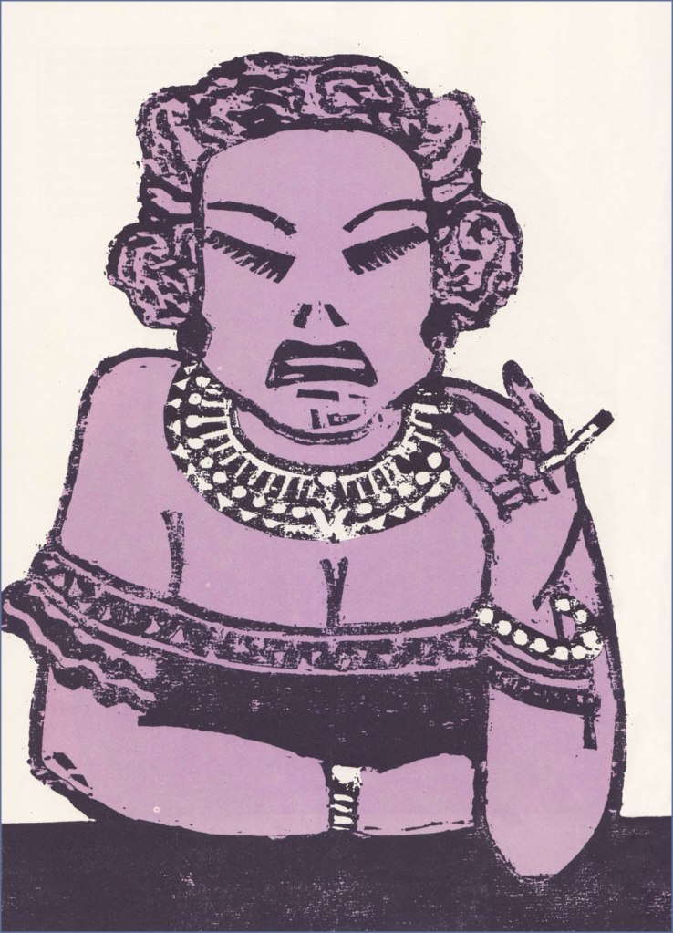
« Another of Chwast’s graphic stories is Sam’s Bar (Doubleday, 1987). Written by Donald Barthelme, it is also a total narrative and pictorial story. It captures in woodcut illustrations one night in a bar somewhere in America, people talking to each other and talking to themselves as the reader goes from one end of the bar to the other. » The book’s intriguing structure would have made it an ideal comic *strip*, in the literal sense.
Ellie says: « So I told the kid May 31, 1989, was the cutoff date, as of May 31, 1989 she’s off the payroll whether she’s finished goddamn college or has not she’s finished goddamn college. So she tells me she’s thinking of transferring to UCLA and that’s going to set her back two semesters. So she can get fencing. Where she is they don’t have fencing. I said I’ll rent you an Errol Flynn movie. »
Trish and Calvin.Hal and Germaine.Two lawyers, Mario and Saul. Someone ought to make a show about a lawyer named Saul.
The book’s handy endpapers, featuring “The Regulars at Sam’s Bar“.
I wouldn’t want to short-change Barthelme’s contribution… as a collaboration, this truly works a treat. Here’s an amusing passage I encountered on the subject of this routinely misunderstood author: « Donald Barthelme was, by his own design, a hard writer to categorize. Even at the height of his fame, in the late 70s and early 80s, there were readers who just didn’t get him, or suspected his work was a hoax or a joke they weren’t in on. At The New Yorker, where he was a regular contributor for decades, clerks in the library were expected to type up on index cards brief summaries of every article, fact or fiction, that appeared in the magazine. Barthelme’s cards sometimes contained just one word: “gibberish.” » [ source ]
One more for the road? I couldn’t leave out Chwast’s adorable cover illustration for issue 57 (Why People Keep Dogs) of Push Pin Graphic, from 1972.
Many happy returns and thanks for the inspiration, dear Mr. Chwast!
« History deals mainly with captains and kings, gods and prophets, exploiters and despoilers, not with useful men. » — Henry Louis Mencken
A few months ago, I was reading an old John Severin interview (in Graphic Story Magazine no. 13, Spring, 1971, Richard Kyle, editor) conducted by John Benson, and this passage stuck with me:
BENSON : Who are your favorite comics writers that you’ve worked with?
SEVERIN: I don’t even know who writes half the stories. Well, there are two guys, but they aren’t essentially comics writers. I like to work with Jerry DeFuccio and with Colin Dawkins. They write stories.
Which in turn led me to another Severin interview, this one conducted by Gary Groth in the early 2010s.
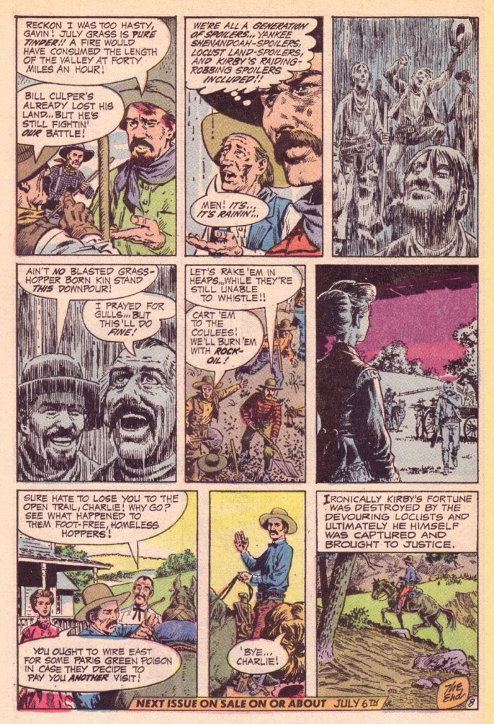
GROTH: In the back of the book, I’m looking at one issue of Son of Tomahawk actually, which I guess is a post-Tomahawk spin-off, but Frank Thorne does the lead feature and you did a really beautiful backup, I think one of your best strips during this period called Spoilers, that Jerry DeFuccio wrote.
SEVERIN: Really?
GROTH: You don’t sound like you have any recollection of this whatsoever.
SEVERIN: No, not at all. Oh, there’s an awful lot of stuff. Once I do a script and turn it in, it’s only with minor exceptions that I’ll remember the thing next week! I might remember it later on if somebody reminds me of something, but if somebody said, “What did you do last week?” I’d be damned if I know.
Severin’s reaction, to me, is a reminder of two things: first, that some artists (and fans!) are only interested in the visual aspects of comics. And second, that work conditions in the comics field (and most other commercially driven endeavours) are pretty inhumane if you have to just keep chugging on, with little time or impetus to look back and sniff the newsprint, let alone reflect.
Jerome ‘Jerry’ DeFuccio (1925 – 2001) was born on this day, ninety-eight years ago. While he’s most closely associated with his quarter-century stint as associate editor of Mad Magazine, readers of EC’s war/adventure titles know he could also pen, in excellent fashion, a thoroughly gripping yarn. Here’s one of the handful he later did for DC, for editor Joe Kubert. And while Son of Tomahawk wasn’t commercially successful, it was a highlight of its era, a truly adult comic book. See for yourself:
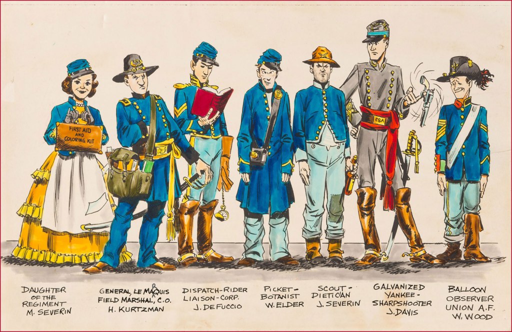
‘Spoilers!’ saw print in Tomahawk no. 135 (July-Aug. 1971, DC). Here’s a lovely illustration of some of the EC gang, in civil war drag . Like it says, DeFuccio’s third from the left. Ink and wash over graphite pencil on Bristol board. » Drawn in the 1950s, this piece saw print in 1983, in issue 9 of the excellent EC fanzine Squa Tront.
GROTH: Was DeFuccio working for Mad at that time?
SEVERIN: Yeah.
GROTH: It seems like you remained friends with DeFuccio for a very long time.
I had initially figured to make this post coincide with World Bicycle Day, but misremembered the date (it’s on the third of June). I briefly considered bumping my post in favour of a pollution-themed one, given the close-to-home current events, but it struck me that people are likelier to need a respite from catastrophe than a reminder of it.
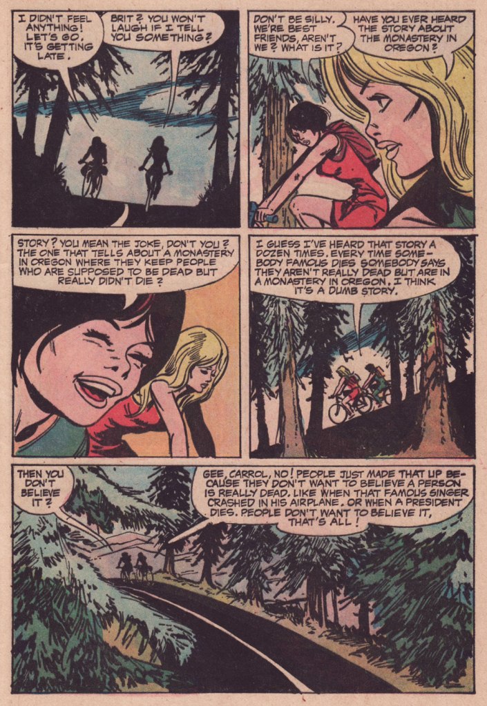
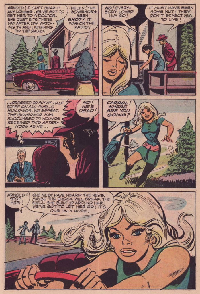
Since I must save up material for my Hallowe’en Countdown all year ’round in order to keep the frenetic pace it requires, I sometimes regret, in other parts of the annum, not featuring spooky stories as often as I’d like. I’ll make an exception this time, since this is more of a summer story with a light touch.
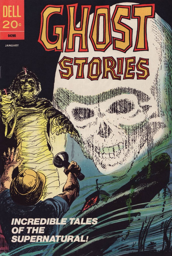
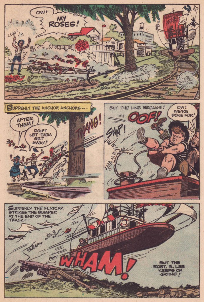
This particular issue of Ghost Stories has the — dubious, I’ll grant — distinction of being the last original comic book published by the once-mighty Dell Comics. How mighty? Well, in 1960, they were smugly ensconced at the top, as they had been for most of the industry’s history. Until the following year: « As publishers began raising prices from the 10¢ mark comics had been at for a quarter of a century, Dell misread the market and went to 15¢ when everyone else went to 12¢. »
That was the beginning of the end for Dell, triggering a long, humiliating slide, going from locomotive to caboose. By 1970, they were just reprinting what little of their once-glorious back catalogue they still retained rights to. I believe their final trio of titles, all reprints, were cover-dated October, 1973 — among them the final issue of Ghost Stories, a straight up reprint of 1966’s no. 16.
I’m not sure why this all-new issue even came to be. Perhaps this was inventory material some editor at Dell saw no point in squandering. If so, this sagacious frugality is appreciated.
This is Ghost Stories no. 35 (Jan. 1973, Dell); cover by Jack Sparling (1916-1997).
Now, I won’t argue that this is one of Jack Sparling‘s most stellar jobs… it was obviously dashed off in workmanlike fashion, even in comparison to the other tales in the issue. But I really like its themes, which tick a lot of boxes for me, cycling and folklore foremost among them.
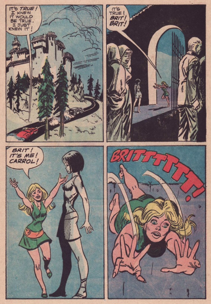
I tried to find out whether this purported ‘story about the monastery in Oregon‘ (Mount Angel Abbey being the likeliest model) had any currency in popular culture, and came up empty. Well, essentially. While it’s undeniable that “Conspiracy theories frequently emerge following the deaths of prominent leaders and public figures“, I do think the uncredited and unknown author of this yarn came up with a clever little angle… who’s to say it won’t catch on some day? Unlikelier things have come to pass.
-RG
p.s. It occurs to me that this story handily passes the Bechdel Test, surely a rarity in a mainstream comics story of this vintage.
p.p.s. Another tale in this ‘vanished celebrity’ tradition would be Gerald Kersh‘s superb, Edgar-winning The Oxoxoco Bottle aka The Secret of the Bottle. Read it here!
« This is how you disappear… » — Scott Walker, Rawhide
No foolin’, honest: today is the birthday of cartoonist Frank M. Borth III (April 1, 1918 – August 9, 2009), who worked on such Golden Age features as Phantom Lady, Captain America, Skypilot, Spider Widow, colleagues Captain Daring, Captain Battle and Captain Fleet… he kept busy.
Borth’s first Phantom Lady page — premiering her classic outfit, at that — from Police Comics no. 17 (March 1943, Quality). Unusually for such an assembly-line industry, Borth did his own lettering, and it’s easy to see why: he was terrific at it. Read the whole issue here!
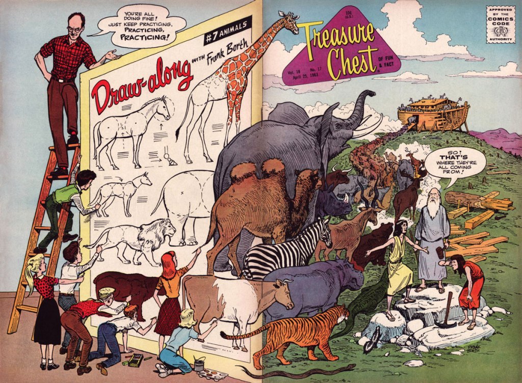
Then, at the close of the 1940s, he began a long association with Catholic publisher George A. Pflaum, chronicling (among others) the rollicking adventures of one Frumson Wooters, aka The Champ, a stereotype-bucking chubby kid who’s at times scatterbrained and clumsy, but also wise, determined, resourceful, and humble to boot. Written by Captain Frank Moss and radiantly illustrated (and later, also scripted) by Borth, the feature ran for two decades in Treasure Chest of Fun and Fact, a publication distributed to parochial school students between 1946 and 1972 and generally avoided like any of the Ten Plagues of Egypt by your average comic book fan, but — wouldn’t you know it? — chock full of excellent work by the likes of Bernard Baily, Fran Matera, Bob Powell, Reed Crandall, Joe Sinnott, Graham Ingels, Joe Orlando, Murphy Anderson, Jim Mooney, Marvin Townsend, Paul Eismann… I’ll stop now.
Being ad-free, Treasure Chest had the luxury of full cover spreads, and Borth would, with his, delight in the element of surprise. This is Treasure Chest of Fun and Fact Vol. 18 no. 17 (Apr. 18, 1963, George A. Pflaum). Issues 11 to 20 this volume of TCOF&F presented a 5-page chapter of his engaging tutorial Draw-Along with Frank Borth, which was collected in 1965.
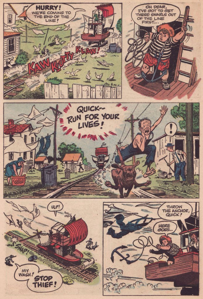
I was going to feature a gallery of favourite Borth pages from all over the place, but instead decided it might be more interesting to highlight his ability to break down an action sequence, since that’s the palpitating heart of an adventure yarn. Therefore, here’s chapter 4 of “The Champ’s Treasure Hunt“, published in TCOF&F volume 15, No. 4 (Oct. 22, 1959).
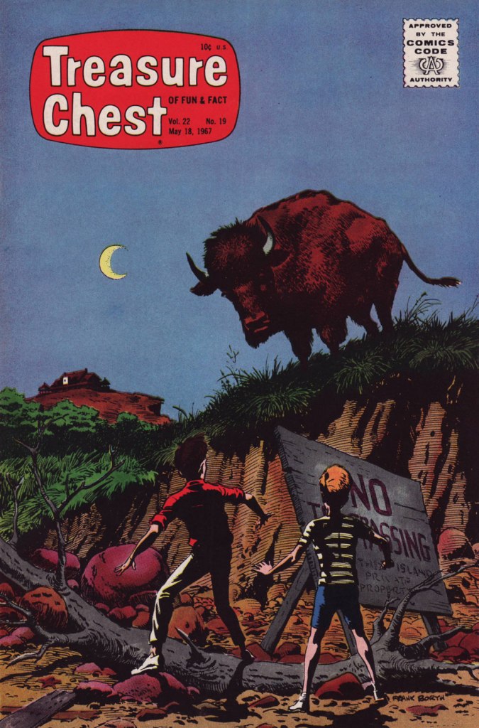
You can read the entire saga, from the start, right here!Another splashy (quite literally) Borth cover, this time featuring The Champ! This is Treasure Chest of Fun and Fact Vol. 21 no. 10 (Jan. 13, 1966, George A. Pflaum). I allow myself a Frumson exception for Treasure Chest of Fun and Fact Vol. 22 no. 19 (May 18, 1967, George A. Pflaum), my favourite Borth cover — and one of my very favourites, period. It’s a scene from the penultimate chapter of The Mystery of Forbidden Island, written and drawn by Borth.
I intended to direct interested readers to an autobiographical essay Borth penned late in life, but it’s gone — well, retrievable if you try hard enough, but to avoid losing it altogether, I’m going to quote it in full:
FRANK BORTH, syndicated cartoonist was born in Cleveland, Ohio and graduated from Cleveland School of Art in 1940. Frank had earned his tuition by painting price signs in tempera paint for butcher shops, grocery stores, Green Grocers, etc. from 11th grade on until he left Cleveland to get employment as an illustrator in New York City. Where he worked as a free-lance illustrator and writer for comic book publications.
Frank was drafted into army and assigned to the Transportation Corp training Center at Indiantown Gap Military reservation to produce training aids where he rose to the rank of T/Sgt. In 1944 Frank painted a 52-foot mural for the Service Club that is still there today. Frank married Barbara Stroh of Harrisburg, Pa in 1944 and was discharged in 1946.
Frank came back to New York to find work and an apartment; he found neither, but his landlady offered him the summer use of some unheated rooms over garage of a large house she planned to rent to roomers out in Montauk. Frank and Barbara moved in May 1st for the summer as Montauk was by then once more a summer resort, and he found employment by painting murals in bars and sign work at the Yacht Club. Frank entertained members every Friday night at a dinner with chalk talk and other inspiring skits. Finally Frank decided to create a new comic-adventure strip about a two-masted schooner available for hire and an agent in the audience offered to try to sell it in New York.
Frank’s little family really lived on the money he had saved up in the three years in the army. He went back to Cleveland however due to the death of his father and worked for a small ad agency. The following spring the agent told him that he had sold the yachting script and Frank went back to Montauk to work on the strip “Ken Stuart” for three years; but couldn’t get it syndicated inland. Frank was not saved by the bell but by a Catholic publication called “Treasure Chest” who mailed him a script to illustrate in ten chapters of six pages each, a fiction story about the Priest of Shark Island. This led to steady interesting assignments for 25 years. The magazine was in comic book form, and was published every two weeks during the school year, twenty in all. Since they didn’t print in the summer, Frank would use that time to write scripts on his own. In those days they corresponded by letter and the editor and Frank soon became pen pals. Frank made sure that he delivered always on time and produced exactly what they were looking for.
The Borth family, they had produced two children a son and a daughter, they bought property in Montauk and built a house. Frank had joined the volunteer fire department and also volunteered to be one of the crew on our new ambulance as well. You can imagine that he did a lot of artwork for the fire department and other civic organizations. He taught Sunday school and was elected an Elder of the Montauk Community Church. Barbara, Frank calls her lovingly Bobbie, became a Girl Scout leader and also sang in the choir, they no longer were “summer people” but full time residents of Montauk. Bobbie became a schoolteacher and also attended Southampton College and earned a Masters degree.
Frank was asked to become a republican committeeman, which led to Frank being elected a Town trustee, and to the office of Councilman on the East Hampton Town Board in 1968. At the conclusion of the four-year term Frank choose to give up the part time position that had by then turned into a full time commitment. Shortly after retiring from politics, Warren Whipple, a long time friend (The artist who drew the syndicated cartoon feature “There Oughta Be a Law”) called to asked Frank if I would take the job of writing the plot and dialogue of each cartoon as the original creator of the strip wanted to retire. Frank said OK, as he had done almost as much writing as drawing with his own labors. The syndicate approved Frank taking over and for the next ten years, Whipple and Frank Borth were a team.
Frank took over the entire production of writing and drawing the strip until February of ’83 when he turned 65 and terminated the production. The Treasure Chest Publisher also went out of business due to the rapid closing of a lot of parochial schools. Another publisher tried to sell it on the newsstand but failed. Frank turned out about 50 when another acquaintance talked him into getting back into production doing crazy assignments for Cracked Magazine which he had done for a period of time until they switched editors and all they were interested in was using famous people’s names.
Frank concluded his second career and retired to doing art and posters for local organizations like the Fire Department, Lighthouse, and the Town. Since he had created the Town seal of east Hampton as well as the Bicentennial seal, he also drew up the tricentquinquagenary seal as well. He still does things for the Library, church, and other local organizations until I lost the vision in his left eye which has deprived him of depth perception. Frank still writes but cannot draw as I used to. Oh, well. 84 is a reasonable time to retire, he chuckles. Frank’s retirement is spent in painting Montauk land and seascapes.
Circling the drain: this is TCOF&F vol. 27, No. 2 (Jan. 1972, George A. Pflaum), the final volume; at this point, the magazine had adopted a monthly schedule and relied heavily on reprints. But heck, an issue with a 37-page Frumson Wooters epic, The Champ Goes Down!, is pretty easy to take. It had been serialised over the six issues of 1967’s Treasure Chest Summer Edition.
« I’ve never been to Texas but I’ve heard Willie Nelson Sing. » — Mark Ballard
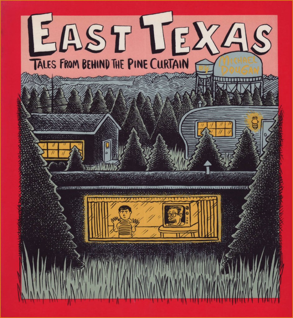
I’ve just heard of the recent, untimely passing of cartoonist Michael Dougan (1958-2023). Well, perhaps former cartoonist would be more accurate, but if so — he said his piece, made his mark, and moved on — and that’s cool. But can cartooning truly ever be left behind?
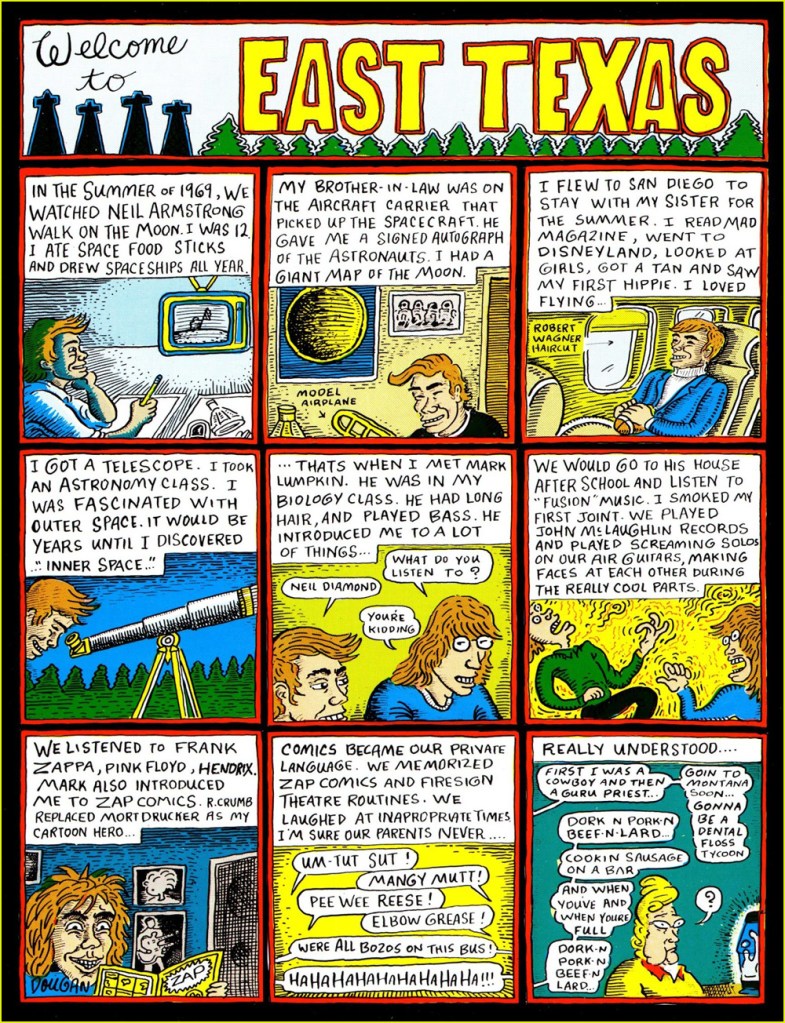
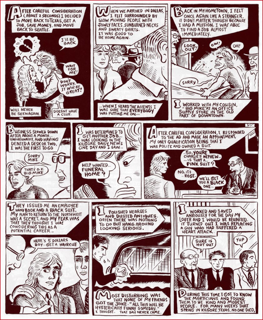
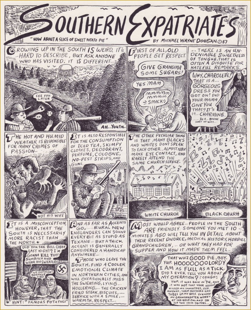
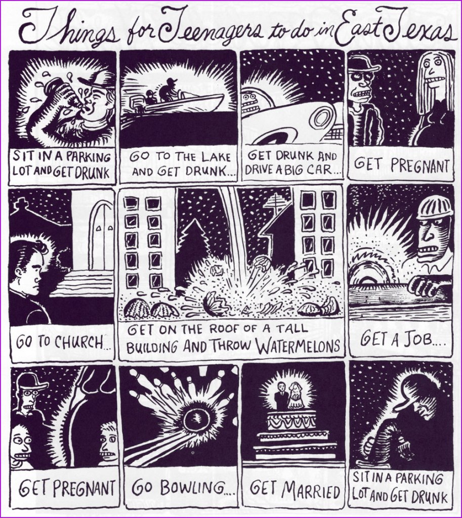
Dougan made his début in comics on the back cover of my very favourite issue of Weirdo, no. 17 (Summer 1986, Last Gasp), which also housed my pick for Robert Crumb‘s greatest short-form achievement, The Religious Experience of Philip K. Dick, and a cover among his finest *and* most provocative. See both story and cover here!Dougan’s first collection appeared the following year, published by Seattle’s fabled The Real Comet Press. The back cover was festooned with eloquent-upon-eloquent quips from his peers. For instance, Gary Panter wrote: « Dougan’s work is clear and he is not afraid. He is a big storyteller and a good liar. In East Texas the wire fences, orange colored tufts of grass, pine trees, tire tracks, piles of wood, and water towers are the best parts. The stories are about human desperation, a funny kind of desperation, an air-conditioned kind of desperation. »
And here are a few excerpts from its pages:
Dougan’s second and final collection, from 1993, was published by Penguin, no less! It featured longer, more ambitious pieces.Kentucky Fried Funeral would have to be my first pick for Dougan’s masterpiece. Unfortunately, it’s around 20 pages long, so it was unfeasible to present it here. Still, here’s the opening splash.A detail, perhaps, but worth noting, I think: Dougan preferred handling his own lettering, finding, like many a visual artist, the look and texture of mechanical text too… well, mechanical. Lovely!
In 2017, some twenty years after his last cartoon (that I’m aware of… Double Booked?, in Fantagraphics’ Zero Zero no.17, June, 1997) Michael and his wife moved to Japan and opened a café-restaurant. Read Michael’s own account of the saga.
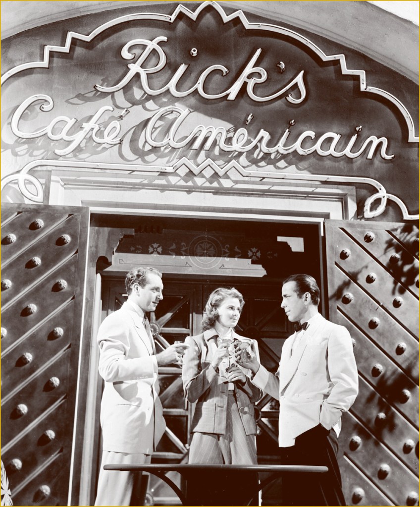
This must be the place.Of course, Dougan named his place after Bogie’s in Casablanca, but not without adding a couple of typos, for that modern touch.
Creative types often get restless, and Michael found himself a little niche answering people’s mostly, and sometimes incredibly, inane questions on Quora, with a potent mixture of withering sarcasm with a side of snide, all the while providing helpful information — whenever possible. Check out his feed, but let me caution you: it’s a bit of a frazzling rabbit hole (or warren, more accurately).
I’m hoping that, once news of Michael’s passing trickles over to his native land, that The Comics Journal will provide a detailed obituary of this notable artist. Farewell, Mr. Dougan.
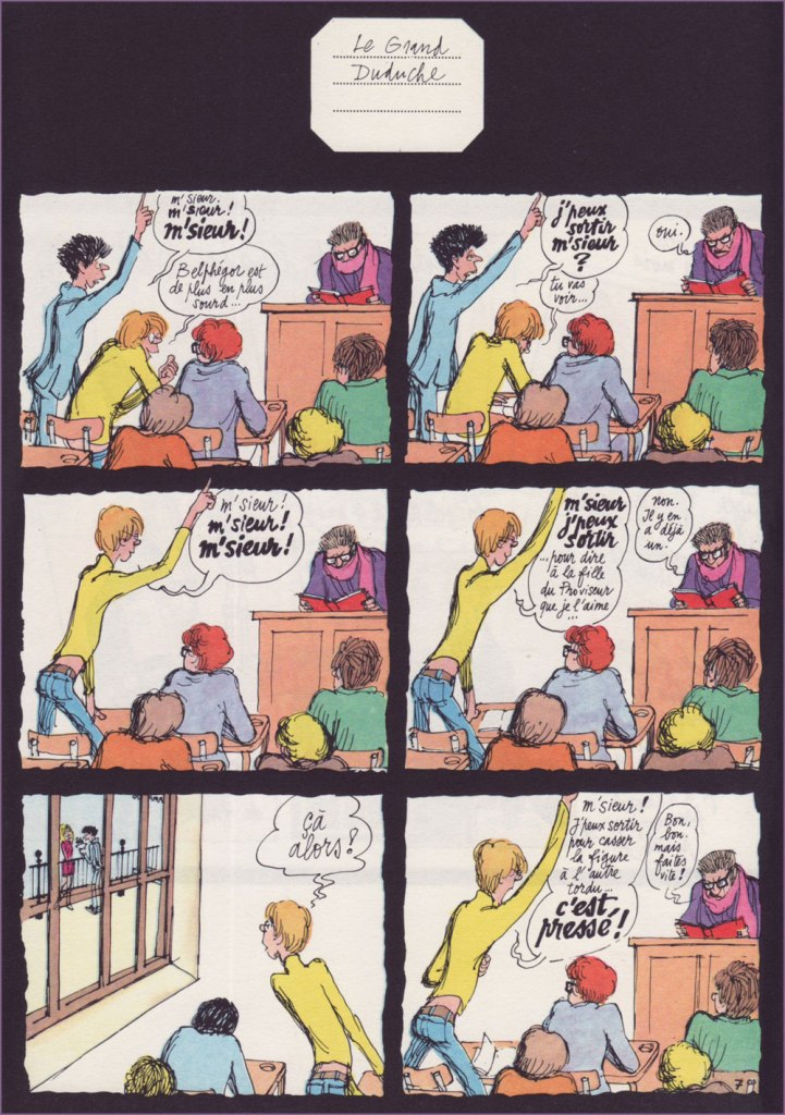
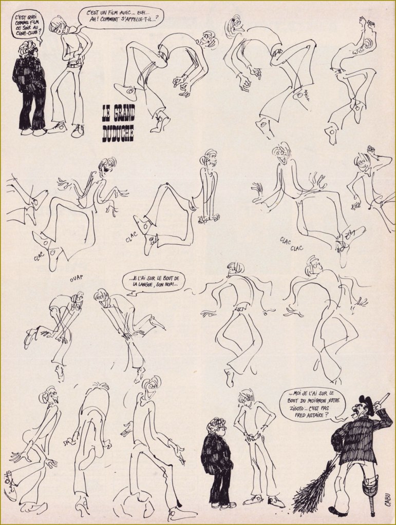
« A shaggy mane, odd, steel-rimmed little glasses, a get-up owing rather more to personal fancy than to the edicts of fashion, a candid gaze, the smile of a malicious dunce, that’s Le Grand Duduche… and it’s also Cabu. » — René Goscinny
On this significant day, I will spotlight Jean Cabut (b. 1938, d. 2015) alias Cabu, and his wondrous Le Grand Duduche series, begun in 1963 and concluded in 1982, published in Pilote, Hara-Kiri, Charlie Hebdo and Pilote Mensuel. An absurdly massive collection of the entire series (672 glossy pages!) was published by Vents d’Ouest in 2008. Even as a hardcover volume, the thing’s so big and heavy it can barely bear its bulk, and is therefore virtually unreadable. It should really have been three books in a slipcase. But hey, the reproduction is first-rate… for what it’s worth.
Duduche is a gangly lycéen (high school student, sort of) wending his way through classes and student life, doing as little work as possible but expanding a maximum of ingenuity. It’s most certainly not about the plot.
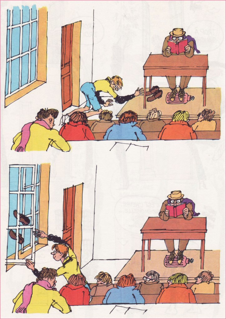
The strip displays a fantastic level of graphic bravura and formal experimentation, while retaining 20/20 narrative clarity. I felt it was a fool’s errand to try singling out a “typical” example, since every page is unique — so here’s a sampler. Amazing, and yes, highly recommended, even if you can’t read the (marvellous and abundant) text.
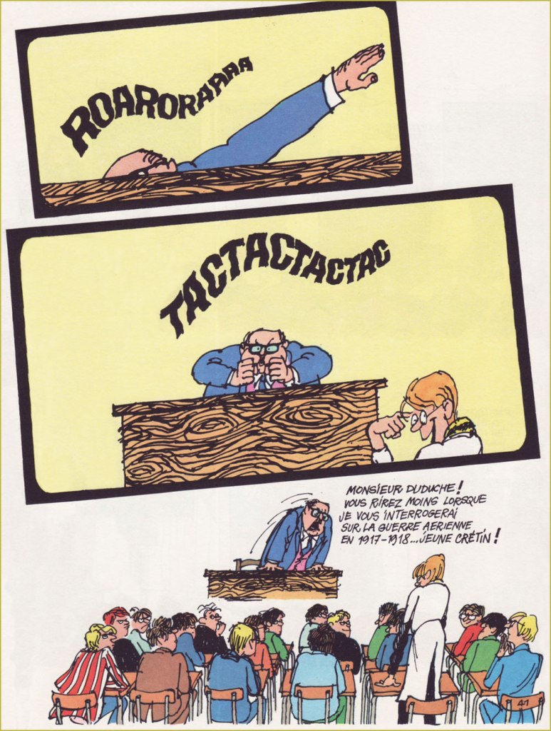
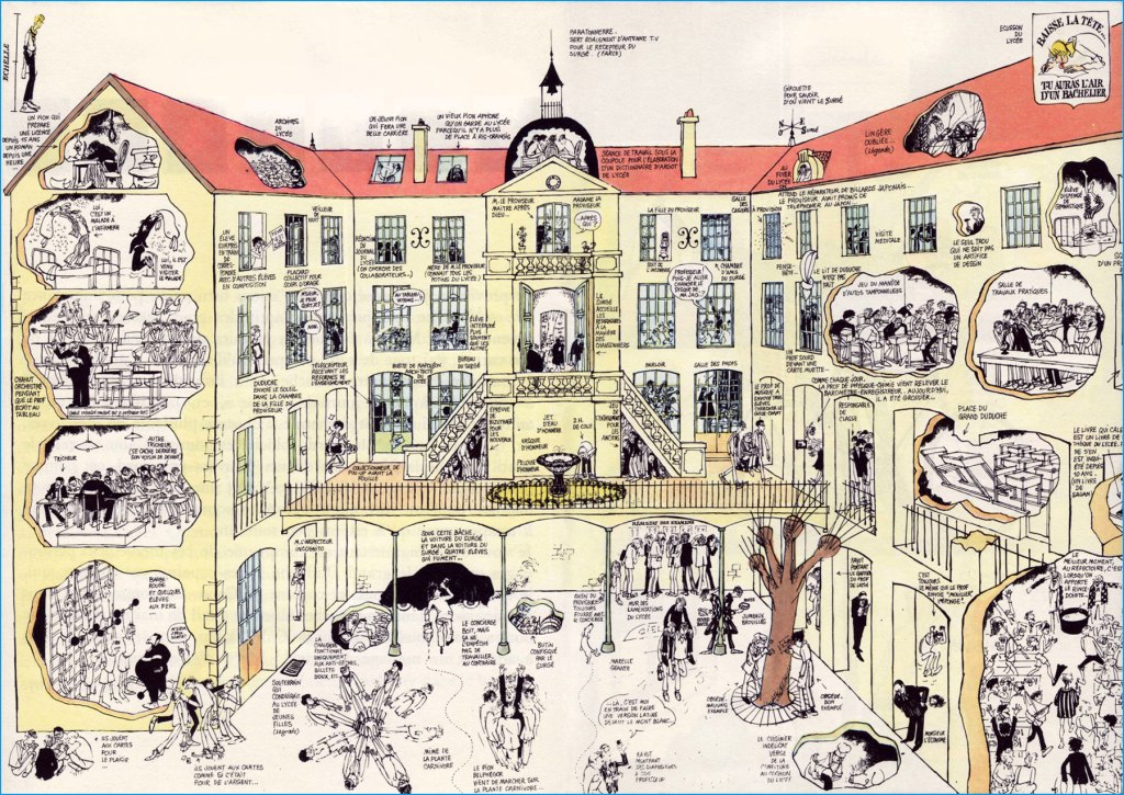
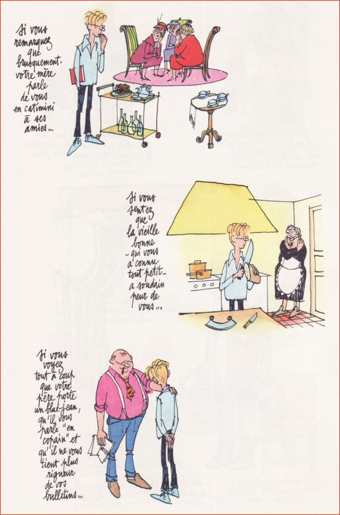
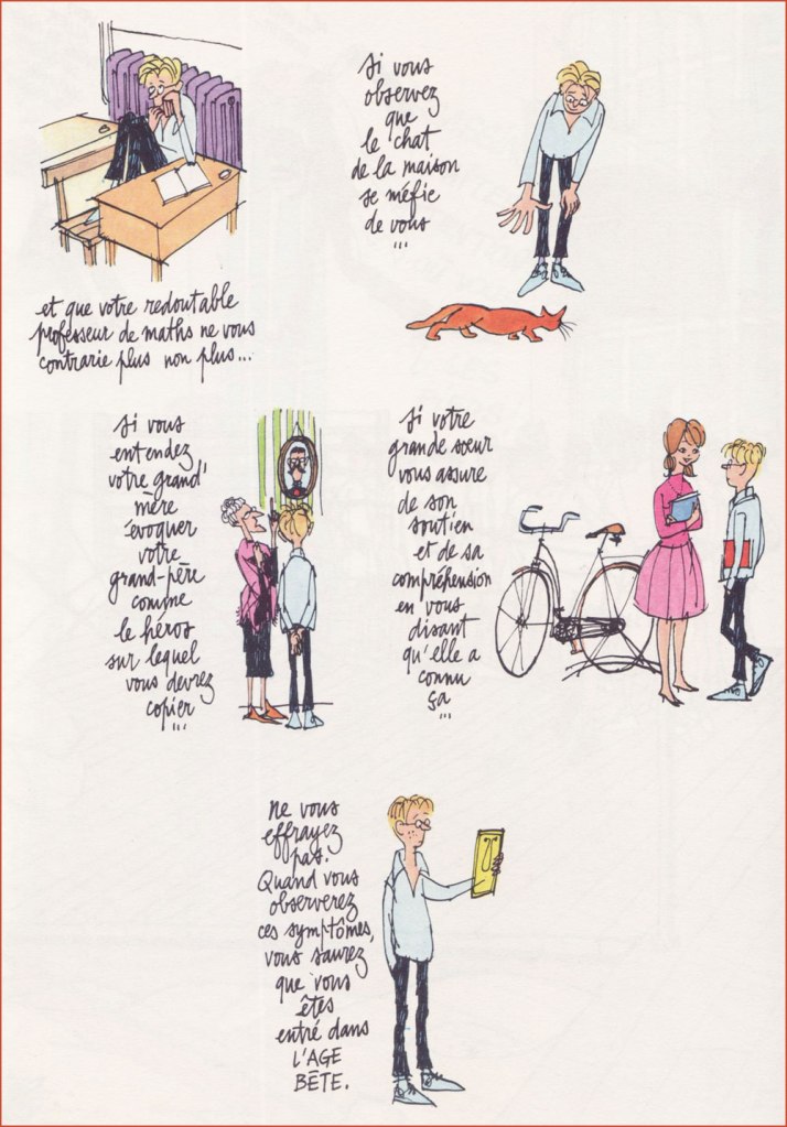
Ah, remember cursive?Little Duduche has to give away his cat’s latest litter, with deplorable results. « A female cat can have up to 20,000 descendants in just a span of five years. If you don’t want to take care of tons of cats or feel responsible for many homeless ones, it’s a good idea to spay or neuter your cat. » It’s just common sense, folks.Expressive, varied lettering is another crucial asset in the toolkit of the complete artist. « Mister Duduche! You will no longer find it quite so droll when I quiz you on aerial warfare of 1917-18! » Okay, this was hell to scan and reassemble (do open it in a separate tab to see the glorious details). But I felt it essential to showcase Cabu’s mastery of scale, perspective, architecture and general cohesion. Once in a while, Cabu would pull out one of these ambitious strips with over a hundred distinctive and identifiable figures, in service of a couple of dozen individual or entwined jokes. It is a rare breed of genius that can conceive such an array of moving parts and keep them all under control. 1- “Sir! Sir!Sir!” ” “Belphegor is getting deafer by the day...” 2- “May I go out, sir?” “Yes.” “Watch this…” 3- “Sir! Sir! Sir!” 4- “Sir, may I go out… to tell the principal’s daughter that I love her?” “No. There’s already another.” 5- “Well, I never!” 6- “Sir! May I go out to smash the other freak’s face in… it’s urgent!” “Okay, okay. But make it quick!““If you notice that the elderly maid, who’s known you all your life, is suddenly afraid of you…“Duduche catalogues the telltale signs of his entrance into ‘the awkward age’. “If you notice that the house cat is now wary of you…“Interesting: I had no idea until just now that the country fair game of ‘Chamboule-tout’ was known as ‘Coconut Shy‘ in English. Live and learn!Duduche’s utter inability to keep a poker face can be a bit of a liability. I love the well-observed detail of the study monitor keeping his feet warm with a hot water bottle. In French, the lovely, evocative term for that item is ‘bouillote‘.Here’s one from Pilote no. 590 (Feb. 1971, Dargaud). Though Cabu could be much, much acerbic than his American colleague, he and Jules Feiffer had a lot in common. “What’s on tonight at the film society?” “It’s a flick with, ah, what’s his name again… ?” “It’s on the tip of my tongue, his name…” “… I’ve got his name on the tip of my stump, your weirdo… isn’t it Fred Astaire?“
Coming back around to what makes this a ‘significant day’… Eight years ago to the day, Cabu was among those viciously murdered during the terrorist assault on the Charlie Hebdo offices. Honestly, I can’t bear to talk about it, but it’s crucial that this horrible event not be forgotten, and not merely because one of my artistic heroes was slaughtered that day.
« When she visits the gravesite of her late husband in Châlons-en-Champagne, Véronique Cabut-Brachet can witness just how much the French have not forgotten him: locals and fans come regularly to reflect (“It’s Cabu’s grave that people are looking for, and some people come just for it: nearly one a day, yes!” and for the past five years, according to the caretaker of the Cimetière de l’Ouest, interviewed by France Bleu). The artist’s gravestone is copiously covered in flowers but, especially, pencils in jars, a touching homage and the most beautiful of symbols. » [ source ]
« And by the time they reached the shore of the quiet lake the sun was clouding over and fog moved in across the water so swiftly and completely that it frightened Doug to see it move, as if a great storm cloud from the autumn sky had been cut loose and sank to engulf the shore, the town, the thumping, happy brass band. » — Ray Bradbury, Farewell Summer (1980)
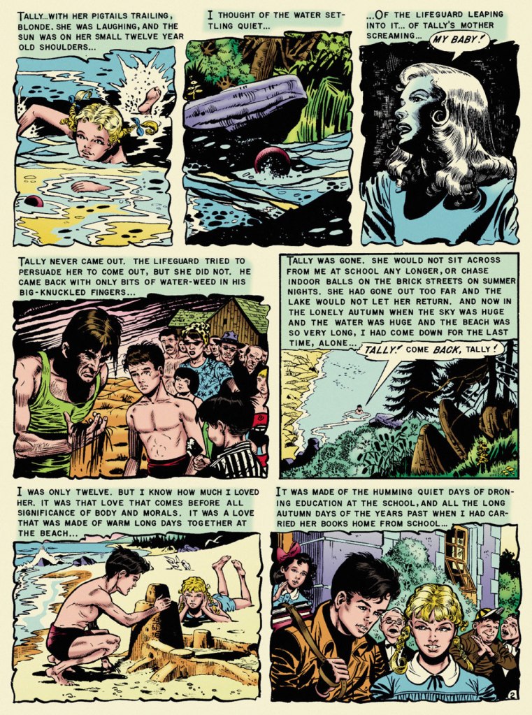
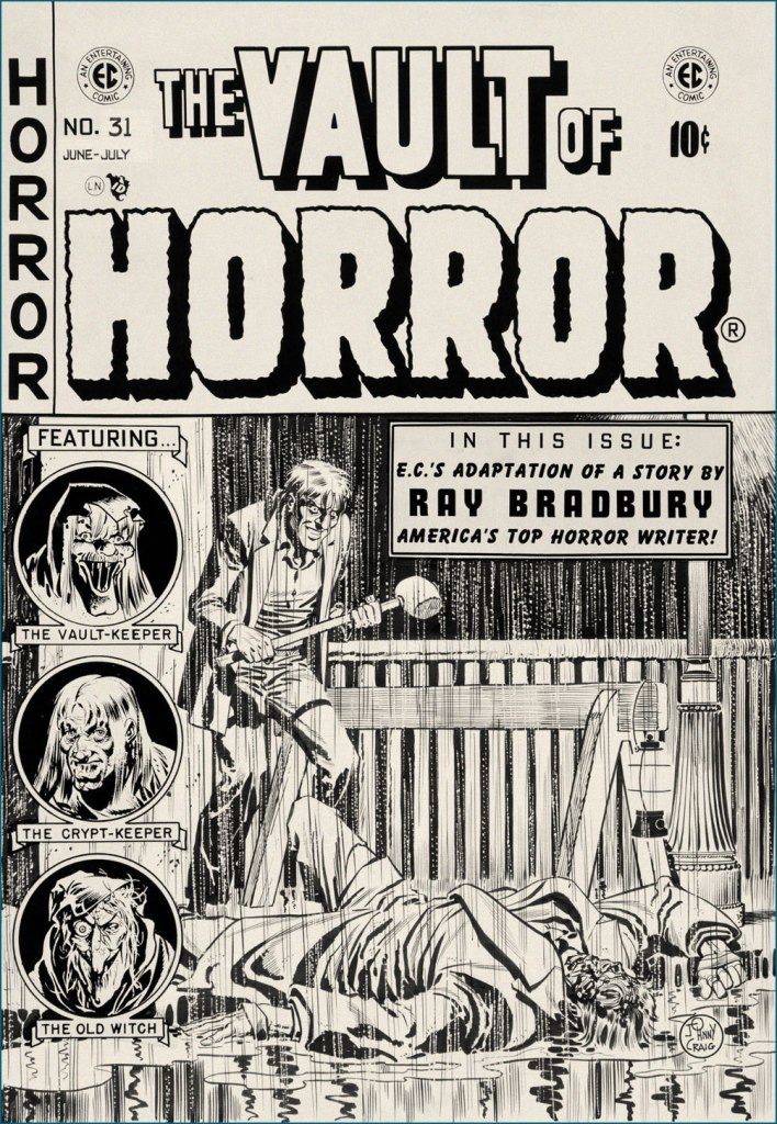
With summer on the wane — never mind the heat and humidity! — it seems fitting to feature, on the one hundred and second anniversary of Ray Bradbury’s birth, what’s possibly my very favourite EC comics adaptation of his work, Al Feldstein and Joe Orlando‘s ‘The Lake’. The other contenders jockeying for the top spot would be Johnny Craig‘s ‘Touch and Go!‘ (from the story ‘The Fruit at the Bottom of the Bowl‘) and Bernie Krigstein‘s ‘The Flying Machine‘. This mournful coming-of-age story was a speck of maturity in a boundless hinterland of juvenilia. I was agreeably surprised to find that there are some who concur with me on that point:
« It is hard for me to imagine how the 1953 comic book reader must have reacted when they picked up Vault of Horror #31 and read “The Lake” (adapted by Feldstein and Joe Orlando). The same month, Batman was fighting a crime predicting robot and Superman was helping to peel potatoes for Lois Lane during her stint in the Women’s Army Corps. So to go from that to this, a hauntingly sophisticated tale of a young boy obsessed with the death of his childhood sweetheart, must have been mind-blowing. »
Now, I trust I don’t have to school you about the life and times of Mr. Bradbury (1920-2012). Were it the case, I’d still skip the lesson, thanks to this 1953summary, which will suit our current purposes just fine:
The good folks at EC comics, namely those in charge — proprietor William Maxwell Gaines and his loyal acolyte and second-worst artist, Al Feldstein — decided to adapt the works of young Ray… without bothering to first secure his blessing. After a few (splendid) adaptations, Bradbury shrewdly wrote: « Just a note to remind you of an oversight. You have not as yet sent on the check for $50.00 to cover the use of secondary rights on my two stories ‘The Rocket Man’ and ‘Kaleidoscope.’ . . . I feel this was probably overlooked in the general confusion of office work, and look forward to your payment in the near future. ». By 1953, the collaboration was well established, and so…
Bless her soul and all that, but I found Marie Severin‘s latter-day recolouring for Fantagraphics’ ‘definitive’ edition to be on the garish side, so I’ve toned it down somewhat. Computers aren’t for everyone. Russ Cochran‘s stunningly ambitious and still-definitive The Complete EC Library featured John Benson, Bill Mason and Bhob Stewart‘s insightful and in-depth interviews and notes. Here’s what Benson wrote about The Lake:
« One of the few serious errors in the EC Bradbury adaptations is Joe Orlando’s imagery in ‘The Lake‘. Ignoring the many clues in the text (the long beach, the sand, the incoming waves) and taking his cue only from the title, Orlando drew a mountain lake, with pines and rushes, and a lodge in the background. But Bradbury’s lake was Lake Michigan, and this is a story that draws on the special poignance of the first autumn days at a large tidal beach. Had Orlando drawn on his undoubted experiences of the Atlantic seashore, he would have come much closer to the spirit of the original.
Readers who compare the dialogue in the EC version with the full version of the story in The October Country will find some seemingly inexplicable differences. The explanation is not that Feldstein cavalierly tampered with Bradbury’s text but quite the opposite. Feldstein was faithful to the story as it appeared in the May 1944 Weird Tales and in Bradbury’s first book anthology Dark Carnival (now long out of print). It was Bradbury himself who rewrote passages for this and other stories in The October Country, published after the EC adaptations. »
Orlando’s a funny guy. Like Harry Harrison, he started out as a friend, collaborator and friendly competitor of Wally Wood‘s. Unlike Harrison, who left the comics field to become a successful SF writer, Orlando was briefly able to more-or-less keep pace with Wood. It must have been nerve-wracking and of course quite unsustainable. While I hold that Orlando’s most aesthetically accomplished art job is ‘A Rottin’ Trick!‘ from Tales from the Crypt no. 29 (Apr.-May 1952, EC) and his most significant has to be anti-racist parable ‘Judgment Day!‘, from Weird Fantasy no. 18 (Mar.-Apr. 1953, EC), ‘The Lake‘ triumphs, thanks to its writing. After his peak of ’52-’53, Orlando’s art deteriorated fast. He made a bit of comeback in the mid-60s (the ‘Adam Link‘ stories at Warren were highlights) but… that’s when he was more often than not signing his name to Jerry Grandenetti‘s work. He found his niche as an editor at DC, and whatever artwork he produced thereafter seemed, to me, rushed and half-hearted. But he was a pretty good editor!
It’s a bit incongruous that what must be EC Comics’ quietest, most ruminative horror story should appear under one of its most violent (‘hard hitting’ comes to mind… literally) covers. Johnny Craig’s work could be — and generally was — quite understated, but on days when he wasn’t in that particular restrained frame of mind… look out! This is the original cover art from Vault of Horror no. 31 (June-July 1953, EC).
In closing, a word of warning: you’ll be seeing precious little of us in the coming month of September, as we’re preparing ourselves for a major change of domicile. We’ll be living in boxes for a spell, but I’m hoping to be back in time for the annual Hallowe’en Countdown. The show must go on!
« Goodbye—if you hear of my being stood up against a Mexican stone wall and shot to rags, please know that I think that a pretty good way to depart this life. It beats old age, disease, or falling down the cellar stairs. To be a Gringo in Mexico — ah, that is euthanasia. » — Ambrose Bierce, writing to his niece in the fall of 1913.
There’s a profusion of biographical material out there on the topic of Ambrose Gwinnett Bierce (June 24, 1842- ??), but here’s a capsule version to get the preliminaries out of the way:
« Ambrose Bierce was an angry young man who got angrier as he grew older. His strong talent was directed always by bitterness and despair. His wonderful stories were weird, cynical, shocking. His life was restless, his temper outrageous, and his death violent. »
Bearce belongs to a select club of larger-than-life American literary figures (among which we might also encounter Messrs. Poe, Twain, Lovecraft, Hemingway, and perhaps Vonnegut), whose life and work inspired, and continues to inspire, countless adaptations in all media, imitations and parodies, appropriations. You know the drill: works by, works about, works starring the author as protagonist.
In addition to the expected adaptations of varying quality, Bierce’s own nebulous ending inspired both fiction (Gerald Kersh‘s 1957 short story ‘The Oxoxoco Bottle‘, in which the narrator discovers a manuscript, in Bierce’s hand, that recounts the extraordinary events that followed his disappearance) and speculative non-fiction, by which I mean Jake Silverstein‘s fascinating 2002 essay, The Devil and Ambrose Bierce: Well Met in Marfa, which you can read here).
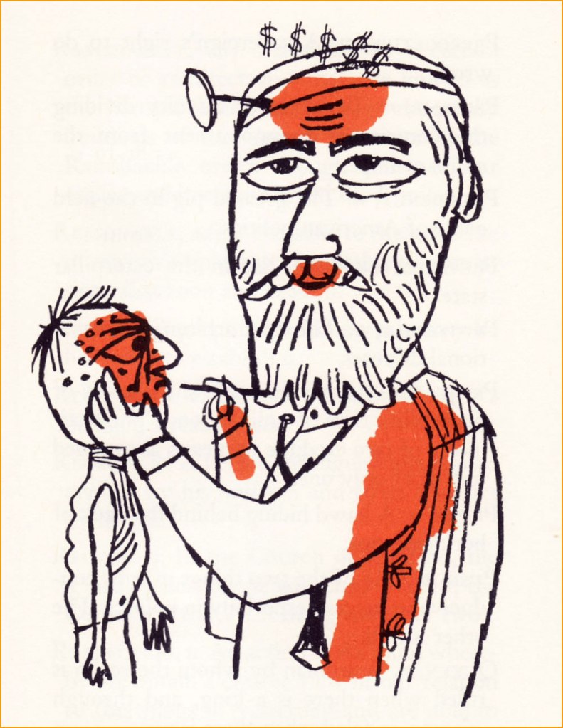
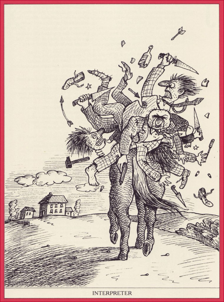
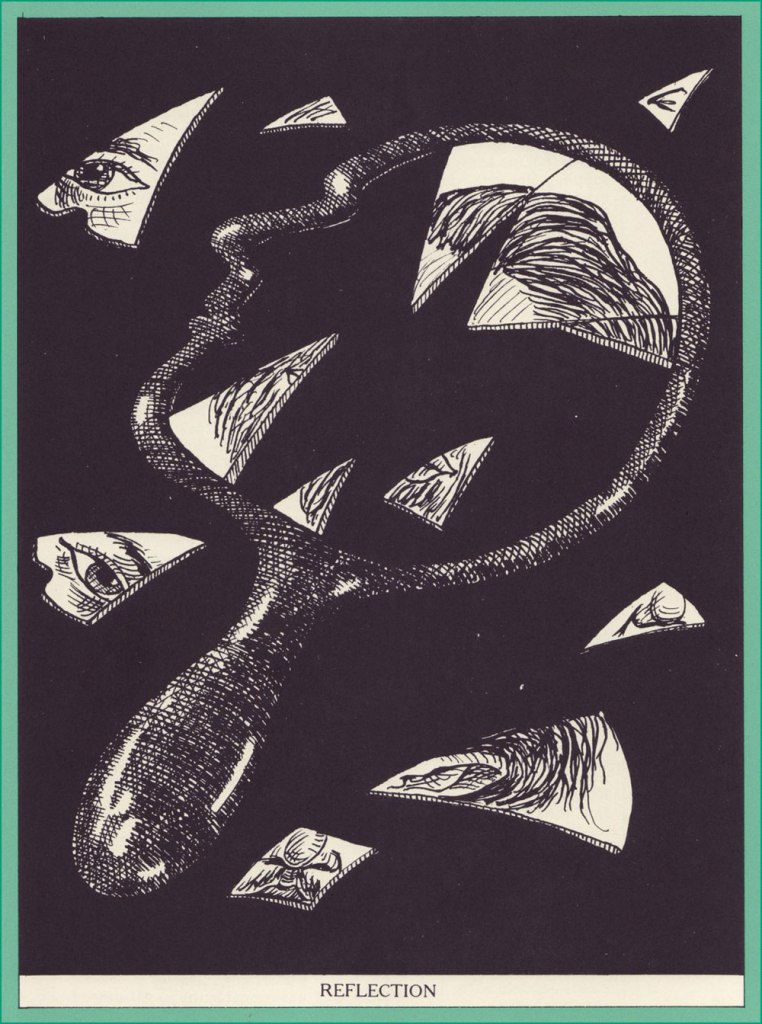
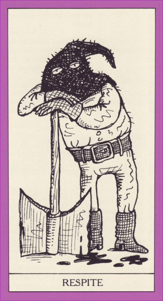
Since there’s so much to take in, I’ll fall back on my usual coping strategy, keeping my focus narrow to avoid (further) losing it. We’re going to explore my two favourite editions of a defining Bierce work, The Devil’s Dictionary, first published in 1906 as The Cynic’s Word Book.
Abasement, n. A decent and customary mental attitude in the presence of wealth or power. Peculiarly appropriate in an employee when addressing an employer.Commerce, n. A kind of transaction in which A plunders from B the goods of C, and for compensation B picks the pocket of D of money belonging to E.Edible, adj. Good to eat, and wholesome to digest, as a worm to a toad, a toad to a snake, a snake to a pig, a pig to a man, and a man to a worm.Prescription, n. A physician’s guess at what will best prolong the situation with least harm to the patient.This lovely edition, featuring illustrations by Joseph Low (1911-2007) was published in 1958 by the Peter Pauper Press of Mount Vernon, NY. This, as it happens, was my introduction to the series, picked up at a long-gone bookstore during a 1992 visit to Victoria, BC, a city that last year finally broke with its proud, longstanding tradition (begun in 1894!) of dumping its raw sewage into the Pacific ocean, surely to the relief of most Seattlites.
Then in 1979 came along a most handsome edition (Thomas Y. Crowell, Publishers) boasting a wealth of illustrations by Egyptian-born force of nature Jean-Claude Suarès (1942-2013).
Interpreter, n. One who enables two persons of different languages to understand each other by repeating to each what it would have been to the interpreter’s advantage to have said.Lawyer, n. One skilled in circumvention of the law.Longevity, n. Uncommon extension of the fear of death.
Medicine, n. A stone flung down the Bowery to kill a dog on Broadway.
Reflection, n. An action of the mind whereby we obtain a clearer view of our relation to the things of yesterday and are able to avoid the perils that we shall not again encounter.
Respite, n. A suspension of hostilities against a sentenced assassin, to enable the Executive to determine whether the murder may not have been done by the prosecuting attorney. Any break in the continuity of a disagreeable expectation.
Witch, n. (1) An ugly and repulsive old woman, in a wicked league with the devil. (2) A beautiful and attractive young woman, in wickedness a league beyond the devil.
For the sake of comparison, here’s Mr. Low’s rendition of same:
.
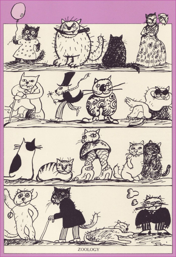
Zoology, n. The science and history of the animal kingdom, including its king, the House Fly (Musca maledicta). The father of zoology was Aristotle, as is universally conceded, but the name of its mother has not come down to us. Two of the science’s most illustrious expounders were Buffon and Oliver Goldsmith, from both of whom we learn (L’histoire générale des animaux and A History of Animated Nature) that the domestic cow sheds its horns every two years.
Happy 180th anniversary, Mr. Bierce, wherever you may roam!
« To many people in the mid-19th century, Canuck was merely a casual synonym for French-Canadian — and like the nicknames for people of various other ethnicities or nationalities, it came with unpleasant overtones. The word is“used vulgarly and rather contemptuously” »
A friendly birthday how-do-you-do to mighty Manitoban George Freeman (born May 27, 1951 — that’s seventy-one years ago — in Selkirk, MB). Some of you will remember him for his Jack of Hearts mini-series at Marvel or his collaboration with Michael T. Gilbert on Elric for First; the more adventurous will recall his fine and, ahem, too-brief work on DC’s Wasteland.
By the 1990s, he was also affiliated with Winnipeg’s celebrated Digital Chameleon studio… but to me, he’s the guy who made Richard Comely and Ron Leishman’s Captain Canuck into a contender, as far as I’m concerned.
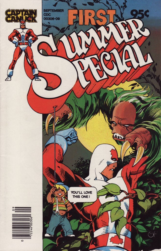
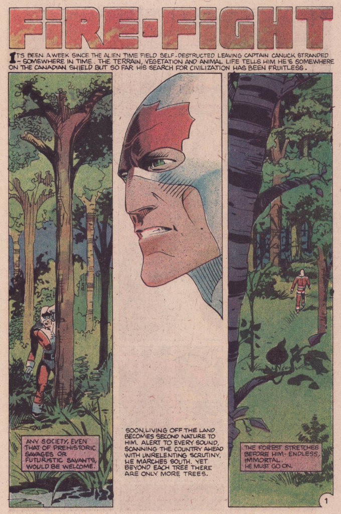
This is Captain Canuck no.7 (Dec. 1979-Jan. 1980, CKR Productions), featuring Ruse, story by Richard Comely, art by George Freeman. Cover by Freeman, with colours by Freeman or Jean-Claude St. Aubin.This was the Captain’s first (and sadly, only) Summer Special (July – Sept. 1980, CKR Productions); a winningly mixed bag, it *was* a lot of fun. Cover by Freeman.Among the goodies included in the Summer Special was a preview of the short-lived CK newspaper strip, which ran in three daily newspapers in Western Canada. It looked quite promising! Written and lettered by Comely, illustrated by Freeman and St. Aubin.This is Captain Canuck no.14 (Mar.-Apr. 1981, CKR Productions), the final issue — just when the series was going from strength to strength. Sigh.
To demonstrate, here’s the opening sequence from that issue. Freeman and St. Aubin were evidently pushing hard against the conventions and constraints of the era’s crappy printing standards.
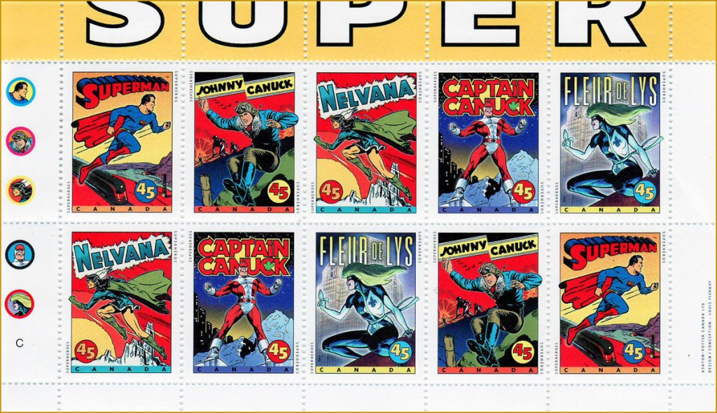
In 1995, the Captain even got his own stamp. Quoting the press release: « What do Superman, Nelvana of the Northern Lights, Johnny Canuck, Captain Canuck and Fleur de Lys have in common? For one thing, they’re all super heroes sprung from the wondrous pages of comic books; and for another, they’re all the marvelous creations of Canadian talent. On October 2, these five super heroes will find new adventure in a booklet of 10 stamps from Canada Post Corporation, to be issued in conjunction with Stamp Month 1995. A universal hero in concept, Captain Canuck is undeniably Canadian in nationality, costume and mannerisms. The concept can be traced to Ron Leishman and Richard Comely. Comely changed Leishman’s Captain Canada to Captain Canuck, and in 1974 established the only independent full-colour comic book in Canada. The cover price was 35¢ – 10¢ higher than other comic books at the time – but that didn’t stop Captain Canuck from outselling all American titles. Unfortunately, the series folded with issue No. 14, in March 1981. »
Part one of The Jack of Hearts’ limited series (Jan. 84, Marvel). The character was introduced in, of all places, an issue of The Deadly Hands of Kung Fu (no. 23, Apr. 1976, Marvel); The Jack shuffled around various Marvel titles for a time, culminating in this solo four-parter scripted by his co-creator, Bill Mantlo, and illustrated by Freeman. That costume must have been a bitch to draw.
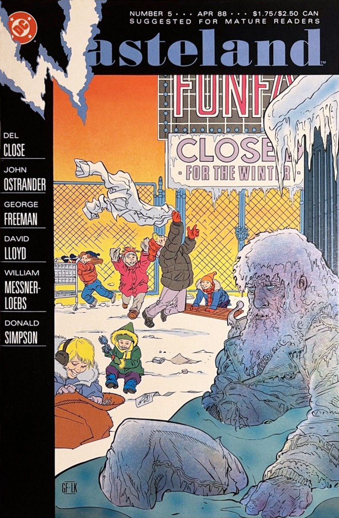
Oddly enough, while Freeman was my favourite among the stable of artists chosen to illustrate John Ostrander and Del Close‘s scripts on Wasteland (Don Simpson and David Lloyd got the best), I feel he was assigned the least interesting ones to work on, with the exception of the excellent Del Close autobiographical two-parter, On the Road (issues 6 and 7). Beyond that, he drew one cover and split, unwittingly triggering the debacle that was the second half of the series’ run.
This is Wasteland no. 1 (Dec. 1987, DC). Pencils and inks by Freeman, colouring by his Digital Chameleon accomplice, Lovern Kindzierski.This is Wasteland no. 5 (Apr. 1988, DC). Pencils and inks by Freeman, colouring by Lovern Kindzierski. As denizens of Winnipeg, a notoriously cold city, the guys would know how to colour ice, all right. To quote another famous native son, Randy Bachman : “Portage and Main, Fifty below“.
On the subject of chameleons, it appears that the traditionally held ‘camouflage’ theory of their colour changes is simplistic and generally incorrect.