Panning the murky old print stream for the odd glimmering nugget
By the Light of the Silver Age
We know when the Silver Age begins, but when exactly does it come to a close? Since it’s just arbitrary retrofitting, a bunch of events and dates have been posited, mostly from the early 1970s: Kirby leaving the Fantastic Four and Marvel, the “relevance” of Green Lantern/Green Arrow… The cut-off points of decades have been pretty misleading in the past while the middles have often been more pivotal: for instance, the years 1955 to 1965 are more of a piece than 1950-60, for instance. Same goes for 1965 to 1975. I therefore deem the end of the Silver Age to be the end of 1975, when Carmine Infantino stepped down as DC publisher, along with his brilliant art director Nick Cardy. Replace them with inexperienced Jenette Kahn* and the legendary (but not in a good way) Vince Colletta as art director, and you have a pretty massive sea change. Compared to that, comics from 1969 are virtually identical to releases from 1970. *creating Dynamite Magazine for Scholastic is what got Kahn the job. She only stayed for four issues, and Jane and Bob “R.L.” Stine likely did most of the heavy lifting, since the magazine only improved following Kahn’s departure. – RG
« You should be ashamed, Mr. Lash! Making such noises in front of the children! »
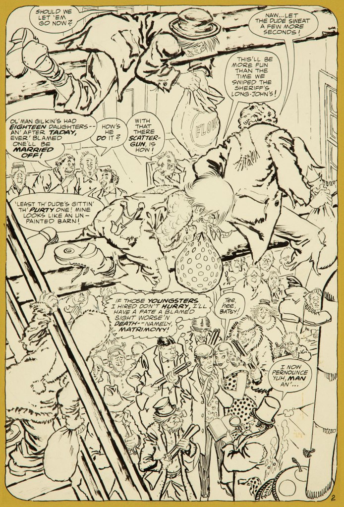
Bat Lash was introduced with issue 76 (August, 1968) of DC’s launching pad title Showcase, wedged between the respective débuts of Hawk and Dove and Angel & the Ape. At various stages of his conception, the character of Bartholomew “Bat” Aloysius Lash reportedly went through the hands of Carmine Infantino (who designed or at least supervised all of the following covers), Joe Orlando, Sheldon Mayer and Sergio Aragonés. Sergio plotted and thumbnailed the mise en scène, Dennis O’Neil added dialogue, then Nick Cardy pencilled and inked. For such a product-by-committee, Bat Lash is quite remarkably good — but then consider the talent involved!
Mind you, I make no claims of originality for Bat — he was distinctly a product of the times, when the vogue of Spaghetti Western had peaked* and ironically left its (off)brand on its model. By the time — in 1968 — its market reached its apex, the Italian Oater idiom threatened to congeal into a morass of clichés, becoming, as these things tend to go, (over)ripe for self-parody. Intentional and otherwise.
I surmise that the key model for Bat Lash was the ever-charming Mario Girotti**, reportedly enlisted thanks to his resemblance to the intense but one-note Franco Nero, even replacing the latter in his star-making, titular role of Django (1966) for a 1968 sequel, Prepare a Coffin, Django.
Ripe for its time it may have been, but I suppose that American audiences were still quite allergic to jarring tonal shifts in their entertainment (now commonplace), and would be for some time — just ask, say, John Carpenter. So the blend of light comedy and dark drama that Bat Lash proposed must have been difficult to market.
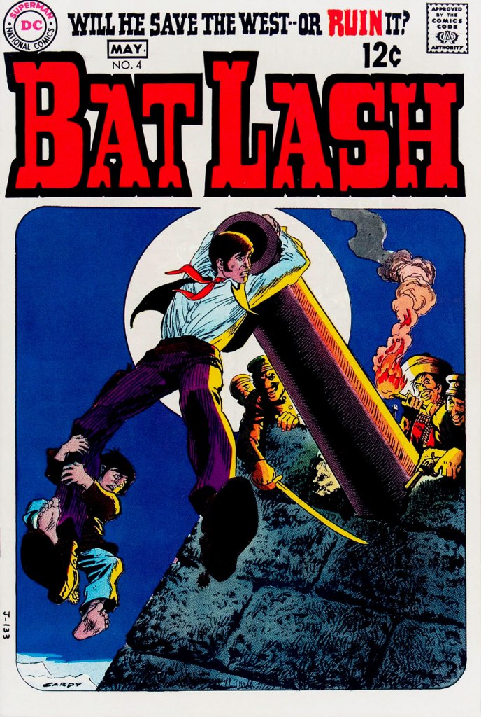
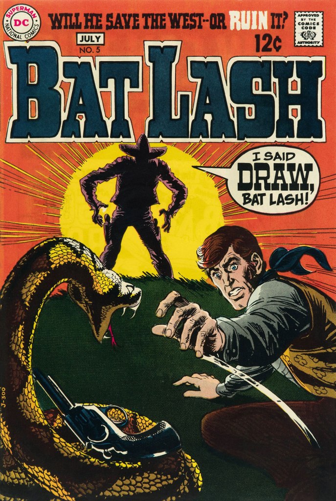
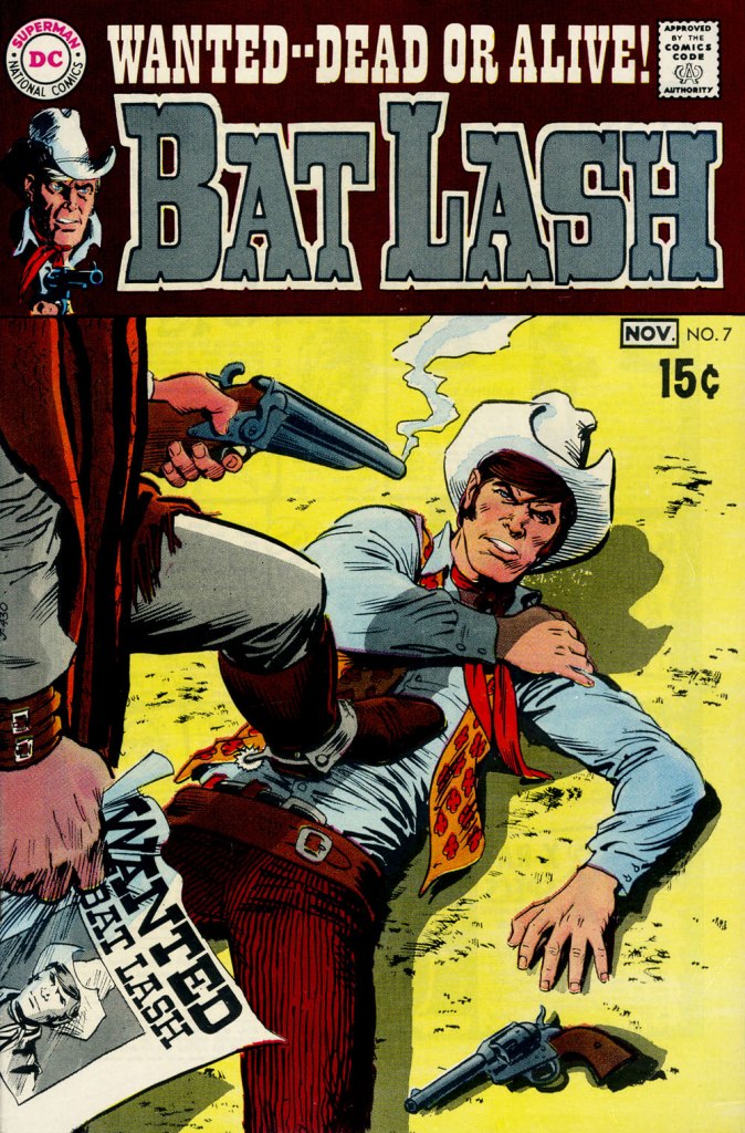
Our streak begins with Bat Lash no. 2 (Dec. 1968-Jan. 1969, DC) since the covers of Showcase no. 76 and Bat Lash no. 1 were good, but not — imho — great. I daresay this one is, in fact, the finest of the lot, with Cardy at his most Tothian.A peek inside the same issue, for contrast: lively and loose inking over rock-solid pencilling, and miles away from the tone of the cover. My guess is that some people weren’t happy.Bat Lash no. 3 (Feb.-Mar. 1969, DC) highlights the comedic side of the feature, which all but evaporated by the last two issues.This is Bat Lash no. 4 (Apr.-May. 1969, DC). Dig Cardy’s expert use of the ‘drybrush‘ technique on the stones.This is Bat Lash no. 5 (June-July 1969, DC). I’m reminded of a similar, later cover featuring one of Bat’s successors, Jonah Hex. The price goes up and the comedy… just goes. This is Bat Lash no. 6 (Aug.-Sept. 1969, DC).… and there goes the original tagline. This is the final issue, Bat Lash no. 7 (Oct.-Nov. 1969, DC)… and so must end this particular hot streak.
And now, some choice bonuses!
From issue 7, editor Orlando gives us some cheeky insight into the creation of an issue of Bat Lash.And plotter Aragonés provides some visual direction. To give you a sense of the less flippant, but not altogether grim, tone of the later issues, this is page two from issue 7. DC Comics of that period were quite ambitious with the limited means of the four-colour reproduction process, using plenty of backlighting and projected light… quite another level.
I was *delighted* to see ol’ Bat Lash turn up in the Weird Western Tales of DC’s outstanding Justice League Unlimited animated series, , along with some of his distinguished colleagues. In the usual order: Ohiyesa ‘Pow Wow’ Smith, El Diablo, Bat Lash, Jonah Hex.
-RG
* “In 1968, the wave of spaghetti Westerns reached its crest, comprising one-third of the Italian film production, only to collapse to one-tenth in 1969.” [ source ]
« History deals mainly with captains and kings, gods and prophets, exploiters and despoilers, not with useful men. » — Henry Louis Mencken
A few months ago, I was reading an old John Severin interview (in Graphic Story Magazine no. 13, Spring, 1971, Richard Kyle, editor) conducted by John Benson, and this passage stuck with me:
BENSON : Who are your favorite comics writers that you’ve worked with?
SEVERIN: I don’t even know who writes half the stories. Well, there are two guys, but they aren’t essentially comics writers. I like to work with Jerry DeFuccio and with Colin Dawkins. They write stories.
Which in turn led me to another Severin interview, this one conducted by Gary Groth in the early 2010s.
GROTH: In the back of the book, I’m looking at one issue of Son of Tomahawk actually, which I guess is a post-Tomahawk spin-off, but Frank Thorne does the lead feature and you did a really beautiful backup, I think one of your best strips during this period called Spoilers, that Jerry DeFuccio wrote.
SEVERIN: Really?
GROTH: You don’t sound like you have any recollection of this whatsoever.
SEVERIN: No, not at all. Oh, there’s an awful lot of stuff. Once I do a script and turn it in, it’s only with minor exceptions that I’ll remember the thing next week! I might remember it later on if somebody reminds me of something, but if somebody said, “What did you do last week?” I’d be damned if I know.
Severin’s reaction, to me, is a reminder of two things: first, that some artists (and fans!) are only interested in the visual aspects of comics. And second, that work conditions in the comics field (and most other commercially driven endeavours) are pretty inhumane if you have to just keep chugging on, with little time or impetus to look back and sniff the newsprint, let alone reflect.
Jerome ‘Jerry’ DeFuccio (1925 – 2001) was born on this day, ninety-eight years ago. While he’s most closely associated with his quarter-century stint as associate editor of Mad Magazine, readers of EC’s war/adventure titles know he could also pen, in excellent fashion, a thoroughly gripping yarn. Here’s one of the handful he later did for DC, for editor Joe Kubert. And while Son of Tomahawk wasn’t commercially successful, it was a highlight of its era, a truly adult comic book. See for yourself:
‘Spoilers!’ saw print in Tomahawk no. 135 (July-Aug. 1971, DC). Here’s a lovely illustration of some of the EC gang, in civil war drag . Like it says, DeFuccio’s third from the left. Ink and wash over graphite pencil on Bristol board. » Drawn in the 1950s, this piece saw print in 1983, in issue 9 of the excellent EC fanzine Squa Tront.
GROTH: Was DeFuccio working for Mad at that time?
SEVERIN: Yeah.
GROTH: It seems like you remained friends with DeFuccio for a very long time.
« I wish I could blend into the background / I’ve no excuses for my lack of guts / What is it about me that draws attention? » — Kevin Godley & Lol Creme, Punchbag
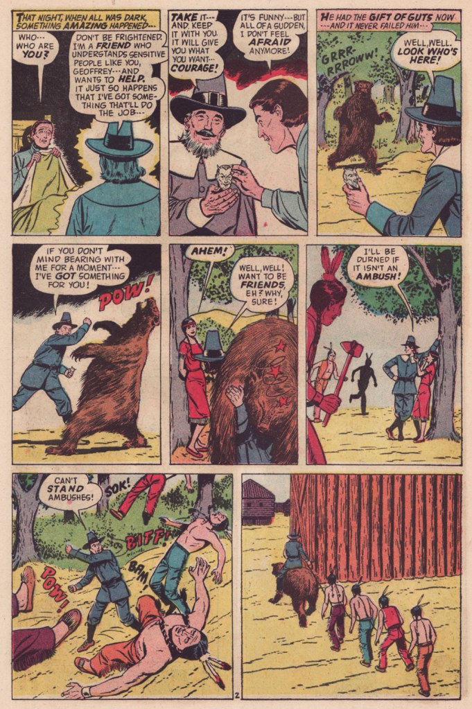
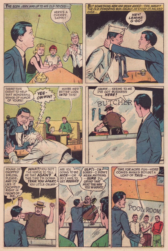
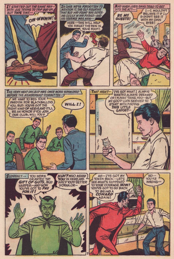
Today, let’s delve into the little-frequented wilds of that underrated little publisher that could, American Comics Group (ACG), 1943-67. The brand is chiefly recalled today for a pair of notable features: ACG pioneered the ‘horror’ anthology comic book with its Adventures Into the Unknown (1948-1967, 174 issues) and, in 1958, brought Herbie Popnecker, Richard Hughes and Ogden Whitney‘s ‘little fat nothing‘ to an unwary and undeserving world. ACG was co-founded and, briefly, co-owned by one of the field’s great villains, Harry Donenfeld.
But that’s all trivia in the end. ACG’s special appeal rests for the most part on the shoulders of one man of many monikers: writer-editor Richard E. Hughes (1909-1974).
I’ve already enumerated the man’s bona fides a couple of years back, when I featured one of his most celebrated (by ACG readers) tales, The People Versus Hendricks!, so I refer you to that particular entry.
As Hendricks’ tale was a rather tragic one, and since his dry wit ranked high among Hughes’ preeminent attributes, what do you say we set him loose for a demonstration of said lighter side?
Though many a notable illustrator passed through ACG’s doors — under his given name or otherwise — it’s undeniable that Hugues’ most consistently effective comrade-in-arms was the forenamed Mr. Whitney. Don’t let his low-key, ‘square’ approach deceive you: here’s a master storyteller at play.
Read on, febrile friends of ol’ Faust!
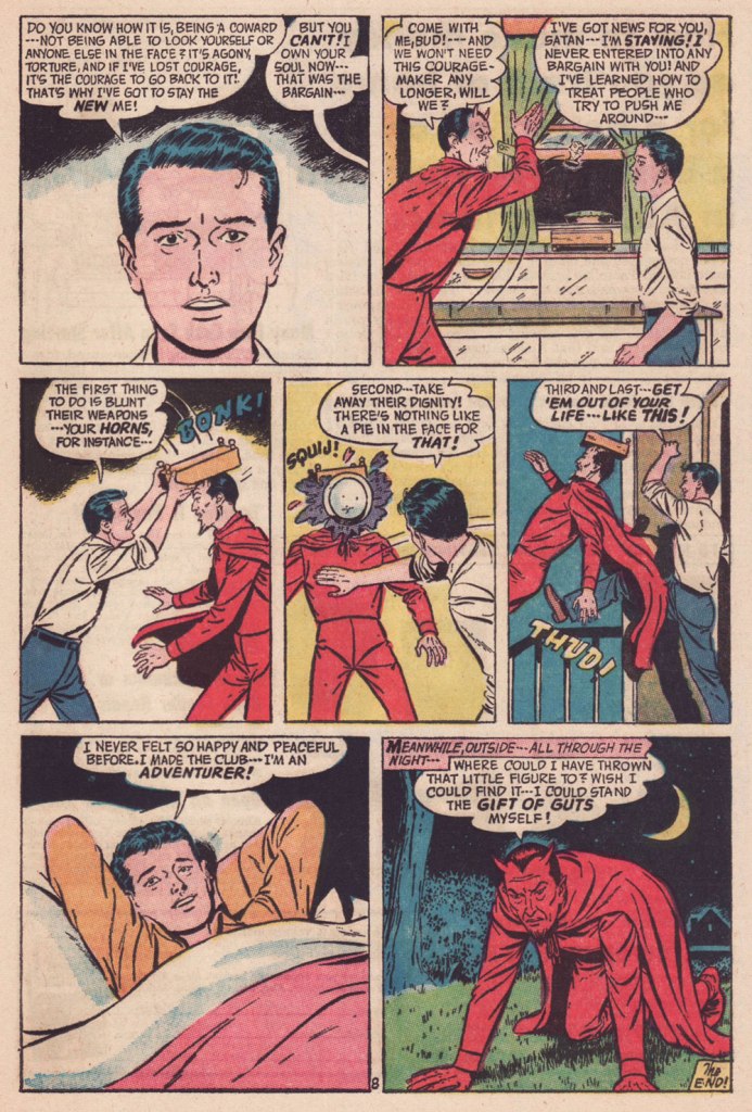
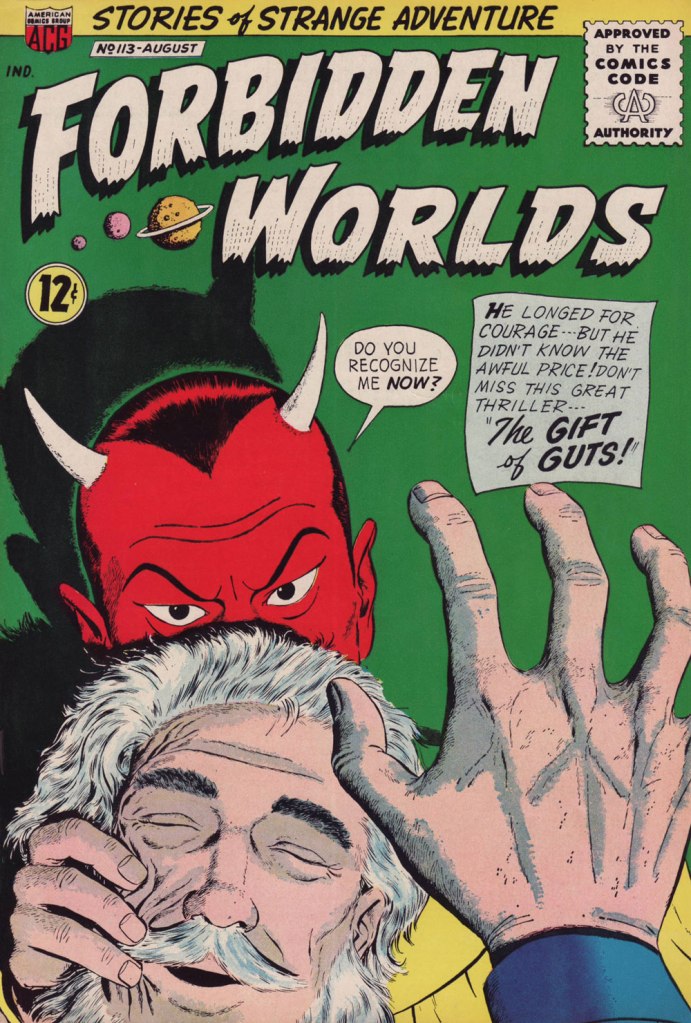
« Squij! » is now one of my favourite sound effects.The Gift of Guts was cover-featured in Forbidden Worlds no. 113 (Aug. 1963, ACG). Pencils and inks by Ogden Whitney.
« Carefully, the old man utters a cacophonous incantation… then lets his mind go blank. » — Stephen Skeates
We recently (last March 30) lost a fine fellow and writer in Steve Skeates (1943-2023). I’ve long appreciated his work, as I felt he was among the very few ‘mainstream’ comic book writers who could actually be funny, not to mention gripping or thought-provoking*, whatever the situation demanded.
At its peak, his writing also stood out by virtue of its containing actual creative ideas rather than the usual mishmash of bromides and creativity-stifling continuity that the fanboys clamoured for.
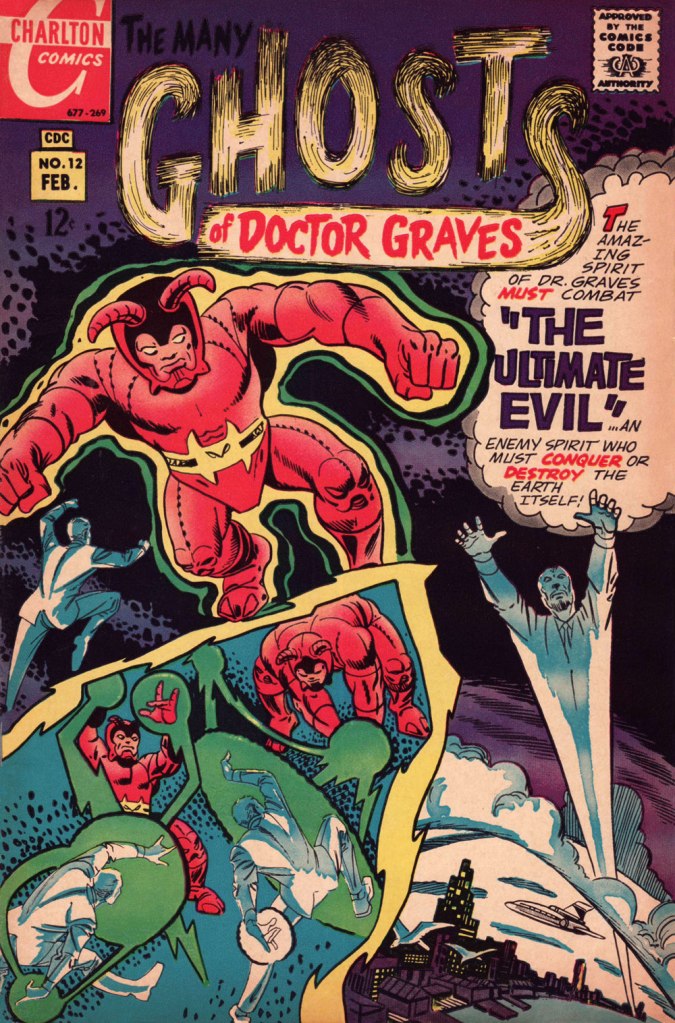
Today, I’ll showcase a bicephalous favourite, The Spectre in « The Parchment of Power Perilous » and Dr. Graves in « The Ultimate Evil », both springing from the same author… and the same plot.
How did this come to pass? Skeates told the story in an article entitled « Graves Acting Strangely: The Ultimate Evil Reconsidered », published in Charlton Spotlight no. 5 (Fall 2006, Argo Press, Michael Ambrose, editor).
« … at that particular point in time, I was totally unaware of the unique manner in which Julie [Schwartz ] approached his profession, typically in the dark when it came to the fact that this longtime comic book icon was far more actively involved in the plotting process than any other editor up at DC. […] I ambled into Julie’s well-kempt office armed with an intricate plot… something I had stayed up half the night before constructing, working, reworking, polishing and repolishing, only to have Julie read it over, extract a couple of ideas he liked, and unceremoniously toss the rest of it away. […] the two of us set about constructing what basically amounted to a brand-new plot based on those couple of ideas of mine that Julie liked, ideas that had somehow gotten his creative juices flowing. »
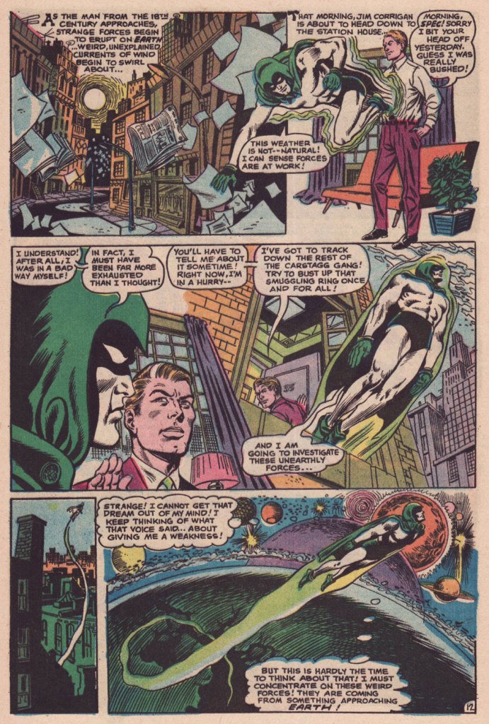
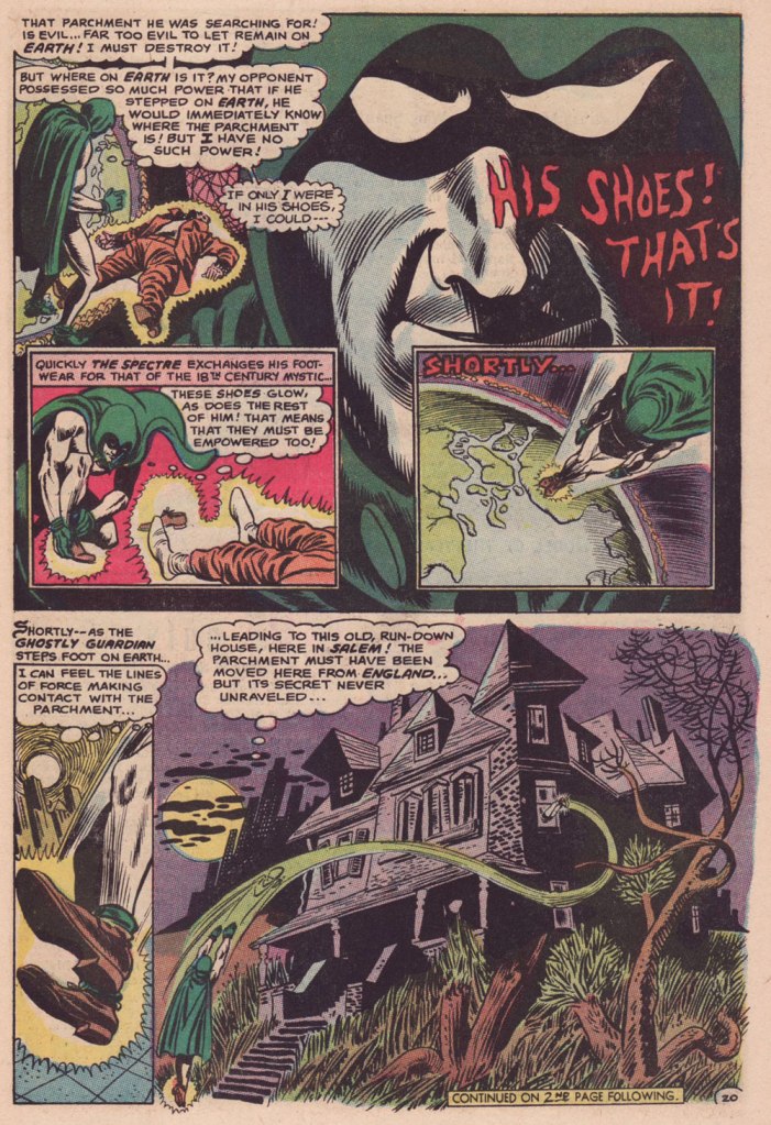
Charles J. “Jerry” Grandenetti (1926-2010) shows to breathtaking advantage his mad compositional virtuosity, anchored by Murphy Anderson’s rational inks. Skeates again: « … inker Murphy Anderson was the perfect stabilizing force, his meticulously detailed inks reining in Grandenetti’s insanity just enough so that even the latter’s wildest notions — colliding planes (no, not aircraft — planes of existence), his frequent disdain for panel borders, the same character shot from two or three separate angles within seemingly the same panel, etc. — became perfectly understandable, making the story so much utter fun to follow (even for someone like me who obviously knew exactly where it was going. ) »Grandenetti’s two previous issues on the title, illustrating Gardner Fox’s Pilgrims of Peril (check out a stunning excerpt here) and The Ghost That Haunted Money!, had demonstrated that he likely was the only match for Ditko when it came to depicting hallucinatory other-dimensional vistas. Let’s face it, just about all who followed Ditko on Doctor Strange either half-heartedly aped Ditko’s designs or drew other dimensions as if they were Wally Wood’s outer space (or Dali’s The Persistence of Memory). Well, save for Tom Sutton, I guess. Grandenetti could have done a great job, but honestly, I like his career as it is. The day Steve Ditko walked away from Doc Strange is the day the character ceased to exist, as far as I’m concerned.Five pages from The Spectre n. 8 (Jan.-Feb. 1969), edited by the… mighty hand of Schwartz. Special kudos to the uncredited colourist (though DC’s assistant production manager Jack Adler surely supervised), who did a superlative job, making discerning use of bold contrasts and close harmonies. It would have been so easy to end up with a garish mess!
Unlike (with one notable exception, initials SD) his colleagues who scampered from Charlton to DC along with editor Dick Giordano (Denny O’Neil and Jim Aparo, for instance) in the late 1960s, Skeates maintained his Charlton work for a time. He explained: « I simply possessed too much affection for what I was producing for that Derby, Connecticut company to do anything along those lines. » Skeates enjoyed « … contributing to Charlton’s take on the “mystery” anthology, ghostly compilations somehow edgier, funkier, and far more fun than those produced by DC and Marvel. »
« Furthermore, unlike DC, Charlton didn’t require that I first submit a plot outline, get it approved, and then write my story. Instead, I could just suddenly turn in a finished product, on spec, a way of working I very much preferred — diving right in with the plot idea only sketchily there, not boxed in even by myself but allowing the story to work itself out, to go where it wanted to go. » Amen.
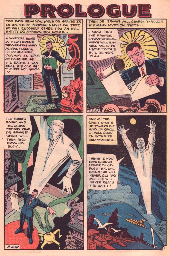
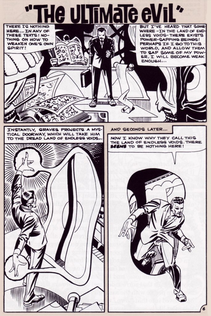
The one time we saw the Doctor M. T. Graves truly get his mystical groove on was in this tale of two Steves, Skeates and Ditko, a splendid bit of recycling-but-not-quite.
And he’s how the whole ball of wax coalesced: « I suddenly remembered that fairly intricate Spectre plot that Julie had long ago summarily tossed aside. Hey, y’know, I might just be able (especially if I placed most of my emphasis on those portions that Julie hadn’t extracted, working on the bulk of my original plot while rather downplaying those couple of ideas that Julie and I had built our new plot on) to transform that baby into a workable Dr. Graves adventure! »
This is The Many Ghosts of Doctor Graves no. 12 (Jan.-Feb. 1969, Charlton). Edited by Sal Gentile.
« Boom! I was into it, writing this story nearly as fast as I could type. Of course, to in effect have Graves play the role of the Spectre, I could see no way around making certain alterations to my protagonist’s makeup, making him far more mystically powerful than he had ever before seemed, more like Marvel’s Doctor Strange than anyone else…
Yet I could see no real problem in any of that, unless of course someone up at Charlton wound up doing something supremely silly like assigning the art for this story to none other than Ditko himself — which, as it turned out, is exactly what happened! »
Some — perhaps all, who knows? — of this tale’s original art (or at least production photostats) has survived, and gives us the opportunity to gaze upon Ditko’s artwork in its raw state, so to speak.
Hail and farewell, Mr. Skeates. You will be missed.
« This is how you disappear… » — Scott Walker, Rawhide
No foolin’, honest: today is the birthday of cartoonist Frank M. Borth III (April 1, 1918 – August 9, 2009), who worked on such Golden Age features as Phantom Lady, Captain America, Skypilot, Spider Widow, colleagues Captain Daring, Captain Battle and Captain Fleet… he kept busy.
Borth’s first Phantom Lady page — premiering her classic outfit, at that — from Police Comics no. 17 (March 1943, Quality). Unusually for such an assembly-line industry, Borth did his own lettering, and it’s easy to see why: he was terrific at it. Read the whole issue here!
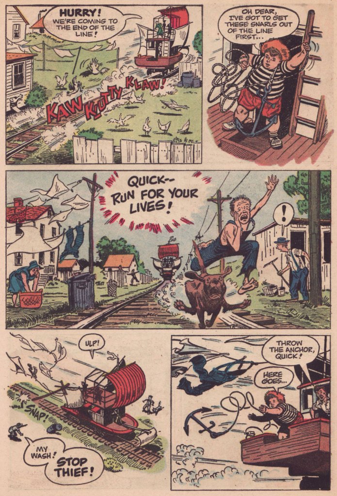
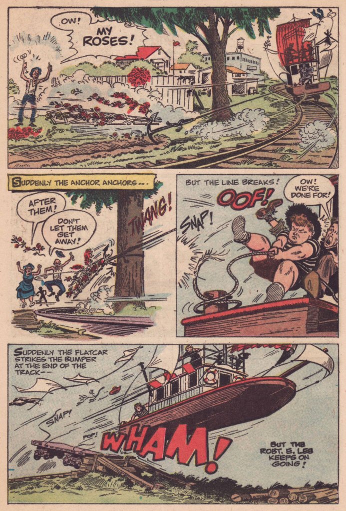
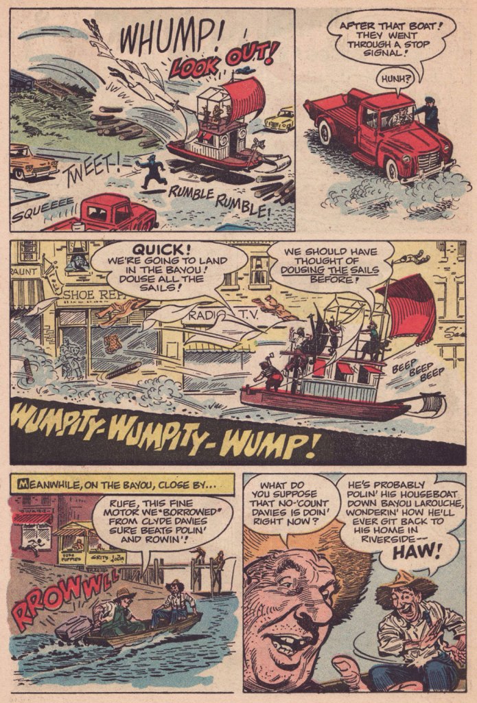
Then, at the close of the 1940s, he began a long association with Catholic publisher George A. Pflaum, chronicling (among others) the rollicking adventures of one Frumson Wooters, aka The Champ, a stereotype-bucking chubby kid who’s at times scatterbrained and clumsy, but also wise, determined, resourceful, and humble to boot. Written by Captain Frank Moss and radiantly illustrated (and later, also scripted) by Borth, the feature ran for two decades in Treasure Chest of Fun and Fact, a publication distributed to parochial school students between 1946 and 1972 and generally avoided like any of the Ten Plagues of Egypt by your average comic book fan, but — wouldn’t you know it? — chock full of excellent work by the likes of Bernard Baily, Fran Matera, Bob Powell, Reed Crandall, Joe Sinnott, Graham Ingels, Joe Orlando, Murphy Anderson, Jim Mooney, Marvin Townsend, Paul Eismann… I’ll stop now.
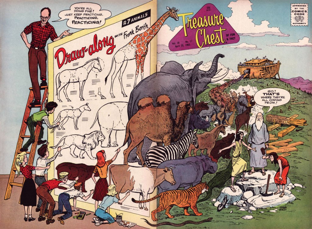
Being ad-free, Treasure Chest had the luxury of full cover spreads, and Borth would, with his, delight in the element of surprise. This is Treasure Chest of Fun and Fact Vol. 18 no. 17 (Apr. 18, 1963, George A. Pflaum). Issues 11 to 20 this volume of TCOF&F presented a 5-page chapter of his engaging tutorial Draw-Along with Frank Borth, which was collected in 1965.
I was going to feature a gallery of favourite Borth pages from all over the place, but instead decided it might be more interesting to highlight his ability to break down an action sequence, since that’s the palpitating heart of an adventure yarn. Therefore, here’s chapter 4 of “The Champ’s Treasure Hunt“, published in TCOF&F volume 15, No. 4 (Oct. 22, 1959).
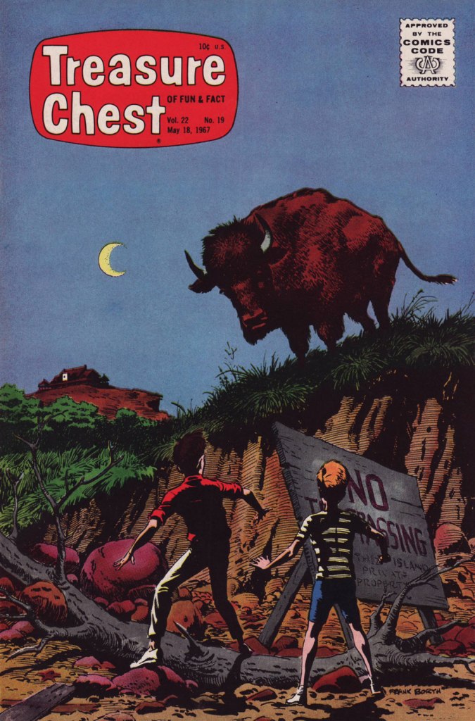
You can read the entire saga, from the start, right here!Another splashy (quite literally) Borth cover, this time featuring The Champ! This is Treasure Chest of Fun and Fact Vol. 21 no. 10 (Jan. 13, 1966, George A. Pflaum). I allow myself a Frumson exception for Treasure Chest of Fun and Fact Vol. 22 no. 19 (May 18, 1967, George A. Pflaum), my favourite Borth cover — and one of my very favourites, period. It’s a scene from the penultimate chapter of The Mystery of Forbidden Island, written and drawn by Borth.
I intended to direct interested readers to an autobiographical essay Borth penned late in life, but it’s gone — well, retrievable if you try hard enough, but to avoid losing it altogether, I’m going to quote it in full:
FRANK BORTH, syndicated cartoonist was born in Cleveland, Ohio and graduated from Cleveland School of Art in 1940. Frank had earned his tuition by painting price signs in tempera paint for butcher shops, grocery stores, Green Grocers, etc. from 11th grade on until he left Cleveland to get employment as an illustrator in New York City. Where he worked as a free-lance illustrator and writer for comic book publications.
Frank was drafted into army and assigned to the Transportation Corp training Center at Indiantown Gap Military reservation to produce training aids where he rose to the rank of T/Sgt. In 1944 Frank painted a 52-foot mural for the Service Club that is still there today. Frank married Barbara Stroh of Harrisburg, Pa in 1944 and was discharged in 1946.
Frank came back to New York to find work and an apartment; he found neither, but his landlady offered him the summer use of some unheated rooms over garage of a large house she planned to rent to roomers out in Montauk. Frank and Barbara moved in May 1st for the summer as Montauk was by then once more a summer resort, and he found employment by painting murals in bars and sign work at the Yacht Club. Frank entertained members every Friday night at a dinner with chalk talk and other inspiring skits. Finally Frank decided to create a new comic-adventure strip about a two-masted schooner available for hire and an agent in the audience offered to try to sell it in New York.
Frank’s little family really lived on the money he had saved up in the three years in the army. He went back to Cleveland however due to the death of his father and worked for a small ad agency. The following spring the agent told him that he had sold the yachting script and Frank went back to Montauk to work on the strip “Ken Stuart” for three years; but couldn’t get it syndicated inland. Frank was not saved by the bell but by a Catholic publication called “Treasure Chest” who mailed him a script to illustrate in ten chapters of six pages each, a fiction story about the Priest of Shark Island. This led to steady interesting assignments for 25 years. The magazine was in comic book form, and was published every two weeks during the school year, twenty in all. Since they didn’t print in the summer, Frank would use that time to write scripts on his own. In those days they corresponded by letter and the editor and Frank soon became pen pals. Frank made sure that he delivered always on time and produced exactly what they were looking for.
The Borth family, they had produced two children a son and a daughter, they bought property in Montauk and built a house. Frank had joined the volunteer fire department and also volunteered to be one of the crew on our new ambulance as well. You can imagine that he did a lot of artwork for the fire department and other civic organizations. He taught Sunday school and was elected an Elder of the Montauk Community Church. Barbara, Frank calls her lovingly Bobbie, became a Girl Scout leader and also sang in the choir, they no longer were “summer people” but full time residents of Montauk. Bobbie became a schoolteacher and also attended Southampton College and earned a Masters degree.
Frank was asked to become a republican committeeman, which led to Frank being elected a Town trustee, and to the office of Councilman on the East Hampton Town Board in 1968. At the conclusion of the four-year term Frank choose to give up the part time position that had by then turned into a full time commitment. Shortly after retiring from politics, Warren Whipple, a long time friend (The artist who drew the syndicated cartoon feature “There Oughta Be a Law”) called to asked Frank if I would take the job of writing the plot and dialogue of each cartoon as the original creator of the strip wanted to retire. Frank said OK, as he had done almost as much writing as drawing with his own labors. The syndicate approved Frank taking over and for the next ten years, Whipple and Frank Borth were a team.
Frank took over the entire production of writing and drawing the strip until February of ’83 when he turned 65 and terminated the production. The Treasure Chest Publisher also went out of business due to the rapid closing of a lot of parochial schools. Another publisher tried to sell it on the newsstand but failed. Frank turned out about 50 when another acquaintance talked him into getting back into production doing crazy assignments for Cracked Magazine which he had done for a period of time until they switched editors and all they were interested in was using famous people’s names.
Frank concluded his second career and retired to doing art and posters for local organizations like the Fire Department, Lighthouse, and the Town. Since he had created the Town seal of east Hampton as well as the Bicentennial seal, he also drew up the tricentquinquagenary seal as well. He still does things for the Library, church, and other local organizations until I lost the vision in his left eye which has deprived him of depth perception. Frank still writes but cannot draw as I used to. Oh, well. 84 is a reasonable time to retire, he chuckles. Frank’s retirement is spent in painting Montauk land and seascapes.
Circling the drain: this is TCOF&F vol. 27, No. 2 (Jan. 1972, George A. Pflaum), the final volume; at this point, the magazine had adopted a monthly schedule and relied heavily on reprints. But heck, an issue with a 37-page Frumson Wooters epic, The Champ Goes Down!, is pretty easy to take. It had been serialised over the six issues of 1967’s Treasure Chest Summer Edition.
« We never knew his name; we only knew him as “the good artist”. But his style spoke for him. He was instantly recognizable despite his anonymity — at once different from the other funny animal artists and better. » — Dwight R. Decker
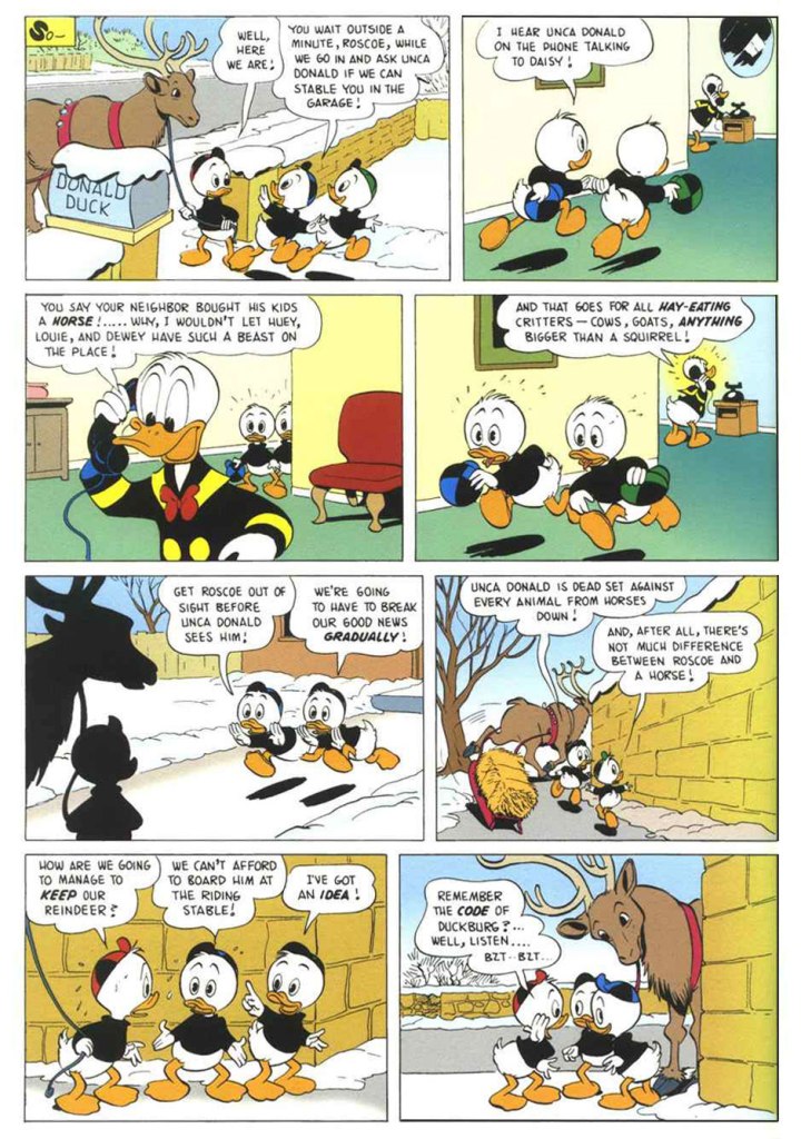
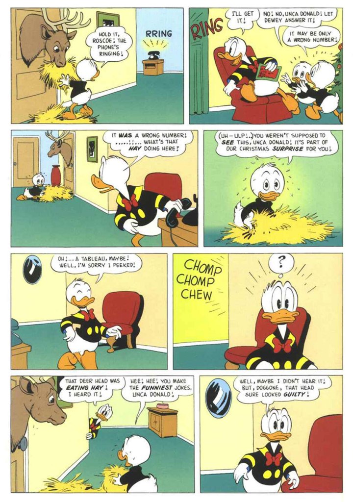
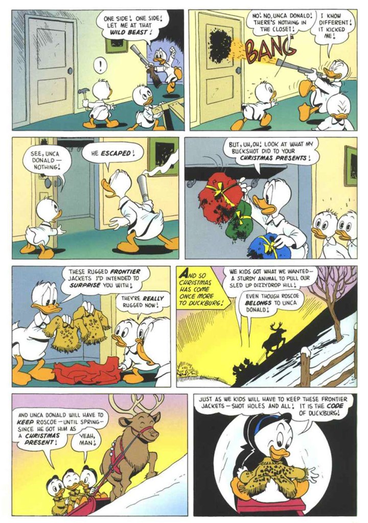
The great Duck Man, Carl Barks, despite having little interest in the holiday, drew over two dozen Christmas-themed stories featuring Donald and his relatives (and wrote the bulk of them). Now, so very much has been written and said about Barks that I won’t bother to add much here. I’ll just let his work speak for itself and breathe. I opted for a lesser-known ten-pager, not coincidentally one of my favourites. “The Code of Duckburg” originally saw print in Walt Disney’s Comics and Stories no. 208 (Jan. 1958, Dell), but I’m using a more contemporary issue boasting better printing and a commendably tasteful colouring job, from Walt Disney’s Uncle Scrooge no. 317 (Jan. 1999, Gladstone). It must be said that the folks at Gladstone did right by the ducks — it was more of a labour of love than a strictly commercial venture.
Here’s a closer peek at a panel from page 3: just look at the joy on Roscoe’s face. Unlike Donald, his nephews are unfailingly kind to (other) animals, great and small. That’s what makes them such sterling exemplars of the Junior Woodchucks. The issue of WDC&S where our story first appeared didn’t have a Holiday-themed cover, but this one reprinting it did. This is Walt Disney’s Comics and Stories no. 376 (Jan. 1972, Western); pencils by Tony Strobl and inks by Larry Mayer.
And as a bonus (there has to be a bonus!), here’s a look at a Barks model sheet. « The Barks sense of whimsy extended even to the model sheets he drew for other artists to follow. » I made it a larger image so that all the small details remain discernible. Happy Holidays, everyone!
« Gamma rays are the sort of radiation you should avoid. Want proof? Just remember how the comic strip character “The Hulk” became big, green, and ugly. » — Neil deGrasse Tyson
It may seem a counterintuitive notion, but some artistic virtuosi, while draftsmen supreme, may be sorely lacking in pure design chops, while some otherwise unremarkable craftsmen design splendidly. The same general principle applies to a colour sense, or handwriting. As the cliché goes, the most skilled brain surgeon’s penmanship may just yield sloppy gibberish, what’s wittily described as chicken scratch writing.
My point in this case is that, while Herb Trimpe (1939-2015) has never ranked among the comics industry’s glory boys, I consider him one of its finest cover artists. It’s a special skill and quite a scarce one…
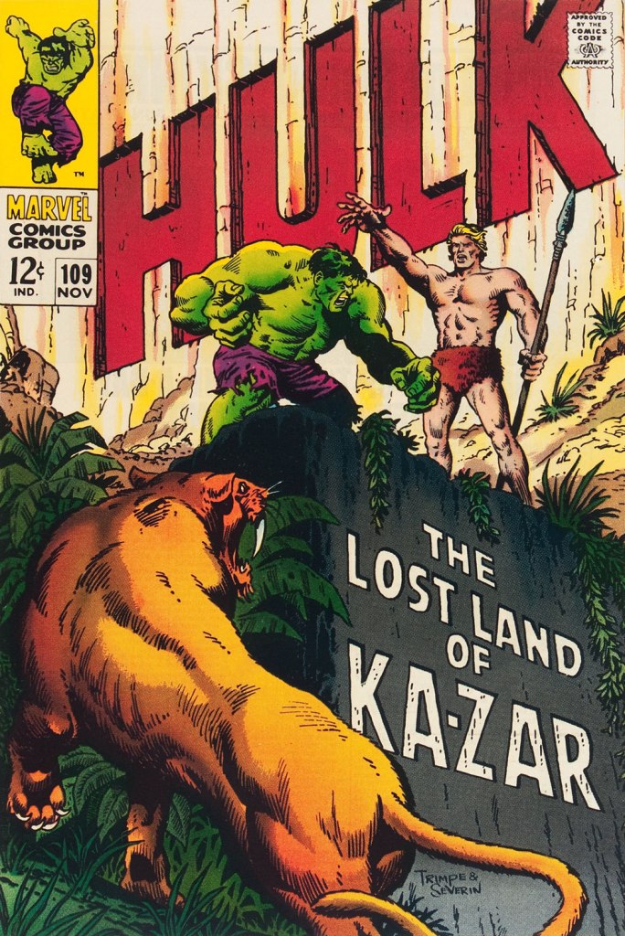
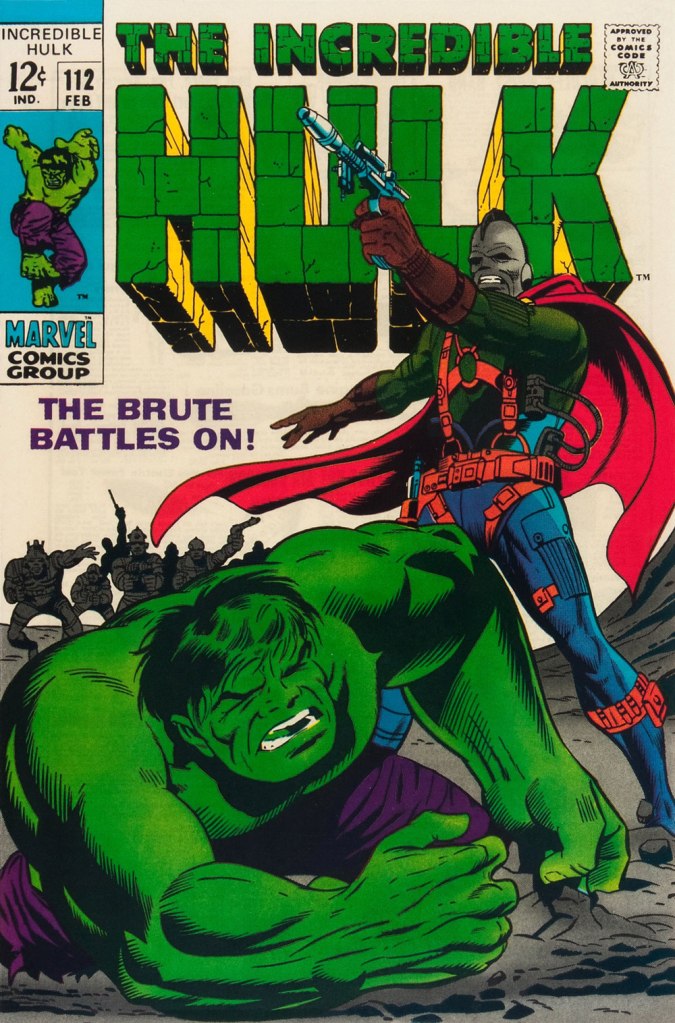
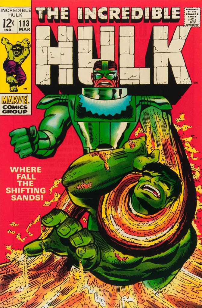
Herb’s streak begins with The Incredible Hulk no. 109 (Nov. 1968, Marvel), his first cover for the series. And yes, being seconded by one of comics’ all-time finest inkers (and cover artists!) didn’t hurt, but this is flawless layout work in the first place. This is The Incredible Hulk no. 110 (Dec. 1968, Marvel), again boasting John Severin inks (and quite likely Marie Severin colours).This surviving piece of production art grants us the opportunity to admire the splendid inks. I honestly don’t know what Ka-Zar was hoping to achieve here, though. Trimpe also produced another, rejected, version of this cover (scroll down, it’s near the bottom) the action tackled from quite a different angle. Featured in IDW’s ultra-fancy, signed-and-numbered limited run in the ‘where can I fit this damn monster?’ Artist’s Edition format in 2015, it demonstrates just how tight Trimpe’s pencil work was.This is The Incredible Hulk no. 111 (Jan. 1969, Marvel). Dan Adkins takes over the inker’s chair. This is The Incredible Hulk no. 112 (Feb. 1969, Marvel). Notice how innocent of hype and verbiage these covers are? This is The Incredible Hulk no. 113 (Mar. 1969, Marvel). I always preferred the simplicity of The Sandman’s garb as envisioned by his creator, Steve Ditko. He was depicted as a bully in a striped green and black sweater, which was fine for a guy able to turn his body into sand. When Jack Kirby redesigned him, he gave him a cool-looking, but frankly rather impractical getup.
And that’s where this streak ends, as far as I see it: the following few issues feature decent covers, but nothing outstanding. But there were scores of excellent Trimpe Hulk covers to come. The blocky dynamism of his visuals, so easy to underrate, made his covers a reliable breath of fresh air in the mire of formulaic and overwritten Marvel 1970s covers (et tu, Gil Kane?)
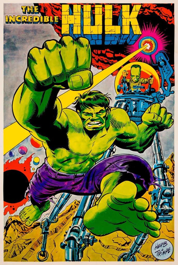
As a bonus, here’s a 1970 Marvelmania poster, one in a series of products exclusively available through mail-order. Nowadays, any of them routinely fetches princely sums. If you think Herb’s perfectly nailed the King Kirby aesthetic with this one, you wouldn’t be far wrong, but there’s a twist. The drawing was designed and pencilled by Kirby, then in the process of leaving Marvel for DC. Trimpe was asked to ink the drawing, redraw the Hulk’s face in his own style, and delete Kirby’s signature. I forget just where I read about this, but Trimpe had some heavy moral qualms about being made a party to this petty act of malice.
« It’s quiet snow that I remember best… snowfall and Brahms on November nights. » — Rod Mckuen, Midnight Walk
While Autumn is easily my favourite season, much of its magic and colours are gone by the purgatory that is the month of November, and I find myself longing for snow to brighten the relentlessly longer and gloomier evenings.
And then, yesterday, as I was still mulling over this post, I woke up to this view from my front door.
Well, then! This post consists of a(nother) gallery of Warren Kremer‘s delightful Harvey covers, this time with a snowy theme. Never truly ‘ha ha’ funny, they get along on charm and crafty, limpid conception and execution.
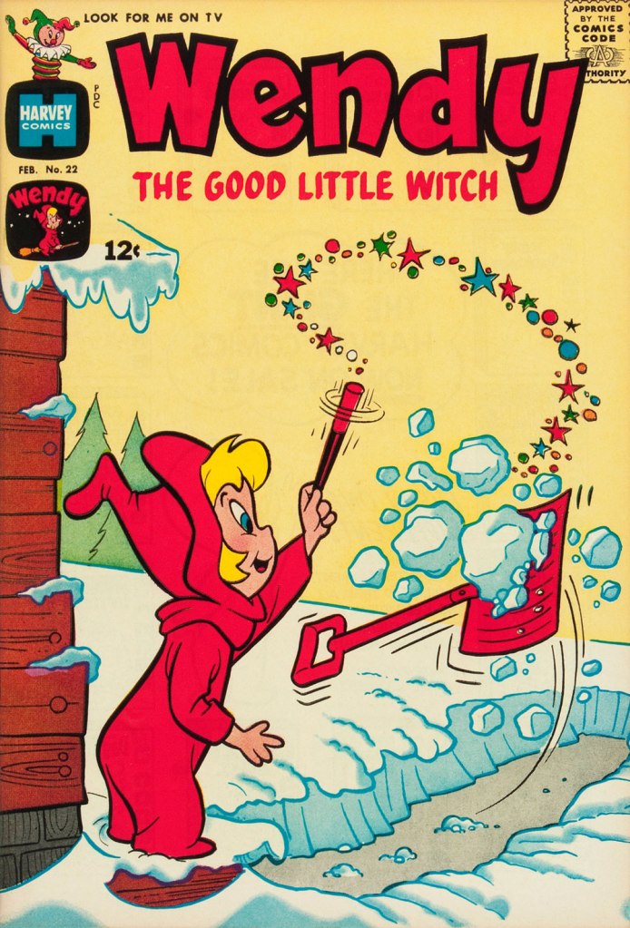
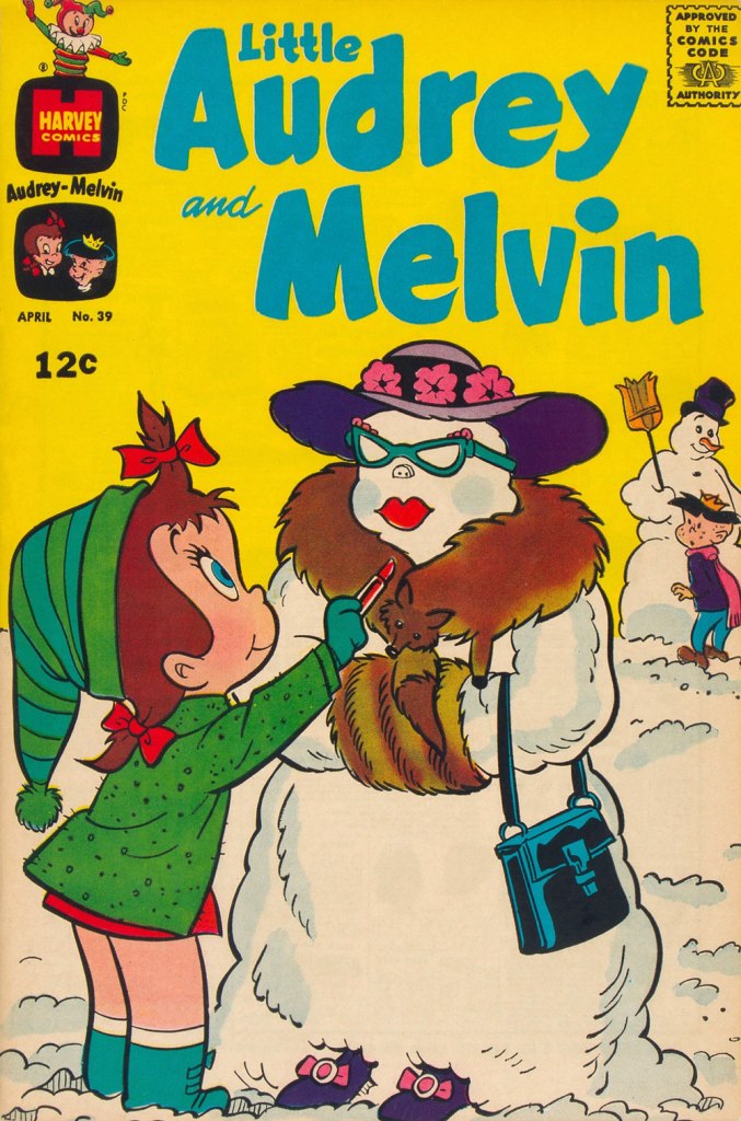
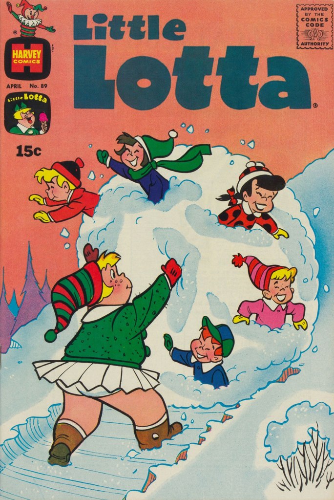
This is Little Dot no. 15 (Jan. 1956, Harvey). While most of Harvey’s efforts were channeled into their ‘Big Two’, Casper and Richie Rich, I always found these too bland (in the former’s case) or kind of deplorable (in the latter’s). I was more attuned to the line’s (slightly) bad boys, Spooky and Hot Stuff (Donald Ducks to Casper and Richie’s Mickey Mice), but really, the genuine interest resided in art director Kremer’s nimble design gymnastics and thematic acumen on Little Dot covers. By this time, these have improbably (but happily) inspired designers all over the globe. Nevertheless, a big juicy pox on the article’s author for failing to acknowledge Warren Kremer even once.This is Spooky no. 73 (Apr. 1963, Harvey). Those 1960s Harveys were so beautifully uncluttered in their design, with the bonus of Kremer’s marked and ongoing contempt for the Comics Code Authority stamp. Oh, and here’s our earlier selection of Spooky covers.This is Wendy, the Good Little Witch no. 22 (Feb. 1964, Harvey).Richie Rich no. 23 (May 1964, Harvey). What have you been eating, Richie?This is Little Audrey and Melvin no. 23 (Mar. 1966, Harvey). As you can see, Audrey’s sidekick Melvin shares a former fedora with our dear friend Forsythe Pendleton ‘Jughead’ Jones. That particular chapeau is called a Whoopee Cap. This is Richie Rich no. 55 (Mar. 1967, Harvey).This is Casper, the Friendly Ghost no. 116 (Apr. 1968, Harvey). Variations on skiing through solid objects is quite the cartooning wellspring.This is Little Audrey and Melvin no. 39 (Apr. 1969, Harvey). This is Hot Stuff, the Little Devil no. 93 (Oct. 1969, Harvey). For more Hot Stuff covers, check out Who Will Change the Devil’s Nappy?This is Little Lotta no. 89 (Apr. 1970, Harvey). And they didn’t find the local children’s mangled bodies until the following spring thaw.
« I was already doing a lot of splendid research reading all the books about ghosts I could get hold of, and particularly true ghost stories – so much so that it became necessary for me to read a chapter of Little Women every night before I turned out the light – and at the same time I was collecting pictures of houses, particularly odd houses, to see what I could find to make into a suitable haunted house. » — Shirley Jackson
This one’s from the department of historiated text. What text? “those fiction pieces that nobody read” in comic books, prose pages mandated by the United States Postal Service. The USPS insisted that comic books «… have at least two pages of text to be considered a magazine and qualify for the cheaper magazine postage rates. »
By the Sixties, most of these pages consisted of letters to the editor, but not every company followed this practice. After EC pioneered the letters page idea in the early 1950s, ACG, DC, Archie and Marvel followed suit. But not Dell/Gold Key, Harvey and Charlton.
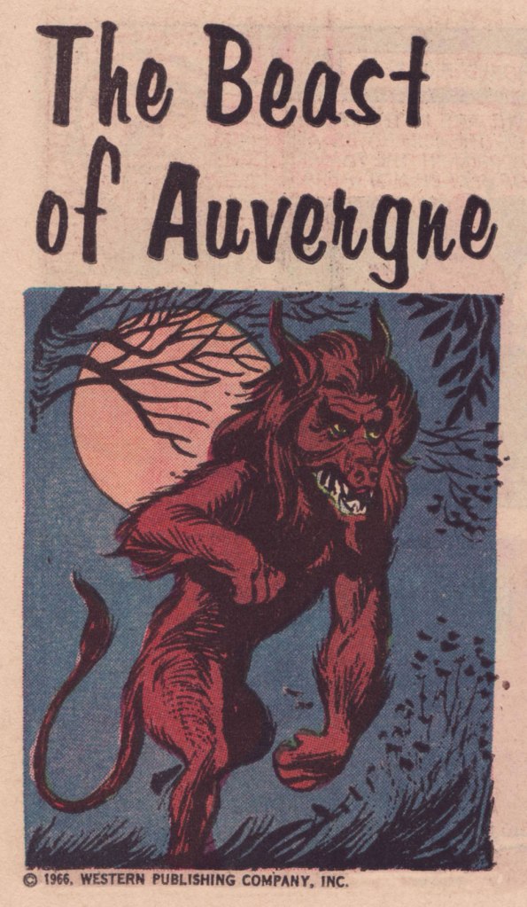
For its mystery titles, Gold Key naturally opted for a ‘unusual history’ format, enlisting, to provide spot illustrations, veteran cartoonist Joe Certa, best known for his co-creation of and long run (1955-1968!) on J’onn J’onzz, the Martian Manhunter and his stylish run on Gold Key’s Dark Shadows comic book series (1969-76). While Certa started out with a pretty mainstream approach, as the Sixties wore on, his style got increasingly angular, spare and expressive. Personally, I love it… but I know it’s not for all palates.
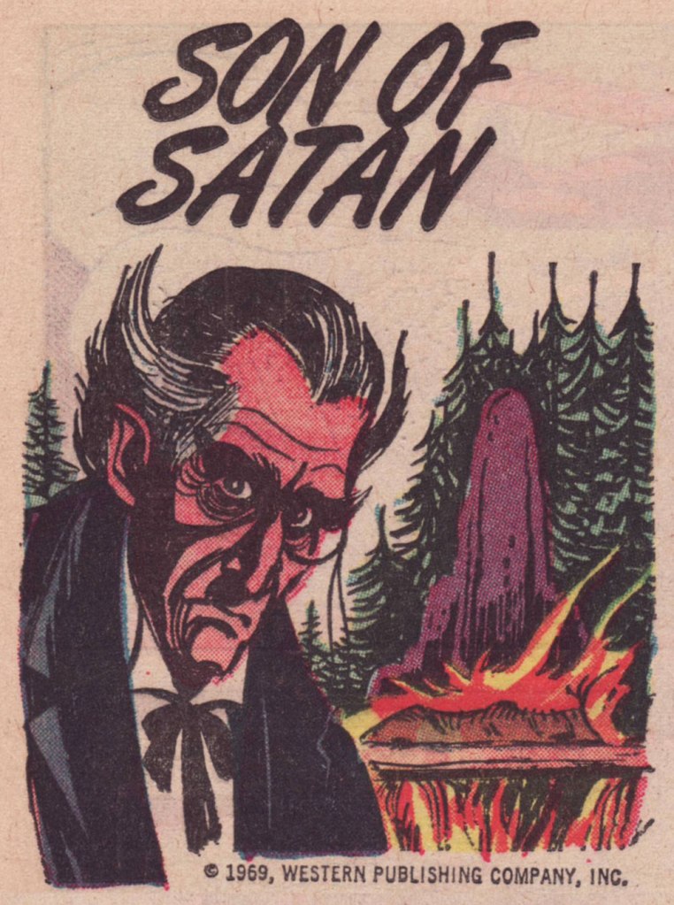
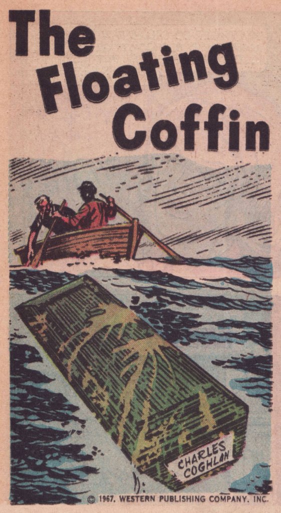
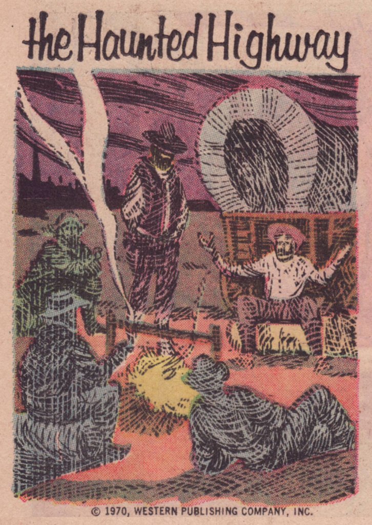
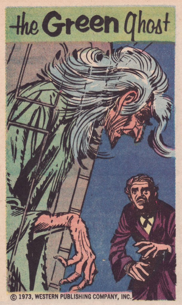
This one appeared in Boris Karloff Tales of Mystery no. 17 (Mar. 1967, Western); « It was more than two centuries ago when the monstrous creature known simply as ‘the Beast’ appeared in the province of Auvergne, in France. » Perhaps you’ve seen the action-packed, *slightly* fictionalised cinematic account of the events, 2001’s Le pacte des loups, aka Brotherhood of the Wolves.This one’s from Boris Karloff Tales of Mystery no. 28 (Dec. 1969, Western); « When Gustave Labahn appeared in Munich, Germany in 1890, he was indeed a man of mystery. Nothing was known of his except that he was tall, lithe and powerful, with strangely hypnotic eyes, and a possessor of unlimited wealth. »This one, from Boris Karloff Tales of Mystery no. 28 (Dec. 1969, Western) states: « He was a man of a hundred names and countless identities. No one knew his true origin. It was said he was descended from an evil medieval warlock. Others said he was a reincarnation of the Count de St-Germain… a man who claimed to be more than 2,000 years old. He called himself Raoul Plessy, but his followers he was known as La bête… The Beast. »Appearing in Boris Karloff Tales of Mystery no. 50 (Oct. 1973, Western), this one concerns the 1793 murder of French revolution leader Jean-Paul Marat by Charlotte Corday. Exceptionally, the art on this one is the work of John Celardo, a lovely, delicate composition.One from Grimm’s Ghost Stories no. 5 (Aug. 1972, Western). The cat’s name is Satan, we are told.From Ripley’s Believe It or Not! no. 8 (Feb. 1968, Western), this piece tells the story of a coffin that found its way home to one of my favourite places, Canada’s Prince Edward Island. Here’s a more sober account of the legend.From Ripley’s Believe It or Not! no. 15 (Feb. 1968, Western), this one concerns the purported haunting of Scotland’s Meggernie Castle.A cozy one from Ripley’s Believe It or Not! no. 21 (Aug. 1970, Western): « In the northeastern corner of Mississippi, near the town of Aberdeen, lies a stretch of deserted country road which has lately become known as one of the most haunted spots in the United States. »A great drawing from Ripley’s Believe It or Not! no. 41 (July 1973, Western); The text opens with « Ash Manor House in Sussex, England, was over six hundred years old when bought in 1934 by a man named Keel. Mr. Keel did not believe in ghosts. Neither did his attractive wife. »This hails from Ripley’s Believe It or Not! no. 42 (Aug. 1973, Western). The piece recounts anecdotes about such thespians as Burl Ives, Jackie Gleason, Rudolph Valentino and our beloved Vincent Price.And here are a couple of samples of full pieces to give you an idea of how they looked in print. This thoroughly seasonal one saw print in Grimm’s Ghost Stories no. 6 (Nov. 1972, Western).
One more? Here’s a favourite from The Twilight Zone no. 42 (Mar. 1972, Western):
I’ve always had a soft spot for Gold Key’s The Little Monsters, who dwell within a cleverly designed and unaccountably comforting, topsy-turvy world; we’ve featured them back in the third edition of this countdown. This entry, however, isn’t strictly a return visit: I’ll be focussing on the back pages of ‘Orrible Orvie and Awful Annie’s antics. Last year, I picked up an issue I’d been missing, and was delighted with a surprise section, which I’ll happily share with our readers.
This is The Little Monsters no. 5 (July, 1966, Gold Key). Cover artist unknown, sigh.
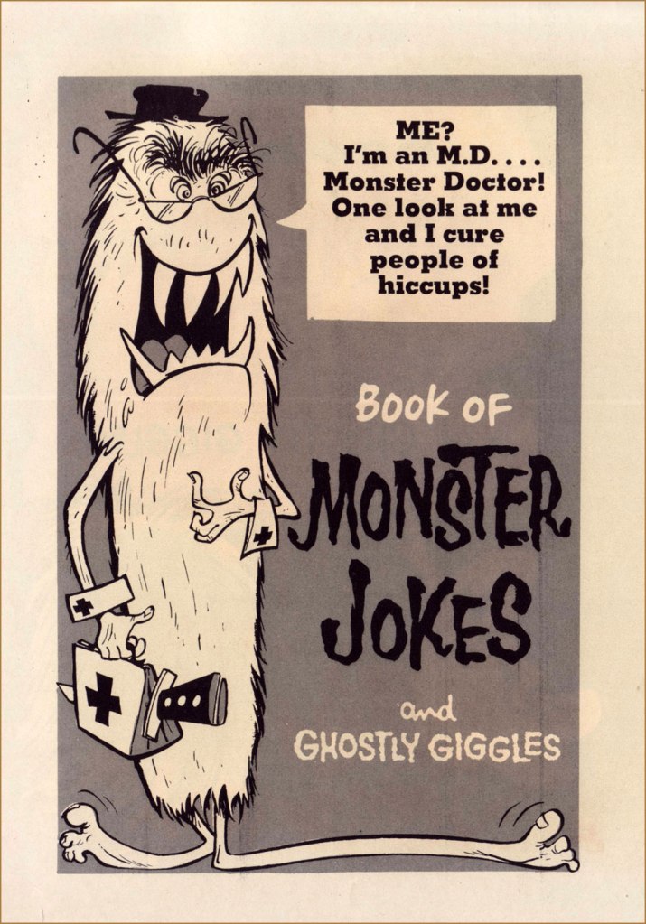
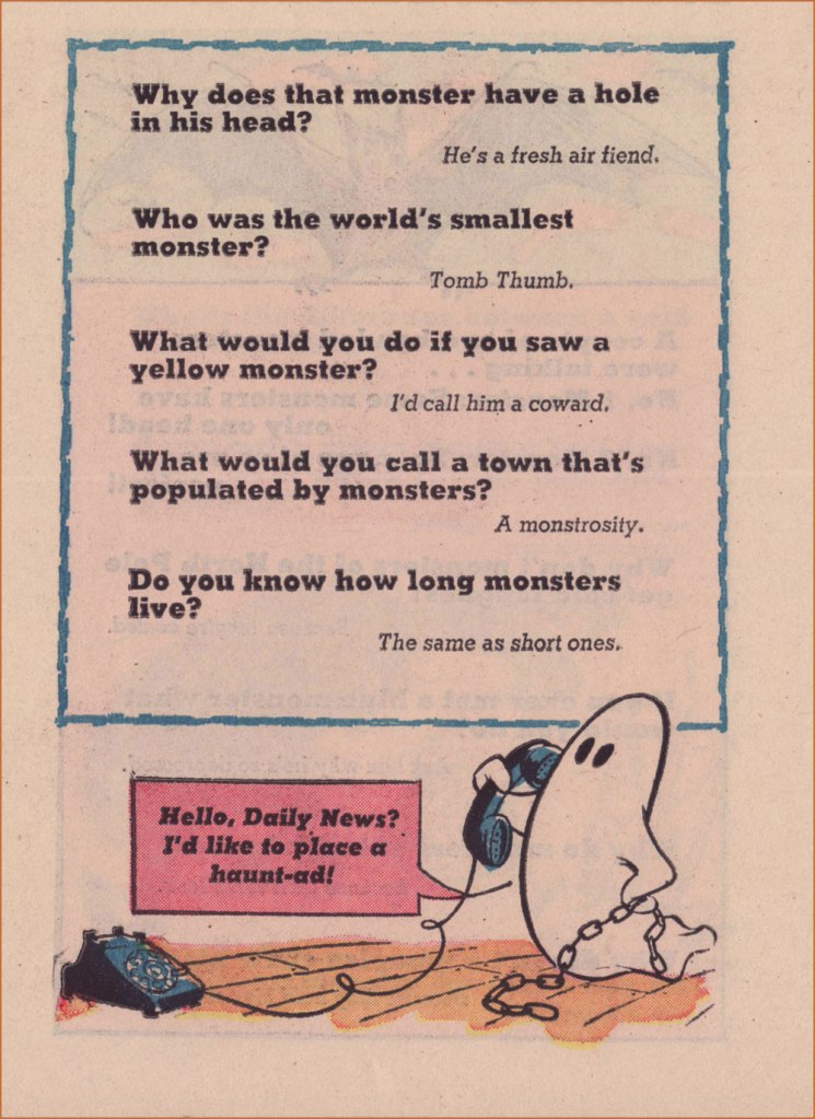
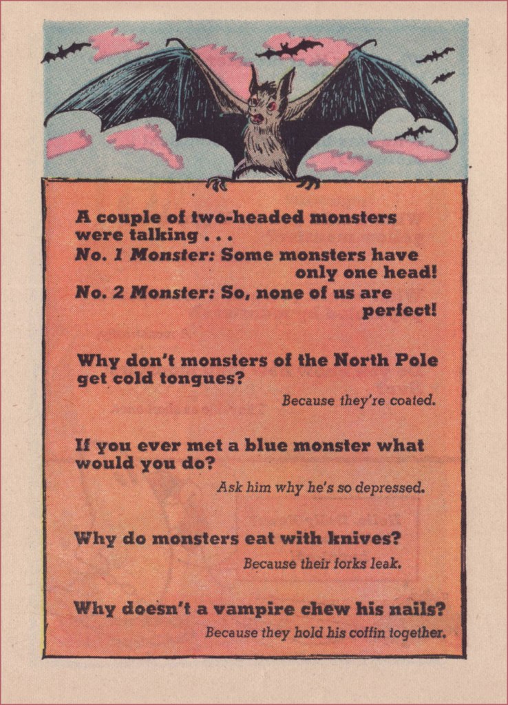
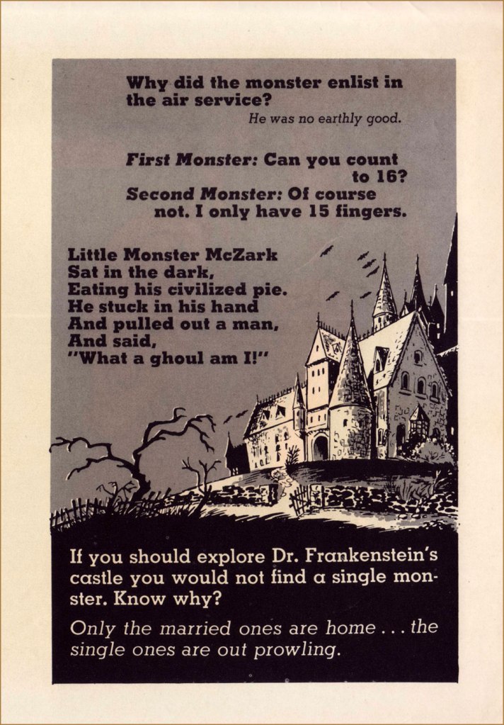
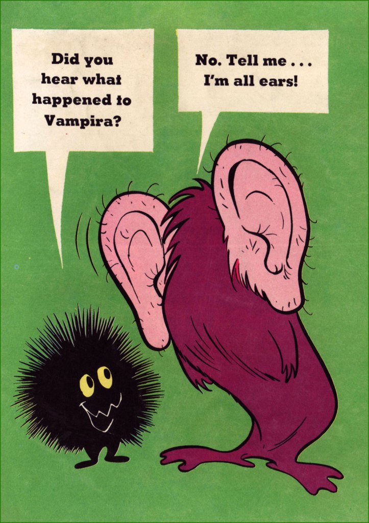
What do you say we take a peek at that Extra Bonus Book of Monster Jokes?
Another uncredited, unacknowledged and unknown artist. Why, thank you, Gold Key!
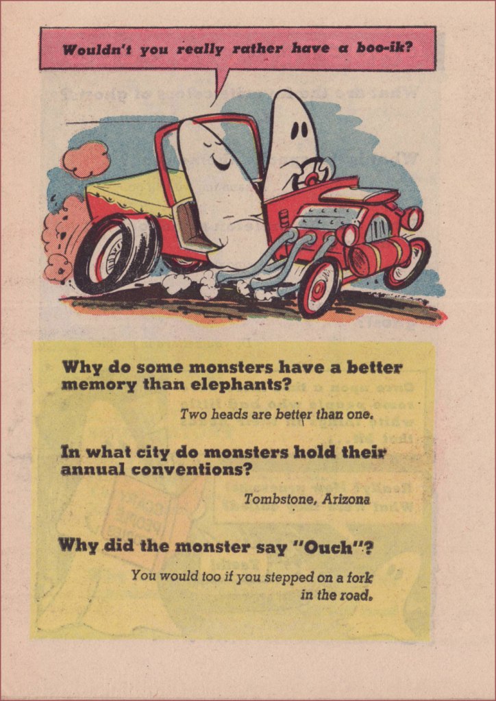
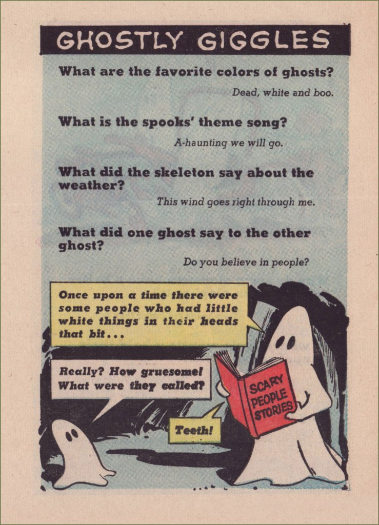
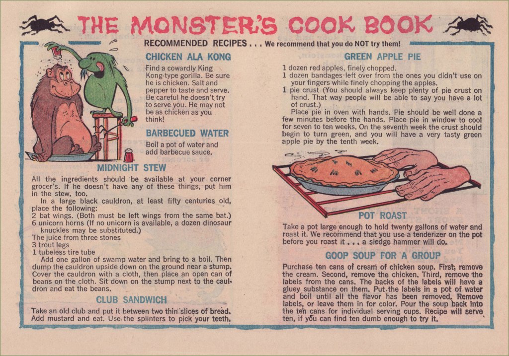
… and there you have it, and you didn’t even have to destroy a comic book (preferably someone else’s) to assemble it. The jokes are corny — what did you expect? — but I can’t help but find the whole thing quite adorable. Sometimes that’s precisely what one needs.
As a bonus, here I am holding the piece of Little Monsters original art (Page 2 from issue no. 12’s ‘Stormy Weather‘) I was fortunate enough to get my mitts on. Back in the day, comic book artists worked *large*!