« In the last analysis, a pickle is a cucumber with experience. » — Irena Chalmers
Earlier this week, the world lost another of its greatest cartoonists in Nikita Mandryka (October 20, 1940 – June 13, 2021), and he’s been among my lifelong favourites, thanks to his accessible, deceptively simple style and its nervous, explorative vitality. I’ve written about Mandryka’s Ailleurs some time ago, so there’s no pressing need to rehash his biography.
He was a giant, I tell you! The artiste circa 1975.
This freed me to opt for another tack this time. Since Nikita’s work is all-but-untranslatable (between the argot and the puns and general free-form lunacy… I’m not Even Going to Try) and his pages too dense for meaningful large-scale extraction, I’ve selected a sort of random number of panels — eleven seemed right (and winnowing things down was predictably exacting); Hope you like them.
Encore merci, Monsieur Mandryka!
An incisive entry from Rébus au pied de la lettre, published in Pilote super pocket no. 5 (Sept. 15, 1969, Dargaud); script by Marcel Gotlib.
Clopinettes: Toute une existence, from Pilote no.634 (Dec. 30, 1971, Dargaud), script by Gotlib. « I have loved… »
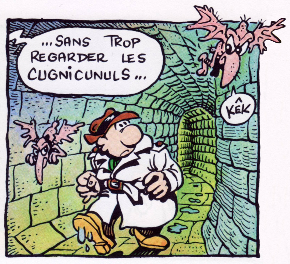
Clopinettes: Les bons conseils de tante Glutzenbaum, from Pilote no. 635 (Jan. 6, 1972), script by Gotlib. Background characters singing « Mammy Blue » was one of Mandryka’s most enduring recurring gags, certainly an idée fixe. The song was an inescapable, multi-lingual worldwide earworm hit in 1971 and beyond. It was composed by seasoned French songwriter Hubert Giraud, who had earlier written the standard Sous le ciel de Paris / Under Paris Skies. Chanteuse Nicoletta’s rendition was the bane of Nikita’s existence; the one that pervaded my childhood was Roger Whittaker’s, and here’s a reggae version by The Cimmarrons. Americans would know of it through Stories’ 1973 rendition. Phew!
Clopinettes: Les trois dessinateurs, from Pilote no.644 (March 3, 1972, Dargaud), script by Gotlib. In the usual order, L’Écho des Savanes‘ founding trio: Mandryka, Gotlib, (1934-2016), Claire Bretécher (1940-2020). L’Écho was but a couple of months away!
Opening panel from Initiation, collected in Les aventures potagères du Concombre Masqué (Apr. 1973, Dargaud). At left: le Concombre’s fabled home, the Cactus-Blockhaus. The cryptic cucurbit’s loyal companion, Chou-rave (kohlrabi) is seen on the right. Nice brushwork!
« Somewhere, at the world’s edge… », an excerpt from Rêves de sables 2, collected in Le retour du Concombre masqué (1975, Dargaud).
A favourite excerpt from the superb opening sequence of Comment devenir maître du monde?, another entry in the Concombre Masqué saga (1980, Dargaud). Our protagonist is a journalist making the perilous journey to conduct an exclusive interview with Le Concombre.
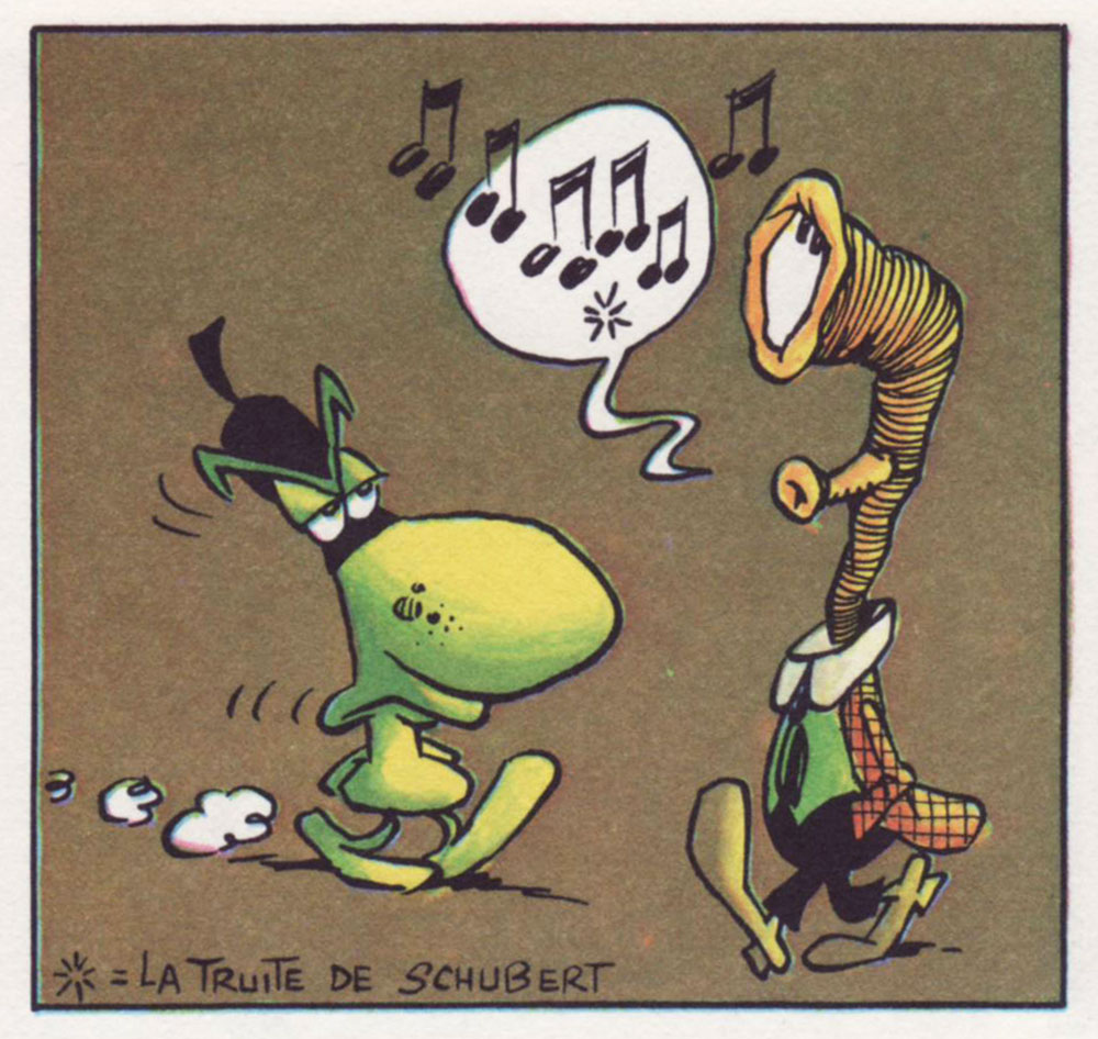
A panel from « … quelque part à l’endroit où ailleurs veut dire ici… », collected in La vie quotidienne du Concombre Masqué (1981, Dargaud). For the full effect, listen to Schubert’s La truite.
Another one from the same source. « Scram! Out! Everyone! ».
« Le Concombre is on his way to the South Seas with Zaza »; a panel from Le bain de minuit (2006, Dargaud). Meet Zaza, le Concombre’s latter-day personal secretary and Girl Friday. Incidentally, they’re travelling by bathtub, which is likely le Concombre’s favourite place to be.
A panel from La vérité ultime (2012, Dargaud). All is not what it seems aboard this flight to Timbuktu.
For more Concombre Masqué and all things Mandryka (did you know it was he who reportedly coined Métal Hurlant‘s title? ‘Howling Metal’ would have been such a better name than ‘Heavy Metal’… and ironically more Metal), check out his website (now gone, sadly). Well, try instead leconcombre.com… while it lasts (2023 update: it’s also gone).
« The history of men’s opposition to women’s emancipation is more interesting perhaps than the story of that emancipation itself. » — Virginia Woolf
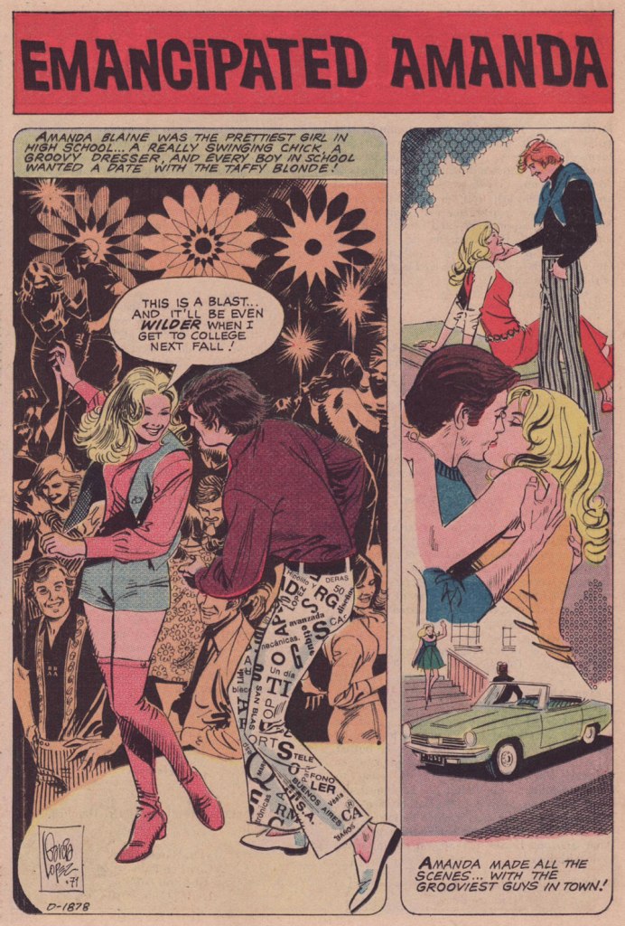
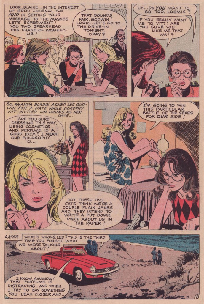
It has dawned on me that we’ve been neglecting the romance genre of late, and so the time has come to remedy this regrettable situation. To that end, I’ve opted to spotlight some early work by Spanish-Argentine master José Luis García-López (born 1948, Pontevedra, Spain).
If you ask me, Mr. García-López is far under-appreciated. His graceful but unassuming virtuosity, and the seeming ease with which he wields it, makes it too easy to take him for granted. And while he’s tackled just about every major character (and many a minor one) in the DC Comics stable, much of it has been behind the scenes, in the way of style sheets and promotional artwork.
Meanwhile, in comic books, he’s mostly made pedestrian scripts* shine more brightly than they deserved. But there’s only so much, er… polishing one can do.
As it stands, my favourite portion of his œuvre is the romance comics he illustrated for Charlton early in his career, roughly 1968-74, before he moved to New York to launch his North American phase. While my predilection for his romantic material is a minority opinion, I’m not alone in this, I’m relieved to report.
It seems to me that, as a man who can clearly draw anything at all, JLGL’s chops are largely squandered on superheroes and such. But, in comics as in life, romance is hard. As Mr. García-López confirmed in the definitive interview he granted in 2010 to the championne of romance comics, Sequential Crush‘s Jacque Nodell: « Even now, I consider romance stories the most difficult genre to illustrate properly. » Bingo.
If you’ve at all read comics from the early 70s, romance or otherwise, you’ll have noticed that clothing and hair fashions can generally be termed (charitably) ‘of their time’. Not so much here. Have we come full circle, or does JLGL have a secret? He confides (do read the full entrevista… it’s well worth it):
« In those years we also had photo-novel magazines (like the foto-romanzo or fumetti in Italy) and they were very useful to design the characters and for the romantic scenes. Doing a good kiss without a good reference was very hard, honest. Besides, I was lucky to have two kindly girl friends that helped me with fashion advice and suggestions and even posed for me. That period was full of learning experiences – there is no better way to learn to draw than from a living model. »
Where can I get myself a pair of those snazzy Letraset pants?
Writer unknown, incidentally. Which is a shame.
Now, artwork aside, why am I fond of this particular story?
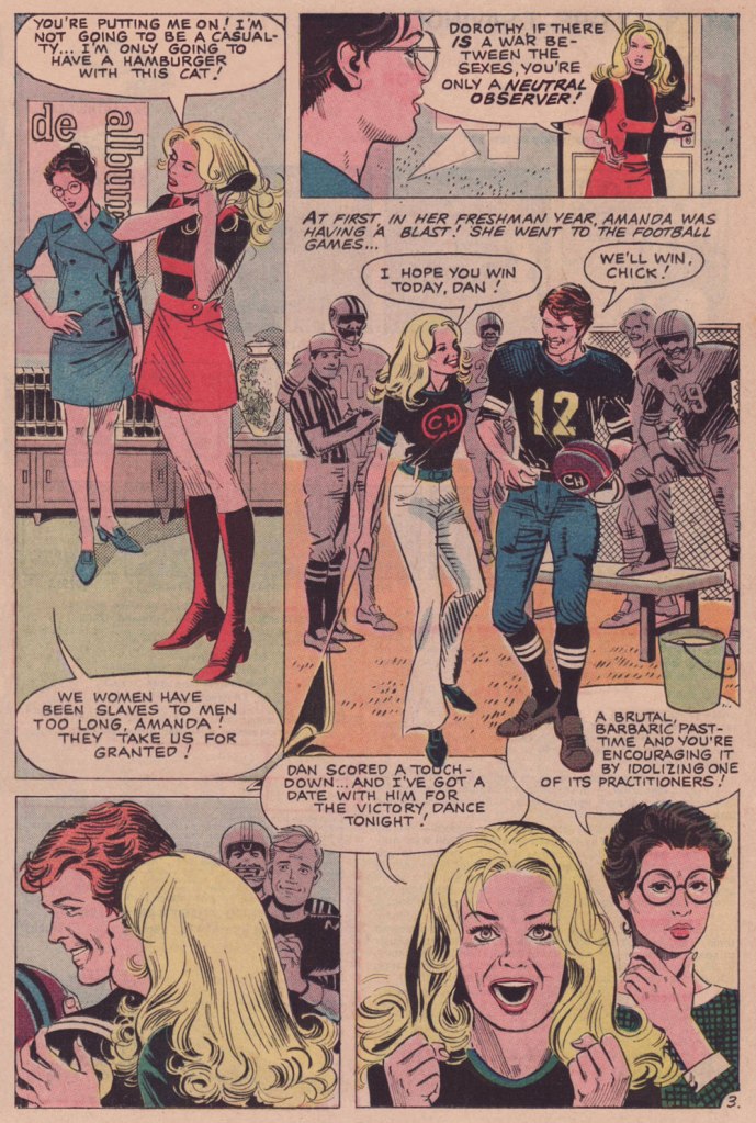
I love the mise-en-scène: characters are introduced in the background and without dialogue before they enter the stage. Namely Dorothy in the first panel of page 2 and ‘that beanpole’, Jim Loomis in the first panel of page 6. His first line comes in the final panel of page 7, but he and Dorothy have been staring holes into each other from the start. That’s great staging, not to mention something that, arguably, only the comics medium can achieve effectively.
I also enjoy the evolution of Amanda and Dorothy’s friendship; at first testy and tentative, Amanda’s calling her roommate ‘Dot’ by page 7. And they learn from, and support, each other. No cheap betrayal in this one.
It’s a lovely change of page for the genre that, once gridiron ‘hero’ and BMOC Dan Sruba commits his inevitable transgression… he’s gone (save for a passing mention from Les): no ‘second chance’, no confrontation, no revenge, no melodrama.
Despite the headline, I’m reading this as the story of Dot and Jim’s romance. Amanda’s interest in Les, beyond playing matchmaker for her roommate, is uncertain.
My wife was disappointed in the ending, and I can certainly see why: will Dorothy lose her fire and her beliefs? I prefer to think not — she was looking for an equal, respectful relationship, and I do think she’s found it with Loomis. And she had him well before word one, and she was clad in glasses, picket sign and dungarees. The guy seems like a keeper to me. They’re both quiet, thoughtful observers, for the most part. I like their odds.
There are a few glitches here and there, but given that the script had to first be translated into Spanish (Mr. García-López claims to still not speak English to this day… technically) to be illustrated, there may have been here and there a nuance missed, a description gone astray. Loomis isn’t quite a beanpole, and neither is Dorothy, for that matter. And ‘Plain Janes’? (page 8) And I scarcely think that Les and Jim were planning a hatchet piece (given Jim’s evident interest in Dorothy, for one), no-one would mistake these two for Plain Janes. Well, that’s always been a systemic weakness of the romance genre, in comics and elsewhere: the plain one, the skinny one, the rejected one? Still gorgeous.
This is I Love You no. 95 (Jan. 1972, Charlton). For a variety of factors, distance chief among them, Garcia-Lopez never drew an original cover for Charlton, but the publisher often creatively recycled story panels, a task handled exceptionally well in the present case.
What’s that? Oh, right. Fine, here’s that « FREE Pin-Up Poster of David Cassidy » already.
« When I grow up I would like to be an artist in France. » — Keith Haring
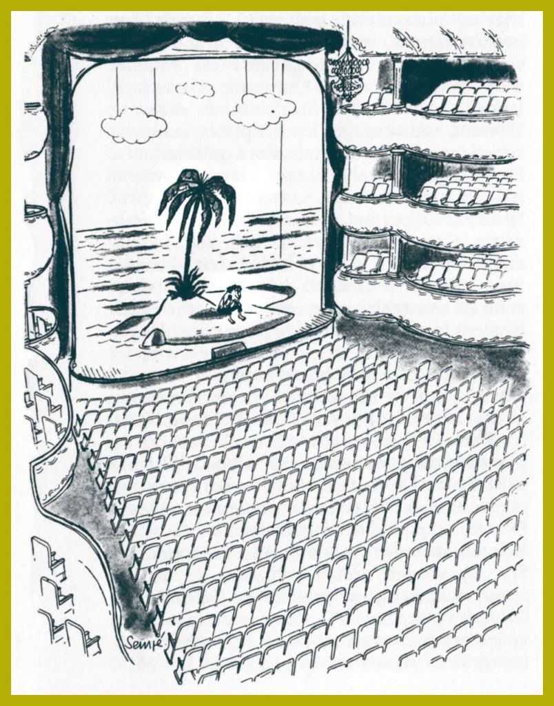
The other day, while weighing the idea of producing this post, I asked my wife: “Is Sempé too obvious a choice?”, to which she wisely replied: “To whom?”. To add another few grammes of perspective, I’m reminded of how, a decade-or-so ago, I was helping out a friend by manning his business phones while he took a vacation. One caller identified herself as Mme Sempé. I immediately asked whether she was related to the cartoonist. She was (they’re second cousins), but rather shockingly, this was the first time anyone had ever brought up the subject with her. Okay, so not so obvious after all.
If you only know Jean-Jacques Sempé‘s work through his cover illustrations for The New Yorker, well, you’ve missed his finest. Sempé (born August 17, 1932, in Bordeaux, France; died August 11, 2022, just a few days short of his 90th birthday) was recruited in the late 70s, in the twilight of editor William Shawn‘s tenure (1952-87) with the magazine. To be quite frank, Sempé’s New Yorker work is his weakest, comprising almost invariably mawkish scenes of the dying arts: little girls practicing scales at grand pianos, ballet rehearsals and grand operas. And the work has only grown more anachronistic and sentimental with time; I’d say he’s the least compelling cover artist currently working for the magazine, with the exception of art director Françoise Mouly‘s little chouchou, the stiff and bland Adrian Tomine, he of the lifeless line and emetic palette. Ahem.
But there was a time…
In 1968, a decade-and-a-half into Sempé’s career, ever-lucid Belgian writer and historian Jacques Sternberg perceptively summed up the artist’s appeal:
« But Sempé’s humour has earned the favour of a very wide audience. Without a doubt because he’s able to observe with a playful — but rarely sadistic — eye the drawbacks and peculiarities of our daily lives, and that his reader feels — mistakenly — reassured by this vision.
Sempé has, in fact, a way with an impressive setting, with meticulous detail, of the mise en scène that sugarcoats the bitter pill and of the lyrical flight that dampens the ferocity of the content. The miracle occurs as if by magic: Sempé, who is rather scathing, seduces rather than worries his readers. »
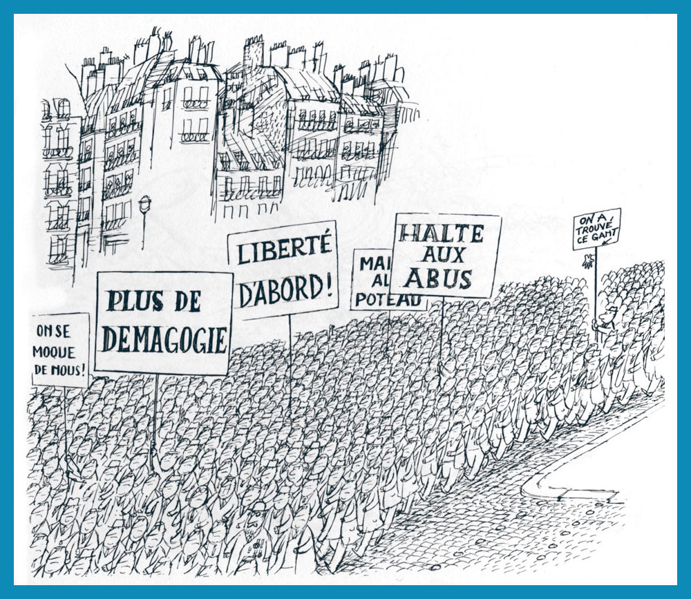
A cartoon that first saw print in the pages of Ici Paris in 1958.
The signs say, from left to right: “They’re mocking us“; “Nomore demagoguery“; “Freedom First!“; “End the abuse“, “Down with…” and… “We have found this glove“.
From France Dimanche (1957). This one strikes close to home for me. Makes me think of the sort of barbarians always seeking to ‘improve upon’ nature. A passage from friendly gadfly and crime writer Carl Hiassen‘s brilliantly scathing polemic, Team Rodent: How Disney Devours the World (1998) comes to mind:
« Disney is so good at being good that it manifests an evil; so uniformly efficient and courteous, so dependably clean and conscientious, so unfailingly entertaining that it’s unreal, and therefore is an agent of pure wickedness. Imagine promoting a universe in which raw Nature doesn’t fit because it doesn’t measure up; isn’t safe enough, accessible enough, predictable enough, even beautiful enough for company standards. Disney isn’t in the business of exploiting Nature so much as striving to improve upon it, constantly fine-tuning God’s work.
Lakes, for instance. Florida’s heartland is dappled with lovely tree-lined lakes, but the waters are often tea-colored from cypress bark. For postcard purposes, tea-colored water was deemed unsuitable for Disney World’s centerpiece, Bay Lake, so in the early 1970s Team Rodent sprang into action—yanking out many of the cypresses, draining the lake, scraping out the bottom muck, replacing it with imported sand, then refilling the crater. All this was done to make the water bluish and therefore more inviting to tourists. For good measure, Disney even added beaches.» [ read it here ]
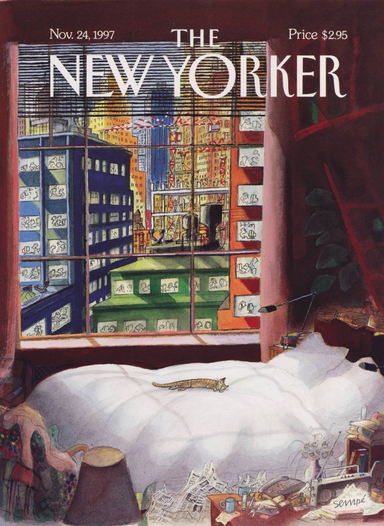
Naturally, I don’t dislike *all* of his New Yorker covers. This one, from the November 24, 1997 issue, is a peach.
I don’t know about you, but for me postcards are an intense evocation of nostalgia – so ubiquitous in the last century, and just a pale shadow of their former glorious selves in this day and age. Fortunately, a lot of them have survived through the years, and collectors have taken care to preserve these snippets of the past, whether crass or elegant, stunningly illustrated or just the barest sketch of an idea.
We’ll start with the oldest postcards of today’s post from quite a long time ago – the beginning of the 20th century in France.
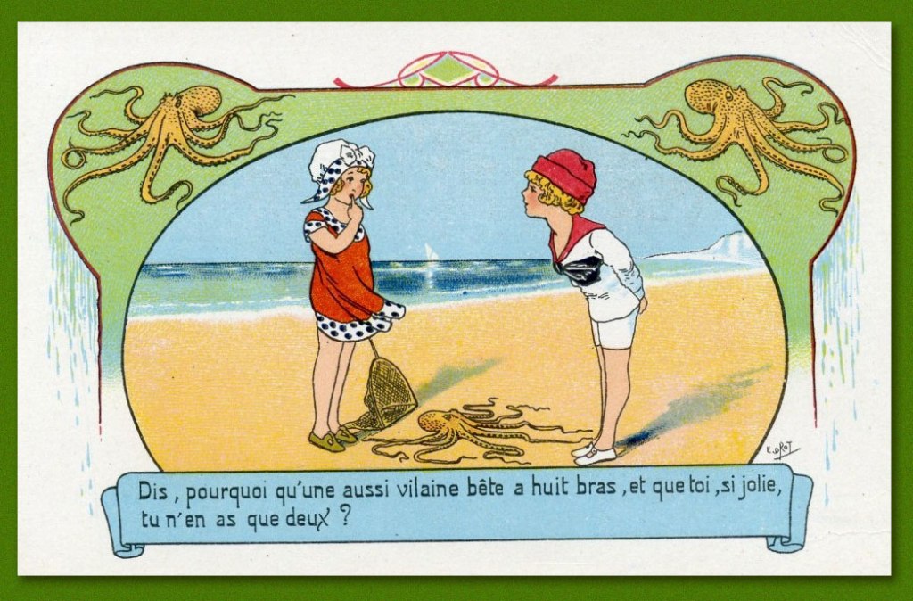
These following two French postcards from 1910 are signed by “E. Orot”, though I wasn’t able to find out whose nom de plume that was. The back of the cards says “près des grands flots bleus” (near the great blue waves) which was the name of the seaside-themed series by this mysterious artist.
The poem is something like “Why don’t I have, like this octopus, eight long arms to embrace you, for I would, without getting weary, make my kisses into true masterpieces”.
“Say, why does such a nasty beast have eight arms, and you, so pretty, have only two?”
The following postcard is French, part of a series of images depicting France in the year 2000 as seen by artists in the early 20th century. These were first published as inserts in cigar boxes, and later given second life as postcards. This one is painted by Jean-Marc Côté. « There are at least 87 cards known that were authored by various French artists, the first series being produced for the 1900 World Exhibition in Paris. Due to financial difficulties the cards by Jean-Marc Côté were never actually distributed and only came to light many years later after the science-fiction author Isaac Asimov chanced upon a set and published them in 1986, with accompanying commentary, in the book Futuredays: A Nineteenth Century Vision of the Year 2000. » To see more of these cards, visit A 19th-Century Vision of the Year 2000, which is also where that quote is taken from.
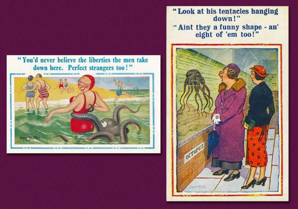
All I was able to ascertain is that this postcard is British, from the 40s or possibly 50s. Are these women giantesses, or is this aquarium exhibit meant for children or possibly dwarves? We will never know.
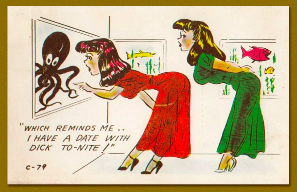
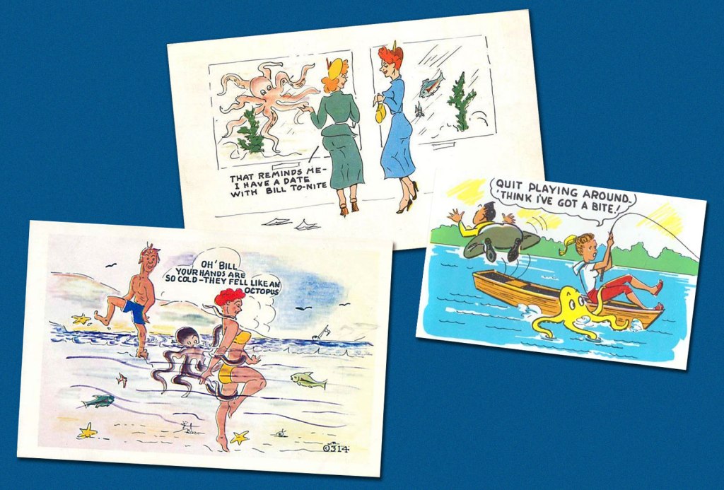
The three following postcards are British, but from varying decades. The Bill going on a date is from the 1950s. Bill’s cold, octopus-like hands (is it the same Bill, some twenty years on?!) are from the late 70s, published by Kromekolor, which seems to have had a chunk of the British market, though very little information is available online. And the nameless guy playing around with a fishing girlfriend is from sometime in the late 60s, and I would not at all be surprised if his name was William.
We have talked about Donald McGill, the king of comic postcards (take a look here) before. I was delighted to find two tentacular offerings from the vast collection of postcards he has drawn.
Continuing in a British vein, this postcard is part of the Seaside Spooners collection by Tom Browne, (another extremely prolific British artist and very much a contemporary of McGill) and is entitled The Lovers’ Seat.
Moving on the good ole U.S. of A. – here’s a pair of American postcards from the 50s, with rather similar jokes.
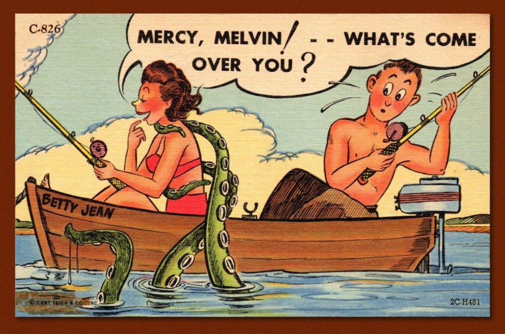
It’s not very clear why Horace is being propelled out of the boat like that. Is he perhaps terrified of octopuses? Note that it is exactly the same “gag” as in a British postcard featuring William.
And another postcard from 1954. Unfortunately, I don’t know who the illustrator is in either case. I like how Melvin looks puzzled, not scared, by this cephalopod intrusion.
I hope you enjoyed this little voyage! Until next Tuesday…
« The bureaucracy is expanding to meet the needs of the expanding bureaucracy. » — Oscar Wilde
Marc Caro, born in 1956 in Nantes (birthplace of Jules Verne!), was never a prolific bédéiste, quite possibly because he liked to spread his talent around: musician, animator, film director, designer, art director… et j’en passe!
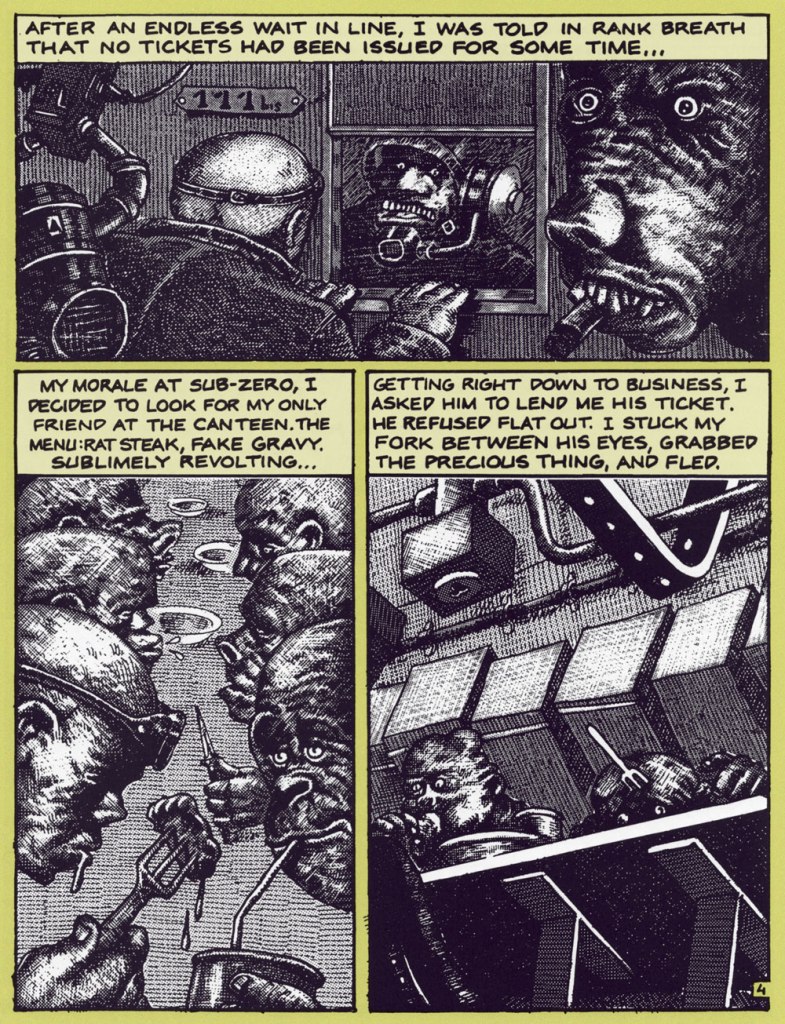
Back in the early days, though, while juggling animation projects and musical gigs (ah, youth!), Caro created a clutch of brief and brutal vignettes for such fabled publications as Métal hurlant, Fluide glacial, Charlie Mensuel and, on this side of the pond, Raw. Most of these strips were crafted using the daunting technique of scratchboard; done right, it’s strikingly effective, and in Caro’s nimble hands, it’s done right. Another master of the technique is Switzerland’s Thomas Ott.
Our featured piece was translated into English by Elisabeth Bell and lettered by Lea Hernandez [psst: someone left out a word in the first panel…]. It appeared in The New Comics Anthology, edited by Bob Callahan (1991, Collier Books). In this case, Caro is using a combination of scratchboard and Craftint.
That grotesque cigar chomper, top right, brings to mind the savagery of Marshall Arisman‘s work, but in a different medium.
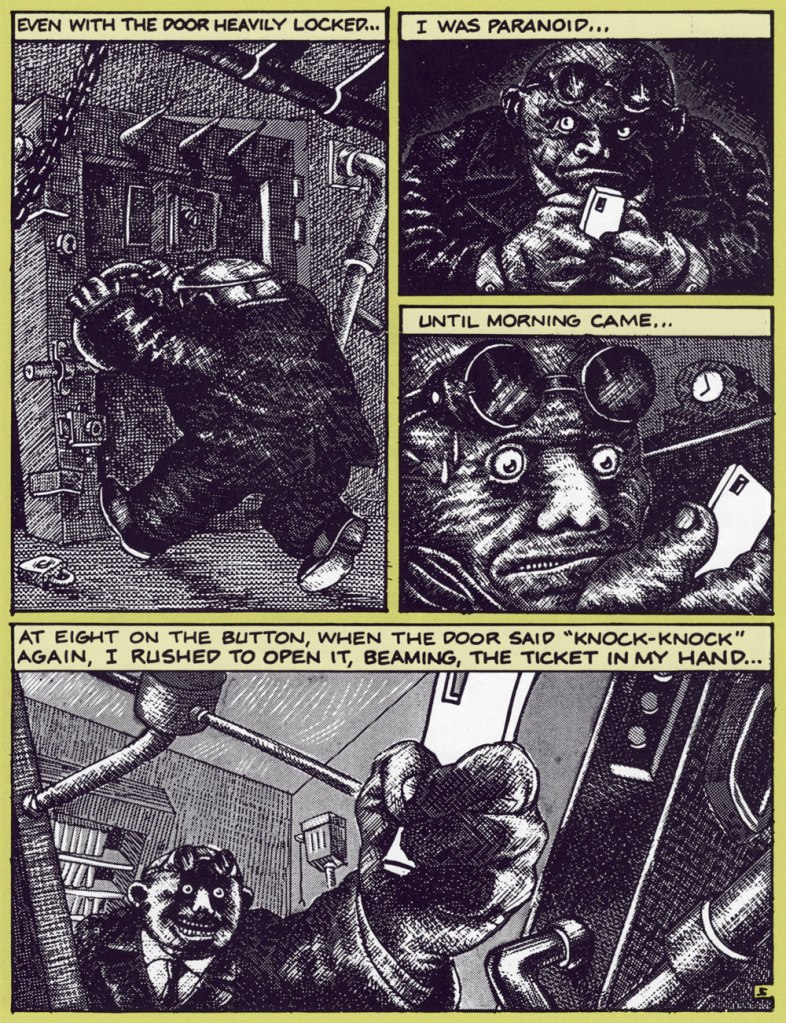
Sadly, this printing doesn’t quit do justice to the finesse of Caro’s rendering. Compare with an excerpt from the French original:
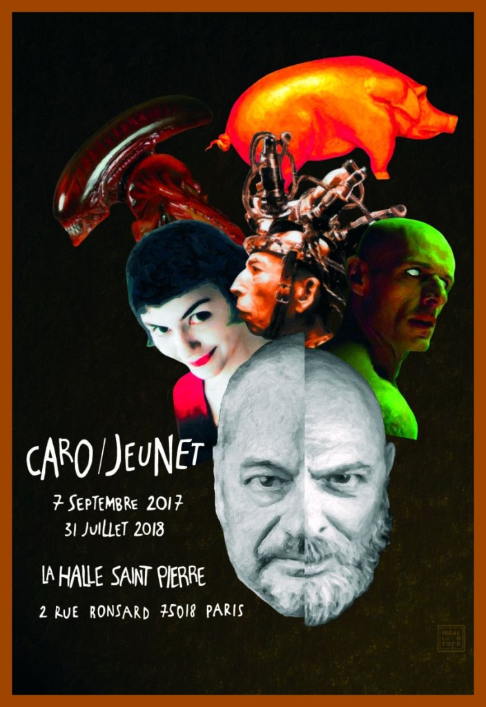
Caro’s retrospective poster for Paris’ Art brut gallery La Halle Saint Pierre‘s Caro/Jeunet exhibition. Sorry, looks like we’ve all missed it. « Reached at home in Nantes, a few weeks after the vernissage, Marc Caro chuckles when it’s pointed out that even their heads are identical. “I’m not sure who first grew out his goatee, but I was first to lose my hair.” »
One of the Caro/Jeunet exhibition’s treasures: Makeup tests and elements of Caro’s storyboards, on loan from the collection of the great makeup designer (and long-time associate) Nathalie Tissier.
See further samples of Caro’s comics work here, and if you crave yet more, you can’t go wrong with L’Association‘s Caro compendium, Contrapunktique.
«The land of embarrassment and breakfast. »– Julian Barnes
Ah, yes, it’s time to paddle once again to British shores, after fortifying myself with a few dainty tea sandwiches. In rough chronological order…
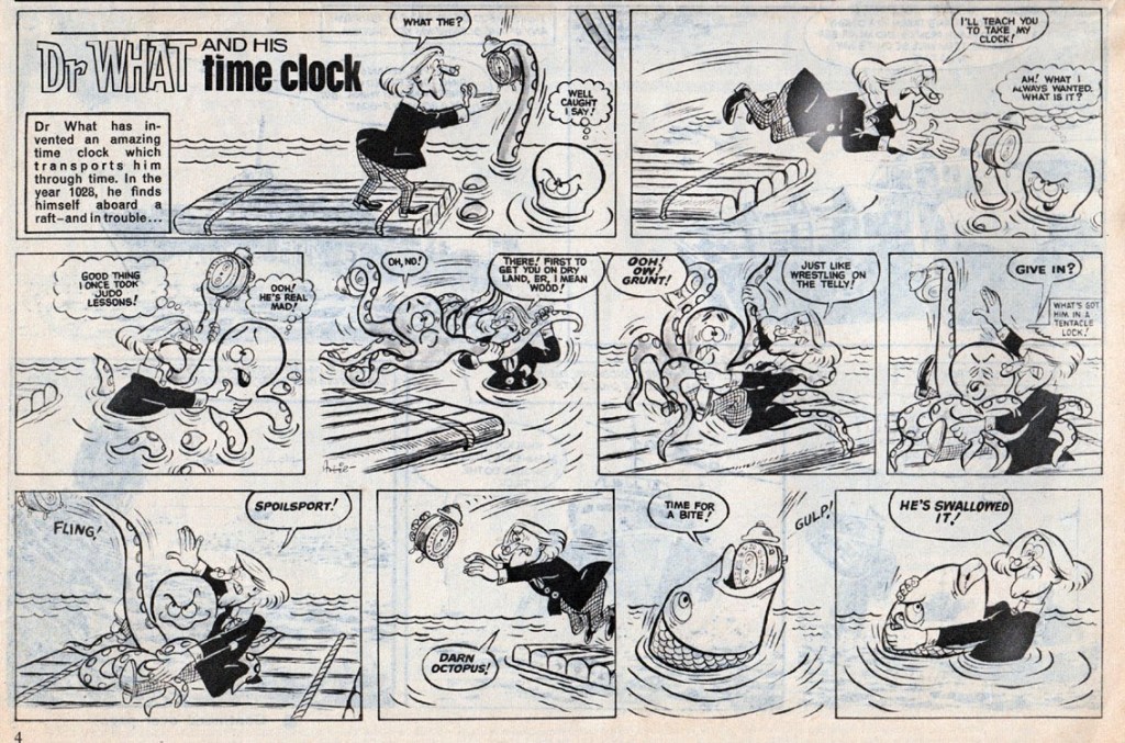
Here is a Dr What and His Time Clock strip I found on the excellent Blimey! The Blog of British Comics. I’ll quote Lew Stringer, its author, who is a lot more knowledgeable about British comics than I’ll ever be: «... a weekly humour-adventure serial that ran in Boys’ World in 1964, published by Odhams. The hairstyle and clothing of the character is obviously based on that of the first Doctor as portrayed by William Hartnell. Here’s the episode from Boys’ World Vol. 2 No. 33, dated 15th August 1964. The art is by Artie Jackson, who later drew Danger Mouse (preceding the TV cartoon of the same name/concept) for Smash! in 1966. Jackson also drew many of the Danny Dare strips for Wham! »
Dr What and His Time Clock strip from August 1964, drawn by Artie Jackson.
In case you didn’t know, a beano is British slang for a noisy festive celebration, or, in other words, some sort of a party. Biffo the Bear is not my favourite character from this very long-running publication (started in 1938, still ongoing), but I really like the way this octopus is drawn.
Beano no. 1435 (January 17th, 1970, D.C. Thomson). Cover by David Sutherland.
Chips from March 10th, 1973. The cover is drawn by Mike Lacey, son of adventure strip artist Bill Lacey.
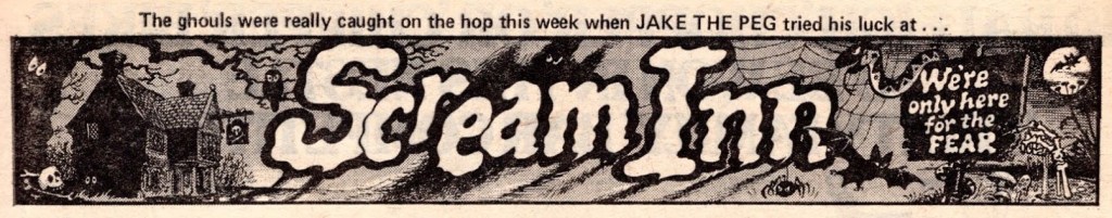
Scream Inn, written and illustrated by Brian Walker, was a beautifully-drawn strip published in Shiver and Shake (and, later, Whoopee!). The location: a hotel run by ghosts. The premise: these ghosts delighted in playing pranks on humans, and offered a million pounds to anybody who would manage to stay at their hotel for an entire night. Readers were invited to suggest what type of person could make it through the night (and were granted a one quid reward if their suggestion made it into a story).
In this one, a friendly octopus is borrowed to terrify a clown:
Scream Inn page published in Whoopee! from June 4th, 1977.
Cookie’s many-tentacled friend Olly makes another appearance a month later, this time used to spook “Jake the Peg with an extra leg”.
Scream Inn detail published in Whoopee! from July 16th, 1977.
Incidentally, isn’t this a nice header?
Elephant on the Run ran in Cheekly Weekly and was drawn mostly by Robert Nixon, with some other artists occasionally filling in. This strip boasted a pleasantly surreal premise: the elephant, Walter, is being relentlessly pursued by a mysterious man in a plastic mac… and suffering from a bad case of amnesia after an unfortunate circus act mishap, he has no idea why he’s being hunted, or what the man wants from him. Still, he runs! Both of them donning a range of improbable costumes to fake each other out – as in the following strip, in which Walter dresses, among other things, as a one legged pirate to elude detection. This sort of wackiness is why I love British comics.
This instalment of Elephant on the Run was published in Cheeky Weekly of November 25th, 1978 and is drawn by Robert Nixon. Look inside this issue here.
I hope you enjoyed this foray into British tentacles! There are plenty more of that stuff in our archives – or go rummaging through the whole British category in THE SUN NEVER SETS ON THE BRITISH EMPIRE!
« Michael is, simply put, Japan’s version of Garfield, Heathcliff and Krazy Kat all rolled into one. » — Wizard: The Guide to Comics*
* I actually disagree with all three comparisons, aside from the fact that the first two comics are also about orange cats, but this is the review Dark Horse used to promote the series.
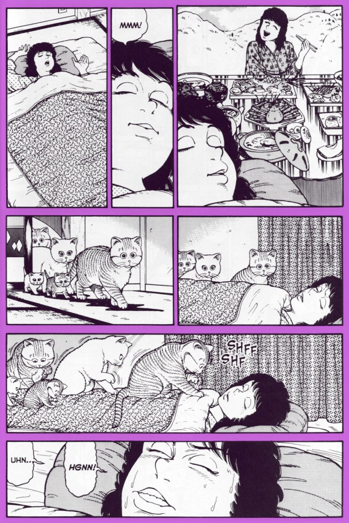
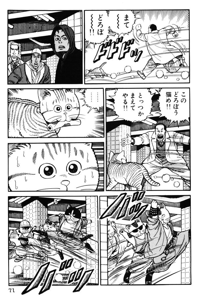
What’s Michael? (ホワッツマイケル? in Japanese) is a comic series by Makoto Kobayashi about a cat named Michael who goes about his cat life in a pretty standard way. He spends most of the day snoozing, has distinct food preferences, and likes to meow loudly at night while courting his favourite cat lady. One would not be entirely unjustified in thinking that cat lovers will read any old comic that prominently features felines (I have occasionally been guilty of that myself!), but I am convinced that there’s something special about this series.
One of the things that makes it so endearing is that Kobayashi has a very good grip on feline body language, making it fun to follow even the poorest excuse for a plot, like for instance Michael contemplating which cozy enough spot to select for a nap. That being said, he doesn’t limit himself to realistic cat situations, often featuring cats acting like (very goofy) people, parodying human and feline at the same time.
Natural cat body language… and different ways in which cats just can’t bend, cheerfully pointed out.
Some readers are more interested in the outlandish stories, of which there are many (ranging from cat parodies of various movies to plain weirdness), some develop a soft spot for the recurring human (or semi-human) characters. Michael himself switches owners like switching gloves, depending on the needs of the story, and there is not much continuity. Kobayashi’s ideas can be a little hiss or miss, but there’s something here for everyone… provided you like felines, of course… adventures of a vampire count who is scared of cats are side-by-side with wacky cat food commercials, depictions of everyday life of various cat-besieged country bumpkins alternate with cat street gang rumbles, and all of that is sprinkled with humans-as-pets interludes. And, naturally, our ordinary yet handsome tabby Michael drinks, sleeps and plays alongside Popo, his wife, their kittens, and a rotating cast of other cats (Catzilla comes to mind!) and the poor, often put-upon dog nicknamed Bear.
The Count’s quest for a pretty neck to bite is, as always, thwarted by Michael or one of his relatives.
Michael, Popo and their kittens on the prowl for a soft spot for a snooze.
One of the strip’s running jokes is that Michael passionately hates Morning Cat canned food, and will go to ridiculous lengths to avoid eating it.
The following sequence illustrates one of Kobayashi’s favourite tricks, namely to start off with more-or-less normal cat behaviour and veer off into an unexpected direction:
As you have probably noticed, Kobayashi often opts for exaggeration when it comes to people’s facial expressions, which sometimes leads to results that are more grotesque than funny. He also enjoys drawing pretty women, but that is more obvious elsewhere, for instance in his series Club 9 (Dark Horse has published 3 volumes of that and abandoned the project before the story’s end, much to my annoyance).
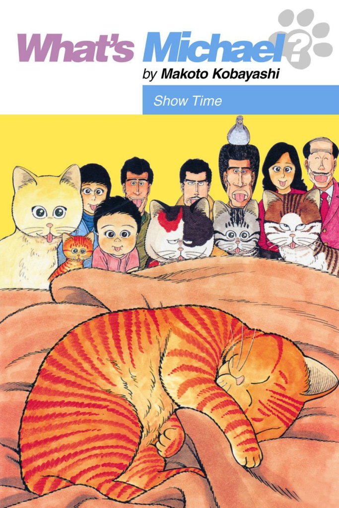
In Japan, What’s Michael? was published in the weekly magazine Morning starting in 1984, and it even won the Kodansha Manga Award in 1986. There seems to also have been quite a few collections released.
One of the Japanese editions of volume 1 and 2.
Cover of another collection from 1987; Bear likes to sit and watch cats playing.
In 1988, its popularity was also rewarded with a 45-episode anime which was also broadcast in Italy and Spain (at least according to a Russian article I found). The following is the cover of a collection of these episodes, as far as I could ascertain:
In the US, it was published by Dark Horse‘s manga imprint. I am not entirely sold on the translation (the aforementioned country bumpkins, for instance, talk as if they were in a cheesy would-be Western written by somebody who has no understanding of the genre), and it also bothers me that the comics were published in the standard American left-to-right reading direction. I think it is a relatively recent phenomenon to leave manga as it was drawn when translating it into European languages – audiences have become more refined.
An example of the story going interestingly off the rails, in the proper right-to-left format.
Apparently there are stories that have never been translated, as they were deemed unfit for Western audiences (those intrigue me, yet my knowledge of Japanese is nil!), but those that were selected by whomever is in charge of these decisions have been collected in 11 volumes, published between 1997 and 2006. Most of them are quite out of print by now; I managed to gather all eleven over the years, though while writing this post I discovered that Dark Horse has decided to rescue this series out of its out-of-print-darkness and re-publish the works in two 500-page volumes. Am I going to purchase those? Yes, of course, as there is bonus material involved! Though the wrong reading direction remains wrong, alas.
Volume 8 of Dark Horse’s initial What’s Michael? run.
« Generally speaking, espionage offers each spy an opportunity to go crazy in a way he finds irresistible. » — Kurt Vonnegut
I love a good tale of espionage, but not in the Bond mould. While the adventures of Fleming’s 007 have their charm, it’s not exactly plausible spycraft, nor is it expected to be, I reckon. The world-weary, less flashy and more cerebral approach pioneered by Eric Ambler (Passport to Danger, A Coffin for Dimitrios) and Graham Greene (The Confidential Agent, The Quiet American) is more in keeping with my interests.
« Before Ambler, international thrillers tended to be dominated by such writers as John Buchan, Herman Cyril McNeile (known as “Sapper”), and their many imitators. These books were often rousing adventures, but filled with improbabilities, both of plot and character, plus a hearty jingoism and a well of right-wing, Old World prejudice that would curl your hair today. » [ source ]
As far as I’m concerned, I’m afraid that describes Fleming’s writing to a T. By contrast, I was right chuffed when I learned, a couple of days ago, of this striking bit of news about worthy Ambler disciple John le Carré (The Spy Who Came in From the Cold, Tinker Tailor Soldier Spy), who passed away last year.
Now, given his prodigious and lasting popularity, most people likely presume that James Bond was the first “super spy”. While espionage chronicles have been around nearly as long as there’s been storytelling, the spy, if he survived his adventure, rarely embarked on a sequel.
That state of affairs was scrambled somewhat by the arrival on the scene of Hubert Bonisseur de la Bath, alias OSS 117. Created by Jean Bruce, he’s starred in 265 novels, which have sold in excess of 75 million copies. The series was initially published by the legendary Fleuve Noir press, which lent the English language the now-ubiquitous (and often misused) term of ‘Noir‘.
As it happens, Mr. Bruce decided, after 25 novels in three years, to shift his series over to a rival publisher (Presses de la Cité*). Fleuve noir, understandably scrambling to avoid a massive shortfall, commissioned a pair of Belgian writers, Gaston Van den Panhuyse and Jean Libert (under the joint nom de plume of Paul Kenny) to concoct a replacement agent secret. The new fellow was Francis Coplan, alias FX-18. He was featured in 237 novels between 1953 (beating James Bond to the stands by a couple of months) and 1996.
Coplan’s début, 1953’s Sans issue (“No Exit”)
In 1966, les Presses de la Cité began issuing, through their Arédit/Comics Pocket line, graphic adaptations of OSS 117 novels; Coplan followed in 1969. As a kid (and later!), I assiduously steered clear of these: stiff and generic-looking artwork, overly-verbose scripts. At nearly 200 pages, the comics were barely shorter than the novels (generally less than 250 pages long), so the adaptors clearly didn’t make full use of the visual medium’s condensing potential.
So why am I even discussing these?
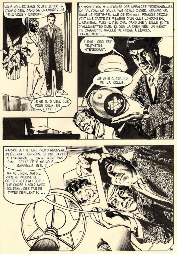
Because I discovered recently that an artist whose work I do rate highly, José de Huéscar (1938-2007), drew, as it happens, a handful of Coplan issues, and demonstrably well at that. Here are some samples, pulled from the original art.
Position clé, page 33 (1971). Note Huéscar’s confident use of a dry brush technique and his bold use of negative space (panel one in particular).
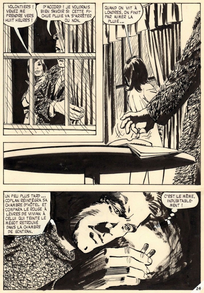
Sabotages sanglants, page 16 (1971). Ingenious, low-tech Coplan is far more John Drake than James Bond, and that’s how I prefer my spies!
Sabotages sanglants, page 24 (1971). Inventive, but not gratuitous or confusing, ‘camera’ work.
Sabotages sanglants, page 29 (1971). Fun with textures, great depth of field work, again with clear storytelling despite the invasive captions.
Sabotages sanglants, page 43 (1971). Another page that would have resulted in static talking heads. The meal the characters share is virtually relegated to the captions, and Huéscar wisely moves the action (so to speak) outside.
Sabotages sanglants, page 85 (1971). Having left London for Cairo, Coplan recruits some local help. In lesser hands, this would have just been graphically tedious talking heads.
Sabotages sanglants, page 92 (1971). Yes, this will get Francis into trouble.
Front and back covers of Coplan no. 7: Position clé (Jan. 1971, Arédit), and Coplan no. 10: Sabotages sanglants (Oct. 1971, Arédit). Seems like the cover artist (likely prolific Italian painter Carlo Jacono) had a favourite model!
-RG
*the competitors would merge in 1962, when Presses de la Cité bought Fleuve Noir. While les Presses always did a steady business in translations of American novels, their output comprised a healthy contingent of French-language originals (including excellent series by San-Antonio and Georges Simenon); nowadays, after the usual jumble of soul-killing mergers and acquisitions, they mostly traffic in translated novelisations of American TV shows and pop franchises, a dismal parallel path to globalisation and the steady decline of French culture from the second half of the 20th century.
« It took me some years to clear my head of what Paris wanted me to admire about it, and to notice what I preferred instead. Not power-ridden monuments, but individual buildings which tell a quieter story: the artist’s studio, or the Belle Époque house built by a forgotten financier for a just-remembered courtesan. » — Julian Barnes
Depending on where and when you are, this post will take you far away and to long ago.
For instance, during the storied humour magazine Le Rire’s prime years (roughly the first quarter of the 20th century), Gerbault was featured in most issues, often on the front or back cover, and generally in sumptuous colour. Well, you’ll see what I mean. Clearly not one to rest on his laurels, he somehow found time to lend his sundry gifts to the theatrical, advertising, etching, and fine art fields.
Here’s a bit of context if you don’t know who Saint Denis was. Love his interaction with the initially skeptical doggo! Originally published in La Vie Parisienne, and collected in Parisiennettes (1897), with colours by J. Chauvet.
There’s the lad, Paris’ first Bishop, at the Cathédrale Notre-Dame de Paris. Hope he wasn’t damaged in the blaze.
Gage d’amour (“Token of Love”), originally published in La Vie Parisienne, and collected in Parisiennettes (1897), with colours by J. Chauvet.
Les Coulisses de l’Amour is a collection of cartoons published between 1893 and 1895 in La Vie Parisienne. Racist caricatures abound but, to be fair, everybody gets it in the neck.
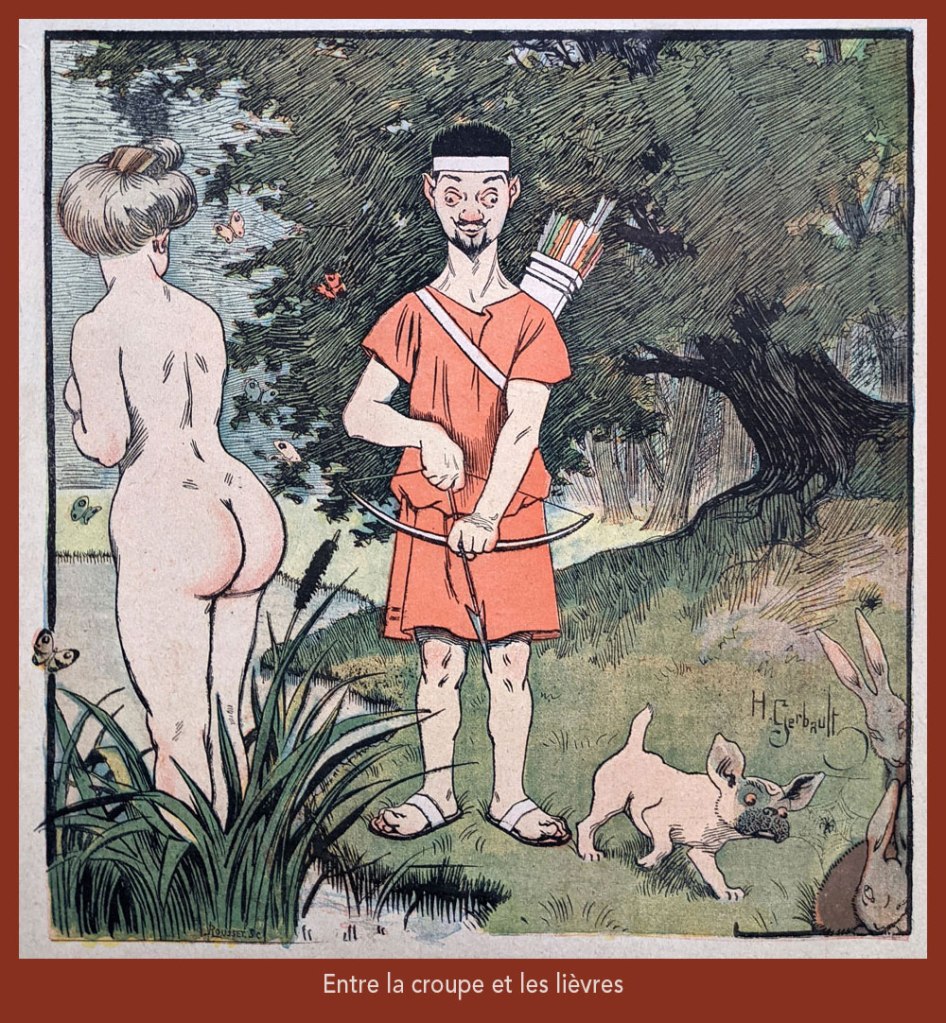
“Entre la croupe et les lièvres” is a play on “Il y a loin de la coupe aux lèvres” (English equivalent: “there’s many a slip ‘twixt the cup and the lip”), with ‘coupe’ replaced by ‘croupe’ (rump) and ‘lèvres’ by ‘lièvres’ (hares) — It was featured on the cover of Le Rire no. 261, (Nov. 4, 1899), eloquently demonstrating the vast cultural gulf between Edwardian England and Belle Époque France… not to mention the United States!
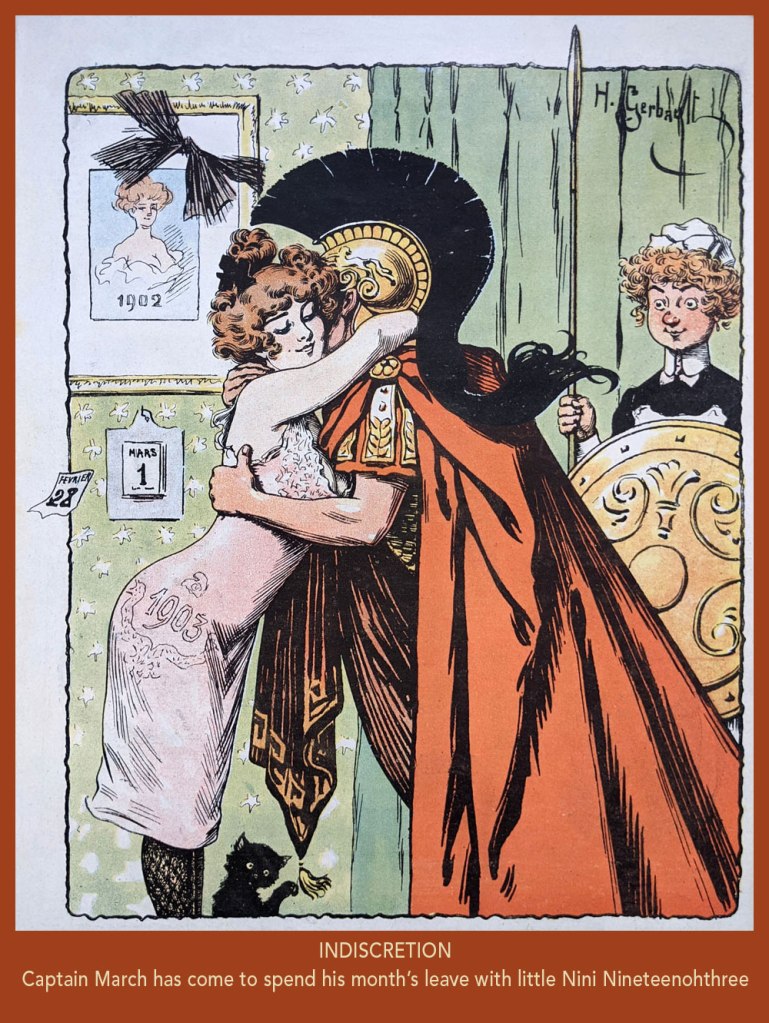
From Le Rire no. 7, (March 21, 1903). In French, the Roman God of war and the year’s third month are both “Mars”. Why is it even “March” in English?
Taking the piss out of that old English discretion (some might call it hypocrisy); from Le Rire no. 18 (June 6, 1903).
From Le Rire no. 59, (March 19, 1904).
From Le Rire no. 160 (Feb. 21, 1906).
From Le Rire no. 380 (May 14, 1910). Missals are also known as ‘prayer books’.
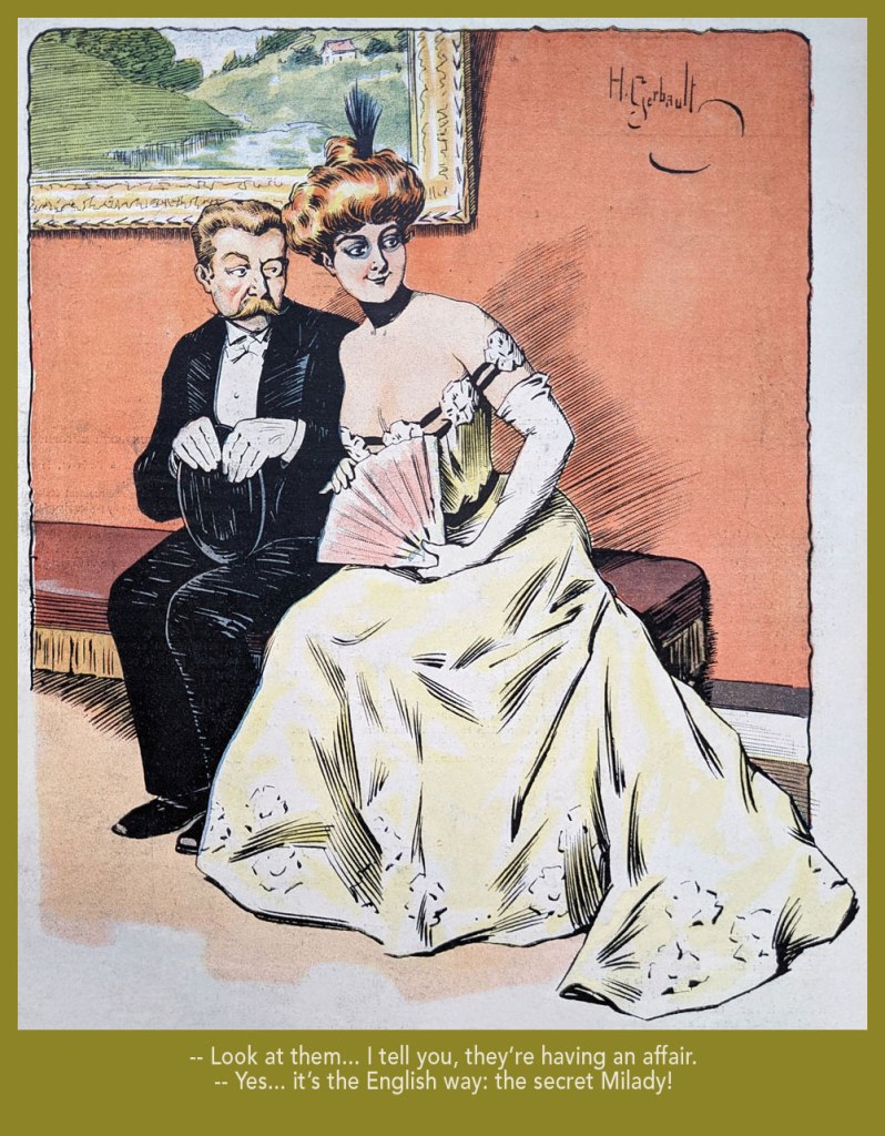
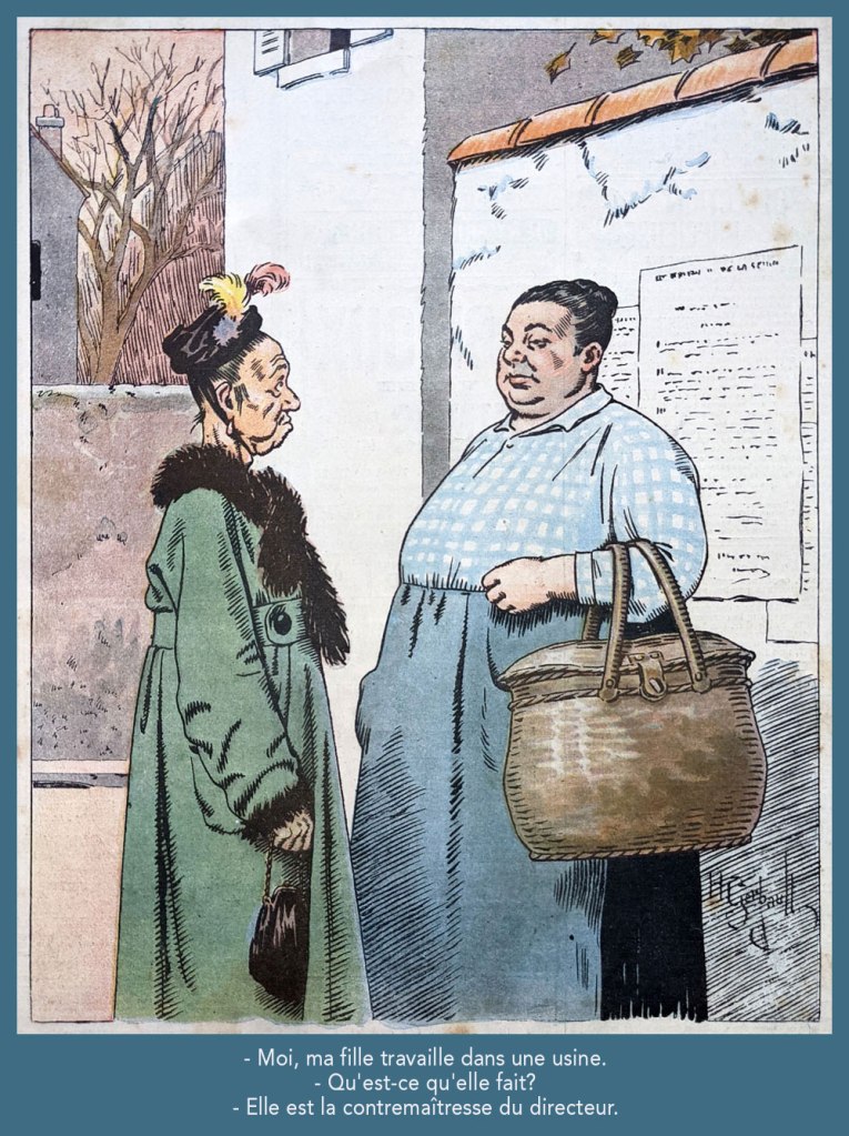
Despite being quite amusing, this one loses it all in translation. Still, “contremaître” is a foreman; its feminine form is “contremaîtresse”, which combines foreman and “mistress”; you’ll hopefully get the idea. This piece appeared in Le Rire rouge (as Le Rire was called during The Great War) no. 179 (Apr. 20, 1918). Note the beautifully understated colour work.
From Le Rire no. 189 (Sept. 10, 1922). « Je m’fiche à poil, rien que pour l’embêter! » in the original; sometimes it’s mighty hard to do proper justice to the source text.
« I believe that the Belgians do possess some surrealistic gene. » — Eddy de Clercq
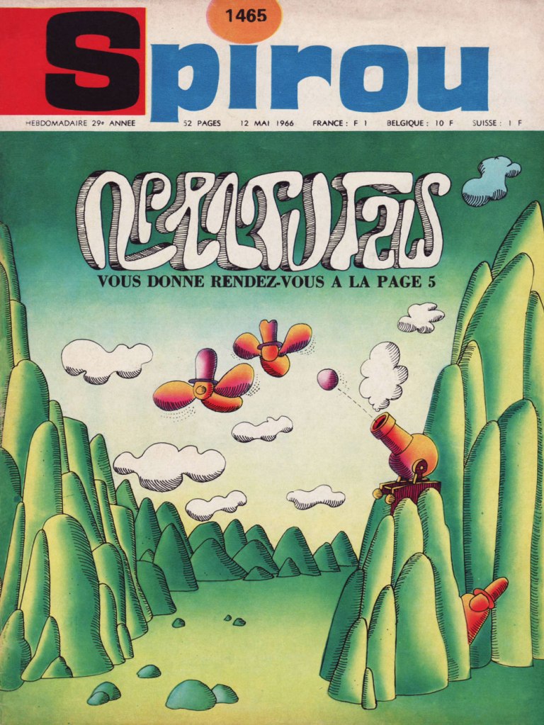
I’m afraid we’re back into surrealism territory, folks. Our focus today is on a single piece by polymath Maurice Rosy (1927-2013, Fontaine-l’Évêque, Belgium), published in bédé weekly Spirou in 1966, in the midst of Rosy’s tenure as the magazine’s co-art director (with Yvan Delporte) and boundless idea generator (1956-73, for the record… the period widely hailed as Spirou’s golden age).
As for the story in question… it was, shall we say, ahead of its time. And still is.
Nonetheless, its value was recognized almost immediately (less than one year on, for the record) by connaisseursJacques Sternberg, Michael Caen (co-founder of the epochal Midi-minuit fantastique) and Jacques Lob‘s essential Les trésors de la bande dessinée (1967, Éditions Planète), wherein they wrote:
Intrigued by oriental philosophies and General Semantics*, jazz pianist in the modern idiom, art director of the publishing house that produces Spirou, hilarious storyteller, Rosy has had drawings published in Paris-Match and Adam, all the while crafting (with Pol Deliège) tales of Bobo. He is also the author of the most bizarre story ever to appear in a kids’ magazine, which earned its publisher and author an especially venomous stream of insulting letters. Geniuses are always unsung.
Rosy has the sharp smile of a Steve McQueen and a picturesque language all his own.
You be the judge, He looked winningly impish, all right!
And now, the item in question:
From the next page over, a detail from more typical fare, namely Peyo’s La Schtroumpfette. Rosy, art director to the hilt, had opted to further mess with the readers’ minds by tampering with the magazine’s standard À suivre (to be continued) box.
When Rosy was interviewed for a deluxe, 16-volume reprinting (begun in 2007) of the adventures of Tif et Tondu (with Will as illustrator, Rosy served as writer/metteur en scène on the feature for many of its glory years, 1954-67), the notorious one-shot was touched upon:
In 1966, you created a strip with an unreadable, and therefore unpronounceable name, which even made it onto the magazine’s cover: are we deep into Herriman* territory?
Rosy: That’s weird, people say that, but at the time, there was no such conscious homage. It was rather a reflection of the state of mind that I was in. I was increasingly bearing the marks of (and anguished by) the absurdity of certain facets of life.
«… awaits you on page 5. » Rosy’s cover for Spirou no. 1465 (May 12, 1966, Éditions Dupuis).
**In the same way that people with an insufficient frame of reference wrongly compare every musician they hear to The Beatles, the under-informed tend to ascribe any sign of whimsy or absurdity in the comics medium to Krazy Kat progenitor George Herriman. Yes, both were deeply influential, but come on, there are limits. In Rosy’s case, I’d posit that, if there was influence at work there, it was more likely that of the mighty Saul Steinberg.