Like many a bibliophile, I enjoy browsing shelves in a used bookshop without any particular goal or author in mind. On one of my last forays, I found the following book:
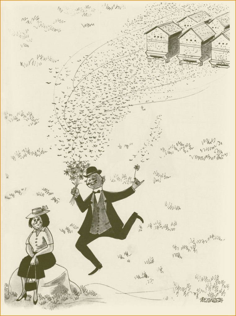
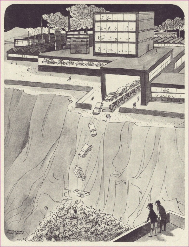
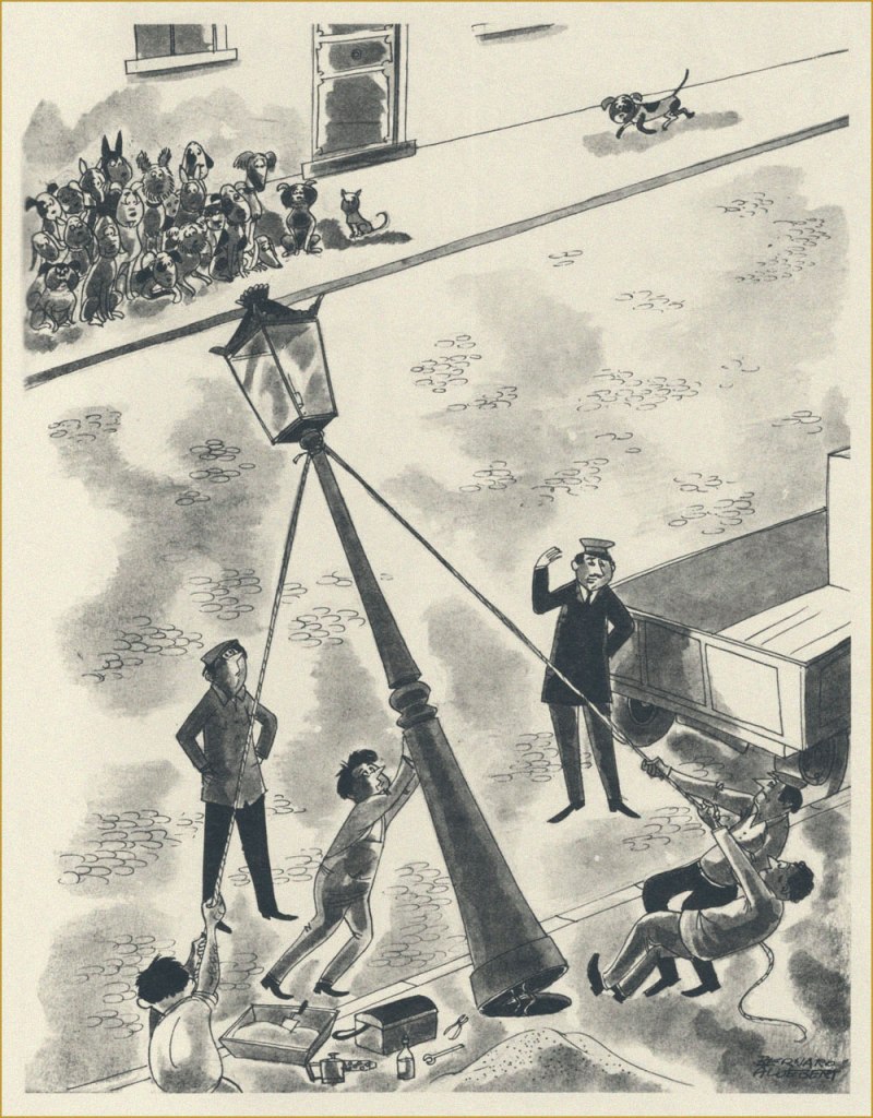
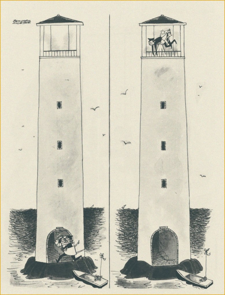
I had never heard of Aldebert (at that point I was under the misapprehension that ‘Bernard’ was his first name, and ‘Aldebert’ his family name), and the jokes were a bit hit-or-miss, but more than just a few charming cartoons lay within… certainly enough to pick up this book from 1970 for the impressive sum of 12 dollars.
Jean Bernard-Aldebert (1909-1974) was a French illustrator with an interesting, if not devoid of tragedy, life. He started drawing for various satirical publications early on, at 19, and for some fifteen years his career was gradually gaining in traction, his cartoons appearing in such weeklies as in Ric et Rac, Marianne and L’os à mœlle. In 1944, this came to an abrupt halt when he was arrested and deported to a German concentration camp (one of the worst, and the last one to have been liberated by the Allies – Mauthausen) for having depicted Hitler as a chimpanzee in one of his caricatures. Miraculously, he survived, and even set his experiences down on paper – these 50 drawings were published as the album Chemin de Croix en 50 Stations in 1946.
After his return to France, he moved away from satire and caricature (frankly, who could blame him?) and onto more humorous publications like Paris Pin-Up and Fou rire, also illustrating many posters and ads, and drawing two comic strips for Ici Paris (Adonis and GIgolette).
This seemed appropriate, given that spring is clearly in the air!
Bernard-Aldebert might have moved away from satirizing serious topics, but it doesn’t mean he lost his sense of observation of the ludicrous aspects of life.
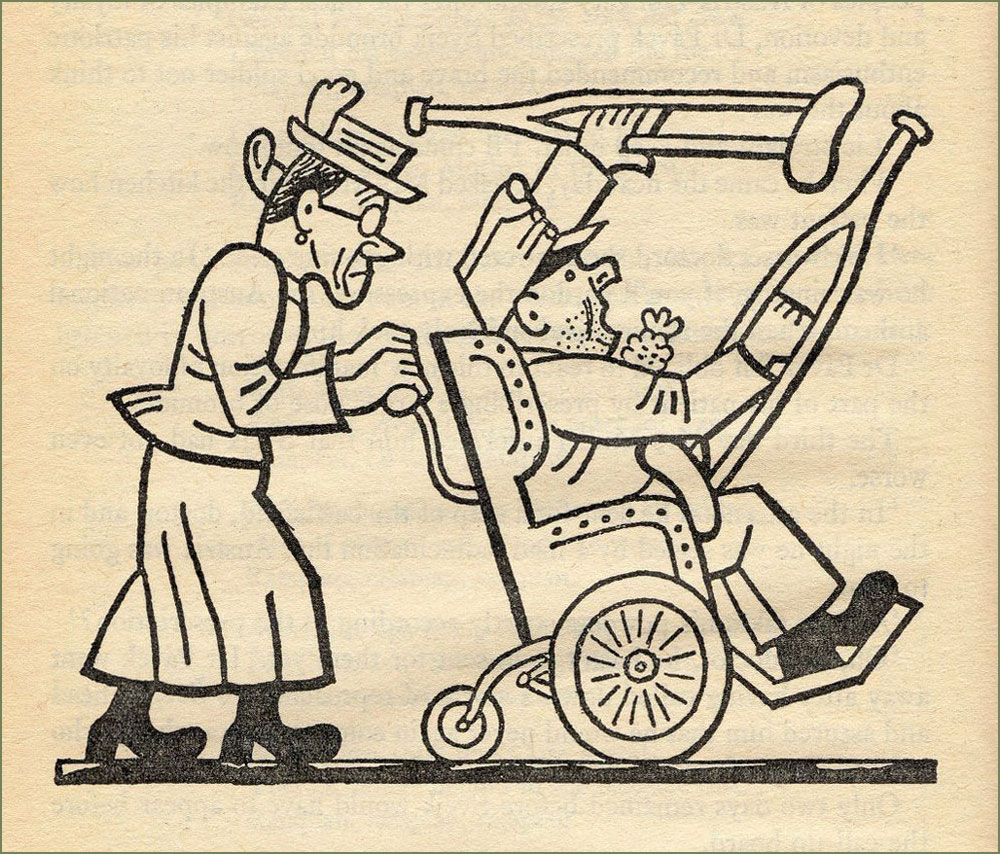
« If you had just a little imagination, you’d come to the beach! » This is my favourite cartoon from this collection.
If people still had to use a sickle, maybe fewer lawns would be tragically over-mown.
I don’t know what year this haunting photograph is from, but I think we can all agree that these eyes look like they’ve seen too much.
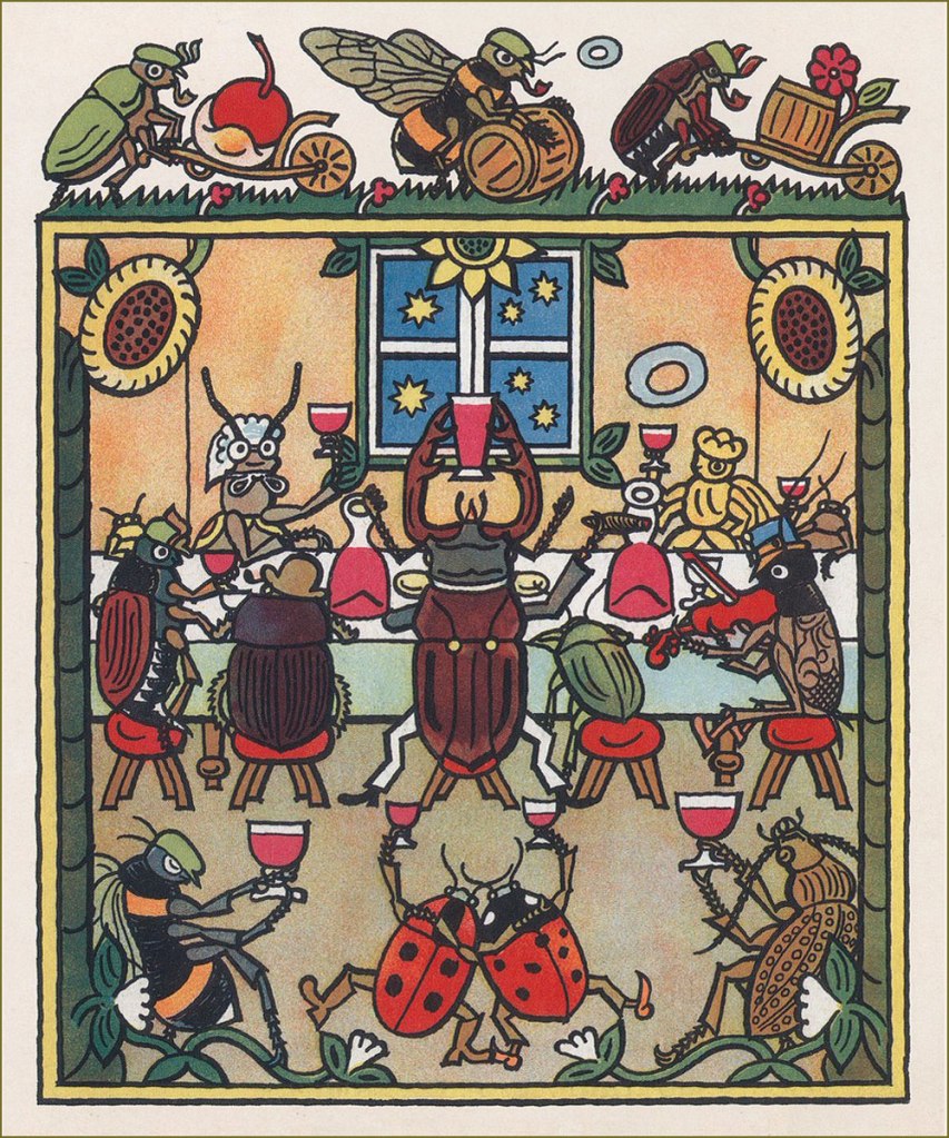
When I looked up Czech painter-caricaturist Josef Lada (1887-1957), I was surprised to find him called ‘one of the best-loved Czech painters of all time‘. There’s no question that Lada’s work remains immensely popular among Czechs, but I suppose the question for context would be « how many painters from that corner of the world are well known outside of outside of the Czech Republic and ex-USSR countries » (probably not many). Lada doubtlessly deserves his lasting fame, at any rate.
My familiarity with his style comes from his illustrations for Jaroslav Hašek‘s sardonically hilarious novel The Good Soldier Švejk, a favourite family book from which we can all quote at length, and which I own in several Russian editions (thanks to inheriting my grandfather’s copy). There have been many adaptations of Švejk, but I can only imagine him the way Lada depicted him. Visit BibliOdyssey for a glimpse of the good soldier.
While his renown is assured thanks to his work on Hašek’s magnum opus, the entirely self-taught Lada is also fondly remembered for his illustrations to children’s books (which he occasionally wrote himself), as well as paintings of pastoral life, probably inspired by his childhood in the small village of Hrusice. For a fuller biography, head over to The Genius of Josef Lada, the most complete source of information that I could find online in English.
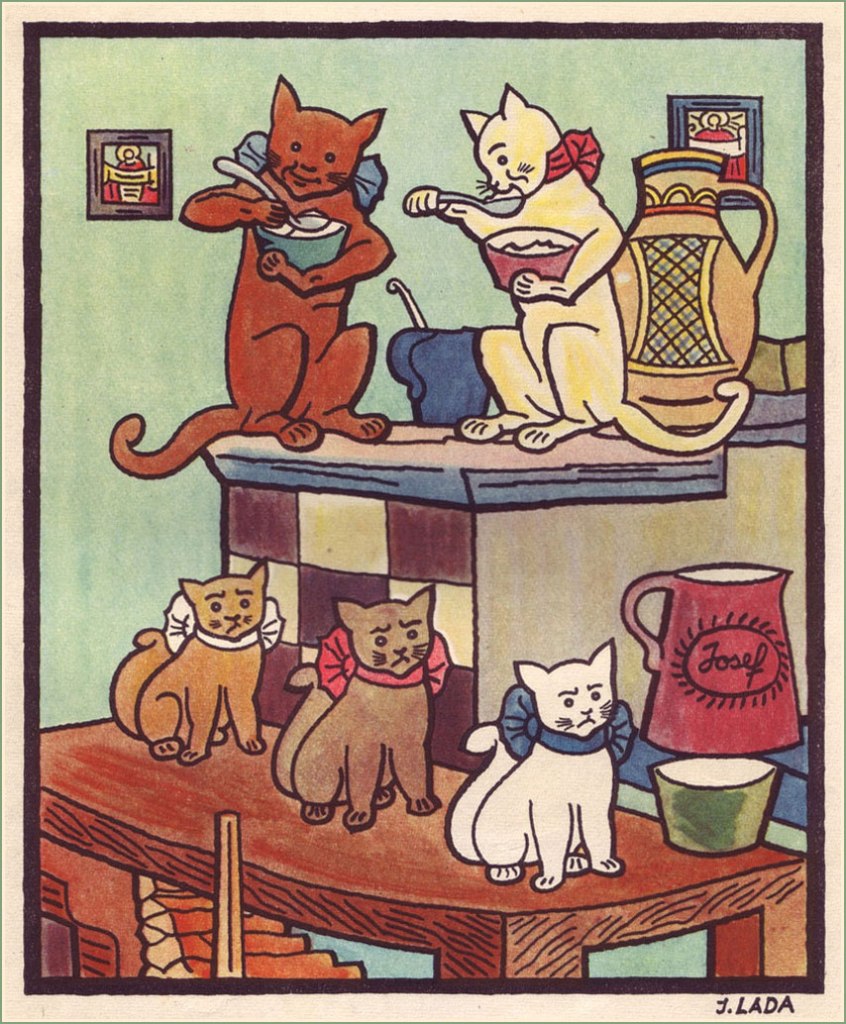
Here’s an assortment of images from various books – among others, Ezopské bajky (The Fables of Aesop) from 1931; Kocour Mikeš (Tomcat Mikeš), written and illustrated by Lada between 1934 and 1936, and being a sort of a take on Puss in Boots; Nezbedné Pohádky (Naughty Fairy Tales) from 1946 – as well as some postcards and aforementioned village illustrations.
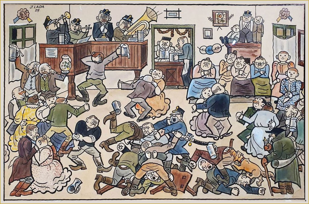
A typical pub night, 1929.
Winter Pleasures, 1936.
« In the first year of his life, [Lada] had a life-altering accident – he fell on his father’s knife and the injuries sustained permanently blinded his right eye. Some art historians later attributed the artist’s flat-perspective painting style to this incident.»
Lada’s depiction of ‘vodnik‘, an evil water spirit.
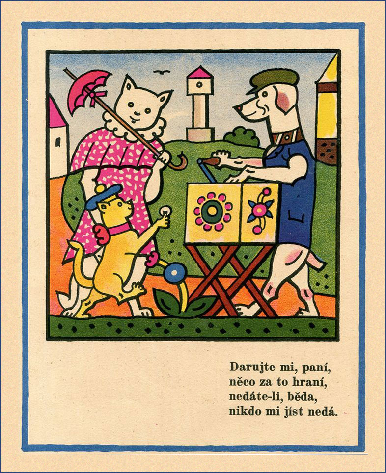
A page from Zvířátka (which translates to ‘beasts’ or ‘animals’), a book comprising a dozen animal illustrations.
A New Year postcard from 1928.
A collection of Lada’s caricatural cartoons – ‘A Hundred Cheerful Drawings’ – published in 1970. I found this little volume in a used bookstore, and was delighted to find what was clearly the work of the artist who illustrated Švejk – I didn’t know Lada by name, back then. I don’t speak Czech, but it’s still plenty fun to leaf through.
« The whistle of the old steam trains … could conjure up visions of bleak distances with one solitary wail. » — M.C. Beaton
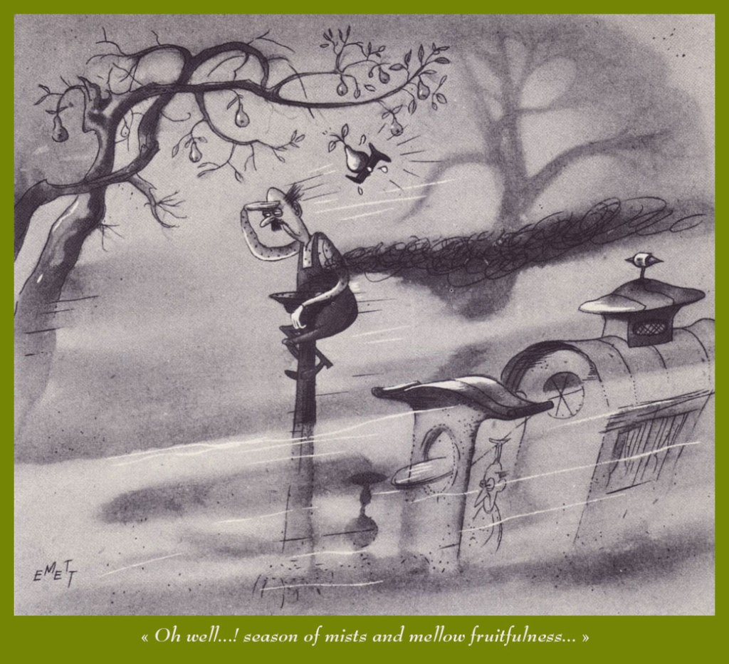
A couple of years back, I gave our readers an introductory sample of the genius (hardly too strong a word in his case) of Rowland Emett (1906-1990), and vowed I would return with a fuller, more lingering look.
Since I got the biographical trimmings out of the way that time, today, I’ll merely offer you an even dozen of my favourites.
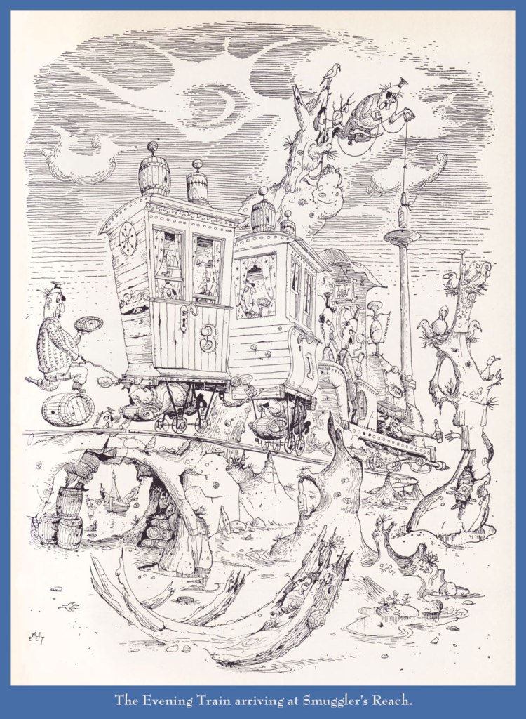
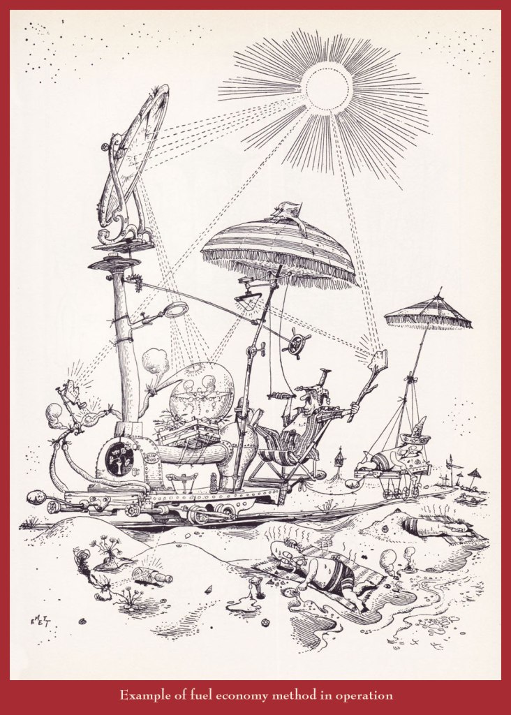
Can’t tell a trébuchet from a catapult from a ballista? This handy guide will steer you right!Prof. Lightning’s moniker is evidently well-earned.Another inventive step in the harnessing of solar power.While this particular train route sadly does not exist (as an editor once wrote, “the great Emett, whose crazy world seems so much saner than our own…”), there are some lovely birding tours available throughout that green and pleasant land, from Land’s End to John o’Groats. Said nationalisation took place in 1948. Here’s a bit of background on that historic endeavour.
Today we foray into the land of semi-autobiographical, prototypically ‘female’ chronicles – you know the thing, jokes about dieting and weight gain, a never-ending quest for the right boyfriend, hoary chestnuts about opening jars and eating ice cream when sad. The focus may vary a bit – some characters are stuck in humdrum drudgery, potty-training children and husbands, and some are bouncing around on sexy outings (and all of them fretting about becoming their mothers). While I am not automatically dismissive of this genre, it’s difficult to pull it off in an interesting way. For every Sylvia, there are many, many Cathys*.
Anyway, lately French cartoonists who go down that road have tended to opt for a very similar drawing style, similar to the point where one starts wondering who has ripped off whom. One of the artists who stands out a bit more to me is Pénélope Bagieu, whose work, while adopting a lot of tropes inherent to this category, also provides some genuinely interesting moments.
Bagieu might be best known for her 2016 webcomic-turned-best-selling-book Les Culottées (Brazen: Rebel Ladies Who Rocked the World in English) that tells stories of exceptional women of different eras and nationalities. It’s a great idea… that I am not interested in, which can also be said about California Dreamin’, her biography of Mama Cass. However, two of her graphic novels are definitely worth seeking out.
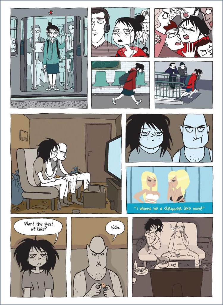
Exquisite Corpse (translated from the French Cadavre exquis, published in 2010, Gallimard) does a great job of depicting the depressing life of Zoe, who shuffles between a mind-numbing job and a lackluster relationship, growing more desperate by the day. Her life takes an altogether different turn when she accidentally meets a recluse who turns out to be a famous author. I don’t want to give any spoilers about the set-up of the ending, but I did not see it coming at all.
Her other graphic novel I like, La page blanche (2012), was written by Boulet and remains untranslated into English. It opens with a young woman sitting on a bench, having no idea how she got there or who she is. The interesting thing is that her amnesia never goes away — she never gets to remember anything about her past life, or discover who she was. All she finds was an apartment full of books that everybody reads and movies everybody watches, as well as shallow friends who are not really friends.
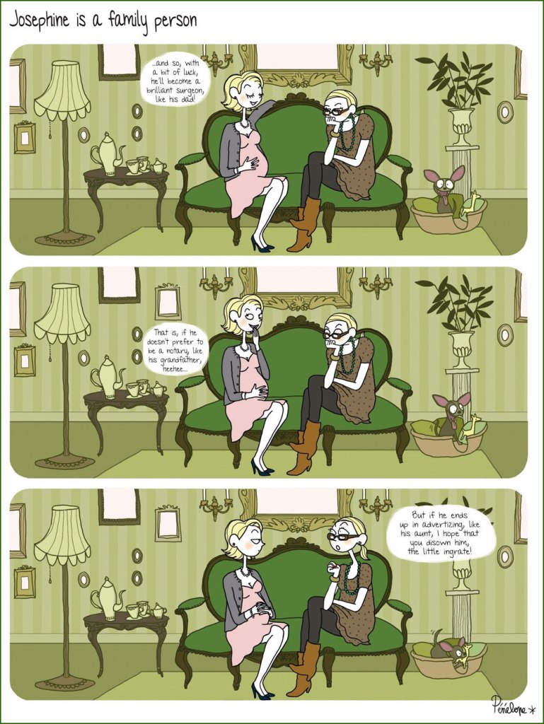
More in ligne with the aforementioned ‘woman seeks partner, settles for ice cream instead’, here are a few pages from the first volume of Joséphine, a series of three albums published between 2008 and 2010:
Joséphine’s only weapon against her holier-than-thou sister is sarcasm.
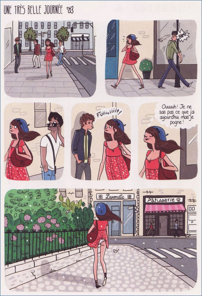
Since I made a point of mentioning artists with similar styles, here’s an example. The following pages have been scanned from La célibataire, written by Quebecoise India Desjardins and illustrated by French Magalie Foutrier (although given how light in storytelling content this book is, and how very French it is, too, I’m not really sure what Desjardins actually contributed):
One of my favourite storylines in this book, about a cat she finds on her balcony one autumnal afternoon. Not sure why she’s bathing it, though. Unlike the very human Joséphine, this gal is always impeccably dressed and perfectly coiffed.
Despite its lack of originality, I like La célibataire a lot for its the bright colours and textured art. Sometimes, ‘it’s pretty’ is a justification to keep something despite multiple attempts at purging the books one doesn’t really need. This one has survived every purge, so far.
That was two examples I actually like — for kind-of-similar-but-no-thank-you, check out Margaux Motin or Nathalie Jomard.
~ ds
*On Hating Cathy over at The Comics Journal is a worthwhile read, though I disagree with its conclusion.
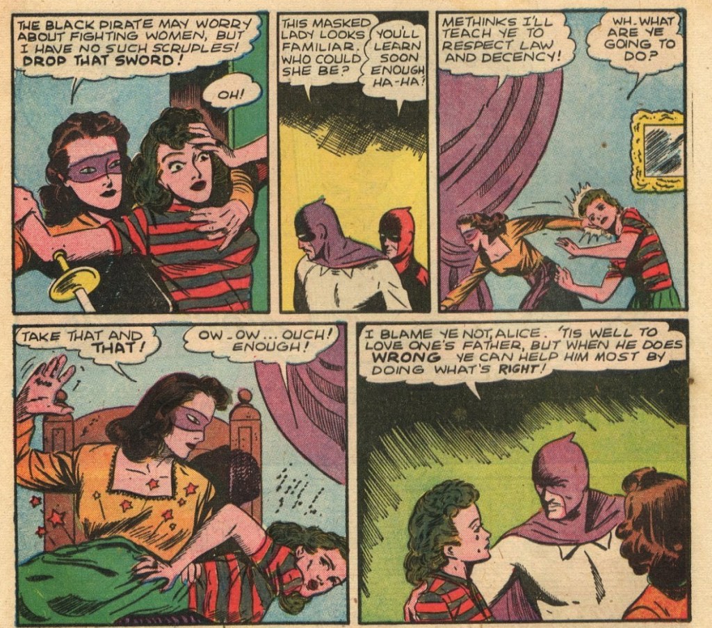
One of this blog’s unexpected hits (pow!) has been Let’s All Go Down to the Catfights!. Though published in 2018, this post still generates a lot of interest on a practically daily basis – I knew people liked to spectate women fighting, of course, but I didn’t realize just to which extent. I mean, we have a whole THE TWILIGHT WORLD OF GIRLIE CARTOONS category, it’s not like that post was the only instance of us featuring half-or-entirely-naked women.
I’ve been meaning to do a part 2 for a long time now, gradually accumulating choice material, to finally spring it on you when you least suspect it (yes, that’s me cackling in the corner). When dealing with a potpourri of styles and decades, I usually try to go in chronological order. If this cavalcade through the years demonstrates something, it’s that our tastes haven’t evolved much. Plus ça change…
Page from The Last Curtain, illustrated by Sheldon Moldoff and published in Sensation Comics no. 22 (Oct. 1943, All-American/DC).
Page from Condemned Venus!, scripted by ‘Gregory Page’ (who’s probably Ruth Roche), and tastily illustrated by Matt Baker. This story was published in Phantom Lady no. 14, 1947.
Jumbo Comics no. 105 (November 1947), with a cover by Joe Doolin.
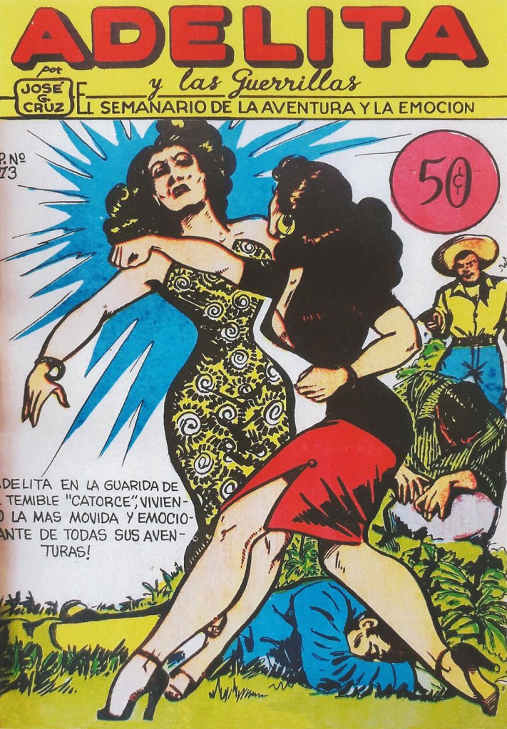
Adelita y las Guerrillas no. 73 (1953, Ediciones José G. Cruz). This is a Mexican Western comic series created cartoonist José G. Cruz in 1936, initially published in Paquito magazine. I’m not sure whether here Adelita is fighting her nemesis, Tigresa del Bajio, or just punching around some other woman.
Crimes by women, on women? Read an entertaining overview of this dime comic book published by Fox Features Syndicate on Criminal Element.
Crimes by Women no. 6 (April 1949). Is a cheap frill the same thing as a cheap floozy?
Crimes by Women no. 16 (December 1949). ‘Crime never pays’, they always remind the reader, who’s probably too interested in the catfight to believe it.
We have a heavy Italian contingent today! Co-admin RG recently wrote a post about Averardo Ciriello, Sitting Pretty: Averardo Ciriello’s Maghella. As he pointed out, Ciriello lent his art to many an erotic series — here’s his cover depicting Lucifera fighting a woman with three breasts (?) I mean, nobody can say you don’t get your money’s worth from this blog… 😉
Lucifera no. 165, 1980.
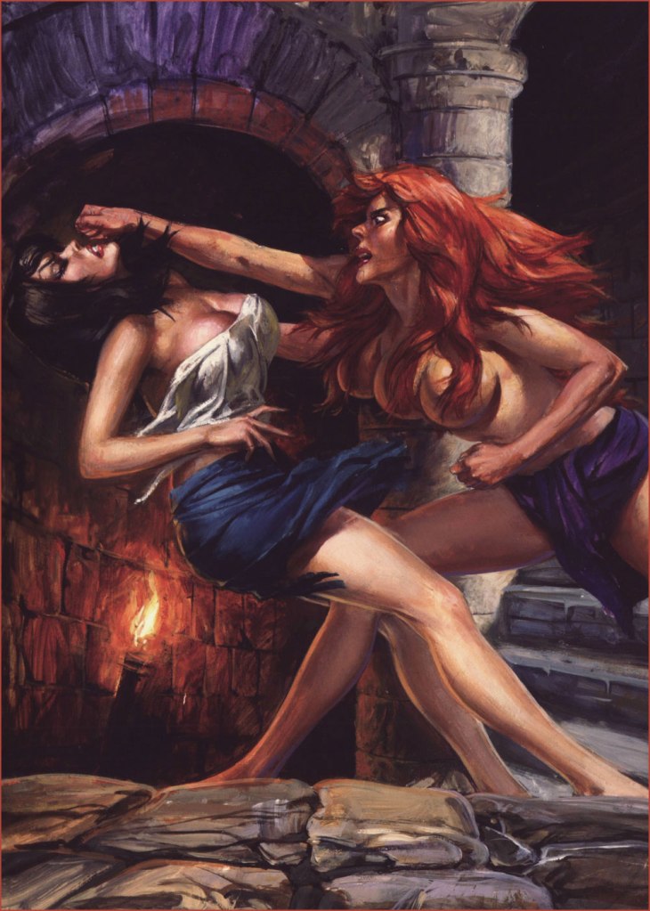
And here is the original painting, for comparison purposes:
Ciriello wasn’t the only one working in that vein.
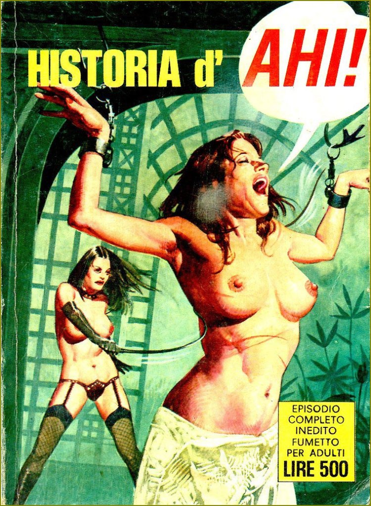
Historia d’Ahi!, a one-shot published by Edifumetto, presumably in the 1970s. Episodio Completo Inedito Fumetto… cashing in on Histoire d’O.
Storie Blu Special no. 12 — L’astronave dei mille tormenti (1983, Ediperiodici).
How about some dubious plot involving a fight between an impeccably fair-skinned maiden and an exotic black woman clad in some sort of tribal garb? Uh, sure.
A page from Royal Hunt, scripted (cringingly overwritten, frankly) by Chris Claremont and illustrated by John Bolton. Marada the She-wolf finds herself a ‘worthy’ adversary in Epic Illustrated no. 12 (June 1982, Marvel).
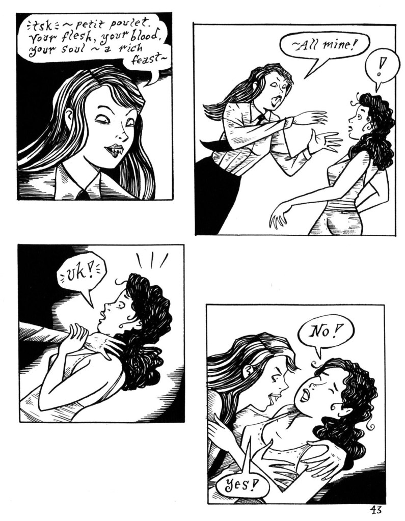
For a slight change of pace and style, I offer you some horror from Tentacle Tuesday MasterRichard Sala, two pages from Peculia and the Groon Grove Vampires, published in Evil Eye no. 13 (August 2005, Fantagraphics):
~ ds
P.S. Here’s a Tik Tok video of a female martial artist who has a rather interesting way of showing different self-defense techniques. It seemed relevant!
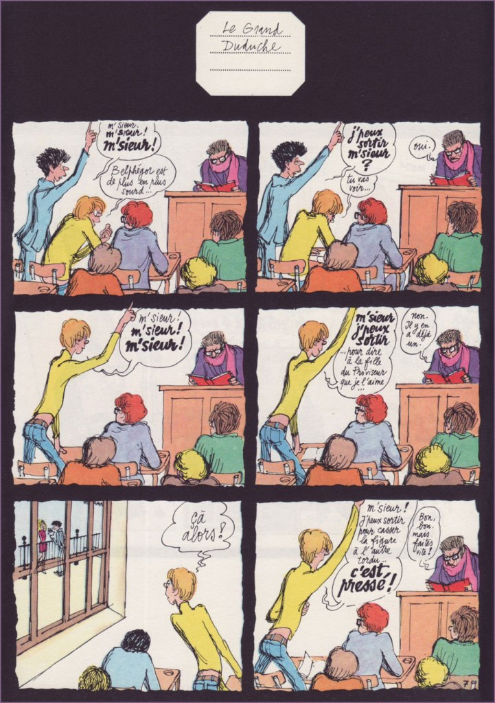
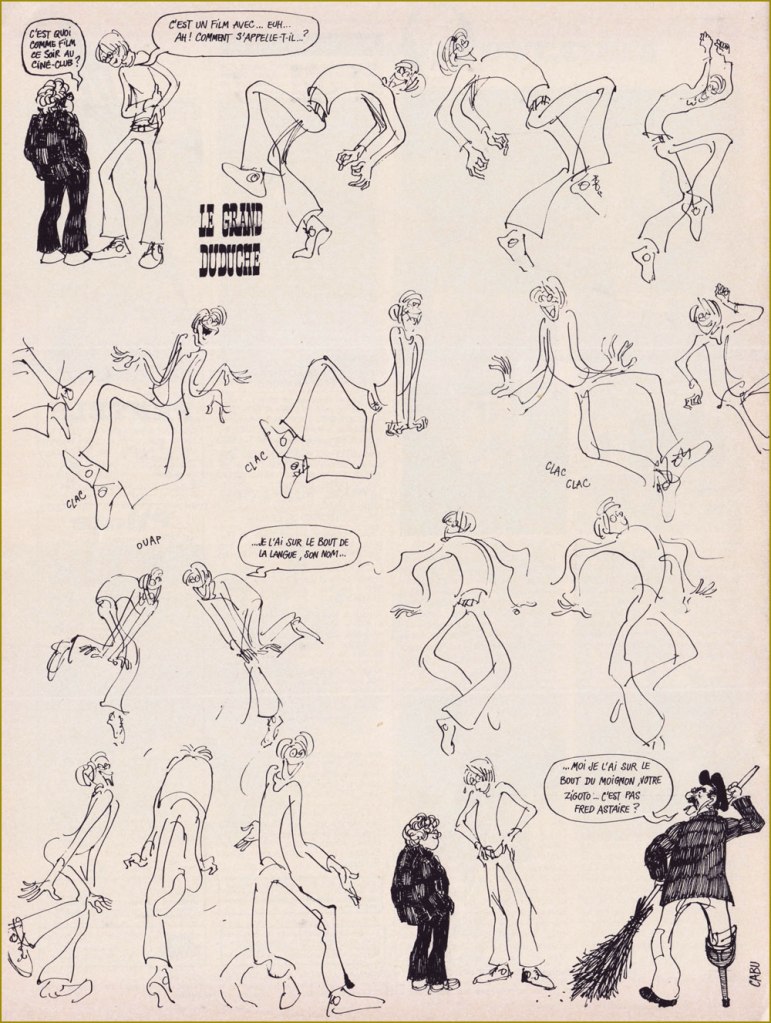
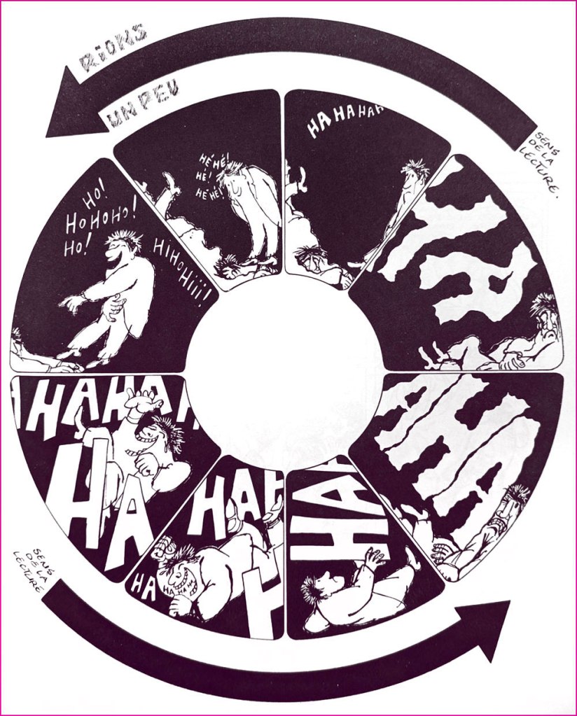
« A shaggy mane, odd, steel-rimmed little glasses, a get-up owing rather more to personal fancy than to the edicts of fashion, a candid gaze, the smile of a malicious dunce, that’s Le Grand Duduche… and it’s also Cabu. » — René Goscinny
On this significant day, I will spotlight Jean Cabut (b. 1938, d. 2015) alias Cabu, and his wondrous Le Grand Duduche series, begun in 1963 and concluded in 1982, published in Pilote, Hara-Kiri, Charlie Hebdo and Pilote Mensuel. An absurdly massive collection of the entire series (672 glossy pages!) was published by Vents d’Ouest in 2008. Even as a hardcover volume, the thing’s so big and heavy it can barely bear its bulk, and is therefore virtually unreadable. It should really have been three books in a slipcase. But hey, the reproduction is first-rate… for what it’s worth.
Duduche is a gangly lycéen (high school student, sort of) wending his way through classes and student life, doing as little work as possible but expanding a maximum of ingenuity. It’s most certainly not about the plot.
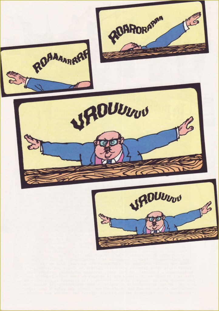
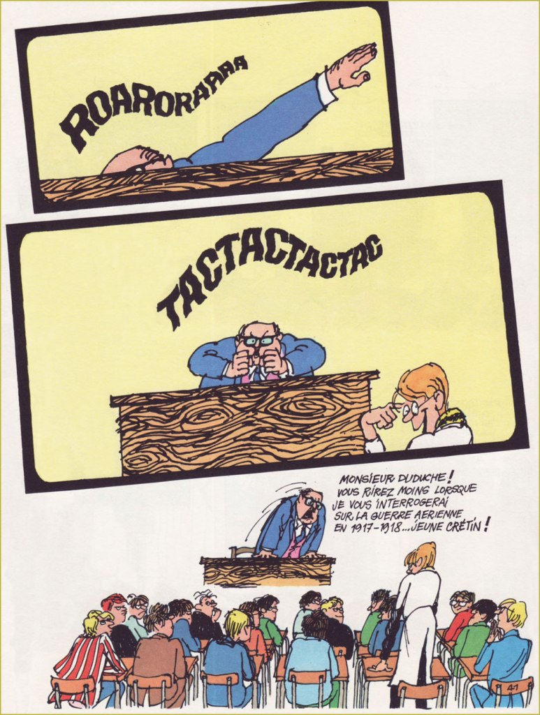
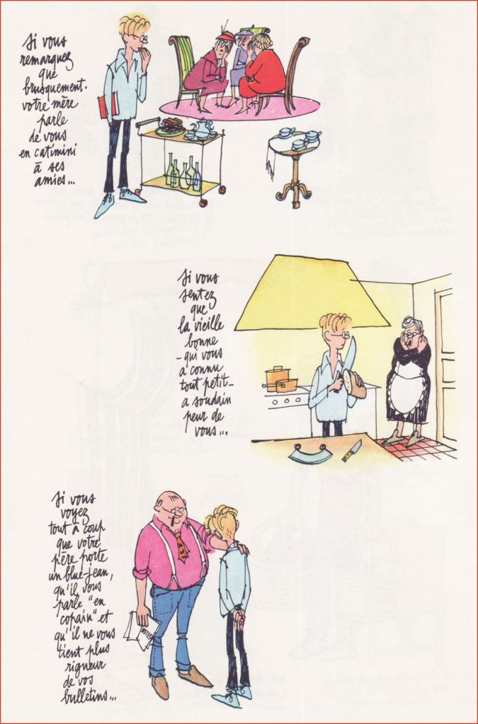
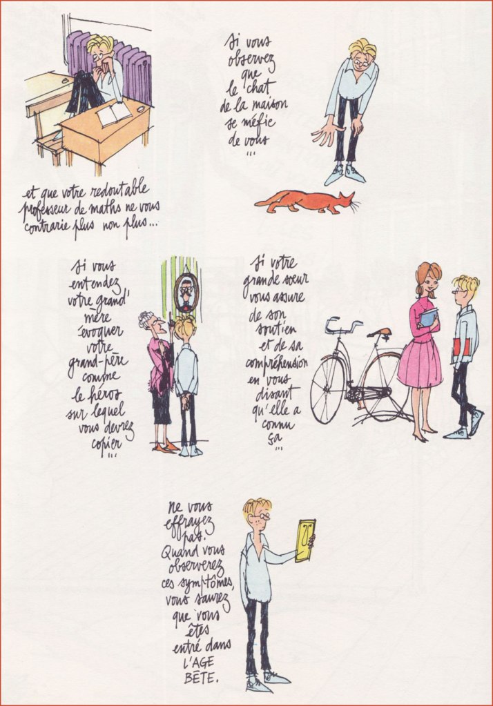
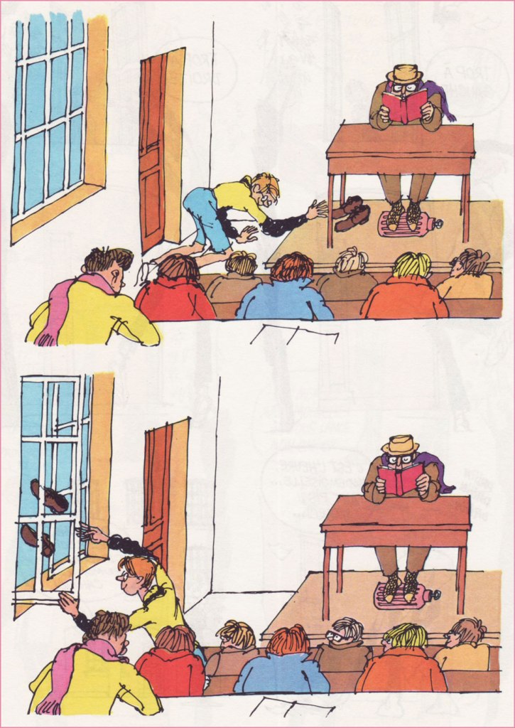
The strip displays a fantastic level of graphic bravura and formal experimentation, while retaining 20/20 narrative clarity. I felt it was a fool’s errand to try singling out a “typical” example, since every page is unique — so here’s a sampler. Amazing, and yes, highly recommended, even if you can’t read the (marvellous and abundant) text.
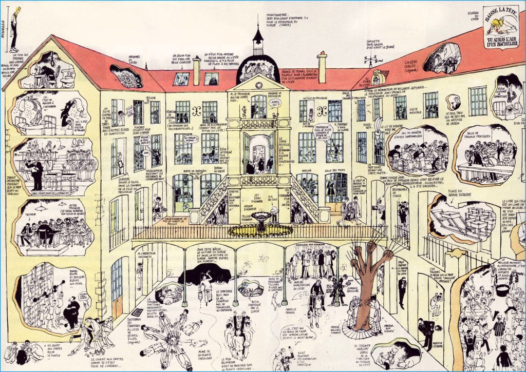
Ah, remember cursive?Little Duduche has to give away his cat’s latest litter, with deplorable results. « A female cat can have up to 20,000 descendants in just a span of five years. If you don’t want to take care of tons of cats or feel responsible for many homeless ones, it’s a good idea to spay or neuter your cat. » It’s just common sense, folks.Expressive, varied lettering is another crucial asset in the toolkit of the complete artist. « Mister Duduche! You will no longer find it quite so droll when I quiz you on aerial warfare of 1917-18! » Okay, this was hell to scan and reassemble (do open it in a separate tab to see the glorious details). But I felt it essential to showcase Cabu’s mastery of scale, perspective, architecture and general cohesion. Once in a while, Cabu would pull out one of these ambitious strips with over a hundred distinctive and identifiable figures, in service of a couple of dozen individual or entwined jokes. It is a rare breed of genius that can conceive such an array of moving parts and keep them all under control. 1- “Sir! Sir!Sir!” ” “Belphegor is getting deafer by the day...” 2- “May I go out, sir?” “Yes.” “Watch this…” 3- “Sir! Sir! Sir!” 4- “Sir, may I go out… to tell the principal’s daughter that I love her?” “No. There’s already another.” 5- “Well, I never!” 6- “Sir! May I go out to smash the other freak’s face in… it’s urgent!” “Okay, okay. But make it quick!““If you notice that the elderly maid, who’s known you all your life, is suddenly afraid of you…“Duduche catalogues the telltale signs of his entrance into ‘the awkward age’. “If you notice that the house cat is now wary of you…“Interesting: I had no idea until just now that the country fair game of ‘Chamboule-tout’ was known as ‘Coconut Shy‘ in English. Live and learn!Duduche’s utter inability to keep a poker face can be a bit of a liability. I love the well-observed detail of the study monitor keeping his feet warm with a hot water bottle. In French, the lovely, evocative term for that item is ‘bouillote‘.Here’s one from Pilote no. 590 (Feb. 1971, Dargaud). Though Cabu could be much, much acerbic than his American colleague, he and Jules Feiffer had a lot in common. “What’s on tonight at the film society?” “It’s a flick with, ah, what’s his name again… ?” “It’s on the tip of my tongue, his name…” “… I’ve got his name on the tip of my stump, your weirdo… isn’t it Fred Astaire?“
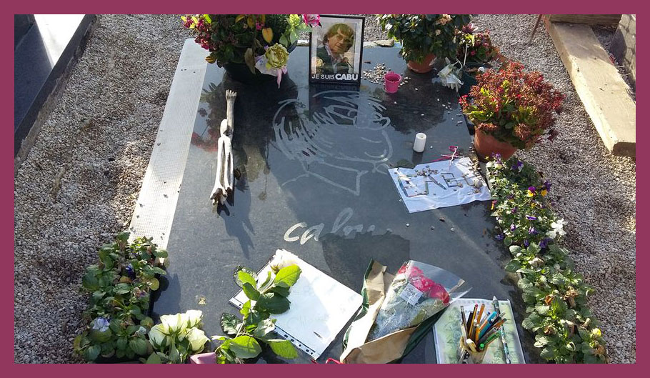
Coming back around to what makes this a ‘significant day’… Eight years ago to the day, Cabu was among those viciously murdered during the terrorist assault on the Charlie Hebdo offices. Honestly, I can’t bear to talk about it, but it’s crucial that this horrible event not be forgotten, and not merely because one of my artistic heroes was slaughtered that day.
« When she visits the gravesite of her late husband in Châlons-en-Champagne, Véronique Cabut-Brachet can witness just how much the French have not forgotten him: locals and fans come regularly to reflect (“It’s Cabu’s grave that people are looking for, and some people come just for it: nearly one a day, yes!” and for the past five years, according to the caretaker of the Cimetière de l’Ouest, interviewed by France Bleu). The artist’s gravestone is copiously covered in flowers but, especially, pencils in jars, a touching homage and the most beautiful of symbols. » [ source ]
I’ve recently given in to a long-time interest (‘a fool’s dream is realized‘) and purchased one of those pretty miniature book nook kits. In case you are not familiar with them, they’re usually the size of a big hardcover book once assembled, and are meant to be inserted on a bookshelf and provide a bibliophile with an intriguing glance into an urban landscape, a Victorian street, a bookshop, a train station, or whatever it is bookworms tend to go for. One painstakingly (and crookedly, at least in my case) glues together furniture and houses, cuts out tiny pieces of paper or slices of fruit, and connects wires to provide background illumination. The one I’m currently working on is a peaceful Japanese street with a sushi shop, a tea store, and lots of cherry blossoms.
I’m clearly not alone in my love for house miniatures or drawn isometric projections of a room. One can do without too much unnecessary psychoanalysis (perhaps it allows us to feel organised and in control when real lives and houses are quite messy), but most of us find such things soothing. Placing a tiny plate on a tiny table is profoundly satisfying; the 2021 game Unpacking makes good use of this, consisting of pulling various objects from a box and placing them where you want through different rooms of the house.
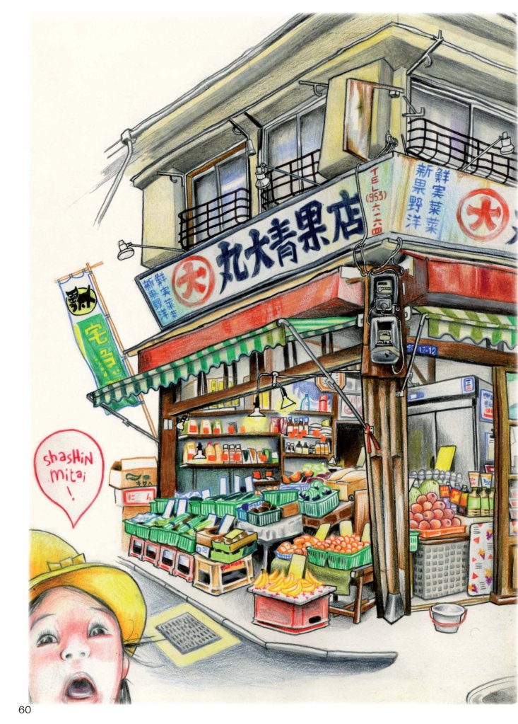
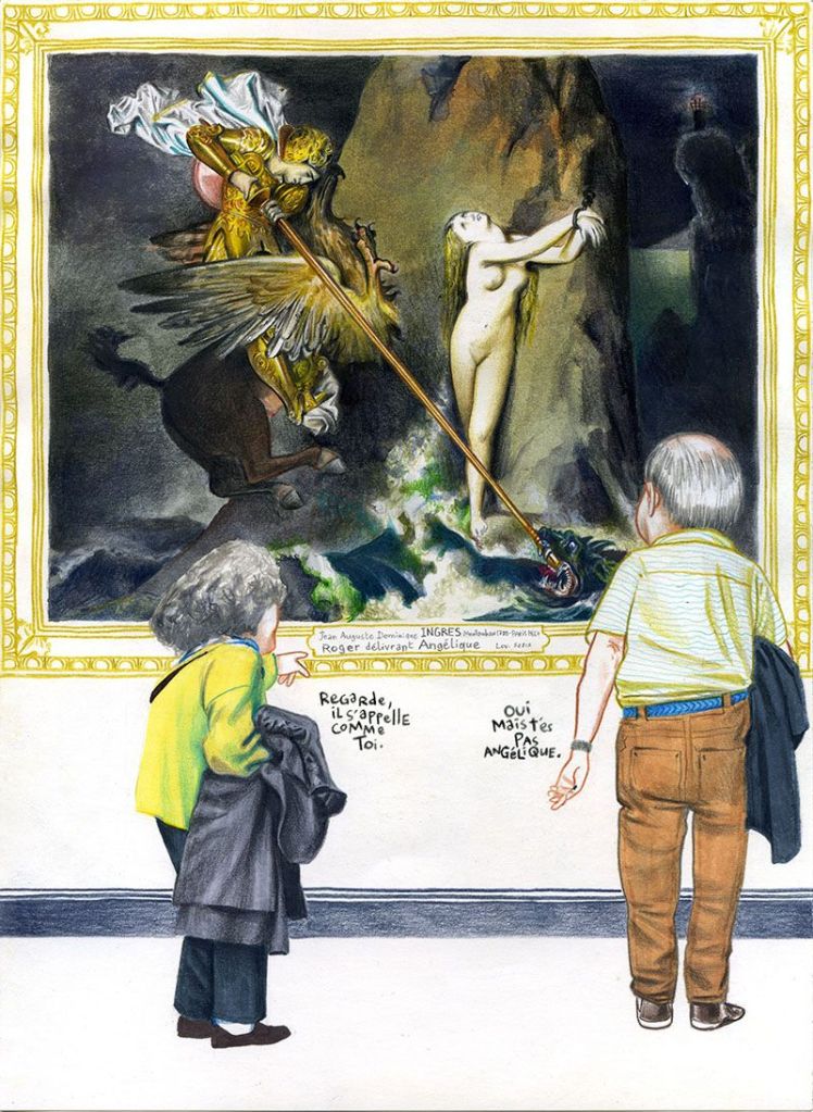
The art of French artist Florent Chavouet (see my earlier post Spotlight on Florent Chavouet) hits a similar note for me. His love of isometric projection and his elaborate sketches of storefronts and people’s rooms immediately attracted me, though at the time I didn’t think to verbalise the reason for it. I concentrated on his excellent graphic novel Petites coupures à Shioguni last time, so here are more glimpses of his other books.
Tokyo Sanpo : Promenades à Tokyo (2009, Philippe Picquier)
Manabé Shima (2010, Philippe Picquier)
L’île Louvre (2015, Futuropolis)
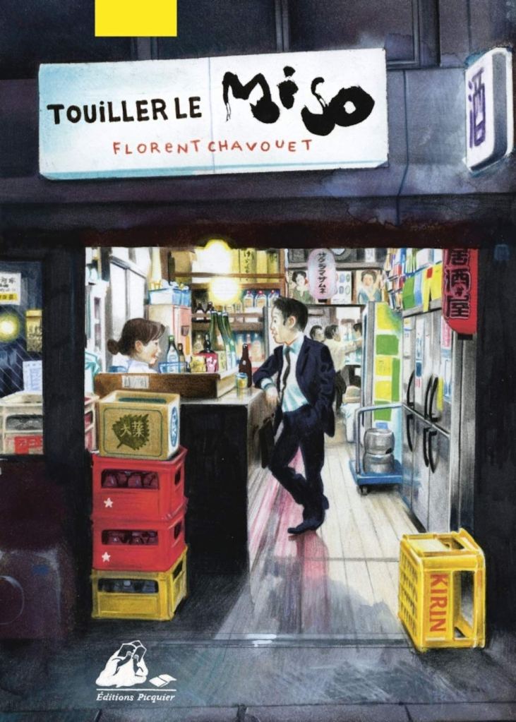
Touiller le miso (2020, Philippe Picquier), his latest book (which I haven’t bought yet, shame on me!)
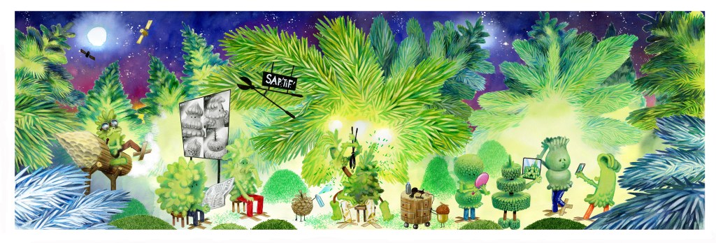
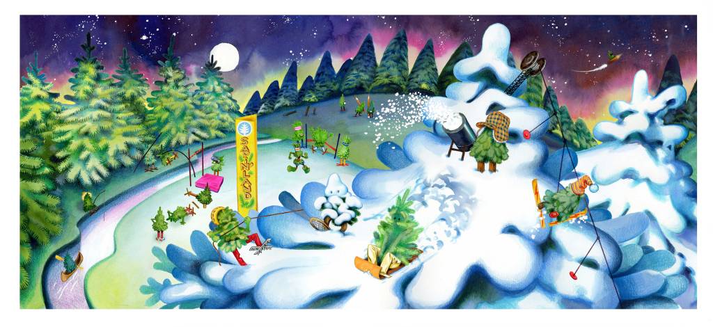
On a more seasonal note, two of his window panoramas drawn for the famous Galeries Lafayette in 2022:
Another thing I really love is imaginary food (which is why the duo of comic artists James Stokoe and Brandon Graham is going to be a post topic sometime in the future), and Chavouet did a beautiful job with his Gloutisphère, a map of the best food in the world… completely made up. Enjoy it on his blog!
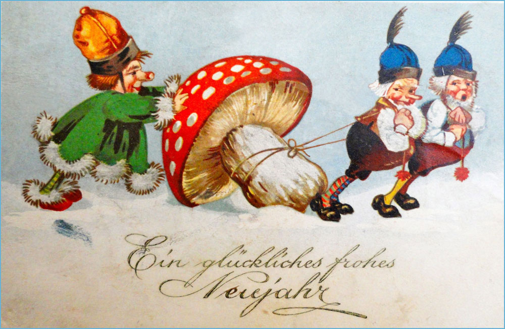
It’s nearly New Year’s eve, and a Friday, which seems like some sort of omen for a gallery of vintage winter postcards featuring toadstools, seeing as Fungus Friday is every bit as tangible as Tentacle Tuesday (go here if you’re late to the tentacle train). The connection between hibernal celebrations and mushrooms might not be an immediately obvious one, but one has to keep in mind that the way we celebrate Christmas is distinctly pagan.
More in reference to mushrooms, it has been argued that Santa Claus actually started out his folkloric life as a shaman who gets high on Amanita* (either by direct consumption, or by drinking the urine of reindeer who have consumed them). When one looks for coincidences, one finds them, but nevertheless it’s worthwhile pointing out that the pine trees we adorn our households with for Christmas form a symbiotic relationship with Amanita muscaria (yes, that iconic red toadstool with white warts that so often stands in for a generic mushroom in many stories), and that Santa Claus’ red-and-white costume follows its colours. For more in-depth analysis, I highly recommend Santa Claus Was a Psychedelic Mushroom (written by Derek Beres, who also coined the great alliteration ‘psychedelic piss’ when discussing reindeer-processed Amanitas).
This claim has been disputed by people (some of whom were foaming at the mouth, and not necessarily from mushroom consumption) who point out that this is rather a case of retro-fitting facts into the storyline. You may accuse me of intellectual laziness, but I actually don’t give a fig about where Santa Claus came from. Of more relevance to me (and this post) is this bit: ‘Fly agaric does not appear in authentic Germanic Christmas cards, they’re New Years cards which use fly agaric as a good luck symbol, alongside horse shoes and four-leaf clovers.’ The Fliegenpilz is indeed a good luck charm in Germany, so that’s quite possible. New Year’s card are certainly germane to this time of year, now that the ecstatic joys of Christmas (ahem) are a week behind us.
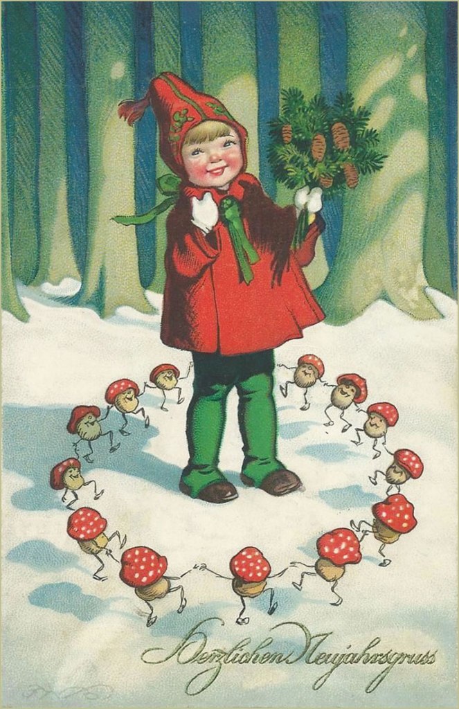
Either way, enjoy the array of vintage postcards from the late 1930s-1940s, most of them German. Whatever they’re supposed to symbolize (the ones with writing do mention New Year, not Christmas), to a modern reader’s eyes they’re delightfully weird, and I won’t blame anyone for thinking that some drugs were involved.
The Amanitas-as-good-luck-charm theory seems to be borne out in the following, given the presence of clover, horse hooves, etc.:
I wonder if the kid in white represents the Destroying Angel (Amanita virosa and similar) – its name gives more than a hint about its toxicity. Perhaps ‘Mushroom Grandpa’ should stay away. Pigs are also a good luck charm, so they make more than one appearance in these postcards (though much like the rabbit’s foot, they’re distinctly unlucky for the actual animal, since they get gobbled up…)
Boldog Új Évet is actually in Hungarian, not German, and means Happy New Year…
… and Daudz laimes jauna gada is in Latvian.
Who knew so much revelry was taking place around a couple of mushrooms?
The closest I was able to find is Head uut aastat, which is Happy New Year in Estonian. This post is proving to be quite a language lesson.
Another Latvian postcard. The one on the left is totally sloshed.
Gelukkig Nieuwjaar is in Dutch.
The rest of these are in German:
There is something disquieting about a pink-cheeked child surrounded by dancing mushrooms.
‘Wow, this thing is big and it’s all for me!’
An Amanita drawn by somebody who wasn’t sure what they looked like (hint: it’s not a raspberry).
Weihnacht is sort of like Christmas eve in German-speaking countries. Note that this postcard differs from others in two ways – it features a bolete, not an Amanita, and wishes the viewer Merry Christmas, not Happy New Year (with a bag full of money, apparently).
Happy New Year to all our dear readers, and may your paths be littered with tasty mushrooms in the coming year!**
*Amanita muscaria is considered poisonous, as far as foraging mushrooms go, though it has a long history of being used as a psychedelic/intoxicant by many tribes (namely, by the indigenous people of Siberia). A strong dose causes delirium and a host of other side-effects, which fade after a few days. I might add that some Russians (and god knows Russians will eat whatever mushroom is even remotely edible – I say that with nothing but admiration) consider it a good edible, provided you boil it in water three times or so. I might try that one of these days! I have no interest in psychedelic properties, but plenty of interest in culinary ones.
« Italy hasn’t had a government since Mussolini. » — Richard M. Nixon
Today, let’s bask in some purely visual glory. Let’s take a gander at a small corner of the mind-boggling œuvre of Averardo Ciriello (1918 – 2016). As you can see from these dates, he was a long-lived fellow, and I’m delighted to report that he was healthy, hearty and active well into his nineties.
He was one of those illustrators who truly delighted in their craft, and so produced an enormous body of work that bore every sign of inspiration and enthusiasm. Since my plan is to focus on a specific period of his career, I’ll skip most of his early work — though it’s well worth returning to — and give you a couple of famous pieces to give you as a sense of his success and importance in his field.
It’s fair to say that Ciriello excelled across the board, likenesses included. This is the Italian poster for 1956’s Forbidden Planet. And this one for 1965’s Bond adventure Thunderball. Since the Bond movies were as much Italian as British production (if not moreso), it’s no surprise that producer Cubby Broccoli did not scrimp, tapping Ciriello for the series’ Italian promotional campaign.
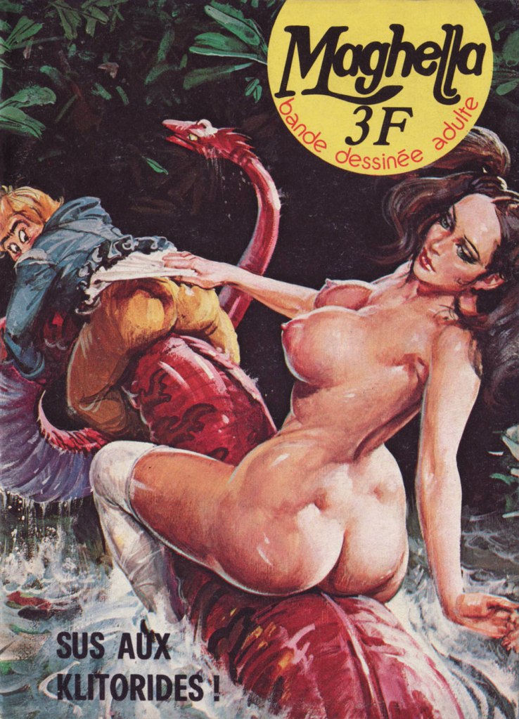
Now for the heart of it: I frankly marvel at Ciriello’s willingness to provide hundreds of cover paintings for cheap, mass market erotica fumetti. The way I see it, it’s evidence that he greatly enjoyed the assignment, and that the money was but a secondary concern at best. We’ve briefly touched upon the Maghella series (in our all-time most popular post, as it happens), but here’s some more.
This is Maghella no. 1 (Nov. 1974, Elvifrance).This is Maghella no. 15 (Oct. 1975, Elvifrance).This is Maghella no. 22 (Mar. 1976, Elvifrance). ‘Gode’, aside from being a city in Ethiopia and a species of fish, is the abbreviation of godemichet, which is to say… a dildo.This is Maghella no. 24 (Apr. 1976, Elvifrance).This is Maghella no. 41 (Apr. 1977, Elvifrance). Since you’re bound to ask, here’s a recipe for Salade russe, which actual Russians call ‘Salade Olivier‘. DS made it for lunch a couple of days ago, and it was delicious.This is Maghella no. 42 (May 1977, Elvifrance). Unlike most artists specialising in ‘erotica’, Ciriello could draw anything, in any style, and effortlessly mix sensuality with comedy with horror with angst. A true master — sorry, maestro. This is Maghella no. 66 (Jan. 1979, Elvifrance).This is Maghella no. 77 (Feb. 1980, Elvifrance). I assure you, those pun-based titles are utterly untranslatable.Censorship inevitably got into the act. Here’s one of several instances, the before (with imposed editorial revision indicated) and after of Maghella no. 110 (Sept. 1978, Publistrip); said censorship seems to have driven up the cover price, to boot. This precious bit of info gleaned from a lovely monograph of the artist, Gianni Brunoro and Franco Giacomini’s Ciriello: Una Vita per l’illustratione(2016, Edizioni Di).
« Crosses and gallows – that deadly historic juxtaposition. » — Howard Zinn
Bonsoir, mesdames et messieurs…
All right, time for me to tackle (though a bit sideways, I’ll explain) another of my daunting heroes. This time out, it’s Frédéric Othon Théodore Aristidès (1931-2013), better — and more simply — known as ‘Fred’.
A compulsive and constant scribbler, he attended no institute of artistic learning but his own (and didn’t bother to complete his secondary education), and made inroads into the field by the dawn of the 1950s, landing in Ici Paris, France-Dimanche, Le Rire, Paris-Presse, France-Soir, Punch, and even as a gagman (uncredited!) for The New Yorker (others, among them Otto Soglow, would illustrate the gags for publication).
Mid-decade, he began his long and fruitful association with Pilote, launching, with the magazine’s 300th issue (July 22, 1965, Dargaud) his undeniable masterpiece, Philémon. And this is where my ‘sideways’ loophole comes in: I’m truly not ready to tackle the overflowing poetic cornucopia that is Philémon. By way of introduction, I’ll stick to the margins and showcase instead some of Fred’s ‘brutish and nasty’ (a rough translation of Hara-Kiri’s motto) panel cartoons and short pieces. There’s a lot to this guy.
Which reminds me of a time, a couple of decades ago, when Montreal’s FIFA (Festival international des films sur l’art/International Festival of Films on Art) presented a series of TV shows showcasing individual cartoonists, among them Chris Ware, Art Spiegelman… and Fred. I recall that Messrs Ware and Spiegelman were just as miserable and neurotic as expected, there was also this Manga master that felt trapped as a cog in an assembly line. Meanwhile, in sharp contrast to the existential angst, Fred was brimming with evident delight and joie de vivre at his good fortune to be a working cartoonist*, grinning and scribbling in his sun-dappled studio, leisurely strolling through his village, charming the ladies, enjoying a glass of wine and a wedge of fine aged cheese… I concluded that here was an eloquent encapsulation of the respective cartooning cultures of a few nations. Regrettably, I haven’t been able to track down this documentary series, not even in the FIFA archives. Nevertheless, here’s a short visit with the dear man, by then living in Paris.
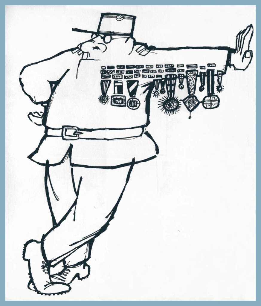
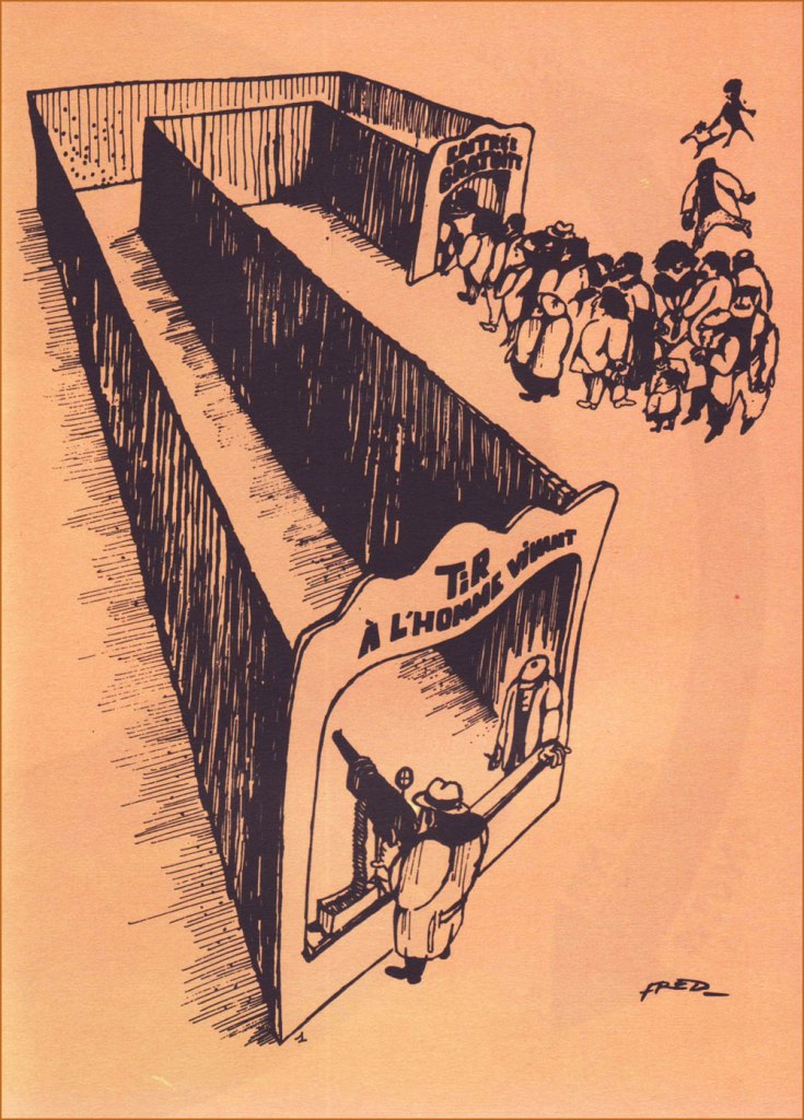
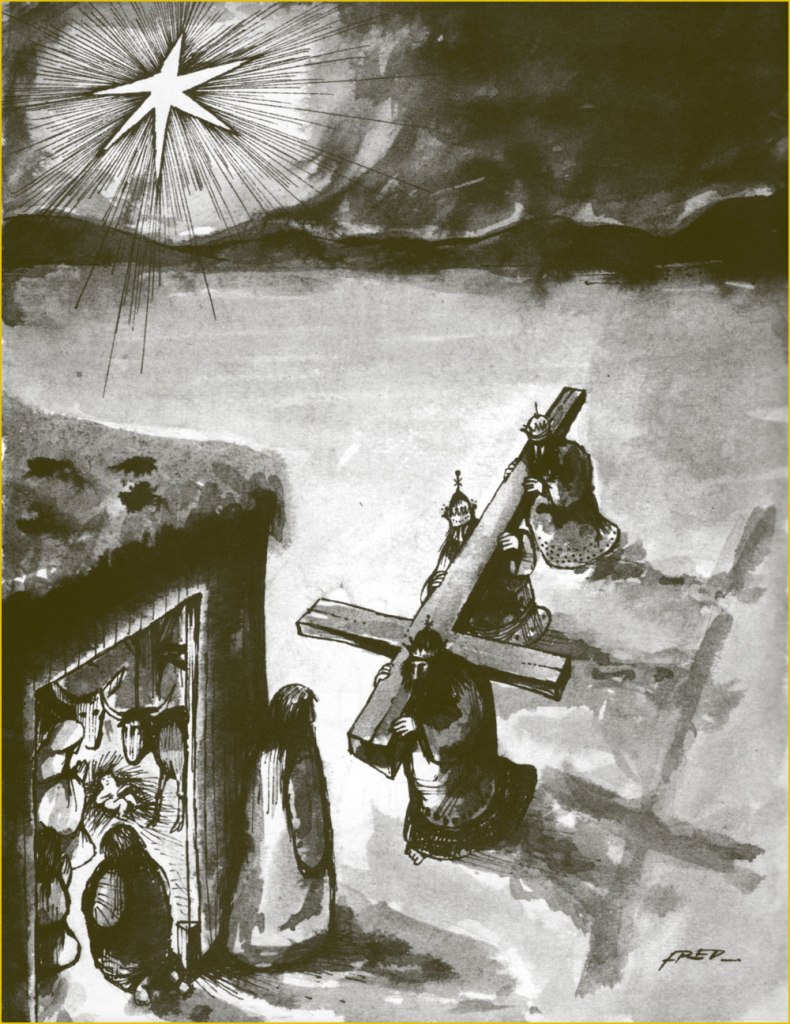
As life tends to imitate art, so has this more or less come to pass.Obviously, you can’t nag anyone into quitting. This ingenious collage strip appeared in Pilote no. 670 (Sept. 1972, Dargaud). An example — quite literally — of gallows humour. Too much of a good thing can kill you — or ‘You may come to rue your mockery’.If one looks for common ground between the more… mordant of French cartoonists, you’ll find their shared, blistering contempt for their nation’s Military brass.The title is a French idiom which roughly translates to “There’s a nip in the air”. This collection of short pieces Fred wrote and drew for Pilote was published in early 1973 by Dargaud.At one end, “Live Human Shooting”; at the other, “Free Admission”.You want it darker? Oh, and also seasonal? Well, your wish is my command.
-RG
*this is serious, though: when Fred stopped drawing comics in the late 1980s, he fell into a deep depression and wound up in a psychiatric hospital. The cure? A return to creating comics. Surely there’s a lesson in this.