« I prefer hallucinations ’cause they tend to make more sense than experience. » — Todd Rundgren
Today, I’m mixing things up a bit and heading over to Europe. We’ll be looking at various versions of « Le seuil du vide » (Threshold of the Void) a story by André Ruellan (1922-2016), aka Kurt Steiner.
At left, the original novel, published in 1956; at right, the comics adaptation, published in 1973. Believe it or not , both covers are the work of the same man, the prolific Michel Gourdon (1925-2011). He had a predilection for a palette of green and blue hues.
The plot, in a few broad strokes: Young painter Wanda Leibovitz comes to Paris, hoping to forget a romance gone wrong. At the train station, upon her arrival in town, Wanda encounters a mysterious old lady offering to rent her a room, but under certain conditions…
Basically, it’s the ‘New Bodies for Old’ plot, and it ends as bleakly as you might imagine. Ruellan/Steiner wasn’t the least bit afraid to probe the darkness. The victim’s innocence was no protection against the forces besieging her, to put it mildly.
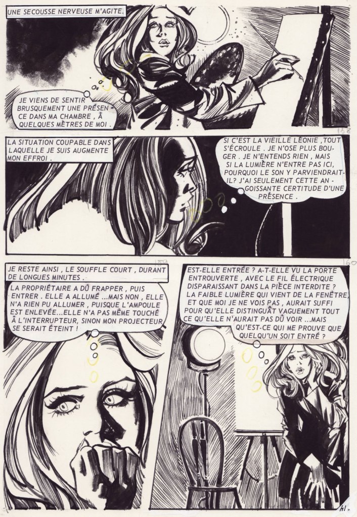
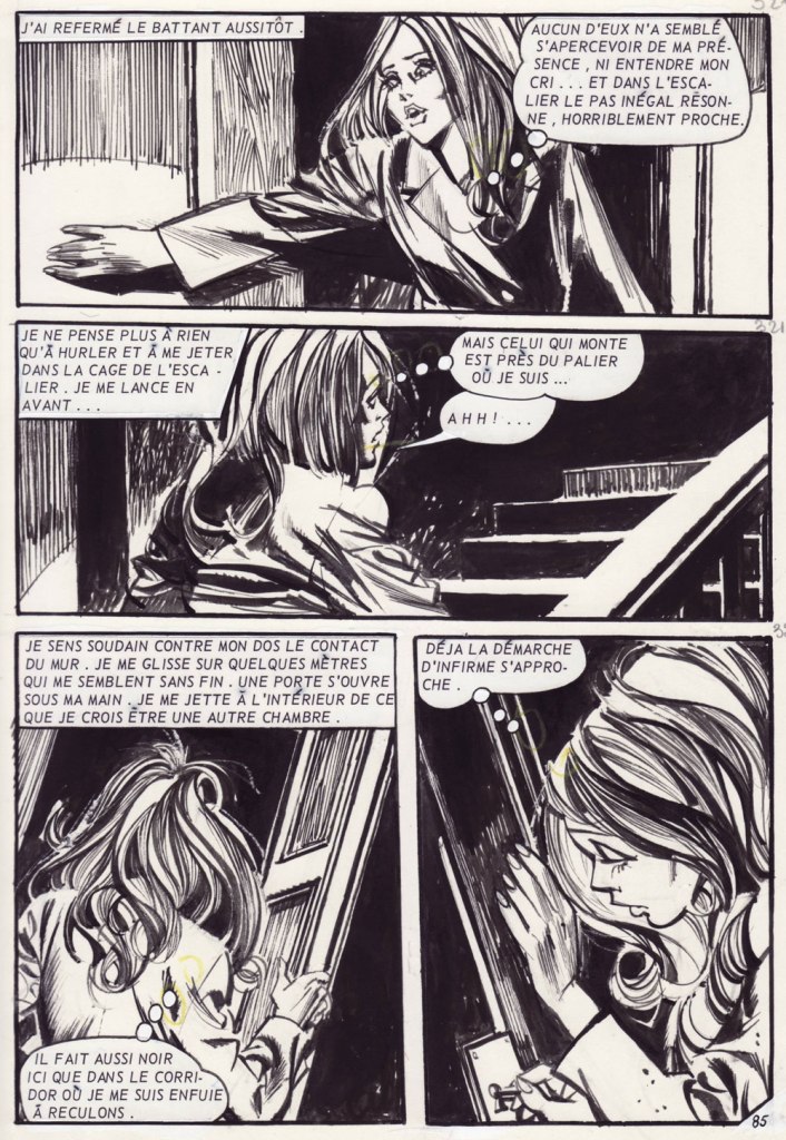
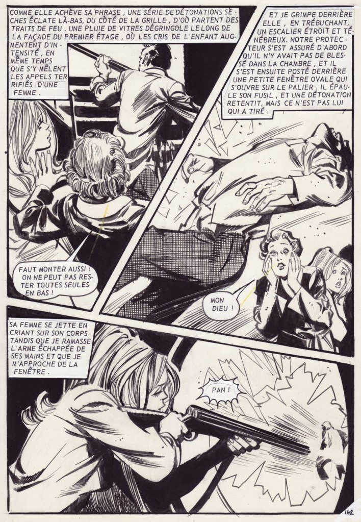
Here are a few interior pages from the Arédit adaptation, featuring art by Cándido Ruiz Pueyo.
There was also a movie adaptation by an ambitious young filmmaker by the name of Jean-François Davy. This was his third try at getting a project off the ground and into cinemas, and his only horror film. They just weren’t making such films in France in those days — the iconoclastic Jean Rollin being the notable exception — in Belgium, sure, but not in France. It took some doing to get the project (barely) financed, lensed and distributed, and its director wound up turning to porn for the rest of his career — hilariously titled porn, to be fair.
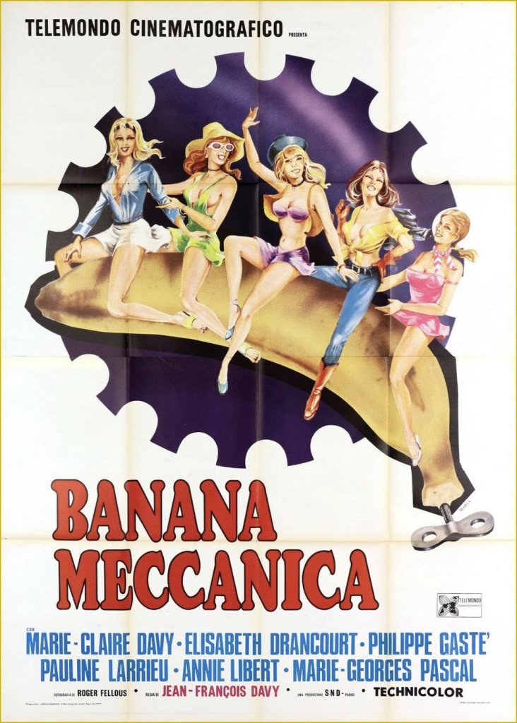
The film features such luminaries as Rififi‘s unforgettable Jean Servais, along with a non-coincidental cameo by (yet to be filmed) The Tenant author Roland Topor. Davy soon attained greater commercial success with his Bananes mécaniques, nominally a Clockwork Orange parody.
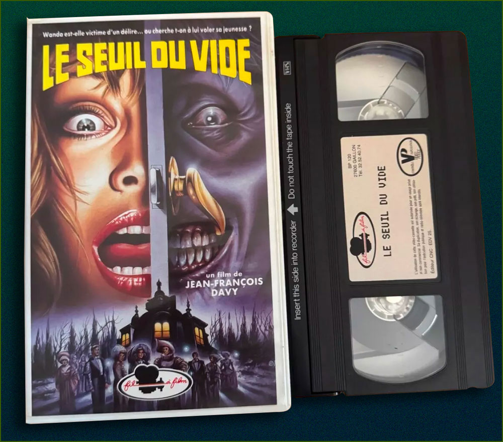
And here’s the VHS release, featuring the film’s original poster. Airbrush!
« Daddy had an argument on Friday night, with a man from outer space. Daddy said, ‘I don’t care where you’re from, you’re in my parking space!’ » — Colin McNaughton
Here we are, against all odds, at the beginning of yet another edition of WOT?’s annual Hallowe’en Countdown… hope you enjoy the bumpy — that’s the spirit! — ride.
This time, our opening salvo comes courtesy of British illustrator-poet Colin McNaughton (born 1951). Though I’ve been known to haunt used bookstores whenever the occasion arises, I’ve but once encountered a single one of Mr. McNaughton’s productions, a couple of decades ago at that… which is odd, given his rather prodigious output: over seventy books! That said, my mama having raised no fool (my brother notwithstanding), I unerringly grabbed it.
As it happens, Wikipedia claims — though without any context or evidence — that « His most notable book is perhaps There’s an Awful Lot of Weirdos in Our Neighbourhood »… but I’ll accept it unless a stronger claim comes along. It’s a truly splendid tome.
Oh, and here’s the requisite snatch of (auto?) biography: « Growing up in his native England, the young Colin McNaughton had little indication that he would one day become an author-illustrator. There were no books at all in his parents’ home, he recalls, but there were always comics. These were his formative literature, and their slapstick humor has been a lasting influence. “I’ve been talking about the comic format for years,” he says. “It’s the modern way of telling stories for today’s children; it’s about movement, the step between film and the book.” »
I can live with that. enjoy!
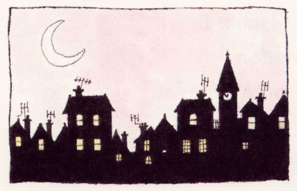
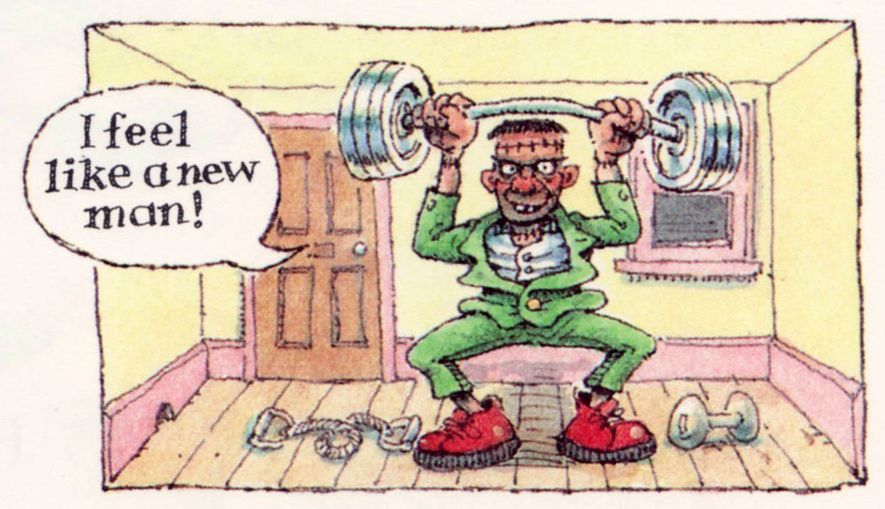
There’s an awful lot of weirdos in our neighbourhood! Yes, there’s an awful lot of weirdos in our neighbourhood!I know this physical wreck, who has a bolt through his neck! There’s an awful lot of weirdos in our neighbourhood!And in an upstairs room, an old lady rides a broom! There’s an awful lot of weirdos in our neighbourhood.A man lives on the square, when he’s in he isn’t there! There’s an awful lot of weirdos in our neighbourhood.And that woman down the block, whose snaky hair’s a shock! There’s an awful lot of weirdos in our neighbourhood.We’ve a strange old feller, with horns, down in the cellar! There’s an awful lot of weirdos in our neighbourhood.There’s a guy who’s green and scaly, has webbed feet and sells fish daily! There’s an awful lot of weirdos in our neighbourhood.And someone near the dairy, when the moon is out gets hairy! There’s an awful lot of weirdos in our neighbourhood.Think I’ll leave this miscellanea, and return to Transylvania, ’cause there’s an awful lot of weirdos in our neighbourhood!
How about one more? One more it is!
Mum! The garden’s full of witches! Come quick and see the witches. There’s a full moon out, and they’re flying about, come on! You’ll miss the witches.
Oh, Mum! You’re missing the witches. You have never seen so many witches. They are casting spells! There are horrible smells! Come on! You’ll miss the witches.
Mum, hurry! Come look at the witches. The shrubbery’s bursting with witches. They’ve turned our Joan into a garden gnome. Come on! You’ll miss the witches.
Oh no! You’ll miss the witches. The garden’s black with witches. Come on! Come on! Too late! They’ve gone. Oh, you always miss the witches.
« Better to have a lousy character than no character at all. » — Alain Delon (Nov. 8, 1935 – Aug. 18, 2024)
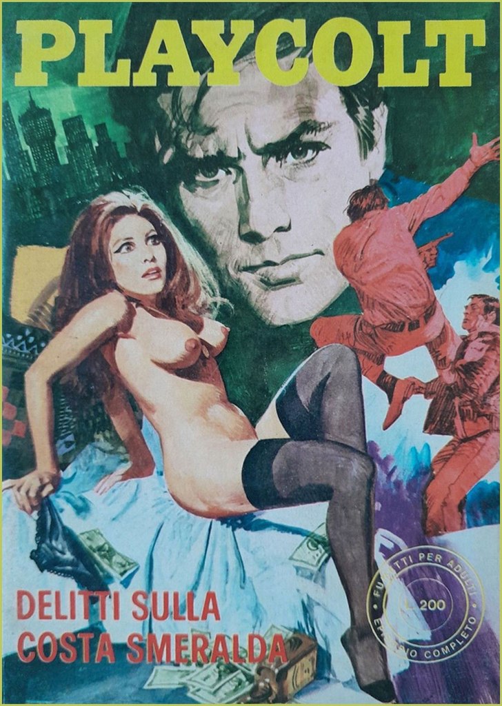
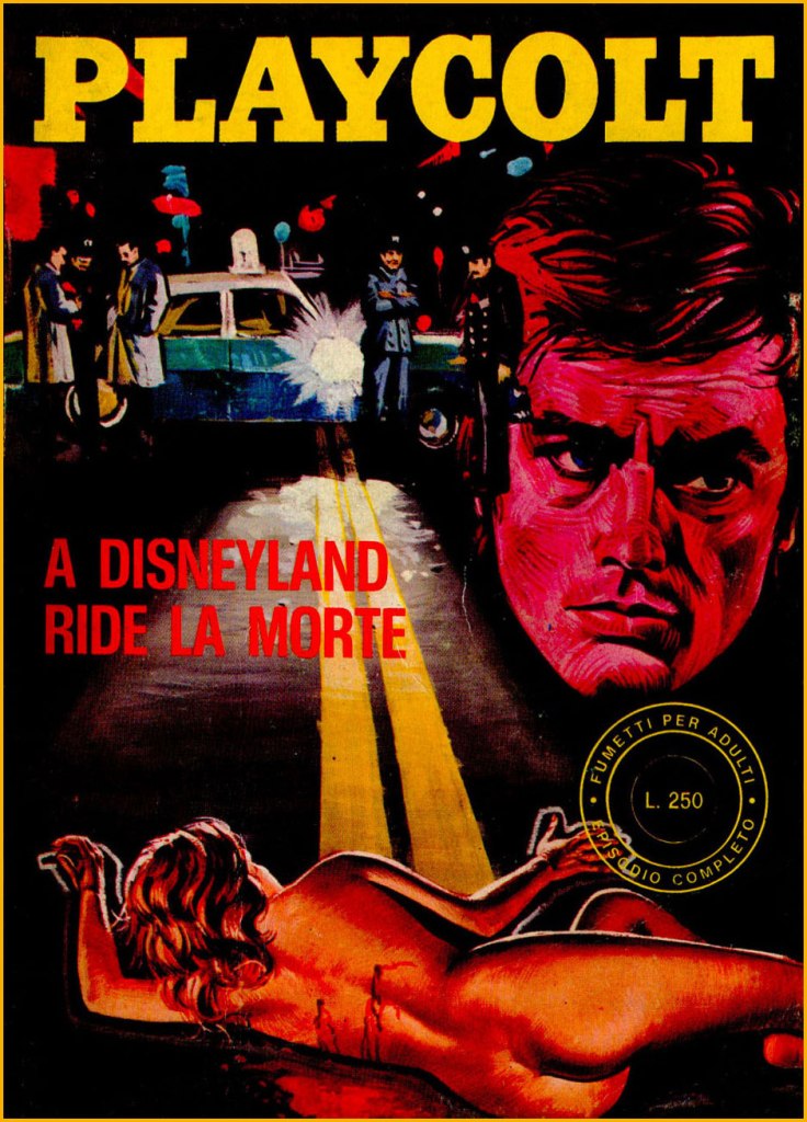
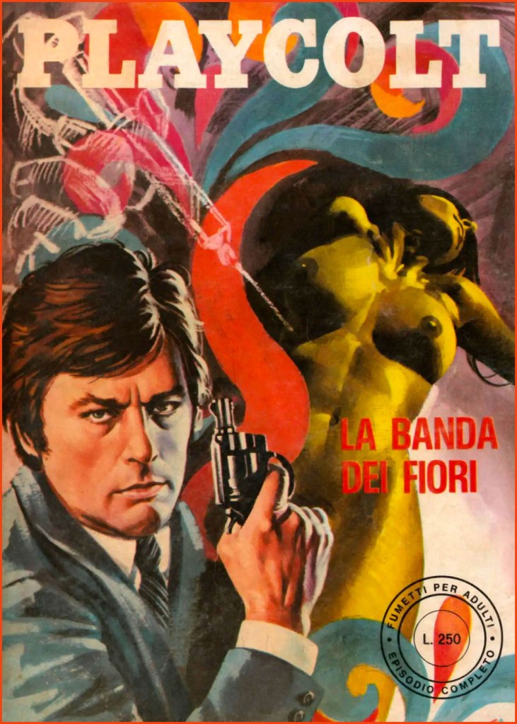
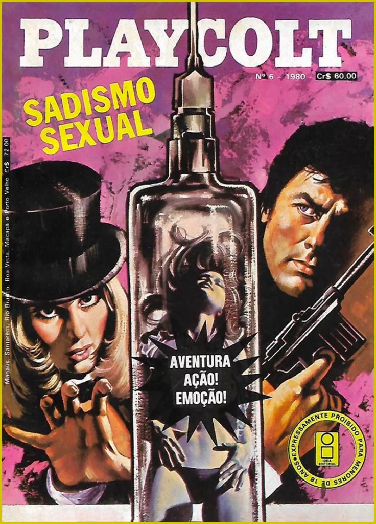
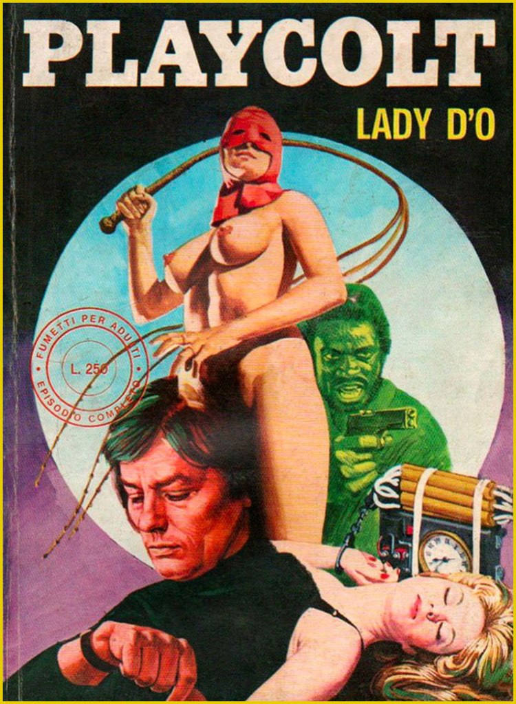
Quite recently, we lost monstre sacréAlain Delon. He was a complicated man, a bit of a prickly bastard, but he sure made a lot of great movies*. But comics, you ask? Well, I’m sure he never asked for it, but like many a celebrity (Jean-Paul Belmondo, Ornella Muti…) his famous countenance was appropriated by those incorrigible rascals at Edifumetto and Ediperiodici.
So Alain Delon became… « Alain Velon, a billionaire playboy who lives on an island “a 3-hour flight from New York“. He spends his private life conquering women in a continuous stream even if he is already engaged to the film actress Lizzy Scarlett, but “due to his innate sense of justice” he periodically transforms into Playcolt, a sort of superhero. His enemy is Linda Darnel, also a billionaire: sadistic and fetishist, she turns into the anti-heroine Za the Dead. Another historical rival is the always sadistic but lesbian Mandrakka. »
Now don’t get me wrong: these are virtually unreadable, poorly drawn, sadistic, illogical, reactionary misogynistic claptrap. But the covers are fascinating in their gonzo way, randomly cobbling together purloined bits from famous likenesses to established logos. You’d think this brazen wave of wholesale filching would have led to swift and decisive legal action from several stars’ solicitors, not to mention Hugh Hefner’s… but it seems not. This was, after all, the Italy that gave us Silvio Berlusconi.
« To the Sound of Punches »; this is Playcolt Series II no. 9 (Nov. 1973, Edifumetto). Cover art by Carlo Jacono, a nice piece, but celebrity likenesses evidently weren’t among his strong suits.« Crimes on the Emerald Coast »; this is Playcolt Series II no. 14 (Aug. 1973, Edifumetto). This one’s *possibly* the work of Alessandro Biffignandi… or his studio.« The Golden Rain » (ahem); this is Playcolt Series II no. 23 (Dec. 1973, Edifumetto). Another Jacono, another botched likeness.« The Divine Sadist »; this is Playcolt Series III no. 1 (July 1974, Edifumetto). « Death laughs in Disneyland »; this is Playcolt Series III no. 11 (June 1974, Edifumetto). « There’s a mess in the middle of the sea »; a 1980 Brazilian edition reprinting Playcolt Series III no. 18 (Sept. 1974) in Portuguese. « The Flower Gang »; this is Playcolt Series III no. 22 (Nov. 1974, Edifumetto). I have no concrete evidence, but the technique displayed here reminds me strongly of British illustrator-cartoonist Ron Embleton (1930-1988), co-creator of Oh, Wicked Wanda! and illustrator of the immortal Captain Scarlet closing credits.No need for a translation, is there? A 1980 Brazilian edition reprinting Playcolt Series IV no. 1 (Jan. 1975) in Portuguese. « Operation Puzzle »; this is Playcolt Series IV no. 12 (Nov. 1975, Edifumetto). Cover painted by the prolific Emanuele Taglietti, who handled quite a few covers in this series. Here’s an impressive gallery of these.« The White Shark »; this is Playcolt Series IV no. 35 (May 1976, Edifumetto). Sharks were all the rage that year.« To Love a Hole »; a 1980 Brazilian edition reprinting Playcolt Series IV no. 2 (Jan. 1975). Dig that strategic blurb placement; the Italian edition was not so coy. Clearly a reference to the previous year’s hit ‘erotic’ film, L’histoire d’O; this is Playcolt Series IV no. 27 (Jan. 1976, Edifumetto). It’s funny how the Delon photos used span his career up to that point, which yields visual whiplash when you go from the Delon of Plein Soleil to the jaded, grizzled one of, say, Monsieur Klein or La mort d’un pourri from one issue to the next.« Terror in California »; this is Playcolt Series IV no. 44 (Oct. 1976, Edifumetto). The obligatory Jaws cash-in. Say what you will, those Italians didn’t miss a trick.
There was, concurrently, another Delon homage in Jean Ollivier and Raffaele Carlo Marcello‘s successful Docteur Justice, a humane but hard-hitting series about a physician and expert judoka who roams the globe’s trouble spots for the World Health Organization. There was even a film adaptation in 1975, with John Phillip Law essaying the title role… and co-starring Delon’s ex — and only — wife, Nathalie. Among Pif Gadget’s adventure series, it was only bested in popularity by the prehistoric blond heartthrob Rahan. I’ll tell you more about it one of these days.
-RG
*So claims the Russian pop song entitled Взгляд с экрана, and who are we to doubt it?
Back of Bob Foster’s Myron Moose no. 1 (Myron Moose Comic Book Works, 1971); this art print was also released years later, as can be seen by the date on it.
We are technically a three-cat household — that’s how many cats we had decided we could comfortably handle. For a while we stuck to this number, and when one cat departed, another one would come to take his place. Then number four walked through the door — he was sort of a part-time cat, until he became decidedly one of ours. Well, four isn’t that much more work than three. When number five appeared, bedraggled, underfed and with a perpetually sad expression (‘he had that look you very rarely find — the haunting, hunted kind‘, to quote Tim Rice), we wanted to give him to a rescue society… and of course ended up keeping him.
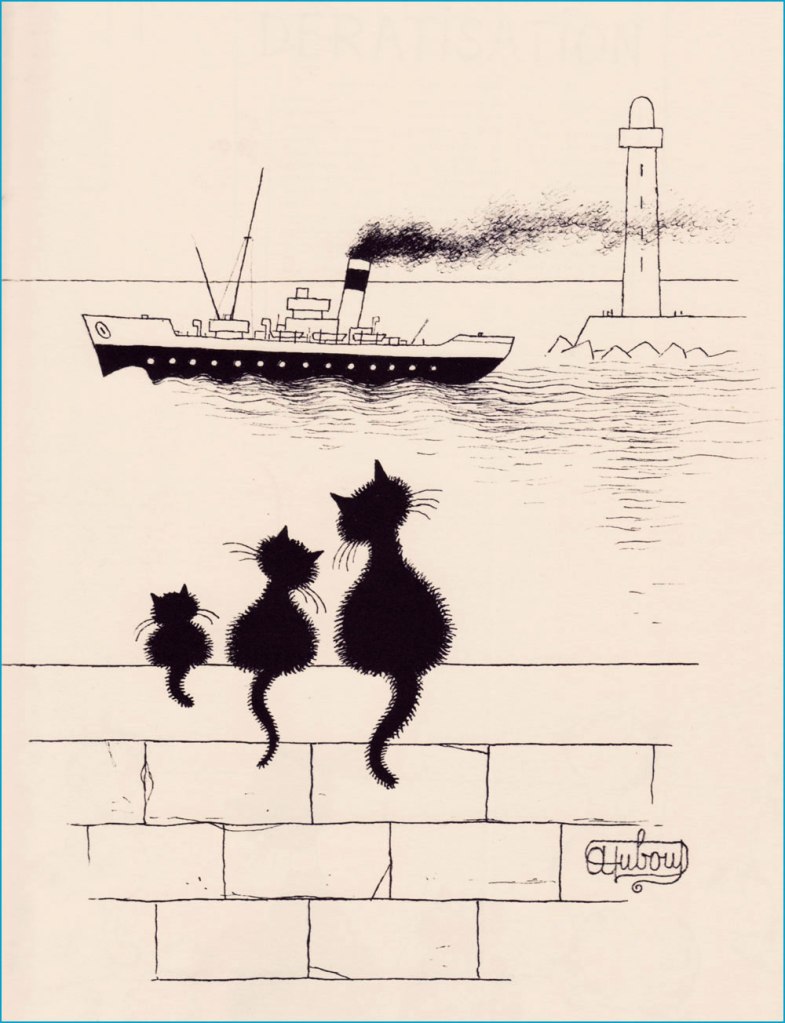
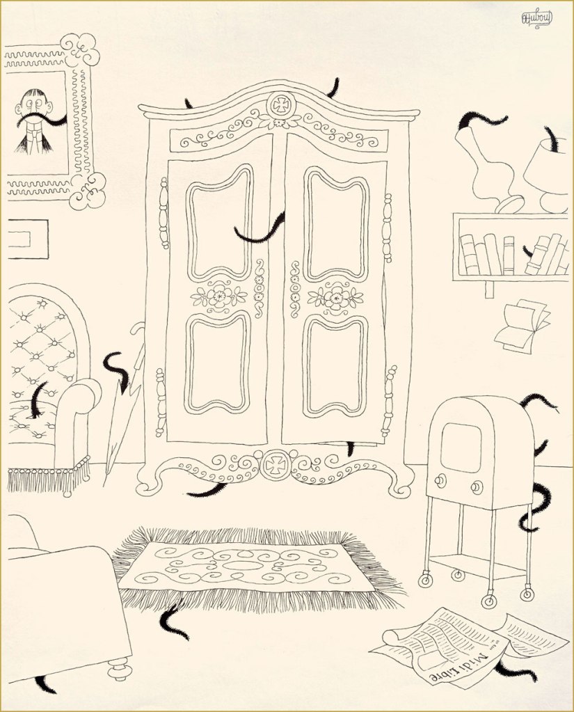
Albert Dubout (born as lbert Dubout, 1905-1976), was primarily an illustrator of books (notably, his amical collaboration with French writer San-Antonio, many of whose novels proudly bore Dubout’s covers and inside illustrations), and, with equal talent, a cartoonist and poster designer (check out some of his film posters here), not to mention a calligrapher with a number of delightfully mellifluous signatures. His official website can be found here, in case you want to take a peek.
The following excerpts have been scanned from Les chats (Editions Hoebeke, 1999).
*I don’t like Hemingway at all, but I do have a certain grudging respect for a man who kept some 40+ cats. Rhetorical question: are cats living at that high a density within one house really having a good time?
« Looking for love is tricky business, like whipping a carousel horse. » — George Cukor
As I’ve noticed that we’ve been dwelling strictly in the cartoonier suburbs of late, allow me to gently nudge us into the realm of high-end draftsmanship and bravura technique for a change. In so doing, let us turn the clock back a century or thereabouts.
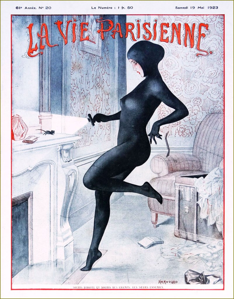
French cartoonist-illustrator Chéri Hérouard, né Chéri-Louis-Marie-Aimé Haumé (1881-1961) is mostly renowned for his lengthy and fruitful (1910-1940) association with the ‘mildly risqué’ weekly La Vie parisienne. It is said that « During World War I, General Pershing personally warned American servicemen against purchasing the magazine, which boosted its popularity in the United States. » There always was — and let’s hope there always shall be! — considerable difference between the French and American mindsets.
« The Nightmare of Coal », Hérouard’s cover for La vie parisienne’s November 1st, 1919 edition. For those interested, there’s a classy hardcover collection entitled La vie parisienne: Covers & Cartoons 1917-1922 (Dover/Calla Editions, 2018). The art restoration is flawlessly executed and the translation is often hilariously botched. La vie parisienne’s May 19, 1923 issue. « The hotel mouse and the field mouse: enemy sisters ». A ‘souris d’hôtel’ was a thief that plied her trade in chic hotels. A cat burglar of a sort. This sleekly sexy look is clearly based on Musidora‘s legendary turn as Irma Vep in pioneering cinéaste Louis Feuillade‘s epic 1915 serial Les Vampires.
Like many of the best and most free-spirited cartoonists, Hérouard illustrated books and magazines aimed at both innocent and decidedly roué readerships…
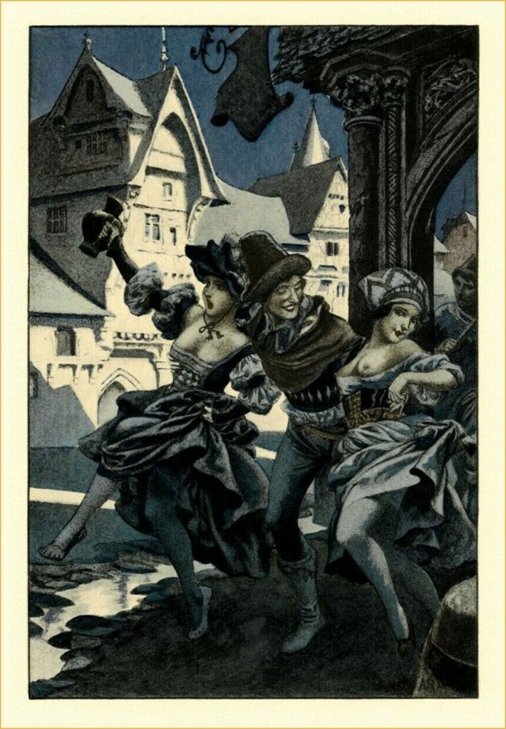
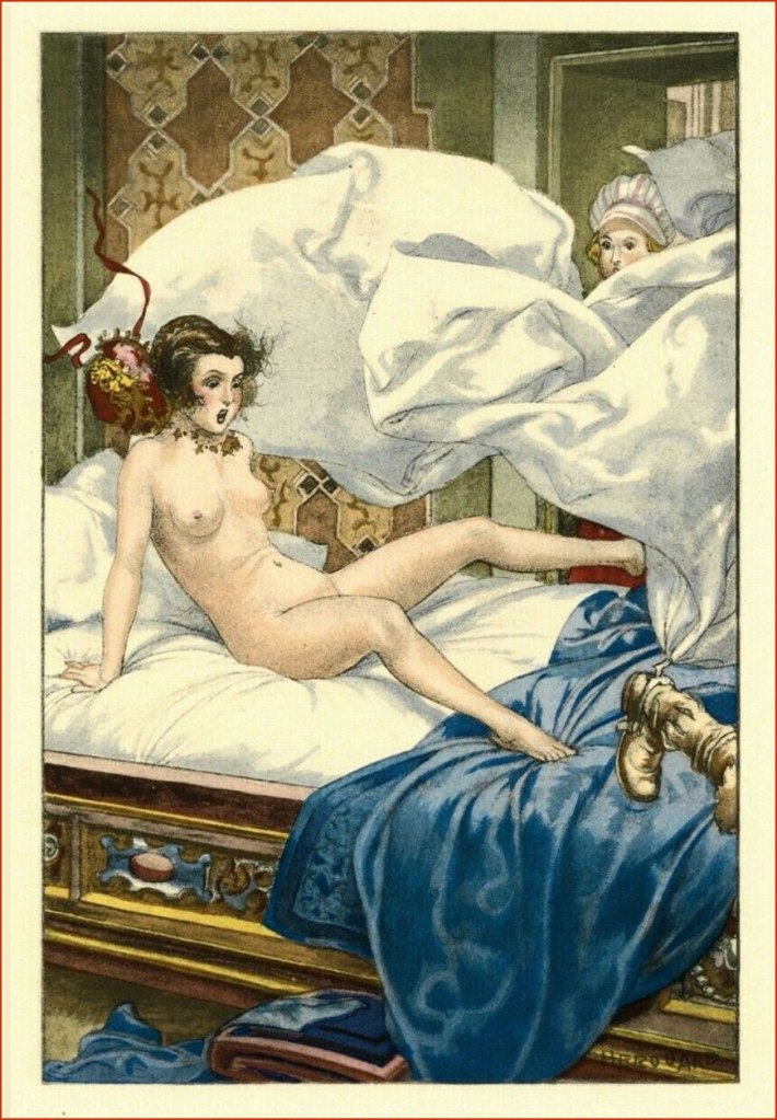
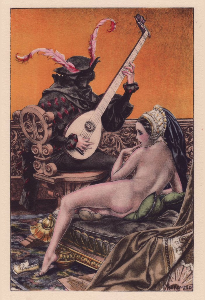
To wit, Hérouard produced sixty-four illustrations for a four-volume set of ribald historical tales entitled L’Heptaméron des Nouvelles de la Reine de Navarre — which is to say Marguerite de Navarre (1492–1549) — in a rather exclusive print run of 1540 copies (Javal et Bourdeaux, Paris, 1932). It was quite a challenge to pick just a handful. If you want them all, here’s a copy for sale… while it lasts!
.
Even with a limited colour palette, Hérouard was a master of light and shadow.
.
.
.
.
.
Admire the depth of field in this image… so many planes, and yet it never feels cluttered. That’s composition (among other things).
In addition to the book, hand-coloured engravings of the illustrations were produced in a run of five hundred. I recently acquired my very favourite of the lot, and the kind seller graciously included an uncoloured version for comparison. And so, before:
… and after!
Some background on the technique of stencil colouring: the stencil is created using a zinc sheet one-tenth of a millimetre thick. Using a very sharp metal blade, previously traced openings are cut into the zinc sheet, according to the drawing and colour required. The stencil is then applied upon the printed proof (e.g. engraving, lithograph or phototype). For faithful reproduction, the necessary number of stencils must be traced and cut (an average of fifteen to forty stencils, sometimes up to sixty for more delicate works). In the course of the tracing, one must determine the range of values of each colour, beginning with the lightest, and define with precision the shape and location of the gradations, keeping in mind the effects of superposition. For each stencil, the colour must be prepared, taking care to maintain its tonal intensity throughout the printing process. This colour — be it gouache, watercolour, India ink or wash — will be applied using a special round hog bristle brush. In the case of certain stencils, the colour will be softened after its application, mixed and blended using a small softening brush.
Oof! Given the immensity and delicateness of the task, it must be noted that the colourist in question was one ‘Jacomet’, presumably Daniel Jacomet (1894-1966). Bravo!
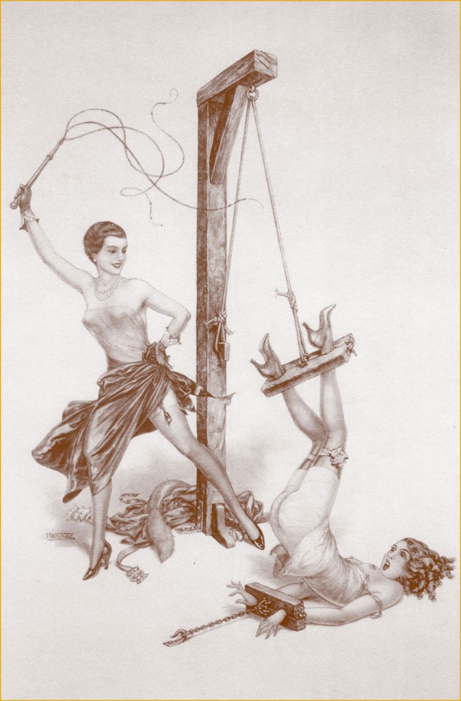
And finally, here’s a… striking quartet of sepia rotogravure etchings, which were discreetly sold as a set in the years just preceding the second world war. For these, Hérouard adopted the transparent pseudonym of ‘Herric’… but the style is unmistakable.
« After the horrors of 14-18, the healthy pleasures of peace. »
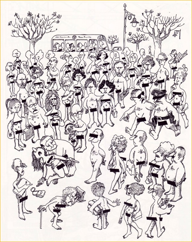
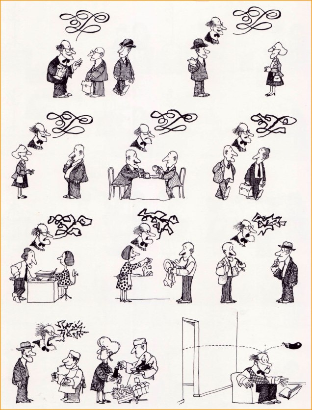
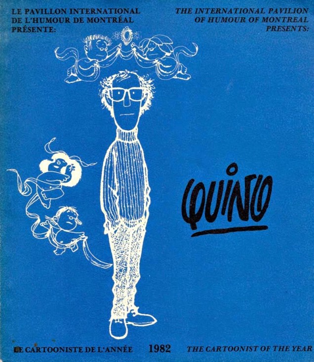
«When searching for a parallel in the pantheon of movie comedy or for a quick way to understand Quino’s work without Googling a single panel, you should think of him as a more disappointed Jacques Tati, the French director of Playtime and Mon Oncle, who was, like Quino, fascinated by architecture. »
In the early days of WOT, before I got used to the blog format (as opposed to posting-on-Facebook format), sometimes my posts only contained a few images. Idly looking through my library the other day, I concluded that it’s a pity Argentine cartoonist Quino is only represented by three selections from a collection specifically about food (the aforementioned post — from 2017, what children we were then! –is (27178) Quino*).
Joaquín Salvador Lavado Tejón was alive in 2017, but now he is dead. He died in 2020 in Argentina, having returned to his place of birth after a long exile, after the National Reorganization Process was dismantled and democracy restored, in 1983. He did not live to see the election of bedlamite right-wing Javier Milei in 2023, which is probably just as well.
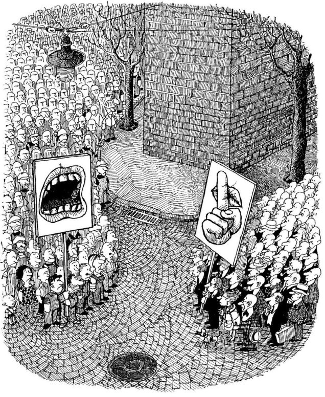
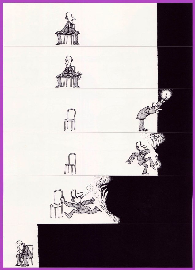
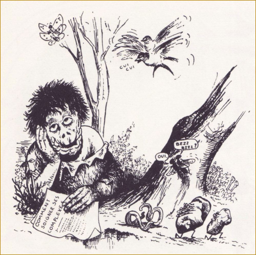
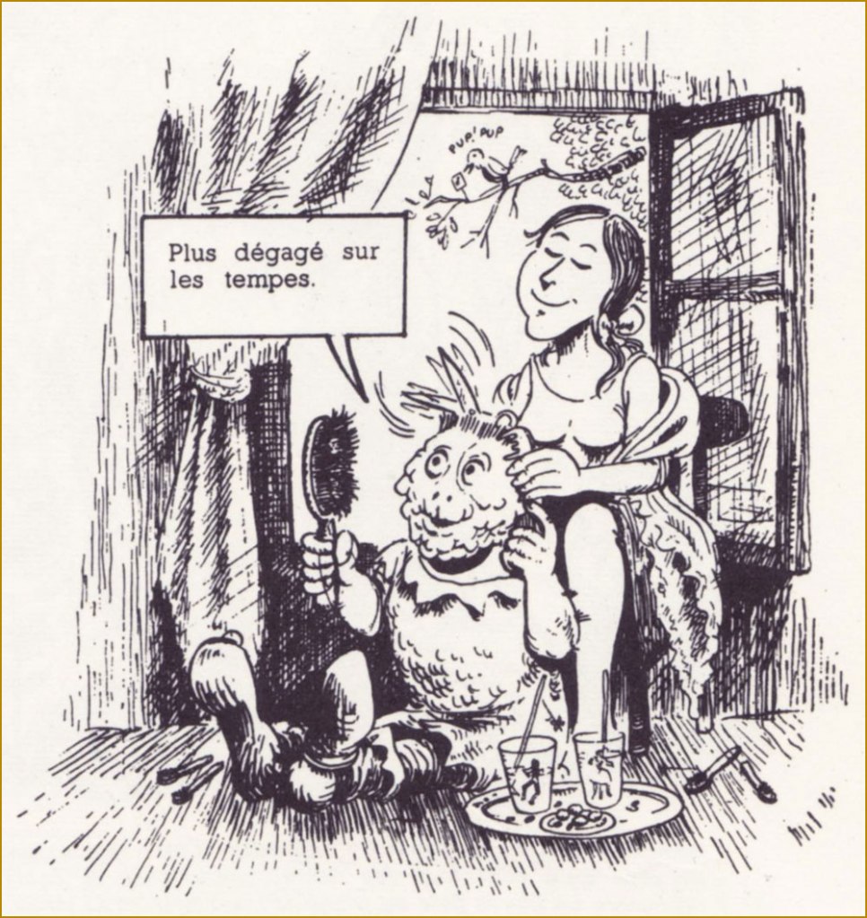
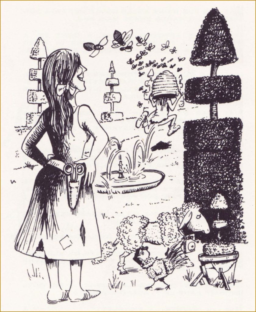
This is definitely not the place for provocative political discussions, but how offensive can a few smooth ink lines on paper be? Interpret the following as you will.
« “Violence is everywhere,” stated Quino, in Pergolini’s 2014 interview. He was talking about ants. The ants he used to watch and move around in his childhood home. His cartooning, adored even by his always-quoted Umberto Eco, feels like an echo of that idea: Violence is everywhere. But, at least in his work, genius is also everywhere, as well as his heartfelt indignation, fueling one of the brightest of 20th-century takes on humanity. »
~ ds
P.S. While looking up stuff for this post, I stumbled across a « Quino AI Art Style Inspiration » (which has very little to do with Quino’s style or raison d’être). No comment needed.
« The majority has no right to impose its stupidity on the minority. » — George Wolinski (1934-2015)
I realised this morning that yesterday was Mr. Wolinski’s birthday, so here’s a quick post. Despite what one might expect from the name, Wolinski was born in Tunisia; aged eighty, he perished in the terrorist attack on the Parisian offices of Charlie-Hebdo on that grim Wednesday of January 2015. For more context, see last year’s related post Never Forget: Cabu, le grand Duduche.
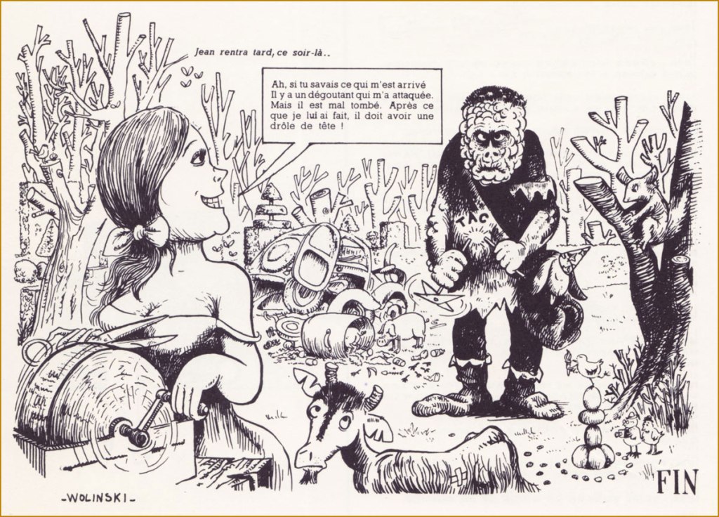
It would be futile to attempt to do justice to a brilliant, prolific and varied career spanning seven decades, so I won’t waste anyone’s time with such foolishness. Here’s Lambiek’s biographical essay, and here’s a conte cruel from Wolinski’s first solo collection, Histoires lamentables (1965, Hara-Kiri).
« Jean was the lone survivor of a fire that claimed his entire family. Having suffered atrocious burns to the face, he was as hideous as one could imagine. In order to avoid exposing others to that grim spectacle, he went to live deep in the woods with the wild beasts. However, each year, the returning Spring invoked in him strange reveries. » A PATHETIC TALE. « He then could not refrain from lurking about the homes of men. And so it was, one day, that he heard Isabelle’s song. Her voice made him forget his usual caution. » « Isabelle was blind. At the idea that she could not witness his ugliness, Jean felt an extraordinary emotion. He found the courage to speak to her. She responded with kindness, and he dared return. » « Soon, they became inseparable, and at last Isabelle agreed to follow him into the forest. »« Long months of happiness ensued. And then, Isabelle realised that, little by little, her sight was returning. When Jean learned the wonderful news, he was at once happy and desperate. Because he could no believe that Isabelle would remain by his side, now that she saw his ugliness. But Isabelle told him that his physical appearance mattered little to her, and that she would always love him. »« Jean, however, could not help but be miserable. One day, as he was hunting for mushrooms in the forest, he came upon a hare caught in a snare, pitied him and set him free. As it happened, that hare was a powerful genie who, in gratitude, transformed him into a handsome young man. »« Jean, delirious with joy, ran to meet Isabelle. The young girl was working at the beehive. Jean took her in his arms. »« Sweet Isabelle, assailed by this young stranger and fearing for her virtue, crowned him with the hive. »« Panicked with suffering, poor Jean fled like a madman. »« That evening, Jean returned late… » « Ah, if you only knew what happened to me. Some horrid masher attacked me. But I gave him a bad time. After what I’ve done to him, he must look quite a fright! »
from the look of this early style, I get the sense that young Wolinski was under the artistic sway of, say, Will Elder and Al Jaffee…. not a bad place to start!
Here’s a trio of his early gag cartoons (circa the early 1960s), working in a more natural, more direct style:
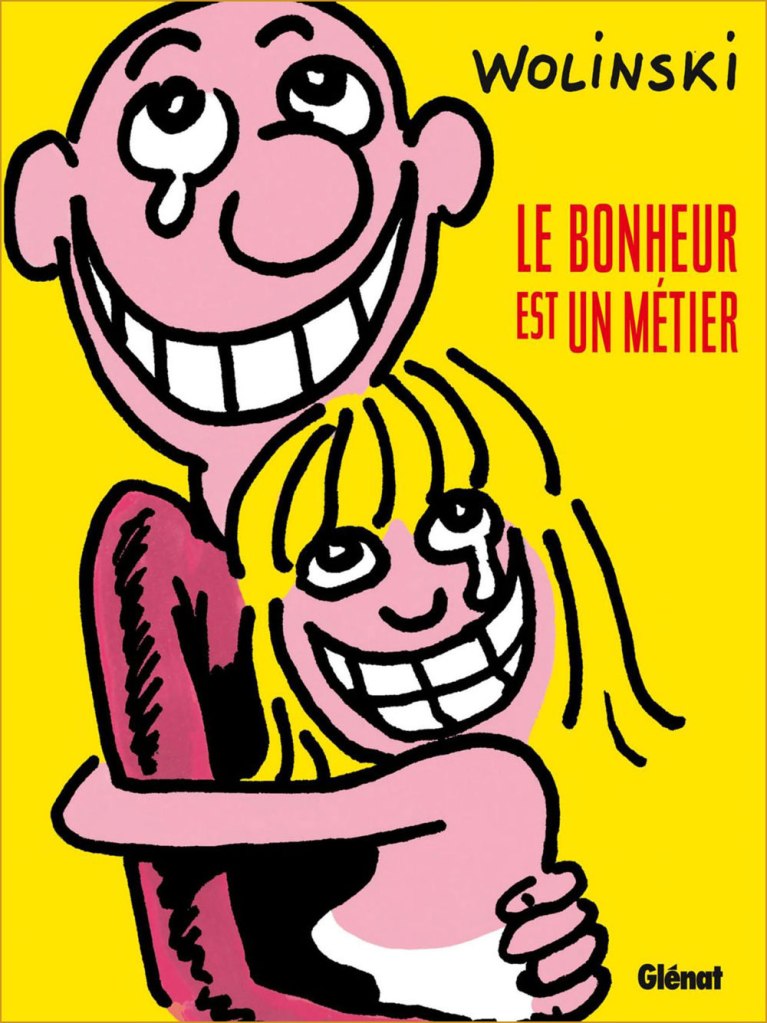
« Working in collaboration means spending half of one’s time explaining to the other that his ideas are stupid. » Wolinski served as the editor-in-chief of Charlie Mensuel from 1970 to 1981. His chief non-editorial contribution was his scripting, for his friend — and fellow Georges — Pichard, the adventures of Paulette, which ran in the magazine from 1970 to 1976. For more Pichard (and Paulette!), check out ds’ post Georges Pichard’s Distressing Damsels. This is Charlie Mensuel no. 80 (Sept. 1975), art — naturally — by Georges Pichard.« Happiness is an occupation » (2016, Glénat). Here’s an example of Wolinski’s fully evolved, more streamlined visual style, from the cover of a posthumous autobiographical collection. Wolinski was interred in Paris’ Cimetière du Montparnasse. Photo by Stéphane X. « Murdered on January 7 during the attack against Charlie-Hebdo. »
Despite the online abundance of all manner of cat cartoons, the work of Russian artist Vasya Lozhkin (the nom de plume of Alexei Kudelin, born in 1976, lawyer by profession) stands out. Passed around on social media with equal enthusiasm by housewives looking for a giggle, journalists foraging for a satirical cartoon to supplement an article, and art lovers with a penchant for the feline, his paintings run the gamut from wistfully sentimental to quite scary, often in some combination thereof.
One can argue whether Lozhkin is actually an Artist or not (capital A intended) — he himself says that he loves painting, but is no painter. As far as I’m concerned, his eye for colour and striking compositions compensate for whatever deficiency may exist in terms of actual drawing talent. He’s unabashedly prolific, returning again and again to the same themes, populating his world with an addictive medley of orange tomcats, grannies of a threatening disposition, sad Slavic bears and grey bureaucrats of ill intent… as well as good sprinkle of ‘ordinary’ people gone mad, with or without the presence of alcohol. There’s a lot of alcohol.
‘I’m an artist! I have a certificate!’ The author posing next to one of his paintings.
It is Lozhkin’s cats that mostly grab the public’s fickle heart, thus providing their creator with what must be a fairly steady income from knick-knacks of all kinds, à la Kliban*. I’m glad. If it didn’t involve ordering stuff from Russia, I’d be first in line for, say, a mug or two. He has produced something like five thousand paintings so far, exhibiting no shyness whatsoever about recreating particularly successful canvases. He notes that ‘I like cats, but so does my audience. Since my job is to feed my family, I feed it with cats.’ His pragmatism strikes one as being almost defensive.
« Life is a merry carnival »
«Smile, and this world will smile back at you! »
« Talking about the ideas behind Lozhkin’s paintings is like explaining a joke — the explanation will not make it funnier or clearer. His metaphysical world is a sort of peculiar successor to the classic Lubok, where a highly amusing image with a straightforward caption is filled with philosophical meaning. Grotesque buffoonery is aimed to the public exposure of a man’s self, his hidden aspirations and his dreams. The Skomorokh makes an absurd mockery of events, turns the innermost self inside out, so that Man can see his soul — see it and laugh at the absurdity of its ideals. » [source in Russian]
«Stuffing your face while Motherland is sleeping? »
«Improving the marketable appearance »
«Freemasons invent rock’n’roll in order to wreck USSR »
« Each sees what he wants to see. And hears what he wants to hear. But with the sense of smell, this trick does not work: if one early morning you go stand in the middle of a field, knee-deep in manure, squint your eyes and take a sniff, you’re certainly not going to smell violets. » On the topic of sweet violets…
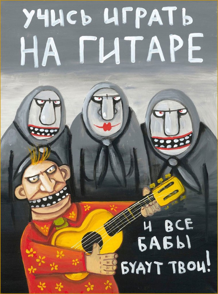
«Learn to play guitar, and all broads will be yours! »
«Get down, fool! »
« Glamour cockroaches got into Petrovich’s head by accident »
‘Cockroaches in the head‘ is a popular idiom, meaning somebody’s mind is messy or full of idiomatic eccentricities. Do professional art critics ignore Lozhkin’s cats et al because this isn’t high art, or because they’re perplexed? Occasional exhibitions, if not very well attended, are distinctly enthusiastically attended by ‘people with cockroaches in their heads’.
«A soul’s suffering will be healed with love »
Komsomolskaya Pravda (the ‘Komsomol truth’) included Lozhkin in its series of ‘Best Contemporary Artists’, dedicating its 15th volume to his art. On one hand, he is now amusingly rubbing elbows with Edvard Munch (volume 6) or Salvador Dali (volume 30)…. currently the series is up to 34 (Pablo Picasso, and no, I don’t understand which logic these choices are governed by, either). Lozhkin was amused by this, apparently. From this end of the world, having anything to do with a pro-Putin newspaper** with Soviet roots is disturbing, but then again… I don’t have to survive in that climate.
Veer to the right towards the traditional Slavic bear family for ‘Motherland’, stray to the left for ‘Abroad’, with its circus of horrors and immoralities. Internet denizens are scarily divided about this painting – is this satire, or brainwashing? I’ll let the reader decide, based on the rest of Lozhkin’s oeuvre as glimpsed in this post.
In an interview, Lozhkin said that the fairy tales he creates always have a happy ending, despite heavy elements of psychosis. He also mentioned that lately he’s been trying to accentuate on the positive, to evoke pleasant emotions from his audience. I admire the motive, but I’m not sure he believes in it himself — there is little doubt that the darkness deepens.
« Each one of us, if you look carefully, has this bottomless depth; everything is in there, the icy horror, this hopeless darkness, gray hopelessness and green melancholy, as well as terrible laughter, pandemonium, devils, animals, cockroaches… »
Contemporary Russian cartoonist (and colourist) Alexey Gorbut, born in Yekaterinburg, had been drawing (by his own admission) since babyhood. When asked in an interview to describe his work in three words, he said ‘I’m always drawing’. As clearly seen from his art, he is a great fan of Golden and Silver age comics, an devotee of old horror comics (he specifically mentions Chamber of Chills* and Tales from the Crypt as favourite anthologies in this interview), with a special affection for Steve Ditko and Alex Raymond. While he wears these influences on his sleeve, his work still boasts plenty of Slavic trimmings, which makes for a really fun blend of styles and perspectives.
Gorbut mostly self-published his stories until 2016. Alexey Volkov spotted his work while looking for an illustrator for a project requiring a Kirby-esque hand, and, smitten with Gorbut’s style and his proclivity for drawing on paper instead of a tablet, offered him to collaborate on a book to be published by Jellyfish Jam. The Alexeys’ first book together was «Победителиневозможного » (2017), a sort of Metal Men seen through the lens of Soviet sci-fi. A team comprising four members who possess fantastical powers, two men, one woman and an android, is on the search — to exact revenge — for their creator, a mysterious time traveller.
The cover of «Победители невозможного » (2017), which translates to something like ‘Vanquishers of the impossible’. “Krackle” notwithstanding, the result actually did not come out Kirby-esque at all — you can see some inside page samples here.
Their next significant collaboration was «Вор теней» (Thief of Shadows), plotted by Volkov and Kirill Kutuzov, who were old childhood friends and partners in comic crimes. The first four issues were published in 2019 by aforementioned Jellyfish Jam, with publishing rights picked up by Bubble Comics on issue 5 and onwards. The series is still going strong, and the Kutuzov, Gorbut and Volkov trio became such a steady team in readers’ minds that they were even assigned an unofficial acronym, KGV (which of course brings to mind ‘KGB’).
Page from Вор теней no. 1: Вор теней и час волка (May 2019, Jellyfish Jam).
The cover of the first collection gathering the first five issues, published in 2020 by Bubble Comics.
« Майор Гром 1939 » (‘Major Thunder 1939’), a seven-story collection, came into being in 2019, a successful stab at recreating a golden age comic with ‘old-school’ storytelling and wackiness.. and far more interesting than Bubble’s Major Grom franchise it sprang from, if you ask me. Volkov and Gorbut took the main series’ characters and transferred their raison d’être to the Soviet era, cooking up a delirious blend of parody with a heavy sprinkling of American comic influences defused by Soviet lifestyle snippets. Titillating details abound, like corrupt billionaire Plague Doctor becoming the Plague Physician, a child of noblemen murdered by the Bolsheviks.
Майор Гром 1939 no. 1… October 1939, I mean 2019, published by Bubble Comics.
Alternate cover for no. 1. If it looks familiar…
… it’s because it should!
Detective Comics no. 31 (September 1939), cover by — or at least credited to — Bob Kane.
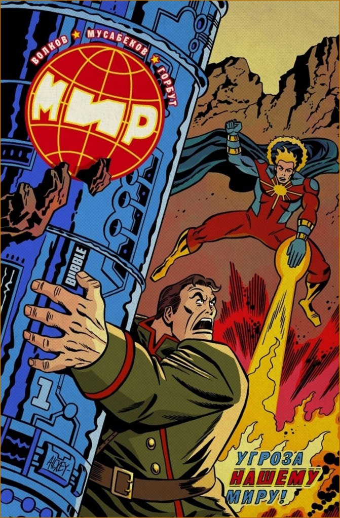
Superhero/sci-fi series «МИР» (2020 and ongoing) is written by Volkov and illustrated by Madibek Musabekov, with the former drawing “real-life” action and the latter, dream sequences and such. Musabekov has a perfectly ordinary, dull, tablet-drawn style devoid of any personality, and he also draws all the covers so that’s one series I’m not going to touch… but Gorbut’s alternate covers can be nice.
МИР no. 1 (August 2020, Bubble Comics)… on the other hand, now ‘Kirby-esque’ has caught up.
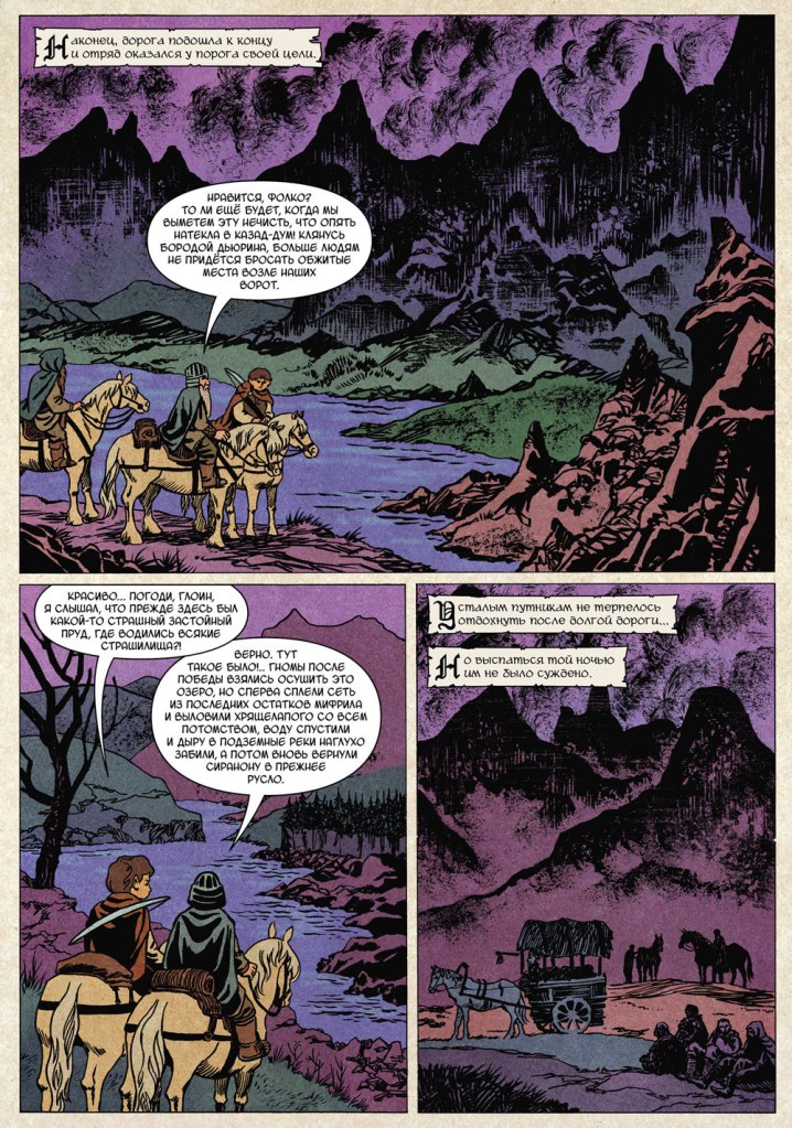
More recently Gorbut has adapted Nick Perumov‘s «Кольцо Тьмы» (The Ring of Darkness) fantasy novel series. If it looks like a Lord of the Rings rip-off, that’s because it’s purposefully set in Tolkien’s word, with a hobbit protagonist (not that it makes it less of a rip-off, mind). As it happens, I recently read a novel (from another fantasy cycle) by Perumov, and co-admin RG can confirm that I kept swearing at its prose throughout, though I still finished it out of a sort of morbid fascination. Gorbut’s art is nothing to sneer at, just too bad it’s tied to something so trite. Here is the cover of Volume 1, « Кольцо Тьмы: Эльфийский клинок» (2022, Alpaca), as well as some inside pages:
Those trees in the background are rather Bilibin-esque, which I really like.
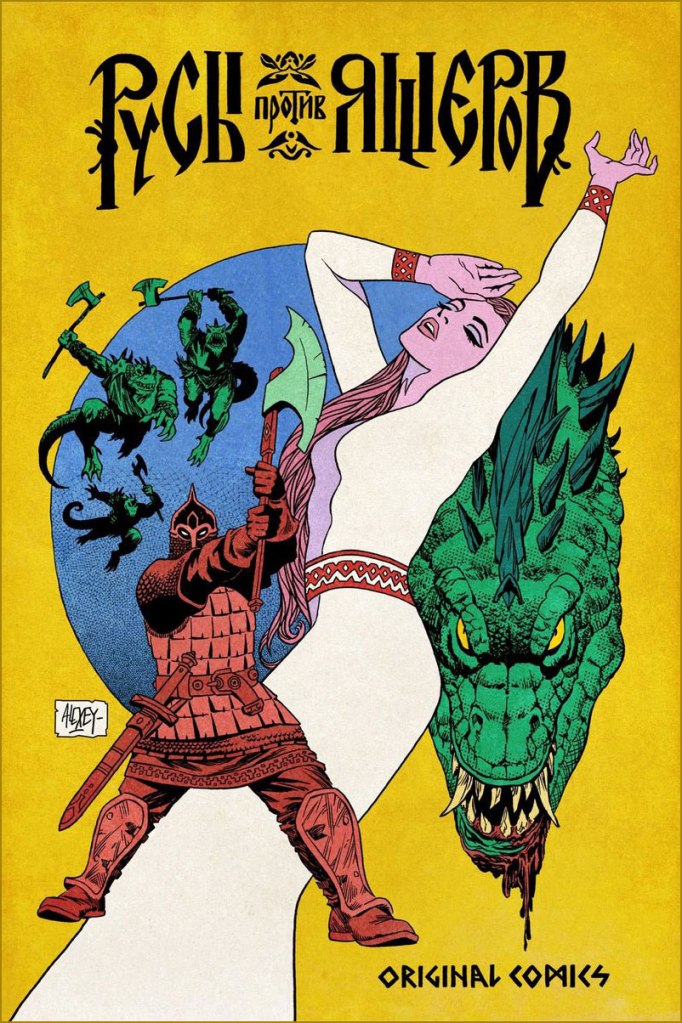
Finally, for more of a Slavic effect (though not devoid of certain European influence!), here are two comics covers created for « Русы против Ящеров » (Lizards Must Die), a videogame released in 2023.
~ ds
* While from the context it’s clear he meant the 1950s Harvey anthology, I think it’s safe to assume he’s equally fond of the 1970s Marvel one.
« Len Norris portrays rather the little man in his everyday complications, and by showing us his, and our own predicaments, he helps relieve us of the burden of the daily toll of bloodshed and terror we see in the news pages. » — Stu Keate
Here’s to a semi-forgotten Canadian legend.
In my long-ago teen years, when I began haunting second-hand bookstores, single-author collections of political cartoons were everywhere, dirt-cheap, largely interchangeable to the untrained eye.. and evidently hard to dispose of.
Most common were collections of The Daily Express’ Ronald “Carl” Giles (1916 – 1995), AKA Giles — but this being Canada, we saw plenty from The Montreal Gazette’s Terry Mosher AKA Aislin and the Vancouver Sun’s twin cartooning stars, Roy Peterson and Len Norris. Peterson is the one that first caught my eye — Vancouver was a long way off — thanks to his quarter-century run illustrating Allan Fotheringham‘s back page column in Maclean’s Magazine. However, I shelled out folding kale for but a single one of these collections, and it was the one comprising the cream of Norris’ 1960-61 output; it turned up in a long-neglected chest at my folks’ place last month, and so it’s ripe for rediscovery.
Here’s a bit of background on the man… born in 1913 in London, England…
« Norris came to Canada with his family when he was 13, growing up in Port Arthur, Ont. (now Thunder Bay). He moved to Toronto during the Great Depression, where his artistic talents landed him jobs in ad agencies. Before he joined The Sun, he was the art director for Canadian Homes and Gardens Magazine.
Norris didn’t become a full-time cartoonist until he joined The Vancouver Sun in 1950.
Norris was a sensation out of the box, picking up a National Newspaper Award for Top Canadian Cartoonist in 1952. His work was so popular that 27 collections of his cartoons were published.
He produced an estimated 8,000 cartoons during his 38 years at The Sun. He officially retired in 1979, but kept producing two cartoons a week until he finally hung up his pen in 1988, at age 75. He died in 1997 at 83. » [ source ]
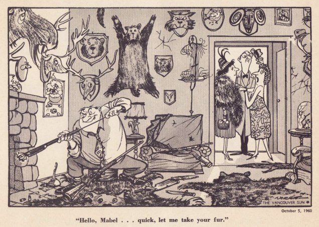
Ah, those quaint Colonials… « The phrase “the natives are getting restless” emerged from racist colonial origins. It sets up a scenario where wise, cool minds are overseeing and running things. And there is a more “savage,” “uncivilized” set of local people, the natives, who are seen as subordinate. Who deserve to be ruled by the lighter-skinned European colonists. »Quite timeless, that one — regrettably.Unlike a couple of these political parties, the Shrine Circus is still around — so it might have been the savvier investment after all. You can take the Englishman out of England, but… it’s snap to picture this appearing in the pages of Punch instead of a North American newspaper.Note that each and every child has his or her own ambulatory posture. Now that’s draftsmanship. Clearly, in Norris’ case, the verisimilitude of each detail, every gesture, springs from a deep well of visual observation — and he was no slouch with the verbal either. Like many a cartoonist, Norris was unambiguously on the side of the animals.I can relate far more readily with this gag since I’ve acquired a home with both a septic tank and lots of greenery.While the point might be a tad obvious — though still worth making — the expert composition is what makes this one special.Speaking of that Punch spirit: with this particular cartoon, Norris gleefully wanders into Rowland Emett‘s garden patch.I love how Norris didn’t stack the deck, where a lesser light surely would have: the members of the academic body on the right are still recognizably educators.Ah, poor Laika. Such a heartbreaking tale. Though she notably inspired a monument in Moscow, an outstanding Finnish rock band, a moving verse of a Divine Comedy song, and this cartoon, it’s a given that the poor doggie would have rather lived her life in peace than die alone and terrified.
The next two make it thanks to bravura use of compositional space. Such chops!
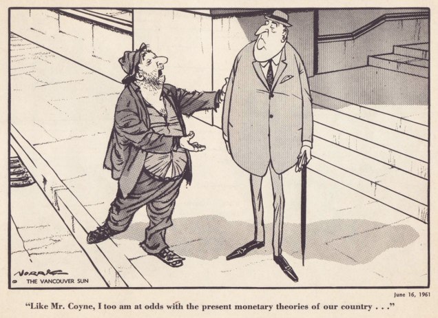
With a population of 3,985 — and rising — Grand Forks, BC, “is Boundary Country’s largest city”. All kidding aside, it does look like a very nice place to visit.Dig if you will the artist’s mastery of volume and gesture, of costume and body language. The Mr. Coyne alluded to is James Elliott Coyne (1910-1979), who was the Bank of Canada’s second Governor, from 1955 to 1961. He resigned in the aftermath of what was known as The Coyne Affair.
His Vancouver Sun colleague Trevor Lautens eloquently depicted the Norris he knew: « Len limned not the pompous event, but the pompous event’s effect on ordinary people. He seemed a small-c conservative, but look and you will find that his drawings were blandly subversive. The bureaucrats were black-suited, pince-nezed satraps. Pietistic Social Crediters wore haloes and walked on fluffy clouds. The Victoria Conservative Club was populated by dozing, look-alike, pear-shaped gents with walrus moustaches. »
For a deeper burrow into Norris’ œuvre and legacy, here’s a fine documentary film on the subject.