At Last… Freff Speaks!

« Only times and places, only names and ghosts. »Aldous Huxley

Last November, after we spotlighted a pair of mid-70s Gold Key gems I had presumed to be the brainchildren of Connor Freff Cochran (as it turned out, I was only half right; see my revised original post), we heard from the gentleman himself (and I don’t use the term lightly), who generously shared with us his sharp recollections and insights. Once you’ve read them, I’m confident that you’ll agree that such goods would have been squandered as mere comments at the bottom of a post.

So I’ve picked out another Freff favourite to feature, which will be followed by the author’s commentary.

But first, let us set the stage through a bit of autobiography and an inestimable glimpse into the 1970s publishing scene.

Here’s the skinny. Heeding a suggestion Kelly Freas had made to me eight months earlier, I moved to New York City right after Labor Day 1973. (It was a two-step process. First I hitchhiked from San Francisco to Toronto for that year’s Worldcon, then I caught a ride the rest of the way to NYC from there.) I was six weeks away from turning 19, and gung-ho to launch a career as a professional cover artist and illustrator. I also wanted to work in comics, and thought the best way to break in and learn the ropes was to start as an inker. On the comics side I took my portfolio around to Marvel, DC, Gold Key, and Warren. On the book/magazine side, I went to any publisher where I could land an appointment.

It was not a stellar launch. My portfolio was full of SF convention art show pieces, some semi-prozine illustrations, and a handful of two-toned small press book covers. It wasn’t bad stuff, but it was certainly not well-targeted to the people I was trying to impress. A couple of magazines did pay me for spot illustrations. Jim Baen — brand-new managing editor at GALAXY and IF — liked my stuff, but he wasn’t in charge of art assignments. As for my attempt to break into comic inking, that was a complete washout. There was a paper shortage on, and because of publishing cutbacks there wasn’t enough work for established inkers, let alone a newbie like me. Marvel did give me a bunch of pencil Xeroxes to do vellum samples over…but I was a pen inker, not a brush guy, and pen inking wasn’t the Marvel house look in 1973. I did get to know and hang around with a bunch of people in the company, but I didn’t get any work there.

At Gold Key, though…

At Gold Key, Wally Green looked at my portfolio and said “We don’t need any more artists. But we do need writers. Can you write?” Years later I learned that Wally was trying to plug the production hole created when Len Wein stopped scripting for him. Most likely he put that same question to every stranger who walked through the door. In the moment, though, all I knew was that I’d be an idiot to say anything but yes. Wally then introduced me to his second-in-command, Paul Kuhn. Paul handed over some sample issues of TWILIGHT ZONE, and told me to come back when I had a five-page script to show him. A few days later I brought in a story called “The Stand-In”, which was read and bought on the spot. Thus did my accidental writing career begin. This was in early October 1973. At the beginning of 1974 I did the math and decided to quit my 9-5 job, because by then I was making more from three days per month of Gold Key scripting (at the princely sum of $10 per page) than my fulltime gig was generating. I’ve been self-employed ever since.

I wrote for GRIMM’S GHOST STORIES, RIPLEY’S BELIEVE IT OR NOT, BORIS KARLOFF TALES OF MYSTERY, TWILIGHT ZONE, DARK SHADOWS (for a different editor, Denise Van Lehr), ADAM-12, and even one issue of Gold Key’s STAR TREK. Roughly once a month Paul would agree to a pitch session. I’d bring 10-15 different story ideas with me, knowing I needed to sell at least five to meet my monthly minimum nut (which was low, since I lived in a 7’ x 12’ fifth-floor walkup room on the West Side that rented for $50). Paul would listen intently, but he couldn’t look me in the face most of the time because he had a permanent spastic tic in his neck. Inevitably he would reject all but a couple of ideas, at which point I had to invent more on the spot and talk him into buying them. It was GREAT story development training.

Paul had an eidetic memory for every damn comic book Gold Key had ever published, which was its own kind of problem. This is a real exchange we once had:

Paul: I don’t know…

Me: Paul —

Paul (shouting through the open door to Wally, in the next-over office): Hey, Wally! Freff has an idea for an art museum guard ghost story. Didn’t we do a museum guard ghost story, what, nine years ago?

Wally: I think so.

Paul: Sorry, Freff. That’s out. What else have you got?

Me: Paul, your readers are eight years old. They weren’t even born when that other story was published! And anyway, it’s an ART museum guard ghost story. What kind of museum was it last time?

Paul: History.

Me: So no art.

Paul: Okay, I’ll think about it.

(He did…and still passed on the idea.)

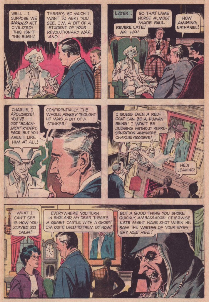
And here’s our featured tale: Charm of the British, first published in Grimm’s Ghost Stories no. 22 (March 1975, Gold Key).
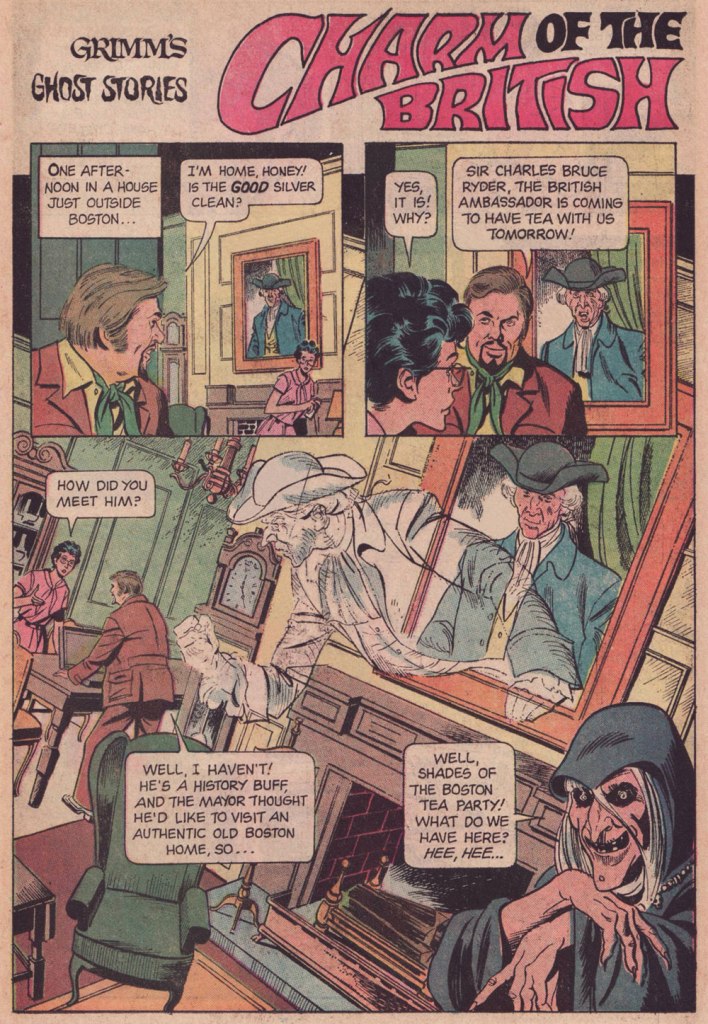
Before I return the floor to Freff, it bears mentioning that this tale was illustrated by Argentine cartoonist José Delbo (born in 1933 and still among us), then on the cusp of a five-year run on DC’s Wonder Woman. Delbo was quite recently in the news for the astonishing windfall he received from a crypto artwork auction. In these uncertain times, what 87-year-old on a fixed income couldn’t use an extra million to top up his or her nest egg?

While I confess I’ve never quite warmed up to most of Delbo’s DC work (his inkers did him no favours), I do have a soft spot for his solid run on Charlton’s Billy the Kid (1966-74!), I dug his deft comic touch on Dell’s The Monkees, and let’s not forget his inspired work on the real ‘weird western tales’ series, Charlton’s gonzo Geronimo Jones (1971-72).

I hear James Mason as the British Ambassador. How about you?

And now, with a first-hand account of its genesis, Mr. Connor Freff Cochran!

The publication date of the issue with “Charm of the British” was March 1975. Gold Key comics typically hit the stand a month sooner than the official date, so that makes this a February 1975 release. From that, and some internal clues, I can narrow the writing window down to the first three weeks of September 1974.

I’d been away from NYC all the previous summer, living in Champaign-Urbana, IL, where I was self-training just in case my application to that year’s Ringling Brothers Clown College was accepted. I finally got word that I’d made it when I arrived at the World SF Convention, which was held over Labor Day weekend in Washington, DC. (One day later I went out for Chinese food and got a fortune cookie that read “You will visit a strange place and find fresh work.”) The Clown College started on September 23rd and ran for just over two months, during which time I would be unable to do any paying freelance work. So between the end of WorldCon and flying to Venice, FL on 9/22, I crammed in every job I possibly could – which included selling and writing as many Gold Key stories as I usually did in three or four months. Wally Green and Paul Kuhn knew I would be unavailable until late November/early December at the soonest, so they did something they hadn’t done with me before, and built up inventory.

“Charm of the British” was one of those inventory pieces. It paid $60 (my page rate for scripting was $10), and looking back I have no idea what the exact trigger for the idea was. Most likely it was improvised during a pitch & sell session with Paul. Those were always insane. The typical structure: I’d come in once a month with 8-10 ideas, knowing that I needed to sell five or six to guarantee my monthly budget. Paul would say yes to one or two and reject the rest. At which point the improv would begin, with me inventing more stories on the spot while he tried to get me to leave… something I would only do after getting him to say yes as many times as needed. I was 19 years old, and it was great training for a creative future. 

The title’s a minor bit of wordplay, of course – “charm” as in magic and manners, both.

Grimm  always had to have jokey intro and outro lines for each story. The outro on this one wasn’t anything to be proud of, but all these years later I’m still happy with the punny “shades” (of the Boston Tea Party) in the intro.

These were stories for young kids, so you couldn’t go into detail about anything. But I did enjoy slipping in as many real Revolutionary War references as I could, both direct (namechecking Paul Revere) and indirect (referencing Revere’s profession by having my lead character ask for “the good silver” in the first panel). “I won’t be judging without representation anymore” is obviously a riff on “no taxation without representation.” No child who read this comic book was ever going to remember it years later, when they encountered the real phrase in some history class, but maybe a bit of subconscious memory would help the knowledge stick, you know? In any case I enjoyed playing with all these references.

Page 2, panel 2: I absolutely did NOT write that unnecessary “Why, No!” Either Paul or Wally or the letterer added that. Didn’t make sense to me then, and makes no sense to me now. Similarly, the “Thinks they he can come in…” in panel 4 on that page is definitely an editing/letterer goof. I wrote “Thinks he can come in…” 

As usual, my character names referenced friends, sometimes combined with private jokes. Fan friends Eli Cohen and Susan Wood had begun dating recently, so I named the house owners “Eli and Susan Wood” (though all reference to the name “Susan” somehow vanished in the editing process). Susan eventually became one of the major academic names in the science fiction field, before she sadly passed, much too young, in 1980. Our visiting British Ambassador got the name of a junior high school friend of mine who had spent a lot of his childhood growing up in Europe. These days he’s a partner with the law firm of Thompson Coburn LLP, in St. Louis. Revolutionary War ghost Nathaniel Emerson is a combination of Nathaniel Hawthorne and Ralph Waldo Emerson (they were neighbors in Concord, MA for a time), with a sideways nod to NYC fan David Emerson. David had recently shared an apartment with Eli Cohen, so it amused me to have an “Emerson ghost” hanging around to haunt an Eli living space…

Looking back from today, it amuses me to think of Outlander’s evil British soldier “Black Jack Randall” and his nice-guy modern descendant, who both have the same face. It’s a neat coincidental lineup with my evil British soldier “Black Jack” Ryder and his nice-guy, same-face descendant.

Overall… confronted with this story after nearly 50 years, I’m pleasantly surprised. It’s got some nice lines, it turns in unexpected directions, and none of the characters are idiots (though they are all amazingly blasé about spectral appearances). I can imagine the Ambassador and the ghost of Nathaniel Emerson becoming the best of friends, making regular visits back and forth across the Pond… and hanging out together in the afterlife when the Ambassador finally dies from eating one too many diplomatic desserts.

Alternatively, of course, there’s a story to be written about the Ambassador coming home to England and being haunted by Black Jack’s ghost, who is appalled that any descendant of his would make nice with Yankee riffraff like Nathaniel…

Again, my heartfelt and slightly befuddled gratitude to Mr. Cochran for all his cordiality and patience. We’ve more of it to share with our readers, so expect a sequel in the near future. Cheers!

-RG

Henri Gerbault, Leading Light of la Belle époque

« It took me some years to clear my head of what Paris wanted me to admire about it, and to notice what I preferred instead. Not power-ridden monuments, but individual buildings which tell a quieter story: the artist’s studio, or the Belle Époque house built by a forgotten financier for a just-remembered courtesan. » — Julian Barnes

Depending on where and when you are, this post will take you far away and to long ago.

Having failed to launch a career as a painter after his studies at the Beaux-Arts de Paris, Henri Gerbault (1863 – 1930) tried his hand at satirical cartooning, and succeeded brilliantly, appearing in all the important magazines of the day, among them La Vie Parisienne, Le Rire, Le Bon Vivant, Le Frou-Frou, L’Art et la Mode, Fantasio, La Vie Moderne, Lectures pour tous… for France, it truly was a golden era for satirical, literary and cultural periodicals.

For instance, during the storied humour magazine Le Rire’s prime years (roughly the first quarter of the 20th century), Gerbault was featured in most issues, often on the front or back cover, and generally in sumptuous colour. Well, you’ll see what I mean. Clearly not one to rest on his laurels, he somehow found time to lend his sundry gifts to the theatrical, advertising, etching, and fine art fields.

Here’s a bit of context if you don’t know who Saint Denis was. Love his interaction with the initially skeptical doggo! Originally published in La Vie Parisienne, and collected in Parisiennettes (1897), with colours by J. Chauvet.
There’s the lad, Paris’ first Bishop, at the Cathédrale Notre-Dame de Paris. Hope he wasn’t damaged in the blaze.
Gage d’amour (“Token of Love”), originally published in La Vie Parisienne, and collected in Parisiennettes (1897), with colours by J. Chauvet.
Les Coulisses de l’Amour is a collection of cartoons published between 1893 and 1895 in La Vie Parisienne. Racist caricatures abound but, to be fair, everybody gets it in the neck.
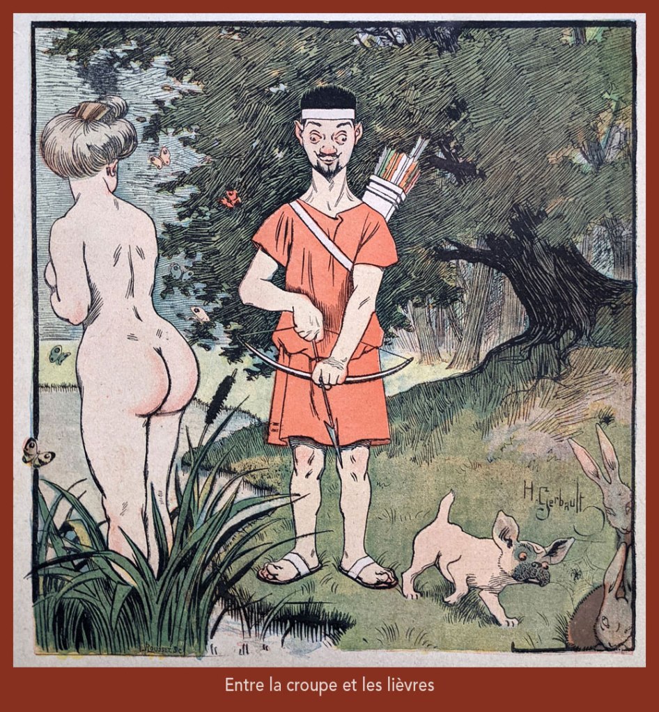
“Entre la croupe et les lièvres” is a play on “Il y a loin de la coupe aux lèvres” (English equivalent: “there’s many a slip ‘twixt the cup and the lip”), with ‘coupe’ replaced by ‘croupe’ (rump) and ‘lèvres’ by ‘lièvres’ (hares) — It was featured on the cover of Le Rire no. 261, (Nov. 4, 1899), eloquently demonstrating the vast cultural gulf between Edwardian England and Belle Époque France… not to mention the United States!
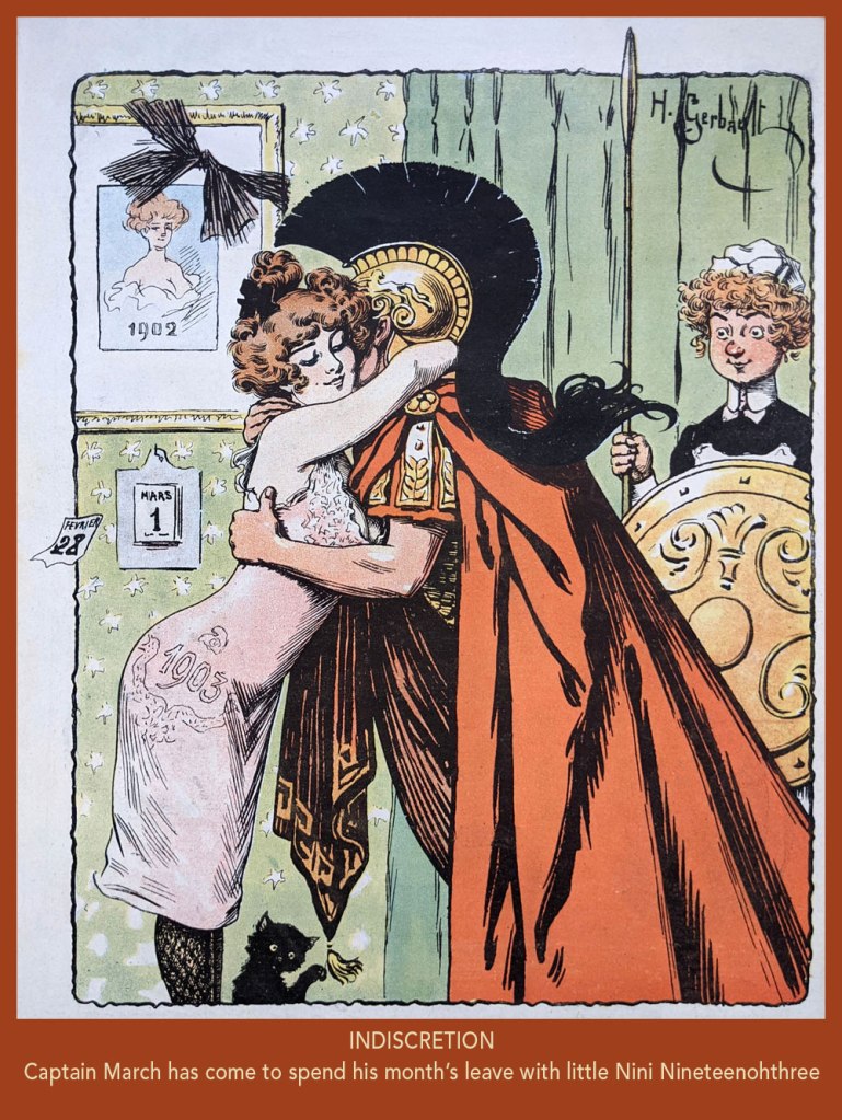
From Le Rire no. 7, (March 21, 1903). In French, the Roman God of war and the year’s third month are both “Mars”. Why is it even “March” in English?
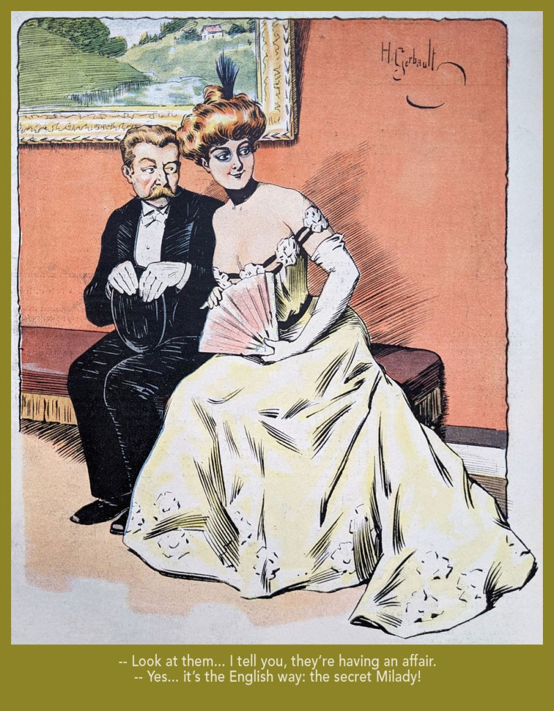
Taking the piss out of that old English discretion (some might call it hypocrisy); from Le Rire no. 18 (June 6, 1903).
From Le Rire no. 59, (March 19, 1904).
From Le Rire no. 160 (Feb. 21, 1906).
From Le Rire no. 380 (May 14, 1910). Missals are also known as ‘prayer books’.
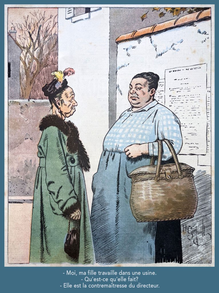
Despite being quite amusing, this one loses it all in translation. Still, “contremaître” is a foreman; its feminine form is “contremaîtresse”, which combines foreman and “mistress”; you’ll hopefully get the idea. This piece appeared in Le Rire rouge (as Le Rire was called during The Great War) no. 179 (Apr. 20, 1918). Note the beautifully understated colour work.
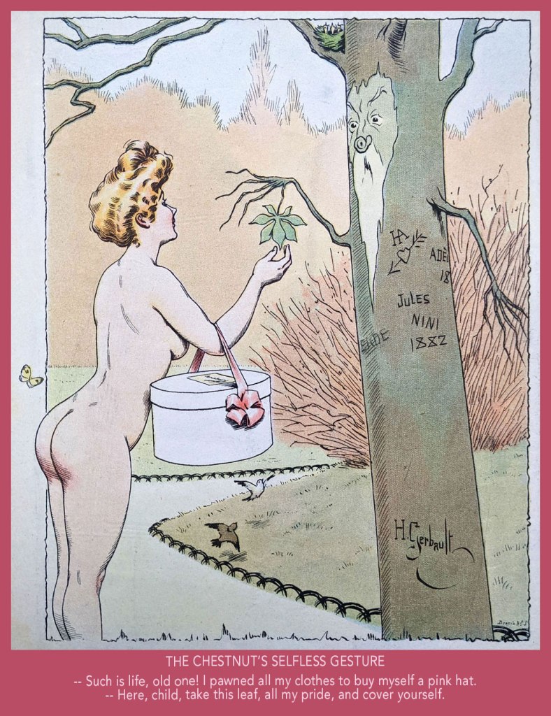
From Le Rire no. 189 (Sept. 10, 1922). « Je m’fiche à poil, rien que pour l’embêter! » in the original; sometimes it’s mighty hard to do proper justice to the source text.
The master’s self-portrait, circa 1904.

-RG

Hot Streak: Gil Kane’s Green Lantern

« It was exactly an assembly line. You could look into infinity down these rows of drawing tables. » — Gil Kane

Some of our more sensitive readers may have noticed that we’ve been none too gentle with Gil Kane (1926-2000) in the past, dealing him some rather rough lumps at times. But that’s not the whole story: in taking stock of such a protracted and prolific (dare I say profligate?) career as his, much of it inevitably spent on autopilot, one must be discerning. In other words, I like some of Kane’s work, but there’s plenty of it I don’t care for. Still, WOT’s rule of thumb is that if we altogether loathe an artist and/or his work, we’ll just turn a blind eye.

And speaking of the sense of sight, what makes a great comic book cover? Must be my art school training and subsequent work in advertising tipping the scales, but to me, design and layout reign primordial as ingredients… as values. I’m often dismayed at many a would-be critic’s apparent method of assessing an image’s artistic worth, namely: how many popular characters does it feature? Is it action-packed? Is the issue sought-after and expensive? Does it feature a famous character’s début? Is it drawn by a fan-favourite artist who unquestionably can do no wrong… because he’s a fan-favourite artist who unquestionably can do no wrong? (and how dare you claim otherwise!)

Gil Kane reportedly generated around eight hundred covers for Marvel in the 1970s… of all levels of craft and quality. With that kind of frenzied output, it’s impressive that most were perfectly serviceable, given that there certainly was no time for meticulous, sober planning. They were generally over-captioned (not Kane’s fault!) and crassly sensationalistic, but that’s what Marvel sought and settled for.

It’s a shame that Kane and his former classmate at the School of Industrial Art (back in the early 40s!), DC lynchpin Carmine Infantino didn’t get on too well, because their Silver Age collaborations had a special spark… must have been the animosity. It had been noted by the DC brass, as early as the late 50s, that Carmine’s covers reliably caught prospective buyers’ attention and dimes. And so, by 1967, he was unofficially designing most of the publisher’s covers, and certainly the covers of all titles edited by Julius Schwartz. Green Lantern was among these.

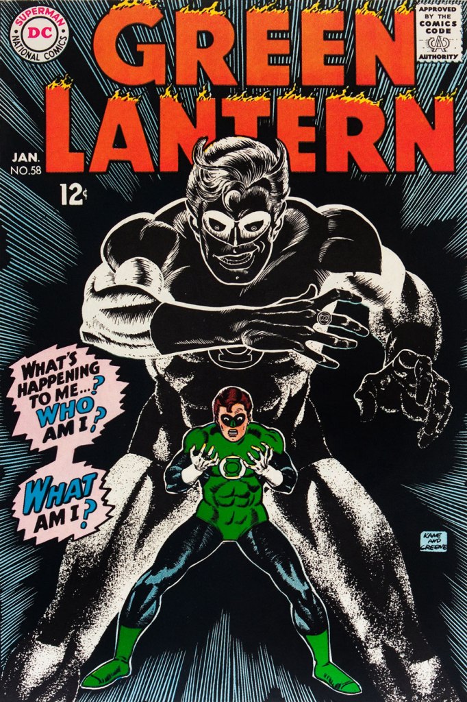
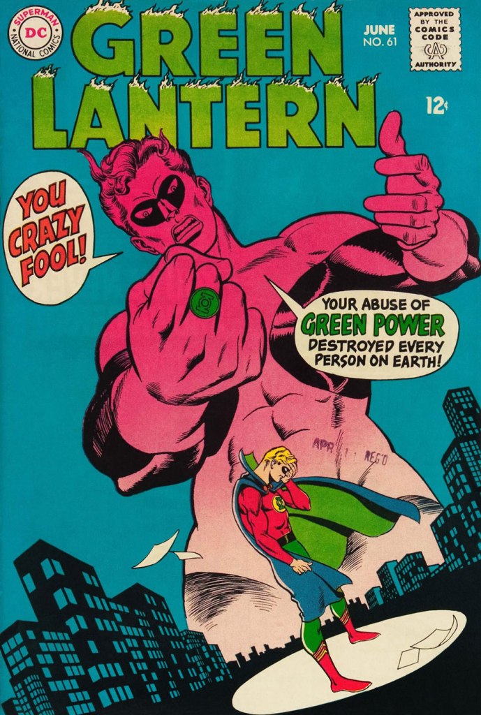
So we turn today’s spotlight on a hot streak of seven. Kane gets his name in the title, but it would be more accurate to say they were Infantino-designed, Gaspar Saladino-lettered, Jack Adler-coloured, Gil Kane-pencilled and Murphy Anderson and Sid Greene-inked covers. The streak begins after Green Lantern no. 54’s downright poor cover, and ends with the interruption of Kane’s impressively long run of consecutive issues.

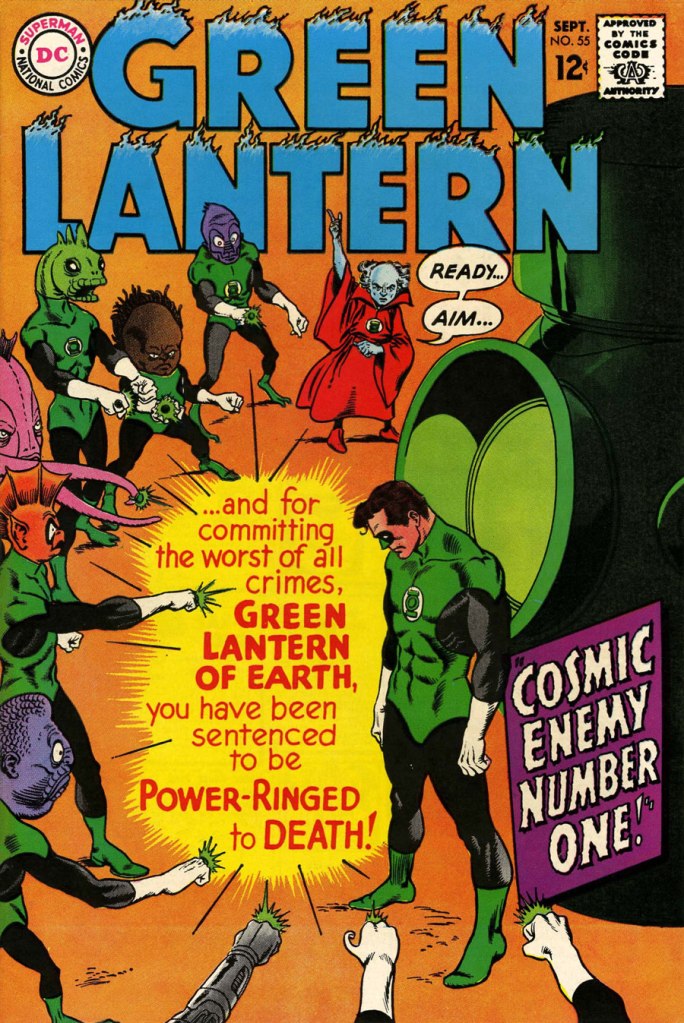
We begin with Green Lantern no. 55 (Sept. 1967, DC). Harmonious, easy-to-parse arrangement of numerous elements and exemplary integration of text. Design by Infantino, pencils by Kane, inks by Murphy Anderson, lettering by Gaspar Saladino, colours by Jack Adler. Oh, and lest we forget: logo designed by Ira Shnapp (circa 1964), classic Green Lantern uniform designed by Kane (circa 1959).
This is Green Lantern no. 56 (Oct. 1967, DC). Kane was never much for varying his monsters (see below). Pencils by Kane, inks by Anderson.
For a bit of comparison on how things were done from company to company, this is Tales to Astonish no. 91 (May, 1967, Marvel). This is what happens when there’s no planning or attention to detail: in an already-crowded cover, did we really need that ugly box advising us of the presence of The Abomination? He’s right there! (maybe the abomination refers to the cover itself). And the foreshortening nightmare that is the baddie’s left arm was so dire that, when a fan commissioned Arthur Adams to produce a recreation of this cover (which, things being as they are, many surely consider ‘iconic’)… he wisely corrected the anatomy and tweaked the poor composition. Interesting how Marvel’s heavy-fingered yes-man, art director John Romita Sr., was always game to “fix” Ditko and Kirby art, but saw nothing wrong with this one.
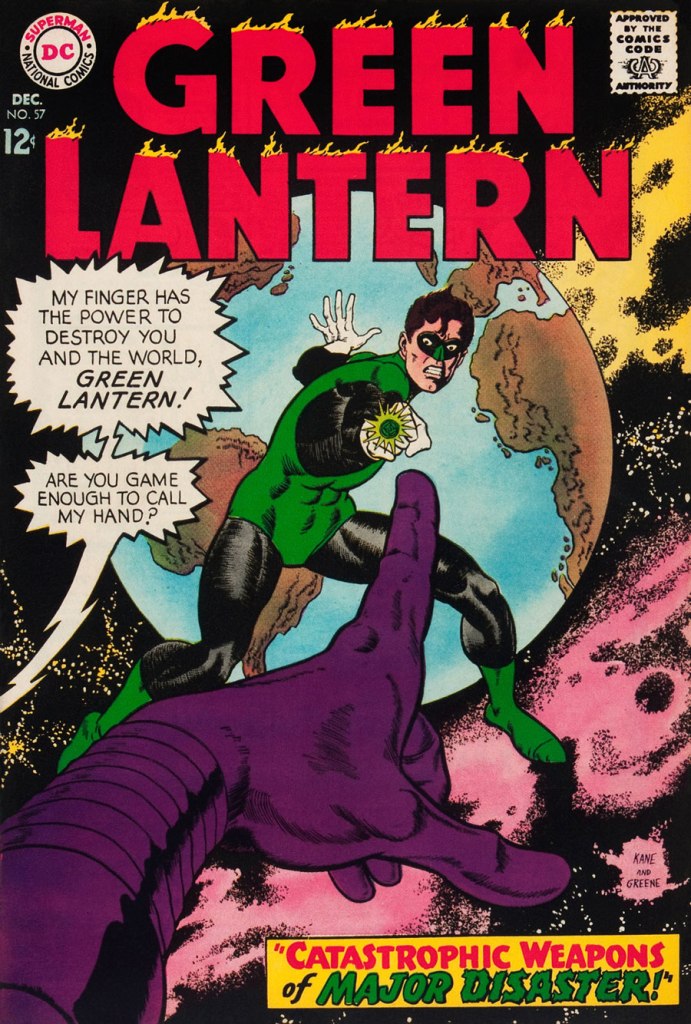
This is Green Lantern no. 57 (Dec. 1967, DC), featuring Catastrophic Weapons of Major Disaster!, written by Gardner Fox, pencilled and inked by Kane. Cover by Kane and Greene… love the placement of the signatures!
This is Green Lantern no. 58 (Jan. 1968, DC), featuring Peril of the Powerless Green Lantern! (a Julius Schwartz title if there ever was one), written by Gardner Fox, pencilled by Kane and inked by Greene. I’m not overly fond of the Kane-Greene mix, but Sid Greene, as a penciller-inker did some splendid work on the Star Rovers series (1961-64), co-created and scripted by Gardner Fox.
An issue whose price few can afford unless they bought it off the racks, this is Green Lantern no. 59 (March 1968, DC); pencils by Gil Kane, inks by Murphy Anderson. Featuring the introduction of GL alternate Guy Gardner, who was to be dubiously re(jack)-booted in the 1980s, by Steve Englehart and Joe Staton, as a jackass with an ugly uniform and a worse haircut. Never mind the fact that the Green Lantern Corps would never bestow power and stewardship on such an immature and pompous loose cannon.
This is Green Lantern no. 60 (April 1968, DC); an evident Infantino design, with pencils by Kane and inks by Anderson… which interestingly ends up producing a prototype of Brian Bolland‘s distinctive style… a decade early.
This is Green Lantern no. 61 (June 1968, DC); pencils by Kane, inks by Greene, and featuring (groan) Thoroughly Modern Mayhem!, scripted by Mike Friedrich, pencilled by Kane and inked by Greene. Co-starring Alan Scott, the Golden Age Green Lantern.

-RG

When Rosy Baffled the Kids

« I believe that the Belgians do possess some surrealistic gene. » — Eddy de Clercq

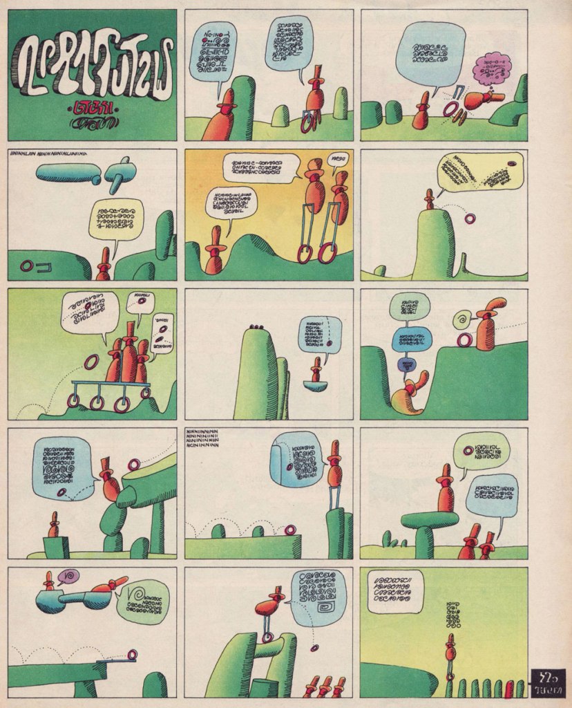
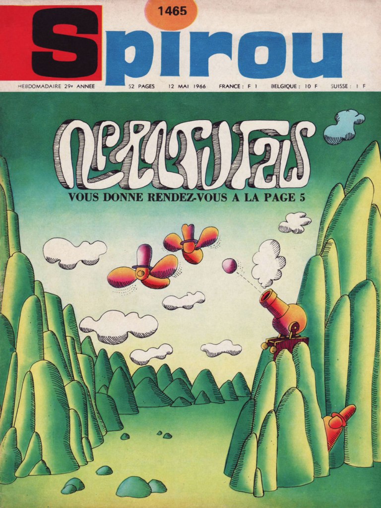
I’m afraid we’re back into surrealism territory, folks. Our focus today is on a single piece by polymath Maurice Rosy (1927-2013, Fontaine-l’Évêque, Belgium), published in bédé weekly Spirou in 1966, in the midst of Rosy’s tenure as the magazine’s co-art director (with Yvan Delporte) and boundless idea generator (1956-73, for the record… the period widely hailed as Spirou’s golden age).

As for the story in question… it was, shall we say, ahead of its time. And still is.

Nonetheless, its value was recognized almost immediately (less than one year on, for the record) by connaisseurs Jacques Sternberg, Michael Caen (co-founder of the epochal Midi-minuit fantastique) and Jacques Lob‘s essential Les trésors de la bande dessinée (1967, Éditions Planète), wherein they wrote:

Intrigued by oriental philosophies and General Semantics*, jazz pianist in the modern idiom, art director of the publishing house that produces Spirou, hilarious storyteller, Rosy has had drawings published in Paris-Match and Adam, all the while crafting (with Pol Deliège) tales of Bobo. He is also the author of the most bizarre story ever to appear in a kids’ magazine, which earned its publisher and author an especially venomous stream of insulting letters. Geniuses are always unsung.

Rosy has the sharp smile of a Steve McQueen and a picturesque language all his own.

You be the judge, He looked winningly impish, all right!

And now, the item in question:

From the next page over, a detail from more typical fare, namely Peyo’s La Schtroumpfette. Rosy, art director to the hilt, had opted to further mess with the readers’ minds by tampering with the magazine’s standard À suivre (to be continued) box.

When Rosy was interviewed for a deluxe, 16-volume reprinting (begun in 2007) of the adventures of Tif et Tondu (with Will as illustrator, Rosy served as writer/metteur en scène on the feature for many of its glory years, 1954-67), the notorious one-shot was touched upon:

In 1966, you created a strip with an unreadable, and therefore unpronounceable name, which even made it onto the magazine’s cover: are we deep into Herriman* territory?

Rosy: That’s weird, people say that, but at the time, there was no such conscious homage. It was rather a reflection of the state of mind that I was in. I was increasingly bearing the marks of (and anguished by) the absurdity of certain facets of life.

«… awaits you on page 5. » Rosy’s cover for Spirou no. 1465 (May 12, 1966, Éditions Dupuis).

-RG

*Philosopher Alfred Korzybski‘s General Semantics, that is; most famous for its premise that « the map is not the territory ».

**In the same way that people with an insufficient frame of reference wrongly compare every musician they hear to The Beatles, the under-informed tend to ascribe any sign of whimsy or absurdity in the comics medium to Krazy Kat progenitor George Herriman. Yes, both were deeply influential, but come on, there are limits. In Rosy’s case, I’d posit that, if there was influence at work there, it was more likely that of the mighty Saul Steinberg.

Treasured Stories: “Smalltown Stardom” (1999)

« I’m going down to the Dew Drop Inn / See if I can drink enough / There ain’t much to country living: sweat, piss, jizz and blood » — Warren Zevon, Play It All Night Long

Kevin Nowlan (b. 1958, Chandron, NE) is one of those artists whose style I’ve always admired, and I’m far from alone in this sentiment. However, when it comes to what I think he should be applying his tremendous talent to, I’m squarely in the minority. Most people would evidently have him drawing Batman or the X-Men or other spandex fanboy favourites… but I feel there’s far more to him. He’s too good for the mainstream comics industry as it exists.

Always a meticulous artist he’s slow as (anti-gravity?) molasses in February, but while that’s led to a relatively modest body of work, it’s all solid. Even early in his career, his path was set, as evidenced by this bit of biography that appeared along with the opening instalment of his short-lived fantasy series, Grimwood’s Daughter (written by Jan Strnad) in Dalgoda no. 2 (Dec. 1984, Fantagraphics):

He discovered that working as gun-for-hire, illustrating scripts for which he had no respect, turning out more art than he could comfortably (and conscientiously) handle, and being forced by publishing schedules to allow as four artists to ink a single story, was artistically debasing and depersonalizing.

Like other creators (say, Adam Hughes and Frank Frazetta, for instance) of the popular but leisurely persuasion, he’s got imitators that can produce at five times his rate of speed. Good; let them take care of the superhero stuff.

Nowlan’s always possessed a sure hand with wry understatement, but he’s not a writer, and that’s a thorny problem when lacking a reliable accomplice to handle that part of the equation. So Nowlan’s done more than his share of covers, pinups and inking jobs.

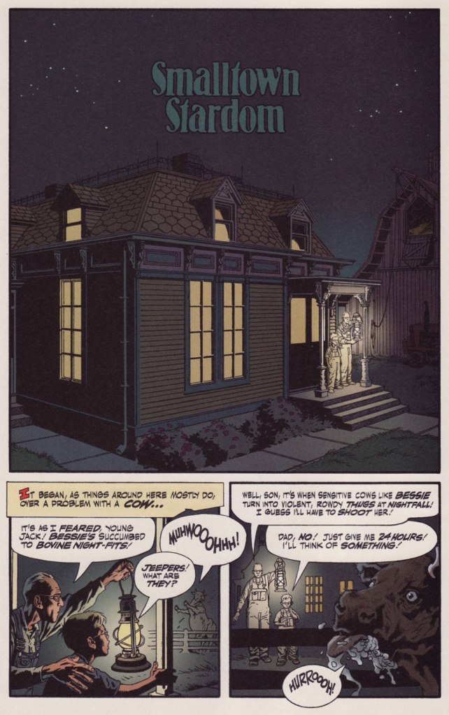
Ah, but then along came Alan, whom you’ve all met. That hirsute prankster from Northampton understood. He had in his mind’s eye just what Mr. Nowlan needed to truly stretch out and shine, the absurd deeds of Jack B. Quick, Boy Inventor.

JBQ was supposed to be one of a quartet of regular features appearing in the Moore-scripted anthology title Tomorrow Stories, but Nowlan didn’t last long on a schedule, and there are but a handful of JBQ tales, all excellent, capped by the fitting double-length finale, I, Robert. (Tomorrow Stories Special no. 1, Jan. 2006). The feature was (for the most part) replaced by an unfunny waste of Hilary Barta‘s talent, a woeful would-be Plastic Man ersatz, Splash Brannigan. Alan Moore can wring humour out of nearly anything, but as Splash and (even worse) The First American show, superhero parodies are his Waterloo.

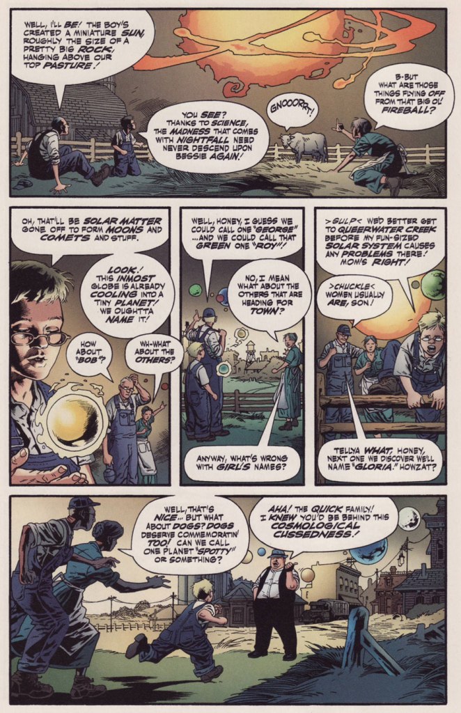
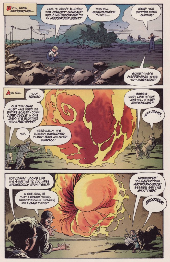
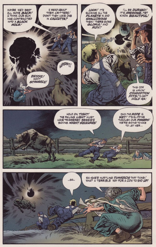
JBQ, on the other hand, provides values rarely encountered, let alone appreciated, in mainstream American comics: deadpan, understated humour, surreal but non-cloying whimsy, and a rigorous, steadfast adherence to the mechanics of internal logic, no matter how outlandish things get. In prose, one might chance upon that sort of approach in the works of Marcel Aymé or R.A. Lafferty. But even there, it’s hardly routine. Oh, and given that it’s Alan Moore we’re dealing with, it’s a huge bonus that the JBQ stories are quite rape-free!

But let’s commence from the top, with the dizzying tale of Smalltown Stardom (Tomorrow Stories no. 1, Oct. 1999, America’s Best Comics). No need to shove, there’s plenty of room at the trough!

Find out more about the infamous Black Hole of Calcutta!

Is it just me, or can you also picture Thomas Dolby as a grown-up Jack?

-RG

Behold… the Great Shnozzola!

« That’s the conditions that prevail! » — Jimmy Durante

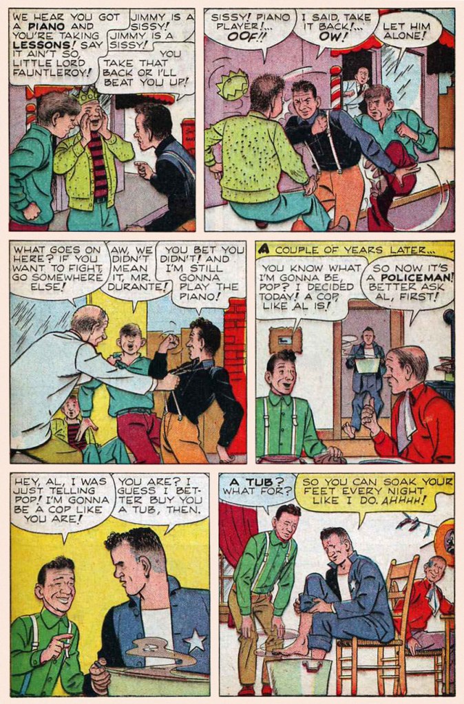
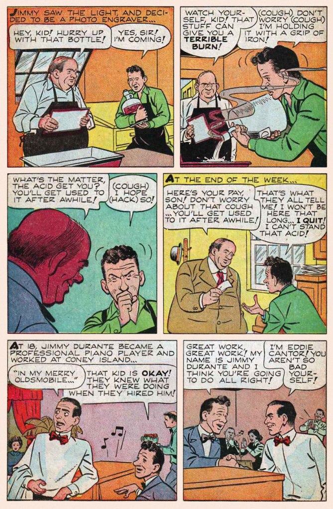
Today, we salute noted vaudevillian, piano player, comedian, singer, film and radio star, raconteur and unlikely comics legend James Francis “Jimmy” Durante, born on this day, February 10, in 1893 (as it was a Friday, the family presumably fasted or had fish for dinner). He truly was a master of all media, as you’ll witness.

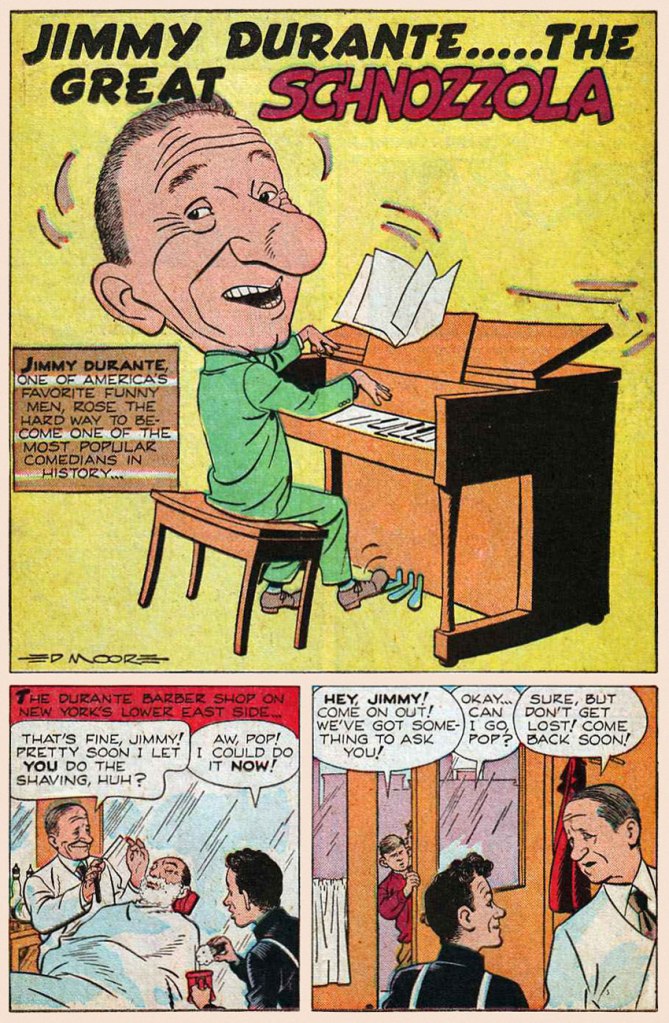
This early bit of biography appeared in Juke Box Comics no. 4 (Sept. 1948, Eastern Color); it was illustrated by Ed Moore. Hear Cantor and Durante reminisce about their early days on this 1947 episode of The Jimmy Durante Show.
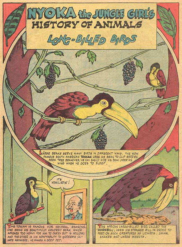
A passing mention of old Jimmy, from Nyoka the Jungle Girl no. 24 (Oct. 1948, Fawcett). Writer and artist unknown.
An early cover by Dick Ayers (1924-2014), this is Jimmy Durante Comics no. 1 (Oct. 1948, Magazine Enterprises).
The second and final issue of Jimmy Durante Comics (Winter 1948-49, Magazine Enterprises).
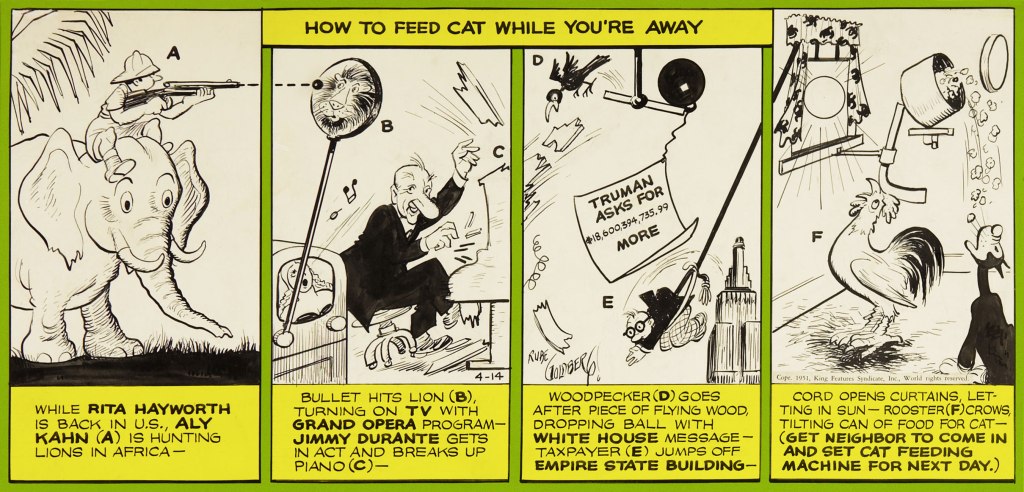
Mr. Durante rates a smashing musical appearance in this Rube Goldberg Device daily strip (Apr. 14, 1951, King Features Syndicate)… by Rube Goldberg, naturally.
And here’s the Shnozzola in the midst of a carnal melée of his fellow Old Hollywood legends (can you name them all, cinephiles?) This is Bill Griffith‘s cover for The Tiajuana Bible Revival Volume Two: Under the Stars in Hollywood (1977, Hooker, California: Paramounds Prod.). This was « An anthology reprinting 1930’s Tijuana Bibles, some of which were obscene parodies of popular newspaper comic strips of the day. Others made use of characters based on popular movie stars and sports stars of the day, such as Mae West and Joe Louis, sometimes with names thinly changed. Before the war, almost all the stories were humorous and frequently were cartoon versions of well-known dirty jokes that had been making the rounds for decades. » [ source ]
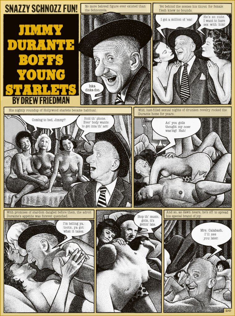
Pointillist-satirist Drew Friedman‘s immortal Jimmy Durante Boffs Young Starlets first saw print in National Lampoon vol. 2 no. 78 (Jan. 1985).
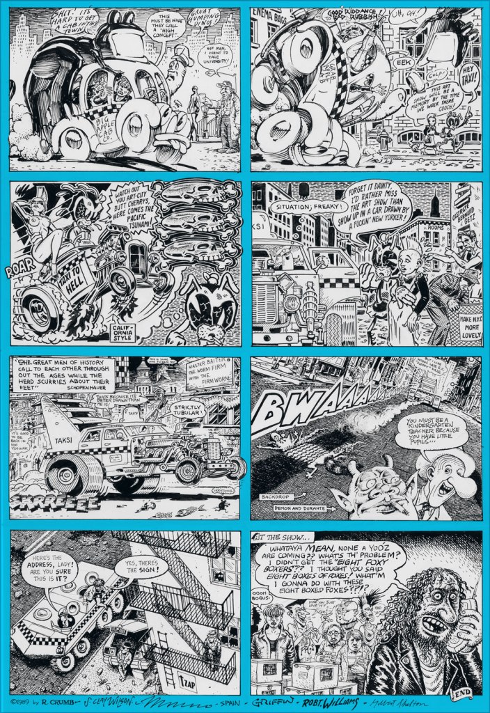
Durante briefly pops up (with the Checkered Demon!) in the second half of a truly all-star underground comix jam involving R. Crumb, Steve Clay Wilson (1941-2021… he left us just three days ago, aged 79… RIP), Victor Moscoso, Spain Rodriguez, Rick Griffin, Robert Williams and Gilbert Shelton. It appeared in Zap Comix no. 12 (1989, Last Gasp). Cartoonists are generally fond of the Schnozzola, but Underground cartoonists are just mad about him.
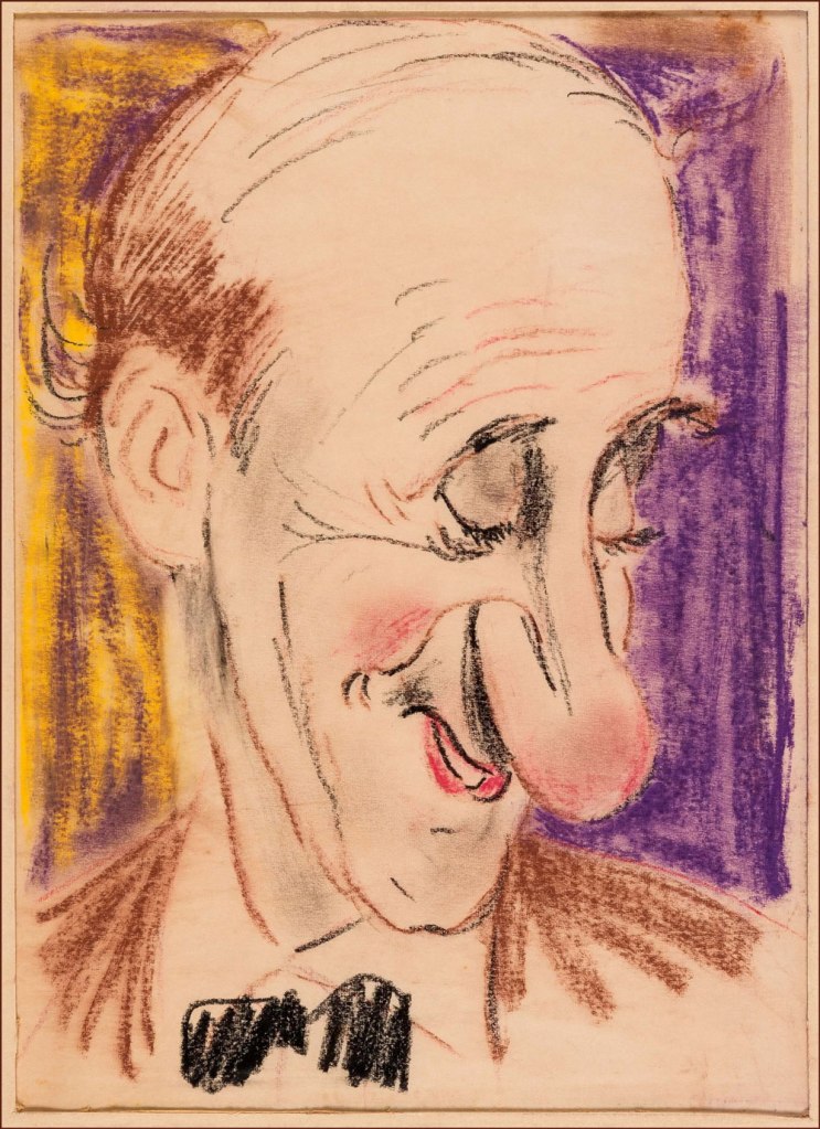
And finally, on a gentler note… here’s a clearly affectionate caricature (a preliminary sketch) of the esteemed Signor Durante (aw, he’s blushing!) by the amazing Sam Berman (crayon on onionskin paper, 1947). Berman (1907-1995) was, deservedly, quite a big deal in his day; as the erudite Drew Friedman told Print Magazine in his quality of co-curator of the 12 Legendary Caricaturists You’ve (probably) Never Heard Of exhibition at NYC’s Society of Illustrators, Berman « was indeed famous and celebrated in his day. Beginning his career in the late 1930s, he created iconic sculpted caricature covers for Esquire featuring their new mascot “Esky” (created by Berman) for an entire year. He created the sculpted caricatures of the leading actors (Fredric March, Carole Lombard, etc.) for the opening titles of the 1937 classic screwball comedy Nothing Sacred, did huge amounts of work for all the top magazines and newspapers of the day, including for Mark Hellinger’s popular column, created close to 60 amazing full-color portraits for the 1947 booklet The NBC Parade of Stars, drew children’s books, and arguably his most famous creation, the opening caricature of Jackie Gleason rising over Brooklyn for “The Honeymooners,” although he was never credited on the show for drawing that image, nor in any books. He then inexplicably went into map-making and faded quietly into obscurity. »

To wrap things up, here’s Jimmy D. and Frankie S. duetting in Russian. And why not? Happy birthday, Jimmy, wherever you are (and do say hello to Mrs. Calabash!)

-RG

A Secret, Silken World: Max Andersson’s “Lolita’s Adventures” (1995)

« Most of us will still take nihilism over neanderthalism. » — David Foster Wallace

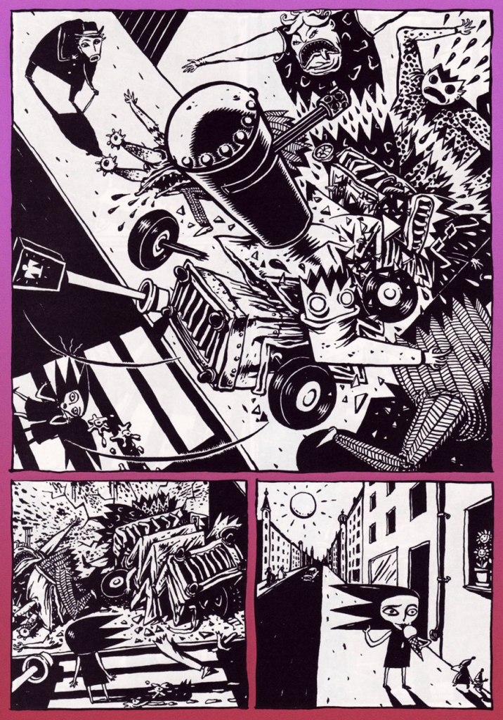
It’s become so quiet” “Yes“; from Galago no. 40 (1994, Atlantic Förlags AB)

Today, let’s dip a toe (at the risk of losing it) into the midnight domain of Swedish cartoonist and filmmaker Max Andersson (b. 1962). It’s a relentlessly-perilous scene, but like Kaz’s Underworld comic strip or Arnt Jensen‘s Limbo video game, I find it unexpectedly comforting in spite of (and thanks to) all the darkness, both thematic and in density of ink. In Andersson’s case, might it be owing to the author’s kindness to his protagonists? That’s a factor with odds I rather favour.

I don’t doubt that certain readers of a more sensitive cast will differ, but I posit that the cheerful lack of clemency the artist affords the callous, the cruel and the pernicious makes Andersson’s universe a profoundly moral one. Contrary to, say, your average American action blockbuster, such a purge of the villainous doesn’t restore the status quo… because here, malevolence is the status quo. Andersson’s put-upon little people are true outsiders, and his stories feel like Kafka, but blessed with dénouements far merrier yet merited.

Jolly carnage! Lolita’s Adventures appeared in the third issue (July, 1995) of Fantagraphics’ outstanding anthology title Zero Zero (27 issues, 1995-2000).

See? A happy ending and all, and even a rare glimpse of daylight.

Soon after he began to publish his work, Gary Groth spoke with Andersson (The Comics Journal no. 174 (Feb. 1995, Fantagraphics):

Groth: What would you point to as your defining influences? How did you develop this approach, style and point of view?

Andersson: What I always have in my backbone is the style of classic comics, the stuff I read when I was a kid.

G: I don’t see much Tintin.

A: No, but it’s there if you look closely. The basic technique of how to tell a story well. I try to do that because I want the storytelling to work, to be easy to read.

G: Were you influenced by sources outside of comics — film, literature?

A: Yeah, more of those than comics. The German Expressionist movies of the ’20s, Nosferatu; and artists from the period, like George Grosz.

And don’t leave out old cartoons! Andersson’s thoroughly animist way dovetails neatly with early animation’s unhinged, anything-can-happen mode. By which I mean that anything and everything possessed motion and sentience, be they boulders or pebbles, thunderclouds, petals or creepers, sparks or flames, pantaloons or braces, blunderbusses or bassoons…

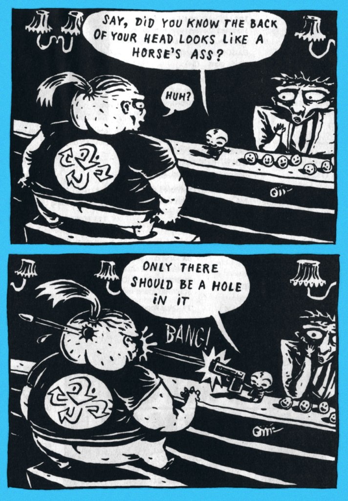
As a bonus, a sequence from Andersson’s breakthrough work, Pixy (1993). The title character is the fœtus with a pistol, and the happy little fellows on the counter are units of money. Highly recommended, and likely available in the language of your choice.

About Pixy, fellow dweller-in-darkness Charles Burns exulted: « So you think it’s a cold, creepy, world out there, huh? Hah! Just wait’ll you get a load of Max Andersson’s Pixy… safe sex suits, buildings that eat people, drunken fœtuses with bazookas, money that shits on you, recyclable bodies… hey, wait a minute, that’s not creepy, that’s fun. MY kind of fun. »

For more dope on this important creator’s endeavours, do sidle over to his official website!

-RG
Take Ten With Shel Silverstein

« Join the army and see the next world. » — Dylan Thomas

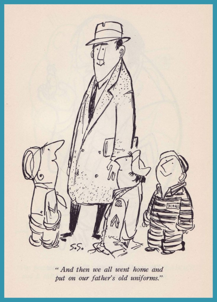
A couple of eternities ago, in Shel Silverstein: Without Borders, we profiled you-know-who and showcased the travel cartoons he produced for Hugh Hefner and Playboy Magazine. Now, we reach back even earlier, to his first stirrings as a professional cartoonist… and a lifelong rover. As it would turn out, Shel truly was a free spirit.

A little bit of biography to set the stage… circa 1955. I can just about hear him, in that distinctive voice of his, hawking hot dogs at Comiskey Park!
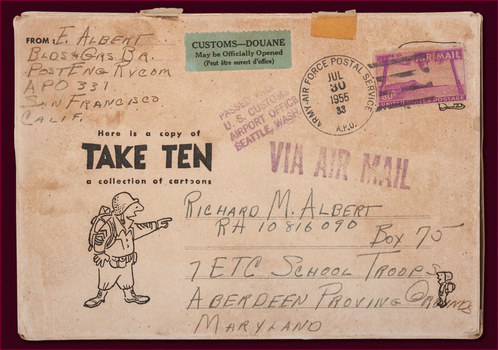
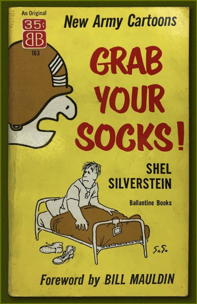
« In 1955, Stars and Stripes published Take Ten, a book collection of his cartoons that was sold through military PXs et commissaries. » And also by mail!
« Here they are… the Centaurs and Bird men… the Geniis and Cobras… the fifteen-foot PFC’s and two-inch E-1’s. Here is TAKE TEN, the first collection of Shel Silverstein’s cartoons, taken from Pacific Stars and Stripes, Army Times and his untapped top drawer. Here is a pocket-full of cartoons that will make you smile and chuckle and laugh out loud. »

Lisa Rogak writes, in her A Boy Named Shel (2007, St. Martin’s Press):

Once he arrived in Tokyo, Shel was assigned to the Pacific Stars and Stripes to past up stories and photo features for the paper. When his work was done — which he performed as quickly as possible — he turned his attention to drawing cartoons using the material that was right in front of him: the military. Shel roamed the streets of Shinbashi, a neighborhood that GIs frequented that once served as the end of the line of Japan’s first railroad. He spent hours each day wandering the streets taking note of the activities of his fellow soldiers, which would invariably end up in one of his cartoons.

He initially did it for his own amusement, through within a few weeks, the paper began to print his work. After spending six months juggling newspaper paste-up with cartooning, he convinced his editors to take him off layout duties and allow him to wander the Far East and send back reports in the form of one-panel cartoons. They agreed.

Evidently, Mrs. Silverstein’s boy was a most charming and persuasive fellow. He would soon pull the same stunt on Hugh Hefner… but none can claim, in either case, that he failed to deliver on his lofty promises!

Here’s a little bit of background on that famous old General, should you need it.
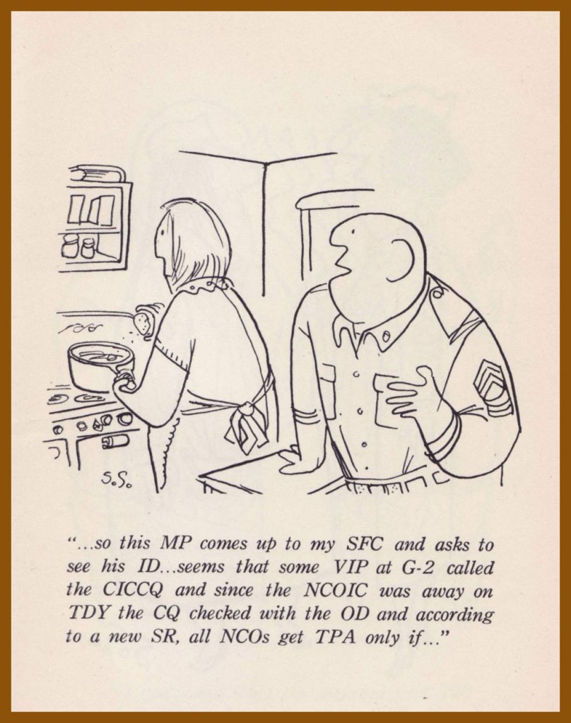
Here’s a helpful guide to US Military acronyms. Who knows, it might spare you some confusion one day.

Even with his freedom, Shel had a hard time dealing with the restraints of army protocol. Corky Alexander, the late editor of the English language Tokyo Weekender, first met Shel at Stars and Stripes. “He was an army corporal and was perhaps the worst soldier in the history of armed might, down through the ages,” he said.

His technique followed a simple pattern. First he thought of an object — say, his first sergeant. He’d concentrate until he would come up with 20 or 30 gags on the one subject. Out of it came situations peopled by his long-nosed characters, his little men, his giants, the animals and the strange creatures for which he has a special affection.

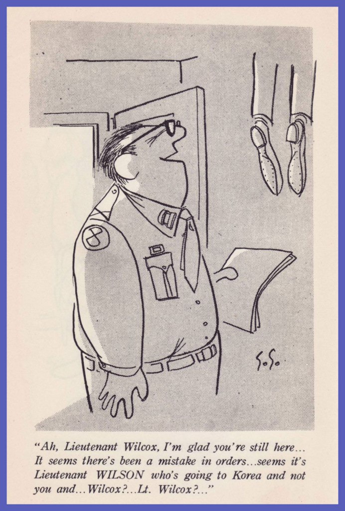
His favorite overall targets were the officers. “They even made zebras off-limits to me because they had stripes,” Shel said.

Old habits die hard. An occupational hazard, you might say.
This, er.. pet might be an early prototype of Shel’s mythic Floobie Doobie Doo.
Now what is that?
It ain’t no dog and it ain’t no cat.
It’s nine feet tall with eyes of blue.
I never seen such a thing
As a thing called a Floobie Doobie Doo.
« Shel’s humor had struck such a nerve, and soldiers based in the Pacific shared his cartoons with their families and other civilians to show them what life in the military was really like, that a larger audience for his work was a natural consequence. In 1956, Ballantine Books published a thirty-five-cent mass market paperback edition of Take Ten called Grab Your Socks! »

In his foreword to Take Ten, Shel’s good buddy and PS&S colleague Bob Sweeney recounts:

In a letter to the home office, Bob Brown of the S&S Seoul Bureau wrote:
He stays up all night chewing pencils, drawing cartoons and writing ideas on little scraps of paper he never finds again. In the first twenty minutes he was here he had our little office more cluttered than the convention hall in his native Chicago.”

But,” added Brown, “he knows the people he draws. He’s lived through the same experiences and heard the same lines.

Here then are the simplicities as well as the subtleties — the obvious and the obtuse — the wonderful conglomerate of a man who loves to write, to draw, to create — and best of all — who loves to laugh.

-RG
Off to the Isle of Cats — and Back by Teatime!

« It’s no good trying to teach people who need to be taught. » — Aleister Crowley

You may have happened across our earlier post on that astounding but tragically short-lived touche-à-tout, Gerard Hoffnung (1925-59). Well, here’s a look at another facet of the man’s work, crafted this time in tandem with, of all people, the definitive-but ambivalent biographer of opprobrious occultist and Ozzy song subject Aleister Crowley, namely the intriguing John Symonds (1914-2006). Come to think of it, the affiliation makes impeccable sense, and it proceeds swimmingly.

In an era where it often seems that those rare adults who yet read do so at toddler-ish levels, it’s easy to forget how many so-called children’s books of yore had plenty to offer the refined adult mind. Here, then, are some highlights from Messrs. Hoffnung and Symonds’ 1955 opus, The Isle of Cats.

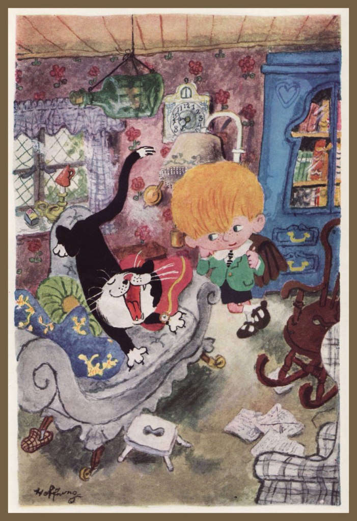
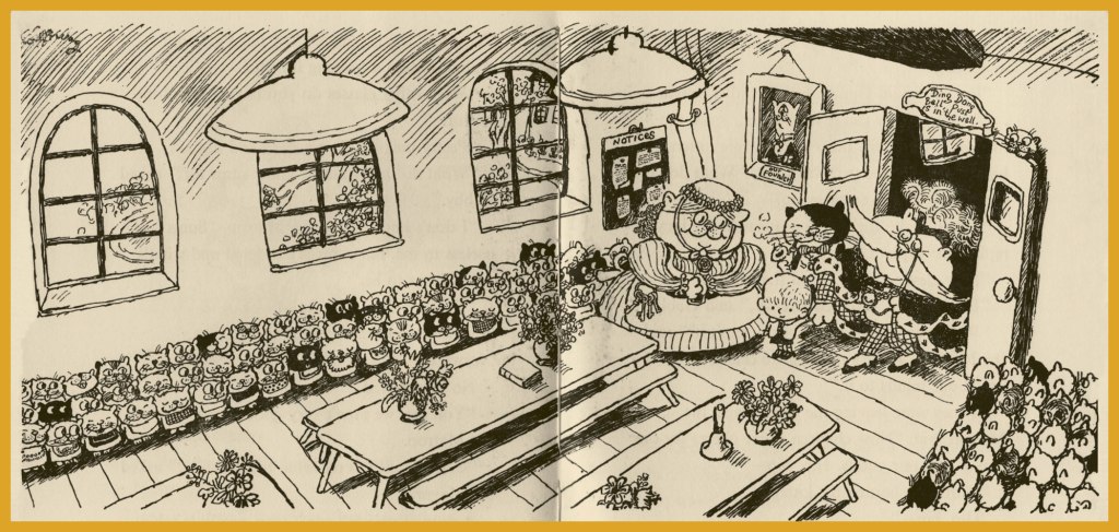
« He closed his eyes, yawned, arched his back and began to dig his claws in and out of the sofa. Uncle Tom was no ordinary cat, for he could tell the time, look through a telescope (keeping one paw over the other eye, of course), beat up an egg, steer a raft, smoke a pipe and do many other things. »
« He’s the Mayor, » whispered Uncle Tom to Gabby, « so be nice to him. »
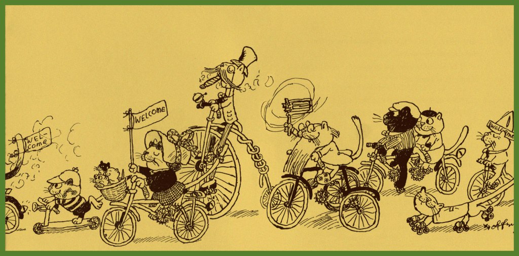
« He was still saying thank you as he and Uncle Tom were being driven away in the Mayor’s car, followed by various cats on bicycles, tricycles and penny-farthings. »
The wrestling bout pitting Tim the Terror (left) against The Furry Fury (right). Things end with a crash when Tim lets go.
« The Hall of Fame contained the portraits of the island’s most celebrated cats. »
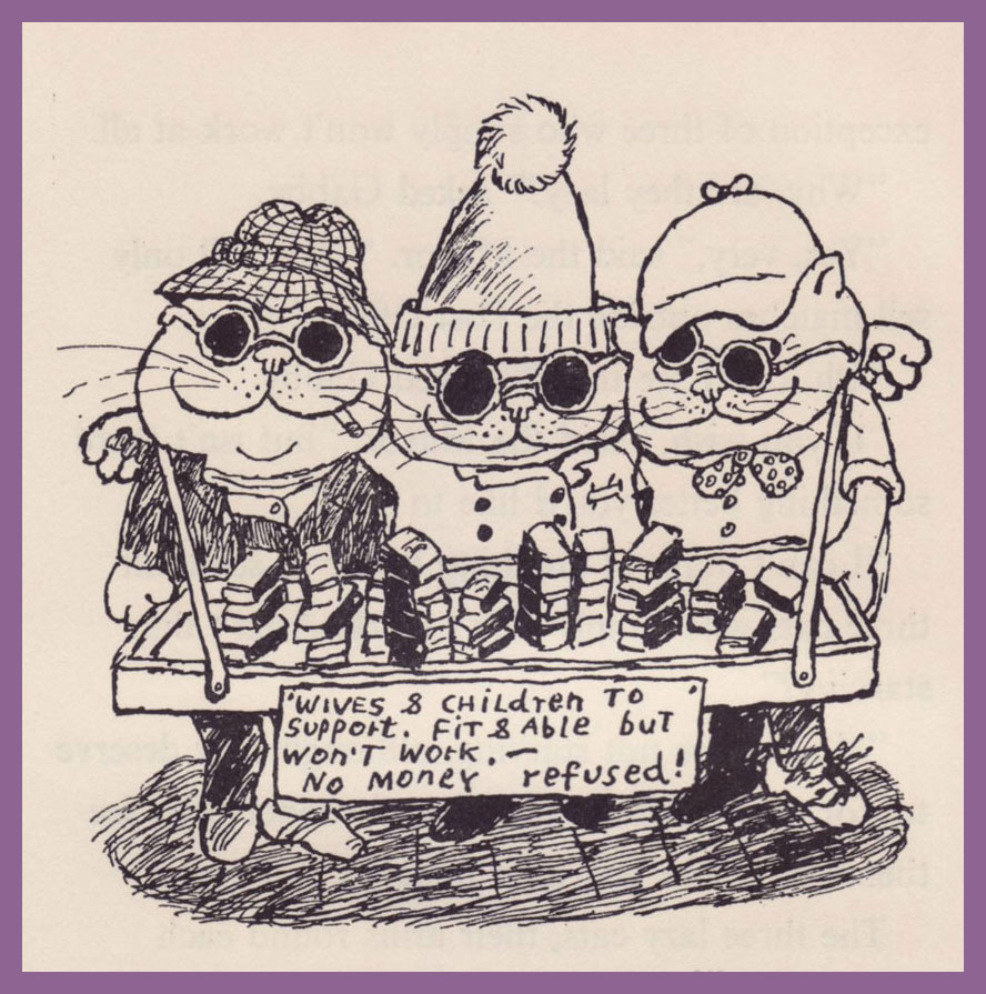
« There were portraits of lots of other famous cats, including Martha who had seven hundred and forty nine children, six hundred and eighty three of whom survived, and were now working hard as tram-drivers, crossing-sweepers, lamp-lighters, pastry-cooks and so forth, with the exception of three who simply won’t work at all. »
« At the Orphanage, all the kittens were lined up on either side of the Great Hall, looking as good as gold, their hankerchiefs sewn to their shirts, close enough to their noses to blow into them. »
« Just then they sailed over the madhouse and saw some cats standing on their heads, waving their legs in the air. »
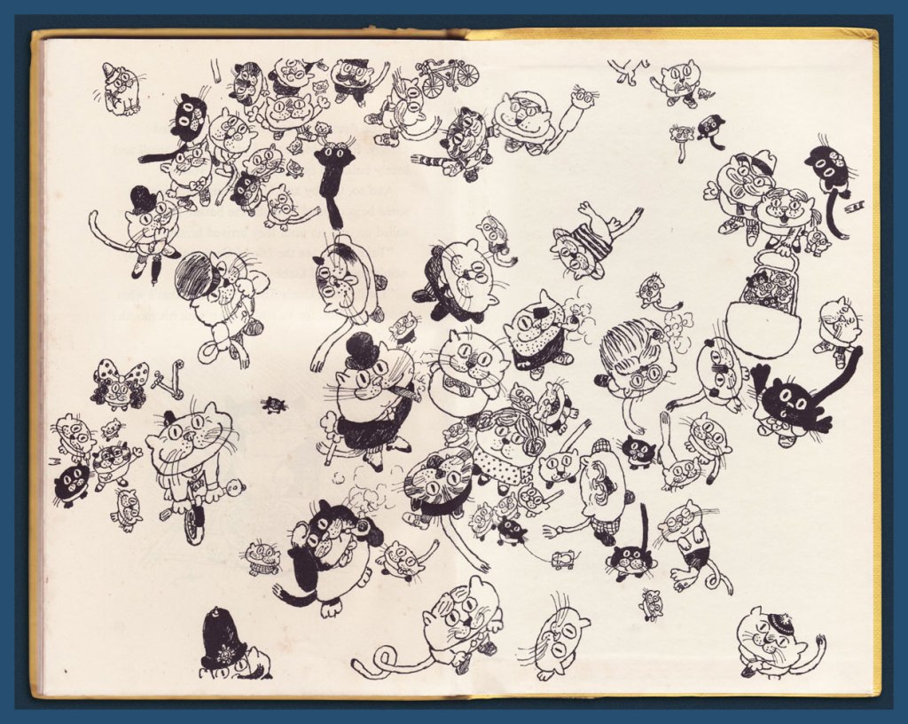
The book’s endpapers illustration, granting the reader a lofty view from the Mayor’s hot air (of course) balloon.

As a bonus, for the finale, here’s the poster Hoffnung was commissioned to illustrate for the classic, Brexit-anticipating 1949 Ealing Studios comedy Passport to Pimlico. [ watch the trailer! ]

Hoffnung’s loving widow, Annetta, wrote, in her 1988 biography of Gerard: « As he sat at his drawing board, increasingly involved and complicated fantasies tumbled from Gerard’s pen onto the paper. In 1949 came perhaps the most intricate of all, a drawing for the poster advertising a popular film of the day, Passport to Pimlico. I do not have the original design but it is unlikely to have been larger than 12″ x 15″, and to squeeze so much into so little space is no mean achievement. » I couldn’t find a trace of this image online, so I’m providing a nice ‘n’ large scan for you. Eat your heart out, Will Elder!

-RG

Treasured Stories: “Tee for Three” (1975)

« Coming to play golf is not what I would consider to be an essential purpose. » — Nicola Sturgeon

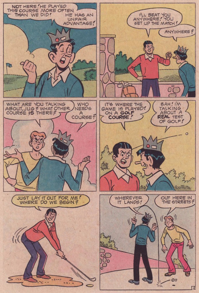
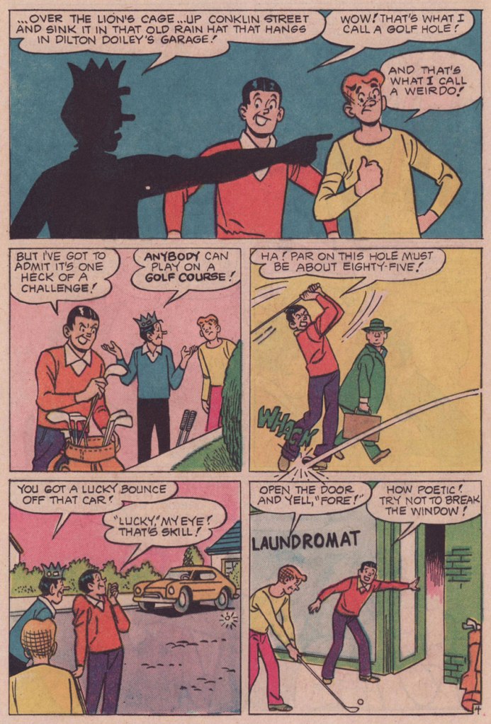
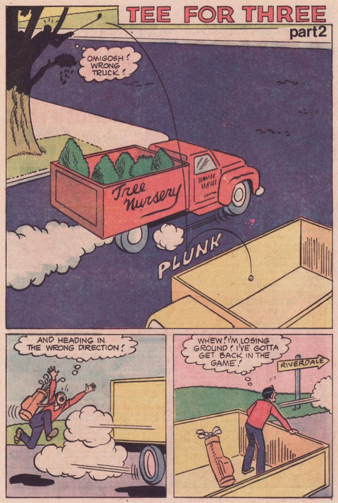
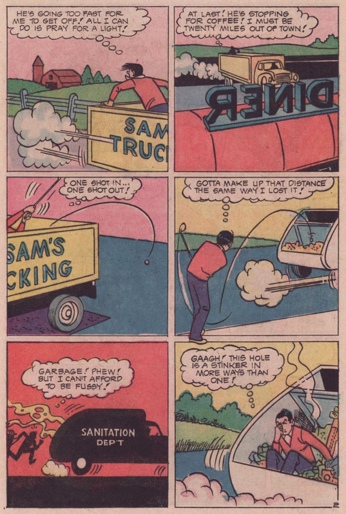
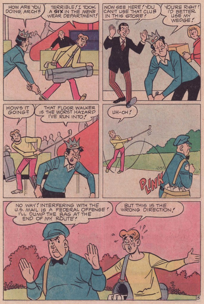
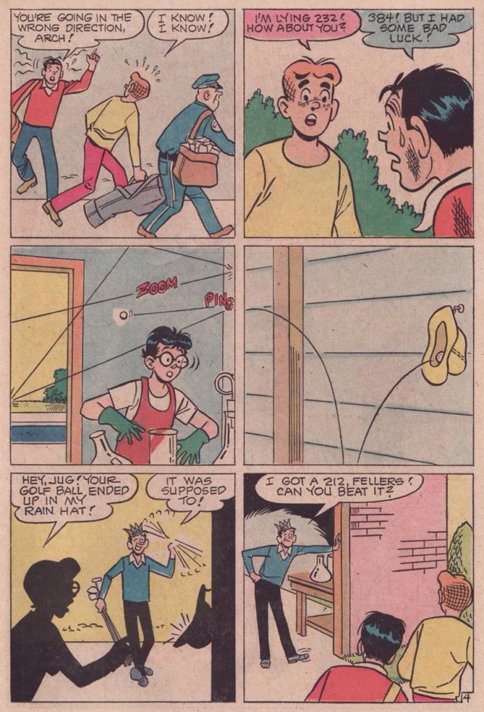
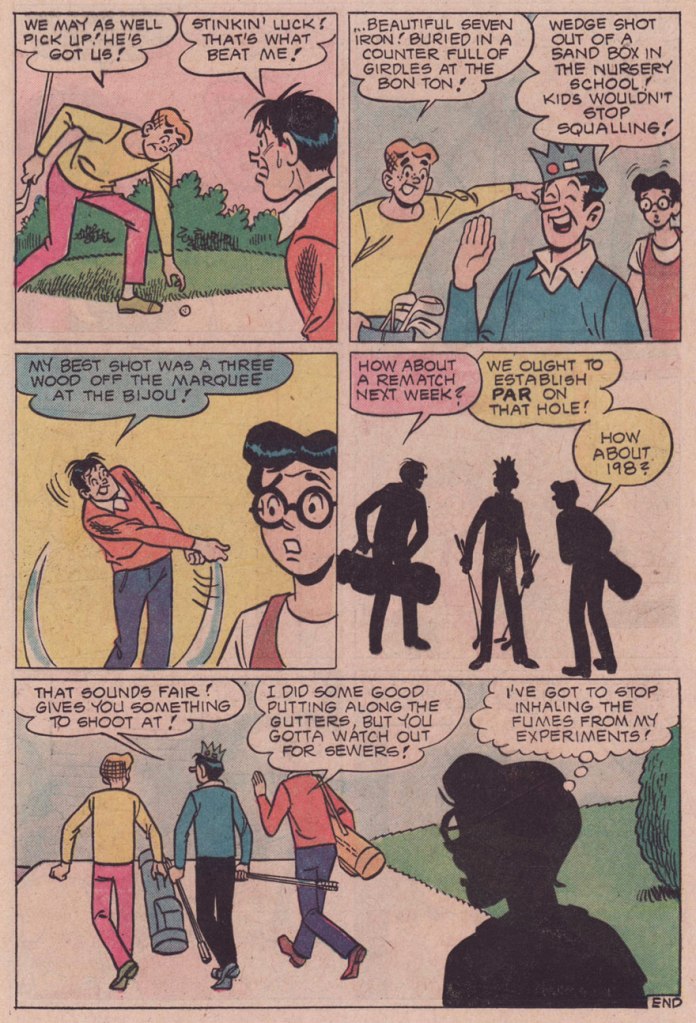
I’ve long wanted to showcase one of Samm Schwartz‘s Jughead stories on this blog, but always hit the same snag: which one? Not too long ago, while revisiting my trove of 1970s issues, I came upon just the specimen. Tee for Three appeared in Jughead no. 247 (Dec. 1975, Archie). I’ll spare you the hideous-as-usual Stan Goldberg cover.

While we know the story was illustrated by Samm Schwartz, the writer’s identity remains unknown. Schwartz usually took a hand in the scripting, but he didn’t really ever work alone. The likeliest miscreants are his usual accomplices, Frank Doyle and George Gladir.

Why this one among hundreds of others, then? For one thing, it’s longer; at eleven pages long, it’s a towering freak amidst the customary five-or-six pagers.

But that’s not all: Tee for Three also boasts an unconventional plot, one that cried out for (and received) a more leisurely deployment. Its tone is also surprising: it’s quite deadpan and sanguine in its absurdity.

For once, you can envision why these three, despite being frenemies or plain rivals, would actually hang out: they challenge and entertain one another. And even collaborate when the occasion calls for it. In this case, Jug, Archie and Reggie are so bonded in their good-natured folie à trois that the rest of the world doesn’t have a clue and hardly stands a chance.

While such a golf contest would surely result in much injury, property damage and litigation in the ‘real’ world, it sure seems like a rollicking bit of sport here, and isn’t that what good fiction is for(e)?

-RG