« If you’re going to be a sinner, be the best sinner on the block. » — Anton Szandor LaVey
I’m afraid the appeal of Archie Goodwin’s (1937-1998) writing has always escaped me. As you’d expect with a career as busy and prolific as his was, there are notable exceptions*. But I think, as is often the case in comics, he gets a lot of credit for tepid, formulaic writing that happens to be masterfully illustrated. You know, like just about every story from the early Creepy and Eerie (Goodwin was editor and principal writer of the Warren line for its first four years or so) with their groan-inducing ‘shock’ endings: “But I’m a vampire, and we don’t like competition around here!” or “We ghouls don’t cotton much to werewolves!” or “You’ve guessed my secret too late — I’m a witch!” or “For I am… Death!“
On the other hand, he was a fine editor and, by all accounts, a terrific human being. In 2013, Mark Evanier put it this way: « At a time when some editors in comics were notorious for treating their freelancers with disrespect and yelling, Goodwin had a sterling reputation. He always would. Archie was nice. He was honest. »
It is to his great distinction that even such divisive, eternally-acerbic figures as Jim Shooter (« First and foremost, everyone loved Archie. Archie had a manner about him that you just couldn’t not like him. While he was tough as nails, and he was probably the best that passed through this business, he managed to do it without offending anyone. He managed to be respected and remain friends with everyone and do his job. ») and Alex Toth (« None of us were working there [at Warren ] for the money, because there wasn’t much. We were working there to work with Archie. ») reserved naught but effusive praise for the man.
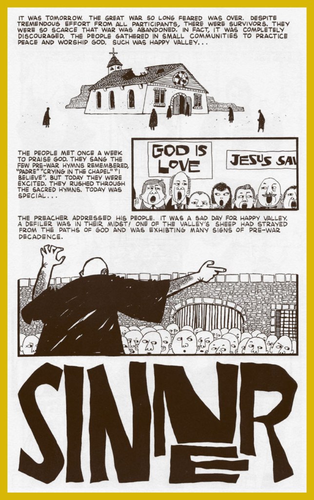
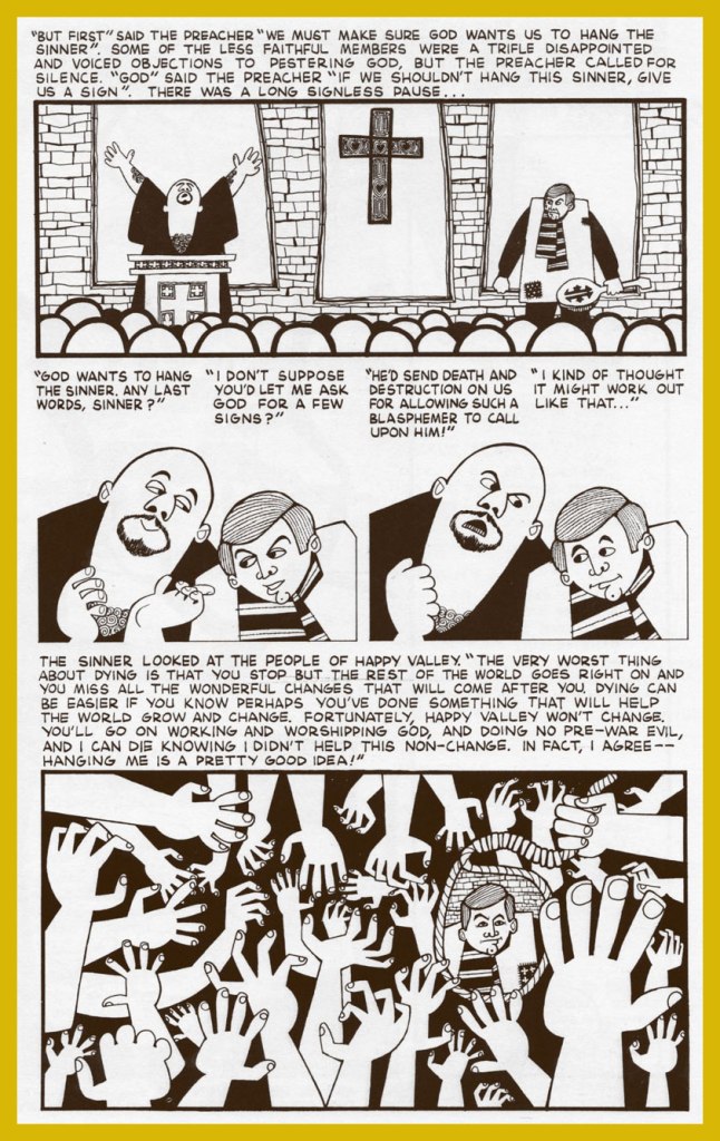
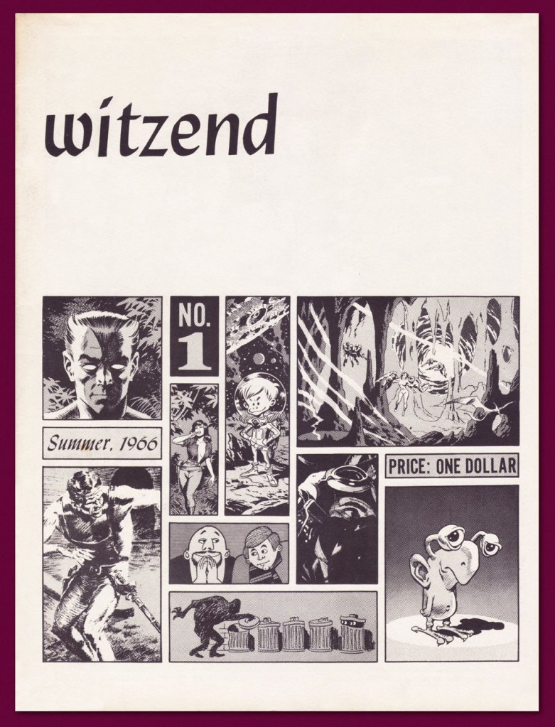
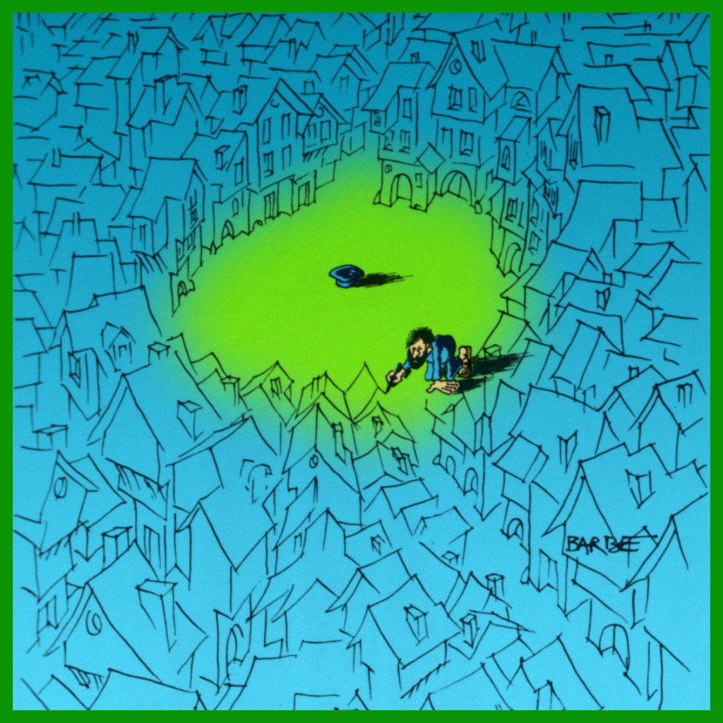
But you know what I really like about Archie? His drawing, which was all-too-rarely showcased. While he did adjoin thumbnails layouts to his scripts, Goodwin’s drawings rarely appeared in print, aside from some jokey editorial asides at Marvel in the 1980s. Here’s Sinner, written and illustrated by Goodwin, from Wally Wood’s prozine Witzend no. 1 (Summer 1966).
Sinner would be reprinted a few times, notably in the second issue of Marvel’s Heavy Metal knockoff Epic Illustrated (Summer, 1980), edited** by Goodwin. Marvel had passed on the Métal Hurlant licensing rights and, when Heavy Metal proved a smash hit, launched their ersatz. Such is the way of Marvel.
This is Witzend no. 1, featuring a splendid cover layout by Goodwin…. it’s harder than it looks, especially when it looks this good… and given the relatively primitive means employed. I tell you, Archie missed his calling.
Goodwin’s, adobe, clean line and silhouette graphic approach has always reminded me of this fine album cover from a few years earlier, which is to say 1963. It was designed by A&M Records art director Peter Whorf (yes, the legendary Whipped Cream & Other Delights cover was also one of his).
Despite all this, Archie Goodwin’s greatest claim to fame simply has to be the tremendous legwork he did as Nero Wolfe’s assistant.
« Archie Goodwin’s first prose story was published by Ellery Queen’s Mystery Magazine, which warned him he could not use Archie Goodwin as a pen name because it was a Rex Stout character in the Nero Wolfe books. According to Goodwin’s wife Anne T. Murphy, the magazine’s editors ‘then were so delighted when he wrote back to say that it was his real name that they used the anecdote as the introduction to the story, which ran in the July 1962 issue.’ »
-RG
*Notable exceptions: The Success Story, with art by Al Williamson (Creepy no. 1, 1964) has actual bite. Despite its rote-EC-revenge-from-beyond-the-grave finale, it’s a bitter parody of real-life comic-strip parasites such as Don Sherwood (Dan Flagg, The Partridge Family) and Alfred Andriola (Kerry Drake). There’s the tragically moving Island at World’s End, illustrated by Gray Morrow (Eerie no.4, July 1966). And a handful of inspired little tales that truly fired up the creativity of a freshly-emancipated Steve Ditko: Collector’s Edition (Creepy no. 10, Aug. 1966); Second Chance! (Creepy no. 13, Feb. 1967); Deep Ruby! (Eerie no. 6, Nov. 1966); and my very favourite, Room With a View (Eerie no. 3, May 1966… their first collaboration!). If anyone’s interested, the Goodwin-Ditko outings have been handsomely collected in Creepy Presents: Steve Ditko (2013, Dark Horse).
It must be said that Goodwin knew how to match a plot with the proper illustrator. As he explained, « I always tried to write the stories for individual artists. Sometimes, I’d ask them if there was a certain setting or a certain kind of story they were interested in, and I also knew what they did best. » It’s a shame that, overall, the stories themselves were so timid and unambitious, so mired in the glories of the past. Some people can’t help pulling their punches, I suppose.
**To give you a fair idea of Marvel’s delusions of corporate grandeur at the time, Epic Illustrated no. 2‘s convoluted and deceptive editorial credits read thus: Stan Lee (editor); Archie Goodwin (editorial director); James Shooter (consulting editor); Marian Stensgard; Louise Jones; Larry Hama; Ralph Macchio (editorial); Roy Thomas (contributing editor); Maggie Thompson (contributing editor); Don Thompson (contributing editor). Dollars to doughnuts that Goodwin and Louise Jones did all the actual work.
« You better watch out, you better not cry, better not pout, I’m telling you why —Santa Claus is coming to town. » — Haven Gillespie
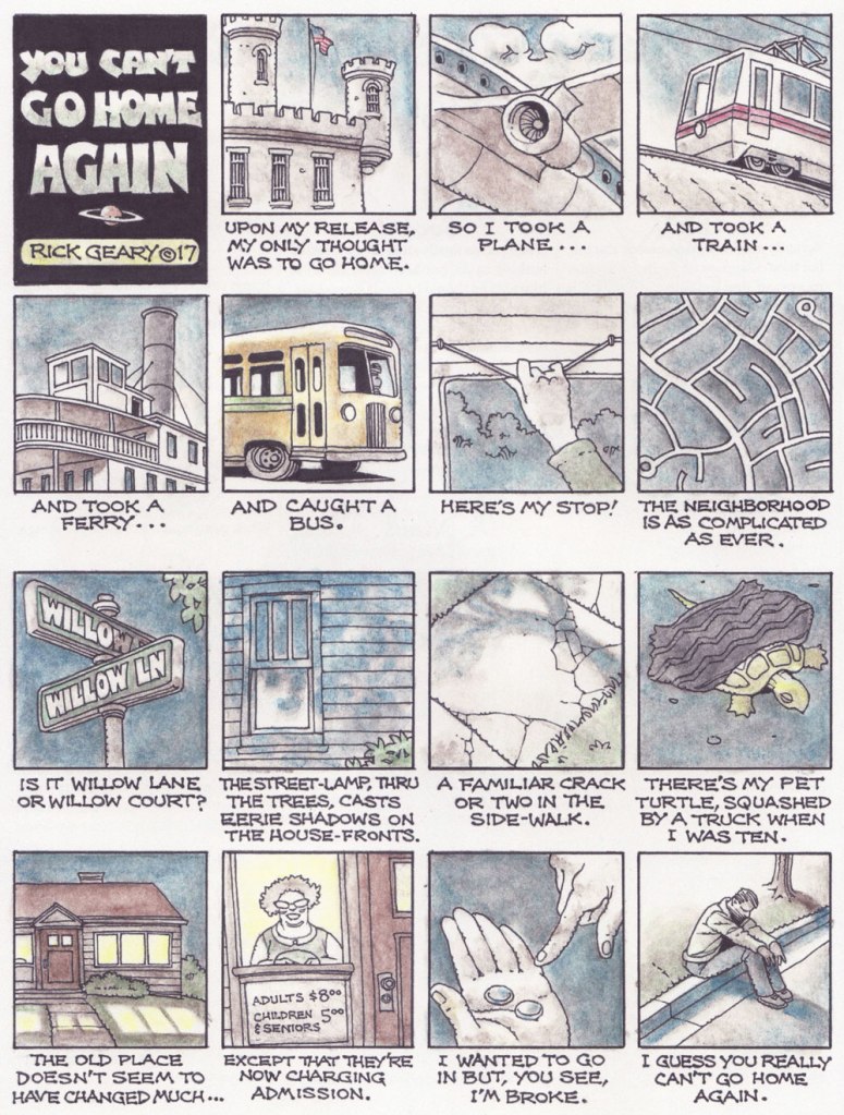
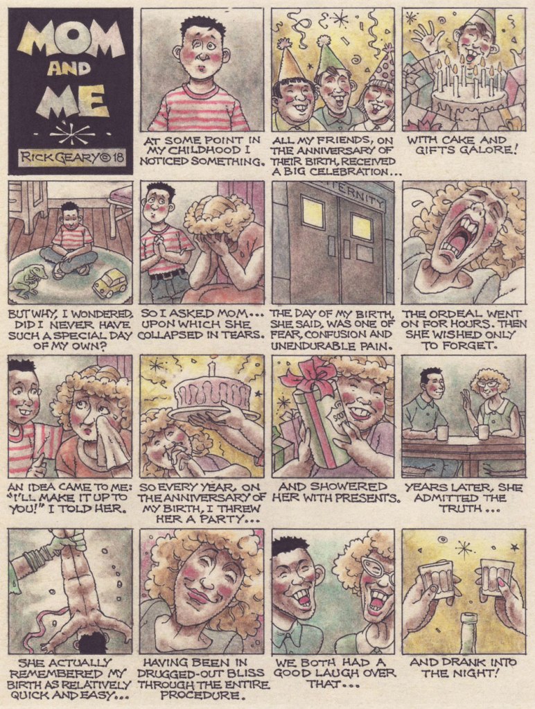
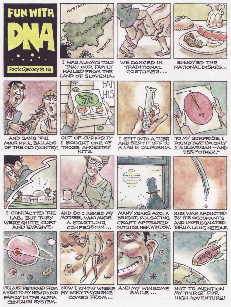
Taking stock, I can’t help feeling that the singular Rick Geary (b. 1946) is a creative force that’s taken for granted. He’s been consistently chugging along at a dizzyingly high level of erudite inspiration and craft since the mid-70s. His work has been recompensed and saluted several times (an Inkpot from the San Diego Comic-Con in 1980; a Magazine and Book Illustration Award in 1994 and a Graphic Novel award in 2017, both from the prestigious National Cartoonists Society…) yet he’s remained kind of a well-kept secret, a cartoonist’s cartoonist. Even as he turned up in countless anthologies, in most cases, it felt as if he didn’t quite belong, didn’t exactly jibe with the respective audiences of, say, Dark Horse Presents or Pulse (on the other hand, High Times wasn’t a bad fit!).
Still, it’s fair to say that his following is one quite discrete from the comics mainstream. The Geary devotee must ever remain vigilant, for one never can anticipate his next move.
Which brings me to The American Bystander, which Newsweek deemed « The last great humor magazine », and to which Geary has been contributing since its second issue… and for once, it feels like home.
The Bystander, according to Wikipedia…
… features contributions from many notable comedy writers, illustrators and cartoonists. The Bystander is designed to provide a classic print humor magazine experience similar to that delivered by National Lampoon, SPY, Harold Hayes-era Esquire and many others in the pre-internet era. Yet according to The New York Times, The American Bystander “does not just belong to the tradition of defunct magazines like The National Lampoon and Spy. Its nostalgic, lightly witty style evokes influences that have been dead even longer, like the raconteur Jean Shepherd and the sophisticated stylist Robert Benchley.”
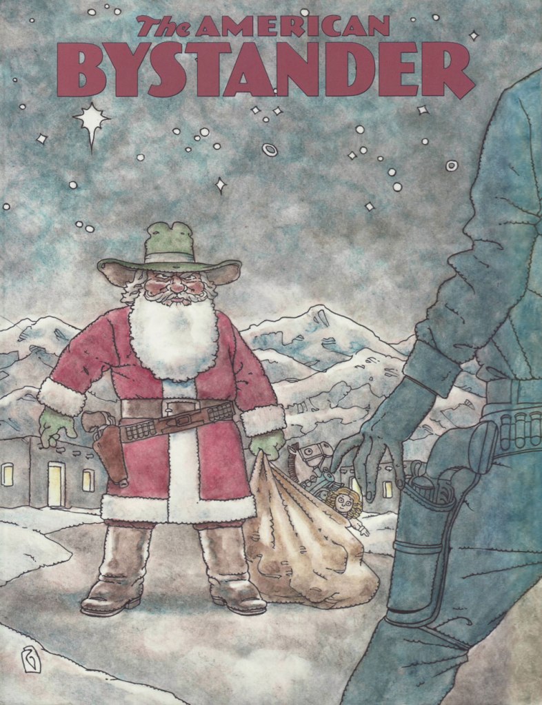
Mr. Geary’s magnificent cover for The American Bystander no. 9 (Fall, 2018). « Have Gun, Will Travel — Wire Santa, North Pole »
The Bystander‘s editor-publisher, Michael Gerber, exults: « In addition to his civilian fans, Rick Geary is one of those illustrators that other illustrators love, and I am with them all 100%. This drawing, entitled ‘New Mexico Christmas’, appeared in my inbox mere moments after I’d given Rick the assignment — which is why editors love him, too! »
While this ever-industrious auteur has produced graphic novels galore in the glorious Geary fashion, I remain fondest of his short-form pieces. Here’s a choice handful plucked from Bystander issues.
From The American Bystander no. 7 (Winter 2017).
From The American Bystander no. 8 (Summer 2018).
From The American Bystander no. 9 (Fall 2018).
From The American Bystander no. 10 (March 2019).
And while ’tis the Season, I would be remiss in neglecting to mention that TAB’s latest issue no. 18, is hot off the presses. More details here. And should you crave to sample the goods… gratis — that option’s on the table as well!
This is The American Bystander no. 18, boasting this festive cover by Rick Meyerowitz.
That said, Happy Holidays, everyone. Be merry but above all be safe!
« Aren’t we forgetting the true meaning of Christmas. You know, the birth of Santa? » – Matt Groening
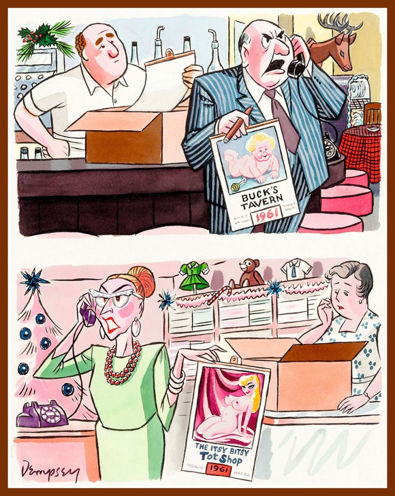
We’re back with another piping hot batch of Holiday cartoons from the pages of Playboy. I have striven mightily to represent most of the big guns (Kiraz and Smilby are among the missing — better luck next year, gents!) whilst keeping it to a tidy, cherry-picked dozen. One can only take so many ‘Randy Santa’ gags, even when they’re lavishly illustrated… that’s only a fraction of the culling process.
An early one by John Dempsey (1919-2002); it appeared in Playboy’s January, 1961 issue (what gave it away?)
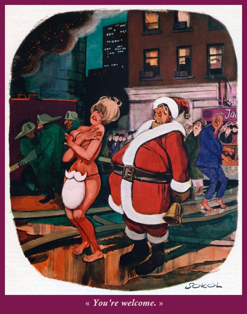
Austrian master Erich Sokol (1933-2003) shared his playful erotic visions with the readers of Playboy from 1958 to 1975, when he returned to his homeland, and again from 1992 until his passing. This one’s pleasantly gentle and understated.
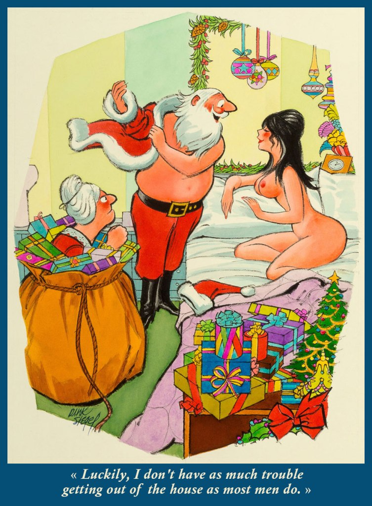
Readers of this blog will already know that Leo ‘Dink’ Siegel (1910-2003) is a favourite of mine. I showcased some of his Playboy work last year in Dink Siegel’s Swingin’ Roommates. Now *this* particular bit of impending marital strife and comeuppance appeared in the January, 1972 issue of the magazine.
Mighty Texan Rowland B. Wilson (1930-2005) was a dazzlingly-skilled illustrator and animator, as evidenced by this late-70s piece. His association with the magazine was long and fruitful. To wit, « on the day of his death, a sketch for a new Playboy cartoon still lay on his drawing board. »
Second only to Saucy Santa jokes were the Scrooge sex jokes. But Eldon Dedini (1921-2006) really nails this one, from the pages of Playboy’s December, 1980 edition. And for your further edification, here’s my co-admin ds’ fond salute to this lovely, talented man.
Sure, we love Bernard Kliban (1935-1990)’s cats, but I’m frankly more partial to his anarchic, surreal, free-form wit. This sweet slice of… well, just desserts saw print in Playboy’s December, 1981 delivery.
Hardly-frosty Ontarian Doug Sneyd (1931–) has his go at Charles Dickens’ moral fable, with pretty solid (or so Ebezener hopes!) results. Mr. Sneyd knows his antiques, that’s evident.
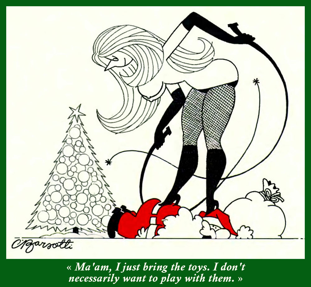
Dog aficionados everywhere best know Charles Barsotti(1933-2014) for his canine cartoons. This habitué of The New Yorker magazine (from 1970) also created several comics strips, was cartoon editor of The Saturday Evening Post, and generally a hard-working, genial man of tremendous talent. This lovely panel was buried near the back of Playboy’s December, 1982 issue.
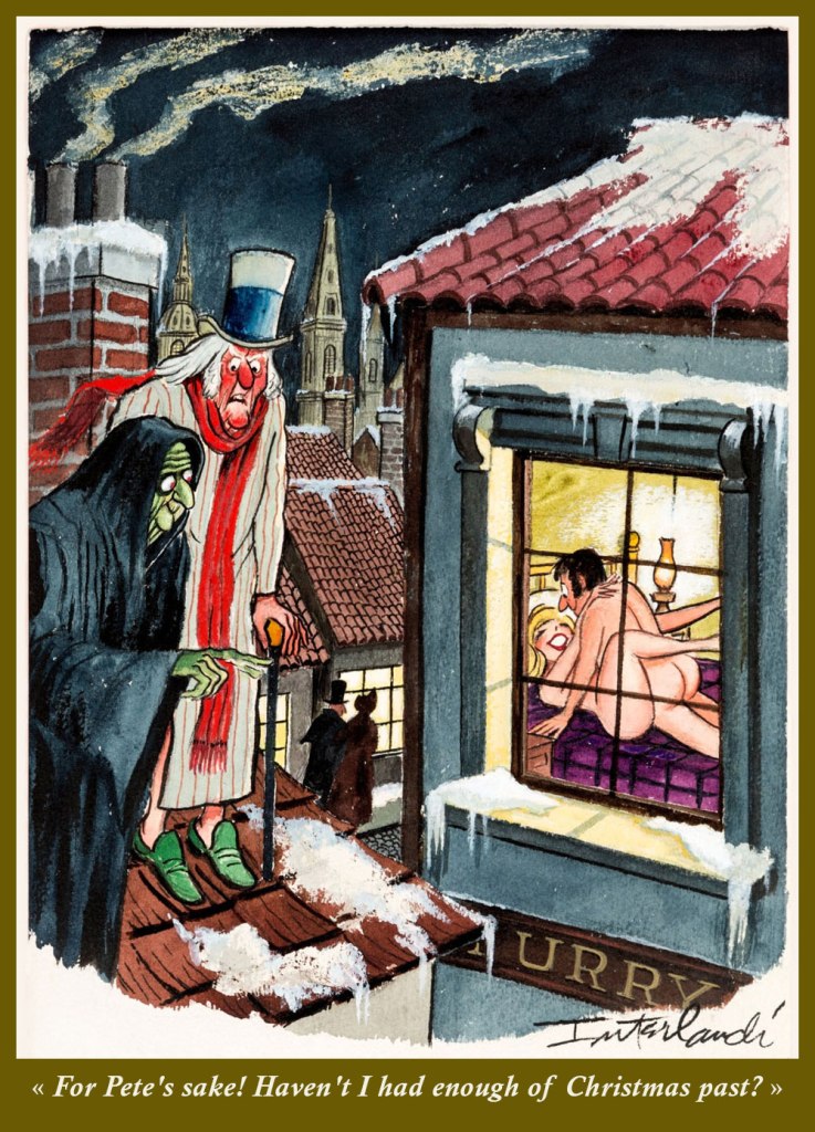
Phil Interlandi (1924-2002) sold his first cartoon to Playboy in 1955, just a couple of years into the magazine’s existence. He soon had earned his permanent spot in the roster. Here he contributes his bit of Dickensian sauciness to the canon.
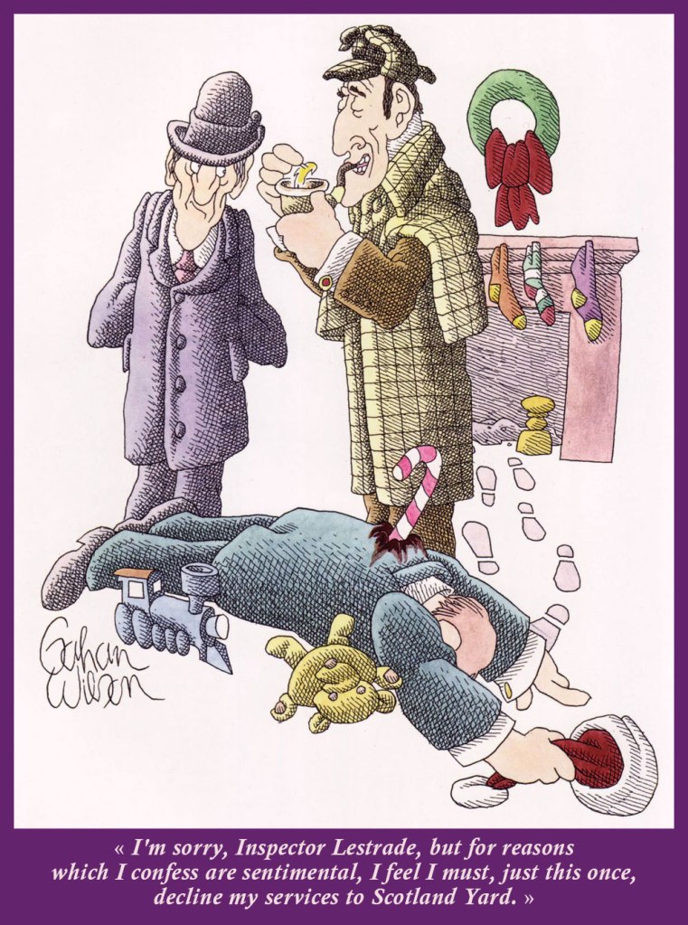
Among the Playboy cartoonists, Gahan Wilson (1930-2019) surely was the one most left to his own devices, and wisely so. He created scores of gleefully macabre Christmas cartoons for the magazine, but this one’s a real standout. Every element counts. Exemplary cartooning from the December, 1987 Playboy. And beware — more Gahan awaits you here.
Certainly a cut above the usual ‘Lascivious Saint Nick’ fare, this lush piece by Robert ‘Buck’ Brown came along in Playboy’s December, 1988 issue. Pray note the fretful reindeer peering over the roof’s edge. That’s cartooning!
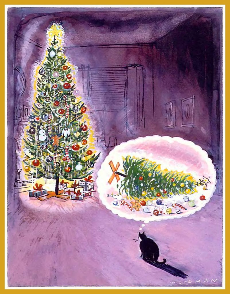
While he’s mostly renowned for his work in The New Yorker (which continues to this day), Bill Woodman (1939 –) also contributed (this beauty, among others) to Playboy. From the December, 1988 issue. Yeah, our cats too.
And that’s our crop for this year… hope your holidays are bright and merry, under the circumstances. Joyeux Noël, one and all!
« She kept her ears permanently tuned to the chicken voices outside, so knew immediately when a coyote had crept into the yard, and barrelled screaming for the front door before the rest of us had a clue. » ― Barbara Kingsolver
Given how muted the holiday season is likely to be for most of us, and in light of how much our readers appear to enjoy our past Christmas offerings — (all year long!), I’d thought I’d get an early start on the festivities.
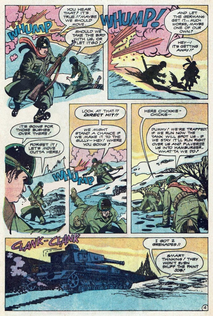
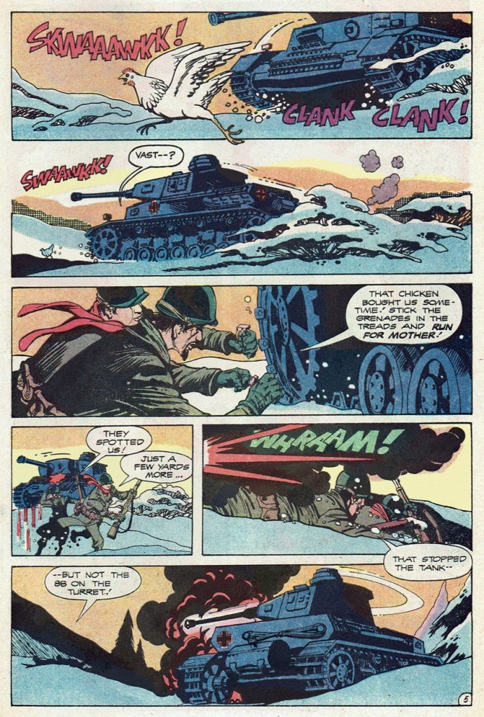
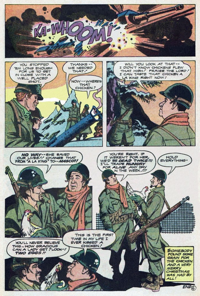
Here’s a fine, but truly obscure little Christmas fable. It was buried in the back of an issue of The Unknown Soldier, at a time when the DC war line was well into its final decline.
… as much of a ‘very merry Christmas’ one may possibly enjoy in the midst of war, far from home and loved ones, at any rate. I would have enjoyed seeing more of those two kind-hearted doofuses, Burf and Flaps… and their chicken mascot. I wonder what name they would have given her…
According to editor Paul Levitz, Christmas Dinner‘s script had been purchased six or seven years earlier by his predecessor Archie Goodwin but had lain fallow in the interim. It was written by one Janus Mitchell (his sole credit in comics, but we may be in the presence of pseudonymous shenanigans) and was finally assigned for illustration to Teny Henson (often credited in the US as ‘Tenny Henson, as he is here), one of my favourite creators from the ranks of the Filipino Komiks community. In America, Henson’s work mostly appeared in DC publications for about a decade (1974-83), beginning with the plum commissions of inking a returning Sheldon Mayer (post-cataract surgery) on his Rudolph the Red-Nosed ReindeerLimited Collectors’ Edition giants, and inking Ramona Fradon‘s pencils on DC’s underrated second revival of Plastic Man for a pair of issues. All in all, Teny flew under the fanboy radar, chiefly providing artwork for mystery and war short stories, and always at a high level of craft and inspiration.
I love the economy and precision of his line, his limpid storytelling, and his mastery of an aesthetic merrily at play in the sweet spot between the cartoonish and the representational. Fittingly, he went on to work in the animation field.
This is The Unknown Soldier no. 237 (Mar. 1980, so on the stands in Dec. 1979, DC), picking up its numbering from the venerable Star-Spangled War Stories; cover, of course, by Mr. Joe Kubert, though by no means among his finer moments — that ‘Nazis in ambush’ formula was getting pretty long in the tooth by then.
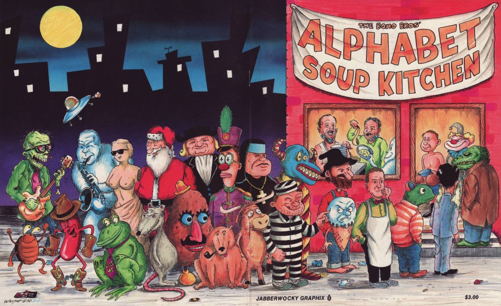
While concocting a post on a favourite oddball obscurity, the one-shot Alphabet Soup Kitchen (1990 Jabberwocky Graphix), I decided to reach out to one of its co-creators, the dapper Wayne ‘Wayno’ Honath, to see if he could shed some light on this delightfully batty project of yore. And did he ever come through!
Wayno’s lavish wraparound cover features most of the issue’s cast, and was coloured by ‘guest Boho Bro’ and publisher Brad W. Foster.
In one of those happy cases of talent and perseverance rewarded, Wayno®nowadays splits creative duties on syndicated strip Bizarro with its originator, Dan Piraro (since 2018, though he’d been part of team Bizarro going back to 2009), with Wayno® ably handling the dailies and Mr. Piraro the Sundays. It’s a fact: Wayno®, thanks to his crisp visual style, sharp gag writing and encyclopedic grasp of cartooning history and archetypes, was just the right ink slinger for the task.
Without further delay, I cheerfully yield the floor to Wayno®, his superbly lucid recollections, and some choice letters from the Alphabet Soup Kitchen!
Sure, I remember doing Alphabet Soup Kitchen! Ted Bolman and I had traded minicomics through the mail, and appeared in some of the same publications. We may have collaborated earlier, but I don’t think so.
I don’t recall whose idea the book was, but it sounds like something I’d have done. I liked to define parameters or constraints for projects, and then work to complete the parts. We split up the alphabet so Ted would do the first half of “A,” then I’d do “B,” and we’d alternate to the end. We sent the pages to each other by mail.
There were two different printings. I printed it as one of my “No Way Comics” minis. The interior was black & white, and the wraparound covers were brown ink on an off-white textured stock. I used a local printer for my minis, and most of them were offset printed, not Xeroxed. (I did several “secret” publications in editions of 50 or fewer, and those were Xeroxed.) They’d offer a free ink color once a week, and that’s how the brown ink on the cover came about. I drew the inside cover endpapers.
After my minicomic version was published, Brad Foster contacted me about doing a larger reprint under his Jabberwocky Graphix imprint. I drew a new wraparound cover featuring characters from the interior. I included a photo of two men wearing some sort of jaw-braces to represent the Boho Brothers, and also drew these guys on the cover. I can’t recall whether the endpaper drawings were included in this edition. I have a copy somewhere, probably in my office/storage space. I believe that Brad Foster may have done the color work on the cover. Yes, just confirmed that on the Poopsheet Foundation webpage (a good source of minicomics images and info).
I also included copies of my original printing in one of two multi-packs I offered for sale. This was in a set called THE NO WAY MINICOMIC FUNBAG, which included Boho, Uncontrolled Copy, The World’s Most Dangerous Animal, and one bonus minicomic from my backstock. They were packaged in a plastic bag with a wraparound cover.
Incidentally, the title is an example of a form of wordplay I still use from time to time in Bizarro. I couldn’t find a good descriptive name for this, and I coined the term streptonym, which still hasn’t caught on. I first blogged about it here: https://waynocartoons.blogspot.com/2011/08/whatchamacallit_11.html
That’s as much as I can come up with off the top of my head!
Watch the brief, eerie documentary entitled… Göring’s Ghost.
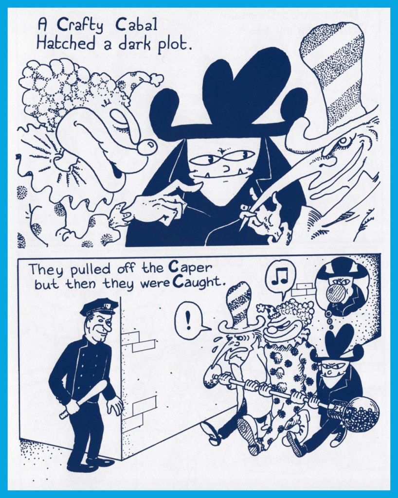
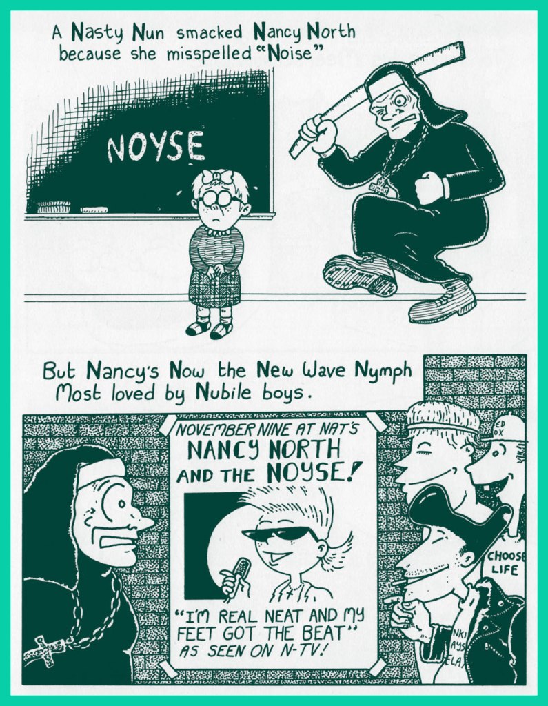
Nuns with rulers? A classic theme! “The nuns who smacked me and my friends at our small elementary school in New Jersey were Sisters of Charity, a cheap bit of irony that always draws a chuckle when I talk about being on the receiving end of those holy rights and lefts.“
To join the Roy Orbison Fan Club, the line forms here.
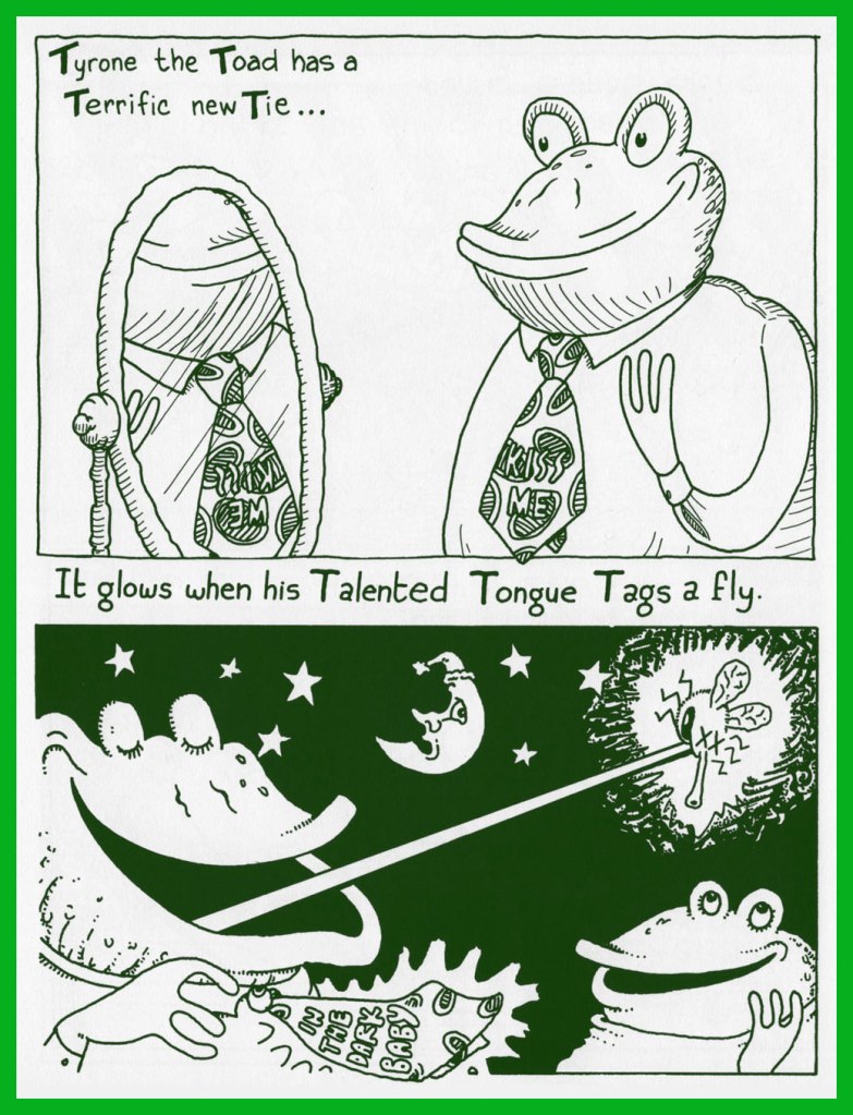
Perhaps you’d like more details on Tyrone’s rather swanky tie? Say no more… here you go.
In case you doubted it (for shame!), yes, there *is* such a thing as Yiddish Yodeling.
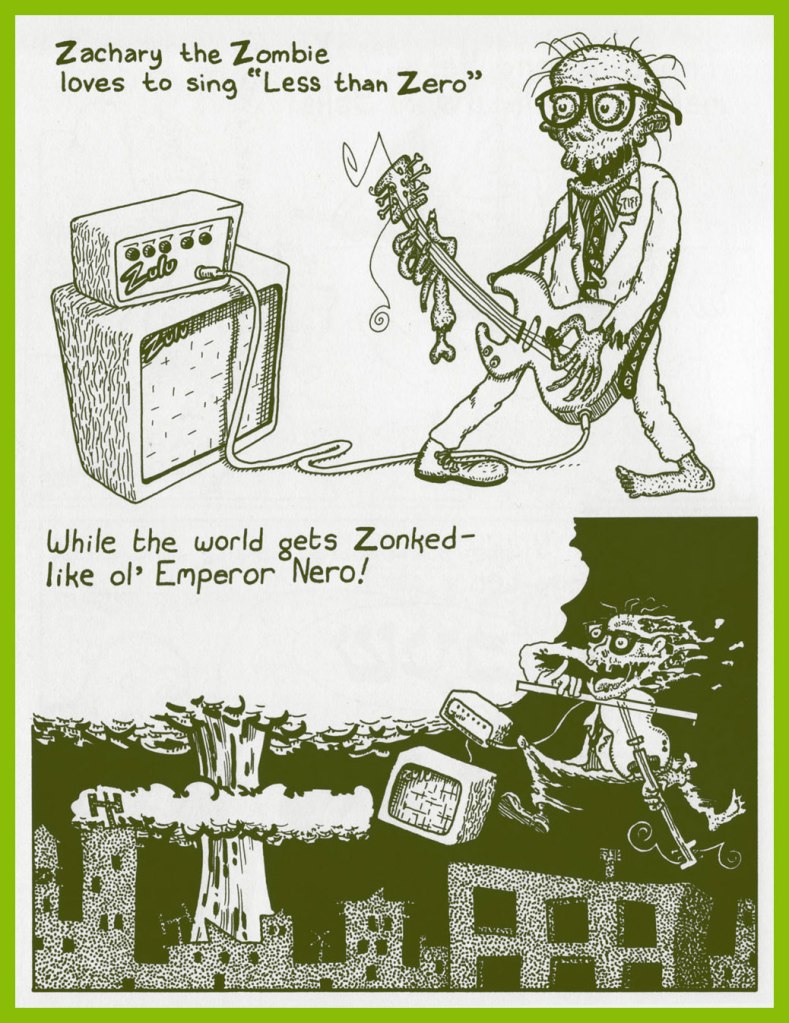
Zachary the Zombie’s version hasn’t been committed to tape, I’m afraid, but here’s a rendition of Less Than Zero by its composer.
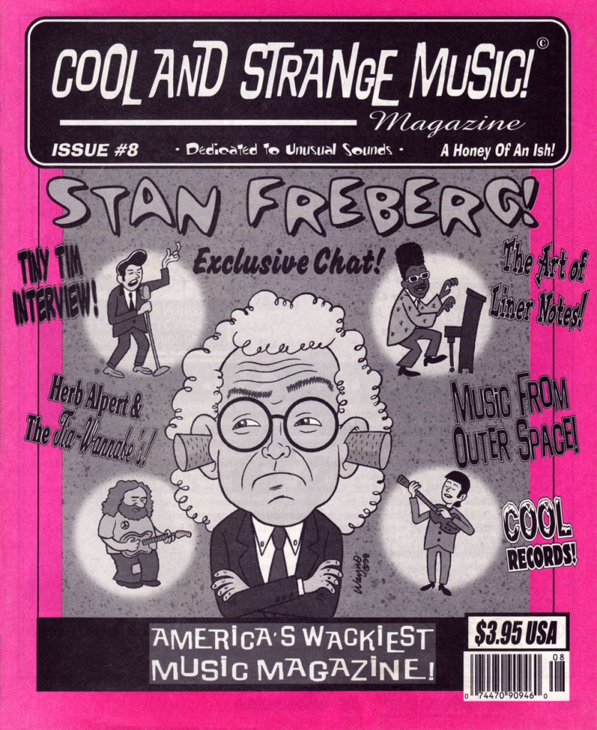
I mentioned to Wayno® that I enjoyed his cover work for Dana Countryman’s Cool and Strange Music magazine (28 issues, 1996-2003), to which he responded:
Cool & Strange Music was great! I’m still friends with Dana Countryman, and I still admire that he was able to continue self-publishing it for so long, and always on schedule, and he always paid for the art. He was more reliable and professional than a lot of bigger mainstream publications I worked with!
This was the first issue I chanced to get my mitts on. Some back issues of this most excellent publication are still available (at most reasonable prices!) from this fine source!
Once more, three cheers and my most heartfelt thanks to Wayno® for his generosity and kindness. Best of luck with everything!
« This world is run by clowns who can’t wait for it to end. » — Too Much Joy, ‘Clowns‘
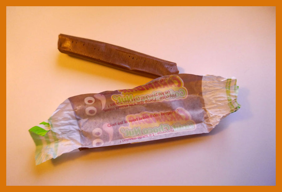
Well, the topic of this post kind of snuck up on me. I’ll explain: last Saturday, as we were out of Russian marinated mushrooms (a simply unacceptable state of affairs in this household), we ventured into a European deli in quest of something to tide us over until we could properly restock. They had some button mushrooms in oil, fair enough. As we reached the counter to tally up our purchases, something caught my eye: a display for a French confection called Carambar, which I’d known about for most of my life, but never encountered in the wild.
After a moment’s hesitation (which baffled my partner), we picked up a sample and added it to our bounty.
It happens that Caram’ Bar (as it was called until 1977, when the apostrophe was dropped) ties into a minor childhood incident whose recollection elicits, in equal parts, snickers of amusement and pangs of guilt. It was in, oh, the second or third grade. We were standing in rows, about to return to class after recess. I turned to my neighbouring classmate, and asked him whether he knew… oh, never mind — it went exactly like this:
“Mister Pipo! I will pose you a riddle!” “Do you know what the difference is between a Caram’ Bar…” (I love riddles!) “… and a Super Caram’ Bar?” (They’re the same!) “But of course not, Mister Pipo!” “The Caram’ Bar was this long…“
“The Super Caram’ Bar is THIS LONG!” The full-length Super Caram’ Barfumetti, as it appeared in the pages of Pif Gadget no. 171 (May 1972, Vaillant).
Regrettably, the back of my hand connected with my classmate’s nose, not his cheek, and he wound up with a nosebleed. Désolé, Germain!
The acquired item.
…. unwrapped. CaramBar wrappers have, since the 60s, famously featured corny gags, which once were selected from entries provided by consumers. A kid whose joke got the nod could win his weight in candy. Here’s one of the pair I got here (the other doesn’t work in English)… Q: Why are elephants grey? A: Because if they were pink, they’d get confused with strawberries. It may come as no surprise that in France, a ‘blague Carambar’ has become shorthand for a lame joke.
The preceding Super Caram’ Bar ad was quite unusual in that it was a full-colour three-pager, which must have cost the candy maker a bundle. Indeed, it only ran au complet once or twice; thereafter, only its concluding page appeared.
Looking back at this campaign, I wondered whether these clowns were merely company mascots, or something more. As it turns out, Sergio (né Serge Drouard in 1950, so 21 years old at the time) was in the early stages of a remarkable career in the circus, first as Clown blanc Sergio (here are a brief video profile from 1970 and a lovely 1975 performance at Paris’ legendary Cirque d’hiver) and then as ringmaster M. Fidèle. Now seventy, he more-or-less retired after the 2010-2011 season. As for poor Pipo, I’m afraid I don’t know. He’s similar to the famous Dutch clown Pipo de Clown, but they’re merely homonyms.
Clowns are a curious proposition. Kids used to (presumably) find them amusing and endearing, but several generations of thin, gruelling antics and downgrading of the brand and métier, not to mention the sinister hijinks of the infamous Pogo the clown, have flipped the cultural perception of these once-beloved entertainers. At this point, Coulrophobia is impressively widespread, and not just among the wee ones.
For my part, I’m not so eager to condemn en bloc. Your run-of-the-mill, unqualified local kids’ show, mall-opening Bozo is but a faint, hopelessly distorted echo of the great clowns of history. They were the fruits of a complex, nuanced and codified tradition with its thick, gnarled roots in early 16th century Italy’s Commedia dell’ Arte.
But I don’t need to reach quite that far: I grew up on Radio-Canada’s absurd, minimalist masterpiece Sol et Gobelet (1968-71). Sol (Marc Favreau) was a naïve tramp clown who creatively mangled language and logic and Gobelet (Luc Durand) was the poetic, reasonable, refined Pierrot type. Here’s a classic episode. Such is the duo’s cultural significance that a public library (Favreau) and a nearby public park (Durand) have been christened in their posthumous honour.
And since we’re on comics and clowns, here’s a bonus short tale.
« Sergio has also learned that one must never try to catch a falling performer. One should only push them to redirect their path and cushion their fall. One day at the Paradis latin, he had no choice but to tackle in flight a trapeze artist who was about to land on a table. The outcome : a few collapsed vertebrae. » Also, « When a lion attacks, it always goes for the testicles. » Keep these sage verities in mind, next time you’re under the big top!
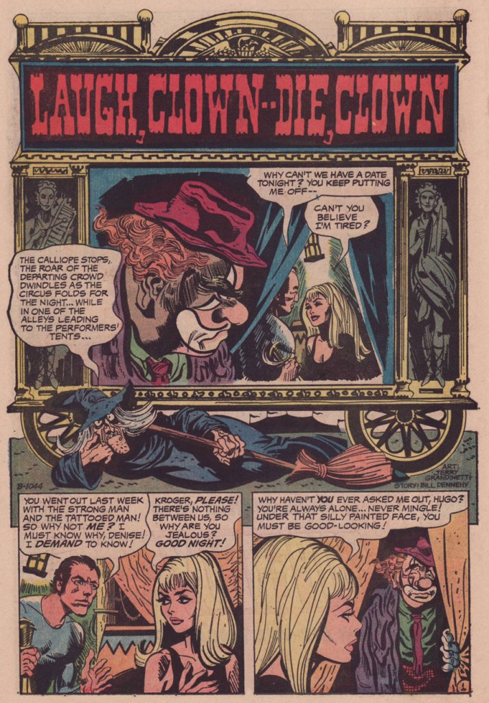
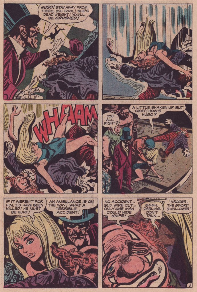
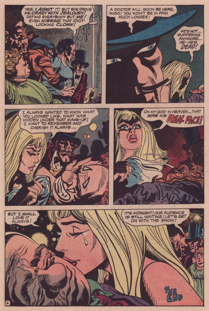
Laugh Clown — Die, Clown appeared in It’s Midnight… The Witching Hour no. 21 (June-July 1972, DC). It was scripted by editor Murray Boltinoff under his Bill Dehenny nom de plume and illustrated by Jerry Grandenetti.
While LCDC is the flimsiest of stories, just a troupe of stock characters going through their hoary paces, Grandenetti’s artwork elevates the affair. It’s as if, having precious little to work with, the artist opted to push against the material, moulding it oddly, imbuing the proceedings with unstated implications. Consider, for instance, how sinister is the depiction of the ringmaster. Nothing in the dialogue or plot indicates that the man is up to anything untoward or malicious, quite the contrary. The second panel of page four is quintessential Grandenetti.
And how was my first Carambar, you may ask. We both tried it, and… were singularly underwhelmed. Perhaps it was a question of freshness, but it was disappointingly brittle in the beginning, almost chalky, hardly what you’d expect from a caramel product. Then it just fell apart and faded, like third-rate taffy.
« I found something in one of my pockets. It was about as big as your shoe, but it was shaped like a rocket! » — a not-at-all ambiguous statement from litigious chuckler Bozo the Clown.
« It’s a lot easier to draw rubble when deadlines hit. » — Guy Davis
Today, on his birthday, we seize the occasion to salute prodigious autodidact Guy Davis and to look upon his works, no despair necessary.
Born in Michigan on November 20, 1966, Guy Davis started out in comics in 1981 with a SF strip, Quonto of the Star Corps, published (he suspects his dad had something to do with it) in local newspaper The Clarkston News.
From there, he delved into sword and sorcery with The Realm (1986-1988, Arrow), then made significant strides toward his mature style with punk saga Baker Street (1989-1991, Caliber).
He then hit the majors, devoting most of the 90s to pencilling and inking the bulk of Sandman Mystery Theatre‘s quite respectable run (70 issues + 1 annual, 1993-1999, DC/Vertigo), Matt Wagner‘s darkly revisionist chronicles of Wesley Dodds, the Golden Age Sandman… pre-yellow-and-purple togs.
I must confess that I wasn’t, at this point, particularly fond of Davis’ style. His endearingly schlubby, potato-schnozzed characters had yet to work their charm upon me. But the writing was compelling, Davis’ storytelling was strong and clear, so I stuck around.
However, I’m not ambivalent at all when it comes to his subsequent work, wherein he ditched his often awkward cross-hatching, his inking improved by leaps and bounds in expressiveness, and he was at long last paired with a colourist that fully grasped his singular style.
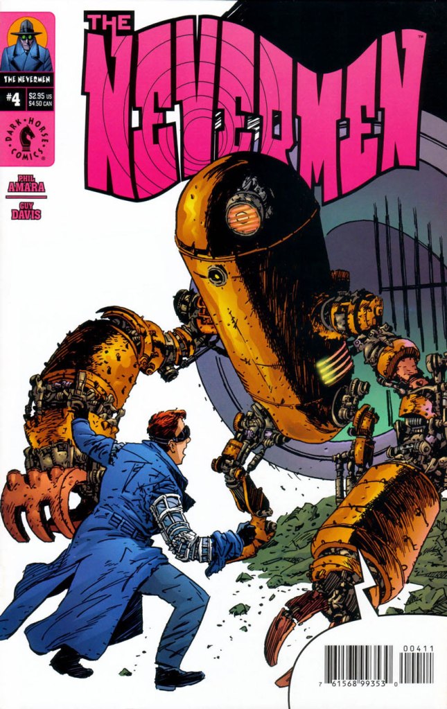
This is The Nevermen no. 4 (Aug. 2000, Dark Horse). Cover by Guy Davis.
Page 22 of Nevermen no. 1 (May 2000, Dark Horse). Written by Phil Amara, pencils and inks by Davis, colours by Dave Stewart.
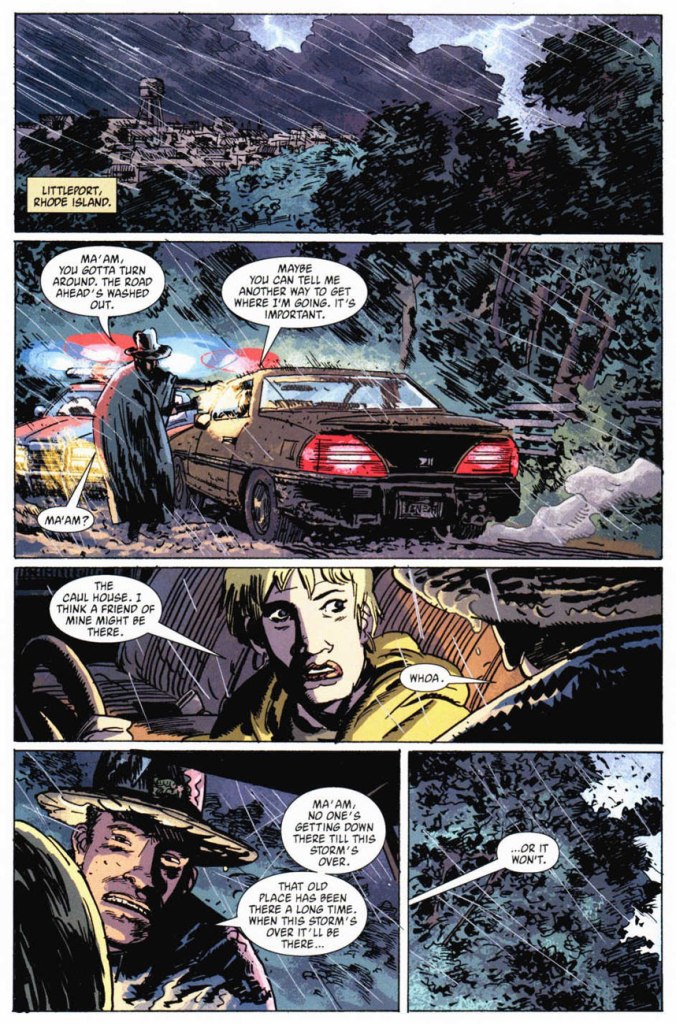
Page 8 of The Nevermen no. 4 (Aug. 2000, Dark Horse). Same personnel…
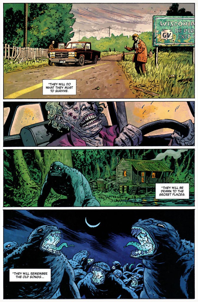
Page 15 of B.P.R.D. Plague of Frogs no. 1 (Mar. 2004, Dark Horse). Story by Mike Mignola, pencils and inks by Davis, colours by Dave Stewart.
Page 22 of B.P.R.D. The Dead no. 3 (Jan. 2005, Dark Horse). Story by Mignola and John Arcudi, pencils and inks by Davis, colours by Dave Stewart. Shot from the original art, courtesy of, er… the author’s collection.
And in case you’ve ever wondered just what a good colourist can contribute to the finished product, let alone the finest colourist in the business. Ladies and gentlemen, Mr. Dave Stewart!
Guy Davis on his collaboration with Dave Stewart:
I was never never happy with my work in color — I hated the idea of it — until [ Dave Stewart ] started coloring me in B.P.R.D. He had this textured brush look that was just perfect for my linework. My linework is not clean, and before Dave, everybody who’d color me would do a standard house style. They wouldn’t adapt for each artist, and that’s what makes Dave so amazing is that he adapts his style for the art as opposed to trying to shoehorn one style of coloring — which a lot of colorists do — into every artist’s style.
(from an interview conducted by Eric Nolen-Weathington and published in Modern Masters Volume 24: Guy Davis, 2010, TwoMorrows)
Page 22 of B.P.R.D. The Dead no. 3 (Jan. 2005, Dark Horse), by the aforementioned.
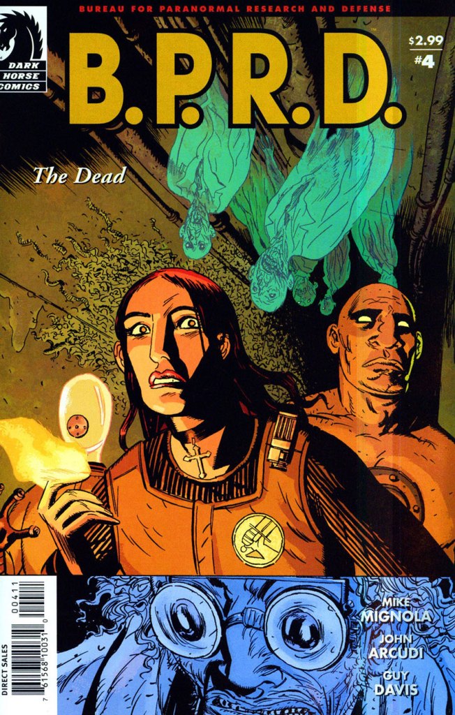
This is B.P.R.D. The Dead no. 4 (Feb. 2005, Dark Horse). Cover by Davis and Stewart.
Page 11 of B.P.R.D. The Dead no. 4 (Feb. 2005, Dark Horse). Note that Stewart doesn’t fall back on one go-to, characteristic colour palette; he has range. Muted, saturated, bright or dark… he uses what the situation calls for. That’s what a true artist does.
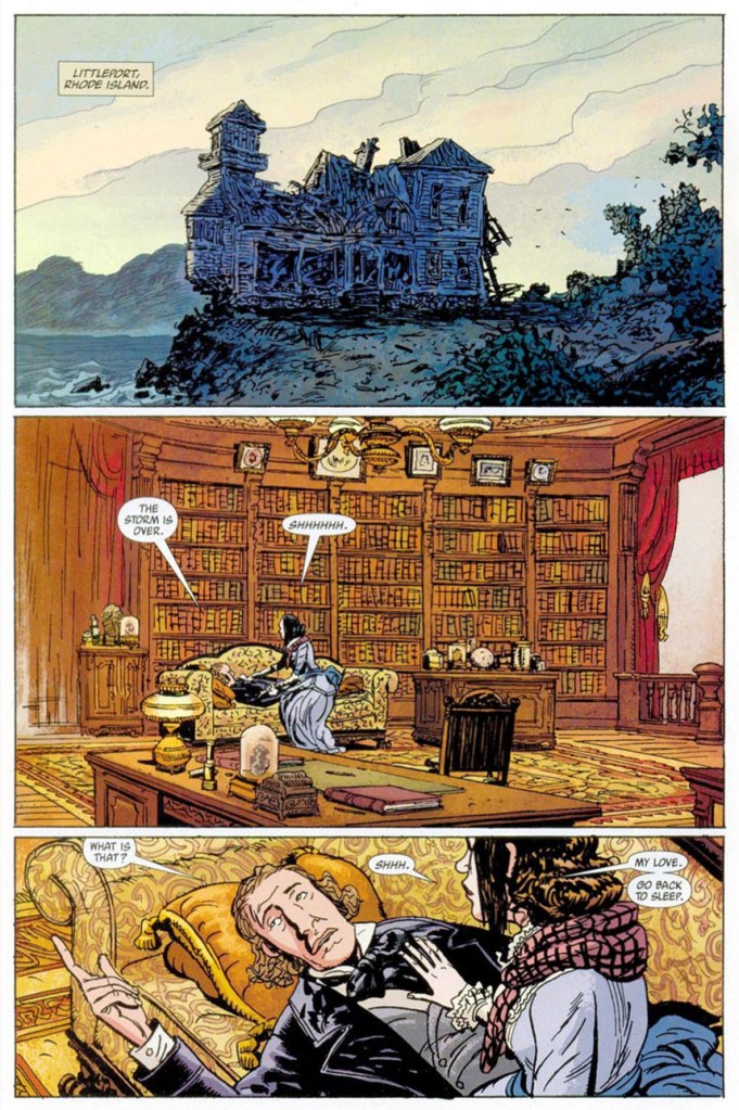
Page 18 of B.P.R.D. The Dead no. 5 (Mar. 2005, Dark Horse). Now *that* is a library.
With his love and mastery of period detail and the human proboscis, wouldn’t you say that Davis would have been the ideal candidate to depict legendary pulp hero The Shadow? A 2005 drawing excerpted from Guy Davis Sketch Macabre Volume 2 (Oct. 2006).
Frankly, I don’t think Mr. Davis ever received his due in comics; he remained an artist’s artist, reliable and productive, but relatively unsung. On B.P.R.D., he allowed Mr. Mignola to envision events and visions on a far, far grander scale than Hellboy’s creator could have realised by himself. After Davis resigned from the title and exited the comics field for challenges and well-earned success, artistic and financial, in the realms of film and video games, there simply wasn’t anyone able to fill the void he’d left.
Happy birthday, thanks for everything and all the best to you, Mr. Davis!
-RG
p.s. In selecting artwork for this essay, I forced myself to exclude any and all instances of tentacles, and trust me, there were plenty. We haven’t made it official yet, but if anyone ever deserved the title of Tentacle Master…
« There’s something about guitars, they’re just so big, you know what I mean? You’re just like, ‘Ugh!’ It just seems so overwhelming. And the ukulele is, like, the opposite of overwhelming. » — Zooey Deschanel
While the inside artwork also had its charms, the weak link in the chain was the writing. Pedestrian and formulaic, most of its anonymous load was borne by Paul S. Newman, one of the comics industry’s great cranker-outers. And so things ran their humdrum course, even with the arrival of talented DC expatriate Arnold Drake in the early 1970s. I strongly suspect rampant conservatism on the part of the editors, as even normally-compelling authors produced the same generic plots, ground out like under-seasoned sausage.
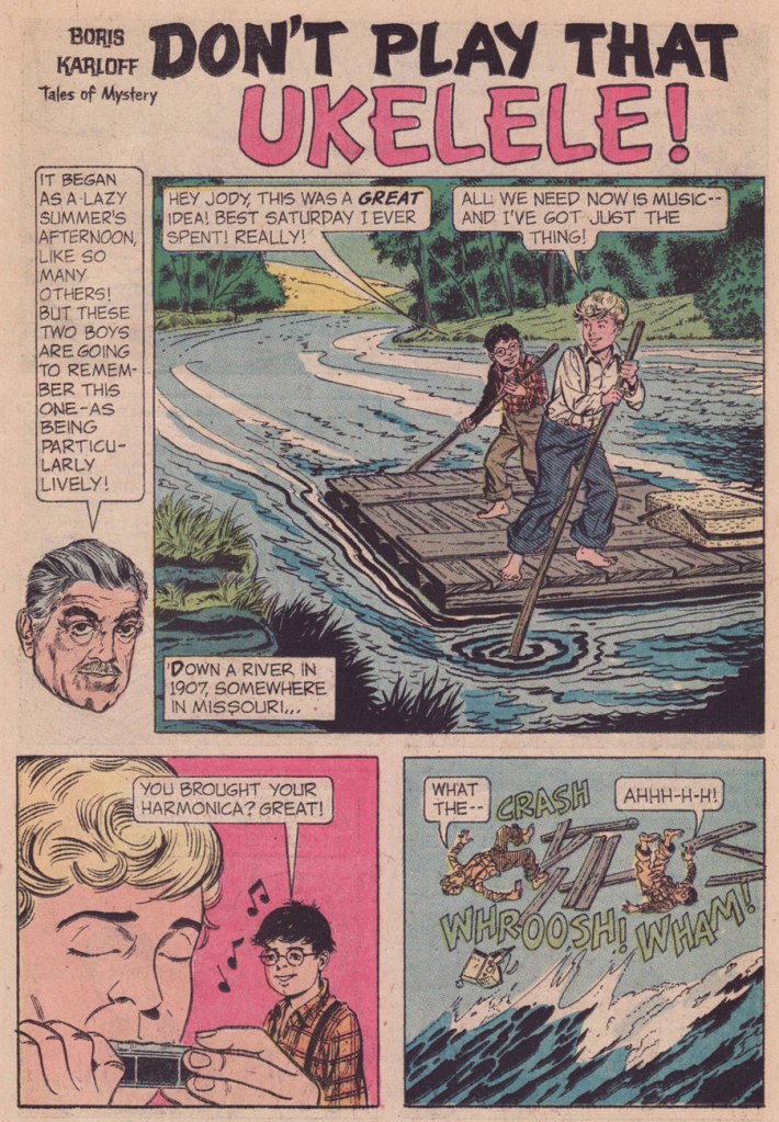
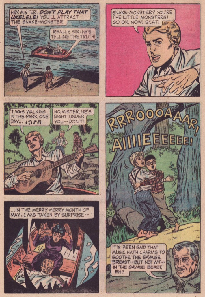
Then occurred a curious bump in the road: the unheralded, near-anonymous arrival of future Clown College alumnus*Connor Freff Cochran (1954-), who scripted (as Freff, when credited — a rarity at GK) a number of short tales for Gold Key’s anthology titles for a few years (1974-1977). Of those I’ve read, most docilely follow the publisher’s tame editorial formula. But there are exceptions, and they really do stand out. Here’s such a pair, which I’m boldly attributing to Mr. Cochran.
Interesting that writer Freff opted here for the obscure, alternate spelling of ukulele. Speaking of which, how do you think ‘ukelele‘ is pronounced? You might be surprised. Check here for the answer. And, er… 1907? “One of the earliest appearances of the word ukulele in print (in the sense of a stringed instrument) is in the Metropolitan Museum of Art’s Catalogue of the Crosby Brown Collection of Musical Instruments of All Nations published in 1907.” [ source ]Man, that lake monster looks familiar. I smell a swipe.And for the full multimedia experience, you can sing and strum along with George!
Ahem — sloppy research on Freff’s part:
The ukulele was popularized for a stateside audience during the Panama–Pacific International Exposition, held from spring to autumn of 1915 in San Francisco.
It is therefore highly unlikely that anyone on the American continent would have been plucking a uke, let alone that two random Missouri farmboys would spot a specimen from a distance. Not to mention the fact that the uncredited and unknown artist (no, it’s notBill Molno, dear ignoramuses at the GCD) drew… a plain old guitar. Let’s face it, a banjo or even a mandolin would have made more sense.
In his defense, Freff recalled:
« I absolutely did write “Don’t Play That Ukulele!” But I don’t deserve the ding for the misspelling — that was the letterer’s error, which no one fixed. I will cop to not knowing (in 1975) that the ukulele wasn’t introduced stateside until 1915…but even there the story is a bit more complicated than it appears on the surface. When I pitched the idea it was a guitar that brought doom down on our unfortunate swain, same as it wound up being drawn. But editor Paul Kuhn thought a ukulele was intrinsically funnier than a guitar, and he’s absolutely right about that. I remember us both giggling over the title when we came up with it. »
At fourteen, he and his family moved to Placentia, California, east of Los Angeles, where he graduated from El Dorado High School a year ahead of the normal schedule. One of his fellow students had combined the words “friend” and “Jeff ” to coin the name “Freff ”— and while at first this remained only a nickname, by 1970 he had started signing his artwork that way, as well. Like many artists, Cochran entered the science fiction field doing “freebie” drawings for fanzines. His first paid job were pen and ink drawings for Andrew Porter’s semi-prozine Algol, done in 1972. In the same year he dropped out of Fullerton Junior College after two months of art classes to live on his own. He worked in various fields to make a living and “The rest was all just self-directed study and experimentation,” he says, adding “as a young pro, just starting out, I was lucky enough to be mentored ever-so-slightly by two of my early faves in the field: Kelly Freas and Jack Gaughan. At Kelly Freas’s suggestion Cochran moved to New York in September 1973 and started looking for work as an illustrator.
When that was not forthcoming, Cochran attended the Ringling Brothers and Barnum & Bailey Clown College — class of 1974.
In that year he got his first big break from Jim Baen, the new editor of Galaxy and If. Baen needed people who would work fast and cheap and put up with being paid late — in other words, the perfect opportunity for beginning artists like Cochran. By this time he was aware that other professional artists and cartoonists were named “Cochran”— and feeling that using his initials “JC” would be presumptuous — the artist in 1976 went to court and legally adopted “Freff ” as his professional nom de brush, and kept it during his years of magazine illustrating. Baen was so taken with the name that he put it on the cover of Cochran’s first cover for IF, as if Cochran was an author with a story in the magazine. After that “Freff ” did a lot of work for Baen, primarily interiors in black-and-white. He also did drawings for Cosmos, Isaac Asimov’s SF, and did cover work for publishers such as Dell, Berkley, and Doubleday. Cochran was selected to be one the artists in the special 1975 NASA/Smithsonian Artists Tour. After early success illustrating Zelazny’s “Amber” novels for Galaxy, followed by cover art and interior illustrations for a set of hardcover novels by Zelazny for Gregg Press in the early 1980s, Cochran became disgruntled over nonpayment for the use of his art in foreign editions of John Varley’s novel Titan, for which he had done a frontispiece and 16 illustrations—and the argument led to the end of Cochran’s illustrating in the field.
He turned to other endeavors, but briefly “dipped a toe back into the waters by collaborating on the first (and only) issue of an SF comic book called D’Arc Tangent” in 1982–1983. He did inking and penciling for DC and Marvel comics: Star Trek** and Tomb of Dracula***.
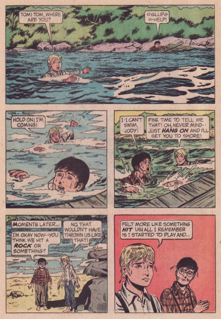
This is Boris Karloff Tales of Mystery no. 64 (Oct. 1975, Gold Key), featuring a painted cover by Argentine master Luis Dominguez. Don’t Play That Ukelele! isn’t even the cover story… there’s just a lot of aquatic peril in this particular issue.
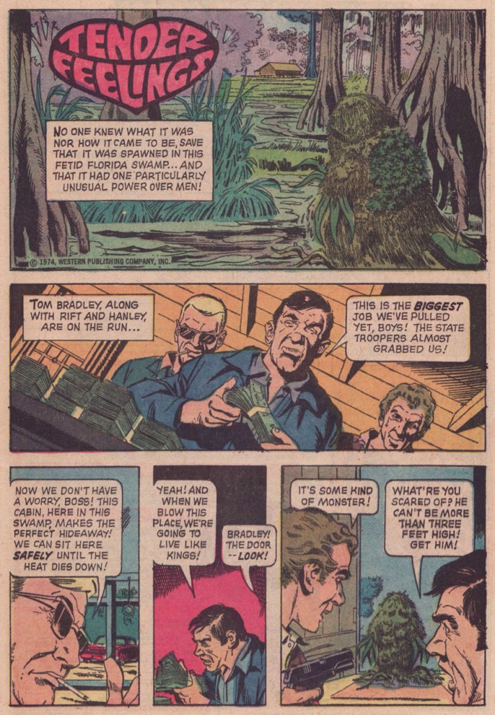
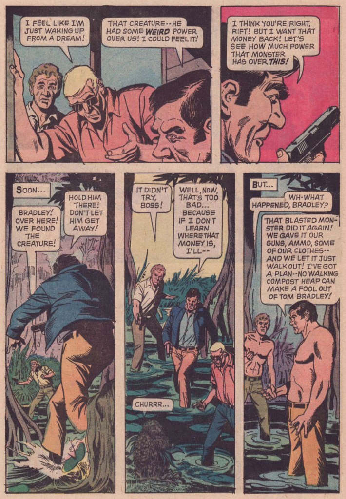
And here’s the uncredited, utterly batty Tender Feelings, recognizably illustrated by another hardworking Argentine, José Delbo. It saw print in Boris Karloff Tales of Mystery no. 53 (Apr. 1974, Gold Key).
Part of my reasoning for attributing authorship of Tender Feelings to Freff is his penchant for light, deftly humorous tales that conclude with several characters meeting dismal ends. Churrr...
But… nope. The mystery of this mordant little tale remains whole. Freff helpfully eliminated himself as a suspect, and proposed some intriguing leads:
« I can’t take credit for “Tender Feelings.” I certainly wish I could, since it’s a delightful mashup/piss-take on DC’s Swamp Thing and Marvel’s Man-Thing. But nope — not me.
The publication date I find online for that story is April 1974. But Gold Key titles usually hit the stands a month ahead of the printed date, and editors Wally Green and Paul Kuhn liked to have a solid backlog of finished stories on hand. That puts the likely writing window for “Tender Feelings” somewhere around August 1973, which means there’s a chance that “Tender Feelings” was written by Len Wein himself. Len did a lot of uncredited Gold Key stories, starting around 1969, but he stopped in late summer 1973. It would have been absolutely in keeping with his sense of humor to write something like “Tender Feelings” as a happy sendoff for himself.
My best second guess after that would be John David Warner…though if I really had to bet, I’d bet on Len. In any case, whoever did it was lightyears better than the usual Gold Key writer. Glad to see them get this recognition. »
-RG
*Class of ’74. As Freff himself stated: « The Really Famous Guy from our session was Bill Irwin, who went on to a great stage, TV, and film career, and was the first performer to win a Genius Grant from the MacArthur Foundation.) I did originally intend to apply for the ’73 class, but I learned about it too late to make that year’s deadline. So I went to NYC instead to pursue art, while waiting for my next chance to roll around.. »
**he inked two drawings (one of them a double-paged splash) in Who’s Who’s in Star Trek (1987). That seems to be all.
***a pair of frontispiece illustrations in Tomb of Dracula (the magazine, that is: six issues, published Oct. 1979 – Aug. 1980); he also conducted a fine interview with Stephen King, published in issues 4 and 5 of TOD. Freff provides some illumination: « plus the framing graphics for the magazine’s title/table of contents page, plus I got to ink a bunch of ads for the magazine. The one I know they used involved inking Gene Colan’s pencils, which was hella fun and a childhood dream come true. I grew up on Gene’s work in DAREDEVIL, DOCTOR STRANGE, IRON MAN, CAPTAIN MARVEL, etc, and he was easily as big an influence on my visual thinking as people like Jack Kirby, Steve Ditko, Neal Adams, or Jim Steranko. (I got to achieve another childhood comics dream when I got to re-pencil, ink, and color a Curt Swan drawing for the October 1988 cover of KEYBOARD magazine.)
I did a lot more writing than artwork at Marvel, but most of it was nonfiction material in their b&w magazines — 100+ articles for PLANET OF THE APES, DEADLY HANDS OF KUNG-FU, CELEBRITY, NOSTALGIA ILLUSTRATED, THE TOMB OF DRACULA, etc. »
« In my youth I thought of writing a satire on mankind! but now in my age I think I should write an apology for them. » — Horace
Cartoonist and illustrator André-François Barbe (1936-2014) was born in Nîmes, France.
After an abortive stint in the French air force, he spent a few years fiddling around in Air France’s employ. His earliest professional drawings saw print in the venerable Le Rire (1894-1971) in 1958. After a few years of tentative, but increasingly encouraging results, he finally made his decisive move in 1965, joining the shaky ranks of full-time cartoonists.
Fittingly, Barbe was an unabashedly chatty man in person… while his work scarcely required words.
A self-portrait of the bewhiskered (of course!) young artiste at his easel.
Remember how deep our television sets used to be?
This one anticipates a similar concept later mined by his Argentine contemporary, Guillermo Mordillo. To wit, check out co-admin ds’ Mordillo gallery… you’ll know just which cartoon I mean.
Like Gerard Hoffnung before him, Barbe was a connaisseur of classical music. He would frequently return to this theme.
By the early 1970s, Barbe was increasingly devoting his pen and his interest to erotic subjects, and that’s the work he’s most associated with. Though that material held greater commercial clout, the work remained flawlessly executed and formally explorative… at least at first. Then, I’d argue that it became a bit of a cul-de-sac. Personally, I’ve always found it a bit chilly in its execution, quite a liability for erotica. Your kilométrage may vary.
Speaking of distances, Barbe was always a bit of a routard, an adventurous traveller. Here’s one instance of particular interest:
In the 1980s, on the initiative of his brother Michel Barbe, a history and geography teacher in Marseille, he took part in a conference given by Haroun Tazieff on the subject of volcanism. Owing to the quality of his drawing skill, he was allowed to accompany, in 1982, an exploratory scientific journey to the volcanic region of the Djibouti Rift. This expedition, led by Lucy co-discoverer Maurice Taieb, enlisted 32 professors who explored the basalt flows in the Assal Lake depression.
-RG
*a handy description I’ve rifled from the ever-erudite Jacques Sternberg.
« I grew up in a farm town in the Midwest, where not much exciting happened. I liked the idea of lives lived at night and the shadowy characters who lived in that demi-monde. — Michael Emerson
And our final slot goes to… the eminent Mr. Roger Langridge!
An average, ‘nuclear’ family moves to a small town in the Midwest, which turns out to be mind-numbingly strange… a fact entirely lost on the clueless parental units. Sound familiar?
It’s obvious, given the time frame (five years late), that Gross Point was, to be charitable, keenly influenced by the television show Eerie, Indiana (1991-92)… whose short run (just one season and a mere nineteen episodes… plus fifteen novels!) belies its lasting appeal and influence.
But, and there’s a sizeable ‘but’… both series provide considerable, often subversive entertainment, and come from a long line of high-concept, cœlacanth-out-of-aqua sagas. You might say that Gross Point stands as a darker, yet goofier Eerie, Indiana. Incredibly, it was still approved by the clearly-agonizing, utterly irrelevant Comics Code Authority!
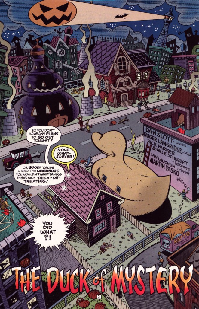
This is Gross Point no. 5 (Dec. 1997, DC), the Halloween special… but then again, as they say, “Every day is Halloween in Gross Point“. Cover by Sean Taggart.
The facetious small print:
Gross Point is a fictitious town, not to be confused with that differently-spelled one in Michigan. The magazine Gross Point is a work of satire. The stories, characters and incidents mentioned in this magazine are entirely fictional. No resemblance to actual persons, living or dead, or comatose, deformed, deranged, disfigured, dismembered, disembodied, discarnate, decaying, reincarnated, undead, immortal, reanimated, telepathic, pyritic, telekinetic, magical, transformed, trans-channelled, enchanted, cursed, possessed, monstrous, cannibalistic, demonic, vampiric, reptilian, lycanthropic, subterranean, mummified, extra-terrestrial, or interdimensionally-stranded, is intended or implied, or should be inferred. Any similarity to same without satiric purpose is coincidental.
The Pickett family’s colourful neighbourhood in Gross Point. Sublime pencils and inks by Roger Langridge. He truly brought a sense of place to his work on GP.
“Tight as a duck’s arse!” This is the issue when we find out — at last! — the answer to the mystery of the duck-shaped house next door.
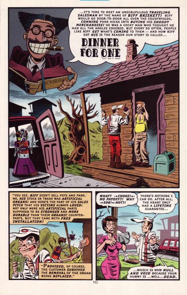
Groucho, who else? DC clearly panders to the late 90s teen set with a hybrid parody of its own late 60s mystery anthology title and a legendary Depression-era comic. Well, it works for me, but what do *I* know?
A sizeable part of why this is Gross Point’s finest hour: Langridge gets to trot out his rather credible EC-vintage Wally Wood/Will Elderersatz.
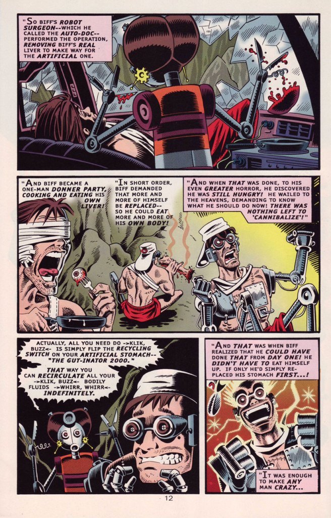
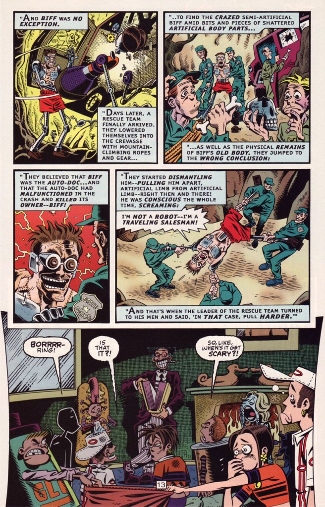
… and then goes full-on Mad-style Will Elder! This bourgeois chiller scared the Dickens out of the local youths.
In Issue two, we are told that:
Gross Point differs from most new DC titles in recent memory in that it was internally created. The concept from the series was the brainchild of the internal development program of the Special Projects Group, headed by Group Editor Martin Pasko [ né Jean-Claude Rochefort, in Montréal, QC ], who is also this title’s editorial overseer.
In other words, Created by committee, which accounts for the utter lack of originality… which is yet no impediment to its ultimate worth.
However, and a big However it is, some savvy, enlightened creative moves were made, most of all by recruiting stupendous penciller/inker Langridge, as well as Sean ‘S.M’ Taggart (perhaps a bit of nepotism, what with him married to a DC editor, but never mind, he’s good) and writers Dan Slott and Matt Wayne, among others.
The series lasted a not-too-shabby fourteen issues, which you can still get your calloused mitts on dirt cheap online and in the quarter bins, as it’s never been collected. I daresay it might have been a smash hit… if, say, Scholastic had published it.
Well, that wraps up another year’s selection! If you’re craving more, then the 93 entries of the previous trio of Hallowe’en Countdowns are (un)naturally at your disposal.