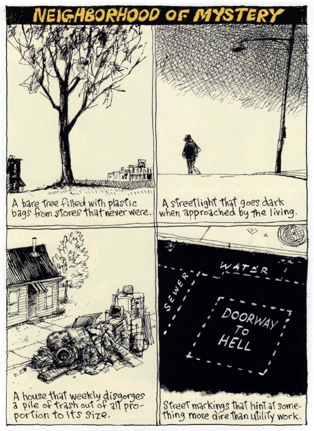
« It was the town dandy! That spiffy cigar-store indian! Within the impact of a second I knew what I had to do! » – Ron gets it wrong.
It’s become a historical footnote that, before fully settling into their (for a time) winning formula of lighthearted, cartoony monomania with Casper, Richie Rich, Little Dot and their ilk, Harvey Comics had published, pre-Code, some of the most, er… transgressive horror comics in the field. And before he settled down to designing and pencilling the lion’s share of Harvey Comics‘ admittedly inventive and arresting covers, art director Warren Kremer had fulfilled many of the same in-house duties in the more daring and diverse pre-Code years. A remarkably inventive and versatile artist, Kremer’s true worth has historically been obscured by his retiring, behind-the-scenes status, as well as the Harvey family’s plantation mentality. Today, let’s take a peek at the nuts and bolts of his collaborative partnership with cover artist Lee Elias, who would go on to become one of DC’s most straight-laced artists (though his talent remained undimmed.) It would seem, and it’s quite understandable, that a lot of artists who’d merrily produced horror comics in the early 1950s got burned by the ensuing censorious witch hunt / backlash… and became quite timid thereafter.
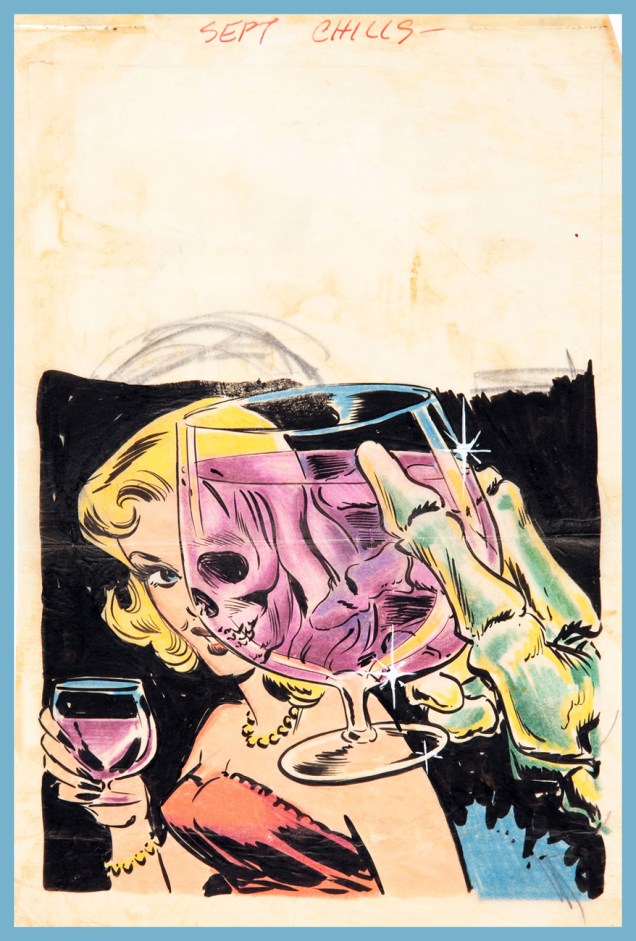
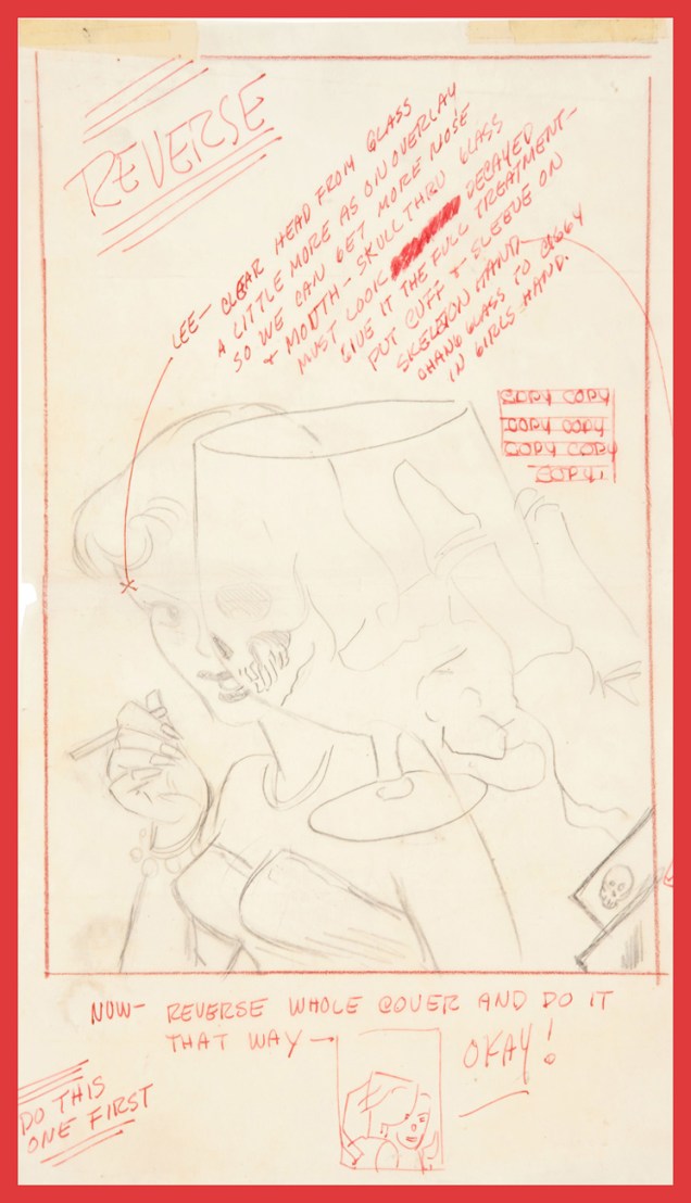
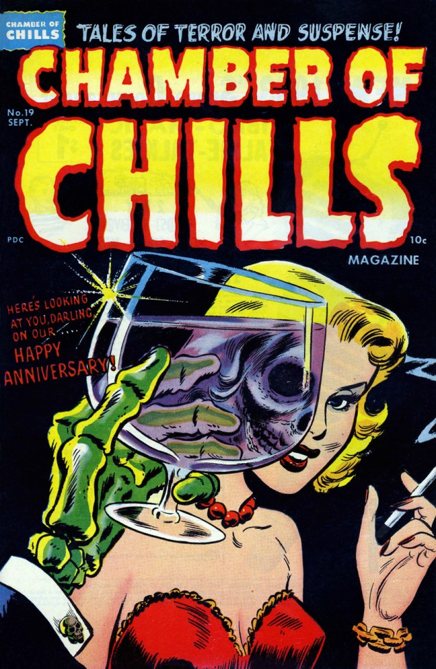
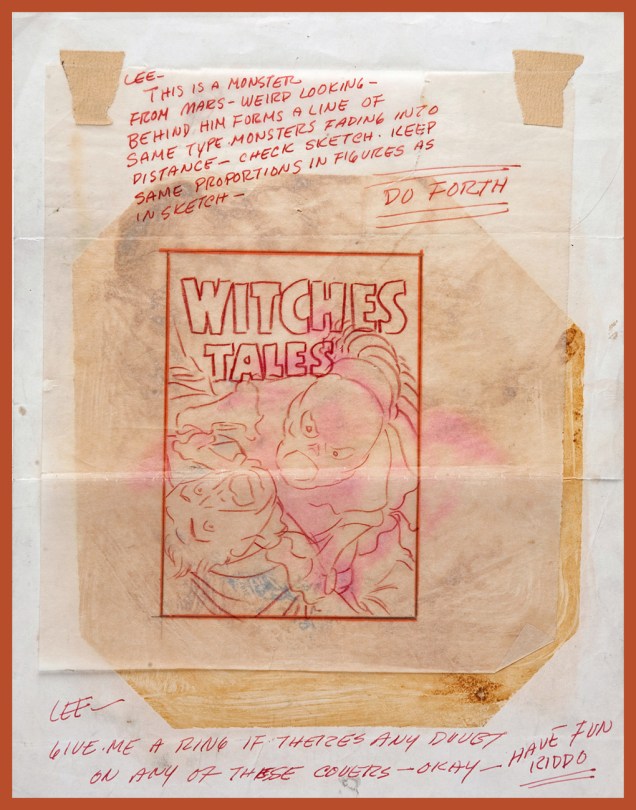
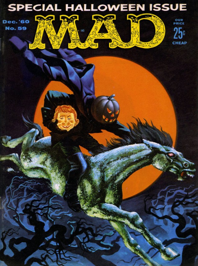
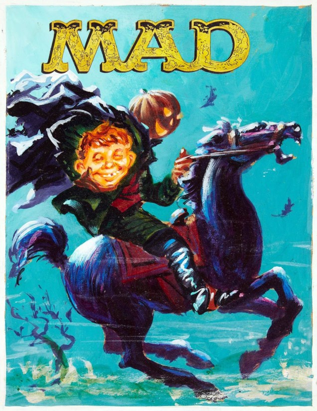
Warren Kremer’s original cover sketch and colour guide.… and his instructions to the final artist, in this case Lee Elias.As it appeared in print, this is Chamber of Chills Magazine no. 19 (Sept. 1953.) Marvel borrowed the title in the 1970s… Harvey clearly had no further use for it.
Another one? But of course!
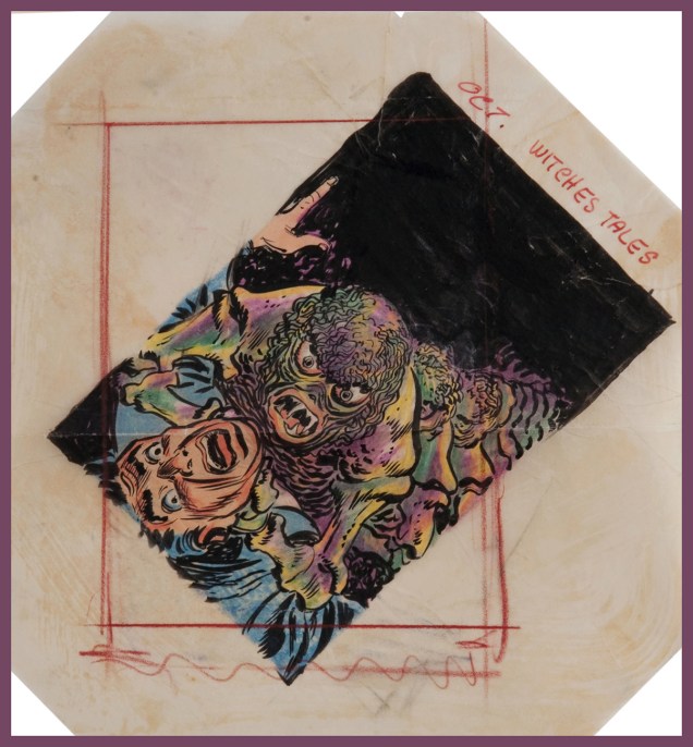
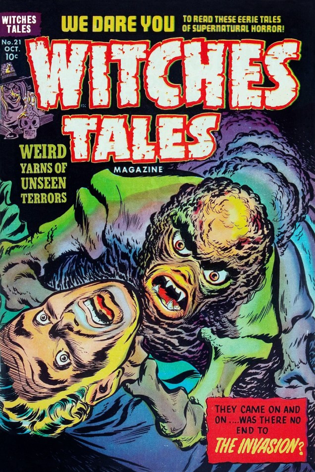
Kremer was evidently a believer in the « tilt the drawing to make it more dynamic » rule of layout (as DC’s Carmine Infantinonotoriously was)Kremer to Elias, again. An illustrator is quite blessed indeed when he gets to work with such a talented, insightful and friendly art director.Elias’ finished version, as it appeared on the stands. This is Witches’ Tales Magazine no. 21 (Oct. 1953).
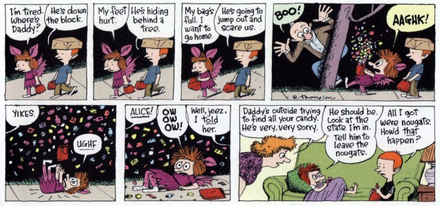
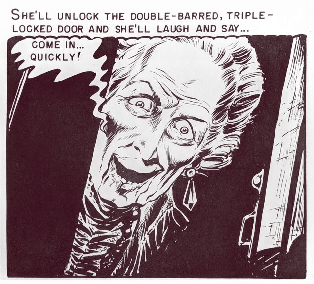
« Grave grunge! You giggling squigglers wriggled around my fashion foul-up and found the store’s name! » – Count Morbida, vowing revenge
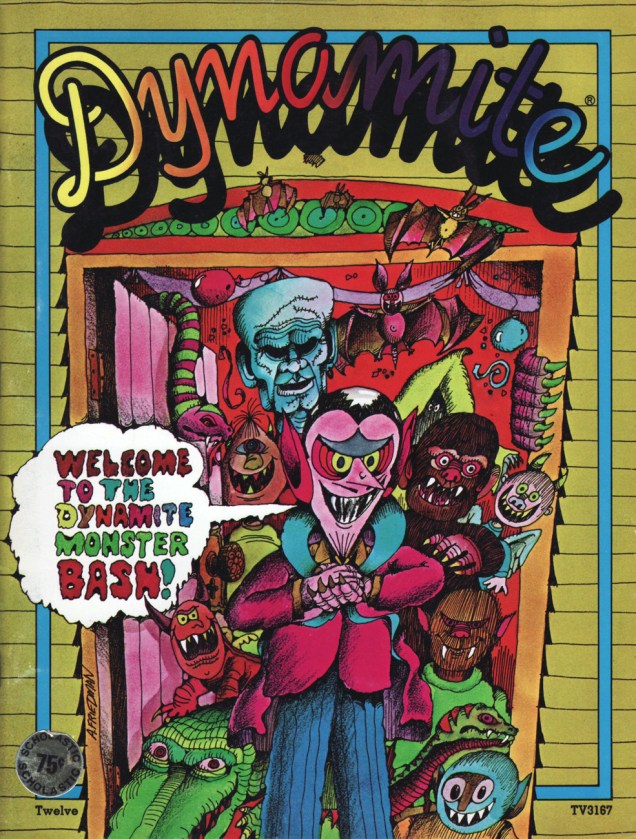
Jumping Jellyfish! Here’s the ghoulishly lovely and eerily colourful poster you got with your March 1976 issue of Dynamite magazine, numero 21, cover-featuring Bill Cosby, Sidney Poitier and Jimmy Walker, stars of the recently-released sequel to Uptown Saturday Night, the honestly-titled Let’s Do It Again.
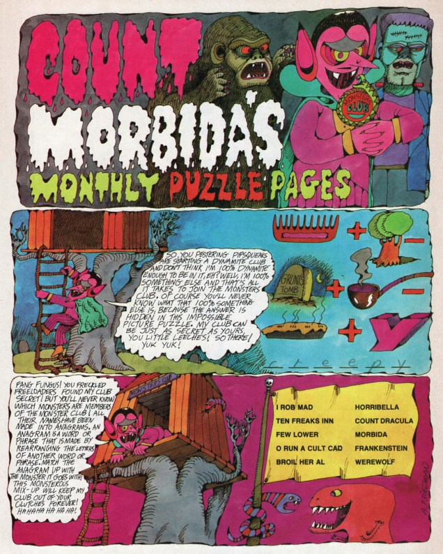
Said poster features dapper Count Morbida (and friends, er, fiends), lovingly rendered by Arthur Friedman (hopefully no relation to evil crank Milton).
The cranky-but-adorable Count hosted his own Monthly Puzzle Pages in Dynamite, and even if the challenges were child’s play, they rarely failed to entertain on the verbal and visual level. Linda Williams Aber (aka Magic Wanda) ably juggled the bons mots.
Despite his unrepentantly evil ways, the crafty nobleman accrued sufficient popularity to glom cover-feature honours a few times, as well as a spinoff book or two. Case in point: Dynamite 12 (June, 1975, Scholastic).
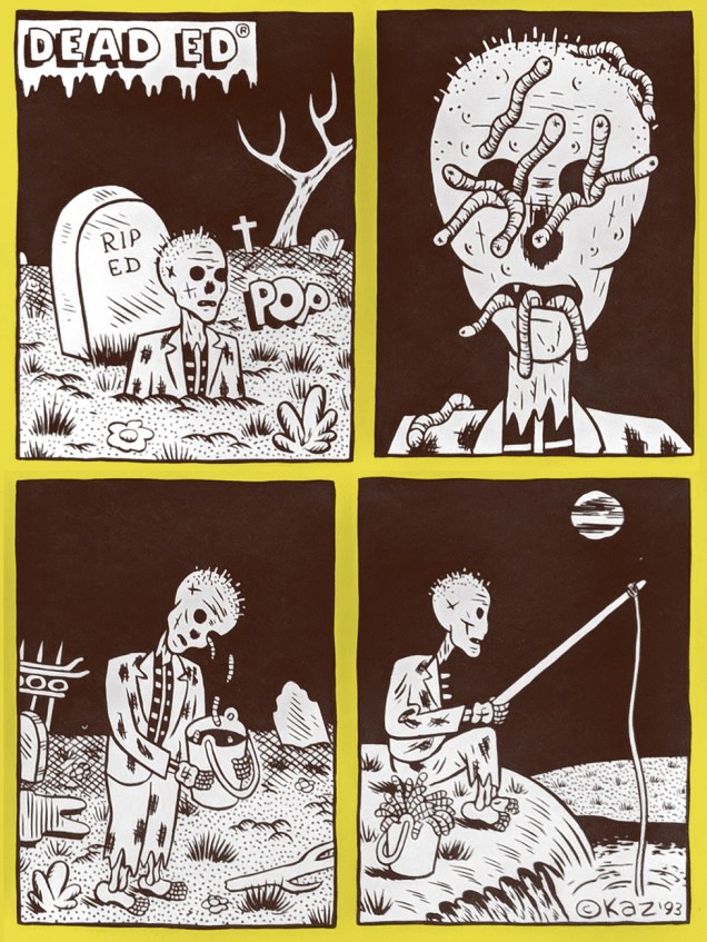
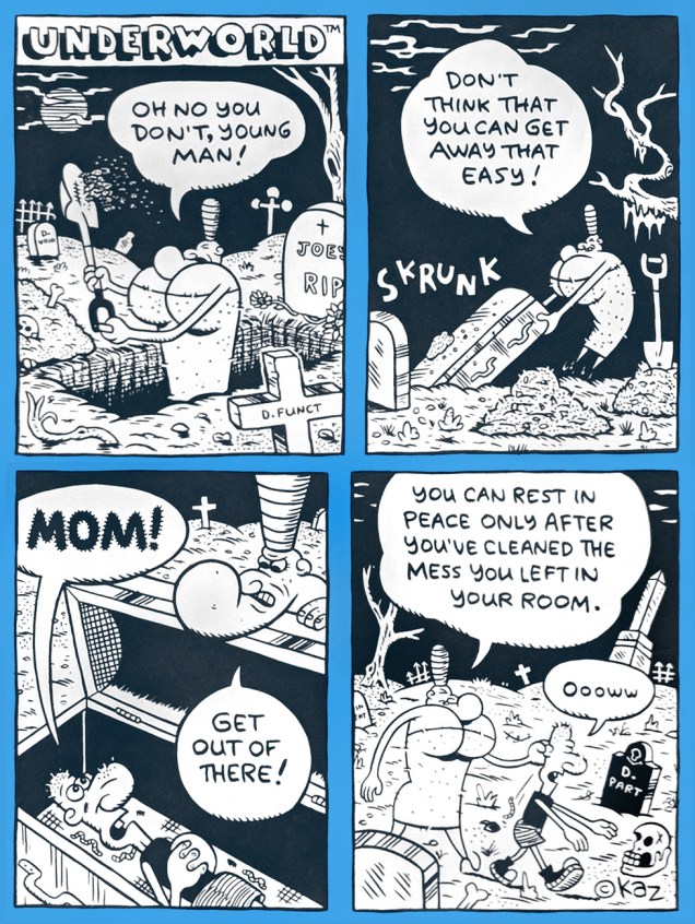
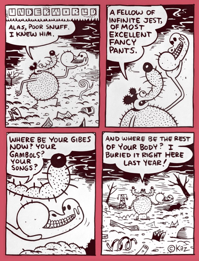
Underworld is the rabid brainchild of American cartoon god (néKazimieras Gediminas Prapuolenis in 1959) alias (for some reason) Kaz. Underworld has been appearing in various alternative weeklies since 1992. But none in my neck of the woods, naturally. Grr.
Fortunately, the discerning folks at Fantagraphics have thus far issued five Underworld collections, plus, a couple years back, an imposing omnibus, each of them wonderful, surreal, morbid and unnaturally comforting. Perfect Hallowe’en reading? You bet. Skrunk!
« Within this general framework of unbridled insanity, we got in our digs at corporate culture. » – Jay Lynch (1945-2017)
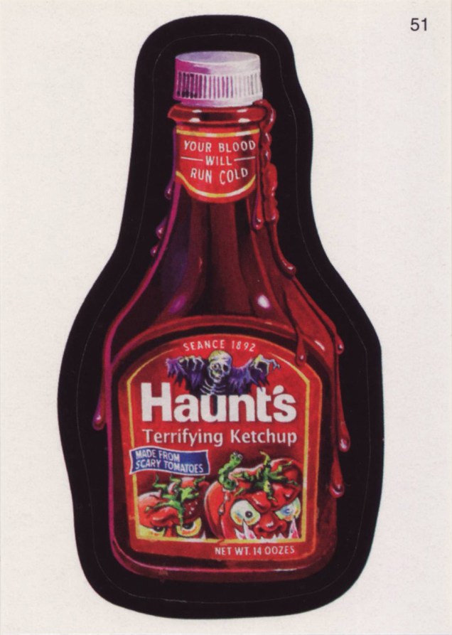
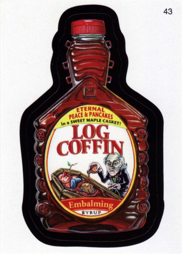
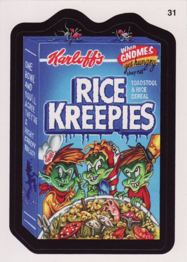
One could be reasonably forgiven for thinking that most cultural staples of one’s youth had just gone away after they slipped beneath one’s radar, or the craze fizzled out. Not so with Topps’ resilient Wacky Packages… they go away for a few years, then resurface in times of greater need. One does have to wonder what their exact audience is, though: some of these jokes and allusions take direct aim at adult sensibilities. Case in point: 2006’s « Brokeback Mountain Duo, The Drink You Wish You Could Quit » (courtesy of twisted masterminds Jay Lynch and John Pound).
Without further ado, instead of the old stickers you fondly but perhaps dimly recall, here are some recent ones you most likely haven’t encountered (though the objects of parody will be familiar), with the properly spooky thematic accent, of course.
Here, then, is a trio of seasonally-and-thematically pertinent excerpts from his Richard’s Poor Almanac, a feature that made its august début in The Washington Post in 1997. Mr. Thompson is somewhat better known for his (other) masterpiece, the beyond-brilliant suburban family comic strip, Cul de Sac (2004-2012).
And since I brought up Cul de Sac, and insolently pilfered a panel from it for this post’s preview image, I would be remiss in my duties were I to not include the strip in its entirety. Here you are.
This one originally saw print on Sunday, October 26, 2008.
For more of Mr. Thompson’s Almanac, check out, if you will, this earlier post on the topic.
« Despite his actions, there is to me a sadness about Dracula, a brooding, withdrawn unhappiness. He is in this world, but he is not of this world. He is a demon, but he is above all a man. » — Christopher Lee, from his foreword.
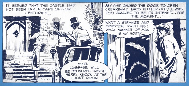
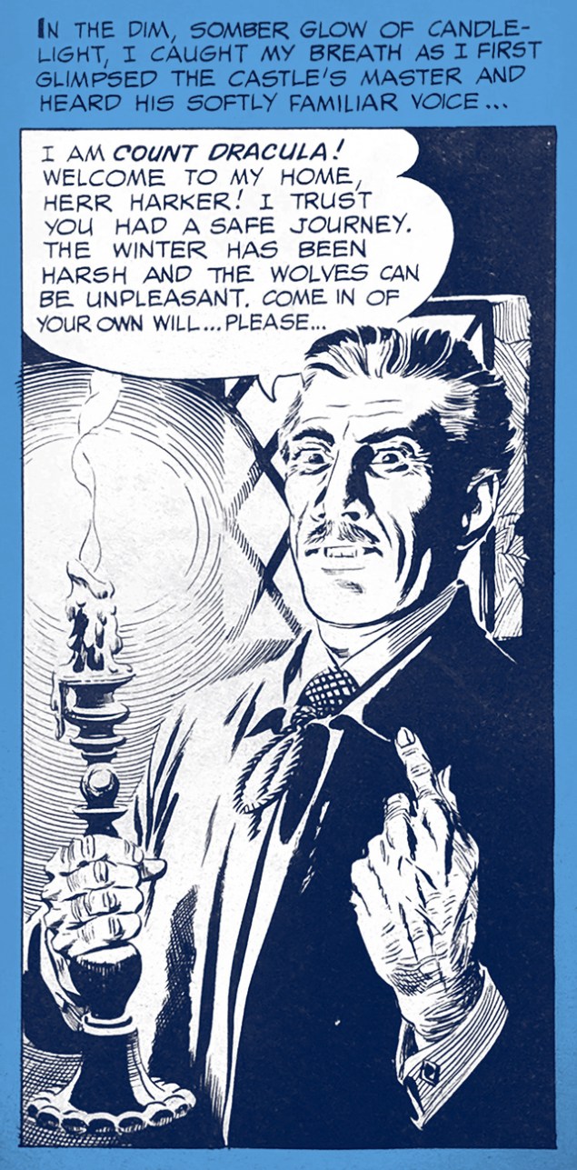
In 1966, Russ Jones (Creepy Magazine’s founding editor) sold Ballantine Books on an « Illustrated comic strip » (redundant, I know… the term ‘graphic novel’ had yet to be coined) adaptation of Bram Stoker‘s notorious Dracula, first published in 1897. For this purpose, Jones assembled the team of writers Otto Binder and (future The Love Boat scripter) Craig Tennis and illustrator Alden McWilliams (Rip Kirby, work for Warren, Gold Key, Archie and DC).
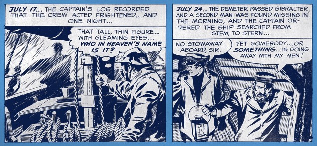
The story’s opening splash. The choice of Alex Raymond disciple McWilliams to bring visual life to this literary chestnut may not have been a daring one, but it certainly was a solid one.Jonathan Harker’s journey ends at Castle Dracula.A certain sanguinary nobleman introduces himself.A snapshot from The Demeter’s doom-laden journey to England.McWilliams has no difficulty in conveying the more… erotic facets of Stoker’s novel.
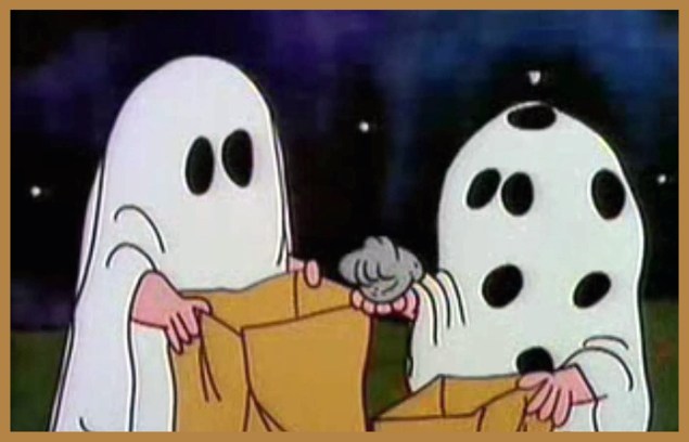
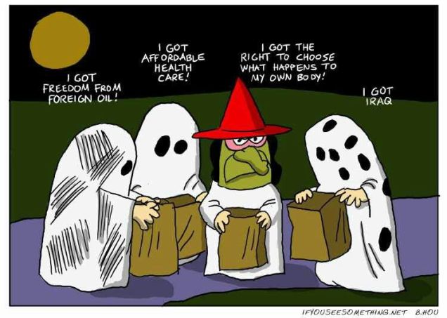
« Charlie Brown’s bad luck trick-or-treating earned him a lot of sympathy amongst young viewers, to the extent that some mailed candy for Charlie Brown to the TV channels that aired the special. In recent years, many fans have viewed the gag as disturbing, viewing it as a conspiracy among the adults to torture Charlie Brown by denying him candy. »
Interestingly, the gag about Charlie Brown’s inadvertent rock collection was introduced here, not in the strip, though it was alluded to in the November 1st, 1975 strip, a whole nine years down the line. Found it in my copy of « Think Thinner, Snoopy » As a bonus, here’s a clever modern update on the classic sequence, from the long-defunct ifyouseesomething.net.
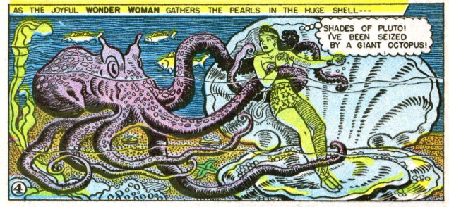
« Give men an alluring woman stronger than themselves to submit to and they’ll be proud to become her willing slaves. » (William Moulton Marston, co-creator of Wonder Woman)
We might all happily to submit to Princess Diana of Themyscira, but *she* occasionally has to submit to tentacles, although of course she always manages to fend them off. Might this be a metaphor for unnecessarily grabby male hands? I’m not here to psychoanalyze (that was Marston’s job!), just to celebrate Tentacle Tuesday. Lots of versions of Wonder Woman have grappled with tentacles… but no adventures are more entertaining than the ones depicted by the formidable Harry Peter!
Without further ado, today’s roster of tentacles – whether they’re attached to a Neptunian fish or sprout out of a mad doctor’s ectoplasm.
Page from “The Tigeapes of Neptunia“, scripted by Joye Murchison (the first female writer of superhero comics) and drawn by Harry Peter, published in Wonder Woman no. 15 (Winter 1945). Read the issue here.Page from “The Drugged WAC”, scripted by Joye Murchison and drawn by Harry Peter, published in Wonder Woman no. 18 (July-August 1946). Read the issue here.
The following panels are from from “Three Secret Wishes!“, written by Robert Kanigher and drawn by Harry Peter. The story was published in Wonder Woman #81 (April 1956). The whole issue is fun, actually, largely thanks to the gorgeous art – read it here.
« When the dark mists rise up from the graveyard, and shutters bang in the windows of old abandoned houses, and the lights burn late in the back rooms of funeral parlors, the hour has struck for the Autumn People. » — anonymous back cover blurb
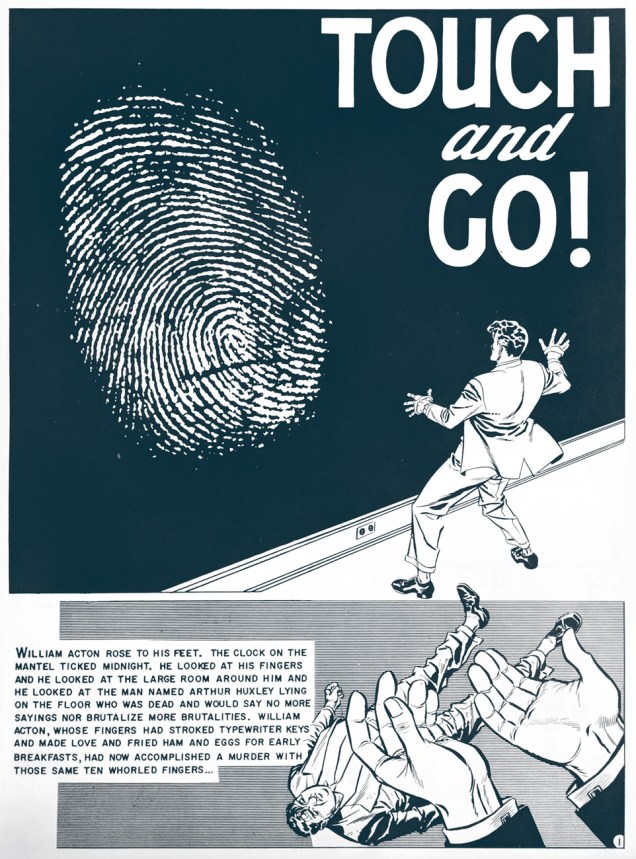
Frank Frazetta‘s cover for Ballantine Books’ October 1965 collection of EC adaptations of Ray Bradbury short stories (such a string of possessives!), namely « There Was an Old Woman » (art by Graham Ingels) « The Screaming Woman » (Jack Kamen), « Touch and Go », aka « The Fruit at the Bottom of the Bowl » (Johnny Craig), « The Small Assassin » (George Evans), « The Handler » (Ingels), « The Lake » (Joe Orlando, some of the finest, most sensitive work of his incredibly-brief peak, which he would coast on for the rest of his career), « The Coffin » and « Let’s Play Poison » (Both Jack Davis).
I’m feeling foolishly generous, so here’s a panel from each story. Owing to personal bias, Mr. Craig is the only one who gets a full page to show off. Seriously, though, scripting his own stuff afforded him greater latitude in storyboarding his work… and how it shows!
« Ghastly » Graham Ingels.Jack Kamen.Johnny Craig.Mr. Ingels again.George Evans.Joe Orlando.Jack Davis once…… and Jack Davis twice.
I first encountered Bradbury through « The October Country » (1955), which turned out, I was to discover later, to be a heavily-revised version of his initial, Arkham House-issued collection, « Dark Carnival ».
« When given the chance to rerelease the out-of-print collection in 1955, Bradbury seized the opportunity to revisit his first book and correct the things he deemed inadequate. (Ever the perfectionist, Bradbury was, throughout his career, often discontent with calling a book done, even after its publication.) He rewrote a number of stories, made light revisions on others, cut twelve tales altogether, and added four new ones to round out the collection. The stories Bradbury discarded he thought too weak, too violent, or too primitive, and not representative of where he was as a writer at that moment. »
As it happens, several of the stories that caught Gaines & Feldstein’s fancy were the very ones that Bradbury was in the process of disowning. Ditching « The Coffin » or « Let’s Play Poison » or, for different reasons, « The Black Ferris » (as he was to expand it into « Something Wicked This Way Comes » a few years down the line) I can understand, but losing the incredible « The October Game »? Especially since he was making (lots of) room for his most plodding story, the seemingly-interminable (at 44 pages) « The Next in Line ».
There was a companion volume devoted to EC’s adaptations of Bradbury science-fiction tales, « Tomorrow Midnight », also boasting a Frazetta cover.
« Just then he saw the goblin rising in his stirrups, and in the very act of hurling his head at him. » — Washington Irving, The Legend of Sleepy Hollow
And here’s a peek at one of Freas’ preliminary versions of the cover. I daresay it’s lovely, but the final rendition is the clear winner. Sometimes the editorial process works just fine!
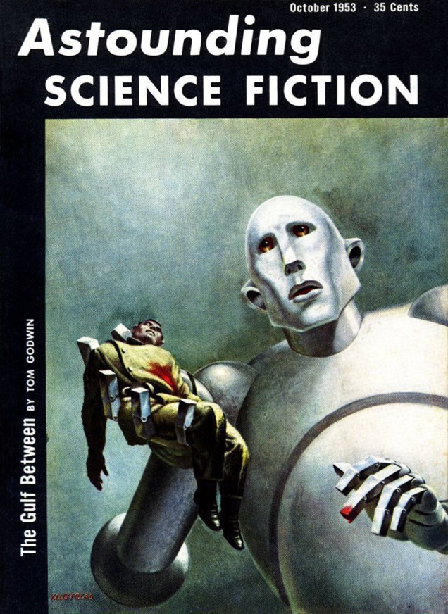
Some of you may recall Freas’ classic cover art for Queen’s News of the World album, back in 1977. That, in fact, was a case of Freas recasting his painting from the October 1953 issue of pulp mag Astounding Science Fiction. Look familiar?