Way Off-Model Archie, or ‘Escaping the Big Two’

« Our Betty Cooper is still the girl next door – she literally lives next to Archie. And she’s the blonde all-American girl; she’s so sweet and forgiving, gives people the benefit of the doubt and second chances, wears her heart on her sleeve. But she’s also incredibly broken on the inside, for many different reasons. » — Lili Reinhart

As a whole, comic book artists are not a happy lot, and for good reason. During the Golden Age, at least, there were countless publishers, so one could move around if unsatisfied with the working conditions.. even if meant finding out that things were rotten all over. After the mid-1950s, when the field violently contracted — you know the story — leaving scant players standing, you pretty much had to take the work, and the abuse, as they came. And certain publishers frowned upon ‘their’ creators playing what little remained of the field.

Kurt Schaffenberger had steady work at DC, but presumably — and understandably — sought to keep his options open, so he moonlighted for ACG, often under a pseudonym, probably unaware that the ‘competitor’ was covertly owned (at least in part) by DC co-founder and co-owner Harry Donenfeld. One can imagine Kurt’s distress when ACG folded in 1967. From what I can surmise, he did, in 1970, a lone, inexplicable cover for Stanley Morse… wildly outside his range but still kind of awesome. And then… he quietly boarded a bus to Riverdale.

A page from Voice of Doom; script by Frank Doyle, pencils by Schaffenberger, inks by Jon D’Agostino. Published in Archie’s TV Laugh-Out no. 16 (Dec. 1972, Archie).
The, er… punchline from Peace of Mind. Script by Frank Doyle, pencils by Schaffenberger, inks (likely) by Chic Stone; published in Archie’s TV Laugh-Out no. 18 (Mar. 1972, Archie).
Drawing for Archie wasn’t too much of a stretch for Kurt; whether it was Reggie or The Big Red Cheese getting knocked on his ass, he had his stock posture. This is Shazam no. 22 (Jan-Feb. 1976, DC). Pencils and inks by Mr. Schaffenberger.

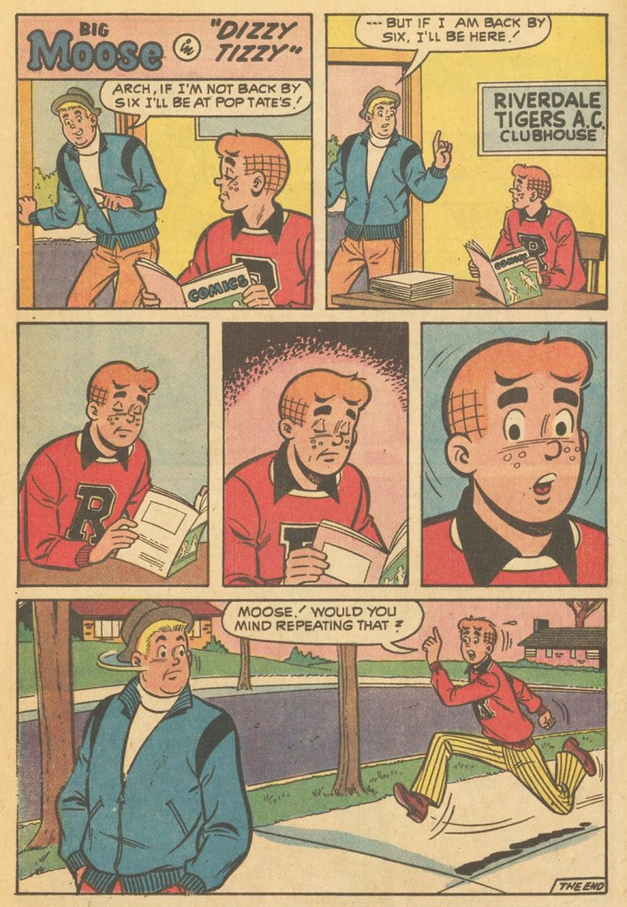
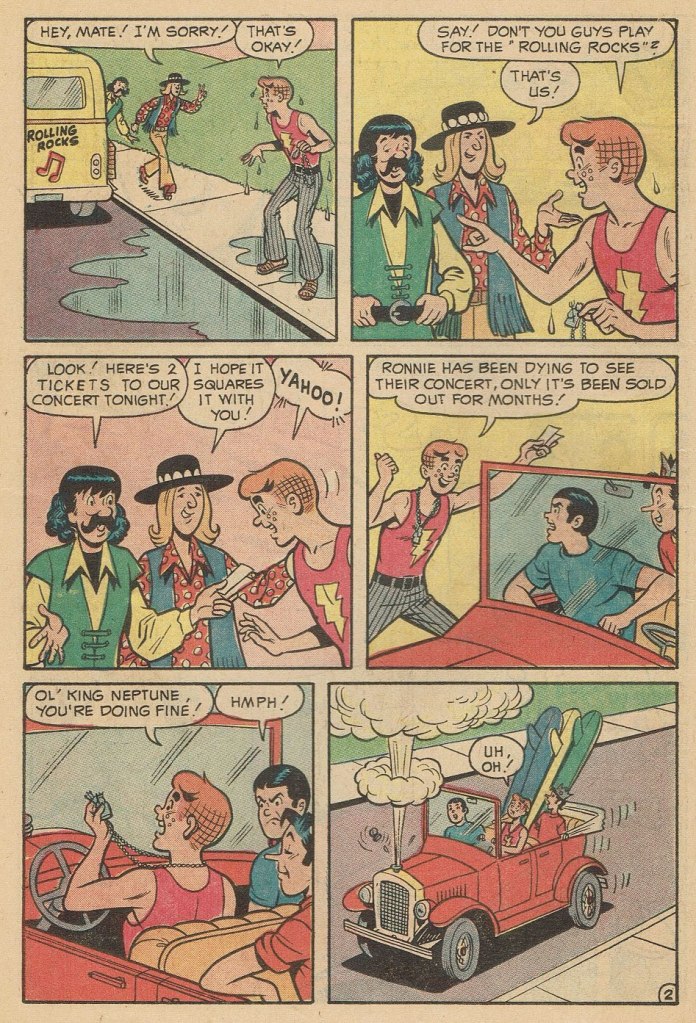
A couple more samples from Mr. Schaffenberger’s all-too-brief Archie period — solid, well-paced, ably-designed and economical storytelling:

A slightly surreal one-pager from Archie’s Joke Book Magazine no. 150 (July 1970, Archie).
A page from Luck Struck, published in Archie’s Pals ‘n’ Gals no. 73 (Oct. 1972, Archie); note the Captain Marvel tank top young Mr. Andrews is sporting!

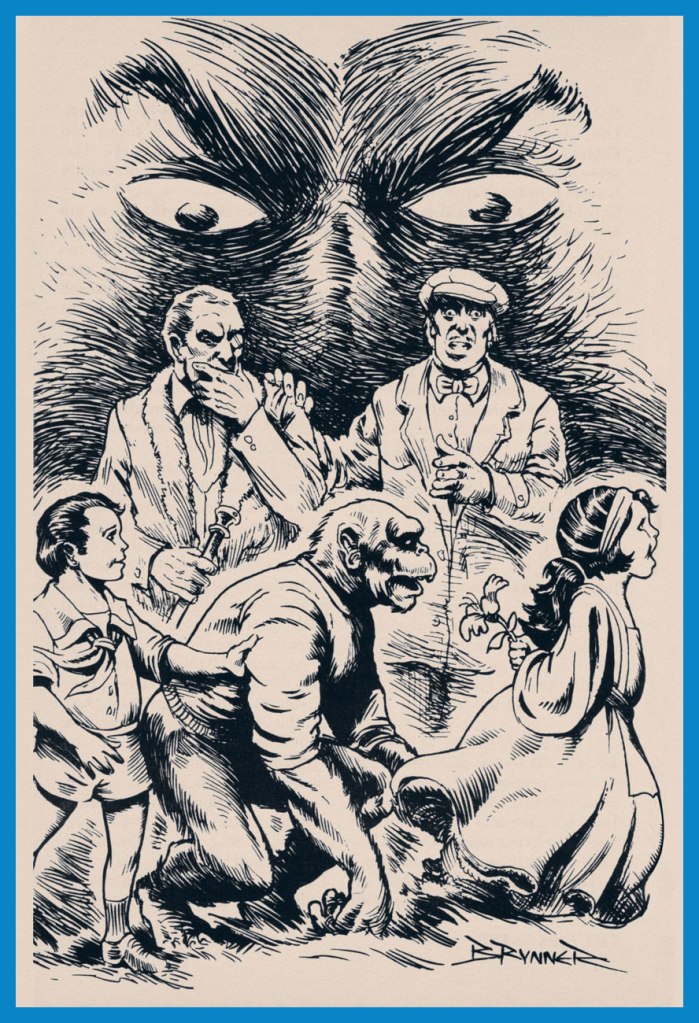
And then, there’s the case of Sal Amendola, a Neal Adams protégé whose reputation in comic books largely rests on a single Batman story, 1974’s ‘Night of the Stalker’, a highly praised tale whose chief conceit is that Batman never utters a word and weeps bitterly at the end. I’d apologise for the spoilers, but honestly, it’s been half a century, what mystery is there to dispel?

An excerpt from Detective Comics no. 439 (Feb.-Mar. 1974, DC); I’ll rarely say this, but Dick Giordano’s inks are an asset in this case, not a liability. The story’s scripting credits are at once hilarious and a bit sad: Steve Englehart, script; Vin and Sal Amendola, plot; and… “from an incident as described by Neal Adams.” Yeah, Neal; that’ll surely earn you a Pulitzer.

Anyway, after his turn in the Bat-spotlight and 1975’s Phoenix, one of the short-lived Atlas-Seaboard‘s more daring titles, Amendola turned up at… Archie. And it was not a good fit.

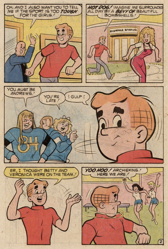
This, in fact, was the springboard for this post: a couple of years ago, I encountered an Archie story that so grotesquely missed the mark — stylistically speaking — that it bordered on the fascinating. You guessed it, Sal Amendola, utterly out of his element, not to mention, surprisingly… his depth.

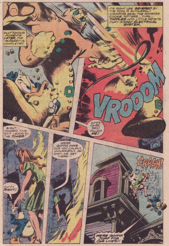
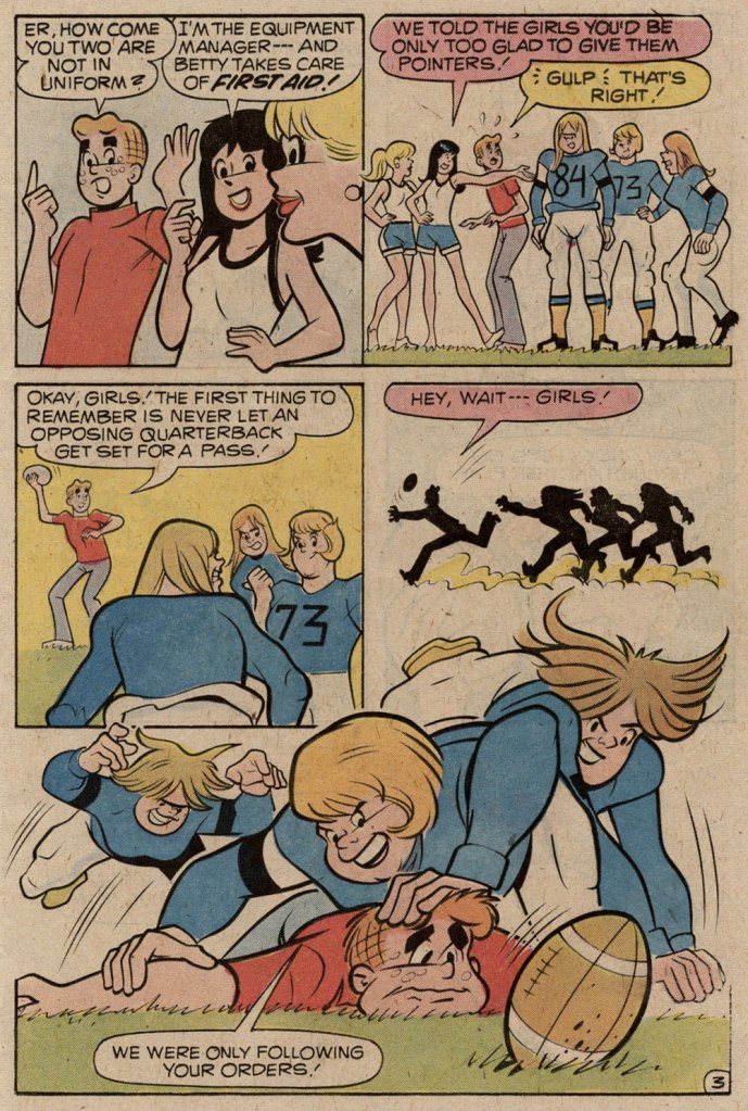
Here are a pair of pages from Coach Reproach, published in Everything’s Archie no. 71 (Dec. 1978, Archie), script by George Gladir, pencils by Amendola, inks by Jon D’Agostino.

Where to begin? In the first panel, you give Archie a stiff, unnatural pose and you follow it up by repeating it on a background character in the very next panel. And Arch is due for a nasty case of whiplash if he keeps trying to make like Linda Blair.
At this point, I’m thinking Sal had learned plenty from his mentor on how to utterly fail at comedy.
If what I’ve observed about pitching stances is worth anything, Archie’s about to get brained by a baseball. Ginger boy is also looking right past Coach Kleats. Despite the low bar — issues of quality control were rampant at Archie in the 1970s — this is impressively incompetent storytelling,
What happens when you never learn basic inking principles: one creates depth by using thinner lines — and less detail — on background characters, otherwise… visual chaos ensues, as demonstrated here. And Sal’s Betty and Veronica sorely need a brand of shampoo that won’t leave their hair so oily and limp… but the anatomy is beyond help. This is the opening page of The Specialty, from Pep no. 342 (Oct. 1978, Archie).

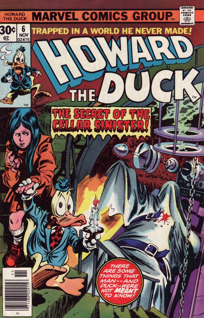
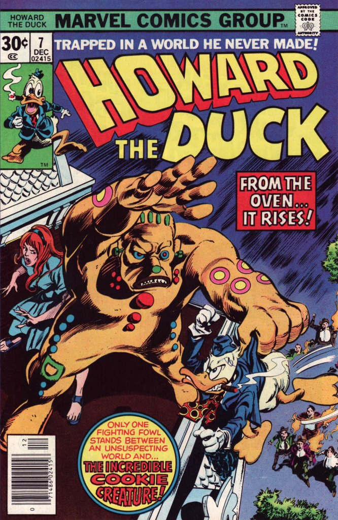
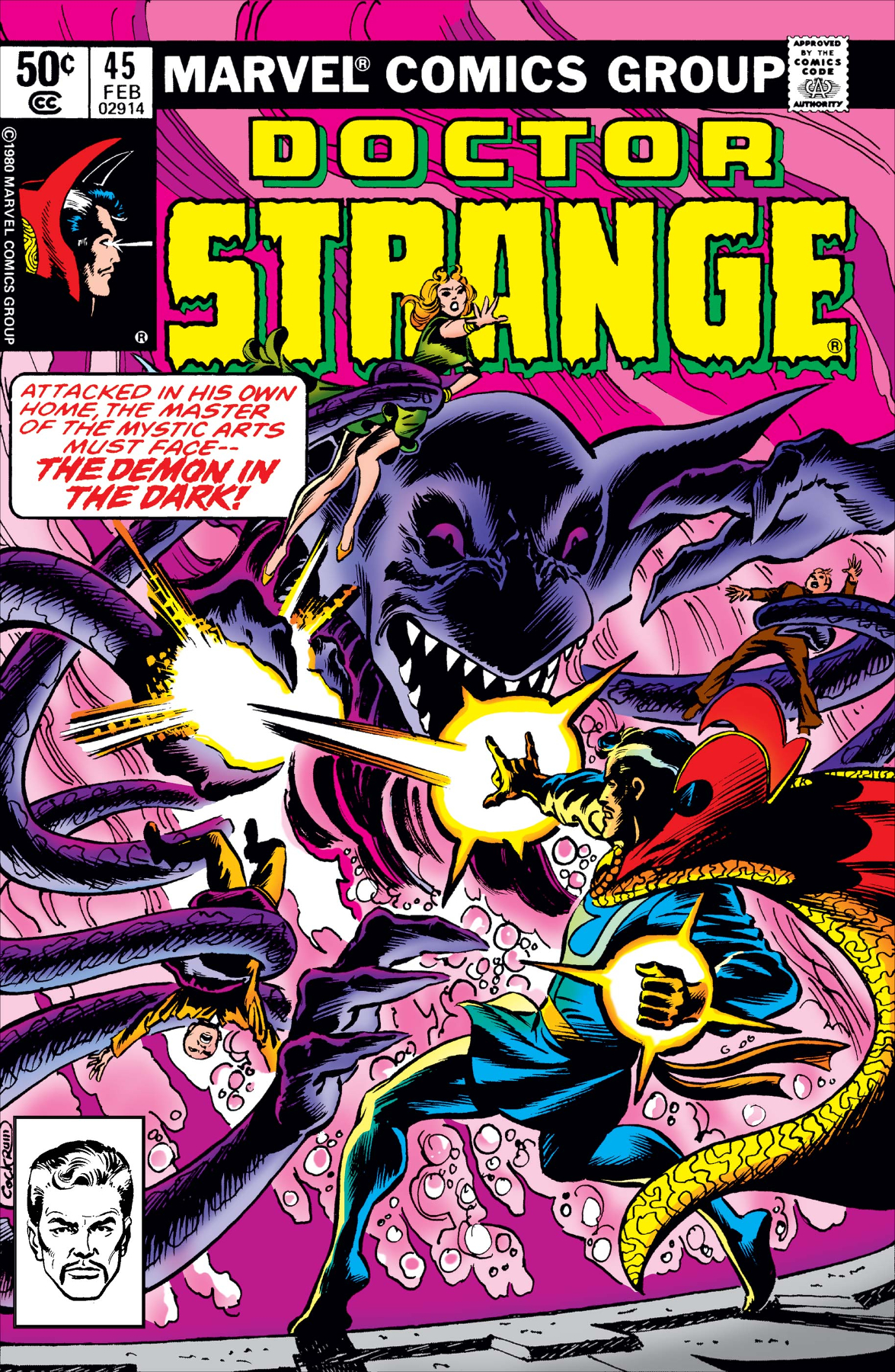
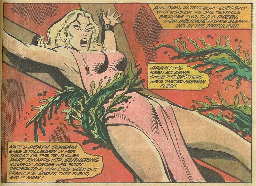
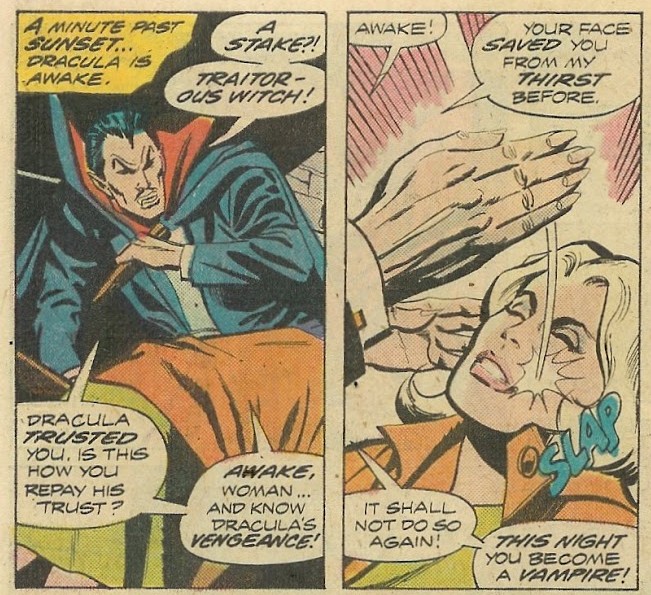
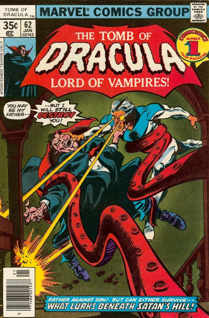
Schaffenberger’s fellow Golden Age veteran, Gene Colan, also found himself moonlighting in the 1960s. In his case, it was for Marvel, under the alias of ‘Adam Austin’, but also for Dell (just a couple of covers mid-decade) and more significantly for Warren Magazines. In the 1970s, he concentrated on Marvel and was, in the chaos that was the so-called ‘House of Ideas’ at the time, the single most reliable artist in the maelström: surely none can match his seventy consecutive — and meticulously detailed — issues of Tomb of Dracula, in addition to lengthy runs on Howard the Duck, Daredevil, Captain America, Doctor Strange and so forth.

Enter Jim Shooter, a man only Vinnie Colletta could love.

« When writer Jim Shooter became Marvel’s editor-in-chief in the late ‘70s, the tension between Colan and the younger authors came to a head. By 1980, Shooter and Colan were totally at odds with one another over Colan’s approach to storytelling. »

« [Shooter] was harassing the life out of me. I couldn’t make a living,” Colan said. “He frightened me, he really did. He upset me so bad I couldn’t function.” Just as she had urged Colan to quit one job [in] the 1960s, wife Adrienne begged him to leave Marvel in 1980. After delivering his resignation, Colan was asked to sit down and seek resolution with Shooter and publisher Mike Hobson. Colan agreed to the meeting, but declined any overtures to stay at Marvel. “Shooter was in the same room,” Colan recalled, “and I said, ‘That man’s not gonna change. He is what he is. Whether it’s six days, six months or six years, it’s not going to be any different, so I’m not going to put up with it for another minute.‘ » [ source ]

He then scampered over to DC for a few years. His production there was hit-and-miss, but his Batman run (1981-86) was outstanding, pairing him with some of the rare inkers who could do his nuanced pencils justice: Klaus Janson, Tony De Zuñiga (to my amazed delight!) and especially Alfredo Alcala.

But once his contract ran out, he was out knocking on doors again. Against all odds, Archie beckoned.

This is the cover — dreadful, I’m afraid — of Jughead no. 17 (Apr. 1990, Archie), reviving the opportunistic, Batman TV show-derived ‘Riverdale Gang as superheroes’ de trop move of the mid-1960s, with even less aplomb. But then the Archie folks were plumbing an especially low point with such ‘experimental’ titles as Jughead’s Diner, Archie 3000, Dilton’s Strange Science, Jughead’s Time Police, Archie’s R/C Racers, Explorers of the Unknown, and of course The Adventures of Bayou Billy.
An action-packed — and Colan-shambolic — excerpt from that issue’s Hatman saga, written by Robert Loren Fleming, pencilled by Colan and inked by Rudy Lapick. Notwithstanding his sticking out like the proverbial sore thumb, Colan clearly had a ball working on his Archie stories. He brought some urgently needed chutzpah to a perilously stale formula.
A page from Will the Real Archie Please Stand Up!, published in Life with Archie no. 273 (July 1989, Archie), wherein Archie is mistaken for his doppelgänger, a foreign prince named Kafoufi… but of course. Pencilled *and* scripted by Colan, which is most unusual. Oh, and inked by Mr. Lapick, who doesn’t quite know what to do with those ol’ Colan worm-fingers, seen wriggling in panel five.

-RG

Hallowe’en Countdown VI, Day 24

« I love the scents of winter! For me, it’s all about the feeling you get when you smell pumpkin spice, cinnamon, nutmeg, gingerbread and spruce. » — Taylor Swift

It occurred to me, just the other day that I’d failed to feature, over the course of five and three-quarters countdowns, anything by Gene Colan. And this despite the fact that I’ve always enjoyed his work and his undeniable adroitness within the horror genre.

Still, I decided to sidestep the obvious touchstone, his monumental run on The Tomb of Dracula, and opted instead for another of his big series at Marvel: Howard the Duck.

I was a fervent fan of the series as a kid, but I honestly haven’t returned to it in decades. Which is not to say that I’ve forgotten it. There’s no doubt that I should give it a fresh look — I’d probably get more of Steve Gerber‘s jokes than I did as a twelve-year-old — but in the interim, let’s focus on a couple of pertinent issues.

This is Howard the Duck no. 6 (Nov. 1976, Marvel); cover pencils by Gene Colan, inks by the recently departed Tom Palmer (1941-2022).
Colan’s style meshes surprisingly well with Mr. Gerber‘s madcap comedy… he plays it straight, and that’s why it clicks. Savvy move.
I wasn’t sure about Steve Leialoha‘s appropriateness as a Colan inker at the time, but I really don’t see what I could have objected to.
Let’s see, what have we here? The Addams Family, Shelley’s Frankenstein, gothic romances, Nathaniel Hawthorne, religious sects… in this case the reverend Sun Myung Moon‘s Unification Church, better known as The Moonies

I won’t leave you in suspense! On to the following issue…

This is Howard the Duck no. 7 (Dec. 1976, Marvel); pencils by Colan, inks by Palmer.

And that’s it! Steve Gerber had a refreshing knack for subverting and upending the Marvel formula: instead of some drawn-out, epic standoff, Howard disposes of the threat — a threat worth two cover features! — in a couple of panels, then the story moves on… to another range of targets.

– RG

A Visit to the Hall of Impractical Costumes!

« Taking sartorial risks and not following other people is what makes you stand out. » — Zac Posen

I was planning a big commemorative post for today, but I got tangled up in my calendar and realised in time that I was a couple of weeks off. So instead, I’ll just blow off a little steam.

Some cartoonists are born character designers. Others, not so much. The Rhino, a Stan Lee-John Romita Sr. creation, first appeared in The Amazing Spider-Man no. 41 (Oct. 1966, Marvel), soon after Steve Ditko‘s abrupt but quite justified resignation. Isn’t that just a dog of a cover? (pencils and inks by Romita, colours by Stan Goldberg).

I’ve been getting these migraine headaches, Doc” “What do you do for a living?” “Uh…” Seriously, what can you do with a character who obviously can’t move that fast, has to lean his head down to strike… blindly, and isn’t particularly smart? All Spidey has to do is duck, which is one of his chief talents.
Answer: you pit him against a more suitable adversary, preferably a dumber one. This later, but still ludicrous, appearance is The Incredible Hulk no. 104 (June 1968, Marvel). Cover by Marie Severin and Frank Giacoia.

Somehow, Daredevil seems to wind up with more than his share of poorly-attired villains. It’s as if they know he’s blind and won’t judge them too harshly on sartorial grounds.

The Beetle first scurried into view in Strange Tales no. 123 (Aug. 1964, Marvel), tackling the Human Torch (and The Thing). Too bad it wasn’t Doctor Strange he was sparring with, since his threads would then have been designed by Mr. Ditko instead of by Carl Burgos.

He then went on to bug the aforementioned ‘hornhead’. This is Daredevil no. 34 (Nov. 1967); pencils by Gene Colan, inks by Bill Everett. Why does everyone on stage appear to wear a size 15 shoe? At least!

The costume of the Tarantula (a glorious Gerry Conway-Ross Andru creation!) is such an impractical conceit that they pretty much have to use him in the same position on every cover. The guy can barely walk in such, er — calzado, let alone fly at Spider-Man with such force. Just a lousy idea, on every level — tarantulas bite, they don’t sting, Gerry.

This is The Amazing Spider-Man no. 134 (July 1974, Marvel). Art by John Romita Sr. So… much… pointless…. exposition.
They just had to bring him back! This time, Gil Kane and John Romita Jr. do the honours. This is The Amazing Spider-Man no. 147 (Aug. 1975, Marvel).
No formula at work here, no sir. This is Peter Parker, the Spectacular Spider-Man no. 1 (Dec. 1976, Marvel). Cover by Sal Buscema. Tarantula creator Conway was the editor, which explains a lot — but hardly excuses it.

Poor Razor-Fist was created by writer Doug Moench and artist Paul Gulacy. How did he get dressed? How did he go to the bathroom? How did he feed himself? How did he get his head to bend that far back? (Perhaps he’s a Pez Dispenser).

This is The Hands of Shang-Chi, Master of Kung Fu no. 30 (July 1975, Marvel). Cover by Gil Kane and (most likely) Frank Giacoia. I guess all the male lions were taking a nap somewhere.

Should you hanker for more of these, er… dressing-downs, you might want to inspect our earlier instalment along these lines, « You’re going out wearing THAT? ».

-RG

Hallowe’en Countdown IV, Day 25

« He was offered a sloe gin fizz in a pink frosted glass by a young woman who removed her glass eye and sucked on it while discussing the moral imperatives of the sponge boycott in Brooksville, Florida. » — Harlan Ellison, ‘Neon’.

In 1973, Marvel was trying all sorts of things to bolster its market presence. They even dared to tread where even the venerable Weird Tales had never quite succeeded. The Haunt of Horror was a prose fiction digest that strongly showed its comics roots. It offered a mixture of classic material (Fritz Leiber’s Conjure Wife, a piece by Robert E. Howard) and of contemporary genre practitioners: Harlan Ellison, Ramsey Campbell… featuring a score of illustrations slapped together by Marvel’s less superhero-limited alumni, namely Gene Colan, Mike Ploog, Frank Brunner, Walt Simonson and Dan Green. After two issues, Marvel called the whole thing off, licking its wounds, but soon revived the title as a b&w comics magazine, this time eking out five issues (May 1974 – Jan. 1975) plus a 1977 issue of Marvel Preview.

This is The Haunt of Horror no. 1 (June, 1973), edited by Gerry, no, make that *Gerard* Conway (in full ‘take me seriously, I’m not just a hack comics writer!‘ mode), with a striking cover by Gray Morrow.

As for me, I picked it up for the rare short story by the nonpareil R. A. Lafferty, Ghost in the Corn Crib.

Dan Green‘s illustration for Lafferty’s story.
One of Frank Brunner‘s illustrations for John K. Diomede (alias George Alec Effinger)’s The First Step.
Werewolf by Night originator Mike Ploog didn’t have to stretch far beyond his comfort zone for this illustration for Alfred Angelo Attanasio‘s Loup Garou (french for Werewolf, if you still feel the need to ask).
It’s nigh-impossible to fully scan some these images without destroying the source document, but here’s the opening splash for Haunt of Horror’s publication of Fritz Leiber’s 1943 classic Conjure Wife, adapted in the movies as Night of the Eagle (in the UK) and Burn, Witch, Burn (in the US). Here, a fine, committed but uncredited Gray Morrow pebble board illustration is ‘corrected’ by Marvel’s number two Yes Man (Consulting Editor Rascally Roy Thomas would surely be numero uno), who replaces whichever figure Gray had drawn by an image of Mary Jane Watson, not even bothering with the slightest effort to match the style. John Sr. had gotten plenty of practice ‘fixing’ Kirby and Ditko, so Gray Morrow was just ‘all in a day’s work‘.
Gene Colan was called upon to whip up a few quick pieces for the rest of the feature.
The Haunt of Horror ran just one more issue, graced by a lovely, quite pulpy cover by the nonpareil Frank Kelly Freas, whose efforts Romita Sr. has also seen fit to ‘fix’. See Unknown World of Science-Fiction no. 1 (Jan. 1975). This, however, is The Haunt of Horror no. 2 (Aug. 1973, Marvel). Come to think of it, that evil priest kind of anticipates a latter-day Nicolas Cage, doesn’t he?

In the end, you might say that this short-lived publication is best known for a screwup: indeed, the notoriously disorganized Marvel Bullpen messed up the page order of Harlan Ellison‘s contribution to the first issue, Neon. Never one to let such things slide, Harlan made sure that a correct version was printed in the second issue. Score one for the good guys.

-RG

Tentacle Tuesday: Paging Doctor Strange

It’s difficult to impress me with a magician, unless we’re talking real-life magicians with a strong skeptical streak, like James Randi or Ricky Jay. Given that the concept of a person who has access to ‘mystical’ forces and who can manipulate beings (supernatural or otherwise) has been around for as long as humans have been able to communicate with one another, be it through grunts and squeals, it’s pretty damn difficult to come up with a new wrinkle to this old tired nag. Having no previous experience with the series, I had no high expectations for Steve Ditko‘s Doctor Strange, but I was pleasantly surprised. I liked the earnest, solemn Dr. Strange from the beginning, but it’s Ditko’s mind-boggling, soaring surrealistic landscapes that bloomed over time that really impressed me. It’s not an easy feat to make the reader feel like he’s being transported into another dimension, but Ditko pulled it off beautifully, making us feel Dr. Strange’s disorientation as he gets sucked into yet another psychedelic terrain.

To quote comics historian Mike Benton:

The Dr. Strange stories of the 1960s constructed a cohesive cosmology that would have thrilled any self-respecting theosophist. College students, minds freshly opened by psychedelic experiences and Eastern mysticism, read Ditko’s Dr. Strange stories with the belief of a recent Hare Krishna convert. Meaning was everywhere, and readers analyzed the Dr. Strange stories for their relationship to Egyptian myths, Sumerian gods, and Jungian archetypes.

What does this have to do with the current post? Precious little, actually. I’m a firm believer of not recycling dramatis personae past their due by date (defined, of course, as that time when their creator/author moves on to greener pastures, by design or because he has to). Doctor Strange moulded by other hands loses his raison d’être and becomes just another Joe in a funny cape, uttering ineffable, paranormal gobbledygook. Oh, sure, he’s aided by more mystical artifacts than before. How exciting… if you are excited by gadgets and gimmicks, that is.

He also encounters a lot of tentacles, apparently the most mystical, otherworldly apparitions *this* crew could think of. Welcome to 70’s (for the most part) Doctor Strange!

MarvelPremiere6
Marvel Premiere no. 6 (January 1973). Cover by Mike Ploog and Frank Giacoia.

The Shambler from the Sea is scripted by Gardner Fox, pencilled by Frank Brunner, and inked by Sal Buscema and Ralph Reese:

MarvelPremiere6-The ShamblerFromTheSea

MarvelPremiere6-The ShamblerFromTheSea-2

DoctorStrange1
Dr. Strange no. 1 (June 1974). Cover by Frank Brunner.

Through an Orb Darkly is scripted by Steve Englehart and Frank Brunner, pencilled by Frank Brunner and inked by Dick Giordano:

DoctorStrange1-ThroughanOrbDarkly

DoctorStrange21
Doctor Strange no. 21 (February 1977). Cover pencilled by Gene Colan and inked by Tom Palmer. Is Clea basically humping the (impeccably, gleaming clean) side of the car, basically?

Mind Trip!, scripted by Marv Wolfman and drawn by Rudy Nebres, was published in Doctor Strange no. 22 (April 1977):

DoctorStrange22-MindTrip
That’s quite a group scene *slurp slurp slurp*

DoctorStrange22-MindTrip-2
Why does your image haunt me? Why are my boobs perkily gravitating towards the light?” I can’t even muster a passing interest in figuring out what’s happening in this mess.

DoctorStrange23
Doctor Strange no. 23 (June 1977). Cover pencilled by Gene Colan and inked by Tom Palmer.

DoctorStrange30
Doctor Strange no. 30 (August 1978). Cover by Frank Brunner.

A Gathering of Fear! is scripted by Roger Stern and illustrated by Tom Sutton:

DoctorStrange30-AGatheringofFear-TomSutton

DoctorStrange30-AGatheringofFear-TomSutton-2
I like Tom Sutton, a Tentacle Tuesday master on this blog.

doctorstrange45
Doctor Strange no. 45 (February 1981). Cover by Dave Cockrum and Steve Leialoha.

Wizard of the West Village is scripted by Chris Claremont and pencilled/inked… by a whole bunch of people:

doctorstrange45-WizardoftheWestVillage

doctorstrange45-WizardoftheWestVillage-2

… and there you have it!

∼ ds

Tentacle Tuesday: Dracula Drops In

« Kate’s death scream gags stillborn in her throat as the tentacles dart toward her, slithering hungrily across her body. »

Here’s a quick association exercise: as fast as you can, name words that come to mind when somebody says “Dracula”. Um, fangs! Stake! Blood, cape, biting! … Tentacles? Say what?

It would have never occurred to me to look for tentacles in Dracula, giant-size or otherwise, so thanks to admin RG for this splendid suggestion.

GiantSizeDracula-2-PabloMarcus
Giant-Size Dracula no. 2 (September 1974). Cover by Pablo Marcos.

You’re not sure those green things were tentacles? If it quacks like a duck, it may well be an aquatic bird – and if it slithers towards female “human flesh”, count it as tentacles! Call Them Triad… Call Them Death! is scripted by Chris Claremont, pencilled by Don Heck and inked by Frank McLaughlin. I have to say that the art is distinctly subpar, as far as I’m concerned.

Giant-Size-Dracula-Issue-2-3-DonHeck
The writing isn’t brilliant, either.

Words are inadequate”.

Giant-Size-Dracula-Issue-2-4-DonHeck

Perhaps it’s the drab colours that weigh this down, and the original art would be a considerable improvement? Nope, sorry.

Giant-Size Dracula2-Don_Heck

As further example of the ineptitude of this art team, a quick question: does this look like he’s slapping her?

Giant-Size-Dracula-Issue-2-2-DonHeck
She was lying face down, but she somehow manages to flip over instantly.

However, I have no wish to engage in Don Heck bashing – he had his moments, it’s just that this story wasn’t one of them. Instead, I will direct you to this article explaining how Harlan Ellison mocked Heck once upon a time, several lifetimes ago. Also, ouch.

Harlan Ellison: There are guys who’ve got very minimal talents and it doesn’t matter whether they corrupt it or not. I could name them and would happily name them, but why bother? There’s no sense kicking cripples. I mean, all you have to do is open up comic books from Marvel and DC and take a look at them. You see these guys have a very minor-league talent and, to say, “Well, these people are wasting their talent” is ridiculous. I mean, they’re never going to be any better. What’s the name of the guy who used to do… over at Marvel… he use to do… [Pause]… the worst artist in the field.

Continuing our foray into Draculas of colossal proportions tangling with tentacles…

GiantSizeDracula4
Giant Size Dracula no. 4 (March 1975). Cover pencilled by Gil Kane and inked by Tom Palmer.

Sadly, the tentacles promised on the cover don’t really appear in the cover story. Time to move to another series —

TOMB-OF-DRACULA-62-GeneColan-TomPalmer
Tomb of Dracula no. 62 (January 1978), pencilled by Gene Colan and inked by Tom Palmer.

What Lurks Beneath Satan’s Hill? (tentacles, obviously) is scripted by Marv Wolfman, pencilled by Gene Colan and inked by Tom Palmer.

TombofDracula62-Marv-Wolman-Tom-Palmer
This has been scanned from the reprint, which in my opinion looks worse, not better.

The story continues in number 63 –

TombofDracula63-GeneColan-TomPalmer
Tomb of Dracula no. 63 (March 1978). Cover pencilled by Gene Colan and inked by Tom Palmer.

The Road to Hell! is scripted by Marv Wolfman, pencilled by Gene Colan and inked by Tom Palmer:

Tomb-of-Dracula-1972-Issue-63-2

Tomb-of-Dracula-1972-Issue-63-3
« All-you-can-eat-calamari — dive in! »

Next up (eventually), an equally random concept: Werewolf VS tentacles!

∼ ds