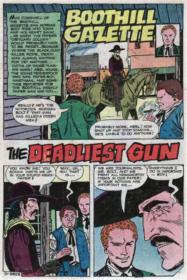
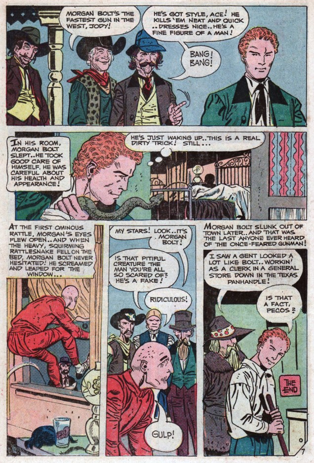
« That young fella must be the college kid who’s going to work for my paper! Those two prairie wolves will pick him clean… it’ll be an excellent lesson to him, I reckon! » — Max Cogswell, editor-publisher of The Boothill Gazette
Today marks what would have been the ninety-fifth birthday of suave Texan Renaissance man Aaron P. “Pat” Boyette (July 27, 1923 – January 14, 2000). The Golden-voiced Mr. Boyette was in turn actor, radio announcer, cinematic auteur and of course a far-beyond-fine painter and cartoonist. Ah, and if anything could speak more eloquently of his worth as a human being, he was best man at Gus Arriola‘s wedding.
Didn’t I say he was suave?
Now, I could have focussed on any number of his remarkable projects: his 1966-67 run on The Peacemaker (« A man who loves peace so much that he is willing to fight for it! »), his tour-de-force fill-ins on DC’s Blackhawk (issues 242-43, from 1968), his lavishly-detailed work for Warren Magazines (1968-72), his brilliant, but admittedly controversial, run on The Phantom at Charlton (1970-73), his far-better-than-its-source adaptation of Hanna Barbera’s Korg 70,000 B.C., his intense The Tarantula for Atlas-Seaboard (with Michael Fleisher, 1975), his fun revival of Spencer Spook for ACE Comics in the 1980s, or any of his moody work for Charlton’s ghostly anthologies… but I won’t, at least not this time.
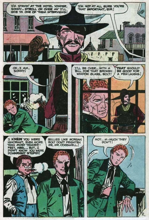
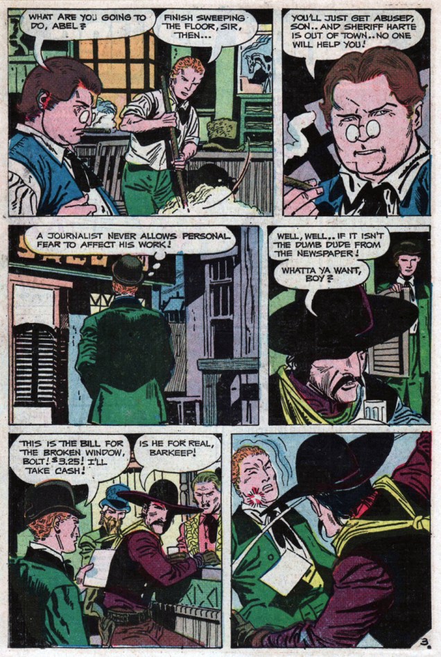
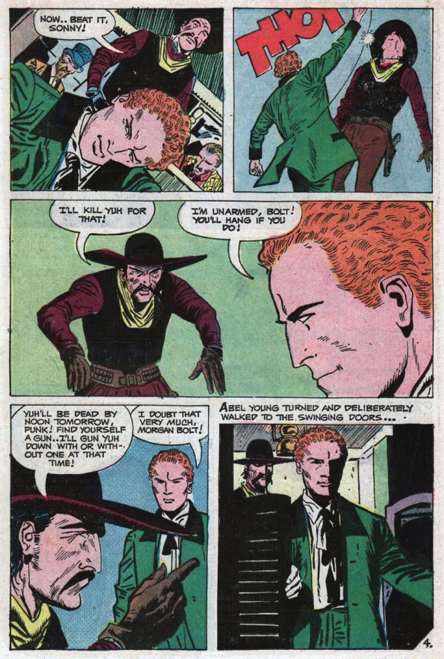
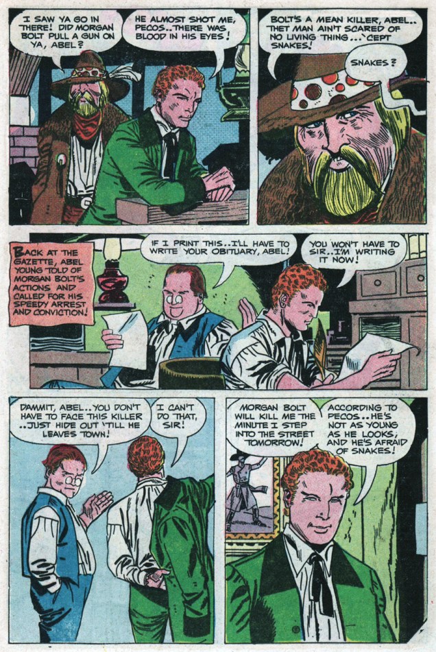
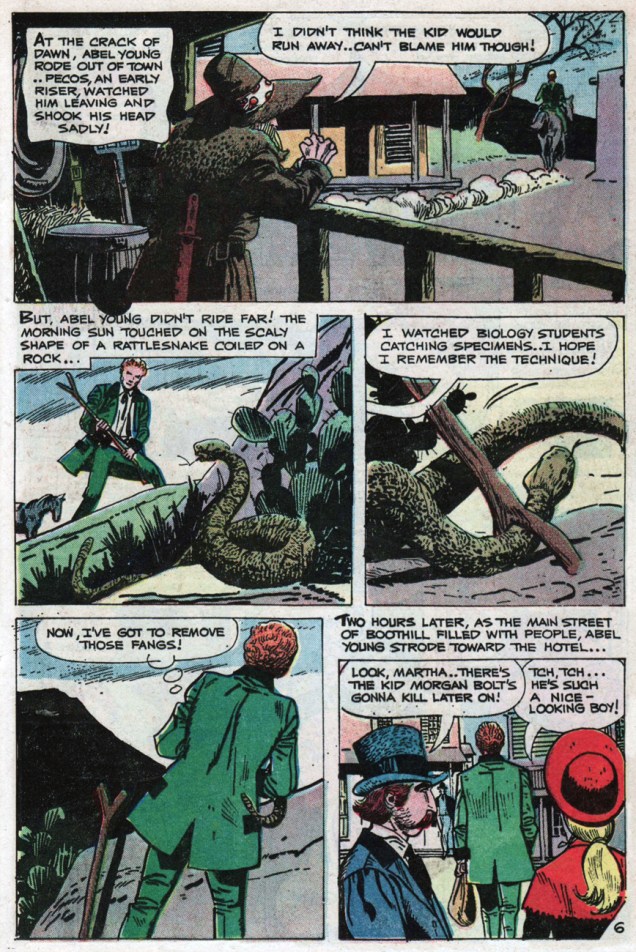
Instead, if you’ll bear with me, we’ll take a gander at a fine, fine backup series he co-created with Joe Gill for the pages of Charlton’s long-running Billy the Kid. Mr. Young of the Boothill Gazette (BTK 88, Dec. 1971, to BTK 110, Dec. 1974). Abel Young, bereft of sharp-shooting or pugilistic skills, is a true hero: a fool, an idealist, a stubborn cuss who acts nobly even when he’s scared spitless. His is a charming strip, full of graceful humour and humanity.
Here, then, is my selection: the series’ thirteenth episode, originally published in Billy the Kid no. 100 (March, 1973, Charlton).
Happy birthday, Mr. Boyette. The world needs more gentlemen of your ilk.
-RG
*so proclaimed the headline of a Boyette profile published in Creepy no. 33 (June 1970, Warren).
Ahoy, landlubbers! Today’s Tentacle Tuesday goes back to the good ol’ days of nautical journeys, ships crushed by mighty tentacles, and brave men who end their lives as snacks for the mighty cephalopod.
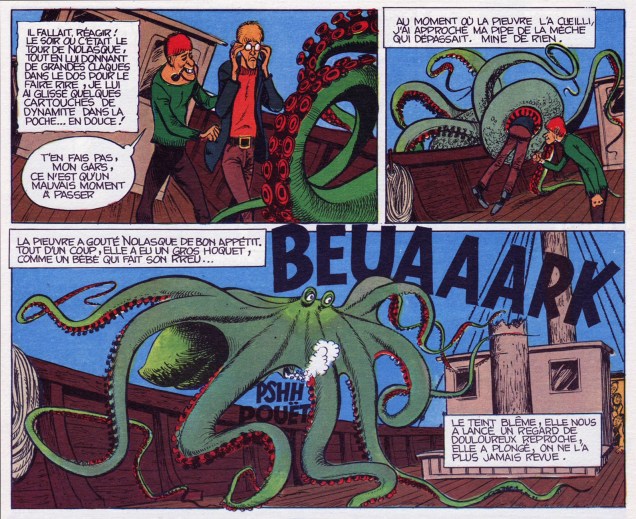
Printed in Pilote Hors série aventure no 17 bis (October 1975, Dargaud). The story is titled L’Antoinette Pécuchet, from the cycle Les histoires de Pemberton, written and illustrated by Sirius (real name Max Mayeu, Belgian cartoonist).After most of the crew is swallowed up by the starving octopus, our narrator gets the bright idea to stick some dynamite into the pocket of the next sacrificial lamb and lights it just before he’s eaten. “The octopus savoured Nolasque with a healthy appetite. Suddenly, she hiccuped loudly, like a burping baby… Pale, she threw us a glance of bitter reproach, and dove into the water, never to be seen again.”
Speaking of the Sargasso Sea (frequently depicted in fiction as a perilous area where ships go to die, mired in Sargassum seaweed, unable to escape), here’s another vignette about that mysterious spot. Incidentally, it is the only sea that doesn’t have land boundaries, enclosed by the Gulf Stream on the west side, the Canary Current on the east, the North Atlantic Current on the North and the North Atlantic Equatorial Current on the South. No wonder people thought it was full of mystery and danger! Even I, more or less immune to the siren’s call of wild maritime adventure, feel a little thrill at its mention. *Ahem* back to comics.
Boris Karloff Tales of Mystery no. 29 (March 1970), painted cover by George Wilson.
As is often the case, the original painting has a lot more detail than the printed version:
The original painting for “Creature of the Sargasso Sea” by George Wilson.
What does this peculiar, one-eyed beast look like closer up, one might ask? Something like this:
A page from Creature of the Sargasso Sea, pencils by John Celardo and inks by Sal Trapani. Furry octopuses are my favourite!
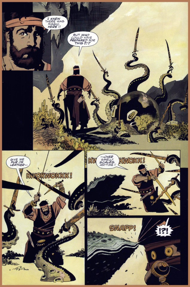
The sea can bring many (other) strange things, including a sword-wielding octopus… who should have stayed in the water, where he had the home advantage, instead of attempting to wage battle on sort-of land.
A couple of pages from Fafhrd and The Gray Mouser, a comic adaptation of Fritz Leiber’s cycle of sword-and-sorcery stories. Adaptation by Howard Chaykin, art by Mike Mignola, who’s inked by Al Williamson. This 4-issue series was anthologized in 2007 by Dark Horse; these pages were scanned from Book 4, published in 1992 by Epic Comics.One can only hope to be as stylish while fighting a many-tentacled monster.
« The French have a phrase for it. The bastards have a phrase for everything and they are always right. To say goodbye is to die a little. »
― Raymond Chandler, The Long Goodbye
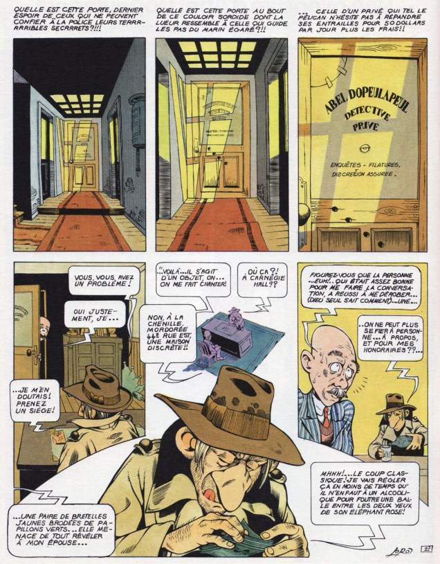
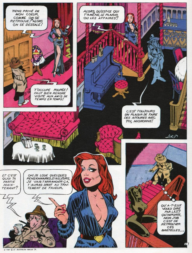
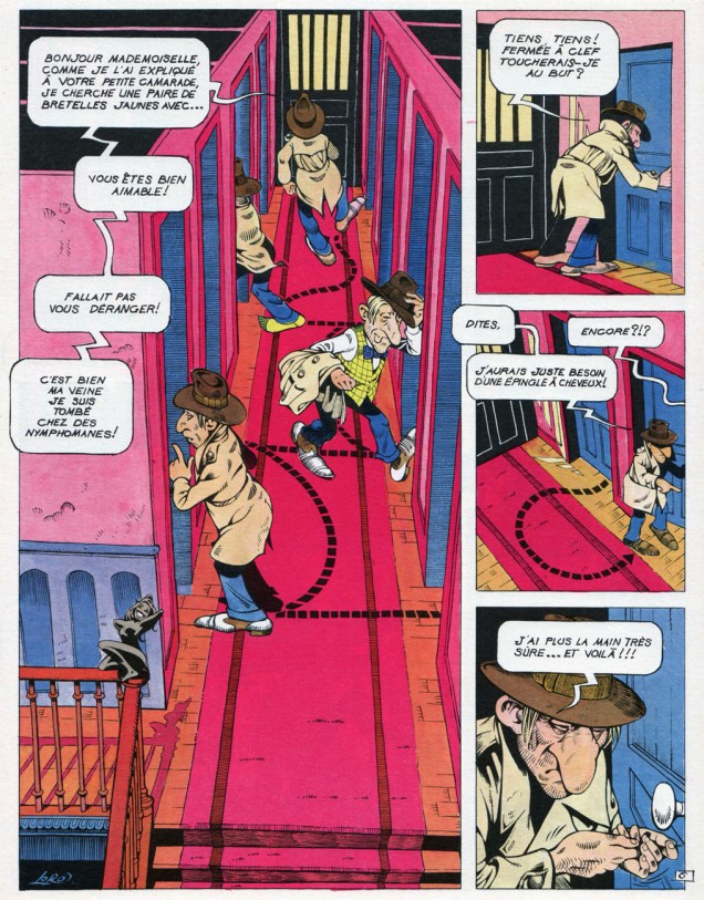
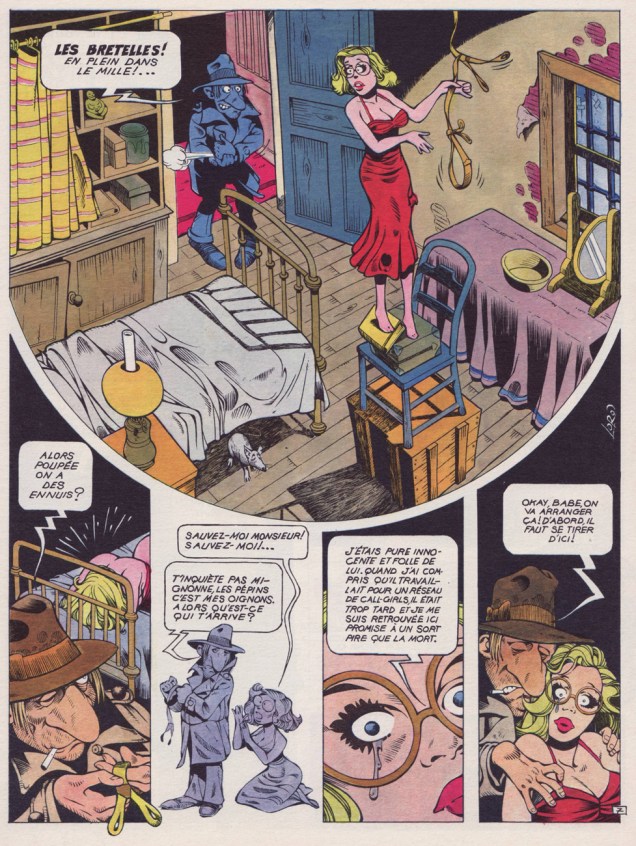
Dopey private detective parodies are a dime-a-dozen, and they seldom raise more than a lazy, jaded chuckle. With that out of the way, just how does Jean-Marc « Loro » Laureau (1943 – 1998)’s Les enquêtes d’Abel Dopeulapeul pull ahead of the pack? Let’s see: while it’s hardly side-splitting, it nevertheless scores precious points on the hilarity front by maintaining a mostly deadpan tone. But… one quick peek at the strip and the jig is up: it’s a glorious, unabashedly visual feast. Loro was blessed with that rather uncommon gift, the ability to seamlessly mix the cartoonish and the realistic. Even Wally Wood couldn’t pull that off. Frank Cho is a perfect contemporary example of someone who’s utterly incapable of it.
Monsieur Laureau himself, in the late 1970s.
M.A. Guillaume, who penned the back cover copy for the second Abel collection, Sale temps pour mourir (1979, Dargaud), clearly gets the picture. I’ll translate:
« Dopeulapeul, a parodic and cretinized response to [Philip] Marlowe, views himself as that marvellous guy who stalks vice and corruption on fifty dollars a day plus expenses. Within the haze of his dream fed by adulterated bourbon, he doubtless imagines he’ll croak on some moonless night, alone like a dog behind the last trashcan of some filthy dead end. The reader will cackle maliciously, knowing no-one gives a toss about the death of a caricature. But he’ll be wrong. Dopeulapeul conducts himself like some village idiot in the throes of some clandestine passion for Lauren Bacall. His blasé detachment, dragging a language school aftertaste, is as seductive as an unkempt stinkbug. It matters little how offhandedly Loro may treat the tentative meanderings of this poor beggar. Within him slumbers a fascinated vision that survives all clichés: in the debauched night, a man moves along, and his shadow is weary of knowing too well the callousness of the blacktop and of men’s hearts. He is free and solitary and Death is at his heels.
Parody can’t put a dent to that, and Loro knows it full well. He may laugh, parody, demystify, “Sale temps pour mourir” is nonetheless an homage to an untouchable legend. »
Loro is all-but-forgotten nowadays, but his ability to channel vintage Will Eisner (particularly The Spirit) without aping him, while displaying plenty of his own pyrotechnics, by itself deserves a more prominent place in history.
« Réquiem pour un privé », an early entry in the series, first saw print in Pilote Hors série aventure (No 17 bis, October 1975, Dargaud)
« Gosh, if only Dad would inject me with some of that!* »
The undervalued Gaspano “Gus” Ignazio Ricca (1906-1956) managed, in the first half of his scant half-century of life, to get his foot in a lot of important doors: The New Yorker (1928), Liberty (1933), Time (1934), Collier’s (1935)… then he wound up in pulps and comics, for better or worse.
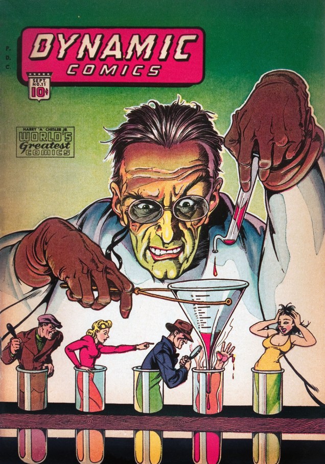
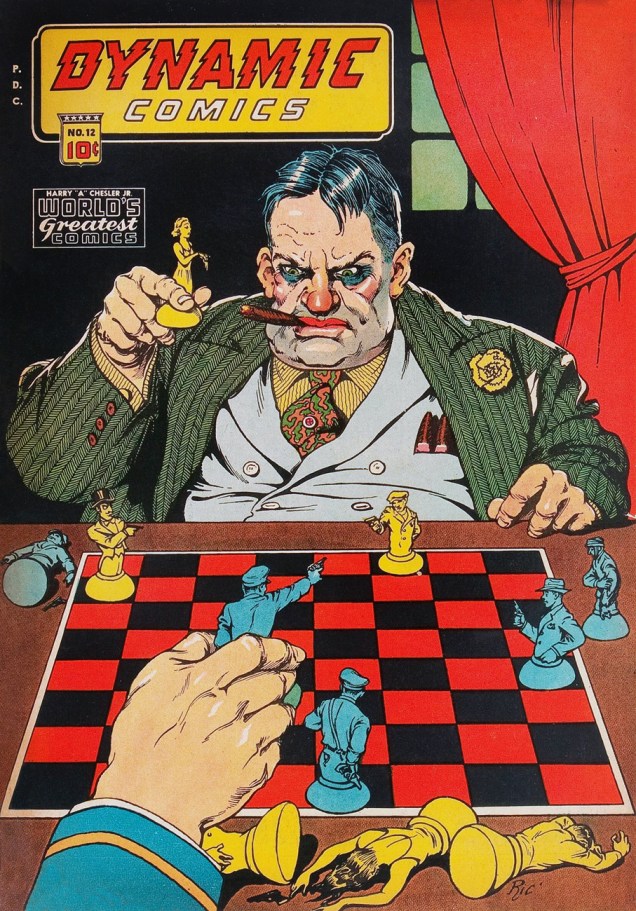
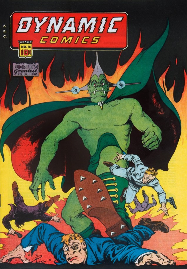
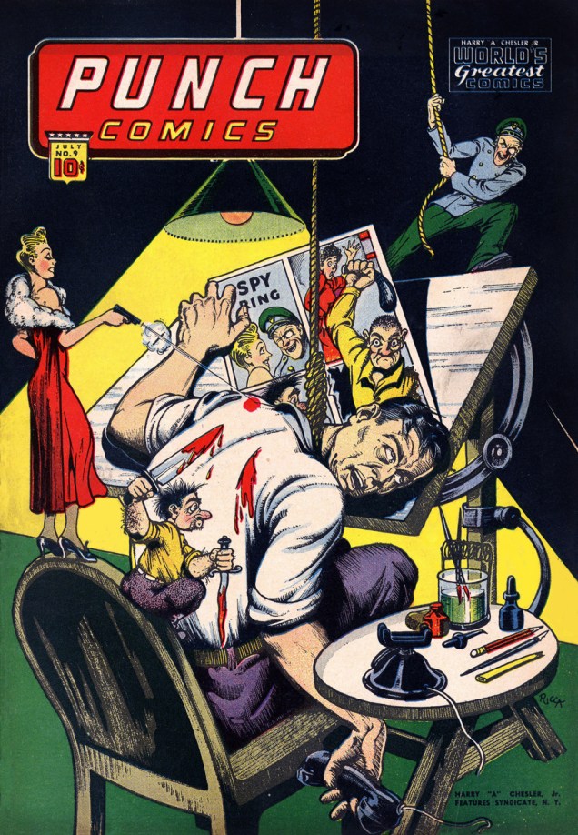
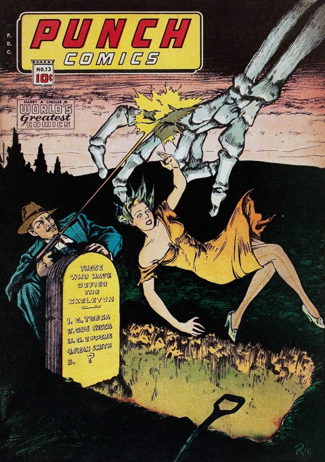
Having joined, at the dawn of the 40s, the fabled studio of Harry A. Chesler, the original comic book packager, he became, in 1944, art director of one of Chesler’s many lines, namely Dynamic Comics.
In general, Dynamic’s output wasn’t anything particularly distinguished or accomplished, but oh, those eye-catching covers!
Dynamic Comics no. 8, published sometime between 1942 and 1944. Read this issue here.Dynamic Comics no. 10 (July 1944, Chesler / Dynamic.) Read this issue here.Dynamic Comics no. 11 (September 1944, Chesler / Dynamic.) Read this issue here. The “little people in test tubes” motif never lost its cool, and it pops up all over: for instance, here, here, and also here.Dynamic Comics no. 12 (November 1944, Chesler / Dynamic.) According to the Grand Comics Database, “The man playing chess bears a distinct resemblance to many contemporary descriptions of Harry “A” Chesler.” Read this issue here.Dynamic Comics no. 18 (April 1946, Chesler / Dynamic.) Read this issue here.As if the back-breaking, eye-straining labour, low pay and oppressive deadlines weren’t enough to sap the spirit of a cartoonist. This is Punch Comics no. 9 (July 1944, Chesler / Dynamic.) Read this issue here.This is Punch Comics no. 12 (January 1945, Chesler / Dynamic.) Read this issue here.This is Punch Comics no. 13 (April 1945, Chesler / Dynamic.) Read this issue here. Pray note that Mr. Ricca seized the opportunity to symbolically write finis to his and a trio of his colleagues’ lives. « You should’na oughta defied The Skeleton, chum! »
-RG
* from the mouth of Yankee Doodle Jones’ sidekick “Dandy”, Dynamic Comics no. 6. Read it here!
We’d like to wish a happy birthday to Mexican cartoonist and animator Gustavo “Gus” Arriola, creator of beautiful, experimental, charming (am I running out of superlatives yet?) comic strip Gordo, published for an impressive some-forty-odd years (between 1941 and 1985, to be exact). Arriola was born on July 17th, 1917 and died in 2008, when he was 90 years old.
Gordo was designed to be a Mexican version of Li’l Abner, but Arriola quickly realized that his strip was relying on stereotypes of Mexican culture as seen through American eyes. He strove to make it truer to his mother culture, making Gordo (the main character – his real name being Perfecto Salazar Lopez, with his nickname more or less translating to « Fatso ») “an accidental ambassador” for Mexican mores.
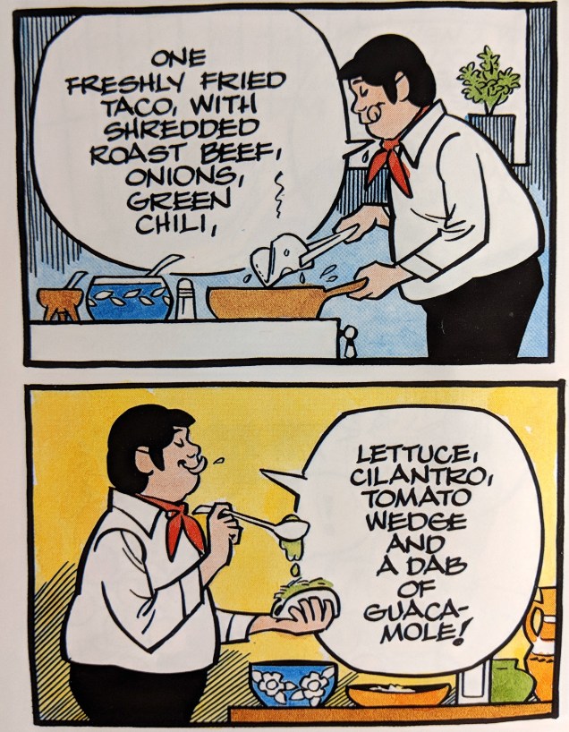
The strip featured a lot of animals, and its plotlines often pivoted around concerns about the environment. It also regularly included recipes. For instance, Gordo’s beans and cheese recipe from a strip in 1948 got the comic strip into 60 extra newspapers. And, significantly, Gordo also had gorgeous, inventive art!
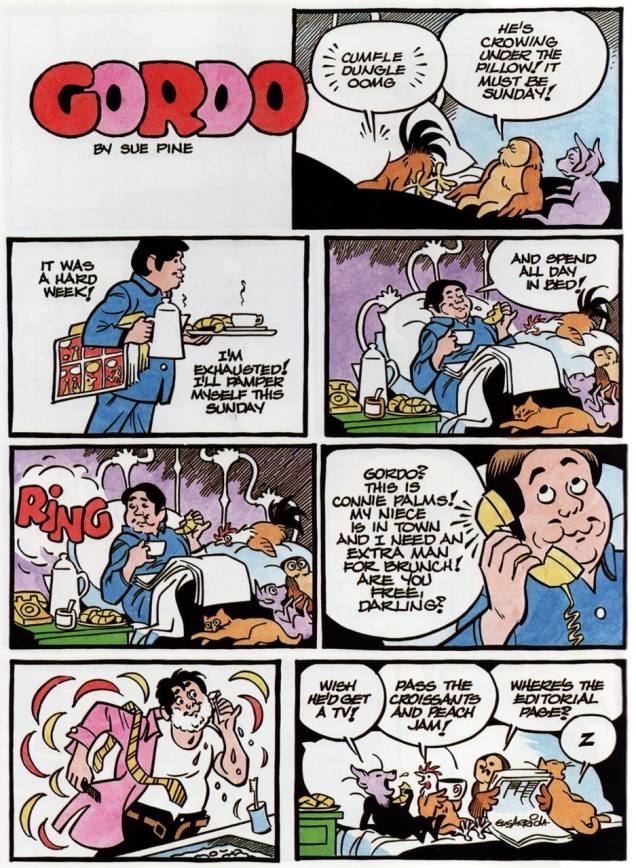
This sweet strip was scanned from a collection of Gus Arriola strips, “Gordo’s Critters: The Collected Cartoons”, published in 1989 and sadly out of print. Gus Arriola had a wonderful drawing style and a bouncy imagination, but it’s his sense of humour I like best: gently philosophical, hilarious but always kind to its characters.Sunday strip from January 25th, 1959.
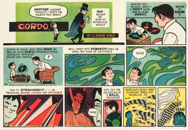
Aside from being a music aficionado, Gus Arriola was also a great connaisseur of art. R.C. Harvey, the editor/writer of “Accidental Ambassador Gordo: The Comics Strip Art of Gus Arriola” mentions Arriola’s love for jazz: “[he] finally [settled] in Carmel, where he met his life-long friend and fellow cartoonist, Eldon Dedini, and they both became fixtures at Doc’s Lab, where Hank Ketcham and other habitués of the place met weekly to admire jazz and tell stories.” Read the rest of his lovely article here.
Sunday from June 11th, 1958.
In 1999, Arriola was interviewed by John Province for Hogan’s Alley no. 6 – it’s well worth a read if you’ve got some spare quality time! You can read the interview here.
Sunday from 1958.
Want to see more? Head over to the Fabulous Fifites blog, where many scans of Sundays strips are available for perusal. (Ger Apeldoorn, the blog’s author, did a monumental job of scanning newspaper strips for our enjoyment.)
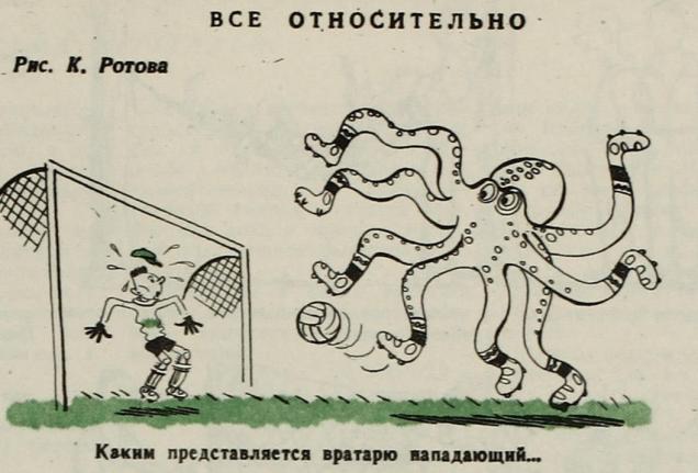
Heigh-ho, it’s off to work we go. Octopuses have to work, too (at least occasionally). (And while they work, they have to restrain from grabbing unwilling passersby, as they don’t want to get slapped with a sexual assault lawsuit. I present to you a list of some of the professions that cephalopods excel at… no hanky-panky involved.
They’re musicians!
Budding guitar players rejoice: octopuses sometimes have trouble getting all the notes right, too. This was scanned from “Mitch O’Connell: the World’s Best Artist” (Last Gasp, 2014) by, obviously, Mitch O’Connell, who does not mince words when referring to his mad talent. Check out our other post about Dr. Mitch here.
Cooks!
This poor overworked fella is drawn by Paul Mavrides (he of the Furry Freak Brothers and Church of the SubGenius fame!) An excerpt from « Skull Farmer », Tundra Sketchbook Series #10 (1991, Tundra).
Entertainers!
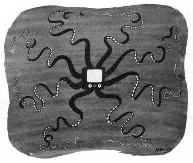
Octopus by Anatol Kovarsky (born 1919 in Moscow to Jewish parents, passed away in 2016), who had a long career (nearly 300 drawings and almost 50 covers) in The New Yorker’s pages.
Richard Thompson*, cartoonist extraordinaire and an exceptionally kind and talented man, tragically passed away in 2016 – and I don’t like to throw the word “tragically” about without good cause. His was a rare combination of wit, imagination, and style – think of how often one comes across an excellent writer whose material suffers from his poor drawing ability, or an artist whose beautiful art is like en empty shell, with nary a story nor convincing characterization in sight. Thompson had ideas, tons of ideas, and he was able to translate them into visuals with a dynamic pen-line and elegant watercolours.
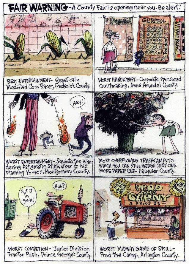
His first truly successful strip was Richard’s Poor Almanac, which ran in the Washington Post for seven years or so from 1997. These little gems have been collected in “Richard’s Poor Almanac: 12 Months of Misinformation in Handy Cartoon Form” in 2004, but sadly this wonderful volume is quite out of print. You can get your fix from GoComics, however, as they’re re-running the whole thing here.
*not the musician.
Here’s a few strips from Richard’s Poor Almanac that always make me chuckle, no matter how many times I see them.
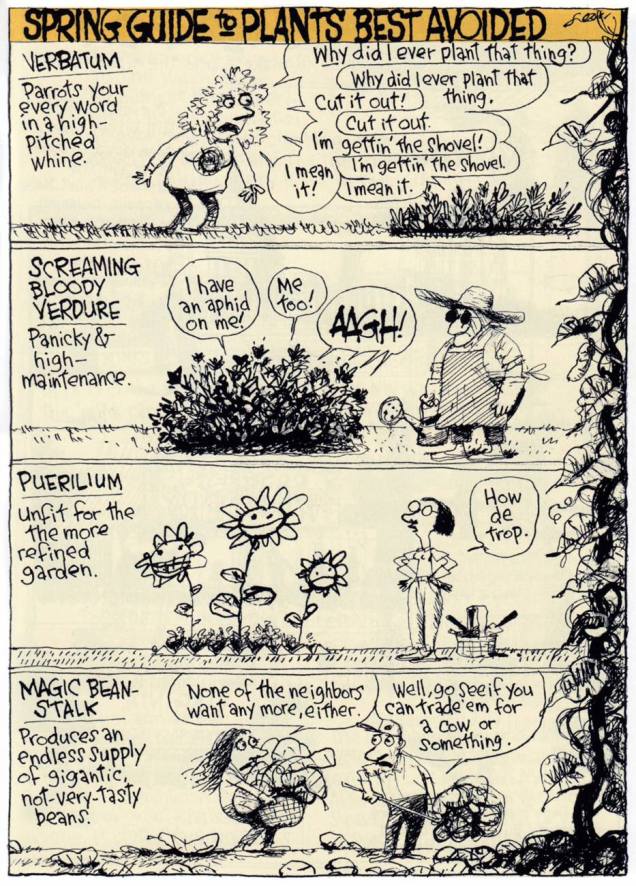
The sprawling, madcap Almanac presented “misinformation in handy cartoon form” on subjects ranging from traditional almanac fodder like weather phenomena and local fauna to entertainment and political news. “The ideal cartoon for the Almanac was made up off the top of my head with no research, with only its own comic logic holding it together,” noted the artist in The Art of Richard Thompson. (Andrew Farago for the Comics Journal.)
It may not be spring anymore, but this is still perfectly relevant. Just trade “magic bean-stalk” for “zucchini”.
You may have heard about the Almanac thanks to the fame of “Make the Pie Higher”.
«Upon learning that George W. Bush had opted not to invite an official poet to his inauguration ceremony in January 2001, Thompson composed his own poem from Bush malapropisms, and assembled them into a free-form verse entitled “Make the Pie Higher”. The cartoon was widely circulated online over the next year, was set to music by multiple composers, and earned its own entry on the fact-checking website Snopes.com. » (source)
« Speaking of winners, I’ve got Zwellyn Zablow of 11 West Second Street in Freeport, New York, who saw me at the Rockefeller Center dance. I want you to check in at Murray Hill 85-700. Anyway, MU-700 within the next ten minutes… »
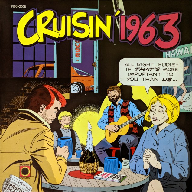
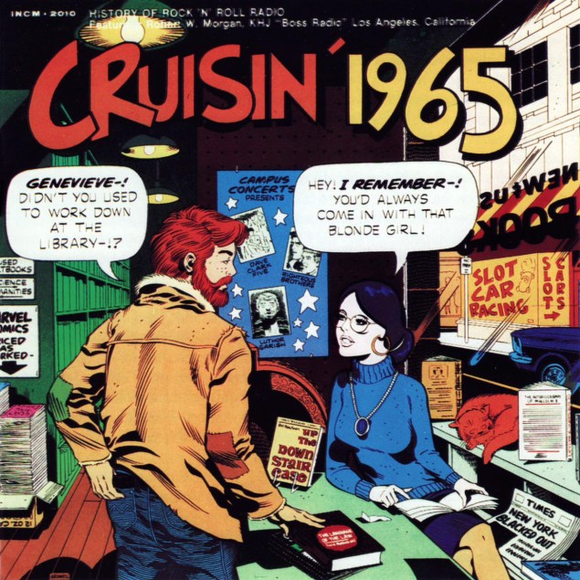
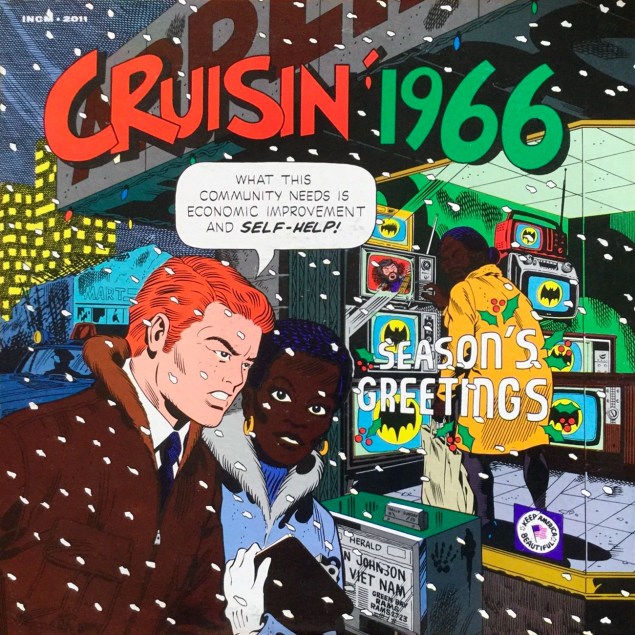
Read the liner notes, or hear Cruisin’ 1962 in its entirety right here… while you can!Read the liner notes, or hear Cruisin’ 1963 in its entirety here!Read the liner notes, or feast your ears on Cruisin’ 1964 pronto… here!Read the liner notes, then grind your teeth in frustration at Cruisin’ 1965‘s absence on YouTube. Happy update: here is it now for your listening pleasure! Read the liner notes, and/or listen to Cruisin’ 1966 in its entirety here!
Now then, here’s part two of our exclusive conversation with Mr. Mike Royer, picking up the thread from where we left off in Part One.
Michael Royer: Richard, you asked « How were you selected? » Well, I’d been working with Paul, and apparently he liked what I did on the Mormon history slides, so he asked me if I would do the ‘final art’ and all the research and everything on the covers, and the last time I saw Paul, before the second batch, that started with The Cruisin’ Years, that had the tickets on the table, and the picture of… I don’t know if it was Eddie in uniform or not… but whatever, that was when Howard Silver of Increase Records decided to do more for the line. And continue the series.
WOT: Right.
MR: And from that point on, all of the writing, and all the ideas, were totally mine.
WOT: I figured it would happen at some point…
MR: I think the ideas might have been a collaboration between Jacobs and Gruwell, but one of the reasons Howard Silver asked me « Do we need to contact Paul Gruwell? », and I said « Nope, you have no reason in the world to contact Paul. »
WOT: Cut out the middleman!
MR: I’m the guy who Paul used to introduce at parties as « This is the man who *inked* my Cruisin’ covers. »
WOT: Oh, boy. Okay.
MR: “Up yours, pal!”
WOT: Oh, this is gold, thank you!
MR: So I said « We don’t need him! », you know, and so all the rest of the albums after that were mine. And there are two covers that were done for a packaging, done for big box stores, that would have had either two or six cds in a tall case…
WOT: I remember those. ‘Longboxes’, shoplifting deterrents of the early cd era.
MR: … and one of them, Eddie is saying « We’ll be late for something at the theater » and Peg is saying « … but, but, the Beatles are on Ed Sullivan tonight! » So they were done to fit in the chronology of the covers. When he said « I’d like to start over with 1968 », and I said, « Well, I don’t wanna do the Woodstock. »
MR: « I don’t want Peg to have a kid from her serviceman, who obviously… died in service. »
WOT: Right.
MR: So I, and you’ve probably seen it, the cover is in front of a theater showing 2001: A Space Odyssey. Eddie discovers Peg there, as one of the Vietnam Widows for Peace. So now we know what happened to the serviceman that she ultimately married.
MR: ’cause I think, uh, the shot of Eddie and the musician with the beard…
WOT: Luthor, yes.
MR: … in college, and he’s got a newspaper clipping taped to his lamp that says « Peg marries… » somebody.
WOT: « Kevin Buchanan III » … he appears to be a society boy.
MR: I don’t know if you have all of them…
WOT: As far as I know.
MR: And of course, I continued, on all of the covers, to introduce a little bit… of tension.
WOT: Do tell.
MR: ’cause there’s some in every cover, sometimes it’s subtle, sometimes it’s overt. But I believe I did through… what year is the Kent State thing?
WOT: Let’s see… 1970. Eddie’s talking with his boss about it.
MR: Peg says « That’s okay, because Mike wants to give me another tennis lesson. »
WOT: Well, another “lesson”, at any rate. Whether it’s tennis remains to be seen. She’s got the racket, but…
MR: So… I can say all those new covers were made… the one previous to that is where they’re at Niagara Falls, and he’s talking about things could happen at his firm, and she’s saying « But Eddie, *I* might want a career! » And I enjoyed doing that cover, because I just wanted to do her standing there at the little motel sink in her slip.
MR: … and of course, being male and having to draw female forms, I made sure that her skirt was blowing in the wind… and in her little tennis outfit in the next year.
MR: We did, uh, let’s see: there was The Cruisin’ Years, which re-established the whole series. And then, starting with ’68 through ’70.
MR: Okay, I did two ‘Cruisin’ With‘… the second one, I guess it was never published…
WOT: Ah, right.
MR: … or produced, or released. And it was just another… let’s see: Porky Chedwick has got her in a poodle skirt and they’re dancing, right?
WOT: Yeah, that’s it.
MR: Okay, the next one was outside on a city street, and in the brick building behind them you see the silhouette of a disc jockey, and the broadcast booth at a radio station, I think the sign is on the roof. And Peg is protesting something. She’s got a banner, and Eddie and she are arguing about something. Ah, I only have a copy of my rough on that, or my comp. And of course there’s more detail on her than on him. I enjoyed drawing her. That last ‘Cruisin’ With’ I thought was much better than the first one I did, for cover art.
WOT: (laughs) exactly.
WOT: Is Cruisin’ a frequently-evoked topic by your fans?
MR: Every once in a while, it’s funny… for years, once in a blue moon, somebody would say something about Cruisin’. But I was in Charlotte, just… less than two weeks ago.
WOT: Right.
MR: … and I swear, a dozen or more people talked to me about the Cruisin’ covers at my table. Maybe that’s because there’s a new series of Cruisin’ albums… with art that I don’t like.
WOT: Oh, I don’t like it either: it looks like, and likely is, clip art.
MR: I don’t know who’s producing it. I don’t think it’s Howard Silver.
WOT: It’s called “The Cruisin’ Story“, it’s out of England, and it’s just a series of run-of-the-mill compilations, without the defining radio program concept.
MR: Howard Silver ran Increase Records. I don’t know if he bought out Increase and that was [Ron] Jacobs’ company or not. He’s in Hawaii now, last I heard. Jacobs [Indeed he was, but Mr. Jacobs passed away in 2016].
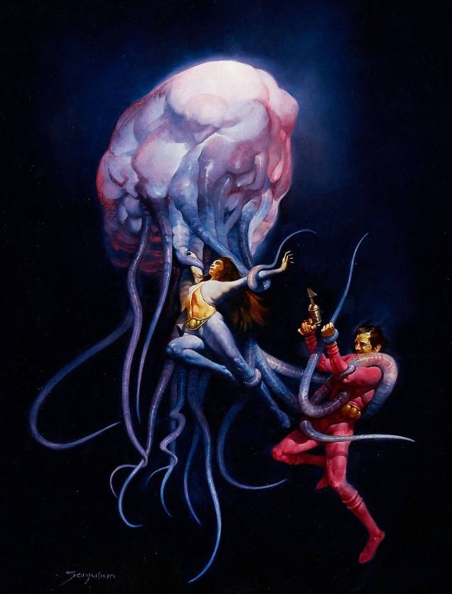
Welcome to Tentacle Tuesday! Today’s edition features beautifully painted covers from series published by Warren, and oh boy oh boy, are there are a lot of tentacles to be found there! To borrow a title from the first cover we’ll be ogling today, “THE SLIMY, CRAWLY SLITHERING GROPIES DO TERRIBLE THINGS TO PRETTY LITTLE GIRLS!” It’s a tad lacking in subtlety, but summarizes the state of things quite nicely.
On with the show…
1994 no. 12 (April 1980). The cover was painted by Sanjulián (his real name is Manuel Pérez Clemente), a Spanish painter who started working for Warren publishing in 1970. The girl’s demure pose coupled with her terrified eyes is quite striking.1994 no. 20 (August 1981). Cover by Nestor Redondo, an exceptional Filipino artist.
I wouldn’t expect cephalopods to care for patriarchal, machismo standards of female purity, but apparently Lecherous Groatie (great nickname) wants his maidens virginous (which isn’t even a word, you guys). “Little Beaver!”, you say? Way to go in being offensive to both tentacled creatures *and* Indians. This issue also contains the story “The Russians Are Coming… All Over America!”, a title which I, for one, find hilarious.
1994 no. 25 (June 1982). Cover by Lloyd Garrison. Aaah, a rare silent cover. It’s clear enough: Ukranian Santa will surely rescue the maiden, if he doesn’t get too distracted by her ass or Chinese-takeout container-inspired undergarment.
Leaving 1994 behind (although technically we’re going back in time), and moving on to Eerie, we get to tentacles that look like worms coming out of a lumpy, squishy brain – the joy of any good anatomical pathologist.
Eerie no. 76 (August 1976). The cover the aforementioned Sanjulián, who has quite the talent for painting extremely realistic textures, as demonstrated by this rather unsettling cover.
One understands the guy’s desperate attempts to get free, but why is the woman so placid, serenely exposing herself to the creature’s grasp? I guess Tentacle Tuesday doesn’t have the same effect on everyone. Interestingly, Sanjulián seems to have tweaked his art for the cover – here’s his original painting, in which the girl’s face is clearly visible.
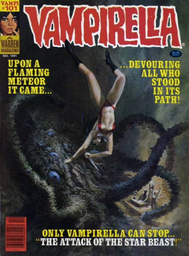
Let’s visit good old Vampi and see what sort of cephalopod encounters she’s had.
Vampirella no. 101 (December 1981); art by Noly Panaligan (who, by the way, is another Filipino artist).
The tentacled creature in question is the “star-beast” advertised on the cover – an alien (suspiciously similar to an octopus) who, as usual, tries to take over the earth by breeding (which for some reason involves a lot of nude & nubile college students as sacrifices) and is killed when Vampirella crashes a car into it. Starting on an epic, inter-planetary scale and ending it all with a banal road accident is a bit of an anti-climax.
Is this Vampirella’s last encounter with tentacles, you ask? Don’t be silly – of course not. As the Russians say, « and yet again the little hare will go out for a walk. »
Vampirella no. 95 (April 1981), cover by Ken Kelly. “O Mr. Walrus-with-tentacles, please don’t hurt little old me!”
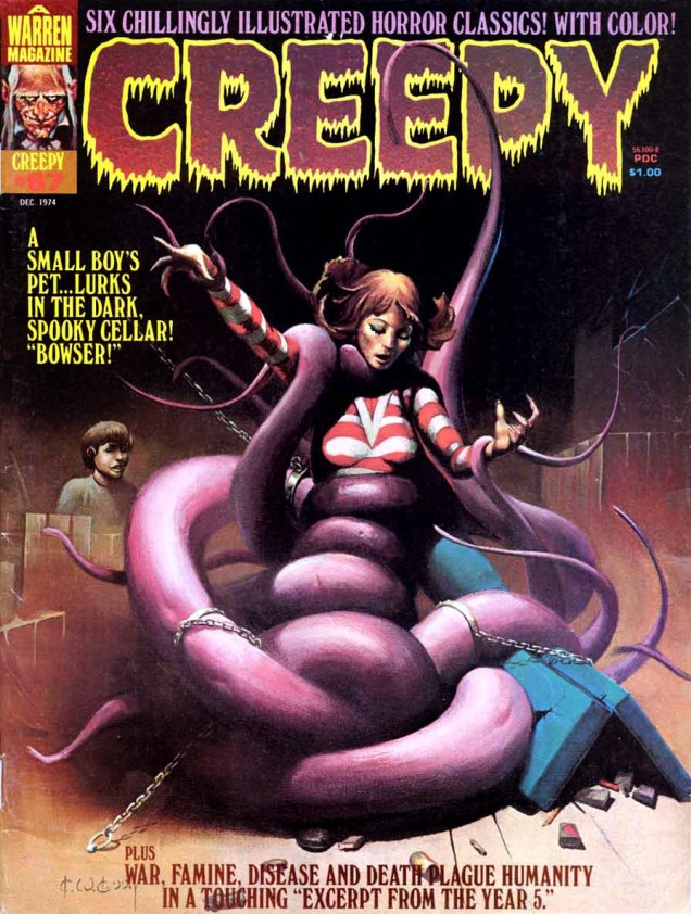
More? Well, okay, one last cover.
Creepy no. 67 (December 1974), cover by Ken Kelly (not one of his better efforts, to be honest). We’ll return to sweet ol’ Bowser on another occasion.
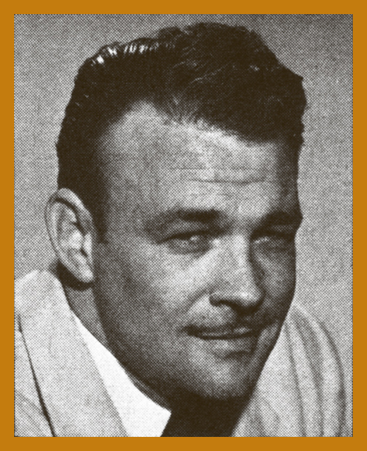
There’s an impressive parade of artists born in July. Of present concern is the birthday of one Murphy Anderson, who came into this world on July 9th, 1926 (and ceased to exist in 2015, at 89, no doubt moving into some parallel dimension).
His work on the Atomic Knights or Hawkman is fondly remembered… but I’ll concentrate on some covers dear to my heart from DC’s science-fiction titles because sci-fi + great art = squeals of enjoyment. Anderson had no trouble portraying any number of far-fetched monsters or depicting incredible situations in his crisp, clean style that made his audience willingly suspend disbelief. Ah, okay, I called it “science-fiction”, but it often crosses the line into fantasy, or horror, with occasional detours into superhero, or just plain quirkiness. To follow the loopy logic of the stories contained in the pages of the following publications, one has to abandon the notion that A leads to B, and prepare oneself for a wild romp through the whole alphabet. Great art certainly facilitates this – the story may leave me scratching my head, but Murphy Anderson’s illustrating chops provide a firm ground to anchor to.
Without further ado, the great Murphy Anderson and some of his artwork!
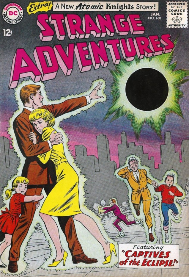
For instance, take a look at some of the creatures featured in DC’s Strange Adventures through the decades. Anderson’s gallery of characters includes, but is not limited to, startled fishermen, anthropomorphized atomic clouds, and Middle-Age barbarians from another planet, all impeccably drawn.
“But I tell you I actually hooked one on my line… THIS BIG!” It’s only fair. I guess you don’t even need to use bait for this type of fishing. Strange Adventures no. 21 (June 1952). Cover by Murphy Anderson.There’s no head-breaking over what title to give these stories… “The Face in the Atom Bomb Cloud” it is! Pencils and inks by Murphy Anderson, grey tones and colours by Jack Adler, lettering by Ira Schnapp. This is Strange Adventures no. 143 (August, 1962). Edited by Julius Schwartz.Strange Adventures no. 160 (January 1964), cover by Murphy Anderson. This issue is a treat, featuring two parts of an Atomic Knights story (“Here come the Wild Ones!”, written by John Broome and illustrated by Anderson).I promised barbarians, didn’t I? Strange Adventures no. 222 (Jan-Feb 1970), art by Murphy Anderson. I have a love/hate relationship with Adam Strange, often loving the art and hating the stories. It’s been a while – I have to re-read this stuff and see if I still find it indigestible.
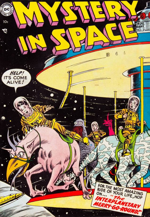
Another favourite series for its oft-striking covers is Mystery in Space. I love it when Anderson invents “space” animals composed of body parts from several Earth species. It’s indubitably fun, and children often have a great time inventing new creatures, but it takes chops to draw the result and make it work, anatomically and aesthetically.
Damn, the safety regulations for those carousel things are really lax these (future) days. It might not be science-fiction per se, but it sure is fun! Mystery in Space no. 21 (August-September 1954), with a cover by Mr. Anderson.
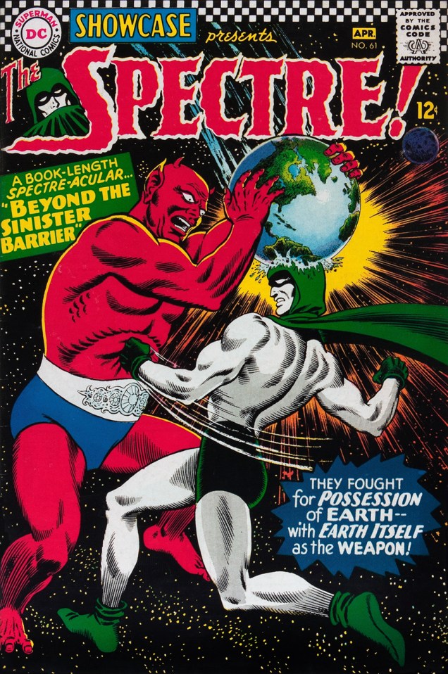
Despite my general resistance to superhero stuff, here’s a cover featuring the Spectre, whose classy costume is easy on the eyes.
When you have to boink your arch-enemy on the head with a whole planet to knock him out and it still doesn’t work, you know you’re dealing with a pro. Showcase no. 61 (March-April 1966), cover by Murphy Anderson.
And one for the road…
Goofiness or social commentary? Frankly, the green “president” looks a lot friendlier than most current politicians. Tales of the Unexpected no. 94 (April-May, 1966). Cover by Murphy Anderson.