Welcome to Tentacle Tuesday! Today’s edition features beautifully painted covers from series published by Warren, and oh boy oh boy, are there are a lot of tentacles to be found there! To borrow a title from the first cover we’ll be ogling today, “THE SLIMY, CRAWLY SLITHERING GROPIES DO TERRIBLE THINGS TO PRETTY LITTLE GIRLS!” It’s a tad lacking in subtlety, but summarizes the state of things quite nicely.
On with the show…
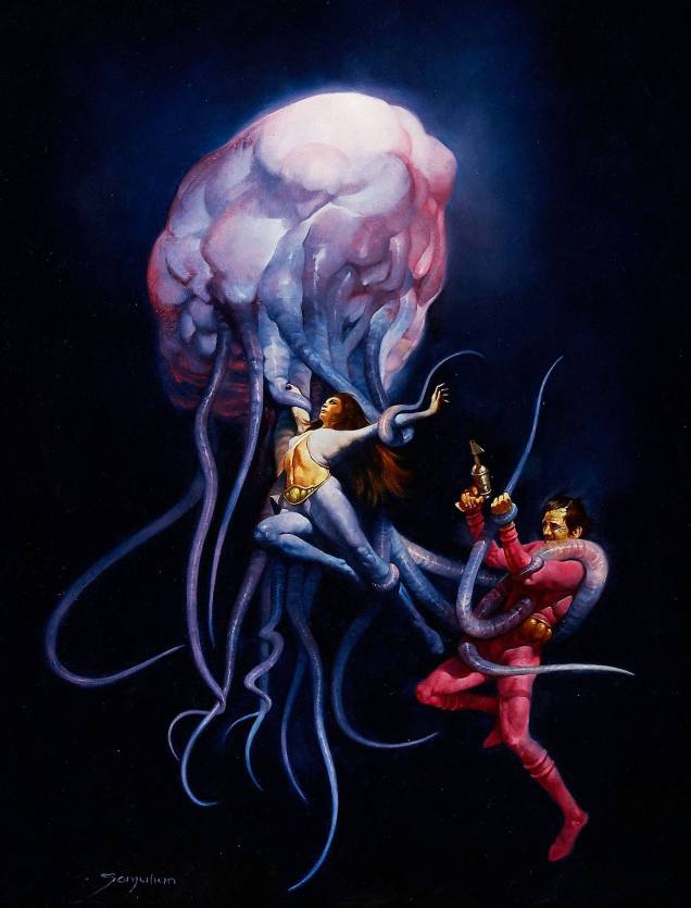
1994 no. 12 (April 1980). The cover was painted by Sanjulián (his real name is Manuel Pérez Clemente), a Spanish painter who started working for Warren publishing in 1970. The girl’s demure pose coupled with her terrified eyes is quite striking.1994 no. 20 (August 1981). Cover by Nestor Redondo, an exceptional Filipino artist.
I wouldn’t expect cephalopods to care for patriarchal, machismo standards of female purity, but apparently Lecherous Groatie (great nickname) wants his maidens virginous (which isn’t even a word, you guys). “Little Beaver!”, you say? Way to go in being offensive to both tentacled creatures *and* Indians. This issue also contains the story “The Russians Are Coming… All Over America!”, a title which I, for one, find hilarious.
1994 no. 25 (June 1982). Cover by Lloyd Garrison. Aaah, a rare silent cover. It’s clear enough: Ukranian Santa will surely rescue the maiden, if he doesn’t get too distracted by her ass or Chinese-takeout container-inspired undergarment.
Leaving 1994 behind (although technically we’re going back in time), and moving on to Eerie, we get to tentacles that look like worms coming out of a lumpy, squishy brain – the joy of any good anatomical pathologist.
Eerie no. 76 (August 1976). The cover the aforementioned Sanjulián, who has quite the talent for painting extremely realistic textures, as demonstrated by this rather unsettling cover.
One understands the guy’s desperate attempts to get free, but why is the woman so placid, serenely exposing herself to the creature’s grasp? I guess Tentacle Tuesday doesn’t have the same effect on everyone. Interestingly, Sanjulián seems to have tweaked his art for the cover – here’s his original painting, in which the girl’s face is clearly visible.
Let’s visit good old Vampi and see what sort of cephalopod encounters she’s had.
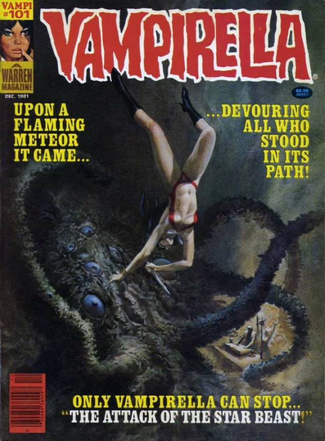
Vampirella no. 101 (December 1981); art by Noly Panaligan (who, by the way, is another Filipino artist).
The tentacled creature in question is the “star-beast” advertised on the cover – an alien (suspiciously similar to an octopus) who, as usual, tries to take over the earth by breeding (which for some reason involves a lot of nude & nubile college students as sacrifices) and is killed when Vampirella crashes a car into it. Starting on an epic, inter-planetary scale and ending it all with a banal road accident is a bit of an anti-climax.
Is this Vampirella’s last encounter with tentacles, you ask? Don’t be silly – of course not. As the Russians say, « and yet again the little hare will go out for a walk. »
Vampirella no. 95 (April 1981), cover by Ken Kelly. “O Mr. Walrus-with-tentacles, please don’t hurt little old me!”
More? Well, okay, one last cover.
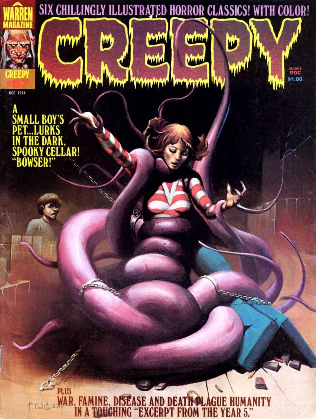
Creepy no. 67 (December 1974), cover by Ken Kelly (not one of his better efforts, to be honest). We’ll return to sweet ol’ Bowser on another occasion.
There’s an impressive parade of artists born in July. Of present concern is the birthday of one Murphy Anderson, who came into this world on July 9th, 1926 (and ceased to exist in 2015, at 89, no doubt moving into some parallel dimension).
His work on the Atomic Knights or Hawkman is fondly remembered… but I’ll concentrate on some covers dear to my heart from DC’s science-fiction titles because sci-fi + great art = squeals of enjoyment. Anderson had no trouble portraying any number of far-fetched monsters or depicting incredible situations in his crisp, clean style that made his audience willingly suspend disbelief. Ah, okay, I called it “science-fiction”, but it often crosses the line into fantasy, or horror, with occasional detours into superhero, or just plain quirkiness. To follow the loopy logic of the stories contained in the pages of the following publications, one has to abandon the notion that A leads to B, and prepare oneself for a wild romp through the whole alphabet. Great art certainly facilitates this – the story may leave me scratching my head, but Murphy Anderson’s illustrating chops provide a firm ground to anchor to.
Without further ado, the great Murphy Anderson and some of his artwork!
For instance, take a look at some of the creatures featured in DC’s Strange Adventures through the decades. Anderson’s gallery of characters includes, but is not limited to, startled fishermen, anthropomorphized atomic clouds, and Middle-Age barbarians from another planet, all impeccably drawn.
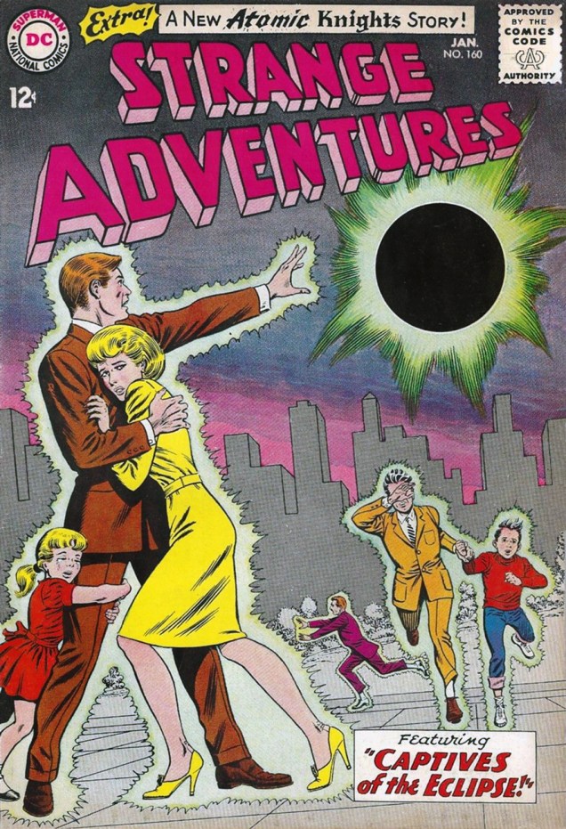
“But I tell you I actually hooked one on my line… THIS BIG!” It’s only fair. I guess you don’t even need to use bait for this type of fishing. Strange Adventures no. 21 (June 1952). Cover by Murphy Anderson.There’s no head-breaking over what title to give these stories… “The Face in the Atom Bomb Cloud” it is! Pencils and inks by Murphy Anderson, grey tones and colours by Jack Adler, lettering by Ira Schnapp. This is Strange Adventures no. 143 (August, 1962). Edited by Julius Schwartz.Strange Adventures no. 160 (January 1964), cover by Murphy Anderson. This issue is a treat, featuring two parts of an Atomic Knights story (“Here come the Wild Ones!”, written by John Broome and illustrated by Anderson).I promised barbarians, didn’t I? Strange Adventures no. 222 (Jan-Feb 1970), art by Murphy Anderson. I have a love/hate relationship with Adam Strange, often loving the art and hating the stories. It’s been a while – I have to re-read this stuff and see if I still find it indigestible.
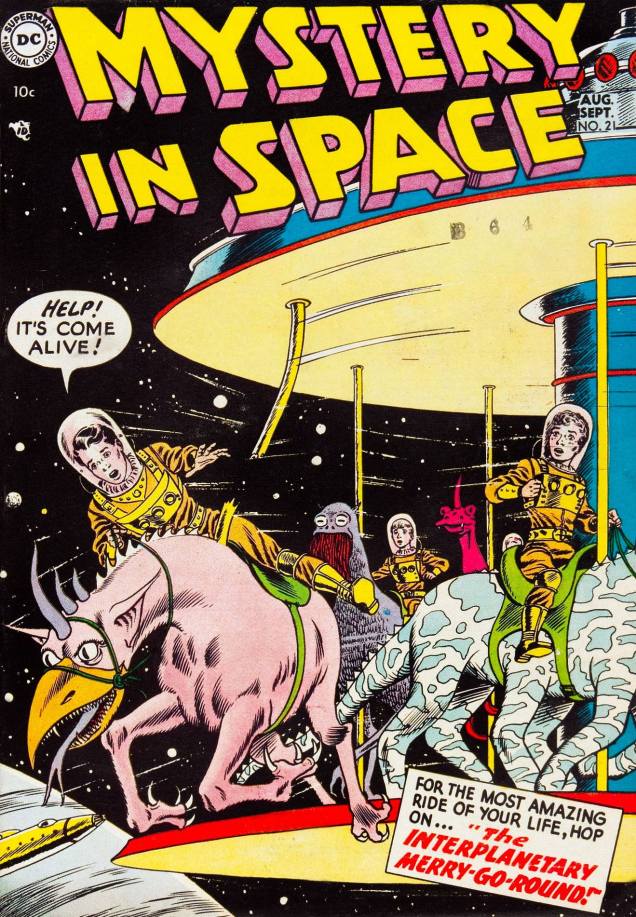
Another favourite series for its oft-striking covers is Mystery in Space. I love it when Anderson invents “space” animals composed of body parts from several Earth species. It’s indubitably fun, and children often have a great time inventing new creatures, but it takes chops to draw the result and make it work, anatomically and aesthetically.
Damn, the safety regulations for those carousel things are really lax these (future) days. It might not be science-fiction per se, but it sure is fun! Mystery in Space no. 21 (August-September 1954), with a cover by Mr. Anderson.
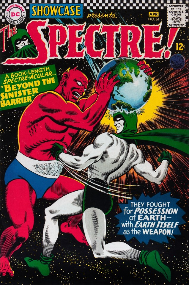
Despite my general resistance to superhero stuff, here’s a cover featuring the Spectre, whose classy costume is easy on the eyes.
When you have to boink your arch-enemy on the head with a whole planet to knock him out and it still doesn’t work, you know you’re dealing with a pro. Showcase no. 61 (March-April 1966), cover by Murphy Anderson.
And one for the road…
Goofiness or social commentary? Frankly, the green “president” looks a lot friendlier than most current politicians. Tales of the Unexpected no. 94 (April-May, 1966). Cover by Murphy Anderson.
« Neither of us had seen a ghost, but I knew what he meant. »
I had planned to feature quite another tale this week, but seeing as we are in the torrid grip of quite the heat wave, I opted in the end for something more topical I’d been saving on the back burner.
Edward Nelson Bridwell (1931–1987) is one of those scarcely noticed but greatly accomplished figures of American comics. At DC from the mid-1960s to the end of his life, he edited, wrote, packaged and compiled his heart out. Most impressive, in my view, were his erudition and discerning eye for a fine short story.
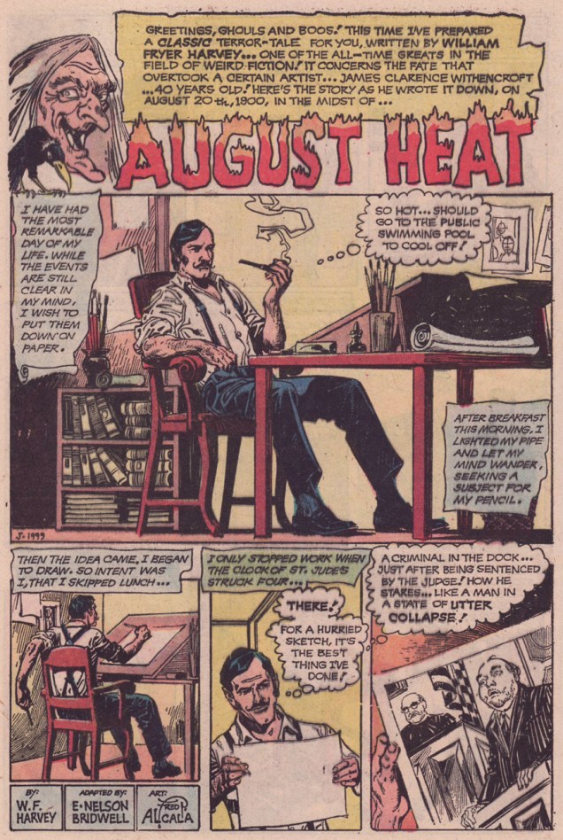
There’s always a blessed but mostly-powerless minority of comics creators that endeavours to improve the unwashed readership’s minds… nearly never at Marvel, most often at DC. In the mid-1970s, while working as Joe Orlando‘s editorial assistant, Bridwell adapted three excellent, but highly unconventional vintage spooky tales, as far afield as imaginable from the usual EC-by-homeopathy fare his boss favoured. These were William Fryer Harvey‘s August Heat (Secrets of Sinister House no. 12, July 1973), Ambrose Bierce‘s The Man and the Snake (Secrets of Sinister House 14, October 1973) and John Russell’s The Price of the Head (Weird Mystery Tales no. 14, Oct.-Nov. 1974); all three were splendidly brought to visual glory by WOT favourite Alfredo Alcala (1925-2000). All three are moody slow burners, with much introspection and little action.
On this scorching day (currently a sticky 35°C /95°F in Montréal, Canada) you’ll forgive me for not waiting until August to share this dark beauty with you.
August Heat was the issue’s cover feature. Illustration by Luis Domínguez.
As evidence of Mr. Bridwell’s skill as an adapter, feel free to read the full (yet quite brief) text of August Heat. Or listen to one its several fine radio adaptations, the choice is yours:
It’s boiling hot in this part of the world, so I’d like to concentrate on soothingly cool covers for this Tentacle Tuesday. If we end up taking a dip in refreshing waters in our quest for relief from balmy temperatures, so much the better. Today’s roster brings us fashionable dames and their splashy encounters with octopuses!
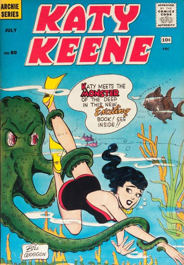
Here’s the Queen of Fashions (and right now, queen of tentacles), and for once the cover doesn’t focus on her outfit – I understand it’s hard to wriggle out of a swimsuit while an octopus is holding your leg.
Katy Keene was created by Bill Woggon, and introduced in Wilbur Comics no. 5 (1945). She was “America’s Queen of Pin-Ups and Fashions”, and readers were encouraged to submit drawings of outfits and other tralala such as designs for automobiles, boats, and whatever other method of transport Katy could glitter in. This is Katy Keene no. 60, July 1961, cover by Bill Woggon.
Mockery aside, I have nothing against Bill Woggon-era Katy – I like Woggon’s art, and the gentle humour of the stories is hard to dislike. After Katy Keene’s demise in 1961, she was eventually revived by Archie Comics in 1983. They should have let the dead rest in peace! Though several people were considered for the role of regular artist, that position went to John Lucas, whose style I abhor, recoil from and spit upon. I first saw his take on KK in those huge Archie digests you can get for pennies that reprint a bit of everything, giving readers a total pêle-mêle of different decades and different artists. I didn’t know who drew what at the time, but I quickly developed a preference for certain styles while finding others repellent… and John Lucas’ puerile art was top of my hated list, along with the half-arsed, anatomically asinine line-work of Al Hartley.
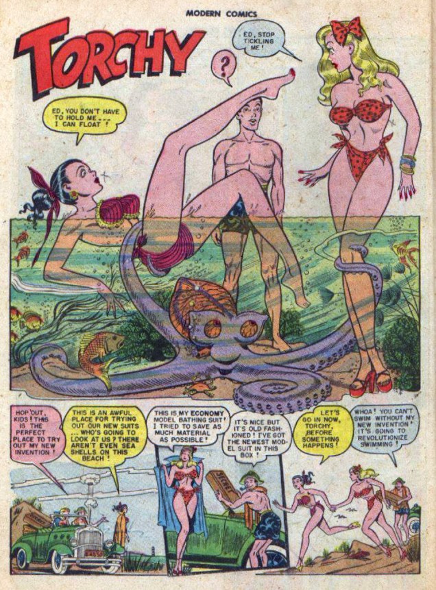
Next, we have another beauty queen, although this time the stuff is quite a bit more risqué. It’s not for nothing that cataloguing websites classify Torchy as “adult” material. As for the octopus, it has impeccable taste, having determined that there’s no need to decide between blonde or brunette when you can have both.
But Torchy, why are you wearing high-heel sandals in water? Modern Comics no. 97 (Quality Comics, May 1950). This is a page from « The Mermaid Gig », with scripted and art by Gill Fox. Fox took over from Bill Ward (Torchy Todd’s creator and writer) five years after her introduction, starting with Modern Comics #89 (1949). As far as replacement of Bill Ward, Fox did a truly excellent job, managing to preserve the mood and style of Ward’s stories. Read the mermaid tale (no more tentacles, sadly) here.
Sometimes octopuses catch little girls, but occasionally a feisty little girl captures an octopus. Little Dot is going to be a handful when she grows up… but of course she never will.
This polka-dotted octopus is a perfect catch for Little Dot in this soothingly green sea. Too bad the cephalopod fellow looks so disgruntled. He was probably in the middle of lunch or something. Little Dot no. 105 (June 1966); cover by Warren Kremer.
Those of you also inhabiting parts of the world where the weather has gone bananas (because it’s certainly hot enough for growing them in here), stay cool!
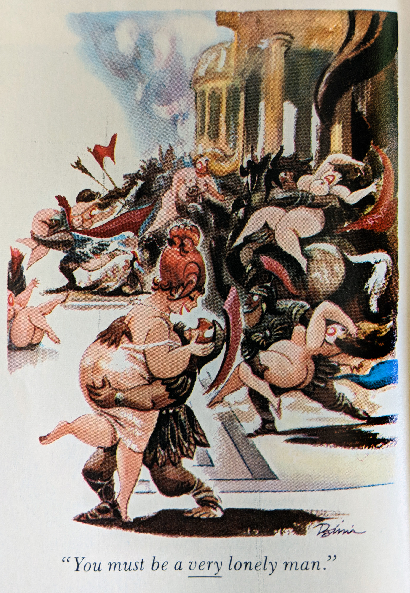
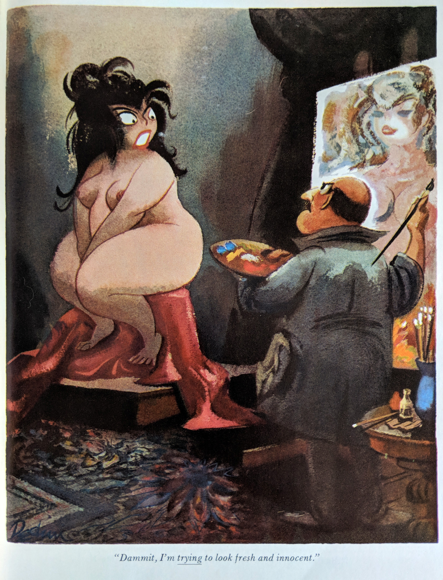
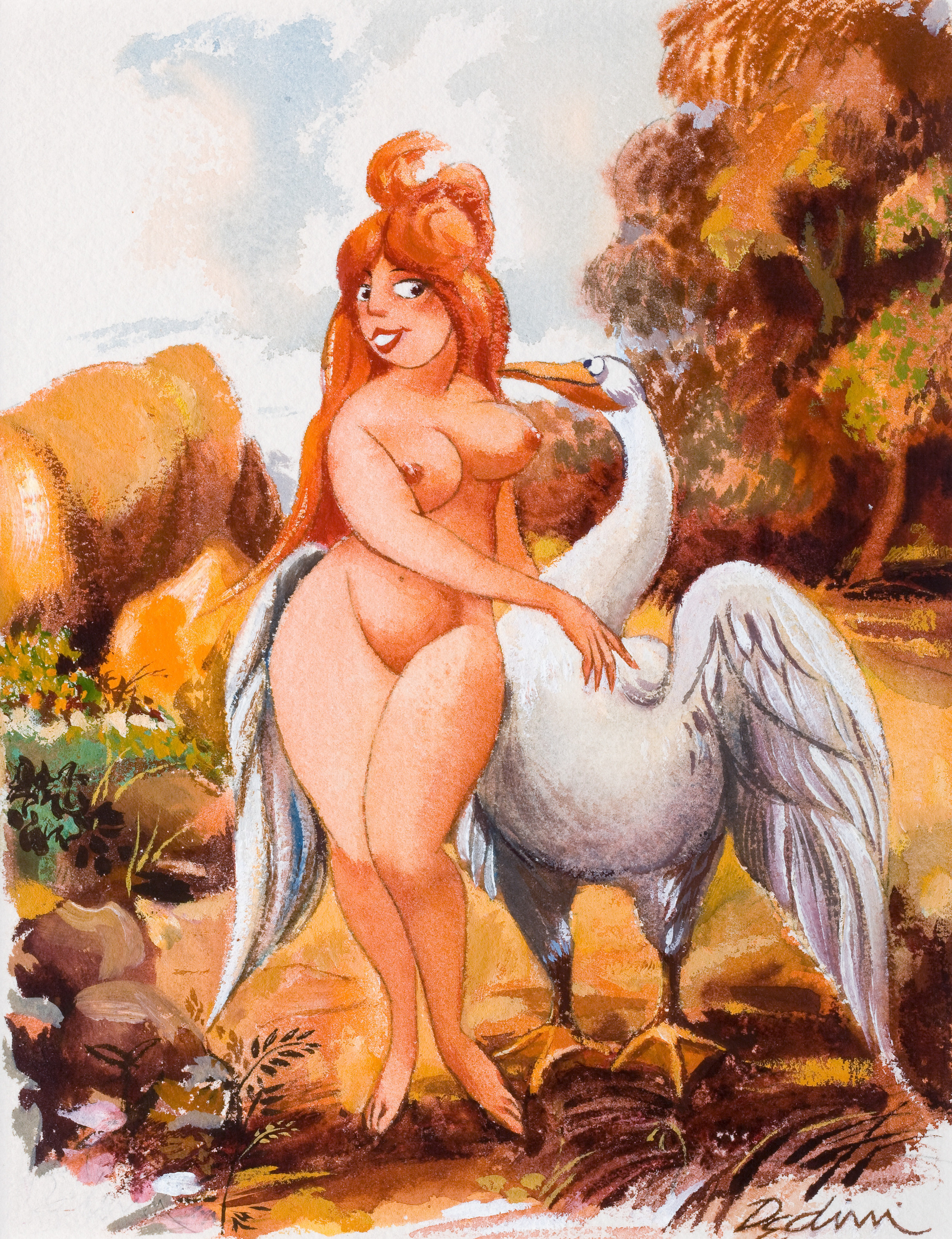
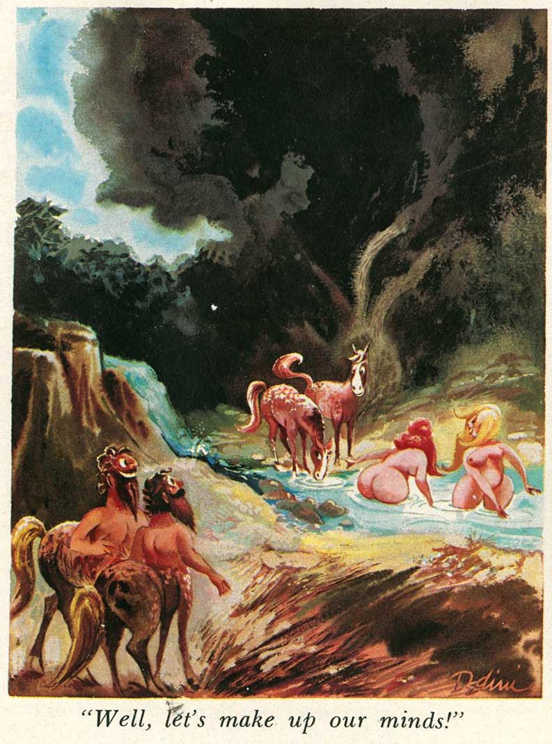
Amidst all the (justified) doom and gloom that this week has brought us, there is one bright spot that comes just in time to save this week from being a complete downer. It’s Eldon Dedini’s birthday! (He was born in 1921, on June 29th.) Yes, I know that he died in 2006… but his joyous, delightfully hedonistic art lives on. As a Russian whose father once started a rowdy party because it was Mozart’s birthday, I claim the privilege of celebrating Dedini’s jour de naissance by raising my glass of rosé (satyr-approved, of course) in his honour.
“That’s all very well for you, but I’m the one who’ll have to sit on the eggs”.
He was one of Gus Arriola’s closest friends. To quote Arriola, «calling Eldon a cartoonist just christens the tip of an impressive iceberg. Beneath the surface is a superb painter, a remarkably inventive illustrator, philosopher, and humorist—a keen observer, revealing life’s little truths with his unerring brush. His chief reward was the viewer’s invariable burst of laughter. He was a walking repository of eclectic knowledge about art, history, jazz, wine—you name it. I gave up using my encyclopedia on a subject search: it was faster to pick up the phone and call Eldon.» By the way, I pulled this quote out of a R.C. Harvey article published in the Comics Journal titled “Viewing Life Through a Twinkle”, which gives you an idea of what a fun read it is.
The first thing that comes to mind when one thinks of Dedini is merrily frolicking satyrs, closely followed (or preceded) by unapologetically buxom women, all of this merry crowd looking to have some fun of the most basic kind. It’s not all randy woodland gods, though; there’s also room for lascivious gnomes, salacious wolves and whatever other lechery comes to mind. (Most of these were published in Playboy Magazine.)
« Remember what Balzac said – ‘it is easier to be a lover than a husband for the simple reason that it is more difficult to be witty every day than to say pretty things from time to time.‘ »Ooh, tough choice.« Either we start pushing birth control or we’re going to be up to our asses in little people. »
« But will you love me when I’m old and gray? » From Playboy’s August, 1971 issue.
Nothing like taking the proactive role, huh?
Although it’s easy to be blown away by Dedini’s take on Grecian and Roman mythology – I think fabled creatures gave him an easy outlet for his joie de vivre – he could seemingly draw anything he wanted to, stunning forest landscapes or historical costumes, capturing carpet textures, clothing accessories or musical instruments with equal ease.
« Well, I guess it goes to prove that not all God’s children got rhythm. » Note the name of the band, which made me snort into my tea.
“During an intermission at one year’s Festival, Dedini and some other PBL members went up on stage to have their photograph taken. Duke Ellington was still on stage, seated at the piano, putting eye drops in his eyes. When Dedini was introduced as “a cartoonist who sometimes draws jazz cartoons,” Ellington got up and, without saying a word, pulled out his wallet and started looking through it as he meandered, aimlessly, around the platform. Finally, he found what he was looking for, a folded up magazine clipping. He carefully unfolded it and spread it out on the piano: it was a cartoon Dedini had done for Collier’s. The cartoon depicted two Russians in Red Square, one of whom is obviously a dealer in blackmarket phonograph records: he has opened his coat to show the other fellow the record that he has tucked inside, saying, “ … Cootie Williams, trumpet; Johnny Hodges, alto sax; Barney Bigard, clarinet; Harry Carney, baritone sax; Duke Ellington, piano …” Said Dedini: “Ellington loved that cartoon because when he toured Russia the people of Russia loved his music, but they couldn’t buy the records.” For years thereafter, Ellington sent Dedini a Christmas card. “I have about twenty,” Dedini said. “He sends them in June.”
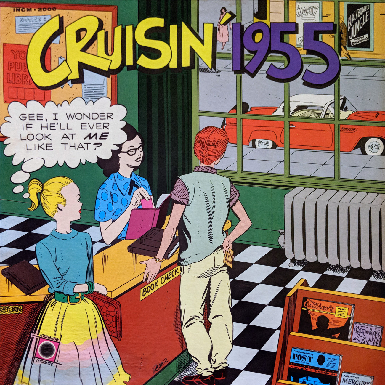
Today, Michael Royer (born June 28, 1941), who surely needs no introduction around these parts, celebrates birthday number seventy-seven, and on this special occasion, we have a treat, both for the great man and for the rest of us: part one of an interview Mr. Royer granted us, conducted just a few days ago.
As you can imagine, Mr. Royer has spent decades answering the same queries about his work with Jack Kirby and with Russ Manning, so that’s quite a well-trod line of investigation. We like to approach things a bit differently here at WOT; having long been intrigued by Mr. Royer’s evocative series of LP covers for the Cruisin’ anthology series, beginning in the late 1960s, and frustrated by the lack of solid information concerning said contribution, I figured I’d take a hand, and reached out to Mr. Royer.
If you’re unfamiliar with the Cruisin’ Series, here’s the pitch: « Cruisin’ is a year-by-year recreation of pop music radio during the years 1956 through 1962 [the years of 1955 and 1963-1970 were produced later]. Each album is not just a collection of the top pop music of a particular year, but a total recreation by a top disk jockey (of that year) doing his original program over a major pop music station. That means actual commercials, promotional jingles, sound effects, newscast simulations and even record hop announcements in addition to the original records themselves. »
« Cruisin’ producer Ron Jacobs monitored thousands of feet of tape, travelled over 10,000 miles and rooted through forgotten files and cluttered basements for old commercials, station promos and jingles. »
« What’s so special about these album covers? », you may ask. I’d posit that they’re unique in the sense that, while they each work as standalone pieces, together, they form a quite impressive comic strip, one in which a year or so elapses between panels. Just about every detail has its place, imparting information plainly or quite subtly. Characters come and go, years apart, sometimes entirely offstage, often never speaking a word. It’s graphic storytelling at its finest. And the LPs are pretty spiffy too.
Now that you’re up to speed, shall we begin? Mr. Royer and I spoke on Tuesday, June 26, 2018, and he was most generous with his time and his recollections. I assure you that the minutes simply fly in such gracious company.
Read the liner notes, or hear Cruisin’ 1955 in its entirety here!
Read the liner notes, or hear Cruisin’ 1956 in its entirety here!
Read the liner notes, or hear Cruisin’ 1957 in far less that its entirety here. Sorry!
Read the liner notes, or hear Cruisin’ 1958 in its entirety here!
Read the liner notes, or hear Cruisin’ 1959 in its entirety here!
For this entry’s cd reissue, the cover artwork was inadvisably cropped, quite obscuring the political differences between Kevin Buchanan III (front) and Eddie (in uniform). Mr. Royer’s least favourite cover, incidentally. Read the liner notes, or hear Cruisin’ 1960 in its entirety here!
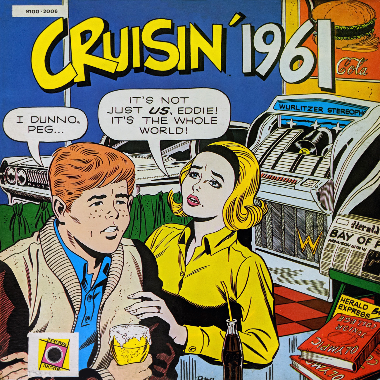
Read the liner notes, or hear Cruisin’ 1961 in its entirety here! And remember, « If you say ‘Woo Woo Ginsburg’ with your order, you get another Ginsburger free of charge! »
Who’s Out There: Mr. Royer, How did you happen to be selected for the job in the first place?
Michael Royer: In 1966, I was working for Grantray-Lawrence Animation on the Marvel Superheroes limited animation cartoon series. And I believe that a man named Paul Gruwell… If you look at the record album, he’s listed in there as the art director… I’m listed as the artist and they misspelled my name.
WOT: Of course. We’ll set that straight.
MR: Paul was one of the guys working on the series and I did some work with him on an outside project he was doing, where he was doing… I guess you could call them slide shows, on the history of the Mormon church.
I was working on these things, and he knew someone at the record company who had this idea for the history of rock ‘n’ roll. And for the life of me, I can’t remember what the young man’s name was. But he’s the cover of one of the records, where he’s coming out of the backroom, through the beads [Cruisin’ 1967]. It’s like a head shop, or something…
WOT: Would that be Ron Jacobs? He was the producer.
MR: Yeah, yeah.
MR: So, anyway, the first batch of covers that went through, I believe, 1968… and the last cover had Peg and Eddie, who were reunited, with her little boy from her fist marriage. And they’re in the front seat of a van, in a traffic jam leaving Woodstock. That cover was never printed.
WOT: No wonder I’ve never seen it!
MR: Anyway, the covers that I did, how many was it? ’54 through…
WOT: Fifty-five. ’55 through ’70, plus one that’s “The Cruisin’ Years”…
WOT: How much latitude/wiggle room were you given? Were research materials provided or not? Were specific cultural signifiers specified, or did you get to pick (or a mix of both)?
MR: Anyway, on those ones that I did in the late Sixties, early Seventies, Paul Gruwell gave me little three-or-four square inch thumbnails… on the covers that he wanted me to do. All I got was his, in my opinion, so-so little thumbnails, which I guess gave him the reason to call himself ‘art director’…
WOT: I was going to ask if he could draw.
MR: I had to do all the research. Each cover had to feature certain items that definitely said that it was that year. Like newspaper headlines, magazine covers…
WOT: Movie marquees…
MR: … automobiles, and I had to look up all that. I went to the library, as we didn’t have “online” then. Ah, on one of the covers where I need the dash, I believe, of a ’57, or ’58 Chevy, I had to go to a used car lot in South East Los Angeles, and with my Polaroid camera, I asked these two big guys in their double-breasted suits if I could, uh, photograph the interior of one of their cars, and they looked at me like… « Okay, white boy, you’re crazy if you wanna shoot it, but we’ll let ya, you know. »
WOT: People do like those odd requests.
MR: It was very interesting researching the cars, and making sure that, even if they were shown from the basement [Cruisin’ 1963], out parked at the curb…
WOT: They had to be accurate.
MR: … you could still tell that it was a Studebaker. You know, and the jukebox had to be, I believe the Wurlitzer that was in places in that year [Cruisin’ 1961]. And so I did all of that. So all of the research materials were not provided by anyone other than me, and the special cultural signifiers had to be newspaper headlines, uh, I think the one where Peg and Eddie are in the basement [Cruisin’ 1963] café, and the Studebaker’s up on the street, there’s a newspaper that says something about “Cuban Missile Crisis” [Cruisin’ 1961 and The Bay of Pigs. 1963’s headline was the Profumo Scandal]…
MR: It’s so long since I’ve looked at these, Richard.
The topic of today’s Tentacle Tuesday is based on a plant-based mishap. I was walking along an alley, minding my own business, when some sort of climbing plant with especially long and vicious tentacle-vines, swinging from from a nearby fence, grabbed my arm. The result were scratches that felt like burns.*
So today’s gruesome offerings are mostly cousins of the Venus Flytrap, if the latter had tentacles to assist its quest for prey. (Let’s breathe a sigh of relief that it doesn’t.)
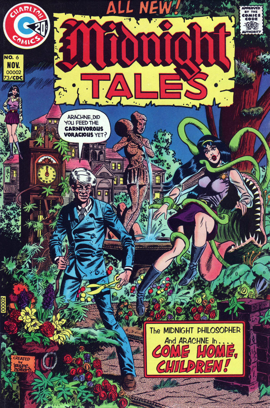
Midnight Tales no. 6 (November 1973), cover by Wayne Howard. I am a big fan of Midnight Tales and its blend of humour and adventure. Note the “created by Wayne Howard” announcement on the cover, which wasn’t exactly typical for its time – comic book companies didn’t use to acknowledge the creators of their “content” so openly and insistently.
Midnight Tales often offer moments of “wait, how did that get through the Comics Code?” Arachne (Professor Coffin’s undeniably attractive niece) is frequently more sexually provocative than one would expect from a kid-appropriate comic, crimes committed are nastier than surmised, and the plots go from morbid to surreal… with some comedy thrown in. Oh, sure, there’s some terrible clunkers, as every issue has three or four stories linked by a common theme and illustrated by different artists, but overall the quality remains high throughout its 18-issue run.
I’ve seen people online saying that Howard shamelessly plagiarized Wally Wood’s style – perhaps people more erudite than I see that, but I don’t. “Influenced” is one thing – but one can build on those beginnings to create a recognizable style of one’s own, right? Those who like Wayne Howard frequently classify him as a “guilty pleasure”, and proceed to insult his art while they’re explaining why they like it. To quote, for instance, from Atomic Avenue,who follow the unspoken rule – just mentioning Charlton Comics warrants a condescending tone, and any acknowledgement of their quality has to be tempered by mockery.
Creator Wayne Howard blatantly imitated the style of comic art great Wally Wood right down to his gothic signature, but at least he aimed high in his plagiarism. Consequently, Midnight Tales had the look of a seedy, off-register knock-off of an EC horror comic—putting it at the top of Charlton’s quality spectrum.
In my world of geek’n out over all this great art, Wayne Howard is one of my biggest guilty pleasures. He loves to draw like Wally Wood, but he’s no Wally Wood. His females usually look like Wally’s women after a really bad day, and his males are just plain fugly. His Wood machinery is close to the background machinery behind the awesome machinery, and everything shouts fan art VS pro art, but… Luvittopieces
Ah, well. I won’t be apologetic about liking Howard’s art, and Midnight Tales will be proudly presented as a favourite series on a need-to-know basis. Fortunately, there’s some nice articles about him, too – a sort of obituary for a great African-American artist who died at only 58.
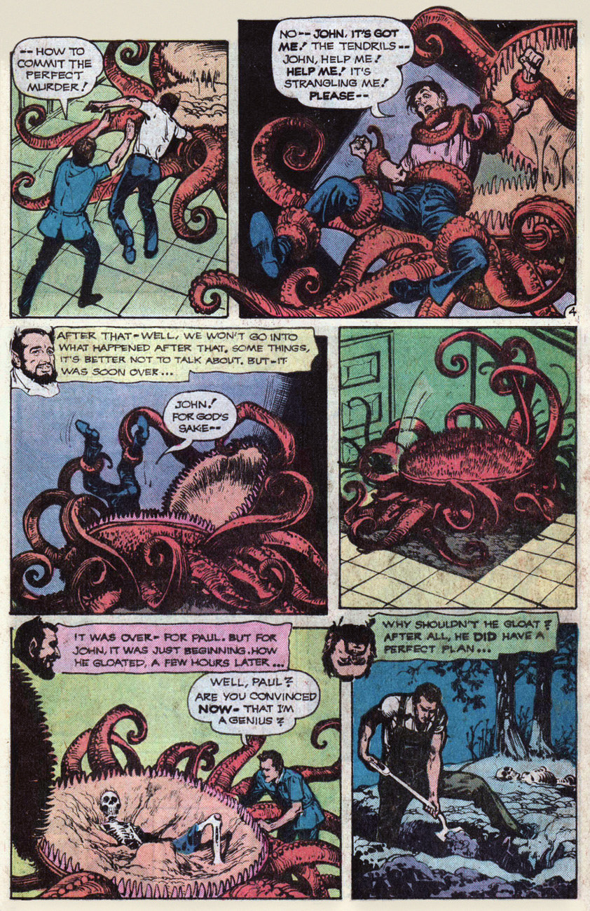
Another Flytrap for your enjoyment, in this tale of brotherly rivalry:
“Harvest of Hate” was scripted by Jack Oleck and drawn by Alfredo Alcala (speaking of whom, I still can’t get over how beautiful his signature is.) Page scanned from House of Mystery no. 251 (March-April 1977).
Don’t worry, the “gardener” who fed his brother to this man-devouring monstrosity gets his comeuppance, all right.
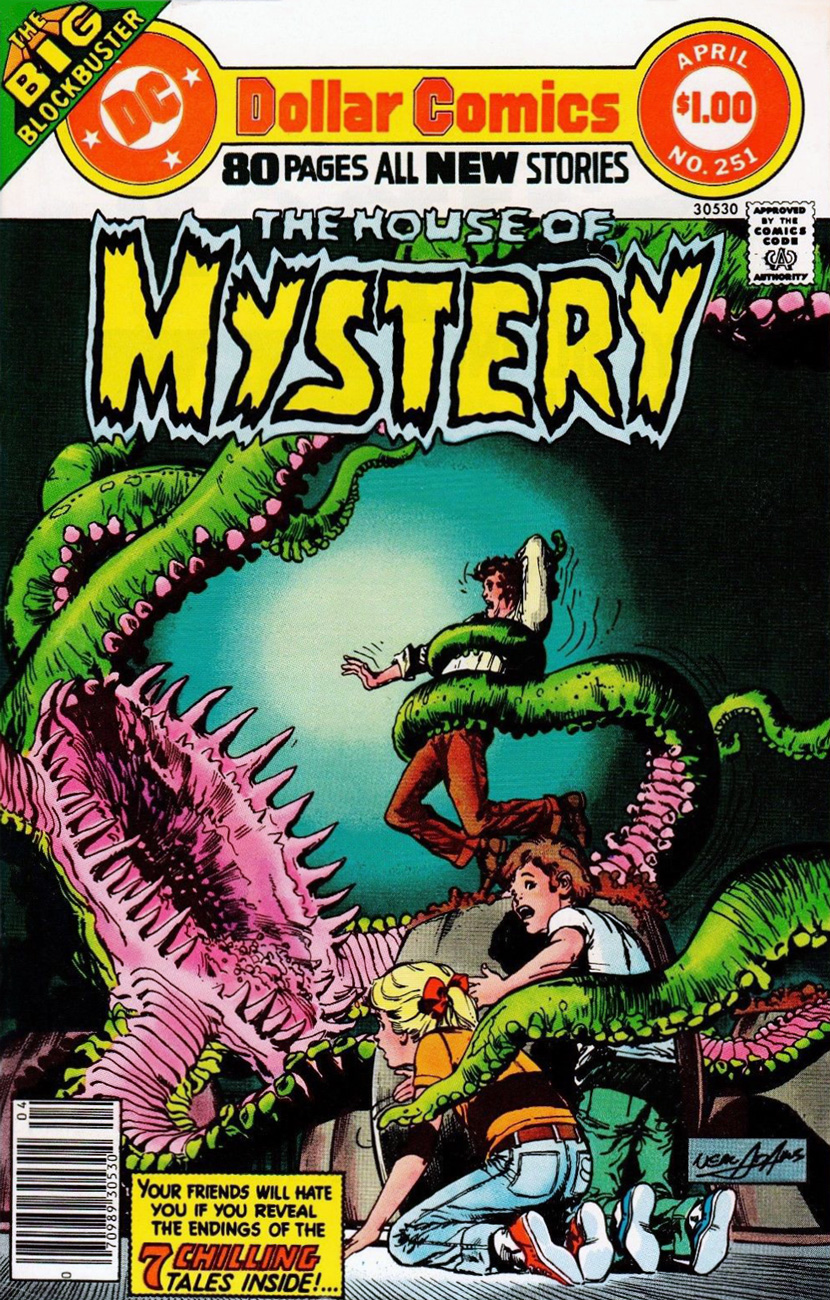
The cover of this issue of House of Mystery is also a good exhibit of plant tentacles, even if the children are a superfluous addition:
House of Mystery no. 251 (March-April 1977), cover by Neal Adams.
Here’s something more recent – published on some almost-thirty years ago, instead of forty – the tentacular adventures of Doctor Gorpon! I hope these guys count as plants (even if they’re slightly more mobile) – they’re the right shade of green!
Doctor Gorpon no. 2 (July 1991) by Marc Hansen. The little guy in the right bottom corner is extra-cute – if only all children looked at their parents with the same sense of admiration and awe! It’s “Ooze Me, Baby!”
I only finished reading this three-issue series today, and I must say, it was an exciting ride. Highly recommended (if you can find it, that is).
A panel from the aptly-titled “Big Eyeballs!”, published in Doctor Gorpon no. 3 (August 1991).
A page from “Big Eyeballs!”, published in Doctor Gorpon no. 3 (August 1991).
« I had me a scientific career before… ah… circumstances forced me to take up fishin’… »
In case it’s escaped anyone’s notice, summer’s officially arrived.
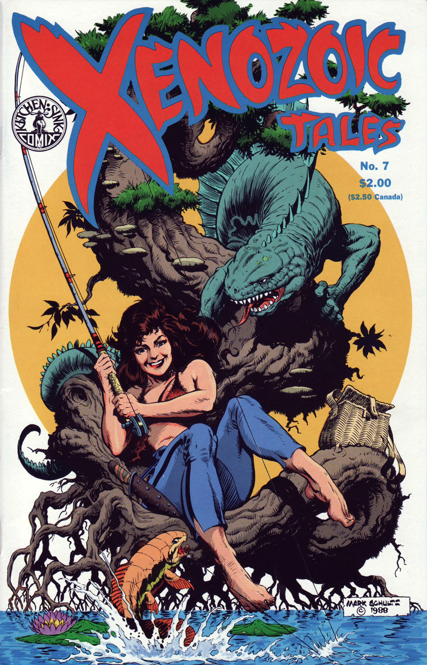
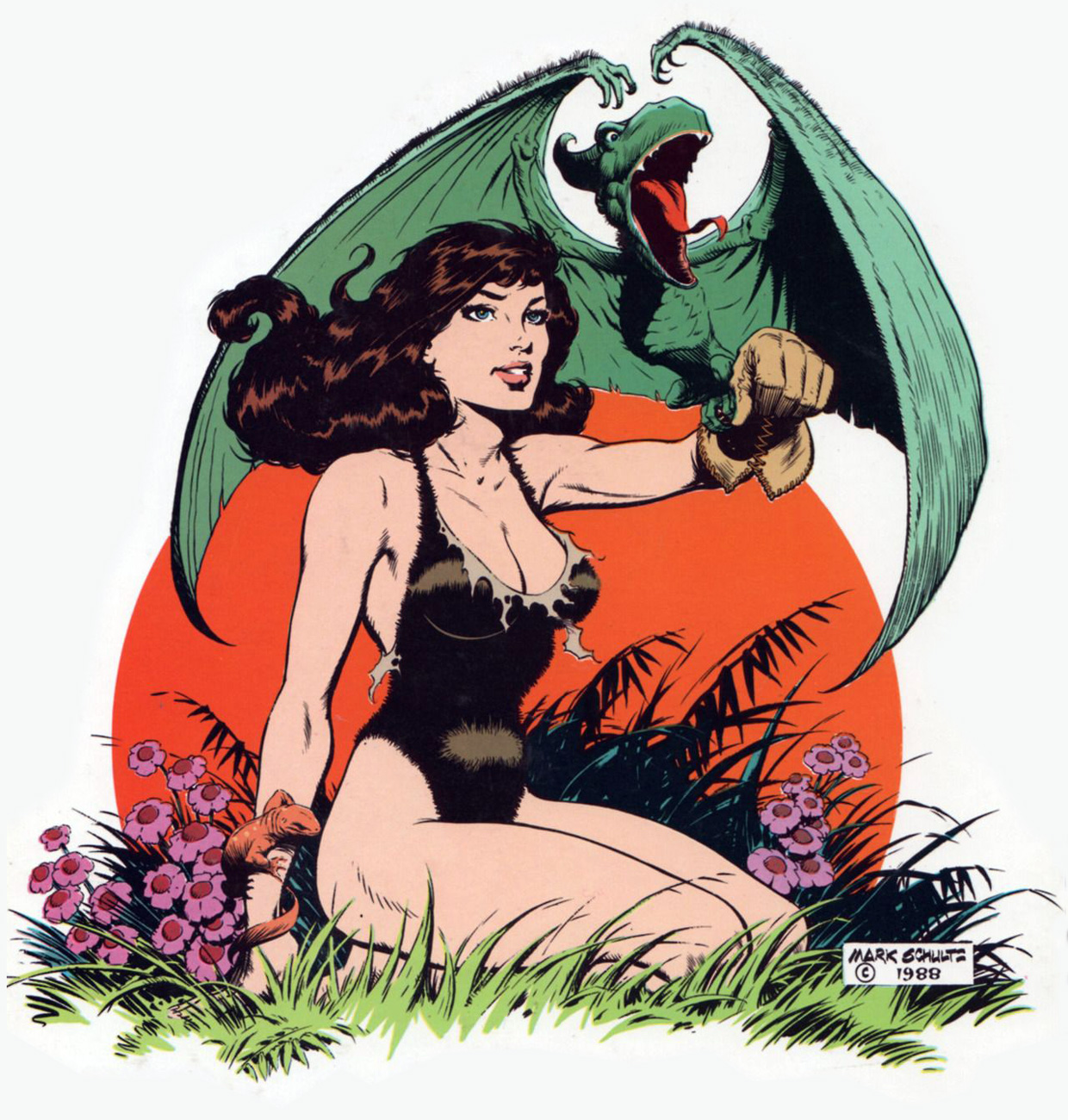
This is Xenozoic Tales no. 7 (Oct. 1988, Kitchen Sink), a series that presented, wonder of wonders, a post-apocalyptic future that wasn’t strictly doom and gloom. Cover by Mark Schultz. This issue features « The Growing Pool », written and drawn by Schultz, and “Crossed Currents”, written by Schultz and illustrated by Steve Stiles.
The lady is Hannah Dundee, and she may soon have to share her lunch. Something tells me this illustration is a pastiche of some The Saturday Evening Post-type cover.. there’s something charmingly old-fashioned about it, and I don’t mean Cambrian Age old.
You know, that sort of thing. The Saturday Evening Post‘s August 5, 1933 cover by… who else? Norman Rockwell.
It’s the new falconry! Xenozoic Tales’ coexistence of humans and dinosaurs is not your run-of-the-mill anachronism: this is the world of tomorrow, not yesterday’s. This striking portrait of Ms. Dundee was conceived as a t-shirt design in the late 1980s. I should still have mine stashed somewhere…
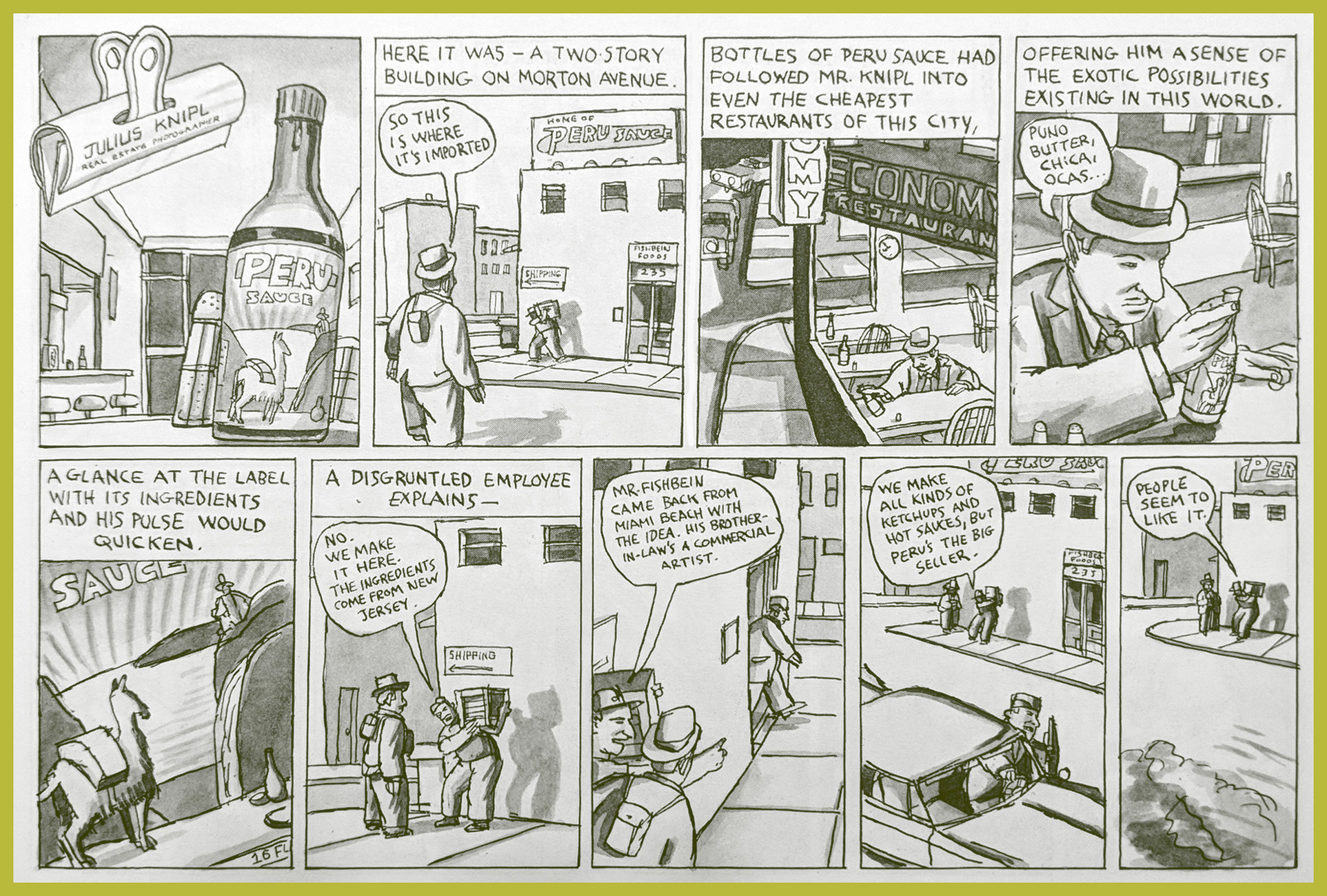
Originally appearing in alternative weekly The New York Press in the late 1980s, Ben Katchor’s Julius Knipl, Real Estate Photographer belongs to that most exotic breed of comic strips, those that suddenly awake the mind to the medium’s grand possibilities. Said experience can be abrupt and dizzying, but in this particular instance, it’s soothing and bittersweet, full of rightful yearning for things that possibly were or surely should have been, glimpsed in a daydream by the low flame of the fantastic mundane.
Mr. Katchor (born November 19, 1951 in Brooklyn, New York) is blessed with a vision of startling depth and singularity. By its nature and scope, it’s not everyone’s thing, but the rest of us likely wind up as lifelong admirers, and isn’t that just the ideal audience?
Much has been written elsewhere, often brilliantly, about Mr. Katchor and his œuvre; it’s work of a calibre to inspire theses, dissertations and papers, so I’ll mostly stick to presenting some samples. The passionate plaudits these strips have inspired tend to obscure the fact that most people just haven’t had the pleasure, or at least the opportunity, of encountering such rich material.
These vignettes were collected in 1991 as Cheap Novelties: The Pleasures of Urban Decay. Oddly enough, it was the only one of Katchor’s books to go out of print… the situation was remedied in 2016 by Montréal’s Drawn & Quarterly, who brought it back in a lovely hardcover edition.
While on vacation, my accountant fell in love with a hot sauce manufactured on the small Caribbean island of Dominica. He’s since devoted considerable energy to renewing his stock of the stuff, which has involved much international horse trading.
Montréal has its share of architectural remnants of bygone commercial enterprise; arguably, the most famous is the “Giant Milk Bottle“, but no, it isn’t full of milk.
From the collection’s back cover blurb: « In a vast and shadowy city of old skyscrapers, neglected warehouses, juice stands, and coffee shops, Julius Knipl, a rumpled, middle-aged man in a suit and hat, wanders the streets photographing buildings and pondering the details: the scent of the past that seeps into the present; the ghosts of other values and culture embedded in the urban landscape; people and behaviors almost gone that linger on. He sees what others overlook, a Borscht-belt Buster Keaton. »
There are few things more satisfying than hitting two birds with one stone. Today’s Tentacle Tuesday almost, but not quite, coincides with the birthday of Hilary Barta, who was born on June 17th, 1957. As it happens, he is delightfully adept at depicting tentacles, and quite enthusiastic about it, too…. so it is my pleasure to combine tentacle festivities with a (hopefully) tantalizing sampling of a great artist’s work.
All I could find about this illustration is that it was meant as a cover to a book. To quote from Rhine’s website, « writer R.S. Rhine and illustrator Hillary Barta will collaborate on the graphic novel (release 2005) ». Was it ever released? It doesn’t seem so.
Art for The Black Flame no. 7, 2017. Art by Hilary Barta. So Black Flame is getting attacked by a bunch of drooling monsters and he’s victoriously brandishing… a small lizard?
The published version of The Black Flame no. 7. I think this colour scheme works much better, actually.
There’s no mentioning Barta without perusing some of his Simpsons’ work, especially under the umbrella of that tentacle-rich (my favourite!) manifestation of the Simpsons, the Treehouse of Horror.
P is for Portal! This « Lexicon of Lurid Limericks » was published in Treehouse of Horror no. 8, 2002. Art by Barta, colours by Dave Stewart. Moe is nonplussed, as usual… it’s going to take more than a few slimy tentacles and a big puddle of gore to shake him up.


 « But will you love me when I’m old and gray? » From Playboy’s August, 1971 issue.