The Old Underground Hall of Legends took some bad hits in 2017, with the losses, within less than a couple of weeks, of Jay Lynch (January 7, 1945 – March 5, 2017) and Mervyn “Skip” Williamson (August 19, 1944 – March 16, 2017). Skip, in fact, would have turned seventy-four today.
Again, we’re dealing with an artist with a long and nomadic career, so it’s best to think small. There’s plenty of excellent, in-depth biographical material on the subject already out there, so I’ll scare up a few scarce items that reflect Skip’s lifelong love of (and involvement with) music.
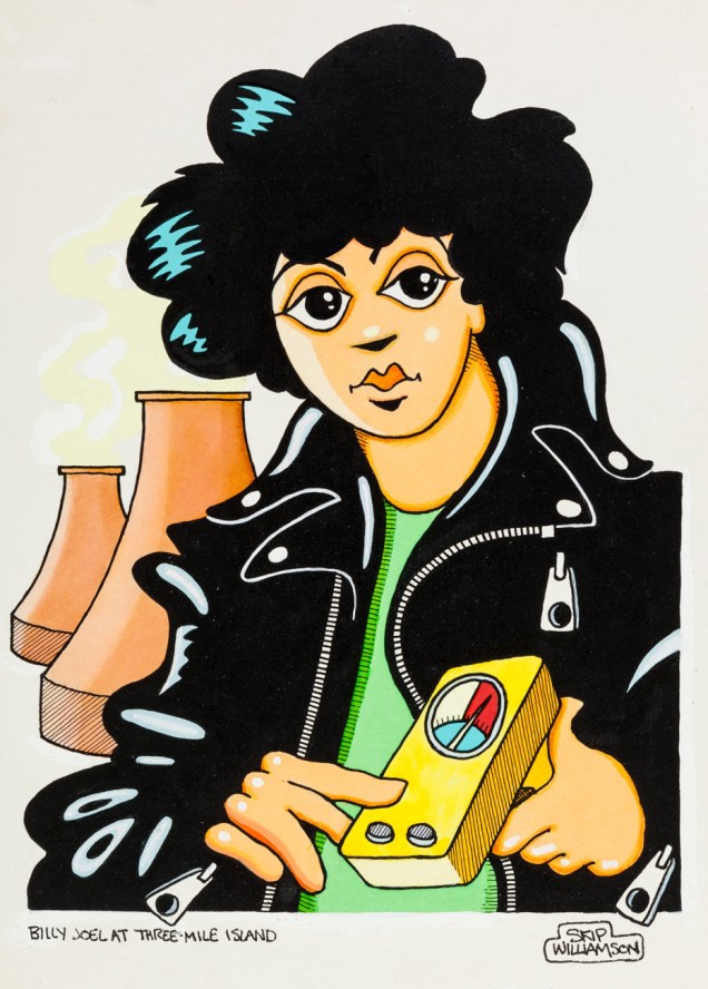
« Right now I’d like to do an original composition which deals with the basic existentialistic thought and parallels between the works of Kafka, Tillich, and Buber in relation to the ‘I-Thou’ concept, and which has just been covered by the Rolling Stones…» Underground comix provocateur Mervyn “Skip” Williamson (born 1944 in San Antonio, TX) takes a witty jab at noted self-mythologist Robert Allen “Bob Dylan” Zimmerman. From the March, 1967 issue of Escapade (incorporating Gentleman!), likely a Charlton Publications product (“Second class postage paid at Derby, Conn.”), a factoid that may someday help you win a bet.« Snuk Comix no. 1 (Skip Williamson, 1970). Extremely rare comic book created for the band Wilderness Road, by Underground Comix artist Skip Williamson. The story is that the printer objected to drug references, and would not deliver the printed comics; Skip managed to grab a few copies before the run was destroyed. As of 2003, only two copies were known to exist; while there have been a few more found since that time, the number of existing copies is staggeringly small… » Typical boorish behaviour on the part of the printer. Most people are unaware of the power that printers held and frequently abused before the salutary advent of digital print. Guys, *first* you nail the printing job (you call that registration?), *then* you indulge in moral grandstanding.1979 original art for a piece Williamson produced for Playboy magazine. « Now what », you may ask « Do Billy Joel and Three Mile Island have to do with one another? » Here’s one account: « Anne had a couple of his 8-tracks, and made plans to see him live at the Hershey Arena during his 1979 tour … plans that were thwarted by a little incident at a nuclear reactor near my home, Three Mile Island. See, when the accident happened, in March of ’79, people had to be evacuated. And those people had to go somewhere. And there just weren’t a whole lot of large buildings suitable for holding thousands of radioactive refugees in the area at that time, so The Hershey Arena had to be put to use, even if it meant canceling a few Hershey Bears games and a Billy Joel concert »
I was too young and in the wrong small town for Underground Comix to reach me back in the 1970s, but when Skip put together the « Playboy Funnies » section (featuring the likes of Bobby London, Jay Lynch, Chris Browne, Art Spiegelman…) for Mr. Hefner’s magazine, I in due course discovered his work since I read Playboy for the cartoons. I immediately took to Williamson’s stylish, bouncy, clean and friendly visuals, paired with his unflagging subversiveness. Not that I got much of said subversiveness at the time… but that’s how it works.
Happy birthday, Skip!
-RG
*Class War (Bijou Funnies no. 3, 1969 The Print Mint)
« It was a fanatic’s world, and I was one of the fanatics » – Gene Deitch
Say, for a bit of a twist, let’s pay tribute to a living* legend. I’m referring to none other than Gene Deitch (born ninety-four years and change ago: August 8, 1924 in Chicago, Illinois).
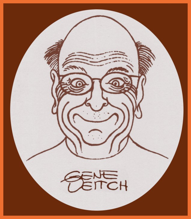
A recent self-portrait of the master.
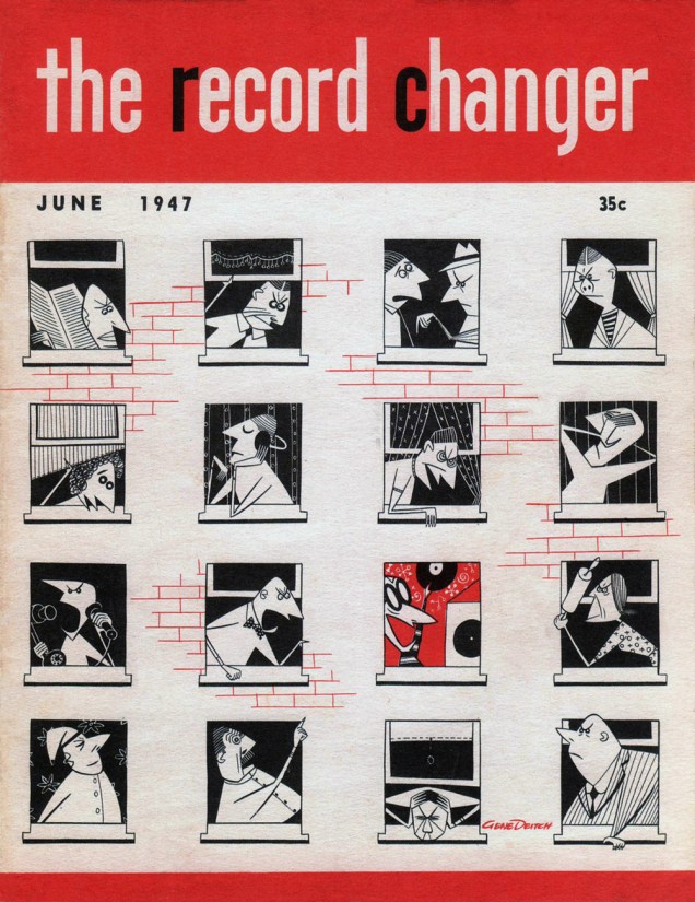
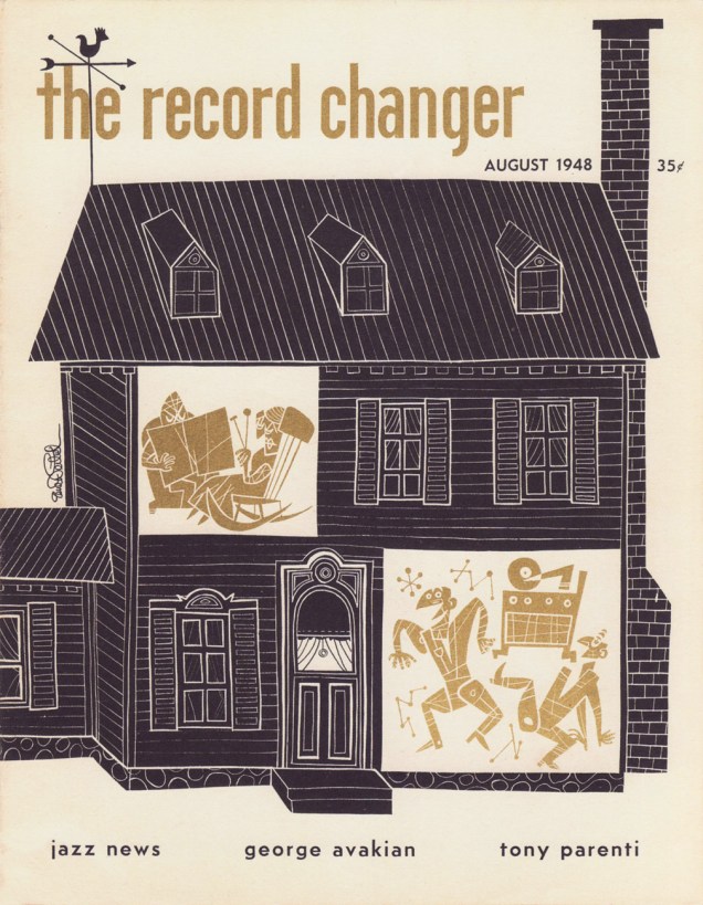
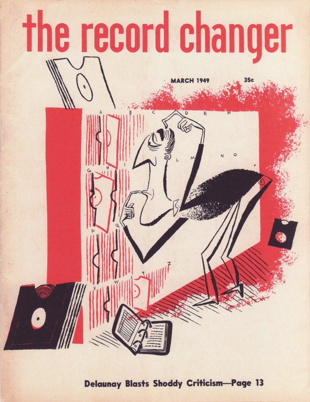
This fascinating man has led a life of such distinction, achievement and all-around coolness that I’m tripping all over myself trying to boil it down to a few highlights. Art director of legendary jazz mag The Record Changer, animator-director-scenarist for UPA, Terrytoons, MGM… Academy Award winner for his direction of his animated adaptation of Jules Feiffer‘s Munro (watch it right here), creator of Sidney the Elephant, John Doormat, Clint Clobber, Gaston Le Crayon… and co-creator of Simon, Seth and Kim Deitch. Some fine artistic genes, to be sure!
The stylish young Master Deitch.
If you don’t terribly object, I’ll sidestep the pitfall of ambition and restrict this post to a single facet of Mr. Deitch’s orbit, namely his jazzy cartoons of the 1940s and 50s. Incidentally, these succulent needles have been collected, in their usual, exemplary fashion, by the Fantagraphics team. If you dig these, and the odds are good, you’ll need to acquire, dentro de poco, their The Cat on a Hot Thin Groove (2013).
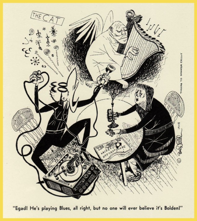
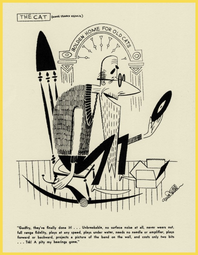
« I had just recently, for the first time, heard the magnificent pipe organ recordings of Fats Waller and imagined a portly black church janitor setting down his mop and bucket and rolling out some mighty blues in the midnight of an empty church on an elaborate organ most likely sanctified for an entirely different kind of music. This drawing was reproduced many times over the years without anyone ever asking permission, and I was tickled to find it once on an actual Fats Waller album cover!** »« The cover shows that having a loud, jazz-playing Cat as an apartment house neighbor is not all that rosy. »« My cover show the devoted bass player protecting his beloved instrument from the pouring rain by covering it with his own coat and hat. If a musician’s livelihood depended on his instrument – often expensive or hard to come by – he did everything possible to keep it from harm. »From The Record Changer (August, 1948). « The search for a recording by the legendary pioneer New Orleans trumpeter Buddy Bolden has never subsided. In this issue, The Cat has actually managed to record him from the Great Beyond, but egad, he’s playing a harp instead of a horn! »« The cover design suggests the unlikely coexistence of a quiet elderly couple and a jazz record maniac within the thin walls of a single boarding house. »« The cover showed that even with the most careful cataloging it was still mainly guess work to find the record you were looking for. »« Earlier that year I moved from Hollywood to Detroit, to take up an offer from a commercial film studio there that would give me a chance to become a director. My cover for July was inspired by the hazards of moving the most precious commodity of all. OK, I had two kids, but I let my wife arrange their things for the moving, and the moving men could do what they wanted with our furniture. But I didn’t let them touch my record collection! I schlepped every box full of discs myself, and carefully placed them in the safest positions. I was proud that my entire collection arrived in Detroit unscathed. »From The Record Changer (August, 1949). « This may be the very best Cat-toon of all. It says everything I ever wanted to say about this character. What is a mere soul in comparison to a 100% complete jazz record collection? Spencer Crilly, wherever you are, I thank you for suggesting this gag! » Perhaps the proverbial catch in the Faustian deal is that, without his soul, a cat can’t appreciate jazz any longer. You can never win.From The Record Changer (January, 1950). « The Cat, seen as a dodderer in the Buddy Bolden Home for Old Cats, basically predicts the CD and DVD records to come 50 years hence! »
*That’s Not Safe For Work, for those unfamiliar with the acronym. Turn back while you still can!
We all know that tentacles are often used in comics as a substitute for other, err, organs. Tentacle porn is nothing new. Still, occasionally I stumble upon something that’s just outstandingly odd and perhaps even depraved. Would one be able to find stuff online that’s far stranger and more degenerate? Indubitably. Still, within the context of Tentacle Tuesday, I’d like to think that the following offerings are firmly in the realm of “well, that was strange…”
Our first example of WTF is this cover, drawn by good ol’ William Stout.
Bizarre Sex no. 10 (December 1982, Kitchen Sink Press), cover by William Stout. I imagine the Earthman quivered in horror and became as flaccid as flaccid can be, though who knows what turns people on? The alien creature seems to have its eyes resolutely shut in grim desperation, so perhaps she’s not enjoying it much, either.
« One of the great series in underground history, Denis Kitchen’s Bizarre Sex was launched in May, 1972. One could discern that this would be a “no-holds-barred” type of publication upon perusing the first issue, as the first two stories were about brother/sister incest and interracial homosexuality. Bizarre Sex became best known for issue #9, which introduced Omaha the Cat Dancer with a story that took up the whole book. After another appearance in Bizarre Sex #10, Omaha moved on to its own successful serial. The great thing about Bizarre Sex is the series matured through the years, evolving from a comic book about atypical sex into more of an in-depth review of sexual relations and the human condition. »
As this is no. 10, the last issue of Bizarre Sex, presumably that “in-depth review of the human condition” part is applicable here. The cover could have fooled me… If anyone out there has read it, do let me know!
Chester Brown has always been one sick puppy. If by now his work is creepy and boring, back in the earlier days of his career, his stories were often fascinating… for those of us who enjoy a good mindfuck and have a strong stomach, that is. As for me, I never liked his stuff: far too disturbing, in a viscerally-uncomfortable kind of way. A good demonstration of his typical sense of humour is the following 2-pager with a characteristic blend of onanism, body fluids and irony. This instalment of Adventures in Science was published in Yummy Fur no. 4 (1984).
A little bit of comic relief: a cartoon from “How the Animals Do It” by Larry Feign. Make sure to visit this page for a little video preview of this book: a little animated tale of the barnacle’s super long penis and what s/he does with it, including the brilliant quote « if no resistance is met, in it goes ».
Okay, I’ll bite. Why did the chicken cross the road? Why did the male octopus lose an arm due to sexual promiscuity?
« Male octopuses have a big problem: female octopuses. Each male wants to mate and pass on his genes to a new generation. The trouble is, the female is often larger and hungrier than he is, so there is a constant risk that, instead of mating, the female will strangle him and eat him. The males have a host of tricks to survive the mating process. Some of them can quite literally mate at arm’s length. Others sneak into a female’s den disguised as another gal, or sacrifice their entire mating arm to the female and then make a hasty retreat. » [source: Mystery of Cannibal Octopus Sex ]
Next time we encounter difficulties with our romantic entanglements, let’s remember not to complain.
Our last entry is a little more standard from the perspective of shokushu goukan. The blend of sex-and-religion is also nothing new, although some people seem to be labouring under the impression that it still has some sort of shock value in this day and age (My sleazy ex-boss from the framing store, I’m looking at you.) However, I think these scaly tentacle-penises are a reasonably original take on the theme, and I also like the choreographed sisters, who seem to be doing some sort of interpretative dance while a-waiting to be ravaged.
Page from The Convent of Hell (published in Spanish in 1987, in English in 1998), written by Ricardo Barreiro and illustrated by Ignacio Noé.
You can read the whole thing here – very NSFW, obviously.
Dennis the Menace, the syndicated strip about a monstrous little kid and the mayhem he gets up to, was created by Hank Ketcham in 1951. The strip was inspired by Ketcham’s son Dennis, who was 4 years old at the time; the title was coined by Ketcham’s then-wife, Alice Louise Mahar, who’s said to have exclaimed in exasperation “Your son is a menace!” (Interestingly, she’s supposed to have said “your son“, even though Dennis was her child, too. She died of a drug overdose in 1959, when the real Dennis was 12. I really hope there’s no connection between the cause of her death and Dennis’ rambunctiousness.)
Wikipedia describes Dennis as “precocious but lovable”. I find him to be an irritating little prick who delights in tormenting his poor parents; the kind of kid who grows up to be a sociopath, happily wrecking people’s lives and then feigning complete ignorance. Tomato, tomat-oh! 😉
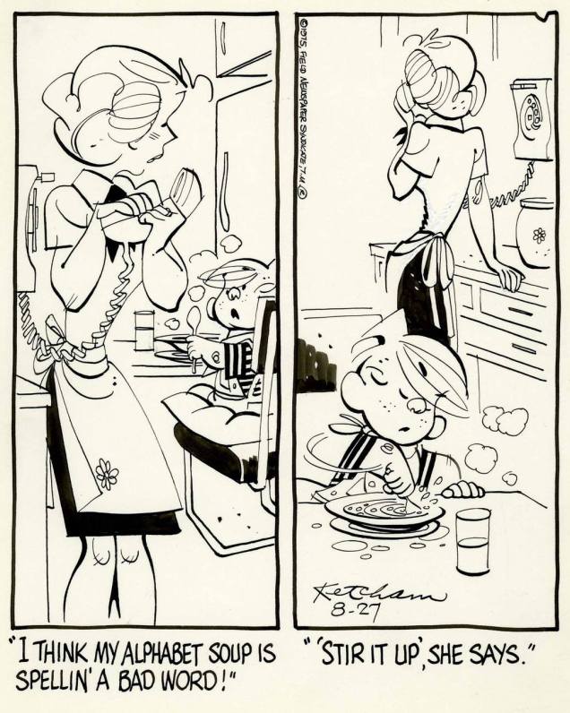
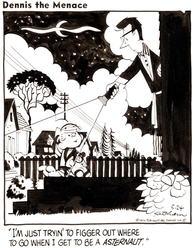
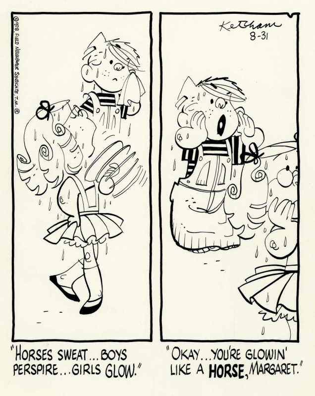
I had zero interest in Dennis until I stumbled upon a scan of the original art of a daily strip… and discovered that Ketcham’s art is stunning. I could happily stare at it for hours. Bonus: as it turns out, the stories can be quite interesting, especially the ones that don’t pivot as much around Dennis’ self-centered behaviour.
Here are a few strips for your consideration – a couple of dailies, a couple of Sundays. I much prefer looking at them in black and white, as I find that colour detracts from the purity and dynamism of Ketcham’s inking.
October 4th, 1953.August 27, 1975. May 24th, 1974.August 31st, 1978. Margaret is quite the thorn in Dennis’ side… but a dainty, girly thorn.November 8th, 1979.July 28th, 1987.A page from Ketcham’s autobiography “The Merchant of Dennis the Menace” (Fantagraphics, 2005). Visit Michael Sporn Animation to read a whole chapter of this book, complete with entertaining anecdotes involving Virgil Partch, a friend of Ketcham’s. (Small world… especially in the sphere of cartooning.)
Dennis the Menace became a hit very quickly, and Ketcham started using assistants fairly early on. In the late 1950s and 60s, the strip was ghosted by Al Wiseman. (Speaking of which, do visit this website maintained by Wiseman’s grand-daughter, who doesn’t think it’s fair that the rôle her grandad played in the creation and success of this strip is so downplayed.)
After Wiseman moved on, Ketcham hired Marcus Hamilton to help out with dailies and Ron Ferdinand to work on Sunday strips; Ketcham presided over their work until his official retirement in 1994, after which they inherited the proverbial driver’s seat. He passed away in 2001, but the strip yet continues. To quote from the Dennis the Menace website, “Hank handed over the reins to Ron Ferdinand and Marcus Hamilton… two artists totally committed to carrying forward the Ketcham legacy, and keeping Dennis’ fans entertained for decades to come. Scott Ketcham (son of Hank) joined the Dennis team in 2010, helping to keep their creative finger on the pulse of current contemporary trends.” Anytime someone expresses a desire to keep a finger on “the pulse of current contemporary trends”, I get worried. Besides, their eagerness to stay relevant to modern life is conflicting with the attempt to keep things static. That’s the thing about newspaper strips that outlast their creators by decades… They get stuck in some bizarre time-warp, but with all the humour leached out. I bravely went through 50 or so dailies to figure out how Dennis the Menace was “Staying Modern”, so you wouldn’t have to. The results are much as expected: the family roles are exactly the same, with apron-ed mothers in skirts serving lunch or cleaning up, fathers working in offices, playing golf or having a beer in front of the TV (the mere three options available to men, apparently). However, now the family has a flat TV screen and a laptop, the babysitter has her nose stuck in a cellphone, and cars have some automated features. Oh, and lest I forget: women very occasionally wear jeans, a true sign of progress.
« I tell ya, Spirit… this neighborhood is like a lit firecracker… »
I’m surprised that it took us this long to get to Will Eisner and his signature creation, The Spirit. Is it perhaps too obvious a topic? Nah. Though the ink and the pixels may flow, and even if everyone and his chiropractor has already waxed rhapsodic about old Will, the subject retains its depths of evergreen freshness.
For most generations of cartoonists, Eisner is an irresistible influence. My own initial encounter came in the early 1970s, when I glimpsed ads for Warren’s Spirit reprints in the rear section of Famous Monsters of Filmland. And then I was introduced to his groundbreaking style and storytelling approach… only it wasn’t, in this case, quite his.
In 1975, I had stumbled upon a Dutch collection of WWII-era Spirit newspaper strips (The Daily Spirit, Real Free Press, 1975-76… a publication designed by none other than Joost Swarte), and I was captivated… by the ghost work of no less than Plastic Man creator Jack Cole!
« You can do that in a comic strip? » was my general feeling as a ten-year-old aspiring cartoonist. From The Spirit daily strip, January 3, 1942 (scripted by Manly Wade Wellman, illustrated by Jack Cole).
I won’t go over the action-packed history of the character… what I’ll focus on here instead is inextricably linked to Eisner’s terrific business acumen: having held onto his character’s ownership, he could shop him around the publishing world, a process still unfolding to this day, well beyond his own passing.
The Spirit, that well-travelled rascal, has witnessed his exploits bearing many a publisher’s imprint, from Quality to Fiction House, through I.W. (naughty, naughty!), Harvey, Kitchen Sink, Warren, and DC… so far. And the coolest thing is that Eisner was along for most of the ride, creating glorious new cover visuals for the venerable archives.
Today, we’ll focus on Quality’s output (1942-50), which alone was contemporary to the strip’s tenure. About half of it was Eisner, but I’m no purist: the man hired some of the finest ghosts in the medium’s history, when it came to both story and art. To name but a few favourites: Manly Wade Wellman, Jerry Grandenetti, Jules Feiffer, Wally Wood…
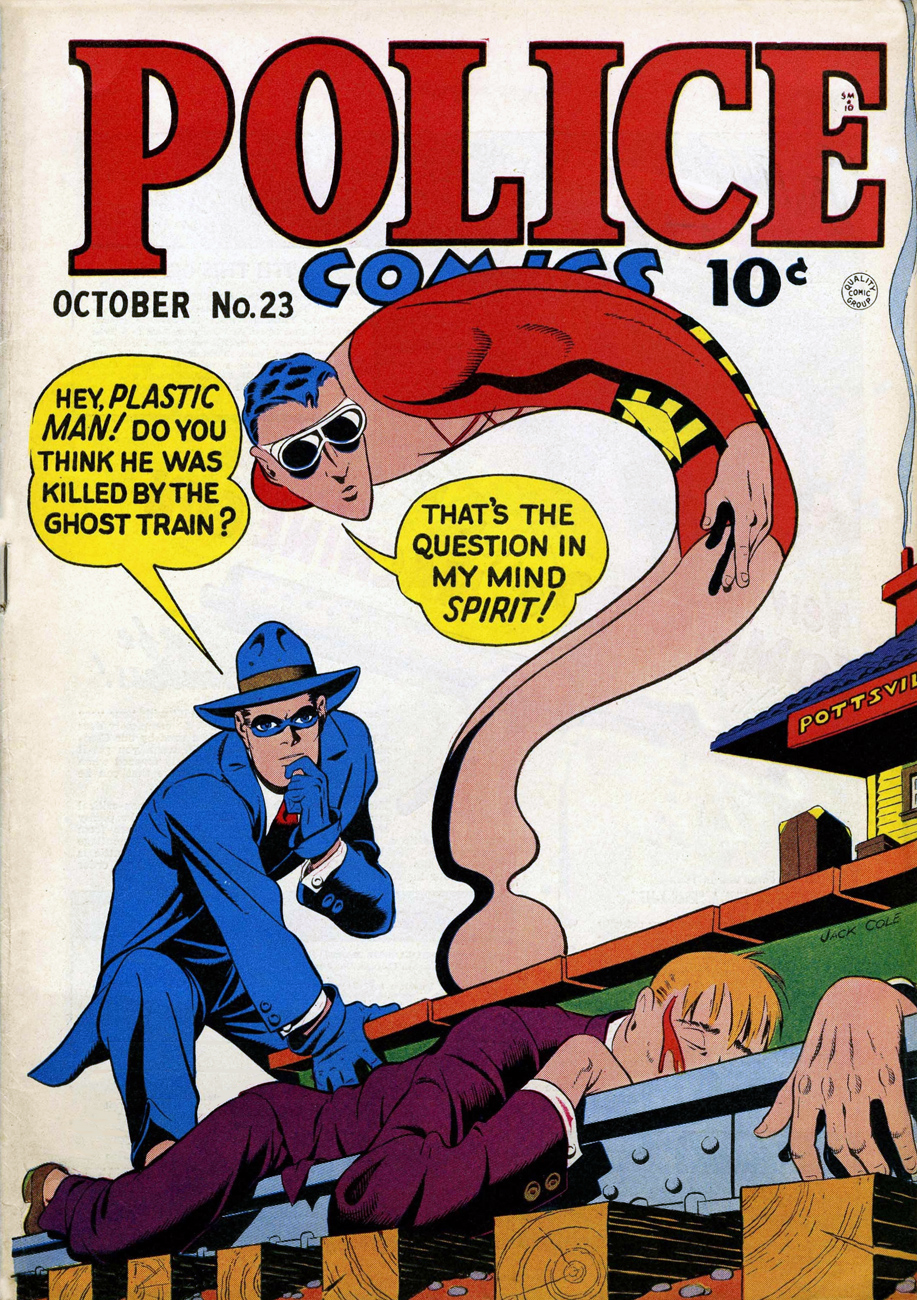
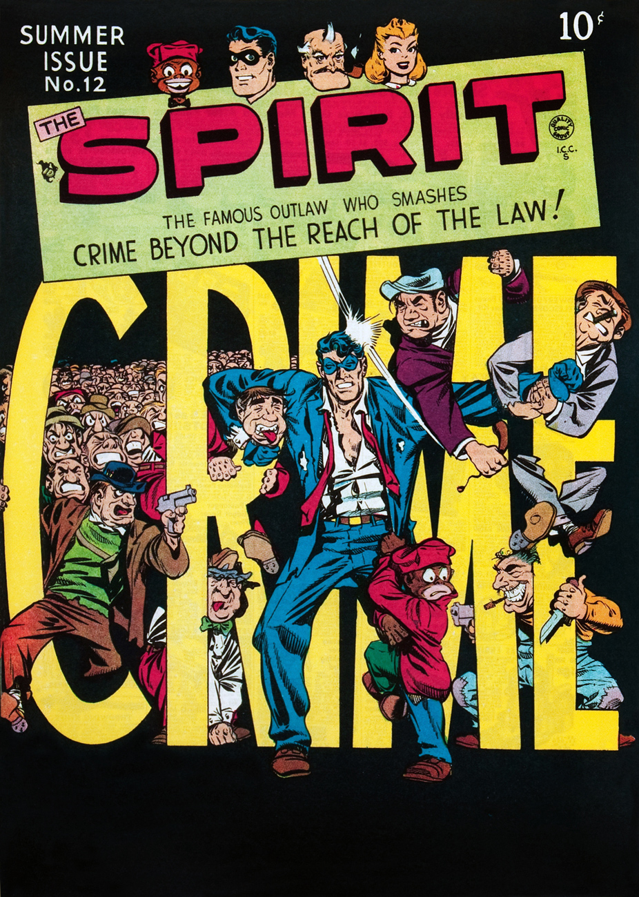
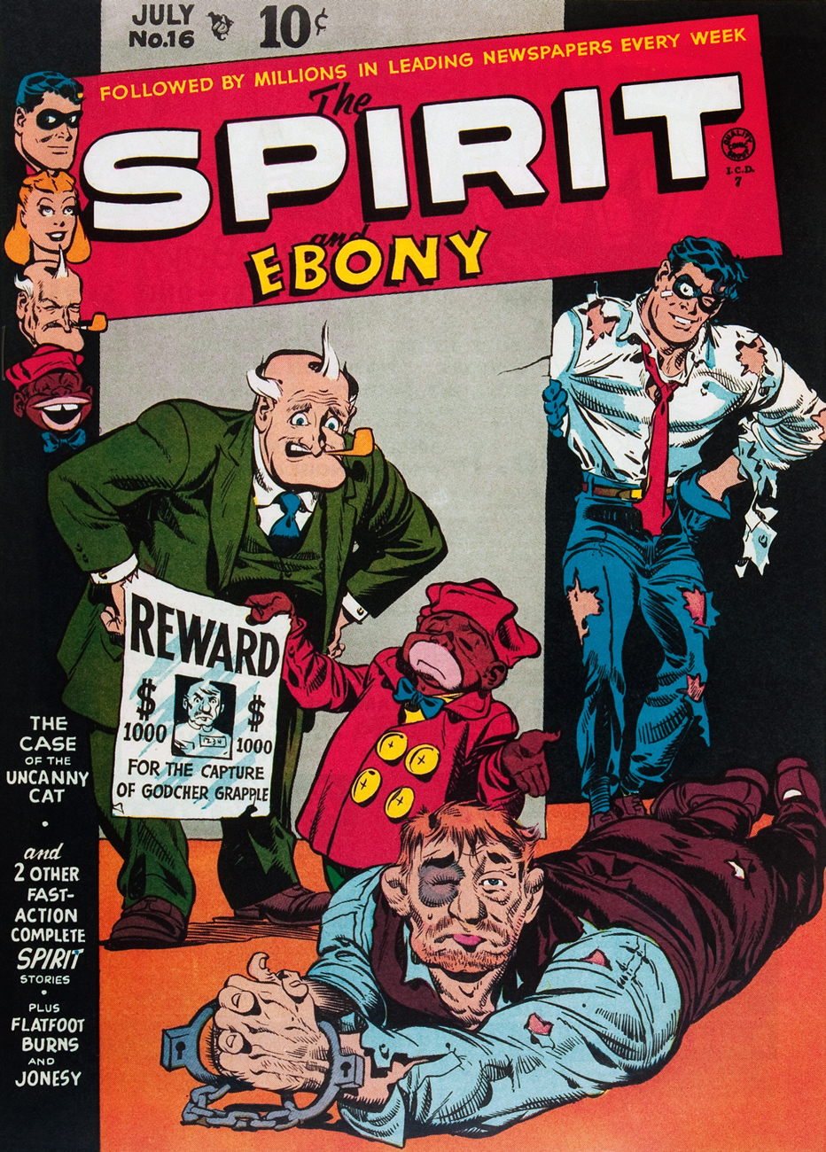
Speaking of Jack Cole… before he got his own title, The Spirit was featured for a couple of years in Quality’s Police Comics anthology. He occasionally ran into his fellow headliner, Plastic Man. This is Police Comics no. 23 (October, 1943). Cover by Jack Cole. Read this issue here.This is The Spirit no. 12 (Summer 1948), cover by Eisner, and featuring a bunch of Manly Wade Wellman / Lou Fine Spirit tales, which is to say “Eye, Feets, and Lock” (August 12th, 1945), “The Case of the Missing Undertaker” (September 30, 1945), “Skelvin’s School for Actors” (November 18, 1945), “The Whitlock Diamond Caper” (June 24, 1945) and “Nitro” (October 21, 1945).This is The Spirit no. 13 (Autumn, 1948), cover by Eisner, and gathering a clutch of Wellman / Fine outings, i.e. “Mr. Martin’s Pistols” (September 23, 1945), “Red Scandon” (June 3, 1945), “The Strange Case of the Two $5.00 Bills” (December 9, 1945), “Mr. Exter” (May 27, 1945) and “Vaudeville Vinnie” (November 4, 1945).Another high-wire master class in design and tension from Mr. Eisner. This is Quality Comics’ The Spirit no. 14 (Winter, 1948), featuring reprints of Spirit adventures (“The Alibi Factory“, “The Kuttup Shop“, “Prominent Executives Vanish“, “The Masked Magician“, “Belle La Trivet“) from 1945, written by Chapel Hill‘s foremost scribe, Manly Wade Wellman, and illustrated by Lou Fine and the Quality shop.This is The Spirit no. 15 (Spring, 1949), cover by Eisner, and gathering a bouquet of Wellman / Fine offerings, namely “Rosilind Ripsley” (June 10, 1945), “Madame Lerna’s Crystal Ball” (September 16, 1945), and “The Case of the Will O’Wisp Murders” (November 5, 1944).This is The Spirit no. 16 (Autumn, 1948), boasting an Eisner cover and rounding up a rogues’ gallery of Spirit exploits scripted by Bill Woolfolk: “The Case of the Uncanny Cat” (October 8, 1944) and “Jackie Boy” (September 9, 1944) and Manly Wade Wellman: “The Case of the Headless Burglar” (September 24, 1944), all pencilled by Lou Fine.I’ll bet Dolan could kick himself if he wasn’t so tidily trussed up. Fooled by a pretty… er, face again. This is The Spirit no. 20 (April 1950), featuring “The Vortex” (September 8, 1946); “The Siberian Dagger” (January 27, 1946); “Magnifying Glasses” (May 26, 1946), plus a couple of Flatfoot Burns stories by Al Stahl. Cover by Will Eisner, and a gold star and a hearty round of applause for the colourist.
As for the insides… I’m tickled to inform you that all of Quality’s issues of The Spirit are available gratis on comicbookplus.com. Enjoy!
– RG
p.s. For more (much more!) of Will Eisner’s famous creation, just click on the umbrella category, THAT’S THE SPIRIT!
I don’t necessarily like to contemplate this fact of life, but octopus flesh gets eaten a lot (in some countries more than others). However, comic artists are mostly a classy lot: they tend to like cephalopods, so it’s not too often that one runs across a depiction of them as a foodstuff. An octopus slashed in battle is one thing, but disgraced and transformed into a dish? What kind of person would want to illustrate *that*? Perverts, that’s who!
These bold souls who have drawn the forbidden, mentioned the unmentionable, shall surely be punished by the Elder Gods.
Let’s have a cautious peek (don’t forget to leave a sacrifice at the altar of the Octopus God, however).
Zoot no. 5 (December 1993, Fantagraphics). Cover by Roger Langridge.
Originally called “Ernie” (the name of its main character), the strip was renamed “Piranha Club” presumably because it’s a much catchier title. No, or few, pirañas are involved, but you are guaranteed to encounter Quacko the Human Duck, his wife the Bearded Lady, Effie (who often cooks octopus, much to the dismay of her husband), Bob the zombie, and a host of other irrelevant and quirky characters. Who’s responsible for all this mayhem? Bud Grace, the creator of this strip. If you haven’t heard of Piranha Club, slither over here.
Delicious in Dungeon Vol. 3 (November 2017). This manga series by Ryōko Kui involves a few characters tromping around a dungeon, consuming all and any monsters they find within. “Slimes, basilisks, and even dragons… none are safe from the appetites of these dungeon-crawling gourmands!“
Octopus pie, again? Is it as inedible as tuna casserole, the frequent butt of jokes in all sorts of sitcoms? This is Mom’ Homemade Comics no. 1, October 1969, cover (and everything else) by Denis Kitchen. Visit Comixjoint for the riveting tale of how this underground classic came to be published, as well as a review of its three issues.
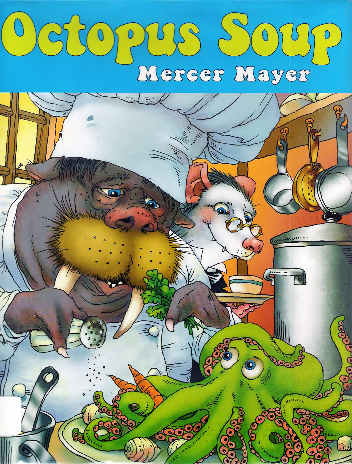
Octopus Soup by Mercer Mayer (2011, Two Lions). Technically a book for kids, but I’d highly recommend it for octopus lovers of any age.
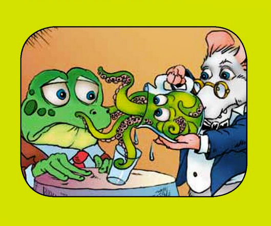
Another peek at Octopus Soup…
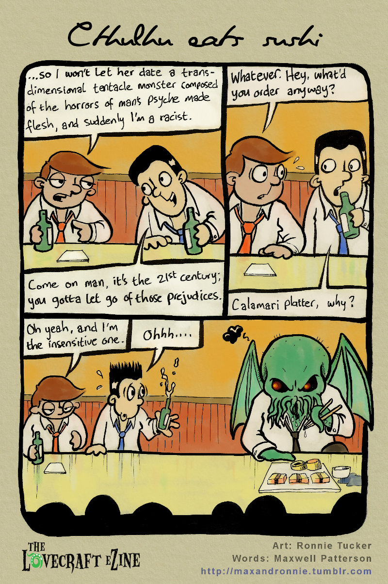
Cthulhu Does Stuff no. 4, by Ronnie Tucker and Maxwell Patterson. Visit their website.
« But observers say it is unlikely to slow down the consumption of fugu* »
DC’s Wasteland** (1987-89) was, to my mind, the publisher’s finest-ever horror anthology… for a handful of issues. While the experiment lasted but a couple of years, and it was mercifully, if a little late, put out to pasture.
To compensate for the usually uneven, often random nature of anthologies, the book was to be scripted by just two writers (John Ostrander and the fascinating Del Close) and illustrated by a carefully-picked skeleton crew of artists, namely George Freeman, David Lloyd, William Messner-Loebs and Don Simpson. Perhaps the vetting process wasn’t sufficiently thorough, though, because Freeman dropped out after a mere seven issues and one more cover, and Lloyd followed suit before the year was through. With proper bullpen substitutions, things might have run smoothly, but of all the ringers brought in, only Ty Templeton rose to the challenge, his sneakily clean-cut style providing ideal contrast and tension to issue 11’s nasty tale of Dissecting Mister Fleming, sadly the series’ final flash of brilliance… with seven dead horse issues left to flog.
But those early issues were, for the most part, quite glorious. Simpson and Lloyd landed the lion’s share of the very best tales, Simpson because he was most versatile, and Lloyd since he excelled at instilling the bleakest, most unsettling ambiances.
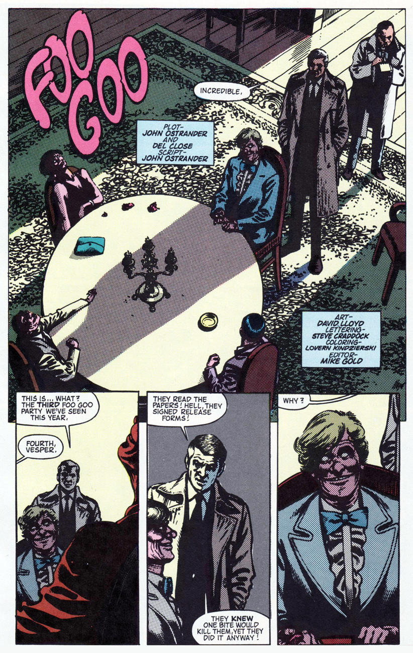
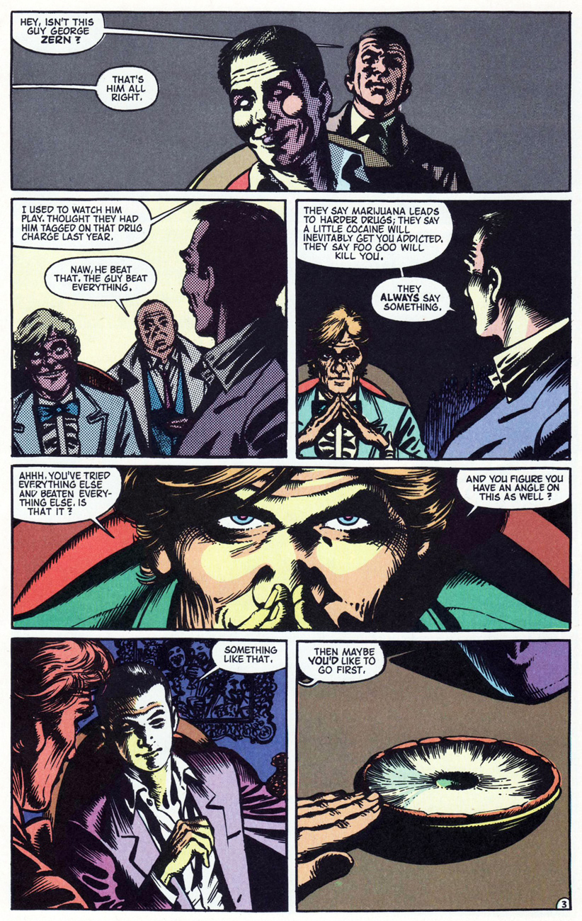
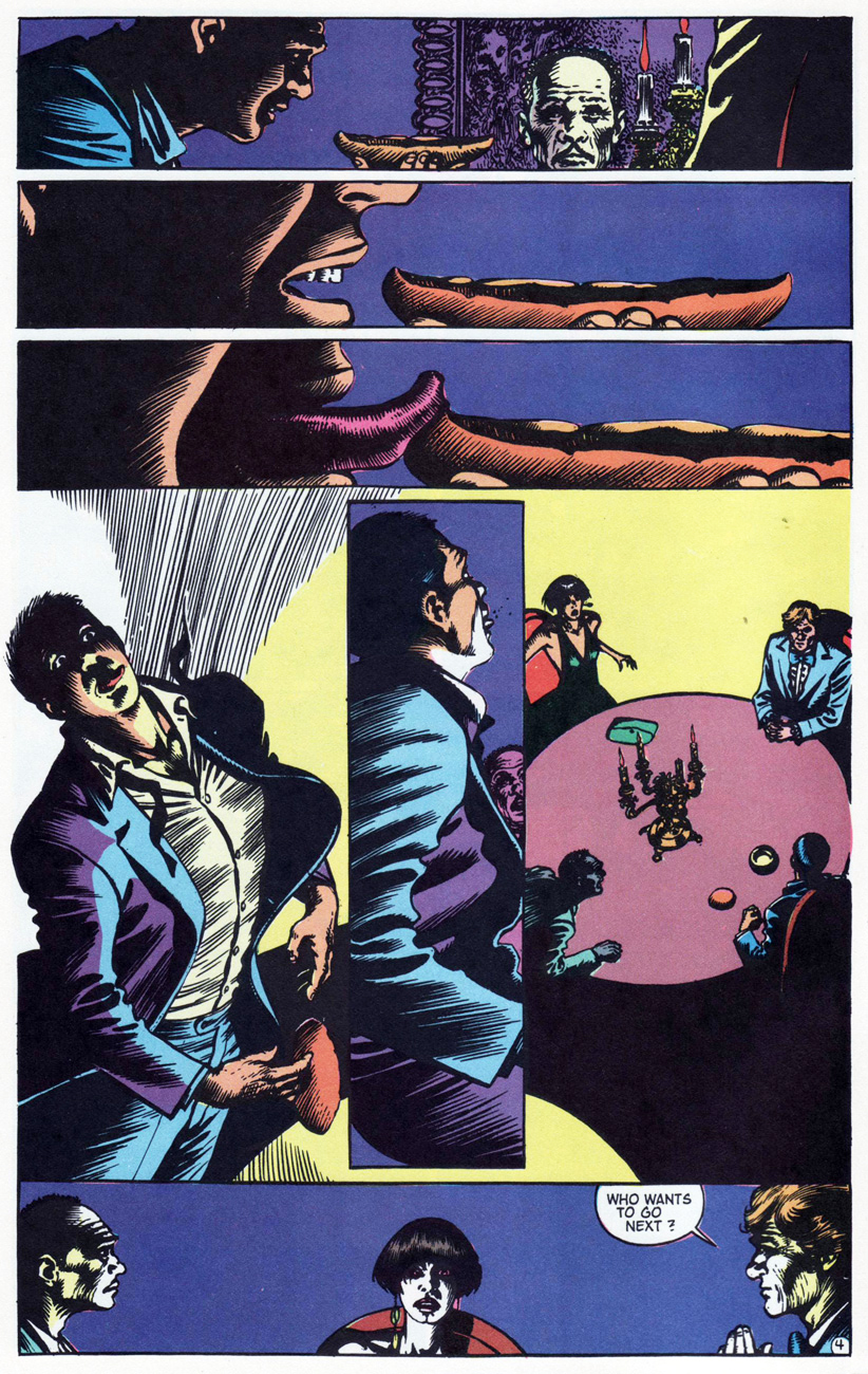
Today, we present Wasteland’s opening salvo, Foo Goo (Wasteland no.1, Dec. 1987, DC), by Ostrander, Close and Lloyd. Bon appétit!
The title, despite denoting a fictive species of fungus, is clearly a reference to the virulently-toxic liver of the globefish, pufferfish, or fugu… which is also, of course, a costly delicacy. It merely needs to be expertly prepared.
I first came upon this intriguing factoid in 1975, when a famous Kabuki performer, Bandō Mitsugorō VIII, presumed he could beat the odds. « In January 1975, Bandō visited a Kyoto restaurant with friends and ordered four portions of fugu kimo, the liver of the fugu fish, a dish whose sale was prohibited by local ordinances at the time. Claiming that he could survive the fish’s poison, he ate the livers and died after returning to his hotel room, after seven hours of paralysis and convulsions. »
-RG
*”Japanese Actor Poisoned“, The Leader-Post (Regina, SK), Jan. 20, 1975
**Not to be confused with the national capital of the United States of America
« And by the way, did I see you without a Pookie Snackenberg button? »
Concluding our exclusive conversation with Mr. Mike Royer, picking up the thread from where we left off in Part Two. And don’t forget to begin with Part One.
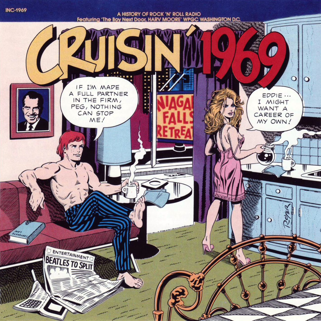
This illustration served double duty, first as a sampler released with the second batch of Cruisin’ albums in 1972, then on a box set collecting Cruisin’ 1955-56-57.
Historical research in those days wasn’t as tidy and simple… and so here, either Peggy’s lying or… Elvis Presley’s third and final appearance on Sullivan’s show was on January 6, 1957. And The Blob wasn’t released until September 10, 1958. Well, Peg?
Royer’s new illustration for the third and final box set, the one gathering Cruisin’ 1961-62-63, issued in 1992.
WOT: Are you happy with the overall work?
Michael Royer: I would say… two-thirds of the covers, I’m really pleased with. I can look at them and pickle the living daylights out of them. The Cruising’ Years… I look at it, and some of the proportions bother me. The scrapbook is too small, compared to the photo on the desk, and other little things that, if I were gonna do that again, I would adjust those sizes. But then again, that’s the impression I get, I guess, that’s important.
WOT: True.
MR: The one where Peggy sees Eddie behind her in a car at the drive-in is my least favorite of all of them.
WOT: Do tell.
MR: Because Paul had given me an impossible thumbnail. To make it work, so that they were all on the same planet… Ah, it’s really easy to lay out something and have two cars and the drive-in theatre lot, and not worry about if they’re on the same plane, if they’re seen from the same point of view… and so to do that and make it work… I still look at that and I get disappointed.
MR: I really like the one where he’s outside and it’s snowing.
WOT: And he’s with a black lady? That’s 1966.
MR: The black lady is looking at him… kind of suspiciously, and it may have something to do… because he’s in her neighborhood. I’m trying to remember if his early career at the law firm was dealing with…
WOT: Social issues?
MR: And I can’t remember, every tv screen’s got the same thing on it. Is it the Batman logo?
WOT: Confirmed. You were right on the money.
MR: Here we are, all the Cruisin’ cds. They have changes on them. Okay, let’s see. ’55 was the first one.
WOT: Actually, from what I’ve read, ’55 was actually done later, part of the second batch produced [in January, 1972].
MR: Yes, it was added in, and I don’t care for that one. I really like ’56, only because in retrospect, I look at it and it speaks to me. ’57, okay. ’58, only because of the subject matter and Paul’s layout… ’59 is the one where I went to South East Los Angeles, to the car lot that had the dashboard. It had to be that, after so many years, if anybody had one, they just had to go “heyyy!“, you know.
MR: 1960 is… not as bad as I remember! At least I made his layout work…
WOT: That’s good news.
MR: And ’61, is, yeah, they’re about the break up. And Cruisin’ ’62 is.. ha. They *are* breaking up. No, I guess it was a three year breakup, okay?
WOT: (laughs) Okay!
MR: ’63, they’re in the coffee shop, and that’s the Studebaker… now waitaminit, what’s the one on… that’s not a Studebaker on ’61, that’s an Olds, so the Studebaker’s on ’63.
MR: ’64, there’s the announcement: “to wed Kevin Buchanan III…” And ’65 is ten years later, and it’s the same girl that was working at the library, but she’s gotten a little prettier.
WOT: No kidding? Subtle bit of continuity.
MR: And there’s Luthor on the board in the background… his concert, “New York Blacked Out” headlines, Up the Down Staircase… okay, ’66: oh yeah, “What this community needs is economic improvement and self-help!” Ah, yeah, all the TVs except one had Batman, and one of ’em has Luthor on it, singing.
MR: And ’67, that’s the one with Ron Jacobs coming out of the… through the beads in the back. And golly, it’s Genevieve again. Mmm!
WOT: The librarian from ’55!
MR: That’s her.
MR: And ’68 was the first one *after* The Cruisin’ Years. Ah, there it is; I should have them in the order they were released. So we redid 1968, “Vietnam Widows for Peace“, and I kinda liked the way that turned out. It was fun researching all of the fashions and things!
WOT: Good, because research wasn’t always a simple task.
MR: Ah, ’69, on their honeymoon, Niagara Falls Retreat; Newspaper headline: “Beatles to Split” “Eddie, I might want a career of my own“… I just sold the comp to that, I think in Charlotte.
WOT: Oh, wow. So I am being timely here.
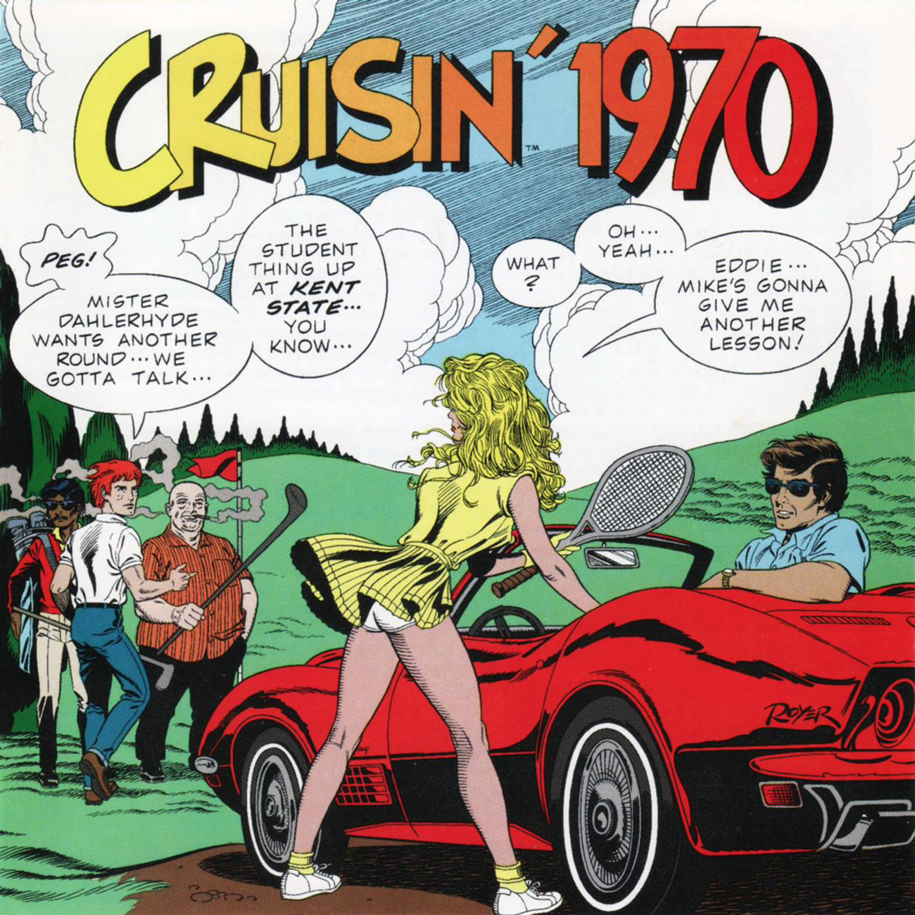
MR: 1970: “Mike’s gonna give me another lesson”. I put myself in there, uh… idealized.
WOT: (laughs) So that’s what it is, then?
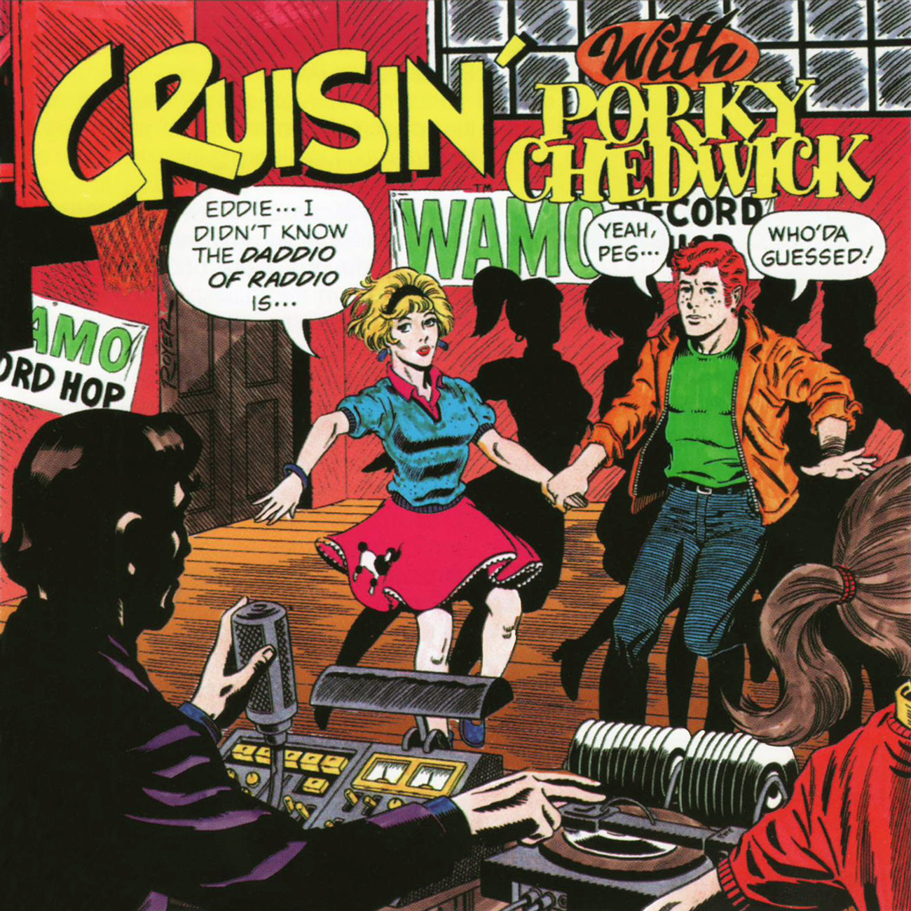
MR: And then there’s the Porky Chedwick, and somewhere in here… the Cruisin’ boxes. Whoa! There are… three of them.
WOT: What are they?
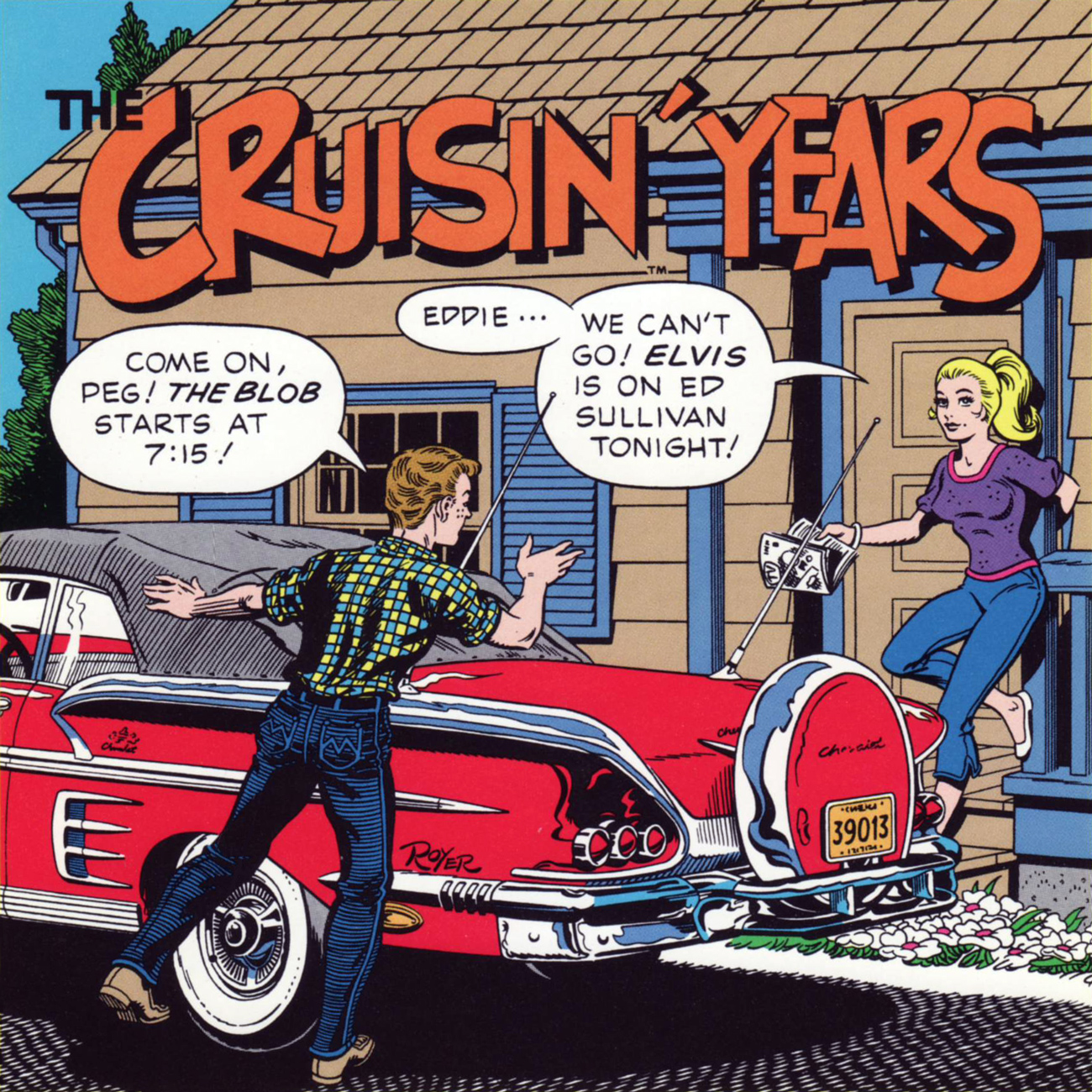
MR: The first box set has ’55, ’56 and ’57, and has the Cruisin’ Years cover, with the Peg and Eddie photographs, and the scrapbook, and the concert tickets and so on. The next one is ’58, ’59 and ’60, and that one is, Eddie is next to his Chevrolet with the tire kit on the bumper, and he goes “Come on, Peg! The Blob starts at 7:15!” “Eddie… we can’t go! Elvis is on Ed Sullivan tonight!”
WOT: Poor girl’s chained to her TV!
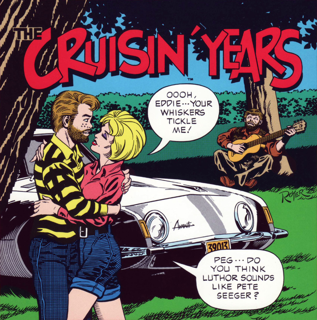
MR: And the last box set was ’61, ’62 and ’63, and Eddie’s got the beard that he’s wearing in the college one, and Luthor’s leaning against a tree, and she says: “Oooh, Eddie… your whiskers tickle me!” and he says: “Peg… do you think Luthor sounds like Pete Seeger?”
WOT: These two were always moving in separate directions.
MR: Always! And so I wrote ’68, ’69, ’70, The Cruisin’ Years, and Porky Chedwick. And if I could the long box artwork, and one of the last ones I did, which I believe was gonna be another Cruisin’ Years, and it’s probably the sexiest Peg I ever did…
WOT: Aw…
MR: It’s Peg and Eddie… oh my God… *two* of them. I might have done another big box, because they’re at the beach, she’s in a bikini, and it’s another tension-filled thing…
WOT: Her bikini?
MR: Oh, he’s saying: “Who’s this Buchanan the third?“, so that fits in the chronology somewhere. And the last one would precede their wedding, it’s where they’re on a bridge, in New York City, it’s a big closeup, they’re dressed to the nines, he’s in… could have been a tux, she’s in a sexy evening gown. And leaning on the rail, exposing her… attributes. The program was for a big Broadway hit of ’69, and he’s got his finger under his collar, kinda saying something to the effect of: “You know, Peg, there’s something I should have asked you… a long time ago“. It’s the proposal cover, you know.
Now I don’t know if that was ever produced. I also did another cover, which I know was not produced, and it was a Cruisin’ Christmas Album.
WOT: Whoa.
MR: And I actually drew my living room, in the house I had in Simi Valley [California] and Eddie, in his Santa Claus outfit is putting presents under the Christmas tree in the center of the room. And Peg is coming down the stairs in her sexy négligé, with her robe blowing open…
WOT: That’s his present.
MR: ’twas drafty in the house that night. And she’s got a plate, and she’s saying: “Oh, Santa… don’t forget your milk and cookies!” So it’s the only cover in the series without any tension.
WOT: Or the most tension, depending on how you look at it.
MR: I think we discussed doing ’71, but figured that there wasn’t enough happening that year to make an interesting cover, or the songs were too new in the late ’80s to get clearances or rights on them, you know.
WOT: Things have changed quite a bit… even the cd reissues are significantly different from the LPs. Reissuing certain pop-song heavy tv shows has proven quite a financial ordeal in some cases because of astronomical increases in the cost of music rights.
For that reason, the Cruisin’ LPs each have a few more songs than the cds, even if the opposite should be true, if only in terms of storage capacity.
MR: They lost rights, and stuff like that.
WOT: People didn’t know back then what was to come, obviously. The Cruisin’ series came out at just the perfect time, and I think it was quite visionary to decide to preserve, or recreate, what must have seemed at the time a very recent piece of the past.
MR: I wish that I had not given all of my vinyl discs to my first… son-in-law… and replaced them all with the CDs before I realized that there were the differences.
WOT: Not to mention the size of the artwork and quality of reproduction.
MR: Once the series was over, I sold Ron Jacobs all of the originals. And I kind of regret that in a way, because I could sell them for a lot more today than I did, in the early ’90s, to him.
WOT: Sigh. They’re heirlooms.
MR: I don’t know why I didn’t think to pull these things off the shelves and look at them before we talked.
WOT: Ah, it’s okay. In fact, it’s probably better: I got your spontaneous responses out of it.
MR: Actually.. overall, I’m more proud of them than I am disappointed. And the things that disappoint me, I can point out why and it doesn’t necessarily mean that it excuses the problems…
MR: Oh, and there was also a full-page ad… that was in Billboard. Peg and Eddie are sitting in the front seat of… probably a 1955 or 56, I think Ford convertible. I cannot remember.
WOT: On the contrary, you clearly remember plenty! (laughs)
MR: I’ve got it somewhere out in the garage, in one of the custom filing cabinets I had made that I call “Mike’s Life in a File Cabinet“.
The ad in question, from the July 11, 1970 issue of Billboard Magazine. Make a wish!
WOT: I think that I think this series is a great artistic success. When people see these volumes individually, they work as snapshots… but put them together, and you realize that there’s so much happening between the panels.
MR: Yeah, it does tell a story!
WOT: It’s beautiful storytelling, and I think, one of your crowning achievements.
MR: You know, it’s funny: the early covers were put into two books. The first one was a… I don’t know if it was a hardcover, it was a oversized, glossy trade paperback called The Album Cover Album [original edition 1977], and it says: “Paul Gruwell, art director, art by Mike Noyer“.
WOT: Oh, lovely. They got one name right.
MR: And the second book they were in, which I didn’t bother to buy, because all they listed was the Art Director. I wasn’t even listed.
WOT: This kind of thing, which I’ve noticed also, is what prompted me to get in touch with you. And I think we’ve done our bit here to help set the record straight. Thank you so much, Mr. Royer!
MR: You’re welcome, Richard. Have a great day!
WOT: You’ve certainly done your part in it!
Read the liner notes, or hear Cruisin’ 1967 in its entirety here!
Read the liner notes, or hear Cruisin’ 1968 in its entirety here!
Read the liner notes, or hear Cruisin’ 1969 in its entirety here!
Read the liner notes, it’ll have to do for now; regrettably, Cruisin’ 1970 isn’t currently available on YouTube! What is this world coming to?
At this time, Cruisin’ With Porky Chedwick would appear to be the final entry in the series (1995). Listen to the whole platter right here.
Aliens inevitably have tentacles. It’s a simple fact of life for any space explorer. Although I’m sure you wouldn’t dream of doubting my words, here are a few exhibits for your pleasure.
We’ll start off with a tentacle bonanza! This is what happens when you cross an octopus with a centipede.
Spaceman no. 6 (July 1954), cover by always-enjoyable Joe Maneely. “Speed Carter, Spaceman” only lasted six issues, which is unfortunate – the stories are a lot of fun, with great art and intelligent-but-humorous scripts.
When “plant creatures” (who look remarkably like toothy goldfish) gone berserk deploy their tentacles to strangle you – in space, no less – , it must be Tentacle Tuesday.
Space Family Robinson Lost in Space no. 30 ( Gold Key Comics, October 1968). Cover by George Wilson, whose paintings are usually quite well executed (and this is no exception). The tentacle story, titled “Attack of the Plant Creatures”, is scripted by Gaylord Dubois and illustrated by Dan Spiegle. Incidentally, Space Family Robinson was an original science-fiction comic by Gold Key, and predates the Lost in Space TV series.
Seriously, who keeps stranding these vicious octopuses in space?
Space Ace no. 5 (1952, Magazine Enterprises), cover by Dick Ayers. I like these elegant space suits of the 50s, where naught but a small glass bubble and a tiny tank provided all the air one might need, and the costumes were tight enough to show off the guy’s muscles. The tentacle wrapped around the astronaut’s leg looks severed.
Just watch Solar-Brain nimbly dismantle an expensive piece of machinery with its tentacles. Tsk, tsk. These panels are from “The Living Gun”, a story from Metal Men no. 7 (April-May 1964) written by Robert Kanigher, pencilled by Ross Andru and inked by Mike Esposito.
Since I like pointing things like that out, please note that all the plot points of “The Living Gun” that concern Platinum (the only girl on the team) are fucking inane. She gets jealous when Doc Magnus is wooed by a beautiful model; participates in a beauty pageant while everybody else continues with their scientific research; attacks her team-mates when she’s disqualified from the pageant for not being human; quits the Metal Men in a huff and barely makes it into the epic battle pitting Magnus and his Metal Men against the murderous, power-grabbing Solar Brain. Girls will be girls… at least when a certain writer with the initials R.K. is around.
I’m reading a play by Anton Chekhov these days. What relevance does this have to comics? Let me explain. I don’t know about the so-called « mysterious Russian soul », but this particular play is histrionic. And the chief cause of drama, of course, is love. One woman tries to poison herself upon discovering her husband has a mistress and is preparing to run off with yet another man’s wife; others literally crawl around while trying to convince the rascal they’ve fallen in love with to condescend to granting them a small sign of affection; small children are threatened with deadly diseases; men launch into hair-tearing monologues, intermittently planning suicide or murder but never actually getting around to it; money is borrowed, and is immediately tossed in the air, friendships are shattered, insults are hurled and then profuse apologies proffered… and everybody, and I do mean everybody, goes hysterical.
Which brings us to Golden Age romance comics. Ha!
I’m not intending to suggest that *all* of them are ridiculously over the top. However, a lot of them are plotted like your average soaper – understandably, as these stories were written with a drama-hungry, lovelorn audience in mind. « Boy meets girl, everything goes well, they’re happy together » is not the kind of thing that moves copies.
Here’s a selection of covers I really like (for various reasons), depicting some common situations in a young woman’s life – like getting back-stabbed or pawed or pregnant while dreaming of some Perfect Love.
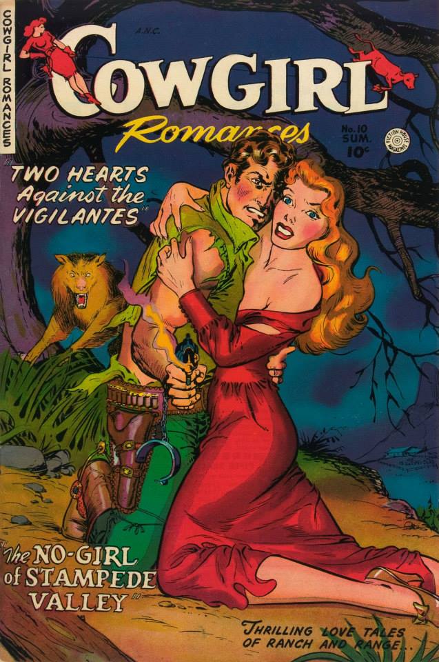
Some gals don’t merely have to contend with vigilantes, but also wolves (of the animal *and* human varieties).
Cowgirl Romances no. 10 (1950, Fiction House). Cowgirl Romances lasted for 12 issues, and usually featured strong heroines capable of defending themselves… although this one looks like she might need a bit of help. Read it here.
Oh, never mind – she doesn’t need help after all. It’s a refreshing change from women who stand by doing nothing while their loved one gets pummelled… or try to help and end up conking the wrong man.
Speaking of wolves, we have this cozy scene with distinctly creepy overtones. Anytime someone mentions an “experienced man”, run the other way.
A Moon, a Girl…Romance no. 11 (January-February 1950, EC). Cover by Al Feldstein.
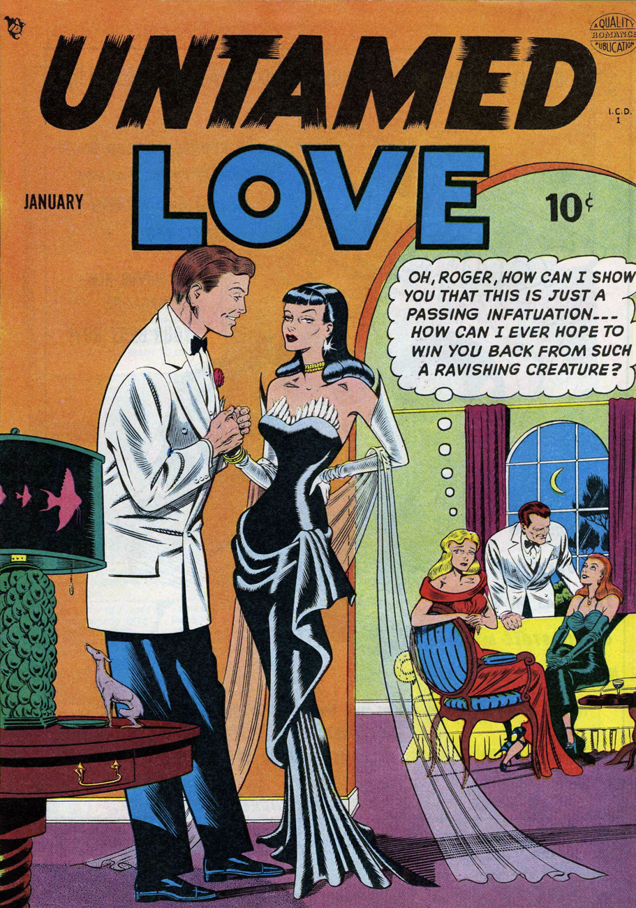
“Julie fought, but now she fought as much against her own hungry response as against his muscles. Try as she would, she could not keep herself from returning that kiss with all the fiery ardor of her wild loneliness.” Untamed Love is quite racy, as the title promises, and as much over-the-top as one could wish for. The cover story is about an evil seductress, but the rest of the tales all concern themselves with a love triangle of another kind, one in which a girl has to choose between two guys. This one’s for the ladies – it’s hunks galore!
Untamed Love no. 1 (January 1950, Quality Comics). Cover by Bill Ward. “Scary” comes to mind more than “ravishing”! Read the issue here.
Here’s the “ravishing creature” in action, in case you’re interested:
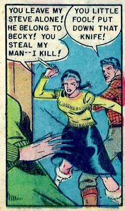
Alaskan beauties don’t understand English grammar, but they dig the language of love! Panel from “The Wrong Road to Love”: “Julie falls in love with truck driver Steve, but he moves to Alaska to become a fisherman. She follows him there, only to discover local resident Becky considers Steve “her man.” Julie is consoled by Steve’s partner Hank. Steve and Becky run off, taking all the money Steve and Hank have earned. Julie decides to go home, but Hank says she can stay — as his wife.”
Another sentimental overload (though one would think that being at war was dramatic enough)? The redhead in the square on the right is in love with a gay man! (She was in love with a man’s fiancé, after all.) The girl at the dance is struggling to get away from a grabby asshole! (Unfortunately, all-too-common even today.) The girl in the green dress is faking it because she’s too polite to say no! (Ditto.)
Wartime Romances no. 10 (October 1952, cover by Matt Baker).
“They were like two jailers, my pa and my brother Bill! At 18, I hadn’t tasted the sweetness of courtin’! And I was hungry for it… bitter hungry…” Things quickly get out of hand in this issue of First Love – a young maiden meets a charming young man who kills her brother (by accident), after which she gets shot by her dad (also by accident). The story concludes with the two lovebirds reuniting while the father realizes that “his soul is black with sin“. Geez, the things some people have to go through to reach a happy ending in a comic story.
First Love Illustrated no. 34, 1953. Read the issue here.
This issue has plenty more “man-starved” maidens up for grabs…
Panel from “Bad Girl”, illustrated by John Prentice.
… and one memorable male character, Alan, “the gay, vital, gloriously-alive lover”.
Page from “My Heart Cried Out”, pencils by John Giunta, inks by Manny Stallman.
The next cover reminds us to never send our dates for refreshments (punch, you say? looks more like something out of a witch’s cauldron), for this is where femmes fatales lurk in hopes of snaring fresh prey.
My Own Romance no. 26 (January 1953, Marvel). The irresistible team-up of two comic-field professionals who would later become terrible Archie artists: Al Hartley (art) and Stan Goldberg (colours). Is that teacup floating in her hand or what?
Pictorial Romances no. 19 (May 1953, St. John). Cover by Matt Baker. Read the issue here. If I had to recommend only one issue out of today’s roster, it would be this one: there’s nice art, and the stories are actually detailed and interesting, and even boast a certain internal logic.
It’s important to know the difference in different tinned meats. Art by Matt Baker.
If you want a lover who doesn’t resist, put her in a trance, first, and then Miss Smith won’t be able to help but say “yes!”
Lovers no. 50 (June 1953, Atlas). This, again, is the handiwork of those two buffoons, Hartley and Goldberg. Look, she’s still holding the chloroform-dosed handkerchief he used to knock her out!
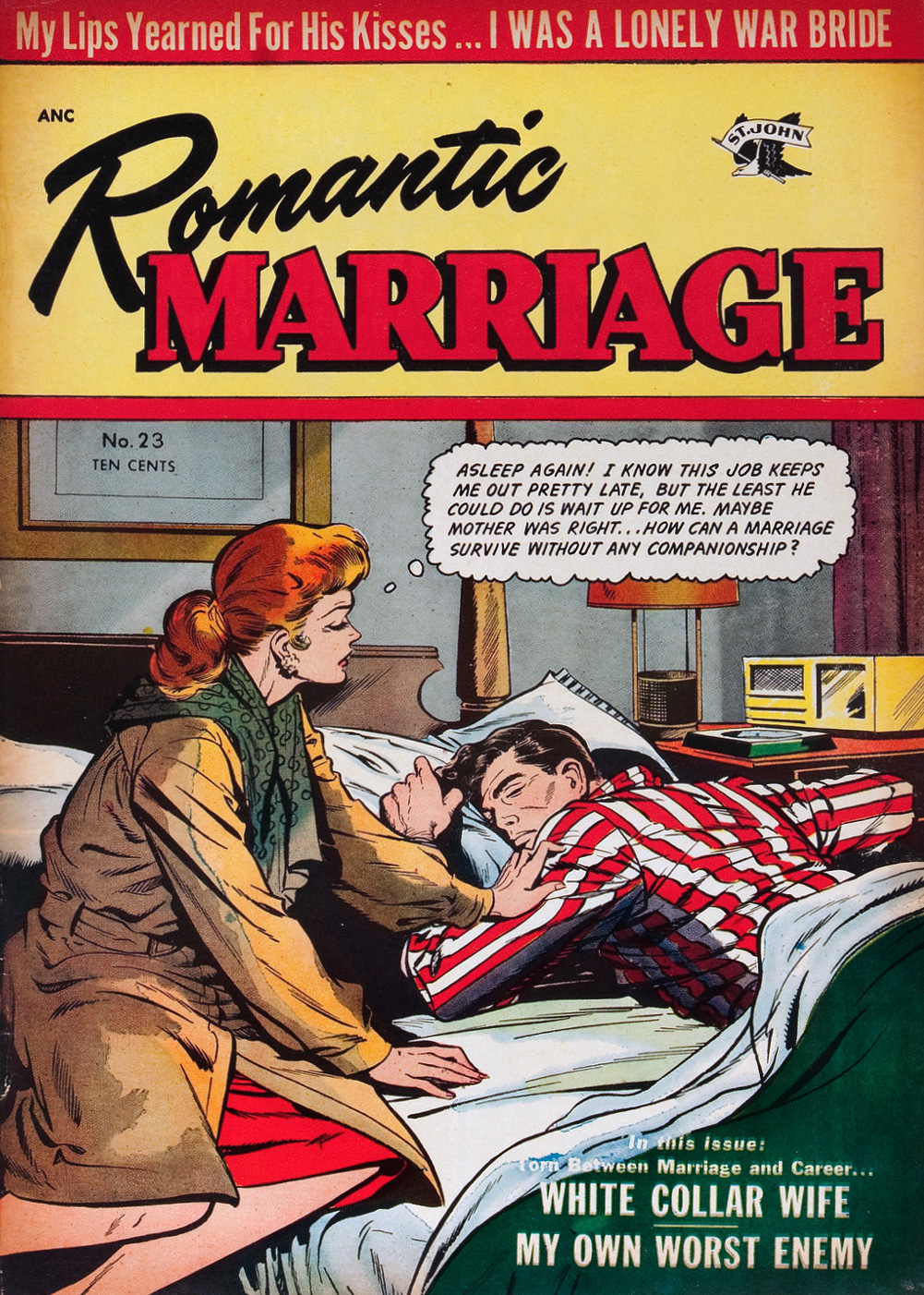
Romance comics love to pit a woman’s career against everything a female should strive for (i.e. marriage). Am I carping that romance comics weren’t very progressive in the 1950s? Ah, I wouldn’t be, if I didn’t know for a fact that Silver Age romance comics often don’t do that much better in that department.
Romantic Marriage no. 23 (July 1954, St. John), cover by Matt Baker. “Companionship”, eh? Read the issue here.
What do we have here? Despite what one would tend to think, this necklace was stolen, not given as a romantic offering. Such are true life secrets: kleptomania, clandestine children, and double-crossed partners.
True Life Secrets no. 25 (March 1955, Charlton). Read the issue here.