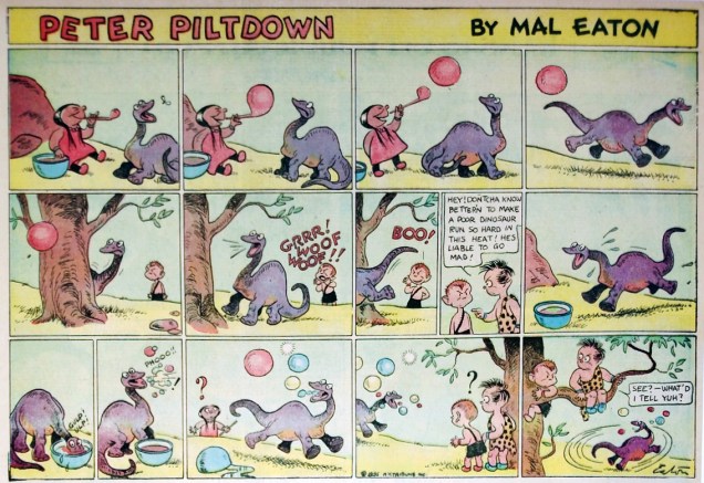
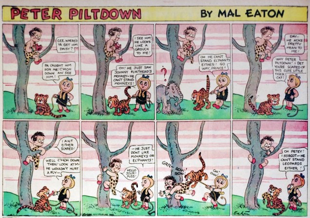
Newspaper strip Peter Piltdown was created by Mal Eaton (1902-1974) and debuted as a Sunday page on August 4th, 1935. Featuring a mischievous boy getting into trouble in some sort of prehistoric world (with a lot of indispensable modern conveniences – like earmuffs!), the strip seems to have lasted for quite a while, until the late 1960s. The reason I say “seems” is because not much is known about Eaton *or* the strip. With some difficulty I managed to find out that Malcolm Eaton was based in New York.
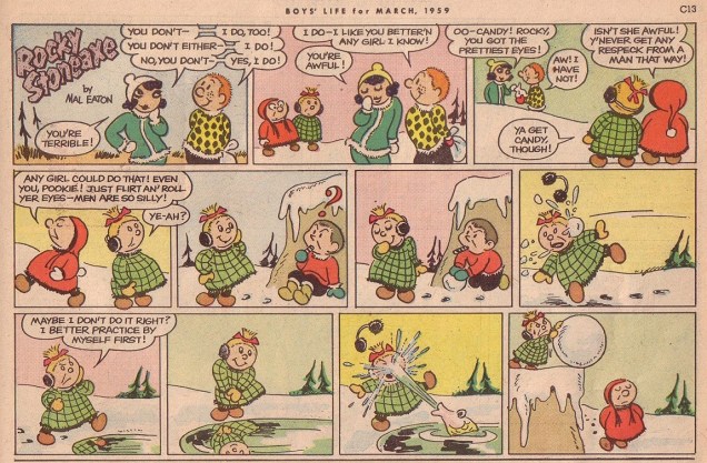
It doesn’t help that the strip changed titles several times. Starting out as Peter Piltdown, syndicated by Miller Services (a small Canadian newspaper syndicate that has since then been renamed into Canadian Artists Syndicate), it appeared as Pookie (Peter’s younger brother, whose antics had taken over the strip) in 1947 and 1948, and then migrated to the pages of Boys’ Life magazine as Rocky Stoneaxe.
Some comics are buried by the collective memory through sheer bad luck, some are rightly forgotten because they weren’t that good. It’s always exciting to unearth something obscure, but one has to ask if this excitement is justified, or whether whatever artifact of the past one has dug up is thrilling only because of a “I know what you don’t!” kind of show-off-manship. I do think Peter Piltdown is genuinely good. The art is manic – and dynamic – in a way that’s spontaneous and appealing. Eaton clearly liked to draw animals; they’re often a big part of the punch line, and they’re drawn lovingly, with great attention to detail and body language. Anyway, you be the judge!
From the small sample that’s findable online, I’d say that the period around the 1940s is the best; the art gets simpler later on. Here’s a selection of strips that I’ve succeeded in finding (and cleaned up somewhat) – they are in chronological order starting from 1943 and going up to 1959. Most of these are original art: three images are from the collection of gallery owner Rob Stolzer (the first two, as well as the Sunday strip in colour); the rest have been found on Heritage Auctions. The last three are scans from a newspaper.
« No other state of confusion is as interesting as yours. »
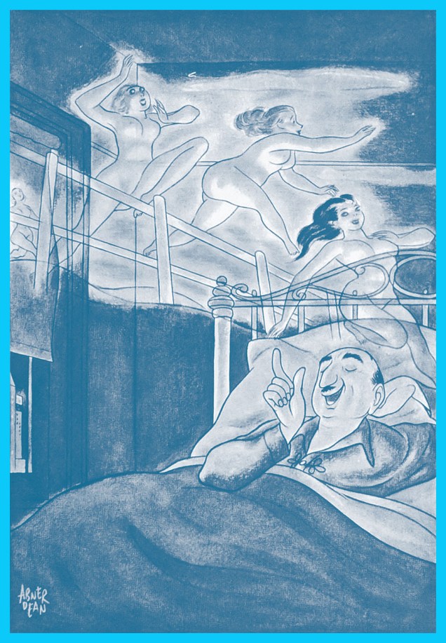
By the mid-1930s, Abner Dean (1910–1982), né Abner Epstein in New York City, had reached the pinnacle of his profession, and begun to make rewarding inroads into other pursuits and endeavours. Fruitfully and prolifically published in most of the top magazines of the era (and top era for magazines), such as The New Yorker, Life, Esquire, Coronet, Time, Newsweek, Collier’s, Look, Ladies’ Home Journal and so forth, he’d also scored in the advertising field (most notably through a fifteen-year association with Aetna Insurance).
Yet he was restless; he bristled at the limitations, conventions and formulae of the era’s gag cartooning world and had something grander in mind and up his sleeve. We’ll get to that.
But first, here’s a sampling of what Abner accomplished as a commercial illustrator and cartoonist early in his career.
The following four cartoons appeared in the pages of Esquire, for which Dean produced in excess of forty colour cartoons, and scads more in good old black and white (frequently with spot colour adornment) between 1934 and 1955.Spot the influence? The girl is a dead ringer for one of Jack Cole‘s celebrated beauties.
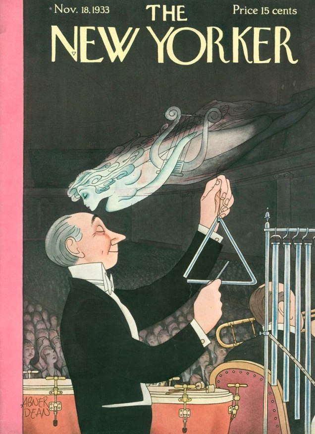
As Abner created five covers for The New Yorker (1933-35), it seemed absurd to leave any of them out, especially given their high calibre. Here they are, in order of their appearance.
Two examples of Dean’s illustrations for Aetna Insurance‘s long-running advertising and prevention campaign, for which Dean produced a whopping one hundred and ten drawings between 1940 and 1955. This one hails from 1946.To better convey the tone and tenor of the campaign, I’ve transcribed some of its text. This entry is from 1955.Our boy, wearing an appropriately skeptical expression, from the back cover of his Come As You Are (1955, Simon & Schuster).
Incidentally, what little remains publicly known about this once-famous man is the fruit of diligent research conducted by the eclectically erudite Ken Parille. As usual, we stand on the shoulders of giants. Thank you!
Today’s Tentacle Tuesday delves into William Gaines’ EC and the glorious 50s (well, glorious for *some* things, at any rate). “Weird”, you say? Why, weird simply must include tentacles!
It’s a mixed bag: those of you who dislike Al Feldstein (and I know my co-admin RG would raise his hand readily) may be terribly annoyed by this post, but patience, my friends! there’s a lot of Wally Wood (a Tentacle Tuesday master, by the way!) in here, too, and who in their right mind would admit to detesting Wally Wood?
(As for myself, in case somebody is wondering, I like Feldstein’s artwork just fine.)
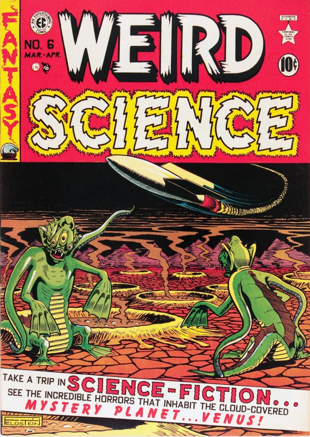
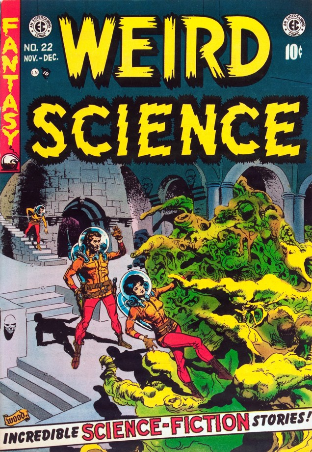
Weird Science no. 6 (March-April 1951). Cover by Al Feldstein.
« EC’s flaws are pretty obvious: even when the artists were striving for greater seriousness than the ironic gore of the horror stories or the outrageous early sci-fi plots or even the clever but predictable crime and suspense stories, the writing was often overwrought, prolix, and ham-fisted, and the artists were straightjacketed by EC’s rigid visual grid. They were Entertaining Comics first and foremost, but they also seemed compelled to break out of their commercial formulas, however finely realized, and publish stories that were fiercely honest, politically adversarial, visually masterful, and occasionally formally innovative…» (source: Gary Groth’s Entertaining Comics)
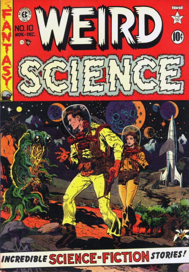
Weird Science no. 10 (November-December 1951), art by Wally Wood.Weird Fantasy no. 15 (Sept-Oct 1952). Cover by Al Feldstein. The best cover that Feldstein has ever drawn? Quizás, quizás, quizás! The monster is doing a traditional Slavic dance, I think.
« While [Feldstein was] freer than most writers of his era to indulge his fantasies, he was also more punitive toward the characters who acted them out. John Updike tormented adulterers with depression and guilt. Feldstein lopped off their heads or burnt them alive. If they received a scarlet letter, it was branded on their flesh. In real life, sexual misbehavior might have cost one alimony. Feldstein made Shahira law seem like Thomas Jefferson had drafted it. Feldstein reflected a society which, while fascinated by sex, was terrified or ashamed of this fascination. » (source: Bob Levin in Let Us Now Praise Al Feldstein)
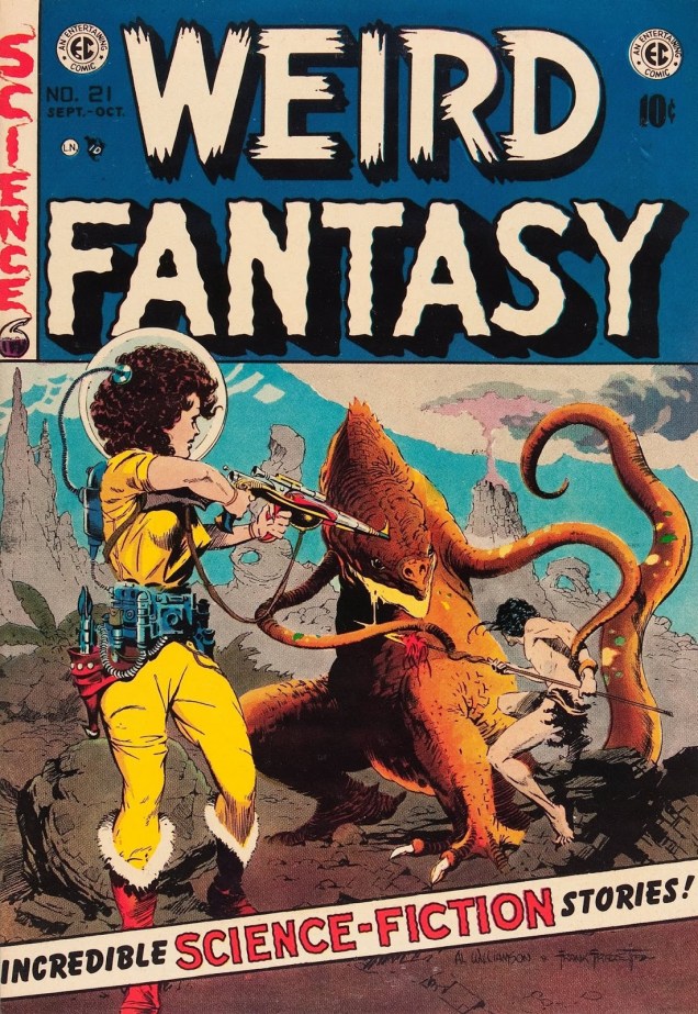
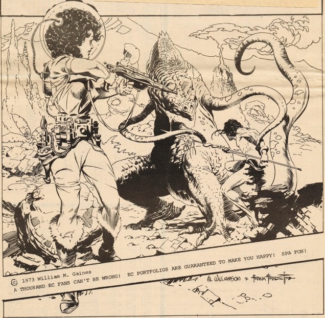
Weird Science-Fantasy Annual no. 1 (1952), art by Al Feldstein.Weird Fantasy no. 21 (Sept-Oct 1953). Cover by Al Williamson and Frank Frazetta.
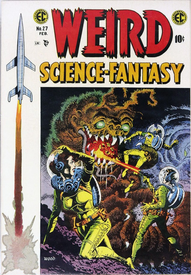
Weird Science no. 22 (November-December 1953), cover by Wally Wood.Detail from the title story, “My World”, scripted by Al Feldstein and drawn by Wally Wood. You can read the story over at Mars Will Send No More.Weird Science-Fantasy no. 27 (January-February 1955), art by Wally Wood.
« In YOUNG LOVE, how can people talk when they kiss? My mom can’t talk when she’s kissing. Can you? I am nine years old. » — Mary K, an astute young reader
It’s recently occurred to me that, in a year-and-a-half of posting, I’ve utterly neglected to feature one of my favourite artists, Nick Cardy (1920-2013); I suppose he’s been easy to take for granted, as he was DC’s main cover artist during most of Carmine Infantino‘s management years (1967-1976).
Much has been made, in various forums, of Cardy’s covers for Aquaman, the Superman titles, The Teen Titans, the Mystery books, and so on. I figured I’d have to dig a bit deeper. Cardy, ex aequo with the even more underappreciated Bob Oksner, was arguably DC’s primo portrayer of feminine pulchritude, and what I’d seen of his artwork for DC’s romance line was pretty stunning. It just turned out that there was far less of it than I had assumed.
DC’s romance books were sadly treated as the proverbial Siberia of the company’s roster. How else might one explain calling upon top illustrative talent, the likes of Jay Scott Pike, John Rosenberger, Ric Estrada, Werner Roth … then taking these fine men’s work and slathering it with wall-to-wall Vince Colletta… finishes. We’ll return to this topic, naturally. This time around, we’ll showcase the sentimental side of Mr. Cardy. He seems to have produced fewer than thirty covers for the romance line (not counting a handful of gothics he did), of which I’ve retained an even dozen. I’m reserving a handful for an eventual thematic post, plus one that Colletta “fixed” (in the criminal, rather than useful, sense.)
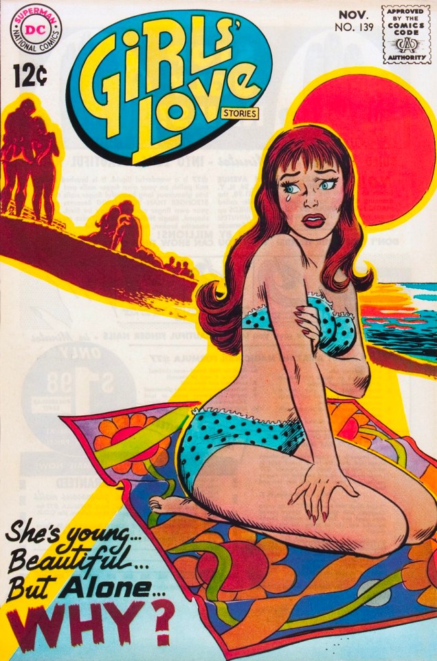
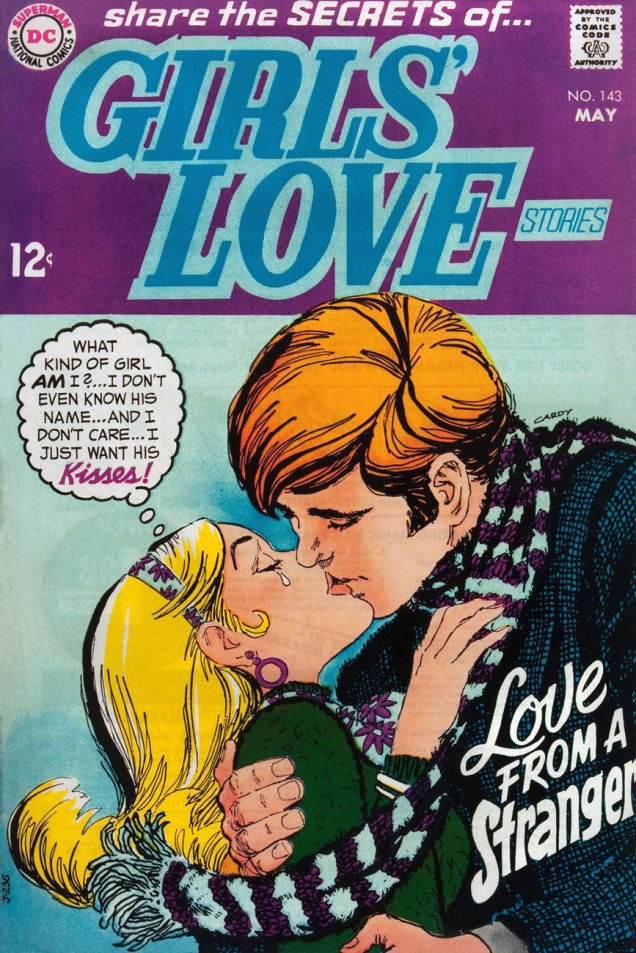
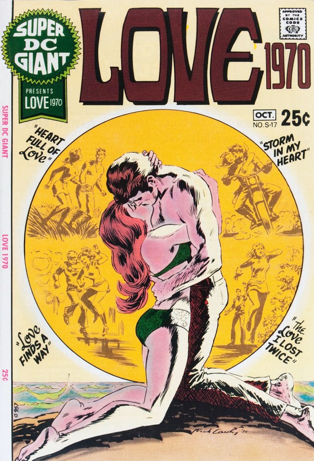
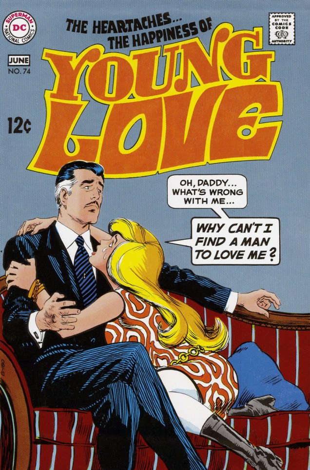
Falling in Loveno. 115 (Feb. 1970), edited by Murray Boltinoff.Falling in Loveno. 119 (Nov. 1970), edited by Murray Boltinoff. Something tells me Mr. Older Generation is holding a pipe off-panel.« Goodbye, and as my sister once said, good riddance! » This great Nick Cardy cover puts an attractive spin on an issue unfortunately marred by the omnipresent and indigestible Vinnie Colletta sauce over half the stories. Poor Ric Estrada and Werner Roth! Girls’ Romances enjoyed a healthy 160-issue run from 1950 and 1971. This is number 144 (Oct. 1969).« Rumors are carried by haters, spread by fools and accepted by idiots. » – Unknown purveyor of sage quips – This is Girls’ Love Stories no. 139 (Nov. 1968) Edited by Jack Miller. Inside: The Only Man for Me, illustrated by Ric Estrada, How Could He Stop Loving Me?, by Tony Abruzzo, a Mad Mad Modes for Moderns from Jay Scott Pike, a reprint from 1963, Kiss Me If You Dare, by John Romita, Sr. and Bernard Sachs, and our cover story, She’s Young, Beautiful–and Alone! … Why?, illustrated by John Rosenberger.Girls’ Love Stories no. 143 (May 1969), edited by Joe Orlando, who couldn’t be less suited to the genre. Cover wise, it’s not everyone’s cup of tea, I suppose, but I adore Cardy’s expressive, roughly organic inks. Still totally in control!Girls’ Love Stories no. 148 (Jan. 1970), edited by Joe Orlando.Girls’ Love Stories no. 151 (May, 1971), edited by Joe Orlando.Interesting, given that these were the prime days of women’s lib, how little actual sisterhood was in evidence in these comics. Too many *male* cooks, surely. Girls’ Romances no. 147 (Mar. 1970), edited by Murray Boltinoff. Carmine Infantino‘s fingerprints are all over this particular layout… which is more than fine: he’s a master.This is Super DC Giant no. S-17 (Sept.-Oct. 1970), “edited” by Dick Giordano. Despite comprising nothing but crappy reprints, the scarce item will cost you a pretty penny if you can find it in decent condition. Here’s its only worthy selling point, Mr. Cardy’s cover, of course.Talk about a question that provides its own answer… this is Young Love no. 74 (May-June, 1969). Edited by Dick Giordano (who lost the bet that month). Cardy’s Alex Toth-ish side rises to the surface.Young Romance no. 157 (Dec. 1968 – Jan. 1969), edited by Joe Orlando. Never was the “Have a Fling With…” tag more appropriate… and more disturbing. « Oh, Ann-Margret‘s your mom? »Young Romance no. 163 (Dec. 1969 – Jan. 1970), edited by Joe Orlando. YR, as you may know, was the original romance comic book, created way back in 1947 by Joe Simon and Jack Kirby. Things improved near the end of the series’ run, when Simon briefly returned to ride it into the sunset.
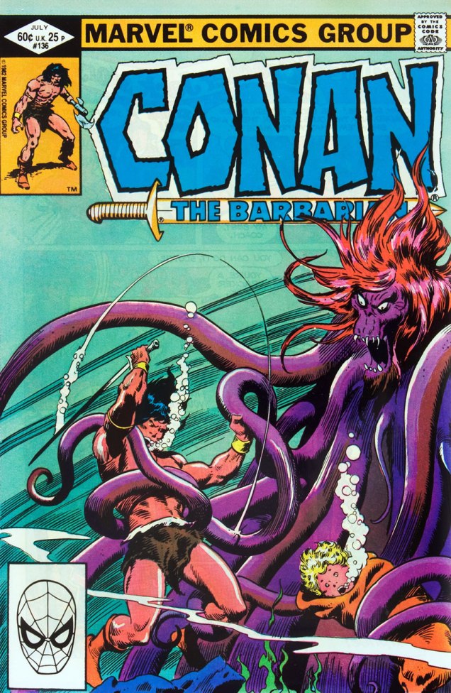
There’s some sort of Conan-mania around these parts. I’ve never understood the fascination with the Barbarian Hero (associated terms, in case you go barbarian-spotting: loin cloths or Pelts of the Barbarian, taut rippling muscles, oiled back, impressive weapons, the beard of a grizzly bear – or inexplicably clean-shaven at all times – and glorious manly manes), but clearly others go for sword-and-sorcery stuff in a big way. Conan sure puts the ‘sword’ in… err… well, he puts the sword into *everything*, slashing, hacking and dismembering his way through tedious comic after tedious comic.
He also runs into tentacled monsters, like, every 5 seconds. It seems that whatever tentacles existed in the Hyborian Age, they all made a point of appearing in concentrated clusters in whatever geographical area Conan was passing through. I understand, it’s difficult to come up with a decent monster for an Epic Fight Scene every month. Tentacles were clearly Plan B for days when nothing more exciting came to mind.
I’ve actually skipped some Tentacle Tuesday-relevant covers of this Conan the Barbarian series (275 issues published between October 1970 and December 1993) because they were just too ugly… or too boring. Can you imagine a cover with tentacles on it that’s boring?! Well, I can, now.
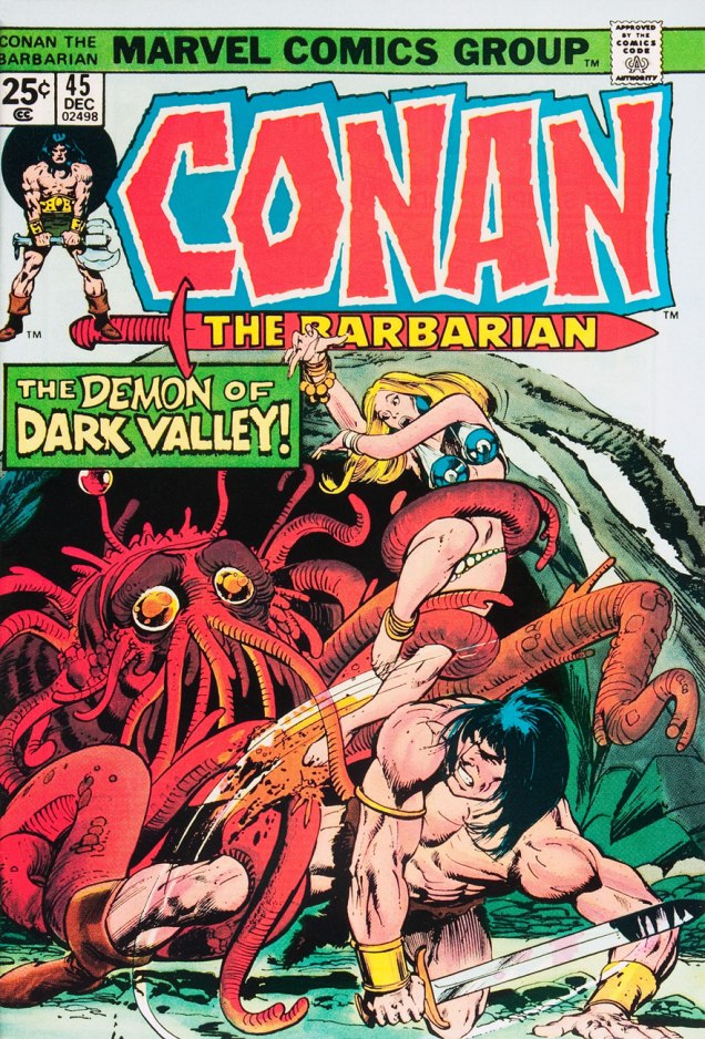
Conan the Barbarian#25 (April 1973), penciled by Gil Kane and inked by Ralph Reese. I actually sort-of like this cover. Nice totems!Conan the Barbarian #32 (November 1973), penciled by Gil Kane and inked by Ernie Chan. “Give the woman tentacles, but make sure she has huge boobs, too. And make them flesh-coloured, otherwise it’s too weird. And give her fangs because she’s also a vampire.“Conan the Barbarian #41 (August 1974), penciled by Gil Kane and John Romita (?), inked by Ernie Chan and John Romita. Conan the Barbarian #45 (December 1974), penciled by Gil Kane and inked by Neal Adams. What a cutie! I bet he was just minding his own business in a cave when he was rudely interrupted by Conan and his blondie.Conan the Barbarian #86 (May 1978), art by John Buscema. Conan the Barbarian #116 (November 1980), penciled by John Buscema and inked by Klaus Janson; the latter information has been suggested by co-admin RG, whose artistic eye I unreservedly trust. To quote him directly: «another misattribution from the GDC. They think it’s Neal Adams inking, toss in Dick Giordano’s name to try and explain away the too-thick-for-Adams lines, and still get it wrong. Giordano’s inking is sloppy and random, never ‘organic’. This, despite clearly being a rush job, isn’t botched. The main inker: Klaus Janson, then-member of Adams’ Crusty Bunkers, and an inker with a very distinctive style. Dead giveaway, if you need just one: Conan’s left boot, bottom right corner. It’s likely a group effort, but there’s no trace of Adams nor Giordano on this page. Adams does pop up later, mostly inking Conan faces and some figures.» See how hard we work to bring you not only entertainment, but also edification?« Is that you, Conan? » Conan the Barbarian #117 (December 1980), art by John Buscema. Why is Spidey’s face in the bottom left corner?* Everyone looks half-hearted on this cover – the tentacles are only making a half-assed attempt at grabbery, Conan’s in the middle of some sort of intricate ballet footwork, and the girl seems a little bored. It’s not a good sign when I start reminiscing about the good old Gil Kane covers… I don’t even like Gil Kane (although I’m gradually warming up to him, I admit).Conan the Barbarian #136 (July 1982), art by John Buscema. I’m fascinated by the sword’s arc: what direction is it going in? From the bubbles, it’s a swing backwards, but why is the tentacle in the path of that art unaffected? And why is Conan swinging backwards? That child’s face is enough to give one nightmares.
In the mood for more Conan? Visit another Tentacle Tuesday entry, the Savagery of Conan’s Savage Sword, for a gallery of painted Conan covers, replete with mostly nude cuties and of course a great heaping helping of tentacles.
~ ds
*because it’s a direct sales edition, as opposed to a newsstand edition, which would bear a barcode.
« Won’t you have a little rest when they turn out the lights A nice cup of tea and you’ll be feeling alright Don’t fret, you’ll recover yet you’ll see So keep on sending dirty postcards back to me Back to me, back to me » — James Warren/The Korgis (1980)
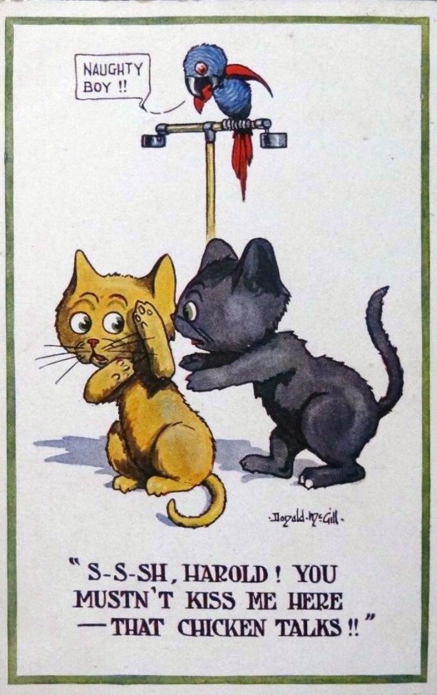
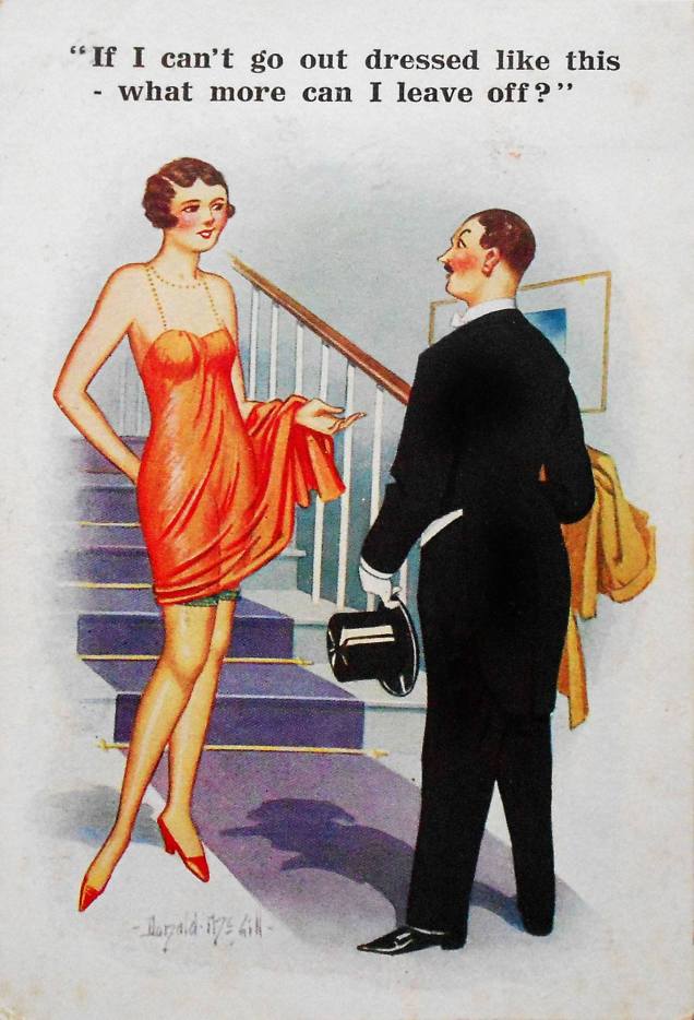
London-born Donald McGill (Donald Fraser Gould McGill, to be more precise, 1875-1962), was known for his risqué seaside postcards, sold mostly in souvenir shops in British coastal towns.
He painted the usual figures of fun in the noble tradition of British titillating humour: attractive young ladies, obese men, respectable drunks in the throes of a midlife crisis, cantankerous old ladies, religious personnel, courting couples (a lot of courting couples!), and so on. He painted well, he was prodigiously prolific… and he was not afraid of making jokes so off-colour they could possibly make a sailor blush. (I only have a vague idea of what sailors were like back then, you see.)
McGill ranked his own work according to its vulgarity, classifying it into “mild, medium and strong”. It goes without saying that the “strong” category sold in far greater numbers! Unfortunately (but not surprisingly), McGill’s postcards got him into trouble with upholders of the Moral Good (spoilsports!), culminating with McGill being dragged into court in 1954, when he was almost 80, for breaking the Obscene Publications Act of 1857. The result of this hearing was a hefty fine for McGill, and disaster for the companies producing saucy postcards, with several smaller companies going bankrupt as sales plummeted, cards were destroyed and retailers cancelled orders.
McGill very much died in the saddle: he continued to work until his death in 1962 (and with cartoons for 1963 already prepared). He certainly recycled some jokes, but I think it’s safe to say that he was not about to run out of material. The “king of the saucy postcard” is estimated to have produced around 12 thousand (!) paintings during his career, resulting in the sale of around 200 million postcards… and no royalties for McGill, mind, just his earnings of three guineas per design.
These days, he’s credited with an astute power of social observation and impressive artistic skill. He’s worthy of that praise, but what touches me most is that McGill gave people who surely needed some cheer in their lives a reason to smile, giggle and perhaps even daydream. Hell, some of these postcards made *me* daydream.
Okay, enough theoretical discussion! On to the indecency. I’ve roughly sorted these out by degree of (increasing) “vulgarity”. I honestly didn’t think the jokes would go beyond the “not indecent, but suggestive as hell” category, as per a definition my college best friend coined for something else altogether, yet some of them make surprisingly direct references. Isn’t it lovely to know that our great-grandmothers had their minds in the gutter, too?
In the category of “social commentary”.
I can’t decide whether this is just sweet and innocent or makes a reference to something far more lewd.
This particular postcard holds the world record for selling the most copies (a little over 6 million).
« McGill’s family was steadfastly respectable. He said of his two daughters: ‘They ran like stags whenever they passed a comic postcard shop.’ »
You can also take a gander at some sketches, which were unearthed in someone’s attic in 2015. As the article explains, « drawings feature fat old ladies, big busted women and lusty men. » While you’re at it, brush up on your Brit slang for the bedroom (entirely unnecessary for the current post, but fun!)
« There’s no room for professional jealousy around the graveyard, chums… life is too short, as they say… but what comes after that short life may stretch into all eternity! »
I could carry on endlessly (or so it would seem) on any number of obscure topics, but it’s healthy, every once in a while, to take a deep breath, empty one’s mind of its flotsam and jetsam, and reach for an old favourite.
I hadn’t yet written anything about Steve Ditko‘s passing, as I figured it would get lost in the mad shuffle of tributes. That base was well-covered. Still, while I’d known all along the day would come, it was hard to imagine a world without that reclusive genius, likely my very first artistic inspiration.
I didn’t see much of Ditko’s 60s Marvel work until the late 70s pocket book reprints (the period equivalent of watching a movie on one’s cellphone), but the Charlton ghost books grabbed me at a tender age. And so…
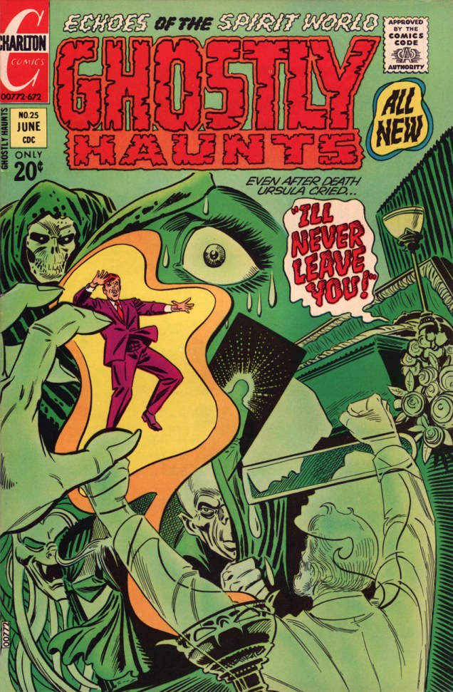
As my candidate for Steve Ditko’s finest cover run, at any company, I submit issues 22-27 and 29-30 (curse you for the interruption, Joe Staton!), from January 1972 to March 1973, final year of Ditko’s peak period, imho.
Ghostly Hauntsno. 22 (Jan. 1972), an excellently-balanced all-around winner, with the whimsical “Wh-Who’s in Th-There?” (w: Joe Gill p: Charles Nicholas i: Vince Alascia), “Witch’s Brew“, a taste of creepy suburbia with a whiff of Rosemary’s Baby brimstone (w: Joe Gill, p/i Pat Boyette) and our headliner, “The Night of the Lonely Man!” by Gill and Ditko. Read the whole pamphlet here, folks.Ghostly Hauntsno. 23 (Mar. 1972), offers two Gill-Ditko stories: “Treasure of the Tomb” and the cover-featured “Return Visit!“… and I’d be hard-pressed to pick the superior entry. The reader wins. Ah, you cast the deciding vote: read them both here.Ghostly Talesno. 24 (Apr. 1972), another strong issue, thanks to Gill and Boyette’s “The Other One!” and of course Ditko illustrating “A Man Who Was Here“, Joe Gill’s parable about a Tennessee mountain man displaced, but not entirely, by the construction of a modern superhighway. Read the entire issue here, ladies and gentlemen.« The butler’s a real monster! » Ghostly Talesno. 25 (June 1972) is where Mr. Ditko demonstrates his unmatched virtuosity in the delicate task of incorporating several elements of a tale without winding up with the dog’s breakfast. Compositional alchemy of the highest order! The cover tale aside, Joe Gill’s wonderfully-titled “What Will Lance Surprise Us with This Time?“, illustrated by Fred Himes, is loads of fun. Read “I’ll Never Leave You!” here.Roger C. Feeney, Indian Affairs bureaucrat from Washington, DC, appears to have stumbled onto the wrong sacred Hopi cave. Uh-oh, Roger, it appears you’ve been noticed by… something. This is Ghostly Hauntsno. 26 (Aug. 1972). Beyond the classy Ditko cover, it’s just an okay issue.« Why does it happen each year? Citizens of Trappton don’t know it, but it always begins right here… at an unmarked grave… » Presumably bearing no direct relation to the 1967 Michael Winner- Orson Welles – Oliver Reed film, “I’ll Never Forget What’s-His-Name“, the Gill-Ditko cover story is a classic, the tale of a forgotten man, Bertram Crumm, who merely wanted his existence recognized by the town that spurned him during his lifetime. It’s too bad Charlton only occasionally featured mystery host Dr. Graves in active (rather than narrative) roles, because when they did, the results were pretty gripping. Unusually, Graves guests outside his own book and in Winnie’s, and we find ourselves with a classic on our hands. This is Ghostly Hauntsno. 27 (Nov. 1972). Read the Gill-Ditko story here, but don’t miss the fabulously oddball “The Mine’s All Mine!” by Gill and Stan Asch, featured right here.« Maybe I’m going mad! I keep imagining I hear his voice! » Ghostly Hauntsno. 29 (Jan. 1973) features a striking (gold) exercise in fearful symmetry announcing the Joe Gill – Ditko saga of two untrustworthy acolytes in the Canadian North. Check out “Partners!” here.« Ugh! It’s really hideous! Is it a self-portrait of the real you?» We put the finishing touches on our tour of Steve Ditko covers from 1971-72 with Ghostly Hauntsno. 30‘s “Fear Has Three Dimensions” (Mar. 1973). Despite a theme right in Ditko’s wheelhouse, none of his art appears within; the cover feature is handled by Wally Wood disciple Wayne Howard, and the other tales are deftly told by Fred Himes and Warren Sattler.
That just about wraps it up. For further reading on the topic, I recommend you check out Ben Herman’s perspective on some of these very stories, and on Ditko’s spooky Charlton work of the 70s in general.
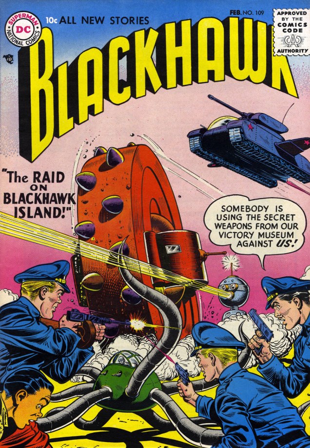
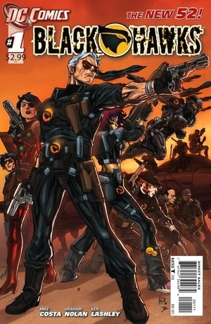
« Blackhawk is helpless! He’s being drawn up by that suction tentacle! »
When my co-admin learned that today’s Tentacle Tuesday is all about Blackhawk, he wanted the answer to an important question. Did I know who created the character? I did not. As some of our readers may be in the same boat, I’ll share what I gleaned.
Blackhawk, the leader of the Blackhawk Squadron, was supposed to have been created by Charles Nicholas ‘Chuck’ Cuidera with assistance from Bob Powell and Will Eisner. Why “supposed”? As with a lot of series that came into existence some 80 years ago (the first appearance of the Blackhawks Squadron was in a Quality Comics issue published from 1941! Holy crap!), and human memory and human’s desire for recognition being what they are, there’s a lot of squabbling about who actually did what.
« Will Eisner has at times been considered the characters’ primary creator, with Eisner himself acknowledging the contributions of Chuck Cuidera and writer Bob Powell. Over the years, Cuidera became increasingly vocal that he did much more work on Blackhawk than Eisner and that he had in fact already started creating the characters prior to joining Eisner’s studio. According to Cuidera, he and Powell fleshed out the concept, deciding on everything from names and nationalities, to the characters’ distinguishing traits, uniforms, and the aircraft they would fly. » |source|
In 1999, Eisner addressed his view of the matter during a Comic-Con panel:
« It’s not important who created it… it’s the guy who kept it going, and made something out if it that’s more important. Whether or not Chuck Cuidera created or thought of Blackhawk to begin with is unimportant. The fact that Chuck Cuidera made Blackhawk what it was is the important thing, and therefore, he should get the credit. »
To me, that sounds like yet another confirmation that Eisner was a really classy guy. At any rate, all we can say with certainty is that Eisner worked on early Blackhawk covers with Cuidera.
Oh, right, we’re here for the tentacles. The Blackhawks have fought a variety of bizarre war machines in their time (and by “bizarre”, I mostly mean preposterous). You can read quite a lot of the DC-published issues (up until no. 273) here, though I’d only recommend it for those of you who don’t mind *really* suspending disbelief while reading a story. If you’re one of those fuddy-duddies who actually insist on plots that make sense, move along!
On a more positive note, the art is usually quite nice. (However, there’s also usually *a lot* of dialogue – peppered with French and German exclamations, as The Blackhawks are an international crew – obscuring the nice art.) The full team consists of the following braves: Blackhawk (American), Olaf Friedriksen (Danish), André (French), Chuck Wilson (American), Hans Hendrickson (Dutch), Stanislaus (Polish), and Chop-Chop (Chinese… seriously, guys? You couldn’t come up with a better name for him?) Oh, and I should probably also explain that events unfold during WWII, and that the Blackhawks are fighting on the Allies’ side (well, obviously).
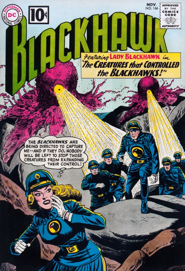
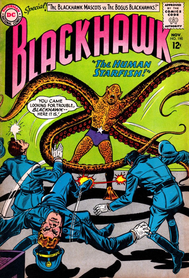
Blackhawk No.109 (February 1957), pencilled by Dick Dillin and inked by Charles Cuidera.Blackhawkno. 130 (Nov. 1958), pencilled by Dick Dillin and inked by Sheldon Moldoff.Blackhawkno. 166 (Nov. 1961), pencilled by Dick Dillin and inked by Sheldon Moldoff.Blackhawkno. 190 (Nov. 1963), pencilled by Dick Dillin and inked by Charles Cuidera.Blackhawkno. 211 (Aug. 1965), pencilled by Dick Dillin and inked by Charles Cuidera.
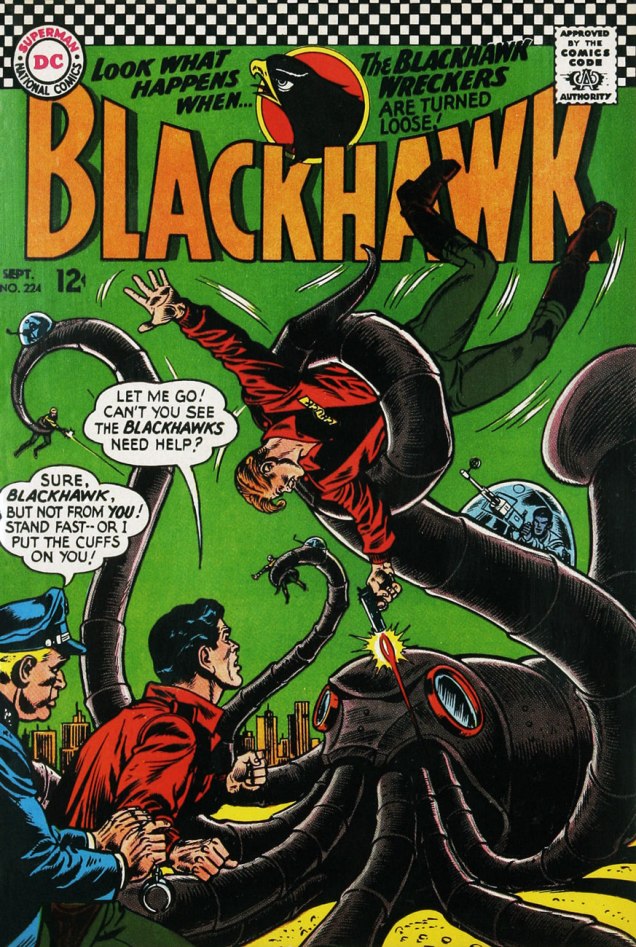
One of the rare cases where tentacles are promised *and* delivered inside:
Page from « Nobody Replaces a Blackhawk », pencilled by Dick Dillin and inked by Charles Cuidera. The evil guys here are the Octopus Gang!Blackhawkno. 224 (Sept. 1966), pencilled by Dick Dillin and inked by Charles Cuidera.Page from « The Blackhawk Wreckers », scripted by Ed Herron, pencilled by Dick Dillin and inked by Charles Cuidera.
I have to admit that while looking up stuff for this post, I grew rather fond of the Blackhawks. It’s fun to follow their adventures in completely improbable situations, to eagerly anticipate the introduction of yet another asinine machine hellbent on destruction. I also enjoyed the international flavour of the team – and Chop Chop, despite his ridiculous name, isn’t treated differently from his teammates.
Y’know what the Blackhawks look like these days?
It’s important to update the image of old heroes so that new audiences can relate. Now let’s go rinse our eyes out with acid.
Signing off before I melt into a big puddle – this post comes to you courtesy of RG’s help cleaning up the images, and of my heavy cold which made me unusually verbose 😉
« Be silent in that solitude which is not loneliness — for then the spirits of the dead who stood in life before thee are again in death around thee — and their will shall then overshadow thee: be still. »
— Edgar Allan Poe (1829)
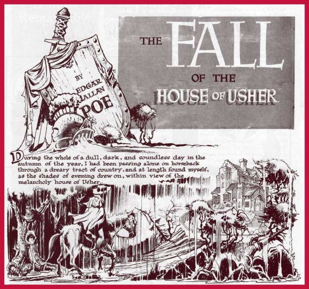
It was on this day, two hundred and ten years ago, that the great writer, poet and posthumous master of all media Edgar Poe (Jan. 19, 1809 – Oct. 7, 1849) was born in Boston, Massachusetts. I’ll spare you the usual biographical details, widely available elsewhere, and we’ll concentrate on his unflagging ubiquity in the medium of comics.
Poe’s literary reputation was in tatters in America, thanks to a rash of hatchet jobs and dismissals, some of the most vicious from the pen of one Rufus Griswold, the very worm he’d named his literary executor (!), as well as such notables as Ralph Waldo Emerson and T.S. Eliot… while his renown was undimmed in Europe, particularly in France (in no small part owing to Charles Beaudelaire’s legendary translations), rehabilitation at home slowly came as the 20th century crept along, but it was likely the publication of Arthur Hobson Quinn’s definitive Poe biography, in 1941, that sealed the deal and opened the floodgates.
Top two tiers from page 2 of The Spirit‘s August 22, 1948 episode. Layout by Will Eisner, pencils and inks by Jerry Grandenetti. As Dave Schreiner puts it: « Grandenetti captures the asthenic look of Roderick Usher that Poe described. The man is a decadent waif; insular, fragile, high-strung, possibly in-bred. »
Classics Illustrated publisher Gilberton was first out of the gate with Poe adaptations, at first tentatively with a pair of poems (Annabel Lee, then The Bells)**, then more substantially with The Murders in the Rue Morgue, in Classic Comicsno. 21 – 3 Famous Mysteries (July, 1944), sharing the stage with Arthur Conan Doyle and Guy de Maupassant. Read it here. Pictured below is Classics Illustratedno. 84 (June 1951, Gilberton), cover by Alex A. Blum. Read the issue here.
A relevant passage from Simon Singh‘s fascinating (if you’re into that sort of thing… and I hope you are) The Code Book: The Secret History of Codes and Code-Breaking (1999): « On the other side of the Atlantic, Edgar Allan Poe was also developing an interest in cryptanalysis. Writing for Philadelphia’s Alexander Weekly Messenger, he issued a challenge to readers, claiming that he could decipher any monoalphabetic substitution cipher. Hundreds of readers sent in their ciphertexts, and he successfully deciphered them all. Although this required nothing more than frequency analysis, Poe’s readers were astonished by his achievements. One adoring fan proclaimed him ‘the most profound and skilful cryptographer who ever lived’. In 1843, keen to exploit the interest he had generated, Poe wrote a short story about ciphers, which is widely acknowledged by professional cryptographers to be the finest piece of fictional literature on the subject. The Gold Bug tells the story of William Legrand, who discovers an unusual beetle, the gold bug, and collects it using a scrap of paper lying nearby. That evening he sketches the gold bug upon the same piece of paper, and then holds his drawing up to the light of the fire to check its accuracy. However, his sketch is obliterated by an invisible ink, which has been developed by the heat of the flames. Legrand examines the characters that have emerged and becomes convinced that he has in his hands the encrypted directions for finding Captain Kidd’s treasure. »A page from EC Comics great Reed Crandall‘s exemplary adaptation of Poe’s The Tell-Tale Heart, from Creepyno. 3 (June, 1965). While Crandall’s work is outstanding, scripter-editor Archie Goodwin tried to ‘improve’ upon Poe by tacking on a tacky ending, a nasty habit he would indulge in again on subsequent adaptations, notably issue 6’s The Cask of Amontillado!. Read The Tell-Tale Heart. And don’t miss The Cask…, if only for the artwork.In the mid-70s, Warren would devote two full issues of Creepy to Poe adaptations; issue 69 (Feb. 1975), featured The Pit and the Pendulum, The Fall of the House of Usher, The Premature Burial, The Oval Portrait, MS Found in a Bottle!, Facts in the Case of M. Valdemar; issue 70 (Apr. 1975) comprised The Murders in the Rue Morgue, Man of the Crowd, The Cask of Amontillado!, Shadow, A Descent into the Maelstrom! and Berenice; All stories were adapted, with far greater respect than Mr. Goodwin seemed capable of, by Rich Margopoulos, and illustrated by a host of artists. The project was edited by Bill DuBay, and the cover painting is by Ken Kelly.Isidre Monés‘ fabulous opening splash from Creepyno. 70‘s Berenice. Read the story in full here.« The rays of the moon seemed to search the very bottom of the profound gulf; but still I could make out nothing distinctly, on account of a thick mist in which everything there was enveloped, and over which there hung a magnificent rainbow, like that narrow and tottering bridge which Musselmen say is the only pathway between Time and Eternity. » In 1976, a peak-form Berni Wrightson got out his brushes and paint tubes for a heartfelt portfolio of Poe-inspired oils. A sensitive and subtle sense of colour was among Wrightson’s chief assets; it’s a shame we didn’t see more of it. I opted to feature my favourite piece from the lot, A Descent Into the Maelström, but by all means feast your eyes on the whole shebang.In 1976, Marvel Comics set out to make their mark on the classics… with dubious, but predictable results. It wasn’t what their zombie readership had clamoured for. Here’s the best page (art by Rudy Mesina) from Marvel Classics Comicsno. 28, The Pit and the Pendulum (1977), featuring three tales adapted by scripter Don McGregor, and including future superstar Michael Golden‘s abysmal professional début on yet another helping from The Cask of Amontillado, where he demonstrates how he believes wine is to be drunk just like Pepsi. See what I’m griping about here.Think Poe’s all about the horror? Think again! You don’t become a household name by putting all your eggs in the same basket. Meet Edgar ‘Eddie’ Allan Poe, romantic leading man. “Based on actual records…” and sanitized beyond recognition. Given that Virginia and Edgar were first cousins and that they married when she was thirteen, you can see how absurd this strip is. Read the full tale of romance and pathos right here. The Beautiful Annabel Lee appeared in Enchanting Loveno. 2 (Nov. 1949, Kirby Publishing). Writer unknown, art by Bill Draut and Bruno Premiani.Kubert School alum Skot Olsen‘s cover illustration for the revised and expanded second edition (July, 2004) of Graphic Classics‘ Poe compendium.As with, say, Elvis or H.P. Lovecraft, when both legend and œuvre reach a certain tipping point of iconic fame, one can bend and twist the concepts any which way and they’ll still be recognizable. Here’s a panel from Harvey Kurtzman and Will Elder‘s faithful-in-its-fashion take on The Raven, from Madno. 9 (Feb.-Mar. 1954, EC).Michael Kupperman strikes again. From Snake ‘n Bacon’s Cartoon Cabaret ( 2000, HarperCollins)Hot off the presses! It’s Edgar Allan Poe’s Snifter of Terror no. 2 (Nov. 2018, Ahoy), featuring a collaboration between Rachel Pollack and the fabulous Rick Geary. Don’t miss it! Oh, and if the pose looks familiar, you’re thinking of this.
Whew — that’s it for now. In closing, I must bow and salute before the gargantuan endeavour accomplished by Mr. Henry R. Kujawa on his truly indispensable blog, Professor H’s Wayback Machine. Thanks for all the heavy lifting, Henry. I get exhausted just thinking about it.
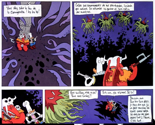
The world of tentacles is colourful and varied – and very much multi-lingual. For those of our readers who have no access to comics in French (or any idea where to start looking for them), we present this gallery of Gallic comics. For an earlier peek into ze tentacules, visit part I – Tentacle Tuesday: The Franco-Belgian Edition. In case you’re wondering what the heck are Franco-Belgian comics, An Introduction to Franco-Belgian Comics gives a good overview.
Sans plus tarder…
What a glorious scene! In this dream sequence, Philippe Caza’s protagonist (clearly a stand-in for himself) battles an octopus that wanted an easy meal and suffered the consequences. This story is called Épaves, which translates in much-more-prosaic-in-English to “shipwrecks”. It was part of Caza’s Scènes de la vie de banlieue cycle, published between 1975 to 1979. Visit Philippe Caza’s Surreal Suburbia for more information.
Caza draws tentacles often and with pleasure. You can keep your Moebius.
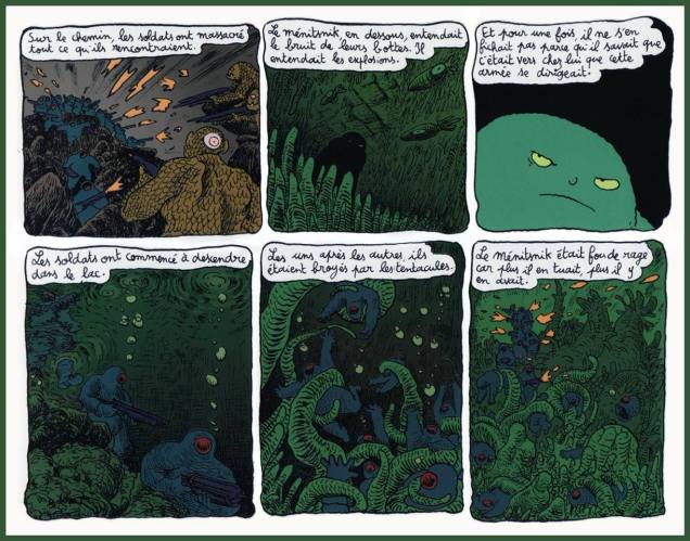
Going into slightly less obscure waters, we have a page from Joann Sfar‘s « Petit vampire» series, its 7 volumes published between 1999 and 2005. I deem it somewhat less obscure because part of it has actually been published in English, and that’s how success is measured these days, right? Only the first 3 volumes of Little Vampire have been translated, but that’s better than nothing. In France, Petit vampire is pretty popular, so much so that it has been made into an animated series.
The following page hails from Volume 4: Petit vampire et la maison qui avait l’air normale, or Little Vampire and the House That Seemed Normal, published by Delcourt in 2002.
Here’s a rough translation of the text: « On the road, the soldiers had slaughtered everything they encountered. The Menitsnik, below, was hearing the sound of their boots. He was hearing the explosions. And for once, he wasn’t indifferent, for he knew that this army was heading towards his home. The soldiers began to descend into the lake. One by one, they were crushed by the tentacles. The Menitsnik was crazed with anger because the more soldiers he killed, the more there were to kill. »
Speaking of Sfar, I’ll mosey along to the Donjon series (Dungeon in English), created by Sfar and Lewis Trondheim. The latter is another not-to-be-missed artist on the Franco-Belgian comics scene, at the very least because he’s one of the founders of L’Association. To explain:
« L’Association is a French publishing house which publishes comic books. It was founded in May 1990 by Jean-Christophe Menu, Lewis Trondheim, David B., Mattt Konture, Patrice Killoffer, Stanislas, and Mokeït. L’Association is one of the most important publishers to come out of the new wave of Franco-Belgian comics in the 1990s, and remains highly regarded, having won numerous awards at the Angoulême International Comics Festival. They were among the first to publish authors such as Joann Sfar and Marjane Satrapi, and also are known for publishing French translations of the work of North American cartoonists like Julie Doucet and Jim Woodring. »|source|
Excerpt from Donjon Zénith: Cœur de canard (Delcourt, 1998), written by Sfar and Lewis Trondheim and illustrated by Trondheim.
I only stumbled upon Donjon, a sort of tongue-in-cheek parody of role-playing games, recently. It has a sprawling structure consisting of 5 sub-divisions into stories tied by a common theme – originally the authors were aiming to release 300 volumes (with the help of many contributing artists floating around L’Association), with 36 volumes published so far. It’s more than a handful for someone who’s just starting to read the stuff… but the world is compelling, with a rich array of appealing (if flawed) characters and a complex mythology. It may technically be a parody, but the stories are poignant and imaginative, the language is delightfully playful. Some of the themes are surprisingly dark… this is far from being another dumb Dungeons and Dragons spoof.
Page from Donjon Zénith: Coeur de canard (Delcourt, 1998), written by Sfar and Lewis Trondheim and illustrated by Trondheim. This volume is full to the gills with tentacles, thanks to the Cthulhian overlords (in pointy red hats) who want to take over the Dungeon.
« I am Octo! The chicken-octopus ninja!!»
Panel from Donjon: La Princesse des barbares (Delcourt, 2000), written by Sfar and Lewis Trondheim and illustrated by Trondheim.
Our last entry is from Valérian and Laureline, the stunningly influential French comics series created by writer Pierre Christin and artist Jean-Claude Mézières that director Luc Besson besmirched, besmeared and befouled. It can also be noted that a variety of movies “borrowed” from V & L’s rich science-fiction lore, most notably the Star Wars franchise. Should I be happy that more people now know about this series now that a shitty movie “based” on it came out? Nope, sorry. Besson claims to have fallen in love with Valérian et Laureline when he was 8 years old, but with Valerian and the City of a Thousand Planets he demonstrated quite thoroughly that he doesn’t understand the characters in the slightest and is only capable of seeing science-fiction through the lens of chintzy special effects designed to wow idiots.
To which I’ll add that Valérian kind of transcends the science-fiction genre – or perhaps I should say that it’s science-fiction as it was originally meant to be, as an exploration of the possibilities of external and internal worlds. (Technologically upgraded cowboys shooting each other with laser guns in primitive, shallow battles between good and evil? We’ll leave that to crappy movie directors, thanks.) Its plots are elaborate (but they never defy their own internal logic), its characters complex but immensely likable.
In 2007, the series got renamed Valérian and Laureline for its 40th birthday, and I’m glad they renamed it, as Laureline is an integral part of both its appeal and its popularity. She’s every bit as intelligent and determined as her companion, and is certainly no maiden in distress, often sizing situations up quicker than Valérian and subsequently pointing him in the right direction.