Nicole Hollander’s Sylvia: Wit, Wisdom and Cats

« America’s top-flight intellectuals will one day hold entire conferences and seminars devoted to Sylviology. They will deconstruct her frame by frame with straight edge and compass, attempting to identify each tiny object as an Artifact of Our Time and a clue to our condition. They will bring in leading neurologists, phrenologists and psychoanalysts to study the blabbermouth pets, the thimble-sized martinis, the neurotic superheroes, to answer the inescapable question: What kind of a mind…? » \from the introduction to Planet Sylvia by Barbara Ehrenreich|

Many years ago, I was perching on a sofa in the corner of a cozy records store (the excellent Death of Vinyl in Montreal, in case anyone is wondering) when I noticed a stack of comics in a nearby bin. Something dishevelled and coverless, pages barely holding together, attracted my attention with its idiosyncratic drawing style and strangely articulated cats. There was also a big-nosed lady with giant earrings and a typewriter. I was hooked and purchased the book immediately, though I wasn’t even sure whether it was for sale or just placed there as reading material. (I located the cover, after all, albeit in a different bin.)

The book was The Whole Enchilada (A Spicy Collection of Sylvia’s Best) by Nicole Hollander, and as it turned out, it the best introduction to her world. (You can purchase it for $1.99 or so on Amazon. I highly recommend it.)
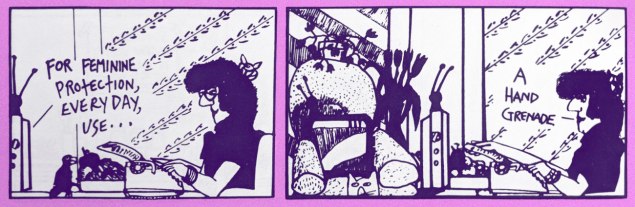
NicoleHollander-Sylvia-handgrenade

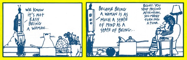
Sylvia is a more-than-slightly cantankerous woman with a wonderfully acerbic sense of humour. Sometimes she doles out social commentary from the bathtub, sometimes a local café serves as her headquarters — or she stays in her living room, dispensing wisecracks at yet another inane TV ad, or bestows advice to lost souls (typed on an honest-to-god typewriter). She’s clearly a feminist, and equally clearly fluent with clichés of womanhood, such a certain obsession with dieting and a definite obsession with cats. She embodies many tropes – she’s the crazy cat lady, an Apron Matron (albeit with a flowery hat instead of an apron), a Dear Abby-type adviser – and puts her peculiar tilt on them all. Extravagant earrings and the odd flamboyant hat (all the articles about Sylvia seem to overstate the presence of hats, yet Sylvia’s handsome head often boasts nought but big hair adorned with a hairnet or bow) are just the cherry on the cake.
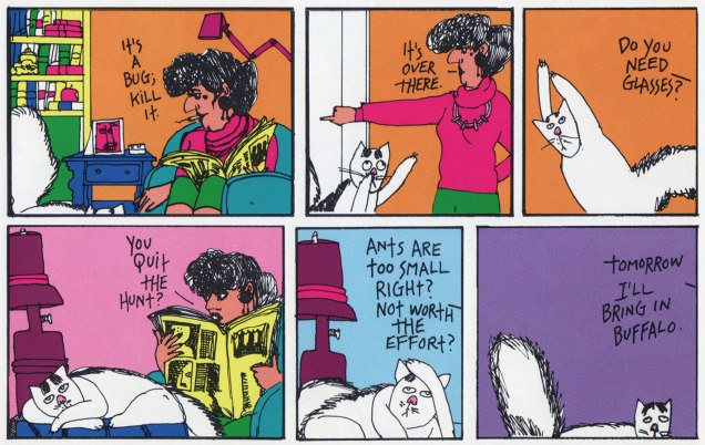
NicoleHollander-SylviaBuffaloA

As for Nicole Hollander, she is a Chicago native and brought forth something like 30 years of Sylvia. Born as a series of cartoons for the feminist magazine The Spokeswoman, it was syndicated in 1981 and continued until March 26th, 2012, upon which date Hollander declared that Sylvia was retiring.
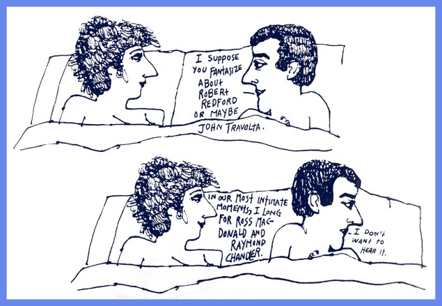
NicoleHollander-Sylvia-IntimateMomentsA

« In the old days, the disconcerting feel of the strip as well as Sylvia’s middle-aged ‘dame’ image and her biting humour gave the artist problems. After St. Martin’s had started publishing Sylvia, even the big syndicates were forced to sit up and take note of her. But they did so in a grudging, good-old-boy sort of way, taking away with one hand what they gave with the other. After Field Enterprises took Hollander on in 1981, a rep would intermittently call Nicole to shake a finger at her – for instance, the week on Sylvia cartoon mentioned hemorrhoids, and another mentioned Lightday pantyliners. “They said, It’s your life, but you’re ruining it. If you leave stuff like this in, a lot of papers will pull the strip. I gave up the hemorrhoids, but not the Lightdays. There was this voice in my head that said, You must take a stand. So I said, I will take my stand for Lightdays, and threw hemorrhoids to the dogs.”» |From Don’t Throw That Old Diaphragm Away! by Ellen Cantarow, published in Mother Jones (June/July 1987)|

In case you’re wondering what *can* you do with a diaphragm, this handy illustration might help:

NicoleHollander-Sylvia-Don't-Throw-That-Old-Diaphgram-Away

For all its popularity, there aren’t a lot of Sylvia strips available online, let alone in decent resolution. Oh, sure, you can go to GoComics and read a whole bunch of them, but that seems to be just the strips from the 2000s. Somebody got started on a documentary about Hollander in 2015, but I get the impression that that was abandoned somewhere along the way, probably for lack of funds. Even Hollander’s website, Bad Girl Chats, doesn’t seem to exist anymore. Speaking of that, please watch this adorable video in which Nicole explains what sort of things she posts on her website.

(On the brighter side, in 2018, Fantagraphics released Hollander’s autobiography-slash-graphic-novel, We Ate Wonder Bread.) I aim to remedy this situation at least a little bit, by showcasing some of my favourite strips (scanned from The Whole Enchilada, 1986 and also from Planet Sylvia, 1990; the black and white strips were “colourized” by co-admin RG, who abhors lousy greying paper.)

NicoleHollander-Sylvia-AuntSybil
As Hollander points out, her mother had a whole network of witty women friends who liked to discuss events of the day over a cup of coffee. Auntie Sybil was surely one of them.

NicoleHollander-Sylvia-VentriloquistCats

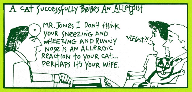
SylviaAllergyBribeA

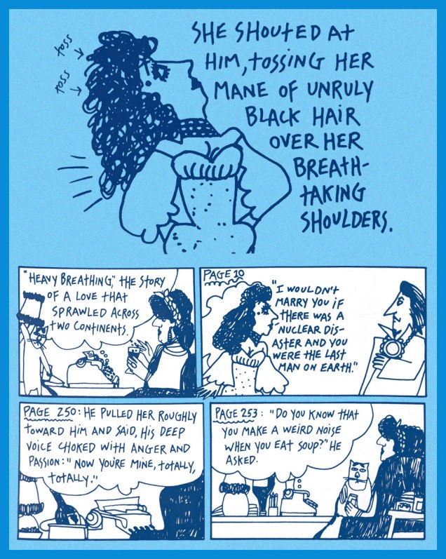
NicoleHollander-Sylvia-TossingManejpg
Occasionally, Sylvia ventures into writing romance novels, which do a delightful job of mocking common clichés of what passionate love is supposed to be like.

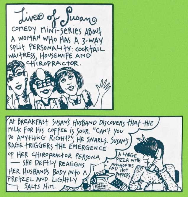
NicoleHollander-Sylvia-LivesofSusan

SylviaTonyBennettA
Waitress Beth Ann is every bit as sardonic as Sylvia, but with more of a food-centric accent.
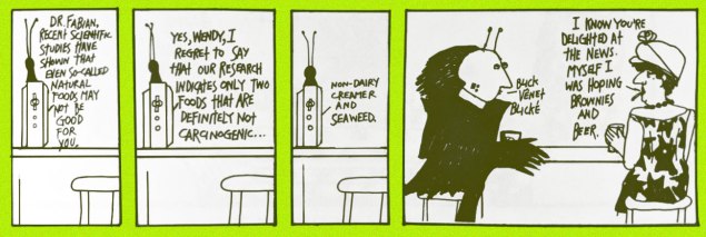
NicoleHollander-Sylvia-Gernif
Gernif often shares a cup of… non-dairy creamer, I guess… with Sylvia. I wonder if she, like Broom-Hilda, stopped drinking and smoking when the proverbial Powers-that-be decreed that syndicated newspaper strips couldn’t feature characters indulging in sinful hobbies.

« When we sat down Hollander began talking about how she and her friends used to sit silent and wide-eared at a table in the deli while their mothers gabbed. I didn’t appreciate how vital a memory this is until I opened Wonder Bread and spotted a sketch of the women yakking, another of young Nicole sitting primly before a corned beef sandwich and a jar of dill pickles as the grownups dish. “We were avid listeners,” says the text, filling in details you sense from the art, “fearful of interfering with their talk, hoping they wouldn’t notice us so they would keep on talking. They were all witty women, fiercely loyal to their friendship, to the specialness of every woman in the group.”» |Life After Sylvia: Cartoonist Nicole Hollander publishes a memoir|

NicoleHollander-TalesfromPlanetSylvia
The cover for Planet Sylvia (St. Martin’s Griffin, 1990). « For all we know, there is a Planet Sylvia. We know that it is a place where cats write passable fiction, where ham has no cholesterol, where women are free to go out of doors without eyeliner and eat large portions of fries in public. Its atmosphere is not only breathable, but induces a delirious sense of lucidity, unknown to our own dank orb, except to the mystically enlightened and abusers of nitrous oxide. » (from the introduction)

SylviaPolkaA

SylviaTunaA

SylviaPoltergeistA

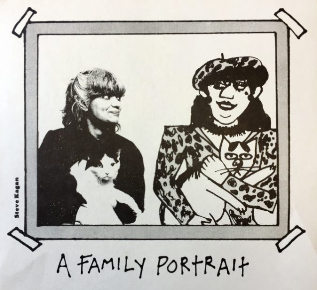
NicoleHollander-familyportrait
I took this picture from Spotlight on the Nicole Hollander Collection, an article about the Billy Ireland Cartoon Library & Museum’s archival collection of Hollander strips and odd and ends.
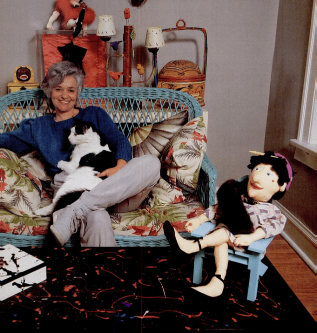
NicoleHollander-1987
Nicole Hollander in 1987. I’d like to point out that even today it is highly controversial for a woman in her late 40s NOT to dye her hair grey. She’s one awesome lady.

One last tidbit: on 2012, Nicole Hollander’s “unique collection of condom packages and sex toys” entered the collection of the Kinsey Institute for Research in Sex, Gender, and Reproduction. That raises more questions than it answers, doesn’t it?

NicoleHollander-MedicalSchoolA

~ ds
Tentacle Tuesday: Rooks, Epics, an Eclipse and a Web

This Tentacle Tuesday is a magazine edition.

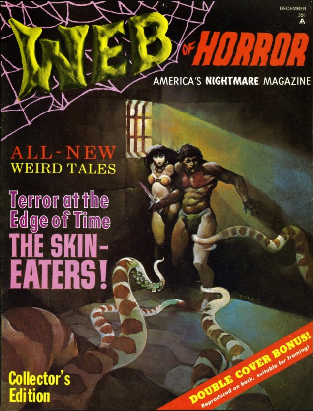
WebofHorror#1-JeffJones
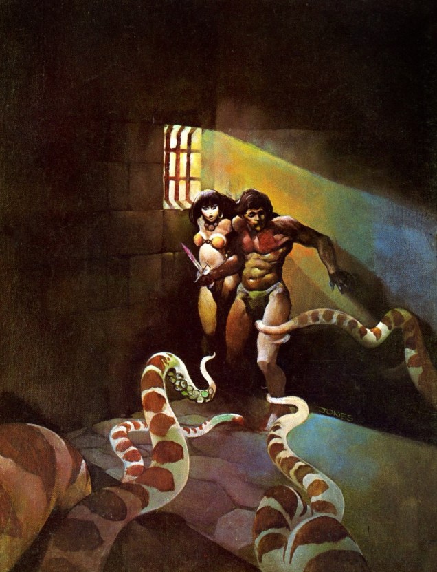
Web of Horror no. 1 (Major Magazines, December 1969). Painting by Jeff Jones.

I understand that the artist left quite a lot of empty space on purpose – to be filled with pointless text – but still, was it necessary to plaster nearly every inch of the image with captions yellow, red and purple? (I do like how the WEB seems to be made out of plasticine… and likely was.) Here’s the cover without all that wordy fluff:

WebofHorror#1-JeffJones-Cover
“Oooh, lookie, tentacles!”

I’ve already covered most Warren tentacles in Tentacle Tuesday: Warren and its many tentacles and Tentacle Tuesday: Warren and its many tentacles, part II, but handsome, gun-toting, time-travelling The Rook got left over. I’d like to rectify this omission. Admire the fight to the death of the scientist-who-likes-to-dress-up-as-gun-slinger and a tentacle-bearing fish-lion!

TheRookMagazine#4-Nestor-Redondo
The Rook no. 4 (Warren, August 1980). Cover by Nestor Redondo.

The Rook couldn’t quite kill the fishy brute’s whole family in #4, so he had to confront its slightly more colourful cousin in issue 7:

The Rook Magazine#7-JordiPenalva
The Rook no. 7 (Warren, February 1981). Cover by Jordi Penalva. It’s nice to see that men (not exclusively Doc Savage) get strategically ripped shirts, too, sometimes. Eye candy!

Co-admin RG suggested I check Eclipse Magazine‘s tentacular offerings for this post, and he was correct, there was one issue involving an octopus used as a coffee table.

EclipsetheMagazine#4-CarlPotts
Eclipse Magazine no. 4 (Eclipse, January 1982). Cover by Carl Potts. I went snorkeling a few months ago and the scene was not dissimilar (minus, sadly, the mermaid).

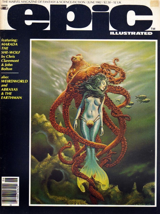
Marvel’s Epic Illustrated, with its 70-odd pages per issue, surely offered something for everyone. The aforementioned offerings were quite hit-or-miss, but the occasional presence of Stephen Bissette, Rick Veitch, Basil Wolverton (in reprints), Berni Wrightson, Ernie Colón, P. Craig Russell, et al. makes it worthwhile to go through its 34 issues (okay, maybe not all in one sitting, unless you have quite a few thermoses of tea prepared – or something stronger).

EpicIllustrated#12-FrankBrunner
Epic Illustrated no. 12 (Marvel, June 1982), cover by Frank Brunner. You can read the whole issue here.

Brunner’s painting is rather nice – the mermaid and her friendly octopus both look so serene! – that here it is again. And read an interview with him while you’re at it: Legendary Feathers: Interview with Frank Brunner. (I apologize for linking to a website titled Fanboy Nation, though. Erk.)

FrankBrunner-Mermaid

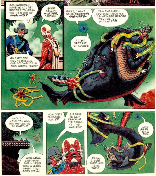
Issues 10 to 17 of Epic Illustrated featured Rick Veitch’s Abraxas and the Earthman, a purported retelling of Moby Dick (although frankly, aside from a vengeful squid, the similarities are not striking). Naturally, tentacles abound. Really freaky, creepy tentacles, much like the rest of the story.

EpicIllustrated#12-TheHunt
Page from “The Hunt: Chapter Three”, written and drawn by Rick Veitch, printed in Epic Illustrated no. 12.
EpicIllustrated#17-TimConrad
Epic Illustrated no. 17 (Marvel, April 1983), cover by Tim Conrad. Read it here.

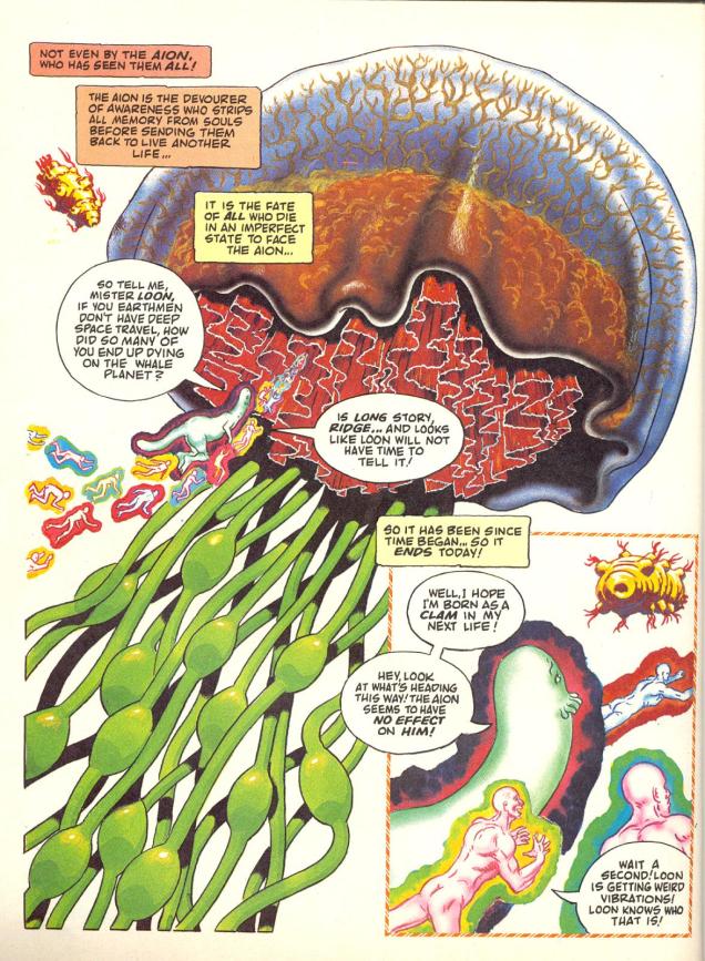
Veitch’s fucked-up (I mean that as a compliment), imaginative tale continues with “Man and Whale (Chapter Eight)”, the final installment. Alongside a plethora of sea-creatures (no longer  in the sea), there’s this Devourer of Awareness, Bearer of Tentacles:

EpicIllustrated17-RichVeitch-Man-and-Whale.jpg

(Incidentally, though somewhat off topic, I’d like to mention that Veitch did a bloody good job on Swamp Thing, for which he does not get enough credit.)

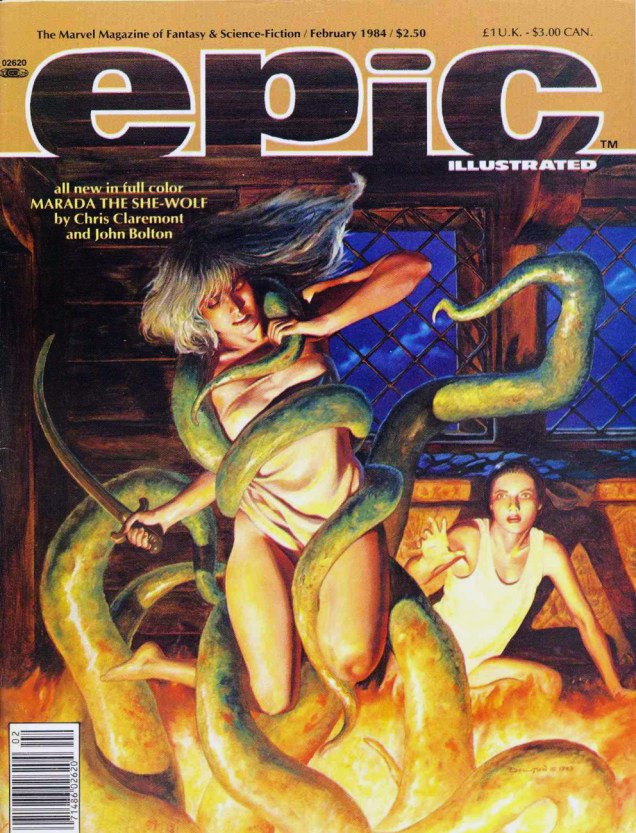
EpicIllustrated#22-JohnBolton
Epic Illustrated no. 22 (Marvel, February 1984). Cover by John Bolton. Read the issue here. It’s a bad, unconvincing cover, but hey, this is an inclusive post.

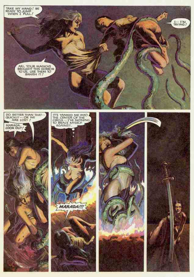
Speaking of Bolton, he drew “Wizard’s Masque” (another chapter in the cycle of Marada the She-Wolf), a story scripted by Christopher Claremont.

EpicIllustrated#22-JohnBolton-Maradatheshewolf

EpicIllustrated#22-JohnBolton-Marada

~ ds
The Quite Wacky Adventures of Cracky

Country Boy: What are you doing?
City Boy: Drawing.
Country Boy: Where are your guns?
— Submitted by Steven Feinstein, 7, Philadelphia, PA (circa 1965)

Cracky the parrot was introduced in the role of mascot for Western Publishing‘s general-interest kids’ mag The Golden Magazine (1964-71), which heavily drew upon the successful Jack and Jill (published since 1938 by The Saturday Evening Post Society) formula.

For much of its existence, The Golden Magazine thrived, having access to top creative talent from the Western publishing empire (Whitman, Gold Key, Golden Press, Golden Book Encyclopedia…)

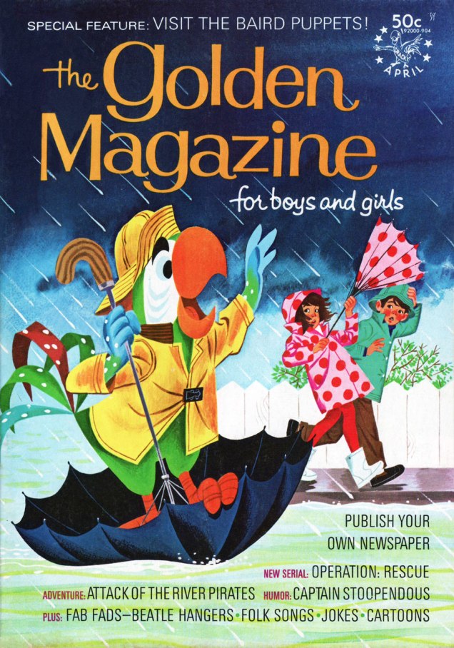
GoldenApr69A
At first, Cracky stuck to sharing reader-submitted jokes. Then, around 1968, he began to show up on covers, generally depicted by versatile Canadian illustrator Mel Crawford (1925-2015). This is one such case, from April, 1969.
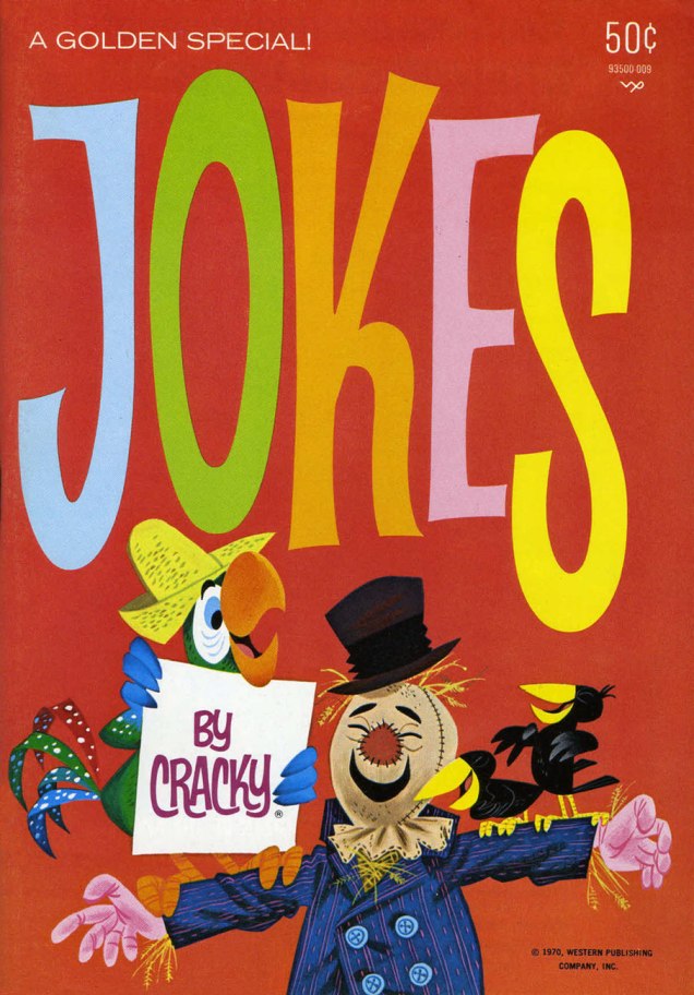
JokesCracky2A
In 1970, Cracky saw his old job expanded, branching out into two titles, Jokes by Cracky and  Pencil Puzzle Fun, the latter outlasting its parent, The Golden Magazine. This is Jokes by Cracky no. 2 (1970); Cover art by Mel Crawford.
CrackyNewJobA
Then, in 1972, it gets interesting: the lowly parrot mascot broke into comics.

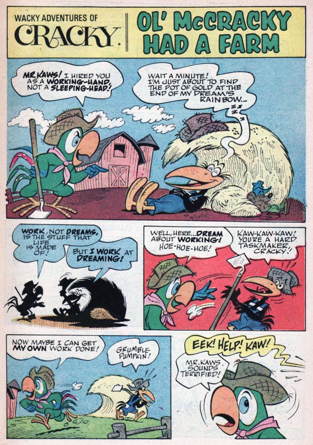
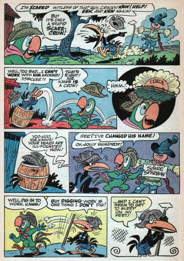
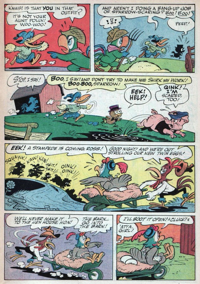
As Archie Comics had their Christian-zealot madman in Al Hartley, so did Western in the person of Vic Lockman. A significant difference, however, is that Hartley, despite quite stiff competition, is arguably the very worst Archie artist; he’s certainly got my vote [Seconded! ~ ds]. Lockman (1927-2016), a prolific but often terrible scriptwriter, was a terrific cartoonist, blessed with a gorgeously fluid line and exemplary design sense, lively and detailed. Here, then, is a story from Wacky Adventures of Cracky no. 3 (June, 1973). Script and art, including his distinctive lettering, by Mr. Lockman.

VicLockmanMcCracky01AVicLockmanMcCracky02AVicLockmanMcCracky03AVicLockmanMcCracky04AVicLockmanMcCracky05AVicLockmanMcCracky06A

During the run of his comic book, Cracky (and sidekick Mr. Kaws) wore many hats: detective, inventor (presumably giving Lockman the chance to recycle some of his rejected Gyro Gearloose scripts), ship’s captain, escape artist, sheik… And yes, he did encounter some choice tentacles, but I leave it to my partner to conduct her own investigation. Lockman beautifully handled the first ten issues of WAOC; the instant he stepped away, the thing dissolved into tripe. Avoid accordingly.

Lockman, who seemed a loveable, well-meaning coot, was also twelve kinds of batty. Biblical Economics, anyone? For as full a picture as can be reasonably assembled, read Mark Evanier‘s fine, thoughtful obituary of Lockman.

Lockman was also among those sadly deluded souls (hello, Chuck Dixon) who tried to lay claim to the title of most published comics writer. Let’s face it: the most likely contenders (Joe Gill, Paul S. Newman, Gaylord DuBois) toiled in anonymity for most of their long careers.

CroakyA
In 1971, The Golden Magazine was sold (to The Saturday Evening Post Company!) and renamed, becoming Young World in 1972. Young World, in turn, got incorporated into Child Life in 1979, but that’s a story for another day. Many of TGM’s features were retained but slightly… tweaked. For instance, see who inherited Cracky’s old desk?

« Moo! I say Moo! »

-RG

Tentacle Tuesday: Satirical Cephalopods

« Knock it off, squiddo! You couldn’t make a class-B horror picture on earth — you’re not even good for a milk shudder! Better skeddadle, or I’ll tie your tentacles into a bow! »

Tentacles are no cause for levity, you say? Ha! Their place in all manner of spoofs and parodies (and other silliness) is ensured. Peppered with a barrage of puns (never undersell puns, please!), whimsical tentacular entanglements abound in literature… err, comic literature, at any rate, and that’s good enough for me.

Not Brand Echh Issue #11
I meant “entanglements” very literally. Story published in Not Brand Echh no. 11 (December 1968, Marvel); script by Arnold Drake, art by Marie Severin.
Unsane#15-L.B.Cole
Say, did I hear some barely restrained giggling over “20 000 leaks under the sea?” (This story, written and drawn by Jay Disbrow, was reprinted in 2000 by Fantagraphics in a collection called The Sincerest Form of Parody: The Best 1950s MAD-Inspired Satirical Comics.) Unsane no. 15 (June 1954, Star Publications), cover by L.B. Cole.

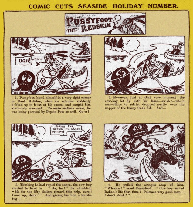
Even some 100 years ago (well, a little less), some unfortunate octopus could easily become a Figure of Fun if he wasn’t careful.

Comic-Cuts-Seaside-Holiday-Number-1923A
The story doesn’t say what happened to the freaking octopus, though. This edition of Pussyfoot the Redskin was printed in Comic Cuts no. 1735 (August 1923). Visit BLIMEY! The Blog of British Comics for more Comic Cuts.

I can’t mention équivoques and wordplay without mentioning Pogo, Walt Kelly‘s keenly intelligent comic strip. Sadly, this was the only appearance of Octopots, as far as I know (and I long to be corrected).

WaltKellyFigmentality
From Figmentality, from The Pogo Sunday Parade (1958). Art by Walt Kelly, of course!

In the competitive world of jokes in bad taste, the man from SRAM probably takes the cake. It’s lucky that he has no qualms about hitting females, or the world would be doomed… although his mirthless monologue would probably kill the creature with sheer ennui.

Jigsaw#2-MadhouseinHollywood-OttoBinder
Madhouse in Hollywood (Man from SRAM), scripted by Otto Binder and drawn by Carl Pfeufer, published in Jigsaw no. 2 (December 1966, Harvey).

On the other hand, Superman‘s creative insults can easily shame a thin-skinned Tentacled Terror (was his spaghetti-and-meatball crack some sort of early Flying Spaghetti Monster reference, even though the latter was only officially created in 2005?)

Superman V1 #184
Superman no. 184 (February 1966). The story is The Demon Under the Red Sun!, scripted by Otto Binder (again; he clearly has some unhealthy attraction to tentacles, like the best of us) and drawn by Al Plastino. Figure out what’s going on in this story (or not, for there’s not a lot of logic to be found, anyway) at Mark’s Super Blog.

~ ds
Will Eisner’s The Spirit at Kitchen Sink (pt. 1)

« Hello… Times? … I want to place an ad in your Situation Wanted column! Wanted… dangerous assignment… will go anyplace, anywhere, anytime… contact The Spirit, Box 35! » – The Spirit, Apr. 30, 1950

If you’ve followed our series dogging the steps of The Spirit, you won’t be in the least surprised that, after a sixteen (plus colour special) residency with Warren Publishing (Apr. 1974 – Oct. 1976), the late Dennis Colt found himself, after a year’s break, updating his mailing address once more. As returning publisher (and later, also Eisner’s agent) Denis Kitchen put it Kitchen Sink’s inaugural magazine issue (no. 17, Winter 1977):

« Welcome back, SPIRIT fans! Several years ago, we launched an experiment, publishing Will Eisner’s SPIRIT in ‘underground’ format. The experiment was so successful that Eisner arranged for Warren Magazines to publish his stories in a larger format, distributed on a national scale. 

Seventeen issues later, we once again have the rights to THE SPIRIT. We will continue publishing stories never before reprinted, on a quarterly basis. In addition, we are adding new features, virtually eliminating the ad pages, and upgrading the quality of the paper. We hope you like the difference and will continue to support THE SPIRIT. »

Well, the first issue was all right, but looked a bit shoddy, a surprise, given the usually-solid production hand of KS’s peerless production man, Pete Poplaski. With the following, er… quarterly issue (five months later), all the kinks had been worked out, and every subsequent entry looks sharp and terrific.

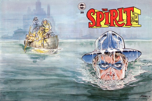
Ah, but there’s the rub: Kitchen Sink’s magazine ran for 25 issues, most of them boasting spectacular, brand-new wraparound watercolour paintings by Eisner. Some brutal excisions had to be made, to say nothing of the backbreaking process of smoothly collating the front and back halves (we have standards!). Hence the necessity of “pt. 1”. Will you settle for my dozen picks of the twenty-five? I’m afraid you’ll have to.

Spirit18A
This is The Spirit no. 18 (May, 1978), featuring a half-dozen Spirit tales, namely: “The Seventh Husband” (May 20, 1951); “Thanksgiving Spirit” (Nov. 20th, 1949); “Future Death” (Jan. 21, 1951); “Barkarolle” (July 18th, 1948); “Mad Moes” (Feb. 9, 1947); “Fan Mail” (Jan. 1, 1950), as well as some vintage Clifford one-pagers by Jules Feiffer.
Spirit19A
This is The Spirit no. 19 (Oct. 1978), featuring five Spirit tales, namely: “Money, Money” (Nov. 23, 1947); “April Fool” (Mar. 30 1947); “Gold” (Oct. 10, 1948); “The Chapparell Lode” (Nov. 14, 1948); “Halloween” (Oct. 31, 1948), as well a pair of Clifford one-pagers by Jules Feiffer, a Lady Luck four-pager by Klaus Nordling, and part one of Eisner’s brand-new, hard-hitting serial, Life on Another Planet (eventually coloured and collected as Signal From Space).
Spirit20A
This is The Spirit no. 20 (Mar. 1979), featuring five Spirit tales, namely: “Quirte” (Nov. 21, 1948); “Cromlech Was a Nature Boy!” (July 4, 1948); “War Brides” (Mar. 14, 1948); “Time Bomb” (Apr. 15, 1951); “Census ’50” (June 25, 1950); and “[Mission… the Moon]” (Aug. 3, 1952), plus part two of Eisner’s Life on Another Planet and some informative articles.
Spirit24A
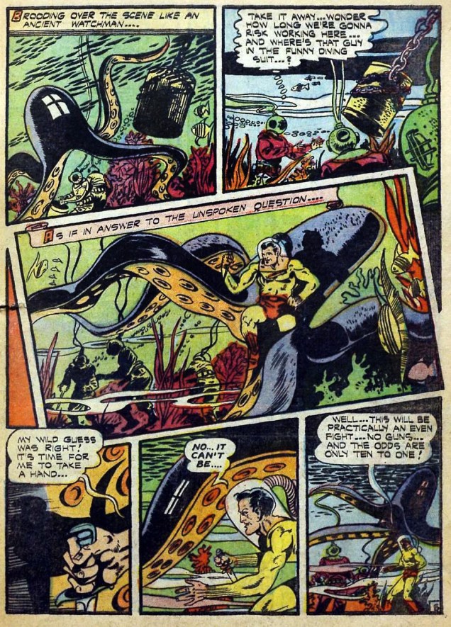
This is The Spirit no. 24 (May 1980), featuring five Spirit tales, namely: “Boombershlag” (Mar. 23, 1941); “Beauty” (June 9, 1946); “Cargo Octopus” (July 14, 1946); “A River of Crime” (Nov. 30, 1947); “Rescue” (Aug. 24, 1952), plus a chapter of Life on Another Planet and a host of other features, including a Spirit checklist
Spirit27A
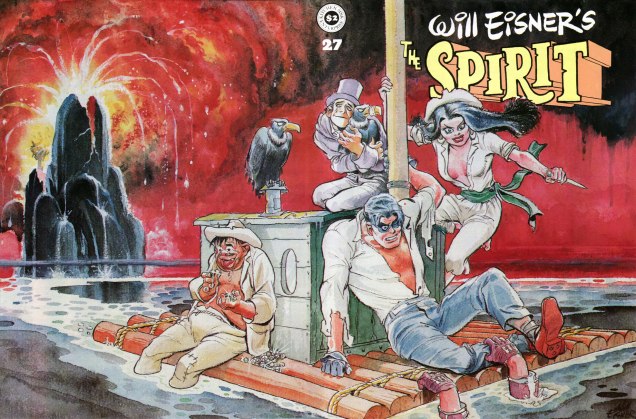
This is The Spirit no. 27 (Feb. 1981), featuring six Spirit tales, namely: “The Devil’s Shoes” (Feb. 1, 1942); “M.U.R.D.E.R.” (July 19, 1942); “Montabaldo” (Jan. 25, 1948); “Rife” (Jan. 14, 1951); “The Amulet of Osiris” (Nov. 28, 1948), “The Return” (Sept. 21, 1952), plus a new Eisner ‘Big City’ nine-pager, “The Treasure of Avenue ‘C‘”… and more.
Spirit29A
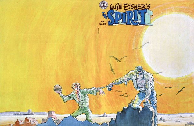
This is The Spirit no. 28 (Apr. 1981), featuring six Spirit tales, namely: “Sphinx & Satin” (Oct. 5, 1941); “Professor Pinx” (Aug. 2, 1942, with Lou Fine); “Survivor” (July 16, 1950); “Deadline” (Dec. 31, 1950); “Return From the Moon” (Sept. 28, 1952), “The Martian” (Oct. 10, 1952), plus a Feiffer Clifford one-pager, a ‘Shop Talk’ discussion between Eisner and Gil Kane, and so forth.

If you’ve just joined us mid-programme, fret not: simply rewind to our earlier instalments, if you will:

… or simply click on its general category, That’s THE SPIRIT!, and find yourself with everything at your blue-gloved fingertips.

-RG

Tentacle Tuesday: Mangled, Pulverized and Slashed Tentacles

« Men!! They are a worse menace than any octupus [sic] or shark that ever swam… »

Oh, poor octopuses. Authors use them as a (not very original) symbol of a terrifying, all-powerful force, and then get them (not very creatively) destroyed. An octopus is lucky to “just” get stabbed; everything seems to be fair play in this violent spree – dynamite, torpedoes, even freakin’ nuclear weapons. In most cases, the problem is definitely Man: man who enslaves sea creatures and makes them do his bidding with varied gadgets, man who intrudes on the octopus’ territory, man who sticks his nose where only tentacles should be.

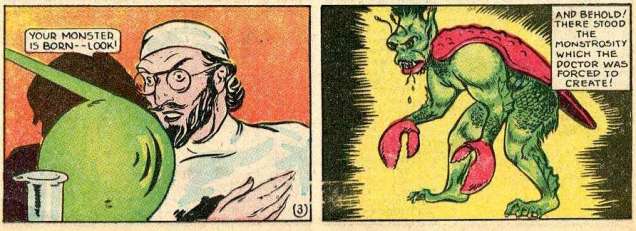
« I only have to give him the claws of the killer lobster… the teeth of the tiger shark… and the heart of the barracuda! That is all! » Because any normal doctor has this stuff just lying around his operating theatre, obviously.

BlueRibbonComics#3-detail-edd-ashe

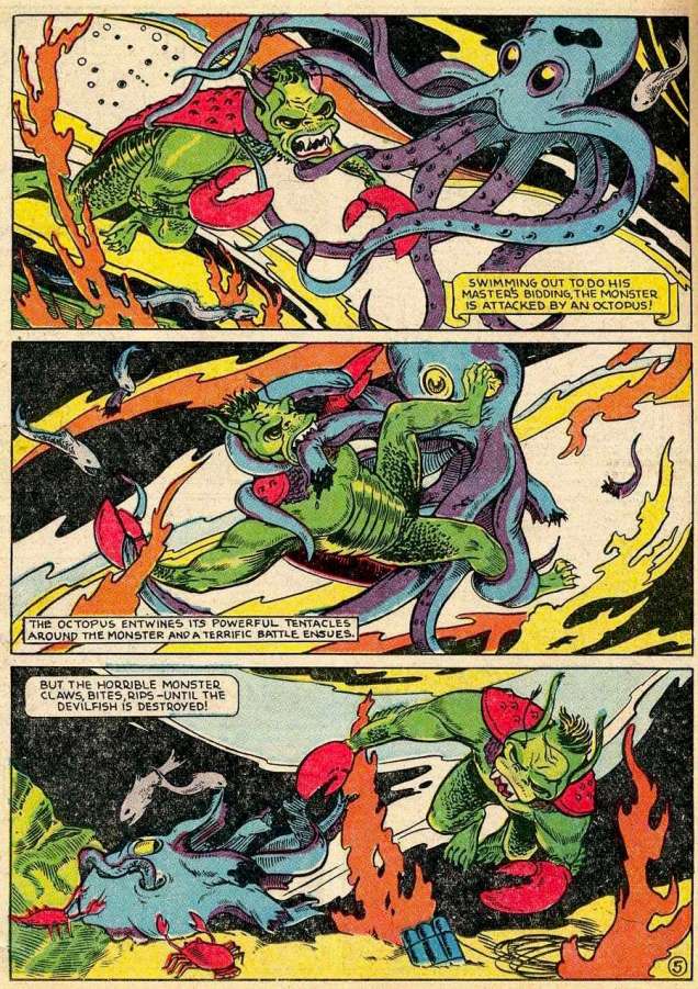
Spectacular, deadly monster created? Next thing to do is to rip an octopus to shreds, in a particularly gory eyeball-wrenching, tentacle-mincing scene.

BlueRibbon Comics#3-EddAshe
Seriously, just look at that eyeball getting pulled out by toes… Page from “Devils of the Deep”, scripted by George Nagle and drawn by Edd Ashe, published in Blue Ribbon Comics no. 3 (January 1940).

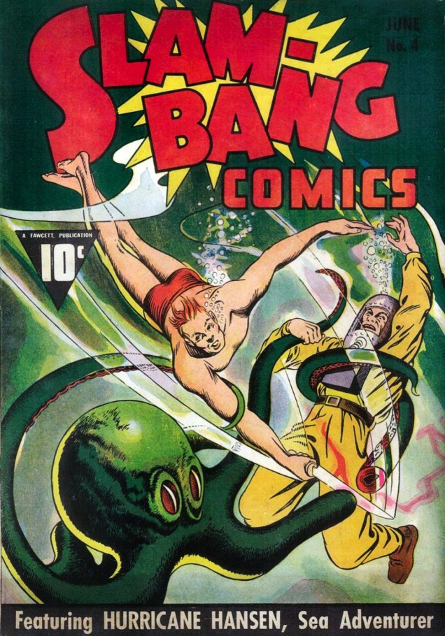
Next up, your standard slashing-at-tentacles-with-a-kitchen-cleaver. The guy must have been stashing it in his swimming trunks; there’s really no need for wearing an actual diving suit. That sap getting squeezed by a tentacle wore one… and look at all the good it did him.

Slam-Bang-Comics-#4
Slam-Bang Comics no. 4 (June 1940), cover by Gus Ricca.
Don-Winslow-of-the-Navy-#36
Don Winslow of the Navy no. 36 (July 1946). Created by Lieutenant Commander Frank V. Martinek as a newspaper strip, Don Winslow was meant to underline Naval courage and inspire American youth to orient their career paths in that direction. I dunno, maybe this particular issue was responsible for a new generation of oceanographers.

I love the idea of an eight tentacled obstacle, and shall aspire to insert that phrase into completely irrelevant conversations.

Don Winslow of the Navy #36-withthemarines
The story is called “With the Marines”, artist unknown.

I have to admit that Don Winslow (not the author) is the kindest octopus handler we’ve seen today. It must be part of those Naval traditions and courage Martinek insisted on. (He was quoted as saying “Since Don Winslow of the Navy is approved by the Navy Department, I cannot allow him to do anything that is contrary to the ideals, traditions or motives of the Navy.“)

Don Winslow of the Navy #36-withthemarines2
Blinding the beastie instead of stabbing – you go, Sir.

It takes cold, raw courage to step up to… This is the grandfather of all octopus… or is it octopi…?” Only a true hero starts fretting about the properness of his English while in proximity to a giant octopus. Are you wondering why that octopus looks distinctly fake? He’s actually made out of rubber, as Don Wallace, a.k.a. Torpedo Man discovers when he punctures the counterfeit cephalopod.

Blue-Bolt-Weird-Tales-of-Terror-#112-
Blue Bolt Weird Tales of Terror no. 112 (Feb 1952). This is a page from “Strange Tale of the Sea Monster”.

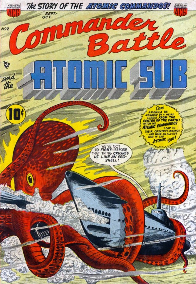
In the 1950s, “atomic” was distinctly a cool word, which clearly inspired the creation of this Atomic Submarine (nuclear powered, that is) and its Atomic Commandos… a crew of, like, four people. To quote Toonopedia, “The real atomic sub was apparently a bit more complex and challenging to deal with than the comic book one. Commander Battle’s got along with only four men aboard — Bill Battle (the boss), Champ Ruggles (“the most powerful man on the American continent”, and maybe even the other American continent as well), Doc Blake (the scientific genius) and Tony Gardello (only mildly ethnic).

Commander-Battle-and-the-Atomic-Sub-#2
Commander Battle and the Atomic Sub no. 2 (Sept-Oct 1954), Cover by Ogden Whitney and Sheldon Moldoff.

The atomic commandos didn’t know that the way to the island was barred by an awful defender… by a gigantic nightmare creature that staggered the imagination! They didn’t see it as it rose from the depths behind them, flaring tentacles ready to pounce, clutch…” The octopus went from red to green – is that for better camouflage?

Commander Battle and the Atomic Sub #2-SheldonMoldoff2
Panels from the rather lengthy, 2-part story titled “Fight for Survival!”, drawn by Sheldon Moldoff.

The weird threat from the center of the earth is actually a nation of sea-dwellers who demand humans cease using atomic weapons, threatening to burn Earth’s surface if this is not done (and unleashing their almost-indestructible octopus, as well). When Commander Battle triumphs at the end of the story, all the “giant attackers” die from a radioactive cloud.  “And so it came to an end, this civilization of titans at the center of the earth… for now, not a single on was left alive! Let it be said that they were not evil! Destiny had willed it that they cross man’s path...” In today’s Tentacle Tuesday, this story takes the cake for its number of gratuitous deaths.

As for the octopus, he gets blown to smithereens…

Commander Battle and the Atomic Sub #2-SheldonMoldoff3

~ ds
Treasured Stories: “American Squalor” (1988)

« People think the show gave Letterman an opportunity, but they don’t see the table with 10 guys in shorts wearing baseball caps pitching jokes for things for him to say. They don’t see the index cards that say: ‘Ask this first.’ It’s all spelled out for him, and everything is pre-interviews. He’s basically had to be this hand puppet, with everybody’s hands up his butt to tell him what to say and do. » — Joyce Brabner on David Letterman
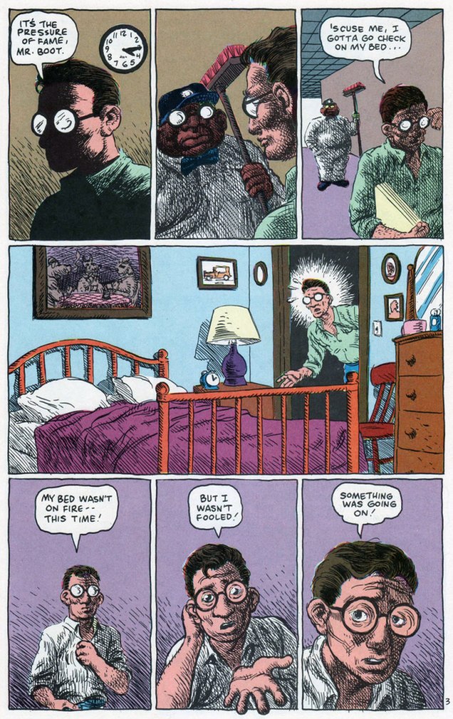
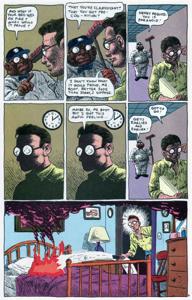
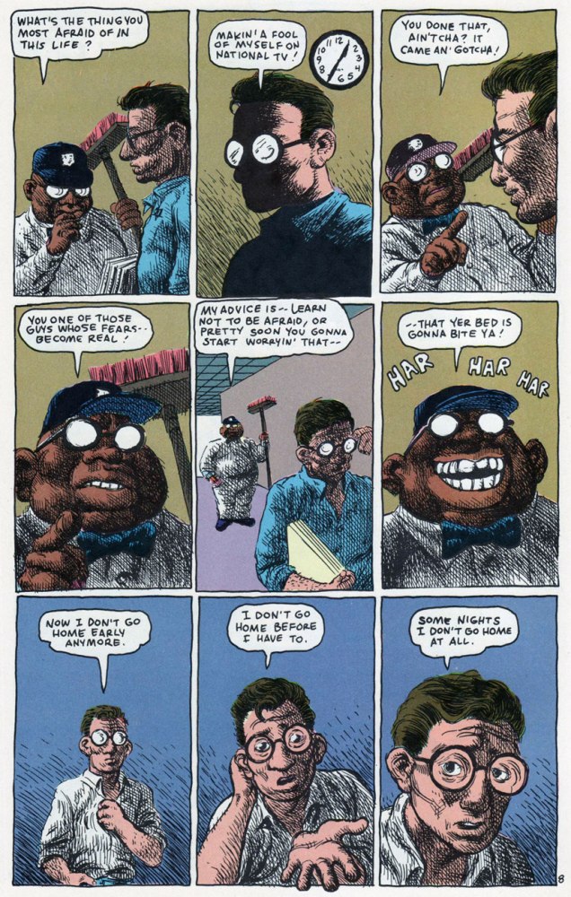
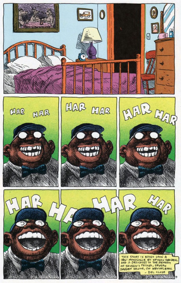
We already snuck a peek at the darker side of DC Comics’ short-lived ’80 mirage Wasteland (18 issues, 1987-89), but the title’s modus operandi was variety… within a set format. Here’s another highlight from one of the earliest and strongest issues, before its co-authors The Second City comedy legend Del Close and Grimjack co-creator John Ostrander lost the plot, interest, or both. This is American Squalor (Wasteland no. 3, Feb. 1988, DC Comics). The underrated Don Simpson, the Wasteland bullpen’s utility player, its most versatile and loyal member, gets to strut his stuff, albeit in a lovely Crumb ersatz, down to the lettering.

« Our next guest works as a file clerk at a Cleveland hospital… »

AmSqualor01AAmSqualor02AAmSqualor03AAmSqualor04AAmSqualor05AAmSqualor06AAmSqualor07AAmSqualor08AAmSqualor09A

What I find so impressive about this story is the scope of its ambition, fulfilled on several unlikely levels: it achieves success as a parody, a pastiche, a tribute, and as its own, standalone bit of workaday folk philosophy. Clearly, calling upon the trappings and rhythms of Crumb and Pekar’s American Splendor was just the starting point.

I’d love to track down (Close’s old Second City colleague) the Severn Darden monologue Close claims to have used as a springboard, but not everything was dutifully recorded for “posterity” in those days…

« I loved Harvey. He was a wonderful guest. The kind you don’t see anymore. The only real problem with Harvey was my immaturity. » — David Letterman

-RG

Tentacle Tuesday: a Treasure Trove of Charlton Tentacles

I wasn’t around in the 70s. (Literally, as in “I hadn’t been born yet”.) So when somebody – in, oh, say 2008 or so – handed me a copy of some ghost comics printed by Charlton Comics (I don’t remember what exactly), that was my first exposure to this publishing company. I wasn’t aware that I wasn’t « supposed » to like this stuff… and by the time some kind soul pointed out that it’s not exactly orthodox to seek out Charlton publications, it was too late to change my mind. Clearly, that’s how monsters with no taste are created.

Charlton Comics had the reputation for inferior printing (as one of my friends put it, « godawful colours and reproduction and paper ») and low quality control. I’d say that when one contemplates the variety of artistic styles and the dizzying panoply of artists published by them, the quality of the printing distinctly becomes a less important consideration. Charlton paid badly, sure, but since when do people decide what they like and what they don’t based on how artists are treated? (Just look around – companies that trample on creators’ rights are doing very well indeed.) It seems like a knee-jerk reaction; I often wonder if people who automatically react with sneers to the very mention of Charlton have actually read any of the comics this company printed. Or perhaps they’re scared by some of the artists’ styles which are just too wild, too squiggly, just not clean enough. (Sloppy line work! Anathema to any comic book lover worth his salt, right?)

Anyway, Charlton’s « loose editorial oversight » meant there was no house style to speak of, and artists with highly idiosyncratic styles could let their eccentricities shine.

You may notice some names are conspicuously absent from today’s post. Tom Sutton, exhibit A of the “chaotic, scratchy art” category, will get a Tentacle Tuesday post all to himself at a later date. Some beloved artists just didn’t draw any tentacles for Charlton (as far as I know!): Warren Sattler, Don PerlinSam Glanzman, Don Newton, Rocco Mastroserio, etc. Wayne Howard is already part of a Tentacle Tuesday (see Plant Tentacle Tuesday), as is Enrique Nieto (Tentacle Tuesday: Spunky Skirmishes).

Without further ado, but with lots of tentacles…

First, two beauties from Steve Ditko (if you’d like more Ditko – and who wouldn’t? – visit my co-admin RG’s lovely posts about him: Ditko’s Ghostly Haunts and Happy 90th birthday, Mr. Ditko!), both featuring “70s Ditko green“. (It’s that characteristic green hue that often appears on his covers, a fitting term coined by erudite Professor Fester.)

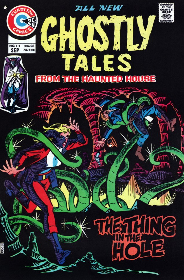
GhostlyTales#111-SteveDitko
Ghostly Tales no. 111 (September 1974), cover by Steve Ditko. « The Thing in the Hole » is a really cool story, but it’s written and drawn by Tom Sutton, and as such it’s off-limits for now (I’m hoarding material for a different post.)
GhostlyTales#122-SteveDitko
Ghostly Tales no. 122 (August 1976), cover by Steve Ditko.
GhostlyTales#122-inside
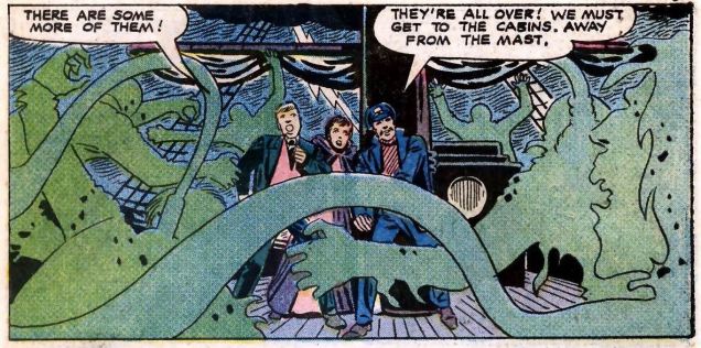
Do these green noose-appendage-things count as tentacles? Sure they do! Panel from The Crew That Was Hanged!, illustrated by Steve Ditko and written by Joe Gill.

And moving on to other series, other artists:

Haunted#8-JackAbel
Haunted no. 8 (October 1972), cover by Jack Abel (1927-1996), perhaps best known as an inker for DC and Marvel.
Haunted#13-WrongTurn-PeterMorisi
Newly-weds that are half-squid, half-fly, but newly-weds nonetheless. Page by Peter A. Morisi (1928-2003), who went by the nom de plume of PAM (or, since his signature’s M looks like a triple “I”, “PAIII!”). He was a NYC police officer, and moonlighted as a comics artist. I really like his calm, easily recognizable style and the way his characters seem to be frozen in each panel. There’s something quite effective about this stillness, a pleasing contrast between the drama and action of a story and the way people are staring off-panel in quiet contemplation, even when terrified. This story is called “Wrong Turn” and comes from Haunted no. 13, 1973.
BaronWeirWulf'sHauntedLibrary#28-MikeZeck
(Baron Weirwulf’s) Haunted (Library) no. 28 (July 1976), cover by Mike Zeck, whose career actually started at Charlton (he later moved on to Marvel to work on Master of Kung Fu, Captain America, etc.).
Haunted#28-FrankBolle-TheSource
« The creature’s tendril closed so gently around his leg, he didn’t notice it at first. Then a second grasped his arm! » The Source is the cover story of Haunted no. 28. Is old Thomas Willet mad? Well, he just has unusual taste in pets, that’s all (and, as tradition demands, he will pay dearly for his extravagance). Pencils and inks by Frank Bolle (1924-2020), who worked for Gold Key and Charlton, illustrated horror stories for Warren titles, and also had a hand in several newspaper strips (Winnie Winkle, Apartment 3-G, Stan Drake’s The Heart of Juliet Jones, and Gil Thorp).
GhostManor#1-PatBoyette
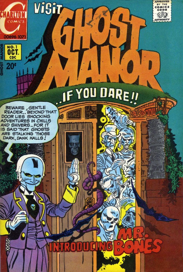
Ghost Manor no. 1 (October 1971), cover by the ever-masterful Pat Boyette (1923-2000), who’s a big favourite at Who’s Out There. Go read a whole story by him: Pat Boyette — Hillbilly Makes Good

We couldn’t find a good enough scan of this issue online, and it’s one of the rare Ghost Manors co-admin RG doesn’t actually own, so here’s a cover photostat (slightly coloured):

GhostManor58ProdA
Ghost Manor no. 58 (August 1981), cover by the Recreo Studio.
GhostlyHaunts#48-RichLarson
Ghostly Haunts no. 48 (February 1976), cover by Rich Larson (we’ve seen him before in Haunted House of Lingerie — see Tentacle Tuesday: a Day at the Beach).
GhostlyHaunts52A
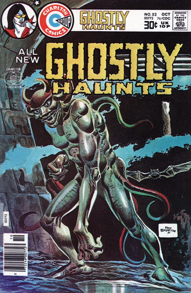
Ghostly Haunts no. 52 (October 1976), another cover by Pat Boyette, this time gorgeously painted.
BeyondtheGrave#11-MitchOConnell
Beyond the Grave no. 11 (October 1983), cover by Mitch O’Connell (also present in Have Tentacles, Will Space Travel).

~ ds

Jean Cézard and Arthur le fantôme

Writer-Artist-Colourist Jean Cézard ( Jean César), born March 23, 1924 in the small French village of Membray, saw a ghost in his room when he was ten years old. In the morning light, the spectre turned out to be naught but one of his mom’s blouses, but the seed was sown: the incident would inspire his most famous creation, Arthur le fantôme justicier.

Arthur first manifested himself (though still invisible!) in issue 449 of comics weekly Vaillant (December 20, 1953). The editorial team realizing the character’s vast potential and charm, Arthur then returned with issue 451 (January 3, 1954), this time fully visible (when he so desired) and he was set for the afterlife. After his creator’s 1977 passing, Arthur’s adventures continued for a time in lesser hands, but really, Cézard was irreplaceable.

Arthur was Cézard’s favourite series to work on, because he could set the little revenant’s* adventures anywhere and any when, and he certainly did.

Arthur2A
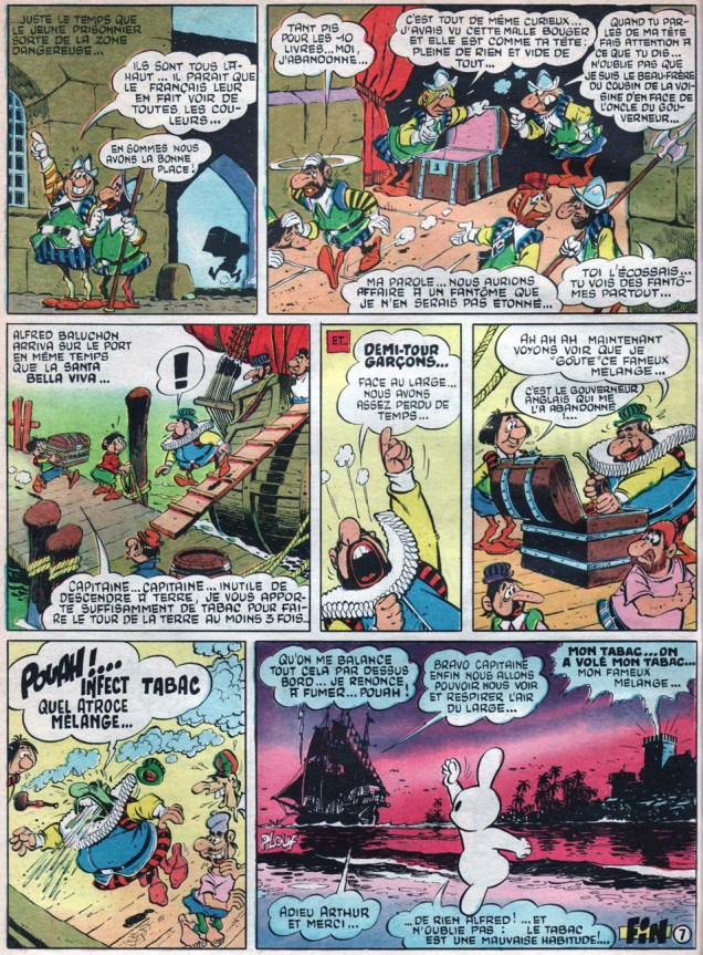
It’s all but impossible to single out an absolute favourite Cézard page, but then again, I’m not held to such arbitrary limitations. Here’s the closing page of Un fameux coup de tabac, from Pif Gadget no. 33 (i.e. Vaillant no. 1271, October, 1969) Those colours!
Arthur3A
And here we have a true splash by Jean Cézard. I wanted to showcase his astonishing aptitude for rendering castles (haunted or otherwise), not to mention complex action scenes. Arthur le fantôme et les nuisances was published in Pif Gadget no. 113 (Vaillant no. 1350, April, 1971).
Arthur1A
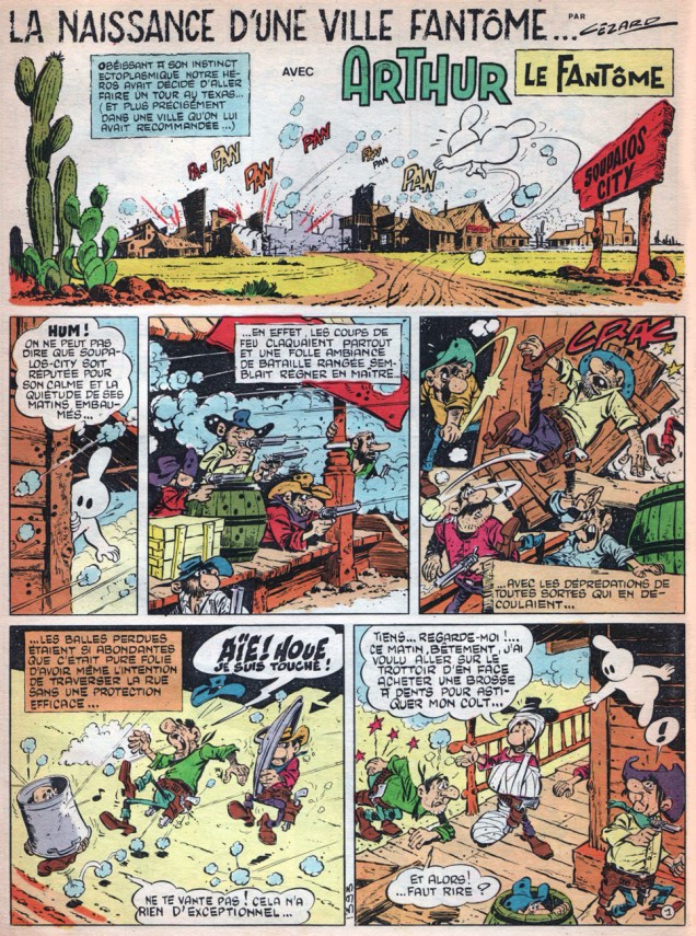
La naissance d’une ville fantôme (“Birth of a Ghost Town”), set of course in the American West (ah, ces Français et leur ‘Far West’) ran in issue 155 of Vaillant’s successor Pif Gadget in February, 1972.
ArthurBainA
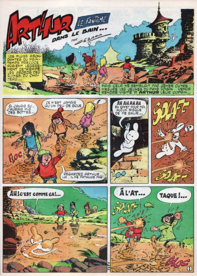
Dans le bain… (“In the Bath…”) ran in Pif Gadget no. 212 (March, 1973). By this point, at its peak, with a print run of 540,000 copies, Pif Gadget sold more than its three main competitors (Pilote, Tintin and Spirou) … combined. Then somebody got greedy, with the usual results.
ArthurPoche9A
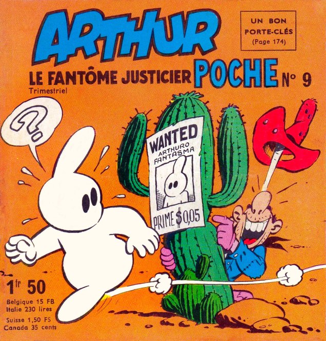
Should anyone wonder whether Cézard could also handle a less crowded, sparer layout, his covers for Arthur Poche should settle the issue. This is Arthur Poche no. 9 (July, 1966).
Arthur11A
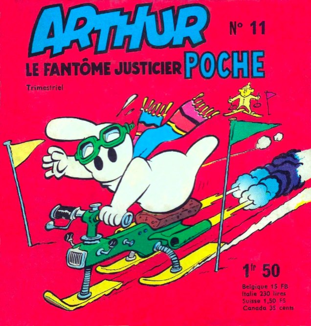
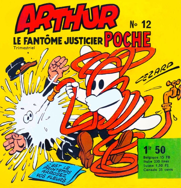
While Cézard was quite a fast worker (in a given month, he could produce around 20 pages, which means, in his case, writing, pencilling, inking, lettering *and* colouring), when it came to the half-comics, half games pocket-sized quarterly Arthur Poche, he merely provided covers. The Arthur material therein was the work of Cézar-trained Michel-Paul Giroud. This is Arthur Poche no. 11 (January, 1967).
ArthurPoche12A
This is Arthur Poche no. 12 (April, 1967).
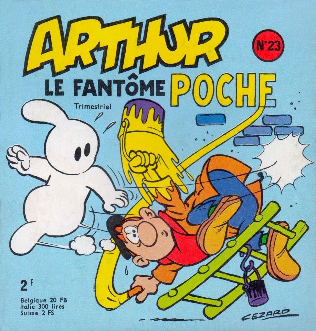
ArthurPoche23A
This is Arthur Poche no. 23 (January, 1970)

Les Éditions Toth, an ambitious Parisian publisher, set out to restore and reprint the works, but after five volumes (2002-2006), the enterprise seems to have stalled. However, another specialty publisher, Éditions du Taupinambour, picked up the gauntlet and published all of Cézard’s Pif Gadget Arthur stories (1969-77) in 13 volumes. That leaves, it seems, a gap of five years or so.

In closing, an anecdote about the loneliness of the long-distance cartoonist, told by Pif’s finest editor-in-chief Richard Medioni (1947-2016) in his definitive chronicle of Vaillant’s rise and fall, Mon camarade, Vaillant, Pif Gadget : l’histoire complète, 1901-1994 (2012, Vaillant Collector): « So I begin to read the episode that Jean has brought — when an author hands me his new pages, I necessarily read them in his presence, because I’m eager to read them, of course, but also out of respect for the work accomplished — and I admire it.

As I read on, Cézard comments here and there… when I laugh, he smiles. Sometimes, he points out a detail in the drawing that I missed… he never ceases to observe me and appears satisfied when I react as he had hoped.

Suddenly, it dawns upon me just how important such a session is to him. I bring up the notion and he explains:

“I spend days at my drawing table, alone, without a soul to appreciate my toil. And it’s a lot of time. No-one to give me a sense of what works and what doesn’t, what will bring a laugh and what will fall flat. So, when I come here, in seeing your response, I get that indispensable connection with my audience…” »

-RG

*Arthur, unlike, say, Casper, isn’t the shade of some dead child: his parents made him the old-fashioned way.

Tentacle Tuesday: Prince Namor, the Sub-Mariner

Created by Bill Everett, Namor the Sub-Mariner first appeared in Marvel Comics no. 1 (October 1939). The offspring of a human sea captain and a princess of Atlantis (and thus proudly bearing the title of Prince), he possessed the aquatic talents one expects of a regular merman and the exceptional strength of a carnival strongman. The cool thing about Namor is that right off the bat, he was a rather negative character – to be more precise, he was an Enemy of the United States (Everett didn’t mince words or characters, huh?) As Les Daniels states in his Marvel: Five Fabulous Decades of the World’s Greatest Comics (1991), « Namor was a freak in the service of chaos. Although the Sub-Mariner acted like a villain, his cause had some justice, and readers reveled in his assaults on civilization. His enthusiastic fans weren’t offended by the carnage he created as he wrecked everything from ships to skyscrapers. » This chaos culminated in an epic fight with Human Torch in 1941 when Namor took things a little too far and threatened to inundate the whole island of Manhattan. This little skirmish didn’t prevent him from joining the Allies’ side once World War II started, however, which gave a more constructive outlet for his somewhat destructive energies.

Right from the beginning, the Sub-Mariner was a complex character who just wouldn’t fit into the standard good guy/bad guy dichotomy. He underwent through quite a few transformations, disappearing for a bit right after WWII like many of his super-and-anti hero compatriots (but never for more than a couple of years at a time) and resurfacing during the Silver Age as a slightly different character. Namor’s concern about encroaching technology and hate of humanity, his fierce independence, made him a likeable character for those of us who like mavericks. He is a tragic character, a king without a kingdom who finds that Atlantis and its people have been destroyed by nuclear testing. After that, who wouldn’t hold a grudge? Anyway, if you’d like a more cogent overview of the Sub-Mariner’s history, visit The Great Comic Book Heroes.

To get back on topic, given how much time Namor spends underwater, it’s hardly surprising that he quite frequently encounters tentacles.

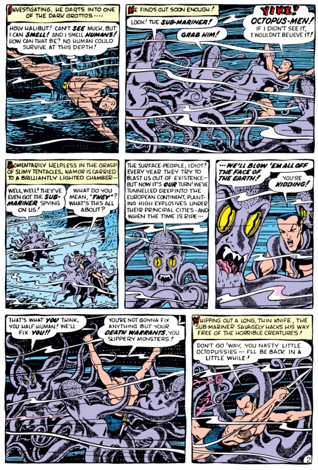
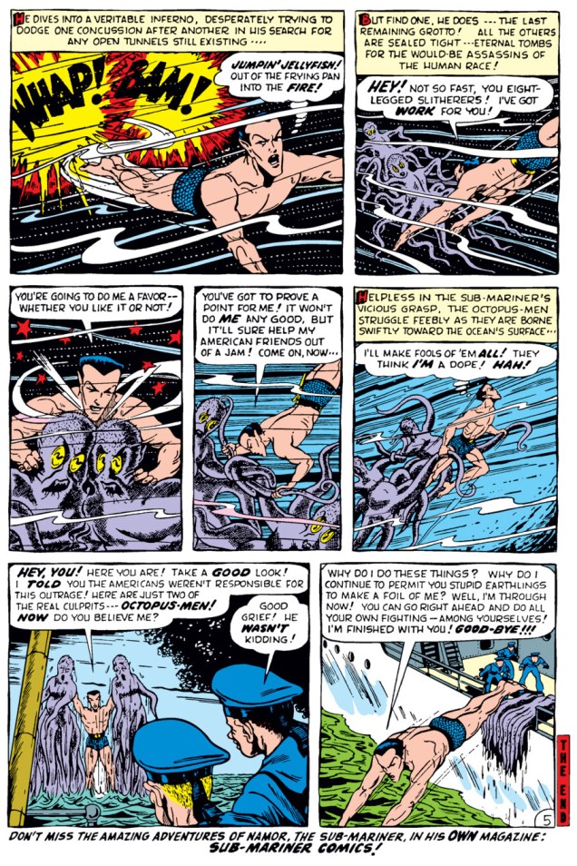
First, a story scripted and drawn by Bill Everett – who better to introduce the character than his creator? This is “The Octopus-Men!”, printed in The Human Torch no. 38 (August 1954).

BillEverett-Submariner-TheHumanTorch38-1
« The Original Aquaman » ? My, aren’t we testy. Now, now, you boys both belong to a long, storied tradition.

BillEverett-Submariner-TheHumanTorch38

BillEverett-Submariner-TheHumanTorch38-2

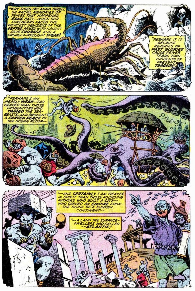
Skipping ahead some twenty years, a page from “Namor Agonistes!”, scripted by Roy Thomas, pencilled by Ross Andru and inked by John Severin, printed in Sub-Mariner no. 38 (June 1971). This is sort of an origin story of the Sub-Mariner. Lovely art, n’est-ce pas?

Submariner38-RossAndru-JohnSeverin

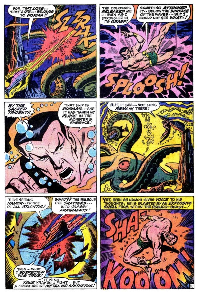
A page from “When Wakes the Kraken!”, scripted by Roy Thomas, pencilled by Sal Buscema and inked by Mike Esposito, printed in Sub-Mariner no. 27 (July 1970):

Sub-Mariner #27-SalBuscema-RoyThomas

Oh, let’s have a couple of covers, too.

Sub-Mariner13
A rather random assortment of creatures, isn’t it? Sub-Mariner no. 13 (May 1969), pencils by Marie Severin and inks by Joe Sinnott.
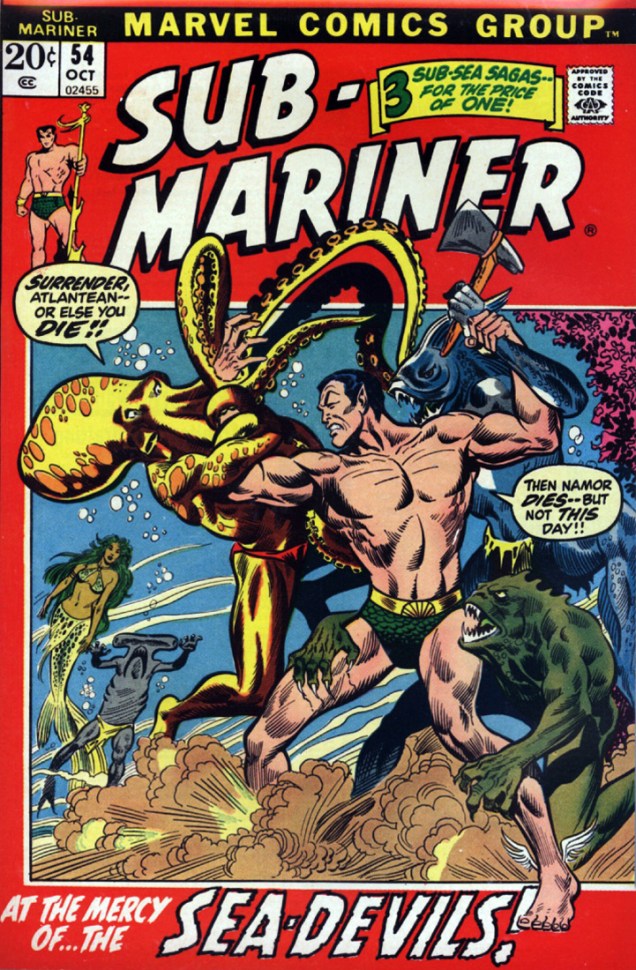
Sub-Mariner54
Umm… why is a piranha wielding an axe? Sub-Mariner no. 54 (October 1972), pencilled by Alan Weiss and inked by Frank Giacoia.

I mostly sneer at modern “reboots” of Golden or Silver Age characters, but Namor’s appearance in the excellent Thor the Mighty Avenger (Marvel, 2010) was completely à propos. (The series is a happy union of an absorbing story with great graphics – it’s written by Roger Langridge with art by Chris Samnee.) Here’s a page from “Thursday Morning“, published in Thor the Mighty Avenger no. 5 (December 2010).

ThorTheMightAvenger

~ ds