Greetings! Today we take another foray (I started with Tentacle Tuesday: the Many-Armed Tentacle Strip) into (modern) newspaper strips. It’s easy to assume that everything published in your paper’s comics page is drivel, but there’s some reassuring exceptions to this rule.
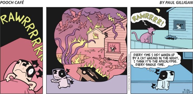
First, we have Canadian Pooch Café, around since 2000. One wouldn’t think that a strip about a dog (Poncho, the terror of the neighbourhood) and its owners and friends would have tentacles in it, but it does, much to my delight.
The fish in the bowl (named Fish) is a recurring character, cohabiting (and occasionally having his life and safety threatened by) Poncho.All cats in this strip are purple and are indistinguishable one from another.
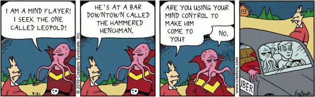
Scary Gary, by Mark Buford, follows the everyday tribulations of a 700-hundred year old vampire who’s gone quite soft and suburban. The most excitement he can hope for is purchasing a new bag of chips… on the other hand, his henchman Leopold’s life is a whirl of nefarious, villainous schemes and ploys.
In case you didn’t know what a mind flayer is, it’s the same thing as an illithid 😉
My colleague has talked in detail about a certain crotchety witch in Growing Old Gracelessly With Broom-Hilda, so I’ll just leave this one strip here (and politely inquire why Broomie thinks that the octopus isn’t good enough to cuddle with, huh, HUH??)
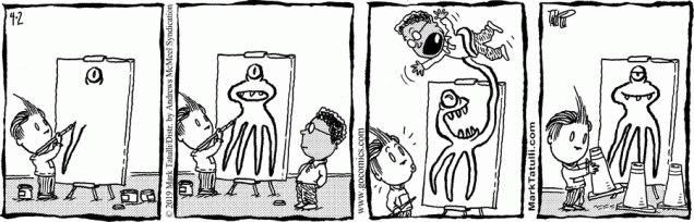
Mark Tatulli’s Lio is a riot of tentacles, given that Lio’s best friend is a giant squid. All of it is pretty fun, but once in a while I’m so charmed that I save the strip to my computer. Here are some of those saved, favourite strips:
No doubt Dr. Zoidberg would rush towards the seafood buffet offer with similar speed. Or is Ishmael just angry for friends of his that have been fried?
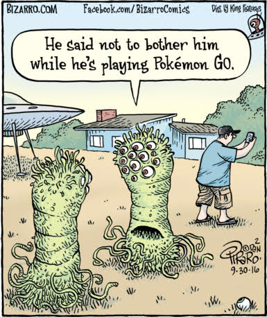
Bizarro – ah, to be able to rely on something that’s still good some thirty-plus years later -, has already had a Tentacle Tuesday of its own (see Let’s Get Bizarro), but since then I’ve accumulated a few extra strips.
« Oh, this is perfect . . . this is exactly what comic books are supposed to look like. » — Chris Samnee on encountering Frank Robbins‘ “Man-Bat Over Vegas” [ source ]
For a change of pace, here’s an artist in the prime of life and at the peak of his powers.
Chris Samnee, born in 1979, first caught my interest when he collaborated with Roger Langridge on Thor: The Mighty Avenger, for which he reaped the 2011 Harvey Award for Most Promising New Talent. But some of my superhero-lovin’ friends had been raving about Samnee’s work for a while.
While obviously a man of his time, he’s clearly drunk deep from the well of classic illustration, comic books and most of all, comic strips. It’s hard to miss in his work echoes of Alex Toth, Doug Wildey, Frank Robbins, Milton Caniff, Will Eisner, Roy Crane… an artistic heritage not too unlike his fellow Daredevil alumnus David Mazzucchelli‘s… fine company, plumb in that sweet spot between ‘realistic’ and ‘cartoony’, and wisely drawing from both.
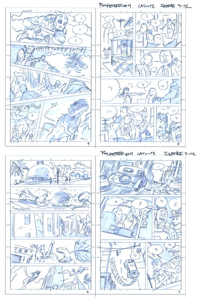
As befits a first-rate cover artist, Samnee thoroughly thinks and feels his pictures through, thumb-nailing his layouts and planning his moves. Here are some of his preliminaries from The Rocketeer: Cargo of Doom (2011), for which he shared (with David Aja) the 2013 Will Eisner Award for Best Penciller/Inker.
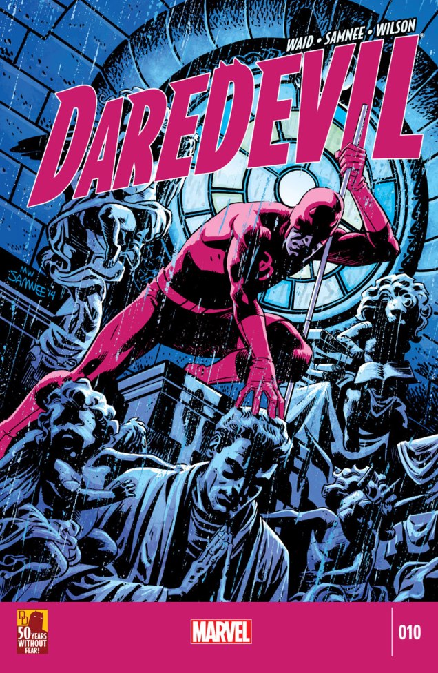
Cargo of Doom marks the first time ever when the character of Betty isn’t sexualized to the hilt. That’s got to count for something.This is Daredevil no. 9 (Dec. 2014). Incidentally, after the intrusion of bar codes on covers in 1975, followed by an increasingly hard-sell culture, the kind of elegantly spare, striking design I personally gravitate to hasn’t had it easy. A surprising step in the right direction came in recent years with the demise of the Comics Code, the introduction of digital editions and the appearance of a handful of enlightened editors (take a bow, Axel Alonso!), first at DC/Vertigo, then (as usual) later at Marvel.This is Daredevil no. 10 (Jan. 2015). Another example of a digital edition: compare this to a 1970s Marvel cover!This is Daredevil no. 11 (Feb. 2015). The Stunt-Master, seen here, first appeared in Daredevil no. 58 (Nov. 1969). It was the era of Evel Knievel and his Daredevils.This is Daredevil no. 11 (Feb. 2015). Hey, even more room for the art!And this is Daredevil no. 13 (Apr. 2015).
And speaking of inks, he sharply stands out in that regard in today’s assembly-line industry. It’s different for every artist, but Samnee loves to ink. He claims: « My pencils are just awful. I can’t imagine anybody else inking me nowadays because most of the work is done in the ink. ». I can relate.
While I greatly enjoyed Thor: The Mighty Avenger, the covers were solid but not outstanding. But Mr. Samnee’s still improving (!), and so a couple of years down the pike, and with the crucial input of colourist Matthew Wilson, a man without fear of colour saturation, we have a hot streak! And yeah, surrounding issues 8 and 14 kind of fell flat, so it’s a fairly short one. But there are quite a few quite outstanding covers outside of this subjective selection, so keep an eye out, and prepare to have it dazzled.
« You know, the dog food that Billy Jack loves! » — The Firesign Theatre
Ah, September the 18th. Today’s the birthday of the staggeringly accomplished William Stout (born in 1949), master of ancient reptiles, bootleg record covers, friend of The Firesign Theatre, former Russ Manning assistant (none but the best would do!), and I’ll spare you the illustrious details of his career in cinema. Still, let’s look around a bit, shall we?
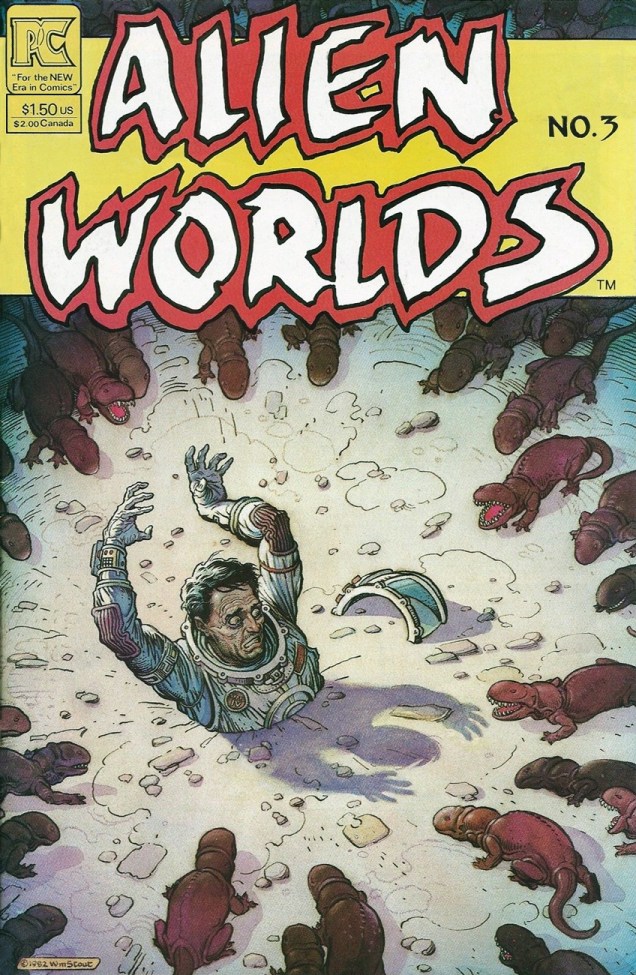
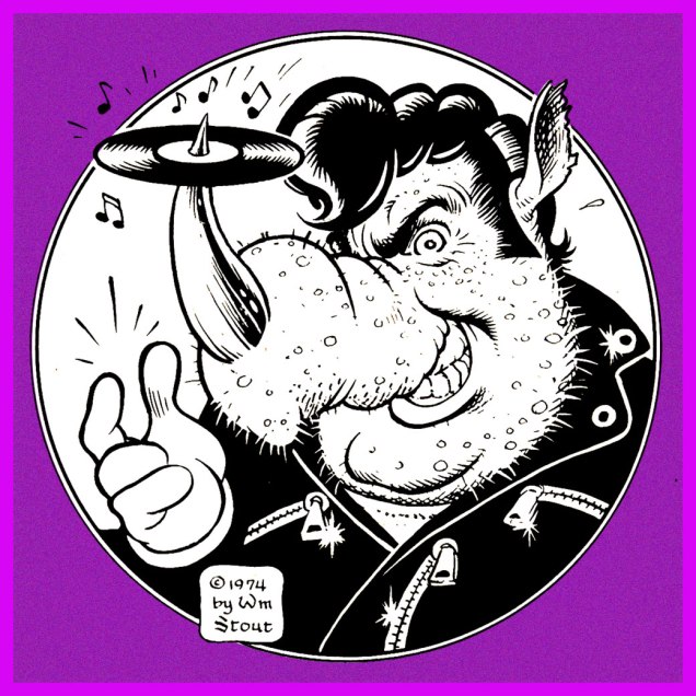
Here’s an unforgettable cover from Alien Worlds no. 3 (July, 1983, Pacific Comics). This scene gave me nightmares, and still raises a shudder. These critters look like a hybrid of a platypus and a piranha. Happy landings!Stout’s wonderful original logo for Rhino Records, circa 1974.
Speaking of ’74, isn’t that rhino a dead ringer for Swan’s oleaginous right-hand man, Philbin, from Phantom of the Paradise?
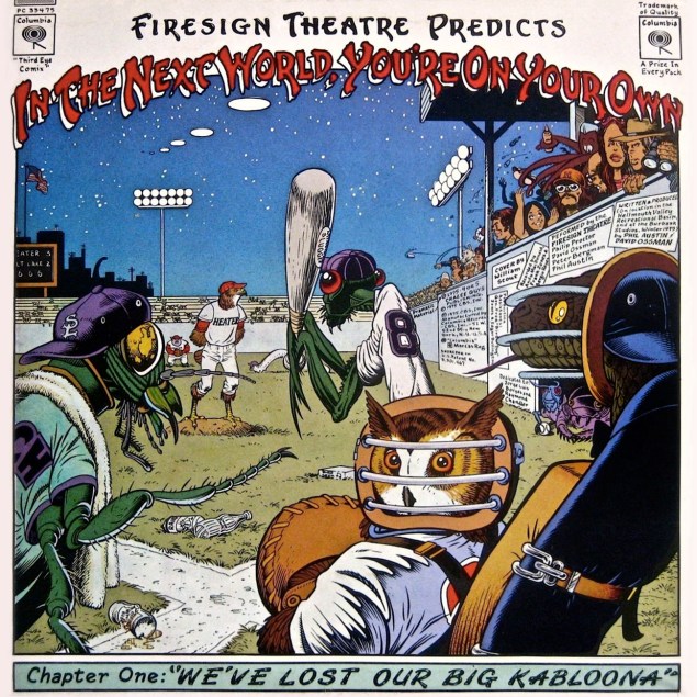
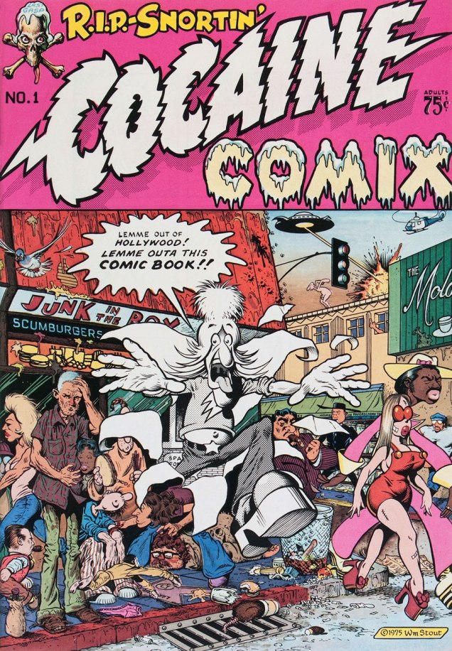
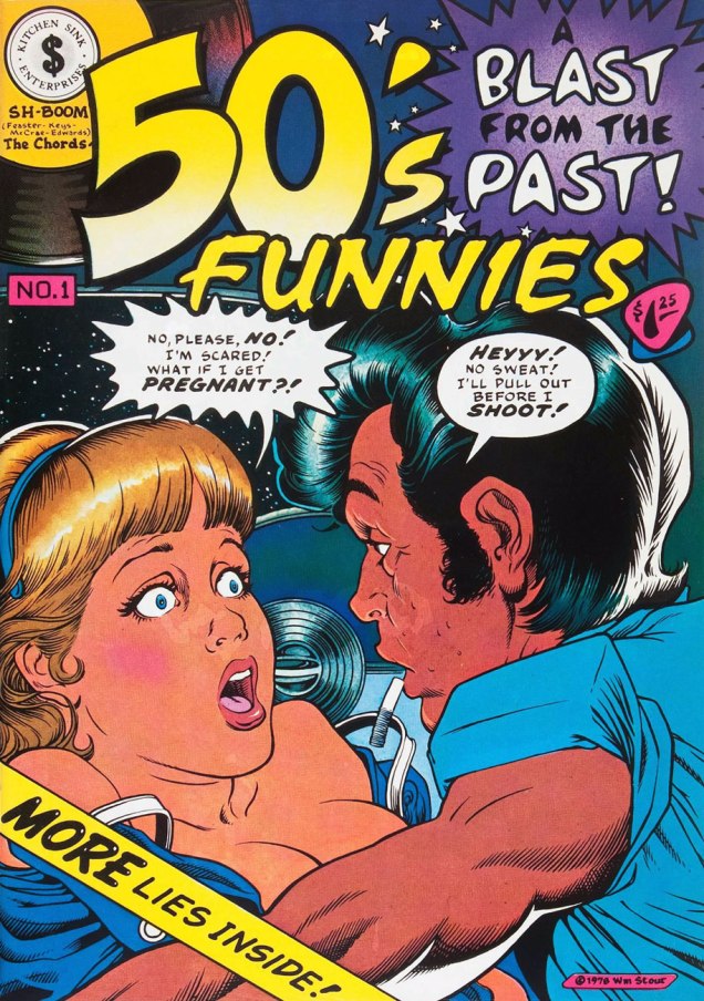
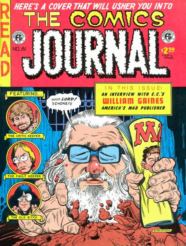
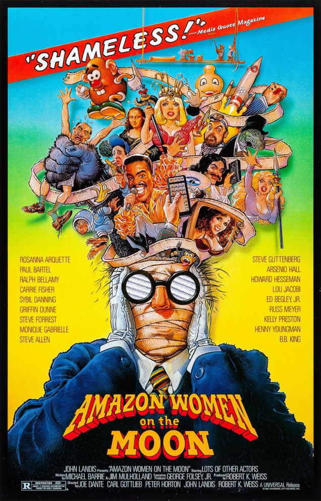
This is the back cover (the recto is equally sumptuous) for The Firesign Theatre‘s 1975 opus, In the Next World, You’re On Your Own, featuring a pair of classic sidelong suites, Police StreetandWe’ve Lost Our Big Kabloona.A clutch of underground classics? Sure. Here’s Cocaine Comix no. 1 (Feb. 1976, Last Gasp).Another number one (with a bullet, of course): 50’s Funnies no. 1 (1980, Kitchen Sink). More lies inside!A favourite page from Stout’s masterpiece (or certainly his great labour of love, at the very least): The Dinosaurs: A Fantastic New View of a Lost Era (1981, edited by Byron Preiss). This piece (the first he drew for the book) is entitled Hot Weather. « After lifting his head for air, he drank more and then wallowed his whole length and breadth into the ooze, vocalizing for the first time that day, and loudly. »Say hello to friendly Ed Gein. Weird Trips no. 2 (1978, Kitchen Sink). Please note the sinisterly customized Kitchen Sink Enterprises logo, Wrightson–brand coffee, and EC Comics narrator The Old Witch impishly peeking from a lower-right shelf. And yes, can’t go disemboweling your fellow man and woman without a copy of Gray’s Anatomy. Preparation is everything!Well, there never was any doubt that Mr. Stout was an EC Comics überfan. The Comics Journal no. 81 (May, 1983, Fantagraphics).I did bring up his Hollywood work, so here’s a sample. I wasn’t going to go with his the far-too-familiar Rock ‘n’ Roll High School poster… you all know it already, so where’s the fun in that? Of course, Joe Dante’s Amazon Women on the Moon again (1987) raises the eternal question: « Who made Steve Guttenberg a Star? »
And that’s Bill Stout for you: stunningly versatile, but always himself. Could any artist strive for more?
Sometimes I stumble upon a comic with a fight-to-the-death scene in which something-or-other- with-tentacles plays the role of a lethal enemy for our hero – but upon closer inspection, in turns out that the ferocious creature is… gosh-darned cute. I mean, how can you kill anything that has adorable whiskers, or tufted eyebrows like Oscar the Grouch?
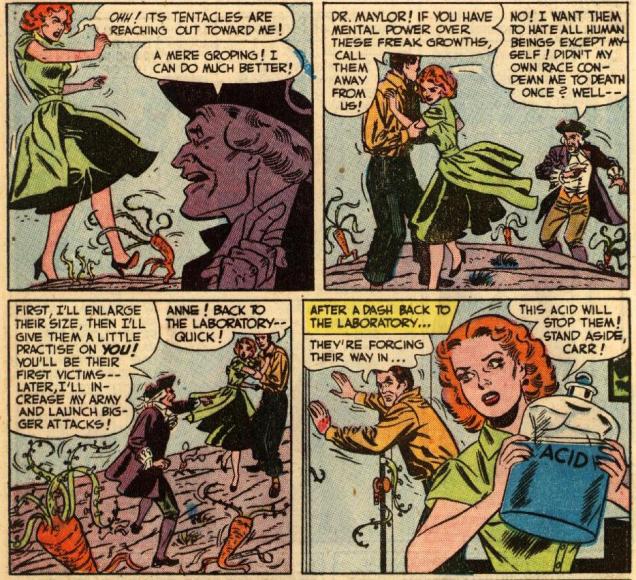
When your attackers are carrots with tentacles, and they really get on your nerves (although I think Ann is safer with them than with Dr. Maylor), I’d suggest throwing them into a nice big pot of soup, maybe… but if you please, do consider abstaining from flinging acid at them.
I do believe that prehensile vegetables fit into the category of “cute” – just look at their precious little root-legs! Page from Heroes Out of Time!, scripted by Manly Wade Wellman (hey, cool!), with some very stylish art by Bob Oksner on pencils and Bernard Sachs on inks, printed in Mystery in Space no. 3 (August-September 1951).
While we’re on that topic: things get delightfully wacky and madcap (not much) later in the story. Namely, Napoleon Bonaparte and Benjamin Franklin are summoned for help against the tentacled carrot-horde.
The Flaming Carrot would not be pleased by this massacre. If only to admire the art, you can read Heroes Out of Time!here.
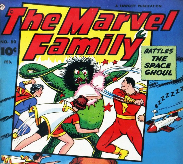
Thank you kindly for suppressing your urge to sock the creature sporting a unibrow and bloodshot eyes worthy of Christopher Lee; it’s also not his fault he got lumbered with such a shaggy wig.
Detail from the cover of The Marvel Family no. 80 (February 1953), pencils by C. C. Beck and inks by Pete Costanza.
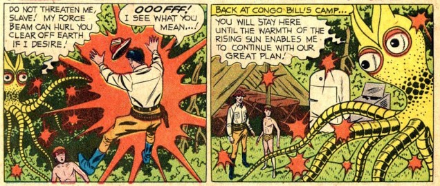
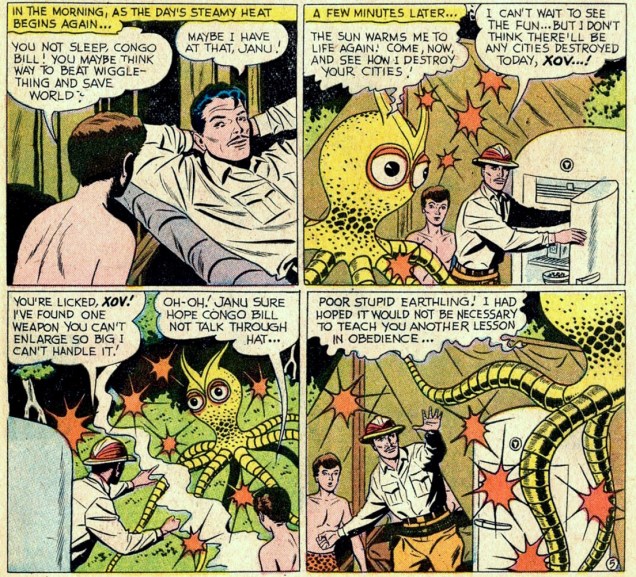
Have the goodness to think twice before pitching lethal ice cubes at an owl, even if it somehow grows metal tentacles and threatens to make mince-meat of humanity, because owls are the very cutest.
Panels from The Man-Ape Skin Diver!, scripted by Robert Bernstein and drawn by Howard Sherman, published in Action Comics no. 257 (October 1959).“Wiggle-thing”? Excuse me?
Pray, don’t kill anything that looks like it’s wearing a dragon wearing a really bad disguise, including a moustache that looks like a pile of hay.
A panel from Fate is the Killer (a preview of a Masters of the Universe story), scripted by Paul Kupperberg, pencilled by Curt Swan and inked by Dave Hunt, published as a promotional bonus in several DC titles cover-dated November, 1982.
If you would be so good as to spare the creature that looks like a mashup of a seal and a mole, especially if it gazes at you mournfully with world-weary sadness.
Masters of the Universe: The Vengeance of Skeletor! (1982), cover by Alfredo Alcala.
« The stranger’s face was entirely obscured by a broad-brimmed felt hat bent downward over his features; and the long, black coat looked almost like part of the thickening fog. » –Harry Vincent first encounters his future employer. (Shadow Magazine, April/June, 1931)
We note today the birth anniversary of Walter B. Gibson (September 12, 1897 – December 6, 1985), an extremely prolific writer and professional magician. Gibson is best known for developing the radio character of The Shadow, through nearly three hundred stories he wrote under the collective nom de plume of Maxwell Grant.
The Shadow’s had an interesting and varied career in comics, but Gibson’s novels (and the radio shows… Orson Welles!) are where it’s at. Still, let’s take a look around, shall we?
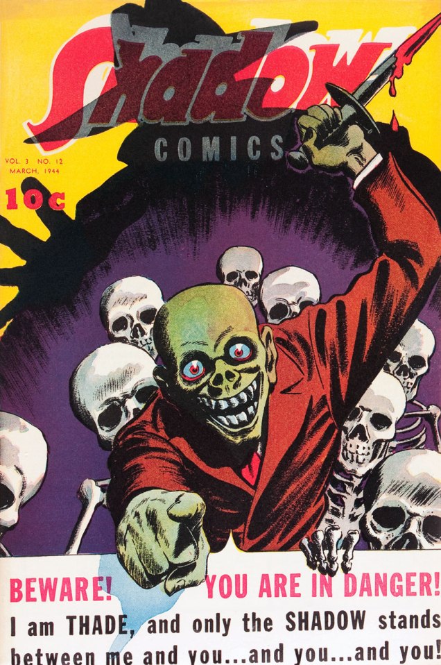
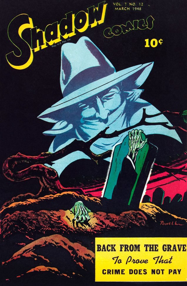
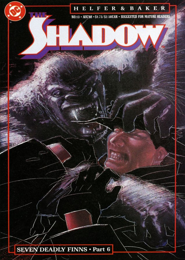
This is The Shadow Comics Vol. 3, no. 12 (March, 1944, Street and Smith); cover possibly by Vernon Greene. That Thade seems like a friendly sort, mayhap a tad overly so.This is The Shadow Comics Vol. 7, no. 12 (March, 1948, Street and Smith); cover by Bob Powell.Now why were Archie Comics allowed to take such ridiculous (though I’ll grant, perversely entertaining) liberties with The Shadow? Must have been a lull in the revival market, I suppose. This is The Shadow no. 1 (August, 1964, Archie), cover by Paul Reinman. You just wait until the subsequent issues…This, however, is not quite how Gibson envisioned and portrayed the mysterious Shadow. This off-model rendition hails from Archie Comics’ 8 issue, 1964-65 run, helmed by Superman co-creator Jerry Siegel and Golden Age journeyman Paul Reinman. This be The Shadow no.8 (September, 1965).A privileged peek at Frank Robbins‘ original cover art for The Shadow no.7 (Nov. 1974), second of his four (or so) covers for DC, featuring Night of the Beast!, scripted by Denny O’Neil. Yummy… but too short.Two great Street & Smith pulp heroes face off! Mr. Kaluta takes some artistic license here, however, since Ike (as The Avenger calls his throwing knife), is supposed to be small and almost needle-like, not a freakin’ butcher knife. Come to think of it, the Shadow’s trusty automatics look like something a Rob Liefeld character would wield. One doesn’t encounter often the final three issues of DC’s initial run of The Shadow. Post-Kaluta (save the covers) and post-Robbins, the art was handled by Filipino artist E.R. Cruz, who did a commendable job, while series regular Denny O’Neil (who wrote all issues except for number 9 and 11, Michael Uslan ably filling in) stayed until the curtain was drawn.Skipping the heinous Howard Chaykin revival, in which he delighted in sadistically dispatching The Shadow’s aged former operatives in gruesome ways (why do these people always call themselves fans of the original series?), we move on to the Andrew Helfer-Bill Sienkiewicz regular book. Better, but still not great. This is The Shadow no. 3 (Oct. 1987). Cover by Bill Sienkiewicz.Ah, now things perk up. A nasty but excellent tale, worthy of Michael Fleisher at his bugfuck best; the shade of Marshall Rogers and smart up-and-comer Kyle Baker were a good visual match. This is The Shadow no. 7 (Feb. 1988).This is Kyle Baker’s cover for the finale of his and scripter Andrew Helfer’s thrilling and hilarious Seven Deadly Finns saga (no. 13, March 1988) that made The Shadow such a must-read title. To quote Kate Bush, « What made it special made it dangerous », and the folks at Condé Nast, who hold the rights to the classic Street & Smith characters (also including Doc Savage and The Avenger) reportedly got twitchy* at the reckless liberties the Helfer-Baker team were taking and pulled the plug after issue 19, where a beheaded Shadow gets a big action robot body. The Shadow was rebooted the following year in more obedient hands, with quite pedestrian results.
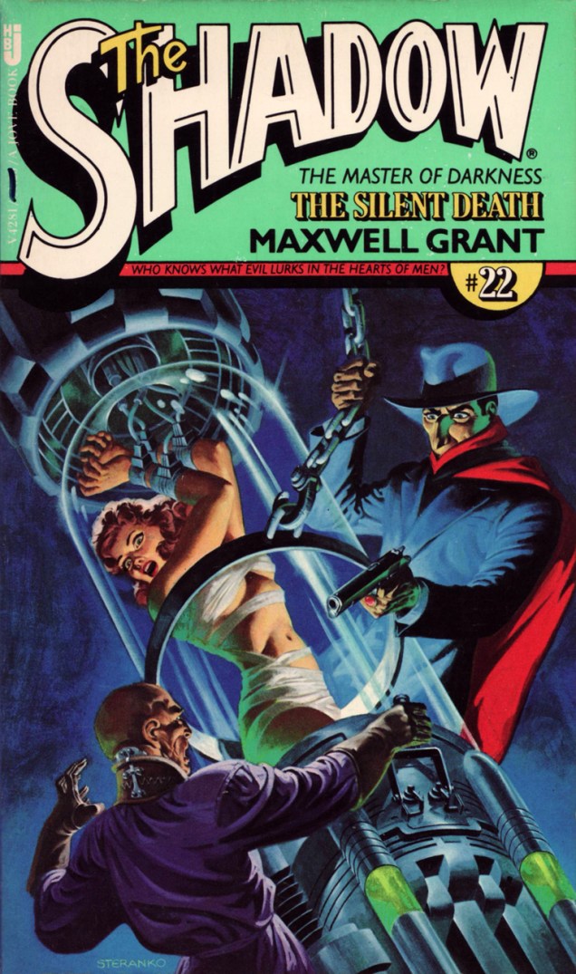
As a bonus, let’s slightly depart from comics proper and admire a couple of paperback reissues from the brush of noted fabulist James Steranko.
Steranko comes up with one of his subtlest, most unctuously moody covers for Pyramid’s 1974-78 series of Shadow paperbacks that introduced these classic pulp adventures to a new audience, picking up where its predecessors Belmont (1966-67) and Bantam (1869-70) had left off. Pyramid had one extra trick in its bag, though: Jim Steranko, who painted tantalizing covers for each of Pyramid/Jove’s twenty-three volumes. This particular case file, MOX, « from The Shadow’s annals as told to Maxwell Grant » originally appeared in The Shadow Magazine vol. 7, no. 6 (November, 1933).Natty dresser Jim Steranko has built up, over the years, quite a biography for himself. Of his numberless and prodigious accomplishments, my favourites are those that actually happened, such as a stunning series of cover paintings for Pyramid Books’ reprints of vintage Shadow pulps from the 30s and 40s. This one, twenty-second in a set of twenty-three, was published in March of 1978. The Silent Death initially saw print in The Shadow Magazine, Vol. 5, no. 3 (April 1, 1933.)
« J’fais dans la bande dessinée, qu’est bien plus pop que le ciné!* » — J.C. Forest (Une chanson, 1973)
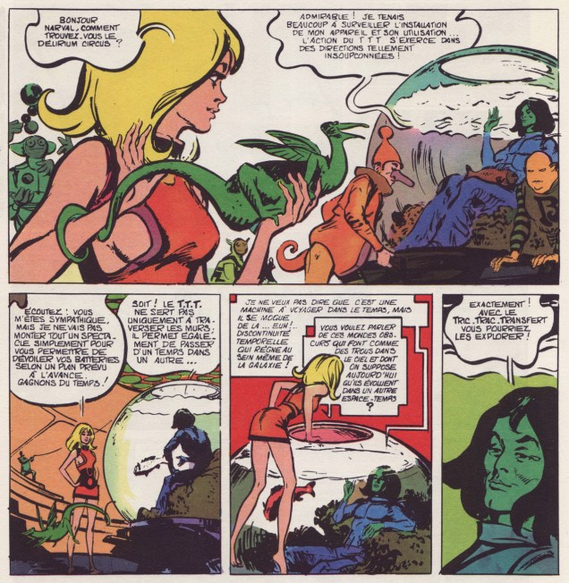
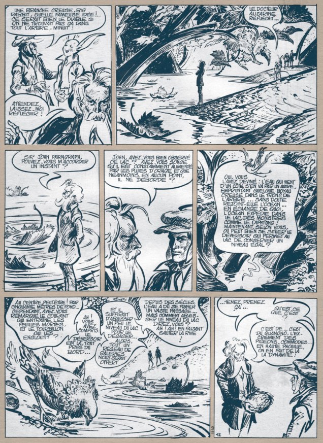
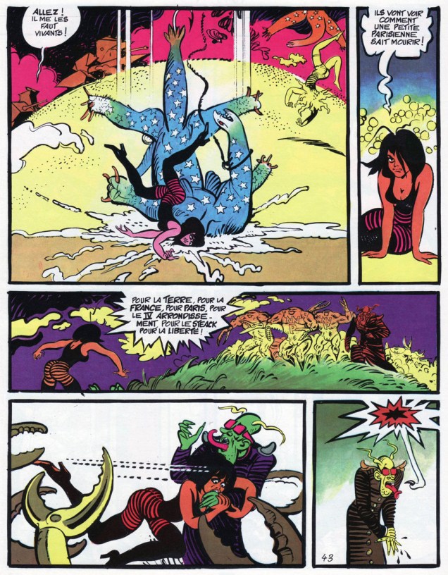
On the eighty-ninth anniversary of his birth, let’s salute in passing one of the great pioneers of French comics, namely Jean-Claude Forest (Sept. 11, 1930 – Dec. 29, 1998), Barbarella’s creator, the man who, in the early 1960s, ushered strictly-for-kids bandes dessinées into decidedly more risqué and adult realms of eroticism, fantasy and fun.
Born on September 11, 1930 in the Parisian suburb of Le Perreux-sur-Marne, he passed away in 1998 at the age of 68, but not before leaving behind a body of work of breathtaking depth and variety. Barbarella aside (sorry, miss): Le Copyright (the springboard for Nikita Mandryka‘s Le Concombre masqué), Hypocrite, Mystérieuse matin midi et soir (his wild riff on Jules Verne’s L’île mystérieuse), Bébé Cyanure, Les Naufragés du temps (illustrated by Paul Gillon), Enfants c’est l’Hydragon qui passe… « et j’en passe », as they say.
Here are a few highlights to give you a sense of the man’s imagination, versatility and tremendous draftsmanship, in chronological order.
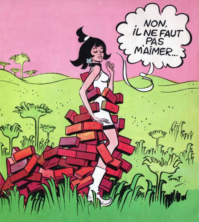
An excerpt is from Les colères du mange-minutes (1965-66), the second volume of Barbarella’s adventures. Yes, there was a film adaptation, but it’s, well, pretty vapid. Director Roger Vadim was kind of the Gallic John Derek; both were fair-to-middling directors whose chief talent was womanizing. Though one has to admit it *was* quite a talent.« No, you mustn’t love me… » Detail from the cover of giff wiff, revue de la bande dessinée no.22 (Dec. 1966), previewing its article on Forest’s 1965 experimental tv cartoon Marie Mathématique, which you can watch here. It features the dulcet tones of Le beau Serge, certainly one of the most overrated artistes of the 20th century. Too much competition to call the race to the bottom, though. 😉Born out of a misunderstanding between the editorial team of Pif Gadget and Forest, Mystérieuse matin midi et soir proved too labyrinthine for the magazine’s young readership, cost the publishers a bundle, and only two of its three parts appeared in Pif. Fear not, it was collected in album form the following year. This is a page from part 1, which saw print in Pif Gadget no. 111 (April, 1971).
A sequence from the rollicking N’importe quoi de cheval…, featuring Hypocrite, another of Forest’s spunky heroïnes. From Pilote Mensuel no. 6 (Dargaud, Nov. 1974).
A pair of pages from the melancholy, elegiac Enfants, c’est l’Hydragon qui passe « Children, there goes the Hydragon » (Casterman, 1984).
I’m sure it’s mere coincidence, but the boy, Jules, seems to be modelled after yet another Gainsbourg “muse”, pop nymphette Vanessa Paradis.
« It is not Frank Hampson’s original creation from the 1950’s Eagle, far from it. This is a different beast, featuring a harder man in a harsher world, a long way from the good-natured stoicism and stalwart, stiff upper lip of the original… »
(Garth Ennis in his introduction to Dan Dare: The 2000 AD Years)
Dan Dare, sort of the British answer to Buck Rogers, took his earliest space flight in the pages of the very first issue of Eagle, a now legendary British children’s comics periodical. He was created by illustrator Frank Hampson. From the day of its inception, Eagle was meant to perch on a high moral ground. Its founder, reverend John Marcus Harston Morris, an Anglican vicar, devised the Eagle in collaboration with Hampson (one of his parishioners, and a budding artist seeking fulfilling work) with a specific purpose in mind: a magazine that would hold itself to high standards of art and printing, but would stay away from violence and depravity, instead offering children wholesome characters they could use as role models. Aligned with that vision, Hampson’s Dan Dare stories were meticulously researched, based on a wealth of models (space ships, suits, and even a complete space station) and reference materials, including the services of Arthur C. Clarke as a science and plot advisor in the early days of the strip. Dan Dare‘s complex plots, witty dialogue and full-colour art guarantee that British children who lived through the 50s cherish their memories of this character.
1959 was the year of change – Morris resigned from the editor’s seat after bitter disputes with the bean-counters from Hulton Press (Eagle’s publisher at the time). Shortly after, the Eagle was taken over by Odhams Press, with the new owners objecting to the complexity of Dan Dare stories as well as the cost of Hampson’s studio. Hampson could not compromise his lofty standards and pursuit of perfection, and left. Things were never the same after that, with Dan Dare strips varying in format and quality until the series ended in 1967.
Fast forward to 1976. « A punk who has always written outrageously violent, scabrous satirical and often hilariously funny attacks on authority and the establishment» – which is to say, Pat Mills, a British freelance writer and editor – set out to create a science-fiction themed weekly publication, 2000 AD. With the aid of John Wagner as script advisor, presided over by John Sanders, the publisher, he decided to 1. develop a horror strip, which later became Judge Dredd; 2. revive Dan Dare, so that at least something about 2000 AD would have immediate public recognition. Oh, there were plenty of other strips in there, too, but that’s a topic for another conversation.
« 1976. I realize that the science fiction comic I’m creating, 2000 AD, needs a space hero. I think about bringing back Dan Dare – the publisher, John Sanders, is agreeable, he tells me not to worry about the original fans. I study the bound Eagle volumes. Artist Belardinelli submits a wild version on spec. At least it’s exciting and eye-catching and – most important – helps us over the poor quality paper. 2000 AD appears, it’s a success and Dan Dare is popular – about 3rd or 4th in the popularity charts. I don’t recall any critical letters apart from things along the lines of « my dad doesn’t like it, but I do ». And, sometimes, « my dad likes it, too ». Lots of criticism in the press, however, but we don’t care about annoying them. In fact we quite like it. » (From an article by Pat Mills, published in Spaceship Away: the Dan Dare Fan Magazine)
Okay, now that we have the backstory over with, on with the tentacled show!
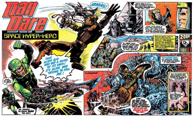
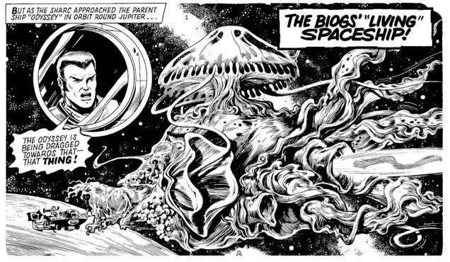
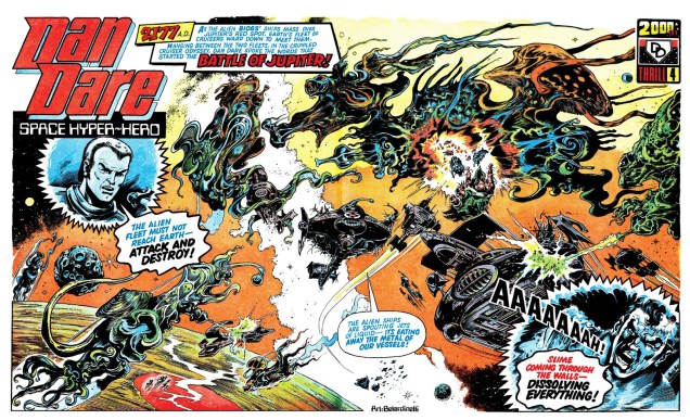
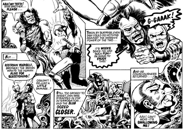
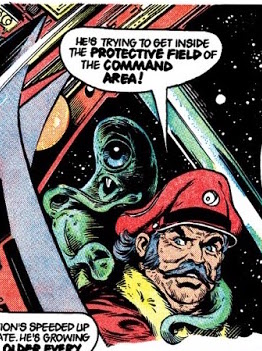
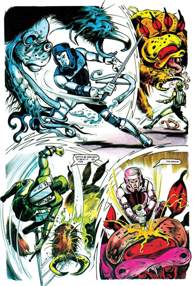
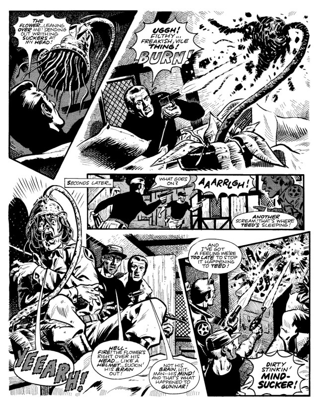
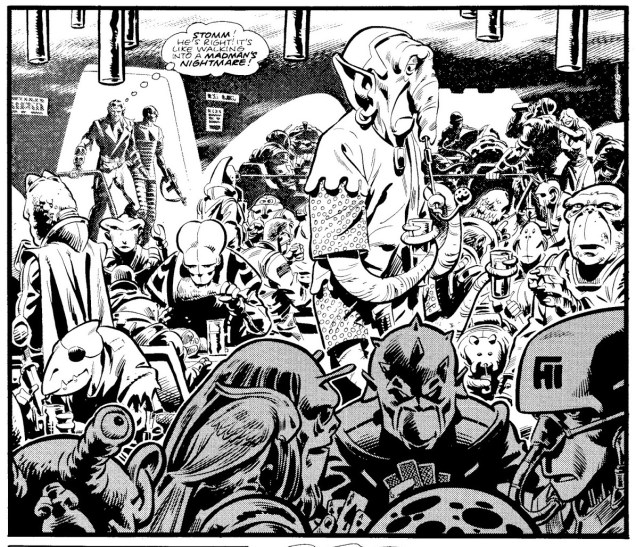
Dan Dare’s early 2000 AD adventures were drawn by Massimo Bellardinelli, who seems to take great delight in adding tentacles hither and thither. Are we expected to believe that every alien and every alien’s ship is be covered in them? Yes? Ah, okay. Please carry on.
The first, self-titled story, published in Programmes 1 to 11. Scripted by Ken Armstrong, Pat Mills and Kelvin Gosnell, and drawn by Massimo Belardinelli.
Hollow World, scripted by Steve Moore with art by Massimo Belardinelli, published in Programmes 12 to 23.
This cutie from Hollow World also wished to say “tally-ho!”:
Belardinelli’s style is often described as “hallucinatory”. Despite Pat Mills’ portrayal of his art as “eye-catching” (although even Mills thought that he made “the hero look awful”), his work on Dan Dare was not very popular. It’s also possible that readers were still sore about Dare’s sacrilegious resuscitation. All I can state with certainty is that it’s not really *my* cup of tea – I prefer my cuppa strong and dark, without excessive flourishes or hallucinations, thank you kindly. For those of you who agree, more… grounded times were coming: with Programme 28, Belardinelli switching over to drawing Harlem Heroes while Dave Gibbons took over Dan Dare, with an occasional hand from Brian Bolland.
Greenworld, scripted by Gerry Finley-Day, art by Dave Gibbons and Brian Bolland., published in Programmes 34 and 35.
A little trek into the past, back to the hallucinatory tentacles: The Curse of Mytax, drawn by Massimo Belardinelli, published in 2000 AD annual 1978.
Oh Dan, where is your moral compass now? While I love the guys from 2000 AD to bits, I have to grudgingly admit that taking someone else’s character and modifying his raison d’être beyond all recognition is a tad uncouth (and certainly anti-authoritarian, which is, after all, Pat Mills’ leitmotif). Can you imagine how this trigger-happy Dan Dare apparition, some 25 years later, ruffled the feathers of readers who take their heroes seriously? (If we have any readers who have lived through this themselves, please chime in!)
« Indeed, the reader may be forgiven for thinking that the Lost Worlds sector is soon going to be a very quiet sector indeed, just because there’s not going to be much left of it. The frequency with each our heroes resort to violence – sudden, crushing, all-consuming, high-velocity violence that utterly obliterates whatever it’s unleashed upon – – is really quite spectacular. Unidentified species of dodgy appearance? Play safe, fry ’em. Giant-sized aquatic life form? Got to be worth a torpedo or two. Alien intruder? Give it loads. If things get sticky, just do the whole ecosystem. And you know those planet-busters we’ve got in the tail-fins…? »
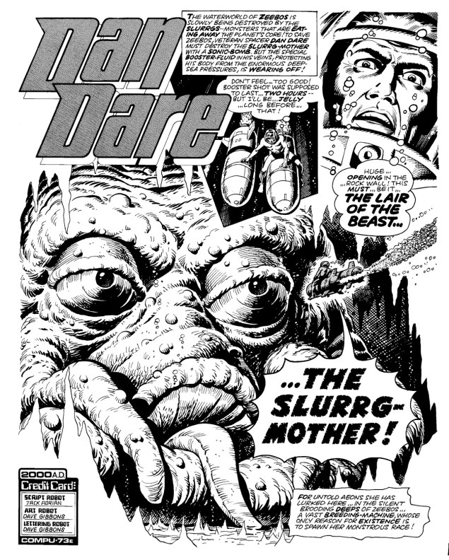
Waterworld, scripted by Chris Lowder (as Jack Adrian), with art by Dave Gibbons. Originally published in Programmes 56 to 60.
Does the Slurrg-Mother have tentacles? Such a silly question…Nightmare Planet, scripted by Chris Lowder (as Jack Adrian), art by Brian Lewis, published in Programmes 61 to 63.Ice Planet – they were really running the gauntlet of planets – is scripted by Gerry Finley-Day, with art by Dave Gibbons. Published in Programmes 64 to 66.Aww, freedom for the tentacled cutie!Garden of Eden is scripted by Chris Lowder with art by Dave Gibbons. Published in Programmes 67 to 72. Naturally, one doesn’t expect anything decent or god-fearing to come out of the Garden of Eden… and nothing does.
The sprawling Servant of Evil (scripted by Tom Tully and drawn by Dave Gibbons, published in Programmes 100 to 126) was the last Dan Dare story, one that wasn’t even finished. Was it too complex or morally ambiguous for readers of 2000 AD, or simply too rambling? Dan Dare’s exit was probably caused by the confluence of several factors – Dave Gibbons was leaving the strip to work on UK Marvel’s Dr. Who Weekly; the failing comic Tornado needed a new home within an established title, so 2000 AD needed to make room for it by pushing something else out; and let’s face it, Servant of Evil was dragging on, even though fans still bemoan the lack of closure from having all those plotline threads severed so abruptly.
Do you have a couple of hours to spare? You can actually read the full collection of 2000 AD Dan Dare strips here.
« If you don’t want to be idolized by the masses, you don’t become an author, you become a plumber-welder! » — Entretien avec Mandryka, Les cahiers de la bande dessinées no. 28 (1975), conducted by Numa Sadoul
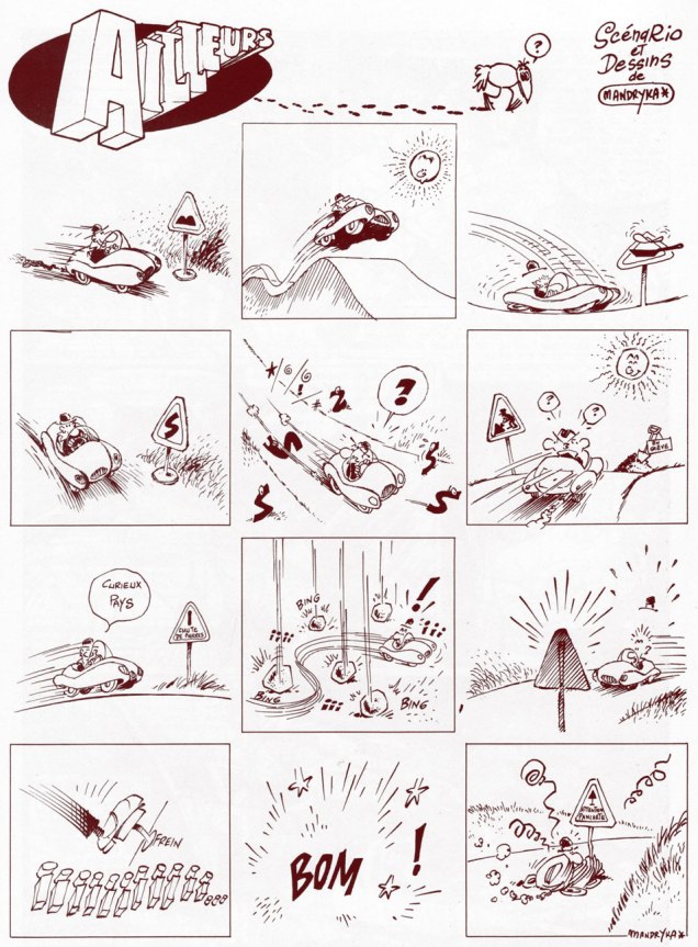
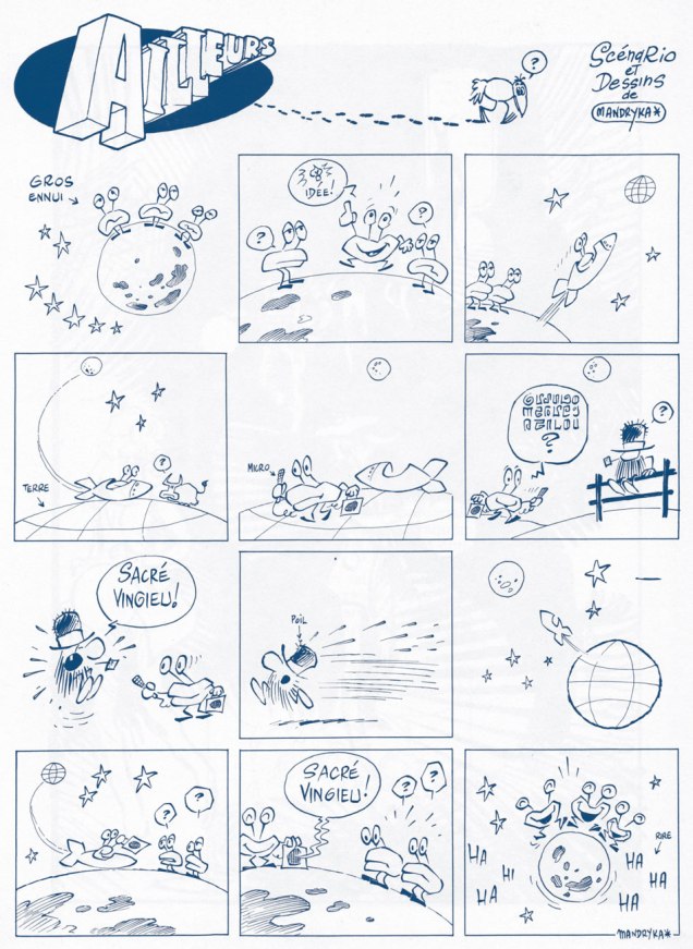
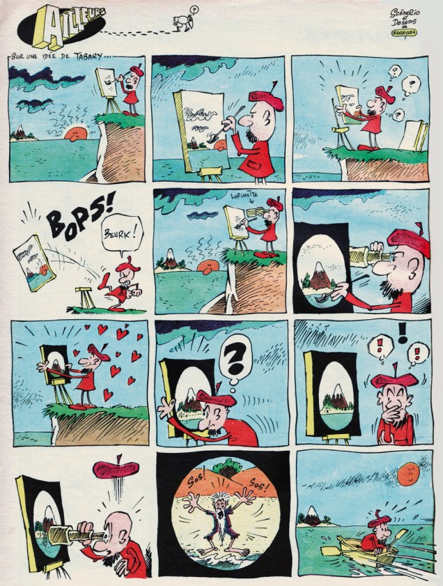
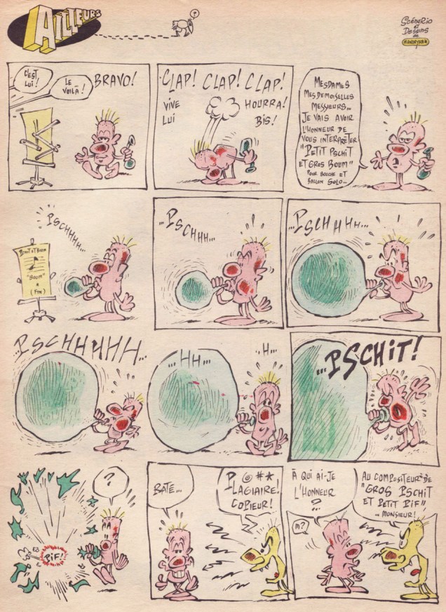
Nikita Mandryka was born October 1940 in Bizerte, Tunisia, to Russian émigré parents. His grandfather had fled the Russian Revolution in 1921 aboard a warship he was commanding. Nikita’s first professional strip appeared late in 1964 in Vaillant (Boff, in Vaillant no. 1024, Dec. 27, 1964), soon renamed Vaillant, le journal de Pif , then Pif Gadget in 1969. While he’s best known for his loquacious, dominoed cucurbit, Le Concombre Masqué, today we’re going to harvest the riches of his somewhat less familiar, but equally absurdist creation, the free-form strip Ailleurs (“Elsewhere”). The feature debuted with the inaugural issue of Pif Gadget and made its bow with issue 35, a few months down the line.
Mandryka left Pif Gadget on good terms (and returned over the years), and with a solid reason: while Pif’s editorial team rightly adored his work, its left-field humour left the majority of Pif’s young readership quite baffled, and sometimes infuriated. Mandryka’s place in the magazine may have been secure, but he yearned for an audience that actually understood him. This he would find at Pilote, with its teenage readership, and all the more so with L’Écho des Savanes (which he cofounded, in 1972, with Claire Bretécher and Marcel Gotlib).
Pif’s was an unusual case: its most singular, daring, arguably most valuable strips were those least appreciated by the kids. And that slice of the readership, you’ll have guessed it, tends to express its opinions more freely and vehemently than their elders, who did love (but more quietly) the somewhat abstract, second degré (offbeat, ironic) features, such as Marcel Gotlib and Henri Dufranne‘s Gai-Luron*, the recently-departed Massimo Mattioli‘s M. Le Magicien or Henri Crespi‘s Nestor. Still, the savvy editorial team, who after all had made the magazine a massive hit, keenly grasped the import of editorial balance and trusted its collective taste and instinct over the “wisdom” of the accountants and marketers… who, at the height of the magazine’s popularity, pulled a mutiny and… sank the ship. So, in hindsight, Mandryka was right to leave.
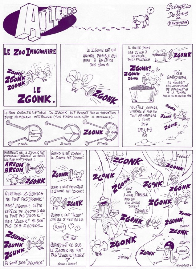
Ailleurs‘ début, from the inaugural issue of Pif gadget / Vaillant no. 1239 (March 1st, 1969); If it goes “zgunk”, it’s not a zgonk, it’s a zgunk.
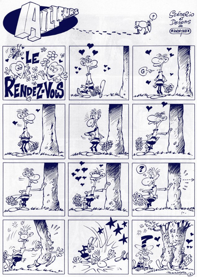
As an english equivalent to « Sacré vingieu! », I propose « Dagnabit! »Ends with a sarcastic « Glory to the ten millionth discoverer of our planet! »« An original solution to the parking problem. »From Pif gadget no. 23 / Vaillant no. 1261 (July 1969); now you know what the legendarily stoic members of The Queen’s Guard do whilst at leisure.From Pif gadget no. 33 / Vaillant no. 1271 (Oct. 1969); idea provided by Tabary (Jean or his brother/ghost Jacques? We may never know).The final Ailleurs strip, from Pif gadget no. 35 / Vaillant no. 1273 (Oct. 1969). This would have made a great skit for Jacques Tati‘s peerless Mr. Hulot.Nikita’s just heard a really good one during this photoshoot for a L’Écho des Savanes advert.
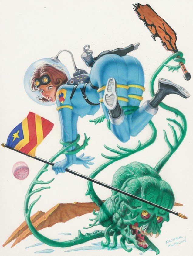
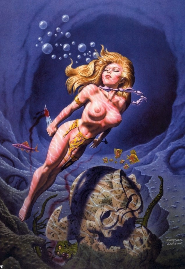
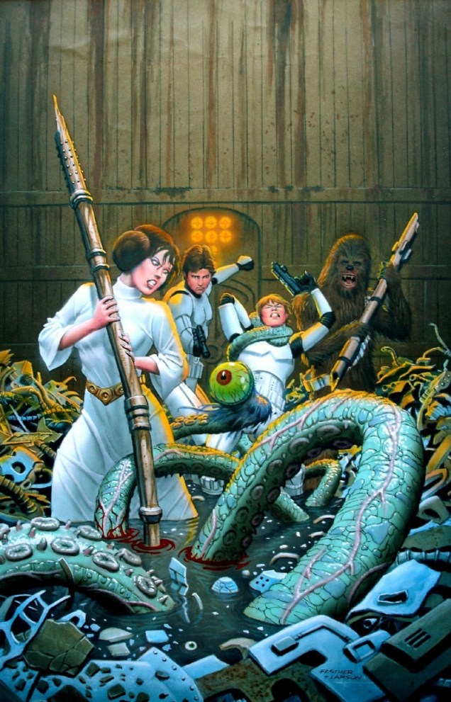
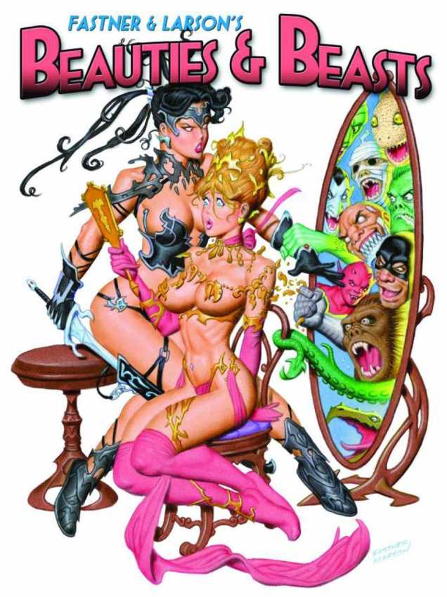
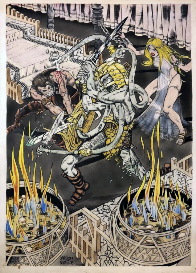
American artist Richard Larson has had his ink-smeared fingers in many pies. He has drawn ghost stories for Charlton Comics (see our posts dealing with that here and here), followed by some underground comics, followed by Marvel super-hero portfolios, followed by his own series Demon Baby, followed by…. He often works in tandem with other artists, most notably with Tim Boxell and with painter Steve Fastner (see a gallery of their collaborations here).
« Steve Fastner and Rich Larson have been working in concert since 1976, and together they create one entity of staggering abilities. Rich will lay down the structure of an illustration in pencil form, and then Steve will attack it with army of airbrushes – and when the dust clears – a magnificent painting stands proudly. For over a quarter of a century, they’ve been able to do this, working for comics, book publishers, advertising agencies, movies and television, and now the web. » (quote from Fastner and Larson Gallery, 2002)
Have you ever seen anybody looking so smug after having stabbed some creature to death?Does the wild, groping beard of the old sea pirate count for tentacles? Indubitably. So does at least one of his hands.This may be just a sea-serpent, but there are no pedants in this audience, right? Besides, those suckers are distinctly tentacle-like.Fastner & Larson’s Beauties & Beasts (2010)
I would be remiss in not including a collaboration between Larson and underground comix artist Tim Boxell, whom I mentioned at the beginning of the post and then proceeded to neglect.
Art by Rich Larson and Tim Boxell
Speaking of beautiful women in varying states of undress… if I mention Haunted House of Lingerieto you, does it ring any bells? Does it sound like an intriguing concept? Then the first thing you should do is visit our Tentacle Tuesday: a Day at the Beach. Nothing like shameless self-promotion! But afterwards, you might want to seek out the three volumes published so far before the whole thing goes completely out of print.
« He’s back from the dead / the telegram read / If you get on a flight / You could catch him tonight / You’ll find Commissar / He’s at the Munich Hilton Bar » — B.A. Robertson
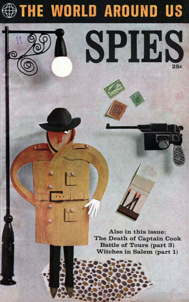
In 1958, Classics Illustrated publisher Gilberton tried something a bit different: a mostly non-fiction documentary title on various topics entitled The World Around Us, and featuring The Illustrated History of… Dogs, Space, Pirates, Great Explorers… depending on your area of interest, these could mean unrelenting tedium or sheer bliss. I haven’t encountered many issues, but the two I own, Ghosts and Spies, count among my prized paper possessions.
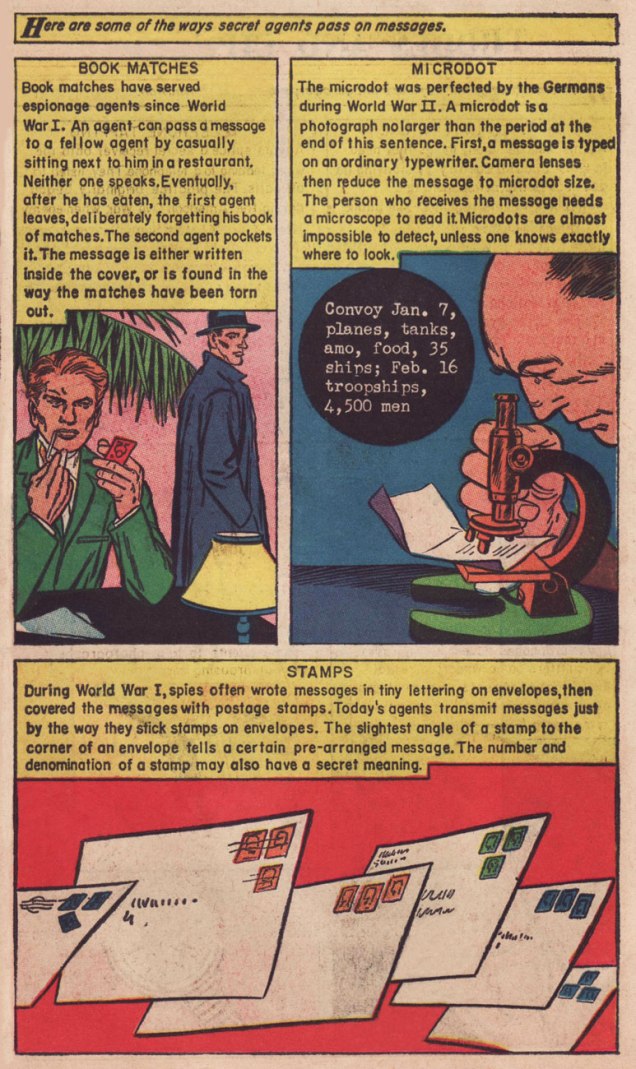
This is The World Around Us no. 35 (August, 1961), featuring this lovely mixed media piece by The Unknown Artist, whose cover remains defiantly unblown. On the inside, some fine company: George Evans, Norman Nodel, Edd Ashe, Jo Albistur… and Jack Kirby (inked by Dick Ayers)… the most beaten-down, anonymous, excitement-dialed-down-to-one Kirby you’re ever likely to see. Oh, he could do the job just fine, but the job, and the publisher, were not making anything of his regal strengths*. He would recall that this was « … the worst paying job of my entire life, including times I worked for free. »
Those early post-Code years were difficult ones for the diminished comics industry, and Kirby’s situation wasn’t exactly rosy: he’d been blacklisted at DC, thanks to the Jack Schiff / Sky Masters imbroglio, and his work at Harvey Comics had dried up. So what was a prolific artist to do, but pick up whatever bits of freelancing were available, here and there…
Quoting from Paul Gravett‘s review of Classics Illustrated: A Cultural History, we find this telling statement: « The most demanding editor was Roberta Strauss, a stickler for detail, who would count soldiers’ buttons or pleats in skirts and even called an editorial meeting in her hospital room only days after her son’s birth. » Give me Harvey Kurtzman‘s editorship** any old day!
**« Kurtzman’s editing approach to Two-Fisted Tales and Frontline Combat was a stark contrast to EC editor Al Feldstein‘s style. Whereas Feldstein allowed his artists to draw the story in any manner they desired, Kurtzman developed detailed layouts for each story and required his artists to follow them exactly. »