« Only times and places, only names and ghosts. » — Aldous Huxley
Last November, after we spotlighted a pair of mid-70s Gold Key gems I had presumed to be the brainchildren of Connor Freff Cochran (as it turned out, I was only half right; see my revised original post), we heard from the gentleman himself (and I don’t use the term lightly), who generously shared with us his sharp recollections and insights. Once you’ve read them, I’m confident that you’ll agree that such goods would have been squandered as mere comments at the bottom of a post.
So I’ve picked out another Freff favourite to feature, which will be followed by the author’s commentary.
But first, let us set the stage through a bit of autobiography and an inestimable glimpse into the 1970s publishing scene.
Here’s the skinny. Heeding a suggestion Kelly Freas had made to me eight months earlier, I moved to New York City right after Labor Day 1973. (It was a two-step process. First I hitchhiked from San Francisco to Toronto for that year’s Worldcon, then I caught a ride the rest of the way to NYC from there.) I was six weeks away from turning 19, and gung-ho to launch a career as a professional cover artist and illustrator. I also wanted to work in comics, and thought the best way to break in and learn the ropes was to start as an inker. On the comics side I took my portfolio around to Marvel, DC, Gold Key, and Warren. On the book/magazine side, I went to any publisher where I could land an appointment.
It was not a stellar launch. My portfolio was full of SF convention art show pieces, some semi-prozine illustrations, and a handful of two-toned small press book covers. It wasn’t bad stuff, but it was certainly not well-targeted to the people I was trying to impress. A couple of magazines did pay me for spot illustrations. Jim Baen — brand-new managing editor at GALAXY and IF — liked my stuff, but he wasn’t in charge of art assignments. As for my attempt to break into comic inking, that was a complete washout. There was a paper shortage on, and because of publishing cutbacks there wasn’t enough work for established inkers, let alone a newbie like me. Marvel did give me a bunch of pencil Xeroxes to do vellum samples over…but I was a pen inker, not a brush guy, and pen inking wasn’t the Marvel house look in 1973. I did get to know and hang around with a bunch of people in the company, but I didn’t get any work there.
At Gold Key, though…
At Gold Key, Wally Green looked at my portfolio and said “We don’t need any more artists. But we do need writers. Can you write?” Years later I learned that Wally was trying to plug the production hole created when Len Wein stopped scripting for him. Most likely he put that same question to every stranger who walked through the door. In the moment, though, all I knew was that I’d be an idiot to say anything but yes. Wally then introduced me to his second-in-command, Paul Kuhn. Paul handed over some sample issues of TWILIGHT ZONE, and told me to come back when I had a five-page script to show him. A few days later I brought in a story called “The Stand-In”, which was read and bought on the spot. Thus did my accidental writing career begin. This was in early October 1973. At the beginning of 1974 I did the math and decided to quit my 9-5 job, because by then I was making more from three days per month of Gold Key scripting (at the princely sum of $10 per page) than my fulltime gig was generating. I’ve been self-employed ever since.
I wrote for GRIMM’S GHOST STORIES, RIPLEY’S BELIEVE IT OR NOT, BORIS KARLOFF TALES OF MYSTERY, TWILIGHT ZONE, DARK SHADOWS (for a different editor, Denise Van Lehr), ADAM-12, and even one issue of Gold Key’s STAR TREK. Roughly once a month Paul would agree to a pitch session. I’d bring 10-15 different story ideas with me, knowing I needed to sell at least five to meet my monthly minimum nut (which was low, since I lived in a 7’ x 12’ fifth-floor walkup room on the West Side that rented for $50). Paul would listen intently, but he couldn’t look me in the face most of the time because he had a permanent spastic tic in his neck. Inevitably he would reject all but a couple of ideas, at which point I had to invent more on the spot and talk him into buying them. It was GREAT story development training.
Paul had an eidetic memory for every damn comic book Gold Key had ever published, which was its own kind of problem. This is a real exchange we once had:
Paul: I don’t know…
Me: Paul —
Paul (shouting through the open door to Wally, in the next-over office): Hey, Wally! Freff has an idea for an art museum guard ghost story. Didn’t we do a museum guard ghost story, what, nine years ago?
Wally: I think so.
Paul: Sorry, Freff. That’s out. What else have you got?
Me: Paul, your readers are eight years old. They weren’t even born when that other story was published! And anyway, it’s an ART museum guard ghost story. What kind of museum was it last time?
Paul: History.
Me: So no art.
Paul: Okay, I’ll think about it.
(He did…and still passed on the idea.)
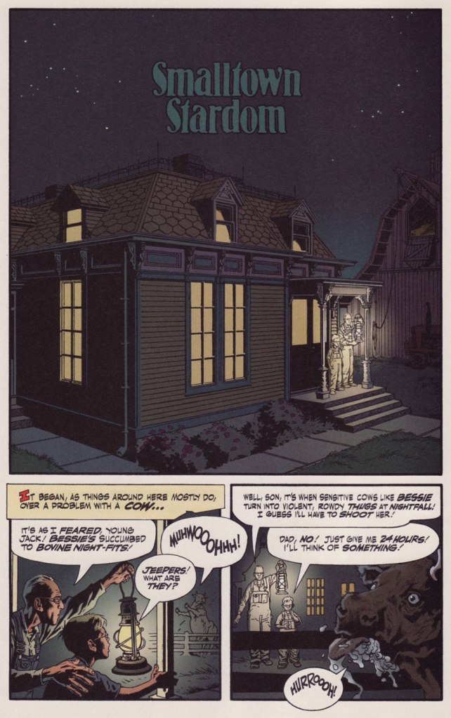
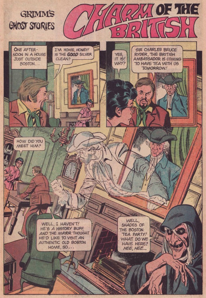
And here’s our featured tale: Charm of the British, first published in Grimm’s Ghost Stories no. 22 (March 1975, Gold Key).


While I confess I’ve never quite warmed up to most of Delbo’s DC work (his inkers did him no favours), I do have a soft spot for his solid run on Charlton’s Billy the Kid (1966-74!), I dug his deft comic touch on Dell’s The Monkees, and let’s not forget his inspired work on the real ‘weird western tales’ series, Charlton’s gonzo Geronimo Jones (1971-72).
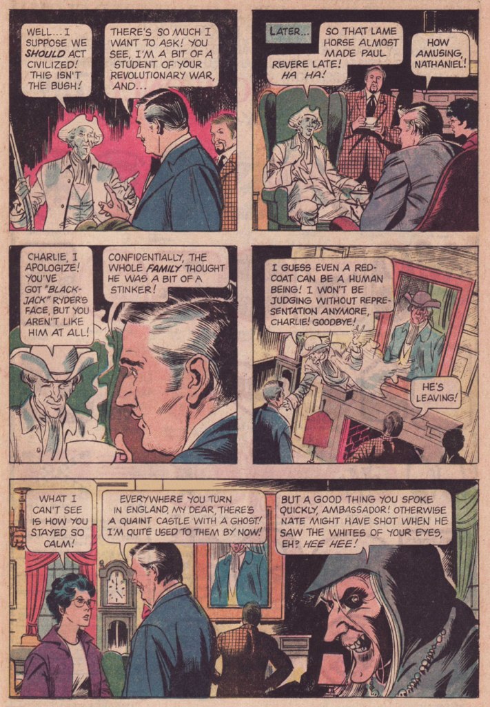
I hear James Mason as the British Ambassador. How about you?
And now, with a first-hand account of its genesis, Mr. Connor Freff Cochran!
The publication date of the issue with “Charm of the British” was March 1975. Gold Key comics typically hit the stand a month sooner than the official date, so that makes this a February 1975 release. From that, and some internal clues, I can narrow the writing window down to the first three weeks of September 1974.
I’d been away from NYC all the previous summer, living in Champaign-Urbana, IL, where I was self-training just in case my application to that year’s Ringling Brothers Clown College was accepted. I finally got word that I’d made it when I arrived at the World SF Convention, which was held over Labor Day weekend in Washington, DC. (One day later I went out for Chinese food and got a fortune cookie that read “You will visit a strange place and find fresh work.”) The Clown College started on September 23rd and ran for just over two months, during which time I would be unable to do any paying freelance work. So between the end of WorldCon and flying to Venice, FL on 9/22, I crammed in every job I possibly could – which included selling and writing as many Gold Key stories as I usually did in three or four months. Wally Green and Paul Kuhn knew I would be unavailable until late November/early December at the soonest, so they did something they hadn’t done with me before, and built up inventory.
“Charm of the British” was one of those inventory pieces. It paid $60 (my page rate for scripting was $10), and looking back I have no idea what the exact trigger for the idea was. Most likely it was improvised during a pitch & sell session with Paul. Those were always insane. The typical structure: I’d come in once a month with 8-10 ideas, knowing that I needed to sell five or six to guarantee my monthly budget. Paul would say yes to one or two and reject the rest. At which point the improv would begin, with me inventing more stories on the spot while he tried to get me to leave… something I would only do after getting him to say yes as many times as needed. I was 19 years old, and it was great training for a creative future.
The title’s a minor bit of wordplay, of course – “charm” as in magic and manners, both.
Grimm always had to have jokey intro and outro lines for each story. The outro on this one wasn’t anything to be proud of, but all these years later I’m still happy with the punny “shades” (of the Boston Tea Party) in the intro.
These were stories for young kids, so you couldn’t go into detail about anything. But I did enjoy slipping in as many real Revolutionary War references as I could, both direct (namechecking Paul Revere) and indirect (referencing Revere’s profession by having my lead character ask for “the good silver” in the first panel). “I won’t be judging without representation anymore” is obviously a riff on “no taxation without representation.” No child who read this comic book was ever going to remember it years later, when they encountered the real phrase in some history class, but maybe a bit of subconscious memory would help the knowledge stick, you know? In any case I enjoyed playing with all these references.
Page 2, panel 2: I absolutely did NOT write that unnecessary “Why, No!” Either Paul or Wally or the letterer added that. Didn’t make sense to me then, and makes no sense to me now. Similarly, the “Thinks they he can come in…” in panel 4 on that page is definitely an editing/letterer goof. I wrote “Thinks he can come in…”
As usual, my character names referenced friends, sometimes combined with private jokes. Fan friends Eli Cohen and Susan Wood had begun dating recently, so I named the house owners “Eli and Susan Wood” (though all reference to the name “Susan” somehow vanished in the editing process). Susan eventually became one of the major academic names in the science fiction field, before she sadly passed, much too young, in 1980. Our visiting British Ambassador got the name of a junior high school friend of mine who had spent a lot of his childhood growing up in Europe. These days he’s a partner with the law firm of Thompson Coburn LLP, in St. Louis. Revolutionary War ghost Nathaniel Emerson is a combination of Nathaniel Hawthorne and Ralph Waldo Emerson (they were neighbors in Concord, MA for a time), with a sideways nod to NYC fan David Emerson. David had recently shared an apartment with Eli Cohen, so it amused me to have an “Emerson ghost” hanging around to haunt an Eli living space…
Looking back from today, it amuses me to think of Outlander’s evil British soldier “Black Jack Randall” and his nice-guy modern descendant, who both have the same face. It’s a neat coincidental lineup with my evil British soldier “Black Jack” Ryder and his nice-guy, same-face descendant.
Overall… confronted with this story after nearly 50 years, I’m pleasantly surprised. It’s got some nice lines, it turns in unexpected directions, and none of the characters are idiots (though they are all amazingly blasé about spectral appearances). I can imagine the Ambassador and the ghost of Nathaniel Emerson becoming the best of friends, making regular visits back and forth across the Pond… and hanging out together in the afterlife when the Ambassador finally dies from eating one too many diplomatic desserts.
Alternatively, of course, there’s a story to be written about the Ambassador coming home to England and being haunted by Black Jack’s ghost, who is appalled that any descendant of his would make nice with Yankee riffraff like Nathaniel…
Again, my heartfelt and slightly befuddled gratitude to Mr. Cochran for all his cordiality and patience. We’ve more of it to share with our readers, so expect a sequel in the near future. Cheers!
-RG