Oor Wullie and His Trusty, Rusty Auld Bucket

See the janny? See ma granny?
Ma granny hit um wi a sanny
then she timmed the bucket owerum
an he tummelt doon the sterr
an he landed in the dunny
wi the baikie in his herr.
*

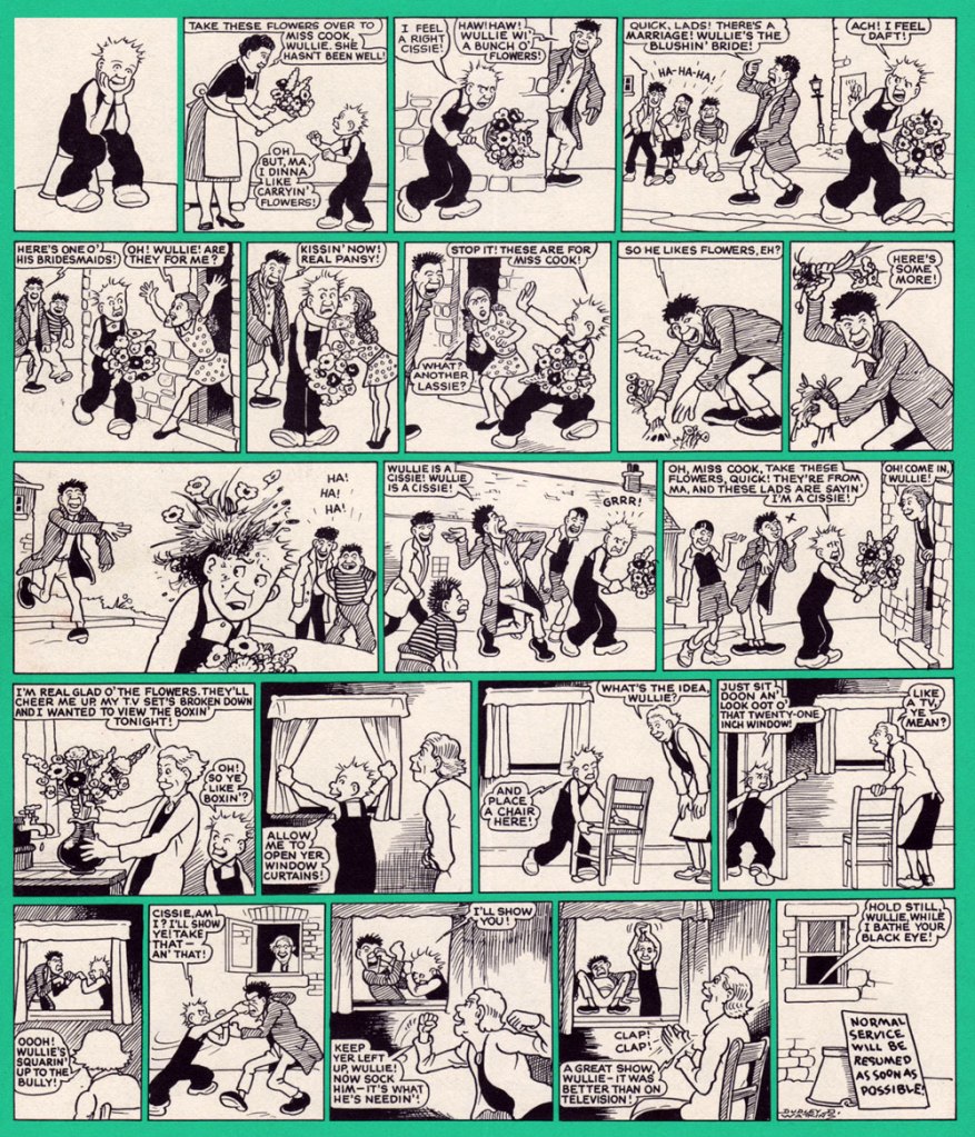
The home of Scottish strip Oor Wullie is The Sunday Post, distributed by D.C Thomson (publishers of, notably, The Beano and The Dandy). You may note that I used the present tense – this strip was brought into the world in 1936, but astonishingly it’s still going strong (it celebrated its 80th anniversary in 2016, to give a quick idea to those who prefer not to launch into mathematical cogitations). It has, through the years, gone through a number of different hands, but it was originally created by comics writer and editor Robert Duncan Low and drawn by cartoonist Dudley Dexter Watkins, who died very much in the cartooning saddle in 1969. His work was reprinted for a bit, until new blood could be found to take over, first in the shape of Tom Lavery (who was told to imitate Watkins’ style), then followed by a bevy of other cartoonists since then.

The Low & Watkins duo also came up with The Broons, which started the same year and ran in The Sunday Post as well, to the point where the strips were often collectively referred to as Broons & Oor Wullie. There’s a lovely documentary about The Broons here.

Reading Oor Wullie is loads of fun, and a big part of that is its use of Scottish slang – not so much of it that action is obscured, but enough for plenty of colour and also the opportunity to pick up some new vocabulary. Did you know that ‘oxter‘ means ‘armpit‘, for example?

To quote from perceptive article THE BROONS AND OOR WULLIE from Indira Neville‘s blog,

« […] the use of the dialect reflected the publisher D. C. Thomson’s ‘realist’ editorial policy and focus on authenticity. It was intended to attract a large Scottish urban audience and in this was really successful. Both strips were massive hits and at their peak had an estimated readership of three million (79% of the adult population of Scotland!) 

One of the most interesting aspects of Oor Wullie and The Broons is that for most Scots they were/are the only mainstream, regularly available written representation of their spoken language. In being this they have an increased relevance within the current Scottish language revival. The National Library of Scotland is even using Oor Wullie as a means to introduce and engage children in the richness of the lexicon. It has a website that’s ‘a guid fun wey tae lairn oor language‘. »

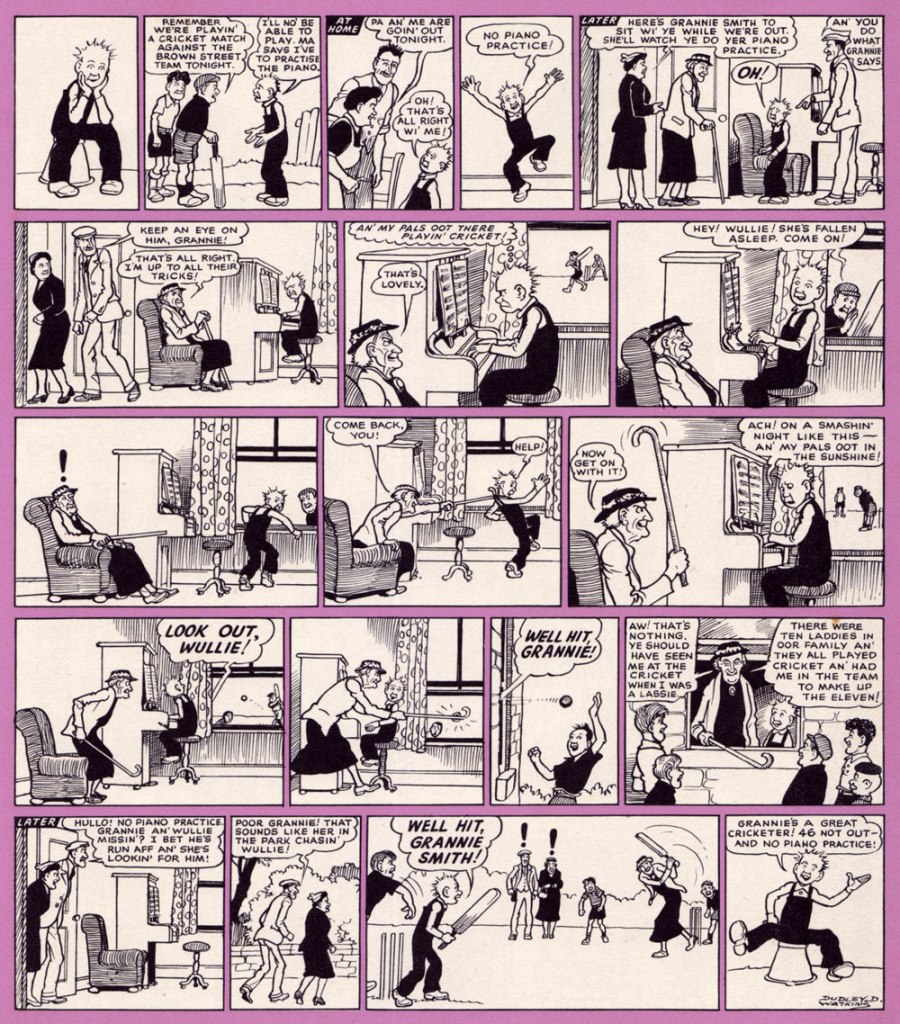
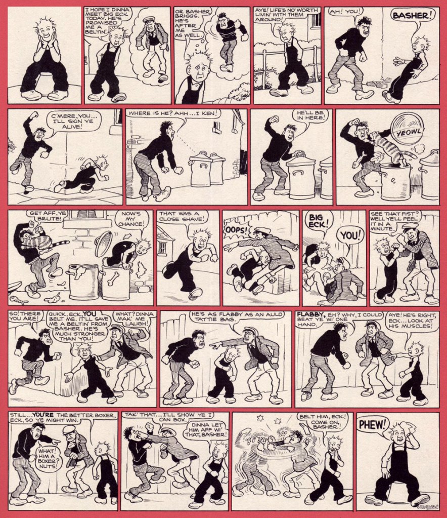
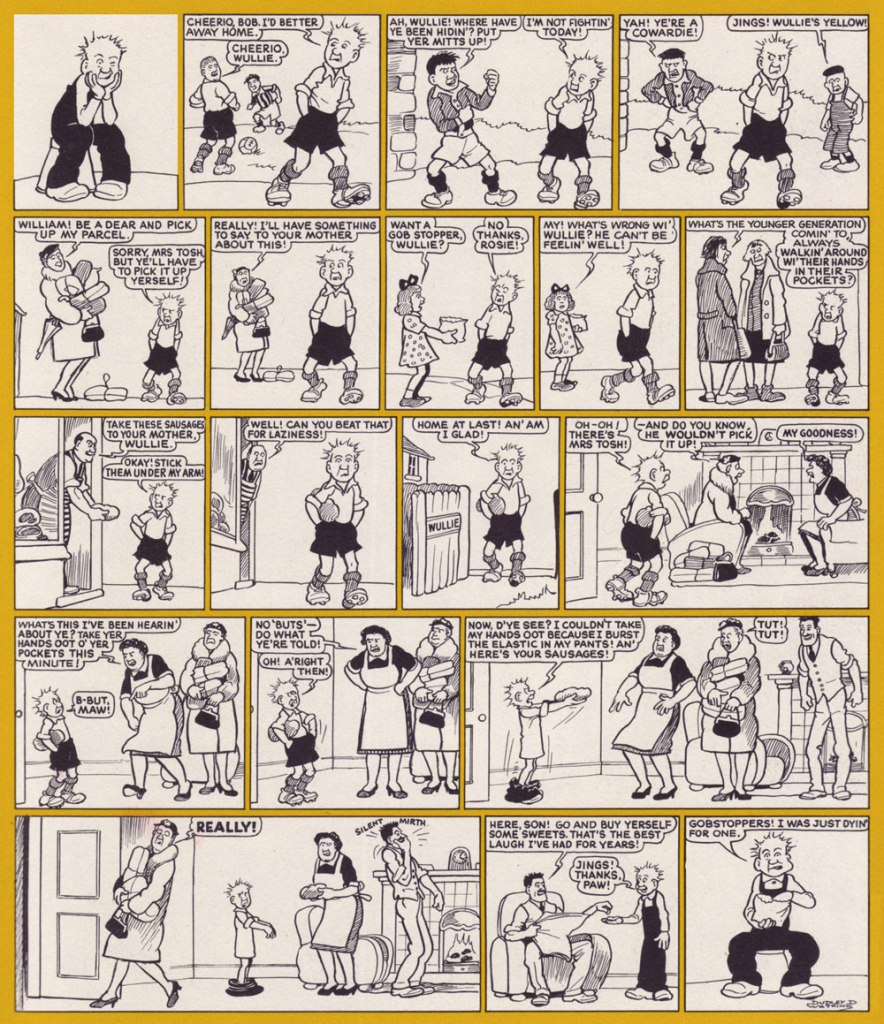
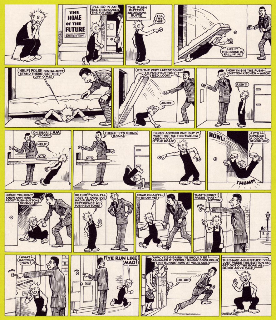
Wullie (or William) is a pretty standard boy prototype: prone to mischief and frequently embroiled in neighbourhood fights, embarrassed when his mam dresses him in nice clothing, but basically an honest lad with his heart in the right place. In that sense, he reminds me of Sluggo. You may note that every page starts and ends with Wullie sitting on his favourite bucket – every boy needs a good friend!

The following strips have been scanned from a 1976 collection, ‘selected from the Sunday Post and earlier Oor Wullie books‘. The artist is the aforementioned Dudley Watkins (which I can confidently claim, as each page is signed – I also compared the art to some original Dudley art being sold online, and this conclusion seems legit).

To celebrate Our Wullie‘s 80th birthday in 2016, 86 statues of Wullie in different costumes were placed around Dundee for the Bucket Trail event (including Oor Bowie, a David Jones tribute). This was a great hit, and Wullie’s BIG Bucket Trail was launched in 2019, with around 200 statues installed all around Scotland. View them here, they’re really fun.

When one thinks that a Moscow-born Russian (that would be me) would be greatly enjoying a classic Scottish comic some decades later… the world works out in funny ways.

~ ds

* From The Ballad of Janitor MacKay by Margaret Green

Treasured Stories: “Life’s Illusion” (1988)

« Reality is a powerful solvent. » — Tony Judt

I was all set to write about a certain topic… but one hurdle stopped me cold: having recently moved, we are (mostly me, I confess) still somewhat living in boxes. So… where’s that other book? In any one of a hundred or more boxes. Fortunately, I try to always have a backup plan.

This isn’t the first time I draw attention to an offering from DC’s ambitious but ill-fated Wasteland (1987-88) under the Treasured Stories rubric. See also Foo Goo and American Squalor for more details and to (beware!) suffer a case of thematic whiplash. Whatever warts and blemishes Del Close and John Ostrander‘s Wasteland creations may have borne, they weren’t interchangeable.

Today’s yarn is a spot-on homage to author Philip K. Dick (1928-82), down to the name and occupation. The ‘real’ PKD may have been fond of meat loaf as well, for all I know.

Possibly a reference to PKD’s 1966 novel The Crack in Space?
Another cute detail: « From 1948 to 1952, he worked at Art Music Company, a record store on Telegraph Avenue » (in Oakland, CA). Oh, and Robin Williams was a Del Close fan… and vice versa.
Life’s Illusion appeared in the final semi-decent issue of Wasteland, no. 10 (Sept. 1988, DC)… beyond that point, it was a painful slide into the abyss. Anyway, I love how this story is able to deftly juggle its elements of comedy, tragedy and Dickian metaphysics without dropping the ball. Poor Mary.

PKD had been on my mind lately. Last fall, while rambling around town, I came upon a Little Library housing one of his books, a French-language edition of 1964’s The Three Stigmata of Palmer Eldritch. I’d read the original paperback edition in 1992, but wasn’t sure I quite grasped its dénouement, and had no-one to compare notes with.

Somewhere, eons ago, I’d read that Dick’s manuscripts for his 1960s paperback originals were abridged (i.e. gutted) to fit the publishers’ format and predetermined page count. But this might be apocryphal. As it stands, I can find no trace of such a claim. The story went on to say that publishers in Belgium and France, where the author was more of a draw than in North America, based their renditions upon Dick’s unexpurgated manuscripts, leading to, unusually for translations, results hewing closer to the writer’s intent. It helps that Dick, not given to extravagant stylistic flourishes, is relatively easy to translate.

« This is an illusion ». Here’s the tome in question, published in 1977 by Belgium’s Éditions Marabout, using Guy Abadia’s 1969 translation. Despite the fact that the book’s been retranslated since, I’ve no quibble with this version, save for the lack of credit for the cover illustrator.

I’m currently halfway through, and so far all is clear; I may have to confer with my younger self to explain the plot to him, poor thing.

-RG

Of Ducks, Russian Folklore, and the Mysterious Gamayun

Today’s post started out as an introduction to Moscow-born Russian cartoonist and illustrator Alexander Utkin, whose family name translates to something duck-related (‘utka’ means ‘duck’)… a few other topics may have crept in on soft paws, but sticking to one thing was never my forte.

I came across Utkin’s work in a comic book store. The volume attracted me with its stylish cover and vivid colours, standing out among its shelf companions despite the fact that they were also quite vibrant, this being the children’s corner (thankfully a reliable refuge for colour that’s often shunned in modern comics – if you haven’t noticed the absence of colour in the modern aesthetic, see this documentary about Chromophobia, or Colors: Where did they go? An investigation for a discussion).

The book that introduced me to Utkin, although what I had first seen was the French edition (Le roi des oiseaux, 2020); this edition is from 2018 and published by Nobrow.

I like cases where one doesn’t have to choose between art and storytelling, when the former is lovely and the latter, substandard (or vice versa). Utkin’s illustrations are beautiful, and he coherently and engagingly tackles a topic that’s dear to my heart – namely Russian fairy tales. Remember I mentioned Baba Yaga (see Hallowe’en Countdown VI, Day 28) a few weeks ago? We will meet her again today (hide your children). We also encounter the legendary Gamayun, a prophet-bird (strangely, as a child I learned its name from the song Sirin, Alkonost, Gamayun* and not from reading folk tales) with no legs or wings, who propelled itself with its tail, and whose interrupted flight signalled death or misery. In a more modern interpretation, she morphed into a sort of bird of paradise with a woman’s face. Read about her and her ‘sisters’ Sirin and Alkonost here.

Published by Nobrow in 2020. Here’s a review of this collection.

Utkin’s Gamayun is a strange, vaguely female creature with huge eyes who narrates the stories (thus ‘Gamayun Tales’). There seems to be a resurgence of interest in all things folky** in many parts of the world, perhaps a desire to preserve some cultural heritage when faced with globalisation – in that sense, one can say that this series is part of that pattern. These revivals don’t often reach a Western audience, however, so it’s especially cool that Utkin’s forays into Slavic myths have been well received and enthusiastically lauded by French and English speakers as well.

Here are a few pages from Roi des oiseaux or The King of Birds, which are, respectively, the French and English versions of the same story… except that the French edition also contains La dispute (The Quarrel), which in English was plunked into Gamayun Tales I. It’s a bit confusing.

In case you were wondering, Utkin’s Gamayun series is technically intended for children. I’m in the habit of regularly raiding the children’s section for interesting stuff, but I can call it mother’s interest (never-you-mind that I am the mother of cats and plants, not little humans). Here are several pages from Gamayun Tales II – this story is called The Quarrel (and, as mentioned earlier, was part of the French edition of The King of Birds):

The following page are from Vasilisa and the Doll, which in English was published in Gamayun Tales II, and in French, as part of the La princesse guerrière (‘the warrior princess’) collection:

I promised you Baba Yaga, didn’t I? The way Utkin draws her predatory teeth reminded me of Canadian artist Emily Carroll, whose creepy stories often mention teeth (one might say it’s a leitmoteeth of hers – sorry for the terrible pun). Her work deserves a post of its own, but for now I restrain myself to mentioning that Carroll, clearly also a fan of traditional folklore, illustrated a graphic novel (written by Marika McCoola) about you-know-who, Baba Yaga’s Assistant (2015, Candlewick). Here is a tooth and style demonstration:

A few stylized pages tell the traditional story of Baba Yaga and the girl with the kind heart – you can read the tale (in English) here.
And here is what the slightly re-upholstered, modernized tale looks like.
Classic chicken legs!

To get back to our main topic, I’ll leave you with this glorious poster Utkin illustrated for a French bédé (comics) festival in 2020:

Visit Utkin’s IG account.

~ ds

*I highly recommend the whole album for those who like folk rock – it’s by the Russian band Akvarium.

**This includes the bevy of young woman trios and quartets (from Ukraine, Georgia, Poland, Finland, Germany…) popping up seemingly all over the place, singing traditional folk songs whilst walking around. Here is a charming example from Russia.

Here Come the Flakes!

« It’s quiet snow that I remember best… snowfall and Brahms on November nights. » — Rod Mckuen, Midnight Walk

While Autumn is easily my favourite season, much of its magic and colours are gone by the purgatory that is the month of November, and I find myself longing for snow to brighten the relentlessly longer and gloomier evenings.

And then, yesterday, as I was still mulling over this post, I woke up to this view from my front door.

Well, then! This post consists of a(nother) gallery of Warren Kremer‘s delightful Harvey covers, this time with a snowy theme. Never truly ‘ha ha’ funny, they get along on charm and crafty, limpid conception and execution.

This is Little Dot no. 15 (Jan. 1956, Harvey). While most of Harvey’s efforts were channeled into their ‘Big Two’, Casper and Richie Rich, I always found these too bland (in the former’s case) or kind of deplorable (in the latter’s). I was more attuned to the line’s (slightly) bad boys, Spooky and Hot Stuff (Donald Ducks to Casper and Richie’s Mickey Mice), but really, the genuine interest resided in art director Kremer’s nimble design gymnastics and thematic acumen on Little Dot covers. By this time, these have improbably (but happily) inspired designers all over the globe. Nevertheless, a big juicy pox on the article’s author for failing to acknowledge Warren Kremer even once.
This is Spooky no. 73 (Apr. 1963, Harvey). Those 1960s Harveys were so beautifully uncluttered in their design, with the bonus of Kremer’s marked and ongoing contempt for the Comics Code Authority stamp. Oh, and here’s our earlier selection of Spooky covers.
This is Wendy, the Good Little Witch no. 22 (Feb. 1964, Harvey).
Richie Rich no. 23 (May 1964, Harvey). What have you been eating, Richie?
This is Little Audrey and Melvin no. 23 (Mar. 1966, Harvey). As you can see, Audrey’s sidekick Melvin shares a former fedora with our dear friend Forsythe Pendleton ‘Jughead’ Jones. That particular chapeau is called a Whoopee Cap.
This is Richie Rich no. 55 (Mar. 1967, Harvey).
This is Casper, the Friendly Ghost no. 116 (Apr. 1968, Harvey). Variations on skiing through solid objects is quite the cartooning wellspring.
This is Little Audrey and Melvin no. 39 (Apr. 1969, Harvey).
This is Hot Stuff, the Little Devil no. 93 (Oct. 1969, Harvey). For more Hot Stuff covers, check out Who Will Change the Devil’s Nappy?
This is Little Lotta no. 89 (Apr. 1970, Harvey). And they didn’t find the local children’s mangled bodies until the following spring thaw.

-RG

Boop-Oop-a-Doop Like It’s the Thirties!

« Her surname, a familiar catchphrase of the time, was inspired by the inter-lyric expostulations of a nationally famous Paramount Pictures songbird, Helen Kane. ‘Boop Boo a Doop!’ was the chant she sang in her sweet, high-pitched voice, a flippant raspberry to the jazz age. Somehow these nonsense syllables seemed to embody the spirit of the waning days of the twenties… »

I think everybody knows Betty Boop, though probably not that many have seen the original cartoons from the 1930s. She was ‘created’ by Max Fleischer orchestrating a team of animators – as with any gestalt creation, one can argue about who was responsible for what until one is blue in the face, but it has been convincingly argued (by Bill Blackbeard, for example) that Grim Natwick was the actual creator, probably with a stable of other animators.

In 1930, Betty, then still nameless, made her first appearance in (the pleasantly weird) Dizzy Dishes as a supporting character, as a seductive canine anthropomorph with dog ears and human curves. She acquired more personality once she was matched up with Bimbo, another doggo, in Bimbo’s Initiation (1931) – which is an even stranger cartoon, a tale of hazing by a bunch of creatures with pulsating buttocks and candles on their heads pursuing Bimbo with chants of ‘wanna be a member? wanna be a member?’, to which Bimbo always responds ‘no!’ to get sent to yet another chamber of tortures. I would suggest not psychoanalysing that too closely. Watch for the grand WTF finale:

By 1932, Betty, who now had a stable position as Bimbo’s regular girlfriend and a name to call her own, had jettisoned her dog attributes, floppy dog ears quite seamlessly transformed into big hoop earrings. Though she was a’booping from the very beginning, she acquired her hallmark Boop surname with Betty Boop Limited (1932). The aforementioned Helen Kane* was not pleased, and there were, as Blackbeard explains in his introduction to Betty Boop’s Sunday Best: The Complete Color Comics, 1934-1936 (Kitchen Sink Press, 1995), ‘threats of lawsuits, various legal manœuvres, and demands for creator royalties, all without result‘.

In 1933, Hearst’ King Features Syndicate started negotiating terms for a Betty Boop comic strip, and in 1934 the strip, drawn by Bud Counihan, appeared. However, this was not exactly the same unhinged, hip-jiggling Betty of earlier years. King Features wanted to appeal to more conservative audiences, and Betty’s sexuality was toned down a notch. The animated Betty didn’t fare much better – as usual, guardians of Moral Purity™stuck their fingers in the pie, and from June 1934, the Motion Picture Production Code kicked into effect, forcing Betty to leave behind her carefree flapper days to become either a career girl, or some generic housewife.

Oh, but there was still plenty fun to be had. Besides, the comic strip Betty was not quite as smothered – while the latter was nursing babies and whatnot in a long dress, the former was still running around in her risqué red number, occasionally even kissing men and living the life of a spoiled movie star. Here are a few Sunday strips – thanks for co-admin RG for scanning these unscannables.

Sunday strip from March 1935. Counihan’s tigers are consistently adorable.
Sunday strip from 1935, and a few different perspectives on Betty’s legs and derrière.
Sunday strip from 1935. That’s a more fun version of a police line-up…
Sunday strip from 1935. Mentions of nudism come up more often than one would expect (and yet Betty is never particularly undressed, at least not by modern standards).
Sunday strip from 1936. In the later years, Betty’s indomitable aunt Tillie monopolized much of the action. She may have not had Betty’s sex appeal, but she was kind of fun to watch – a generous woman (also generous with her fists in cases of disagreement). Have I mentioned the tigers?

Blackthorne Publishing, known for their reprints of classic titles, issued three 72-page collections of Betty Boop reprints, comprising a mix of dailies and Sundays.

Blackthorne Comic-Strip Preserves nos. 1 and 2 (both published in January 1986). Covers by Bud Counihan.

There are a lot of modern conversations about the meaning of Betty Boop**. Was she but a sex symbol, bent to the lascivious male gaze that created her? Or perhaps an early example of a feminist icon, in control of her own sexuality? Her combination of innocence and feminine wiles actually reminds me of Sally the Sleuth (see Here Comes Sally the Sleuth… and There Goes Her Dress!), as Betty effortlessly runs around half naked, thwarting rape attempts without losing an ounce of her cheerfulness. These questions mostly address a pre-1934 Betty, as her identity in the public eye seems to have been formed in those few years of unhinged actions and symbolism… as well as BB merchandise in the 1980s, as she was rediscovered by makers of all manner of goods (note that it was still her sexier form that was used on cups, lamps, t-shirts, keychains, and whatever else you can think of).

From recent attempts to revive the character, Gisele Lagacé and Roger Langridge‘s comic series comes to mind – more as a traumatic experience rather than a pleasure, despite being hyped as ‘insanely entertaining‘. Langridge is a WOT favourite, but in this case even his script cannot save Lagacé’s insipid art (‘Lagace’s art is amazing. Her characters emote in ways I didn’t think two-dimensional cartoons could.’ says The Court of Nerds) or the flat colours by Maria Victoria Robado (who normally opts for colourful images, so I’m thinking that the drabness was imposed upon her by the artist). At least some of the covers of this 4-issue series were nice…

Betty Boop no. 4 (January 2017), cover by Roger Langridge.

*In recent years, it has come out that Kane was probably aping the act of black vaudeville performer Esther ‘Baby’ Jones.

**See, for example, The Forgotten Black Woman Behind Betty Boop.

~ ds

Hallowe’en Countdown VI, Day 31

« Clocks in disagreement are worse than no clock at all. » — David Mitchell

There’s simply nothing that gets me more into the proper Hallowe’en spirit than a spectral Joe GillSteve Ditko yarn.

Back in 1999, Mr. Ditko shared this intriguing insight about his most frequent — and preferred — collaborator:

« Joe Gill is one comic book story/script writer who understands a comic panel. Many other writers believe a single panel is a long, continuing strip of a movie film, containing numerous, changing, point-of-view frames. »

Here, then, is a moody tale that originally saw print in Haunted no. 7 (Aug. 1972, Charlton).

I could be wrong, but this, to my recollection, is the only Charlton ghost story wherein Ditko gave us a full-page splash.
Incidentally, the pint-sized ghostly narrator is Impy, a Ditko creation who later had the dubious honour of being evicted from his own book (with issue 21, Apr. 1975) by one Baron Weirwulf. Bah, I liked Impy better.

A few notes: The title design is among the best I’ve seen from Charlton; it wasn’t generally their forte.

I’m wondering whether I’m just imagining the Benny Goodman / Don Ellis jazz subtext. Joe Gill is just the type of guy to surreptitiously toss that into the mix. Goodman, the ‘King of Swing’ was an paradigm of the big band school of jazz, while Ellis, though he began his career with Glenn Miller’s band, soon fell in with the avant-garde side of things. I see a natural dichotomy at work here… though I’m a fan of both myself.

Also, this seems to me like another instance of the suave villain / obnoxious hero setup (think Night of the Demon)… I mean, who would you rather spend an evening with, dapper Howard R. Clark, or with those two boorish, meddlesome stuffed shirts? Oops, I think I’ve given my bias away.

For a bit of mood setting, listen to some of those fabulous Lights Out radio shows that Mr. Clark so rightly digs.

And here’s a swingin’ Miller performance, circa 1937, of the Louis Prima standard Sing, Sing, Sing. And to balance things out, here’s Don Ellis performing his Bulgarian Bulge in 1969. Now, now.. can’t we all just get along?

So we’re done, countdown-wise, for another year. If that’s not enough to satisfy your odious cravings, take a stroll through our voluminous-by-now archives, at this point one hundred and eighty-six posts strong (or at least long!):

Hallowe’en Countdown VI

Hallowe’en Countdown V

Hallowe’en Countdown IV

Hallowe’en Countdown III

Hallowe’en Countdown II

Hallowe’en Countdown I

Wishing you all a bloodcurdling Hallowe’en — thanks for tuning in!

-RG

Hallowe’en Countdown VI, Day 30

« It is a privilege to be the master of destinies, and director of every urge and event in the lives of such a group of folks. They may be dream folks, but the responsibilities are real because I know these characters are real to many thousands of readers. » — Frank King

This post is but a simple sequel: a couple of countdowns ago, I shared some of Frank King‘s Halloween and Autumn-themed Gasoline Alley Sundays… but it turned out that, King manifestly being a fiend on the topic, there were more of these placidly poetic beauties. And so here are some of them.

The November 30, 1921 strip.
The October 21, 1923 strip.
The October 28, 1923 strip.
The November 1st, 1925 strip.
The October 29, 1933 strip. Horsepower!

Pray note that, as these were originally published at a rather gigantic size — especially if you compare it to the lilliputian space allotted in newspapers for today’s comic strips — I consequently posted these images in a larger format than is my custom. And so, open in a separate tab to get the larger (and fuller) picture!

-RG

Hallowe’en Countdown VI, Day 29

« I’m alone with the ghost of the swamp, somewhere near the weeping willows. » — Steven Herrick

Today, we pull on our wellies and boldly venture into the depths of the mysterious swamp, but not entirely unprepared: on this occasion, I turn the microphone over to an acknowledged expert en la matière visqueuse, Mr. Stephen R. Bissette. I queried Steve about his early work for Scholastic and he most munificently lifted the veil on those wild days of youth:

« Well before my stint on Swamp Thing, I drew two swamp monster stories (one of which I’d also scripted) for Weird Worlds for Scholastic Magazines back in the day. The magazine’s editors were Bob and Jane Stine (Bob aka R.L. Stine), who wrote the first of the two stories; the magazine art director was Bob Feldgus, who was always a joy to work with, and trained me well.

The story titles are counter-intuitively reversed, in a way. “The Return of the Swamp Beast” was originally published in Weird Worlds no.3 (October 1979) in black-and-white, colored for its reprint in Yearbook no.1 (and only, 1986). Enjoy! »

The Return of the Swamp Beast was coloured by Brendan McDonough.

« These were among my favorite early freelance gigs, and remain my favorite magazine account and people I was fortunate enough to work with and for. The Stines and Bob Feldgus extended the best, most gracious, most responsive relations with this freelancer of any I had in those formative early years; it also was the best-paying of all the early freelance gigs, extending the greatest freedom for me to do the work itself, and they boasted the best production and printing of any publisher I worked for then (even better than Heavy Metal).

My entry into the Scholastic freelance pool was via a one-shot horror story for Scholastic’s then-new zine Weird Worlds. Joe Kubert brought me into his studio/office in the Baker Mansion (which has long since been the dorm for the Kubert School rather than its headquarters and main building, as it was during its first few years) and asked if I’d be willing to draw a short (three pages, if memory serves) horror story for a magazine intended for schools; I would be doing the whole art job working from a silly but fun script by Bob and Jane Stine, co-editors of the zine, and my name would not go on the job, it would be credited to The Joe Kubert School of Cartoon and Graphic Art, Inc. Fair enough! I was still a student after all, and this was my shot at doing something different.

I was overjoyed to have the shot, and did my best on it. Part of the appeal, mind you, was drawing a horror comic for schools. During my early ’60s childhood, any comics brought to school were verboten and usually confiscated, horror comics above (or beneath, in the minds of my teachers) all. So, drawing a horror story that was intended for distribution to junior high students—sanctioned horror comics for school!—was a hoot and a bit of karmic comeuppance I was happy to be part of.

Joe was delighted with what I did with the script, as was Scholastic. I wanted to do more. One of (many) great acts of generosity Joe extended my way was gifting me with the account with Scholastic when I graduated in the spring of 1978 from the Kubert School, and thus began my happy few years of working with Scholastic—an account that often paid the rent and kept me working when work in comics was hard to come by.

Scholastic treated me like a prince. They paid well, paid promptly upon delivery of the finished pages, and were always a joy to work with. Like all good things, this passed: Weird Worlds was cancelled after a few issues, and after a couple of jobs for Bananas I moved on to other things, including pencilling Saga of the Swamp Thing beginning in 1983. But I always loved working with and for Bob and Bob, and I miss ’em both. I eventually collected some of my work for Scholastic for two comicbooks in the late ’80s, and did so with Scholastic’s permission. »

That source, Bissette & Veitch’s Fear Book (Apr. 1986, Eclipse) is the one we tapped for this post, and the most affordable solution should one crave more of these sharp little tales. Here’s another, this one a Bissette solo (including the colouring), originally from Weird Worlds no. 7 (Jan. 1981, Scholastic).

« Who remembers these magazines? Bananas and Weird Worlds seem to be lost in the limbo of all school zines; no comics sites acknowledge them or offer back issues for sale (none I can find, anyway), and general online searches turned up little. Back in 1995, The New York Times ran an interview/article on Bob Stine when his Goosebumps TV series was about to debut, making mention of Bananas magazine. There’s a number of online sites dedicated to Stine’s famous and beloved Goosebumps books series, but Bananas and Weird Worlds are less than footnotes in the long shadow of Goosebumps.

There’s a handful of affordable back issues of Weird Worlds available on various online venues and auction sites; I’m in almost every issue. One cautionary note: If you go looking on eBay, though, don’t confuse the Scholastic media zine Weird Worlds with the lurid, gore-splattered Eerie Publications 1970s newsstand horror comic magazine Weird Worlds. Those are fun in their way, too, but you won’t find me in there—just my eye-tracks from reading ’em three decades+ ago.

I’ve long wished to convince Scholastic to consider a collected edition of this body of work, but each & every attempt to engage has fallen on deaf ears. I’m still proud of this work, and as a precursor to the very successful R. L. Stine Goosebumps franchise & Scholastic graphic novels of today, can still hope that one day someone at Scholastic will have the “lightbulb” moment… »

I truly can’t thank Steve enough for this bounty of information — you just can’t beat going straight to the source, particularly with a source this friendly and eloquent!

-RG

Hallowe’en Countdown VI, Day 28

Most readers will be familiar with the East European witch Baba Yaga, she of the giant mortar, pestle, and chicken-legged-house. The Slavic tradition is rich in heroes and villains, but Baba Yaga is my definite favourite. Perhaps it’s because of her dichotomous nature – undeniably evil, kidnapping children to eat them and such, she also lends a very helpful hand to those she likes… depending on the vintage of the tale and who’s the narrator, and sometimes within the same story. Potato, pota-toh, right? She’s the kind of hag that cool women aspire to become when they’re old: a cantankerous, wise beldam who does whatever she pleases, lives alone in the middle of a forest with her cat, and tells anybody she doesn’t like to fuck off (or transforms them into something nasty to teach them a lesson).

Introduction to Vasilissa the Beautiful, illustrated by Ivan Bilibin, 1931. That’s Baba Yaga flying on top.

Interpretations of what she actually stands for abound, but to be honest I am not interested in her narrative origins, just the storytelling. She is a character who lives and breathes; it rather seems impolite to ask too many questions, lest one ends up in her oven, on the way to becoming dinner.

Folklorist Vladimir Propp‘s theory is probably the best regarded, and argues that she’s the guardian of the kingdom of the dead, with her house representing a grave (people of yore were buried in special houses built on top of tree trunks, with roots resembling chicken legs). She might have once been a deity of hills and forests, kind protector of villagers; or perhaps a goddess of harvest, punished by other gods who removed her beauty and left her a crone. Viy (yes, that Viy) is her father, and Koschei the Immortal (sometimes pictured as riding naked on his favourite horse) is either her son or her nephew. The fence around her house is built from human bones. I think she deserves her place in this year’s Halloween pantheon.

Anyway, here are a few of my favourite visual renditions of her…

Ivan Bilibin (1876-1942), co-founder of the Union of Russian Artists, is mostly remembered for his illustrations to Russian folk tales. His was the first version of Baba Yaga I was introduced to a a small child (as a matter of fact, I still have a collection of tales illustrated by him lying around somewhere). His style is easy to recognize, and full of details – while tsars and beautiful maidens get clothed in robes painstakingly adorned with golden filigree, forest scenes are crowded with branches, leaves, and mushrooms, giving the slightly claustrophobic impression of the trees closing in on the viewer. This is no civilised forest. This is a wild, slightly malicious entity that does not take kindly to strangers.

Baba Yaga in her natural habitat, the flying pestle. Ivan Bilibin, 1900.

The following book from 1915 does not credit its illustrator, and I’m not knowledgeable enough to interpret their memorable signature (seen in the inside illustrations, bottom left).

Baba Yaga (this book was originally published in 1908, using the same painting, but with fewer background details; this edition is from 1915, illustrator still unknown).

Two illustrations from the inside, showing off Baba Yaga’s frequently present black cat, and her fence of human bones and skulls. Admire the decorative ‘devils dancing’ panel inside her hut. The cat can be easily bribed, and in one of the classic tales helps out the would-be victim get the best of Baba Yaga, after the young girl gives him some ham out of the kindness of her heart.

In the Western world, illustrator Nicolai Kochergin (1897-1974) is famous for his Soviet propaganda posters, but he is beloved by Russians who grew up around the so-called ‘golden age’ (1950s-1960s) of children’s book illustrations in the USSR. See a selection of the latter over at Tom Cochien’s Monster Brains Blog. WOT habitué Barney might be interested in his first-ever illustrated book, a Soviet translation of Twain’s A Connecticut Yankee in King Arthur’s Court, published in instalments in a magazine in 1928.

Although I technically grew up much after these illustrations were published, I think I can count myself lucky that my parents mostly surrounded me with old books.

~ ds

Hallowe’en Countdown VI, Day 27

« Now these men have no need for words… they know! » — Anonymous

Now I won’t claim that Dick Ayers (1924-2014) was all that great an artist. In the early Sixties at Marvel, as an inker of Jack Kirby’s pencils, he was at best neutral, more likely than not to defuse much of the explosive excitement of the King’s pencils*.

However, Ayers’ chief strengths lay elsewhere: it was demonstrated time and time again that he could quickly put together dynamic and easy to parse — don’t laugh, it’s no cakewalk — layouts, and if you paired him with a dominant inker (such as John Severin (on Sgt. Fury) Alfredo Alcala (on Kamandi), Jack Abel (on Freedom Fighters) or Gerry Talaoc (on The Unknown Soldier), you’d get some quite presentable results — and quickly at that. Guys like Ayers should be saluted instead of dismissed, because they were the glue that held the funnybook business together and operating more or less smoothly.

I won’t claim either that Eerie Pubs’ product was anything but shoddy, shlocky goods, but I won’t deny that it can be fascinating… in small doses. While still working for Marvel, Ayers produced a memorable bunch of stories for a pair of former Timely/Atlas colleagues, publisher Myron Fass and editor Carl Burgos (creator of the Golden Age Human Torch). This is Ayers’ first published effort for those rascals. It appeared in Horror Tales v.2 no. 1 (Jan. 1970, Eerie Pubs). Brace yourselves!

«… Dick Ayers understood what ‘Carl and Myron’ were asking for and gave it to them in spades. They wanted gore? They got it! Ripped-off limbs, lolling tongues, gouts of blood and oh my… those popping eyes! Ayers’ trademark was the eye-poppin’. Socket just couldn’t contain ’em! » — from Mike Howlett‘s definitive study The Weird World of Eerie Publications (2010, Feral House).

« House of Monsters » is a Grand Guignol remake of « The Castle of Fear », from Weird Mysteries no. 3 (Feb. 1953, Stanley Morse). Read it here! Myron Fass held the rights to a lot of old inventory, so he had the old stories touched up or redrawn, some of them multiple times. Grotesqueness aside, I do prefer the original version. It had a better monster and a stronger ending… but you be the judge!

I came across this saucy bit of Ayers carnage in 1976, in one of the first Eerie Pubs mags to surface following a hiatus imposed by a severe contraction of the black and white horror mag market (thanks, Marvel). At the time, it just seemed like the oddest item: at once something of another, earlier time (it was an all-reprint affair), but also extremely garish in its goriness, even by slack contemporary standards.

Here’s my beat-up original copy of Weird vol. 9 no. 3 (Sept 1976, Eerie Pubs). Cover by Bill Alexander. I didn’t realise at the time that it was a bit of an Eerie’s Greatest Hits collection, so every other Eerie mag subsequently encountered rather paled in comparison.

-RG

*But then, with the splendid exception of Steve Ditko (and that was a waste of precious resources), I’d argue that virtually all of the inkers he was saddled… er, paired with before Joe Sinnott were rather underwhelming.