« Taking something from one man and making it worse is plagiarism. » — George Augustus Moore (1852-1933)
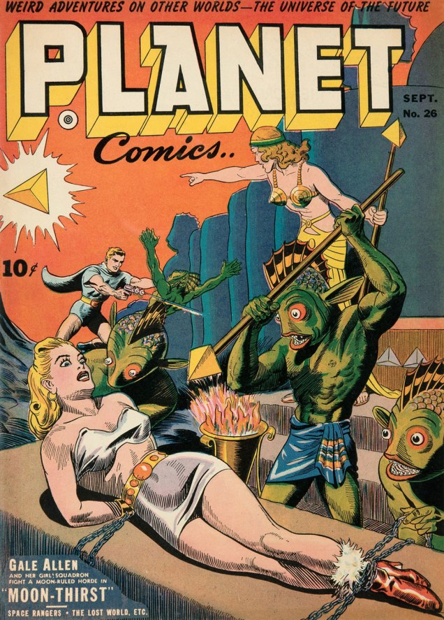
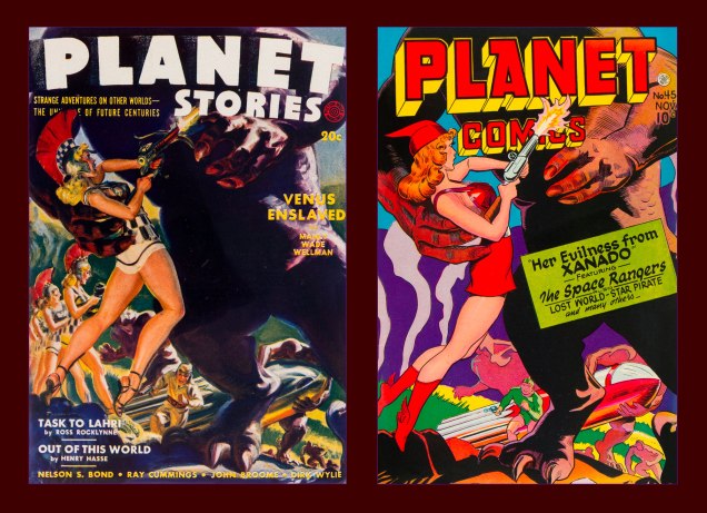
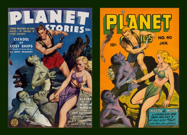
A fortnight or so ago, I came across an image that looked… familiar. It wasn’t slick enough to be AI, so I presumed it was a swipe. My first guess was Fiction House’s Planet Comics, but I initially came up empty. Then I realized my error: I was looking for a reproduction of the whole scene, involving both figures.
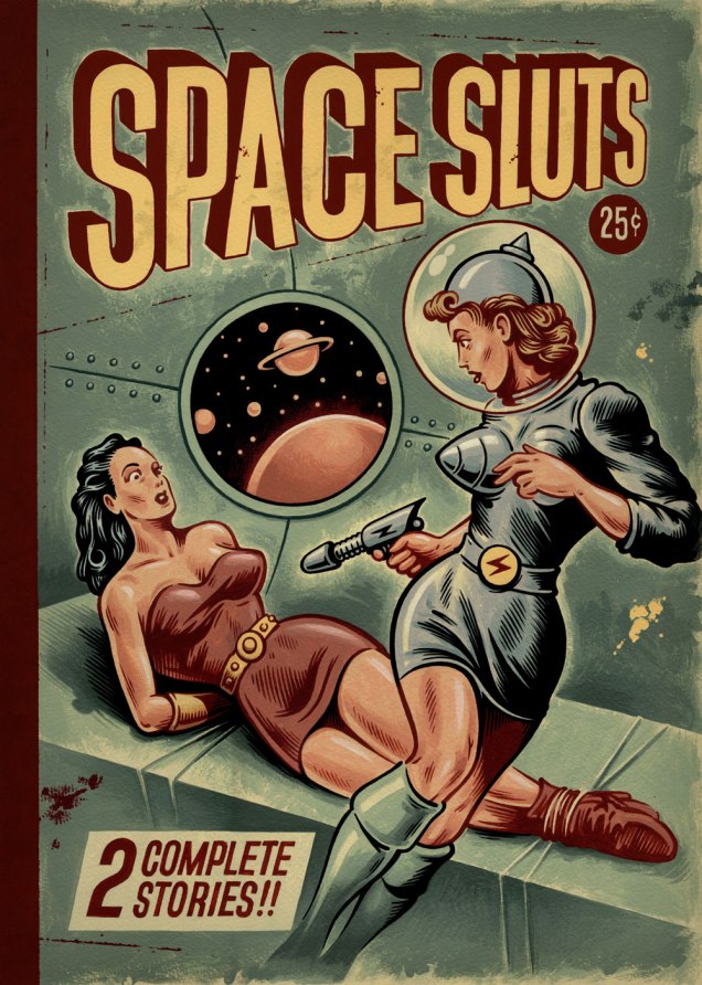
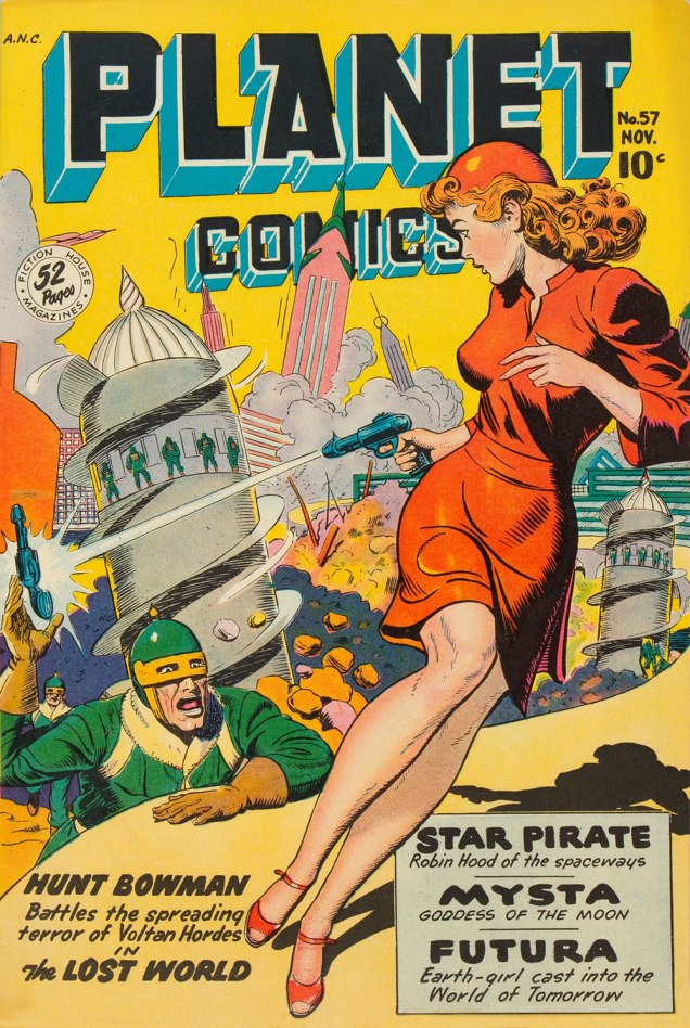
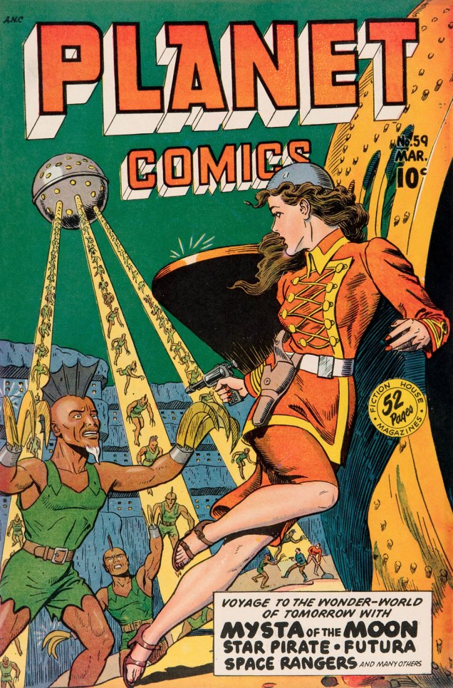
After a second pass… bingo: two issues of Planet Comics. At least the swiper was consistent: both covers were drawn by the same guy, Joe Doolin (1896-1967), a prolific pulp and comic book illustrator. Check out his interesting biography.
I mentioned the clumsy swipe in question to a long-time friend and colleague (salut, Éric!), who informed me that the ‘Space Sluts’ had been making the social media rounds (as they would), and that an alarming proportion of commenters had been fooled into thinking the piece was an artifact of some ancient origin, instead of a recent ‘creation’. No great shock there, as your average Joe Schmoe can’t recognize AI slop either when he sees it (but adores it indiscriminately).
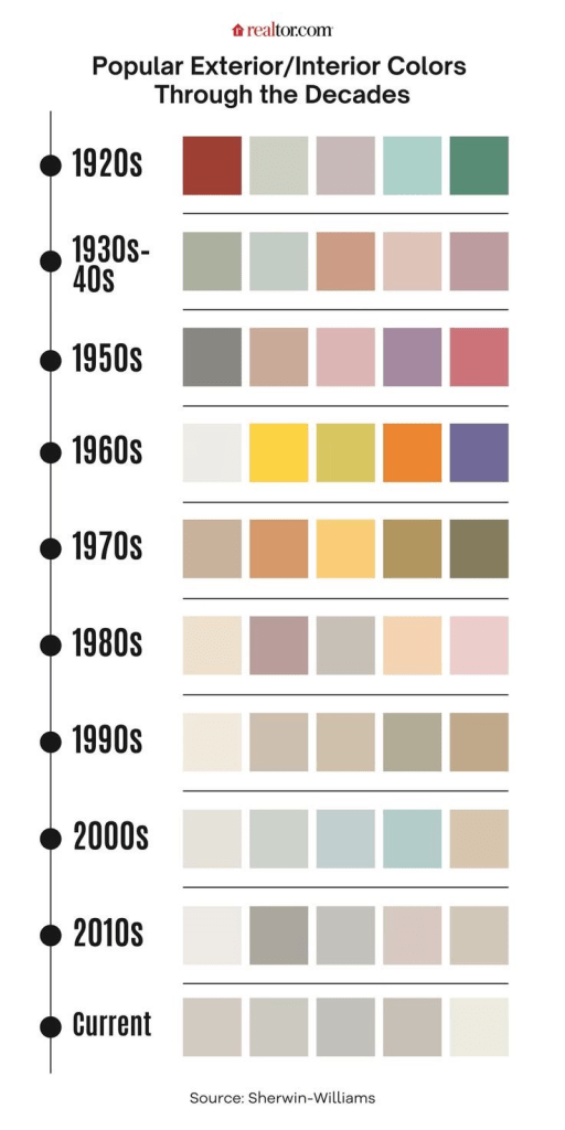
I mean, it’s all wrong: the depressing 21st century desaturated colours (denizens of our current dystopian nightmare shun bright, saturated colours (see graphic below) like a vampire eschews garlic), the telltale phoney brushstrokes of digital art, the incorrect cropping (no art would have been published with the space beyond the edges showing), methods of shading, the ‘dust and scratches’ being the same colour as the printed ink,.. I could go on all night, but I’ve got better things to do.
Then there’s the title. The art is insult enough, but was the shaming necessary? On Facebook, some mooncalf pointed out — incorrectly — that ‘slut’ didn’t have the meaning we’re familiar with until the 1960s. Nope (read on), but it likely wouldn’t have made it into print, and certainly not on the cover of a mainstream pulp magazine. I turn to a favourite reference work, Hugh Rawson‘s Wicked Words (1989, Crown) for the nitty-gritty:
slut. A slovenly woman, one of loose morals, a prostitute, HUSSY, or JADE. “He got very drunk and brought back a sluttish girl to the house. He woke me later to tell me that he had rogered her and her mama, too.“ (Evelyn Waugh, Remote People [in Kenya], 1931).
An old word, perhaps related to SLATTERN, slut was applied to women long before the nineteenth century, when it sank to the animal level, becoming a euphemism for a she-dog, or BITCH. In very olden times, it was not restricted to women, e.g. “Why is thy lord so sluttish“ (Geoffrey Chaucer, The Canon’s Yeoman’s Tale, 1387-1400). The feminine senses developed early, however, and they soon became dominant, which is usually what happens when “bad” words have both male and female meanings. Nowadays, only women are sluts or sluttish, the men having managed to get to escape the derogatory designation, just as they did with, for instance, GIRL, HARLOT, and SHREW.
As a side note, Doolin himself was no stranger to swipes, though technically these were above-board, publisher-commissioned recreations.
« The publisher of Fiction House, Thurman T. Scott, was notorious among pulp artists for repeatedly demanding additional revisions before granting final approval of his cover art. Most pulp publishers understood that good covers resulted in good sales, but Thurman T. Scott was obsessed with perfecting an unbeatable formula for maximum sales. The most obvious element of his formula was a big sexy pin-up. This same mania is reflected in the bizarre reappearance of Fiction House pulp covers on Fiction House comics. »
-RG
*I expect more from Doolin than from, say, Ross Andru, who used the same basic pose on every single 1970s cover he drew, and I’m barely exaggerating.