« Go to your bosom; Knock there, and ask your heart what it doth know » — William Shakespeare
Joe Gravel’s work came my way when, if memory serves, eBay suggested one his cartoons. As a fan of classic breakfast cereal mascots and vintage pinup art, this was as catnip to me.
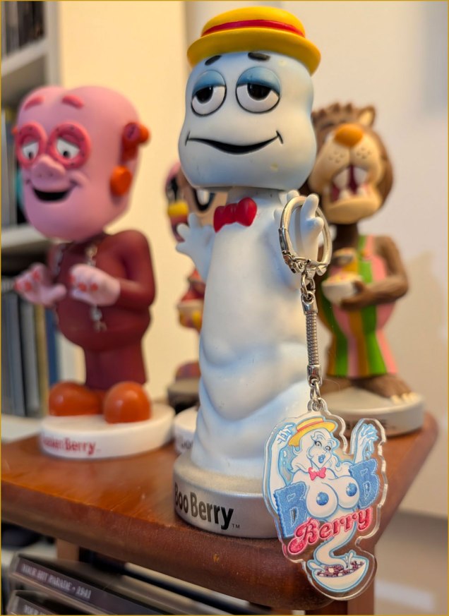
I ordered his lovely Boob Berry keychain (shown below) — and Dracurella and Frankenbabe stickers and buttons, and my fate was sealed. Writing to thank him, I found Joe to be a gracious and erudite fellow, and so I kept an eye on his work from that point on.
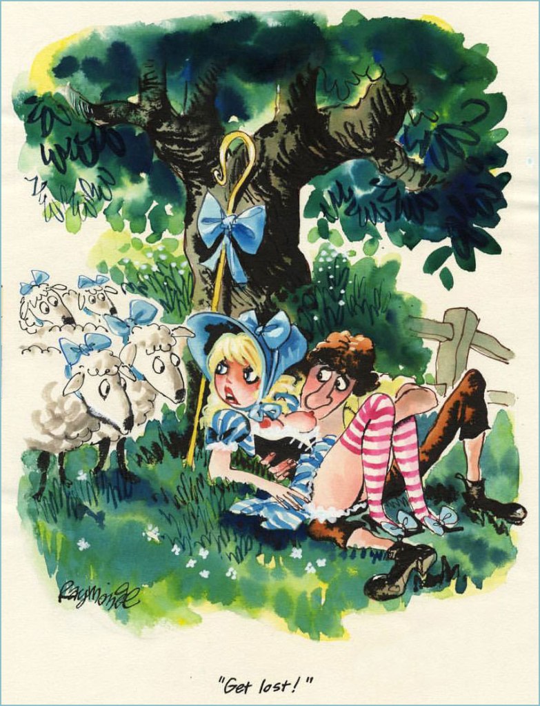
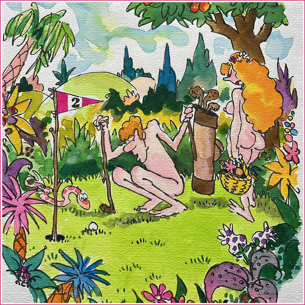
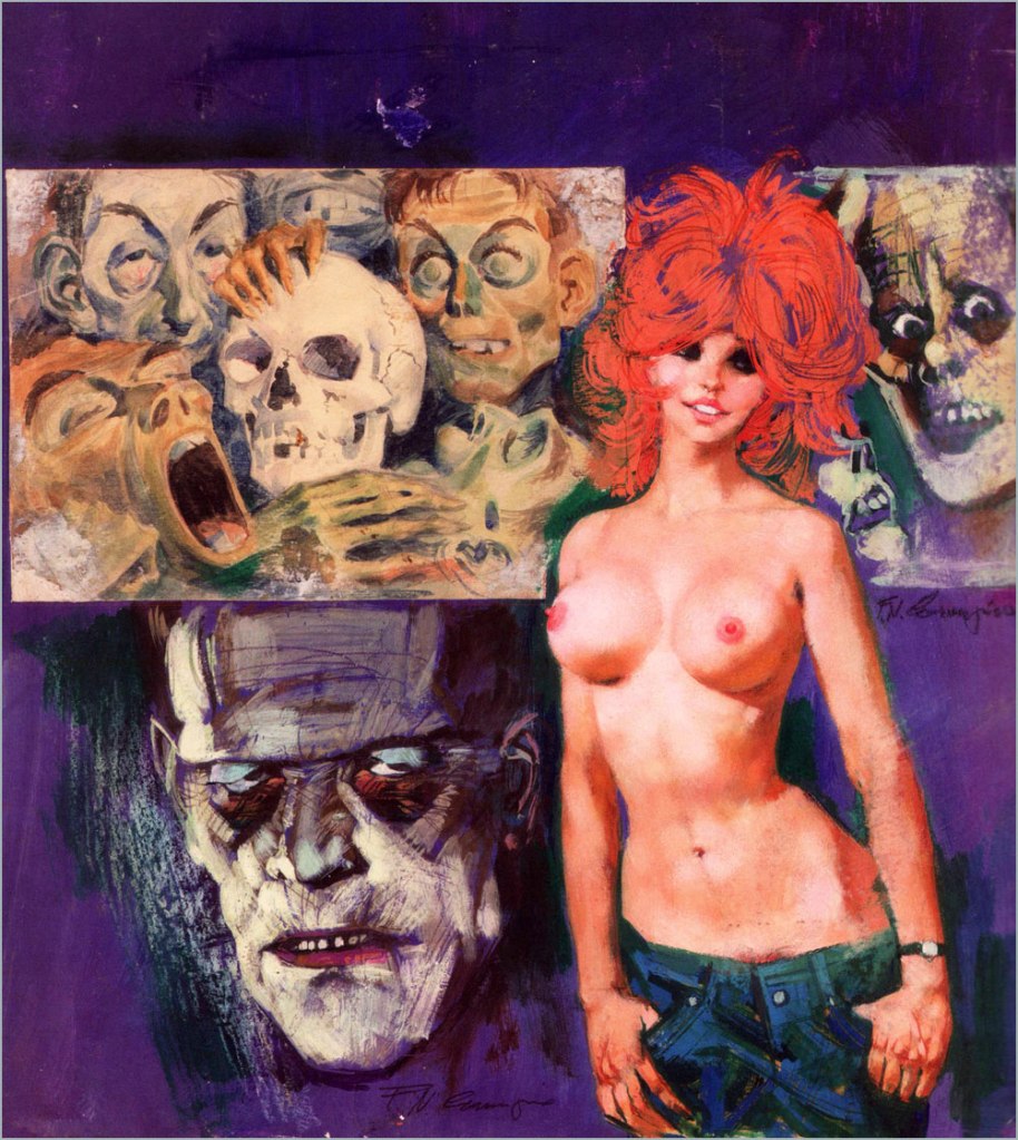
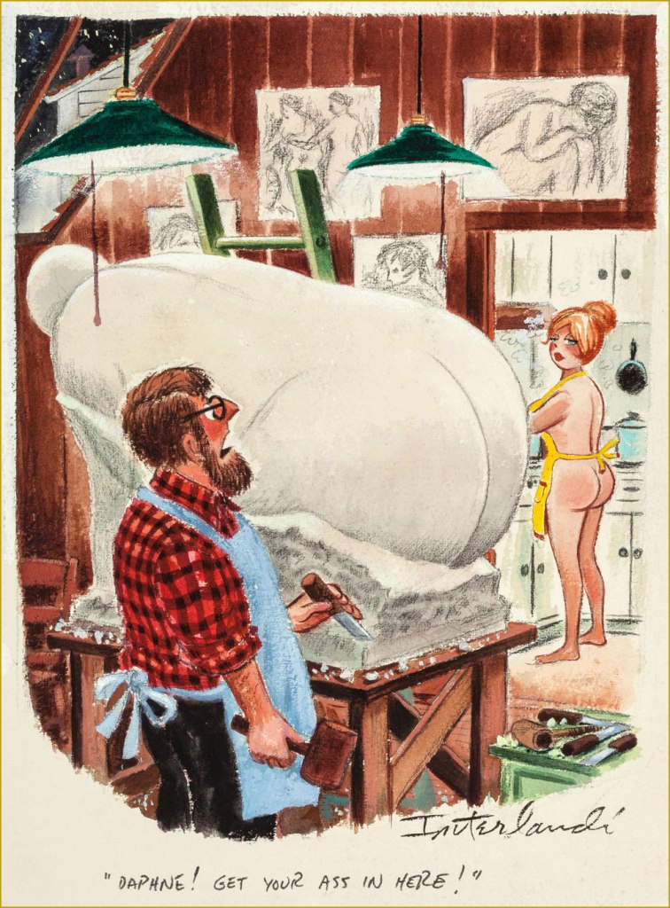
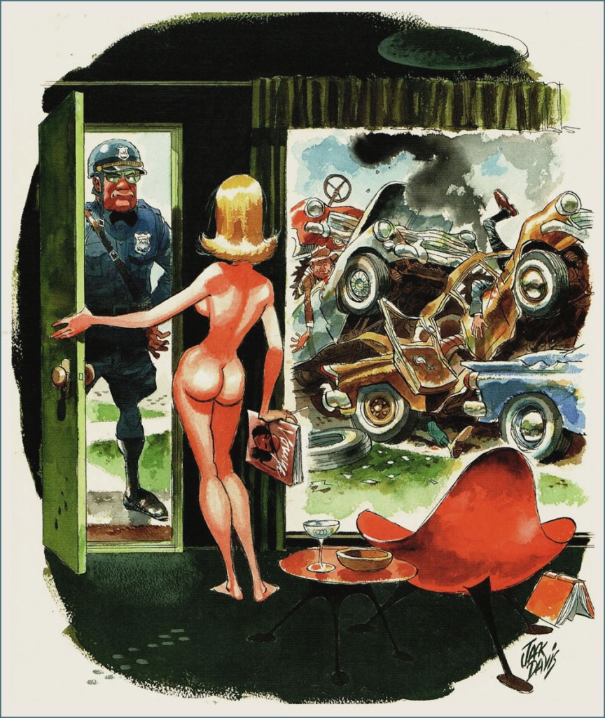
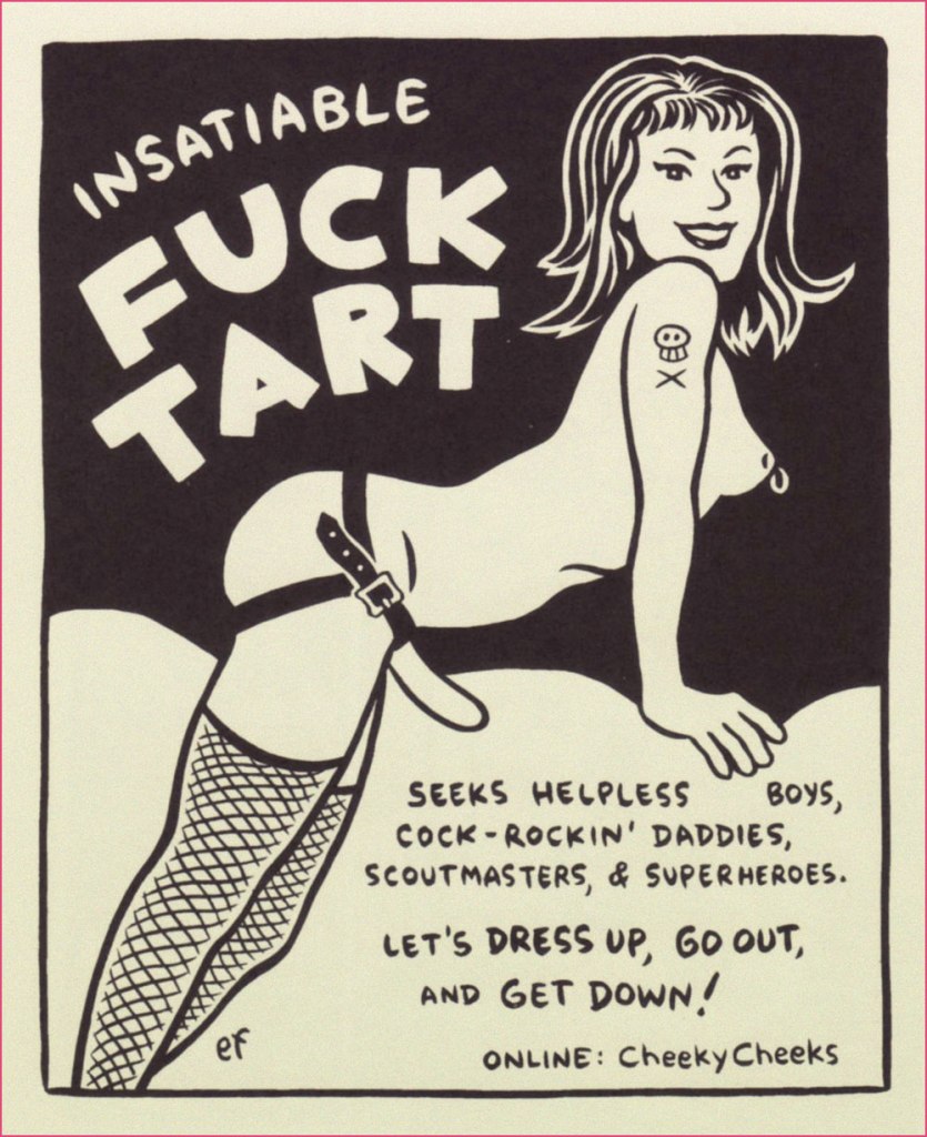
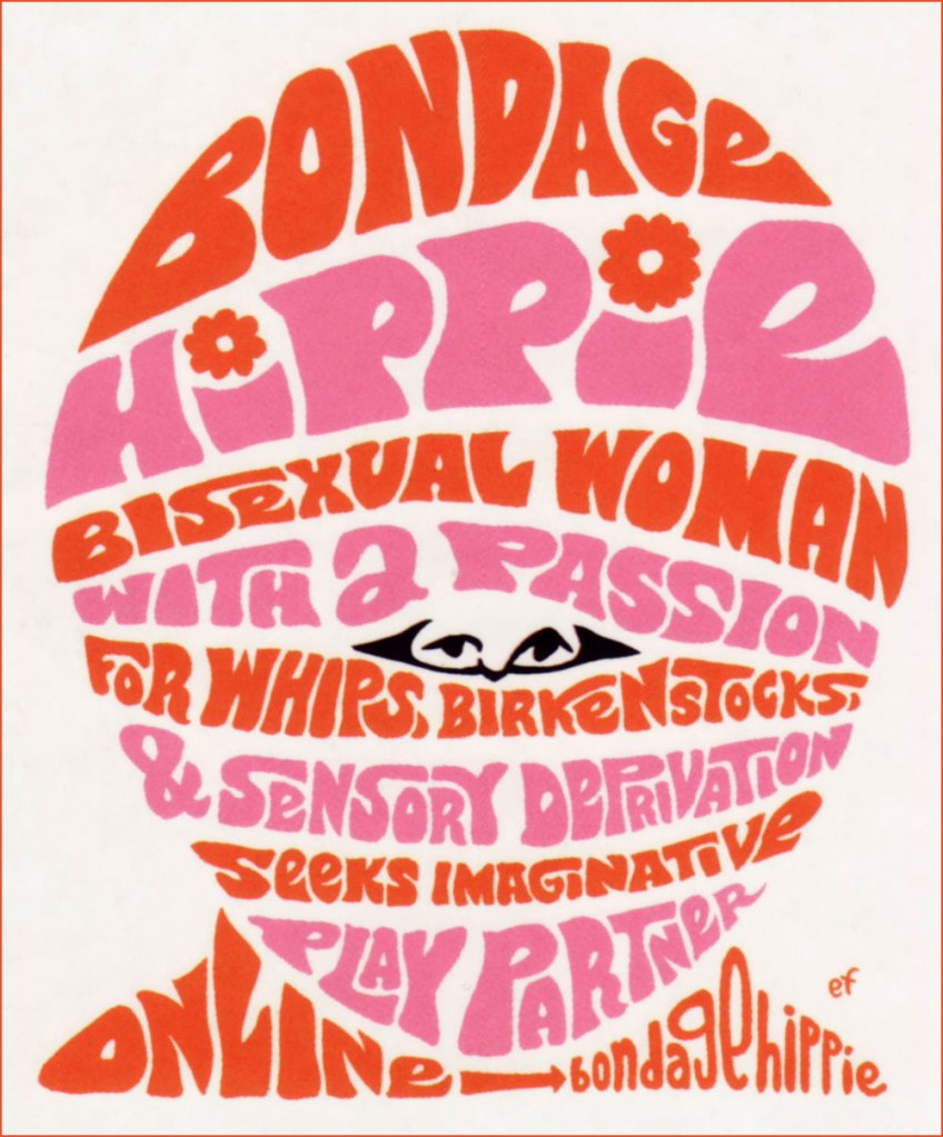
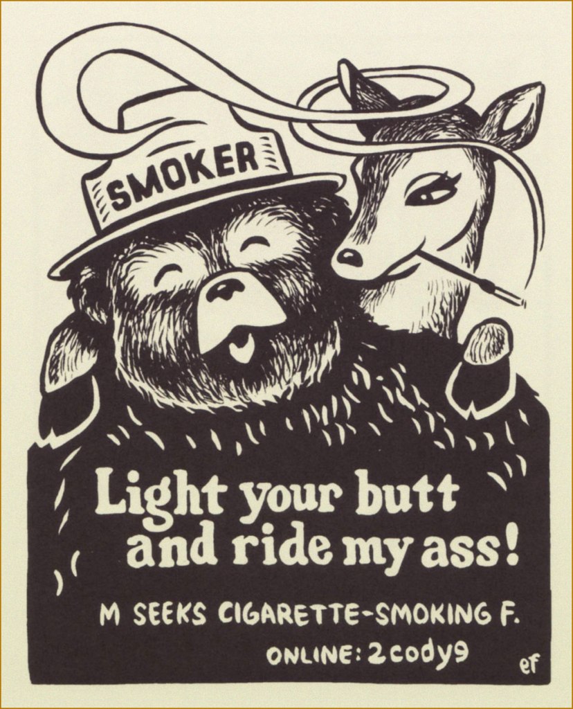
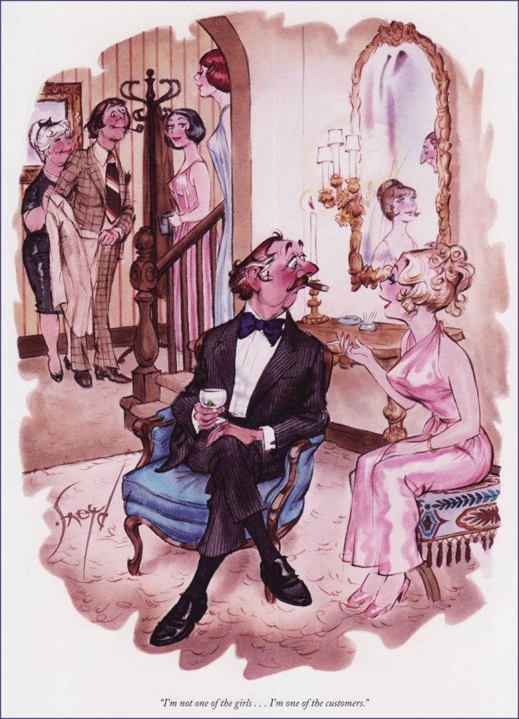
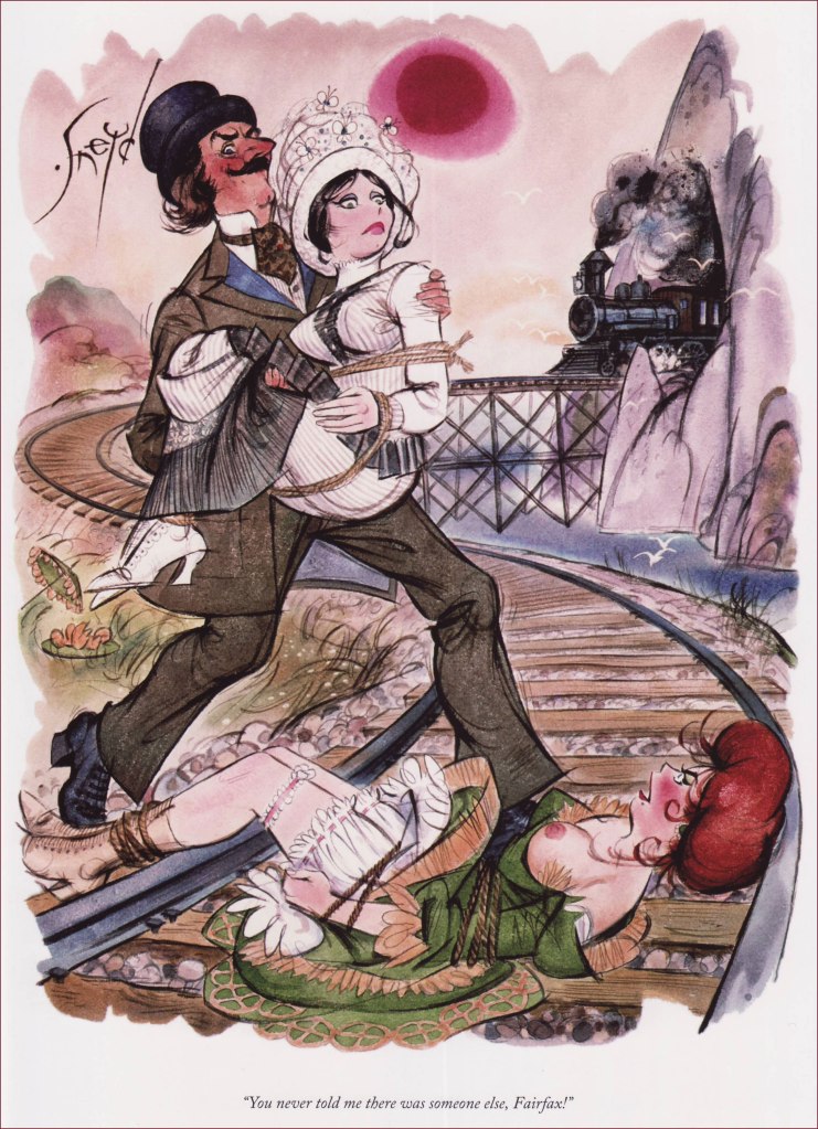
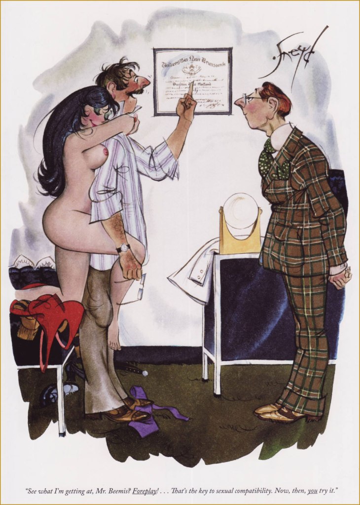
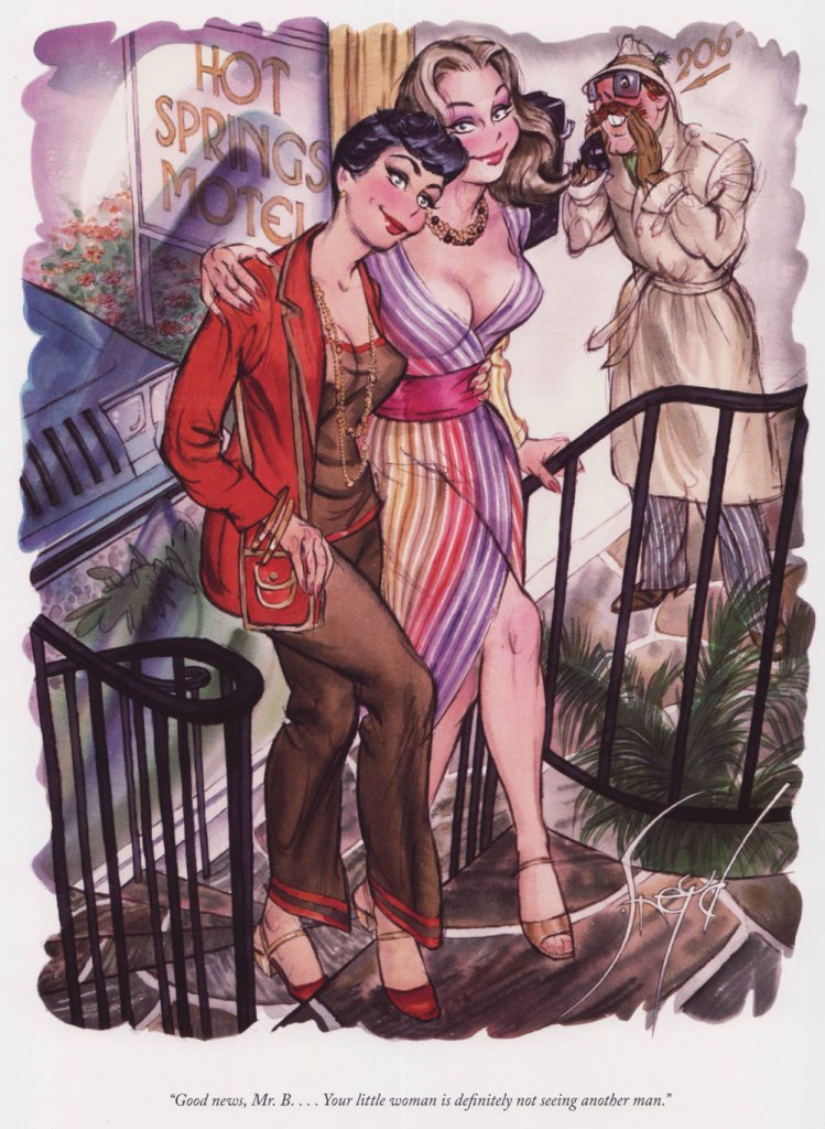
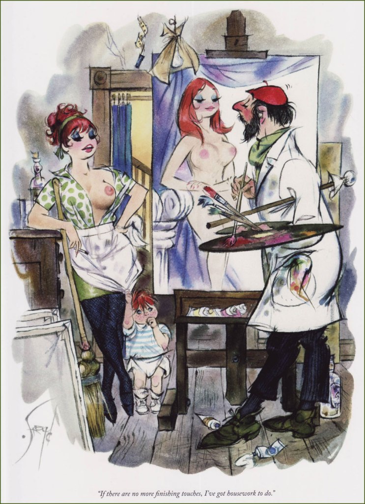
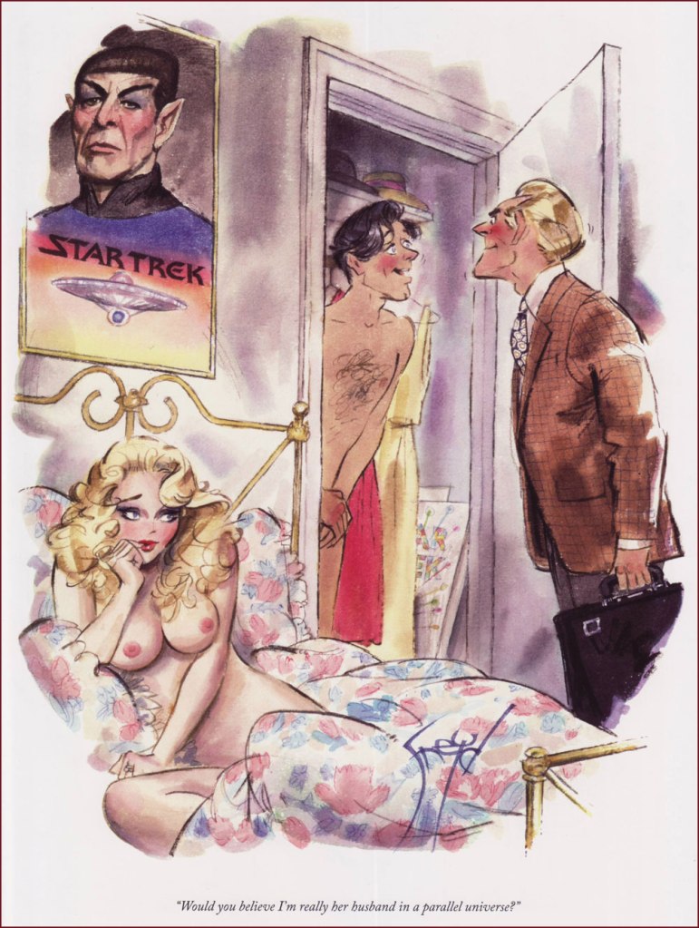
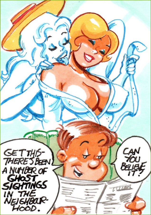
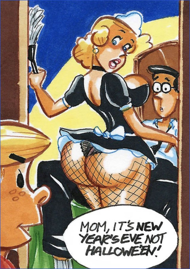
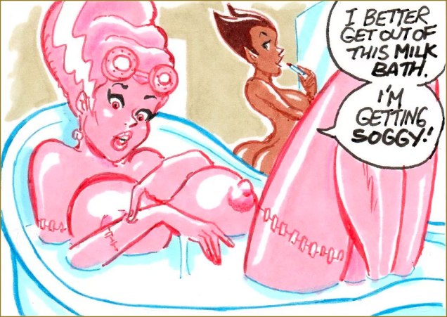
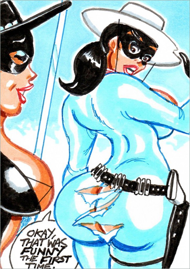
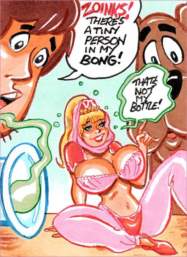
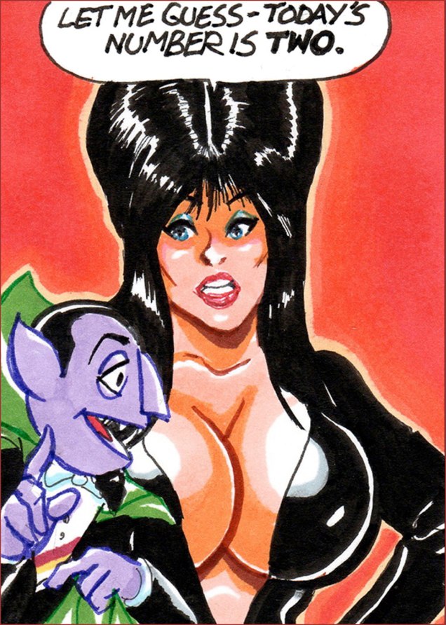
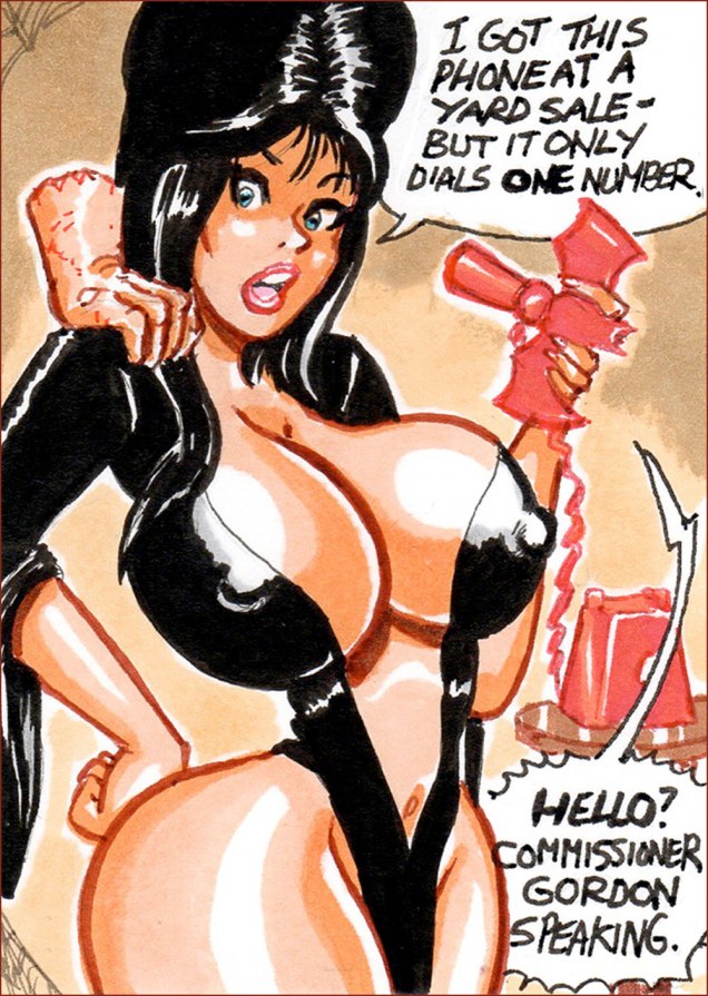
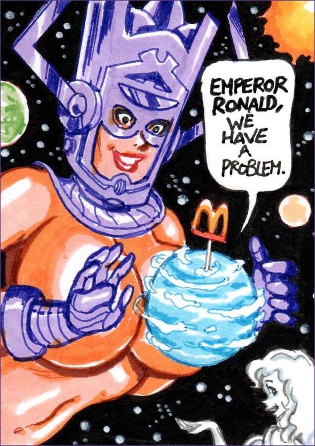
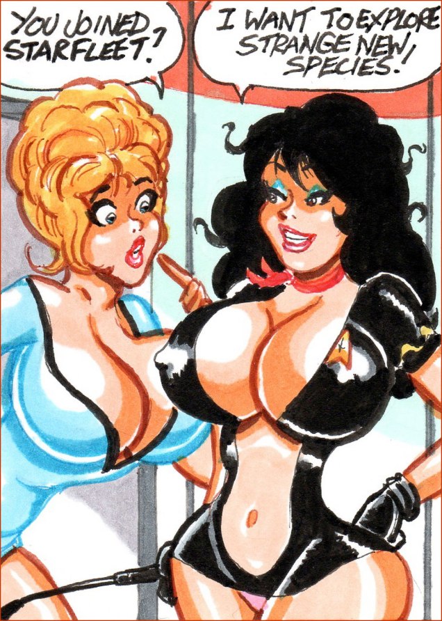
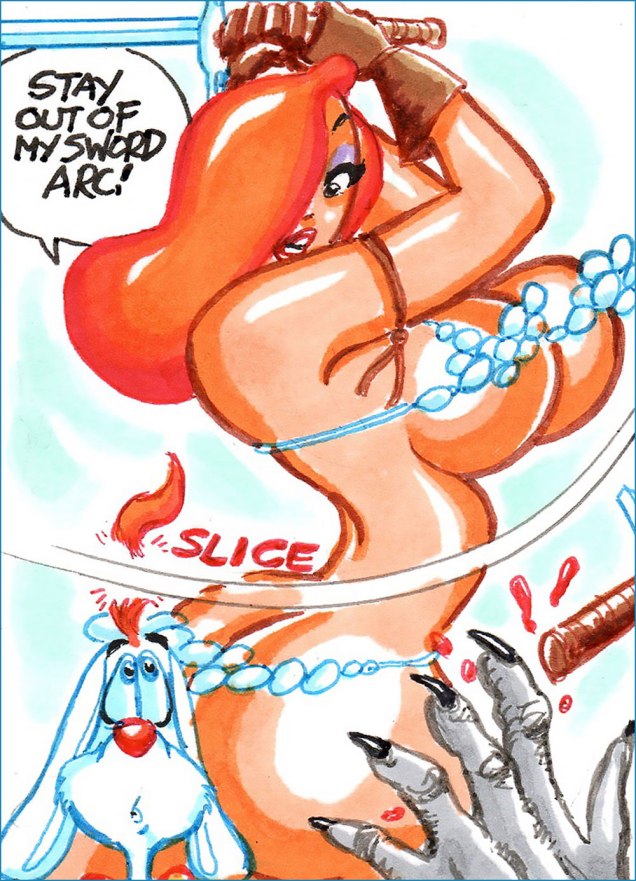
Now, hypersexualization of superheroines and sundry cartoon characters is a bit of a cottage industry, and most of its fodder is quite devoid of interest. Another application of Sturgeon’s Law, if you will. Ah, but Mr. Gravel’s work is witty, accomplished, positive, and perhaps best of all, he doesn’t explain his jokes.
Joe was kind enough to answer my questions about his craft and inspiration… and here’s the result, peppered with some of his favourites and some of mine.
WOT?- You draw from all genres, media and companies, yet maintain a consistency in style, and your own style at that. Does that come easy for you, or is it harder than it looks?
JG: Actually, I draw without any thought to staying in my style. It’s what comes naturally and what it has evolved to.
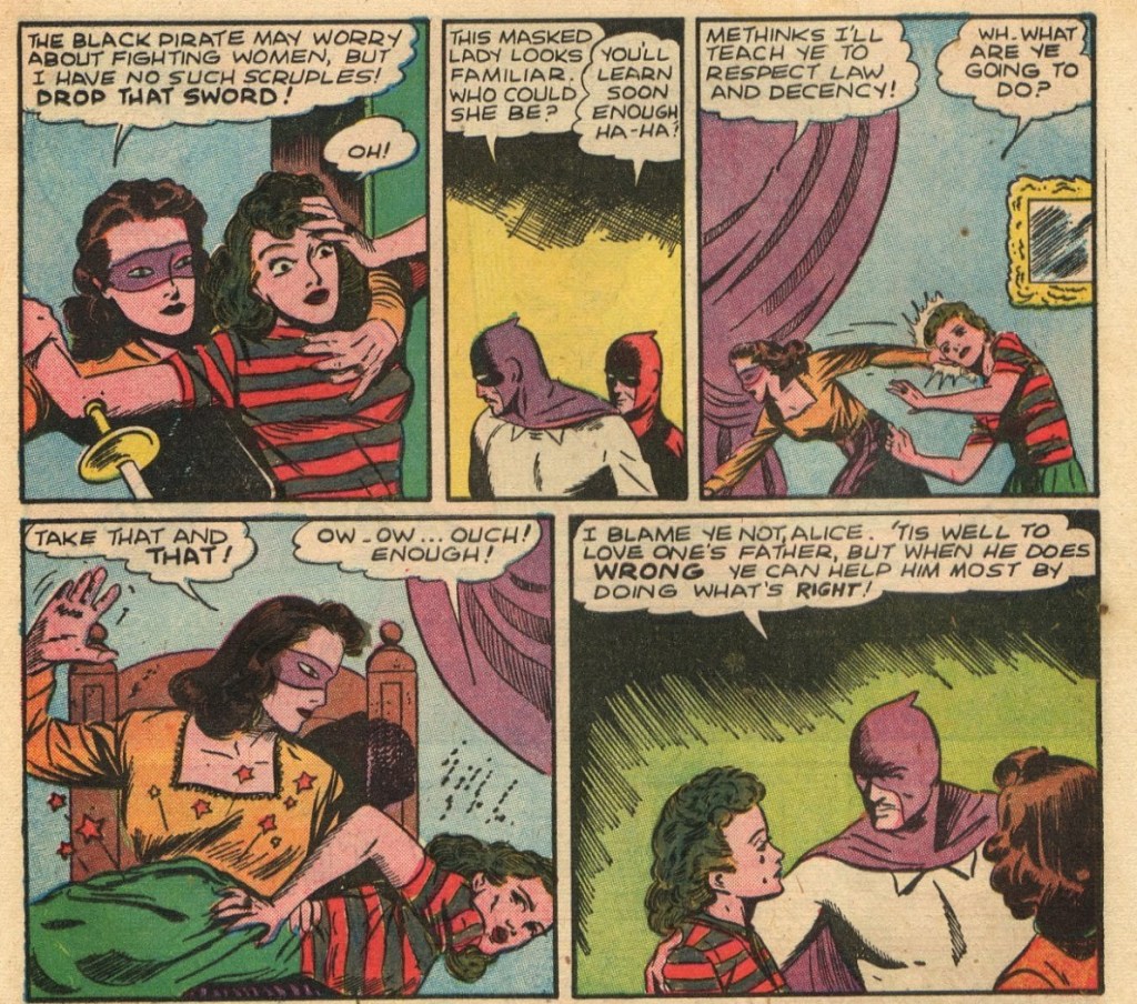
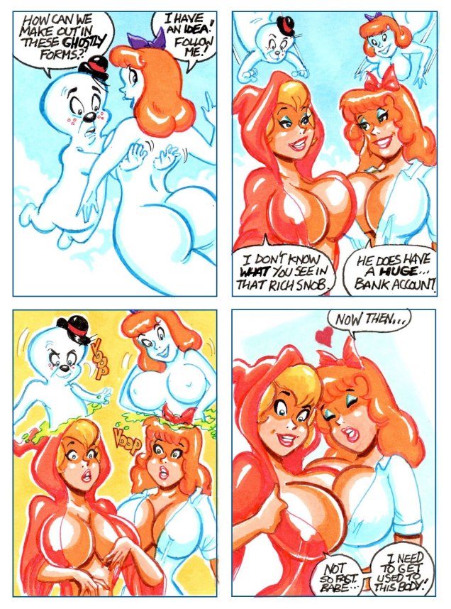
WOT?- You often produce multi-panel sequences… which brings your work closer to a panel approach, rather than the pin-up/splash one some often encounters. Is that because you have a fuller narrative in mind, one that you pluck sequences from?
JG: Occasionally I’ll have an idea that I can’t condense to a single card so I’ll expand it to a sequence of multiple cards/panels and post them as a single auction. Other times, I’ll do a single card and get a good response to the theme and then continue the narrative with other single card offerings. Were I more organized I’d have themes a bit better planned out. 🙂
WOT?- Gender switches: who gets them and why?
JG: Gender switches are kind of random. Whichever character I figure would look good with a swapped gender is fair game.
WOT?- The basic, but crucial question: what are some of your influences… and I presume they are numerous and varied.
JG: My influences include the usual cast of characters from anyone who read comics in the 80s such as, John Byrne, Frank Miller, Walt Simonson and Michael Golden. Pinup influences include George Petty, Gil Elvgren and Peter Driben – among many others. Probably the biggest was the Harvey Kurtzman / Will Elder collaboration on Annie Fanny.
WOT?- As a complement to the previous question, can you tell us a bit about your habitual comics and media diet?
JG: I don’t pick up many comics regularly these days though I have taken a liking to Mark Spears’ Monsters series. Besides that, I’ve started picking up the Criminal series by Ed Brubaker and Sean Phillips in trade format. Mostly I’m introduced to new artists through posts I see on Instagram and sometimes Tumblr.
WOT?- In this digital age, your choice of technique is unusual (and refreshing, if you ask me). Why markers?
JG: I choose markers for my work due largely to the ease of use and the speed it gives me compared to painting. I’m old school so while I dabble in digital art from time to time, I very much prefer the physical media.
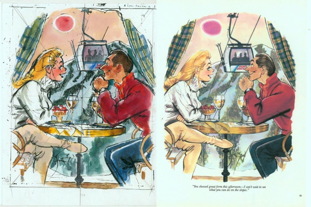
WOT?- In terms of planning and layout, are you more akin to, say, a Sergio Aragones or a Jack Kirby, who could start a drawing anywhere and make it work… or a Harvey Kurtzman, who needed a pile of preliminary drawings and overlays to achieve his goal?
JG: For planning and layout, I’m on the opposite spectrum of Kurtzman :). Often I do my rough sketch on the sketch card and then refine the pencils from there. If I have multiple elements on a card, I’ll do a super rough thumbnail on a scrap piece of paper to help visualize what should go where.
WOT?- Any collections planned? Since each panel is auctioned off individually, any collector of your work must be seething with frustration. Is there any hope on that front for the completists?
JG: A collection is a great idea. I’ve had a few people say that I should pull some of my storyline cards together for a booklet or PDF. My biggest hurdle is myself taking the time to do it. Having said that, I have a series going now that I’m going to make an effort to assemble into a sequential piece. Also, much of the time these ongoing series start out as one or two cards that I had gags for and if they’re well-received I continue the series without a pre-planned idea of where they go. Sometimes they just trail off. So, I’d like to get into the mindset of doing a rough arc in my head if an idea takes off.

My heartfelt thanks to Joe Gravel for his time, patience and insight! Check out his latest creations, up for auction right here: https://www.ebay.com/usr/rocketred23
-RG