Hallowe’en Countdown III, Day 29

« Sharon… Marilyn… Jayne… Eva… Claudia… plus bits and pieces of bit part actresses. » — Prof. Shelley recites Cadavera’s recipe

In the early 1990s, Seattle-based publisher Fantagraphics were in choppy financial waters. To save the ship, they went commercial… in their own fashion. Two speciality imprints were launched, most famously Eros Comix, but also the lesser-known Monster Comics.

My own contender for the finest of Monster releases adroitly straddled both the erotic and the monstrous (and a few other genres besides): a two-issue wonder, Cadavera, was the hallucinatory, disembodied brainchild of Memphis cartoonist auteur John Michael McCarthy. Sadly, this raunchy-in-all-the-best-ways, rollicking saga-in-the-making, fireball of jolting ideas did nothing to help its publisher climb back into the black. But hot damn, did it ever give its all. However, in the speculator-frenzied, Image Comics-happy US marketplace of ’91? Oh, just forget it.

Cadavera2CoverA
This is Cadavera no. 2 (Nov. 1991); artwork by John Michael McCarthy, who helpfully tells us that the « cover car is a35 model Ford Model ’48 3-window coupe, original price $570. ». And isn’t that a doozy of a catchy slogan?

I know I could pull striking samples from these skinny pamphlets all the live long day, such is their level of visual craft and quotability, but I’ve checked, and you can still get copies for a song, so why spoil your eventual pleasure?
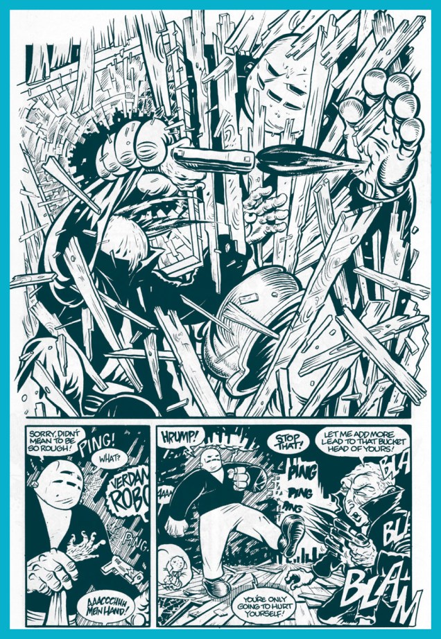
Cadavera1GoogogA
Meet Prof. Shelley’s hulking robot helper, Googog. From Cadavera no. 1 (March, 1991).
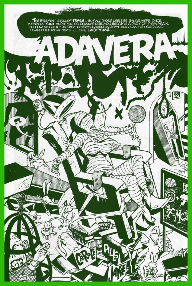
Cadavera2Splash01A
Cadavera no. 2, page 4.
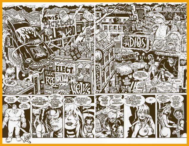
Cadavera2XSlashA
Cadavera no. 2, pages 22-23. No-one could accuse Mr. McCarthy of being a slouch.

Anyway, all the gooey goods are accounted for in this « unofficial death certificate for unpopular culture »: punk rock, tabloid journalism, fascism, hot rods, hillbillies, Nazis (the original and the currently popular Neo (in)breed), mad science, robots, bunnies, Vice-Prez Chas. Manson…
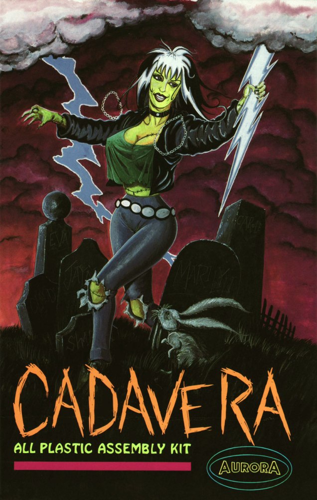
Cadavera02BackA
Oh, and model kits! This painting by Gary Makatura appeared on the back cover of Cadavera no. 2. « … and thanks to the Holland Company for allowing me ‘the look’ of authentic Aurora, here’s to a new world of plastic and glue! »

The amazing Mr. McCarthy, after giving comics his more-than-game try (with Eros entries Supersexxx and Bang Gang, the one-shot movie tie-in Damselvis Daughter of Helvis and one of my all-time favourite series, Kid Anarchy, written by his pal George Cole), went the Roger Corman route and became a micro-budget filmmaker. There may be zero bucks in it, but that’s still a rosier financial situation than comics could offer.

« To hell with all those near-fatal quests and celebrity body parts! »

-RG
Hallowe’en Countdown III, Day 22

« I saw old Autumn in the misty morn stand shadowless like silence, listening to silence. » — Thomas Hood (1799-1845)

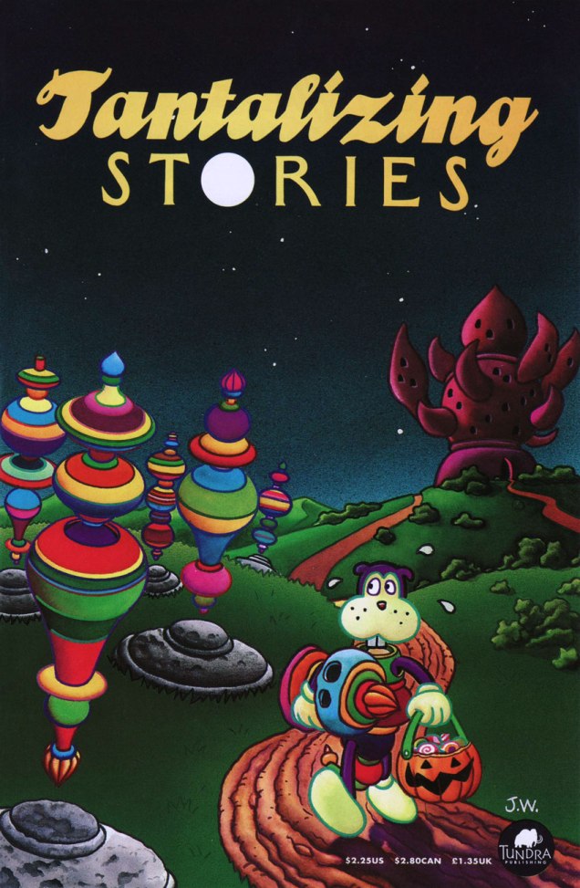
Jim Woodring‘s Frank, cogently termed « a bipedal, bucktoothed animal of uncertain species » was introduced to readers on the cover of Jim no. 4 (Dec. 1990, Fantagraphics), virtually straight from his genitor’s id. He would turn out to be Woodring’s most enduring creation. I was absolutely in awe of Woodring’s original, somewhat autobiographical showcase title, Jim. But it practically sold in the negative numbers (I recall an admiring / dismayed Dan Clowes stating something to that effect during an interview), and dammit, a genius like Woodring should be able to earn a living in freedom and dignity, so I understand the slight shift in gears. Though I miss Woodring’s tremendous verbal gifts, Frank’s is a rather extraordinary universe.

WoodringTanta01A
This is Tantalizing Stories no. 1 (Oct. 1992, Tundra), a duplex anthology shared by Woodring and Mark Martin. Painted cover by Woodring, of course.

Speaking of Tundra, its tale is quite a colourful one: it was the publisher that The Teenage Mutant Ninja Turtles built; an act of atonement? « Tundra was certainly, not to put too fine a point on it, the biggest and most absurd (as well as the most idealistic) publishing catastrophe in the history of comics — maybe in the history of the print medium. » [ source ]

WoodringHalloween01A
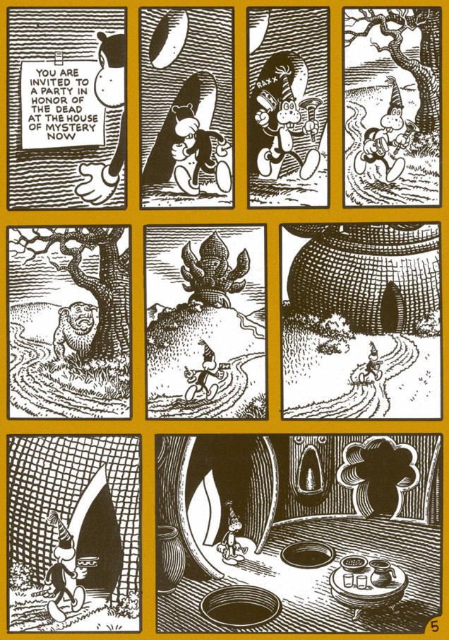
Frank observes the signs of autumn, which puts him in a contemplative, melancholy mood; the middle tier of page 2.

WoodringFrankDead01A

WoodringFrankDead02A
Yeah, I’ve been to a couple of those parties too.
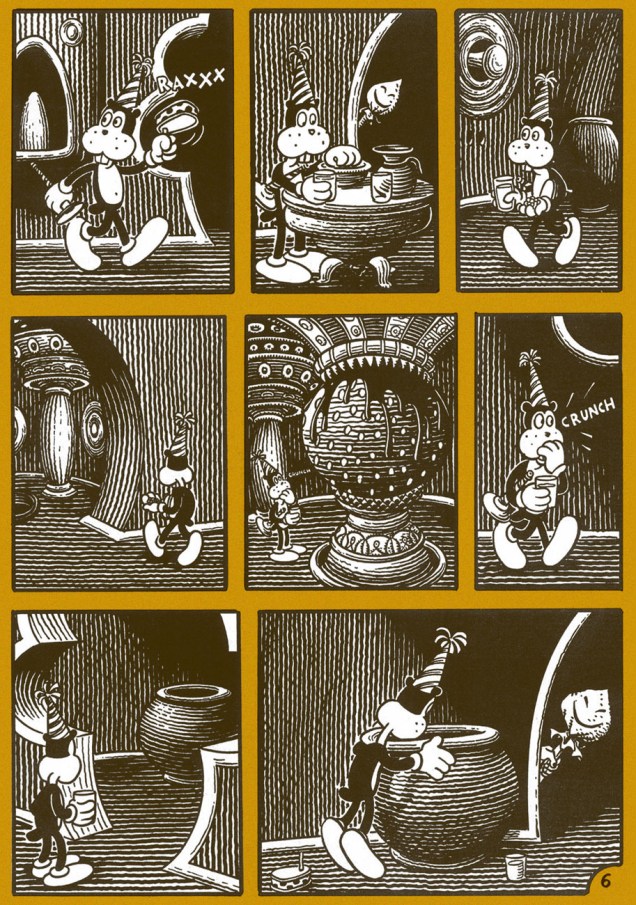
WoodringFrankDead03A
The party sequence; I wouldn’t want to spoil the ending, which comes one page later. Read the issue in full here. Woodring is of that rare complete breed of cartoonist, a uniquely soulful writer and a master of both black and white and colour rendering, quite autonomous but also a fine collaborator.

Woodring, nearly three decades down the line, has stated that he’s ‘extremely interested’ in wrapping up Frank’s adventures.

-RG

Hallowe’en Countdown III, Day 17

« I may turn up as flies on your ceiling. »

From the earliest issues of  Love & Rockets (circa the early 1980s), it was quite evident that Jaime Hernandez was a cartoonist of the first order.

At first, he kept the tone of the proceedings fairly jovial; but gradually, a little darkness crept into the ambiance. Not systematically, mind you: it was just the natural course of things. For all that, he didn’t sacrifice one bit of his light touch; he was just expanding his range, the simple process of his artistic maturation.

The first time he fully demonstrated that he could evoke the texture and the essence of terror… was a milestone. In 1989’s Flies on the Ceiling, he stunned readers with a dizzying, yet understated tale that lifted the veil on a murky chapter of Izzy’s past. In the telling, he adroitly looses a startling panoply of techniques and ingredients that this reader wasn’t nearly prepared for. A true brain-singer.

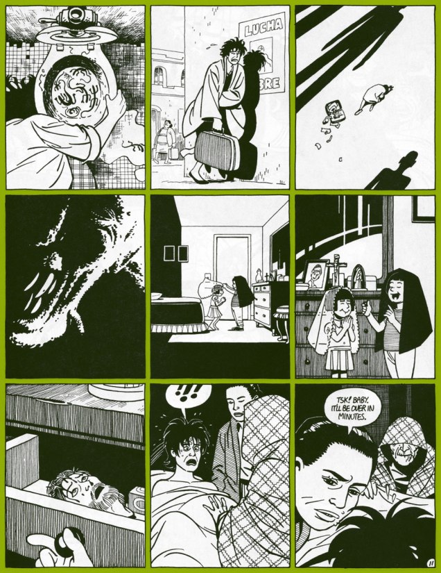
JaimeFlies11A
Roman Catholic iconography, traditional Mexican beliefs and rituals, dead-on psychology, awful things hinted at in the margins. An excerpt from Flies on the Ceiling: the Story of Isabel in Mexico (Love & Rockets no. 29,  Fantagraphics) [ Read it here. ]
Jaime occasionally returns to the realm of the uncanny (we’ve featured him in a past countdown entry), but never treads the same path twice. A few further samples, if you will:

JaimeRayNightmareA
Poor Ray has a singularly vivid nightmare. Hopefully, that’s all it is. This ghoulish entry appeared on the back cover of Penny Century no. 3 (Sept. 1998, Fantagraphics). Story and art by Jaime Hernandez, colours by Chris Brownrigg.

JaimeLaBlanca01A

JaimeLaBlanca02A
La Bianca: a True Story appeared in the Gilbert Hernandez-edited all-ages anthology Measles no. 2 (Easter 1999, Fantagraphics.)
JaimeScaryStoriesA
Jaime in a spooky-lite register, for a 1994 Rhino Records spoken-word anthology featuring such titans of the macabre as Boris Karloff, Brother Theodore and Nelson Olmsted.

– RG

Hallowe’en Countdown III, Day 13

« Here’s to the thugs and maniacs who fill each book with concepts so damnable, so putrescent, that they make the EC horror magazines of yore seem like mere cocktail napkin doggerel. I salute you. Now I’m going to take a bath in quicklime. » — Harlan Ellison toasts Death Rattle (1986)

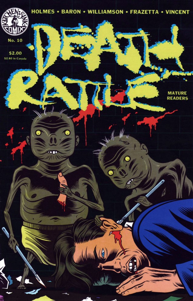
In the 1980s, with the Comics Code Authority in its death throes, you’d think horror comics would have made a massive comeback. Well, they did… and they didn’t. Since there had been plenty of black and white magazines to operate outside of the Code’s restrictions, bringing bloodshed and mayhem to colour comics made the much-anticipated liberation a bit of a non-event. For my money, the truly interesting horror material opted for different approaches, now more experimental, then rather whimsical, at times clinical, sometimes abstract. Underground comix publisher Kitchen Sink, surviving thanks to its eclectic spirit, revived its early 70s horror anthology in 1985, an adventure that this go-round lasted eighteen issues and unleashed cutting-edge, nostalgic, shiver-inducing, thought-provoking and gut-busting efforts by such talents as Richard Corben, Rand Holmes, P.S. Mueller, Jack Jackson, Stephen Bissette, Mark Schultz (his Xenozoic Tales were introduced in Death Rattle 8, in 1986), and, on this unsettling cover, Charles Burns.

BurnsRattle10A
This is Death Rattle no. 10 (April 1987, Kitchen Sink). Cover by Charles Burns, coloured by Pete Poplaski.

Before this cover, and speaking of clinical horror, Burns had earlier provided one of Death Rattle’s most harrowing gut-punches in issue one’s Ill Bred: a Horror Romance. I wouldn’t want to give away too much, but here are a few samples from this queasy masterpiece of gender fluidity, body horror and (justified) insect fear, seemingly inspired in equal parts by David Cronenberg films, Japanese art prints and Burns’ personal demons. Not for the queasy, but peruse it here if that ticks any of your happy boxes.

BurnsIllBred01ABurnsIllBred02ABurnsIllBred03A

– RG

Earth Day With Jim Woodring and Friends

« Oh Beautiful for smoggy skies, insecticided grain,
For strip-mined mountain’s majesty above the asphalt plain.
America, America, man sheds his waste on thee,
And hides the pines with billboard signs, from sea to oily sea. » ― George Carlin

On this day, the forty-ninth edition of Earth Day, we feature some little-seen work (by his usual audience, at any rate) by Jim Woodring and his collaborator Scott Deschaine*. Given the current political climate, an increasingly dire state of affairs, I’ll (mostly) skip the chit-chat and make with the visual riches.

WoodringGreenTreeA
Among the Woodring / Deschaine collaborations, One Green Tree (1990) is the masterpiece, and the only full-on Woodring, visually-speaking, with its expressive inks, unsimplified art and lush palette.
WoodringTreeЗ5A
An interior (in more than one sense) page from One Green Tree, a sixteen-pager. Full marks to Deschaine, a science popularizer of the first order, and a cartoonist himself, which goes a long way in explaining the success of these collaborations.
WoodringUnderwoodA
Incidentally, Woodring drew himself into the story as the friendly guide, Mr. Underwood.
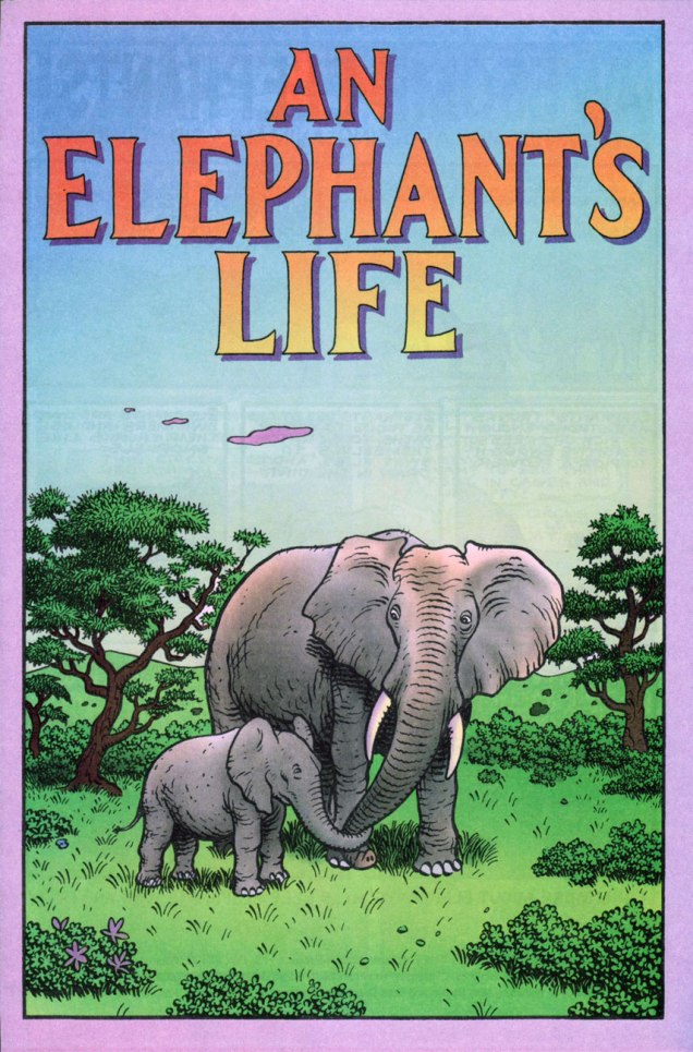
WoodringElephantLifeA
As it happens, Earth Day 2019’s theme is « Protect Our Species », and few species need more protection than the gentle elephant.
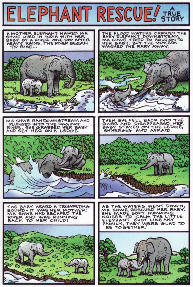
WoodringElephantsA
An excerpt from An Elephant’s Life (1999), written by Mike Benton and Scott Deschaine, illustrated by Woodring.
WoodringSoil_A
Search for Soil (2000, Discovery Comics) features Woodring in a simpler style, but it’s still gorgeous and effective. And hey, a Tiny Perfect Mole!
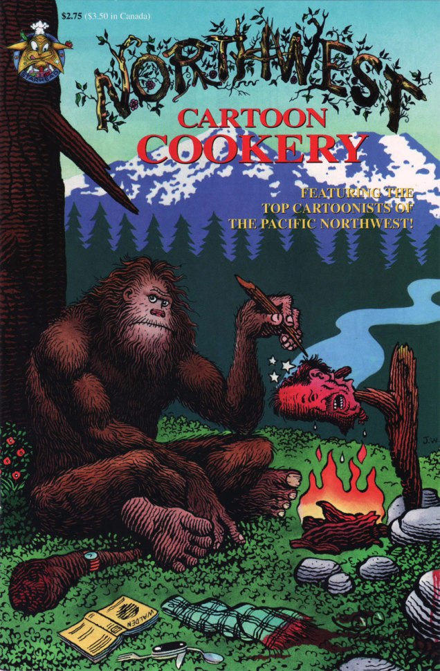
WoodringNorthwestA
And for those of you who may find this all too earnest, cute and family-friendly, I’ve saved a Woodring piece to soothe your savage brow. This is the one-shot Northwest Cartoon Cookery (1995, Starhead Comix), also featuring fine work by J.R. Williams, Donna Barr, Ellen Forney, Roberta Gregory, Michael Dougan, Mark Zingarelli… and a couple of pages of Ed Brubaker’s dismal artwork.

« What we are doing to the forests of the world is but a mirror reflection of what we are doing to ourselves and to one another. » ― Chris Maser, Forest Primeval: The Natural History of an Ancient Forest

-RG
*French family names, after spending some time in English-speaking lands, tend to distort in interesting ways: “Deschaine” makes no grammatical sense. It likely started out as “Deschaînes” (of the chains), or its homonym, Deschênes ou Duchêne (of the Oaks or the Oak). Sometimes, the name gets so badly distorted that it’s quite unpronounceable: Shia LaBeouf  (Leboeuf, the ox) or Cara Delevingne (Delavigne, of the vine)… not that I’d want to utter these names, save perhaps as curses.

Just a Humble Boy From Tupelo, Mississippi

« When I was a boy, I always saw myself as a hero in comic books and in movies. I grew up believing this dream. » – Elvis Aaron Presley (1935 — ?)

Today, somewhere, the King of Rock ‘n’ Roll celebrates his eighty-fourth birthday, be he alive, dead or undead, he lives on. And never forget: Elvis is everywhere!

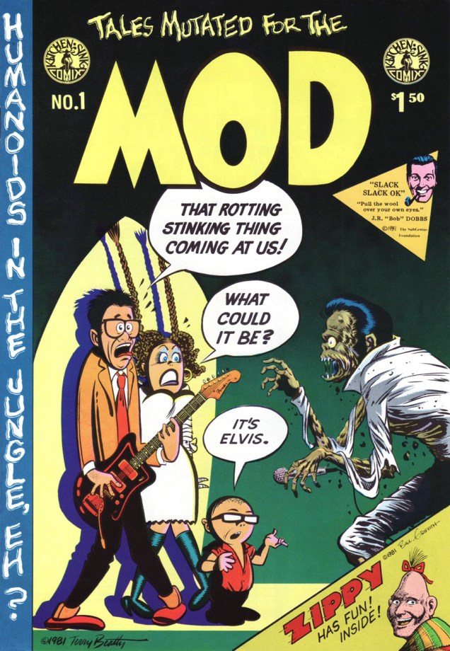
mod1a
A most salty salute to the King of Rock ‘n’ Roll on his birthday! Compared to earlier decades, the 1980’s (and on!) were not kind to the anthology comic book. Thankfully, the meagre rewards and resounding indifference weren’t enough to quite dissuade some foolhardy souls from giving the format a go. But the fanboys wanted spandex, they wanted continuity and they soon wanted their « decompressed storytelling ». Bah. 
In 1981, Kitchen Sink Comix published the lone issue of Terry Beatty‘s labour of irradiated passion, Tales Mutated for the Mod. (June, 1981). Unlike John Byrne and others’ unceasing and pointless ‘tributes’ to Fantastic Four No. 1, this cover version of Harvey Kurtzman‘s Mad No. 1 is fiendishly clever. Kudos, Mr. Beatty!
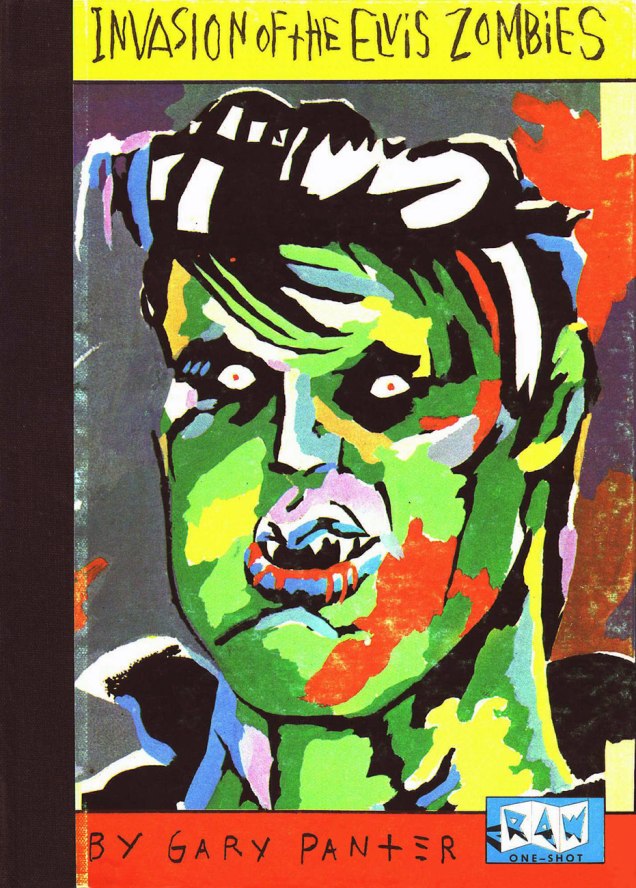
panterelviszombiesa
Gary Panter crafted this loving tribute in 1984, a one-shot published by RAW. Such heady stuff was well ahead of its time!
elviszombiesbacka
The back cover… this beats Power Records‘ meek offerings flat!
heartthrobs95a
The oft-inaccurate Grand Comics Database really fumbles it this time: the instantly-recognizable icon on the right is, according to them… Fabian. Dopes. Hamilton, Ontario’s Win Mortimer (1919-1998), inducted into the Joe Shuster Hall of Fame in 2006, drew this cover for DC’s Heart Throbs no. 95 (April-May 1965); given the time period and The Pelvis’ shirt, he would presumably be shooting the dire Paradise, Hawaiian Style. If you’re of a mind to commemorate the King’s anniversary with one of his mid-60s cinematic offerings, better opt for the far finer Tickle Me (1965).
elviseeriea
His (alleged) paper boy claims, and I do want to believe him, that the Big E has peacefully decamped to the quietude of Eerie, Indiana. Looking good, Big E!

-RG

Tentacle Tuesday Masters: Brian Bolland

« Or… uh, huh… with the severed neck of a dead ostrich… Yow! Tentacles! Long wriggly tentacles! Woo-WOO! »

Ah, Brian Bolland, the British artist that generally comes to mind when one mentions Judge Dredd. This was certainly *my* introduction to him, and my so-called initiation went over with a bang! (Which is to say, I fell in love with his art instantly. It took me a little longer to learn to appreciate Judge Dredd stories illustrated by other artists.) His crisp line adorns many, many comic titles, and I’m not going to enumerate all the pies he’s had his fingers in. I can, however, kill two birds with one stone by combining Wonder Woman Tentacle Tuesday part 2 (part 1 can be found here) with Bolland tentacles along other lines.

Actually, DC’s 1987 Wonder Woman series is a treasure trove of tentacles even without Mr. Bolland. However, some of these covers are frankly too ugly to feature here (I have high standards, in case you hadn’t noticed), while he can be relied on to always provide us with eye candy and an engaging composition.

BollandWW75A
Wonder Woman no. 75 (June, 1993).

Bolland is reputedly fond of his work on Wonder Woman covers, marking that it was “one of the few occasions he actually sought work rather than being sought for work.”

WonderWoman86-BrianBolland
Wonder Woman no. 86 (May, 1994).

A bonus WW illustration as a special treat, albeit a follicular extension of the definition of a tentacle, I confess. Well, it *is* Movember.

BrianBolland-WonderWoman-vs-EggFu
A pin-up published in Wonder Woman no. 120 (April, 1997): Wonder Woman vs Egg Fu!

TentacleTuesdayIcon

Moving on from the powerful, intrepid Wonder Woman to smaller crawfish, we have this maiden in an incredibly silly costume, which Bolland managed to somewhat redeem, mostly by hiding the stupid bow and differently-coloured boot on her left leg.

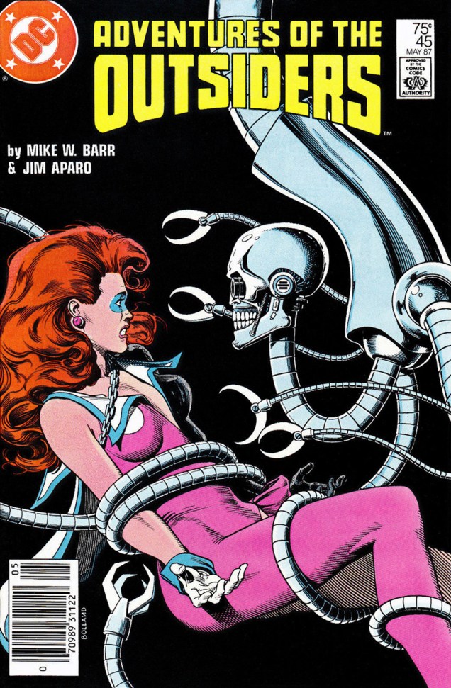
BrianBollandOutsiders45A
Adventures of the Outsiders no. 45 (May 1987). Mechanical tentacles are all well and good, but it’s Duke of Oil‘s inane grin I like best.

The maiden’s name, by the way, is Looker (!), presumably because the team who created her (Jim Aparo and Mike W. Barr) couldn’t think of a better moniker for a woman who went from a mousy bank teller to a cocotte (oh, sorry, I meant “coquette”) with superpowers. Pardon me going off-topic, but I really must illustrate: here’s what her costume looks (oh, har har) like in its full frontal glory.

BatmanandtheOutsiders31
Batman and the Outsiders no. 31 (March 1986), cover by Alan Davis.


And a last piece of balderdash:

« Her original costume was manufactured from a material unique to Abyssia; one way fabric, which was invisible from one side. This allowed her to keep her costume handy but not visible. She would turn the clothing out to make it visible. »


Moving on to classic Bolland with creepy-crawlies, fatal beauties and grotesque sub-humans, we have this delightful poster:

BrianBolland-peoplelikeusv2
An advert Mr. Bolland created for Forbidden Planet, « London’s Newest Science Fiction and Comics Book Shop! » in the early 80s. You can admire it (and other designs) in action, so to speak.

And a last madcap entry, amusingly full of non-sequiturs:

BrianBolland-AxelPressbutton
A page from « Silver Sweater of the Spaceways », featuring Zirk, and published in Axel Pressbutton no. 1 (November, 1984), scripted by Steve Moore and illustrated by… well, you know.

~ ds

Hallowe’en Countdown II, Day 21

« Are you mentally undressing me? » « Actually, I’m mentally shaving you. »

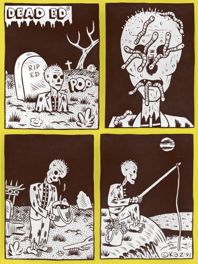
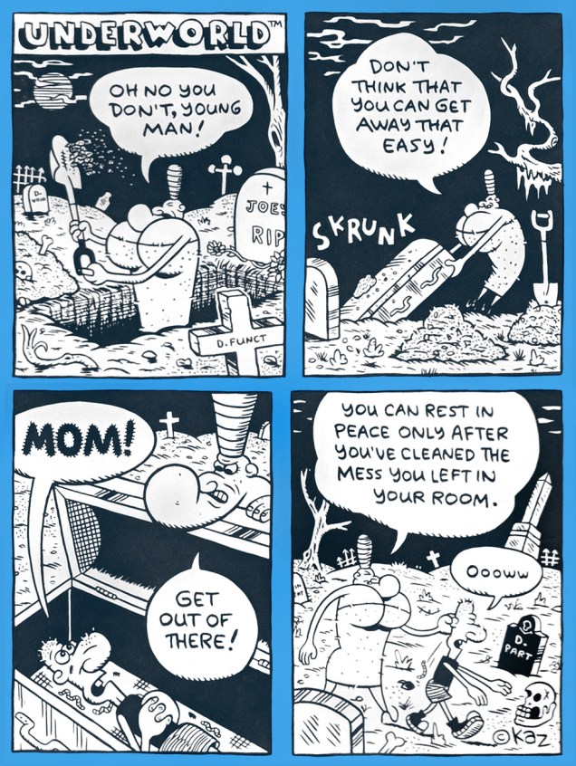
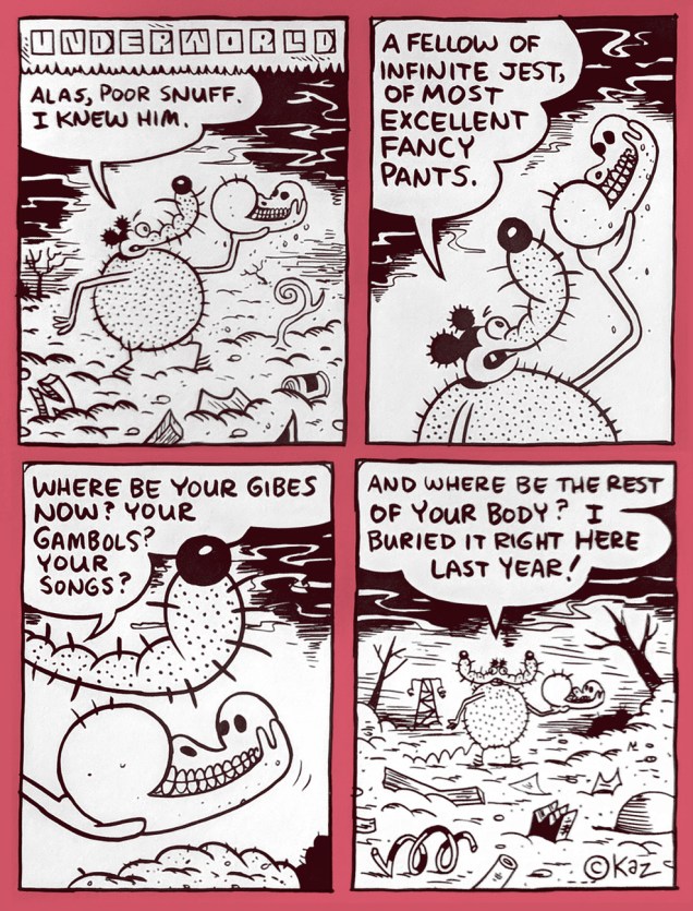
Been sniffing ’round the bushes for a depraved hybrid of Popeye, Snuffy Smith, Nancy, Bazooka Joe on one hand, and, say… Ambrose Bierce, Oscar Brand and Charles Rodrigues on the other, with a sprig of Rod McKuen for nuance? Perk up, Sparky, your quest is about to reach its happy end.

Underworld is the rabid brainchild of American cartoon god ( Kazimieras Gediminas Prapuolenis in 1959) alias (for some reason) Kaz. Underworld has been appearing in various alternative weeklies since 1992. But none in my neck of the woods, naturally. Grr.

KazDeadEdAKazDemisaAKazKunkelPoemAKazMessyRoomAKazNecrophiliacAKazPoorSnuffA

Fortunately, the discerning folks at Fantagraphics have thus far issued five Underworld collections, plus, a couple years back, an imposing omnibus, each of them wonderful, surreal, morbid and unnaturally comforting. Perfect Hallowe’en reading? You bet. Skrunk!

– RG
The Observant Ambulations of Julius Knipl, Real Estate Photographer

« This peephole was smeared when I moved in »

CheapNoveltiesCoverA
« A RAW One-Shot » (1991, Penguin Books)

Originally appearing in alternative weekly The New York Press in the late 1980s, Ben Katchor’s Julius Knipl, Real Estate Photographer belongs to that most exotic breed of comic strips, those that suddenly awake the mind to the medium’s grand possibilities. Said experience can be abrupt and dizzying, but in this particular instance, it’s soothing and bittersweet, full of rightful yearning for things that possibly were or surely should have been, glimpsed in a daydream by the low flame of the fantastic mundane.

Mr. Katchor (born November 19, 1951 in Brooklyn, New York) is blessed with a vision of startling depth and singularity. By its nature and scope, it’s not everyone’s thing, but the rest of us likely wind up as lifelong admirers, and isn’t that just the ideal audience?

Much has been written elsewhere, often brilliantly, about Mr. Katchor and his œuvre; it’s work of a calibre to inspire theses, dissertations and papers, so I’ll mostly stick to presenting some samples. The passionate plaudits these strips have inspired tend to obscure the fact that most people just haven’t had the pleasure, or at least the opportunity, of encountering such rich material.

These vignettes were collected in 1991 as Cheap Novelties: The Pleasures of Urban Decay. Oddly enough, it was the only one of Katchor’s books to go out of print… the situation was remedied in 2016 by Montréal’s Drawn & Quarterly, who brought it back in a lovely hardcover edition.

KatchorCheapNovelties031A
While on vacation, my accountant fell in love with a hot sauce manufactured on the small Caribbean island of Dominica. He’s since devoted considerable energy to renewing his stock of the stuff, which has involved much international horse trading.
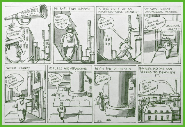
KatchorCheapNovelties043A
Montréal has its share of architectural remnants of bygone commercial enterprise; arguably, the most famous is the “Giant Milk Bottle“, but no, it isn’t full of milk.
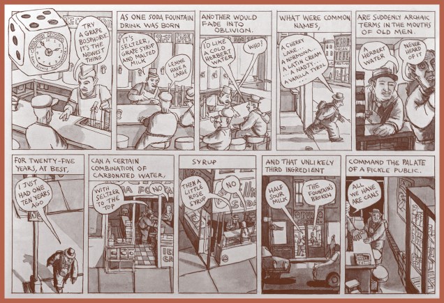
KatchorCheapNovelties051A
This melancholy vignette ties in quite nicely with a recent piece from Atlas Obscura noting the fading lingo and diminishing rôle of the soda jerks of New York City. Read it over a mug of murk with a choker hole.

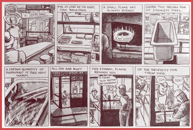
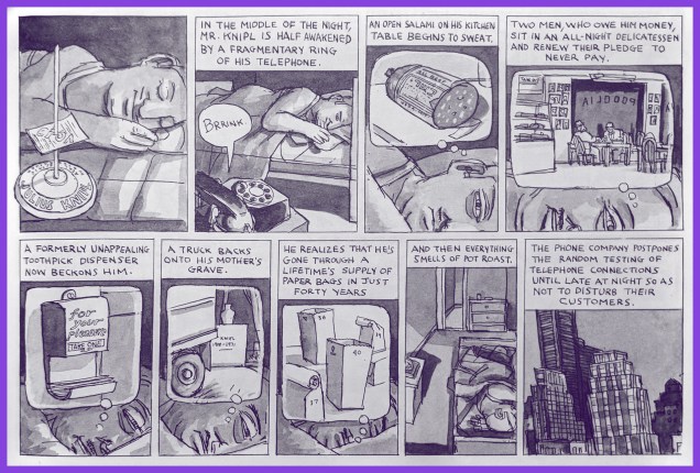
KatchorCheapNovelties063AKatchorCheapNovelties073AKatchorCheapNovelties079A

From the collection’s back cover blurb: « In a vast and shadowy city of old skyscrapers, neglected warehouses, juice stands, and coffee shops, Julius Knipl, a rumpled, middle-aged man in a suit and hat, wanders the streets photographing buildings and pondering the details: the scent of the past that seeps into the present; the ghosts of other values and culture embedded in the urban landscape; people and behaviors almost gone that linger on. He sees what others overlook, a Borscht-belt Buster Keaton. »

Ben-Katchor
The esteemed Mr. Katchor.

-RG

Beware, the Eye of Zohar Is Watching!

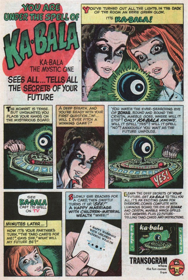
A 1968 ad full of spooky, green-glowy fun for the kiddies. An… interesting appropriation of Jewish mysticism. After all, Zohar and Kabbalah don’t really fall within the usual range of docile toy industry gibberish, straying closer to the realm of sideshow hucksterism, with its fortune-telling automatons.

Learn (a little) more about The Mysterious Game That Foretells the Future.

Ka-balaA

Wikipedia tells us: « The Zohar (Hebrew: זֹהַר, lit. “Splendor” or “Radiance”) is the foundational work in the literature of Jewish mystical thought known as Kabbalah.

There are people of religions besides Judaism, or even those without religious affiliation, who delve in the Zohar out of curiosity, or as a technology for people who are seeking meaningful and practical answers about the meaning of their lives… »

Why, hello there, Ms. Ciccone.

It’s hard not to draw a parallel between this toy’s name and eerie oculus and Charles Burns‘ Big Baby tale of a « Teen Plague » (from Raw vol. 2 no. 1, 1989). Be careful out there, kids!

BongaB
« Taste the Kiss of the Almighty Kaballa-Bonga! »
Mike-Wazowski2
I know, Mike. I can hardly believe it either.

-RG