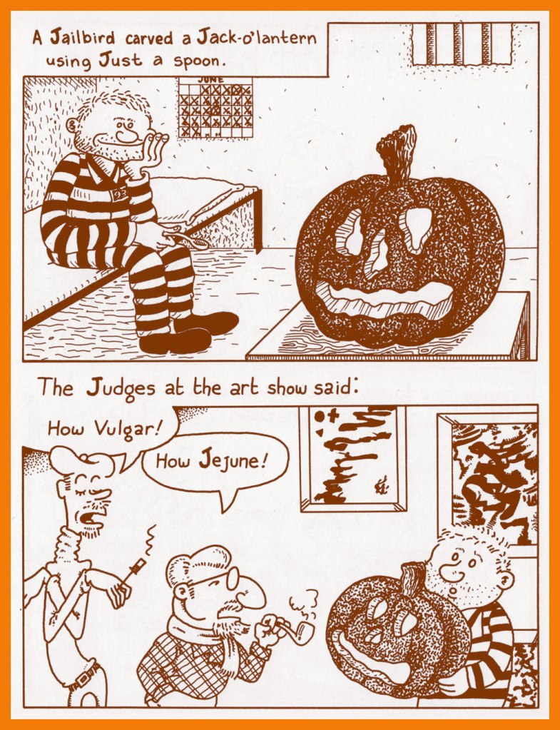
Today’s TT is like one of those 5$ grab bags: you don’t exactly know what you’re going to get, but there will at least one thing you’ll find amusing! Unless the store has cheapened out and stuffed it with nonsense nobody in their right mind would want. This offering, on the other had, is full of our favourite artists, and is not nearly as disparate as I first thought 😉
I don’t always have an over-arching idea for a post, inevitably ending up with plenty of odds and ends that don’t neatly fit into any one category. Actually, some of those “scraps” are the most enjoyable finds for me.
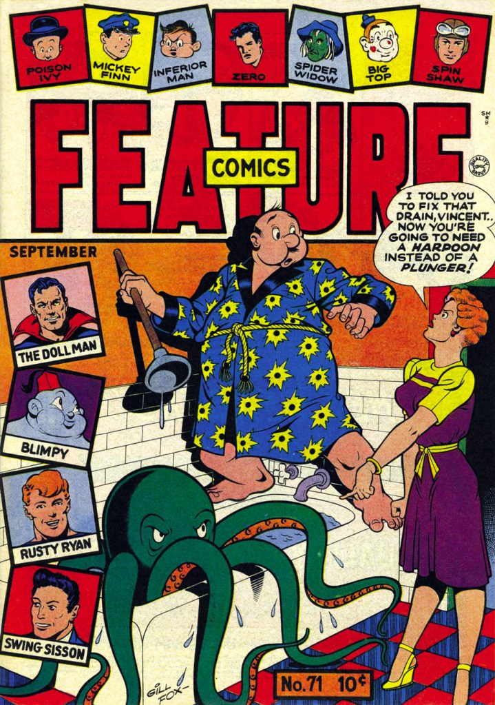
Feature Comics no. 71 (September 1943, Quality Comics). Cover by Gill Fox. The octopus-in-plumbing theme is an oldie-but-goodie; the undaunted housewife may yet regret her cavalier attitude towards the tentacled one, who probably wants to move in with his family.
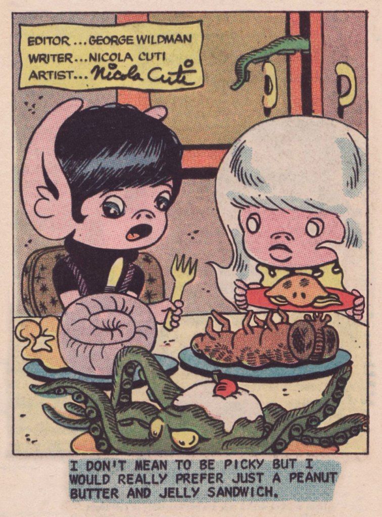
Nicola Cuti‘s Weirdlings was a charming little ‘filler’ gag page designed and drawn by him. This one was published in Haunted no. 14 (Sept. 1973, Charlton). I think the octopus, that appears to be still alive, would also prefer a good old PBJ sandwich.
Archie’s Pal Jughead no. 77 (October 1961). Cover by, dare I say legendary, Samm Schwartz; revisit (or discover!) some of the nicest covers he has drawn for Archie Comics in co-admin RG’s post.
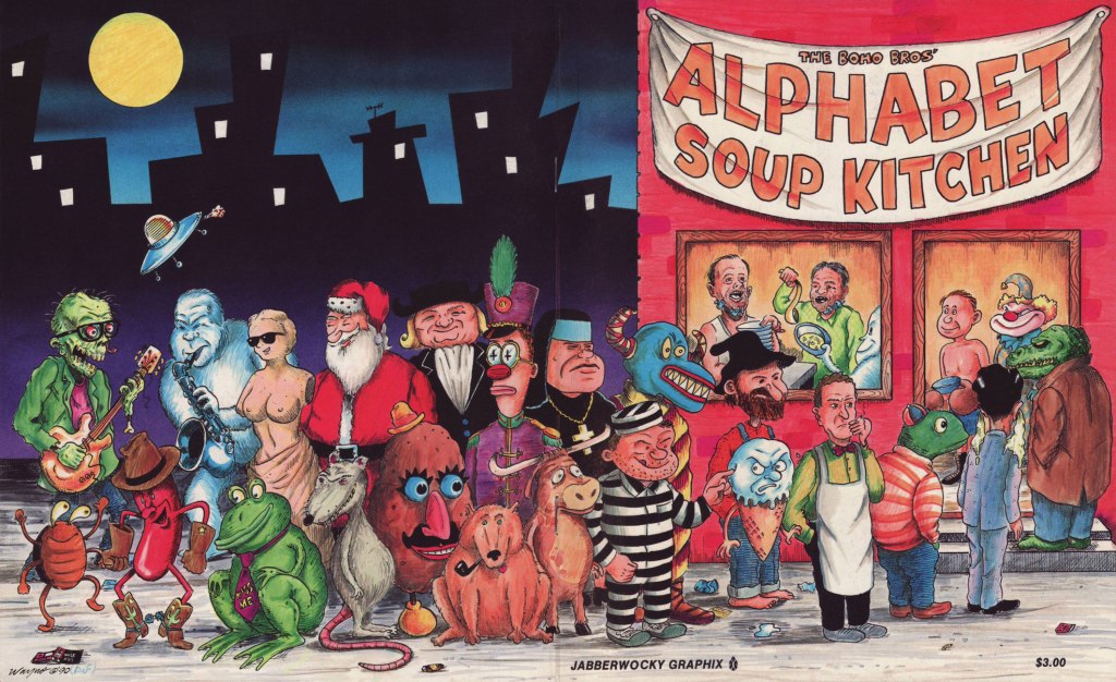
While concocting a post on a favourite oddball obscurity, the one-shot Alphabet Soup Kitchen (1990 Jabberwocky Graphix), I decided to reach out to one of its co-creators, the dapper Wayne ‘Wayno’ Honath, to see if he could shed some light on this delightfully batty project of yore. And did he ever come through!
Wayno’s lavish wraparound cover features most of the issue’s cast, and was coloured by ‘guest Boho Bro’ and publisher Brad W. Foster.
In one of those happy cases of talent and perseverance rewarded, Wayno®nowadays splits creative duties on syndicated strip Bizarro with its originator, Dan Piraro (since 2018, though he’d been part of team Bizarro going back to 2009), with Wayno® ably handling the dailies and Mr. Piraro the Sundays. It’s a fact: Wayno®, thanks to his crisp visual style, sharp gag writing and encyclopedic grasp of cartooning history and archetypes, was just the right ink slinger for the task.
Without further delay, I cheerfully yield the floor to Wayno®, his superbly lucid recollections, and some choice letters from the Alphabet Soup Kitchen!
Sure, I remember doing Alphabet Soup Kitchen! Ted Bolman and I had traded minicomics through the mail, and appeared in some of the same publications. We may have collaborated earlier, but I don’t think so.
I don’t recall whose idea the book was, but it sounds like something I’d have done. I liked to define parameters or constraints for projects, and then work to complete the parts. We split up the alphabet so Ted would do the first half of “A,” then I’d do “B,” and we’d alternate to the end. We sent the pages to each other by mail.
There were two different printings. I printed it as one of my “No Way Comics” minis. The interior was black & white, and the wraparound covers were brown ink on an off-white textured stock. I used a local printer for my minis, and most of them were offset printed, not Xeroxed. (I did several “secret” publications in editions of 50 or fewer, and those were Xeroxed.) They’d offer a free ink color once a week, and that’s how the brown ink on the cover came about. I drew the inside cover endpapers.
After my minicomic version was published, Brad Foster contacted me about doing a larger reprint under his Jabberwocky Graphix imprint. I drew a new wraparound cover featuring characters from the interior. I included a photo of two men wearing some sort of jaw-braces to represent the Boho Brothers, and also drew these guys on the cover. I can’t recall whether the endpaper drawings were included in this edition. I have a copy somewhere, probably in my office/storage space. I believe that Brad Foster may have done the color work on the cover. Yes, just confirmed that on the Poopsheet Foundation webpage (a good source of minicomics images and info).
I also included copies of my original printing in one of two multi-packs I offered for sale. This was in a set called THE NO WAY MINICOMIC FUNBAG, which included Boho, Uncontrolled Copy, The World’s Most Dangerous Animal, and one bonus minicomic from my backstock. They were packaged in a plastic bag with a wraparound cover.
Incidentally, the title is an example of a form of wordplay I still use from time to time in Bizarro. I couldn’t find a good descriptive name for this, and I coined the term streptonym, which still hasn’t caught on. I first blogged about it here: https://waynocartoons.blogspot.com/2011/08/whatchamacallit_11.html
That’s as much as I can come up with off the top of my head!
Watch the brief, eerie documentary entitled… Göring’s Ghost.
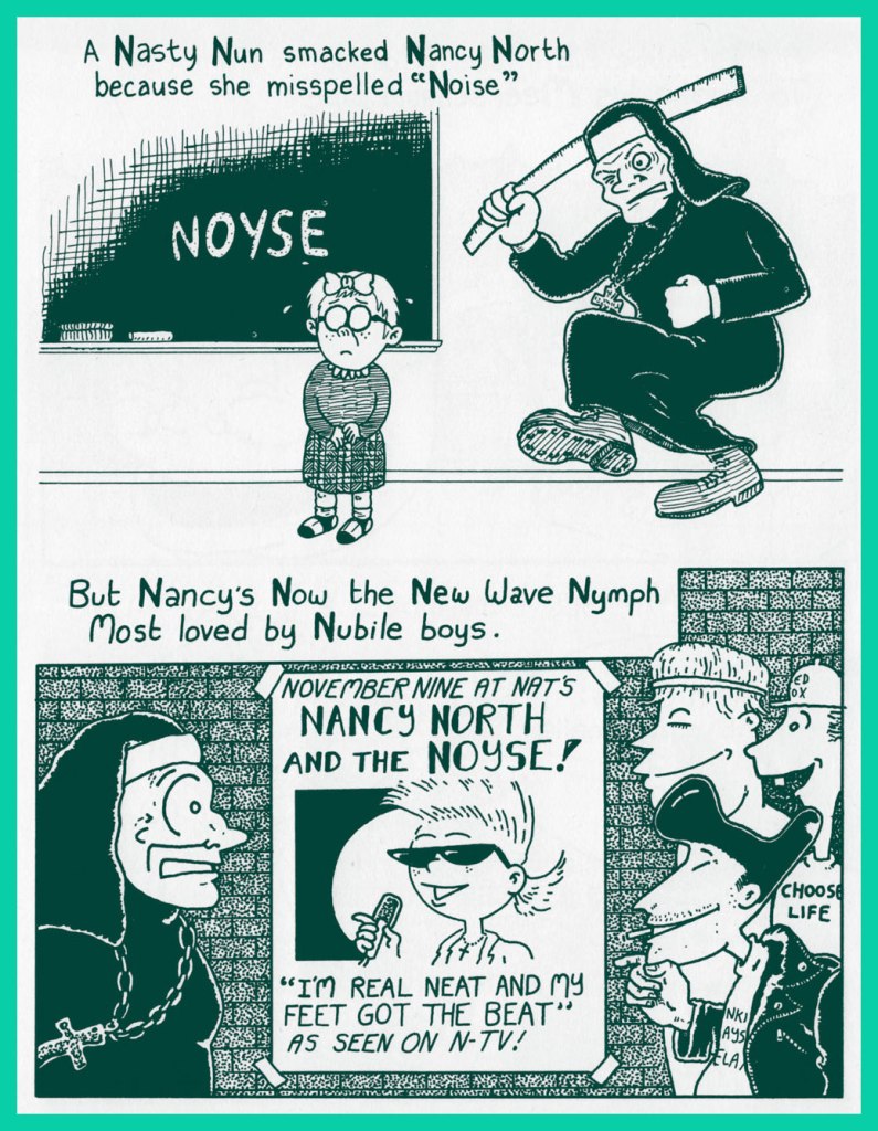
Nuns with rulers? A classic theme! “The nuns who smacked me and my friends at our small elementary school in New Jersey were Sisters of Charity, a cheap bit of irony that always draws a chuckle when I talk about being on the receiving end of those holy rights and lefts.“
To join the Roy Orbison Fan Club, the line forms here.
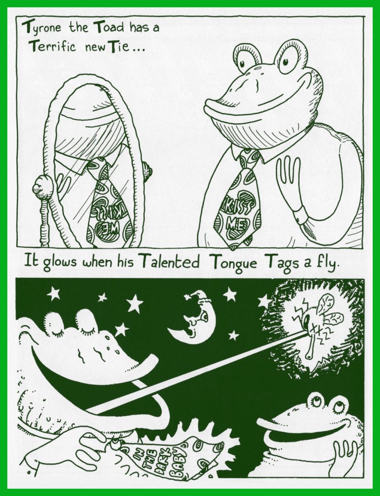
Perhaps you’d like more details on Tyrone’s rather swanky tie? Say no more… here you go.
In case you doubted it (for shame!), yes, there *is* such a thing as Yiddish Yodeling.
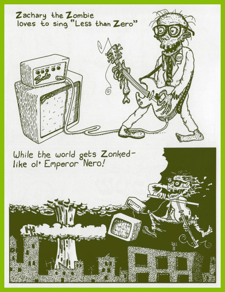
Zachary the Zombie’s version hasn’t been committed to tape, I’m afraid, but here’s a rendition of Less Than Zero by its composer.
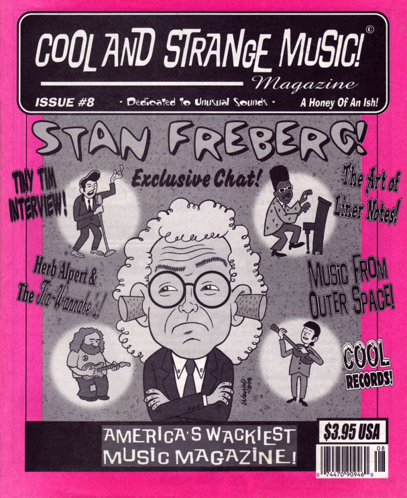
I mentioned to Wayno® that I enjoyed his cover work for Dana Countryman’s Cool and Strange Music magazine (28 issues, 1996-2003), to which he responded:
Cool & Strange Music was great! I’m still friends with Dana Countryman, and I still admire that he was able to continue self-publishing it for so long, and always on schedule, and he always paid for the art. He was more reliable and professional than a lot of bigger mainstream publications I worked with!
This was the first issue I chanced to get my mitts on. Some back issues of this most excellent publication are still available (at most reasonable prices!) from this fine source!
Once more, three cheers and my most heartfelt thanks to Wayno® for his generosity and kindness. Best of luck with everything!
« I grew up in a farm town in the Midwest, where not much exciting happened. I liked the idea of lives lived at night and the shadowy characters who lived in that demi-monde. — Michael Emerson
And our final slot goes to… the eminent Mr. Roger Langridge!
An average, ‘nuclear’ family moves to a small town in the Midwest, which turns out to be mind-numbingly strange… a fact entirely lost on the clueless parental units. Sound familiar?
It’s obvious, given the time frame (five years late), that Gross Point was, to be charitable, keenly influenced by the television show Eerie, Indiana (1991-92)… whose short run (just one season and a mere nineteen episodes… plus fifteen novels!) belies its lasting appeal and influence.
But, and there’s a sizeable ‘but’… both series provide considerable, often subversive entertainment, and come from a long line of high-concept, cœlacanth-out-of-aqua sagas. You might say that Gross Point stands as a darker, yet goofier Eerie, Indiana. Incredibly, it was still approved by the clearly-agonizing, utterly irrelevant Comics Code Authority!
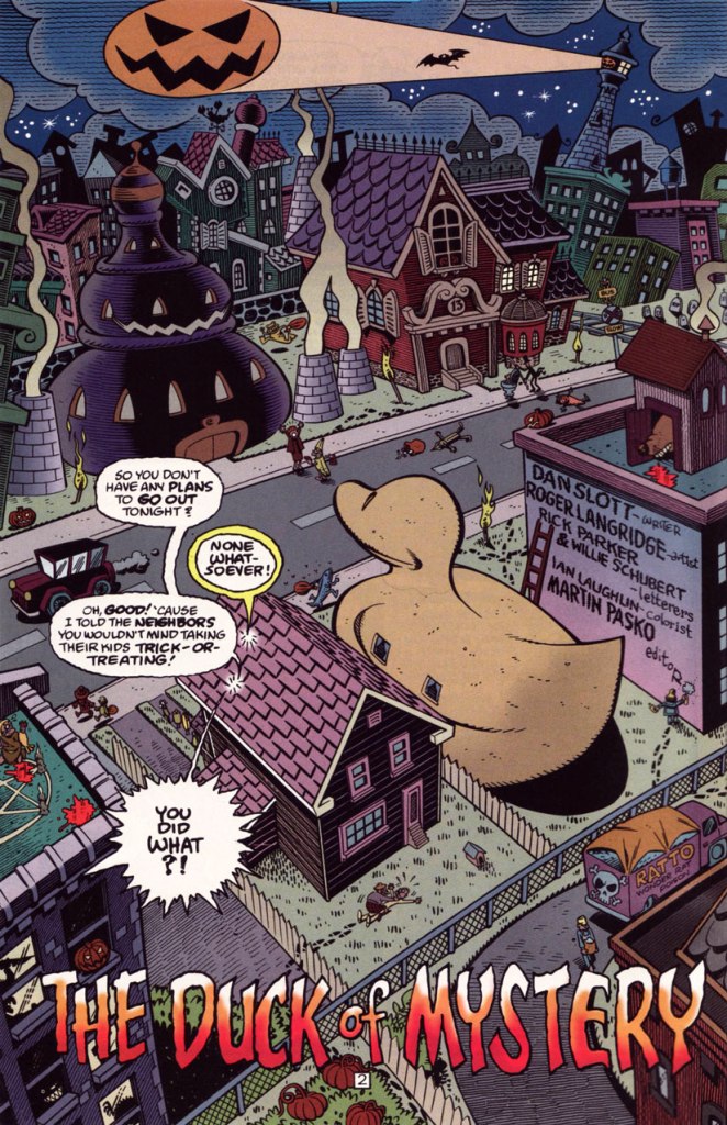
This is Gross Point no. 5 (Dec. 1997, DC), the Halloween special… but then again, as they say, “Every day is Halloween in Gross Point“. Cover by Sean Taggart.
The facetious small print:
Gross Point is a fictitious town, not to be confused with that differently-spelled one in Michigan. The magazine Gross Point is a work of satire. The stories, characters and incidents mentioned in this magazine are entirely fictional. No resemblance to actual persons, living or dead, or comatose, deformed, deranged, disfigured, dismembered, disembodied, discarnate, decaying, reincarnated, undead, immortal, reanimated, telepathic, pyritic, telekinetic, magical, transformed, trans-channelled, enchanted, cursed, possessed, monstrous, cannibalistic, demonic, vampiric, reptilian, lycanthropic, subterranean, mummified, extra-terrestrial, or interdimensionally-stranded, is intended or implied, or should be inferred. Any similarity to same without satiric purpose is coincidental.
The Pickett family’s colourful neighbourhood in Gross Point. Sublime pencils and inks by Roger Langridge. He truly brought a sense of place to his work on GP.
“Tight as a duck’s arse!” This is the issue when we find out — at last! — the answer to the mystery of the duck-shaped house next door.
Groucho, who else? DC clearly panders to the late 90s teen set with a hybrid parody of its own late 60s mystery anthology title and a legendary Depression-era comic. Well, it works for me, but what do *I* know?
A sizeable part of why this is Gross Point’s finest hour: Langridge gets to trot out his rather credible EC-vintage Wally Wood/Will Elderersatz.
… and then goes full-on Mad-style Will Elder! This bourgeois chiller scared the Dickens out of the local youths.
In Issue two, we are told that:
Gross Point differs from most new DC titles in recent memory in that it was internally created. The concept from the series was the brainchild of the internal development program of the Special Projects Group, headed by Group Editor Martin Pasko [ né Jean-Claude Rochefort, in Montréal, QC ], who is also this title’s editorial overseer.
In other words, Created by committee, which accounts for the utter lack of originality… which is yet no impediment to its ultimate worth.
However, and a big However it is, some savvy, enlightened creative moves were made, most of all by recruiting stupendous penciller/inker Langridge, as well as Sean ‘S.M’ Taggart (perhaps a bit of nepotism, what with him married to a DC editor, but never mind, he’s good) and writers Dan Slott and Matt Wayne, among others.
The series lasted a not-too-shabby fourteen issues, which you can still get your calloused mitts on dirt cheap online and in the quarter bins, as it’s never been collected. I daresay it might have been a smash hit… if, say, Scholastic had published it.
Well, that wraps up another year’s selection! If you’re craving more, then the 93 entries of the previous trio of Hallowe’en Countdowns are (un)naturally at your disposal.
« … a radical series of crappy jokes & trashy art mopped out of the Bowery’s least washed lavatories. Fueled on bologna sandwiches, black coffee & cheap cigarettes, these are the ugly buttons that scream ‘America‘ to an America that has forgotten itself. » — a tasty bit of hype from Goblinko
Fabled pulp illustrator Norman Saunders (a definite favourite around these parts) is legitimately appreciated for his body of work, but I do believe he isn’t sufficiently lauded for his humorous work. After all, he could hold his own against the likes of Basil Wolverton and Wally Wood, and how many of his peers could lay claim to such a lofty achievement?
A passage from his son David’s definitive monograph, the simply and fittingly titled Norman Saunders:
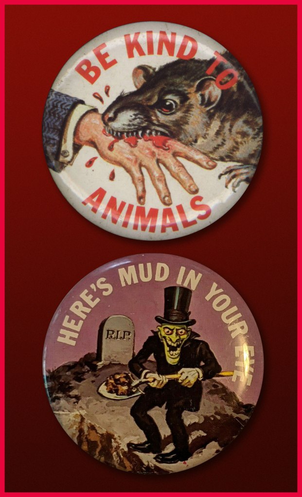
Ugly Buttons came out in 1967 to exploit the popular trend of protest buttons with witty sayings. The macabre humor of Ugly Buttons reflects their Halloween release date as well as the morbid comedy of popular TV shows like The Addams Family and The Munsters. Norm Saunders created half [ eleven, actually ] of the twenty-four images in this set, while Wally Wood created the other half.
A sample of the original packaging…
I’m sorry… but that bat is just so adorable…
You can see why these are perfect Hallowe’en fodder!
Macabre, and with a tidy moral to boot! At a nickel apiece, an undeniably excellent value.
Well, perhaps not *strictly* altogether moral.
The final Saunders button, shot from the original art. This looker was entitled Peek-a-Boo.
One of the original boxes, which held 24 packs. Featured buttons Here’s Looking at You and I’m a Cool Ghoul were designed by Wally Wood.
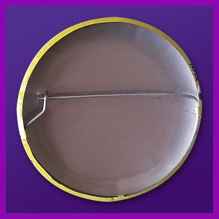
Collectors find this set very difficult to complete. Although the series was a popular success in 1967, the buttons appear to have rarely survived. This is perhaps attributable to the design of the tin back pin, which was made in Japan with a hair-trigger clasp that instantly popped open and fell off.
Here’s one of the underperforming bad boys in question. To be fair, this one’s still holding together, which surely has earned it some kind of goodwill, a half-century hence. Those old enough (enough, enough!) will recall when ‘Made in Japan’ was an indicator of shoddy goods. All that’s been turned on its head since, interestingly. The Japanese people have admirably overcome much adversity, that’s evident.
By the way, I don’t know just how sanctioned these reissues are, but the cool cats at Goblinko have made these lovely buttons available once more, presumably sturdier and certainly at a perfectly reasonable price (forty times the original, I’ll grant you… but you do get to pick).
« When the mind is thinking, it is talking to itself. » — Plato
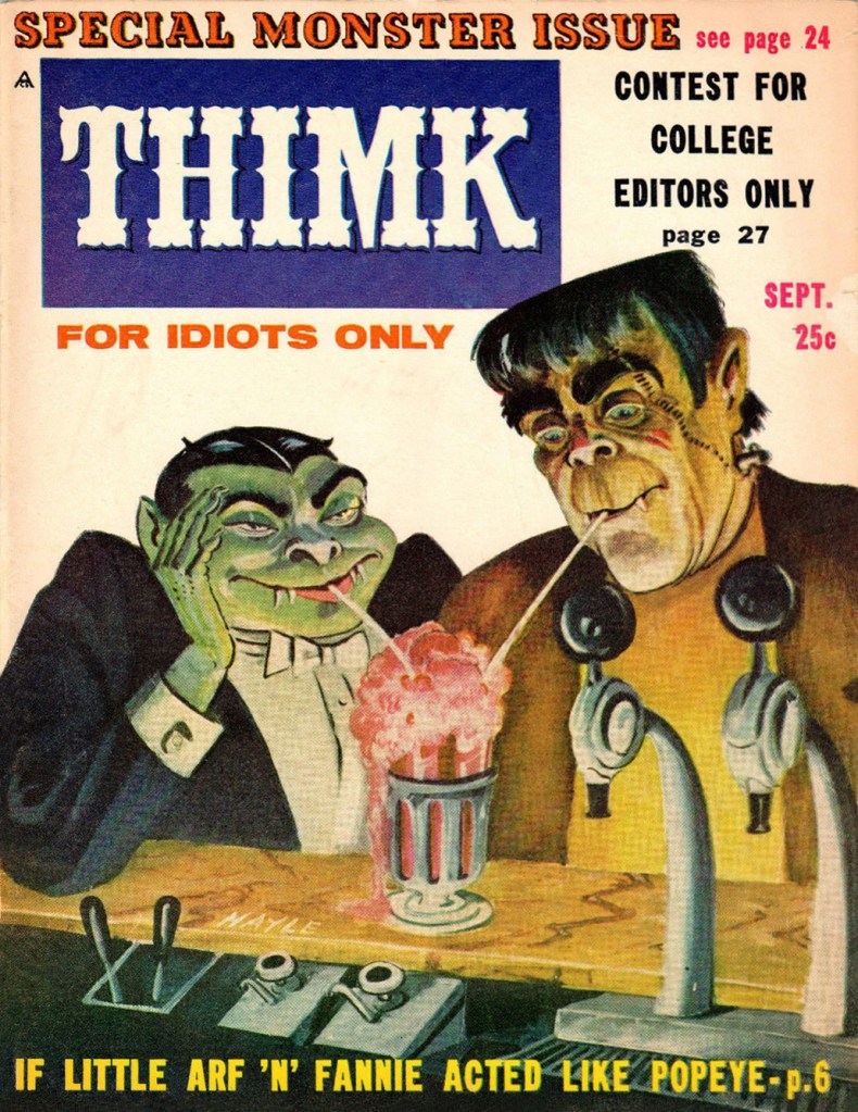
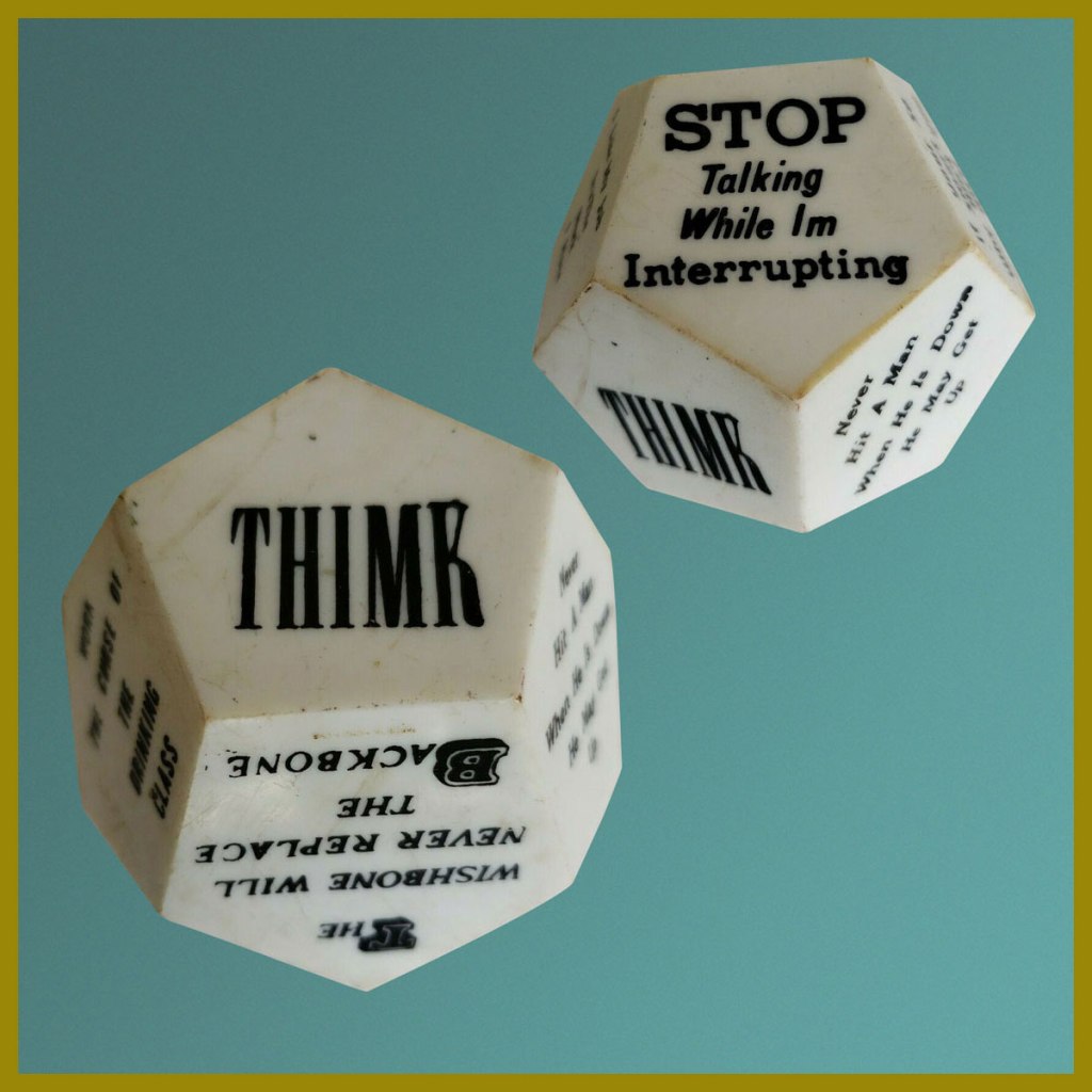
The waning years of the 1950’s marked the beginning of the monster craze, which coincided with Mad Magazine’s ripest period of influence. Here, then, is a publication that sought to capitalize on both occurrences. Alas, chasing fads too eagerly always did land you all-too-promptly in the cultural ditch. Still… Thimk had its moment.
This is Thimk no. 3 (Sept. 1958, Counterpoint). Edited by Alan Whitney, cover by Sam Hayle (1911-1996), who later did a bit of work for Cracked.
This is Thimk no. 4 (Dec. 1958, Counterpoint); cover by Sam Hayle. Elvis finds out first hand how fickle teenyboppers can be, and how a two-year army hitch might as well be an eternity, as far as they’re concerned. Uneasy lies the head that wears a crown!
Thimk was a short-lived (6 issues, 1958-59) would-be Mad, also in the black and white magazine format.
One holiday gleefully bleeds into another… this is Thimk no. 5 (Feb. 1959, Counterpoint). “Free… for 25 cents!”
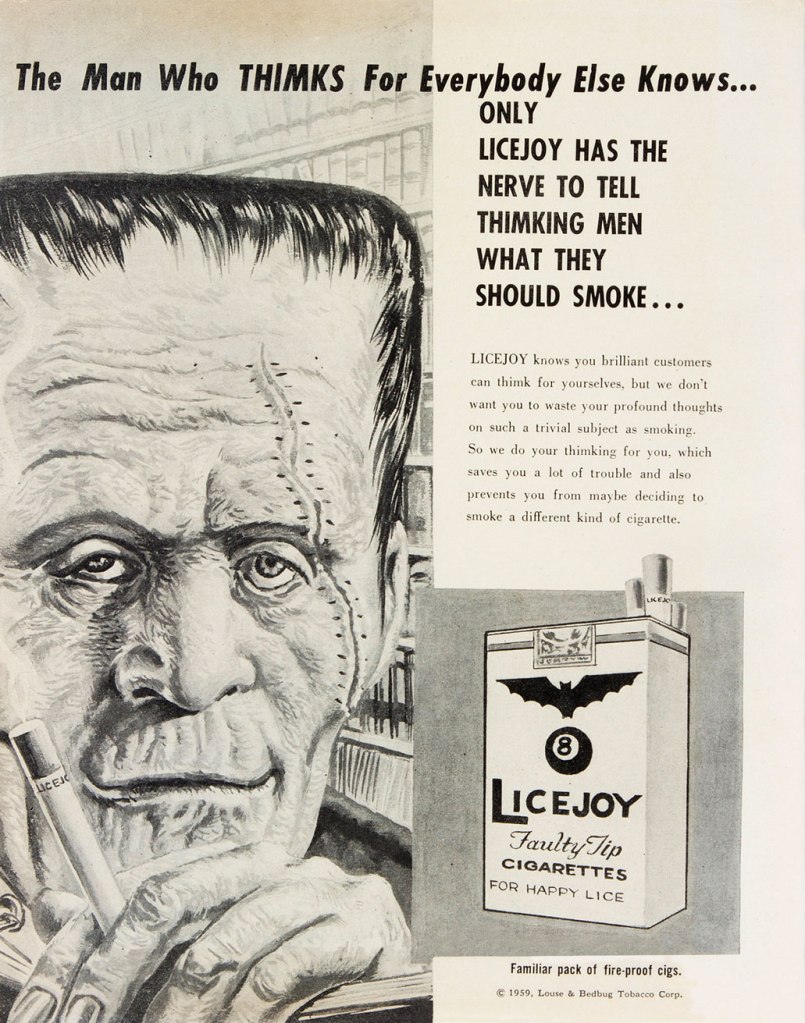
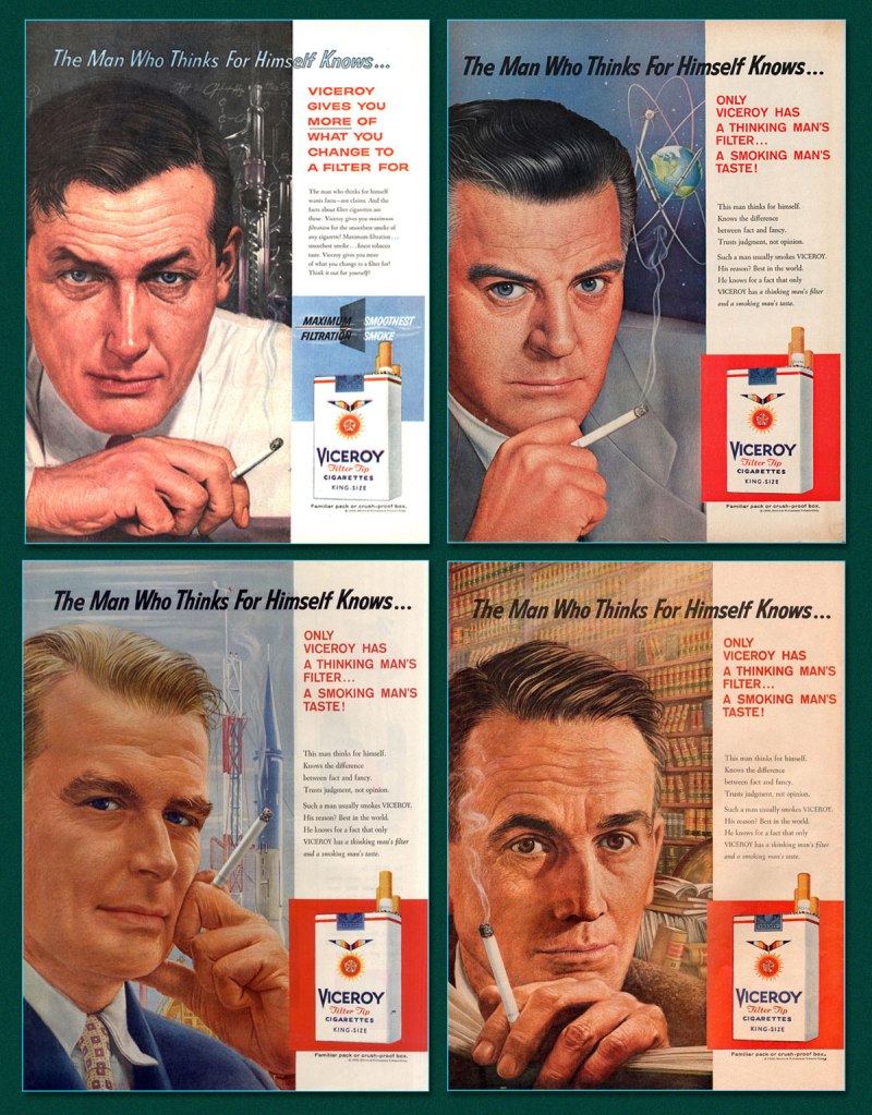
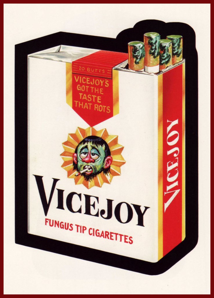
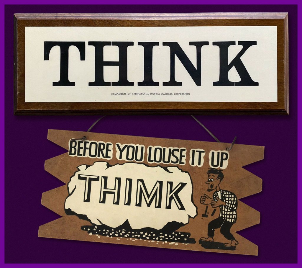
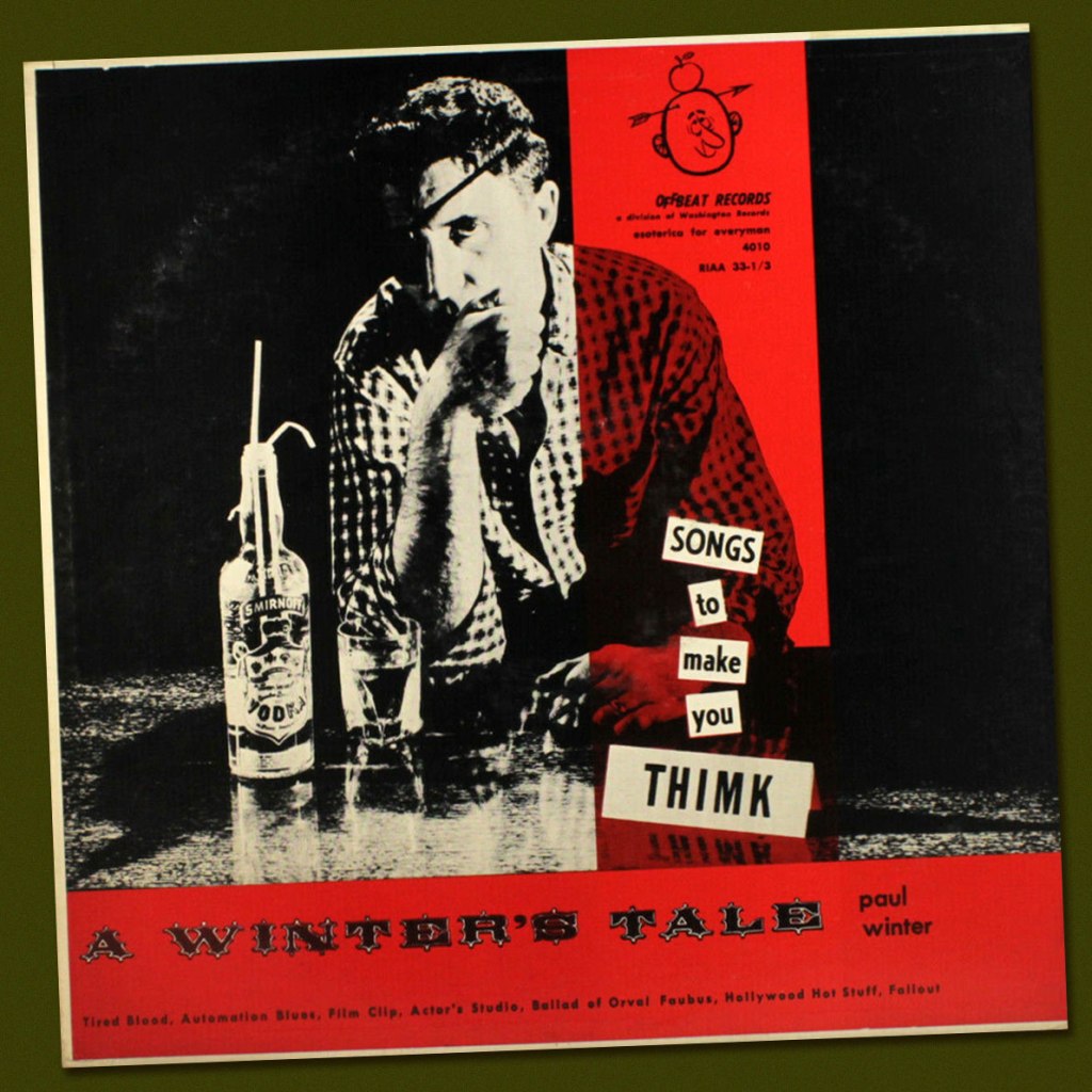
Thimk no. 5‘s back cover… a well-aimed barb at Viceroy Cigarettes.And some samples (there were many, many more!) from the object of parody, Viceroy’s The Man Who Thinks for Himself ad campaign. Lookit all them deep thinkers! (Martin Fry, cancer survivor, bottom left).And it wasn’t to be the last Viceroy parody, either: the brand was also an early Wacky Packages target. This entry hails from Series 1, featuring a rough concept by Art Spiegelman painted by Norman Saunders (1973, Topps). Heads up, Marlon… some… thing is about to cut in for a dance. Is his date dismayed or delighted? Last call: Thimk no. 6 (May 1959, Counterpoint) was the final issue. Cover art, again, by Sam Hayle.From Think to Thimk in one easy step. What began as a ubiquitous IBM slogan soon, inevitably, led to parodic counterpunches.During the late 50s, it spread seemingly everywhere.Legendary Detroit DJ Paul Winter (station WXYZ) got in on the act early (1957). Here’s a sample, Fallout, featuring Charlie Byrd on guitar!And of course, the great Steve Ditko took the slogan to heart (and mind), famously making his own sign. I wonder where it is now.
« Listen, Angel! If they’re out of bananas… I’ll meet you at the corner fruit stand! »
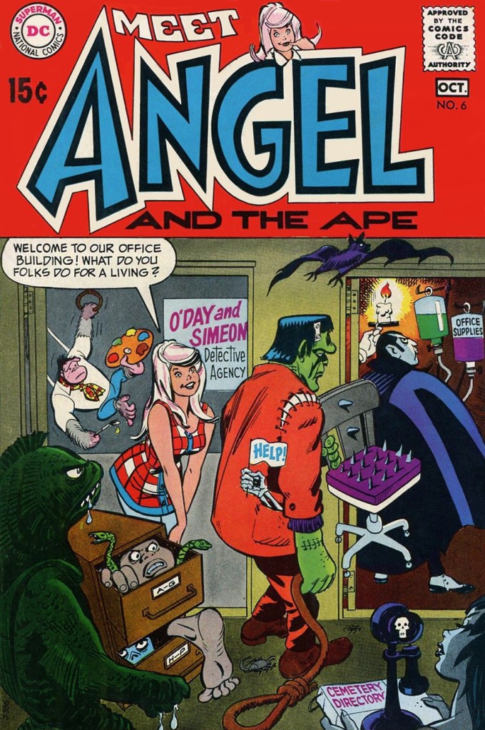
Today, let’s combine our general theme with a celebration of the birthday of one of comics’ great, yet perpetually underappreciated talents: Bob Oksner (October 14, 1916 – February 18, 2007), DC’s go-to humour and good girl art guy. Can you beat that? Didn’t think so.
Bob had a winning penchant for mixing monsters and babes, and for this, he’s earned our lifelong gratitude.
This is Angel and the Ape no. 6 (Sept.-Oct. 1969, DC), featuring The Robbing Robot and The Ape of 1,000 Disguises! (Would You Believe Four?), wittily written by John Albano, lusciously pencilled by Oksner, and creamily inked by Wallace “Wally” Wood. Truly swoon-inducing stuff. Edited by Joe Orlando (that explains all the monsters!), with a cover by Oksner.
You might say Angel and the Ape exist in an awkward sort of limbo: popular enough for the back issues to be kind of pricey, but not popular enough to have been reprinted (eight issues, including their Showcase appearance, ideal for a trade paperback, hint, hint).
So what else has Mr. Oksner cooked up over the years? Keeping to our theme, here are a few highlights, but first, a handy bio:
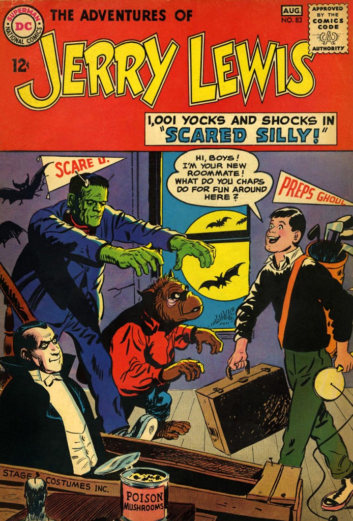
This piece appeared in The Adventures of Jerry Lewis no. 73 (Nov.-Dec. 1962, DC).
The is The Adventures of Jerry Lewis no. 83 (July.-Aug. 1964, DC). Formerly The Adventures of Dean Martin & Jerry Lewis… of course. The book (under both titles) featured some lovely artwork from Owen Fitzgerald, Mort Drucker and of course Oksner… but it was no Sugar and Spike. Still, it had its audience, long-lasting as it was (124 issues… Jerry wasn’t just big in France!)
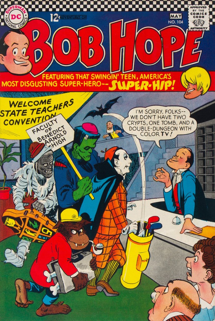
This is The Adventures of Bob Hopeno. 104 (Apr.-May 1967, DC). DC’s celebrity-licensed humour titles followed a parallel course: fading sales led to their nominal stars being more or less sidelined in their own book in favour of increasingly outlandish supporting casts.
An inside page from that issue. Good-looking comics… but they weren’t particularly witty, which can be a bit of a drawback. Arnold Drake was the writer, and while he could be pretty damn funny, it just didn’t work here. Still, you can bet that it was still more amusing than Milton Berle’s comic book.
1940s teenager Binky was pulled out of mothballs in the late 60s (ten years elapsed between issues 60 and 61). A moderate success (especially given it mostly consisted of slightly updated reprints), it returned to oblivion after another twenty-two issues, though the first seven boresome rather fine Oskner cheesecake covers. This is Leave It to Binky no. 67 (June-July 1969, DC).
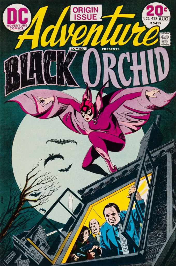
Finally, for a touch of the more ‘realistic’ Oksner style, here’s his cover introducing Sheldon Mayer‘s marvellously-mysterious Black Orchid. This is Adventure Comics no. 428 (July-Aug. 1973, DC). She deserved far more than a mere three-issue run!
« I’ve learned that any fool can write a bad ad, but that it takes a real genius to keep his hands off a good one. » — Leo Burnett
Given that they’re often referred to as comics, or funnybooks, mainstream American comic books haven’t been nearly as funny as one might reasonably expect… particularly the ones that set out to be humorous.
Humour being subjective, of course everyone will have their own favourite to contribute. The gist of my argument, however, is that comics books fail to raise guffaws to a level that, say, newspapers strips, animated cartoons and Franco-Belgian bandes dessinées routinely** do.
Meanwhile, DC Comics arguably boasted their singular genius humorist in Sheldon Mayer (Sugar and Spike). DC’s editors loved to divide and conquer, rarely allowing solo creators to take root, let alone flourish, in their tidy corporate garden patch. Given Mayer’s crucial early importance to the publisher’s rise, he was granted free(er) rein. Which leads one to ponder whether the assembly-line method, then, might not be utterly detrimental to quality humour.
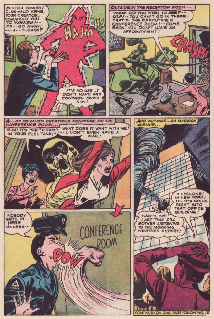
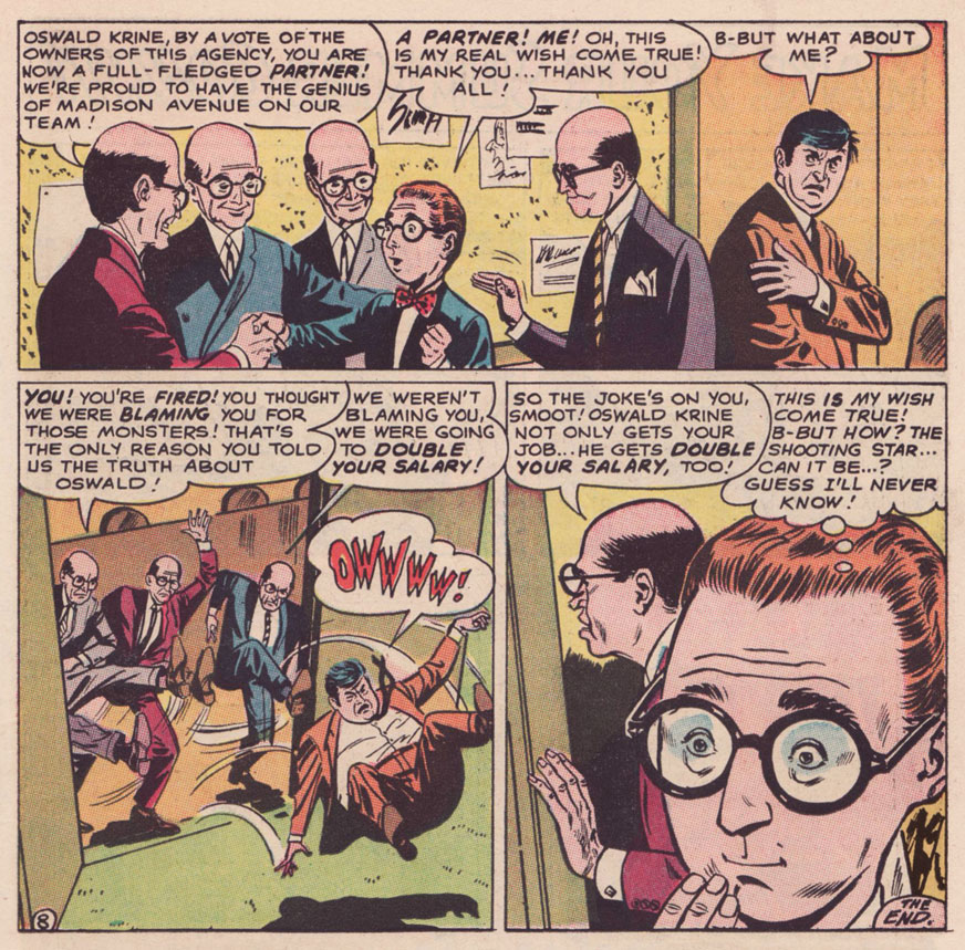
So it was to my elated surprise that I came upon an authentically amusing (imho) tale betwixt the misaligned staples of a 1967 issue of Strange Adventures… what is more, uncredited. A mystery.
Which brings us ’round to another exceptional talent, a writer this time: long-time American Comics Group (ACG) editor Richard E. Hughes, who scripted most of the company’s mid-to-late output under an impressive array of aliases*** with a dry, deadpan, absurdist wit, most memorably deployed through the adventures of Herbie Popnecker, ably illustrated by Ogden Whitney.
In 1967, Hughes found himself at leisure with ACG’s demise (the final issues of its remaining titles, Adventures Into the Unknown and Unknown Worlds, were cover-dated August ’67). He passed through DC, scripting a smattering of stories for Superman czar Mort Weisinger (one might surmise that Kurt Schaffenberger, who worked for both editors, acted as the go-between), for Hawkman editor George Kashdan and Ghosts editor Murray Boltinoff before exiting the field. According to Wikipedia, « His final job appears to have been for Gimbel’s department store, composing response letters to customer complaints. » At least he’s received some posthumous recognition, as he was a 2015 recipient of the Bill Finger Award for Excellence in Comic Book Writing.
I do believe I can detect the Hughes cadence in The Monster Maker of Madison Avenue! According to GCD, the uncredited story is scripted by one Dennis Marks, an animation writer working for Filmation’s The Batman/Superman Hour at the time… but I just don’t know. It would be Marks’ sole comic book credit, and a speculative one at that. Besides, GCD attributes the artwork to Joe Orlando, which is flat-out, laughably wrong. A frequent problem of self-styled art experts is that they wear genre blinders. Most would never be caught dead reading, say, a romance comic, so they wouldn’t recognize (though they should!) the distinctive stylings of Jay Scott Pike (1924-2015).
On with our tale, which originally saw print in Strange Adventures no. 202 (July 1967, DC).
As for the ads parodied therein, I’m no expert, but I can hazard a few guesses: The Fiend in Your Fuel Tank refers to Esso’s famous Put a Tiger in Your Tank campaign; the housewive bluntly bestowing cleaning tips to her neighbour brings to mind Bold Detergent; The Green Knight surely lampoons Ajax’s White Knight; as for Popso Kooler’s Mister Power, it’s anybody’s guess. Pepsi commercials of the period looked great, but nary featured an animated lightning man. Anyone?
-RG
*Yes, Kurtzman (and Stanley) often worked with others to increase their output (and for the love of collaboration), but they fully controlled the mise-en-scène.
** They make it look easy… but it’s quite a feat.
***His imaginary roster comprised Pierre Alonzo, Ace Aquila, Brad Everson, Lafcadio Lee, Kermit Lundgren, Shane O’Shea, Greg Olivetti, Kurato Osaki, Pierce Rand, Bob Standish, Zev Zimmer… Fittingly, even Richard E. Hughes was a pseudonym: he was born Leo Rosenbaum.
« Ideas improve. The meaning of words participates in the improvement. Plagiarism is necessary. Progress implies it. It embraces an author’s phrase, makes use of his expressions, erases a false idea, and replaces it with the right idea. » — Guy Debord
Well, after our brush with Surrealism, let’s hazard a brief detour amidst the Letterists. As we all surely know, The Letterist International was « a Paris-based collective of radical artists and cultural theorists between 1952 and 1957. » I’ll spare you a dry discourse about schools of thought, art and politics and their numerous and acrimonious (perhaps not so dry after all!) schisms.
The main point of interest, in this case, is the Letterists’ pioneering of the rousingly subversive artistic technique of détournement, which involves “taking preexisting images and mixing them together to highlight the underlying ideology of the original image.”
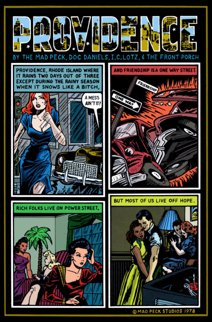
This brings us to the storied career of Providence, Rhode Island’s finest son, John Peck (1942-2025), alias The Mad Peck.
Les Daniels and The Mad Peck Studios’ 1971 Comix was a pretty fair early crack at recounting the history of the comic book up to the peak of the Undergrounds.
A-ha! On the back cover, The Mad Peck indulged his penchant for détournement, repurposing an early 1950’s ad for hair loss reversal scammers Ward Laboratories in a fashion that is in no way relevant to our current, media-savvy, ethically-enlightened world.
In his 1987 retrospective, Peck recalls « Yeah, Comix was good. Maybe a little too good. It’s been stolen from every public library I’ve ever been in. »
By then, he was working steadily for Boston-based music magazine Fusion (1967-74), “doing short reviews of the records nobody else wanted to do.” This one liberally swipes from DC’s long-running Fox and the Crow series (which of course borrows its premise from dear old Aesop’s immortal fable), with a smidgen of Fritz the Cat for the frisky finale.
Fast-forward to 1978, and Peck’s much-improved comix-style capsule reviews are appearing regularly in Creem and The Village Voice.
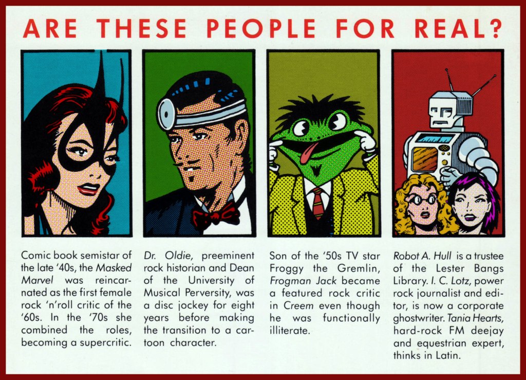
Ah, but she wasn’t a comic book semistar of the *late* 40s… she arrived on the scene in 1941, four months before Wonder Woman, even! Who dat? Why, The Masked Marvel is none other than Golden Age heroine The Black Cat, whose repurposing surely constitutes The Mad Peck’s most brazen act of détournement! This is Black Cat Comics no. 3 (Dec. 45 – Jan. 46, Harvey); cover art by the lady’s creator, Al Gabriele. ‘Action that’ll make you pop your monocle!‘
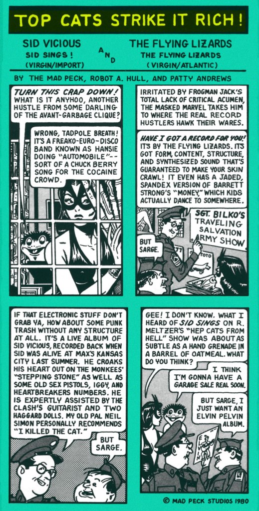
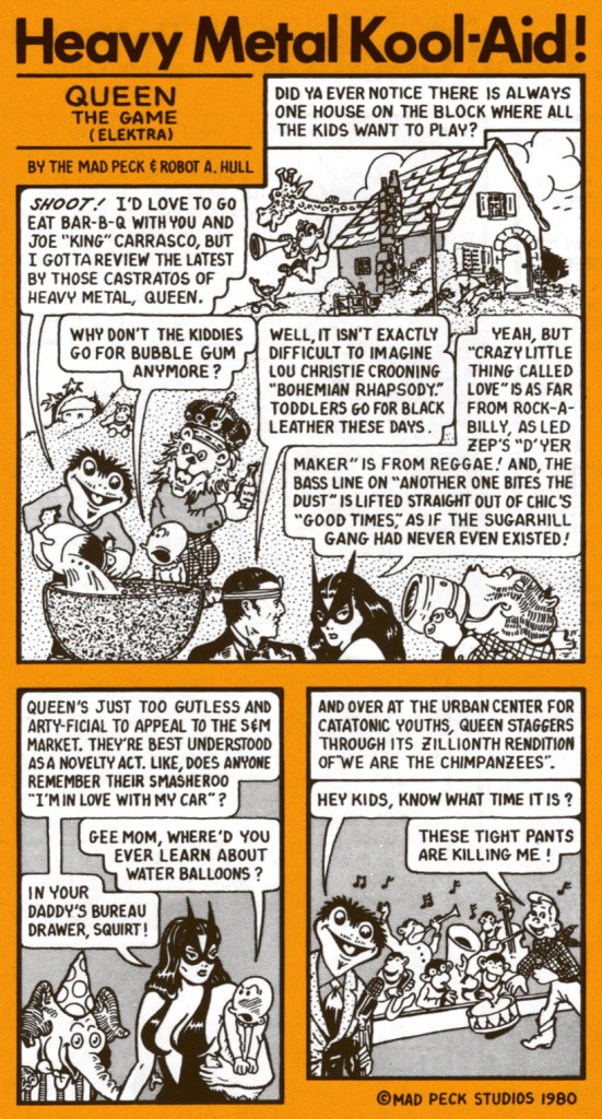
The Mad Peck really stood out in the landscape of rock criticism in that he wasn’t a rockistsnob (“It’s not rock, therefore it’s crap!“), and that his taste was wide-ranging and often surprising, evidence of a true music lover well-versed in all its strata and permutations.
And still, these Jefferson Airplane alumni had yet to hit bottom (knee-deep in the hoopla, so to speak)!
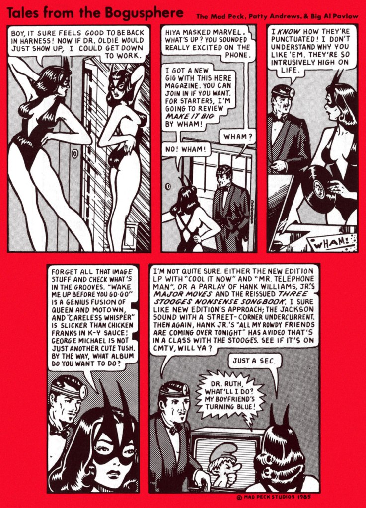
Then ahead to the mid-80s and Bob Guccione Jr.’s Spin (est. 1985), and a short run with a new title, Tales From the Bogusphere. Meanwhile, The Masked Marvel had been sidelined by legal hassles. As the heroine recalls:
I took an extended vacation in 1980 when Marvel Comics threatened to sue Peck after reading ‘Ms. Marvel’ in the Eagles cartoon that led off Creem’s review section in February. I hightailed it before the corporation had me roped into a team-up book with She-Hulk, but Peck had to stick it out while they tried to stick it to him. What really teed me off was that Ms. Marvel, who had oozed out of Marvel’s bullpen in the early ’70s, was such a dynamic concept that her book died almost instantly.
Peck’s experience as a critic left him with an encyclopedic knowledge of doo-wop and early R&B. When financing from rock publications got thin, Peck practiced the art of rock ‘n’ roll arbitrage: buying records at flea markets and “backwater Woolworths” and trading them at statewide record collectors’ conventions that he organized himself.
Peck spun his best finds on his popular WBRU radio show, “Dr. Oldie’s University of Musical Perversity.” Wary of semi-fame, Peck still makes an occasional public appearances in disguise as Dr. Oldie, complete with lab coat and head mirror. [ source ]
As a bonus, here’s The Mad Peck’s greatest commercial success, a piece first commissioned by Providence’s The Humbox Press for the inaugural issue of its poetry journal Loose Art. A fluke hit, it spawned postcards and posters “and is still keeping the Mad Peck in Camels.”
« In 1978, Peck designed the famous Providence Poster, a composite of witty one-liners that he and Daniels had uttered over the years about their beloved city. » I must confess I could not resist the urge to recolour it.
Channeling a credo he gleaned from a chance encounter with comic book artist Wally Wood — “Don’t draw what you can trace, and don’t trace what you can paste” — Peck made his name as a comic book artist despite an inability to draw anything more complex than psychedelic hand lettering. Most of his characters are swiped from the works of an obscure Golden Age comic artist, Matt Baker.
I can buy that most of his characters were swiped from Baker (hello there, Canteen Kate!), but he also begs, steals and borrows from, namely… Al Feldstein, George Carlson, Phil Davis, Jim Davis (no relation to Phil, and not the Garfield guy either), Bob Oksner, Don Flowers, and a gazillion anonymous advertising and animation toilers. And it works!
As a trailblazer of this particular approach, you might say he was Yesterday’s Tom Tomorrow.
« You know, I once took a ride in a Volkswagen convertible driven by Harvey Kurtzman, with fellow passengers Terry Gilliam and Robert Crumb. Had we been smacked by a garbage truck the history of humor and popular culture would have been slightly changed. Interestingly not one of us had the slightest interest in any of the other three. Except, I am pretty sure we all hated Kurtzman, but who didn’t? » — Daniel Pinkwater
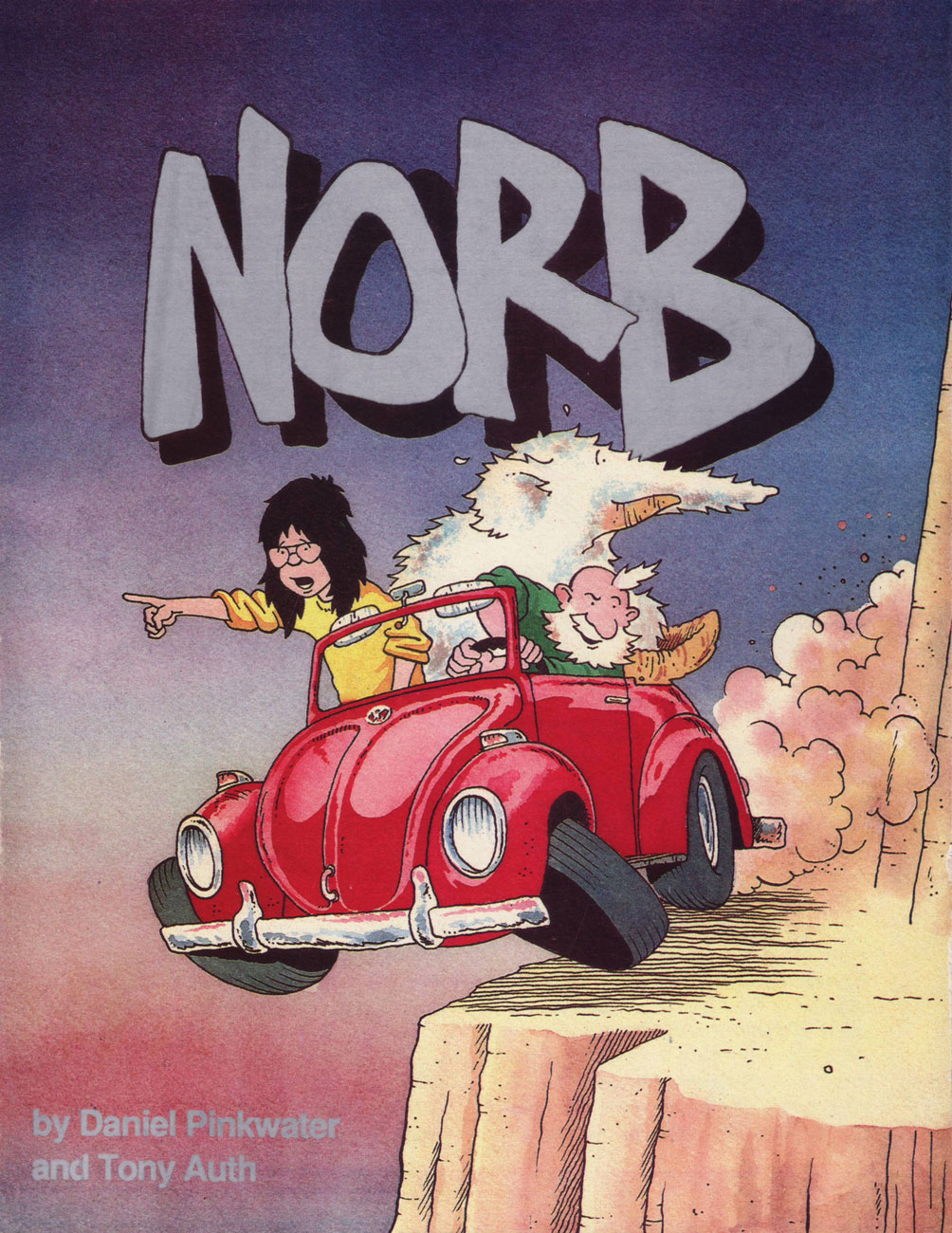
This post was originally going to be an interview. Having belatedly discovered Norb (1989-1990), I got in touch with Daniel Pinkwater (who better to ask?), intending to pepper him with questions, but he was so very helpful, providing me with all the background material I could have desired, that his prediction that « … since I have nothing to add, you may not need to formulate any questions for me » … came to pass. And so I gladly yield the floor to the sterling Mr. Pinkwater.
Tony Auth was a brilliant artist. He had an important day job as editorial cartoonist for the Philadelphia Inquirer. I think it was his first job, which he held for decades, and he was a Pulitzer Prize winner. We talked about doing ‘something’ together for a couple of years. Tony wanted to do a daily/Sunday newspaper strip, so we did that. Every day we’d remind one another, ‘keep it stupid.’ The fact was, we had no idea how stupid a commercial strip needed to be.
Stroke of luck, Denny Allen, who was temporarily in a position of influence at King Features had approached me years before about doing a strip. We met the power elite at King Features. I won’t characterize them except to say that the concept of stupid did not elude them, nor would it have been likely to. We negotiated for, and received a substantial advance from King, covering two years. I understand this was unheard of in the highly competitive rat race with a great many submissions coming in every day from marginally talented cartoonists.
So we went to work. My part was utterly easy. I would write the dailies and the separately plotted Sunday strip every Saturday while watching Dr. Who. Tony was putting in long hours in addition to his job at the newspaper. The strip launched in something like 70 papers, and I was told this was a big launch and unusual for the times.
We started in the vacancy created when Bloom County ceased production. The response from readers consisted entirely of actual hate-mail, letters saying it was hoped we would die, crude drawings of tombstones and daggers dripping blood. The only piece of positive fan mail I remember came from Jules Feiffer. A few papers dropped the strip, some in response to outrage from readers for whom the comics page was their literature. The typical letter read, ‘I hate NORB, it makes me feel stupid.’ Fair enough, I thought.
I understood that as few as 10 negative letters were enough to spook a paper into dropping a feature. My wife did a bit of research and discovered that all new strips have it rough initially, but if one survives two years it becomes un-droppable, and it is the editorial staff who get the threatening letters. Interestingly, Tony, who was a fair-minded political cartoonist, and got abuse all the time, (he’d had his office trashed by the right and the left at different times over the same issue, for example), and didn’t mind it, regarded the comic strip as the product of his heart, and was hurt by the unfair criticism.
So, at the end of the first year, Tony, exhausted by working two full-time jobs, depressed by the evidence that nobody seemed to like the strip, unwilling, as I was, to follow the advice from the comics/humor expert at King Features, let me know that he was not having any fun. ‘So, shall we quit?’ I asked. Since he was carrying 90% of the weight, I didn’t feel it should be my call. King was delighted to kill the strip because that meant they wouldn’t have to pay us the second year’s advance, and apparently they thought that saving money was the same as making money.
Exactly a year after the strip stopped appearing the fan mail started to come in, ‘Where’s NORB?’ ‘NORB was my favorite comic.’
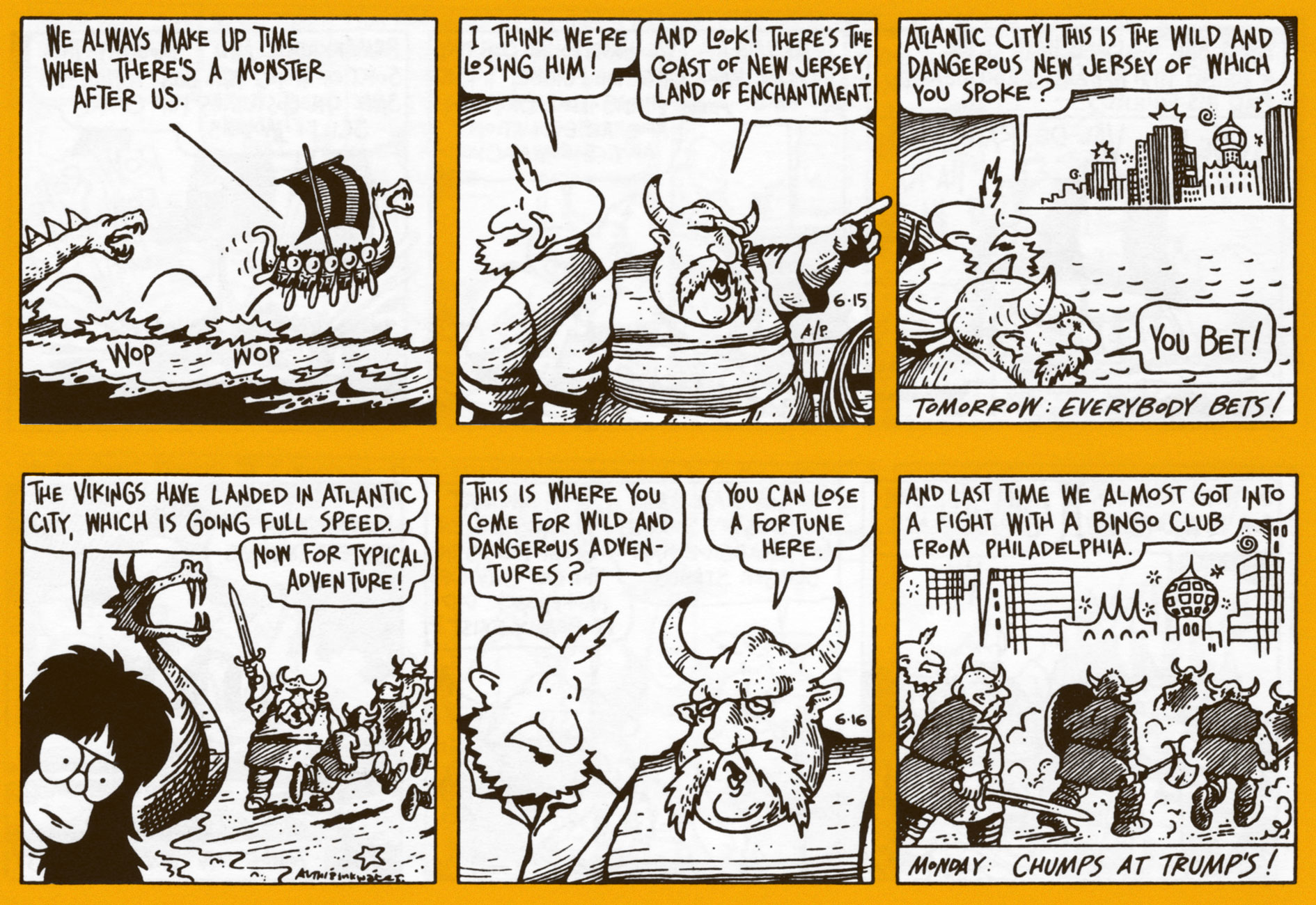
A pair of dailies from the first week, whereupon we meet our protagonists and our protagonists meet.
From week two. It’s lovely that Mr. Pinkwater opted to bring along a character from his Snarkout Boys novels (The Snarkout Boys and the Avocado of Deathand The Snarkout Boys and the Baconburg Horror), Bentley Saunders Harrison Matthews, aka Rat Face aka Rat. She fits right in. That kind of freedom is among the foremost perks of owning your work.
A four-day sequence, to give you a better sense of the strip’s flow. I love how the alien armada is basically pixelated. Spoiler: They won’t get very far with their plan of conquest.
Front cover of Mu Press‘ collection of the Nord dailies, published in 1992. To quote the late SF luminary Vonda McIntyre in her INTROdadaDUCTION: « When [Mu Press] decided to reprint NORB, I jumped at the chance to write this essay. Only then did I discover that writing it didn’t mean I got to reacquaint myself with the Sunday strips… it meant I got to see the daily strips, which I didn’t even know about, for the first time. »
Now and then, Pinkwater would drop out of the narrative, go into meta-textual mode and engage the critics in an entertainingly passive-aggressive fashion. I do prefer the plot-driven strips, however… as does Rat. « Problem, Norb-Baby. Humorous adventure with a touch of satire is out this year. I don’t know where to put you. » (07/13/1990)
« You’ll pay for treating my employer like a baked ham, you evil person! ». Don’t worry, Norb’ll be okay: « Explain. Were you sliced like a radish or not? » « Oh, I was! But it was in the future. »
Anything goes, in the most winning sense. The noble Norse warriors were soon to realize that at Trump’s, you simply can’t out-chump the boss.
Norb is an exemplar of the narrative strip that doesn’t take itself seriously: while the story proper is intriguing, any individual fragment is quite entertaining on its own.
Never having been reprinted, the Sunday strips are rare as hen’s teeth, and those who possess them presumably clipped them out of their local paper back in the day. Foresight! As is often the case with King Features continuity strips, Sundays and dailies feature separate storylines.
Several years ago, Norb was featured as the Obscurity of the Day on the excellent Stripper’s Guide blog. There you’ll find a handful more of these gorgeously-coloured (aside from all their other evident virtues) Sundays, and more dirt about Norb.
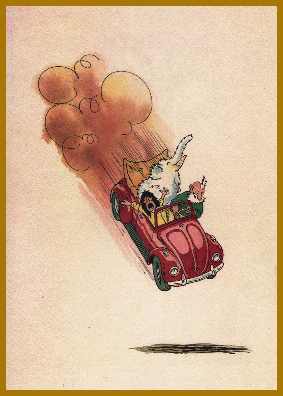
Et pour conclure, Auth’s back cover illustration from the Norb collection.
« It’s pretty clear that you take the whole subject of comics and cartooning a lot more seriously than I do. » Guilty as charged. Thanks for your most kind coöperation, Mr. Pinkwater!
This post is dedicated to the memory of Mr. Tony Auth (1942 – 2014).
« Octopuses have a lot in common with other species that are known to thrive in cities—not only can they use human-made structures for shelter, but they’re highly adaptable and good at problem solving. So maybe we’re justified in adding to our list of neighbours, next to the raccoon at the sliding glass patio door and the coyote in the halo of the street lamp, the octopus casting its appraising eye from under the sunken hull of a rowboat. » |source|
Octopuses in a mundane, urban setting? Address yourself to Gary Larson!
As promised a couple of weeks ago, we’re back with another Larson-copia of tentacles! Pt. 1 can be found here. Again, thanks to co-admin RG for all the scanning and colouring work.
If you think we’re somewhat stretching the definition of “tentacle”, I think the husband’s, err, feet definitely qualify.
Incidentally, one the world’s largest sea creatures is the lion’s mane jellyfish, whose tentacles are the longest of them all (they can attain lengths up to 37 metres or 120 feet).
Letting us know what we’re in for straight away, even the cover of the fourth Far Side collection features a tentacle.
∼ ds
Some content on this page was disabled on June 3, 2022 as a result of a DMCA takedown notice from Gary Larson. You can learn more about the DMCA here: