« There are no innocent bystanders… what are they doing there in the first place? » — William S. Burroughs
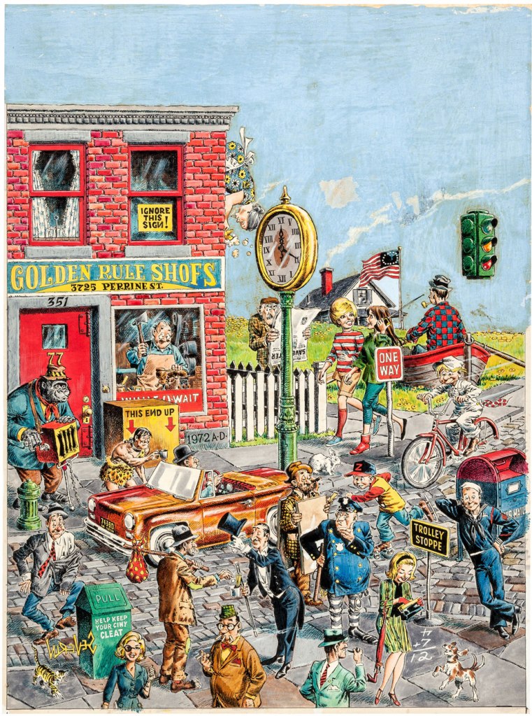
I’ve sung the praises of The American Bystander before, and I do believe it could still use whatever publicity it can get. And so here are some choice excerpts from the magazine’s Hallowe’en-themed issue — no. 13 (naturally), Fall 2019… starting with its unfathomably gorgeous double-spread by Armando Veve.
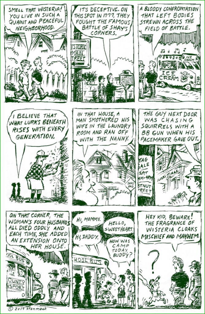
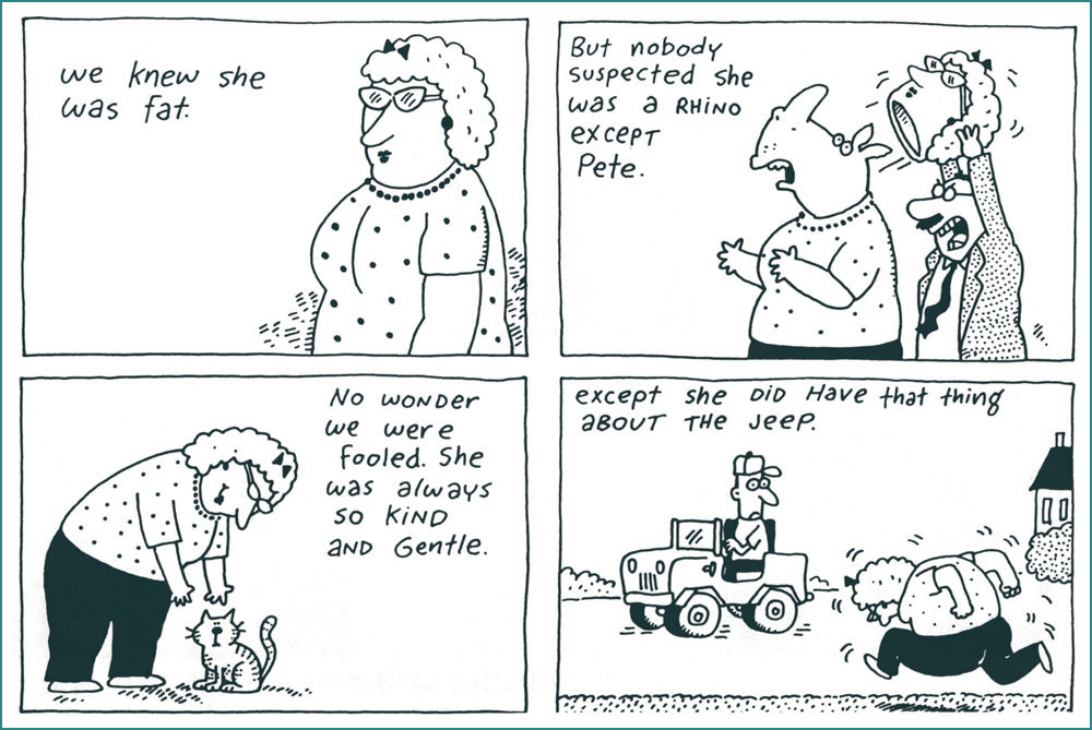
The editor wrote: « Some of our covers are so good they could conjure an entire book, and when Armando Veve delivered his art, a whole story blossomed in my brain. This wired witch is speeding to her digs downtown, a well-appointed brownstone on West 11th between Bleeker and West 4th. She received the deed some years ago from a grateful secretary of state Seward, in exchange for “Mr. Stonewall Jackson’s unfortunate accident.” More recently, she’s occupied herself by magically manipulating the stock market; she delights in dropping enormous, anonymous college scholarships into the laps of earnest high school Wiccans. Most afternoons she can be found at Tartine, eating pastries and slipping love potions into unsuspecting patrons’ teacups. She agrees that the neighborhood isn’t what it used to be but — being 227 — knows it never was. » Horror is around all the year ’round… we just celebrate it more fervently in the Fall. A strip by Brandon Hicks.I certainly hope that’s not Joltin’ Joe DiMaggio‘s spectre on the right, since he couldn’t handle that scene in real life. A cartoon by Matt Percival.I love that extra second-level chuckle (hint… ‘spell’). A cartoon by The New Yorker cartoonist Mick Stevens.A low-key guide to lethal passion in the suburbs from WOT? favourite Stan Mack. And I’m with the squirrels; that neighbour got what he deserved.The kids’ grapevine is utterly unforgiving. If you’re very fortunate, your ill repute will turn over with the next generation. A strip by Jim Siergey (b. 1949).
« In old New York it was Turkey Mike, Muggsy and the Big Six. In San Francisco, Baby Bull, Stretch, and the Say Hey Kid. Then came the Count, the Hackman, Jack the Ripper and Will the Thrill. Barry and Jeff Kent, but a dearth of nicknames, that is, until… The Giants got the Panda. » — Scott McCaughey, “Panda and The Freak“
In those callow days of youth when I still cared about big league baseball — having lost interest in such matters when Montréal lost its team — the post season was over and done by, say, the 20th of October. Nowadays, with all the extra teams and trimmings, it just seems to go on and on.
I long for the days when only ball players and little kids wore baseball caps, to be honest. Ah, but the sport yet holds some fond memories for me. I recall most fervently the rather outré facets of it, fostered and amplified by the sport’s scads of iconoclasts and loonies*.
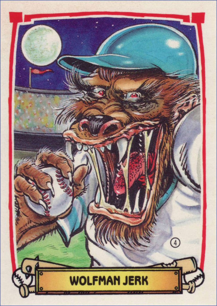
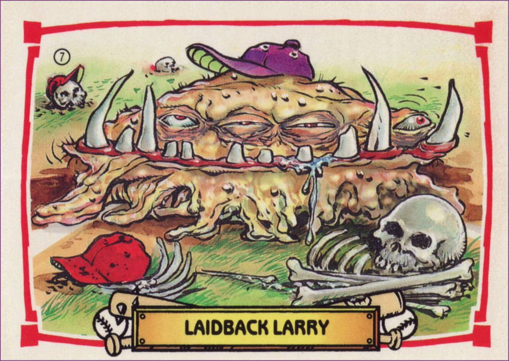
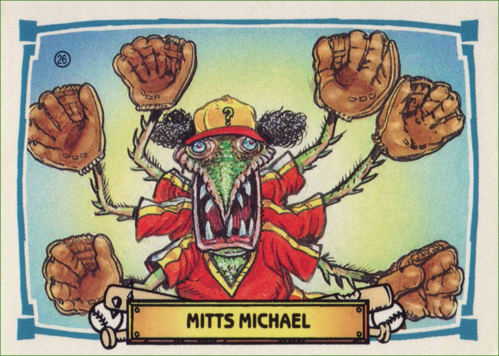
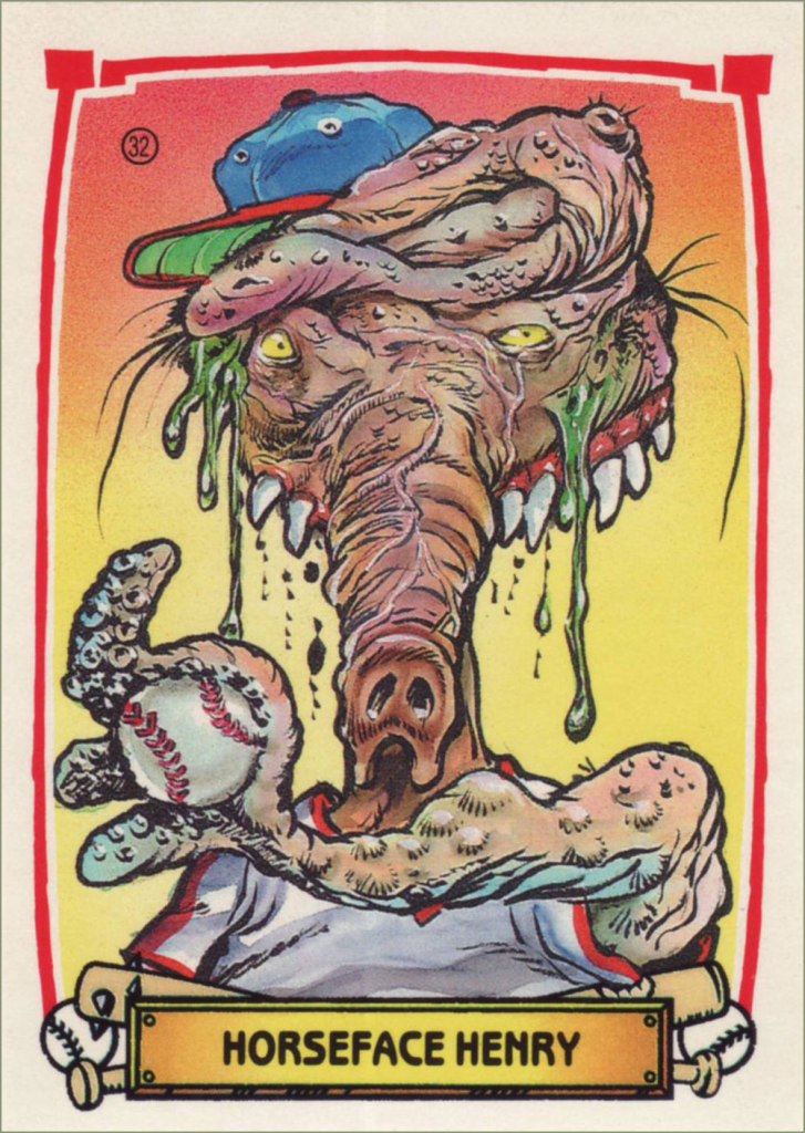
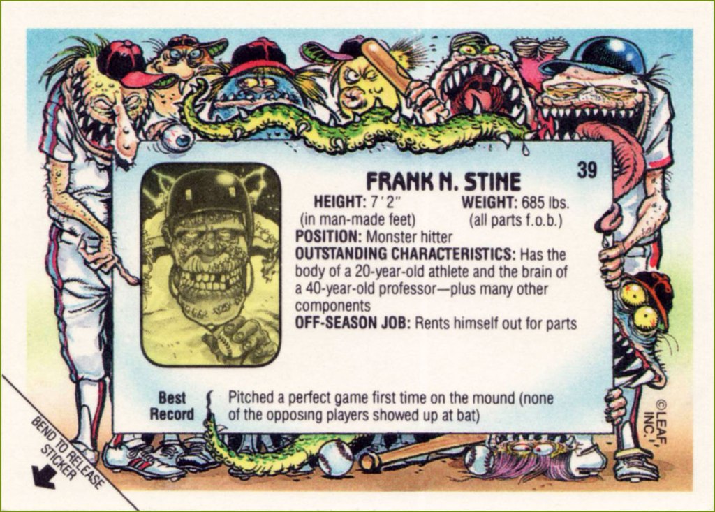
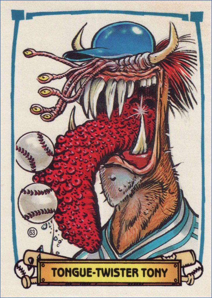
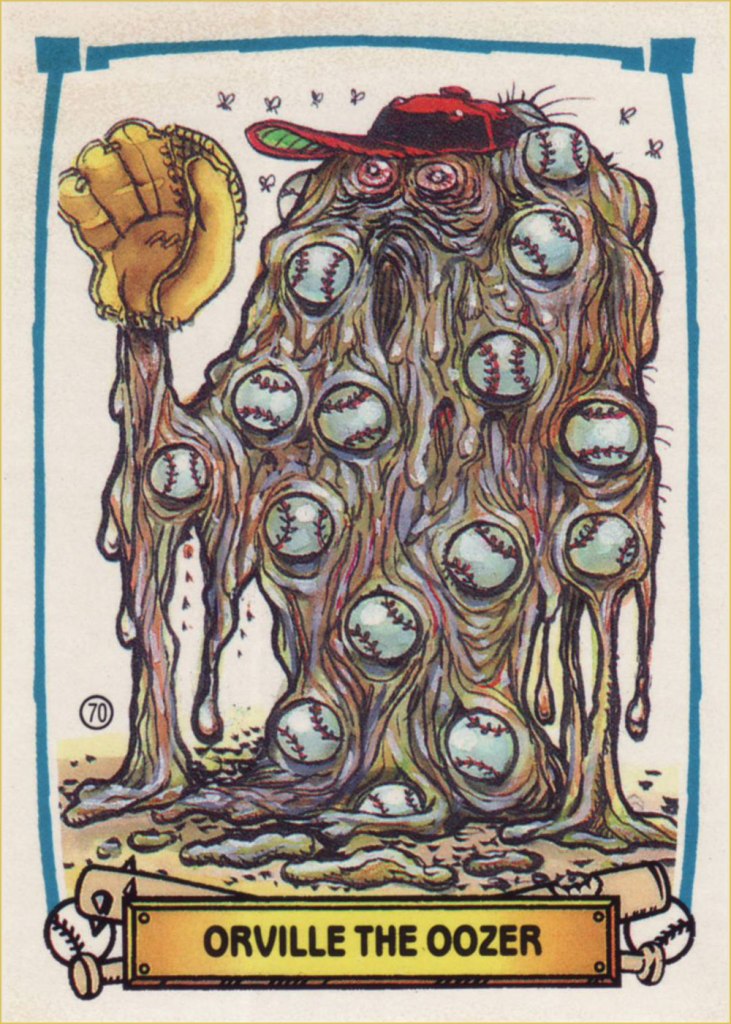
And while we’re on the subject, here are some highlights of Leaf/Donruss‘ 1988 card set Baseball’s Greatest Grossouts, illustrated by the busy yet ever-dazzling B. K. Taylor (Sick Magazine, The National Lampoon, The Muppet Show — he designed Dr. Teeth! — Sesame Street, Dynamite, Mulan…).
I’m mostly featuring the front of the cards, but the backs were also a treat. Love that grotesque wraparound artwork!
-RG
*splendidly — and catchily! — eulogised by supergroup The Baseball Project, featuring members of REM, The Young Fresh Fellows and Dream Syndicate. Four albums on, and their latest, Grand Salami Time!, may just be their finest hour. End of commercial, play ball!
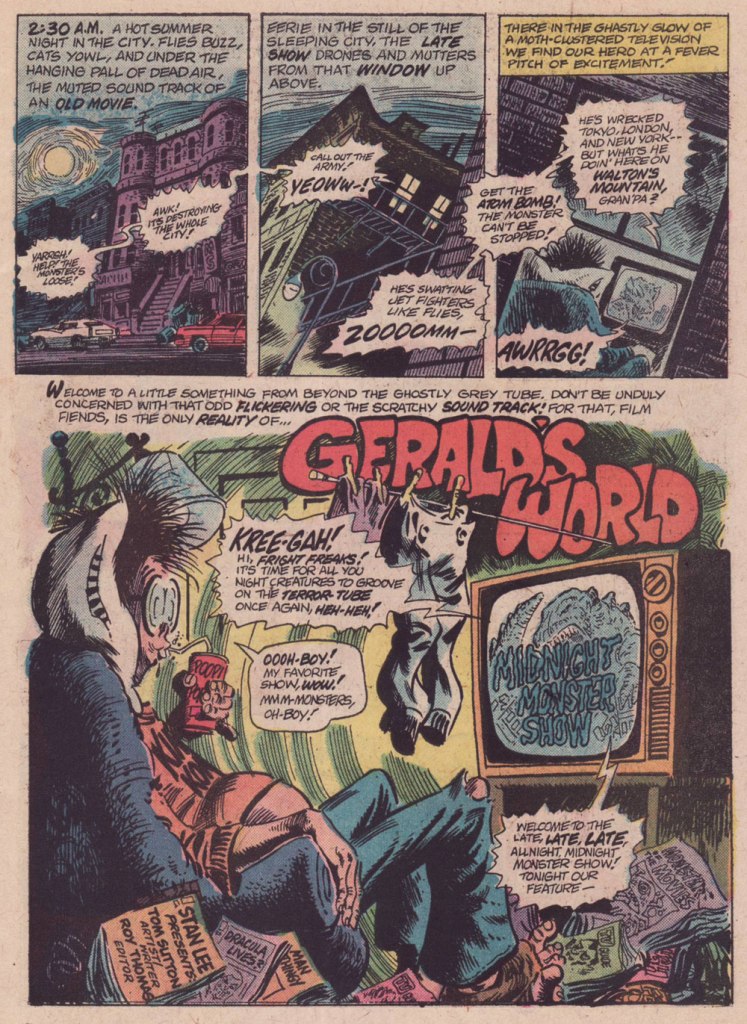
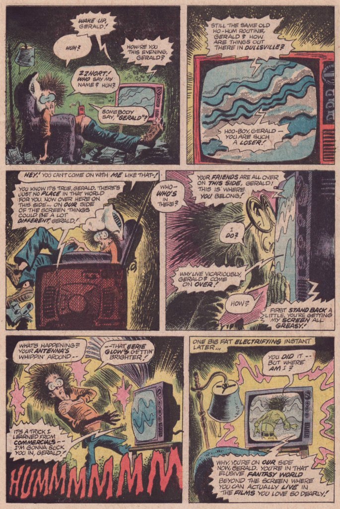
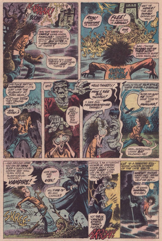
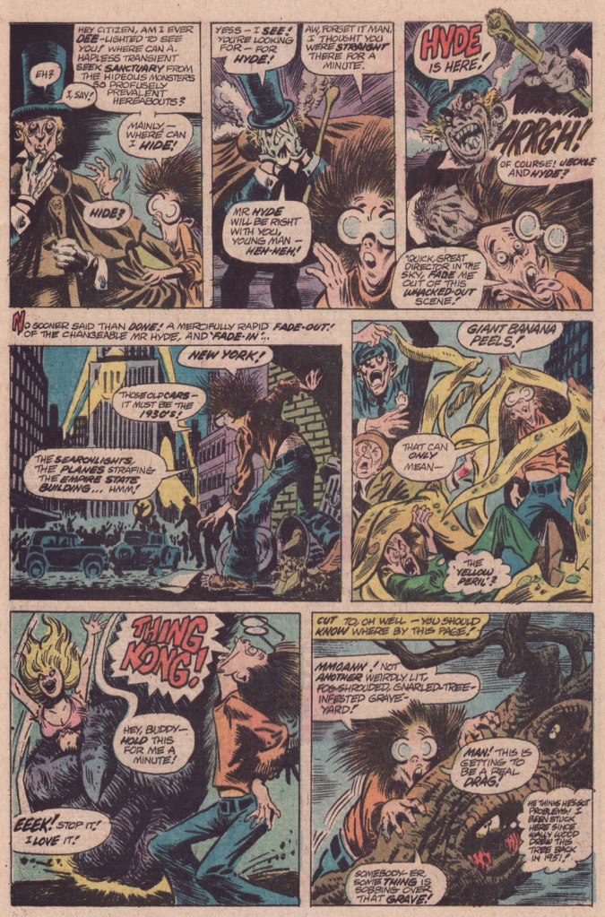
« … so I’d work on it until three or four o’ clock in the morning — that is the time to do Loevecraftian machinations. » — Tom Sutton (2001)
If you ask me, Marvel’s attempts at humour never came off*, being both strained and generally directed at superheroes, who are ridiculous in the first place. It’s like mocking pro wrestling — What’s the point?
Marvel did half-try its clammy hand at a horror humour comic book midway through the 70s, and while much of it looked decent, it was consistently unfunny. You can give it your best Will Elder, but it won’t stick if you don’t have that rare magic comical gene.
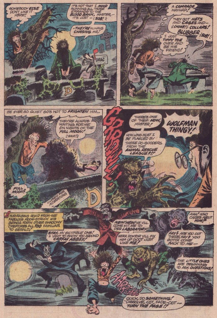
And while I’d love to say that Tom Sutton (1937-2002) had it, I’m afraid he didn’t. But Gerald’s World was a story close to his heart, to the point where he actually remembered creating it and having fun doing so.
« Right, and I did “Gerald”, who stayed up all night watching Fay Wray or something like that. I had fun with those! You know there were people who really didn’t like those things? » (Comic Book Artist no. 12, 2001)
It’s overstuffed, but it’s brimming with mood and solid craft. Take it away, Tom!
For a dose of real-life, depressing horror, read the definitive, late-in-life Tom Sutton interview, ‘An Odd Man Out‘. I’m afraid it’s unlikely to leave you swooning with affection and goodwill for the comic book industry.
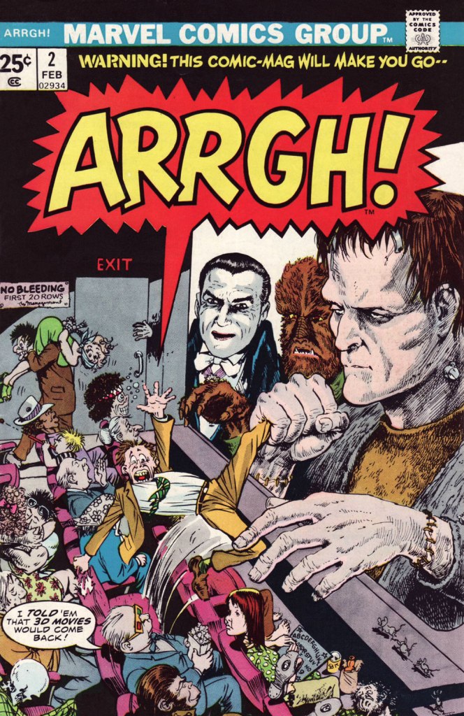
And here’s Marie Severin‘s cover for that issue. This is Arrgh! no. 2 (Feb. 1975, Marvel). By issue five, the final one, Marvel were down to licencing 1954 Get Lost! material from Ross Andru and Mike Esposito.
-RG
*there’s always an exception, isn’t there? I’ll proudly vouch for Scott Gray and Roger Langridge‘s Fin Fang Four stories, circa the late Oughties. Recommended? You bet.
« If you take drawing seriously, you never quite feel you’ve arrived. » — Ed Sorel
This time out, I’m pinch-hitting for my co-admin ds, who’s burning the midnight oil these days.
Just about a month ago, when I wrote a piece about Seymour Chwast (b. Aug. 18, 1931), it occurred to me that I should also devote post-haste (just in case) some column space to his fellow surviving Push Pin Studios co-founder, Edward Sorel (b. March 26, 1929). Let us celebrate the living while we can. The dead don’t appreciate nearly as well such gestures .
Opting for a freelancing career, Sorel left Push Pin, just a few years after its founding. He made it, all right, becoming one of the greatest caricaturists of the century. But he was every bit as accomplished a writer, which elevates his work above the ‘merely’ visual.
I’ve always been blown away by how deceptively easy he makes it all look, and that’s what’s so impressive: very loose on the surface, but with an underlying, laser-sharp precision. I could easily go on at some length, but Sorel’s career and art are well-documented themes. Check out, for instance, The Enigmatic Edward Sorel(From The Comics Journal), or this fine New York Times review of his recent memoir (circa 2021), Profusely Illustrated.
And now, some of the man’s work:
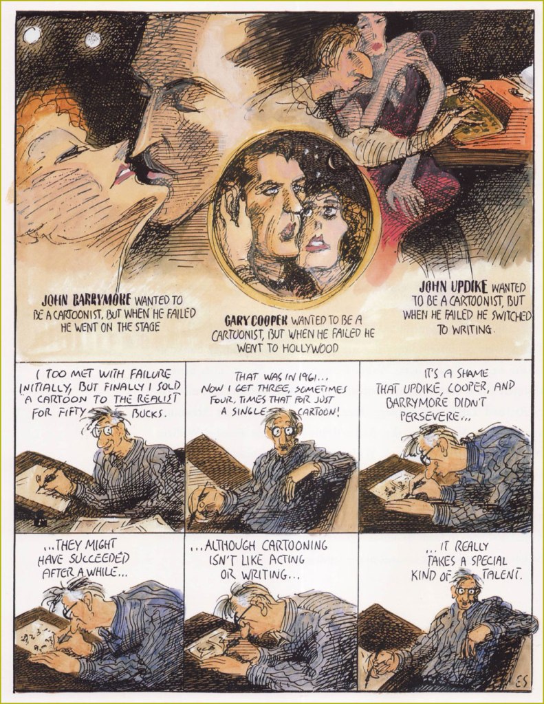
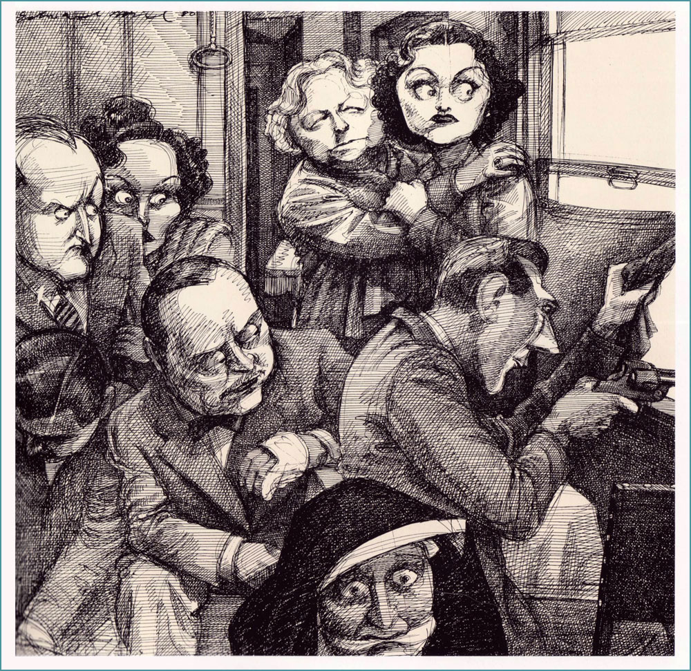
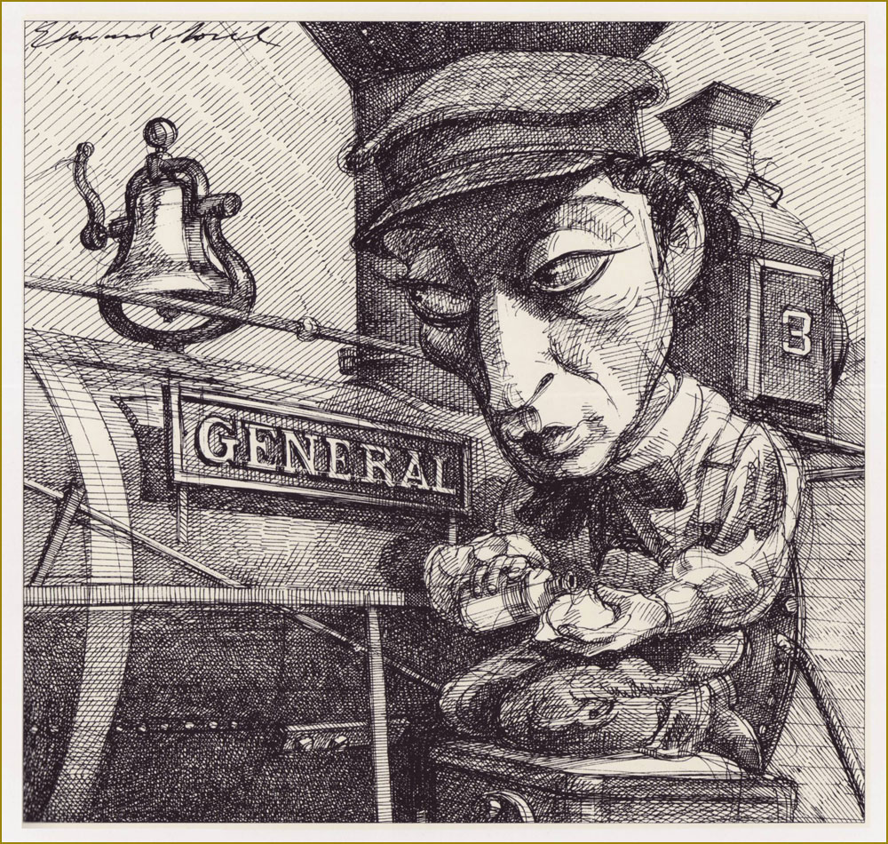
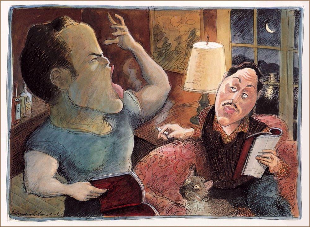
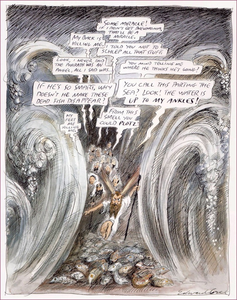
« My long association with Penthouse was unique. They bought every idea I submitted to them, and never changed anything except my spelling. This solipsistic strip appeared in 1990. »He can draw *anything*! This one appeared as The New Yorker‘s Jan. 31, 1994 cover illustration.I suppose every cinephile has his favourite Hitchcock film; mine’s The Lady Vanishes (1938). An entry in Sorel’s “Movie Classics” series, published in the March, 1981 issue of Esquire. « The General, starring Buster Keaton, is the only silent movie I included in my “Movie Classics” series. Based on an actual incident in the Civil War, it often has the look of a Mathew Brady photograph. » From Esquire, Dec. 1980.« Tenor Enrico Caruso is a guest at the St. Francis Hotel when the 1906 earthquake hits San Francisco. He vows *never* to return to a city “where things like this are permitted”. From Sorel’s pictorial essay “Keyhole History” (GQ, Oct. 1984).More rollicking blasphemy for Penthouse (Dec., 1992). Ah, yes. « The 1973 Academy Awards are remembered for Marlon Brando’s refusal to accept his Oscar for The Godfather. His emissary, Apache tribe member Sacheen Littlefeather, explained that Brando’s rejection of the award was to protest Hollywood’s depiction of Native Americans. Backstage, John Wayne was apoplectic. As John Lahr wrote in his article “The Birth of the Oscar“, “The Duke, who had dispatched many an Apache on film, didn’t take kindly to Brando’s protest… Wayne had to be restrained by six men from yanking Littlefeather off the stage.” From The New Yorker, March. 21, 1994. And speaking of Brando… « Marlon Brando is sent up to Cape Cod to read the part of Stanley Kowalski in A Streetcar Named Desire for Tennessee Williams‘ approval. First he fixes the nonfunctioning electricity and plumbing, then he auditions. His performance was stellar in every role. From Sorel’s “First Encounters” series, this entry appeared in Atlantic Monthly‘s July, 1994 issue. Note the kitty’s rapt expression.« Exodus revisited: an educated guess as to what Moses endured as he led his people through the Red Sea. A cartoon for Penthouse, the only mass-circulation magazine to welcome my blasphemy. » Penthouse (like the man said), Apr. 1995. Oh, and Plotz: To burst from strong emotion; often used humorously to express minor shock or disappointment (פּלאַצן, platsn, ‘crack’; cf. German: platzen;) and Schlep: To drag or haul (an object); to walk, esp. to make a tedious journey (שלעפּן, shlepn; cf. German: schleppen;).« Another of my egocentric ramblings, this one a rationalization for not becoming a great artist. » It appeared in the Aug. 21/28 issue of The Nation.« How Was I Supposed to Know? », from The Nation, Sept. 24, 1990. Oh, the sequels just write themselves.Here’s a rather famous one: « Back in the mid-sixties, my friend George Lois had an idea for an Esquire cover that couldn’t be done with photography. He asked me to do it, and I panicked — i.e. I tightened up. When I handed him my finish, he rolled his eyes and said he’d give me until the next morning to do it over. I went beyond panic, but nevertheless did a drawing we were both happy with. » It appeared on the cover of Esquire’s April, 1966 issue, with the caption of “The problems of power for Frank Sinatra”.« Director Michael Blakemore, at a rehearsal of Woody Allen’s one-act contribution to Death Defying Acts, watches in horror as Allen scribbles copious stage directions for him to execute. (Caricaturing Woody Allen is so easy that after drawing him, many an amateur comes to think of himself as a pro.) » From The New Yorker, June 3, 1996. Look at that pen move!
« I opened my magazine (What did you see?) / I saw Mr. France (What did he have?) / A girl on each shoulder (What else?) / And one in his pants » — 10cc, Sand in My Face (1973)
You may think of this post as a companion piece, a spinoff of its predecessor. I’d had for some time, in the back of my mind, the notion to showcase some obscure French ‘human sculpture’ ads, but it needed more. Comments on the previous post provided the spark.
Is there a more classic “humble immigrant makes good in the USA” yarn than that of Angelo Siciliano, born in 1892 in the tiny Italian town of Acri? The Smithsonian has told the full, colourful story, so I’ll spare you a rehashing of it.
Let’s just say that young Siciliano worked hard to overcome adversity and redeem his puny physique, and the rest is the stuff of legend. The principles of ‘dynamic tension‘ and his immortal moniker aside, Angelo’s finest brainstorm was to employ the lowly but then-ubiquitous medium of comic books to introduce his product and its natural audience to each other. Let’s take the tour!
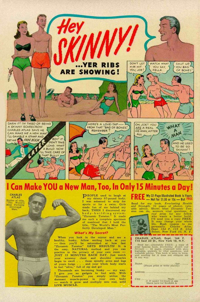
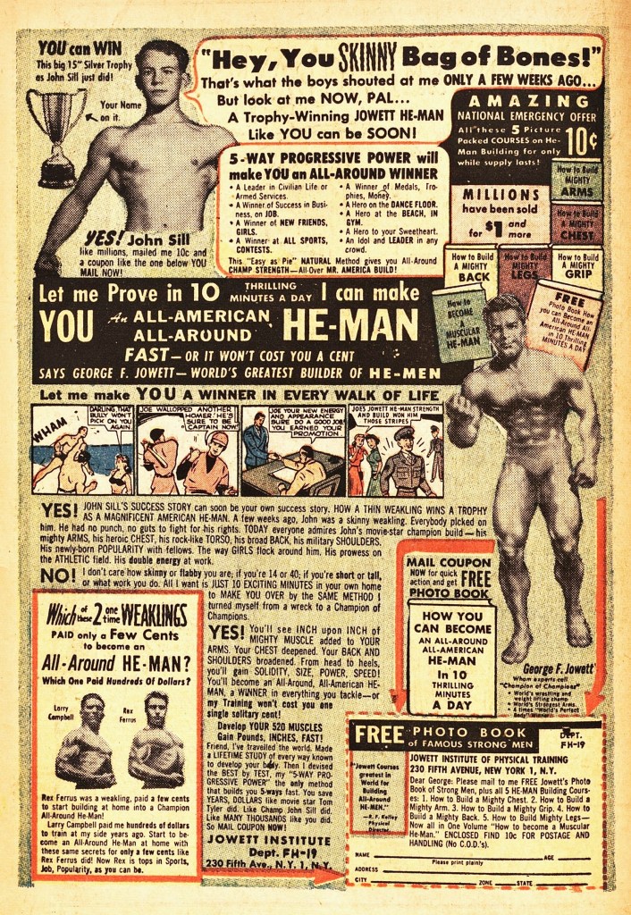
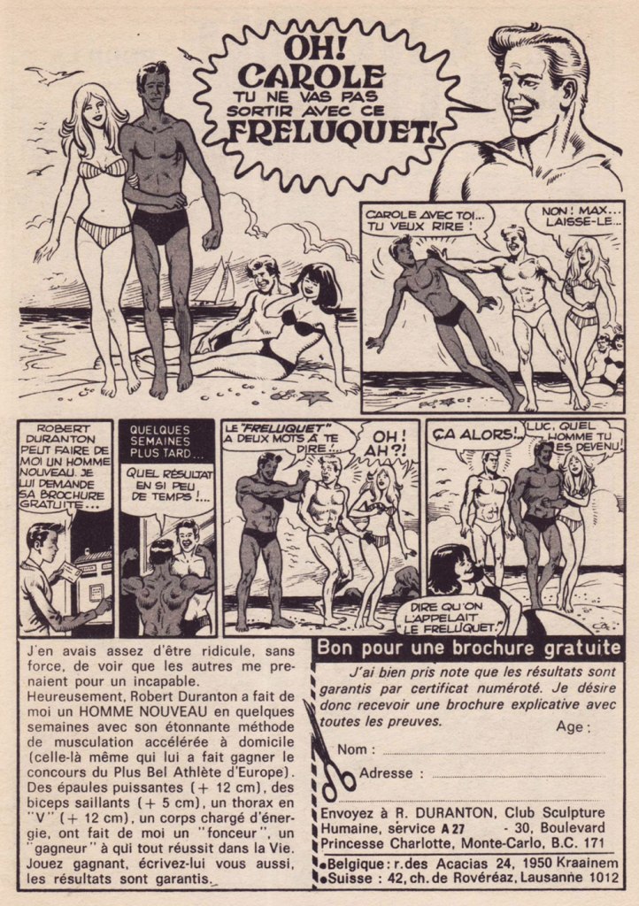
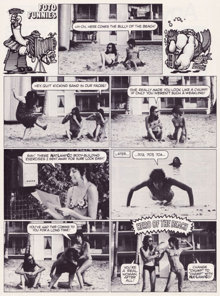
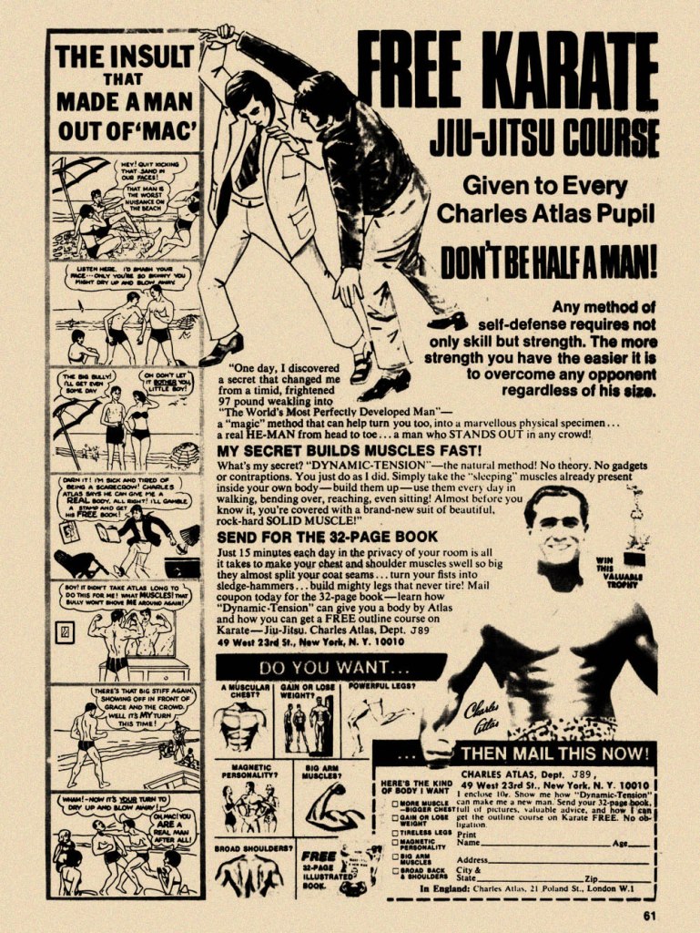
While the Charles Atlas ads began running in the 1930s, this is probably their classical expression. This one saw print as the back cover of Mad no. 14 (Aug. 1954, EC). Its opening insult even inspired Miles Heller’s 1995 salute to the great old comic book ads, Hey Skinny!There was inevitably fierce competition in the self-improvement field. This entry, from the U.S. Nature Products Corp., appeared in Stan Lee’s oh-so-macho Man Comics no. 10 (Oct. 1951, Atlas).Lots and lots of copy — but the all-important cartoon hook is present and accounted for. From the pages of Firehair no. 9 (Fall 1951, Fiction House). The Jowett Institute of Physical Training wants you to get buff! To be fair, George F. Jowett got there first.This is surely the definitive version, with the unforgettable tag line and ‘hero of the beach’ conclusion. I pulled this one from The Witching Hour no. 25 (Nov. 1972, DC), which hit newsstands just a few months before Mr. Atlas passed away, aged 80, on Christmas Eve. I can’t help being amused: French publisher Arédit, whose digest-sized collections of (mostly) reprints of US comics proudly bore the tag « Comics for adults », featured very few outside ads… and those were almost exclusively for self-defense and body-building systems. Here’s a sample trio. This one appeared in Maniaks no 4 (Fall, 1971). This title featured reprints of DC Silver Age ‘humour’ comics… all but the only actually funny one (that would be Sugar and Spike, of course).Oh, I’m sure the ERB Estate got their cut. And who might that R. Duranton fellow be? Four times Mr. France, for one thing! Here he appears with Louis de Funès in a famous scene from Le Corniaud, a 1965 farce starring beloved stars André Bourvil / De Funès and directed by Gérard Oury. This one’s from Kamandi no. 4 (Summer 1976, Artima), which featured reprints of various 60s and 70s DC adventure comics. It was an affordable way to catch up on material one might have missed — or couldn’t afford!This refreshing gender-switched lampoon comes from the pages of National Lampoon no. 26 (May, 1972), the ‘Men!’ issue, guest-edited by Anne Bats, No other credits, dammit. The opening page (of four) of Steve Skeates and Sergio Aragonés‘ wacky satire, from the pages of Plop! no. 2 (Nov.-Dec. 1973, DC). There have been truly countless spoofs of the Atlas adverts… most of them quite dire. Once more, I’ll spare you.By the mid-1970s, with America in the kung-fu grip of martial arts fever, it’s understandable that many a young man was envisioning Bruce Lee‘s lithe, compact physique as an alternative to the hulking musclemen of yore. The Charles Atlas company tried to cover all bases with this ad; from — speaking of old-time musclemen — Doc Savage no. 2 (Oct. 1975, Marvel).
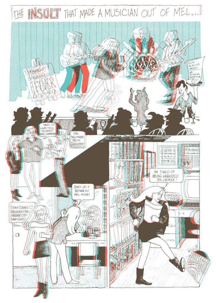
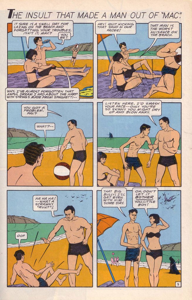
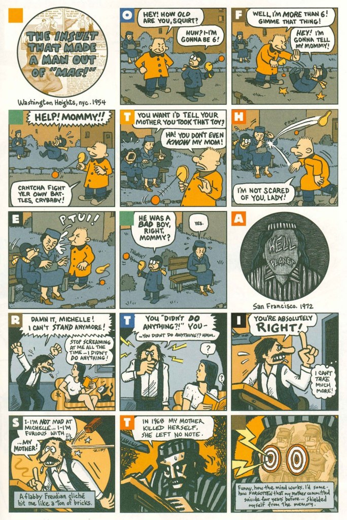
Ah, yes — those days when ‘Bruce‘ was the stereotypical gay name. From the ‘Playboy Funnies’ section of the magazine’s November, 1977 issue.And for something a bit off the beaten path: this is The Insult That Made a Musician Out of Mel, scripted by Rebecka Wright, illustrated by Blanche Santa Ana, with 3-D effects by Ray Zone, from Wimmen’s Comix no. 12 (Nov. 1987, Renegade Press), edited by Angela Bocage and Rebecka Wright.Does this look familiar? This is the first page of Flex Mentallo’s origin tale, as it appeared in Doom Patrol no. 42 (Mar. 1991, DC), written by Grant Morrison, with art by Mike Dringenberg and Doug Hazlewood. I have no idea whether Atlas had a sense of humour, but his successors sure didn’t, as evidenced by the lawsuit they filed against DC Comics over this clear — if brazen — case of satire. I much prefer the TV show version of Flex, I confess.Peter Kuper deftly used the cliché to take a jab at George Bush Sr.’s image and the first Gulf War. Dated and irrelevant? Trying to prove your ‘manhood’ remains distressingly au courant… just consider these two schmucks, to cite but one recent example. And hey, here’s “Stormin’ Norman lying on T.V.” From Bleeding Heart no. 1 (Winter 1991-92, Fantagraphics).Art Spiegelman digs deeper and makes more discerning use of the raw materials at hand with The Insult that Made a Man out of “Mac!”, first previewed in The Virginia Quarterly Review and then collected in Breakdowns Portrait of the Artist as a Young %@?*! (Oct. 2008, Pantheon).
«The kind of guy you’d love to have at your next cocktail party, he’s got a million hilarious anecdotes and he’s more than happy to tell them. »
In the early days of this blog, we talked about American cartoonist Arnold Roth (see « All cartoonists are geniuses, but Arnold Roth is especially so. »). But this was some 6 years ago, and back then I wasn’t too generous with images. Roth has now made it to the venerable age of 94, and hopefully with us for many years to come! Even without dipping into his contributions to Harvey Kurtzman‘s Humbugand (unfortunate name association aside) Trump magazines, there is plenty of material to showcase and giggle at.
Did you know Roth not only illustrated many jazz LP covers, but was also a sax man himself? Check out this awesome gallery of some of these covers on Drew Friedman‘s blog!
A collage of pages from 1970-1971 issues of National Lampoon published in Rick Meyerowitz‘s Drunk Stoned Brilliant Dead (2010), a massive hardcover gathering highlights from The National Lampoon and interspersed with interviews and biographies of its stable of cartoonists and writers. The bottom right, from a series of cartoons titled ‘Nostalgia is Goodstalgia‘ from NL’s November 1970 issue, feels uncomfortably on the ball for the current political climate (ouch).
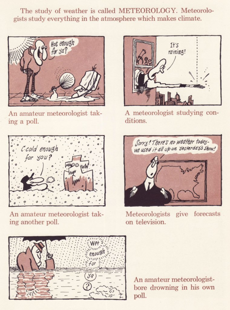
Here are a few pages from Arnold Roth’s Crazy Book of Science (1971), which offers a few suitably madcap pages:
Meteorologists have been the butt of jokes for at least over a hundred years (at least Jerome K. Jerome‘s Three Men in a Boat from 1889 pokes fun at them), but whether the recent weather forecasts have been worse than usual is up for debate.
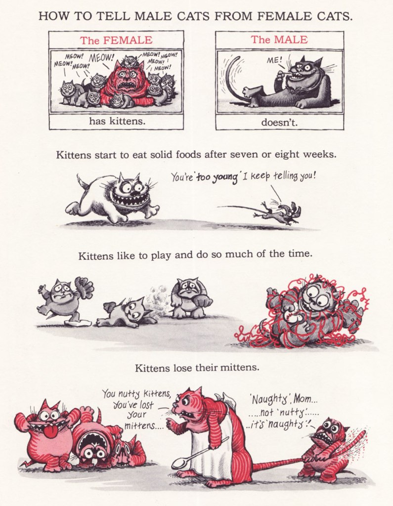
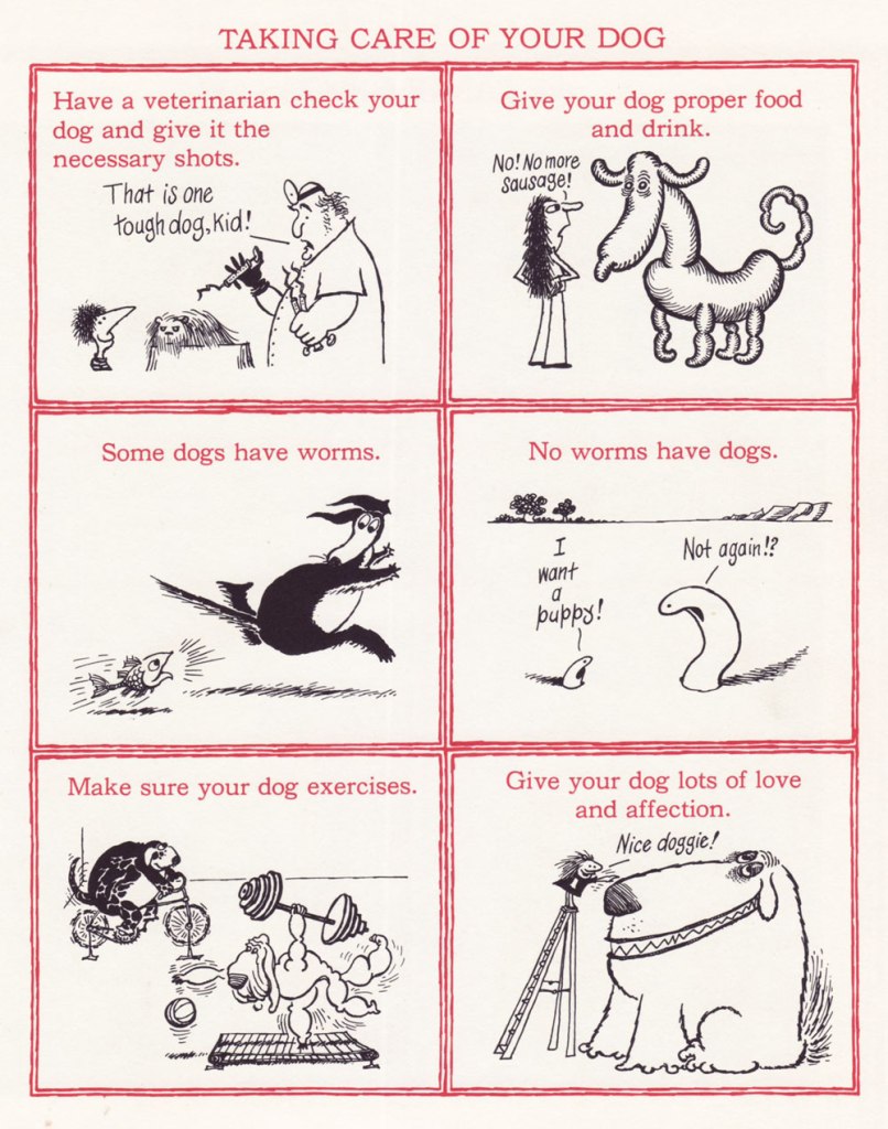
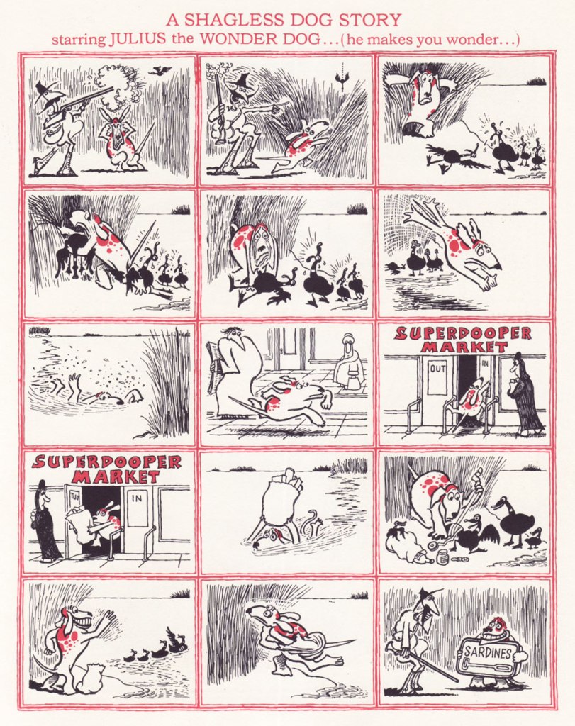
Then there’s my beloved Comick Book Of Pets (1976) – ‘found, raised, washed, curried, combed, fed and cared for in every way‘.
Co-admin RG was swearing a bit while scanning this for me, so please make sure his sacrifice was not in vain by looking at the details.
Read his fascinating interview with Gary Groth here.
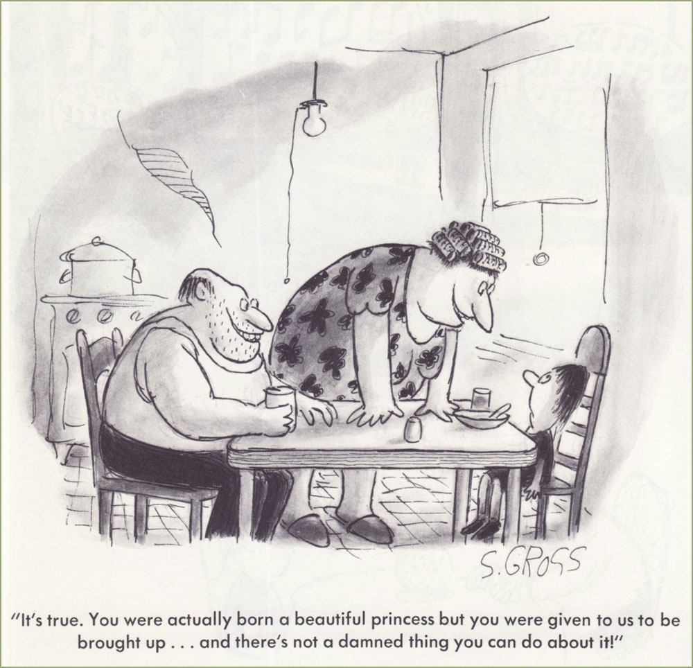
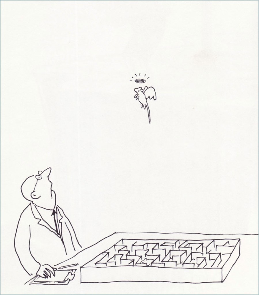
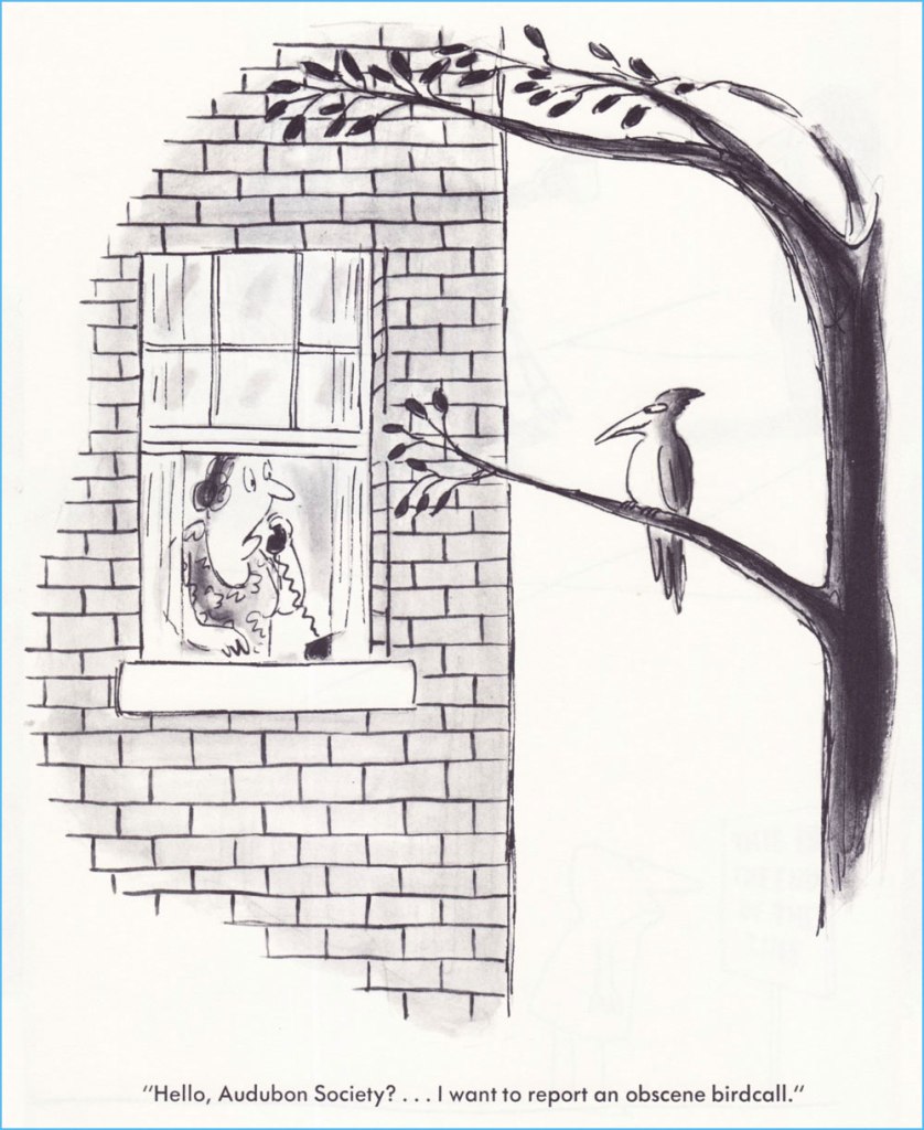
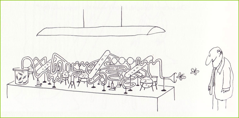
« … while there are lines of taste that many cartoonists will not cross, Mr. Gross leaped over them, doused them with gasoline and lit them on fire, cackling as he did. » — Daniel E. Slotnik, from Gross’s NYT obit.
A couple of weeks ago, we lost yet another of our remaining cartooning titans, hardly a surprising turn of events given the march of time… but this growing void diminishes and impoverishes both the field and the world.
Gross has been eulogised all over the place, notably in obituaries in the New York Times and The New Yorker, his Lambiek entry is lovingly detailed, so there are precious few blanks left to fill in.
All this adulation and appreciation… and yet, all of his books are out of print, so far as I can ascertain. While this does not bode well, I like to think that some savvy publisher will soon make use of Gross’ fastidiously organised files, reportedly comprising over thirty thousand individual cartoons.
For this small homage, I’ve pulled some of my favourites from his most famous (the most infamous being We Have Ways of Making You Laugh: 120 Funny Swastika Cartoons*), 1977’s I Am Blind and My Dog is Dead. Picking favourites is plenty laborious enough, I wasn’t going to slog through seven decades of material, indeed not.
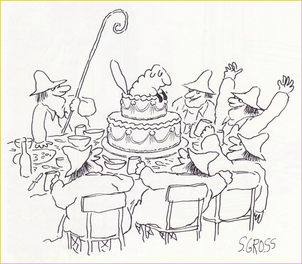
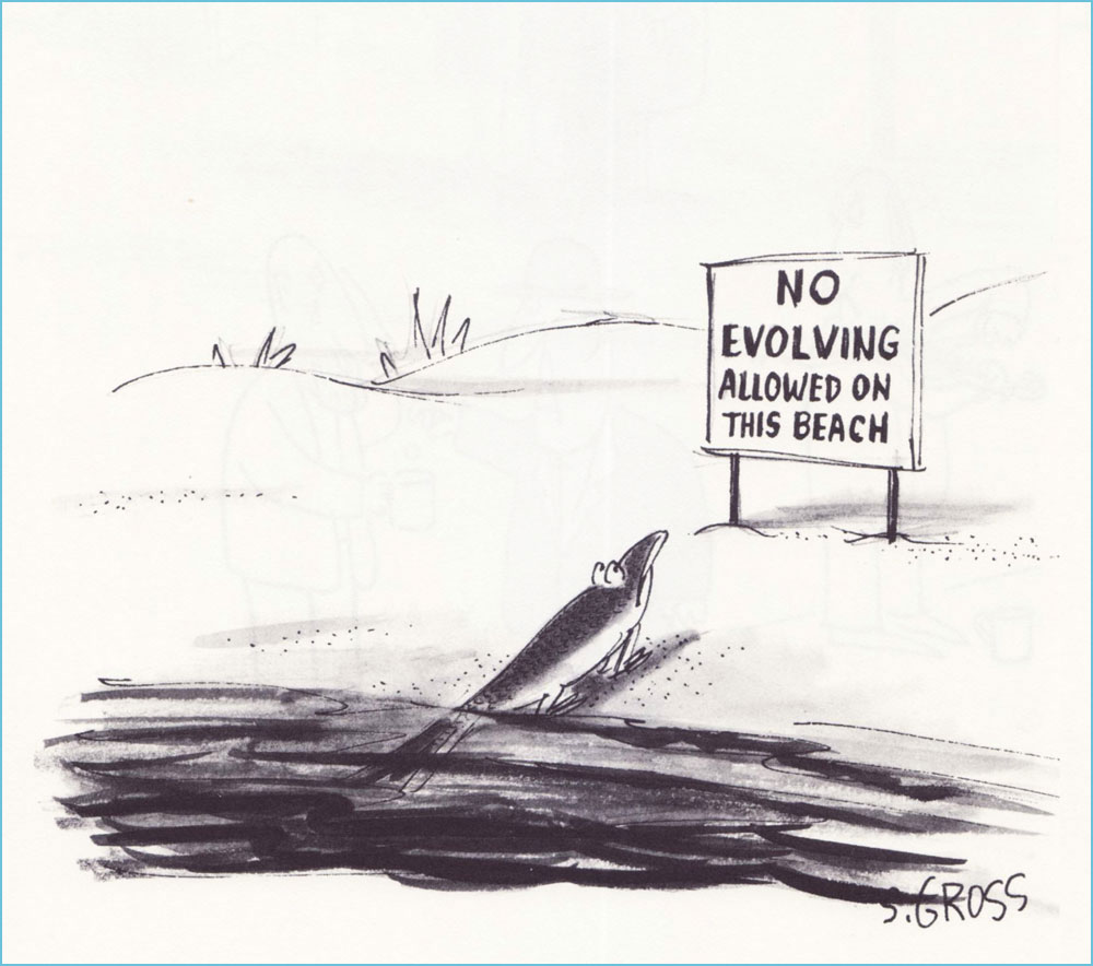
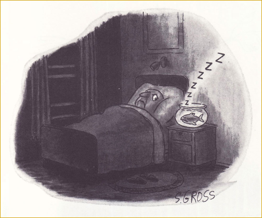
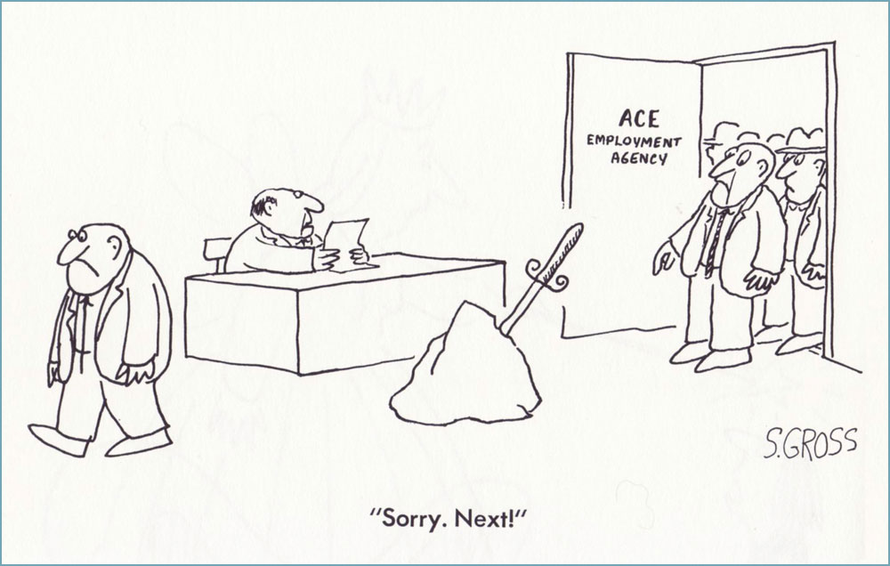
Originally published in Saturday Review.The only way this could have been funnier is if it had been published in the Audubon Society’s magazine… which did publish several of his cartoons — but not this one.Originally published in Saturday Review.One of the great perks of Gross’ range is that this cartoon can be viewed as totally cute and innocent or you’re-going-straight-to-hell filthy. It’s a fairly safe bet that this particular beach is in Florida. I was thinking that this one could have just as well been a Charles Addams cartoon… then recalled that Gross, early in his career, actually sold gag ideas to The New Yorker for Addams to illustrate. This one, interestingly, saw print in Ladies’ Home Journal.Our most recent entry appeared in the pages of The American Bystander no. 3 (Fall, 2016), where he held his own reserved nook, ‘Sam’s Spot‘. Bless ’em.
In closing, this fabulous anecdote from his National Lampoon colleague Larry “Ratso” Sloman:
« After five years, I left the Lampoon and a new executive editor took over. He called Sam into his office. “From now on, I want pencil sketches from all the artists before they do anything,” he told Sam.
“Pencils! Cartoonists don’t do no stinkin’ pencils. Rodrigues will tell you to go fuck yourself rather than show you a pencil,” Sam said. “Oh, and by the way, you can go fuck yourself.” His tenure as cartoon editor was finished. But the funny thing is, Sam was still selling cartoons to the Lampoon long after that editor had been penciled out of his own job. »
-RG
*From Gross’ first-rate 2011 Comics Journal interview, conducted by Richard Gehr: « His doorbell sports an old family name because he doesn’t want to be hassled by anyone who might have been offended by his 2008 book We Have Ways of Making You Laugh: 120 Funny Swastika Cartoons. »
Long before Cracked* was ‘America’s Only Humor Site’ deluging its readers in hit-or-miss listicles (5 Stupid, Stupid Things Humanity Has Shot Into Space, 15 Bonkers Crossovers That Somehow Happened, and so on), it was a satirical mag consciously aping Mad Magazine‘s schtick. I don’t know if anybody is actually hanging on to fond memories of it – Fantagraphics’ Kim Thompson famously quipped ‘I don’t think I’m alone in thinking of CRACKED for most of its run as “a bunch of crap, and John Severin” – but it’s undeniable that quite a few great artists have contributed to it over the years (including the aforementioned Severin, who was a powerhouse** whatever you may think of his art).
Cracked was born in 1958 and shuddered its last in 2007 (more about said demise later). Here are a few Severin covers I like!
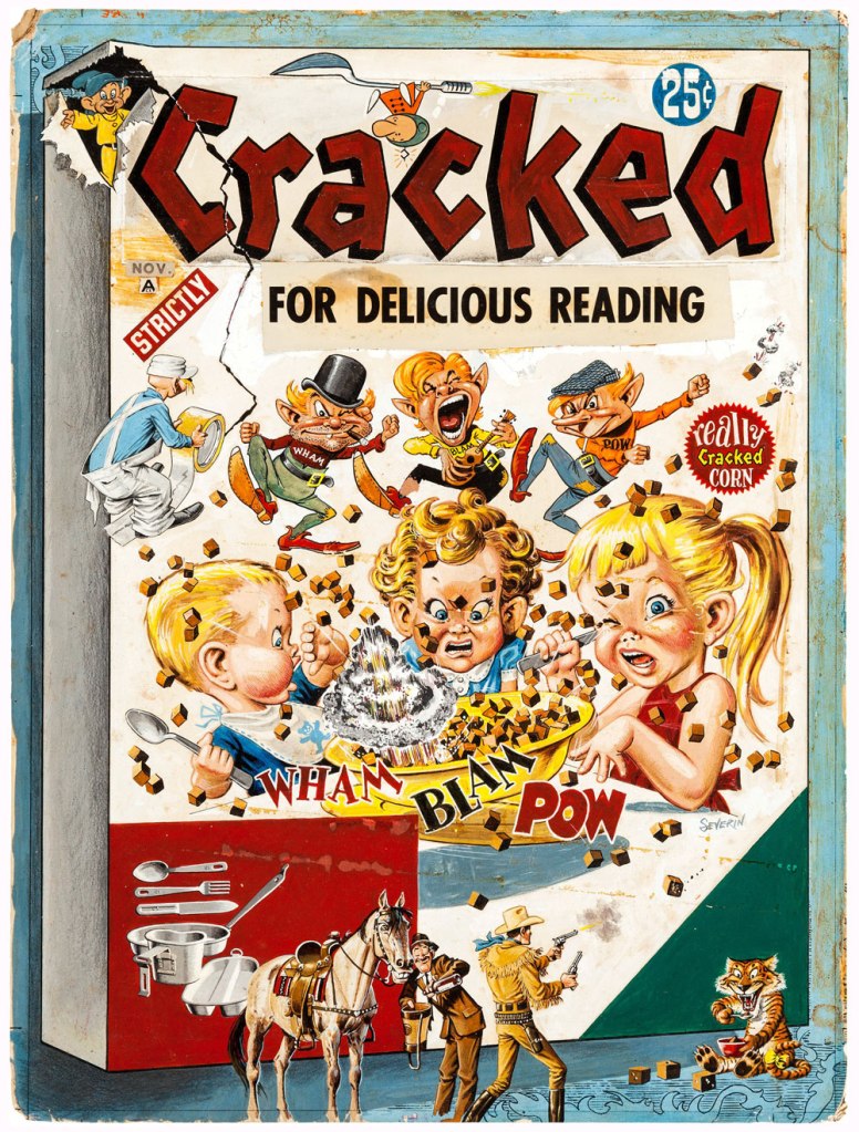
The original art for the cover of Cracked no. 5 (published in October, 1958). How cute/feral is the tiger in the bottom right corner?
Cracked no. 9 (May, 1959). Severin really excelled at these action-packed melée scenes.
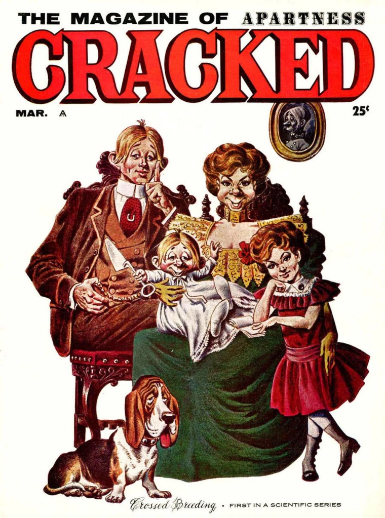
Cracked no. 13 (March, 1960)
Cracked no. 28 (February, 1963). You may note that Cracked’s mascot Sylvester P. Smythe is meant to remind one of another country bumpkin-ish mascot… though I like Alfred E. Neuman‘s mug better.
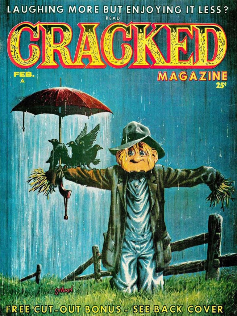
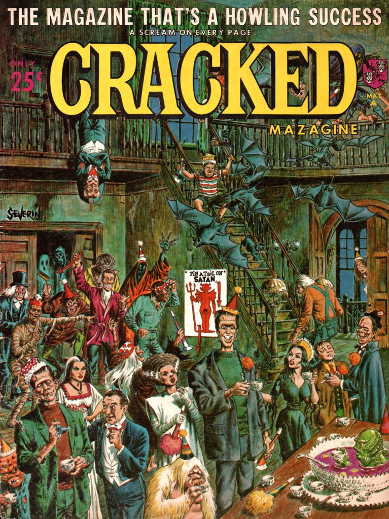
Cracked no. 43 (May, 1965). This party looks like serious fun!
Original art for Cracked no. 49 (January, 1966). The printed version invited the reader to « Find the mistakes on this cover ». Won’t you give it a whirl?
The original art for the cover of Cracked no. 90 (January, 1971). In order to make the scene more properly nocturnal, a blue tone was judiciously added to the final version.
As a bonus, here is ‘Phooey’ Smythe as depicted by the amazing Jack Davis for the cover of Cracked no. 12 (January, 1960).
Head over Mort Todd’s website for a more extensive look at Severin’s contribution to Cracked!
~ ds
* When Cracked Magazine was sold to a group of investors in 2005, it was supposed to return in force with a new design à la ‘lad mags‘ like Maxim. Website Cracked.com launched several months later, outdid its parental unit, and when the magazine folded in 2007 (new design and all), the website stuck around, gaining popularity in exponential numbers. My only interest in it is the fact that Winston Rowntree occasionally contributes articles.
**«After being one of the founding artists for Mad, he began working for the Mad imitation Cracked in the late ’50s and stayed there for nearly 40 years, because he was paid as well as the Mad contributors and was allowed to contribute several features in every issue. In addition to the mountain of work he produced for Cracked, he was simultaneously working for Marvel, Warren and DC. Severin was the consummate professional who editors and art directors knew could draw anything, from a Roman legionary to Cracked mascot Sylvester P. Smythe, and everything in between. Like fellow EC colleagues Jack Davis and Frank Frazetta, Severin could crank out great humor comics with the same facility he drew war, Western and historical tales.» [source]
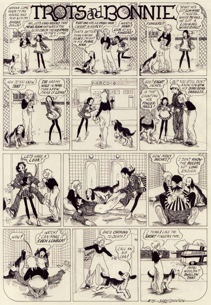
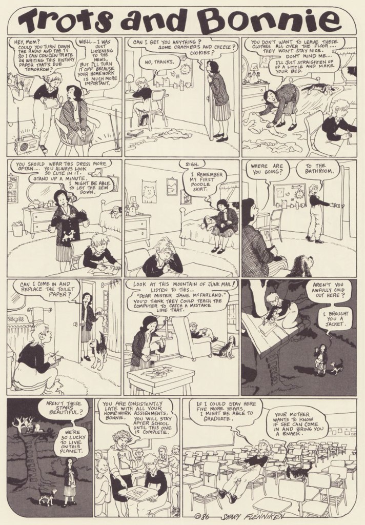
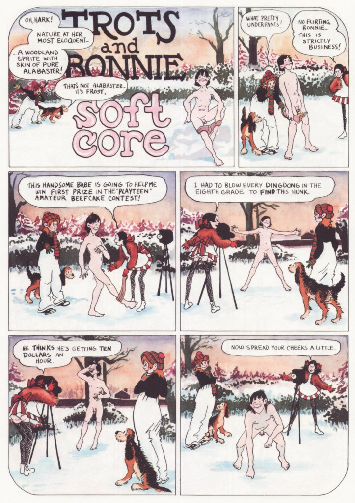
« Bonnie and Pepsi are obsessed with sex, but they’re not there for the male gaze. Their desire is frank and straightforward and more than a little demented, and it’s depicted with a bracing honesty that feels less like a political statement and more like Flenniken is reporting from the front lines with no filter, no safety net, and no intention of telling anything but the truth.»*
I first came across a Shary Flenniken‘s Trots and Bonnie strip in some random issue of National Lampoon. I can’t even really narrow down the decade**, as it ran within its pages from 1972 all the way to 1990. I was intrigued, but not enough to pursue it.
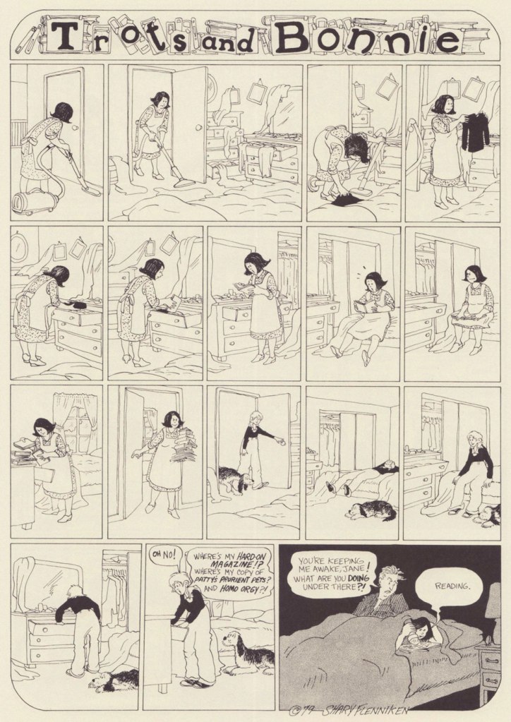
When New York Review Comics published a Trots and Bonnie collection in 2021, gathering 160 strips in a handsome hardcover volume, I was happy to finally be able to partake of T&B in a more organized fashion. One perplexing thing about this collection is that some strips were omitted due to concerns of misinterpretation***. It was apparently feared that some topics would be too controversial, or that the modern reader has lost the ability to interpret things in context. I would have liked the possibility of deciding what has or hasn’t aged well for myself. As it stands, this collection features strips offering a most varied list of topics to horrify the easily triggered (rape, racial epithets, kids getting shot, electrocuted and castrated – albeit by other kids – and pedophilia), so I am truly curious what the censored strips were about. I guess I am now doomed to collect National Lampoon issues (to be fair, the latter was home to many a great cartoonist – Rick Geary, M.K. Brown, Stan Mack, etc.)
Trots and Bonnie is a hilarious strip, and it’s also quite unsettling in the best of ways. While both cartoonists would surely be offended by this comparison, it makes me think of some of Charles Rodrigues’ work (see Charles Rodrigues’ Pantheon of Scabrous Humour) – the same electrifying unwillingness to shy away from difficult topics, although Flenniken was doing it to make a point, and Rodrigues would do it for sheer perversity. More than once while reading T&B I would start wondering how far a certain storyline would go – and it went all the way to its logical (call it immoral, call it stomach-churning…) conclusion. Just take the Dr. Pepsi’s Vasectomy Clinic from 1974, a panel from which made it as the cover of the collection –
«Two youngish girls, dressed as medical professionals, appear to be playing doctor with a young boy, who lies under a sheet, grinning blankly at the viewer while one of the girls, brandishing a pair of scissors, cheerfully communicates something to the other one. A sweet-looking dog with fancy eyelashes lies at their feet. It’s only once you know the particular strip it comes from, in which Pepsi (the shorter firecracker) and Bonnie (the taller girl) attempt to give neighbor kid Elrod a vasectomy and wind up referring to themselves as a sex-change clinic, that you blanch a bit at the art choice. There you go. That’s “Trots and Bonnie” in a nutshell. » [source]
Boys are sometimes disconcerted by Pepsi’s aggressive style of lechery, but they’re mostly on board. To once again quote Emily Blake, ‘what Flenniken understands and brings gleefully to the page is that adolescent girlhood is positively feral and that teenage girls are both threatened and threats themselves.’ Given that highschools are breeding grounds for boys cruelly bullying flat-chested girls, I can see why Flenniken decided to flip the tables.
There’s so much to unpack here – Trots as the voice of the male gaze, female camaraderie, the hilarious but tragic response of the woman to the suggestion of cream (eliciting a sort semi-guffaw, semi-yelp from this reader), a hint at social unrest caused by police brutality, and that’s just skimming the surface. Flenniken says, ‘You might say I was taking the subject lightly here, but at least I was introducing this to an audience that wasn’t going to see anything like this anywhere else‘. Amen.
It’s also a charming strip, with a heroïne who is refreshingly in no hurry to grow up (despite being prodded into it by her early bloomer friend Pepsi, ‘dressed in incongruously childlike pinafore paired with fishnets, a perfect metaphor for the terrifying underage sex fiend she is’). Bonnie dresses like a tomboy, hates going out with her parents, and collects sex magazines and prophylactics like other kids collect marbles. In a world of sleazy men with a creepy predilection for pre-adolescent flesh, she somehow manages to remain an innocent, and shrug off any unpleasantness in favour of a wide-eyed curiosity about everything, be it boys’ cock sizes or sci-fi movies.
I can 100% relate to the thrill of first seeing a naked man (well, maybe not a dead one, though), and at that age I would probably be running around with a jar of lymph nodes as well, given half a chance.
I’ve included more ‘innocent’ strips to showcase that Bonnie is a normal kid with a normal (if staid as hell, especially for the 70s) set of parents. It seems that Flenniken’s friend Mark Evanier suggested Trots’ punchline.
Will men find this strip as hilarious as I do? No idea. But it reminds me of today’s conversation with a (male, gay) colleague, in which he learned that women usually have two or three categories of underwear and spent the rest of the day marvelling at this fact.
I find it charming that there’s someone for everyone in this scene – neither group is focussing on the one best-looking member (accidental pun) to the exclusion of everybody else, but developing an inclusive cloud of lust.
‘I’m partial to gay male porn. And so is Bonnie’s mom now. If you can’t figure out why, you don’t need to know.’
The ridiculous (and lascivious, yuck – Bonnie’s body language makes it clear she is very much creeped out) approach of the psychiatrist is tempered by the punchline – Trots really can talk!
In case that isn’t clear, I heartily recommend purchasing the Trots & Bonnie collection.
~ ds
* This strip is hard to write about and do justice to, and I could not do any better than Emily Flake’s truly excellent introduction to the T&B collection.
** I found it – it was Women’s Erotic Art Gallery, published in 1975.
*** Flenniken explains, ‘the things that I did that we omitted here in this book, I think we looked at those and went, “oh, that might hurt somebody’s feelings or something.” That was me being naïve when I wrote those. A lot of times I was just exploring a subject rather than having a definitive stance. People are pretty darn outrageous today, more so than me. What has changed is what people think is offensive.‘
« I’m not saying I’m cool. That’s your job. » — Happy Bunny
When it comes to Jim Benton‘s work, it seems I got in on the ground floor, thanks to a friend’s shrewdly chosen gift of the man’s first cartoon collection, ‘Dealing With the Idiots in Your Life‘, twenty-nine years ago this Christmas. Yikes!
In a way, Benton’s nearly too obvious a subject for a post: his work is everywhere you turn, but such a large audience seems to have been reached at the cost of relative anonymity. In other words, people know his work, but they may not know his name. I’m sure his name does, however, enjoy some currency with a couple of generations of younger readers familiar with his Dear Dumb Diary (nearly 10 million sold!) and Franny K. Stein (over five million sold) series.
Given his intimidatingly formidable output, I’ll stick to material from his first collection, which I like best anyhow… which is not to say, echoing what all and sundry tell Sandy Bates in Stardust Memories, that I strictly prefer “the early, funny ones“. Mr. Benton is possibly even funnier — or at least more sophisticated — today than he was at the dawn of his career, but these early cartoons are less ubiquitous than this century’s crop.
At this stage, Benton’s style — both in concept and execution — still wore some heavy influences, namely that of Bernard Kliban.It wouldn’t surprise me one bit if this cartoon had near-universal appeal, given the fearful hold of cognitive dissonance: after all, most of us think others have a tenuous grasp on reality.Cute Citizen Kane reference.A timeless and oddly poignant state of affairs.Some of you will likely have occasion to muse over this very question during the Holidays.This one’s *very* Kliban-esque.In this one, I see a bit of his fellow Scholastic alum Tom Eaton‘s touches. All for the good.More Kliban (surely intentional!) but with sprinklings of Nicole Hollander and perhaps Scott Adams. Taking Will Rogers’ famous bon mot to its, er… logical conclusion. Here’s a jolly one for the season.
In closing, a bonus one from quite recent days. While I’m less fond of the digital tablet aesthetic of his latest work, his writing has acquired some even sharper edges. Sadly, this strip will likely be relevant only to medieval citizens of the German town of Hamelin, right?