« I would rather sit on a pumpkin and have it all to myself, than be crowded on a velvet cushion. » — Henry David Thoreau
Have you picked out that special pumpkin for your fast incoming (dark, presumably) celebrations? If not, better get on it — someone (or something) else may be casting covetous glances and about to call dibs.
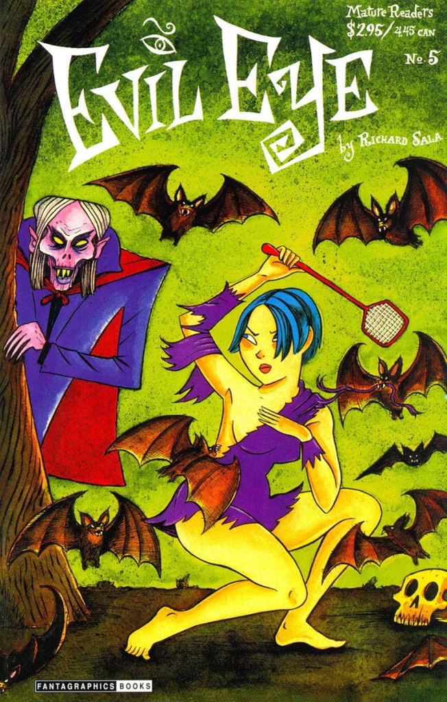
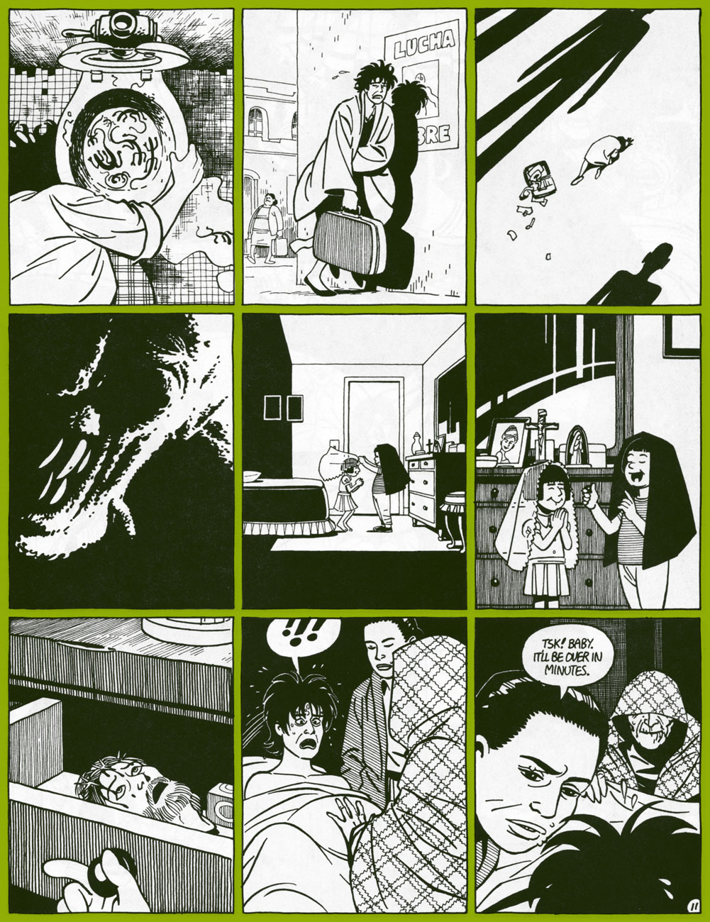
The lovely barefoot damsel is Richard Sala’s plucky heroïne (well, one of them!) Peculia. She was the star of Sala’s showcase title Evil Eye (1998-2004, Fantagraphics), as well as the graphic novel Peculia and the Groon Grove Vampires (2005). Fret not, she can fend for herself.
This is Evil Eye no. 2 (Oct. 1998, Fantagraphics).
This is Evil Eye no. 3 (Apr. 1999, Fantagraphics).
This is Evil Eye no. 5 (Mar. 2000, Fantagraphics).
As you may or may not have heard, Mr. Sala was one of the many notables we lost over the course of this nearly unparalleled Annus horribilis. Let’s remember him through this heartfelt eulogy penned by his closest friend and esteemed colleague, Mr. Daniel Clowes.
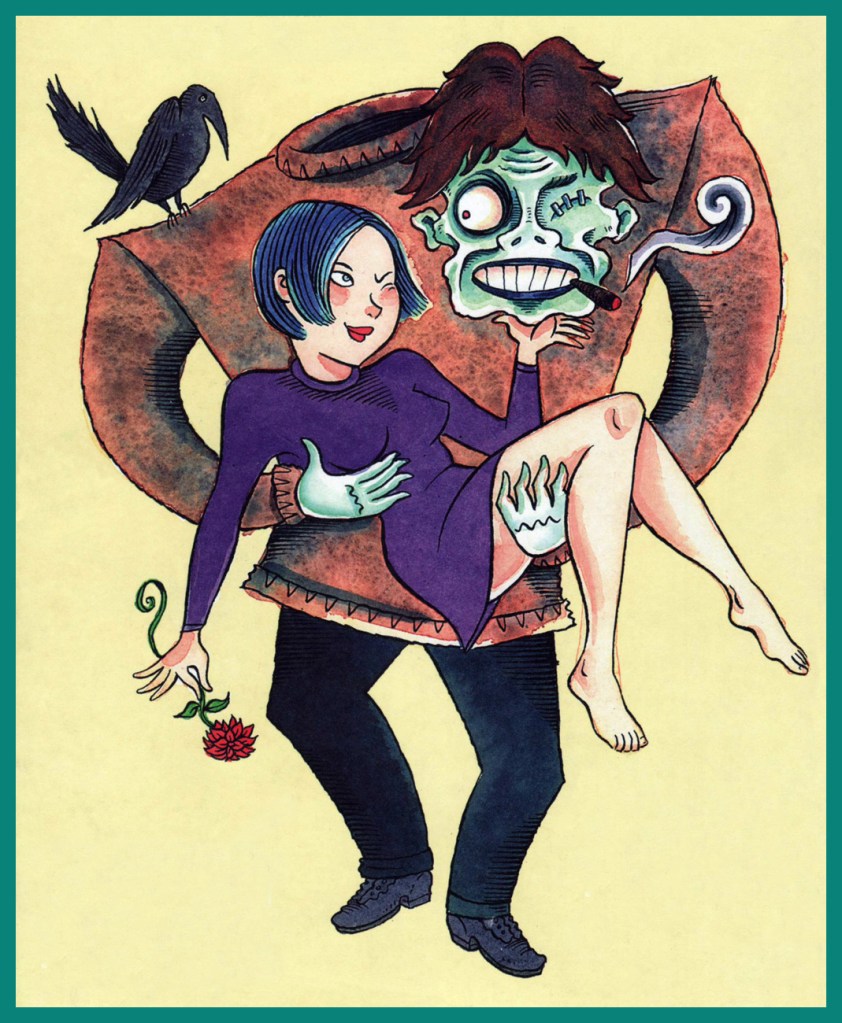
A fetching pinup from the back cover of the 2002 Peculia collection (2002, Fantagraphics).
« Then — when O’Flaherty turned on the light, his blood crystallized! »
This is Unknown World no. 1 (June 1952, Fawcett); cover painted by the rightly fabled Norman Saunders.
Its classic cover aside, this Fawcett one-shot is barely worth reading, save for the utterly bizarre Footprints on the Ceiling.
Synopsis:
The gangsters O’Flaherty and Flitcher train a revived dead dog to be a trick dog on stage. But they have to fight off hordes of skeletal zombies coming after them to bring the dog where it belongs – in the province of the dead.
Who came up with that scenario? (it’s not merely a rhetorical question: no one seems to officially know). Might its loopiness have in some small way inspired Bob Burden’s gonzo Flaming Carrot epic The Dead Dog Leaped Up and Flew Around the Room? It’s not such a stretch, given that Burden is no stranger to Golden Age comics, having been a-dealing in such goods, with a marked (and healthy) predilection for the oddball. Obviously.
Diving right into the splashy fray, here’s the immortal tale’s opening, from Flaming Carrot Comics no. 12 (May 1986, Renegade Press).
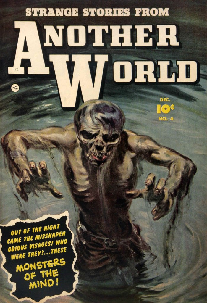
And here’s a bonus one from Mr. Saunders which, thanks to its decidedly muted palette, looks more like a pulp cover than a comic book. This is Strange Stories From Another World no. 4 (Dec. 1952, Fawcett), and you can read it here!
And after all these dead dogs, what do you say we enjoy the sight of a curious and healthy live one?
Wasting the wide range of my xeno-tech training on a home office job was like putting a carpenter in charge of the psycho-ward. Like any fish out of water, I didn’t fit in. Bureaucracy said I didn’t belong.
So they finally shipped me out.
‘Murder on the O’Brien Express‘, published in Keif Llama – Xeno-Tech no. 4
« The ability to think like another species is a rare and galactically valuable gift. Those who are capable of it are called xenotechs. »
Technically, Kēif Llama (pronounced keef yamma) is a government official specializing in communication with alien species. Off record, she tends to poke her nose into beehives, and wards off attempts to deter her from doing so until she gets to the bottom of whatever’s happening, often pursuing the investigation far beyond formal confed business. When the government wants her to provide an quick’n’easy solution, or to hush things up, she kicks up a well-justified fuss. For this reason, despite being a top-notch xeno-tech, the planets to which she gets sent are further and further away from civilized life, the missions assigned to her increasingly inconsequential. Inconsequential to the government, that is – following the thread of a seemingly random event, Llama often stumbles upon some serious plot, often than not concocted by some evil corporation (and occasionally supported by the government itself).
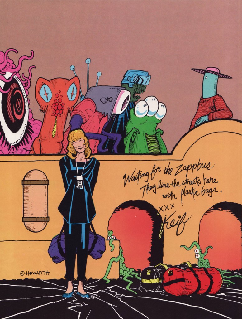
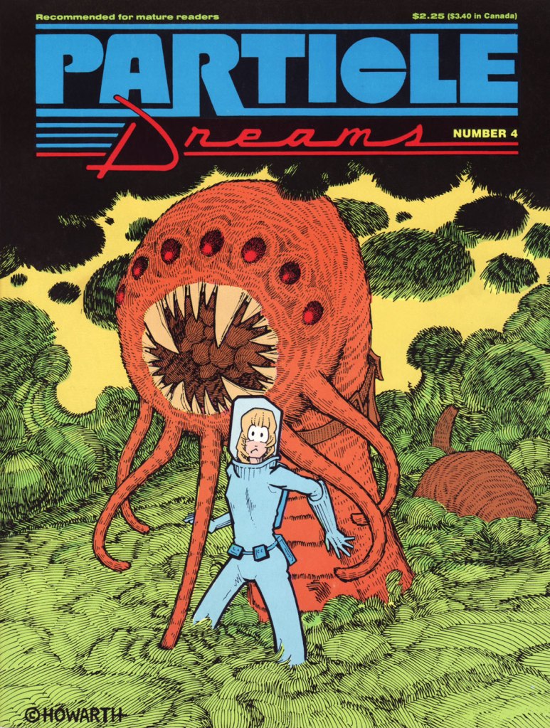
The back cover of Particle Dreams no. 1 (October 1986, Fantagraphics).
Her name is probably a sly wink to Keith Laumer, a sci-fi/fantasy writer whose Retief series is about a diplomat solving alien conflicts on various planets. Except that Retief always comes out with his nose clean and his credentials reinforced by his success. Llama, on the other hand, stumbles through the puzzling and melancholy worlds she’s banished to with an increasing sense of despondence and powerlessness. She often lacks information to make informed decisions, though not through lack of trying; and in this universe of shades of grey, it is often unclear which is right and which is wrong. Saving one alien life can lead to a whole planet perishing. Overlooking a minor detail means disaster, and when hindsight is 20/20, her burden of guilt is heavy to bear.
Particle Dreams no. 4 (June 1987, Fantagraphics).
In FF1986: Keif Llama, Lars Ingebrigtsen, who likes this series with a few reservations, argues that “The stories are problematic. More than a few of them end with a sense of “Huh? That’s the end? Did I miss something?” And most of them feature a genocide of some sort or another. After a while, it starts grating on you.” I would respectfully disagree: these stories are a bit like a slice of life. Sometimes we start in the middle of something that’s already under way, and sometimes we get but a small glimpse of some larger, out-of-reach picture. Not everything gets explained, but that’s not because Howarth couldn’t tie the ends of this plot together: he’s our guide through strange worlds, but even a guide doesn’t know everything. This is *excellent* science-fiction, as far as I’m concerned, imaginative and wide of scope. And Llama does have her moments of triumph (made more precious by their rarity), when she manages to outwit the fools, the bureaucrats, the religious fanatics whose actions would lead to a destruction of a precarious ecological balance or a grave injustice. Howarth’s hallmark humorous winks are scattered throughout the stories, giving the readers a welcome respite from the frequently heavy subject matter.
But more importantly, it’s those ‘problematic’ – whether downright cryptic or just lacking closure – endings that make Kēif Llama into a truly striking body of work. Depressing, it can certainly be (thus the importance to not binge-read your way through these comics, assuming you get your hands on a bunch of them at the same time). Yet as we accompany Llama on her ‘journey of discovery’ that leads her (and us) through a maze of corrupt (or just so weary they can’t be bothered) officials, profit-hungry conglomerates, macho idiots who can’t bear to take orders from women, and alien locals who mostly want to be left alone or refuse to explain their culture to an ‘ugly and smelly’ human, the weight of the universe Howarth has created settles squarely on our shoulders, and keeps us pinned until some uncomfortable truths are faced, commonly held beliefs are unravelled, and a few tears are shed. Happy endings often come at a heavy sacrifice.
Page from Particle Dreams no. 4 (June 1987, Fantagraphics).
On a lighter note, fans of Matt Howarth will indubitably have noticed the abundant presence of tentacles in all of his series. Howarth is exceptionally good at drawing aliens: tangible, ‘believable’ aliens who come in a staggering variety of shapes and sizes, and rarely look like some Earth animal with extra appendages (something artists of more limited imagination resort to quite a lot).
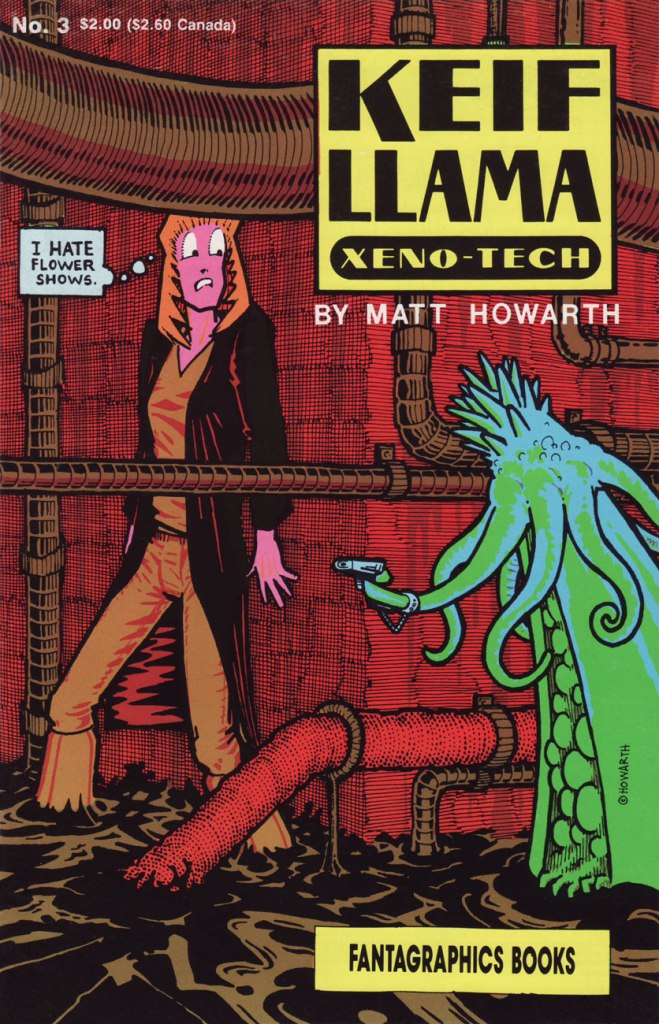
Patience, published in Particle Dreams no. 6 (November 1987, Fantagraphics).Keif Llama – Xeno-Tech no. 3 (November 1988, Fantagrahics).A page from The Thorn Beneath the Rose, published in Keif Llama – Xeno-Tech no. 3 (November 1988, Fantagraphics).
A small-time sheriff, alien as he may be, summarizes the type of thanks Llama frequently gets in this tirade: « You’re an ambulatory disaster area, Llama. Smuggling fiascos, international incidents, they can’t even ship you to the frontier without trouble following you. You’re in transit to Edison-Blue, Llama. I don’t want you or your bad luck in my town any longer than is painfully necessary. »
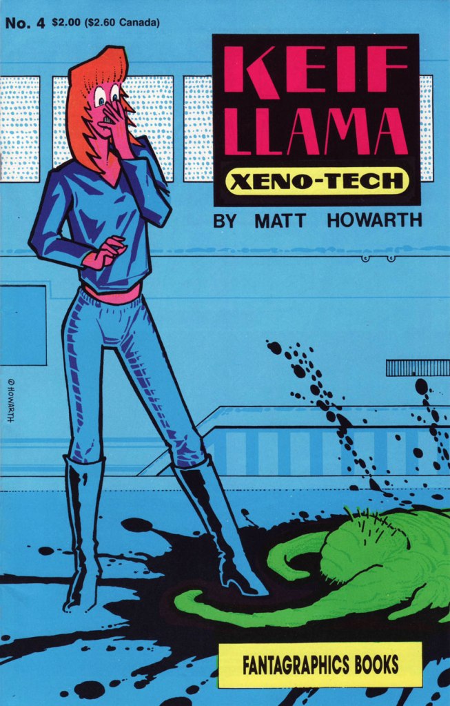
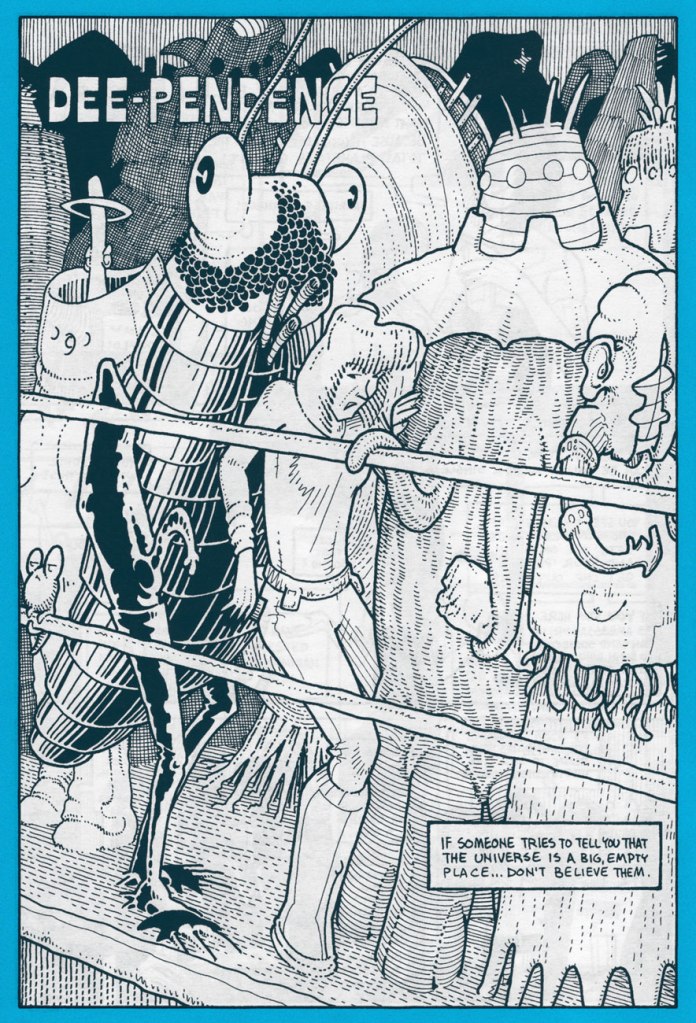
Keif Llama – Xeno-Tech no. 4 (December 1988, Fantagraphics).A page from Down and Out There, published in Keif Llama – Xeno-Tech no. 5 (January 1989, Fantagraphics).Page from Dee-Pendence, published in Keif Llama Xenotech vl 2. no. 3 (December 2005, Aeon).
« It is the beginning of wisdom when you recognize that the best you can do is choose which rules you want to live by, and it’s persistent and aggravated imbecility to pretend you can live without any. » — Wallace Stegner
It’s funny how, closing in on 300 posts, I’m only getting around to discussing some of my very favourite series. As my co-conspirator ds points out, these are far harder to do justice to.
Many of these were abject commercial failures, but providential glimpses into fully-formed universes we must leave forever unexplored save in our dreams. In the eighties and nineties, Fantagraphics were particularly courageous in following up on their principles (explicitly elaborated upon in the pages of The Comics Journal) and publishing material for which there wasn’t much of an obvious market. For instance, the four issues of Jim Woodring‘s pre-Frank anthology, Jim. Still my favourite work of his… but a definite commercial non-starter.
Meet Tommy Delaney, alias Kid Anarchy. This is Kid Anarchy no. 1 (Mar. 1991, Fantagraphics). Colours by Roberta Gregory.
He’s not really an anarchist, you know. This amusingly led an overly literal-minded, self-styled hardcore aficionado (from the nerve centre of American Punk, Monroe, LA) to testily complain to the authors: « Where do you get off calling your lame comic ‘Kid Anarchy’?!! Yup, I thought for sure this might have something to do with Anarchy, hardcore, social and political matters and so on, but what does it turn out to be? A deadbeat story about a bunch of rednecks sitting around a house. You guys suck! Why don’t you get your shit together and do something you understand, like a story about two posers wanking each other! Get a life! »
Ah, but Kid Anarchy could have been utter offal… had it conformed to that (mis)reader’s expectations. Anyway, see for yourself.
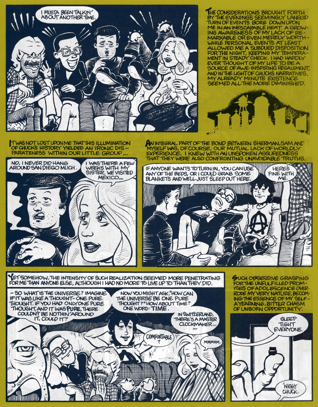
In full, the sequence that introduces our players. From Kid Anarchy no. 1.
Trading tales of youthful escapades until the wee hours, also from the first issue. Worth noting is the complementarity of the narrative and the dialogue, always a plus for this reader.
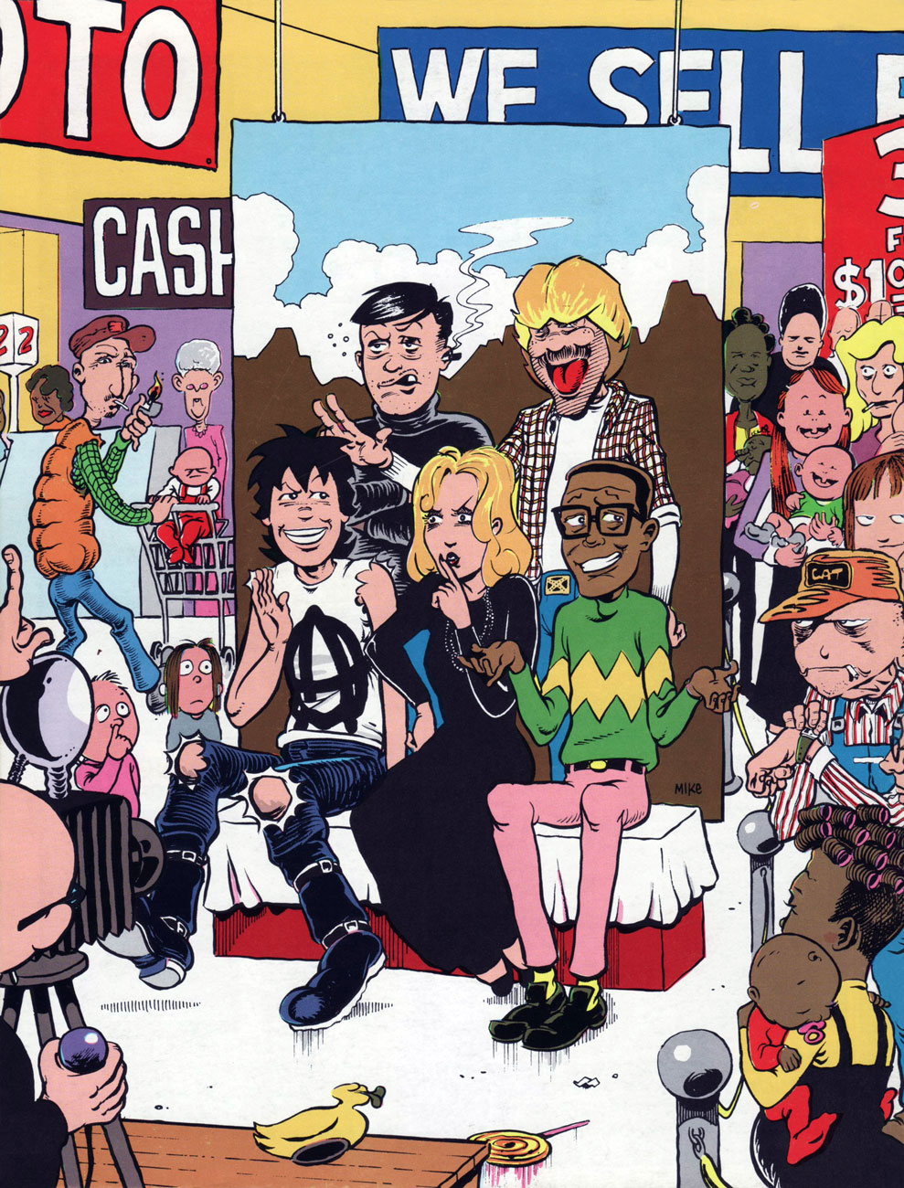
Let’s head over to Sears and sit for a group portrait, from the back cover of the inaugural issue.
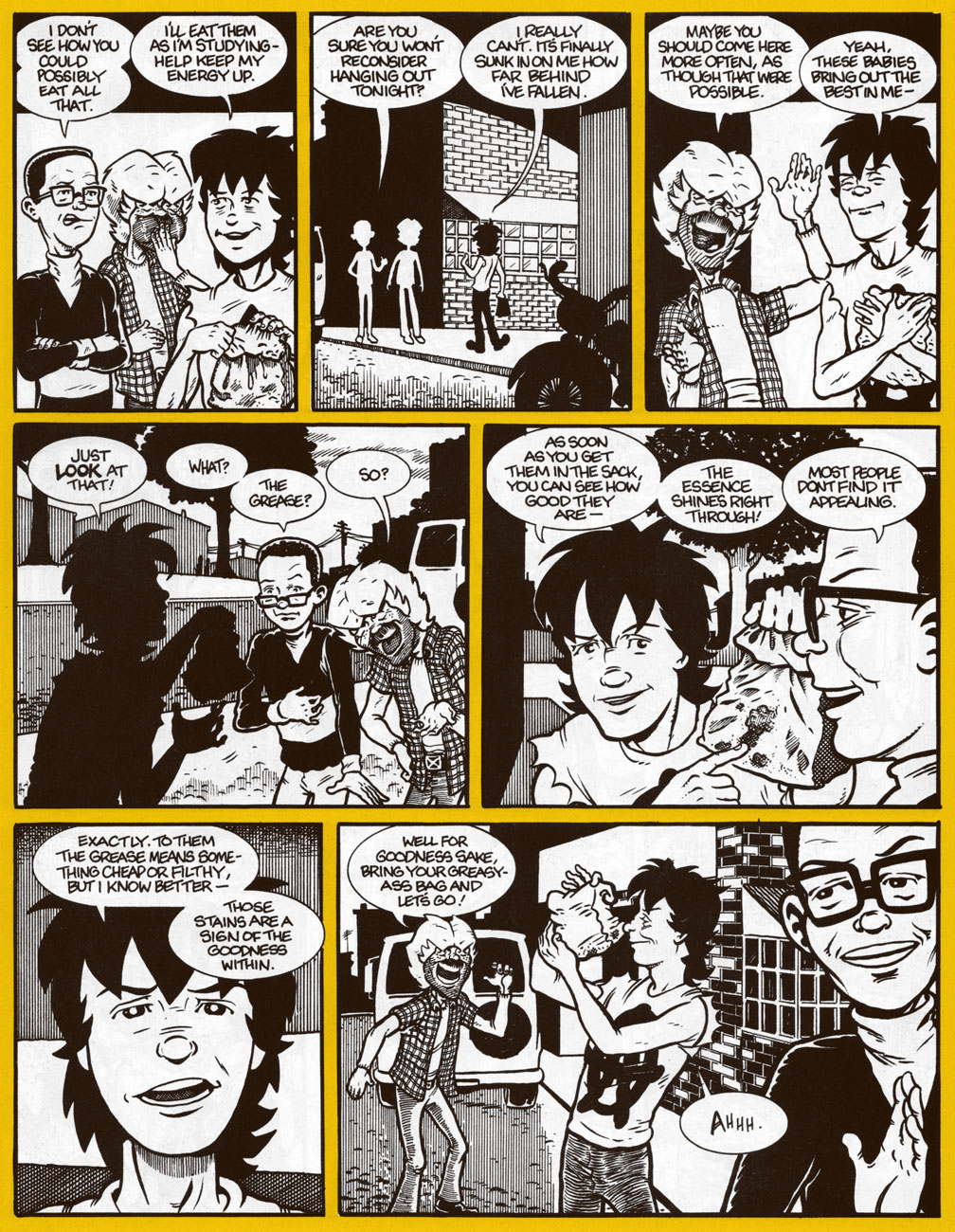
Two non-consecutive pages from a favourite sequence about the joys of grease. I no longer indulge in cheap-o burgers these days, but I get the same thrill from a paper bag full of samosas. One of the Kid’s wiser moments. The “goodness within”, indeed! Too bad he ends up accidentally leaving his “greasy-ass bag” behind in Sam’s van.
Nina gets her cover spotlight, showing us a glimpse of Pandemonium’s tatty arrière-boutique. This is Kid Anarchy no. 3 (Nov. 1992, Fantagraphics)
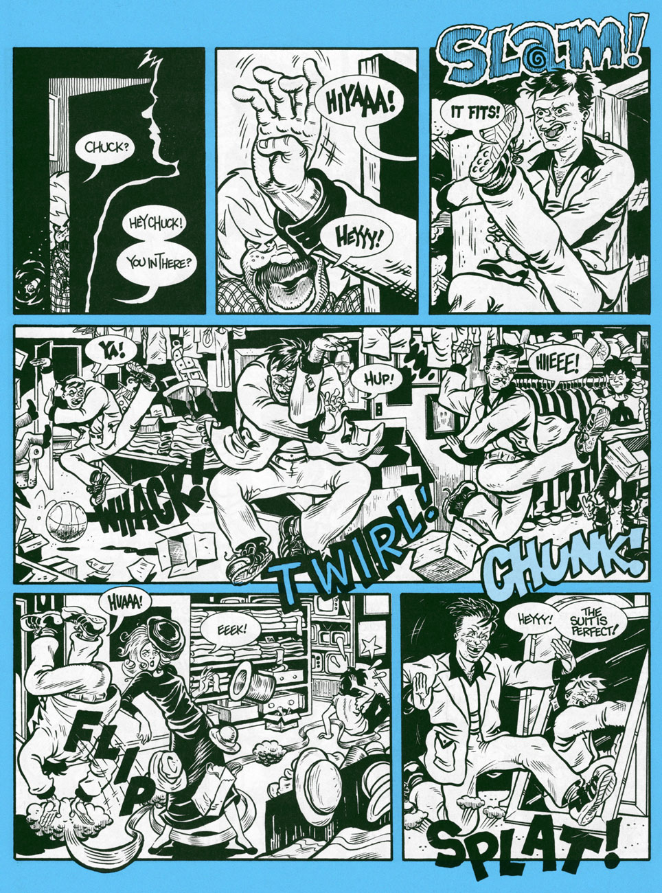
It’s not all quiet and introspection! Moonchow goes wild in the local Salvation Army dressing room! From Kid Anarchy no. 3.
To me, the deeply poignant charm of KA rests in its character study of a band of outsiders, drawn together by virtue of greater difference from the rest of the populace than from one another. While each of them outwardly appears to represent a ‘type’, this facile pigeonholing is defeated and contradicted at every turn. Not one of them fits the tidy category that convention and circumstance seek to wedge them into. Also notable is the tonal choice undergirding the narrative: let’s face it, young Tommy is generally a sullen, immature prick, while the authorial voice of his older self is honestly rueful and brimming with hard-earned insight. I would have loved to see where the story was bound: would the gang dissolve? Would we follow Tommy with a new entourage? What’s the sinister secret behind Pop’s low prices?
As it was, the third issue, appearing over a year after the second, made it clear that it was an indulgent boon from the publisher.
Artist John Michael ‘Jim’ McCarthy would go on to briefly (and often brilliantly) produce monster erotica for Fantagraphics’ company-rescuing Eros and Monsterbrands in the ’90s. Then the dusky lights of independent, impenitent, low-budget cinema beckoned! As for his old pal, writer George Cole… I just don’t know. Anyone?
« Mister X has always puzzled me. I’ve never been exactly certain where he came from. It seems like he has always been present — maybe not skulking through the perplexing shadows of the city so much as through some kind of collective unconsciousness. » — Dean Motter (1986)
On this day, back in 1953, the celebrated art director, graphic designer, writer-illustrator and cartoonist Dean Motter was born in Berea, Ohio, not far from Cleveland.
Over the course of his illustrious career, Motter has flitted in and out of comics, often in tandem with a rather remarkable array of collaborators, among them Jaime Hernandez, Paul Rivoche, Seth, Ty Templeton and Michael Lark… but just as frequently on his own.
As you’ll see, though he is quite adept in a vast range of media and techniques, nearly all of his mature work is lovingly filtered through his abiding interest in Will Eisner’s The Spirit, film noir, Art Deco, German Expressionism, with, I’d say, a soupçon of Soviet Propaganda art… resulting in a surprisingly cogent and coherent retro-futurist vision. The future as seen from the past, in short. And that’s just the visuals.
Ah, youthful indiscretions! Motter’s cover for the inaugural issue of the tabloid version of Andromeda (1974, Media Five; Bill Paul, editor). Herein, Motter wears some rather less highfalutin’ influences on his sleeve, notably those of Mssrs. Brunner,Kane and Steranko. « Focus Fire ~ white Eclipse The Aurora Anti-Cosmos Splitting Heavens Apocalypse. »… concluded Young Master Motter’s epic poem, Celestial Circuit Cirkus.
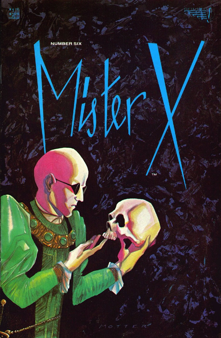
A nice change of pace to showcase his range, this is Motter’s cover for Mister X no. 6 (Dec. 1985, Vortex). This splendid logo, débuting here, would thankfully return from time to time.
This is Mister X no. 8 (Oct. 1986, Vortex); In its subtlety, this cover stretched the limits of what was technically possible in comics printing at the time, in terms of saturation and contrast.
In the late 1980s, Motter jumped at the chance to write and illustrate Shattered Visage (oh dear me, a Shelley quote!) a sequel to 60s British television classic The Prisoner (4 issues, prestige format). This is the (much improved) cover to a 2019 reprint (Titan Books) of the original 1990 DC Comics collected edition.
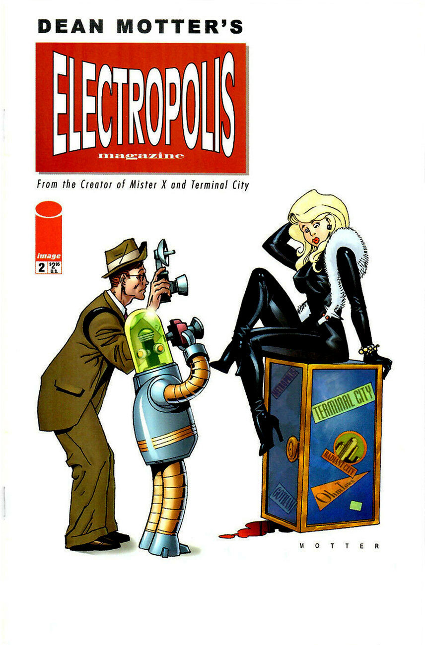
This is Electropolis no. 2 (Sept. 2001, Image), a spin-off of his Terminal City limited series (1996-97, DC Comics).
Page two of Epilogue Prologue from A1 no. 1 (Atomeka Press, 1989), story and art by Motter.
Cover from Mister X: Eviction no. 2 (June 2013, Dark Horse).
The cover of Dean Motter’s Mister X: Eviction & Other Stories (Nov. 2013. Dark Horse).
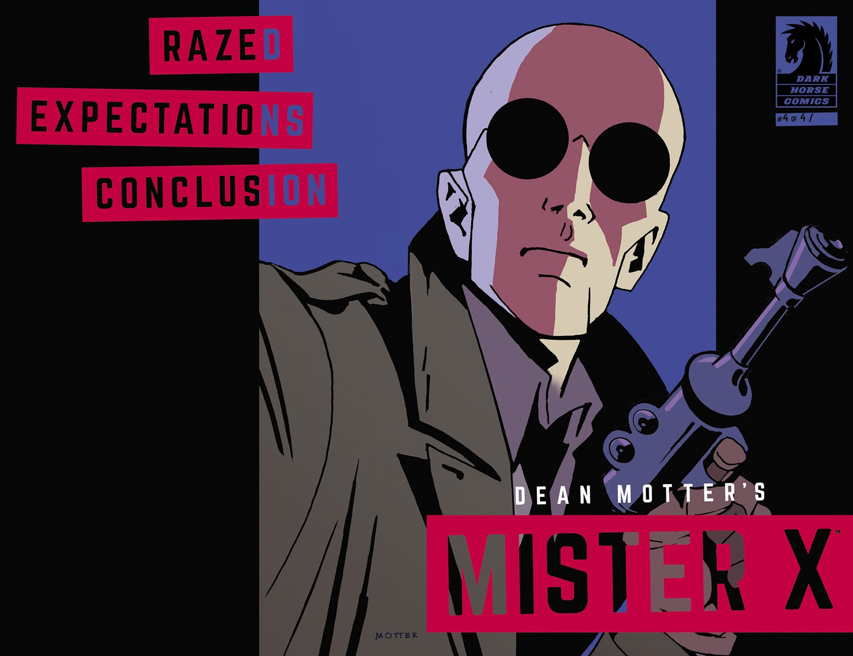
Front and back cover spread of Mister X: Razed no. 4 (May 2015, Dark Horse). Unusually done in gouache, if I’m not mistaken.
One of the current comics field’s crasser, most mercenary outfits, Dynamite Entertainment specializes in the frivolous mangling and mingling of established franchise properties, with the wankbait titillation ramped way the hell up and variant covers out the wazoo. Sample titles: Red Sonja & Vampirella Meet Betty & Veronica (twelve issues so far, as it’s so very high-concept), Barbarella / Dejah Thoris, or Army of Darkness / Xena… I mean, check out this train wreck of a lineup. Such is the power of their brain-dead crappitude that they even managed to produce an abysmal mini-series from a Roger Langridge script, a career first for the great man. Their not-so-secret weapon: in the hallowed publisher’s tradition of the old bait-and-switch, they don’t scrimp on the slick-as-spit cover artwork. This is The Shadow no. 25 (May 2014); a variant cover, need you even ask?
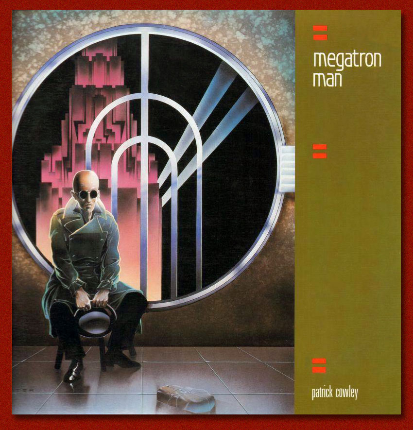
Aside from his comics work, Motter spent a considerable part of the 1980s working for the Canadian arm of what was then the biggest (and possibly stingiest) record label in the world, CBS/Sony, shepherding or designing beautiful and clever covers for albums that were often neither… but that’s an art director’s job, cynical as it may seem. Anyway, you know you’ve made it when your work rates a pastiche decades on; to wit:
This reminds me of how a single-minded, contrarian generation of Chuck Klostermans has taken over music criticism in order to wipe away the work of the Obama AdministrationRobert Christgaus and Dave Marshes of this world, aiming to vindicate and impose their beloved childhood bands, which once were the reigning critics’ whipping boys. Nowadays, you’ll find 4 and 5 star ratings (out of five, there’s no room here for moderation!) of Van Halen, Kiss, Loverboy and Journey albums, which was unthinkable at the time of their release. Plus ça change…
What is there left to do but to warmly wish Mr. Motter the finest of birthdays… at a safe distance? Alles Gute zum Geburtstag!
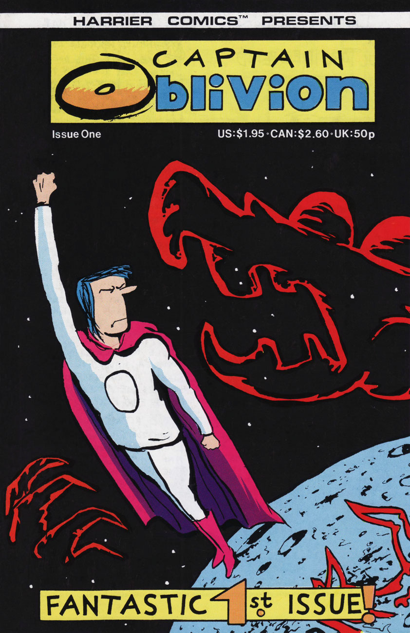
« What’s the point in eternity… if nothing ever changes? » — White Ant gets in the final bon mot (Captain Oblivion no. 1)
In the mid-1980s, the surprise success of Kevin Eastman and Peter Laird‘s Teenage Mutant Ninja Turtles touched off a veritable avalanche of ever crappier, hastily-assembled and cheaply-produced knockoffs — at least Eastman and Laird initially meant their creation as a joke. Oh, there were some real gems amidst the rubbish, but as Sturgeon’s Law tells us, the bad greatly outweighed the good, let alone the great. This is now known as the Great 1980s Black and White Comics Glut.
Among the good-to-great (well, to my taste) were a score of short-lived onomatopoeic humour anthologies such as !Gag! (Harrier), Honk! (Fantagraphics), Splat! (Mad Dog Graphics), Bop, Buzz, Twist (along with the venerable Snarf, all from Kitchen Sink)… the mutant progeny of Zap Comix, I suppose.
It was within the pages of Honk! that I was greeted by such across-the-pond talent as Eddie Campbell, Glenn Dakin, Phil Elliott and Paul Grist. Their work provided a sorely-needed gust of English country air to the superhero-fatigued reader, though one had to keep both eyes open, as alternative comics publishing in the ’80s was a maddening mixture of whack-a-mole and ‘throw stuff at the wall and see what sticks‘.
Now that the stage is set, I’ll share some of my favourite Dakin strips. He’s been a busy chap, creating several solo series: Temptation, Captain Oblivion/Abe Rat, Robot Crusoe; collaborations: Paris: the Man of Plaster (with Steve Way), Mr. Day and Mr. Night, The Man From CancerandGreenhouse Warriors (all with Phil Elliott), as well as YA novels (the spooky Candle Man) and animation (the astonishing Shaun the Sheep).
Today, I’ll focus of my very favourite Dakin creation (his most understated and personal), the fancifully autobiographical Abe Rat.
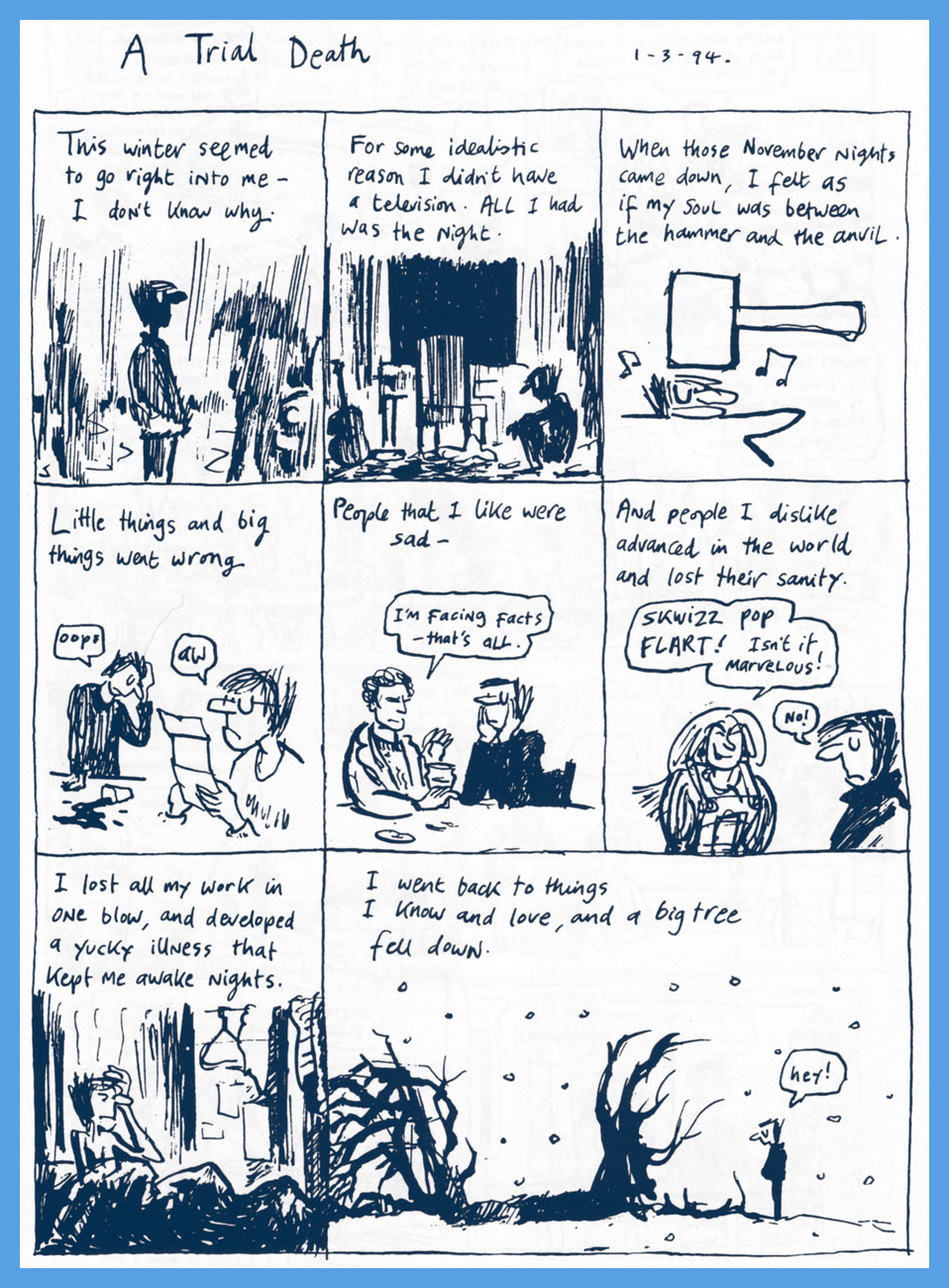
A Song of Spring was originally published in Fast Fiction no. 14 (April 1985, Fast Fiction).
As this Captain Oblivion one-shot was left out of the Abe collection (the original artwork was lost!), the completist will want this one as well… and will not be disappointed nor go broke in the process. This is Captain Oblivion no. 1 (Aug. 1987, Harrier). Cover colours by Mr. Phil Elliott.
Dakin’s comrade-in-ink Eddie Campbell (Abe’s his fave Dakin strip too) provides the introduction to the collection, and therein shares these thoughts: « Back when we were doing our little photocopied comics (what I term ‘small press’) in the ’80s, we constantly challenged each other to take the comics form in new directions. Dakin evolved in exciting ways in his Abe stories. The were autobiographical, but more concerned with the inner life than the physical one. He arrived at an approach which I termed ‘discourse’. He would devise characters and symbols, and borrow others, combining them in argumentative juxtapositions. There would be passages where he’d use a character from history or a novel to push his contemplation towards a resolution. Once he even called a halt to proceedings and ran a variant ending. »
Thanks for reading, hope you enjoyed making Abe’s acquaintance.
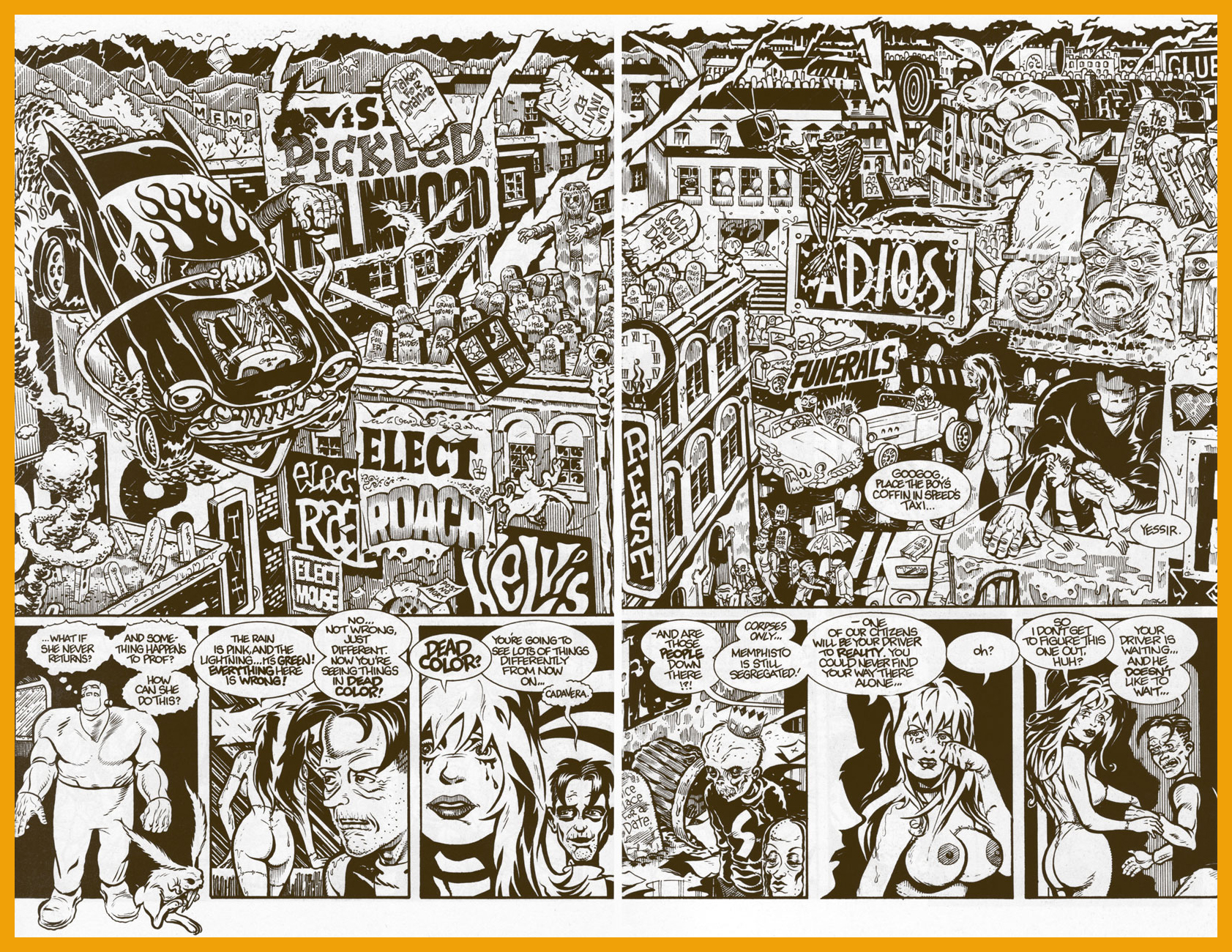
« Sharon… Marilyn… Jayne… Eva… Claudia… plus bits and pieces of bit part actresses. » — Prof. Shelley recites Cadavera’s recipe
In the early 1990s, Seattle-based publisher Fantagraphics were in choppy financial waters. To save the ship, they went commercial… in their own fashion. Two speciality imprints were launched, most famously Eros Comix, but also the lesser-known Monster Comics.
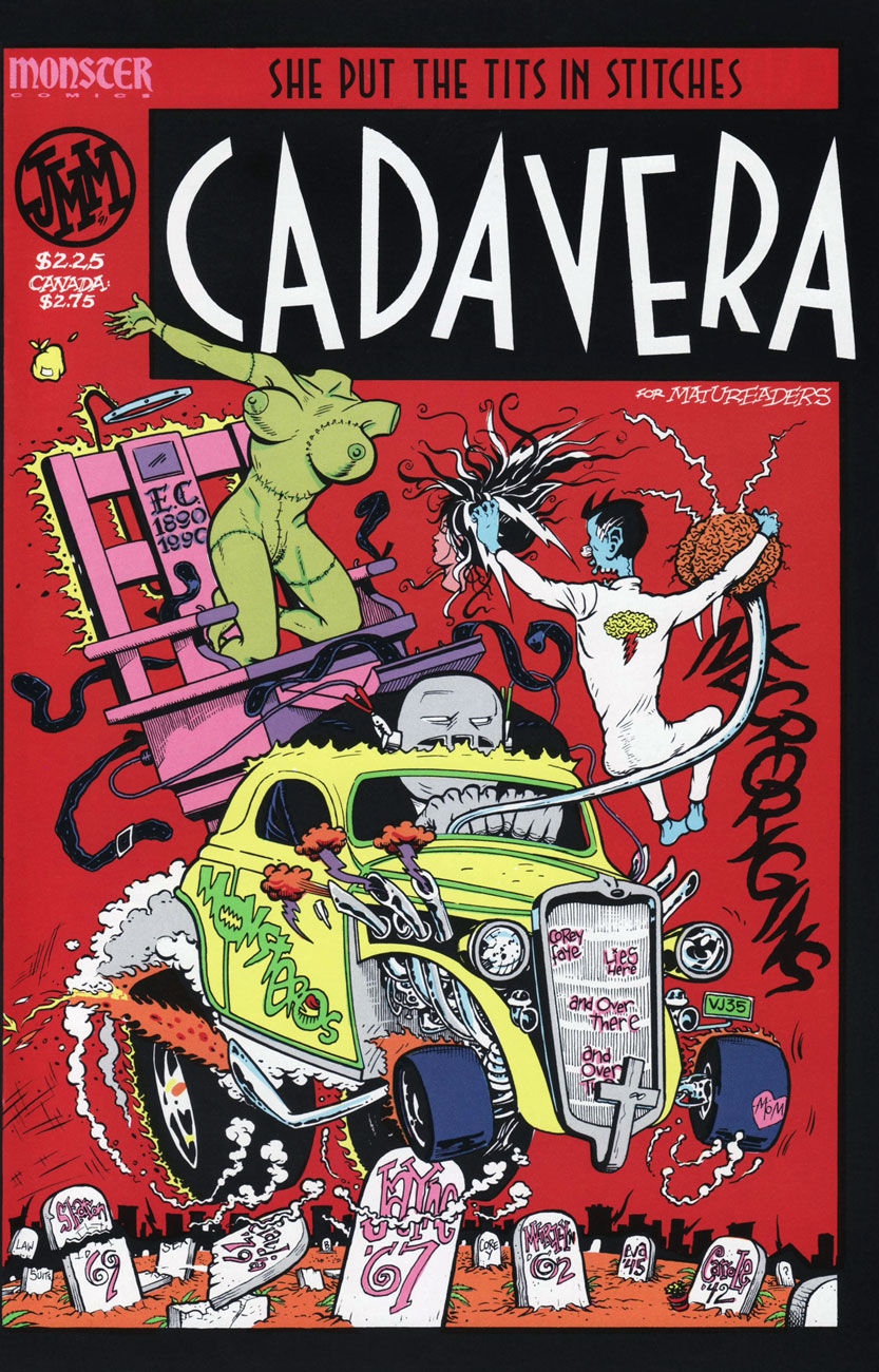
My own contender for the finest of Monster releases adroitly straddled both the erotic and the monstrous (and a few other genres besides): a two-issue wonder, Cadavera, was the hallucinatory, disembodied brainchild of Memphis cartoonist auteur John Michael McCarthy. Sadly, this raunchy-in-all-the-best-ways, rollicking saga-in-the-making, fireball of jolting ideas did nothing to help its publisher climb back into the black. But hot damn, did it ever give its all. However, in the speculator-frenzied, Image Comics-happy US marketplace of ’91? Oh, just forget it.
This is Cadavera no. 2 (Nov. 1991); artwork by John Michael McCarthy, who helpfully tells us that the « cover car is a ‘35 model Ford Model ’48 3-window coupe, original price $570. ». And isn’t that a doozy of a catchy slogan?
I know I could pull striking samples from these skinny pamphlets all the live long day, such is their level of visual craft and quotability, but I’ve checked, and you can still get copies for a song, so why spoil your eventual pleasure?
Meet Prof. Shelley’s hulking robot helper, Googog. From Cadavera no. 1 (March, 1991).
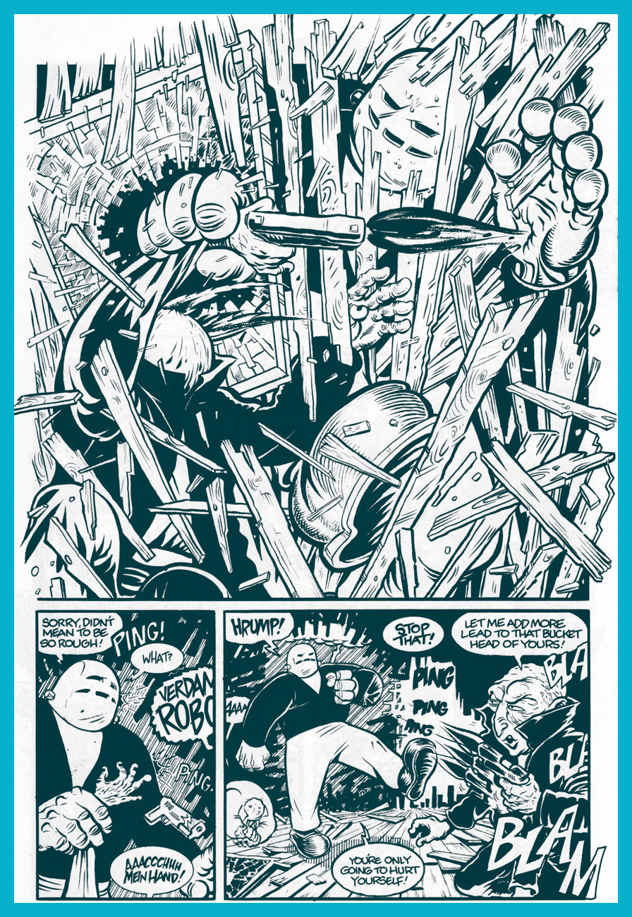
Cadavera no. 2, page 4.
Cadavera no. 2, pages 22-23. No-one could accuse Mr. McCarthy of being a slouch.
Anyway, all the gooey goods are accounted for in this « unofficial death certificate for unpopular culture »: punk rock, tabloid journalism, fascism, hot rods, hillbillies, Nazis (the original and the currently popular Neo (in)breed), mad science, robots, bunnies, Vice-Prez Chas. Manson…
The amazing Mr. McCarthy, after giving comics his more-than-game try (with Eros entries Supersexxx and Bang Gang, the one-shot movie tie-in Damselvis Daughter of Helvis and one of my all-time favourite series, Kid Anarchy, written by his pal George Cole), went the Roger Corman route and became a micro-budget filmmaker. There may be zero bucks in it, but that’s still a rosier financial situation than comics could offer.
« To hell with all those near-fatal quests and celebrity body parts! »
« I saw old Autumn in the misty morn stand shadowless like silence, listening to silence. » — Thomas Hood (1799-1845)
Jim Woodring‘s Frank, cogently termed « a bipedal, bucktoothed animal of uncertain species » was introduced to readers on the cover of Jim no. 4 (Dec. 1990, Fantagraphics), virtually straight from his genitor’s id. He would turn out to be Woodring’s most enduring creation. I was absolutely in awe of Woodring’s original, somewhat autobiographical showcase title, Jim. But it practically sold in the negative numbers (I recall an admiring / dismayed Dan Clowes stating something to that effect during an interview), and dammit, a genius like Woodring should be able to earn a living in freedom and dignity, so I understand the slight shift in gears. Though I miss Woodring’s tremendous verbal gifts, Frank’s is a rather extraordinary universe.
This is Tantalizing Stories no. 1 (Oct. 1992, Tundra), a duplex anthology shared by Woodring and Mark Martin. Painted cover by Woodring, of course.
Speaking of Tundra, its tale is quite a colourful one: it was the publisher that The Teenage Mutant Ninja Turtles built; an act of atonement? « Tundra was certainly, not to put too fine a point on it, the biggest and most absurd (as well as the most idealistic) publishing catastrophe in the history of comics — maybe in the history of the print medium. » [ source ]
Frank observes the signs of autumn, which puts him in a contemplative, melancholy mood; the middle tier of page 2.
Yeah, I’ve been to a couple of those parties too.
The party sequence; I wouldn’t want to spoil the ending, which comes one page later. Read the issue in full here. Woodring is of that rare complete breed of cartoonist, a uniquely soulful writer and a master of both black and white and colour rendering, quite autonomous but also a fine collaborator.
Woodring, nearly three decades down the line, has stated that he’s ‘extremely interested’ in wrapping up Frank’s adventures.
From the earliest issues of Love & Rockets (circa the early 1980s), it was quite evident that Jaime Hernandez was a cartoonist of the first order.
At first, he kept the tone of the proceedings fairly jovial; but gradually, a little darkness crept into the ambiance. Not systematically, mind you: it was just the natural course of things. For all that, he didn’t sacrifice one bit of his light touch; he was just expanding his range, the simple process of his artistic maturation.
The first time he fully demonstrated that he could evoke the texture and the essence of terror… was a milestone. In 1989’s Flies on the Ceiling, he stunned readers with a dizzying, yet understated tale that lifted the veil on a murky chapter of Izzy’s past. In the telling, he adroitly looses a startling panoply of techniques and ingredients that this reader wasn’t nearly prepared for. A true brain-singer.
Roman Catholic iconography, traditional Mexican beliefs and rituals, dead-on psychology, awful things hinted at in the margins. An excerpt from Flies on the Ceiling: the Story of Isabel in Mexico (Love & Rockets no. 29, Fantagraphics) [ Read it here. ]Jaime occasionally returns to the realm of the uncanny (we’ve featured him in a past countdown entry), but never treads the same path twice. A few further samples, if you will:
Poor Ray has a singularly vivid nightmare. Hopefully, that’s all it is. This ghoulish entry appeared on the back cover of Penny Century no. 3 (Sept. 1998, Fantagraphics). Story and art by Jaime Hernandez, colours by Chris Brownrigg.
La Bianca: a True Story appeared in the Gilbert Hernandez-edited all-ages anthology Measles no. 2 (Easter 1999, Fantagraphics.)
Death Race 2020 managed to be a pretty good series… for three issues (read ’em here!) The original creative combo was aces, three veterans from Brit SF institution 2000 AD, namely Pat Mills and Tony Skinner hatching the plots and Kevin O’Neill conveying them to visual glory. O’Neill scampered off after three issues (returning only to craft the series’ final cover), and things just weren’t the same without his sordid, madcap touch. It takes a special talent to depict compellingly *and* with a finely-tuned, subversive tone, this level of carnage and mayhem. Such talent, obviously, is ever in short, and possibly dwindling, supply.
But… we’re not here for the main feature. Buried in the back pages amidst the ads (mostly touting the alt-rock of the day) was a regular one-page hi-concept feature crafted by a succession of young (or young-ish) artistic iconoclasts. I suspect it was the fevered brainchild of former The Comics Journal managing editor Robert Boyd (1989-1990), also the editor of Death Race 2020. If this were Facebook, I’d show you my favourite example and move on to the next pretty shiny bauble. But through the pixie magic of blogging, I can afford to be utterly profligate and fling the whole delirious jumble your way. And so…
Story and art by Dave Cooper, from Death Race 2020 no. 1 (April, 1995).
Story and art by Pat Moriarty, from Death Race 2020 no. 2 (May, 1995).
Story and art by Bob Fingerman, from Death Race 2020 no. 3 (June, 1995).
Story and art by Jay Stephens, from Death Race 2020 no. 5 (August, 1995).
Story and art by Fábio Zimbres, from Death Race 2020 no. 6 (September, 1995). In these troubled days, I imagine many a Brazilian pines for the halcyon days of JK, faced with the reality of JB.
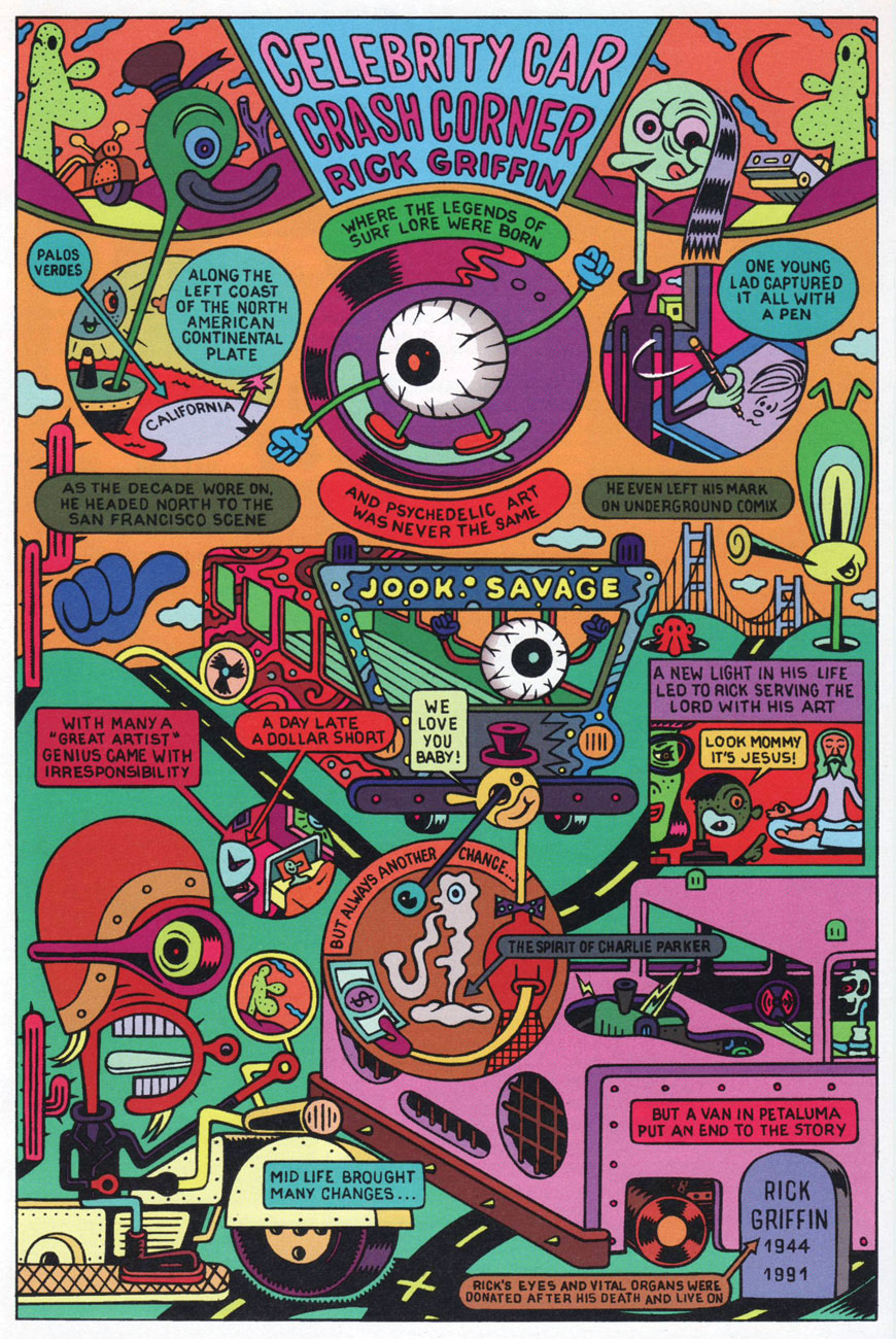
Story and art by Jaca Weiss and Robert Weiss, from Death Race 2020 no. 7 (October, 1995). For a look at some actual Rick Griffin art, look no further than here.
Story and art by Matthew Guest, from Death Race 2020 no. 8 (November, 1995).
To wit… a prime example of the aforementioned. By now, I’d like to think that most people have come to realize that the gendered driver question is a complex and fraught one. Here are some relevant statistics, if that’s your thing. You guessed it, things aren’t fair.
Drive safe, folks, and keep your eyes and mind on the road. The rest of us will appreciate it.
« Technology is constantly improving our lives. Look at the cellular telephone. Just ten years ago, virtually nobody was able to get into a car crash caused by trying to steer and dial at the same time; today, people do this all the time. » — Dave Barry