« When I grow up I would like to be an artist in France. » — Keith Haring
The other day, while weighing the idea of producing this post, I asked my wife: “Is Sempé too obvious a choice?”, to which she wisely replied: “To whom?”. To add another few grammes of perspective, I’m reminded of how, a decade-or-so ago, I was helping out a friend by manning his business phones while he took a vacation. One caller identified herself as Mme Sempé. I immediately asked whether she was related to the cartoonist. She was (they’re second cousins), but rather shockingly, this was the first time anyone had ever brought up the subject with her. Okay, so not so obvious after all.
If you only know Jean-Jacques Sempé‘s work through his cover illustrations for The New Yorker, well, you’ve missed his finest. Sempé (born August 17, 1932, in Bordeaux, France; died August 11, 2022, just a few days short of his 90th birthday) was recruited in the late 70s, in the twilight of editor William Shawn‘s tenure (1952-87) with the magazine. To be quite frank, Sempé’s New Yorker work is his weakest, comprising almost invariably mawkish scenes of the dying arts: little girls practicing scales at grand pianos, ballet rehearsals and grand operas. And the work has only grown more anachronistic and sentimental with time; I’d say he’s the least compelling cover artist currently working for the magazine, with the exception of art director Françoise Mouly‘s little chouchou, the stiff and bland Adrian Tomine, he of the lifeless line and emetic palette. Ahem.
But there was a time…
In 1968, a decade-and-a-half into Sempé’s career, ever-lucid Belgian writer and historian Jacques Sternberg perceptively summed up the artist’s appeal:
« But Sempé’s humour has earned the favour of a very wide audience. Without a doubt because he’s able to observe with a playful — but rarely sadistic — eye the drawbacks and peculiarities of our daily lives, and that his reader feels — mistakenly — reassured by this vision.
Sempé has, in fact, a way with an impressive setting, with meticulous detail, of the mise en scène that sugarcoats the bitter pill and of the lyrical flight that dampens the ferocity of the content. The miracle occurs as if by magic: Sempé, who is rather scathing, seduces rather than worries his readers. »
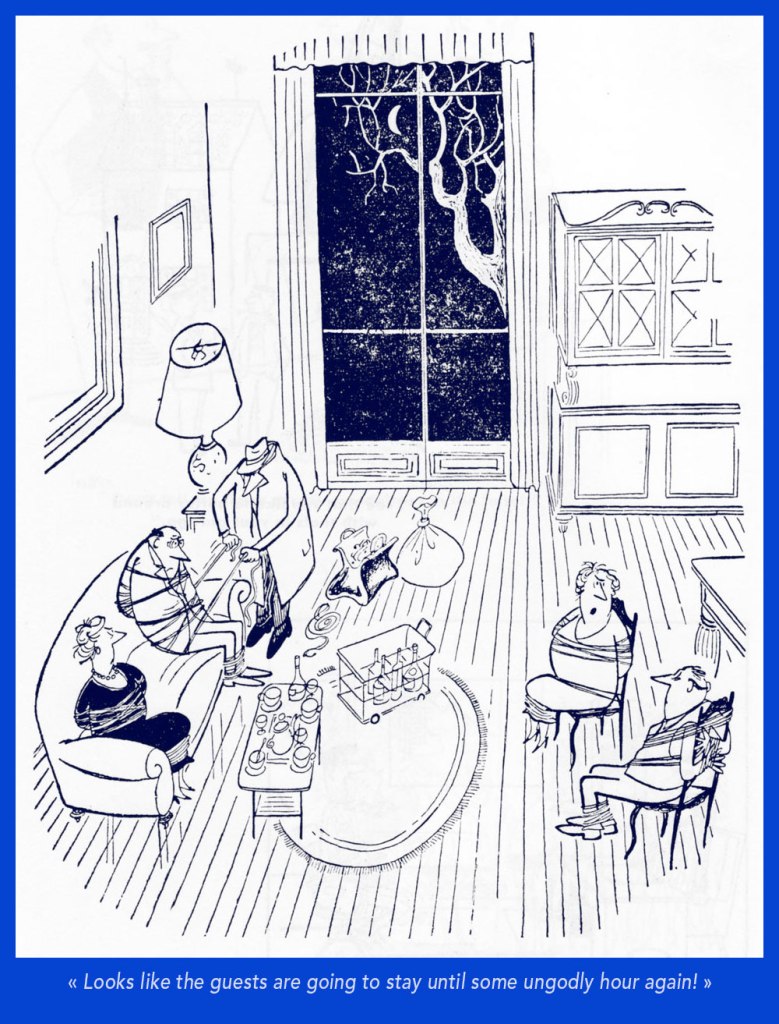
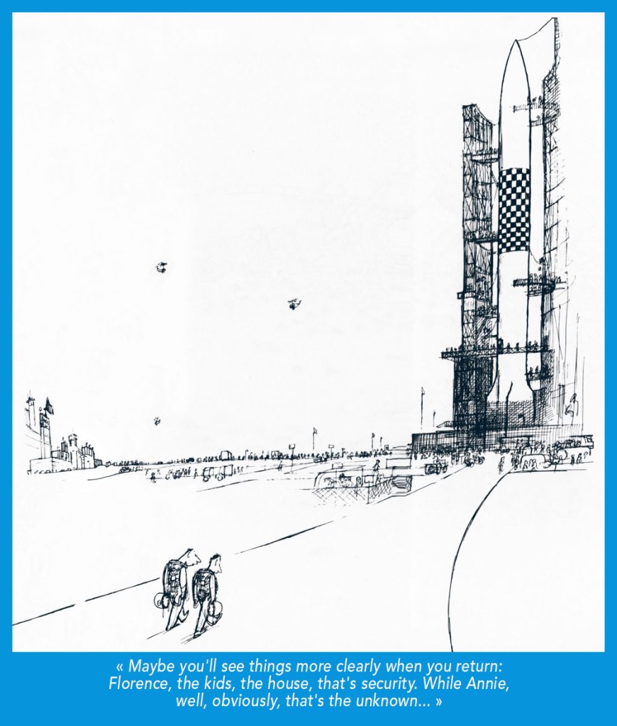
A cartoon that first saw print in the pages of Ici Paris in 1958.
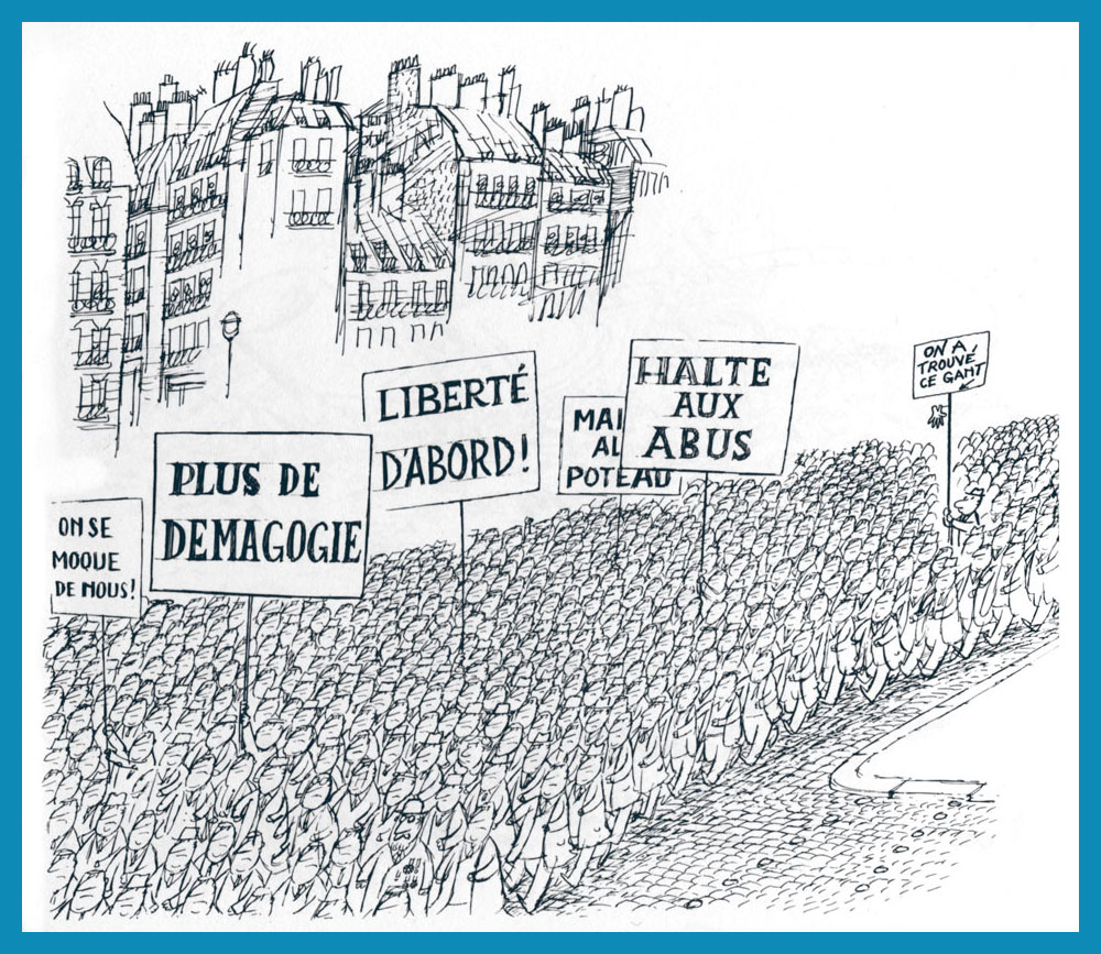
The signs say, from left to right: “They’re mocking us“; “Nomore demagoguery“; “Freedom First!“; “End the abuse“, “Down with…” and… “We have found this glove“.
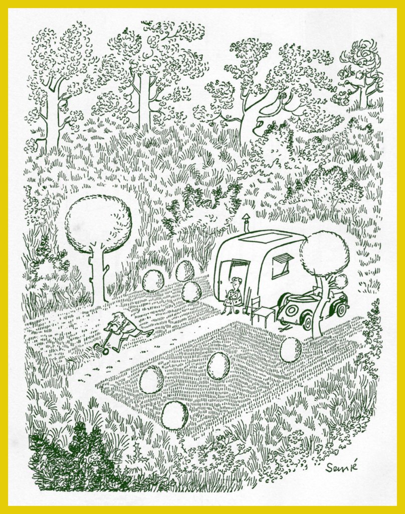
From France Dimanche (1957). This one strikes close to home for me. Makes me think of the sort of barbarians always seeking to ‘improve upon’ nature. A passage from friendly gadfly and crime writer Carl Hiassen‘s brilliantly scathing polemic, Team Rodent: How Disney Devours the World (1998) comes to mind:
« Disney is so good at being good that it manifests an evil; so uniformly efficient and courteous, so dependably clean and conscientious, so unfailingly entertaining that it’s unreal, and therefore is an agent of pure wickedness. Imagine promoting a universe in which raw Nature doesn’t fit because it doesn’t measure up; isn’t safe enough, accessible enough, predictable enough, even beautiful enough for company standards. Disney isn’t in the business of exploiting Nature so much as striving to improve upon it, constantly fine-tuning God’s work.
Lakes, for instance. Florida’s heartland is dappled with lovely tree-lined lakes, but the waters are often tea-colored from cypress bark. For postcard purposes, tea-colored water was deemed unsuitable for Disney World’s centerpiece, Bay Lake, so in the early 1970s Team Rodent sprang into action—yanking out many of the cypresses, draining the lake, scraping out the bottom muck, replacing it with imported sand, then refilling the crater. All this was done to make the water bluish and therefore more inviting to tourists. For good measure, Disney even added beaches.» [ read it here ]
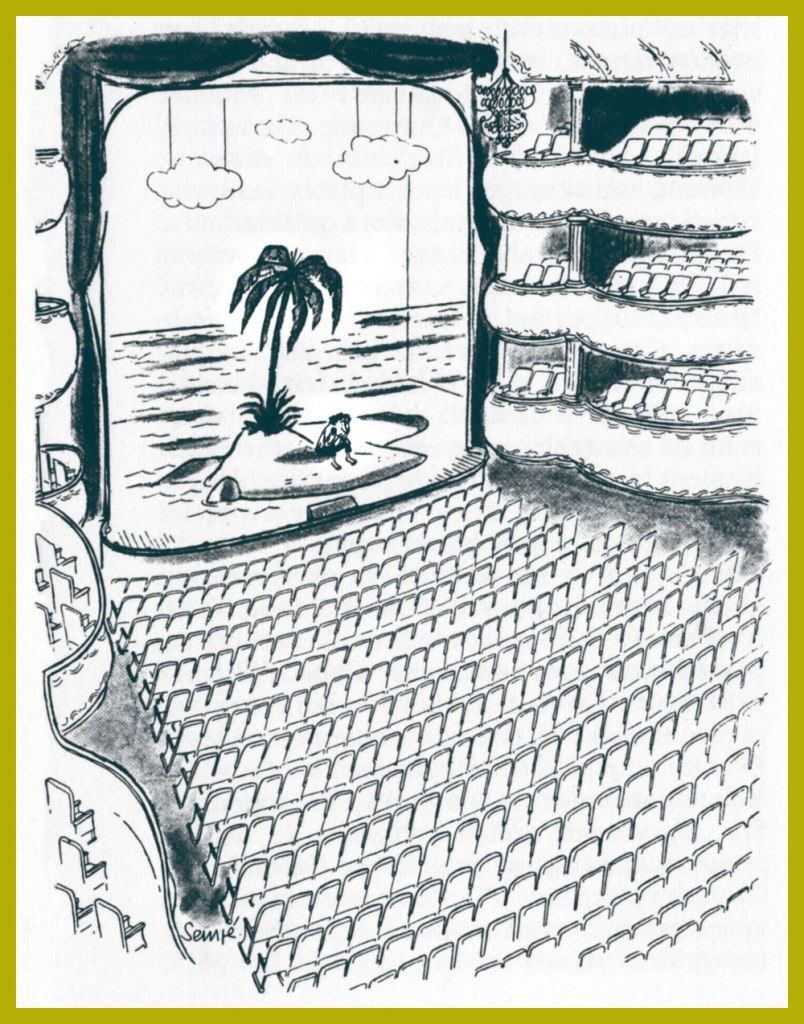
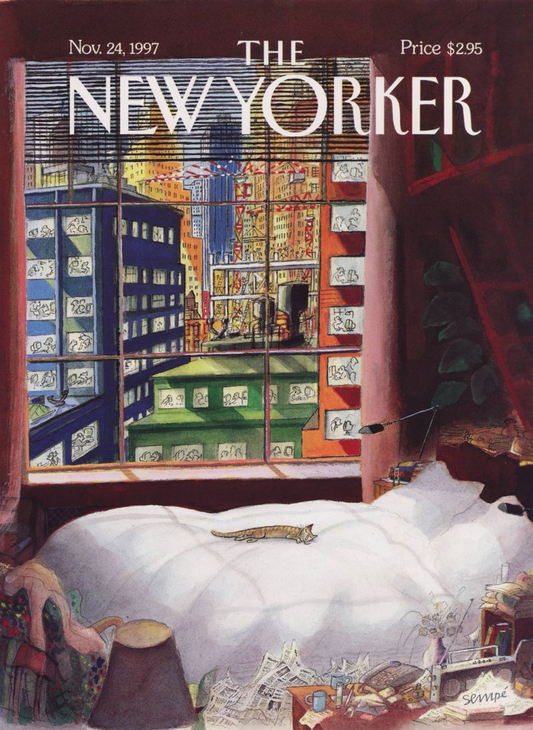
Naturally, I don’t dislike *all* of his New Yorker covers. This one, from the November 24, 1997 issue, is a peach.
« When a naked man is chasing a woman through an alley with a butcher knife and a hard-on, I figure he isn’t out collecting for the Red Cross. » — Clint Eastwood in Dirty Harry (1971)
As is often the case, I had something else in the pipeline for this week… but then I came across a beautiful biography of a wise man whose birthday was just around the corner. Now if the other guy (he’s 88) can just hold on and stay alive another week, things’ll be just fine.
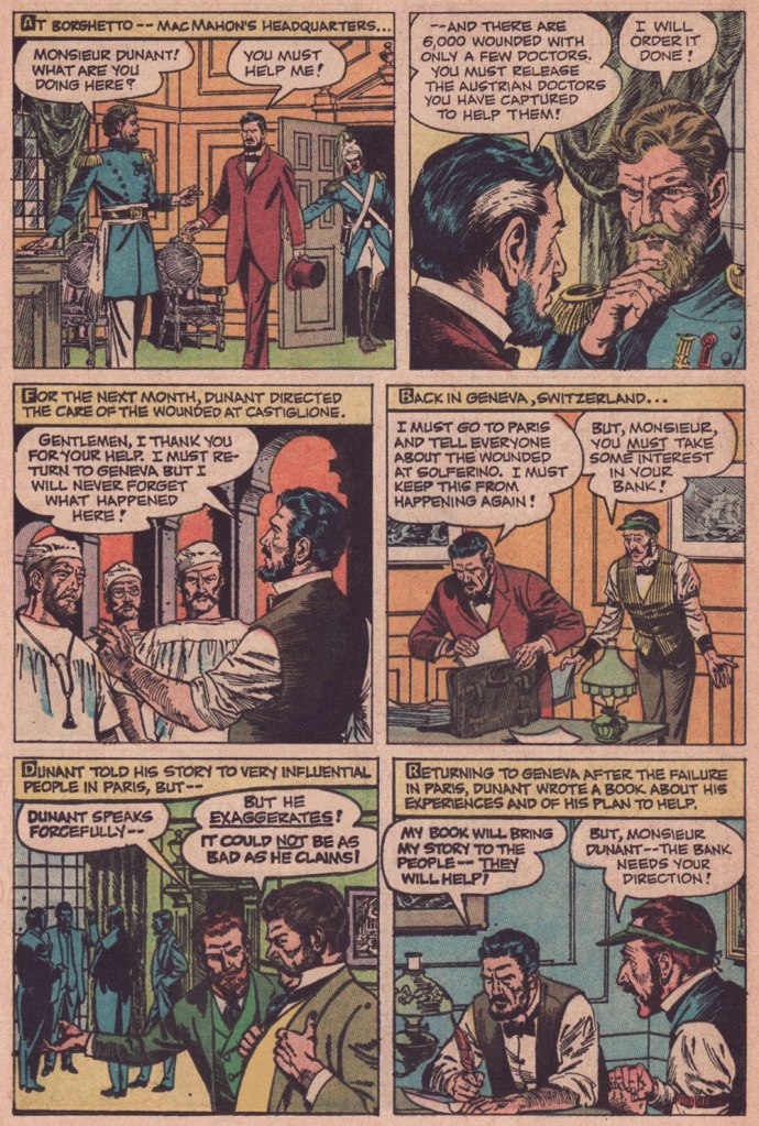
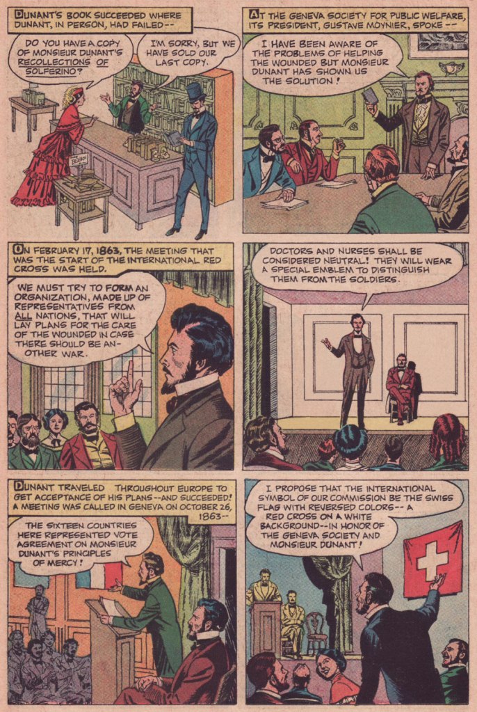
In these riotous days when acts and thoughts of kindness and compassion are being denounced as political and partisan, we would do well to remember the life and example of International Red Cross founder, Henri Dunant (né Jean-Henri Dunant, May 8, 1828 in Geneva, Switzerland). Read on…
To Treasure Chest’s credit, they’re not being tribal or sectarian at all: Dunant wasn’t even Catholic, but rather Calvinist.
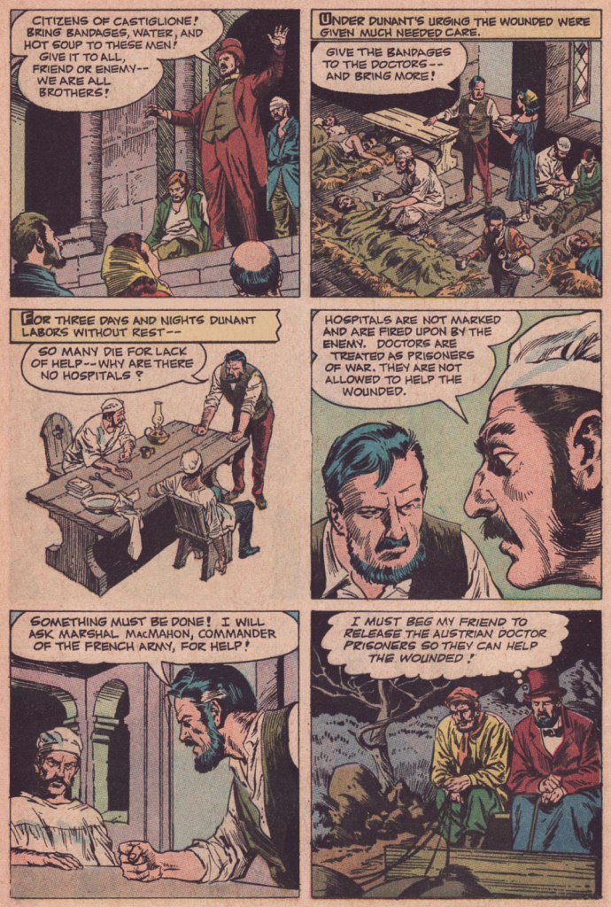
As you can witness, Reed Crandall (1917-1982) was not the type of artist to cut corners. Unlike some of his peers who could not be bothered to properly draw, say, details of background, period or costume, Crandall lavished attention and care to each and every element, yet without overpowering the narrative. His pages aren’t mere sequences of panels: they’re smartly composed for smoothness of flow and tonal balance.
Though nowadays his fame rests largely upon his brief but fruitful association with EC Comics (1953-56) and its echo at Warren Magazines (1964-1973), the greater bulk of his work was produced for Quality Comics (1941-1956) and for the catholic comics anthology Treasure Chest of Fun & Fact (1960-1972). All Men Are Brothers was, as it happens, his first work to be published in Treasure Chest.
Here’s a tongue-in-cheek but revealing snippet from a profile of Crandall that appeared in Creepy no. 10 (Aug. 1966, Warren):
« Combined with Reed’s fantastic drawing ability and mastery of rendering technique, is the rare ability to take any subject or setting and impart to it a complete sense of realism and authenticity. This, along with the fact that he is one of the most genial and unassuming men in the comics field, has earned him the high regard of his fellow artists, in addition to a growing circle of reader-admirers.
Asked about his ambitions, Reed replied: “To live in an ivory tower and to try to learn to draw and paint, also to pursue unendurable pleasure indefinitely prolonged.” It looks to us as though the drawing and painting are pretty far along already, so surely the ivory tower and prolonged pleasure can’t be too far behind… and in our opinion, it couldn’t happen to a nicer guy! »
As for writer John Randolph, who knows? He scripted twenty or so non-fiction pieces for TC between 1955 and 1962, then appears to have moved on. It must be noted that he understood the comics medium, as his work (often with Crandall) was well-paced and not overwritten, the words and visual in steady harmony. Many a writer, lacking the restraint and finesse required for the collaborative pas de deux of comics, tends to crowd out the illustrator, box him in (j’accuse, Al Feldstein!) or pointlessly restate what’s right there in the visuals (Et tu, True Believer?). Add to that the difficulty of elegantly condensing a life or career in six pages… as in this case. Take a bow, Mr. Randolph, whoever you are.
All Men Are Brothers originally appeared in Treasure Chest of Fun & Fact vol. 16 no. 7 (Dec. 8, 1960, Geo. A. Pflaum); cover by Crandall.
Crandall is most closely associated with the long-running Quality (and DC thereafter) character of Blackhawk (a Will Eisner co-creation). This is Modern Comics no. 78 (Oct. 1948, Quality). Between the operas, musicals, and films, John Luther Long’s Madame Butterfly sure gets around! Read the issue here!
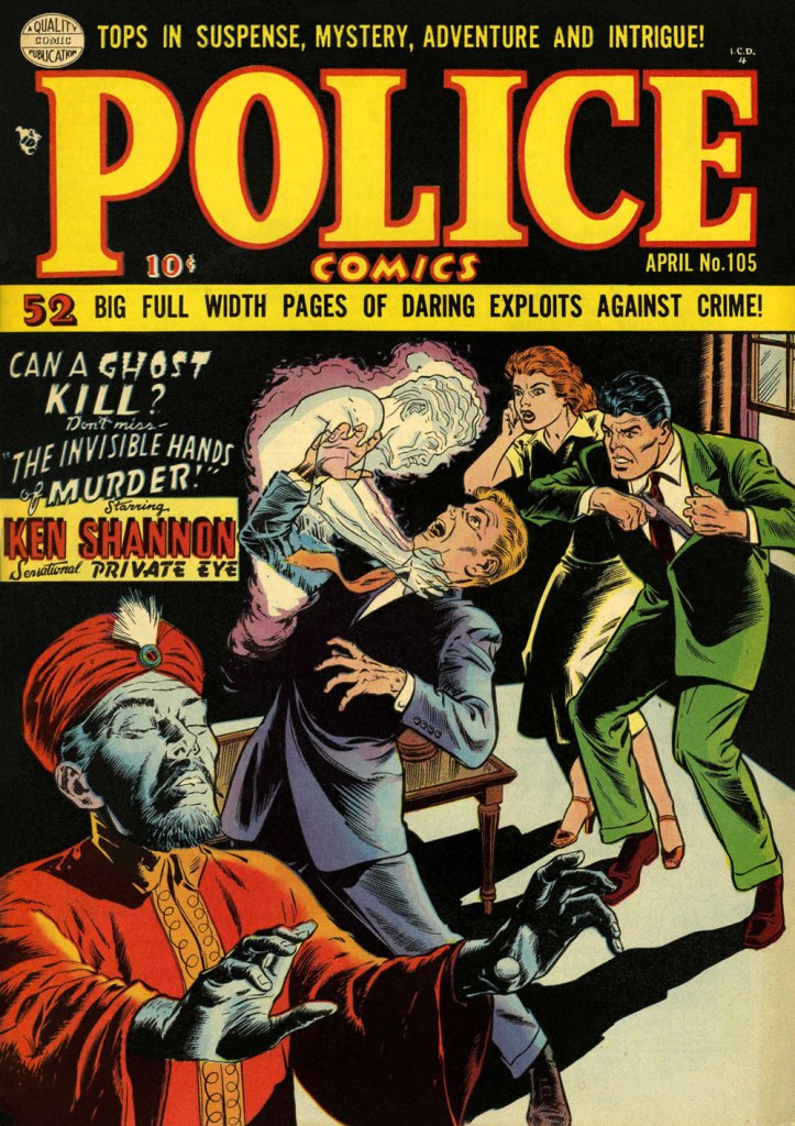
More orientalism, but what a cover! This is Police Comics no. 105 (Apr. 1951, Quality). This title was the former and first home of longtime headliner Plastic Man, who bowed out with issue 102. Superheroes, you’ll recall, suffered fading popularity by the early 1950s. Read the issue here!
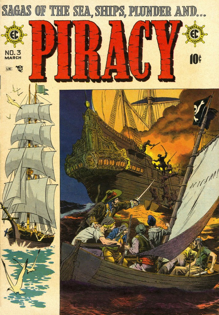
While Crandall arrived a bit late to the EC party, he made his lasting mark. Versatile as he was, I’d argue he was most in his element on this swashbuckling title, one of EC’s last-ditch, doomed attempts to placate the censors. Wally Wood drew the ship on the left, a recurring element of the cover layout. EC colourist Marie Severin (1929-2018) truly deserves a long round of applause for the sublime job she performed here. This is Piracy no. 3 (Feb.-Mar. 1955, EC).
« Suffering sea snakes! Can this really be happening, Aquaman? » — Aqualad has a query.
I just realised, a few days ago, that I’d left something hanging for too long: nearly two years ago, I turned the spotlight on a series of Aquaman covers, casually (in my debonair way) letting it be known that there existed another, earlier, and even longer (well, by one) run of exemplary Aquaman covers. The time has come to see whether I was talking through my hat… or not.
Now, at the risk of repeating myself, it must be stated that, since we’re dealing with DC’s late Silver Age, there’s more to any given cover than a signature. DC’s recently-ascended art director, Carmine Infantino, had a hand in designing virtually every DC cover between late 1966 and early 1976. How strong a hand varied from cover to cover, of course. A good designer sometimes knows when to hold back and be invisible, or just about.
Infantino always strove to improve himself and update and hone his skills. Well into his career (he’d started in 1940 at Timely), he pulled an unexpected (and very smart) move. As he recalled it in The Amazing World of Carmine Infantino (2000, Vanguard Productions):
« Around 1960, I went back to school again, this time to study under a gentleman named Jack Potter at the School of Visual Arts. What Jack taught me about design was monumental, and I went through a metamorphosis working with him. I’d sit there confused and he’d tear the work apart. But then it was a light bulb going off – bam! – and I’d understand everything he was getting at.
After studying with Potter at the SVA, my work started to grow by leaps and bounds. I was achieving individuality in my work that wasn’t there before.
I threw all the basics of cartooning out the window and focused on pure design. Everything I did was design-oriented. That was quite the challenging task. But that’s where Potter’s teaching took me.
… I started putting hands in captions, that was decorative. He taught us to do everything decoratively. I’d always found captions very dull. So I thought I’d break the captions into smaller paragraphs and use hands to get people to read them. I regularly pushed design and perspective to the extreme. »
And speaking of reinvention, I must also salute Nick Cardy’s own mid-career creative burst. Prior to the mid-60s, Cardy had always been one of those genteel, tasteful but entirely unexciting journeymen, the way most DC editors liked ’em. I can think of precious few long-timers that managed to convincingly reinvent themselves and greatly raise their game, well into their career, without utterly misplacing their original identity (that disqualifies you, Keith Giffen) in the process. Alex Toth, Jerry Grandenetti and perhaps Sheldon Mayer come to mind…
At any rate, when Infantino got together with Cardy on those covers, all hell broke loose, in the best possible way.
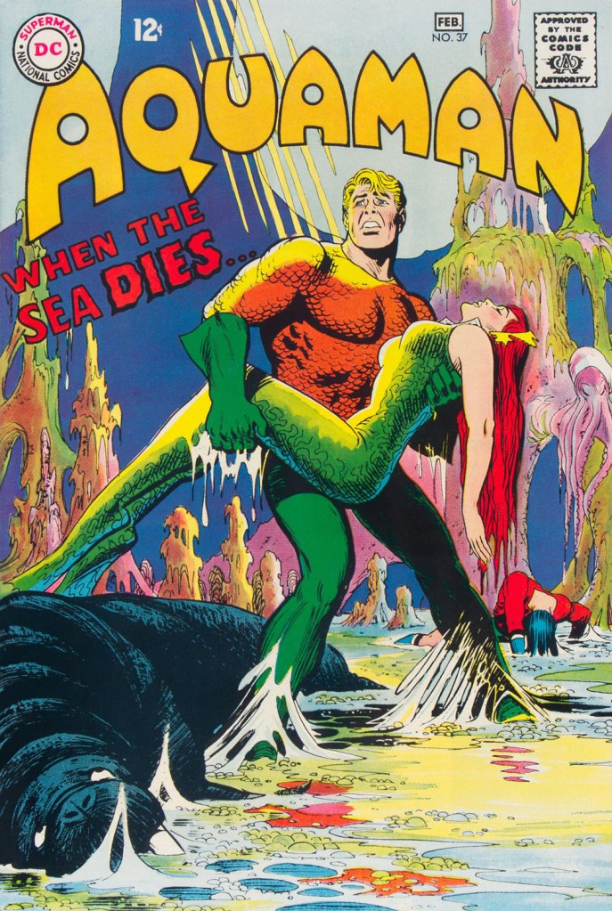
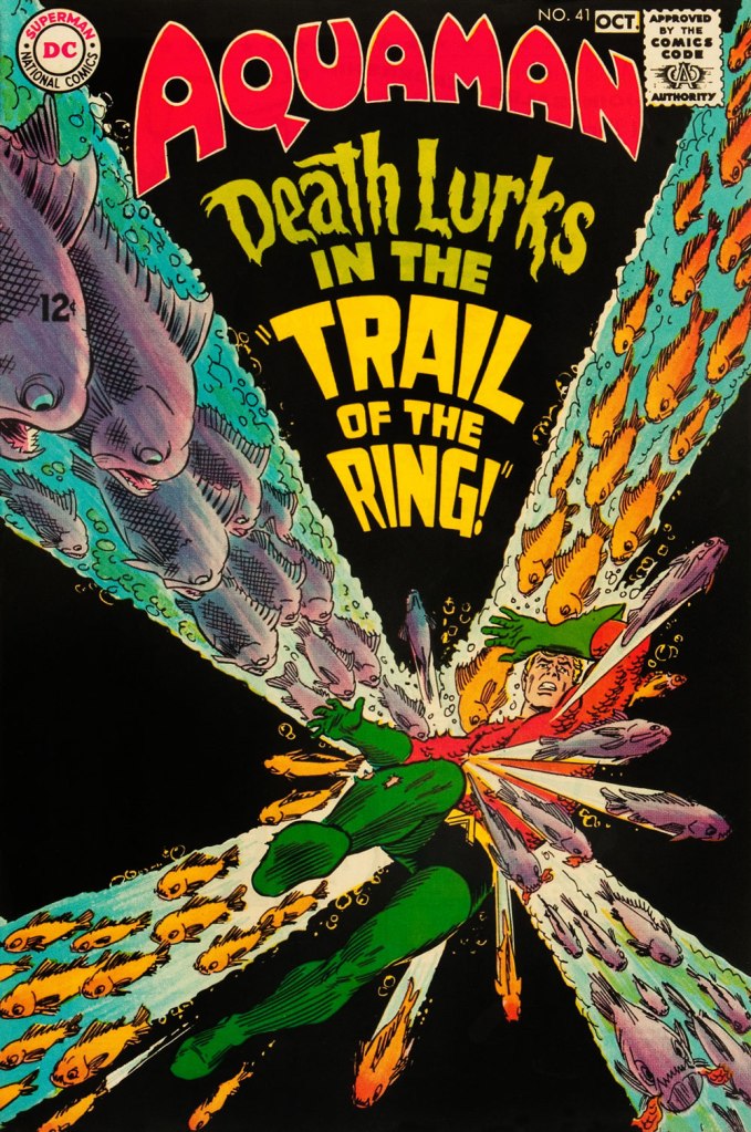
This is Aquaman no. 37 (Jan.-Feb. 1968, DC). The despondent walrus, bottom left, is family pet ‘Tusky’. Oh, and my apologies for ever-so-slightly poaching some potential Tentacle Tuesday material.
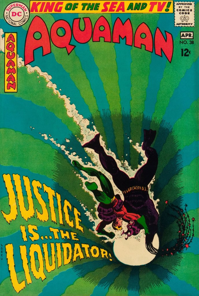
This is Aquaman no. 38 (Mar.-Apr. 1968, DC). I wonder what’s up with the redundant vertical logo, top left.
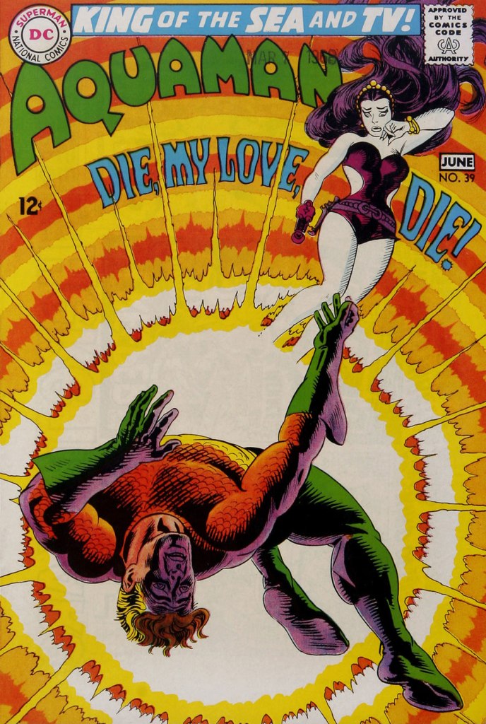
In case you’re wondering about Aquaman’s expanded regal duties (“and TV!“), they were showing repackaged reruns of his half of the previous year’s Superman / Aquaman Hour of Adventure. A Filmation production, so don’t expect too much if you haven’t seen it. But back to the comic book: this dazzling scene announces the saga of “How to Kill a Sea King!”, as our amphibious hero seeks to thwart a hostile Venusian takeover of Earth and sea. Script by Bob Haney, art by Cardy. This is Aquaman no. 39 (May-June 1968, DC). Oh, and the hottie? That’s “Aliena”. A real bolt of ‘inspiration’ there, Mister Haney.
This is Aquaman 41, (July.-Aug. 1968, DC). Such dynamically-designed fun! This is where the new creative team of Stephen Skeates and Jim Aparo joins new editor Dick Giordano (his second issue), but Cardy remains on covers… because Aparo, who resided a couple of states over, couldn’t attend the cover conferences.
This is Aquaman 41, (Sept.-Oct. 1968, DC), a highlight among highlights from the redoubtable team of Infantino (publisher-designer), Cardy (penciller-inker), Giordano (editor), Jack Adler (production manager and colourist), and, inside, Skeates (writer) and Aparo (penciller-inker-letterer). There’s a texture to the colour work (most evident on the foreground piraña… a freshwater fish, incidentally) that’s unusual for comics of that period. I wonder how it was achieved…
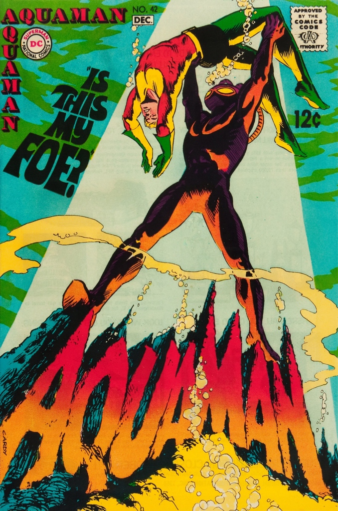
This is Aquaman no. 42 (Nov.-Dec. 1968, DC).
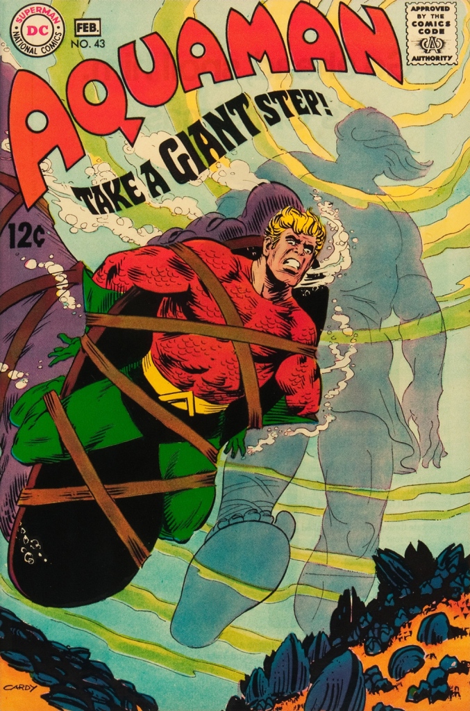
This is Aquaman no. 43 (Jan.-Feb. 1969, DC). Face-first in a bed of mussels, with several tons of pressure? Yikes.
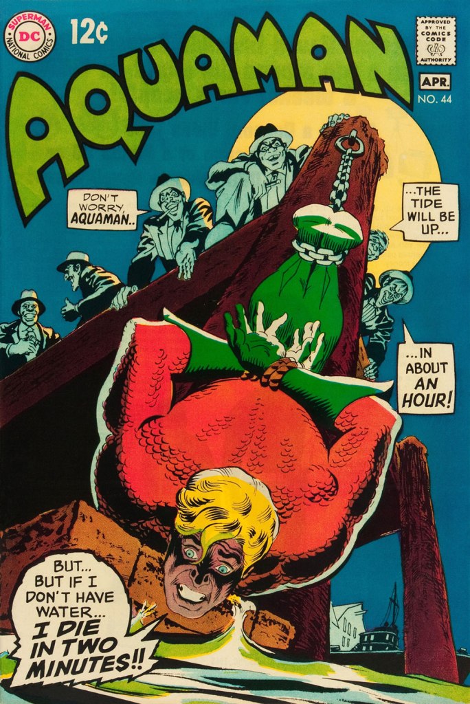
This is Aquaman no. 44 (March-April 1969, DC). I love how, despite the gravity of the situation, the mobsters are kind of cartoony. Cardy would most fruitfully mine this tragicomic vein in the brilliant but short-lived western Bat Lash (1968-69).
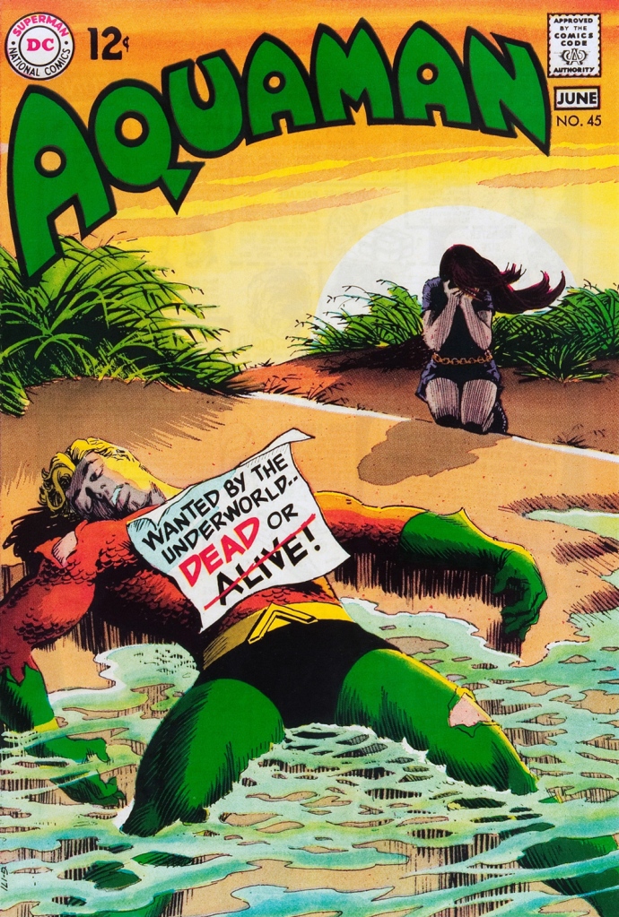
This is Aquaman no. 45 (May-June 1969, DC), concluding Skeates and Aparo’s two-parter, the self-explanatory “Underworld Reward”. An undeniably epochal cover by Mr. Cardy. To wit, so compelling and mysterious is this scene that it’s merited an astute blogger’s impressively in-depth analysis… well worth a peek.
« The bureaucracy is expanding to meet the needs of the expanding bureaucracy. » — Oscar Wilde
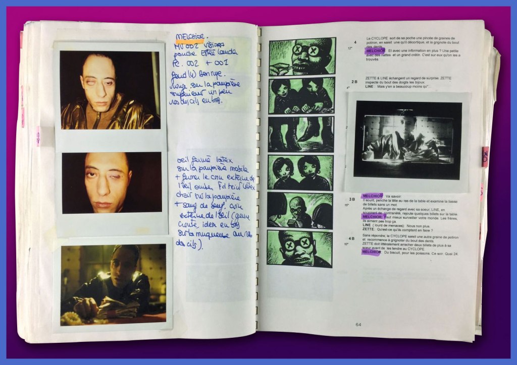
Marc Caro, born in 1956 in Nantes (birthplace of Jules Verne!), was never a prolific bédéiste, quite possibly because he liked to spread his talent around: musician, animator, film director, designer, art director… et j’en passe!
Back in the early days, though, while juggling animation projects and musical gigs (ah, youth!), Caro created a clutch of brief and brutal vignettes for such fabled publications as Métal hurlant, Fluide glacial, Charlie Mensuel and, on this side of the pond, Raw. Most of these strips were crafted using the daunting technique of scratchboard; done right, it’s strikingly effective, and in Caro’s nimble hands, it’s done right. Another master of the technique is Switzerland’s Thomas Ott.
Our featured piece was translated into English by Elisabeth Bell and lettered by Lea Hernandez [psst: someone left out a word in the first panel…]. It appeared in The New Comics Anthology, edited by Bob Callahan (1991, Collier Books). In this case, Caro is using a combination of scratchboard and Craftint.
That grotesque cigar chomper, top right, brings to mind the savagery of Marshall Arisman‘s work, but in a different medium.
Sadly, this printing doesn’t quit do justice to the finesse of Caro’s rendering. Compare with an excerpt from the French original:
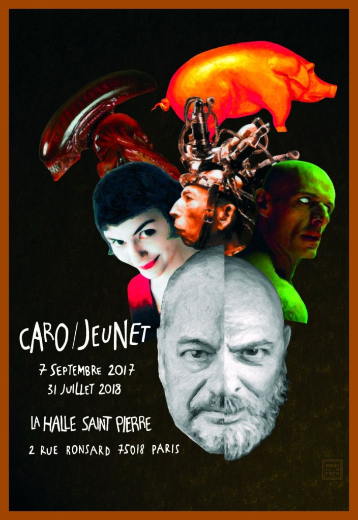
Caro’s retrospective poster for Paris’ Art brut gallery La Halle Saint Pierre‘s Caro/Jeunet exhibition. Sorry, looks like we’ve all missed it. « Reached at home in Nantes, a few weeks after the vernissage, Marc Caro chuckles when it’s pointed out that even their heads are identical. “I’m not sure who first grew out his goatee, but I was first to lose my hair.” »
One of the Caro/Jeunet exhibition’s treasures: Makeup tests and elements of Caro’s storyboards, on loan from the collection of the great makeup designer (and long-time associate) Nathalie Tissier.
See further samples of Caro’s comics work here, and if you crave yet more, you can’t go wrong with L’Association‘s Caro compendium, Contrapunktique.
« Jerry Grandenetti started out ghosting The Spirit, and nobody… NOBODY… captured the spirit of The Spirit better. Not content to stay in Will Eisner’s shadow forever, he forged his own unique style leading to a highly successful comics career lasting decades. » — Michael T. Gilbert
Since my very first encounter with his work, Jerry Grandenetti (1926-2010; born ninety-five years ago today, another Thursday April 15th) has endured as one of my true artistic heroes. But he’s not celebrated much at all.
Though he’s worked extensively on The Spirit, he’s treated as a bit of a footnote in the Eisner hagiography. His DC war work is well-regarded, but he’s inevitably overshadowed by the Joe Kubert – Russ Heath – John Severin trinity. Besides, by and large, the war comics audience doesn’t overlap much with the spandex long johns crowd. Grandenetti has only very occasionally and timidly dipped a toe into the super-heroics fray, and he was far too unusual for overwhelming mainstream acclaim.
In fact, aside from the couple of converts I’ve made over the years, I can only think of three fellow torch-bearing aficionados: Michael T. Gilbert (who digs best the early, Eisner-employed Jerry); Stephen R. Bissette (who favours the spooky 60s and 70s work); and Don Mangus, who’s most into the DC war stuff. I daresay I enjoy it all, but my taste is most closely aligned with Mr. Bissette’s on this particular point. Let’s sample a bit of everything, insofar as it’s feasible to sum up a career spread out over five decades… in a dozen-or-so images.
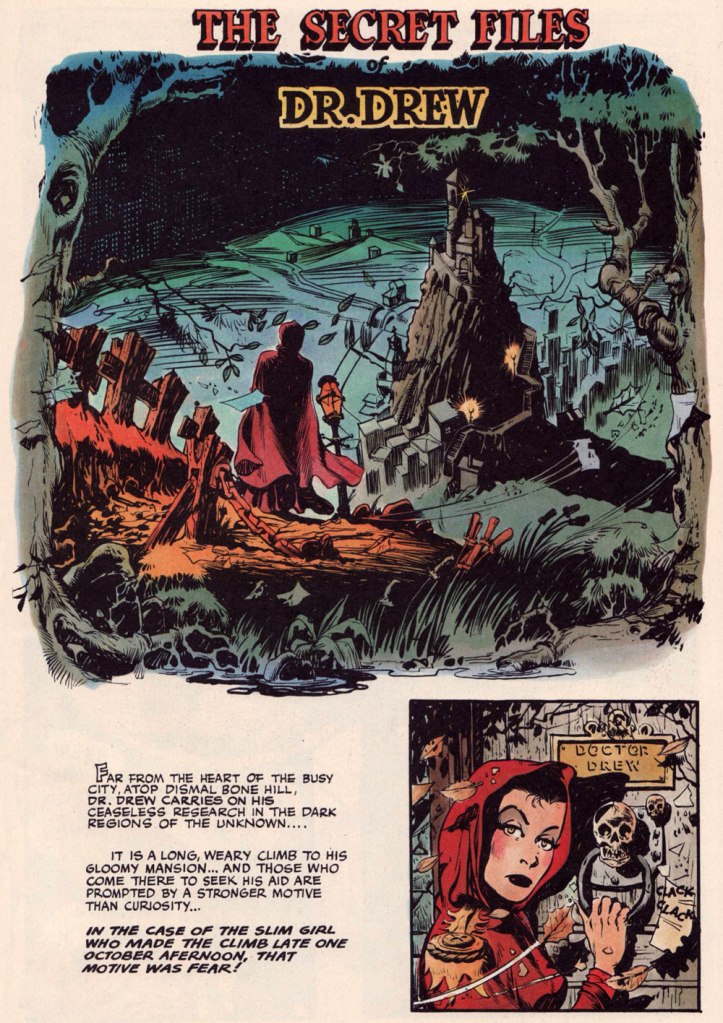
Opening splash from The Secret Files of Dr. Drew: Sabina the Sorceress, written by Marilyn Mercer and lettered by Abe Kanegson, from Rangers Comics no. 56 (Dec. 1950, Fiction House); this version hails from a reprint (Mr. Monster’s Super Duper Special no. 2, Aug. 1986, Eclipse) using the surviving original art; it was recoloured by Steve Oliff.
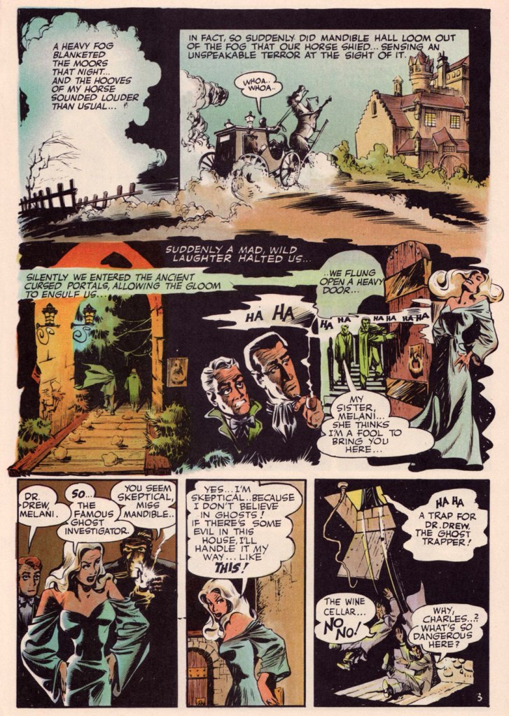
Page 3 from The Secret Files of Dr. Drew: Curse of the Mandibles!, written by Marilyn Mercer and lettered by Abe Kanegson, from Rangers Comics no. 55 (Oct. 1950, Fiction House); this version hails from a reprint (Doc Stearn… Mr. Monster no. 4, Dec. 1985, Eclipse) using the surviving original art; it was most tastefully recoloured by Steve Oliff.
In 1954, the powers-that-be at National Periodical Publications (you know, DC) gave Grandenetti some latitude to experiment with their War covers. Grandenetti produced an arresting hybrid of painted and line art. The process involved a grey wash painting that was photostatted, with flat colour laid over the resulting image. The first few attempts yielded striking, but nearly monochromatic results. A bit farther down the pike, the production department got more assured in its technical exploration.
This is G.I. Combat no. 77 (Oct. 1959, DC); wash tones and colouring by Jack Adler, who recalled, in a 1970s interview: « It was suggested that we start doing washes for covers, and we were talking about doing it for so damned long, but nobody attempted it. I think Grandenetti did the first one, an army cover with someone floating in the water. I think that was the first wash cover that was done. That one ended up looking like a full color painting. »
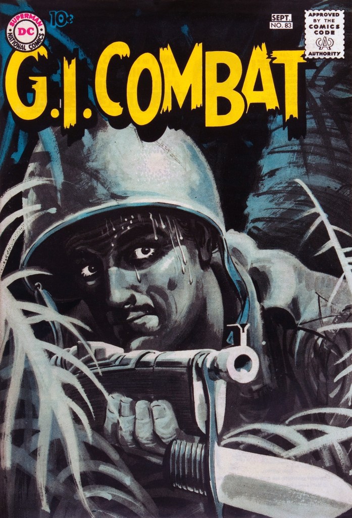
This is G.I. Combat no. 83 (Aug.- Sept. 1960, DC); wash tones and colouring by Jack Adler. In 1995, Robert Kanigher, Grandenetti’s editor on the DC war books and a frequent collaborator, recalled: « Jerry liked to experiment and I had to sit on him to get him to stop it. Especially in his covers, which were outstanding, when I forced him to draw as realistically as possible. »
Original art from The Wrath of Warlord Krang!, smothered in dialogue and exposition by Stan Lee, from Tales to Astonish no. 86 (Dec. 1966, Marvel); inks by Bill Everett. Namor‘s constant random shouts of ‘Imperius Rex!‘ make him sound like a sitcom character with Tourette’s. As far as I’m concerned, it’s possibly been the most annoyingly asinine slogan in comics since Stan stole ‘Excelsior!‘ from Jean Shepherd.
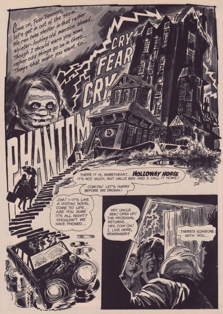
The opening splash from Cry Fear, Cry Phantom, written by Archie Goodwin, from Eerie no. 7 (Jan. 1967, Warren). In the mid-60s, presumably tiring of being pigeonholed as a war artist at DC, Grandenetti made the publishers’ rounds, doing a bit of work for Tower, Gold Key, Charlton, Marvel, Cracked (check it out here) and most memorably Warren where, after ghosting a few stories for Joe Orlando, he unleashed his innovative expressionistic style.
DC was generally hesitant to entrust its more established properties to the more “out there” artists. In the cases of Grandenetti and Carmine Infantino, the solution was to match them with the weirdness-dampening inks of straight-arrow artist Murphy Anderson. And you know what? It did wonders for both pencillers and inker.
This is The Spectre no. 6, October, 1968. A tale told by Gardner Fox (and likely heavily revised by hands-on editor Julius Schwartz, a man who loved alliterative titling) and superbly illustrated by the Grandenetti-Anderson team. Steve Ditko aside, Jerry Grandenetti had no peer in the obscure art of depicting eldritch dimensions (you’ll see!)
Page 13 from Pilgrims of Peril! written by Gardner Fox, from The Spectre no. 6 (Sept.- Oct. 1968, DC); inked by Murphy Anderson. Dig the salute to a trio of real-life spooky writers, all of whom editor Julius Schwartz knew well, having even served as Lovecraft’s literary agent late in the man’s life. By the tail end of the 1960s, Lovecraft’s work was finally making some commercial inroads, thanks largely to Arkham House co-publisher Derleth‘s unflagging diligence.
Page 22 from Pilgrims of Peril! written by Gardner Fox, from The Spectre no. 6 (Sept.- Oct. 1968, DC); inked by Murphy Anderson.
Page 2 from Men Call Me the Phantom Stranger, written by Mike Friedrich, from Showcase no. 80 (Feb. 1969, DC); inks by Bill Draut. This story reintroduced an obscure character from the early 50s, which Grandenetti had drawn a couple of times during his six-issue run. The Phantom Stranger has remained active ever since, but most writers (save Alan Moore, wouldn’t you know it?) don’t really know what to do with him. This, however, is my very favourite PS appearance. Draut, a slightly old-fashioned penciller by this time was, as a slick inker, a wonderful fit for Grandenetti’s confidently loopy layouts.
Page 3 from The Haunting!, written by Jack Oleck, from House of Mystery no. 183 ((Nov.-Dec. 1969, DC). Grandenetti pencils and inks: undiluted!
Page 2 from Eyes of the Cat, written by Robert Kanigher, from House of Mystery no. 189 (Nov.-Dec. 1970, DC); inks by Jerry’s fellow Will Eisner ghost Wallace Wood. The inspired combination of Grandenetti’s adventurous layouts and the velvety unctuousness of Wood’s finishes are a match made in heaven, but one Woody wasn’t fond of. Oh well.
So there you are. Just the tiniest tip of the iceberg. Happy birthday, Mr. Grandenetti!
« Generally speaking, espionage offers each spy an opportunity to go crazy in a way he finds irresistible. » — Kurt Vonnegut
I love a good tale of espionage, but not in the Bond mould. While the adventures of Fleming’s 007 have their charm, it’s not exactly plausible spycraft, nor is it expected to be, I reckon. The world-weary, less flashy and more cerebral approach pioneered by Eric Ambler (Passport to Danger, A Coffin for Dimitrios) and Graham Greene (The Confidential Agent, The Quiet American) is more in keeping with my interests.
« Before Ambler, international thrillers tended to be dominated by such writers as John Buchan, Herman Cyril McNeile (known as “Sapper”), and their many imitators. These books were often rousing adventures, but filled with improbabilities, both of plot and character, plus a hearty jingoism and a well of right-wing, Old World prejudice that would curl your hair today. » [ source ]
As far as I’m concerned, I’m afraid that describes Fleming’s writing to a T. By contrast, I was right chuffed when I learned, a couple of days ago, of this striking bit of news about worthy Ambler disciple John le Carré (The Spy Who Came in From the Cold, Tinker Tailor Soldier Spy), who passed away last year.
Now, given his prodigious and lasting popularity, most people likely presume that James Bond was the first “super spy”. While espionage chronicles have been around nearly as long as there’s been storytelling, the spy, if he survived his adventure, rarely embarked on a sequel.
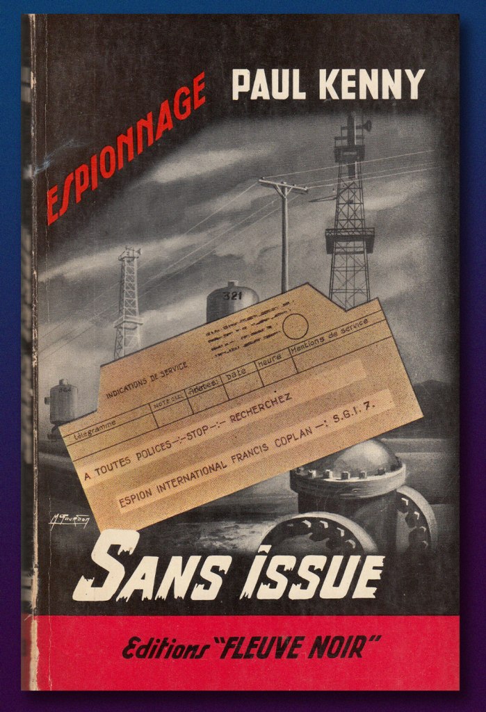
That state of affairs was scrambled somewhat by the arrival on the scene of Hubert Bonisseur de la Bath, alias OSS 117. Created by Jean Bruce, he’s starred in 265 novels, which have sold in excess of 75 million copies. The series was initially published by the legendary Fleuve Noir press, which lent the English language the now-ubiquitous (and often misused) term of ‘Noir‘.
As it happens, Mr. Bruce decided, after 25 novels in three years, to shift his series over to a rival publisher (Presses de la Cité*). Fleuve noir, understandably scrambling to avoid a massive shortfall, commissioned a pair of Belgian writers, Gaston Van den Panhuyse and Jean Libert (under the joint nom de plume of Paul Kenny) to concoct a replacement agent secret. The new fellow was Francis Coplan, alias FX-18. He was featured in 237 novels between 1953 (beating James Bond to the stands by a couple of months) and 1996.
Coplan’s début, 1953’s Sans issue (“No Exit”)
In 1966, les Presses de la Cité began issuing, through their Arédit/Comics Pocket line, graphic adaptations of OSS 117 novels; Coplan followed in 1969. As a kid (and later!), I assiduously steered clear of these: stiff and generic-looking artwork, overly-verbose scripts. At nearly 200 pages, the comics were barely shorter than the novels (generally less than 250 pages long), so the adaptors clearly didn’t make full use of the visual medium’s condensing potential.
So why am I even discussing these?
Because I discovered recently that an artist whose work I do rate highly, José de Huéscar (1938-2007), drew, as it happens, a handful of Coplan issues, and demonstrably well at that. Here are some samples, pulled from the original art.
Position clé, page 33 (1971). Note Huéscar’s confident use of a dry brush technique and his bold use of negative space (panel one in particular).
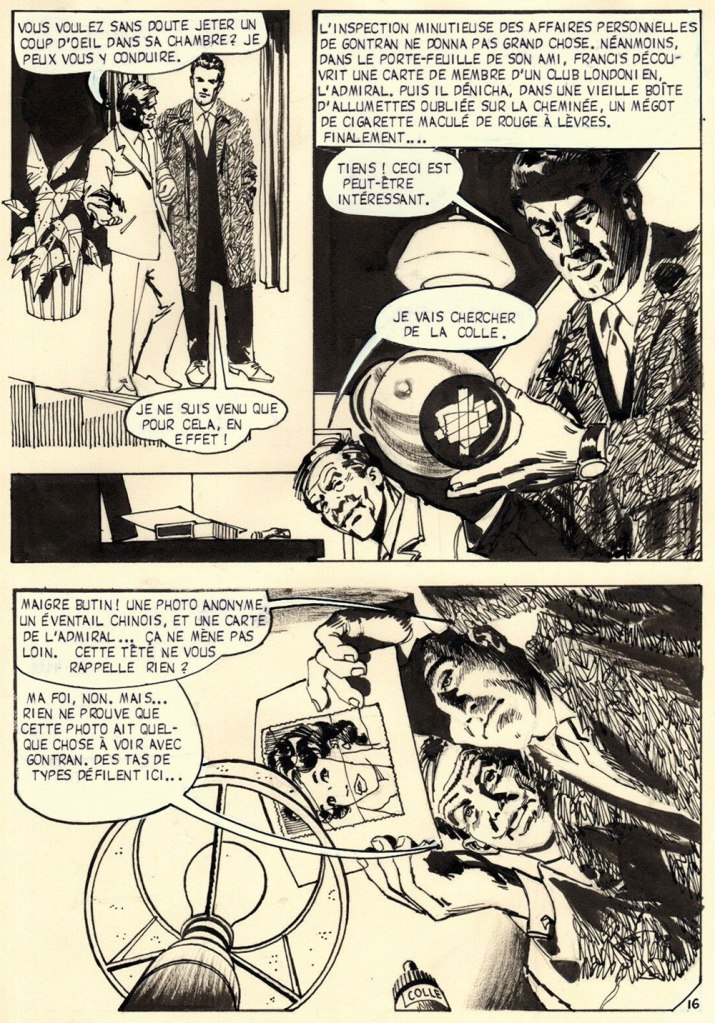
Sabotages sanglants, page 16 (1971). Ingenious, low-tech Coplan is far more John Drake than James Bond, and that’s how I prefer my spies!
Sabotages sanglants, page 24 (1971). Inventive, but not gratuitous or confusing, ‘camera’ work.
Sabotages sanglants, page 29 (1971). Fun with textures, great depth of field work, again with clear storytelling despite the invasive captions.
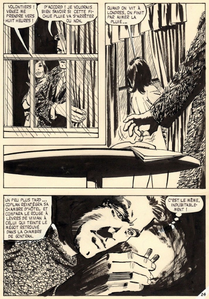
Sabotages sanglants, page 43 (1971). Another page that would have resulted in static talking heads. The meal the characters share is virtually relegated to the captions, and Huéscar wisely moves the action (so to speak) outside.
Sabotages sanglants, page 85 (1971). Having left London for Cairo, Coplan recruits some local help. In lesser hands, this would have just been graphically tedious talking heads.
Sabotages sanglants, page 92 (1971). Yes, this will get Francis into trouble.
Front and back covers of Coplan no. 7: Position clé (Jan. 1971, Arédit), and Coplan no. 10: Sabotages sanglants (Oct. 1971, Arédit). Seems like the cover artist (likely prolific Italian painter Carlo Jacono) had a favourite model!
-RG
*the competitors would merge in 1962, when Presses de la Cité bought Fleuve Noir. While les Presses always did a steady business in translations of American novels, their output comprised a healthy contingent of French-language originals (including excellent series by San-Antonio and Georges Simenon); nowadays, after the usual jumble of soul-killing mergers and acquisitions, they mostly traffic in translated novelisations of American TV shows and pop franchises, a dismal parallel path to globalisation and the steady decline of French culture from the second half of the 20th century.
« I used to be Snow White, but I drifted. » — Mae West
Spring has most definitely arrived, even up here in the Northern latitudes.
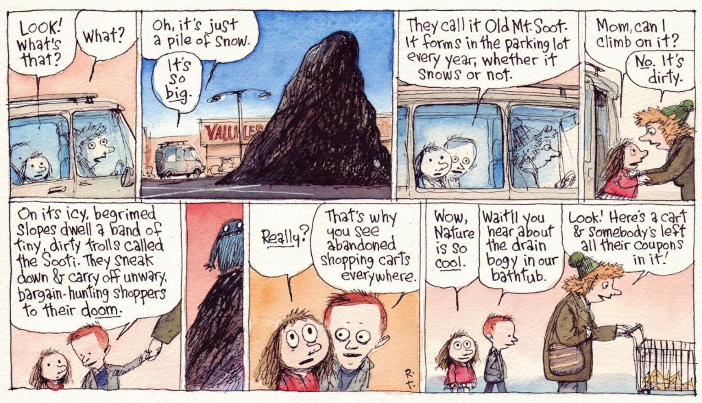
Last week, while wandering the neighbourhood on a gorgeous, inviting day, we roamed farther afield than usual, and happened upon a mostly-deserted parking lot flanked by a humongous pile of sooty snow. I’ve always been fascinated by these filthy behemoths; where I grew up, increasingly crusty and grotesque snowbanks would endure midway through June each year.
It always made sense to me that, being dark, these mounds would absorb more heat from the spring sunlight and melt faster than pristine snow. Counterintuitively, they just stuck around. As it usually turns out, there are more factors at play than one might initially suspect. Here’s a handy scientific explanation.
Another individual who shared my bemused interest in the phenomenon was incredibly-gifted cartoonist Richard Church Thompson (1957-2016), who bestowed upon the unsightly obsidian lumps some intriguing bits of mythology, as he so often and compellingly did to the base materials of the everyday.
This Richard’s Poor Almanac entry « … predates Cul de Sac by some years, yet keen eyes will note the kids in silly hats and the pile of parking lot snow, which have both found their way into the strip. »
Thompson: « CUL DE SAC began as a Sunday-only feature in The Washington Post Magazine in 2004. I painted them in watercolors instead of the process color needed for most newspaper comic strips. »The syndicated strip remake, from Sunday, January 9, 2011. Rats! Now we’ll never hear about the bathtub drain bogy…
Alice retells the Sooti legend with some slight distortions… but you just wait until Dill recounts it his way. Sadly, this was the final allusion to these mysterious creatures. This is the Cul de sac daily from Tuesday, Feb. 8, 2010.
We set off on a quest just yesterday and indeed, there are abandoned shopping carts by the score… if you know where to look.
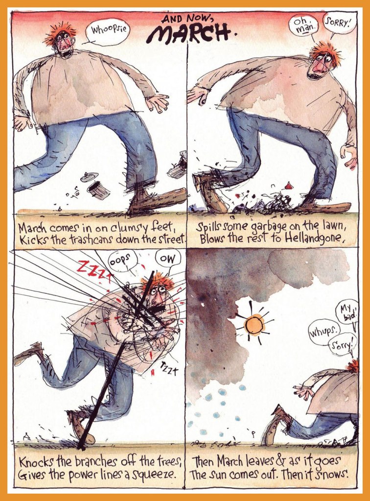
And a bonus seasonal entry to wrap things up! Then it snows.
For more Thompson marvels, do check out our general category, The Stupendous Richard Thompson, and expect massive doses of both awe and amusement.
« Only times and places, only names and ghosts. » — Aldous Huxley
Last November, after we spotlighted a pair of mid-70s Gold Key gems I had presumed to be the brainchildren of Connor Freff Cochran (as it turned out, I was only half right; see my revised original post), we heard from the gentleman himself (and I don’t use the term lightly), who generously shared with us his sharp recollections and insights. Once you’ve read them, I’m confident that you’ll agree that such goods would have been squandered as mere comments at the bottom of a post.
So I’ve picked out another Freff favourite to feature, which will be followed by the author’s commentary.
But first, let us set the stage through a bit of autobiography and an inestimable glimpse into the 1970s publishing scene.
Here’s the skinny. Heeding a suggestion Kelly Freas had made to me eight months earlier, I moved to New York City right after Labor Day 1973. (It was a two-step process. First I hitchhiked from San Francisco to Toronto for that year’s Worldcon, then I caught a ride the rest of the way to NYC from there.) I was six weeks away from turning 19, and gung-ho to launch a career as a professional cover artist and illustrator. I also wanted to work in comics, and thought the best way to break in and learn the ropes was to start as an inker. On the comics side I took my portfolio around to Marvel, DC, Gold Key, and Warren. On the book/magazine side, I went to any publisher where I could land an appointment.
It was not a stellar launch. My portfolio was full of SF convention art show pieces, some semi-prozine illustrations, and a handful of two-toned small press book covers. It wasn’t bad stuff, but it was certainly not well-targeted to the people I was trying to impress. A couple of magazines did pay me for spot illustrations. Jim Baen — brand-new managing editor at GALAXY and IF — liked my stuff, but he wasn’t in charge of art assignments. As for my attempt to break into comic inking, that was a complete washout. There was a paper shortage on, and because of publishing cutbacks there wasn’t enough work for established inkers, let alone a newbie like me. Marvel did give me a bunch of pencil Xeroxes to do vellum samples over…but I was a pen inker, not a brush guy, and pen inking wasn’t the Marvel house look in 1973. I did get to know and hang around with a bunch of people in the company, but I didn’t get any work there.
At Gold Key, though…
At Gold Key, Wally Green looked at my portfolio and said “We don’t need any more artists. But we do need writers. Can you write?” Years later I learned that Wally was trying to plug the production hole created when Len Wein stopped scripting for him. Most likely he put that same question to every stranger who walked through the door. In the moment, though, all I knew was that I’d be an idiot to say anything but yes. Wally then introduced me to his second-in-command, Paul Kuhn. Paul handed over some sample issues of TWILIGHT ZONE, and told me to come back when I had a five-page script to show him. A few days later I brought in a story called “The Stand-In”, which was read and bought on the spot. Thus did my accidental writing career begin. This was in early October 1973. At the beginning of 1974 I did the math and decided to quit my 9-5 job, because by then I was making more from three days per month of Gold Key scripting (at the princely sum of $10 per page) than my fulltime gig was generating. I’ve been self-employed ever since.
I wrote for GRIMM’S GHOST STORIES, RIPLEY’S BELIEVE IT OR NOT, BORIS KARLOFF TALES OF MYSTERY, TWILIGHT ZONE, DARK SHADOWS (for a different editor, Denise Van Lehr), ADAM-12, and even one issue of Gold Key’s STAR TREK. Roughly once a month Paul would agree to a pitch session. I’d bring 10-15 different story ideas with me, knowing I needed to sell at least five to meet my monthly minimum nut (which was low, since I lived in a 7’ x 12’ fifth-floor walkup room on the West Side that rented for $50). Paul would listen intently, but he couldn’t look me in the face most of the time because he had a permanent spastic tic in his neck. Inevitably he would reject all but a couple of ideas, at which point I had to invent more on the spot and talk him into buying them. It was GREAT story development training.
Paul had an eidetic memory for every damn comic book Gold Key had ever published, which was its own kind of problem. This is a real exchange we once had:
Paul: I don’t know…
Me: Paul —
Paul (shouting through the open door to Wally, in the next-over office): Hey, Wally! Freff has an idea for an art museum guard ghost story. Didn’t we do a museum guard ghost story, what, nine years ago?
Wally: I think so.
Paul: Sorry, Freff. That’s out. What else have you got?
Me: Paul, your readers are eight years old. They weren’t even born when that other story was published! And anyway, it’s an ART museum guard ghost story. What kind of museum was it last time?
Paul: History.
Me: So no art.
Paul: Okay, I’ll think about it.
(He did…and still passed on the idea.)
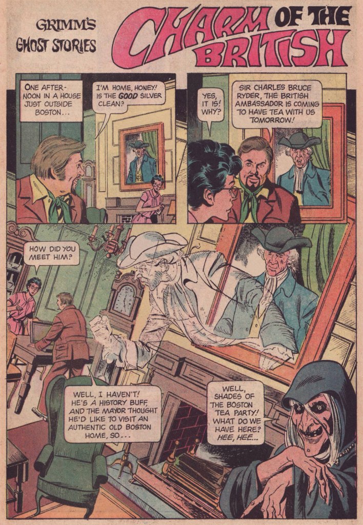
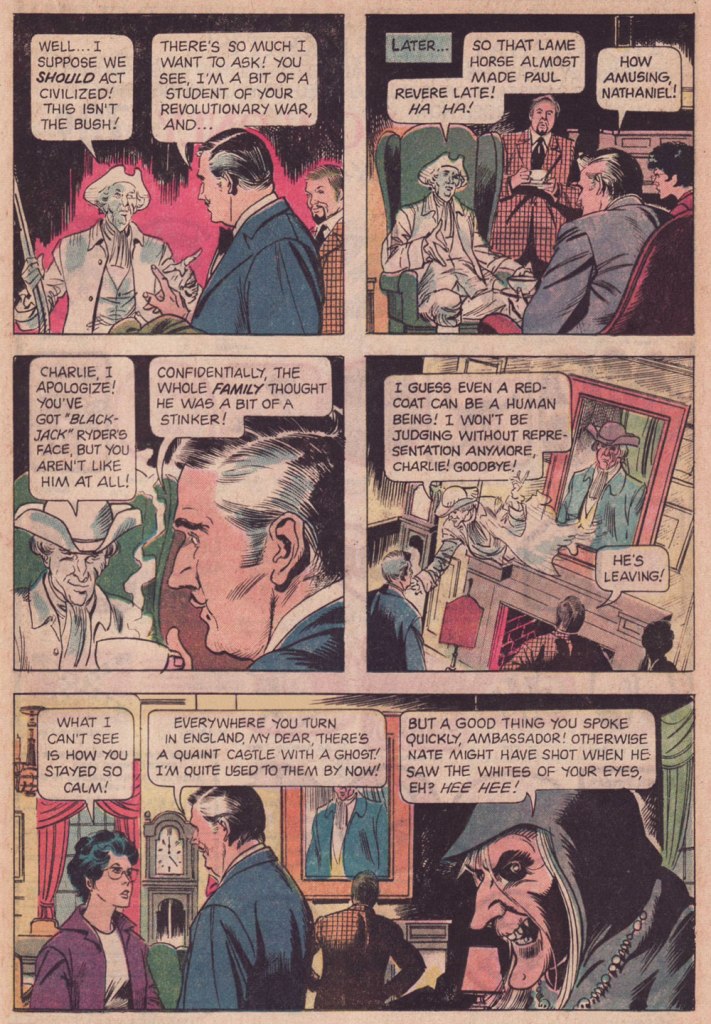
And here’s our featured tale: Charm of the British, first published in Grimm’s Ghost Stories no. 22 (March 1975, Gold Key).
Before I return the floor to Freff, it bears mentioning that this tale was illustrated by Argentine cartoonist José Delbo (born in 1933 and still among us), then on the cusp of a five-year run on DC’s Wonder Woman. Delbo was quite recently in the news for the astonishing windfall he received from a crypto artwork auction. In these uncertain times, what 87-year-old on a fixed income couldn’t use an extra million to top up his or her nest egg?
While I confess I’ve never quite warmed up to most of Delbo’s DC work (his inkers did him no favours), I do have a soft spot for his solid run on Charlton’s Billy the Kid (1966-74!), I dug his deft comic touch on Dell’s The Monkees, and let’s not forget his inspired work on the real ‘weird western tales’ series, Charlton’s gonzo Geronimo Jones (1971-72).
I hear James Mason as the British Ambassador. How about you?
And now, with a first-hand account of its genesis, Mr. Connor Freff Cochran!
The publication date of the issue with “Charm of the British” was March 1975. Gold Key comics typically hit the stand a month sooner than the official date, so that makes this a February 1975 release. From that, and some internal clues, I can narrow the writing window down to the first three weeks of September 1974.
I’d been away from NYC all the previous summer, living in Champaign-Urbana, IL, where I was self-training just in case my application to that year’s Ringling Brothers Clown College was accepted. I finally got word that I’d made it when I arrived at the World SF Convention, which was held over Labor Day weekend in Washington, DC. (One day later I went out for Chinese food and got a fortune cookie that read “You will visit a strange place and find fresh work.”) The Clown College started on September 23rd and ran for just over two months, during which time I would be unable to do any paying freelance work. So between the end of WorldCon and flying to Venice, FL on 9/22, I crammed in every job I possibly could – which included selling and writing as many Gold Key stories as I usually did in three or four months. Wally Green and Paul Kuhn knew I would be unavailable until late November/early December at the soonest, so they did something they hadn’t done with me before, and built up inventory.
“Charm of the British” was one of those inventory pieces. It paid $60 (my page rate for scripting was $10), and looking back I have no idea what the exact trigger for the idea was. Most likely it was improvised during a pitch & sell session with Paul. Those were always insane. The typical structure: I’d come in once a month with 8-10 ideas, knowing that I needed to sell five or six to guarantee my monthly budget. Paul would say yes to one or two and reject the rest. At which point the improv would begin, with me inventing more stories on the spot while he tried to get me to leave… something I would only do after getting him to say yes as many times as needed. I was 19 years old, and it was great training for a creative future.
The title’s a minor bit of wordplay, of course – “charm” as in magic and manners, both.
Grimm always had to have jokey intro and outro lines for each story. The outro on this one wasn’t anything to be proud of, but all these years later I’m still happy with the punny “shades” (of the Boston Tea Party) in the intro.
These were stories for young kids, so you couldn’t go into detail about anything. But I did enjoy slipping in as many real Revolutionary War references as I could, both direct (namechecking Paul Revere) and indirect (referencing Revere’s profession by having my lead character ask for “the good silver” in the first panel). “I won’t be judging without representation anymore” is obviously a riff on “no taxation without representation.” No child who read this comic book was ever going to remember it years later, when they encountered the real phrase in some history class, but maybe a bit of subconscious memory would help the knowledge stick, you know? In any case I enjoyed playing with all these references.
Page 2, panel 2: I absolutely did NOT write that unnecessary “Why, No!” Either Paul or Wally or the letterer added that. Didn’t make sense to me then, and makes no sense to me now. Similarly, the “Thinks they he can come in…” in panel 4 on that page is definitely an editing/letterer goof. I wrote “Thinks he can come in…”
As usual, my character names referenced friends, sometimes combined with private jokes. Fan friends Eli Cohen and Susan Wood had begun dating recently, so I named the house owners “Eli and Susan Wood” (though all reference to the name “Susan” somehow vanished in the editing process). Susan eventually became one of the major academic names in the science fiction field, before she sadly passed, much too young, in 1980. Our visiting British Ambassador got the name of a junior high school friend of mine who had spent a lot of his childhood growing up in Europe. These days he’s a partner with the law firm of Thompson Coburn LLP, in St. Louis. Revolutionary War ghost Nathaniel Emerson is a combination of Nathaniel Hawthorne and Ralph Waldo Emerson (they were neighbors in Concord, MA for a time), with a sideways nod to NYC fan David Emerson. David had recently shared an apartment with Eli Cohen, so it amused me to have an “Emerson ghost” hanging around to haunt an Eli living space…
Looking back from today, it amuses me to think of Outlander’s evil British soldier “Black Jack Randall” and his nice-guy modern descendant, who both have the same face. It’s a neat coincidental lineup with my evil British soldier “Black Jack” Ryder and his nice-guy, same-face descendant.
Overall… confronted with this story after nearly 50 years, I’m pleasantly surprised. It’s got some nice lines, it turns in unexpected directions, and none of the characters are idiots (though they are all amazingly blasé about spectral appearances). I can imagine the Ambassador and the ghost of Nathaniel Emerson becoming the best of friends, making regular visits back and forth across the Pond… and hanging out together in the afterlife when the Ambassador finally dies from eating one too many diplomatic desserts.
Alternatively, of course, there’s a story to be written about the Ambassador coming home to England and being haunted by Black Jack’s ghost, who is appalled that any descendant of his would make nice with Yankee riffraff like Nathaniel…
Again, my heartfelt and slightly befuddled gratitude to Mr. Cochran for all his cordiality and patience. We’ve more of it to share with our readers, so expect a sequel in the near future. Cheers!
« It took me some years to clear my head of what Paris wanted me to admire about it, and to notice what I preferred instead. Not power-ridden monuments, but individual buildings which tell a quieter story: the artist’s studio, or the Belle Époque house built by a forgotten financier for a just-remembered courtesan. » — Julian Barnes
Depending on where and when you are, this post will take you far away and to long ago.
For instance, during the storied humour magazine Le Rire’s prime years (roughly the first quarter of the 20th century), Gerbault was featured in most issues, often on the front or back cover, and generally in sumptuous colour. Well, you’ll see what I mean. Clearly not one to rest on his laurels, he somehow found time to lend his sundry gifts to the theatrical, advertising, etching, and fine art fields.
Here’s a bit of context if you don’t know who Saint Denis was. Love his interaction with the initially skeptical doggo! Originally published in La Vie Parisienne, and collected in Parisiennettes (1897), with colours by J. Chauvet.
There’s the lad, Paris’ first Bishop, at the Cathédrale Notre-Dame de Paris. Hope he wasn’t damaged in the blaze.
Gage d’amour (“Token of Love”), originally published in La Vie Parisienne, and collected in Parisiennettes (1897), with colours by J. Chauvet.
Les Coulisses de l’Amour is a collection of cartoons published between 1893 and 1895 in La Vie Parisienne. Racist caricatures abound but, to be fair, everybody gets it in the neck.
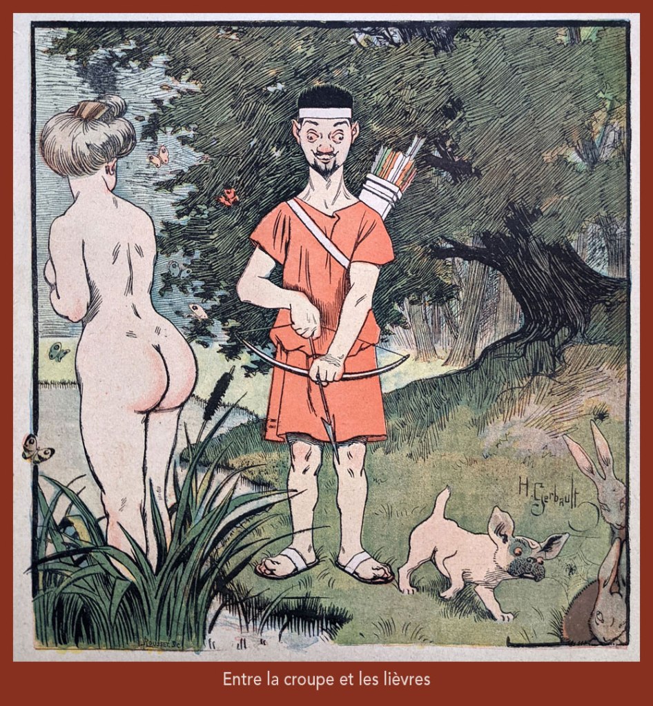
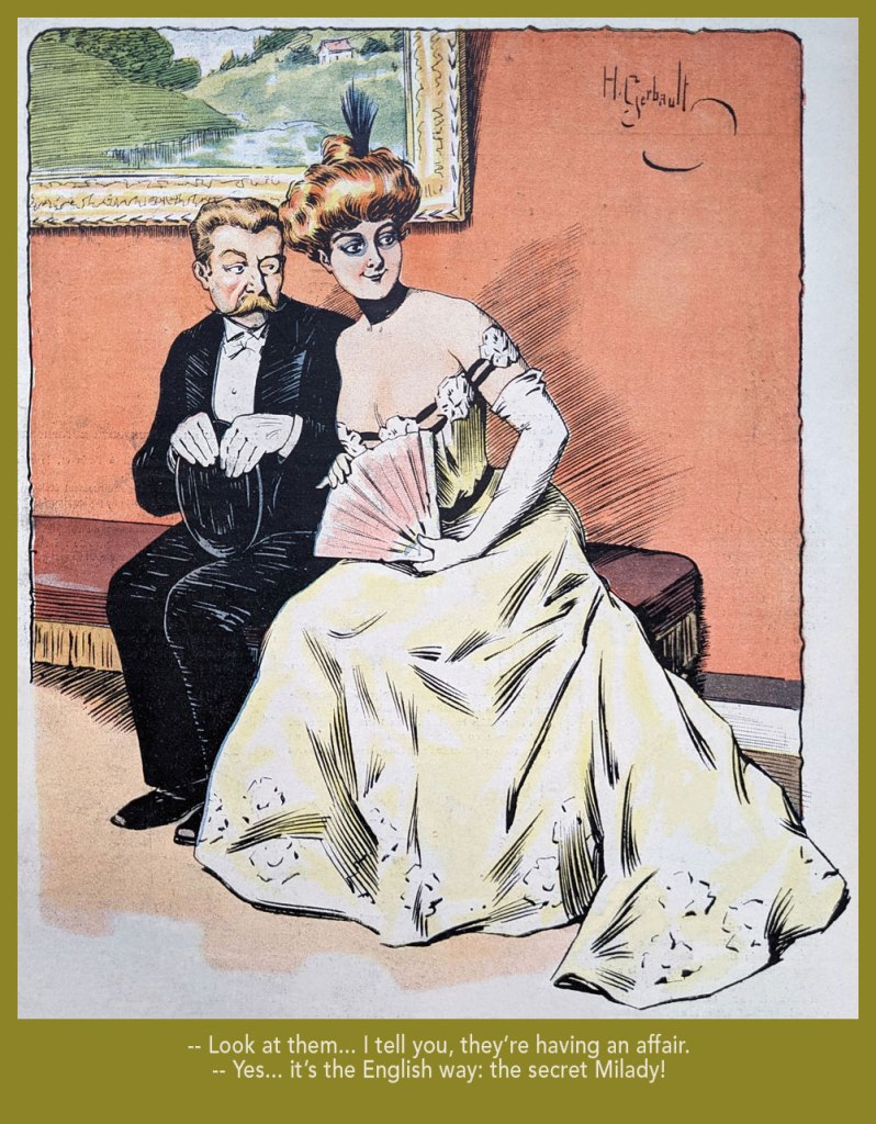
“Entre la croupe et les lièvres” is a play on “Il y a loin de la coupe aux lèvres” (English equivalent: “there’s many a slip ‘twixt the cup and the lip”), with ‘coupe’ replaced by ‘croupe’ (rump) and ‘lèvres’ by ‘lièvres’ (hares) — It was featured on the cover of Le Rire no. 261, (Nov. 4, 1899), eloquently demonstrating the vast cultural gulf between Edwardian England and Belle Époque France… not to mention the United States!
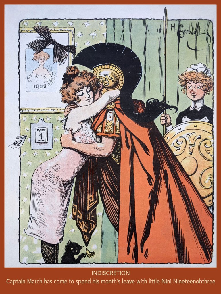
From Le Rire no. 7, (March 21, 1903). In French, the Roman God of war and the year’s third month are both “Mars”. Why is it even “March” in English?
Taking the piss out of that old English discretion (some might call it hypocrisy); from Le Rire no. 18 (June 6, 1903).
From Le Rire no. 59, (March 19, 1904).
From Le Rire no. 160 (Feb. 21, 1906).
From Le Rire no. 380 (May 14, 1910). Missals are also known as ‘prayer books’.
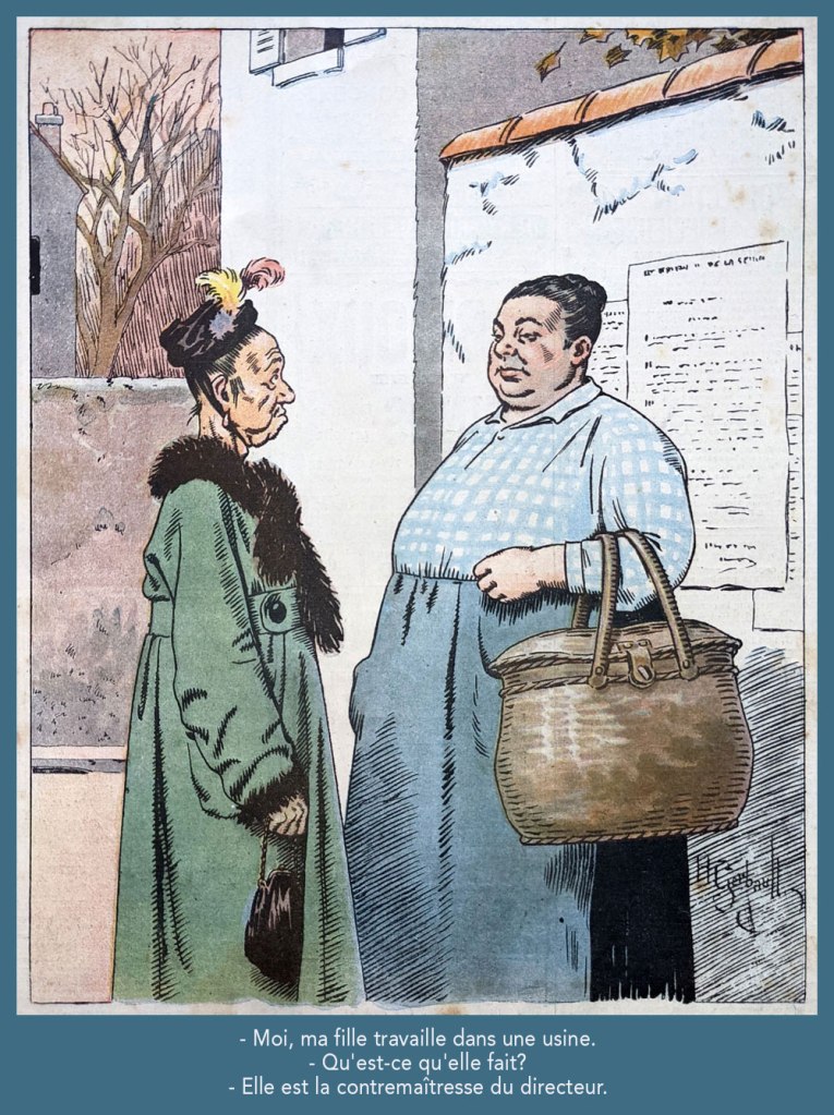
Despite being quite amusing, this one loses it all in translation. Still, “contremaître” is a foreman; its feminine form is “contremaîtresse”, which combines foreman and “mistress”; you’ll hopefully get the idea. This piece appeared in Le Rire rouge (as Le Rire was called during The Great War) no. 179 (Apr. 20, 1918). Note the beautifully understated colour work.
From Le Rire no. 189 (Sept. 10, 1922). « Je m’fiche à poil, rien que pour l’embêter! » in the original; sometimes it’s mighty hard to do proper justice to the source text.
« It was exactly an assembly line. You could look into infinity down these rows of drawing tables. » — Gil Kane
Some of our more sensitive readers may have noticed that we’ve been none too gentle with Gil Kane (1926-2000) in the past, dealing him some rather rough lumps at times. But that’s not the whole story: in taking stock of such a protracted and prolific (dare I say profligate?) career as his, much of it inevitably spent on autopilot, one must be discerning. In other words, I like some of Kane’s work, but there’s plenty of it I don’t care for. Still, WOT’s rule of thumb is that if we altogether loathe an artist and/or his work, we’ll just turn a blind eye.
And speaking of the sense of sight, what makes a great comic book cover? Must be my art school training and subsequent work in advertising tipping the scales, but to me, design and layout reign primordial as ingredients… as values. I’m often dismayed at many a would-be critic’s apparent method of assessing an image’s artistic worth, namely: how many popular characters does it feature? Is it action-packed? Is the issue sought-after and expensive? Does it feature a famous character’s début? Is it drawn by a fan-favourite artist who unquestionably can do no wrong… because he’s a fan-favourite artist who unquestionably can do no wrong? (and how dare you claim otherwise!)
Gil Kane reportedly generated around eight hundred covers for Marvel in the 1970s… of all levels of craft and quality. With that kind of frenzied output, it’s impressive that most were perfectly serviceable, given that there certainly was no time for meticulous, sober planning. They were generally over-captioned (not Kane’s fault!) and crassly sensationalistic, but that’s what Marvel sought and settled for.
It’s a shame that Kane and his former classmate at the School of Industrial Art (back in the early 40s!), DC lynchpin Carmine Infantino didn’t get on too well, because their Silver Age collaborations had a special spark… must have been the animosity. It had been noted by the DC brass, as early as the late 50s, that Carmine’s covers reliably caught prospective buyers’ attention and dimes. And so, by 1967, he was unofficially designing most of the publisher’s covers, and certainly the covers of all titles edited by Julius Schwartz. Green Lantern was among these.
So we turn today’s spotlight on a hot streak of seven. Kane gets his name in the title, but it would be more accurate to say they were Infantino-designed, Gaspar Saladino-lettered, Jack Adler-coloured, Gil Kane-pencilled and Murphy Anderson and Sid Greene-inked covers. The streak begins after Green Lantern no. 54’s downright poor cover, and ends with the interruption of Kane’s impressively long run of consecutive issues.
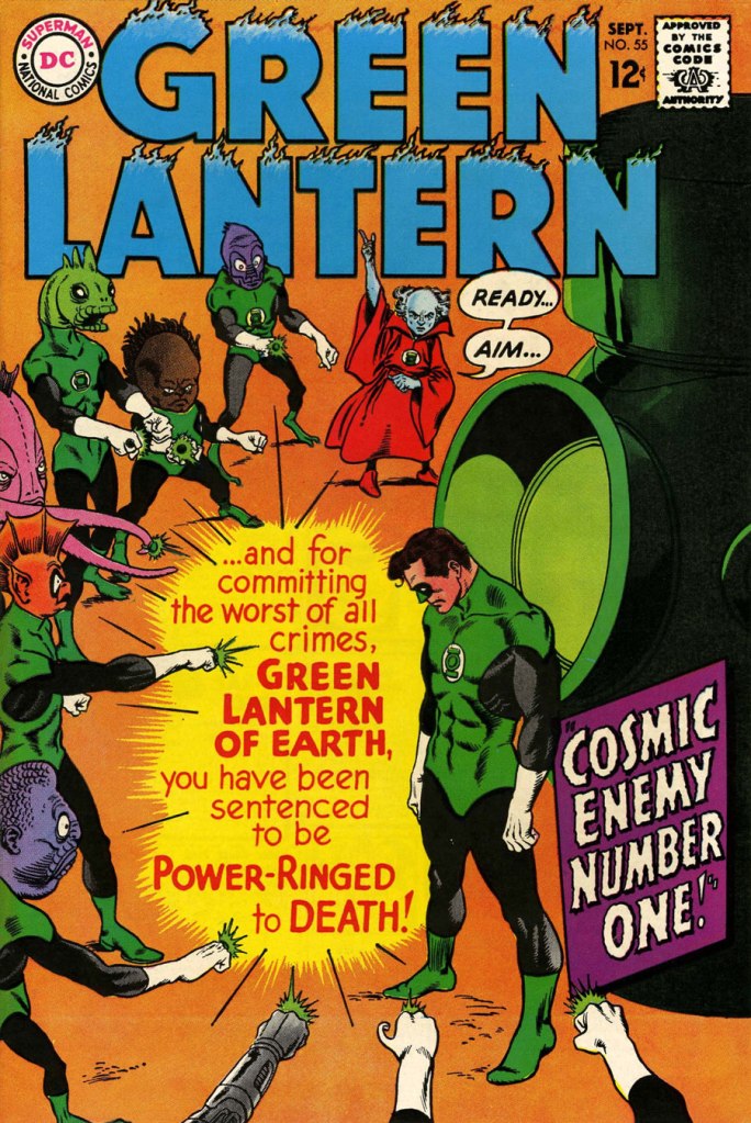
We begin with Green Lantern no. 55 (Sept. 1967, DC). Harmonious, easy-to-parse arrangement of numerous elements and exemplary integration of text. Design by Infantino, pencils by Kane, inks by Murphy Anderson, lettering by Gaspar Saladino, colours by Jack Adler. Oh, and lest we forget: logo designed by Ira Shnapp (circa 1964), classic Green Lantern uniform designed by Kane (circa 1959).
This is Green Lantern no. 56 (Oct. 1967, DC). Kane was never much for varying his monsters (see below). Pencils by Kane, inks by Anderson.
For a bit of comparison on how things were done from company to company, this is Tales to Astonish no. 91 (May, 1967, Marvel). This is what happens when there’s no planning or attention to detail: in an already-crowded cover, did we really need that ugly box advising us of the presence of The Abomination? He’s right there! (maybe the abomination refers to the cover itself). And the foreshortening nightmare that is the baddie’s left arm was so dire that, when a fan commissioned Arthur Adams to produce a recreation of this cover (which, things being as they are, many surely consider ‘iconic’)… he wisely corrected the anatomy and tweaked the poor composition. Interesting how Marvel’s heavy-fingered yes-man, art director John Romita Sr., was always game to “fix” Ditko and Kirby art, but saw nothing wrong with this one.
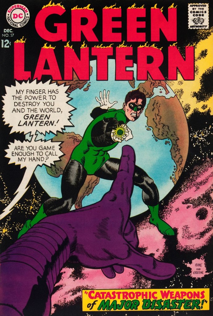
This is Green Lantern no. 57 (Dec. 1967, DC), featuring Catastrophic Weapons of Major Disaster!, written by Gardner Fox, pencilled and inked by Kane. Cover by Kane and Greene… love the placement of the signatures!
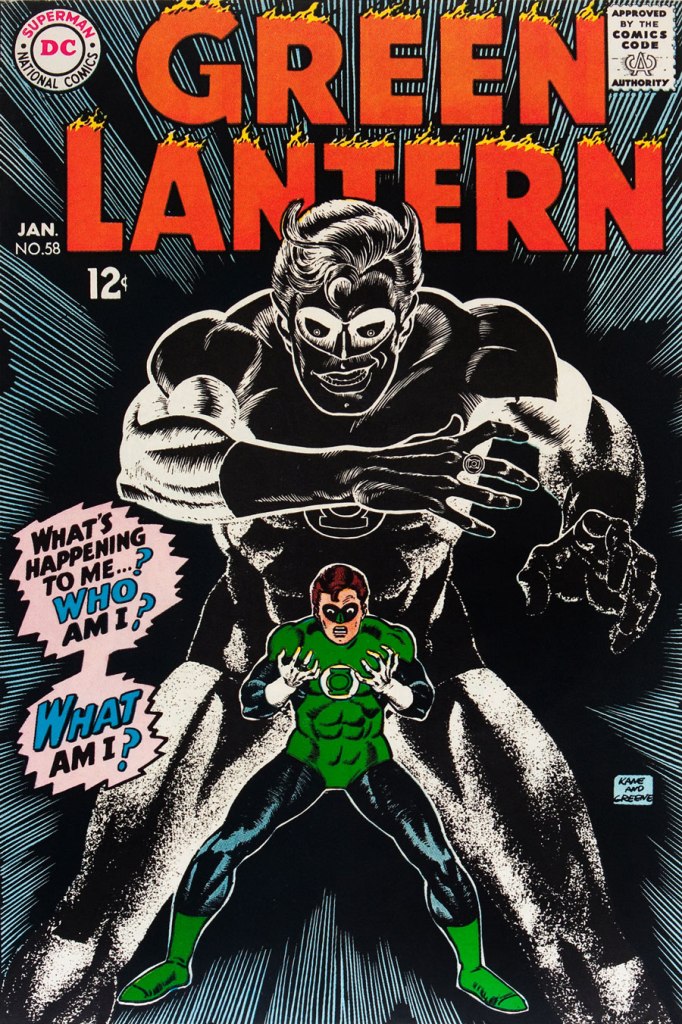
This is Green Lantern no. 58 (Jan. 1968, DC), featuring Peril of the Powerless Green Lantern! (a Julius Schwartz title if there ever was one), written by Gardner Fox, pencilled by Kane and inked by Greene. I’m not overly fond of the Kane-Greene mix, but Sid Greene, as a penciller-inker did some splendid work on the Star Rovers series (1961-64), co-created and scripted by Gardner Fox.
An issue whose price few can afford unless they bought it off the racks, this is Green Lantern no. 59 (March 1968, DC); pencils by Gil Kane, inks by Murphy Anderson. Featuring the introduction of GL alternate Guy Gardner, who was to be dubiously re(jack)-booted in the 1980s, by Steve Englehart and Joe Staton, as a jackass with an ugly uniform and a worse haircut. Never mind the fact that the Green Lantern Corps would never bestow power and stewardship on such an immature and pompous loose cannon.
This is Green Lantern no. 60 (April 1968, DC); an evident Infantino design, with pencils by Kane and inks by Anderson… which interestingly ends up producing a prototype of Brian Bolland‘s distinctive style… a decade early.
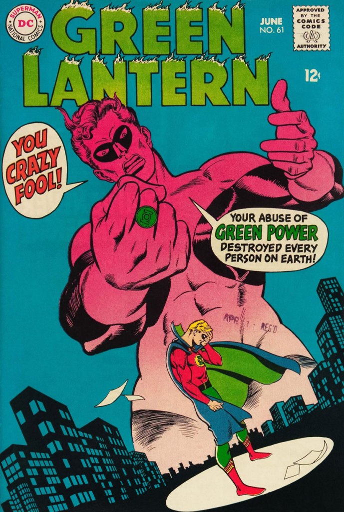
This is Green Lantern no. 61 (June 1968, DC); pencils by Kane, inks by Greene, and featuring (groan) Thoroughly Modern Mayhem!, scripted by Mike Friedrich, pencilled by Kane and inked by Greene. Co-starring Alan Scott, the Golden Age Green Lantern.