« Kate’s death scream gags stillborn in her throat as the tentacles dart toward her, slithering hungrily across her body. »
Here’s a quick association exercise: as fast as you can, name words that come to mind when somebody says “Dracula”. Um, fangs! Stake! Blood, cape, biting! … Tentacles? Say what?
It would have never occurred to me to look for tentacles in Dracula, giant-size or otherwise, so thanks to admin RG for this splendid suggestion.
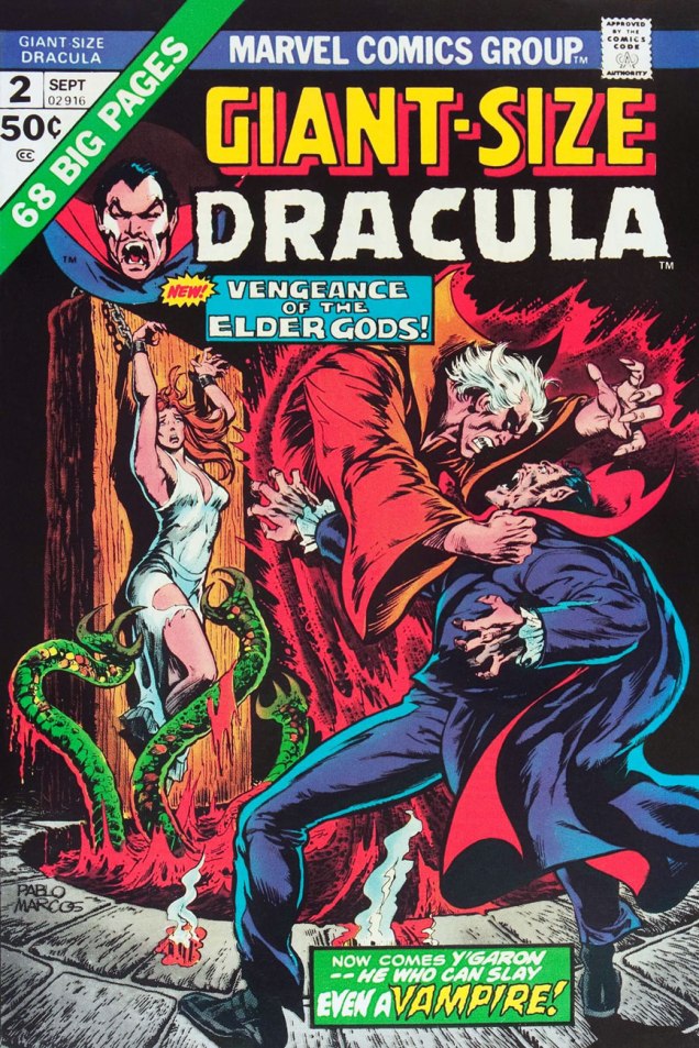
Giant-Size Dracula no. 2 (September 1974). Cover by Pablo Marcos.
You’re not sure those green things were tentacles? If it quacks like a duck, it may well be an aquatic bird – and if it slithers towards female “human flesh”, count it as tentacles! Call Them Triad… Call Them Death! is scripted by Chris Claremont, pencilled by Don Heck and inked by Frank McLaughlin. I have to say that the art is distinctly subpar, as far as I’m concerned.
The writing isn’t brilliant, either.
“Words are inadequate”.
Perhaps it’s the drab colours that weigh this down, and the original art would be a considerable improvement? Nope, sorry.
As further example of the ineptitude of this art team, a quick question: does this look like he’s slapping her?
She was lying face down, but she somehow manages to flip over instantly.
However, I have no wish to engage in Don Heck bashing – he had his moments, it’s just that this story wasn’t one of them. Instead, I will direct you to this article explaining how Harlan Ellison mocked Heck once upon a time, several lifetimes ago. Also, ouch.
Harlan Ellison: There are guys who’ve got very minimal talents and it doesn’t matter whether they corrupt it or not. I could name them and would happily name them, but why bother? There’s no sense kicking cripples. I mean, all you have to do is open up comic books from Marvel and DC and take a look at them. You see these guys have a very minor-league talent and, to say, “Well, these people are wasting their talent” is ridiculous. I mean, they’re never going to be any better. What’s the name of the guy who used to do… over at Marvel… he use to do… [Pause]… the worst artist in the field.
Continuing our foray into Draculas of colossal proportions tangling with tentacles…
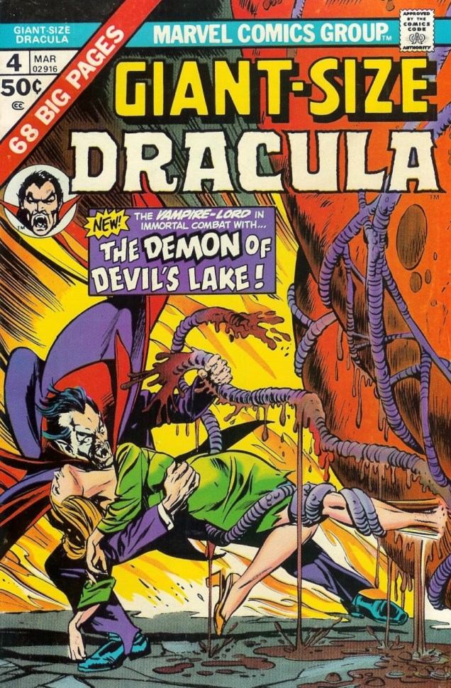
Giant Size Dracula no. 4 (March 1975). Cover pencilled by Gil Kane and inked by Tom Palmer.
Sadly, the tentacles promised on the cover don’t really appear in the cover story. Time to move to another series —
Tomb of Dracula no. 62 (January 1978), pencilled by Gene Colan and inked by Tom Palmer.
What Lurks Beneath Satan’s Hill? (tentacles, obviously) is scripted by Marv Wolfman, pencilled by Gene Colan and inked by Tom Palmer.
This has been scanned from the reprint, which in my opinion looks worse, not better.
The story continues in number 63 –
Tomb of Dracula no. 63 (March 1978). Cover pencilled by Gene Colan and inked by Tom Palmer.
The Road to Hell!is scripted by Marv Wolfman, pencilled by Gene Colan and inked by Tom Palmer:
« All-you-can-eat-calamari — dive in! »
Next up (eventually), an equally random concept: Werewolf VS tentacles!
« The tentacles of today reach out like an octopus to swallow yesterday. »
That’s a quote from Gladys Taber, columnist for Ladies’ Home Journal in the 19th century, and almost as good as “put your foot down with a firm hand”.
Another thing tentacles of today… or any day… do is reach out for women, preferably ones in skimpy outfits. ’nuff said.
By now, I’m completely confused about who Ms. Marvel is supposed to be, but here is some version of her battling an octopus with a heavy hangover or a bad case of conjunctivitis. This blondie is Carol Danvers, I believe, though, that her usually bare stomach has been wrongly coloured red… but I can’t muster enough interest to care.
Ms. Marvel no. 16 (April 1978, Marvel). Cover pencilled by Dave Cockrum and inked by Terry Austin.
The next one is a scene from a fantasy world, though pray note that the tentacle grabs the woman, not the guy who’s right behind her, nor the gorilla (?) who’s right in front of her.
In case anybody is wondering about the plot of this 6-issue series by Bo Hampton, « A wizard, an air force pilot, and a young woman on a mysterious quest, join forces on a “lost planet” accessible only through magic corridors. As Ambrose Bierce, a self-taught wizard who disappeared from Earth in 1914, tells them, when the evil Zorrin family conquered the planet Iriel, they killed off its scientists so it could be dominated by the Zorrins’ magic. Before they can return to Earth, the heroes have to destroy the lotus potion which subjugates the world’s populace to the Zorrins’ will. » (source)
Lost Planet no. 3 (September 1987, Eclipse), cover by Bo Hampton.
There’s very little science in these Thrilling Science Tales – and would you expect any from a story with a protagonist named Stormy Tempest? (any relation to Joey?) Trying to untangle her hair from the tentacle’s suckers/cilia is going to be horrendously painful, but I suppose she has more serious things to worry about.
Thrilling Science Tales no. 2 (1990, AC Comics). Cover pencilled by Mark Heike and inked by John Dell. The brown slime oozing from the tentacle’s embrace is profoundly disturbing, IMHO.
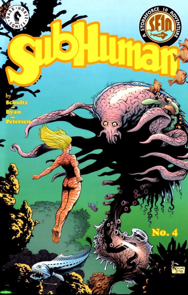
The following is not exactly a worthy use of Mark Schultz‘ talents, but at least it’s a nice, intriguing cover. The insides are not drawn by him, in case you’re wondering.
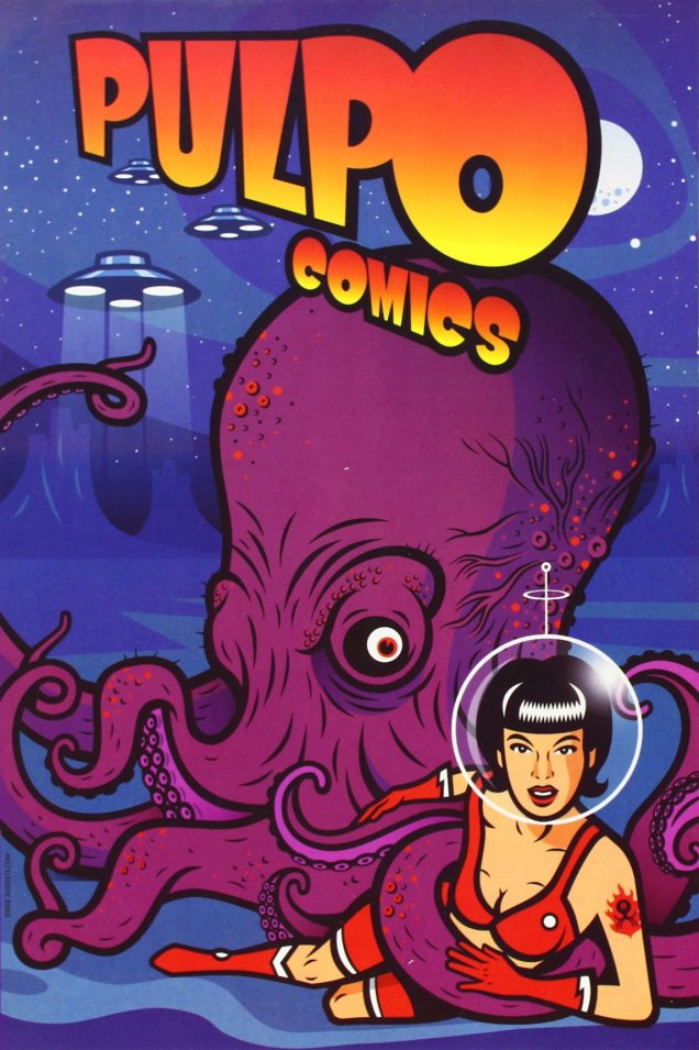
SubHuman no. 4 (February 1999, Dark Horse), cover by Mark Schultz.This Mexican science-fiction comics anthology was published in 2004. The cover is by Mexican cartoonist and illustrator Bernardo Fernández, who’s also the editor.
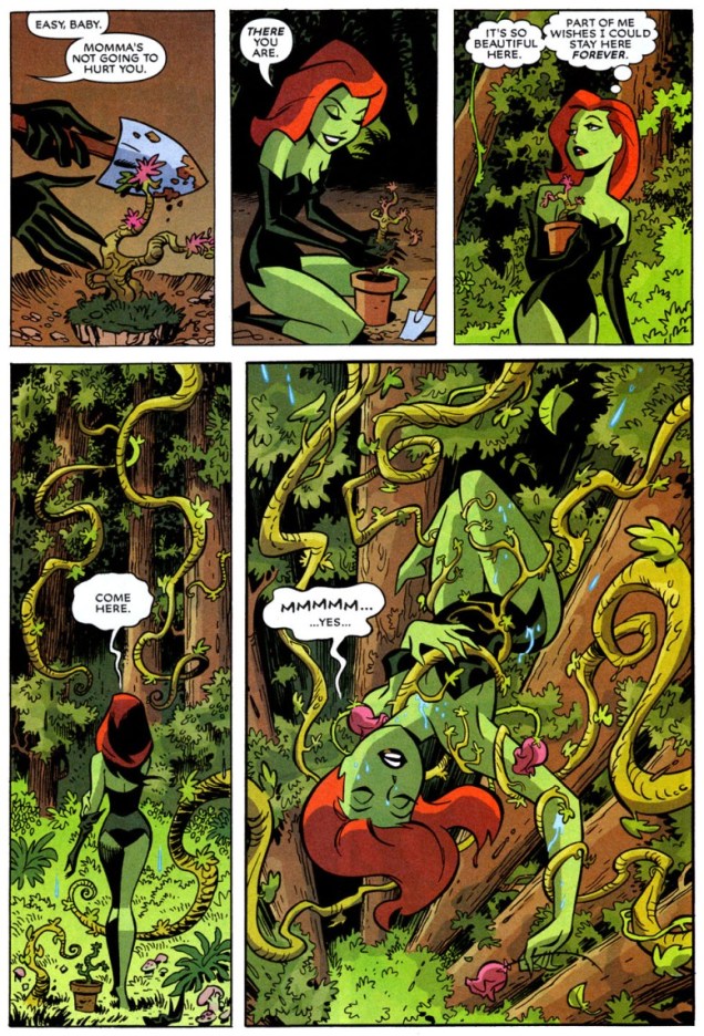
I’ll wrap up with some eye candy – I was pleasantly surprised to discover that it was actually drawn by Bruce Timm and not one of his many imitators. A Timm comic with tentacles and more than a subtle hint of seduction? I’m very pleased, indeed.
A page from Batman: Harley & Ivy no. 2 (July 2004, DC). Jungle Fever! is scripted by Paul Dini and drawn by Bruce Timm. I recommend reading the whole thing, if only for the art.
« Matt Fox drew comics like they were carved out of stone. » — Dan Nadel, Art in Time (2010)
As far back as I can recall, I’ve been intrigued by the tremendous latitude to be found in specific penciller-inker pairings. Depending on who’s at the helm, things can go anywhere from manna to mud.
No need to dwell on the damage a bad or lazy inker can inflict, and we’ve all witnessed the magic of inkers that elevate any pencils they’re called upon to finish.
It’s of yet greater interest, I believe, to delve into the rare and mystifying alchemy worked by two flavours you’d never dream of commingling in the same dish… like anchovies and ice cream, or perhaps Nutella and caviar.
One such audacious mixture was given a go in the transitional post-Atlas days of Marvel comics, as the publisher’s long-running anthologies were shedding their mostly-standalone short story format in favour of the resurgent superheroes.
First, though, a bit about our performers:
Recently-retired (in 2018) writer-artist Larry Lieber (born October 26, 1931, and still with us), is Stan Lee’s younger brother (who didn’t anglicise his name nor sport a toupee) and publisher Martin Goodman‘s nephew. From day one (he got his start in comics with Atlas in 1951), Larry toiled on the family farm, so to speak, his entire career (including a chaotic editorial stint with Martin and Chip Goodman’s ill-conceived Atlas-Seaboard company in 1974-75). His most notable work at Marvel was his run as writer-artist on Rawhide Kid (1964-1973); after Atlas-Seaboard, he worked for Marvel-related newspaper strips, frequently with brother Stan (first The Incredible Hulk, 1978-79, then The Amazing Spider-Man, 1986-2018). He did co-create Iron Man, Ant-Man and Thor… but hasn’t seen a dime for it beyond his measly page rate back in the 60s. Once more, that’s the American comic book industry for you, particularly if you’re a bit of a milquetoast.
In the 1950s, he drew a handful of short stories for Atlas, as well as a single story and a trio of covers for Youthful’s Chilling Tales… upon which largely rest his reputation in comics. Peter Normanton, in The Mammoth Book of Best Horror Comics, wrote: « There is an air of disquiet to his vision, yet it charms through a surreptitious blending of the primitive with the mockingly insane. His characters border on the lunatic seemingly at home in his landscapes, concealing a darkness corruptive of the soul. »
This is Beware — the Machine!!! from Strange Tales no.111 (Aug. 1963, Marvel). Lieber, while he’d never be called (or claim to be, to his credit) a master draughtsman, did possess one irrefutable and priceless artistic quality: he could tell a story clearly, smoothly, without undue fuss.
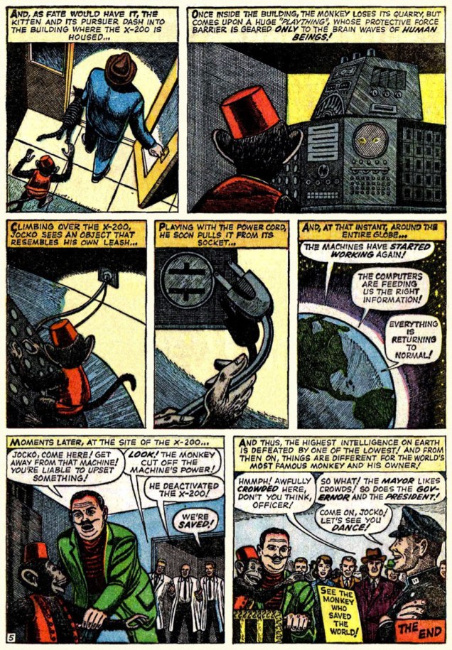
« Without conscience, compassion, or any other behavioral safeguards that humans possess… » I can certainly think of some exceptions, can you?
Uh, guys, monkeys are hardly low on the intelligence totem pole. Now if the X-200 had been brought down by, say, a slime mould, you’d be closer to the truth of your claims.
Now, you may ask, did Lieber appreciate Fox’s stellar efforts? Short answer: nope. In this chat with Roy ‘Houseroy’ Thomas, he lets it all hang out. [ source ]
Roy Thomas:One of the strangest inkers you had was Matt Fox.
Larry Lieber: I hated that stuff! Oh, God, and years later, I learned that Matt Fox is considered one of the greats by some people, and his artwork brings a buck or two.
RT: Yeah, but not in comics.*
LL:I hated his stuff because I struggled with drawing, and I was trying to make the drawings look as real as humanly possible, and I had a tough time. I remember I once had Don Heck inking me on a five-page western, and I remember saying, “My God, he’s good at making my stuff look better than it is,” and he was. Matt Fox – if my stuff was a little stiff, he made it even stiffer; he made it look like wood cuttings!
RT: Fox had been in advertising. He’d done lithographs, pulp illustrations; evidently he did some covers for Weird Tales, the magazine that published H.P. Lovecraft and Robert E. Howard, including Conan, back in the ’30s. Fox did color wood cuts; he was a real artist, but his comic inking was so strange – his line just deadened everything.
LL: One of my traits was that I was reluctant to say anything bad about anybody, because everybody has to earn a living. I wouldn’t complain, no matter who they put on. But one day I was working in the office penciling a western, and Stan walked by. He saw my pencils and he said, “This is your penciling?” And I said, “Yeah.” Stan said, “This is pretty good. I’ve been looking at the finished stuff, and that looks terrible.” And he removed that inker – it wasn’t Matt Fox – and gave me a better one. But I, of my own volition, wouldn’t say a word about it.
RT: Fox obviously had a style that just didn’t translate well into comics.
No, Roy: Fox had a style that just didn’t translate into your own, extremely limited idea of comics. This is, after all, the guy who assigned Vince Colletta to ink Frank Robbins, as well as the single individual most responsible for infecting US comics with the dread malady of “continuity“.
It must be said, however, that Fox’s meticulous line work is not particularly suited to the lousy colouring and printing found in comic books of that vintage. So… let’s look at some original art!
Page two of I Was a Victim of Venus!, from Tales of Suspense no. 43 (July 1963, Marvel).« Camoflauging », Larry? Page five of The Search for Shanng!, from Strange Tales no. 113 (Oct. 1963, Marvel).Page three of The Enemies! from Journey into Mystery no.101 (Feb. 1964).
Here’s a chronological Lieber-Fox bibliography, comprising 17 stories:
Escape into Space (Tales of Suspense no. 42, June 1963) The Man Who Wouldn’t Die! (Journey into Mystery no. 93, June 1963) We Search the Stars! (Strange Tales no. 110, July 1963) I Was a Victim of Venus! (Tales of Suspense no. 43, July 1963) Beware — the Machine!!! (Strange Tales no. 111, August 1963) I Come From Far Centaurus! (Tales of Suspense no. 45, September 1963) The Smiling Gods! (Tales to Astonish no. 47, September 1963) The Search for Shanng! (Strange Tales no. 113, October 1963) Grayson’s Gorilla! (Tales to Astonish no. 48, October 1963) The Purple Planet! (Journey into Mystery no. 98, November 1963) The Secret of Sagattus! (Tales to Astonish no. 50, December 1963) Stroom’s Strange Solution! (Journey into Mystery no. 99, December 1963) No Place to Turn! (Tales to Astonish no. 51, January 1964) The Unreal! (Journey into Mystery no. 100, January 1964) The Enemies! (Journey into Mystery no. 101, February 1964) The Menace! (Journey into Mystery no. 102, March 1964) The Green Thing! (Tales of Suspense no. 51, March 1964)
Larry! sure! loved! his! exclamation! marks!!!
Most of these have never been reprinted until recently, and since they appeared in key early issues of Silver Age Marvel superhero titles… they’ve largely languished in obscurity. Writing-wise, they deserve it. But the artwork is what we’re interested in.
And on that point, it would be fair to feature a solo piece from Fox and Lieber, for a bit of perspective on each man’s respective strengths and peccadillos.
In closing, here’s a bittersweet excerpt from Bhob Stewart‘s vivid recollections of his meetings with Fox in the mid-60s, during Stewart’s time as editor (and just about everything else) of Castle of Frankenstein, when Fox dropped by to place an ad in the magazine.
« Fox came across as a straight-arrow, no-nonsense sort of a guy, and after a brief conversation about Weird Tales, he quickly got to the point. He was selling glow-in-the-dark posters, and he wanted to run an ad in Castle of Frankenstein. With that, he unfurled his glowing poster depicting demons and banshees dancing in the pale moonlight. We took it into a dark corner of the room, and yes, indeed, it did emit an eerie green glow.
He next produced an ad for the posters. He had made a negative photostat of his ink drawing, so the reversal of black to white simulated glowing monsters coming out of the darkness toward the reader. Clever hand-lettering effects added a subtle suggestion of glowing letters seen at night, not unlike the moment when Marion Crane first spots the Bates Motel sign through her car’s rain-covered windshield. »
The advert in question, from Castle of Frankenstein no. 8 (1966).
« … it was the second time I saw him. I admired his tight rendering in ink and crayon on pebbleboard. Then I casually asked, “So how many orders did you get for the glow-in-the-dark posters?” He responded bitterly, “None.” After that day, I never saw him and his demonic entourage again. He became the Phantom Artist, whereabouts unknown. Fox died in 1988… » [ source ]
-RG
*utter half-baked, speculative claptrap from Rascally Roy. The fact is that very little of Fox’s original comics artwork survives. For instance, Heritage Auctions has never sold a single Matt Fox solo page. If anything still exists, it’s been in private hands for a long, long time. Furthermore, the comic books in which Fox’s work saw print do ‘bring a buck or two‘, particularly the issues of Chilling Tales featuring his covers (numbers 13, 15 and 17). Read these sinister beauties here!
(In fact, to fill that gap in demand, renowned fantasy painter Ken Kelly has even produced recreations of Matt Fox covers. Here’s a sample.)
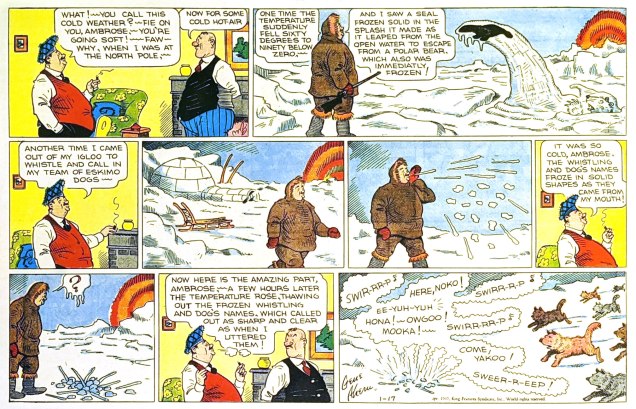
« Polar exploration is at once the cleanest and most isolated way of having a bad time which has been devised. » ― Apsley Cherry-Garrard, The Worst Journey in the World (1922)
Gene Ahern‘s Room and Board (March 17, 1937, King Features).
Of course, it’s all piffle and bunk, but it brought to mind a passage from a favourite article on weather peculiarities in Siberia, Marcel Theroux‘s The Very, Very, Very Big Chill(published in Travel & Leisure in 2000):
« Local people told me that at minus 60 and below, a dense fog settles in the streets, and pedestrians leave recognizable outlines bored into the mist behind them. A drunkard’s tunnel will meander and then end abruptly over a prone body. At minus 72, the vapor in your breath freezes instantly and makes a tinkling sound called ‘the whisper of angels.’ »
Then I thought: « all very nice, but that makes for a rather meagre post »… so I decided to toss in a few bonus images featuring that venerable recurring motif… and got carried away.
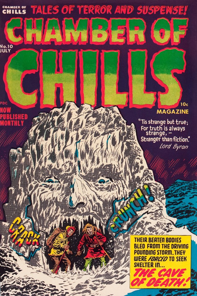
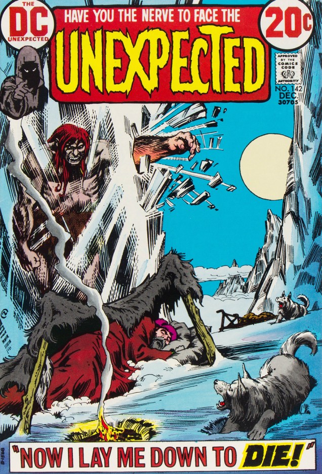
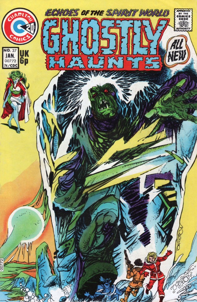
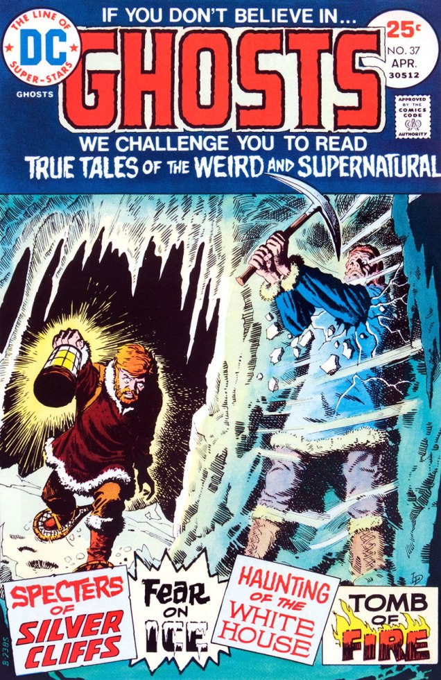
This is Astonishing no. 36 (Dec. 1954, Atlas), the title’s penultimate pre-Code issue… not that Atlas ever crossed the line into gruesome. The cover-featured yarn is The Man Who Melted!, an amusing load of utter rubbish you can read here. Cover art by Carl Burgos.This is Chamber of Chills no. 10 (May, 1974, Marvel), and most everything’s the same, save for the colour palette and the now-hostile expression on the caveman’s mug.And this is alsoChamber of Chills no. 10 (July, 1952, Harvey)… the original, whose title Harvey Comics left curbside for Marvel to recycle when they went all kid-friendly in the Comics-code-ruled Silver Age. Cover designed and art-directed by Warren Kremer and illustrated by Lee Elias. For some insight into these collaborators’ working methods on the horror titles, here’s our post on that very topic. Incidentally, what’s up with the hifalutin Lord Byron quote, Harvey folks? This wacky fare is quite plainly fiction… what’s your point? [Read it here.]This is Tales of The Unexpected no. 101 (June-July 1968, DC). Layout and pencils by Carmine Infantino, inks by George Roussos. Infantino, promoted the previous year to editorial director (he would soon rise to the rank of publisher), brought in the versatile Nick Cardy to serve as his right-hand man on the artistic front; together, they designed all of DC’s covers until both men stepped down in 1975.This is House of Mystery no. 199 (February, 1972, DC), illustrating Sno’ Fun! a rare (possibly unique, really) collaboration between Sergio Aragonés (script) and Wally Wood (pencils and inks). Cover designed by Infantino and Nick Cardy, pencilled and inked by Neal Adams and coloured by Jack Adler.This is Unexpected no. 142 (Dec. 1972, DC); cover art by Nick Cardy.This is Unexpected no. 147 (June, 1973, DC); cover art by Nick Cardy.This is Unexpected no. 150 (Sept., 1973, DC); cover art by Nick Cardy.« Hey, look! The critter is frozen whole… it’s in pretty good shape! » Tom Sutton vibrantly sells Joe Gill and Steve Ditko‘s cautionary tale of arctic drilling gone awry, The Ancient Mine. Also in this issue: Steve and Pete Morisi‘s Surprise!, and Gill and Fred Himes’ touching Pipe Dream. This is Haunted no. 37, (Jan., 1974, Charlton), presented by the publisher’s blue-skinned, green-haired answer to Nana Mouskouri, Winnie the Witch.« … that face haunts me… was it a man or a beast? » Ah, the Seventies. Left dazed and frazzled by his whirlwind life of slow-mo violence, glamorous excess and substance abuse, not to mention radiation poisoning, the inevitable occurs: The Hulk wanders onto the wrong set, as well as the wrong publisher’s! Against all odds, he handles the rôle with aplomb and commendable gravitas. A page from Gill and Ditko’s The Ancient Mine. Read it here!This is Ghosts no. 37 (April, 1975, DC), featuring Luis Dominguez‘s first (or many) cover for the title, a passing of the torch from Nick Cardy, who’d handled nearly every one of the preceding three dozen…. minus two: number 7’s cover was the work of Michael Kaluta and number 16‘s that of Jack Sparling.
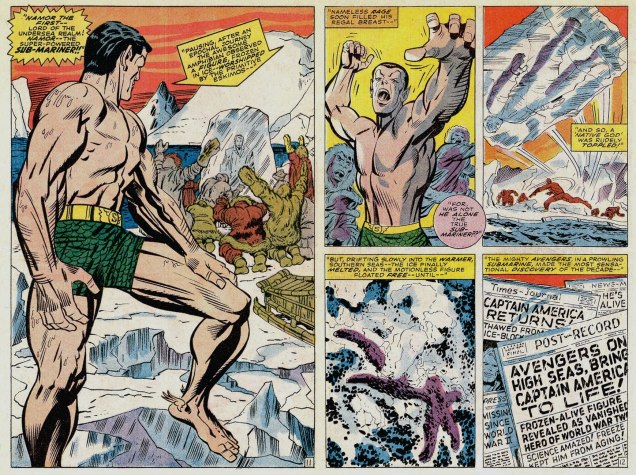
Oh, and since I wouldn’t want any of you superhero aficionados to think I’m freezing you out, here’s another demonstration of Mr. Infantino‘s “encased in ice” idée fixe.
Mr. Freeze, who first popped up in Batman no. 121 in 1959, initially known as, er… Mr. Zero (Celsius, Fahrenheit or Kelvin?) before being revamped and renamed for the mid-60s Batman TV show, a makeover that carried over to the comics, but tragically didn’t include his outfit. This is Detective Comics no. 373 (March, 1968, DC); layout by Infantino, finishes by Irv Novick. [ read it here!]… and I can just about hear the « but what about Cap? » troops tromping down the hall, so…
Namor goes all First Commandment on some poor Inuits (surely they’ve seen frozen bodies before?), displaying an unseemly level of insecurity for someone of his standing. This recap hails from King Kirby’s sensational feat of deadline rescue on the behalf of a tardy Jim Steranko (to be fair, it was worth the wait). George Tuska‘s inks are a surprisingly good fit! This is Captain America no. 112, Lest We Forget! (April 1969, Marvel). [ read it here!]My co-admin ds was just telling me yesterday about a client who, upon remarking to a succession of winter-kvetchers that actually, we’d had a pretty mild January, was invariably met with goggling bafflement, as if he’d just then grown a second head. In related news, it was just announced that said month of January was, indeed, the planet’s warmest on record. There is, naturally, an xkcd strip about this sort of circular denialism.
Some folks seem to display a knee-jerk reaction to the legacy left behind by men and women who lived decades ago: that of condescension. Surely, if it was something that our grandparents believed in, something that made their imaginations soar or intrigued them, by now it’s no longer relevant or just utterly jejune. Frankly, I’d poo-poo this repulsive straw-man I’ve just erected, if it wasn’t for the fact that these narrow-minded airheads actually do live among us. “I’ll listen to music from before my time when today’s musicians stop releasing such excellent music”, somebody daft once opined, and the same (ahem) logic seems to be apply to other forms of culture. If TV shows from two years ago are ancient (overheard at a restaurant), what can we possibly think of comics from 70, 80 years ago?
As you probably noticed, this blog suffers from no such delusions: there’s plenty of intelligent, touching, excellent-all-around material to be dug up from (in this instance) the Golden Age.
Sorry about the varying quality of the images; some of these stories have been reprinted in recent years (and thus, thoroughly cleaned up, or even lovingly restored from original art); and some of them are only available in the original form, which is to say shoddily printed, dubiously coloured, and not all that well preserved. The Golden Age was, as I noted previously, a long time ago…
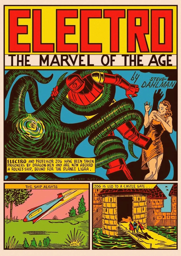
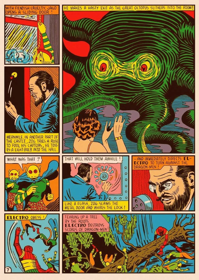
All right, let’s begin! I have a few favourites in this post, and our first story is one of them. I had access to a pristine, cleaned up, painfully white-papered version of it from Golden Age Marvel Comics Omnibus no. 1 (2009), but I by far prefer the following version, which keeps the colours, shall we say… less blinding? This is On the Planet Ligra, originally published in Marvel Mystery Comics no. 9 (Marvel, July 1940). It is scripted by Steve Dahlman, who did a very nice job of it, too. It’s worth a read in its entirety; find it here.
The next few pages demonstrate the dodgy printing I was referring to earlier…
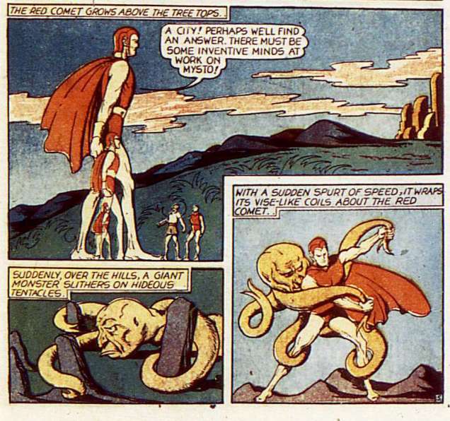
Slave Planet is scripted by Herman Bolstein (as Starr Gayza; what a nom de plume!), and illustrated by Arthur Peddy, possibly with some help by Will Eisner on inks. Published in Planet Comics no. 4 (Fiction House, April 1940). Incidentally, we have a whole bevy of Fiction House Tentacles at Tentacle Tuesday: Planet of Tentacles, courtesy of Fiction House.Mystery of the Vanishing Men, published in The Red Comet no. 8 (Fiction House, September 1940), is illustrated by Alex Blum.Another page from Mystery of the Vanishing Men.
This next part I like a lot, because I’m quite fond of Henry Fletcher, Barclay Flagg and perhaps even Hank Christy. These are all the same person, of course: Fletcher Hanks, The Most Bonkers Comic Book Creator of All-Time, according to Mark Peters. For now, let’s just look at some tentacles, although I will doubtlessly return to this theme at some later juncture.
Because of Fletcher Hanks’ relative cachet, comic scholars and restorers seem to have paid a little more attention to his work of late, and at a result, we can admire the two following pages in all their mighty crispness.
A page from Stardust « featuring the Octopus of Gold!», published in Fantastic Comics no. 16 (Fox, March 1941), scripted and illustrated by Fletcher Hanks. The Slave Raiders is scripted and illustrated by Fletcher Hanks. It was originally published in Jungle Comics no. 1 (Fiction House, January 1940).
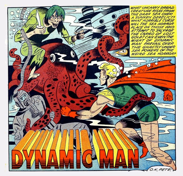
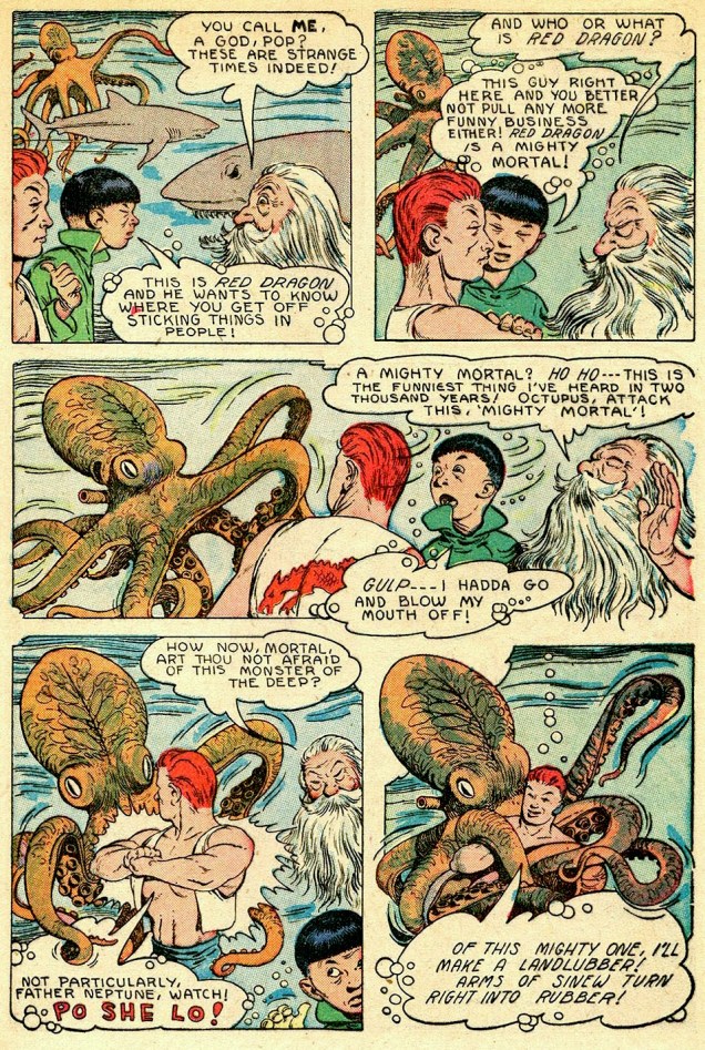
Getting off the Hanks bandwagon, we move into nonetheless enjoyable territory with Dynamic Man. These panels are from an unnamed story (with matching unknown artist ) published in Dynamic Comics no. 9 (Chesler/Dynamic, 1944).
This has no tentacles, but I enjoyed these two panels far too much to not share: the guys’ New Yawk accents, and the witch’s demented rictus (not to mention that it’s all happening underwater).How many more rhetorical questions are you going to ask us?
Last but not least, as boring people say, is my second favourite of today’s post, both because I love the art and because the story gave me something to sink my teeth into. .
Super-Magician Comics vol. 5 no. 8 (Feb-March 1947), cover by Edd Cartier. Dig the guy’s dopey, sneezy expression… contrasted with the octopus’ hypnotic stare.
Twilight of the Gods, the cover story, is also illustrated by Edd Cartier. It’s surprisingly nuanced, doesn’t fall into horrible stereotypes despite the presence of several Chinese characters, and even has an interesting moral. Read it here.
Next week, I’ll return to my usual diet of the Latest Published Thing as well as superhero crossovers! Just kiddin’.
« It’s wisest always to be so clad that our friends need not ask us for our names. » — James Fenimore Cooper
(Being a compendium of fashion faux-pas and various sartorial eccentricities.)
Now here’s a figure shrouded in mystery (and little else): Captain Wizard, whose sole appearance was on the cover (and not enough of it) of Atomic Bomb no. 1 (Gerona/Jay Curtis, 1946), a scarce one-shot. Artist unknown, regrettably.
What are this intriguing man of (relative) mystery’s abilities, aside from autonomous flight, quasi-nudity, bountiful love handles and a snazzy roué moustache? Did he “scare straight” hapless criminals with his sweaty, virile bear hugs? Sigh… I fear we shall never truly know. He’s in the public domain, the gent’s overdue for a revival!
I suppose there are many ways to compete for the prized title of « Most outré criminal Batman and Robin have ever encountered » (awarded every other year in October at Gotham City Hall; call 608-555-1313 for reservations): powers, weapons, motivations, henchmen, moniker, targets, modus operandi…
The Killer Moth made his play for the brass ring by donning the most garish and unsightly garb imaginable. Here he is making his début in Batman no. 63 (Feb. 1951), The Origin of Killer Moth! This sorry buffoon’s inception is credited to Bill Finger, Dick Sprang and Lew Schwartz, presumably to dilute the blame.
Of course, it’s unfair of me to pick on Killer Moth’s costume. I’m sure he took full opportunity to hone and refine his look over the next couple of decades. Plenty of down time to mull things over at his leisure in the clink, right?
To precious little avail, apparently. Here he is a quarter century on, in Batman Family no. 10 (April, 1977); his wings have arguably been upgraded to a cape, but he’s still evidently daltonic. Cover by Bob Brown and John Calnan. Sadly, this was some of veteran Brown’s last published work; he passed away from leukaemia in January, 1977.
Another entry from the closet of shame. His Very Name Invokes Terror… among the dandies of the Serengeti, who blanch and quake at the notion of being seen in public with him. However, that headgear of his reportedly drove Sir Elton mad with envy.
Showcase no. 66 (Jan.-Feb. 1967), The Birth of B’wana Beast, pencilled (and possibly scripted, but who’d admit it?) by Mike Sekowsky and inked by George Roussos. Edited by George Kashdan… who was unceremoniously relieved of his editorial duties after a mere two Showcase issues, both featuring B’wana Beast.
With Jack Kirby and Steve Ditko having decamped (not to mention Stan futilely slouching towards Hollywood), Marvel in the early 70s had not only lost its visionary plotters, but also its ace character designers.
Also, after 30 years or so of men in suits and hats, it was deigned that the younger and hipper generation should have characters whose wardrobe bore at least a tangential relationship to its own.
Created for the 100th issue of Daredevil by scripter Steve Gerber and penciller Gene Colan (who ended his initial long run on the title with that issue; was Angar the final straw, or was it the even more wince-inducing toadying to Jann Wenner?), Angar the Screamer was, to quote the amaranthine words of Wikipedia, « … born in San Francisco, California. He became a hippie and a radical social activist. He volunteered for an experiment that endowed him with sonic powers that caused people to hallucinate. » Groovy. Perfect for… 1973?
If anything, we can be grateful that Angar’s colour scheme is relatively restrained. I suppose it makes sense for a flower child to opt for earth tones. This is the concluding, cliff-hanging panel from Mind Storm! (Daredevil no. 100, June, 1973). Pencils by Gene Colan, inks… nay, “embellishments” by John Tartaglione. Read that, er… masterwork right here.Poor DD’s saddled with calves thicker than his thighs. Cover art by Rich Buckler and Frank Giacoia, with the usual fussing and turd polishing by John Romita Sr..
This is Angar’s first cover appearance, Daredevil no. 101 (July 1973), in a tale that could only be called… Vengeance in the Sky With Diamonds!
There *are* indeed tentacles within, so you’ll likely encounter these, some enchanted Tentacle Tuesday…
When digging through comics in quest for tentacled material, one soon notices that Gil Kane‘s name tends to crop up again and again. Despite this seeming ubiquity, I’ve never specifically concentrated on his art, though he certainly has appeared in Tentacle Tuesdays before (quite a lot in Tentacle Tuesday: Conan-O-Rama, for instance).
I can’t quite put my finger on it, but one of the things that seems to bug me is that Kane, whose real name was Eli Katz and who was born in Latvia, threw himself with such vigour into American culture. It’s an unfair reproach, I realize – one can hardly expect a four-year old child to hang on to a quickly-receding memory of his parents’ motherland to the detriment of whatever culture he’s growing up in, not to mention that this would be unhealthy.
The crux of the matter is that I don’t grasp that je-ne-sais-quoi that people seem to find appealing about Kane’s art. Where others see “dynamic storytelling, emotionally charged characters, and innovative [sic] staged fight scenes“, I see overly busy, hard-to-parse scenes and stiff anatomy. It doesn’t help that the bulk of his oeuvre is concerned with a subgenre of comics I have strong misgivings about, namely superheroes.
To answer the question of what is it that makes Kane so special, I have naturally turned to Gary Groth:
That is certainly well argued, but I’ve read a few Kane interviews and his intellectualism is just clearly not on my wavelength at all. There’s no doubt that he was the analytical kind (this interview with him published in Alter Ego no. 10 (1969) calls him « the comics’ most articulate artist »), but what he says often strikes me as stilted (much like his art). Take this, for instance: « Craft is merely the springboard. It’s the ability to give wings to your expression; otherwise your expression bangs around in an inarticulate way and comes out thick and untutored; you’re just throwing away range and scope. » Let’s just say that Kane was a very opinionated man, which does him credit. Yet I get the impression that his inclination to pick at himself veered towards self-destructiveness, as if he were ever striving for some lofty heights he was aware he would never reach.
In that process of self-improvement (let’s call it that), he often slagged other artists who were operating on a different level from his. Even as he flattered them, his compliments felt incredibly back-handed, bringing to mind those people who never smile, trying to get their atrophied mouth muscles to do the job and achieving merely a sort of pained rictus. For instance, I’m a little sore about his description of Will Eisner, who « did little morality stories, which were very moving, but they had the quality of reading a children’s picture book; he could be quite dramatic, but always on a kind of innocent level. He never had complex, subtle characterizations…» or, again, « Eisner is a writer until you start talking about literature, and talking about the great writers of literature. Then Eisner is only a cartoonist. »
All this being said, I do like *most* of today’s crop… save for the last two Kull the Destroyer covers, instances of the messy, rigid mises en scène I was carping about earlier. The best cover (imho) is inked by Tom Palmer, not so coincidentally. Co-admin RG has been heard to posit that Gil Kane should never have been allowed to ink himself.
And now I’d better stop displaying my ignorance and move on to the tentacles!
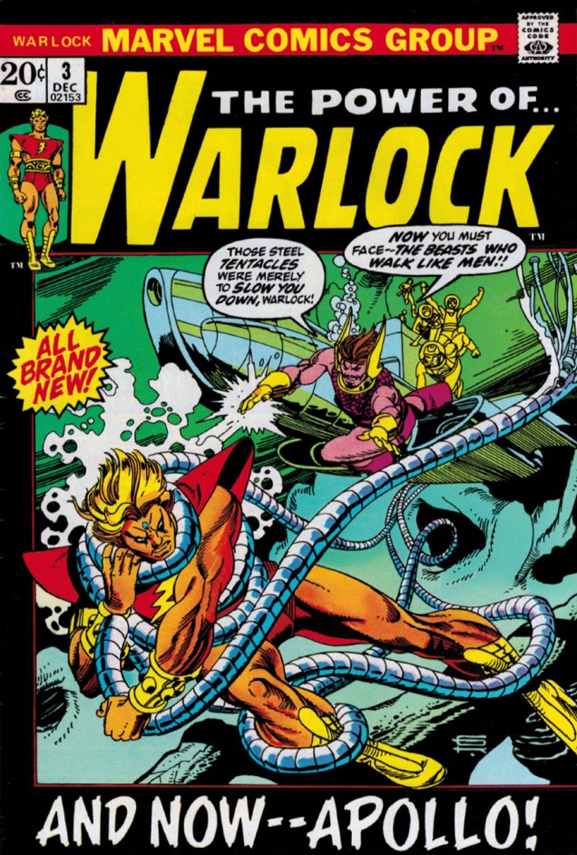
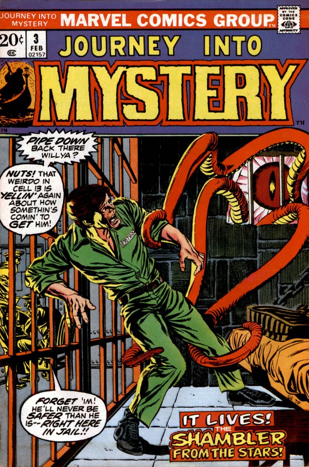
Warlock no. 3 (December 1972). Cover by Gil Kane.Journey into Mystery no. 3 (February 1973). Pencils by Gil Kane, inks by Tom Palmer.
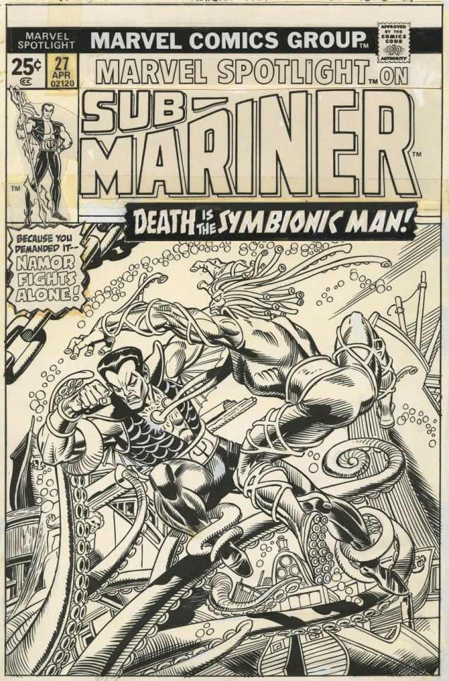
The original art for Marvel Spotlight no. 27 (April 1976). Pencils by Gil Kane, inks by Frank Giacoia.
Kull the Destroyer no. 17 (October 1976). Pencils by Gil Kane, inks by Klaus Janson.Kull the Destroyer no. 21 (June 1977), cover by Gil Kane.
« I have learned to live each day as it comes, and not to borrow trouble by dreading tomorrow. It is the dark menace of the future that makes cowards of us. » — Dorothy Dix
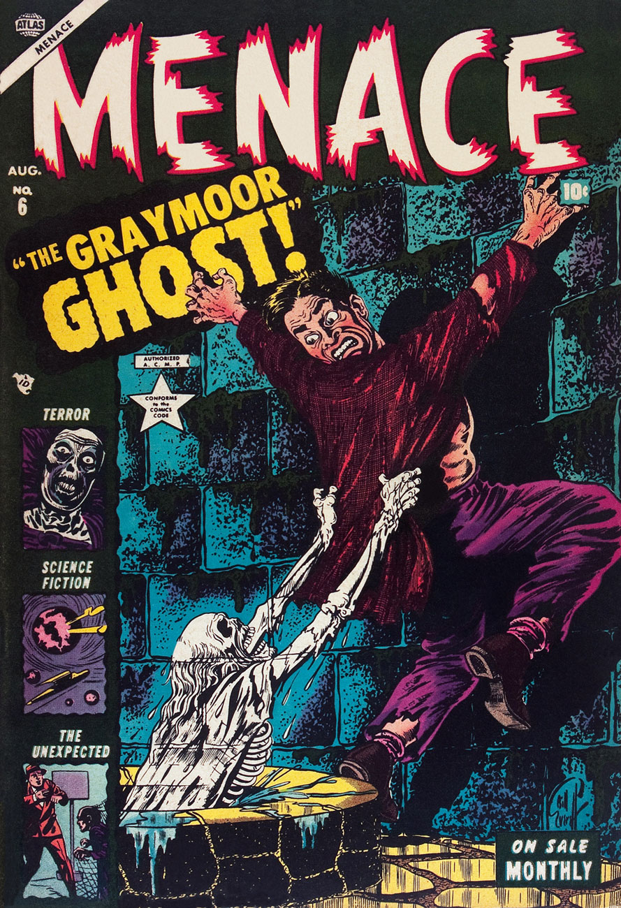
Menace was a short-lived (11 issues, 1953-54, Atlas) horror anthology title that’s mostly remembered*, if at all, for its one-shot introduction of a zombi by the name of Simon Garth. Because Atlas never really played the gore card, its successor Marvel was able to mine most of its Pre-code material as cheap filler in their 1970s bid to flood the market. Don’t get me wrong, though; these titles were still a lot of primitive fun, and in most cases, I’d pick an issue of Weird Wonder Tales, Where Monsters Dwell or Uncanny Tales From the Grave over the latest Fantastic Four or Spider-Man.
The writing was by no means daring or even coherent, but the artwork was frequently rather fine, with none quite finer than Bill Everett‘s, particularly his covers, which elegantly straddled the line between fearsome and goofy.
I’d be tempted to say that Everett (1917-1973) was at his peak when he created these, but the bittersweet fact of it is that Everett was still at the height of his artistic powers, even as he was slowly dying in the early 1970s.
This particular hot streak ends not because Everett turned in a lesser job, but because other hands provided covers for the rest of the run. Talented hands, at that (Carl Burgos, Gene Colan, Russ Heath, Harry Anderson), but none of the other Menace covers are a patch on Everett’s mighty half-dozen.
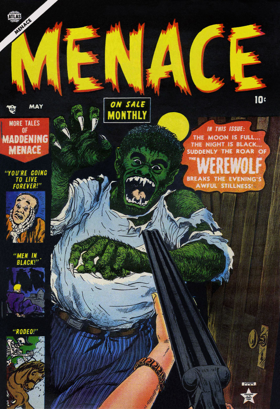
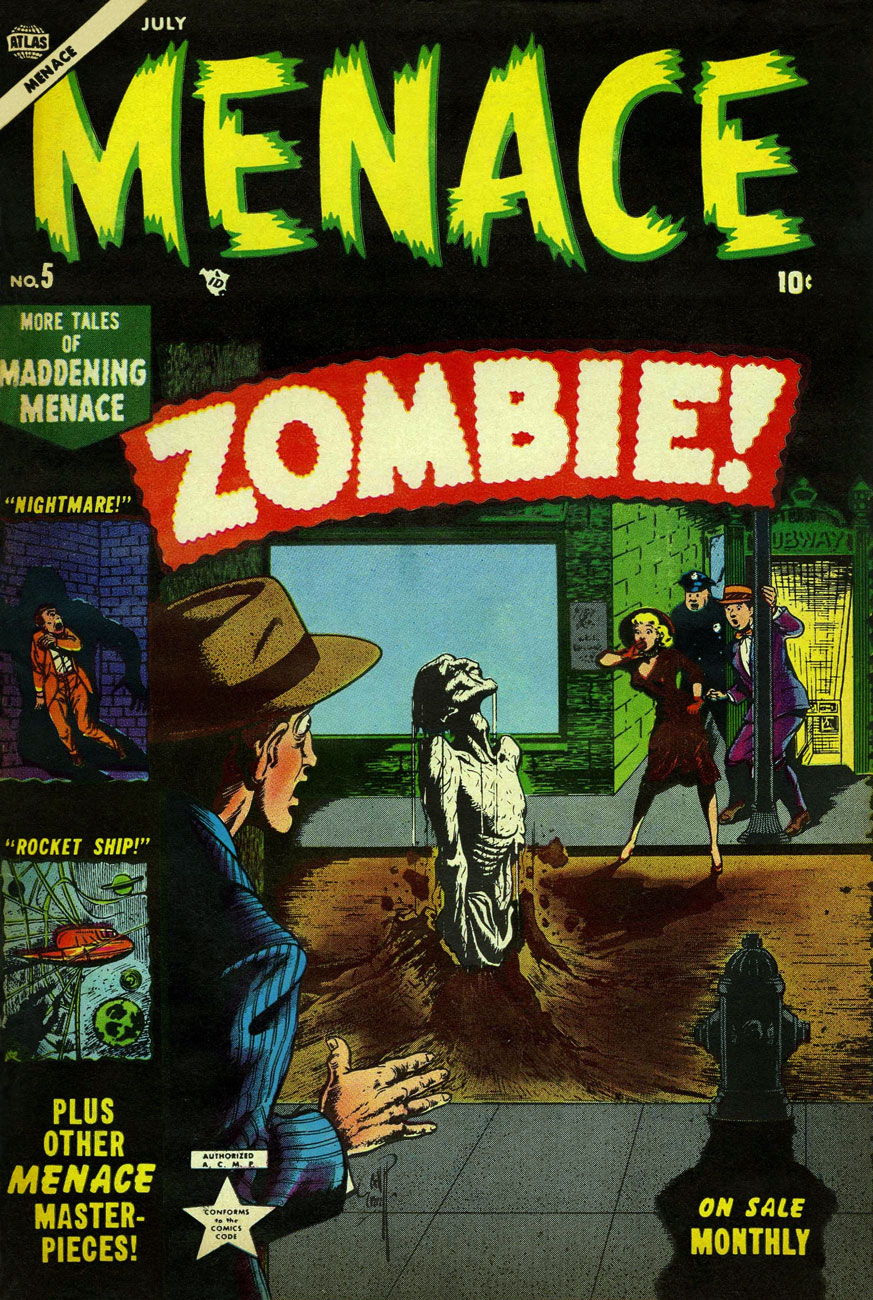
These monsters look kind of playful and kooky, don’t they? This is Menace no. 1 (March 1953, Atlas). Inside we find Everett, George Tuska, Russ Heath and Werner Roth art. Oh, and Stan Lee stories. Colours by Stan Goldberg.This is Menace no. 2 (April 1953, Atlas). Colours by Stan Goldberg.This is Menace no. 3 (May 1953, Atlas). Colours by Stan Goldberg. Was the title’s monthly schedule truly supposed to be a selling point?This is Menace no. 4 (June 1953, Atlas). Colours by Stan Goldberg.If you think that’s impressive, you should see what mushrooms can do to asphalt!** This is Menace no. 5 (July 1953, Atlas). Simon Garth was dug up (sorry) in 1973, likely at the behest of continuity addict Roy Thomas, to star (if you can call it that) in his own black & white magazine, Tales of the Zombie (10 issues, 1973-75). Like The Man-Thing, he was essentially mindless and shambling, and so mostly a pawn or an uncomprehending witness to others’ tragedies. The best of the mangy lot is, imho, The Blood-Testament of Brian Collier (TotZ no.7… read it here.) It’s not great, but it sure looks pretty, thanks to the sublime Alfredo Alcala, who’s quite in his element here.Don and Warren also met Simon. Read Lee and Everett’s 1953 Zombie!This is Menace no. 6 (August 1953, Atlas). Colours by Stan Goldberg.
That strange compulsion that’s creeping over you, that ungodly craving for more Bill Everett, cannot quite be slaked without incurring a terrible cost, be it in human lives, the forfeiting of your immortal soul, or both. But do check out my co-admin ds’ earlier tribute to Mr. Everett’s nightmares, Bill Everett’s Restless Nights of Dread, it might tide you over until dawn.
-RG
*these babies are rare, in any condition.
**Here’s an example:
« A bump in the garage floor turned into a half meter of mushrooms in little more than three days. It crushed its way through five centimetres of asphalt in Åge Reppes garage in Stord, western Norway. It is the water pressure in the cells of the fungus that makes it able to crack the asphalt, says a biologist at the local university. » [ source ]. These are inky caps. Edible, but some species are toxic when consumed with alcohol. These are commonly known as ‘tippler’s bane‘.
« Silence at the proper season is wisdom, and better than any speech. » — Plutarch
When I think of cover layouts, I always recall the sage advice of my art school book design teacher, who posited that « a poster should be One Angry Fist », as you only have a second or two to make your point to the undecided consumer. That knuckle sandwich is what gets your message across, not a bunch of clichés and slogans; these only detract from the power of your image.
While we’re obviously dealing, in comics, with a commercial medium, it’s hard to not view it as creative interference, a lack of confidence**. While all publishers indulged in cover overhyping to some degree, Marvel and DC were the main offenders, and DC at least had superior title and logo designers***.
In the 60s, Jack Kirby created a massive amount of stunning cover art for Marvel… which editor Stan “Ne’er ’nuff Said” Lee buried, as often as not, under his trademark wiseass hyperbole. One might argue that this hardsell approach worked, commercially speaking. Artistically, on the other hand… well, the debate lingers on.
One could counter that cover hype only increased in the subsequent decades (imitated, amplified and distorted), and that stands to reason. That trend is pretty universal, since everything is getting louder, literally and figuratively: commercials, recordings, everyday life. Indeed: louder, sweeter, saltier, faster, meatier and of course cheesier.
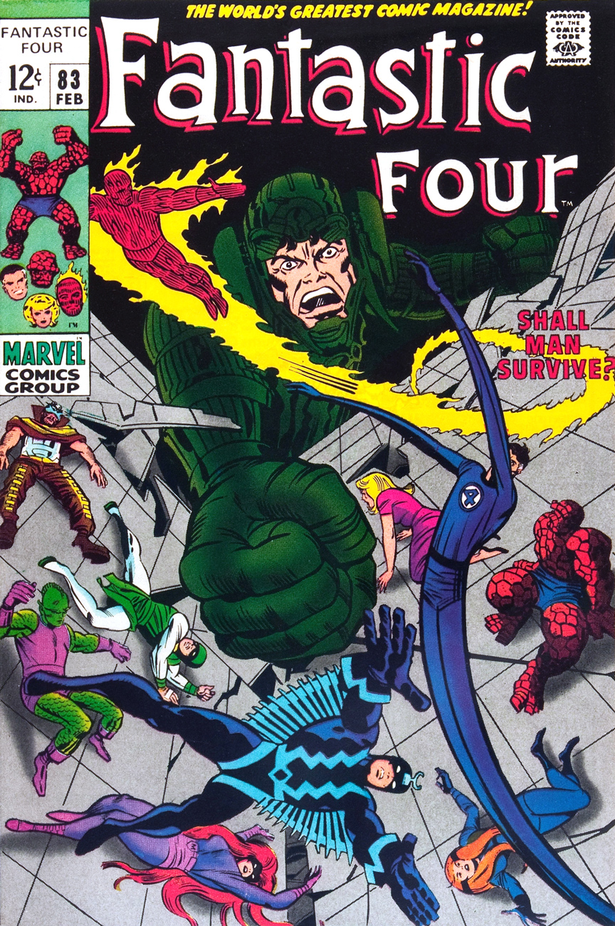
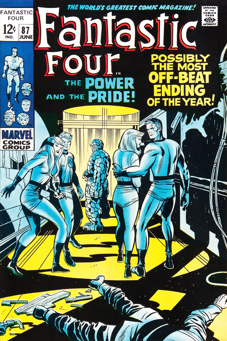
Ah, but for what seems like a mere blip in its history, which is to say around ’68-’69*, Marvel somewhat dialled down the verbiage and let some prime Kirby compositions enjoy a bit of breathing room (at least on Fantastic Four, the company’s second-best seller — and number 16 overall for 1968).
This particular streak is circumscribed by two ho-hum (by lofty Kirby standards) covers: flat FF 81 and messy FF 88 (featured here)… which leaves us with plenty of goodies in the middle. Let’s take the tour, shall we?
This is Fantastic Four no. 82 (Jan. 1969, Marvel). Inks by Joe Sinnott. Silence by Stan Lee. Now isn’t that better?
Maximus tries to usurp Black Bolt’s throne, like clockwork. Just a discreet story title… though even then, it’s still intrusive. This is Fantastic Four no. 83 (Feb. 1969, Marvel)
See picturesque Latveria. Enjoy the charms of its capital, Doomstadt, located just north of the Kline River. Don’t forget to drop in for some howdy-dos at the small but proud nation’s administrative centre, Castle Doom. This is Fantastic Four no. 84 (Mar. 1969, Marvel). Beyond-meticulous inks by Mr. Sinnott.
This is Fantastic Four no. 85 (Apr. 1969, Marvel). Again, did we even need a title? Mechanical lettering, to boot, so it’s not even expressive.
Short of a classic, but a nice entry nonetheless. And quiet! This is Fantastic Four no. 86 (May 1969, Marvel).
This is always the first image that springs to (my) mind when people bone-headedly claim that Kirby’s work is too over-the-top, ham-fisted and frantic. Even the colours (Stan Goldberg, is that really you?) are admirably subdued. Of course, Stan had to panic and turn on the hype in the eleventh hour. The title would have sufficed. This is Fantastic Four no. 87 (June 1969, Marvel). Giacoia-esque inks by Mr. Sinnott.
There. Isn’t that better? The might of Photoshop harnessed to noble ends.
In the face of all this, is it any wonder I found so refreshing the design quietude and purity of some recent comic books covers, such as the Chris Samnee creations we recently spotlighted? There’s hope, thanks to some enlightened folks out there.
**Steve Ditko, for one, grasped that if you couldn’t have your publisher’s confidence and trust in your craft and visual salesmanship, you could go elsewhere and enjoy a publisher’s laisser-faire.
***Marvel would even, in the 70s, hire on the sly, for freelance jobs, DC’s reigning lettering ace, Gaspar Saladino. Heaven knows The Avengers badly needed a logo makeover.
« It is a mistake to fancy that horror is associated inextricably with darkness, silence, and solitude. » ― H.P. Lovecraft
I’ve actually had a friend tell me that he sees tentacles wherever he goes because of my Tentacle Tuesdays. Hey, I’m not making this up – tentacles *are* everywhere. Whether you’re in a well-lit room, with reassuring noises of the city filtering through the windows, or in a city centre, cushioned from harm by the comforting presence of a crowd… repairing a TV set, kissing a date, heading over to the pub for a well-deserved drink… some cephalopod horror is but a blink away. Fie, fie, foul apparition!
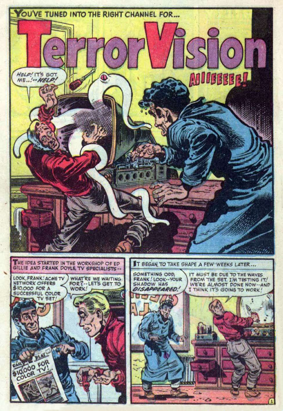
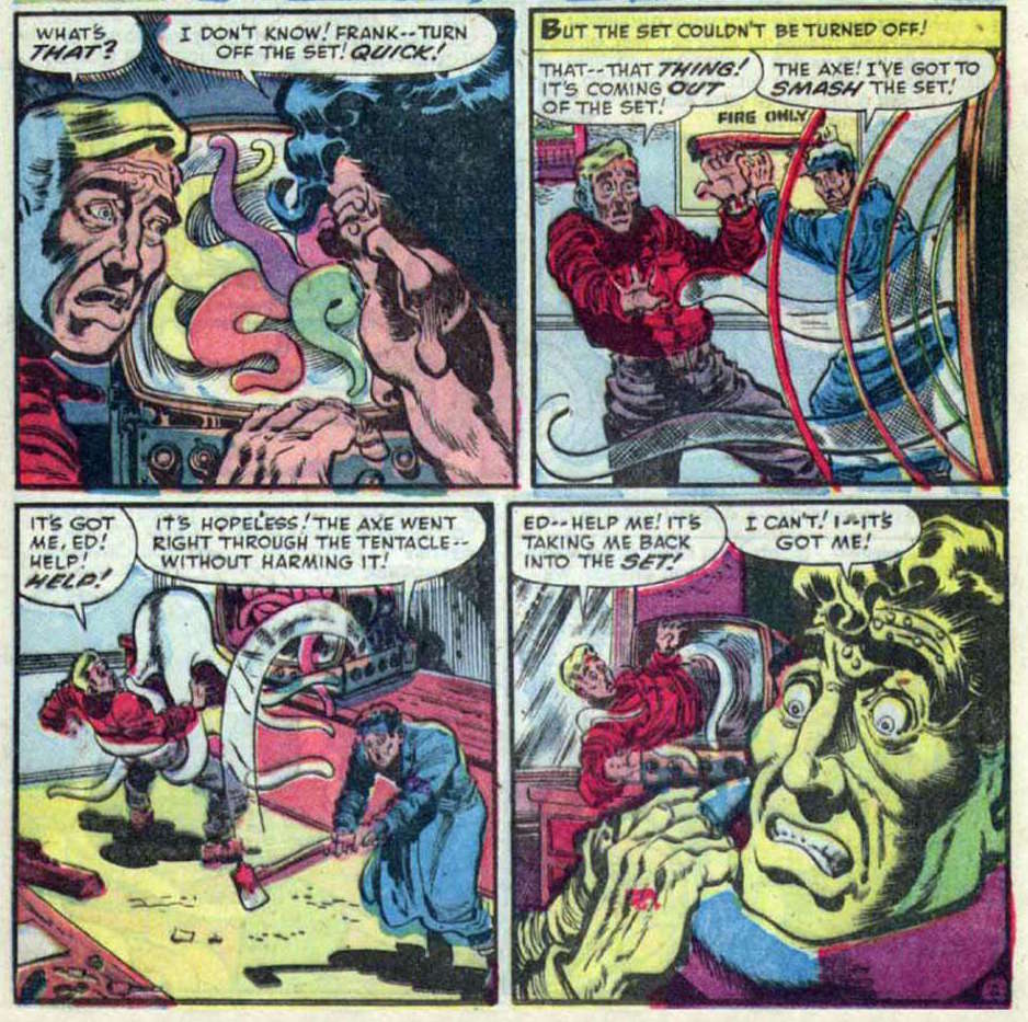
What better beginning to this post than… TERROR VISION!!! (“Aiiieeee!“, to quote the man.)
A page from Terrorvision, with very nice art (and possibly plot) by Howard Nostrand, printed in Chamber of Chills Magazine no. 19 (September 1953, Harvey).
Things go from bad to worse for our repairman…
Normally I wouldn’t post yet another page from the same story, but I like the art so much that I have to share.
I’ve already mentioned German horror comics in the shape Spuk Geschichten (see Tentacle Tuesday: A Torrent of Teutonic Tentacles). Its mother publication, Gespenster Geschichten, also has its share of tentacles. For now, I will limit myself to this one cover:
It’s a cruel thing to do to a man who was just thirsting for one piddling stein of cool beer. I hope they all got better acquainted and are clinking glasses together in the next scene… but I doubt it. Gespenster Geschichten no. 545.
One would be justified in thinking that roofs are generally quite octopus-proof, but nope, this one is either a talented climber or just unimaginably huge.
Chamber of Chills no. 3 (March 1973), pencilled by Alan Weiss and inked by Frank Giacoia.
A street may look peaceful and quiet, but that doesn’t mean a shag rug tentacle isn’t stealthily creeping towards your leg. Far Frontier no. 1 (1984), drawn by Lee Carlson.
As a bit of an aside, there’s a really fun account of one collector’s quest for John Jacobs stories written for Madison Comics over at Kirby Your Enthusiasm (link: Finding John Jacobs). Far Frontier no. 1 has a few of those, and apparently they’re quite perverse and brain-melting. An excerpt of the essay in question to whet your appetite:
« I first became aware of [John Jacobs] through a review by noted comics writer Jan Strnad in The Comics Journal #94 of Dr Peculiar #1. I read and re-read it dozens of times and marveled at the samples of his primitive pencilled art. My mind tried to absorb a comic that had heavy religious overtones plus a healthy dose of T&A (with a monster rape/cannibal fetish). The reviewer theorized that John Jacobs’ mind must be like a bowl of maggots. »
As an editorial aside, I am inclined to trust Strnad on this, both because I really like his writing and because Kirby Your Enthusiasm‘s summary of Jacobs’ plots confirms the maggots theory.