« Jerry Grandenetti started out ghosting The Spirit, and nobody… NOBODY… captured the spirit of The Spirit better. Not content to stay in Will Eisner’s shadow forever, he forged his own unique style leading to a highly successful comics career lasting decades. » — Michael T. Gilbert
Since my very first encounter with his work, Jerry Grandenetti (1926-2010; born ninety-five years ago today, another Thursday April 15th) has endured as one of my true artistic heroes. But he’s not celebrated much at all.
Though he’s worked extensively on The Spirit, he’s treated as a bit of a footnote in the Eisner hagiography. His DC war work is well-regarded, but he’s inevitably overshadowed by the Joe Kubert – Russ Heath – John Severin trinity. Besides, by and large, the war comics audience doesn’t overlap much with the spandex long johns crowd. Grandenetti has only very occasionally and timidly dipped a toe into the super-heroics fray, and he was far too unusual for overwhelming mainstream acclaim.
In fact, aside from the couple of converts I’ve made over the years, I can only think of three fellow torch-bearing aficionados: Michael T. Gilbert (who digs best the early, Eisner-employed Jerry); Stephen R. Bissette (who favours the spooky 60s and 70s work); and Don Mangus, who’s most into the DC war stuff. I daresay I enjoy it all, but my taste is most closely aligned with Mr. Bissette’s on this particular point. Let’s sample a bit of everything, insofar as it’s feasible to sum up a career spread out over five decades… in a dozen-or-so images.
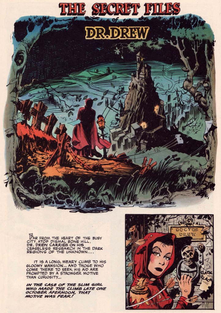
Opening splash from The Secret Files of Dr. Drew: Sabina the Sorceress, written by Marilyn Mercer and lettered by Abe Kanegson, from Rangers Comics no. 56 (Dec. 1950, Fiction House); this version hails from a reprint (Mr. Monster’s Super Duper Special no. 2, Aug. 1986, Eclipse) using the surviving original art; it was recoloured by Steve Oliff.
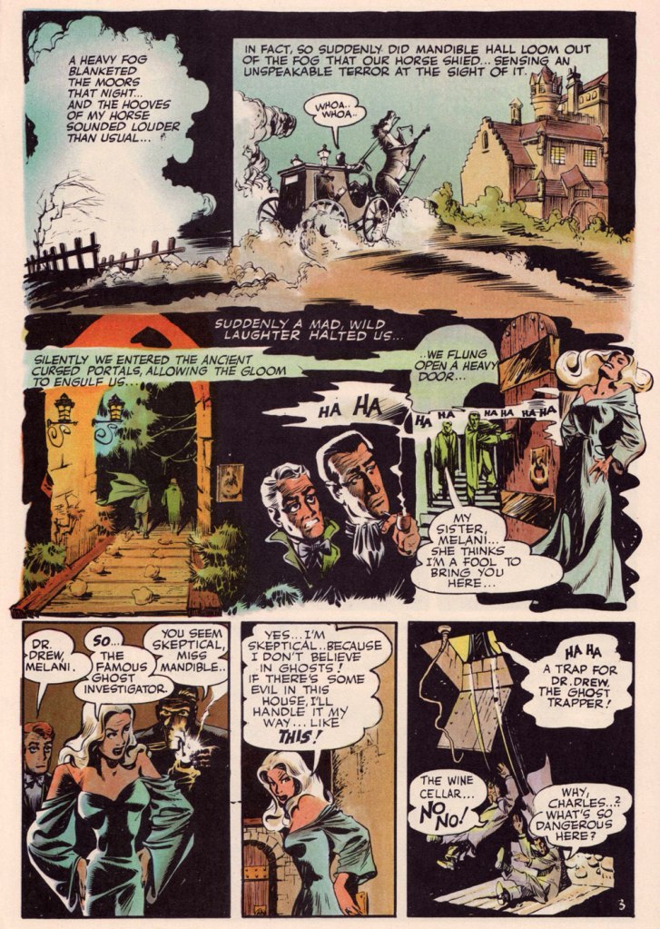
Page 3 from The Secret Files of Dr. Drew: Curse of the Mandibles!, written by Marilyn Mercer and lettered by Abe Kanegson, from Rangers Comics no. 55 (Oct. 1950, Fiction House); this version hails from a reprint (Doc Stearn… Mr. Monster no. 4, Dec. 1985, Eclipse) using the surviving original art; it was most tastefully recoloured by Steve Oliff.
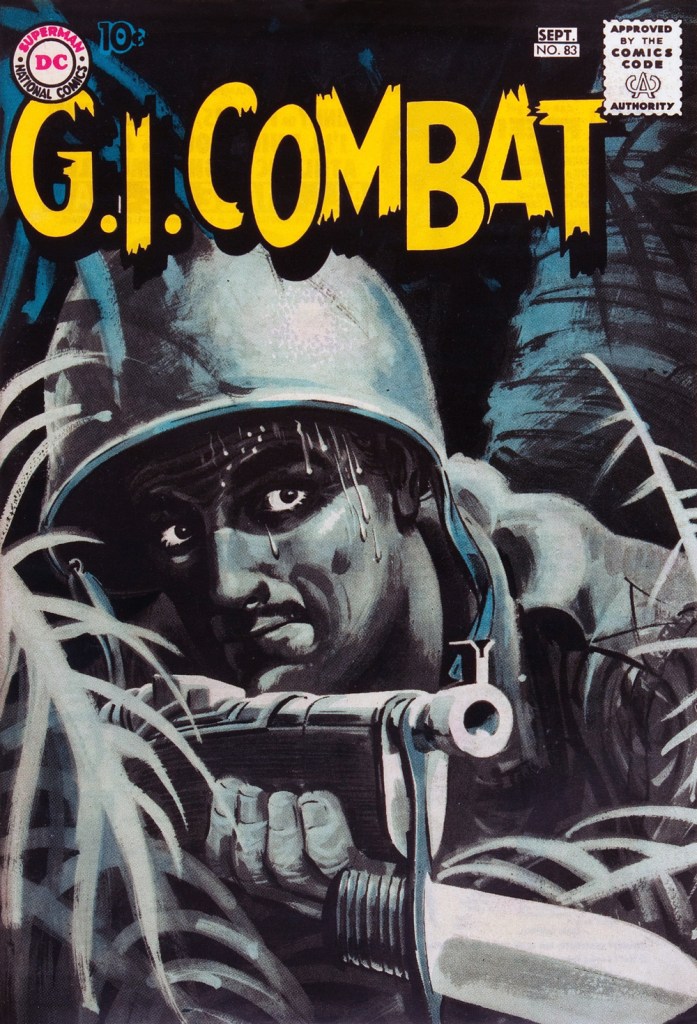
In 1954, the powers-that-be at National Periodical Publications (you know, DC) gave Grandenetti some latitude to experiment with their War covers. Grandenetti produced an arresting hybrid of painted and line art. The process involved a grey wash painting that was photostatted, with flat colour laid over the resulting image. The first few attempts yielded striking, but nearly monochromatic results. A bit farther down the pike, the production department got more assured in its technical exploration.
This is G.I. Combat no. 77 (Oct. 1959, DC); wash tones and colouring by Jack Adler, who recalled, in a 1970s interview: « It was suggested that we start doing washes for covers, and we were talking about doing it for so damned long, but nobody attempted it. I think Grandenetti did the first one, an army cover with someone floating in the water. I think that was the first wash cover that was done. That one ended up looking like a full color painting. »
This is G.I. Combat no. 83 (Aug.- Sept. 1960, DC); wash tones and colouring by Jack Adler. In 1995, Robert Kanigher, Grandenetti’s editor on the DC war books and a frequent collaborator, recalled: « Jerry liked to experiment and I had to sit on him to get him to stop it. Especially in his covers, which were outstanding, when I forced him to draw as realistically as possible. »
Original art from The Wrath of Warlord Krang!, smothered in dialogue and exposition by Stan Lee, from Tales to Astonish no. 86 (Dec. 1966, Marvel); inks by Bill Everett. Namor‘s constant random shouts of ‘Imperius Rex!‘ make him sound like a sitcom character with Tourette’s. As far as I’m concerned, it’s possibly been the most annoyingly asinine slogan in comics since Stan stole ‘Excelsior!‘ from Jean Shepherd.
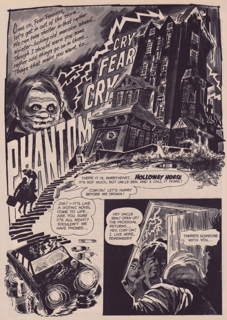
The opening splash from Cry Fear, Cry Phantom, written by Archie Goodwin, from Eerie no. 7 (Jan. 1967, Warren). In the mid-60s, presumably tiring of being pigeonholed as a war artist at DC, Grandenetti made the publishers’ rounds, doing a bit of work for Tower, Gold Key, Charlton, Marvel, Cracked (check it out here) and most memorably Warren where, after ghosting a few stories for Joe Orlando, he unleashed his innovative expressionistic style.
DC was generally hesitant to entrust its more established properties to the more “out there” artists. In the cases of Grandenetti and Carmine Infantino, the solution was to match them with the weirdness-dampening inks of straight-arrow artist Murphy Anderson. And you know what? It did wonders for both pencillers and inker.
This is The Spectre no. 6, October, 1968. A tale told by Gardner Fox (and likely heavily revised by hands-on editor Julius Schwartz, a man who loved alliterative titling) and superbly illustrated by the Grandenetti-Anderson team. Steve Ditko aside, Jerry Grandenetti had no peer in the obscure art of depicting eldritch dimensions (you’ll see!)
Page 13 from Pilgrims of Peril! written by Gardner Fox, from The Spectre no. 6 (Sept.- Oct. 1968, DC); inked by Murphy Anderson. Dig the salute to a trio of real-life spooky writers, all of whom editor Julius Schwartz knew well, having even served as Lovecraft’s literary agent late in the man’s life. By the tail end of the 1960s, Lovecraft’s work was finally making some commercial inroads, thanks largely to Arkham House co-publisher Derleth‘s unflagging diligence.
Page 22 from Pilgrims of Peril! written by Gardner Fox, from The Spectre no. 6 (Sept.- Oct. 1968, DC); inked by Murphy Anderson.
Page 2 from Men Call Me the Phantom Stranger, written by Mike Friedrich, from Showcase no. 80 (Feb. 1969, DC); inks by Bill Draut. This story reintroduced an obscure character from the early 50s, which Grandenetti had drawn a couple of times during his six-issue run. The Phantom Stranger has remained active ever since, but most writers (save Alan Moore, wouldn’t you know it?) don’t really know what to do with him. This, however, is my very favourite PS appearance. Draut, a slightly old-fashioned penciller by this time was, as a slick inker, a wonderful fit for Grandenetti’s confidently loopy layouts.
Page 3 from The Haunting!, written by Jack Oleck, from House of Mystery no. 183 ((Nov.-Dec. 1969, DC). Grandenetti pencils and inks: undiluted!
Page 2 from Eyes of the Cat, written by Robert Kanigher, from House of Mystery no. 189 (Nov.-Dec. 1970, DC); inks by Jerry’s fellow Will Eisner ghost Wallace Wood. The inspired combination of Grandenetti’s adventurous layouts and the velvety unctuousness of Wood’s finishes are a match made in heaven, but one Woody wasn’t fond of. Oh well.
So there you are. Just the tiniest tip of the iceberg. Happy birthday, Mr. Grandenetti!
« Is the spring coming? » he said. « What is it like?» «It is the sun shining on the rain and the rain falling on the sunshine…»| Frances Hodgson Burnett, The Secret Garden
Having been meaning for a while now to concentrate on tentacled plant life, I was hitherto stopped by the idea that it’s somewhat unseemly to talk about flora when most of our readership is buried in snow and ice. But now, well! – today was the first day of the year suitable for wearing shorts, and green shoots are popping up wherever one’s gaze happens to land.
We have waited for quite a long time before co-admin RG managed to get his hands on this issue… and it turned out that the insides vary from ‘lacklustre’ to ‘wow, that’s ugly!’ Still, the wonderful, striking cover makes it worth owning, I believe.
Horror: The Illustrated Book Of Fears no. 2 (February 1990, Northstar). Cover by Mark Bernal.
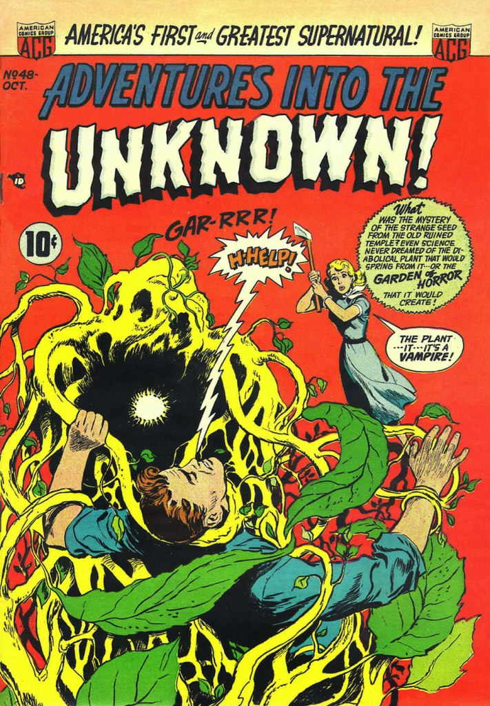
ACG got its tentacle parade in Tentacle Tuesday: ACG’s Adventures Into the Tentacles, but as usual, some material didn’t quite fit the theme, and I saved the following cover for a more appropriate occasion. This, I do believe, is the moment.
Adventures into the Unknown no. 48 (October 1953, ACG), cover by Ken Bald.
Speaking of adventures, let’s delve into Strange Adventures for a bit. The following story has a rather peculiar plot – « Star Hawkins is down on his luck and has to pawn Ilda, his robot secretary. Luckily, Star is hired to locate a fugitive who’s thought to be hiding on Vesta, an asteroid mining settlement, in the Red Jungle. But with a little tracking skill and the help of the creepy vegetation of the Red Jungle, he nabs the fugitive, gets his prisoner, and gets Ilda back from the pawn shop, promising never to pawn her again. »
Page from The Case of the Martian Witness!, scripted by John Broome, pencilled by Mike Sekowsky and inked by Bernard Sachs, published in Strange Adventures no. 114 (March 1960, DC).
Here’s another Earthman (who has dreamed of this moment, by his own admission!) struggling with some coquettish plant tentacles that just want to be friends.
A page from Super-Athlete from Earth!, scripted by Gardner Fox, pencilled by Gil Kane and inked by Bernard Sachs, published in Strange Adventures no. 125 (February 1961, DC).
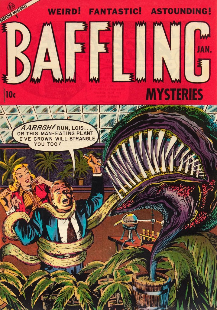
The next thing after adventures is, naturally, mysteries. If they’re strange, puzzling mysteries, even better… what’s that word I’m looking for… ah, yes: baffling! Another day, yet another ravenous man-eating plant.
Baffling Mysteries no. 19 (January 1954, Ace Magazines). Cover is presumed to be by George Roussos. I think strangulation is not even the worst option here.
One more happy tromp through the jungle? Sure, why not!
The following image was originally created as a cover for House of Mystery no. 251 (1977, DC), but was nixed in favour of another, Neal Adams-penned illustration, which we’ve already featured in a previous post (Tentacle Tuesday: Plants Sometimes Have Tentacles, Too). I prefer this gruesome version (complete with skeleton being digested!… also more detail, more dynamic layout and better anatomy of all involved), pencilled by José Luis García-López and inked by Bernie Wrightson.
The tentacled well of funny animal insanity from the Golden Age is nearly bottomless. Just when I think I’ve more or less covered it all, some new goofy octopus cover that I have never seen before pops up, or an unhinged inside story swims by and waves a cheerful ‘hi there!’ with a free tentacle.
Next up, two pages from The Daffy Diver, published in Dizzy Duck no. 32 (November 1950, Standard Comics), artist once again unknown:
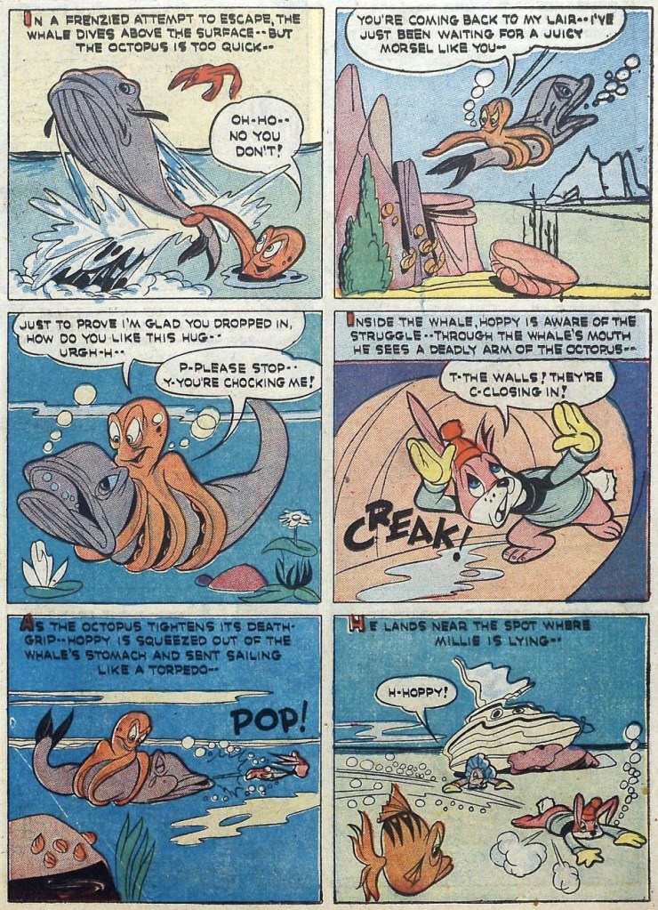
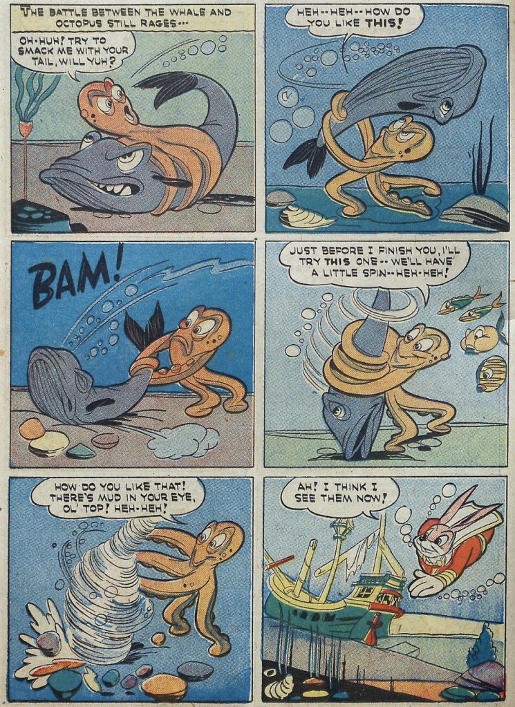
I promised some bunny action – but not the kind that springs immediately to mind! Enjoy this 2-page tentacled tussle in this Hoppy the Marvel Bunny story illustrated by Chad Grothkopf and published in Fawcett’s Funny Animals no. 5 (April 7th, 1943, Fawcett).
For dessert, two covers, because a man does not live on inside pages alone!
National Comics no. 70 (February 1949, Quality Comics). Cover by Gill Fox.
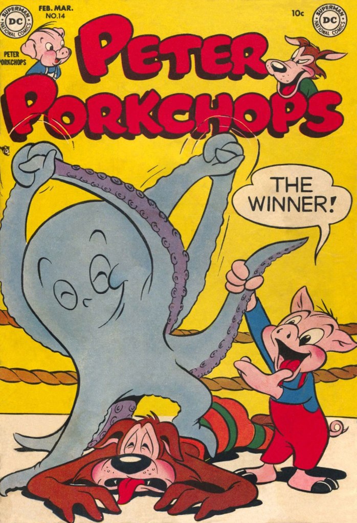
Peter Porkchops no. 14 (February-March 1952, DC); cover by Otto Feuer.
« It was exactly an assembly line. You could look into infinity down these rows of drawing tables. » — Gil Kane
Some of our more sensitive readers may have noticed that we’ve been none too gentle with Gil Kane (1926-2000) in the past, dealing him some rather rough lumps at times. But that’s not the whole story: in taking stock of such a protracted and prolific (dare I say profligate?) career as his, much of it inevitably spent on autopilot, one must be discerning. In other words, I like some of Kane’s work, but there’s plenty of it I don’t care for. Still, WOT’s rule of thumb is that if we altogether loathe an artist and/or his work, we’ll just turn a blind eye.
And speaking of the sense of sight, what makes a great comic book cover? Must be my art school training and subsequent work in advertising tipping the scales, but to me, design and layout reign primordial as ingredients… as values. I’m often dismayed at many a would-be critic’s apparent method of assessing an image’s artistic worth, namely: how many popular characters does it feature? Is it action-packed? Is the issue sought-after and expensive? Does it feature a famous character’s début? Is it drawn by a fan-favourite artist who unquestionably can do no wrong… because he’s a fan-favourite artist who unquestionably can do no wrong? (and how dare you claim otherwise!)
Gil Kane reportedly generated around eight hundred covers for Marvel in the 1970s… of all levels of craft and quality. With that kind of frenzied output, it’s impressive that most were perfectly serviceable, given that there certainly was no time for meticulous, sober planning. They were generally over-captioned (not Kane’s fault!) and crassly sensationalistic, but that’s what Marvel sought and settled for.
It’s a shame that Kane and his former classmate at the School of Industrial Art (back in the early 40s!), DC lynchpin Carmine Infantino didn’t get on too well, because their Silver Age collaborations had a special spark… must have been the animosity. It had been noted by the DC brass, as early as the late 50s, that Carmine’s covers reliably caught prospective buyers’ attention and dimes. And so, by 1967, he was unofficially designing most of the publisher’s covers, and certainly the covers of all titles edited by Julius Schwartz. Green Lantern was among these.
So we turn today’s spotlight on a hot streak of seven. Kane gets his name in the title, but it would be more accurate to say they were Infantino-designed, Gaspar Saladino-lettered, Jack Adler-coloured, Gil Kane-pencilled and Murphy Anderson and Sid Greene-inked covers. The streak begins after Green Lantern no. 54’s downright poor cover, and ends with the interruption of Kane’s impressively long run of consecutive issues.
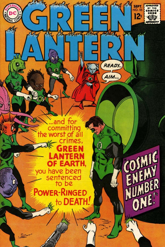
We begin with Green Lantern no. 55 (Sept. 1967, DC). Harmonious, easy-to-parse arrangement of numerous elements and exemplary integration of text. Design by Infantino, pencils by Kane, inks by Murphy Anderson, lettering by Gaspar Saladino, colours by Jack Adler. Oh, and lest we forget: logo designed by Ira Shnapp (circa 1964), classic Green Lantern uniform designed by Kane (circa 1959).
This is Green Lantern no. 56 (Oct. 1967, DC). Kane was never much for varying his monsters (see below). Pencils by Kane, inks by Anderson.
For a bit of comparison on how things were done from company to company, this is Tales to Astonish no. 91 (May, 1967, Marvel). This is what happens when there’s no planning or attention to detail: in an already-crowded cover, did we really need that ugly box advising us of the presence of The Abomination? He’s right there! (maybe the abomination refers to the cover itself). And the foreshortening nightmare that is the baddie’s left arm was so dire that, when a fan commissioned Arthur Adams to produce a recreation of this cover (which, things being as they are, many surely consider ‘iconic’)… he wisely corrected the anatomy and tweaked the poor composition. Interesting how Marvel’s heavy-fingered yes-man, art director John Romita Sr., was always game to “fix” Ditko and Kirby art, but saw nothing wrong with this one.
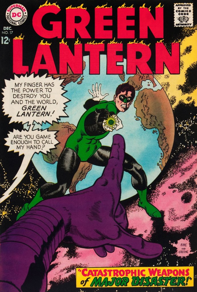
This is Green Lantern no. 57 (Dec. 1967, DC), featuring Catastrophic Weapons of Major Disaster!, written by Gardner Fox, pencilled and inked by Kane. Cover by Kane and Greene… love the placement of the signatures!
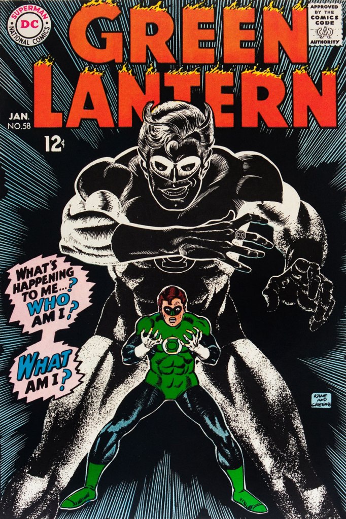
This is Green Lantern no. 58 (Jan. 1968, DC), featuring Peril of the Powerless Green Lantern! (a Julius Schwartz title if there ever was one), written by Gardner Fox, pencilled by Kane and inked by Greene. I’m not overly fond of the Kane-Greene mix, but Sid Greene, as a penciller-inker did some splendid work on the Star Rovers series (1961-64), co-created and scripted by Gardner Fox.
An issue whose price few can afford unless they bought it off the racks, this is Green Lantern no. 59 (March 1968, DC); pencils by Gil Kane, inks by Murphy Anderson. Featuring the introduction of GL alternate Guy Gardner, who was to be dubiously re(jack)-booted in the 1980s, by Steve Englehart and Joe Staton, as a jackass with an ugly uniform and a worse haircut. Never mind the fact that the Green Lantern Corps would never bestow power and stewardship on such an immature and pompous loose cannon.
This is Green Lantern no. 60 (April 1968, DC); an evident Infantino design, with pencils by Kane and inks by Anderson… which interestingly ends up producing a prototype of Brian Bolland‘s distinctive style… a decade early.
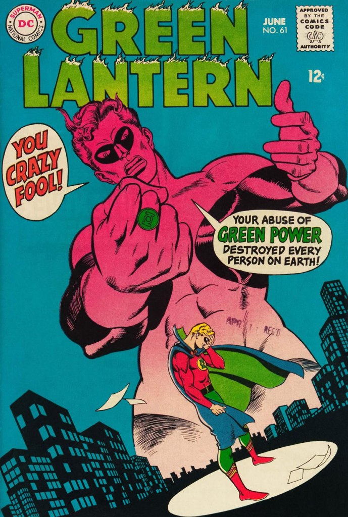
This is Green Lantern no. 61 (June 1968, DC); pencils by Kane, inks by Greene, and featuring (groan) Thoroughly Modern Mayhem!, scripted by Mike Friedrich, pencilled by Kane and inked by Greene. Co-starring Alan Scott, the Golden Age Green Lantern.
« The beginning of wisdom is to call things by their proper name. » — Confucius
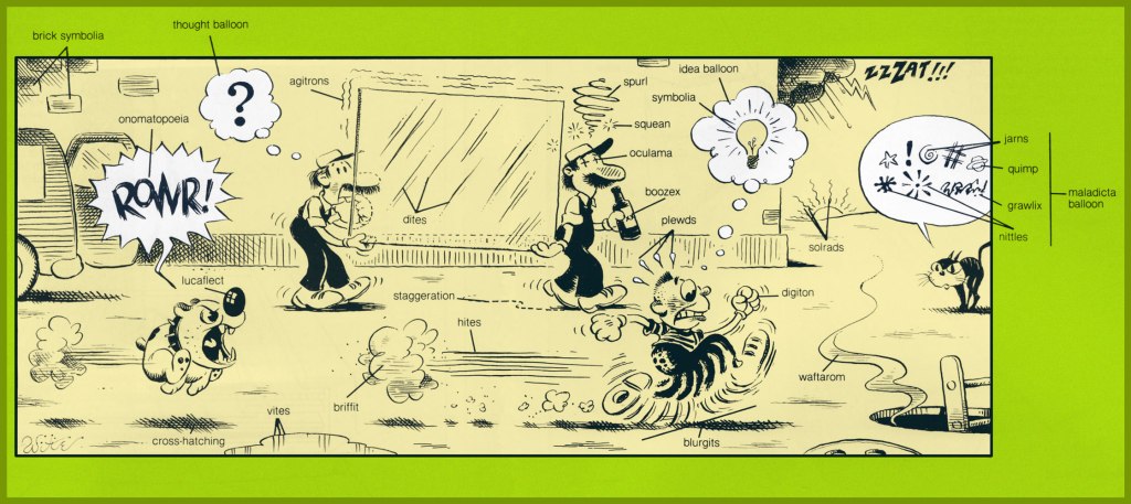
To a bibliophile, shelf space is precious. In recent years, I’ve happily purged my library of many a bulky and obsolete reference tome. With the sheer mass of information that’s migrated online, it’s frequently far simpler to tap a few key words than to scan the shelves in order to pull out and peruse some quaint and curious volume of forgotten lore. Frequently — but not always. One significant exception is my copy of What’s What, accurately touted as « a visual glossary of everyday objects — from paper clips to passenger ships ». Obviously, it covers the expected doohickeys and other dinguses, contraptions and doodads, esteemed constituents of our flora and fauna… but, on occasion, it drifts deep into left field, and that gives it spice. To wit, its entry on cartooning:
Cartooning: Many one-panel cartoons use captions or labels below the illustration for dialogue or explanation. Those appearing on the editorial pages of newspapers are called editorial or political cartoons and usually feature an exaggerated likeness, or caricature, of some well-known figure, as the main character. Comics, or comic books, use cartooning throughout. A complete shericasia, or shallop, is used by a cartoonist to depict a complete swing at an object, be it a golf ball or another person.
This most edifying illustration was the work of Mike Witte (b. 1944), who later chucked this charming infusion of the old ‘big foot’ school of cartooning to settle into an in-demand but pasteurised version of Ralph Steadman‘s style (itself, I would argue, a more grotesque version of Ronald Searle‘s approach). Still, bully for him — it’s a hard business to earn a proper living in. Sure, the classic big foot tradition already had a modern master in Elwood Smith… but the more the merrier! (and speaking of Onomatopeia…)
Mort Walker‘s Beetle Bailey Sunday strip from July 9, 1978, a most judicious choice, was dissected.
Here’s my well-thumbed, yellowing copy of What’s What: it’s the first book trade edition (Nov. 1982, Ballantine), copies of which, or the updated edition, circa the early 1990s, can still be obtained dirt cheap. And “Nose leather?” Awww.
To this array of clever cartooning terms, we simply must remedy one omission, and it’s a crucial one: Kirby Krackle!
A page from Nazi “X” (Captain America no. 211, July 1977, Marvel) with the wild and wooly Arnim Zola – the Bio-Fanatic – flexing his mental muscles. Written, pencilled and edited by Jack Kirby, inked and lettered by our dear Mike Royer, and coloured by Glynis Wein.
Another example, to make sure everyone gets it straight? The sky’s ablaze with Kirby Krackle in this ominously magnificent splash from Kamandi no. 24 (Dec. 1974, DC) and its tale of The Exorcism! Written, pencilled and edited by Jack Kirby, inked and lettered by Douglas Bruce Berry, and most likely coloured by Jerry Serpe.
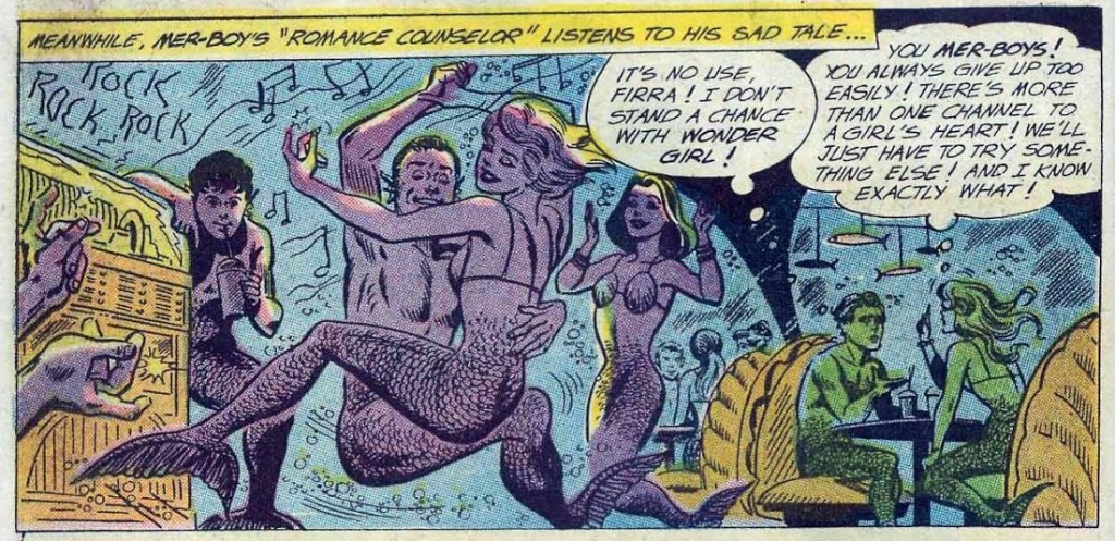
« Mer-Boy! You’re making me angry! »« You’re beautiful when you’re angry! »
Today’s batch of tentacles all come from the heads and hands of one team: scripts by Robert Kanigher, pencils by Ross Andru and inks by Mike Esposito. I make no secret of my dislike for Kanigher scripts when there are women involved*, but the Andru & Esposito team deliver some very nice art to go with the dubious plotting. Besides, we are concentrating on tentacles… though I can’t promise an occasional plot-jab. 🙄
*My complaints about his scripts are two-fold: that his plots make precious little sense is one, but that sort of nonsense is often fun to read, as long as one doesn’t take it seriously. However, the barrage of misogyny, not so much. I go on about it in some length in Don’t Let a Mysogynist Plan Your Wedding: Robert Kanigher and Wonder Woman’s Utterly Unsuitable Suitors, but if you need an immediate example, here are some example of great art and scripting claptrap. I just chose a random, non-tentacle issue from that era… the following panels are from The Cave of Secret Creatures, published in Wonder Woman no. 116 (August 1960).
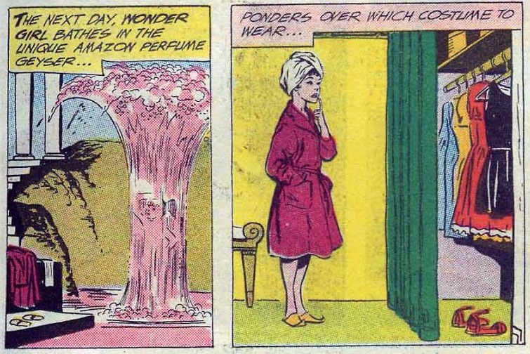
The pretty mermaid’s suggestion is to make Wonder Girl jealous by inviting her to a party and then proceeding to ignoring her altogether. Monumentally stupid? Yes. Is Firra being obtuse on purpose? It’s very possible. Remove the fantastical monsters and the whole superpowers thing, and these stories will read like a hackneyed romance comic.
What’s the point of bathing in perfume (yikes, by the way) before going to an underwater party?
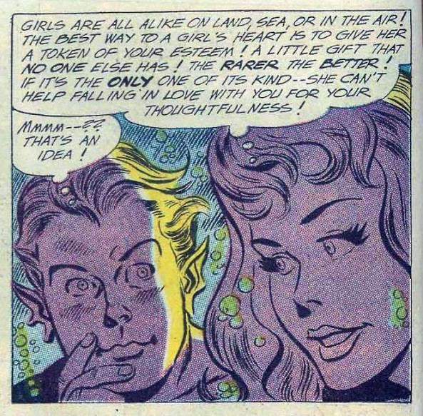
More bad advice from the mermaid. Have you ever heard ANY girl say that “girls are all alike”?
It’s too bad, because it’s really fun to spend some time with this underwater society of mer-teenagers hanging out, drinking seaweed sundaes, and gossiping.
A page from Mer-Boy’s Secret Prize!, published in Wonder Woman no. 119 (January 1961).
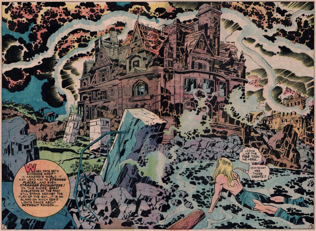
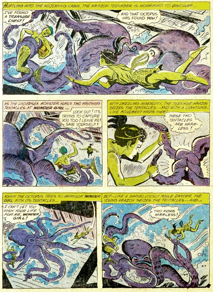
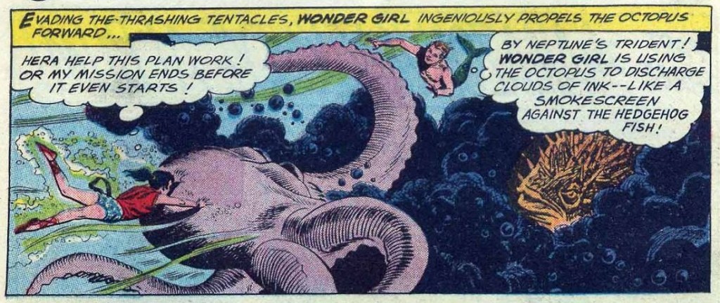
Anyway, I promised you some tentacles, and by Jove (or by Hera!) I shall deliver. Between issue no. 112 and issue 126, Wonder Girl (occasionally her grown-up counterpart, Wonder Woman) has fought more octopuses than one can shake a stick at.
Restraining order, anyone?
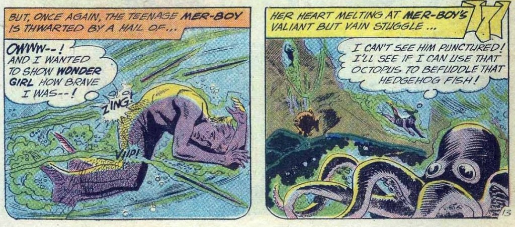
The reason for that is simple – the daft Mer-Boy (and the adult Mer-Man) is a frequent plot hinge of these stories, either harassing Wonder Girl for a kiss, quarrelling with her other (equally daft) suitors, or being in desperate need of rescuing when his imbecilic antics land him (yet again) in hot water. I guess that’s one thing I can say about the plotting – at least WG is not a damsel in distress… And I by far prefer him to Steve Trevor (the other suitor who often comes up in these things), whose behaviour is exemplified in, for instance, Wonder Woman no. 127 (January 1962) – he tricks Wonder Woman into agreeing to marry him by faking a serious wound, complains about the food she cooks for him, and then flies into a murderous rage when she takes off from their honeymoon to stop a nuclear missile. (Oh, and it was all a dream, by the way!)
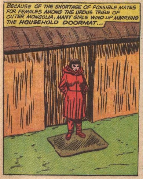
As if to emphasize the retrograde nature of these comics, each issue we are treated to a “marriage around the world” page detailing strange customs. For example, from Wonder Woman no. 128 (February 1962):
Artist unknown. I tried finding out if this was true and could find nothing at all, so the author of this was either talking out of his ass, or has special connections with Urdu tribes… Better to marry a doormat than to become one, I guess?
Page from The Chest of Monsters!, published in Wonder Woman no. 112 (February 1960). “Having to rescue Mer-Boy yet again”, part 300.
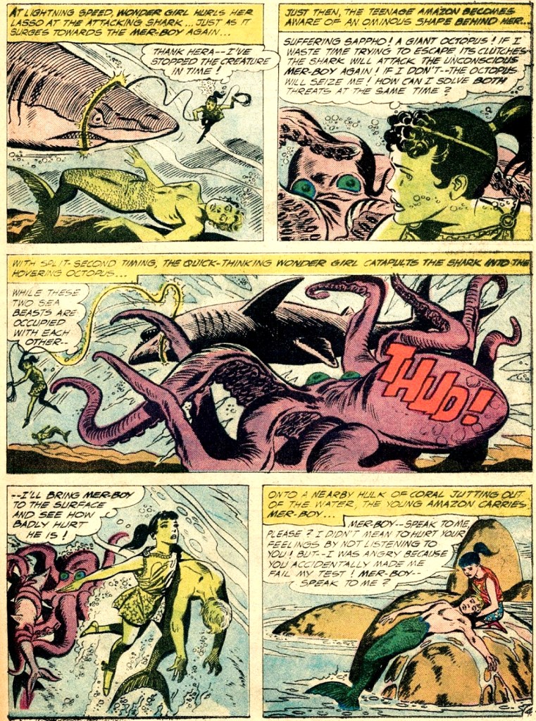
Page from Mer-Boy’s Undersea Party, published in Wonder Woman no. 115 (July 1960). Um, yes, rescuing Mer-Boy again.
Pages from Wonder Woman’s Impossible Decision, published in Wonder Woman no. 118 (November 1960). Oh, now it’s Steve who’s having problems, for a little variety!
In case you’re wondering what the Impossible Decision is, Wonder-Woman has to choose which of her suitors to save. Personally, I would let both of them plummet.
In a previous story, Wonder Woman has to choose between saving Steve or saving a whole world, so I think she’s no stranger to fucked-up situations, thanks to Mr. Kanigher.
Two excerpts from Amazon Magic-Eye Album! published in Wonder Woman no. 123 (July 1961)Admiring the action from a polite distance, Mer-Boy is useless as usual.
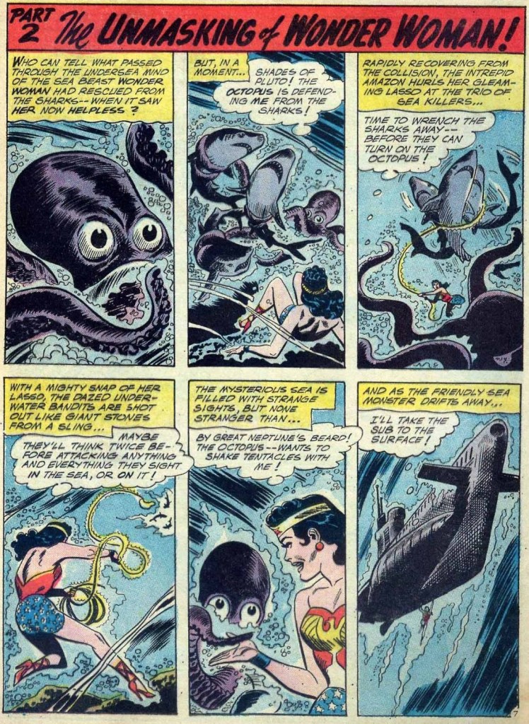
A page from The Unmasking of Wonder Woman! This story was published in Wonder Woman no. 126 (November 1961).
After Wonder Woman rescues the octopus from some bloodthirsty sharks, they become friends! Perhaps because for once, no suitor is involved.
« She kept her ears permanently tuned to the chicken voices outside, so knew immediately when a coyote had crept into the yard, and barrelled screaming for the front door before the rest of us had a clue. » ― Barbara Kingsolver
Given how muted the holiday season is likely to be for most of us, and in light of how much our readers appear to enjoy our past Christmas offerings — (all year long!), I’d thought I’d get an early start on the festivities.
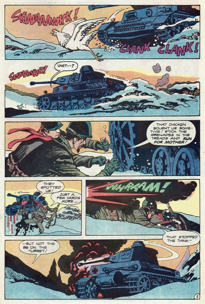
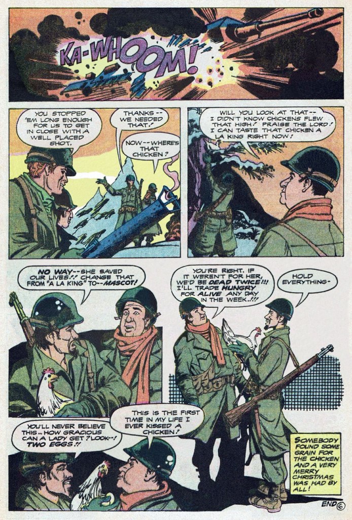
Here’s a fine, but truly obscure little Christmas fable. It was buried in the back of an issue of The Unknown Soldier, at a time when the DC war line was well into its final decline.
… as much of a ‘very merry Christmas’ one may possibly enjoy in the midst of war, far from home and loved ones, at any rate. I would have enjoyed seeing more of those two kind-hearted doofuses, Burf and Flaps… and their chicken mascot. I wonder what name they would have given her…
According to editor Paul Levitz, Christmas Dinner‘s script had been purchased six or seven years earlier by his predecessor Archie Goodwin but had lain fallow in the interim. It was written by one Janus Mitchell (his sole credit in comics, but we may be in the presence of pseudonymous shenanigans) and was finally assigned for illustration to Teny Henson (often credited in the US as ‘Tenny Henson, as he is here), one of my favourite creators from the ranks of the Filipino Komiks community. In America, Henson’s work mostly appeared in DC publications for about a decade (1974-83), beginning with the plum commissions of inking a returning Sheldon Mayer (post-cataract surgery) on his Rudolph the Red-Nosed ReindeerLimited Collectors’ Edition giants, and inking Ramona Fradon‘s pencils on DC’s underrated second revival of Plastic Man for a pair of issues. All in all, Teny flew under the fanboy radar, chiefly providing artwork for mystery and war short stories, and always at a high level of craft and inspiration.
I love the economy and precision of his line, his limpid storytelling, and his mastery of an aesthetic merrily at play in the sweet spot between the cartoonish and the representational. Fittingly, he went on to work in the animation field.
This is The Unknown Soldier no. 237 (Mar. 1980, so on the stands in Dec. 1979, DC), picking up its numbering from the venerable Star-Spangled War Stories; cover, of course, by Mr. Joe Kubert, though by no means among his finer moments — that ‘Nazis in ambush’ formula was getting pretty long in the tooth by then.
« This world is run by clowns who can’t wait for it to end. » — Too Much Joy, ‘Clowns‘
Well, the topic of this post kind of snuck up on me. I’ll explain: last Saturday, as we were out of Russian marinated mushrooms (a simply unacceptable state of affairs in this household), we ventured into a European deli in quest of something to tide us over until we could properly restock. They had some button mushrooms in oil, fair enough. As we reached the counter to tally up our purchases, something caught my eye: a display for a French confection called Carambar, which I’d known about for most of my life, but never encountered in the wild.
After a moment’s hesitation (which baffled my partner), we picked up a sample and added it to our bounty.
It happens that Caram’ Bar (as it was called until 1977, when the apostrophe was dropped) ties into a minor childhood incident whose recollection elicits, in equal parts, snickers of amusement and pangs of guilt. It was in, oh, the second or third grade. We were standing in rows, about to return to class after recess. I turned to my neighbouring classmate, and asked him whether he knew… oh, never mind — it went exactly like this:
“Mister Pipo! I will pose you a riddle!” “Do you know what the difference is between a Caram’ Bar…” (I love riddles!) “… and a Super Caram’ Bar?” (They’re the same!) “But of course not, Mister Pipo!” “The Caram’ Bar was this long…“
“The Super Caram’ Bar is THIS LONG!” The full-length Super Caram’ Barfumetti, as it appeared in the pages of Pif Gadget no. 171 (May 1972, Vaillant).
Regrettably, the back of my hand connected with my classmate’s nose, not his cheek, and he wound up with a nosebleed. Désolé, Germain!
The acquired item.
…. unwrapped. CaramBar wrappers have, since the 60s, famously featured corny gags, which once were selected from entries provided by consumers. A kid whose joke got the nod could win his weight in candy. Here’s one of the pair I got here (the other doesn’t work in English)… Q: Why are elephants grey? A: Because if they were pink, they’d get confused with strawberries. It may come as no surprise that in France, a ‘blague Carambar’ has become shorthand for a lame joke.
The preceding Super Caram’ Bar ad was quite unusual in that it was a full-colour three-pager, which must have cost the candy maker a bundle. Indeed, it only ran au complet once or twice; thereafter, only its concluding page appeared.
Looking back at this campaign, I wondered whether these clowns were merely company mascots, or something more. As it turns out, Sergio (né Serge Drouard in 1950, so 21 years old at the time) was in the early stages of a remarkable career in the circus, first as Clown blanc Sergio (here are a brief video profile from 1970 and a lovely 1975 performance at Paris’ legendary Cirque d’hiver) and then as ringmaster M. Fidèle. Now seventy, he more-or-less retired after the 2010-2011 season. As for poor Pipo, I’m afraid I don’t know. He’s similar to the famous Dutch clown Pipo de Clown, but they’re merely homonyms.
Clowns are a curious proposition. Kids used to (presumably) find them amusing and endearing, but several generations of thin, gruelling antics and downgrading of the brand and métier, not to mention the sinister hijinks of the infamous Pogo the clown, have flipped the cultural perception of these once-beloved entertainers. At this point, Coulrophobia is impressively widespread, and not just among the wee ones.
For my part, I’m not so eager to condemn en bloc. Your run-of-the-mill, unqualified local kids’ show, mall-opening Bozo is but a faint, hopelessly distorted echo of the great clowns of history. They were the fruits of a complex, nuanced and codified tradition with its thick, gnarled roots in early 16th century Italy’s Commedia dell’ Arte.
But I don’t need to reach quite that far: I grew up on Radio-Canada’s absurd, minimalist masterpiece Sol et Gobelet (1968-71). Sol (Marc Favreau) was a naïve tramp clown who creatively mangled language and logic and Gobelet (Luc Durand) was the poetic, reasonable, refined Pierrot type. Here’s a classic episode. Such is the duo’s cultural significance that a public library (Favreau) and a nearby public park (Durand) have been christened in their posthumous honour.
And since we’re on comics and clowns, here’s a bonus short tale.
« Sergio has also learned that one must never try to catch a falling performer. One should only push them to redirect their path and cushion their fall. One day at the Paradis latin, he had no choice but to tackle in flight a trapeze artist who was about to land on a table. The outcome : a few collapsed vertebrae. » Also, « When a lion attacks, it always goes for the testicles. » Keep these sage verities in mind, next time you’re under the big top!
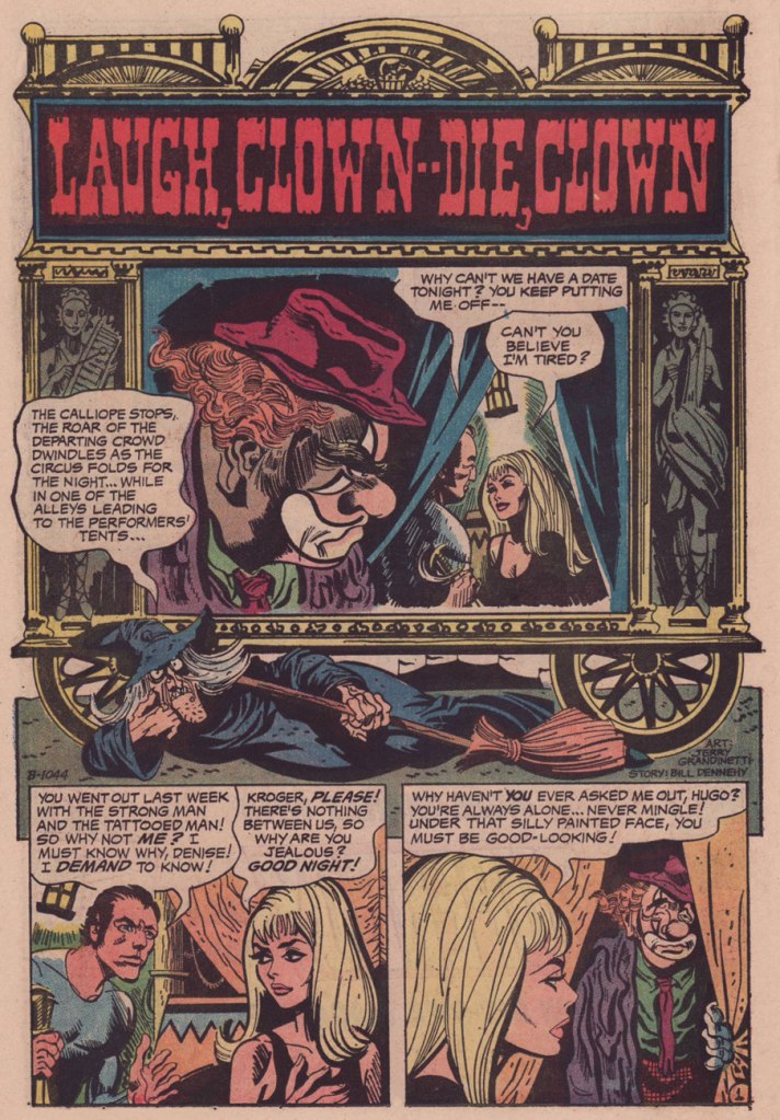
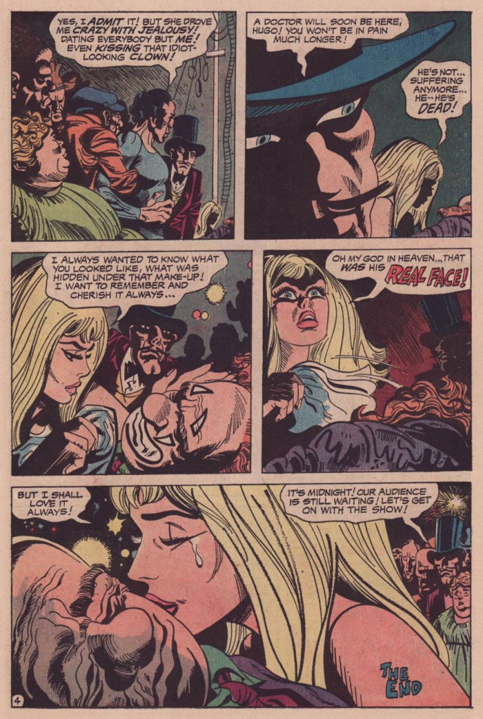
Laugh Clown — Die, Clown appeared in It’s Midnight… The Witching Hour no. 21 (June-July 1972, DC). It was scripted by editor Murray Boltinoff under his Bill Dehenny nom de plume and illustrated by Jerry Grandenetti.
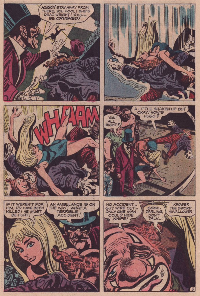
While LCDC is the flimsiest of stories, just a troupe of stock characters going through their hoary paces, Grandenetti’s artwork elevates the affair. It’s as if, having precious little to work with, the artist opted to push against the material, moulding it oddly, imbuing the proceedings with unstated implications. Consider, for instance, how sinister is the depiction of the ringmaster. Nothing in the dialogue or plot indicates that the man is up to anything untoward or malicious, quite the contrary. The second panel of page four is quintessential Grandenetti.
And how was my first Carambar, you may ask. We both tried it, and… were singularly underwhelmed. Perhaps it was a question of freshness, but it was disappointingly brittle in the beginning, almost chalky, hardly what you’d expect from a caramel product. Then it just fell apart and faded, like third-rate taffy.
« I found something in one of my pockets. It was about as big as your shoe, but it was shaped like a rocket! » — a not-at-all ambiguous statement from litigious chuckler Bozo the Clown.
« My imagination grew wilder, the most unexpected associations flared up in my mind, and as I kept trying, the reception room kept filling with strange objects. Many of them were born, apparently, out of the subconscious, the brooding jungles of hereditary memory, out of primeval fears long suppressed by the higher levels of education. They had extremities and kept moving about, they emitted disgusting sounds, they were indecent, they were aggressive and fought constantly. I was casting about like a trapped animal. All this vividly reminded me of the old cuts with scenes of St. Anthony’s temptations. » [source]
Today’s topic does not involve a man becoming a cockroach: that has been discussed often enough. My current area of interest concerns the many strange and striking ways in which a living form becomes a completely different form under the influence of a supernatural power or its natural inclination, of witchcraft or the whimsy of a writer whose imagination flares up much like it did for poor A. I. Privalov, depicted above trying to create a a sandwich and a cup of coffee and ending up with a roomful of horrors…
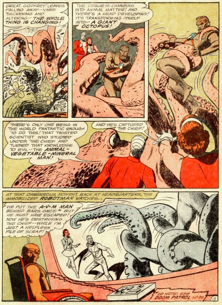
This strange creature surely illustrates the perils of getting stuck mid-metamorphosis!
The Doom Patrol no. 95 (May 1965). Cover by Bob Brown. While transforming into god-knows-what, Dr. Sven Larsen is careful to preserved his impeccably coiffed chevelure. Perhaps he inspired Ted Baxter.
In Return of the Animal-Vegetable-Mineral Man, scripted by Arnold Drake and illustrated by Bruno Premiani, the Doom Patrol battle a scientist crazed with power-lust (while dealing with trouble of their own, like being unable to control their powers – it was apparently decided that a scientist who can become anything he likes is not interesting enough).
That this AVM (animal, vegetable, mineral) man decided to transform into an octopus will not surprise regular readers of Tentacle Tuesday: we know that the octopus is the most perfect form there is!
In the rest of the story, AVM also transforms himself into electric eels, tungsten birds, a building-tall neanderthal man, liquid mercury, a grizzly bear, etc., but it’s all a bit of a let-down after the giant octopus, if you ask me.
I’ll continue with this rather evocative cover by Bernie Wrightson, in which we get a preview peek at a gruesome scene just a few seconds before it actually happens.
House of Mystery no. 204 (July 1972). Cover by Bernie Wrightson.
It all starts with a nasty dream of cranberry jelly…
… and ends with an unwelcome transformation of future bride into hungry monster. In this case, a pretty girl is not so much like a melody, but yet another helping of aforementioned cranberry jelly… perhaps I should have kept this story until Christmas.
All in the Family was scripted by Mary Skrenes and Bernie Wrightson; illustrated by Bernie Wrightson.
If this story of transmogrification made your teeth itch, just have a gander at the following histoire d’amour…
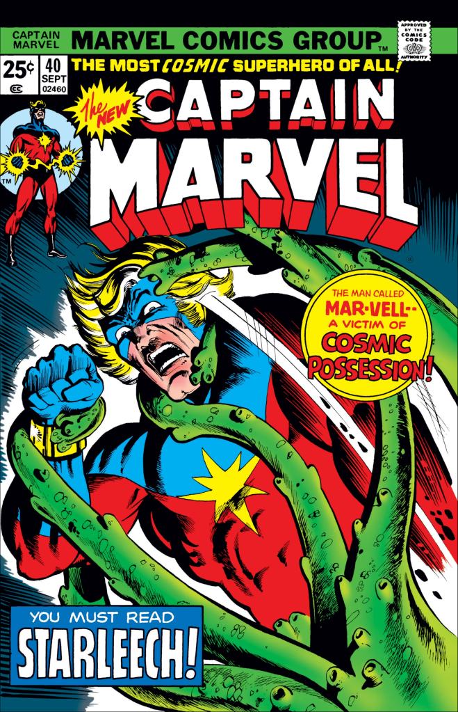
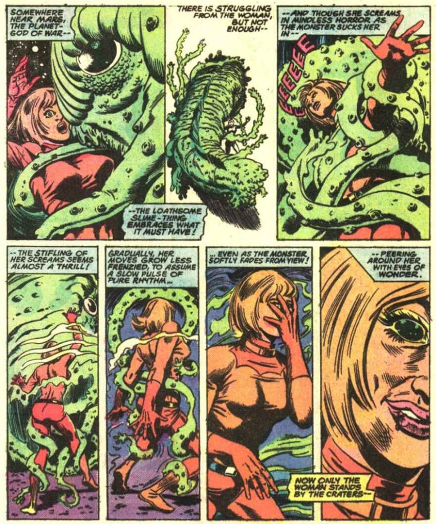
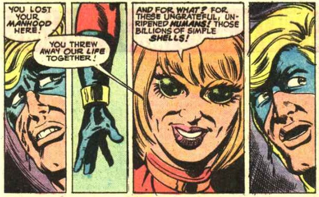
Captain Marvel no. 40 (September 1975). Cover pencilled by Al Milgromand inked by Klaus Janson.
No, hold your horses, I’m not implying anything untoward about Captain Marvel. That thing he’s tangled up with is his lover (or should I say ex-lover) Una. Just a little case of demonic possession!
Um, those are not “eyes of wonder”, more like a demented gaze.
Will Captain Mar-vell be able to kill the woman he loves, even if she’s more of a shell inhabited by a tentacled psychic monstrosity, and despite having lost his manhood, whatever that was?
Stay put for the exciting finale of Rocky Mountain ‘Bye! was scripted by Steve Englehart and Al Milgrom, pencilled by Milgrom, and inked by Al McWilliams!
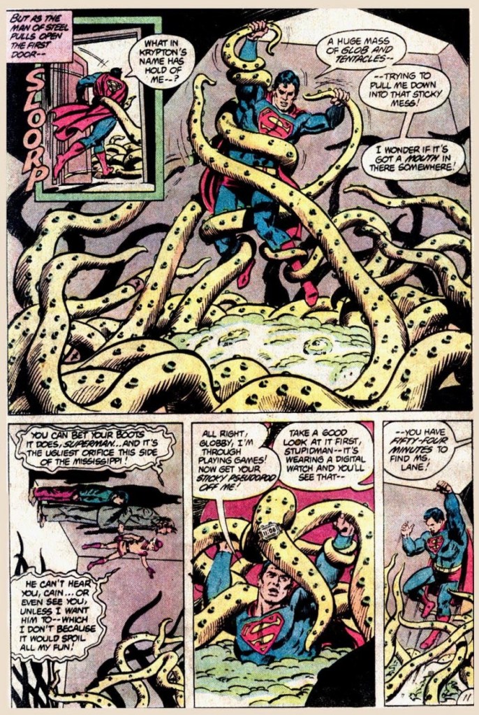
What do we have here? A harmless trick-or-treating kid transformed by Mr. Mxyzptlk into a malefic octopus? It’s business as usual for Superman in this goofy tale (who, incidentally, was the star of Tentacle Tuesday: It’s a Bird! It’s a Plane! It’s a Tentacle!) I’m sure most children would relish the opportunity to become an actual ghost or werewolf…
But I am not convinced that anybody would want to be transformed into, err, “Globby”.
Nothing as stylish as an octopus with a digital watch.
These pages were from The Haunting Dooms of Halloween!, scripted by Dan Mishkin, pencilled by Curt Swan and inked by Tony de Zuñiga, published in DC Comics Presents no. 53 (January 1983).
« I grew up in a farm town in the Midwest, where not much exciting happened. I liked the idea of lives lived at night and the shadowy characters who lived in that demi-monde. — Michael Emerson
And our final slot goes to… the eminent Mr. Roger Langridge!
An average, ‘nuclear’ family moves to a small town in the Midwest, which turns out to be mind-numbingly strange… a fact entirely lost on the clueless parental units. Sound familiar?
It’s obvious, given the time frame (five years late), that Gross Point was, to be charitable, keenly influenced by the television show Eerie, Indiana (1991-92)… whose short run (just one season and a mere nineteen episodes… plus fifteen novels!) belies its lasting appeal and influence.
But, and there’s a sizeable ‘but’… both series provide considerable, often subversive entertainment, and come from a long line of high-concept, cœlacanth-out-of-aqua sagas. You might say that Gross Point stands as a darker, yet goofier Eerie, Indiana. Incredibly, it was still approved by the clearly-agonizing, utterly irrelevant Comics Code Authority!
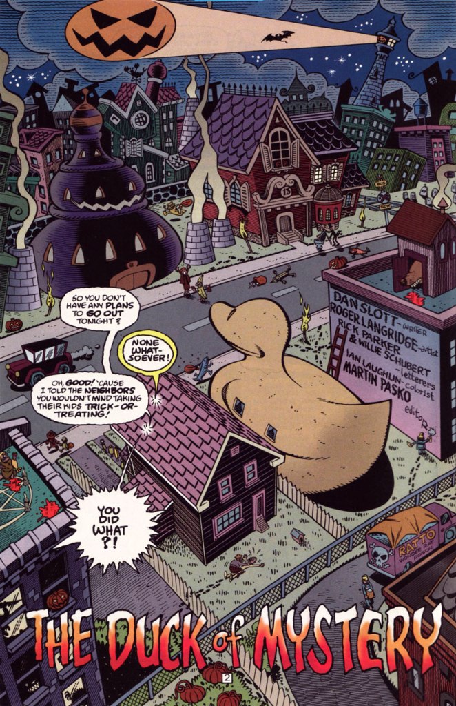
This is Gross Point no. 5 (Dec. 1997, DC), the Halloween special… but then again, as they say, “Every day is Halloween in Gross Point“. Cover by Sean Taggart.
The facetious small print:
Gross Point is a fictitious town, not to be confused with that differently-spelled one in Michigan. The magazine Gross Point is a work of satire. The stories, characters and incidents mentioned in this magazine are entirely fictional. No resemblance to actual persons, living or dead, or comatose, deformed, deranged, disfigured, dismembered, disembodied, discarnate, decaying, reincarnated, undead, immortal, reanimated, telepathic, pyritic, telekinetic, magical, transformed, trans-channelled, enchanted, cursed, possessed, monstrous, cannibalistic, demonic, vampiric, reptilian, lycanthropic, subterranean, mummified, extra-terrestrial, or interdimensionally-stranded, is intended or implied, or should be inferred. Any similarity to same without satiric purpose is coincidental.
The Pickett family’s colourful neighbourhood in Gross Point. Sublime pencils and inks by Roger Langridge. He truly brought a sense of place to his work on GP.
“Tight as a duck’s arse!” This is the issue when we find out — at last! — the answer to the mystery of the duck-shaped house next door.
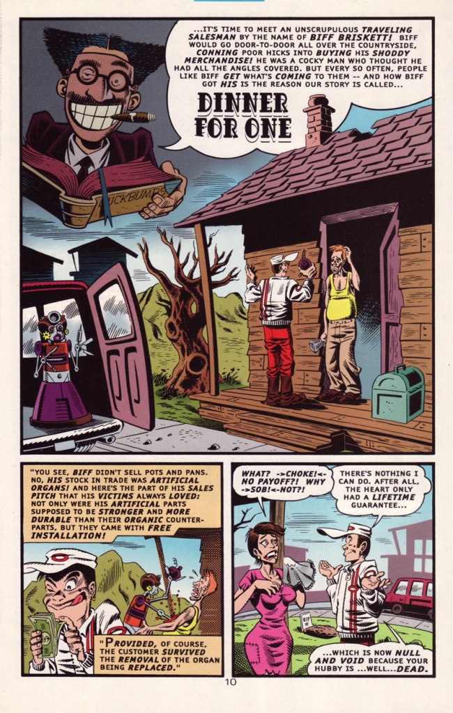
Groucho, who else? DC clearly panders to the late 90s teen set with a hybrid parody of its own late 60s mystery anthology title and a legendary Depression-era comic. Well, it works for me, but what do *I* know?
A sizeable part of why this is Gross Point’s finest hour: Langridge gets to trot out his rather credible EC-vintage Wally Wood/Will Elderersatz.
… and then goes full-on Mad-style Will Elder! This bourgeois chiller scared the Dickens out of the local youths.
In Issue two, we are told that:
Gross Point differs from most new DC titles in recent memory in that it was internally created. The concept from the series was the brainchild of the internal development program of the Special Projects Group, headed by Group Editor Martin Pasko [ né Jean-Claude Rochefort, in Montréal, QC ], who is also this title’s editorial overseer.
In other words, Created by committee, which accounts for the utter lack of originality… which is yet no impediment to its ultimate worth.
However, and a big However it is, some savvy, enlightened creative moves were made, most of all by recruiting stupendous penciller/inker Langridge, as well as Sean ‘S.M’ Taggart (perhaps a bit of nepotism, what with him married to a DC editor, but never mind, he’s good) and writers Dan Slott and Matt Wayne, among others.
The series lasted a not-too-shabby fourteen issues, which you can still get your calloused mitts on dirt cheap online and in the quarter bins, as it’s never been collected. I daresay it might have been a smash hit… if, say, Scholastic had published it.
Well, that wraps up another year’s selection! If you’re craving more, then the 93 entries of the previous trio of Hallowe’en Countdowns are (un)naturally at your disposal.