The Batman’s First True Auteur

« In almost every picture, Batman looks as if he has spent the day greasing the Batmobile and didn’t bother to clean up afterwards. There is a difference between shadowing and what looks like globs of dirt and grime. » — letterhack Bob Rozakis (Detective 420, Feb. 1972), as astute an art critic as he would prove a writer.

Think about it: from his initial appearance in 1939’s Detective no. 27, the Batman was always a bit of a shop product. While notorious deceiver and glory-hog Bob Kane ( Kahn, 1915-98) loved to slap his name on anything and everything, his principal talent was self-promotion. Kane’s Batman was mostly the work of far more talented ‘ghosts‘ such as Jerry Robinson, Dick Sprang, Bill Finger, George Roussos, Jack Burnley, Win Mortimer… and so on, for decades. It’s unlikely that anyone ever produced the artwork for a Batman story on their own (well, professionally), let alone wrote *and* drew one. In a nutshell, that’s the assembly-line style US funnybook industry.

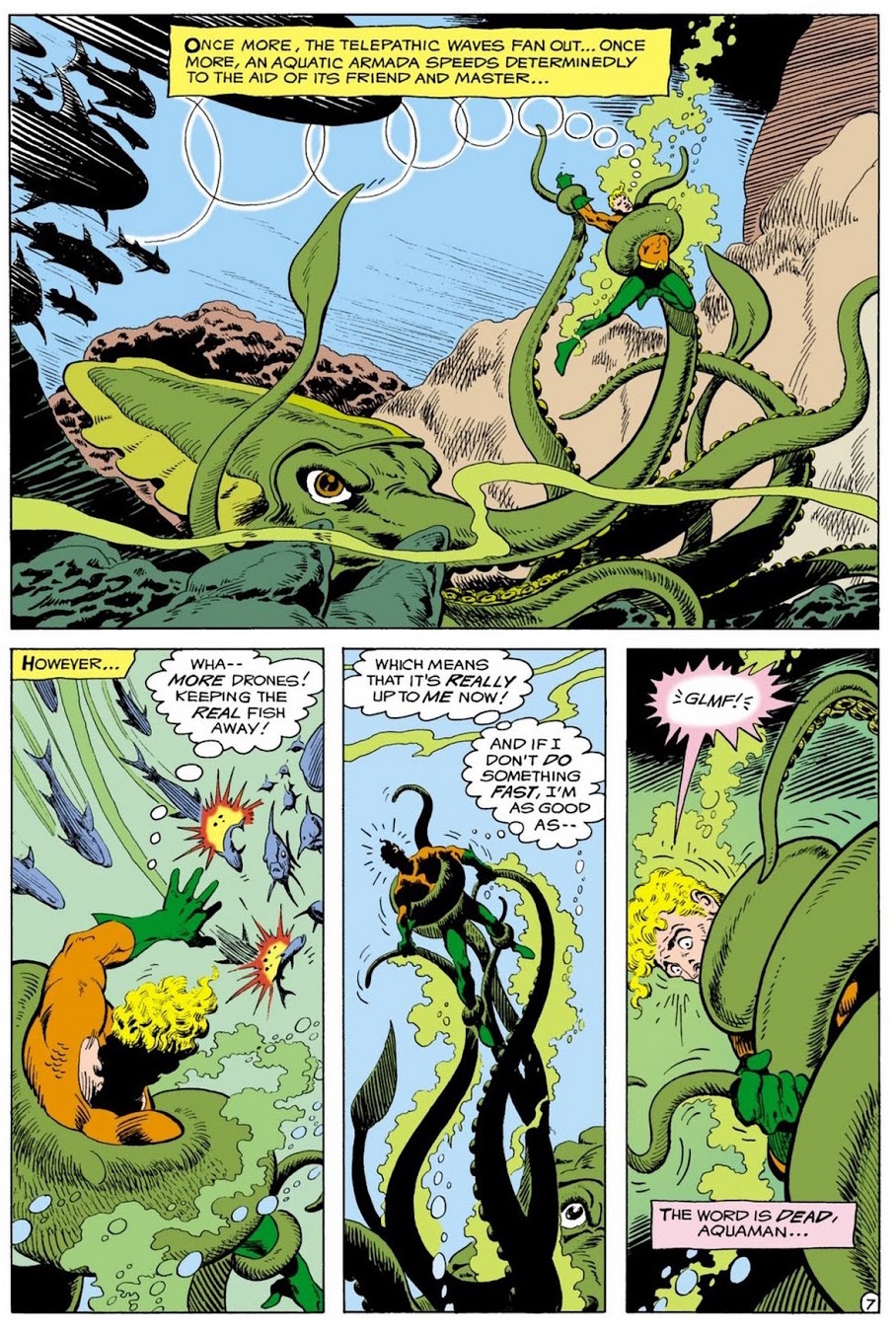
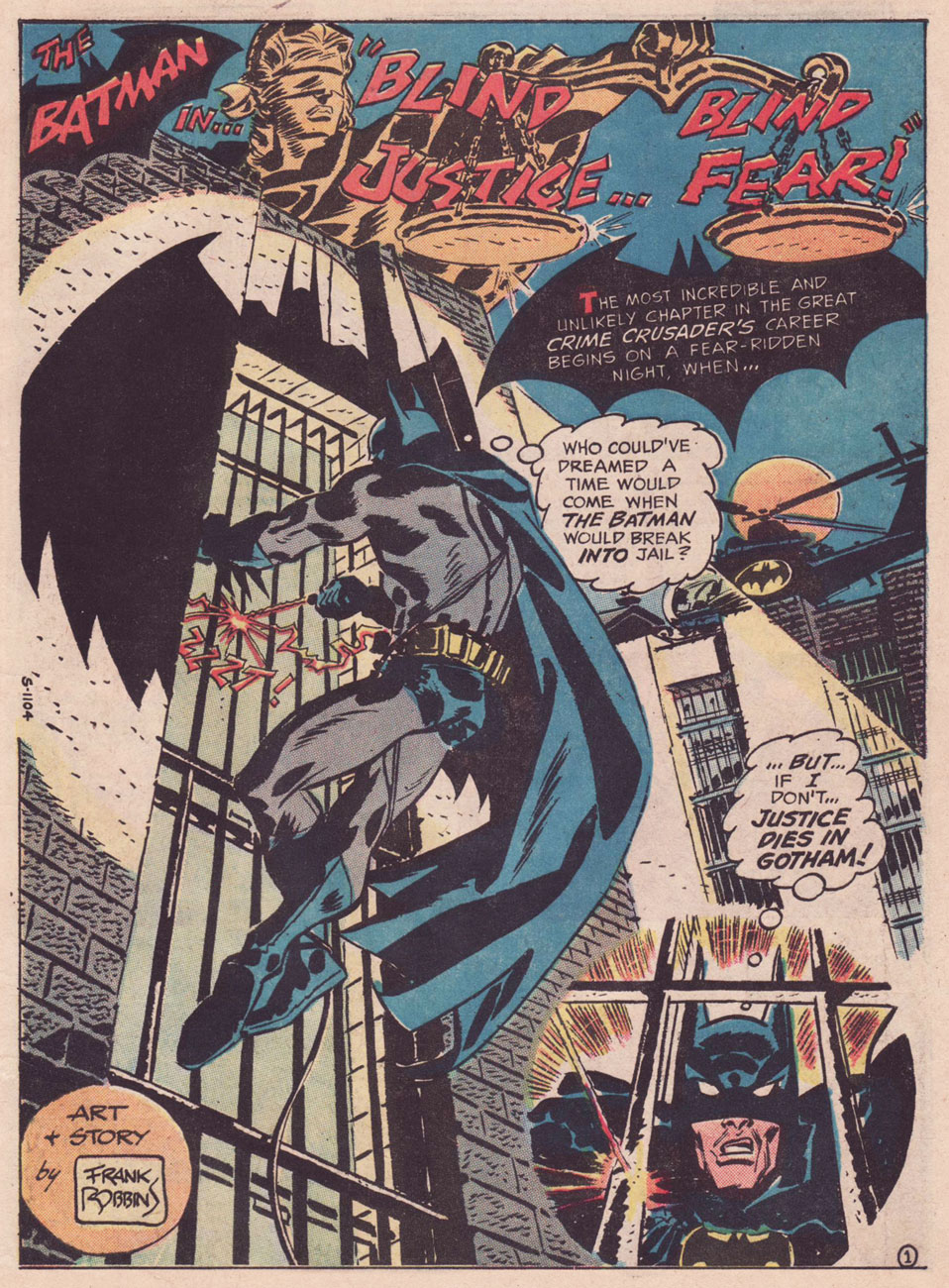
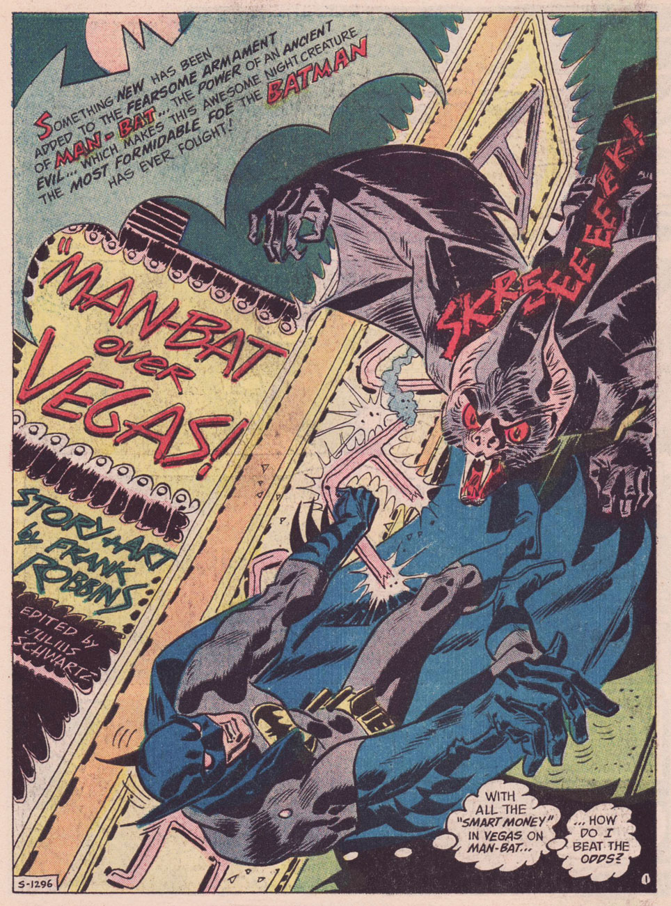
As far as the caped crusader is concerned, that state of affairs would briefly change with Detective no. 416 (cover-dated October, 1971): under a particularly clumsy Neal Adams cover, the lead story, Man-Bat Madness!, was scripted, pencilled, inked *and* lettered by Frank Robbins. He would produce four more solo Batman adventures: Forecast for Tonight — Murder! (Detective Comics no. 420, Feb. 1972); Blind Justice — Blind Fear! (Detective Comics no. 421, March 1972), Killer’s Roulette! (Detective Comics no. 426, Aug. 1972) and Man-Bat Over Vegas! (Detective Comics no. 429, Nov. 1972).

RobbinsMadnessA
A sample from the first one-man Bat-Adventure, Detective no. 416‘s Man-Bat Madness! Robbins’ expertly fluid storytelling and confident spotting of blacks are well in evidence here.
RobbinsBlindJustice01A
Opening splash from my pick of the solo Robbins Batman, Detective no. 421‘s Blind Justice — Blind Fear! [Psst! Read it here.]
RobbinsBlindJustice02A
Those were the days of “relevance” in comics. The Attica Prison Uprising had just occurred…

Robbins had been scripting for DC since 1968 (starting right after the ignominious firing of many of their most seasoned writers… for presuming to request some social benefits after decades of loyal, and often forcibly exclusive, service*), but he didn’t get his brushes out until 1971, presumably wanting to draw his then-recent creation, Man-Bat** (Detective no. 400, June 1970).

After a final hurrah (script-only) with Batman 254‘s King of the Gotham Jungle! (Jan.-Feb. 1974), he was off to Marvel, where he did no writing, but illustrated tales of Morbius The Living Vampire, Dracula, Ghost Rider, The Legion of Monsters, Captain America, The Invaders, the Man From Atlantis, The Human Fly, Daredevil… generally while paired with inkers ranging from the decent (Frank Giacoia, D. Bruce Berry), to the inappropriate (Frank Springer) to the dismal (Frank Chiaramonte and… hello again, Vinnie). He walked away from the industry in the middle of a cliffhanger, after Daredevil no. 155‘s The Man Without Fear? (Nov. 1978). Beyond that, having endured far more than his share of fanboy sniping and editorial meddling, Robbins left comics forever, going off to paint in México. Wise man.

Robbins, as you may or may not know, was a truly polarising figure in 1970s comics. He was the bane of house-style loving fanboys, and it seems that anyone savvy enough to appreciate him at a tender age later became a cartoonist. The ample evidence (meaning far too much) witnessed on FB comics groups has led me to shrugging acceptance that most fanboys’ aesthetic sensibilities haven’t shifted an iota from when they were twelve… and won’t now or ever.

Another dodgy character encountered in recent years is the annoyingly common “I hated Robbins then, but I totally get him now” git, which brings to mind a certain science-fiction cliché.

ChastenedHumanityA
« Yeah, we burned down his house, tarred and feathered him and ran him out of town… but looking back, he was a pretty swell guy! »  Which stories are these? Find out at the end of the post.

Back to our regularly scheduled train of thought…

RobbinsForecastA
A sample from Detective Comics no. 420‘s Forecast for Tonight — Murder! Read it here, while you can.
RobbinsRouletteA
A moody teaser from Detective Comics no. 426‘s Killer’s Roulette! Peruse it here .
RobbinsManbatVegasA
The precarious opening splash from Detective Comics no. 429‘s Man-Bat Over Vegas! Play the odds right… here.

How I wish he’d gotten to illustrate his moody script for The Spook’s Master Stroke! (Batman no. 252, Oct. 1973), introducing my favourite Bat-villain, seldom-seen The Spook. He was difficult to write, so they killed him off after a handful of appearances.

While Robbins wasn’t my very favourite Bat-writer, (that honour goes to… David V. Reed), he generally delivered a solid tale… but when he was in full command, he was pretty top-notch.

-RG

*« Even though Fox has worked for several comic book publishers, he remains most associated with DC Comics, for whom he worked more than three decades. That collaboration came to an abrupt end in 1968. Fox had joined other comics writers like Otto Binder, John Broome, Arnold Drake, Bill Finger and Bob Haney, signing a petition to ask DC for more financial benefits, particularly regarding health insurance. Since the company regarded writers as expandable people they were all fired without mercy and replaced by more obedient newcomers. » [ Source ] (incidentally, Haney wasn’t fired… at least permanently)

**Neal Adams, having waited until everyone else in the room was dead (editor Julius Schwartz passed away in 2004), began to claim that Man-Bat had been his idea, with no-one’s help. Sorry, Neal, I think you’re a bit confused: you’re thinking of Valeria the She-Bat, and she’s all yours.

Mini-quiz answers: 1) Spores From Space (Mystery in Space no. 1, May 1951, DC); written by Gardner Fox and illustrated by… Frank Frazetta. 2) The Unknown Spaceman (Mystery in Space no. 11, Jan. 1953, DC); written by Gardner Fox and illustrated by Bob Oksner and Bernard Sachs; 3) I Created Sporr, the Thing That Could Not Die! (Tales of Suspense no. 11, Sept. 1960, Marvel); written by Stan Lee, art by Jack Kirby and Dick Ayers; 4) The Blip! (Tales to Astonish no. 15, Jan. 1961, Marvel); written by Stan Lee, art by Jack Kirby and Dick Ayers.

Tentacle Tuesday: Aquaman and his Octopus Sidekicks

When you think of Aquaman, what is the first thing that comes to mind? Is he a brooding, tragic hero? A hapless sap whose prowess extends no further than throwing a starfish at his assailant? A talented swimmer, defender of Earth’s oceans?

« The image of the superhero riding on a chariot made of fish—sporting that classic orange top and green pants—sealed the depths-dweller in public memory as a doofy champion, despite defenders who insist there’s more to Aquaman than talking to fish and riding them places. While later depictions of the character emphasized his serious side, Aquaman jokes abounded especially in the 90s and 2000s—largely thanks to a school of young male animators, including Seth MacFarlane and South Park’s Matt Stone and Trey Parker, who couldn’t help but poke fun at Aquaman’s ineffectual reputation. »|source|

I believe the aforementioned Aquaman’s defenders are slightly missing the point. What’s wrong with catching a ride from a fish, or getting a helping hand from an octopus? In Aquaman’s world, octopuses play the role of indispensable helpers, using their tentacles as lassos, bludgeons and tourniquets, or forming acrobatic formations to give Aquaman a boost. Does this somehow make this superhero wimpy? Do we seriously still believe that treating animals with kindness, or collaborating with them, is emasculating? No wonder this world is going to hell in a handbasket. The audience for superhero comics sometimes seems to be quite devoid of imagination (or a sense of humour).

« Jokes about his wholesome, weak portrayal in Super Friends and perceived feeble powers and abilities [] led DC to attempt to make the character edgier or more powerful in comic books. Modern comic book depictions have attempted to reconcile these various aspects of his public perception, casting Aquaman as serious and brooding, saddled with an ill reputation, and struggling to find a true role and purpose beyond his public side as a deposed king and a fallen hero. » |source|

Okay, I’ve grumbled, and now I’ll move on to the tentacles. Take a seat astride your favourite jellyfish, strap in your fins, and let’s go!

Aquaman, the child of an undersea explorer who learned how to breathe and live underwater “by training and a hundred scientific secrets”, was created in 1941 by Paul Norris and Mort Weisinger. During the Golden Age of comics, he fought various evil guys (usually from water-related professions: sailors, marine biologists, pirates… and Axis villains, too). The whole thing started becoming really interesting (imho) in 1956 (coincidentally, with the advent of Silver Age), when Aquaman acquired his sidekick Topo the Octopus:

AdventureComics#229-Topo
Topo’s first appearance! « Aquaman’s Undersea Partner », drawn by Ramona Fradon, published in Adventure Comics no. 229 (October 1956).

Ramona Fradon handled Aquaman from 1951 to 1959, when she became pregnant and had to temporarily withdraw from the comics field until 1963. She deserves a separate post, really, especially since I love her art. In the meantime, read The Woman Who Made Aquaman a Star. As for Topo, I don’t have to explain why I’m fond of the idea of an octopus sidekick.

A few nice Fradon pages:

AquamanAdventureComicsIssue#246-theTownThatWentUnderwater-Ramona-Fradon
«The Town That Went Underwater», drawn by Ramona Fradon. It was published in Adventure Comics no. 246 (March 1958).

AquamanAdventureComicsIssue#246-theTownThatWentUnderwater-Ramona-Fradon-2
Another panel from « The Town That Went Underwater ».

Aquaman-Adventure-Comics#262-RamonaFradon-UnderseaHospital
A panel from « The Undersea Hospital! », scripted by Robert Bernstein and drawn by Ramona Fradon. This issue, Adventure Comics no. 262 (July 1959), has not one, but two fun animal stories: the other one – also lovable, imaginative nonsense – is « The Colossal Superdog », scripted by Otto Binder and drawn by George Papp.

Aquaman-Adventure-Comics#262-RamonaFradon-UnderseaHospital-2
Another panel from « The Undersea Hospital! ». Don’t you love the idea of a seaweed stretcher with eel supports?

In 1961, Nick Cardy started working on Aquaman with Showcase no. 31 (March-April 1961). When the sea king got his own title in 1962, Cardy became the regular artist, drawing inside stories and covers until Aquaman no. 39 (May-June 1968), and staying as the cover artist until Aquaman no. 56 (April 1971).

« Cardy proved adept at drawing sea creatures; his fluid, swirling water currents helped create a captivating, eye-pleasing undersea world. He became a fan favorite, not only because of his superb story-telling ability, solid figure work and facile inking, but because of the way he rendered Mera, Aquaman’s girlfriend. Cardy’s women had curves, not angles, and seemed to exist in three dimensions on the two-dimensional page. He never stopped trying to elevate his work, until the later covers in the series were among the most striking and imaginative of the publisher’s entire line.» (source: Comics Journal’s eulogy for Nick Cardy)

Well, that’s high praise indeed, but is it deserved? I can confirm that Cardy covers were really inventive. As for the interior art, let’s take a peek, as these stories conveniently overflow with tentacles.

There’s tentacles getting tangled, the octopus equivalent on panties in a twist…

Aquaman#1
Panel from « The Invasion of the Fire Trolls », scripted by Jack Miller and drawn by Nick Cardy, published in Aquaman no. 1 (January-February 1962).

Aquaman#3
Panel from « The Aquaman from Atlantis », scripted by Jack Miller and Nick Cardy, published in Aquaman no. 3 (May-June 1962).

An army of octopus fighters…

Aquaman#4
Page from « The Menace of Alien Island », scripted by Jack Miller and drawn by Nick Cardy, published in Aquaman no. 4 (July-August 1962).

I promised you acrobatics, so here are some octopuses doing a cheerleading routine (Aquaman forgot his pompoms at home):

Aquaman#9-endofAqualad
Aquaman no. 9 (May-June 1963). « The menace of the Aqualad-Creature » is scripted by Jack Miller and drawn by Nick Cardy.

Aquaman#9.jpg
It’s not *all* octopus tentacles. Page from  « The Secret Mission of King Neptune», scripted by Jack Miller and drawn by Nick Cardy, printed in Aquaman no. 9 (May-June 1963).

Continuing our tentacle shenanigans…

Aquaman#11
Any jerk who refers to an octopus as a “fish” deserves what’s coming to him. Page from « The Doom from Dimension Aqua », scripted by Jack Miller and drawn by Nick Cardy, published in Aquaman no. 11 (September-October 1963).

Aquaman#18-WifeofAquaman-NickCardy
As usual, mind fuckery rears its ugly head whenever romance is part of the plot. “I could kill you! But I really love you, actually!” An eye roll and a sigh. Panels from « The Wife of Aquaman », scripted by Jack Miller and drawn by Nick Cardy, published in Aquaman no. 18 (November-December 1964).

Aquaman#18-WifeofAquaman-NickCardy-2
Page from  « The Wife of Aquaman », scripted by Jack Miller and drawn by Nick Cardy, published in Aquaman no. 18 (November-December 1964).

One of those Nick Cardy covers we were discussing earlier, so you can decide for yourself whether his women are all angles or all curves:

Aquaman#22-NickCardy
Aquaman no. 22 (July-August 1965), cover by Nick Cardy.

Aquaman#22-NickCardy-TrapoftheSeaNymphs
« The Trap of the Sinister Sea Nymphs », published in Aquaman no. 22 (July-August 1965) art by Nick Cardy.

With Aquaman no. 40 (July-August 1968), Jim Aparo replaced Cardy on the inside art. Issues no. 40 to no. 47 (September-October 1969) were scripted by Steve Skeates (a definite favourite of this blog; read co-admin RG’S post “… and the Dog Howls Through the Night!”) and drawn by Jim Aparo. This creative team is a favourite of many an Aquaman fan. Voilà:

Aquaman55A
Page from « Return of the Alien! », scripted by Steve Skeates and drawn by Jim Aparo, printed in Aquaman no. 55 (January-February 1971).

Aquaman55SwishA
Panel from « Return of the Alien! », scripted by Steve Skeates and drawn by Jim Aparo, printed in Aquaman no. 55 (January-February 1971).

More Jim Aparo (sans Skeates):

Aquaman-Adventure Comics #446
« The Manta-Ray Means Murder! », scripted by Paul Levitz and Martin Pasko and drawn by Jim Aparo, published in Adventure Comics no. 446 (July-August 1976).

Aquaman#57-JimAparo
Aquaman no. 57 (August-September 1977), cover by Jim Aparo. I’m angry at that stupid “you could be in the Superman movie” sign that’s far more distracting than it has any right to be.

Aquaman#57-JimAparo-ALifeforaLife-2
Page from « A Life for a Life », scripted by David Michelinie and drawn by Jim Aparo, published in Aquaman no. 57 (August-September 1977).

Aquaman#57-JimAparo-ALifeforaLife
Another page from « A Life for a Life ».

Aquaman#63-JimAparo
Aquaman no. 63 (August-September 1978), cover by Jim Aparo.

You can read issues Aquaman issues no. 1 through to 63 here.

One last thing… I happen to be the proud owner of a piece of original art by Ramona Fradon (of fairly recent vintage), given to me by my sweetie. Lucky me!

RamonaAquamanA
Keep your octopus pals happy and you’re guaranteed a fulfilling relationship.

~ ds

Treasured Stories: “Dragstrip Paved With Gold” (1968)

« Alcohol is for drinking, gas is for cleaning parts, and nitro is for racing! » — Don Garlits

At this time each year, Montréal is beset by its own plague of greedy locusts: it’s Formule 1 Grand Prix time! While our fair city offers other crowd-pleasing events (for instance le Festival international de jazz de Montréal and le Festival Juste pour rire / Just for Laughs), the most glaring distinction between the Grand Prix and the others is that it essentially draws just one type of visitor, a Las Vegas/Florida Spring Break/Nascar sort of randy, aggressive, would-be Alpha Male yob. Imagine hosting the Republican National Convention year upon year, and at eardrum-tormenting sonic levels. Time and time again, the newspapers run the same stories about rampant prostitution and criminal exploitation and how the event only benefits bar, hotel, restaurant and cab operators and variegated pimps… and shafts everyone else. The usual one-percenter bait-and-switch appeal to everyday avarice, it never fails.

Oddly enough, given my distaste for racing culture proper, I’m paradoxically quite fond of hot rod comics. I was as surprised as anyone when I chanced, several years past, to read an odd issue of Drag n’ Wheels that had come into my possession decades earlier in the midst of an assorted lot (this was no. 46, April 1971)… and greatly enjoyed it. Gripping stuff, as it turned out!

Now, there’s no question that the number one driver of Charlton Comics’ hot-rod line* was Jack Keller (1922-2003), a Golden Age artist who found his true niche with car comics. Around 1967, he was offered an exclusive contract with Marvel to work on their western titles, but Keller declined in order to focus on his Charlton account, where he could write, pencil, ink and letter his own stuff… without having to redraw anything. Moreover, he claimed to favour horsepower over horses.

Keller’s car stories are often a delight, full of knowing detail, clever humour and plenty of thrills. However, if Keller had produced the entire line on his own (as he did, in fact, when it was whittled down to a pair of titles in its final years), the growing bleakness in his work could have become wearying. Drawing from his direct involvement in the racing scene, Keller packed his stories with pompous asses, dangerous egomaniacs, slimy backstabbers, sociopathic glory hogs, and other representatives of a bloodthirsty, mean-spirited mob.

Charlton’s main writer, Joe Gill, filled out the rest of the book, aided by a rotating crew of artists, among them Don Perlin, the tireless Charles Nicholas ‘n’ Vince Alascia duo, Tony Tallarico, Bill Montes, Dick Giordano, Bill Molno, et al.

But in the line’s peak years (1964-1969, also an aesthetic apogee in automotive design), the number two illustrator in Charlton’s racing stable was Edd Ashe (1908-1986), another journeyman from the Golden Age of comics.

Here, at last, are some actual comics. Dragstrip Paved With Gold appeared in Hot Rods and Racing Cars no. 90 (June 1968, Charlton Comics), and was written by Joe Gill, pencilled by Edd Ashe, and inked by the mysterious and likely pseudonymous T. Roots.

AsheDragstrip01AAsheDragstrip02AAsheDragstrip03AAsheDragstrip04AAsheDragstrip05AAsheDragstrip06A

It might be easy to miss some of the more unusual nuances of Gill’s tale. When faced with the daily task of coming up with material grounded in genres with a limited number of available plots (say, romance, war, horror, hot rods, sports), Gill kept the plot basic and tidy, but enriched his stories with unusual characterization, pertinent technical details, vernacular and jargon… and sometimes moral values quite at odds with the prevailing societal mores. In this story for instance, note that the ladies in Terry and Jim’s lives provide the voices of reason, prodding them gently away from blind ambition, excessive materialism and showboating and toward self-preservation and enlightened self-respect. Dead men can’t keep up with the Joneses… or rather ahead, in this case.

WhoThereLogotype

As a bonus, I’ve compiled a complete-as-far-as-I-know bibliography of Mr. Ashe’s contributions to Charlton hot rod comics (1964-1969); wherever available**, follow the links to read the issue on comicbookplus.com!

Hot Rod Racers 1 : Local Champ / The Compact Cavaliers / Back-Road Champ
Hot Rod Racers 2: The Avenger / Joe’s Jalopy / The Driver, not the Car
Hot Rod Racers 10: Quarter King
Hot Rod Racers 11: Fast Loser
Hot Rod Racers 12: Wrecks to Riches
Hot Rod Racers 13: The Spoiler
Hot Rod Racers 14: The Day the Creampuff Won
Hot Rod Racers 15: You Never Know!

Grand Prix 16: Bossin’ the Turns
Grand Prix 17: Twins’ Trouble / Constant Loser
Grand Prix 18: Gentleman Driver
Grand Prix 19: The Eagles Scream
Grand Prix 20: For Money or Marbles
Grand Prix 21: The Town Wreckers

Drag-Strip Hotrodders 2: Tamed Tiger / Falcon Flyer / Little Eliminator
Drag-Strip Hotrodders 3: English Cousin / 1320 in 13.20 / S/S King
Drag-Strip Hotrodders 5: Great Moments in Racing History: “Rods Across the Sea”
Drag-Strip Hotrodders 10: The Furious 40! / 200 Plus!
Drag-Strip Hotrodders 11: Match Champ
Drag-Strip Hotrodders 12: I’m a Lemon (A Car’s Own Story)
Drag-Strip Hotrodders 13: Speed in All Seasons
Drag-Strip Hotrodders 14: Playin’ the Role!
Drag-Strip Hotrodders 15: “Mighty Mustang”
Drag-Strip Hotrodders 16: Speed at Any Price

World of Wheels 17: Modified Madness
World of Wheels 18: The Astro Rod
World of Wheels 19: “Speedy”
World of Wheels 20: Beast From the East
World of Wheels 21: The Rat Pack
World of Wheels 23: The Wild Ones (Parents)
World of Wheels 27: The Sissy Wagon
World of Wheels 28: Home Town Driver / Lemon at Le Mans (Vince Colletta inks)

Hot Rods and Racing Cars 70: Nightmare at Le Mans
Hot Rods and Racing Cars 72: Farmboy at Le Mans
Hot Rods and Racing Cars 73: Outlaw Hot-Rod / 300 MPH Flying Jet / The Novice / Hold It!
Hot Rods and Racing Cars 74: Final Test (Colletta inks)
Hot Rods and Racing Cars 75: Great Moment in Racing History: “Race to the Sky”
Hot Rods and Racing Cars 78: Great Moment in Racing History: Sebring ’65
Hot Rods and Racing Cars 79: Mille Miglia of 1952
Hot Rods and Racing Cars 80: Great Moment in Racing History: The Vanderbuilt Cup Race of 1937
Hot Rods and Racing Cars 83: The Digyard Demon
Hot Rods and Racing Cars 85: Fast and Furious
Hot Rods and Racing Cars 86: Backyard Grand Prix
Hot Rods and Racing Cars 87: The Pigeon / Just a Country Boy
Hot Rods and Racing Cars 88: Wild Willie & the Black Baron
Hot Rods and Racing Cars 89: The Mighty Midgets
Hot Rods and Racing Cars 90: Dragstrip Paved With Gold
Hot Rods and Racing Cars 91: Piston Head
Hot Rods and Racing Cars 92: Dirt Track Digger
Hot Rods and Racing Cars 93: Tomboy Tornado
Hot Rods and Racing Cars 94: A Friendly Little Car
Hot Rods and Racing Cars 99: The New Breed

Teenage Hotrodders 15: Great Moment in Racing History: The World 600
Teenage Hotrodders 16: Great Moment in Racing History: The Detroit Special
Teenage Hotrodders 17: Great Moment in Racing History: Le Mans 24 Hour Race 1959
Teenage Hotrodders 21: His Big Dream
Teenage Hotrodders 23: Flying Failure

Top Eliminator 25: The Pigeon
Top Eliminator 27: RedLight Express / Mad for Matches
Top Eliminator 28: Blow-Up
Top Eliminator 29: Scarface and the Get Away Gasser

Drag ‘n’ Wheels 32: Weird Willy’s Wild Wagen
Drag ‘n’ Wheels 33: Smoked In
Drag ‘n’ Wheels 34: Wastin’ Time
Drag ‘n’ Wheels 35: The Firecracker 500

– RG

*These were Hot Rods and Racing Cars (1951-1973); Speed Demons (1957-58); Dragstrip Hotrodders / World of Wheels (1963-1970); Teenage Hotrodders / Top Eliminator / Drag ‘n’ Wheels (1963-1973); Hot Rod Racers / Grand Prix (1964-1970); and Surf ‘n’ Wheels (1969-1970).

**Until they wised up sometime in 1968, Charlton didn’t bother to copyright their publications; therefore, they wound up in the Public domain.

Tentacle Tuesday: The Jungle Queens

« Beware, bwana — beware its tentacles! »

Cue in the taut, frantic jungle drums! Picture this: through a thick tangle of brush and tropical vegetation, prances a fair maiden who is quite unaffected by spiky plants or venomous insects. She’s the staunch defender of jungle animals, friend to jaguar or hippo (or whatever other animal the artist’s imagination conjures, even if it’s entirely inappropriate to a jungle… but who cares about zoological accuracy?) One creature this wild child is definitely not a friend to, however, is the octopus: anything with tentacles gets stabbed and killed, as expediently as possible. That’s little cause for concern, however – the real octopus, who lives only in oceans, has little use for a jungle… so whatever’s getting killed must be an impostor or a mutant.

I am amused by jungle comics, which perhaps require an even more dramatic suspension of disbelief than many an equally action-oriented genre.  The female protagonists, usually clad in some sort of leopard/jaguar skin (which makes one wonder why big felines even want to hang out with someone wearing their relatives’ pelt), are usually portrayed as guardians of the wilderness… but some of them kill an awful lot of animals for supposed protectors of the feral kingdom. The blonde Sheena (first female comic book character with her own series), equally blonde Lorna the Jungle Girl (Atlas-published, a rival to Fiction House’s Sheena), Avon’s Taanda – White Princess of the Jungle, Camilla – Wild Girl of the Congo (a case of Fiction House knocking off their own Sheena)… the list definitely goes on. That’s quite a few jungle queens bouncing around, dealing with hostile tribesmen getting uppity, lethal white hunters up to no good and would-be Romeos perpetually being held hostage. Sometimes they even have cat fights and overthrow one another. Very amusing indeed. Pepper the dialogue with lots of bwanas, toss in an epic rescue of hapless natives, and you’re all set.

To be fair, however, some Golden Age jungle comics boast fetching art and compelling stories in which natives are their own agents and her Royal Highness gets to show off her wits (and her gams) to best advantage. It’s hard to dislike stories in which a strong, clever woman gets to save the day.

Without further ado, I present Jungle Queen vs Octopus!

First up, there’s Sheena, who has struggled with quite a few tentacles in her day:

Jumbo Comics #31-Sheena-Voodootreasureofblackslavelake
Page from «Voodoo Treasure of Black Slave Lake», scripted by W. Morgan Thomas, pencilled by Robert Webb, and inked by David Heames, published in Jumbo Comics no. 31 (September 1941, Fiction House).

Jumbo Comics #87
«Sargasso of Lost Safaris», pencilled by Robert Webb and inked by Ann Brewster, published in Jumbo Comics no. 87 (May 1946, Fiction House). What the heck does the Sargasso sea have to do with a jungle? I’d like to know.

Sheena, Queen of the Jungle #5
Untitled story from Sheena, Queen of the Jungle no. 5 (Summer 1949, Fiction House). Art by Robert Webb.

Sheena, Queen of the Jungle #12
Panels from «The Beasts That Dawn Begot!» drawn by Robert Webb, published in Sheena, Queen of the Jungle no. 12 (Summer 1951, Fiction House).

Time for other queens to borrow Sheena’s spotlight:

Jungle Comics #105-JohnCelardo
«The Red Witch of Ubangi-Shan», with art by John Celardo, published in Jungle Comics no. 105 (September 1948, Fiction House). Technically, this inclusion goes against my main theme – for Käanga has a very stupid mate who has to be rescued at every turn. She may wear a leopard bikini, but she’s nothing but a Damsel in Distress. Boo.

This Camilla story was scripted by Victor Ibsen and drawn by Ralph Mayo, and was published in Jungle Comics no. 144 (1951, Fiction House):

Jungle Comics #144

Jungle Comics #144 -2
A raft full of musclebound men and Camilla has to be the one to stab the octopus. Her contempt is well justified, as Asheley is clearly a loser.

We’ve had a lot of blondes so far, how about a redhead?

White-Princess-of-the-Jungle-#4
White Princess of the Jungle no. 4 (August 1952, Avon), cover by Everett Raymond Kinstler.

The cover story, «Fangs of the Swamp Beast»:

White Princess of the Jungle #4-swampbeast

White Princess of the Jungle #4-1

Back to our regularly scheduled blonde heroine! This is «The Devil’s Lagoon», scripted by Don Rico and drawn by Werner Roth, published in Lorna the Jungle Queen no. 4 (December 1953, Atlas):

Lorna the Jungle Queen #4-devil's lagoon
Lorna has the talent of plunging into water boobs first, and using them to optimize buoyancy.

LornaTheJungleQueen#4-devil'slagoon-savageye
Again with the bust-ridiculously-stuck-out pose in the first panel.

LornaTheJungleQueen#4-2

For a chuckle, read Stupid Comics‘ critique of Devil’s Lagoon here. Moving on, I have no wish to be unfair to brunettes, especially given that I generally prefer them:

AllTop16A
All Top Comics no. 16 (March 1949, Fox). Cover by Matt Baker. Sure features plenty of top, doesn’t it? That’s Rulah, by the way – you guessed it, Rulah, the Jungle Goddess (well, at least she’s not a queen), one of those run-amok women who has no qualms killing animal or human.

Here’s a rather amusing explanation for Rulah’s raison d’être from Toonopedia: «One day, while piloting a small plane across Darkest Africa, she crash-landed where civilization had scarcely been heard of. Her clothes were damaged to the point of leaving her butt naked (“like Eve in the Garden,” she mused), modesty preserved only by shadows and strategically-placed vegetation — yet, her skin wasn’t noticeably scratched or abraded. Fortunately, her plane had whacked a giraffe on the way down, so she skinned it and skillfully fashioned a fetching bikini from the raw, uncured pelt. Her uncovered parts were no more bothered by thorns, rough bark, poison ivy and the like, than were her bare feet. Next, she saved a tribe from the local tyrant, a white jungle queen much like herself, and was proclaimed its ruler — provided she could prove herself by killing a starving leopard with nothing but a dagger, which she did.»

Vooda22A
Another brunette! Vooda no. 22 (August 1955, Farrell). Note that Jungle Queens are only allowed to have hoop earrings, preferably gold.

Phew, that tromp through the jungle wore me out! Until next Tentacle Tuesday…

~ ds

Jughead’s Pal, Samm Schwartz

« What is it about me, Pops? Am I different than normal people? »

One (more) thing I’ve learned in this world is that the vast majority of people, from the man or woman in the checkout line to the hard core of comics aficionados… can’t tell Archie artists apart, let alone name any of them.

If you scratch deep enough, one name will come up, like pebbles from a fallow field: Dan DeCarlo. I’m reminded of the annual restaurant poll a local alternative weekly used to hold: McDonald’s unfailingly took its category in a landslide, because of its ubiquitous familiarity. And so it is with Archie artists: DeCarlo must be the best because… well, that’s what we’ve always been told.

If you ask me, much of his peers’ work gets attributed to him. For instance, check out our gallery of Bob White covers. That Archie’s Mad House no. 27 cover, in particular…

WOT’s pick for top artist on the Archie totem is handily Samm Schwartz (1920 – 1997). He’s easily the smoothest, most inventive storyteller in the Archie universe. Despite his skill as a cover designer during Archie’s best years (1959-1965, a figure proposed by cartoonist-scholar Seth and worth carving in stone), there were no Schwartz covers chez Archie after 1965.

The likely reason? In ’65, Schwartz was hired away by Wally Wood‘s Tower Comics (by managing editor Harry Shorten, a former Archie writer-editor) to serve as their art director. While there, he conceived Tower’s relatively prolific teen humour line, featuring Tippy Teen, Go-Go and Animal, and Teen-In, often glibly dismissed as “Archie clones“, by people who clearly haven’t read the work. We’ll return to these eventually.

Now comes the clincher: Schwartz in turn hired some of his former Archie colleagues to pitch in (presumably at higher page rates); DeCarlo (a handful of stories in early issues of Tippy Teen), Harry Lucey (a decent batch, actually) and reportedly Bob White (no sign of him, though). But the bulk of the work was done by Schwartz and future Archie artist Doug Crane.

Now the Archie people didn’t like this one bit; it was a clear case of sedition, a threat to their tidy little work camp system. After the industry’s near-collapse in the mid-1950s, there weren’t a lot of options in the tight-knit little club that remained; let’s not forget that even Jack Kirby was driven to such humbling desperation in the early 1960s. It was all too easy to be blackballed. The Goldwater clan, Archie’s reigning dynasty, took careful note of Schwartz’s break for freedom and the names of his accomplices. After Tower called it a day in 1969, Schwartz went to DC for a year, but it didn’t take. He was forced to return to Archie, which certainly suited the publisher since Schwartz’s signature title, Jughead, had been wilting away in his absence.

The terms of his return are unknown… but against all odds, Samm proceeded to create the finest work of his career, pencilling, inking and lettering hundreds of inspired Jughead stories until, well, until he couldn’t any more. But no covers, considered a plum job: these went exclusively to DeCarlo (with an occasional Lucey) and later to versatile mediocrity Stan Goldberg, aping DeCarlo’s style and random design sense*.

Jughead's-Fantasy02A
Jughead’s Fantasy no. 2 (Oct. 1960); a parody of the excellent 1958-61 detective show… and yes, Peter Gunn did get conked on the head an awful lot.

Jughead78A
Archie’s Pal Jughead no. 78 (Nov. 1961)

Jughead81A
Archie’s Pal Jughead no. 81 (Feb. 1962). Check out Reggie’s body language, in particular.

Archie's-Jokes17A
Archie Giant Series Magazine no. 17 (Archie’s Jokes, Summer 1962). There goes Archie, into the next county.

Laugh136A
Laugh Comics no. 136 (July 1962)

Jughead86A
Archie’s Pal Jughead no. 86 (July 1962)

Jughead89A
Archie’s Pal Jughead no. 89 (Oct. 1962)

WorldofJughead19A
Er, interesting choice of space pioneers, USAF. Could this mission be some sort of tax dodge? Perhaps Mr. Lodge has a financial stake in it, and gently “suggested” Archie for the possibly one-way trip. Archie Giant Series Magazine no. 19 (World of Jughead, Dec. 1962)

Pep165A
Pep no. 165 (Sept. 1963). My college graphic design teacher told our class that a poster should be “One Angry Fist”, which certainly applies to comic book covers, and this is a fine, fine example of making the most of a format.

Madhouse33A
Archie’s Mad House no. 33 (June 1964)

BettyVeronica102A
Archie’s Girls Betty and Veronica no. 102 (June 1964). The new, definitely not improved cover layout of the Archie line rears its homely head.

SammSchwartzA
Mr. Samm Schwartz, date unknown, though the cars should certainly serve as a clue.

To quote his daughter, Joanne Colt, from the introduction of 2011’s The Best of Samm Schwartz (it isn’t, but it’s pretty good): « He drew for Archie until his death on November 13, 1997, my birthday. There was an unfinished story on his drawing board. »

-RG

*the way I see it, the difference between a Bob White or a Samm Schwartz cover and a DeCarlo is the difference between a considered, effective layout and the act of pointing a camera at random and snapping the shutter. To be fair to DeCarlo, his girlie cartoons for Martin Goodman’s Humorama were excellent, and his first half-decade at Archie (60-65) was fine… then the company wore him down into a sad hack and the unfortunate protagonist-victim of a cautionary tale.

Tentacle Tuesday: “She was asking for it!”

You know how women aren’t advised to go out after dark, or to go to parties in revealing clothing because they might get raped and/or murdered? (This is purely a comic blog and we play nice, so I’m not developing that line of thought any further.) In the comic world, until relatively recently, that sort of thing couldn’t really be shown, but aren’t tentacles a rather handy stand-in for more realistic (and far scarier) violence? The only point I wish  to state is that a woman can’t even go for a fucking walk without encountering tentacles. Swimming? Just forgetaboutit. Sitting quietly on a log? As long as you’re female, the tentacles will still find you, it scarcely matters whether you’re clad in a swimsuit, a gunny sack, or a parka. If the monster finds you a tad overdressed, it will just rip your clothing off – problem solved!

blackstone-the-magician's-detective-#1
Blackstone no. 1 (Fall 1947, EC). Blackstone, Master Magician was created in 1946 by Elmer Cecil Stoner (1897-1969; one of the first black comic book artists!) for Vital Publications. The comic had a remarkably short life – one issue published by EC Comics (the one you’re currently looking at), and three more issues published by Timely. Somehow this was enough to spawn a radio series that aired from 1948 to 1950.

Stoner, who worked for a plethora of golden age companies (Timely, Fawcett, EC, Dell…) attracted some pretty heavy criticism in recent years. « Stoner’s drawing is the visual equivalent of fingernails scraped across a slate, and whenever he had a chance to botch the perspective, the composition, or even the inking, he did so with brio », opines Ron Goulart in his Great History of Comic Books. One could make the point that the above cover demonstrates this: the characters seem to be floating, not connected at all with one another or the landscape. However, whatever one thinks of his art, it has to be admitted even by the staunchest critic that Stoner was a pioneer who carved out a path for other African-American artists.

« On December 16, 1969, Elmer Stoner passed away. Since then he has been largely forgotten by the comic book industry and overlooked as a trailblazer. He was no Jackie Robinson, his presence in the comic industry didn’t alter its course. He did, however, pave the path for Al Hollingsworth, Matt Baker, Ezra Jackson, Cal Massey and for every African-American artist who followed. Stoner’s life is worthy of further exploration and his story deserving of wider recognition. He should not remain invisible. » |source, an article by Ken Quattro that’s well worth reading!|

tentacletuesdayicon

Vampirella-TheNamelessRavisher
« Miriam and Hester were insane. They took the severed head of a dead man, and sewed it back onto his body. Then, they stripped away their clothes and conjured up a demon! » As usual, Vampirella stories make perfect sense. The Nameless Ravisher, scripted by Flaxman Loew and drawn by Leopold Sanchez, was published in Vampirella no. 40 (March 1975, Warren). Flaxman Loew, by the way, was the somewhat ridiculous nom-de-plume of British Mike Butterworth. His stories seemed to get criticized a lot in the letters’ section, so maybe he deliberately picked a moniker guaranteed to be misspelled. One thing’s for certain – he had a vicious streak, qualified by a fan as a “fizzy, nasty run”. Read the full issue here, if you must; I can’t recommend it.

Vampirella40
Thank you for underlining the VIOLATING in the narration, Mr. Script Writer (what can you expect out of a man named Flaxman Loew?) – otherwise we would have never figured it out. This story also contains awe-inspiring quotes like « Vampirella! Rend her! Rip her! Now! », and « the water comes… and comes… ravishment by water…! »

tentacletuesdayicon

You know how I said that swimming is not recommended unless you want a tentacular encounter? Do keep that in mind, especially with summer just around the bend:

AlphaFlight14
Alpha Flight no. 14 (Marvel, September 1984). Cover by John Byrne. Co-admin RG would like to inform everyone that Lake Ontario is not teal-coloured. I’d rather take my chances with the octopus rather than be rescued by that horrible-looking man, but that’s just me (or Byrne’s so-called art).

A closer look at Heather’s rescuer:

AlphaFlight14-biologyclass.jpg

Puck is a dwarf, okay, but why does it seem like Byrne has never seen an actual dwarf in his life?

alphaflight14-biologyclass-heather
A page from « Biology Class », scripted and drawn by John Byrne. So why doesn’t the athletically-minded Puck jump into the water instead of Heather? She tells him not to: « Stop! You know you can’t swim worth spit! » (Err…?)  Is it just me, or do the “deep and dark waters of Lake Ontario” look like a swimming pool?

tentacletuesdayicon

RipOffPress-Demi#2
O, cute Demi with your gleaming hooves, beware of the quiet before the (sexy) storm! Demi the Demoness no. 2 (1993, Rip Off Press). The cover is by Demi’s Canadian creator, Steven S. Crompton.

Crompton’s art is not *great*, but it has definite charm: somewhat childlike and proudly cartoony, it underlines Demi’s innocence perfectly, her huge puppy eyes beckoning to the reader while she gets ravished by yet another toothy monster, well-endowed Pegasus, or frisky cat goddess. And I don’t mean to make it sound like she’s lying back and thinking of England, either – in most cases, she’s an enthusiastic participant in the sexy shenanigans.

« Over 35 different Demi the Demoness comics have been published. Numerous artists and authors have worked on Demi comics over the years, including Frank Brunner, Tim Vigil, Seppo Makinen, Philo, Ryan Vella, Gus Norman, Enrico Teodorani, Silvano, Diego Simone, Jay Allen Sanford, and many others. Demi has appeared in numerous comics crossovers with other characters, including Shaundra, Captain Fortune, Mauvette, Vampirooni, Cassiopeia the Witch, Djustine, Crimson Gash, and adult film stars Tracey Adams, Tabitha Stevens, Deja Sin, and Bonnie Michaels.» |source|

DemitheDemoness#4-Crompton-angel
Page from « The cumming of Lamasthu », published in Demi the Demoness no. 4 (1994, Rip Off Press). Art by Steven S. Crompton.

DemitheDemoness#4-Crompton
Page from « The Cumming of Lamasthu », published in Demi the Demoness no. 4 (1994, Rip Off Press). Art by Steven S. Crompton.

You can read a dozen Demi issues on My Hentai Comics… the link is very much not safe for work, unless you work for a sex-obsessed Lord Cthulhu or something. But I can guaran-damn-tee a lot of tentacles!

tentacletuesdayicon

DinosaursCadillacs2-DickGiordano
Cadillacs and Dinosaurs no. 2 (March 1994, Topps). Cover by Dick Giordano, who shouldn’t have been let anywhere near Mark Schultz’ characters. I see the lizard has decided to photobomb this romantic scene (the skeleton guy is clearly about to drop Felicia into the murky swamp water.. that’s teal-coloured for some reason… hardly swampy!)

Inside, we get Blood and Bones, Part II: Swamp Things (scripted by Roy Thomas and drawn by Dick Giordano), a Mœbius 2-pager, a couple of pages of captioned Schultz dinosaur illustrations, and – just in time to save this issue from being thoroughly dreadful – Sailor, Take Warning!, scripted by Roy Thomas and drawn by Steve Stiles.

DinosaursandCadillacs2-2
See? Definitely tentacles. Every self-respected brain has ’em.

DinosaursandCadillacs2-1
Felicia’s pose looks distinctly unnatural, but she’s doing a good job of letting everyone know she has an impressive bust (a girl has priorities, even while unconscious). Giordano doesn’t seem to know that human hands curl up when at rest.

You know what Blood and Bones, Part II: Swamp Things has, aside from a suspiciously blue and limpid swamp? Dinosaurs. More specifically a T-Rex skeleton controlled by a brain with tentacles, who’s actually the father of one of the characters! It takes a Roy Thomas to cobble up such classic plots.

DinosaursandCadillacs2-3
Maybe, instead of Brainosaurus Rex, he should have been called Daddysaurus, or maybe even Papasaurus Rex?

Read the issue here.

I hope I have impressed upon you the absolute necessity of caution when taking a stroll – whether your path lies next to a large body of water or leads through a forest. Above all, do not perch on a log when you need a rest, or lean against a tree. Hanging out with magicians is also not recommended.

Until next Tentacle Tuesday, I remain tentacularily yours…

~ ds

A Garrulous Dilettante and Her Pals: Tom Hachtman’s Gertrude’s Follies

« Everybody thinks that this civilization has lasted a very long time but it really does take very few grandfathers’ granddaughters to take us back to the dark ages. » — Gertrude Stein

Several years ago, while browsing in the comics section of a rather lousy bookstore (by which I mean a book shop in which none of the employees know a thing about books, let alone are actual readers… I suspect that this is becoming more common, with predictable results), I stumbled upon an oddball item, a faded-looking, obscure comic strip collection lost amidst the monotonous stacks of DC ‘n’ Marvel superhero fare and the perennial dusty Garfield and Doonesbury paperbacks.

This was Fun City (1985), the second recueil of Tom Hachtman‘s newspaper strip Gertrude’s Follies, which at the peak of its circulation appeared in… well, one paper, but a good one, at least. That was the SoHo Weekly News (1973-82). After the weekly’s demise, a handful of episodes appeared in the fast-fading National Lampoon. Much, much later (which is to say currently) the strip lives on within the pages of American Bystander, an astonishingly well-staffed humour magazine. I smell doom.

Anyway, here’s Hachtman’s recollection of the strip’s genesis, from a 1980 interview conducted by Maxine Fisher for Funnyworld no. 22 (”The world of Animated Films and Comic Art”):

MF: What was your inspiration for a strip about Gertrude Stein and her companion, Alice B. Toklas?

TH: I knew of them, but I didn’t know much about them. And then I saw a photograph of them [by none other than Man Ray] sitting in a room at the home on the rue de Fleurus in Paris. I looked at this famous lesbian couple sitting across from one another — so far apart– and I thought: ”Look at that! One of them is fat, and the other one’s skinny. That’s funny. They’re just like a comedy routine. I wonder if they had any fun.” It didn’t look like they were having any fun in that picture; they just looked like they were posing for a picture. But I thought: ”maybe they ran around and had lots of fun.” So I started drawing pictures of them, and drawing pictures of their friend Pabs, and looking at pictures of them, and looking at pictures of Picasso.

Anyway, I started drawing Gertrude and Alice and Pabs and Hemingway and putting them into situations in my sketchbook.

Basically, I was doing Abbott and Costello or I Love Lucy starring Gertrude, Alice, and their friends.

I knew if would make a nice comic strip in a newspaper. And that narrowed it down. Here was a comic strip about a lesbian couple and all their artist friends. There weren’t too many newspapers that were going to publish this. In fact, I thought, there’s only one. And I started to watch the SoHo News, wondering where it would fit. Where would they put this thing? Would they give me a whole page to do a comic strip?

More juicy details from another interview, this one conducted in 2018 by Martin Kozlowski:

MK: One of the unique features of the strip is the blending of Jazz Age Paris and Punk Rock New York. Was that a deliberate strategy or did it naturally evolve?

TH: I was living in NYC in the 1970s. I only know Paris from movies and books. That’s right; I have never been to Paris. So, when I draw a mailbox I am too lazy to research what a mailbox looks like in Jazz Age Paris. I just draw a mailbox as I know it. I have been told that my readers in Paris find this very amusing. So, the blending happens — naturally.

GertrudeFollies02A

GertrudeExorcism02AGertrudeExorcism04AGertrudeExorcism05A

GertrudeExorcism07A
However, something that Stephen King does mind

GertrudeFollies01AGertrudeFollies03A

GertrudeBrideA
Oh, I’ll bet dear old Dr. Pretorius would be right chuffed with this Alice Bride. « To a new world of gods and monsters! », as the good doc famously exclaimed.

GertBucketAliceA
Our heroines in a more (or less) realistic vein. In the usual order: Gertrude, Bucket, Alice.

HachtmanCafeLaMamaPosterA
Despite, or perhaps because of the liberties he takes with these semi-sacred historical figures, Hachtman’s Gertrude appears to be rather beloved of the keepers of Gert and Alice’s mad flame. For example: « I look at the cover of the soon-to-be-reborn Follies several times a day and have a laugh each time. Too funny, Hemingway’s teeth, silly Picasso avec crayon, Basket’s slobbering excitement and Alice’s cigarette charm!! And Gert, yes sir, she is fierce!!! Rose flying like arrow ready to hit Alice’s nose. This can’t get any better! I hear the brooch ringing… Bravo! » –– Stein scholar Renate Stendahl

HachtmanPortraitA
The auteur, circa the late 70s. Say, what’s that he’s sporting?

GertrudeFolliesSunA
Un mini-parasol, une ombrelle. For shade, not protection from the rain. Hachtman was fond of road-testing some of the props employed by his players. Gives the strip that je ne sais quoi of authenticity, don’t you know.

If  you like what you see, you may rejoice in the fact that Gertrude’s Follies has lately become more widely available (whilst retaining its elusive cachet) thanks to the efforts of Now What Media. Amble over to their website, where they provide a generous sampling of strips and biographical information, not to mention the possibility of acquiring the collections.

Oh, and do check out Alice’s unusual, lasting contribution to popular culture.

« I love you, Alice B. Toklas, and so does Gertrude Stein… »

-RG

Tentacle Tuesday: Tentacules à la mode

« Les artistes, c’est comme les pieuvres: ils crachent de l’encre pour se cacher. » — Julos Beaucarne*

It is time (again) for some French tentacles! (Upon closer inspection, a lot of these actually prove to be Belgian, but my point still holds.) We have all kinds in today’s post: tentacles merry and frightening, realistic or cartoony. There’s even an octopus in a bra (but don’t skip ahead)!

tentacletuesdayicon

Created for Le journal de Tintin in 1963 by Raymond Reding, Vincent Larcher was a professional football player who often used his athletic prowess to defeat evil guys (he also occasionally played football). The first Vincent Larcher story had no supernatural elements, and didn’t seem to make much of a ripple amidst Tintin’s audience. After a 4-year hiatus, Reding re-introduced Vincent Larcher, this time throwing him into a three-part tale with a mad scientist (as usual, hellbent on world domination) and scary aliens. This was later christened the Olympio Trilogy in honour of Olympio, Larcher’s telepathically gifted friend, who was an important figure in these stories. The pages below are from Le zoo du Dr. Ketzal, part three of the aforementioned trilogy, published in Tintin Magazine issues 1039 to 1059 (1969).

le zoo du docteur ketzal-vincentLarcher-1

le zoo du docteur ketzal-vincentLarcher-2

tentacletuesdayicon

The friendly pooch fraternizing with octopuses is Pif, the mascot of Pif Gadget (« gadget » referred to the fact that each issue of the magazine was accompanied by some thingamajig to amuse the youngsters). Pif Poche were pocket-sized collections of short Pif strips (“poche” means pocket in French), meant to be easily carried to trips, picnics, and probably school as well. Pif was created by José Cabrero Arnal in 1948, who gradually abandoned the strip by the 1960s while other artists took over.

PifPoche-270
Pif Poche no. 270 (Vaillant, 1988)

PifPoche287
Pif Poche no. 287 (Vaillant, 1989)

TentacleTuesdayIcon

The following panels are from the series Tropique des étoiles by Christian Lamquet, more precisely from volume 4, Le réveil des poussières (1996, Claude Lefrancq).

LeReveilDesPoussieres-Tropiquedesetoiles4-ChrisLamquet1

LeReveilDesPoussieres-Tropiquedesetoiles4-ChrisLamquet2
« 19 minutes, 10 seconds, you can come out! » Experiments performed on a young woman seldom turn out as intended.

TentacleTuesdayIcon

My next peace offering to the cephalopod gods comes in the form of a very loose interpretation of Carlo Collodi‘s Pinocchio, imagined by French artist Winschluss (real name Vincent Paronnaud) and executed with the help of some friends, most notably Cizo on colours. Winschluss’ art can be quite nice, but it gets a massive boost from the first-rate colouring job, so I’d like to emphasize that Cizo deserves a lot of credit for that (the tentacle pages are actually rather dark, as the action occurs undersea, but just take my word for it).

This graphic novel received a few prizes and has been lauded by many parties, but somehow I’ve managed to be quite unaware of its existence until recently. (Frankly, I am somewhat tired of picking up comics that are supposed to be superb and end up being just mediocre, so I don’t tend to pay much attention to awards and other plaudits.) A friendly comic book store clerk pointed it out to me, explaining that it was brought in by an older gentleman whose granddaughter had presented the book to him as a gift, but it wasn’t his thing at all. I was quickly won over by the art, and the story, well… it’s not for the faint-hearted or easily offended, but it’s a good one.

Winschluss’ Pinocchio was originally published in 2008 by Les Requins Marteaux, but has been reprinted several times in French (in increasingly fancier editions) as well as translated into English in 2011.

WinchlussPinocchio01A

« French comics artist Winshluss leaves his robot child hanging beneath a giant lollipop on a hill for a good quarter of his largely dialogue-free adaptation, as regimes fall, fake prophets rise and a pizza delivery girl is saved from torture at the hands of seven dwarves. It’s a grim, puerile and rather brilliant update, combining chaotic, inked panels and gorgeous full-colour paintwork to great effect. Pinocchio, designed as a killing machine, is plunged from crisis to crisis by a series of greedy men and women, his story interrupted by a tortured detective, a grieving couple and Jiminy the cockroach. » |source|

WinchlussPinocchio02A

Actually, don’t take my word for anything, you can admire the colours in this preview:

tentacletuesdayicon

CosmikRoger

Cosmik Roger is a sci-fi/humour comic series scripted by mo/CDM (no, seriously, that’s his nom de plume, and no, I don’t know what it stands for) and drawn by Julien/CDM (real name Julien Solé – they used to go to school together, which apparently led them to adopting the same stupid monicker). This is the cover of the collected Cosmik Roger (volume 1), published in 2018 by Fluide Glacial.

Just tuning in now? Visit the previous Gallic Tentacle Tuesdays: Tentacle Tuesday: Franco-Belgian Edition, Part I and Tentacle Tuesday: Franco-Belgian Edition, Part II.

~ ds

*artists are like octopuses: they spit out ink to hide.

Bill Everett’s Restless Nights of Dread

Today, 102 years ago (!), on May 18th, 1917, William Blake Everett came into the world. He did not become a poet like his ancestor William Blake, nor a politician like Richard Everett, another famous forebear, who founded the city of Springfield, Massachusetts. Bill Everett’s father wanted him to become a cartoonist, and his wish came true, though the elder Mr. Everett died long before before the rebellious Bill found his place in the comics industry.

Bill Everett is best known for creating Namor the Sub-Mariner (visit out Tentacle Tuesday: Prince Namor for an overview of this character’s story and adventures… or read The Brilliance of Bill Everett’s Sub-Mariner, Marvel’s Superman, a great article from Sequart Magazine), but he also had his hand in the creation of Daredevil and Simon Garth, Zombie. Everett excelled in many genres – superheroes, horror, fantasy, science-fiction – but today, since there are far too many covers to feature, I will force myself to focus on horror. Welcome to the ghoulish gallery of my favourite Bill Everett covers! (They’re not necessarily the goriest or scariest – sometimes it’s a mood of quiet menace or a striking composition that sways me.)

BillEverett-Venus19
Venus no. 19 (April 1952). The silent, smirking watchers in the corner are far creepier than the skeleton embracing her!

EverettAstonishing15A
Astonishing Tales no. 15 (July 1952). Do a lot of daughters address their fathers by their first name?

BIllEverett-Marvel-Tales111A
Marvel Tales no. 111 (February 1953)

BillEverett-Mystic-#18
Mystic no. 18 (March 1953).

BillEverett-JourneyIntoMystery9A
Journey Into Mystery no. 9 (June 1953)

BillEverett-Marvel-Tales117A
Marvel Tales no. 117 (August 1953)

BillEverett-Mystic-#51-(Atlas,-1956)
Mystic no. 51 (September 1956). I love these silent covers where the menace is suggested rather than shown in detail.

BillEverett-Strange-Stories-of-Suspense-#9
Strange Stories of Suspense no. 9 (June 1956)

BillEverett-MarvelTales151A
Marvel Tales no. 151 (October 1956). Here it’s the composition I especially like – the giant hair isn’t that scary.

BillEverett-Mystical-Tales-6A
Mystical Tales no. 6 (April 1957). I admit the WHY? WHY? WHY? amuses me WHY? WHY? WHY?; – one inquiry should have sufficed. Speaking of “WHY?”… Why is she barefoot? Those rocks have to be treacherously slippery at the best of times, let alone in a rainstorm.

If you’d like more, you can visit Scott’s Classic Comics Comics Corner: Top 13 Bill Everett Horror Covers – only two of his entries overlap with my own selection, which shows how opinions vary and just how rich this vein is.

~ ds

“Just a feminine hygiene version of Pee-Wee’s Playhouse”: Russo & Wong’s ‘Rancid Plotte’ (1993)

« We’re not very accepting of people who act strangely. » — Chester Brown

Scott Russo’s Jizz, published by Fantagraphics in 1991-93 (10 issues in all), was a fearless, often downright incendiary and frequently fascinating repository of vitriol from the heart and soul of Mr. Russo. As his own drawing style was pretty rudimentary (but clean and distinctive), the auteur drew upon collage, détournement and plain old text pieces for variety. Russo may have been embittered and misanthropic, but the entertainment he proffered was quite deliberate; a fine, dexterous trick to pull off.

Here, from Scott Russo’s Jizz no. 10 (March 1993, Fantagraphics), is his merciless but spot-on takedown of publisher Drawn & Quarterly‘s stable of neurotics: Julie Doucet, Joe Matt, Chester Brown and Seth, rendered in a breathtakingly accurate facsimile blend of their respective styles and schticks. Script by Russo, art by his trusted confederate ‘Master’ Jeff Wong. Not particularly ‘safe for work‘, I should say.

RussoRancidPlotte01ARussoRancidPlotte02ARussoRancidPlotte03ARussoRancidPlotte04A

Russoolive01A

Russoolive02A
From Scott Russo’s Jizz no. 7 (Sept. 1991, Fantagraphics). I’ll always be grateful to Mr. Russo for this scathing exposé of the Olive Oil industry. My girlfriend at the time was taking a chemistry class at McGill University, during which they subjected various brands of olive oil to chemical analysis and essentially confirmed Russo’s claims. Now I merely snicker and shrug when I see someone shell out big bucks for the stuff… sometimes there’s no sense in trying to convince anyone.

-RG