Today’s Tentacle Tuesday is dedicated to Dark Horse Comics, one of the largest independent comic companies (the third largest, period, after Marvel and DC – at least according to their website). That being said, I’m not a huge dusky stallion fan – one of my gripes is that this publisher tends to reprint older comics (like the Harvey Comics Treasuries) on inappropriately glossy paper, as well as ramp up the contrast on the art until the background is so dazzlingly white you could probably blind yourself with it. On the other hand, a lot of mangas translated to English are published by their imprint, Dark Horse Manga – I am profoundly grateful for What’s Michael?, for instance (even though it’s not the first thing that comes to mind, manga-wise).
Throughout DH’s run (it was formed in 1986), it has housed the work of quite a few influential artists and writers, as well as published many long-running and award-winning series. Overall, this publishing house is a force to be reckoned with… and a lot of their pet series (like Hellboy) have tentacles galore. Shall we take a look-see?
Ragemoor no. 3 (May 2012), cover by Richard Corben.
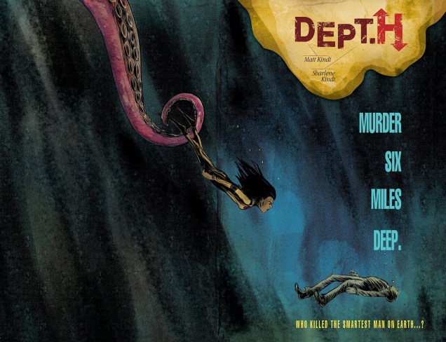
I’ll get around to reading Dept. H one of these days, but in the meantime, some tentacles from this suspenseful (or so say the reviews!) deep-sea who-dunnit:
Dept. H no.1 (April 2016), cover by Matt Kindt.Dept. H no. 7 (October 2016), cover by Matt Kindt, colours by Sharlene Kindt.Black Hammer / Justice League no. 1 (July 2019), a variant cover by Yuko Shimizu.
I mentioned Hellboy earlier – speaking of that, unsurprisingly, a large chunk of today’s post features covers from this ever popular series. But am I going to show you regular covers? Naah, too obvious.
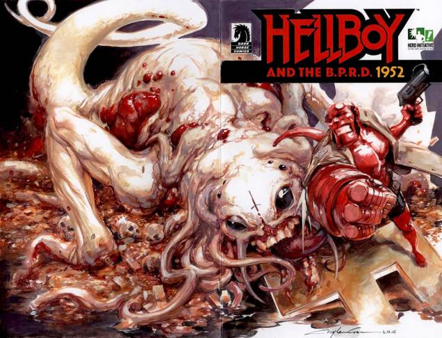
«Dark Horse Comics printed a precious few blank covers on the landmark Hellboy and the B.P.R.D. 1952 #1, and the Hero Initiative commissioned 100+ top artists to do an original drawing on each cover. Presented here is the gallery of ALL 109 original covers!» (See them here.)
I picked a few that I liked, but make sure you click on that link because about three quarters of those commissioned covers are awash in tentacles. Now that’s what I call good, nay, great commission art!
Cover by Chris Ivy. Chosen because despite the abundance of all manner of creatures, the eye is automatically drawn to the Cthulhian horror that’s politely waiting its turn for devouring and whatnot.Cover by Walter Flanagan. They’re somewhat, shall we say, timid tentacles, but that’s what I like about ’em.Cover by Ben Glendenning. Chosen because of the WTF factor of a creature with a dozen scaly, plant-like tentacle-arms.Cover by Clayton Crain. Probably the most gruesome cover of today’s post, included for the blood and entrails and disquieting albino-ness of it all.Cover by Allison Grace. I hope that cigarette isn’t implying anything… untoward has happened.
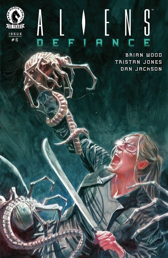
And a last cover, just to leave you on a quiet, peaceful note…
Aliens: Defiance no. 6 (October 2016).
This is, by no means, an exhaustive list – stay tuned for a Part 2, coming to your computer and cellphone screens sometime soon (when you least expect it!)
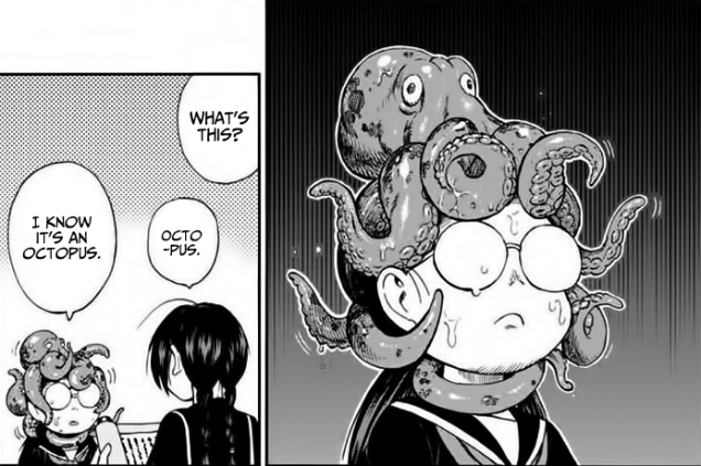
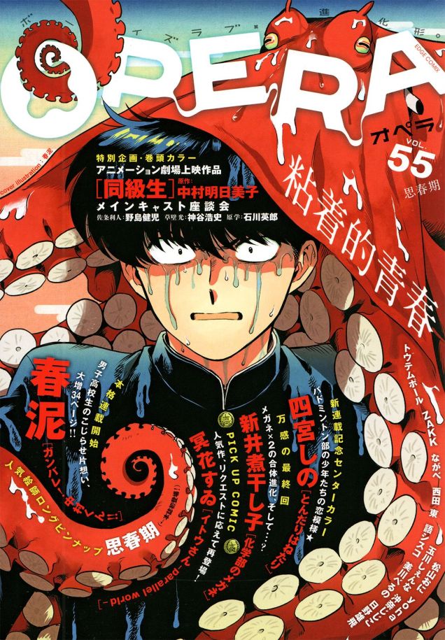
Last night, an octopus materialized into my office and reproached me for neglecting manga during my Tentacle Tuesday forays. I vowed to do better! As octopuses are impatient fellows, I decided not to tarry and complied immediately.
Panels from Shinobuna! Chiyo-chan, a comic by Kiyoto Shitara. Begun in 2017, it is still going and is being published by Tokyo-based Kadokawa Shoten. Read it here.
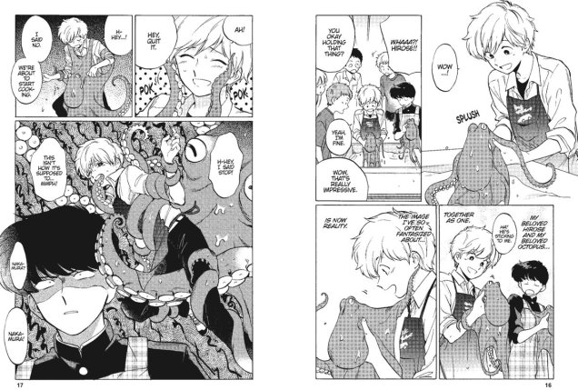
While the previous manga is about a schoolgirl trying to get her classmate’s attention (she’s also a ninja, not that it simplifies matters), the following concerns itself with a shy boy who falls instantly in love with a (male) student from his class and spends the rest of the story trying to get closer to him.
Go For It, Nakamura!, started in 2014, is written and illustrated by Syundei and published by Akane Shinsha.That’s Nakamura’s pet octopus, Icchan. « Octopi like to go into crevices, don’t they?! Wow, look at how squishy it is! »
Adventures in Poor Taste’s Trevor Richardson wrote a slightly extravagant review of Go for It, Nakamura! that delves deep into this manga’s the cephalopod imagery. Just for the fun of all the octopus metaphors, I’ll quote:
« As a queer person, I couldn’t help but identify with that queer young man who doesn’t yet know how to use all the extra arms that queerness grants him. Who doesn’t yet know how to push his tentacles up against the metal lid of self-doubt and oppression and twist it off. Who isn’t yet able to expel all that confusion and rejection like a cloud of black ink and surge down to trenches where straight people never dare drift to join his fellow otherworldly, queer creatures in the dark. »
To those who aren’t into high school romance but prefer their manga on the side of the macabre and the bizarre, I propose Octopus Girl by Toru Yamazaki (1990), though the events still mostly take place at a school. Takoko, our main character, is bullied by her classmates and nearly killed by them when they decide to semi-drown her and then force her to eat a live octopus (to which, the story specifies, she is allergic, because eating a live octopus isn’t horrifying enough as it is). As a response to this ordeal, she turns into an octopus (with a girl’s head) and exacts terrible revenge on her bullies!
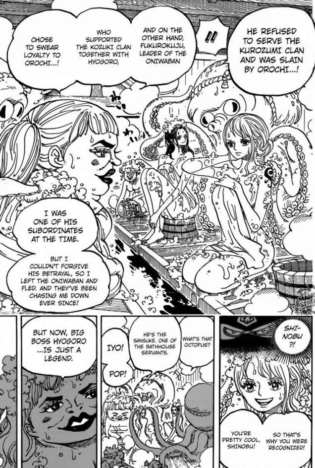
The English publisher describes it as “delightfully disturbing” – at any rate, I certainly agree with the “disturbing” part. Here, Takoko eats her own appendages for sustenance (don’t forget to read from right to left.)« Teenage monsters lose their hearts and heads in a relentlessly gory collection of dark humor and horror! Carving a comical niche in modern horror manga, Toru Yamazaki’s Octopus Girl serves up the most disgusting dishes of heartbreak and revenge found on land or at sea. Have a side order of nervous laughter with your main course of bloodcurdling fear, some gore with your teen angst, and some killer instincts with your kawaii! These shocking vignettes will hypnotize fans of the macabre and the absurd, as intestines, eyeballs, and fluids of all sorts shoot enthusiastically across Yamazaki’s pages! »Page from One Piece, a humorous manga series by Eiichiro Oda, serialized in Shueisha‘s Weekly Shōnen Jump magazine since 1997. Read it here if you’re so inclined – in terms of posting copyrighted content, otakus seem every bit as bad as Russians. « The story follows the adventures of Monkey D. Luffy, a boy whose body gained the properties of rubber after unintentionally eating a Devil Fruit. With his crew of pirates, named the Straw Hat Pirates, Luffy explores the Grand Line in search of the world’s ultimate treasure known as “One Piece” in order to become the next Pirate King. »
Moving on to proper horror – in the sense of it being devoid of comedy -, two pages from Junji Ito’s Gyo Ugomeku Bukimi (Fish: Ghastly Squirming), published as a series between 2001 and 2002 in the Japanese weekly manga magazine Big Comic Spirits. I’m enough of an aficiona-Ito to own most of his work that’s been translated into English, and though a lot of his stories are rather hit-and-miss, Gyo is one of the genuinely gruesome ones.
Ito is quite adept at conjuring up quite far-fetched yet terrifying plots, with events spinning faster and faster out of control until… until he doesn’t quite know how to tie up the story. Having gone so deep into the utter destruction of the world, there’s no elegant dénouement available but sheer Armageddon. That is definitely a weakness, so I tend to prefer his short stories, where the conclusions are fast and hard-hitting. That being said, I definitely recommend reading Gyo (read it here, but remember to support the artist by purchasing!) and Uzumaki (another terrifying read likely to leave you with a phobia of spirals). For an excellent discussion of Junji Ito’s appeal, please consider the excellently written The Horrifying Appeal of Junji Ito.
Okay, a couple more horror comics!
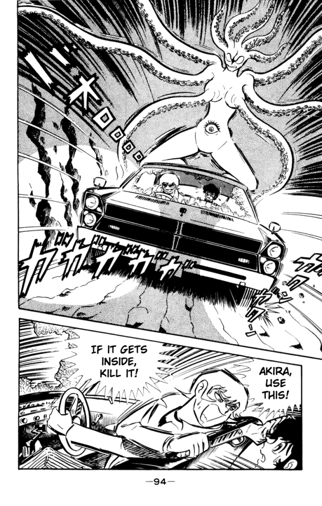
Page from Devilman, written and illustrated by Go Nagai, published from 1972 to 1973 in Shōnen Magazine. This has very typical manga art, which is to say, art that doesn’t appeal to me. But a vicious female demon with tentacles *everywhere*? I wasn’t going to say no to that.
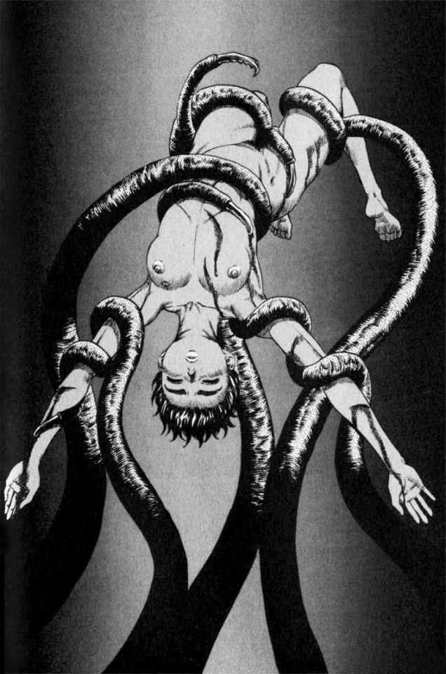
I’ll leave off on a somewhat… sexualized… note with two pages from the dark world of Berserk by Kentaro Miura, first published in 1988 and still going on. It’s been called one of the greatest literary works in all of manga… well, I can’t vouch for that, as I haven’t read much of it, but it does seem complex, at any rate.
Oh, as long as we’re on the topic of probing tentacles, I’ll wrap up with some Toshio Maeda, an erotic manga artist and pioneer of hentai. His best known work is Urotsukidōji: Legend of the Overfiend which been credited with popularizing the trope of tentacle rape. Fellow tentacle lovers, are you for or against such a use of tentacles? Please let us know in the comments.
Urotsukidōji: Legend of the Overfiend by Toshio Maeda, serialized in Manga Erotopia from 1986 to 1989. Were nipples verboten, one may wonder, or is this just a demon of some kind?Panel from Urotsukidōji: Legend of the Overfiend by Toshio Maeda. If you’re in the mood for further tentacles, visit The Tentacle Lounge, an aptly-named blog devoted to Maeda.
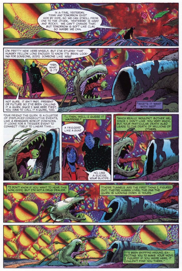
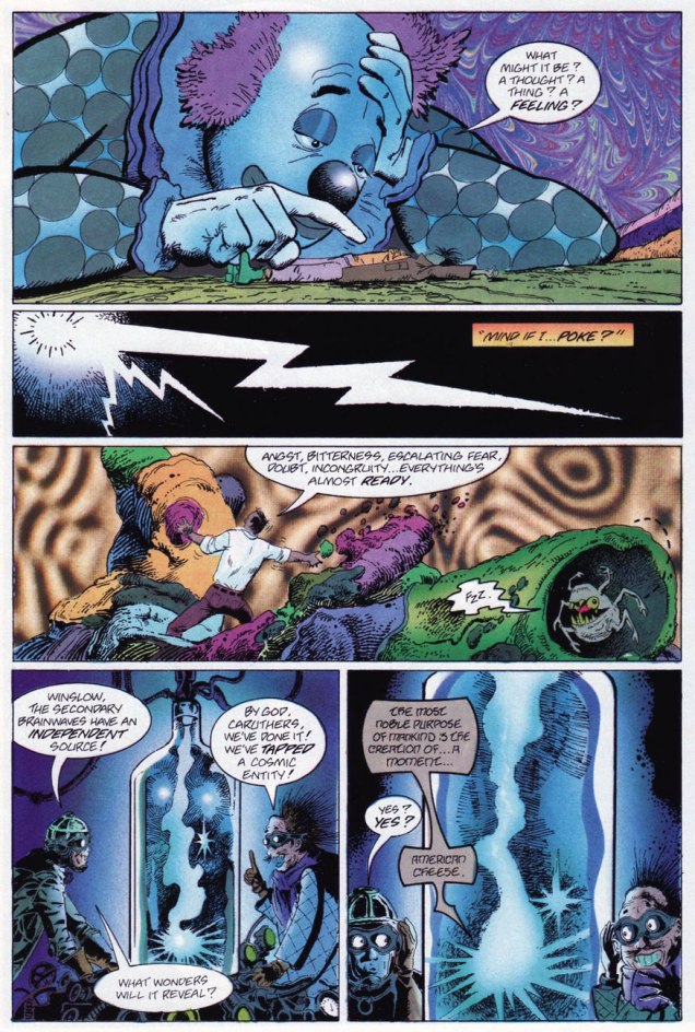
« I, I know this place. I’ve been here when I’m wasted. » « Sure, and a man who drives his car off a cliff knows what it’s like to fly. » « He does if he’s headed DOWN. » — Squalor and Todd debate the nature of reality
Compared to his 1970s, the ensuing decade was surely no picnic for Tom Sutton (1937-2002). After producing a massive body of work for Warren, Skywald, Marvel, Charlton and DC by the late Seventies, the mid-1980s found Sutton trudging through a long run (« It lasted hundreds of years. ») of abysmal Star Trek comics to put food on the table. This was the movie franchise Star Trek, with Bill Shatner’s permed hairpiece and those atrocious red velour outfits. Worst of all, inker/saboteur Ricardo Villagrán dogged his every move, casually pulling a Colletta on him*.
Oh, Sutton did work for other publishers in the 80’s, mainly the once-promising upstart First (1983-91), but the rote fantasy of The Black Flame and the hollow tough-guy posturing of Grimjack (coming soon to a screen near you, apparently) didn’t offer much of substance as alternatives to the Big Two’s sludge.
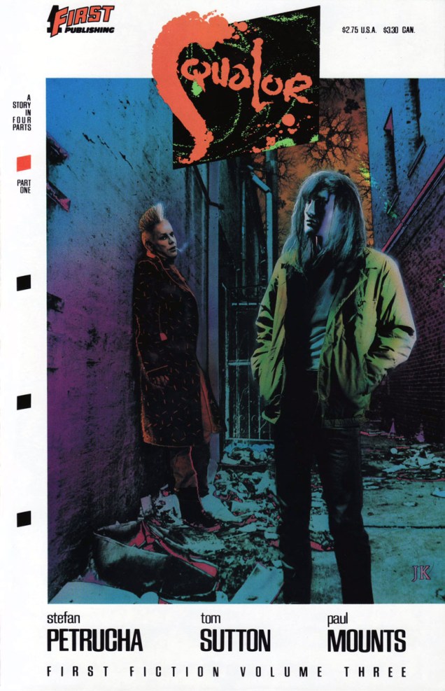
Still, First merits full credit for green-lighting the last great Sutton project, Squalor (1989-90). It was part of a line called First Fiction**, which looked like an eleventh-hour push to get into mainstream bookstores without quite committing to the graphic novel format and its price tag. Cardboard covers, full colour, slick paper; certainly more durable than the average comics pamphlet. Let’s take a look, shall we?
The inspired choice for the series’ covers was photo-montage artist J. K. Potter., whose work I recalled from Twilight Zone and Night Cry magazine covers, as well as a clutch of memorable paperback covers. Joe R. Lansdale‘s By Bizarre Hands comes to mind. Now remember, young Photoshop pups, these had to be created the hard way.
Since you asked, panel four refers to the inevitable American Bandstand teenybopper analysis.« Welcome to A-Time… not another dimension, not a parallel world, but your very own neighborhood bereft of linear time. In A-time, past, present and future merge like expressway off-ramps, six-legged quirks hunt the time trails, and archetypes leave footprints. »
So yes, we have an accomplished illustrator on board… but do we have a proper story to hang the visuals upon? What do you know, we do! In a freakish bit of convergence, a newcomer to comics, Stefan Petrucha, then a freelance technical writer, happened along with a fully fleshed-out, unconventional concept, one ideally suited to Sutton’s strengths. And then someone fished it out of the slush pile.
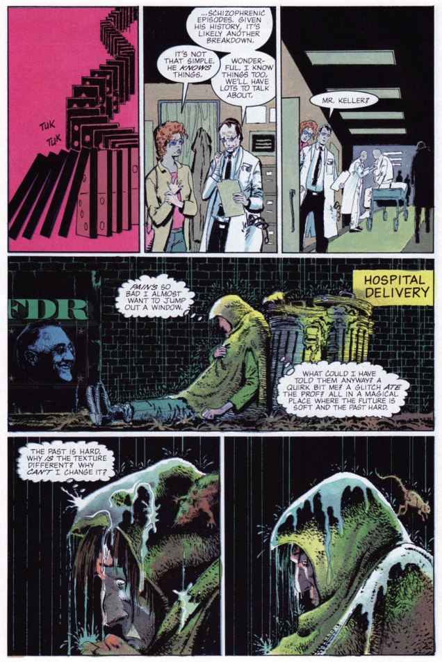
So what’s Squalor about? It’s a bitch to summarize, but it involves alternate time streams, the oft-elusive nature of genius, conspiracy theories, synchronicity, archetypes, and the road map of reality. Fair enough? I surmise that we have Mr. Petrucha’s experience as a technical writer to thank for his capacity to hold his magic bus to the right side of the road through to the end of the journey.
This is Squalor no. 3 (July, 1990) J.K. Potter does the cover honours again.
Petrucha wrote, in Squalor no. 4‘s concluding notes: « Personally, I would love to write more Squalor. In fact, I have a few document files chock full of plot ideas. We’ve seen quirks, glitches, and an archetype up close, but what about paradigms, totems, and babblers? I’d also like to write a graphic novel about Todd Penderwhistle’s coat. Maybe that’s why I’ve had so much trouble breaking into this business. »
While he did break into the business, he’s never again been afforded the chance to handle such a personal project. Squalor was Tom Sutton’s final such endeavour***, though I can’t help but think that he was more than a bit broken by his Star Trek stint.
In 2016, Squalor was at long last collected as a graphic novel by Caliber Press, to what I presume was general indifference. As for the original issues, one can still get copies online for less than the original cover price, which is a bargain and a golden opportunity, but rather bittersweet.
I still have my Squalor pin-back promo button (logo designed by art director Alex Wald) from ’89. Whee.
-RG
*From Gary Groth‘s definitive interview with Sutton (The Comics Journal no. 230, Feb. 2001) ): « No, I did not ink this thing. This was inked by a fellow who I was told inked in bed watching television. The enthusiasm of this man was evident. He was a pro. Oh, he was very slick. He was very, very good. It was exactly what the book didn’t need. What the book needed was Mœbius. Hear what I’m saying?
This will sound really dumb, but even after all of that crap I had gone through I went into this thing and I said, This is going to be fun. This is going to be creative work. I worked like hell on the thing. I penciled backgrounds you wouldn’t believe, with all the scopes and all of those things. I thought I was Wally Wood. I forgot that Wally inked his stuff himself. I had to leave it up to Ying Yang watching TV or something. They actually took your backgrounds out and erased them. I never realized it until I saw the fucking comic book and I said, I drew something there. A large something. A complex something. »
GROTH: « And this would have been for sheer expediency’s sake? »
SUTTON: « I suppose so. Because he knew he could get away with it. He knew something that I didn’t realize until later, that that book had a special job. And that job was to promote movies. » [ source… well worth your time! ]
**The other “volumes” of First Fiction were nothing special, to put it kindly.
As we’re currently in the blaze of summer (rocketing temperatures and crazy humidity, courtesy of global warming – this June was the hottest June ever, and we’re well on track for beating records for July), a Tentacle Tuesday post about plants seemed appropriate. Did I say “plants”? More like “plantacles”: these vines and tendrils snatch and grab, creep and reach, entwine and writhe just like their cephalopod counterparts.
Pages from Dark Side of the Moon, with art by Maurice Gutwirth, published in Hit Comics no. 2 (June 1941, Quality Comics).
So Blaze Barton encounters some vine tentacles, fine; but he also encounters ‘queer tiny plants‘ that swarm him and attack with what looks very much like octopus appendages. The delightful thing about Hit Comics and particularly Barton’s adventures is that the stories are goofy as hell.
The story continues in the same vein, merrily galloping into insanity… into an ‘evil-infested‘ lake that boasts man-eating weeds, once again complete with tentacles.
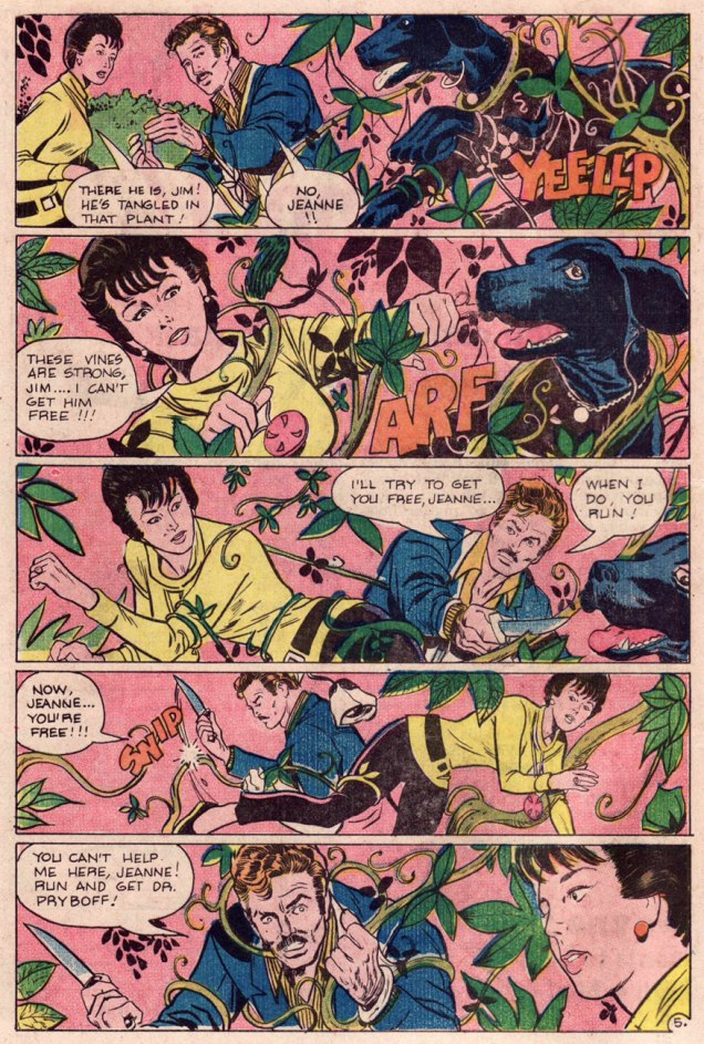
Continuing our grabby, carnivorous vines theme, a creepy little tale of a scientist who slightly oversteps his bounds:
Pages from The Hungry Garden (scripted by Joe Gill and drawn by Fred Himes), published in Ghostly Haunts no. 34 (August 1973). Trespassers will be stung, choked, and then gleefully consumed.Should you be curious or concerned, the pooch makes it out just fine, and in fact goes on to save the day!
Occasionally, an entire tree will decide that it’s more fun to strangle a human than to passively let itself be chopped down. Who could argue with that?
Psychotic Adventures no. 3 (June 1974, Last Gasp). Cover by Charles Dallas. The blog Mars Will Send No More has many Dallas stories (all from Psychotic Adventures) for your perusal; I recommend them heartily.
The cover story, Women of the Wood, is based on a short story by Abraham Merritt that you can read here if you’re so inclined. It’s an excellent creepy tale – though I can’t promise tentacles, I can definitely guarantee murderous trees.
« For all those hundred years there have been hatred and battle between us and the forest. My father, M’sieu, was crushed by a tree; my elder brother crippled by another. My father’s father, woodsman that he was, was lost in the forest — he came back to us with mind gone, raving of wood women who had bewitched and mocked him, luring him into swamp and fen and tangled thicket, tormenting him. In every generation the trees have taken their toll of us — women as well as men — maiming or killing us. »
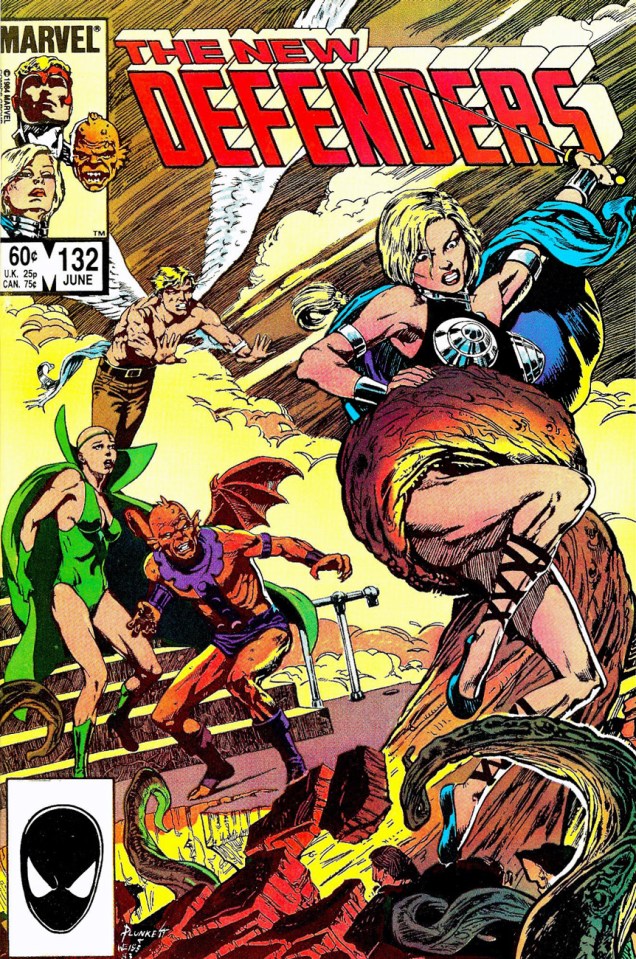
Speaking of attacking tree trunks, I do believe this qualifies:
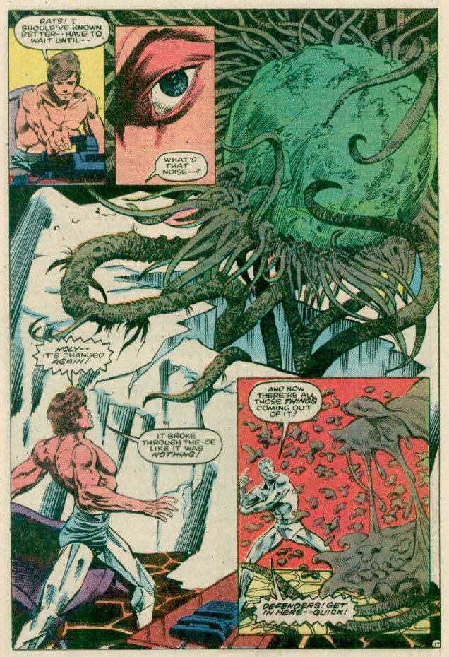
The Defenders no. 132 (June 1984). Penciled by Sandy Plunkett and inked by Alan Weiss.
The cover story, The Phantom of Gamma-Ray Flats! (scripted by Peter B. Gillis, penciled by Don Perlin and inked by Kim DeMulder) is quite entertaining – and brimming to the gills with plant tentacles.
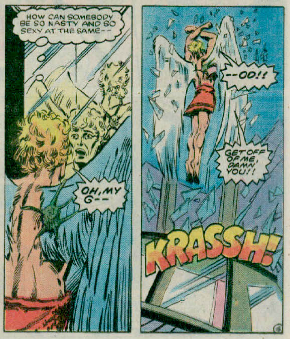
Not “rapey”, “ROPEY”.
The tiny remnant of the tentacle creature manages to find a hold on Warren’s back, perfectly à propos to this post… but I couldn’t resist including the other panel revealing his thoughts about his sexy colleague. Warren is Warren Worthington III, aka The Angel, a founding member of the X-Men.
The Savage Sword of Conan no. 42 (July 1979). Cover by Bob Larkin.The Devil-Tree of Gamburu is scripted by Roy Thomas, penciled by John Buscema and inked by Tony DeZuniga.
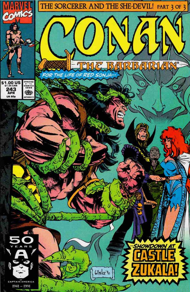
And another Conan cover for the flora hall of tentacles:
Conan the Barbarian no. 243 (April 1991). Cover by Filipino artist Whilce Portacio.
« You’ve got his likeness emblazoned onto
the top of a tin box Perfect big heart
perfect blue eyes
perfect teeth and
perfectly flowing locks » — The Motorz, ‘Bobby Sherman Lunchbox’
It’s birthday number seventy-six for singer, actor, songwriter, Charlton comics star and all-around swell guy Robert Cabot “Bobby” Sherman, Jr. (born July 22, 1943).
This is Bobby Sherman no. 1 (Feb. 1972). Story and art by the much-maligned Tony Tallarico. You know what, though: he’s alright in our book. One of these days, we’ll make our case.
His Getting Together co-star, Wes Stern, also celebrates his birthday this Thursday, July 25. He’ll be seventy-two. You may remember Wes from his recurring rôle as Brenda Morgenstern’s shy, foot-fetishist beau Lenny Fiedler on Rhoda (early on, before the show utterly went South).
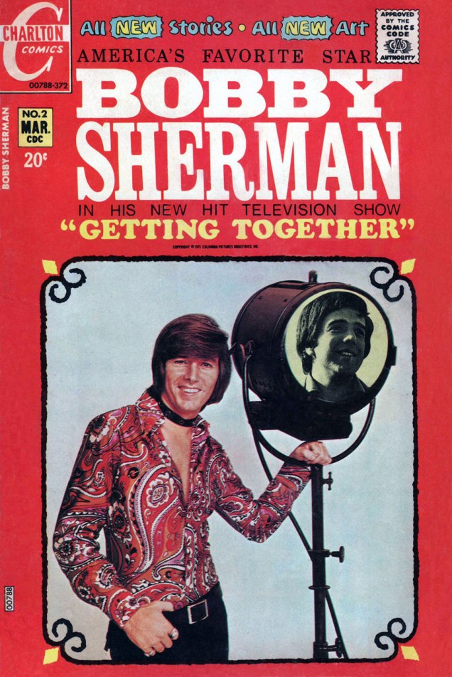
This is Bobby Sherman no. 2 (Mar. 1972). Story and art by Mr. Tallarico.
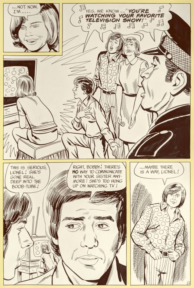
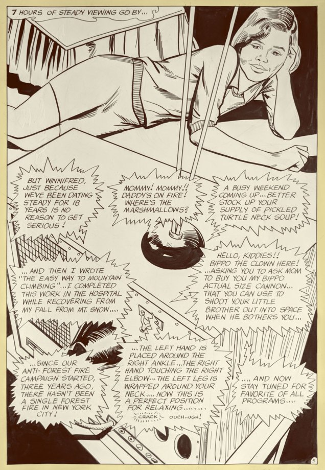
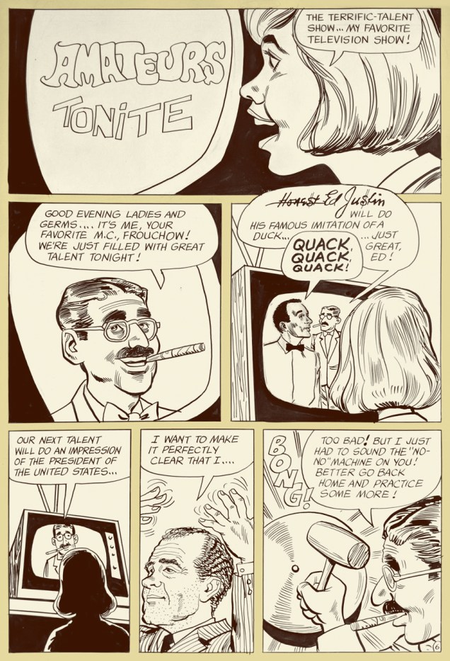
Bobby and Wes had the singular honour of starring in seven issues of their own Charlton comic book (February to October 1972). Our excerpt is number 2’s « A Guide to TV? », written and illustrated by Tony Tallarico and shot from the original art. Good-natured fun, especially when the Getting Together cast of characters is around. In the 1971 Fall season, the snappy little show was off to a promising start, but found itself, in the eleventh hour, scheduled against the powerhouse tv hit of 1971, Norman Lear’s abrasive All in the Family, and that was all she wrote.
Ah, back in those innocent days when watching seven hours of TV was the stuff of humorous exaggeration. Now (depending on how it’s defined and whom you ask) it’s *below* the daily average.Inside joke alert: “Honest Ed Justin” alludes to one of Bobby’s songwriting partners, Ed Justin. Here’s one of their musical collaborations. And, hey, two posts in a row featuring Tricky Dick cameos… I’m on a roll! Incidentally, ‘Amateurs Tonight” predates The Gong Show by nearly half a decade. Was Chuck Barris perchance a Charlton reader?
But that’s all water under the bridge. By the mid-70s, Bobby basically walked away from the grind of public life, and the odd tour or charity event aside, he’s been volunteering with the LAPD, training recruits in first aid, CPR, and so forth. A solid citizen, no irony or sarcasm intended.
One more?
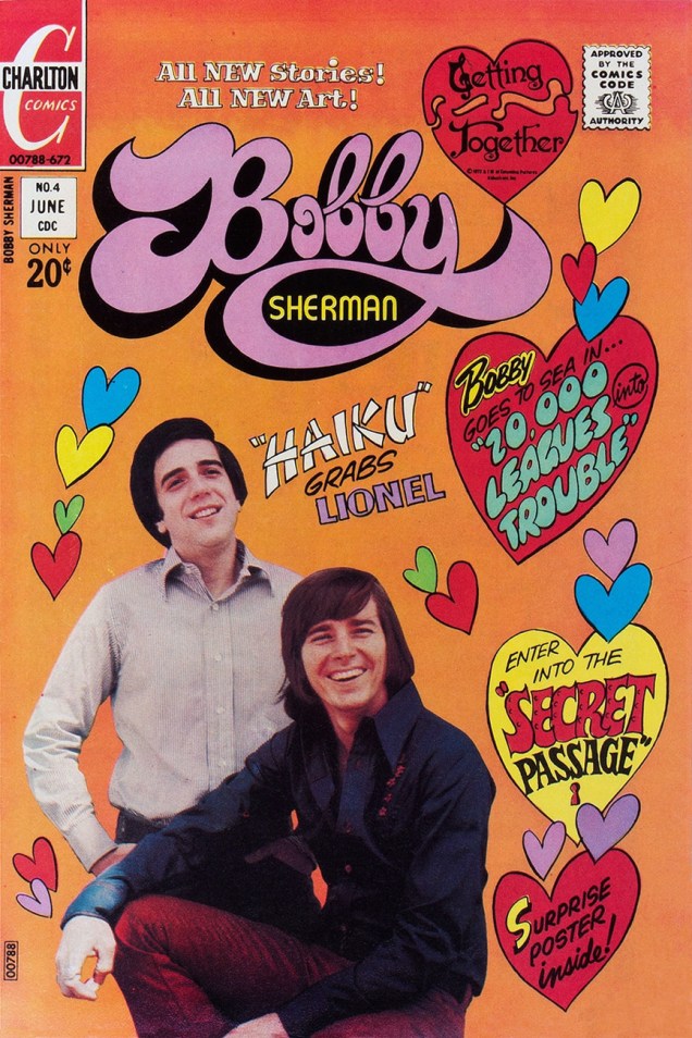
This is Bobby Sherman no. 4 (June, 1972). M. Tallarico strikes again!
Once again, we wish the most joyous of birthdays to Bobby and Wes!
« Mom, my teacher, Mrs. White, has invited me to a slumber party at her house this weekend. She’s really nice. Can I go? »
« Sure, why not? » — from a Jack Chick tract, The Poor Little Witch (1987)*
Today, we part the curtains and peek at the fair bosom of suburbia, circa 1972. In those gentle times of satanic panic, Tricky Dick’s political shenanigans, the oil crisis and all-around grooviness, the Manson ritual murders were recent history, Anton LaVey‘s The Satanic Bible (1969) and its sequel, The Satanic Rituals (1972) were all the rage, not to mention William Peter Blatty‘s The Exorcist (1971… the film another year away) and Ouija boards. DC Comics’ The Witching Hour (85 issues, 1969-1978) was well in keeping with the vibe of the times, and offered girls somewhat of an alternative to Archie, Little Dot and Young Romance. In fact, my recollection (and I’d welcome yours!) was that ghost and mystery comics overwhelmingly found favour with the ladies.
I’ve perhaps said it before, but DC’s mystery books were mostly well-drawn but mind-numbingly formulaic… but exceptions now and again slipped in.
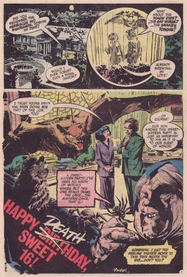
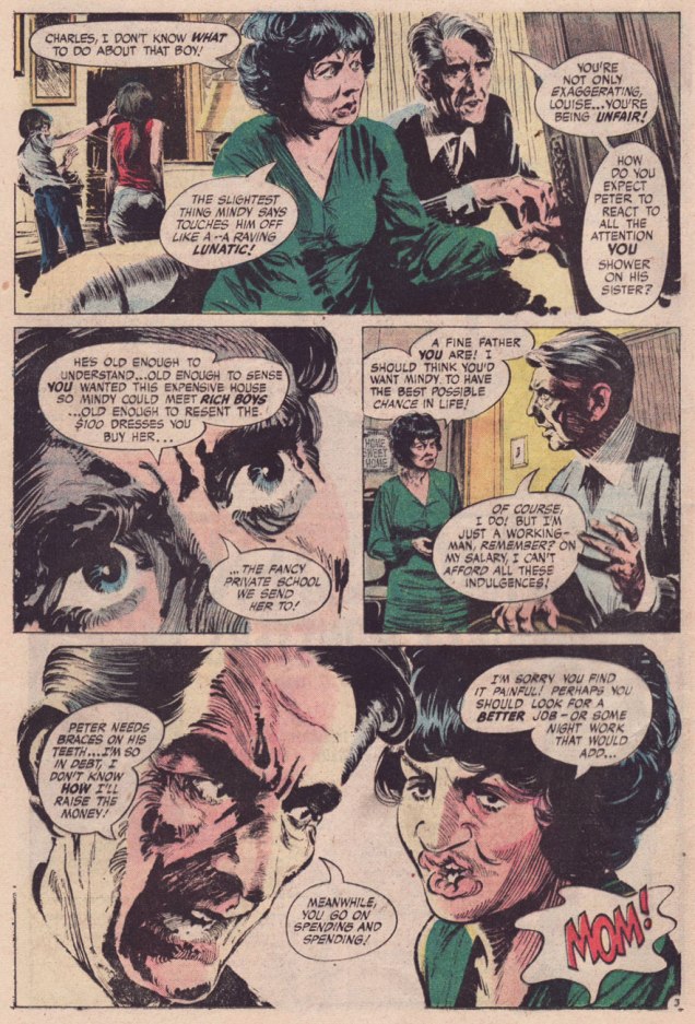
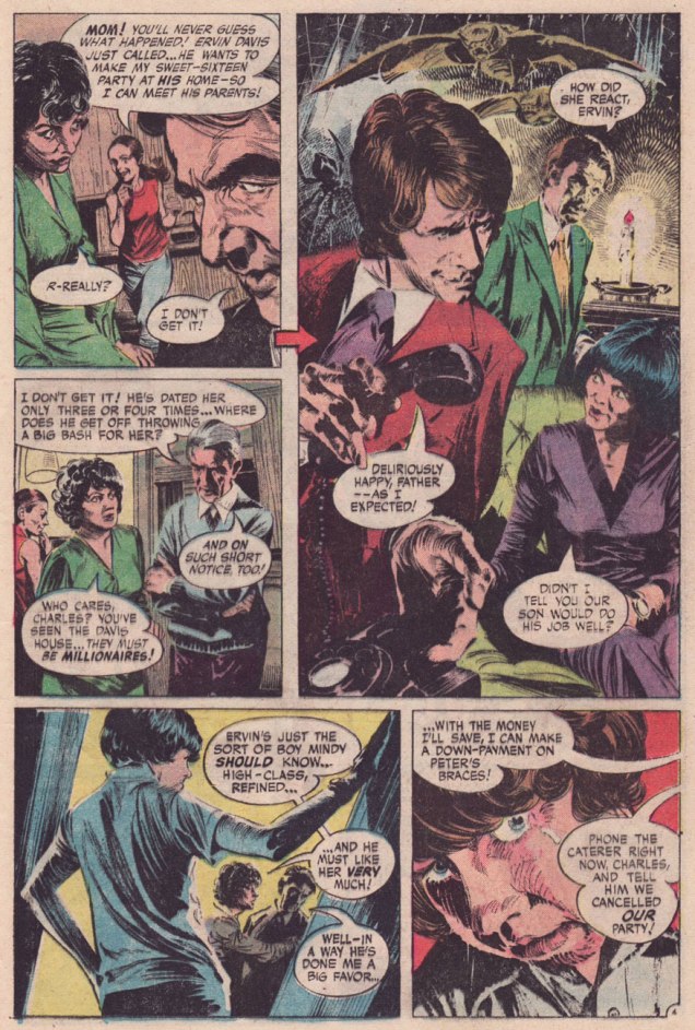
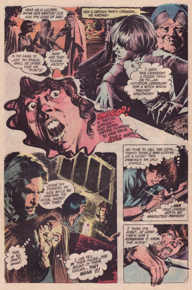
Happy Deathday, Sweet 16! was a bit of lightning in a bottle. It was illustrated by the hardly-prolific Canadian Bill Payne, who drew a dozen or so jobs for DC’s mystery and war titles, lettered a few more, then vanished. I suspect he had a day job in some advertising agency and did a bit of comics work on the side for kicks. If that’s the case, he certainly applied himself, bringing actual realism and a bit of the old ‘Ghastly’ Ingels grotesqueness to the table. The writer, however, is uncredited. The writing doesn’t quite feel like the work of any of DC’s workhorses… it’s markedly better, rising beyond the stock situations and packing in plenty of credible detail to flesh out the players in its scant eight and a half page allotment. Sibling rivalry, social aspirations**, marital and parental discord, class warfare… Lucky Peter, though: he somehow seems to have continual access to Shock Theater; for me, that’s the main cause for suspension of disbelief.
Nick Cardy‘s sweet ‘n’ sassy cover for The Witching Hour no. 25 (Nov. 1972). It’s fun to see one of his winsome romance cover girls put in a rather… perilous cross-genre appearance.
These days, I suppose the fundamentals haven’t changed, though with so-called Christians behaving in most unchristian fashion, and Satanists displaying a puckish (honestly, kind of adorable) sense of humour, things are… interestingly confusing.
-RG
*Read it here; but remember, it’s “available only in multiples of 10,000 at half-price.” ** Let’s keep in mind that, as Lori Loughlin has pointedly pointed out, “Any mother would have done the same if they had the means to do so.”
« I say let the world go to hell, but I should always have my tea. » — Fyodor Dostoyevsky
A colleague at work labelled me a “tea whore” the other day. I don’t think that’s an official expression (though apparently one can purchase tea mugs with this message), but I’ll take that as a badge of honour. And therein lies my similarity to my beloved octopods: they never say no to a nice cup of tea, either. Evidence, you may ask? I’ve a-plenty of it. Pour yourself a steaming cup of oolong and join me!
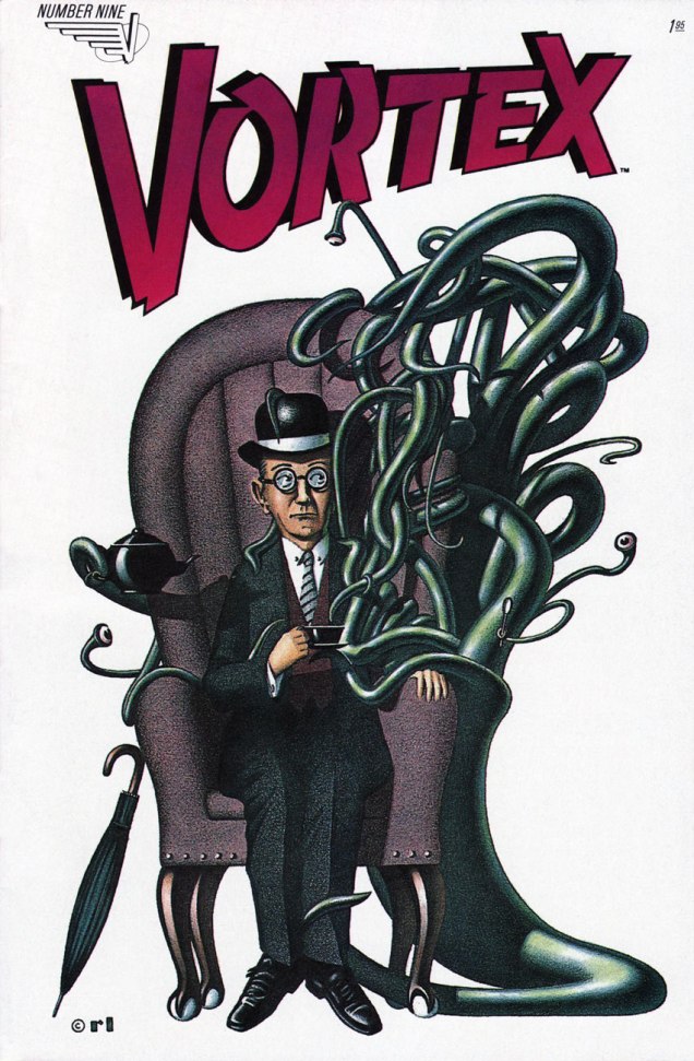
Donald Duck no. 200 (October 1978), cover by Larry Mayer. Incidentally, he has already been part of a Tentacle Tuesday.Surprise: this quintessentially British scene (an umbrella, a cup of tea and a suitably meek accountant) is brought to you by a Canadian comic! This is Vortex no. 9 (May 1984), cover by Ron Lightburn. Vortex was one Canadian Vortex Comics’ titles. Some interesting stuff was published by these guys: Matt Howarth’s Those Annoying Post Bros and Savage Henry, Los Bros Hernandez’s chunk of Mister X, Ted McKeever’s Transit, Chester Brown’s Yummy Fur…
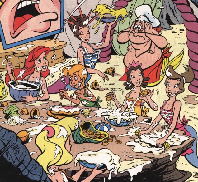
The following pages are from Disney’s The Little Mermaid no. 10 (June 1995). No, no, stick around, it’s worth it. You can read the full issue here.
So far so good, even though this begs some questions (such as “how do you pour a cup of tea underwater?”) But the following dialogue suggests that things other than tea-drinking were on the mind of *this* octopus:
You know how all this ends, don’t you? That’s right:
I tried to make this a purely innocent post, but things didn’t pan out.
Gahan Wilson is always, always good and ready for tentacles. (By the way, he is financially struggling and has dementia, which is both stupefying and depressing. I never cease to be amazed at how someone with such a wide-ranging and fruitful career can end up impoverished… His family raised enough money on GoFundMe – for now – to take care of him, but you should still visit that page for recent pictures and updates about his health.)
Cartoon by Gahan Wilson, published in Playboy’s August 2006 issue.
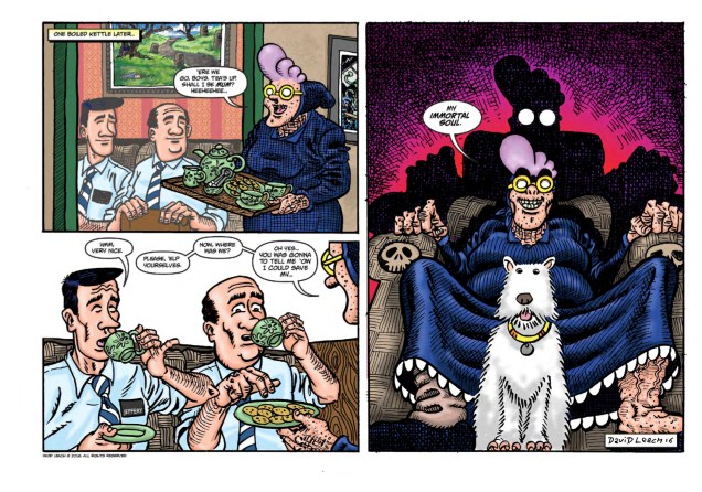
In 1986, British cartoonist David Leach unleashed Psycho Gran upon an unsuspecting world. The « five-foot high, mauve-haired, bespectacled psychotic granny with a pan-dimensional, sentient handbag called Percy, a flying dog called Archie and a pathological loathing of rudeness » first appeared in British children’s comic Oink!, where she lingered for 15 issues, pummeling purse snatchers, clobbering office workers and disciplining rampaging monsters until 1988. In 2011, she came back – her hair more purple than ever, her lust for authoritarianism unabashed – and is currently involved in a four-part mini-series.
And she’s drinking tea with Mr. Cthulhu. I’m jealous.
« We all have grannies. I think there’s something wonderfully exciting, mischievous and dangerous about them, or was that just mine? They’re old and they’re the mum of your mum, plus they spoil you rotten, but they can also tell you what to do, like your own mum does! That seemed so strange when I was a kid, the idea that they could boss not only you but also your mum or dad around. And I think we’re all a little scared of the elderly, no one likes to think that one day they’ll be old themselves, I think we resent them for showing us what we’re going to become. Psycho works because she looks frail and yet she’s super strong and batty. She’s the classic sheep in wolf’s clothing. And there’s something funny about an old granny being lethal and crazy to boot, especially since usually the elderly are portrayed as figures of fun to be mocked and laughed at. » (Look Out, Britain! Psycho Gran is Back!)
And by the way, I wasn’t exaggerating about Psycho Gran’s passion for control (and tea).
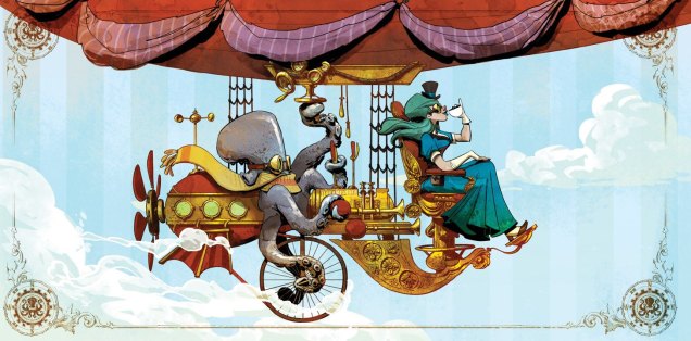
Drink tea with your octopus today… and if you don’t have an octopus, borrow one from a friend. I don’t have a dirigeable (that would be a zeppelin for younger people in the audience) , but I manage. Toodle-oo!
The cover for the 2016 calendar of Otto and Victoria, an adorable steampunk couple created by Brian Kesinger. These two were featured earlier in Tentacle Tuesday: Adopt an Octopus Today!
« Three A.M. The radiators in Commissioner Dolan’s office had long ago conked out… and those of us who could not go home waited… tried in various ways to ignore the damp cold made even more unbearable by the January rain. » — The Spirit, Jan. 8, 1950
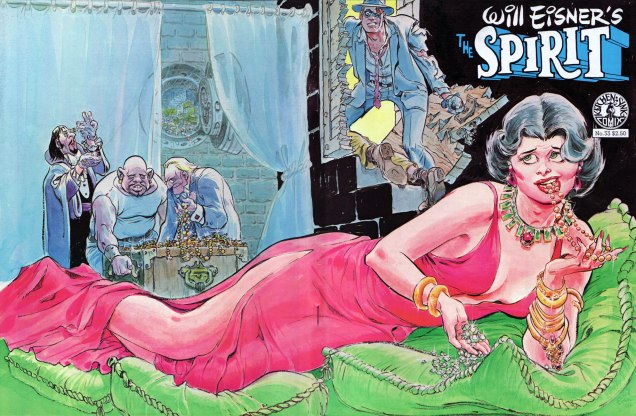
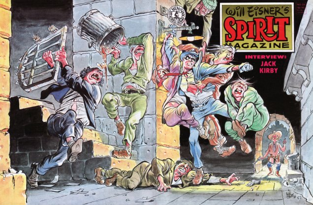
Welcome back! Today, we wrap up Kitchen Sink Press’ experimental continuation of Warren Magazines’ run of The Spirit. By now, Denis Kitchen was probably coming to terms with the fact that building upon Warren’s non-system of random Spirit reprints was not only a dead end, but one with mercilessly diminishing returns, even with so deep and rewarding an archive as Will Eisner’s.
Still, don’t worry, we’re hardly running out of dazzling visuals to tickle your eyeballs with.
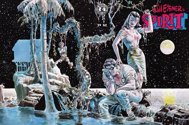
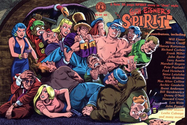
This is The Spirit no. 29 (June, 1981), featuring a mere four Spirit tales, namely: “Framed” ((Nov. 24, 1940); “Sasha’s Sax” (June. 28th, 1942); “Blood of the Earth” (Feb. 26, 1950); cover-featured “The Island” (March 26, 1950) , as well as plenty of fine new material by Eisner.This is The Spirit no. 31 (Oct. 1981), featuring four Spirit tales: “Wanted for Murder” (Feb. 5, 1942); “The Siberian Dagger” (Jan. 27, 1946); “Just One Word Made Me a Man!” (Jan. 18, 1948); “The Barber” (Oct. 22, 1950), some new Eisner material and the second instalment of “Shop Talk”, in which Eisner interviews one of his peers. This time out: Harvey Kurtzman.This is The Spirit no. 33 (Oct. 1981), featuring a quartet of Spirit tales: “The Haunted House” (Dec. 8, 1940); “Slim Pickens” (Dec. 15, 1940); “The Portier Fortune” (Dec. 1, 1946); “Dolan Walks a ‘Beat’!” (Apr. 17, 1949), an Eisner tutorial and a look at Eisner’s P*S Years.This is The Spirit no. 39 (Feb. 1983), featuring five Spirit adventures: “Dead Duck Dolan” (Mar. 2, 1941); “Tarnation” (Mar. 3, 1946); “Voodoo in Manhattan” (June 23, 1940); “The Van Gaull Diamonds” (Dec. 15, 1946), “Veta Barra” (July 29, 1951), and a 12-page Shop Talk with Jack Kirby!As a bonus, here’s the cover of The Spirit no. 30 (July, 1981), which features an amusing, but understandably uneven brand-new 36-page Spirit jam calling upon a whopping fifty pairs of paws. If only this had been the only time Frank Millertried his hand at Will’s creation… The issue also features pair of vintage yarns: “Army Operas No. 1” (Dec. 21, 1941) and “Beagle’s Second Chance” (Nov. 3, 1946). Can you identify all the cover jam contributors? Beware, though: that Pete Poplaski is a redoubtable stylistic chameleon.Here’s the key.
After 25 issues of The Spirit magazine (on top of Warren’s run), Denis Kitchen and Will Eisner would press the reset button and begin again in the comic book format. In part three, we’ll see how that endeavour fared.
If you’ve just joined us mid-programme, fret not: simply rewind to our earlier instalments, if you will:
… or simply click on its general category, That’s THE SPIRIT!, and find yourself with everything at your purple-gloved fingertips (don’t think you fooled us, Octopus!)
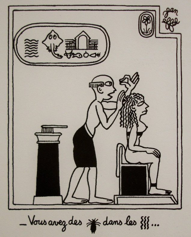
Despite his father’s insistence on a commercial career, French illustrator Jean Effel (1908-1982) pursued studies in music, art and philosophy. When his attempts to become a theatrical writer failed, he switched gears and started working as a caricaturist for newspapers in the 1930s. By the 1940s, his work was widely known and widely published, mostly in socialist/communist newspapers sponsored by the French Communist Party. After the second World War, he also branched out into book illustration (his work on Fables de la Fontaine is quite charming). Today, he’s mostly remembered (if barely) for his La création du monde (The Creation of the World).
I learned about Jean Effel (a nom de plume; François Lejeune was his true name) from a couple of books my parents had lying around when I was growing up. He was, I believe, my first exposure to cartoons, and the warm place his work holds in my heart is partly dictated by nostalgia. Only in part, however; few would deny that Effel’s animals and humans, his God, his Devil and his various angels are charming in that plump, childlike way that young animals are irresistibly cute. Some grouchy contrarians might get annoyed by that cuteness; the rest of us will enjoy his kind world. Oh, vexations and sarcasm are part of its tapestry, but nobody stays angry for long, pranks are witty but inoffensive, and problems are creatively resolved. Effel was an atheist, but his God was so kind and paternal that even priests didn’t object to their parishioners reading his work.
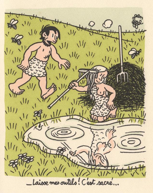
“How was it?” “Divine!” Even Effel’s handwriting/lettering is adorably rounded, childlike.“Leave my tools alone! It’s a sacred thing…” Note Adam’s scar, mute testimony to his missing rib.
To come back to my childhood, the twist in the story is that the books were in Russian: Soviet translations from French. The main collection of Jean Effel’s work was published in 1963 by the Hermitage Museum’s publishing press. The introduction calls him a « sincere friend of the Soviet Union », pointing out that Effel even learned to use Russian letters. In 1967, he was awarded the Lenin Peace Prize, which was mostly reserved for non-Soviets, foreign prominent Communists and supporters of the Soviet Union (Nelson Mandela also had one, as did Linus Pauling and Pablo Picasso).
Jean Effel’s present to the U.S.S.R.: a detailed map of France, with a hand-lettered dedication – “to my Soviet friends, with all my heart”.
It’s odd, but I can’t give you the exact date of the conception or publication of The Creation of the World: the Soviet book mentions that it was begun in 1950, English Wiki gives the date as 1945, French Wiki says 1953, Encyclopaedia Universalis (a French site) posits 1937, etc. Rather absurdly, there are a lot more detailed articles about Effel in Russian than in French, so for once I actually tend to trust the Russian side of things. It was clear that Effel genuinely liked Russians, and admired what he saw on his many visits to the U.S.S.R. I assume he only saw what he wanted to see (or what he was shown by his tour guides); still, he was clearly an idealist, a kind and gentle man by all accounts who believed in pacifism and loved animals.
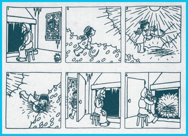
A few pages from my 1963 Soviet edition:
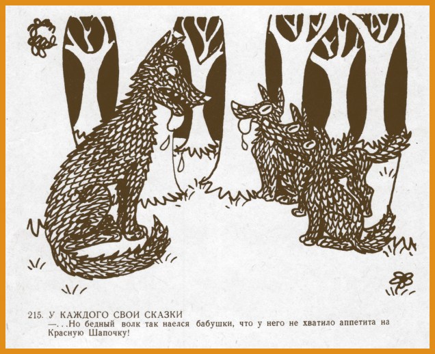
Dog meteorology: “He’s raising his paw: now water will pour down…”To each his own fairy tale: “But the poor wolf was so stuffed after eating grandmother that he had no appetite left for Red Riding Hood!”
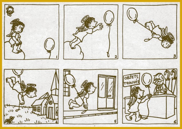
The desk caption says “found objects”.141: “He’s making projects for something…” 143: “How hilarious! If this keeps up, I’ll lose a rib from laughing too hard…” 144: “This is but a sketch. Just wait ’til you see the 3D version…”
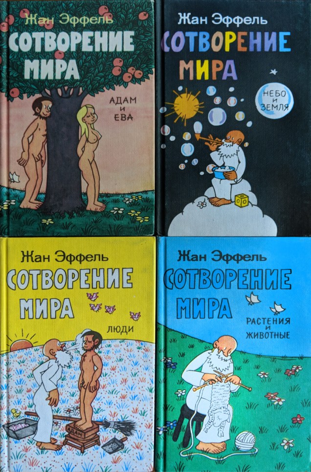
A few years ago, I found another Russian edition in some Canadian (how books travel..) second hand bookstore, a collection in four volumes:
Clockwise, left to right: Adam and Eve, Sky and Earth, Plants and Animals, and People.
The back covers are also worth a look:
Oddly, Animals and Plants is marked as costing 75 kopecks, and the other three are 80 kopecks each, though this was clearly sold as a set with a slipcase.
There can be no god without a devil! The charming Lucifer is probably my favourite character. This is a page from the Russian-Estonian edition. 173: “He likes us: he’s wagging his tail!” 174: “My name is Lucifer, but you can simply call me Lulu!” 175: “Oh, Mister Lucifer! You’re just the devil!” 176: “Perhaps I can tempt you with an apple?”The most recent edition of La création de l’homme, published in 1997.
A few other odds and ends from Effel’s multi-faceted career…
Sylvain is inviting you… to visit the PROTECTION OF NATURE exhibit at the Paris Fair.
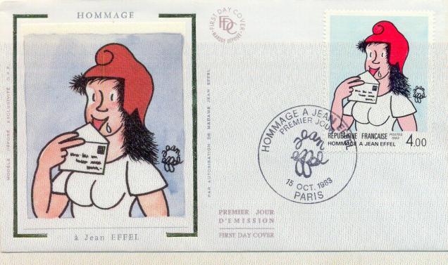
The French Postal Service issued a stamp in 1983 to celebrate Jean Effel and his sweet version of Marianne, a cheerful young woman with a red cap who symbolized the new French Republic.
« Though the refined eyes of the aesthete may consider Kirby’s work crude, ornery, and anti-intellectual, the fact remains that he combined the virtues and limitations of his class with a stubborn genius to produce a body of comics work that has remained consistently true to its source and is unparalleled both in quantity and quality. » (Gary Groth)
Strike while the iron is hot, it is said, and thus part II of our celebration of Jack Kirby‘s tentacle prowess comes hard on the heels of Tentacle Tuesday Masters: Jack Kirby, Part 1. I’d like to thank co-admin RG for his vast knowledge of Kirby comics, as well as his suggestions and scans – that’s what (among other things) partners are for. Whereas part 1 focused on Kirby’s 70’s work for DC, today’s post (also firmly entrenched in the 1970s) is a celebration of his brief but intense return to Marvel Comics.
All art is scripted and penciled by Jack Kirby and inked by Mike Royer, unless otherwise indicated.
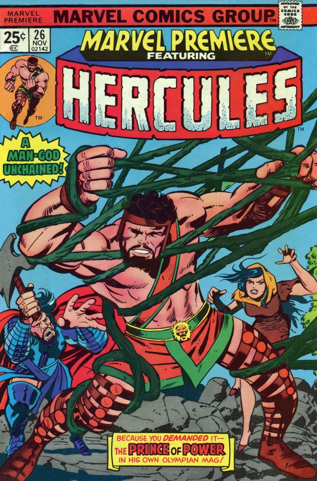
We start with the somewhat less interesting, but nevertheless tentacular, Hercules.
Marvel Premiere no. 26 (November 1975), penciled by Kirby and inked by Vince Colletta. Only the cover is by Kirby, the inside story being a collaboration between Bill Mantlo, George Tuska and Vince Colletta.
Now that we have the boring stuff over with, we move on to the spacey part of this post: epic voyages into the cosmos, mind-shattering encounters with Gods and fights to the death with unthinkable monsters of fearsome power! As usual, in chronological order: one must respect tradition.
« To make his comic, Kirby watched 2001 again, referenced a stack of stills, and pulled from the screenplay and Arthur C. Clarke’s novelization. The illustrations were instantly recognizable to anyone who’d seen the film, but the characters were uniquely his: beefy and emotive with a touch of uncanny. There are also moments of pure Kirby: a splash page of a spacesuit-clad astronaut gaping at an exploding cosmic sky, an acid-trip interpretation of the climatic Star Gate sequence. »
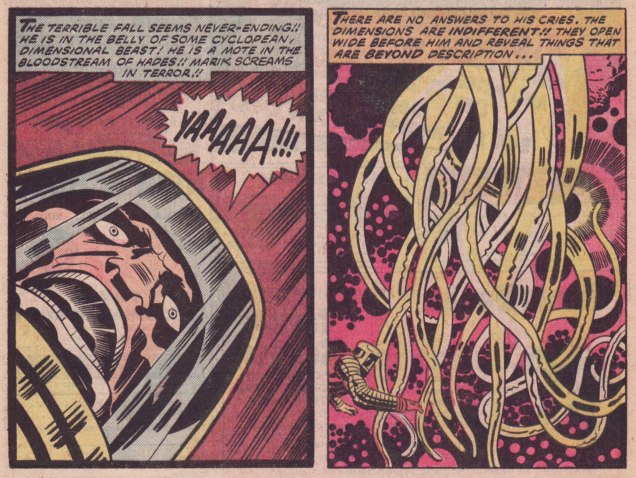
Pages from Beast-Killer! (read the full story on Diversions of a Groovy Kind) published in 2001, A Space Odyssey no. 1 (December 1976).Panel from Wheels of Death (again, read the story on Diversions of a Groovy Kind) published in 2001: A Space Odyssey no. 4 (March 1977). *My* question is, does anybody remember any tentacles in the film? I know, I really have a one-track mind.
« Kirby was the right choice for the assignment, but, Mark Evanier (a comic book writer, Kirby friend and colleague, and author of the biography Kirby: King of Comics) says, he was wary of taking on someone else’s story, especially one as iconic as Kubrick’s vision of 2001. “He didn’t feel he had a lot of wiggle room to expand or inject himself into it,” Evanier says. “He had to keep reminding himself, ‘That’s my viewpoint, that’s not Stanley Kubrick’s,’ and adjusting.”» (source: The Crazy Legacy of Jack Kirby’s Forgotten 2001: A Space Odyssey)
I wanted to find a good overview of The Eternals, and thought I had found it (plenty of pictures, an overall idea of the leitmotifs driving the series – and importantly, NO MENTION OF THE MOVIE)… until I came to the end of the article in question and saw that the author was next going to read Neil Gaiman‘s take on The Eternals* to see if the latter had fixed some of Kirby’s plot flaws, at which point I choked on the water I was sipping. But, but! the author repented, and so I give you Review: The Eternals by Jack Kirby from the blog Giant Size Marvel.
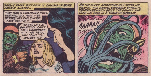
Panels from God and Men at City College published in The Eternals no. 6 (December 1976).Panel from Disaster Area, published in The Eternals no. 15 (September 1977).The Eternals no. 18 (December 1977), penciled by Jack Kirby and inked by Frank Giacoia.Panels from To Kill a Space God, published in The Eternals no. 18 (December 1977).Panels from To Kill a Space God, published in The Eternals no. 18 (December 1977).
Surely everyone knows Captain America already, but here are his 7 Most Awesome Moments (arguable, but a good starting point) by the good folks at Comic Alliance.
Here we have energetic tentacles, free-flowing-energy cephalopods…
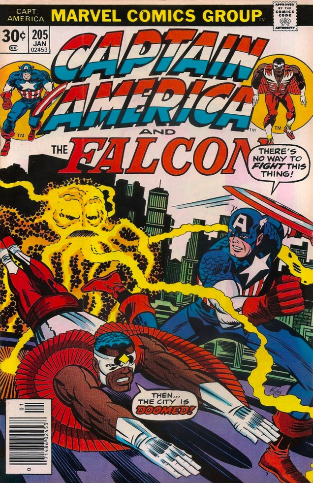
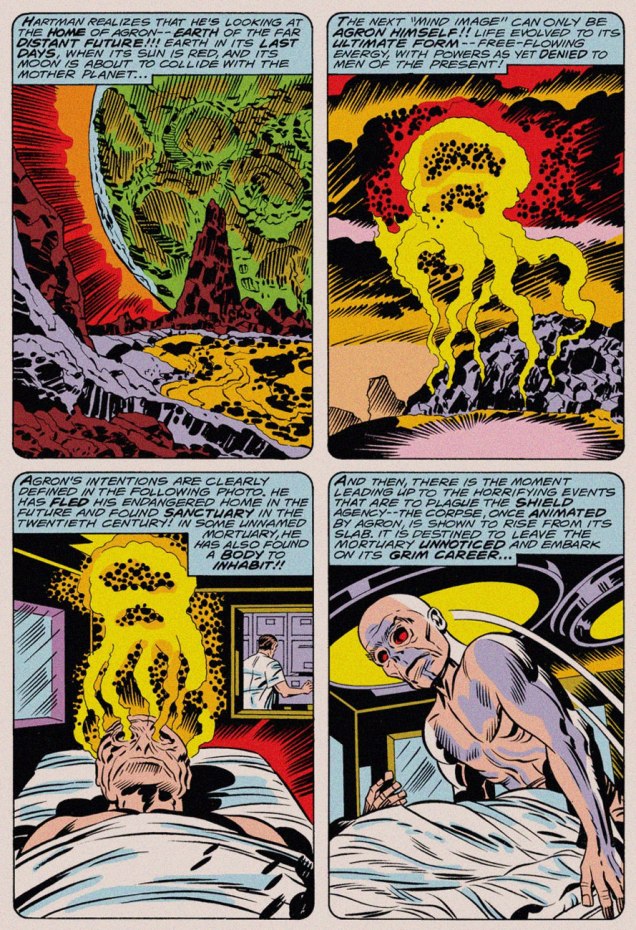
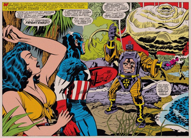
Captain America no. 205 (January 1977), penciled by Jack Kirby and inked by Joe Sinnott. The thing with the tentacles is Agron, who (which?) will eventually learn to animate a corpse, but for now he’s just in his energy form.Page from Agron Walks the Earth!, scripted and penciled by Jack Kirby and inked by John Verpoorten, published in Captain America no. 205 (January 1977). I *told* you Agron would animate a corpse, but did you listen?Double splash from Arnim Zola — The Bio-Fanatic!!, scripted and penciled by Kirby and inked by Frank Giacoia and John Verpoorten, published in Captain America no. 209 (May 1977).
You asked for it (right?): Doughboy in action! Technically, those are rubbery arms, not tentacles, but as someone who regularly makes sourdough bread, I assure you, dough *does* sprout tentacles and will latch onto your hands and arms with them.
Page from Arnim Zola — The Bio-Fanatic!!, scripted and penciled by Kirby and inked by Frank Giacoia and John Verpoorten, published in Captain America no. 209 (May 1977).Captain America no. 210 (June 1977), penciled by Kirby and inked by John Verpoorten. The Red Skull taking a leaf out of Medusa’s book? Seriously, those have *got* to be hair extensions.