« If it wasn’t for baseball, I’d be in either the penitentiary or the cemetery. » — Babe Ruth
Since the (so-called) World Series is still going on, this seems all the more appropriate.
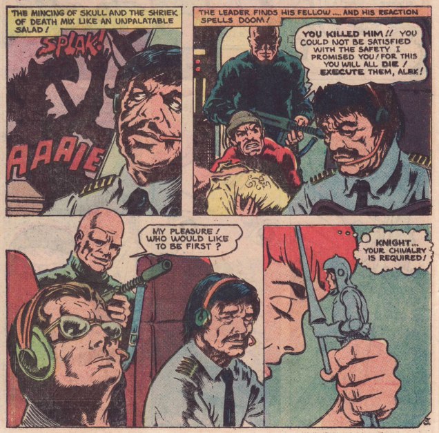
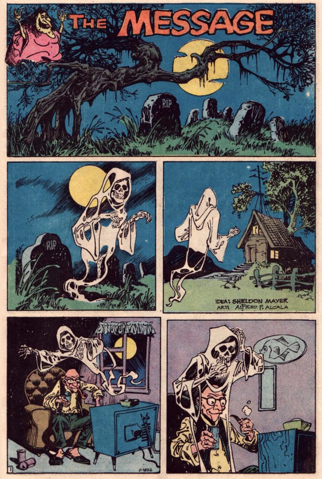
It was with this piece that I first began to grasp just how gifted and versatile Filipino giant Alfredo P. Alcala (1925-2000) was. He’s inarguably a grandmaster of eerie moods, but hardly bereft of a fun side. This brief piece, a dream collaboration between Sheldon Mayer and Alcala, was published in Plop! no. 1 (Sept.-Oct. 1973, DC). And what an issue that was, gathering such talents as Basil Wolverton, Sergio Aragonés, Mayer and Alcala, Frank Robbins, George Evans, John Albano, Stephen Skeates and Berni Wrightson… yikes! (read it here!)
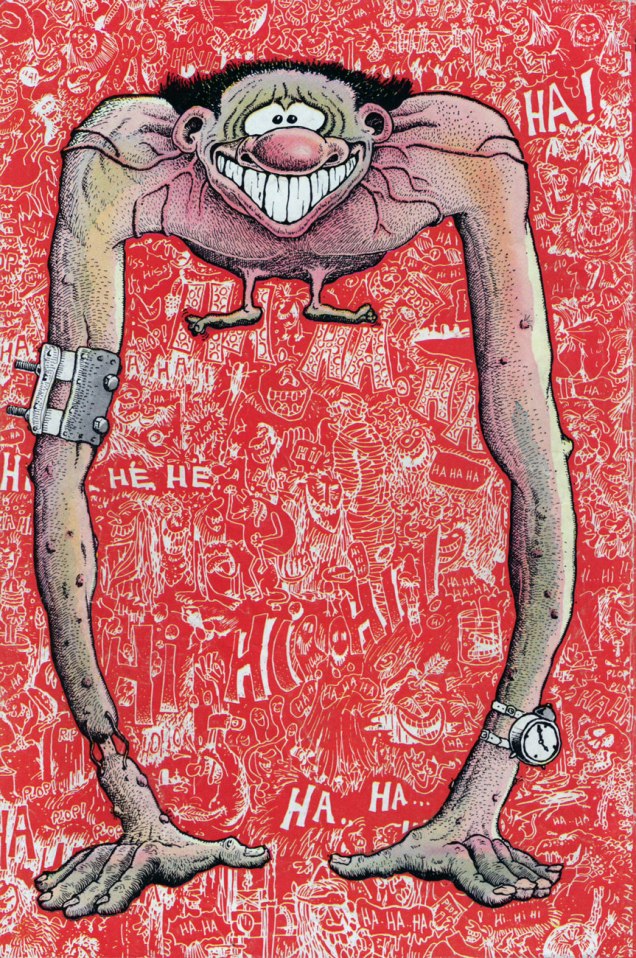
As a bonus, here’s the *back* cover of Plop! no. 1, featuring Wolverton’s cover boy “Arms” Armstrong. Which provides me with the opportunity to inform you that this very week has seen the long-delayed publication of Greg Sadowsky’s Brain Bats of Venus: The Life and Comics of Basil Wolverton Vol. 2 (1942–1952), his definitive biography of that singular and fascinating man. Read all about it here!
Voyage to the Bottom of the Sea no. 2 (July 1965). Cover by George Wilson.
Todd Franklin of Neato Coolville has actually transformed this cover into a groovy wallpaper (go to his website to download the high-res version).
Voyage to the Bottom of the Sea no. 13 (August 1968). Cover by George Wilson.Brothers of the Spear no. 7 (December 1973), cover by George Wilson.
That previous cover has borderline tentacles, I agree, but the completist in me insisted on its inclusion. Also, it’s entertaining.
The Tree That Walks is illustrated by Jesse Santos. The story tags as detailed by GCD are «chariots; draft elands; giant carnivorous plants; human skeletons; leopard; rock slides; saddle elands». I had to look up “elands” (it’s an antelope). How much more entertaining can one get?Tales of Sword and Sorcery Dagar the Invincible no. 11 (April 1975). Cover by the underappreciated Luis Dominguez.
A beautiful cover this may be, but the insides are distinctly underwhelming. The title story, It Lurks by Moonlight, is scripted by Don Glut and illustrated by Filipino artist Jesse Santos, who seemed like a likable artist with a wide-ranging career… but his art is not my cup of tea.
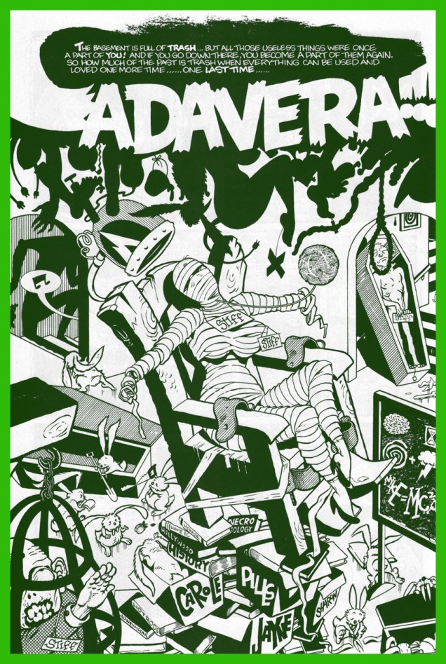
« Sharon… Marilyn… Jayne… Eva… Claudia… plus bits and pieces of bit part actresses. » — Prof. Shelley recites Cadavera’s recipe
In the early 1990s, Seattle-based publisher Fantagraphics were in choppy financial waters. To save the ship, they went commercial… in their own fashion. Two speciality imprints were launched, most famously Eros Comix, but also the lesser-known Monster Comics.
My own contender for the finest of Monster releases adroitly straddled both the erotic and the monstrous (and a few other genres besides): a two-issue wonder, Cadavera, was the hallucinatory, disembodied brainchild of Memphis cartoonist auteur John Michael McCarthy. Sadly, this raunchy-in-all-the-best-ways, rollicking saga-in-the-making, fireball of jolting ideas did nothing to help its publisher climb back into the black. But hot damn, did it ever give its all. However, in the speculator-frenzied, Image Comics-happy US marketplace of ’91? Oh, just forget it.
This is Cadavera no. 2 (Nov. 1991); artwork by John Michael McCarthy, who helpfully tells us that the « cover car is a ‘35 model Ford Model ’48 3-window coupe, original price $570. ». And isn’t that a doozy of a catchy slogan?
I know I could pull striking samples from these skinny pamphlets all the live long day, such is their level of visual craft and quotability, but I’ve checked, and you can still get copies for a song, so why spoil your eventual pleasure?
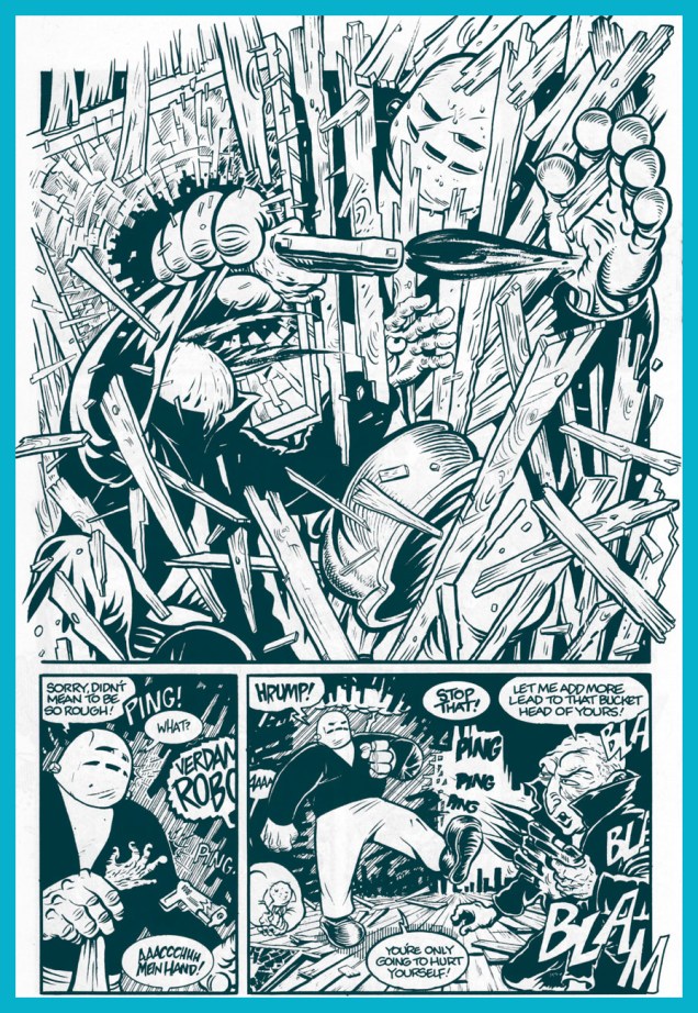
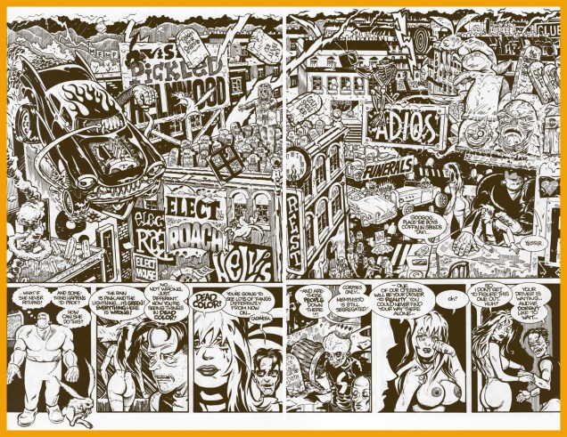
Meet Prof. Shelley’s hulking robot helper, Googog. From Cadavera no. 1 (March, 1991).Cadavera no. 2, page 4.Cadavera no. 2, pages 22-23. No-one could accuse Mr. McCarthy of being a slouch.
Anyway, all the gooey goods are accounted for in this « unofficial death certificate for unpopular culture »: punk rock, tabloid journalism, fascism, hot rods, hillbillies, Nazis (the original and the currently popular Neo (in)breed), mad science, robots, bunnies, Vice-Prez Chas. Manson…
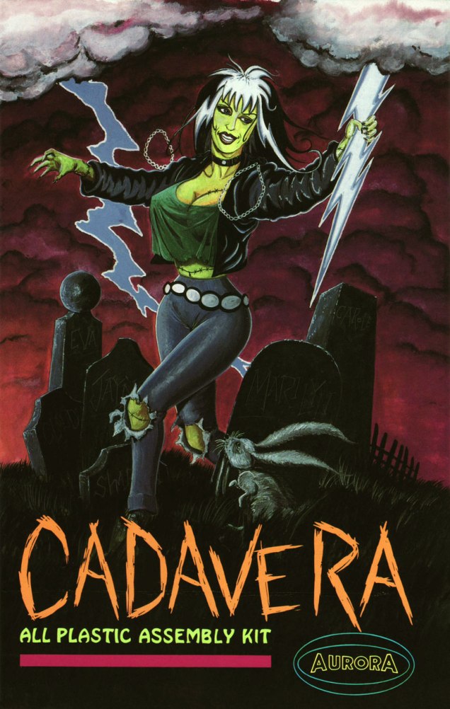
The amazing Mr. McCarthy, after giving comics his more-than-game try (with Eros entries Supersexxx and Bang Gang, the one-shot movie tie-in Damselvis Daughter of Helvis and one of my all-time favourite series, Kid Anarchy, written by his pal George Cole), went the Roger Corman route and became a micro-budget filmmaker. There may be zero bucks in it, but that’s still a rosier financial situation than comics could offer.
« To hell with all those near-fatal quests and celebrity body parts! »
« As worthless a collection of crackpot notions and harebrained theories as I’ve ever seen in print! » — Graymatter McCogitator III, Chairman, National Academy of Very Smart Persons
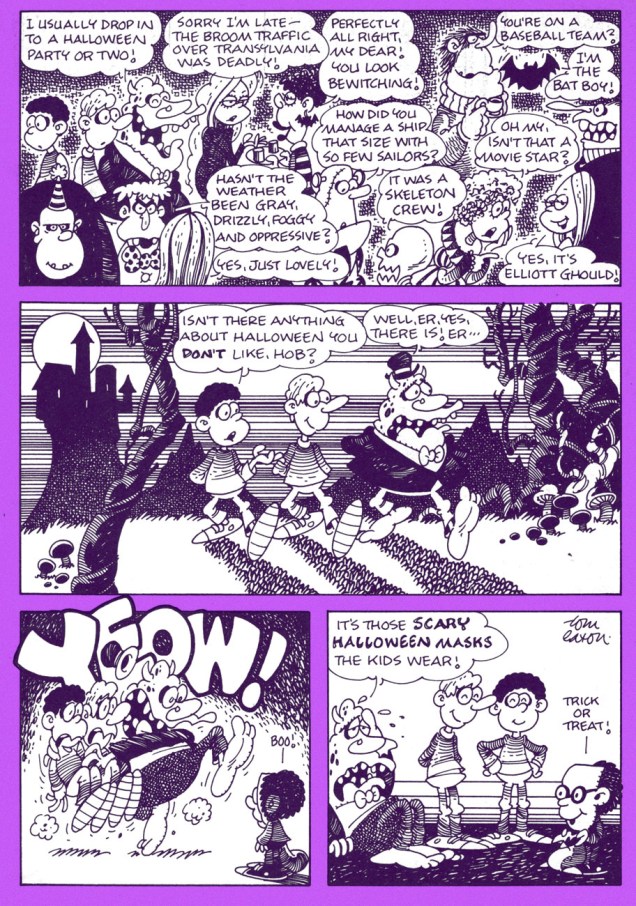
This Oliver Cool strip (we featured another one a couple years back) saw print in the October 1976 issue of Young World. While both strip and publication are just about forgotten, they’re worth a look… but then I have a soft spot for comics produced outside the comics industry proper (if you can call it that); in many cases the ‘product’ reaches a wider audience, but the tradeoff is that it’s a far more casual public.
I’ll readily concede that I’m pretty forgiving when it comes to the scripting of strips aimed at young readers, as the authors are forced to navigate a myriad of oft-needless and downright asinine hurdles in their efforts to amuse, entertain and, yes… even enlighten.
Apparently, though, if he’s to be remembered for anything, it may be for his extended stint as resident cartoonist of scouting magazine Boys’ Life (1984-2015), most significantly on The Wacky Adventures of Pedro, featuring the mag’s ‘mail burro‘, introduced in the 1950s. Take a gander at this (naturally) eye-opening article by R.C. Harvey on the subject.
This is Young World Vol. 13, no. 8 (Oct. 1976). Speaking of the Winchester Mystery House, you owe it to yourself to read Alan Moore‘s tour-de-forceGhost Dance (Swamp Thing no. 45, Feb. 1986, DC), illustrated by Stan Woch and Alfredo Alcala, the definitive WMH spooky tale. In the context of Moore’s American Gothic cycle, it felt a bit incidental, practically a non sequitur, but it’s damn powerful stuff. Psst: check it out here.
Bonus-wise, here’s a pair of recent-ish Pedro strips. At this point, Eaton’s crisp line and meticulous layout bring to my mind the qualities of another Midwestern cartooning wunderkind, Rick Geary.
« And something horrible is going on in Foley’s body! Come at once! Come quickly! »
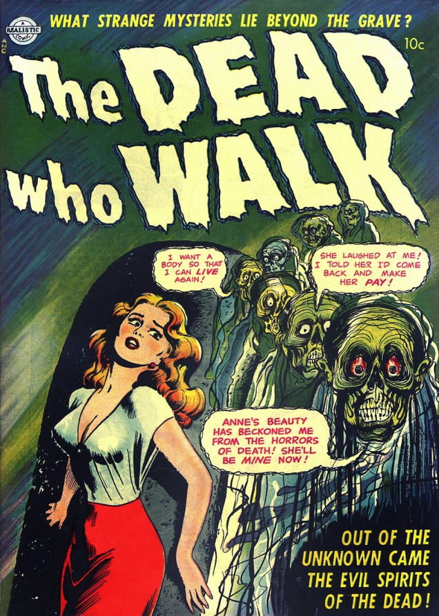
The Dead Who Walk is a mysterious one-shot from 1952. It was issued by Realistic Publications, an ephemeral publishing arm of Avon Books, during the decade that they haphazardly dabbled in the funnybook field.
Boy, whatever you can say about Anne, she certainly made an impression.
The pungent dialogue and its implications aside, what fascinates me about this lavishly grotesque cover is the jarring schism in art styles: the damsel in peril is of the classically-buxom Matt Baker–Nick Cardy species, while the revenants belong to an expressively oddball Edvard Munch–Manny Stallman–Jerry Grandenetti school. As far as I know, the cover artist(s)’s identity is lost to time and obscurity. It has been established, thanks to a signature, that the insides were provided by longtime jobber Tex Blaisdell… a rather stiff and workaday performance, regrettably. But the cover assuredly isn’t his, no matter what the good ol’ GCD says.
The most accomplished interior page, in my view, is the inside front cover intro. Art by Tex Blaisdell.
« Welcome to the house of horrors! Brought to you by Grippo Denture Adhesive! »
A little while back, we made a brief detour through artist Samm Schwartz’s Silver Age Archie comics covers and touched upon the time he took the last bus out of Riverdale and headed for the greener pastures of New York… and an art director gig with Tower Publications.
Robert Klein and Michael Uslan, in their foreword to T.H.U.N.D.E.R. Agents Archives Volume 1 (DC Comics, 2002), stated: « With Samm Schwartz not very familiar with or comfortable editing super-hero adventure books, publisher Harry Shorten cut a dream deal with Wally Wood. Samm would handle the Tippy Teen titles as well as the Undersea Agent comic book and the war comic book called Fight the Enemy. He would be the managing editor of the company and its day-to-day office executive. »
So that’s that. Schwartz’s books, Tippy Teen (27 issues), Tippy’s Friends Go-go and Animal (11 issues) and Teen-in (4 issues), Undersea Agent (6 issues) and Fight the Enemy (3 issues) actually comprise the greater part of Tower’s output, though they’ve received far less attention since, were easily of comparable quality to T.H.U.N.D.E.R. Agents and its spinoffs. Certainly, the humour titles’ wit was a passel of notches above the Archie line’s, what with such heavyweights as Jack Mendelsohn on board*.
Interestingly, Tippy Teen was the first Tower material to be reprinted: in 1975, four issues of Vicki (a renamed Tippy) were issued by the *very* short-lived Atlas/Seaboard, featuring ugly new covers by Stan Goldberg. These issues rank among the most scarce and priciest Atlas releases. Most of the line’s books can still be easily found and acquired dirt cheap… but not Vicki.
This is Tippy’s FriendsGo-Go and Animal no. 7 (Dec. 1967, Tower). Cover art by Samm Schwartz.This is Penny Century no. 5 (June 1999, Fantagraphics). Cover art by Jaime Hernandez, with colours by Chris Brownrigg. Now, you won’t convince me that this cover isn’t a fond homage to Schwartz’s Hallowe’en-themed Go-Go cover… hey, maybe he *thought* this was a DeCarlo.
When I hear about Dan DeCarlo‘s would-be artistic influence on Jaime Hernandez, I can’t help but wince. If I squint real tight, I can kinda-sorta-maybe see a flicker of it in the wholesome sexiness of Betty and Veronica circa 1960-63, but no more. DeCarlo was soon reduced to such a state of hackdom that I can’t fathom how Jaime would have been driven to imitate and absorb the lessons of such hastily-executed, formulaic drivel. There, I’ve said it. On the other hand, Hank Ketcham, Steve Ditko, and, dammit, Mr. Schwartz’s touches are evident all over, though perfectly amalgamated into Jaime’s own singular vision. The way Schwartz and Hernandez draw clothing folds, the beautifully expressive comedic body language… it’s unmistakable.
And as a bonus, this helpful feature from Tippy’s Friends Go-Go and Animal no. 3 (June 1966, Tower), illustrated by Samm Schwartz. And yes, the boys can also come as beautiful victims.
« You’re sure you want to spend the night out there? »
As an avid backyard camper, this effectively chilling cover by the versatile Argentine Luis Dominguez never failed to bring a pleasant tingle of dread. It has that quality of a silent, slow-motion nightmare. Barely-glimpsed but eerily tangible horrors shambling your way… and you can hardly move, helpless but with all senses on edge. Eek.
Though it came late in Carmine Infantino‘s tenure, one can safely assume that DC’s publisher and his adjutant, art director Nick Cardy, had a hand in the cover’s layout. It certainly does tick Carmine’s boxes of « Leave Room for the Kids » and « Make It More Mysterioso. »
DC’s The Unexpected no. 166, (July 1975). The moody featured story, The Evil Eyes of Night, scripted by Al Case (one of editor Murray Boltinoff‘s several noms de plume) and illustrated by an inspired Ruben Yandoc, doesn’t betray or squander the promise proffered by the cover, though it hardly proceeds as one might presume. This isn’t The Expected, after all…
I do believe that Yandoc did his own lettering, as it’s a consistent element across his American output. That’s always a plus, an added touch of personality. Love those sinister onomatopoeia!
« Somehow, this thing had caught the spark of life! And, anything that lives will fight to stay alive… even if it’s just a Rag-a Bone and a Hank of Hair! »
Ah, Brother Power, the Geek. A notorious flop for DC in 1968… or was it? At the time, it took several months for a book’s initial sales reports to make their way back to the publisher. Axing a title after two measly issues is quite a preemptive and premature strike against it. I suspect a case of toxic in-house politics. From the onset, editorial cold feet had the suits meddling with the project: the character of the animated rag doll was to be called The Freak, which was nixed in favour of the less druggy but more chicken-head-bite-y TheGeek.
This is Brother Power The Geek no. 2 (Nov.-Dec. 1968, DC); cover by Joe Simon, colours by DC’s peerless production manager Jack Adler, and logo presumably by Gaspar Saladino.I recall that this particular house ad seared itself into my brain at a very young age, but I had to wonder where exactly I’d first encountered it. As it turns out, it was in a random comic book that happened to land my way in childhood, namely Superman no. 211 (Nov. 1968), featuring You, Too, Can Be a Super-Artist!, written by Frank Robbins (I just found out!) and illustrated by Ross Andru and Mike Esposito.
This is Black Magic no. 13, aka vol. 2 No.7 (June 1952, Prize); cover, of course, by Jack Kirby, with likely inks by Joe Simon. Read it here!
This lovely panorama is from Brother Power The Geek no. 1 (Sept.-Oct. 1968, DC). Written, laid out and inked by Joe Simon, finished pencils by Al Bare.
Say, have I seen Brother Power’s fellow detainees somewhere? Why, yes, of course! It’s Tentacle Master Wally Wood‘s Dorothy, Stanley and Doris, introduced to the world by Topps‘ Ugly Stickers back in 1965! Designed by Wood, they were painted by the masterful Norman Saunders.
Brother Power the Geek, despite its commercial failure and infamy, offered a good-natured, unpretentious romp, even if didn’t quite show us « The Real-Life Scene of the Dangers of Hippie-Land! » You can’t always get what you want.
Brother Power was brought back under DC’s Vertigo imprint in 1993, but as with the revival of its fellow Joe Simon creation, Prez, it received a « groovy » and « ironic » hipster treatment. Bah.
« A knot you are of damned bloodsuckers. » — William Shakespeare
One of my favourite Atlas mood-masters was Anthony Lewis “Tony” DiPreta (July 9, 1921 – June 2, 2010); it appears Mr. DiPreta and his colleague Murphy Anderson share not merely a birthday, but a day of birth as well.
Tony DiPreta’s long career in comics began with his arrival at the “Busy” Arnold studio, with his first credits appearing in early 1942. He worked extensively for Hillman Periodicals, handling such features as Airboy (yay!), Skinny McGinty, Flying Dutchman and Stupid Manny; Lev Gleason Publications (various crime stories and The Little Wise Guys); and of course Atlas Comics, where he chiefly, but not exclusively, cut loose on moody-but-not-gory horror stories, often with a finely-turned streak of gallows’ humour.
Tony survived the post-Code near-collapse of the comics industry when he succeeded Moe Leff on Ham Fisher‘s Joe Palooka strip, which he carried until the feature’s final curtain in 1984. In the 1970s, he also did a bit of moonlighting for Charlton, contributing to a couple of issues of The Flintstones spin-off The Great Gazoo. In 1994, DiPreta took on another venerable, long-running newspaper strip, medical soap opera Rex Morgan, M.D., until his well-earned retirement (DiPreta’s, not Morgan’s) in 2000.
For your reading pleasure and mine, I’ve selected this adorably wacky tale from Atlas’ Journey Into Mystery no. 11 (August, 1953). Writer unknown, which is a shame.
Well, I suppose it might have been simpler to see who wasn’t around in the daytime, but let’s face it, Mazerok’s method is far more entertaining and original.The story was reprinted in Where Monsters Dwell no. 17 (Sept. 1972, Marvel); though cover-featured, the cover itself was a lacklustre job by an overworked and uninspired Gil Kane, stuck here with Vinnie Colletta, though to be fair, there’s nothing here to ruin. Beyond the cover, the insides are great: two Ditko stories (« I Opened the Door to… Nowhere! » and « The World Beyond », a low-key Russ Heath (« If the Coat Fits », also from JIM 11), and our featured yarn.Now that’s more like it! The Hidden Vampires‘ original place of appearance, Journey Into Mystery no. 11 (Aug. 1952, Atlas), boasts a just-about-classic cover by Russ Heath, with a fine colouring job by Stan Goldberg.Heath did a lovely job with the small space allotted to preview the other stories. Pre-Code Atlas books were graced with a clever and attractive cover grid.
Today’s post may step a bit outside my usual purview, which is to say that the octopuses I am introducing do not come from the pages of comics per se. They’re used for mercantile purposes, to attract public to a concert, sell a book or deliver a message. But though they are octopuses in advertising, their artists still clearly have their hearts (and fingers) in the cartooning world.
Exhibit A is this cover for Centipede Press’ edition of Masters of Science Fiction: Fritz Leiber. This edition was limited to 500 numbered copies, so it will surprise no-one when I state that it’s quite sold out (See? Tentacles sell.) The cover is by Jim & Ruth Keegan, a wife-and-husband team, also the authors of the comic The Adventures of Two-Gun Bob.
Next, we have two music-related scenes, both from the Spanish side of things. ¡Fíjate!
The Roctopus Tea Party Festival takes place in Toledo, Spain. (Due to language constraints, I’m not exactly sure how many editions of it there have been.) Each poster features an octopus, but this is my favourite of the lot.
Whoever designed the festival’s logo knew how to harness the power of a lone octopus eye.
This Mardid “lunch box restaurant & tiki room” (now sadly defunct) held a series of “Galician lunches with DJ” splendidly named Día del Tentáculo. With a little Google Translate magic, I came up with this description: « Imagine a restaurant where you can eat hamburger with shiitake and jalapeños, drink the mythical Mai Tai cocktail or enjoy Tentacle Day with the best Galician octopus. And all while listening to good music in an environment inspired by the 50’s America. Sounds like an explosive mix, right? » The hamburger sounds good, but it’s really the Galician octopus that draws one in!
As the Spanish artist Roberto Argüelles held a few exhibitions of his art at Lunch Box, I’m going to assume this is his artwork.
This one I spotted plastered over some other poster in my neighbourhood. It states something like « Ultimatum: provide wages for all internships at all levels, or we go on strike. »
At first I assumed this was poster for a sci-fi convention in San Francisco, but it turned out to be the cover of a comics anthology published by Skodaman Press.