I think the most disappointing scientific discovery of recent years is that there appears to be no octopuses on the moon. Not one teensy-weensy tentacle was spotted by the lunar rovers (that we dispatched to the Moon for that very purpose, of course). But comics had led us to expect otherwise!
Mystery in Space no. 51 (May 1959), cover by Gil Kane.
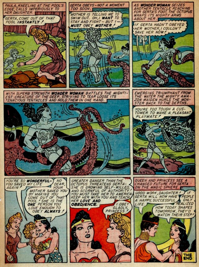
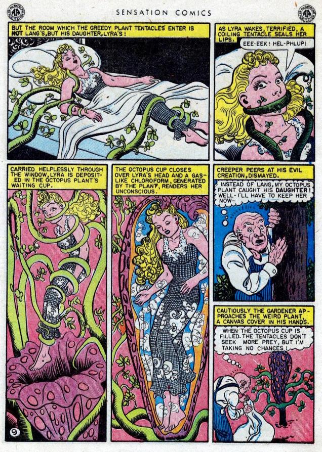
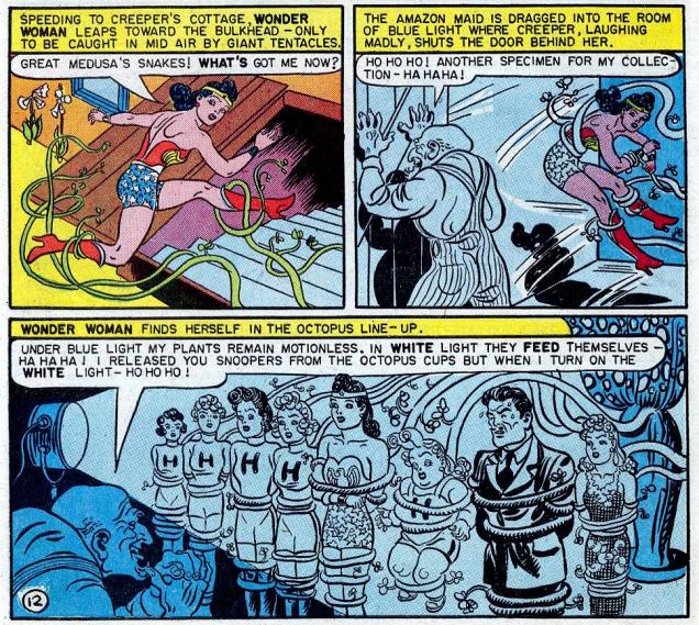
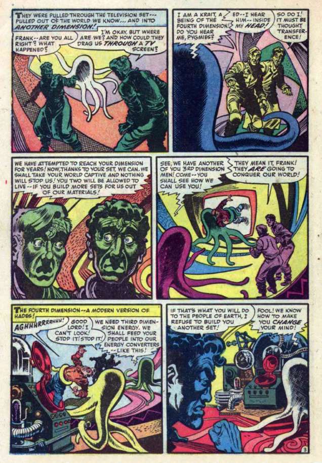
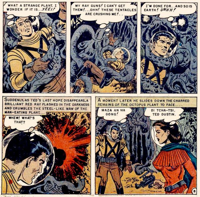
The inside offers us even more tentacles:
Battle of the Moon Monsters! was scripted by Gardner Fox, pencilled by Carmine Infantino and inked by Joe Giella.
In the end, our protagonists realize that the tentacled monster is actually a spaceship, and one manned by humans, at that… after which both parties have a good laugh about having almost annihilated one another. A peculiar sense of humour, those astronauts.
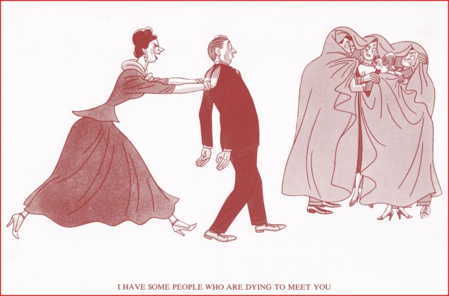
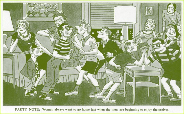
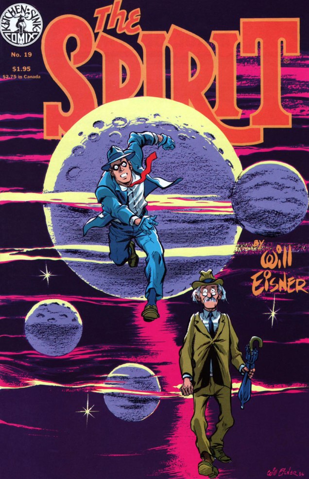
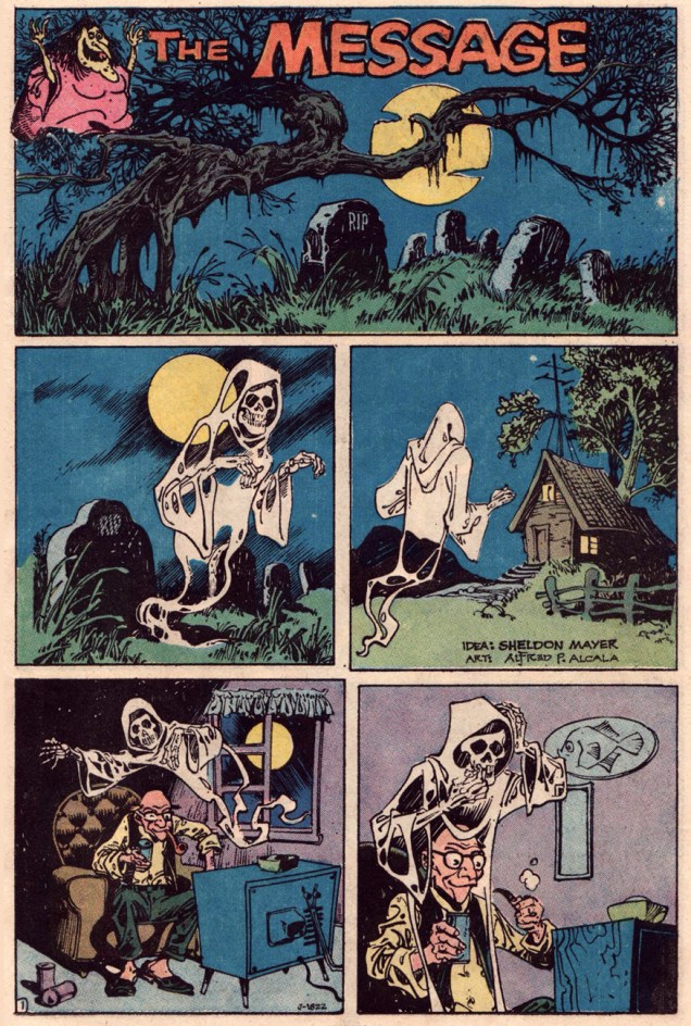
A bit of comic relief…
Panels from the one-pager Outer Spacewith art by Bob White, printed in Archie’s Madhouse no. 21 (September 1962)
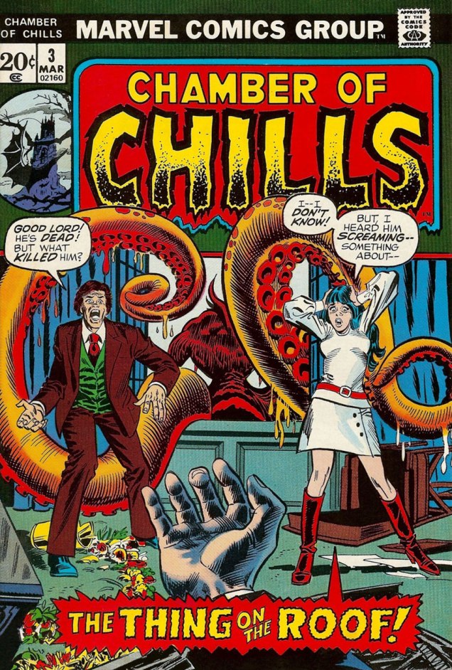
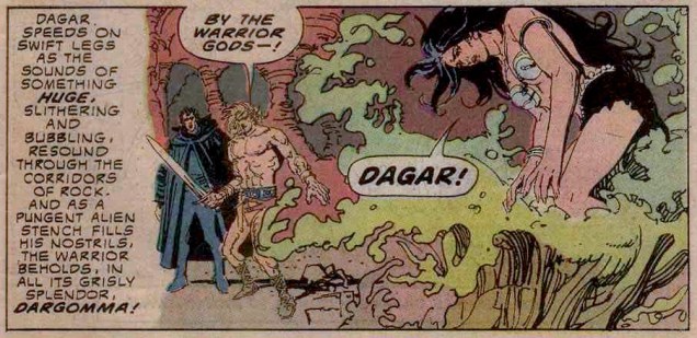
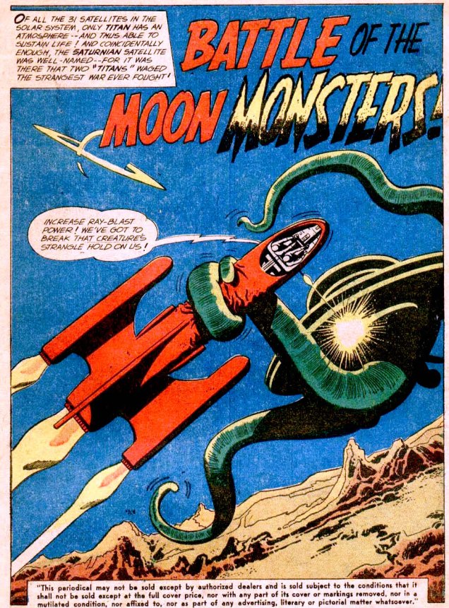
And back to our scheduled program of lethal, tentacle-sprouting monsters that attack the moment anyone sets foot on the moon.
« Traveling at an incredible speed, the rocket reaches the moon in twenty three hours and lands in the gigantic crater… » And what is waiting for our hero, freshly stepped from his rocket? Funny you should ask… Page from Rocket to the Moon (1951 one-shot, Avon) scripted by Walter Gibson and illustrated by Joe Orlando.
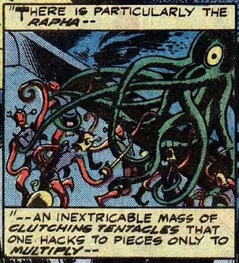
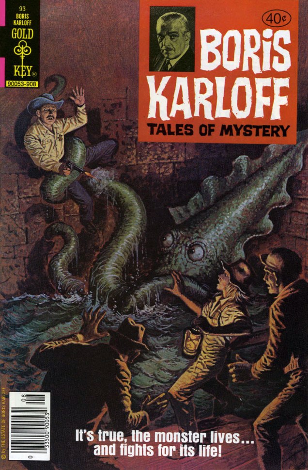
Here’s a good instance of the good folks at Marvel getting quite confused. The First Men in the Moon, published in 1901, was written by H. G. Wells. From the Earth to the Moon was written in 1865 by Jules Verne. Which one is this supposed to be an adaptation of, then? I can confirm that the vaguely ant-like creatures with tentacles are H. G. Wells’ creation. His Selenites are described as following: « They are vaguely similar to quasi-humanoid ants, about five feet tall, with a light physical constitution enclosed in an exoskeleton from which slender jointed limbs and whip-like tentacles protrude. »
Marvel Classics Comics no. 31 (1978), cover by Alan Weiss.
However, the first page of this comic informs us that…
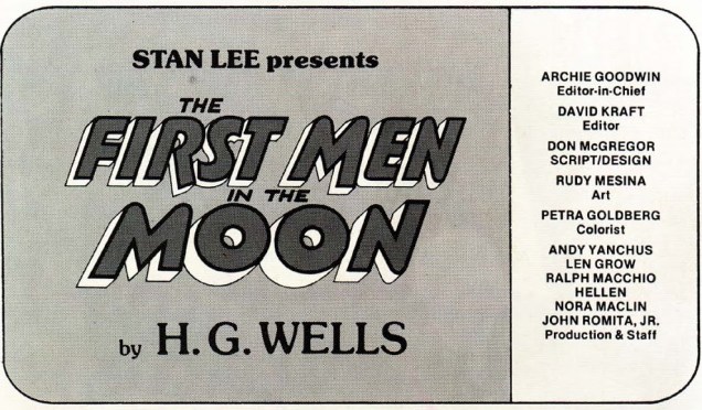
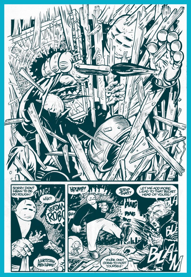
So I guess whoever laid out the cover screwed up. The insides, scripted by Don McGregor and drawn by Rudy Mesina, are considerably better drawn, and an unqualified tentacular treat.
I think the artist just wanted to draw tentacles, and this post is clearly not the place where he is likely to be judged for that little peccadillo.
Did this adaptation succeed in being faithful to and respectful of Wells’ influential novel? Well, not really, although an honest attempt was made. But I found that it focused far too much on the fight scenes, and left out quite a few complex nuances as well as skewing the philosophical underpinnings of The First Men in the Moon. That being said, if you like tentacles, I heartily recommend reading this issue. I cringe at the very idea of recommending something from the Marvel Classics line, but honestly must prevail. Really, it’s good fun. Take a look —
Did the artist go into tentacle overdrive? Oh boy, did he ever!
« What I don’t like about office Christmas parties is looking for a job the next day. » — Phyllis Diller
Between the poles of Abner Dean’s more normal magazine work and his often quite abstract, therapy-inspired books, lies his neglected Come As You Are, his most accessible single-theme work.
In few words but with devastating visual lucidity, Dean turns a probing spotlight on party dynamics, laying bare the casual cruelty, manipulations and seductions, feints and blindsides, alliances and betrayals, thrusts and parries. The results are often hilarious… but laden with uneasy recognition; despite the distance of nearly three-quarters of a century, little appears to have changed in the fundamentals… which really should come as no surprise to anyone.
Witness the following excerpts…
The front cover. The book is tellingly dedicated « To all those wonderful people who I hope will still ask me back. »
According to our resident mycologist, these are pretty much all toxic. The game is rigged!
From the back end of the book: « This is Abner Dean’s fourth adventure with the cross-eyed muse in that area of unexpected turning and hilarious insights that is particularly his own.
The first, in 1945, was It’s a Long Way to Heaven. People began seeing themselves and their friends as Dean saw them. They were startled and fascinated by the view. With What Am I Doing Here? in 1947 they winced and laughed again. Psychiatrists started using certain of his drawings for discussion with their patients. People began playing games of identification with individual pictures.
In 1949 came And on the Eight Day to make more Dean converts. And now here’s a fourth book about people to smoke out any unbelievers who may be lurking in corners at parties.
For those who like their incidental intelligence in an unbalanced phrase — Abner Dean was born in 1910, attended the National Academy in 1927, was graduated from Dartmouth in 1931, and hasn’t been away from a drawing board for more than a few days since then. He is happily married and lives in New York. »
This is our third look at Mr. Dean’s œuvre. If you’re left longing for more, read on:
I’m always happy to revisit Wonder Woman in her glorious young days of being depicted by H. G. Peter, whose expressive, dynamic art I just can’t get enough of. The stories are none too shabby, either! In my earlier post, Tentacle Tuesday: H.G. Peter and Wonder Woman lend a hand, I overlooked a few choice cuts. Well, having spent a few delightful hours going through WW stories originally published in Wonder Woman, Sensation Comics or Comic Cavalcade, it is my pleasure to remedy my previous oversight, and I can possibly even claim that these two posts are a pretty definitive list of Wonder Woman’s tentacular entanglements.
Do you have a few hours to waste – pardon – dedicate to research, too? Here you can read the entirety of DC’s Wonder Woman: Golden Age multiple-volume omnibus. Personally I think the graphic designers responsible overamped the contrast when they cleaned up the images, and much prefer reading these stories in their original colour… but nothing beats having all of this stuff on one website for convenience.
All stories are written by William Moulton Marston with art by Harry G. Peter.
Demon of the Depths, printed in Wonder Woman no. 7 (winter 1943):
The Adventure of the Octopus Plant!, printed in Sensation Comics no. 41 (May 1945):
This is not strictly tentacle-related, but I would also like to share a few choice panels that I’ve stumbled upon while looking for tentacles. Gorgeously weird, they remind us just how strange, inventive and subversive Wonder Woman was in her glory days of yore!
Etta is my favourite character, and this is a great showcase for her sense of humour! Sensation Comics no. 5 (May 1942)This is apparently a standard Amazonian ceremony – the girls dress as deer, are hunted and captured, and then cooked and consumed. Wonder Woman no. 3 (February-March 1943)I had to use at least one scene of bondage, right? I was mostly amused by the quip about French girls. Wonder Woman no. 6 (Fall 1943).Sensation Comics no. 41 (May 1945)
And voilà! But don’t fret, we will see Wonder Woman in the tender embrace of an octopus again… this time in the 60s, Robert Kanigher and all.
Wonder Woman versus the Saboteurs, printed in Sensation Comics no. 5 (May 1942)
« See? Brute force triumphs after all!!! » — Mr. Fly (Jan. 11, 1942)
While Kitchen Sink’s ambitious chronological gathering of Eisner’s post-WWII The Spirit was intended to clean up and organize the series after decades of random, piecemeal reprinting, it was still a bit of a mess, at least early on. The methods of reproduction varied from issue to issue, and even within issues: three of four of issue one’s stories carry the original newspaper shadings, while one (« Hildie ») is newly-coloured and grey-toned. However, the folks at KSP can’t be faulted for this chaos: it all hinged upon which stories’ original line art remained in existence. Through it all, the publisher remained commendably hopeful but realistic and honest about the prevailing realities and conditions.
This is The Spirit no. 1 (Oct. 1983, Kitchen Sink). Colours by Pete Poplaski, grey toning by Ray Fehrenbach. Four tales are featured: The Christmas Spirit (Dec. 23, 1945), by Eisner and John Spranger; Dead End (Dec. 30, 1945), by Eisner, Spranger and Bob Palmer; Hildie (Jan. 6, 1946), by Eisner and Alex Kotzky; and Dolan’s Origin of the Spirit (Jan. 13, 1946), by Eisner, Spranger and Palmer.This is The Spirit no. 4 (March 1984, Kitchen Sink). Colours by Poplaski, grey toning by Fehrenbach. Four stories within, all by by Eisner, Spranger and Palmer: Nylon Rose (Mar. 17, 1946); The Last Trolley (Mar. 24, 1946); Yafodder’s Mustache (Mar. 31, 1946); and The Kissing Caper (Apr. 7, 1946).Here’s a fine example of the careful colour work executed by grey tinter Poplaski and colourists Fehrenbach (in this case) and Mike Newhall, taking evident pains to avoid overwhelming Eisner’s detailed line work. In terms of old-fashioned colouring, this was a notch (or seven) about what was being done in mainstream comics in the 1980s, a period of technological changes, of magnificent highs and painful lows. This is page two of noir classic The Last Trolley (Mar. 24, 1946), from The Spirit no. 4.
The colour question elicited ever-churning controversy and budgetary woes in the face of steadily diminishing sales. By issue 9, the custom colouring was abandoned to make way for the rather more economical, but muddy laser-scanning of original Spirit sections, and an extra story was added to issues 10 and 11; then inside colour was jettisoned for good, with gray toning retained. But issue size was reduced to 6 1/4” x 9 3/4″ (as opposed to the traditional comic book format, which is, as we all know, 6 5/8″ x 10 1/4″) for issues 12-16.
Denis Kitchen sums up the situation very aptly, circa issue 4, late in ’83:
« … the current color comic market demands a more sophisticated reprinting of these stories. There is nothing sacred about the original color. Though Eisner experimented boldly with color, he generally left coloring to assistants, and much of it was handled in a pedestrian manner.
We shoot these stories, where possible, from original art in Will Eisner’s archives. Where stats, negatives silverprints or other proofs are the only source, we use the best existing copies. Our colorists, where possible, use the original sections as color guides and are concerned with authenticity and precedent. Color changes, gray tones and other ‘augmentations’ are made with the approval of Will Eisner. »
This is The Spirit no. 11 (Aug. 1985, Kitchen Sink). For this final colour issue, five stories, all by by Eisner, Spranger and Palmer: The Haunt (Oct. 27, 1946); Beagle’s Second Chance (Nov. 3, 1946); Caramba (Nov. 10, 1946); Return to Caramba (Nov. 17, 1946) and Coot Gallus (Nov. 24, 1946)This is The Spirit no. 17 (Mar. 1986, Kitchen Sink). Colours by Poplaski, grey toning by Fehrenbach. Four stories within, all by Eisner and Jerry Grandenetti: Be Bop (Apr. 20, 1947); Ev’ry Little Bug (Apr. 27, 1947); The Fix (May 4, 1947), and The Fortune (May 11, 1947).This is The Spirit no. 19 (May 1986, Kitchen Sink). Colours by Poplaski, grey toning by Fehrenbach. Four stories await within, each by Eisner, Grandenetti and letterer Abe Kanegson: Black Gold (June 15, 1947); Hangly Hollyer Mansion (June 22, 1947); Whiffenpoof!! (June 29, 1947), and Wanted (July 6, 1947).This is The Spirit no. 22 (Aug. 1986, Kitchen Sink). Colours by Poplaski, grey toning by Fehrenbach. Presenting a quartet of tales by Eisner, Grandenetti and Kanegson: A Killer at Large (Sept. 7, 1947); Into the Light (Sept. 14, 1947); End of the SS Raven (Sept. 21, 1947), and Orson Welles lampoon UFO (Sept. 28, 1947).
If you’ve just caught us mid-swing, nothing to worry about: earlier entries are at your beck and call as follows :
… or point and click on our general category, That’s THE SPIRIT!, and beckon everything at once… but in reverse chronological order; that’s the price you pay for convenience.
« It is a mistake to fancy that horror is associated inextricably with darkness, silence, and solitude. » ― H.P. Lovecraft
I’ve actually had a friend tell me that he sees tentacles wherever he goes because of my Tentacle Tuesdays. Hey, I’m not making this up – tentacles *are* everywhere. Whether you’re in a well-lit room, with reassuring noises of the city filtering through the windows, or in a city centre, cushioned from harm by the comforting presence of a crowd… repairing a TV set, kissing a date, heading over to the pub for a well-deserved drink… some cephalopod horror is but a blink away. Fie, fie, foul apparition!
What better beginning to this post than… TERROR VISION!!! (“Aiiieeee!“, to quote the man.)
A page from Terrorvision, with very nice art (and possibly plot) by Howard Nostrand, printed in Chamber of Chills Magazine no. 19 (September 1953, Harvey).
Things go from bad to worse for our repairman…
Normally I wouldn’t post yet another page from the same story, but I like the art so much that I have to share.
I’ve already mentioned German horror comics in the shape Spuk Geschichten (see Tentacle Tuesday: A Torrent of Teutonic Tentacles). Its mother publication, Gespenster Geschichten, also has its share of tentacles. For now, I will limit myself to this one cover:
It’s a cruel thing to do to a man who was just thirsting for one piddling stein of cool beer. I hope they all got better acquainted and are clinking glasses together in the next scene… but I doubt it. Gespenster Geschichten no. 545.
One would be justified in thinking that roofs are generally quite octopus-proof, but nope, this one is either a talented climber or just unimaginably huge.
Chamber of Chills no. 3 (March 1973), pencilled by Alan Weiss and inked by Frank Giacoia.A street may look peaceful and quiet, but that doesn’t mean a shag rug tentacle isn’t stealthily creeping towards your leg. Far Frontier no. 1 (1984), drawn by Lee Carlson.
As a bit of an aside, there’s a really fun account of one collector’s quest for John Jacobs stories written for Madison Comics over at Kirby Your Enthusiasm (link: Finding John Jacobs). Far Frontier no. 1 has a few of those, and apparently they’re quite perverse and brain-melting. An excerpt of the essay in question to whet your appetite:
« I first became aware of [John Jacobs] through a review by noted comics writer Jan Strnad in The Comics Journal #94 of Dr Peculiar #1. I read and re-read it dozens of times and marveled at the samples of his primitive pencilled art. My mind tried to absorb a comic that had heavy religious overtones plus a healthy dose of T&A (with a monster rape/cannibal fetish). The reviewer theorized that John Jacobs’ mind must be like a bowl of maggots. »
As an editorial aside, I am inclined to trust Strnad on this, both because I really like his writing and because Kirby Your Enthusiasm‘s summary of Jacobs’ plots confirms the maggots theory.
« I guess I look like a rock quarry that someone has dynamited. » — Charles Bronson
Welcome to our 400th post! I suppose a Steve Ditko birthday post would have been more momentous, but I did that already a couple of years ago, while he still drew breath.
Today, our man Charles Dennis Buchinsky, aka Charles Bronson (1921 – 2003… he would have turned 98 today — picture that!) squeezes in a rather routine bit part (merely credited as « The Pilot ») in Joe Molloy and Mike Zeck’s nonsensical hijacking melodrama Only a Toy. Heck, read it here if you don’t believe me.
Oddly enough, this expanded cameo came about just a year after Bronson’s megahit Death Wish, as Bronson reached the pinnacle of his earning power (in inverse proportion to the quality of his output, thanks to his long association with the shady Cannon Group). Presumably, he was just doing a favour for his old pal Zeck.
« Like an unpalatable salad » indeed; a word salad. Published in Charlton’s Scary Tales no. 2 (October, 1975). Edited by George Wildman.
Ah, but this wasn’t the first time cartoonists had paid such tribute to Bronson: in 1971, writer Jean-Marie Brouyère and artist William Tai (aka Malik) created the South-America set Archie Cash series for Belgian bédé weekly Spirou. The series had a healthy run of 15 albums (what one would call a graphic novel over in North America) between 1973 and 1988.
Front and back covers of Archie’s début, Le maître de l’épouvante (1973).And to give you a sense of the series’ narrative texture, page five from Le maître de l’épouvante; when it debuted in the fall of 1971, the series brought a welcome griminess and ethno-social realism to the squeaky-pristine pages of Spirou.
The Italians would then follow suit, “borrowing” Jean-Paul Belmondo‘s likeness for their Goldrake series around 1972, followed by Alain Delon‘s looks for Playcolt, and more exploitively, Ornella Muti‘s charms for Sukia. Mind you, all these liberties with celebrity likenesses don’t make Brian Hitch‘s laziness and lack of imagination any less reprehensible.
Anyway, back to our birthday boy: if you want to see Bronson at his finest, I recommend his early, pre-moustache TV showcase Man With a Camera (1958)… the 29-episode boxed set’ll cost you peanuts and it’s great value. Then, from his European period, you can’t go wrong with 1968’s Adieu l’ami (Farewell, Friend), co-starring the aforementioned Mr. Delon; 1970’s gloriously weird Le passager de la pluie (Rider on the Rain), 1971 winner of the Golden Globe for Best Foreign Film, and co-starring creepy Eva Green‘s mom (or should that be “mum”?), Marlène Jobert. And of course 1971’s Soleil rouge (Red Sun), co-starring, this time not only Delon, but none other than Toshirô Mifune!
« Our dried voices, when we whisper together are quiet and meaningless as wind in dry grass or rats’ feet over broken glass in our dry cellar. » — T.S. Eliot, The Hollow Men(1925)
It’s with a bittersweet little shiver that I wrap up this year’s WOT Hallowe’en countdown. In light of my fond feelings for the holiday, I didn’t want to go out with a massive fireworks display of a post, but opted instead for a quiet, succinct coda.
Nick Cardy‘s illustration impeccably epitomizes the spirit of Hallowe’en. No, it’s not about the candy collection ritual nor about the motley, garish masquerade… truly, it’s much as Ray Bradbury summed it up in his preface to his The October Country, « … that country where it is always turning late in the year. That country where the hills are fog and the rivers are mist; where noons go quickly, dusks and twilights linger, and midnights stay. That country composed in the main of cellars, sub-cellars, coal bins, closets, attics, and pantries faced away from the sun. That country whose people are autumn people, thinking only autumn thoughts. Whose people passing at night on the empty walks sound like rain… »
You can practically hear the echoes of sinister cackling drifting on the chill October breeze.
How’s this for perfectly-composed, uncluttered graphic majesty? A wisely understated palette, from top-to-bottom, holds it all together. One has to understand that this sort of soft-sell, muted grace could not make it to market without a tremendous amount of trust, cooperation and… no second-guessing. This is It’s Midnight… The Witching Hour! no. 33 (Aug. 1973, DC), edited by Murray Boltinoff. That lead witch looks quite… lusty. Where’s she off to, and why is the Comics Code Authority not stepping in?
This seldom-seen Nick Cardy cover graces quite an issue, by my reckoning: the blackly ironic Four Funerals, drawn by Ruben Yandoc and probably written by editor Boltinoff; George Kashdan‘s cynical Cold Ashes — Hot Rage, drawn by Alfredo Alcala (what, him again?); and Carl Wessler‘s convoluted A Choice Seat for… Doomsday!, illustrated by the mighty Jerry Grandenetti. Read it right here!
… and Happy Hallowe’en, one and all!
-RG
p.s. before I forget: how cool is it that the witches exit through the chimney?
« If it wasn’t for baseball, I’d be in either the penitentiary or the cemetery. » — Babe Ruth
Since the (so-called) World Series is still going on, this seems all the more appropriate.
It was with this piece that I first began to grasp just how gifted and versatile Filipino giant Alfredo P. Alcala (1925-2000) was. He’s inarguably a grandmaster of eerie moods, but hardly bereft of a fun side. This brief piece, a dream collaboration between Sheldon Mayer and Alcala, was published in Plop! no. 1 (Sept.-Oct. 1973, DC). And what an issue that was, gathering such talents as Basil Wolverton, Sergio Aragonés, Mayer and Alcala, Frank Robbins, George Evans, John Albano, Stephen Skeates and Berni Wrightson… yikes! (read it here!)
As a bonus, here’s the *back* cover of Plop! no. 1, featuring Wolverton’s cover boy “Arms” Armstrong. Which provides me with the opportunity to inform you that this very week has seen the long-delayed publication of Greg Sadowsky’s Brain Bats of Venus: The Life and Comics of Basil Wolverton Vol. 2 (1942–1952), his definitive biography of that singular and fascinating man. Read all about it here!
Voyage to the Bottom of the Sea no. 2 (July 1965). Cover by George Wilson.
Todd Franklin of Neato Coolville has actually transformed this cover into a groovy wallpaper (go to his website to download the high-res version).
Voyage to the Bottom of the Sea no. 13 (August 1968). Cover by George Wilson.Brothers of the Spear no. 7 (December 1973), cover by George Wilson.
That previous cover has borderline tentacles, I agree, but the completist in me insisted on its inclusion. Also, it’s entertaining.
The Tree That Walks is illustrated by Jesse Santos. The story tags as detailed by GCD are «chariots; draft elands; giant carnivorous plants; human skeletons; leopard; rock slides; saddle elands». I had to look up “elands” (it’s an antelope). How much more entertaining can one get?Tales of Sword and Sorcery Dagar the Invincible no. 11 (April 1975). Cover by the underappreciated Luis Dominguez.
A beautiful cover this may be, but the insides are distinctly underwhelming. The title story, It Lurks by Moonlight, is scripted by Don Glut and illustrated by Filipino artist Jesse Santos, who seemed like a likable artist with a wide-ranging career… but his art is not my cup of tea.
« Sharon… Marilyn… Jayne… Eva… Claudia… plus bits and pieces of bit part actresses. » — Prof. Shelley recites Cadavera’s recipe
In the early 1990s, Seattle-based publisher Fantagraphics were in choppy financial waters. To save the ship, they went commercial… in their own fashion. Two speciality imprints were launched, most famously Eros Comix, but also the lesser-known Monster Comics.
My own contender for the finest of Monster releases adroitly straddled both the erotic and the monstrous (and a few other genres besides): a two-issue wonder, Cadavera, was the hallucinatory, disembodied brainchild of Memphis cartoonist auteur John Michael McCarthy. Sadly, this raunchy-in-all-the-best-ways, rollicking saga-in-the-making, fireball of jolting ideas did nothing to help its publisher climb back into the black. But hot damn, did it ever give its all. However, in the speculator-frenzied, Image Comics-happy US marketplace of ’91? Oh, just forget it.
This is Cadavera no. 2 (Nov. 1991); artwork by John Michael McCarthy, who helpfully tells us that the « cover car is a ‘35 model Ford Model ’48 3-window coupe, original price $570. ». And isn’t that a doozy of a catchy slogan?
I know I could pull striking samples from these skinny pamphlets all the live long day, such is their level of visual craft and quotability, but I’ve checked, and you can still get copies for a song, so why spoil your eventual pleasure?
Meet Prof. Shelley’s hulking robot helper, Googog. From Cadavera no. 1 (March, 1991).Cadavera no. 2, page 4.Cadavera no. 2, pages 22-23. No-one could accuse Mr. McCarthy of being a slouch.
Anyway, all the gooey goods are accounted for in this « unofficial death certificate for unpopular culture »: punk rock, tabloid journalism, fascism, hot rods, hillbillies, Nazis (the original and the currently popular Neo (in)breed), mad science, robots, bunnies, Vice-Prez Chas. Manson…
The amazing Mr. McCarthy, after giving comics his more-than-game try (with Eros entries Supersexxx and Bang Gang, the one-shot movie tie-in Damselvis Daughter of Helvis and one of my all-time favourite series, Kid Anarchy, written by his pal George Cole), went the Roger Corman route and became a micro-budget filmmaker. There may be zero bucks in it, but that’s still a rosier financial situation than comics could offer.
« To hell with all those near-fatal quests and celebrity body parts! »