When digging through comics in quest for tentacled material, one soon notices that Gil Kane‘s name tends to crop up again and again. Despite this seeming ubiquity, I’ve never specifically concentrated on his art, though he certainly has appeared in Tentacle Tuesdays before (quite a lot in Tentacle Tuesday: Conan-O-Rama, for instance).
I can’t quite put my finger on it, but one of the things that seems to bug me is that Kane, whose real name was Eli Katz and who was born in Latvia, threw himself with such vigour into American culture. It’s an unfair reproach, I realize – one can hardly expect a four-year old child to hang on to a quickly-receding memory of his parents’ motherland to the detriment of whatever culture he’s growing up in, not to mention that this would be unhealthy.
The crux of the matter is that I don’t grasp that je-ne-sais-quoi that people seem to find appealing about Kane’s art. Where others see “dynamic storytelling, emotionally charged characters, and innovative [sic] staged fight scenes“, I see overly busy, hard-to-parse scenes and stiff anatomy. It doesn’t help that the bulk of his oeuvre is concerned with a subgenre of comics I have strong misgivings about, namely superheroes.
To answer the question of what is it that makes Kane so special, I have naturally turned to Gary Groth:

That is certainly well argued, but I’ve read a few Kane interviews and his intellectualism is just clearly not on my wavelength at all. There’s no doubt that he was the analytical kind (this interview with him published in Alter Ego no. 10 (1969) calls him « the comics’ most articulate artist »), but what he says often strikes me as stilted (much like his art). Take this, for instance: « Craft is merely the springboard. It’s the ability to give wings to your expression; otherwise your expression bangs around in an inarticulate way and comes out thick and untutored; you’re just throwing away range and scope. » Let’s just say that Kane was a very opinionated man, which does him credit. Yet I get the impression that his inclination to pick at himself veered towards self-destructiveness, as if he were ever striving for some lofty heights he was aware he would never reach.
In that process of self-improvement (let’s call it that), he often slagged other artists who were operating on a different level from his. Even as he flattered them, his compliments felt incredibly back-handed, bringing to mind those people who never smile, trying to get their atrophied mouth muscles to do the job and achieving merely a sort of pained rictus. For instance, I’m a little sore about his description of Will Eisner, who « did little morality stories, which were very moving, but they had the quality of reading a children’s picture book; he could be quite dramatic, but always on a kind of innocent level. He never had complex, subtle characterizations…» or, again, « Eisner is a writer until you start talking about literature, and talking about the great writers of literature. Then Eisner is only a cartoonist. »
You can read the full interview over at Destination Nightmare.
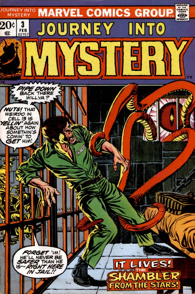
All this being said, I do like *most* of today’s crop… save for the last two Kull the Destroyer covers, instances of the messy, rigid mises en scène I was carping about earlier. The best cover (imho) is inked by Tom Palmer, not so coincidentally. Co-admin RG has been heard to posit that Gil Kane should never have been allowed to ink himself.
And now I’d better stop displaying my ignorance and move on to the tentacles!
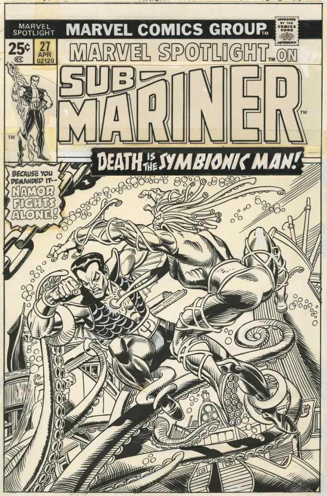
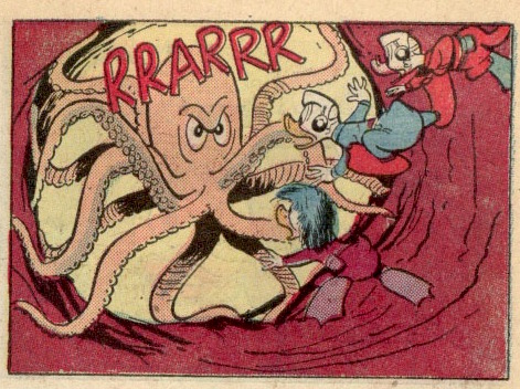
The original art for Marvel Spotlight no. 27 (April 1976). Pencils by Gil Kane, inks by Frank Giacoia.


~ ds