« What’s the point in eternity… if nothing ever changes? » — White Ant gets in the final bon mot (Captain Oblivion no. 1)
In the mid-1980s, the surprise success of Kevin Eastman and Peter Laird‘s Teenage Mutant Ninja Turtles touched off a veritable avalanche of ever crappier, hastily-assembled and cheaply-produced knockoffs — at least Eastman and Laird initially meant their creation as a joke. Oh, there were some real gems amidst the rubbish, but as Sturgeon’s Law tells us, the bad greatly outweighed the good, let alone the great. This is now known as the Great 1980s Black and White Comics Glut.
Among the good-to-great (well, to my taste) were a score of short-lived onomatopoeic humour anthologies such as !Gag! (Harrier), Honk! (Fantagraphics), Splat! (Mad Dog Graphics), Bop, Buzz, Twist (along with the venerable Snarf, all from Kitchen Sink)… the mutant progeny of Zap Comix, I suppose.
It was within the pages of Honk! that I was greeted by such across-the-pond talent as Eddie Campbell, Glenn Dakin, Phil Elliott and Paul Grist. Their work provided a sorely-needed gust of English country air to the superhero-fatigued reader, though one had to keep both eyes open, as alternative comics publishing in the ’80s was a maddening mixture of whack-a-mole and ‘throw stuff at the wall and see what sticks‘.
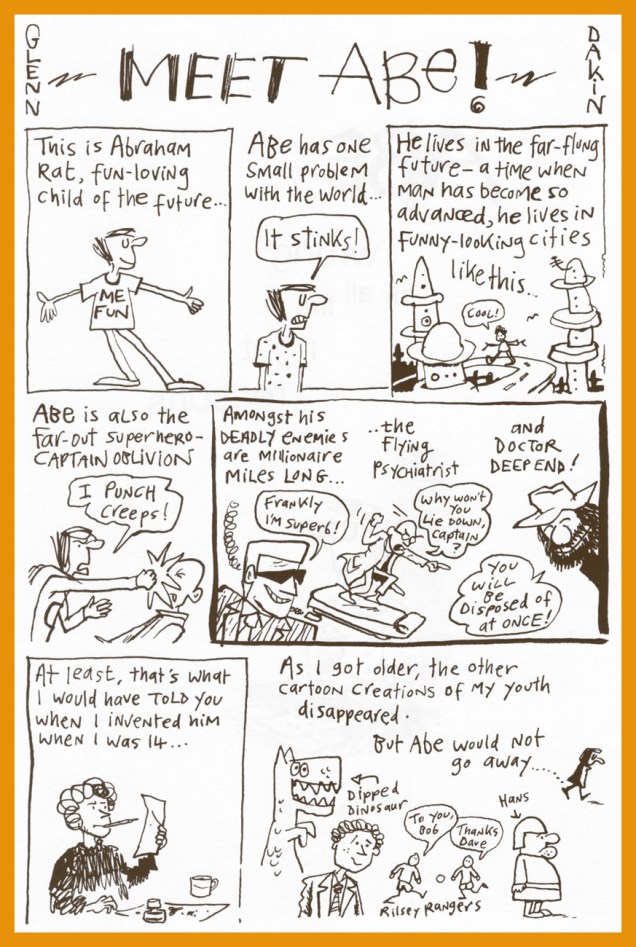
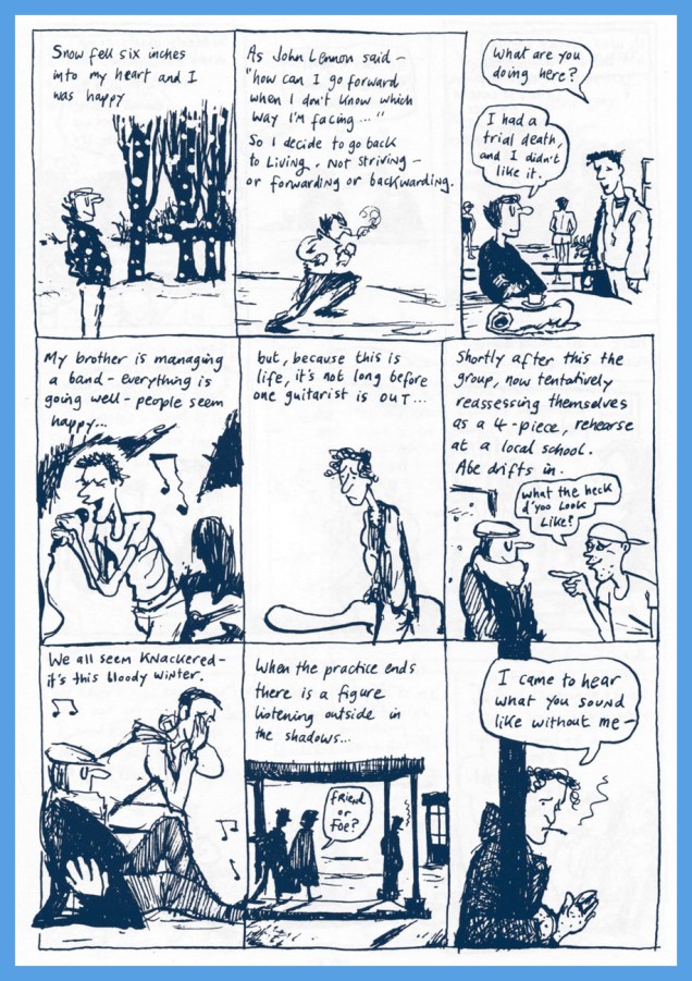
Now that the stage is set, I’ll share some of my favourite Dakin strips. He’s been a busy chap, creating several solo series: Temptation, Captain Oblivion/Abe Rat, Robot Crusoe; collaborations: Paris: the Man of Plaster (with Steve Way), Mr. Day and Mr. Night, The Man From CancerandGreenhouse Warriors (all with Phil Elliott), as well as YA novels (the spooky Candle Man) and animation (the astonishing Shaun the Sheep).
Today, I’ll focus of my very favourite Dakin creation (his most understated and personal), the fancifully autobiographical Abe Rat.
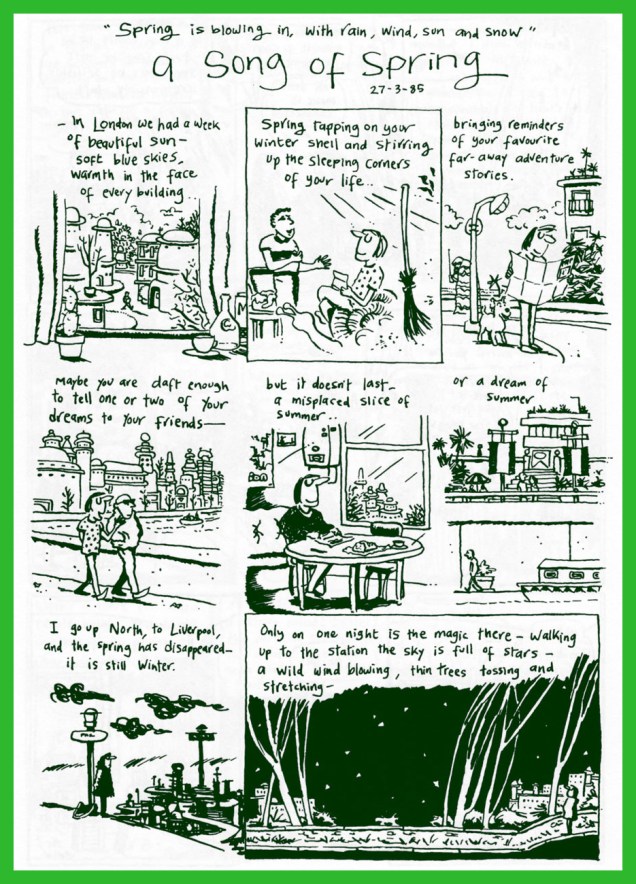
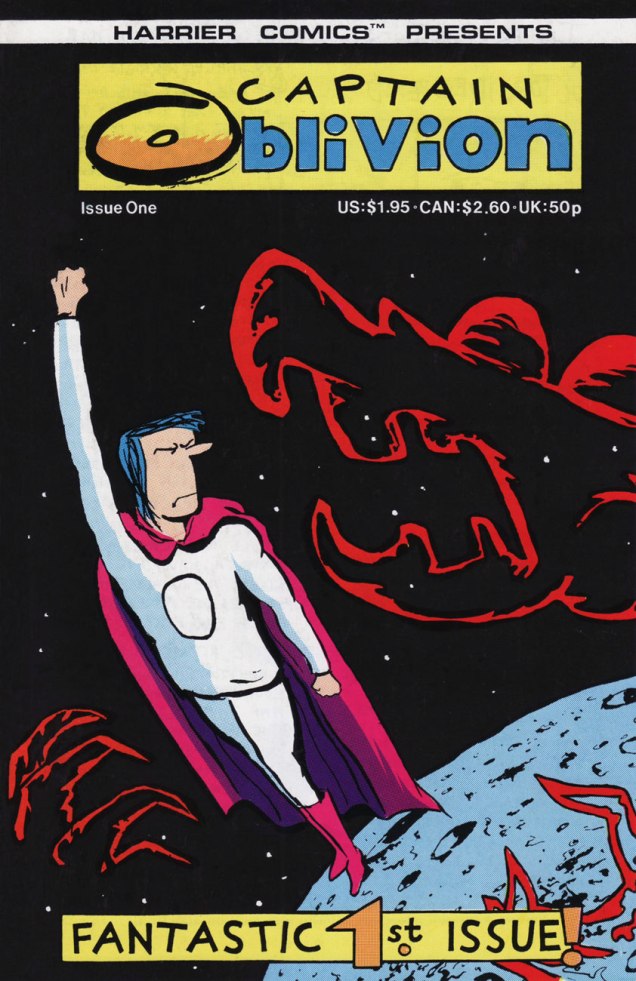
A Song of Spring was originally published in Fast Fiction no. 14 (April 1985, Fast Fiction).As this Captain Oblivion one-shot was left out of the Abe collection (the original artwork was lost!), the completist will want this one as well… and will not be disappointed nor go broke in the process. This is Captain Oblivion no. 1 (Aug. 1987, Harrier). Cover colours by Mr. Phil Elliott.
Dakin’s comrade-in-ink Eddie Campbell (Abe’s his fave Dakin strip too) provides the introduction to the collection, and therein shares these thoughts: « Back when we were doing our little photocopied comics (what I term ‘small press’) in the ’80s, we constantly challenged each other to take the comics form in new directions. Dakin evolved in exciting ways in his Abe stories. The were autobiographical, but more concerned with the inner life than the physical one. He arrived at an approach which I termed ‘discourse’. He would devise characters and symbols, and borrow others, combining them in argumentative juxtapositions. There would be passages where he’d use a character from history or a novel to push his contemplation towards a resolution. Once he even called a halt to proceedings and ran a variant ending. »
Thanks for reading, hope you enjoyed making Abe’s acquaintance.
« Slap him up and down upon the floor Tickle his feet and hear him giggle Then unzip him down the middle Give that gibbon what he’s hollerin’ for! » — Stuff That Gibbon (words and music by Bill Oddie)
Back in the late 1970s, before I had even heard of Monty Python’s Flying Circus, nor even of Benny Hill, for that matter… I discovered The Goodies, thanks to the CBC’s belated programming of their exploits*. While The Goodies do share a *lot* of DNA with the Monty Python gang (they were school chums, close friends, collaborators and friendly competitors practically all along the way), this trio’s comedic format veers sharply away from the Pythons’ methods: Graeme, Bill and Tim play ‘amplified’ versions of themselves, and use the skit format sparingly, reserving it for mid-show intermission ‘blackouts‘.
While the trio was formed in 1970, it only made its comic strip début (and bow) in 1973**, where they held a weekly feature in the pages of Cor!!, also making an appearance in the magazine’s 1974 annual and The Goodies Annual, the whole lot hitting kiosks in ’73.
« Apparently licensed for just the one year, The Goodies were unique in the fact they were the only adapted characters featured with the comic’s pages with copyright credit being given to Bill Oddie, Tim Brooke Taylor (sans hyphen) and Graeme Garden. According to Robert Ross’ book The Complete Goodies, the strips were all authorised and approved by The Goodies prior to publication and Tim still displays an original Cor!! strip in his study. »
Scans (and detailed synopses!) of The Goodies’ Cor!! shenanigans are helpfully provided by their fan site, goodiesruleok.com.
And now, some introductions from the aforementioned The Goodies Annual 1974 (the only one of its kind, poor thing):
The Goodies’ brainbox, Graeme Garden, born in Aberdeen, Scotland, on Feb. 18, 1943. « He lists his hobbies as painting, drawing, playing the guitar and banjo, apologising for playing the guitar and banjo, trying not to travel in cars and, of course, being a Goodie. »The Goodies’ resident singer-songwriter and ornithologist, Bill Oddie, born in Rochdale, Lancashire, on July 7, 1941.« Tim Brooke-Taylor was born very suddenly in Buxton on July 17th, 1940, among those dark, satanic hills of Derbyshire. » I like the sound of that… very Luke Haines. He was The Goodies’ conservative type, and the one who greatly relishes essaying the cross-dressing roles. And he was, after all, the fair one without any of that pesky, telltale facial hair.
Among other, er, goodies, the annual contains a whopping 33 pages of comics. However, as it was fairly typical for UK comics of the period, no creator credits appear anywhere.« The comic strips form a large part of the official Goodies Annual, although “none of us had anything to do with the design or stories”, explains Graeme, “but we were very happy with the results.” »
Goodies, Goodies
Take a little good advice, try a trip to paradise It’s not hard to find, you’ve got it on your mind Can’t pretend it wouldn’t be nice It’s whatever turns you on, Goodies
A circus or a seaside pier, a sausage or a can of beer A stripper or a clown, prices going down You can make it happen here Fun for all the family, Goodies
Goodies are coming for you and you and you and you It’s anything you want it to be, a record or an OBE A four minute mile, a policeman with a smile I know you won’t believe what you see.
(The first Goodies Theme; words and music by Bill Oddie.)
-RG
*« In Canada, the series was shown in on the CBC national broadcast network during the late 1970s and early 1980s, in the traditional “after school” time slot, later a Friday night 10 pm slot, and occasionally in a midnight slot. Several episodes were also shown on the CTV Television Network. In the mid-1970s it was shown on TVOntario on Saturday evenings, repeated on Thursday evenings, until being replaced by Doctor Who in 1976. » [ source ]
**I hear they’ve turned up in The Beano, circa 1994.
« There is nothing new under the sun but there are lots of old things we don’t know. » — Ambrose Bierce
Here’s an unusual specimen: a two-headed, twin-gendered Australian cartoonist. Beryl Antonia Yeoman (1912-1970, b. Brisbane, Queensland) formed, in 1937, a cartooning partnership with her brother, Harold Underwood Thompson (1911-1996, b. West Kirby, Cheshire) when they adopted the nom de plume of Anton.
From the sound of it, Beryl was the power behind the throne, as she produced the Anton cartoons on her own during Harold’s active duty in the Royal Navy during WWII. The pair reconvened after the war and created wonderful cartoons for such publications as Punch, Lilliput, Men Only (ha!), Tatler, The Evening Standard (solo Harold!) and Private Eye. Beryl was the only female member of Punch’s exclusive Toby Club.
Today, a charming bistro named in honour of the artful siblings still operates in Wells, Somerset; it features Anton’s art on its walls. How’s that for posterity?
This slyly cozy cartoon made the cut for the splendid 1952 anthology The Best Cartoons From Punch.
And while we’re on the subject of ghostly radio stories, give one of these a try.
« It is not Frank Hampson’s original creation from the 1950’s Eagle, far from it. This is a different beast, featuring a harder man in a harsher world, a long way from the good-natured stoicism and stalwart, stiff upper lip of the original… »
(Garth Ennis in his introduction to Dan Dare: The 2000 AD Years)
Dan Dare, sort of the British answer to Buck Rogers, took his earliest space flight in the pages of the very first issue of Eagle, a now legendary British children’s comics periodical. He was created by illustrator Frank Hampson. From the day of its inception, Eagle was meant to perch on a high moral ground. Its founder, reverend John Marcus Harston Morris, an Anglican vicar, devised the Eagle in collaboration with Hampson (one of his parishioners, and a budding artist seeking fulfilling work) with a specific purpose in mind: a magazine that would hold itself to high standards of art and printing, but would stay away from violence and depravity, instead offering children wholesome characters they could use as role models. Aligned with that vision, Hampson’s Dan Dare stories were meticulously researched, based on a wealth of models (space ships, suits, and even a complete space station) and reference materials, including the services of Arthur C. Clarke as a science and plot advisor in the early days of the strip. Dan Dare‘s complex plots, witty dialogue and full-colour art guarantee that British children who lived through the 50s cherish their memories of this character.
1959 was the year of change – Morris resigned from the editor’s seat after bitter disputes with the bean-counters from Hulton Press (Eagle’s publisher at the time). Shortly after, the Eagle was taken over by Odhams Press, with the new owners objecting to the complexity of Dan Dare stories as well as the cost of Hampson’s studio. Hampson could not compromise his lofty standards and pursuit of perfection, and left. Things were never the same after that, with Dan Dare strips varying in format and quality until the series ended in 1967.
Fast forward to 1976. « A punk who has always written outrageously violent, scabrous satirical and often hilariously funny attacks on authority and the establishment» – which is to say, Pat Mills, a British freelance writer and editor – set out to create a science-fiction themed weekly publication, 2000 AD. With the aid of John Wagner as script advisor, presided over by John Sanders, the publisher, he decided to 1. develop a horror strip, which later became Judge Dredd; 2. revive Dan Dare, so that at least something about 2000 AD would have immediate public recognition. Oh, there were plenty of other strips in there, too, but that’s a topic for another conversation.
« 1976. I realize that the science fiction comic I’m creating, 2000 AD, needs a space hero. I think about bringing back Dan Dare – the publisher, John Sanders, is agreeable, he tells me not to worry about the original fans. I study the bound Eagle volumes. Artist Belardinelli submits a wild version on spec. At least it’s exciting and eye-catching and – most important – helps us over the poor quality paper. 2000 AD appears, it’s a success and Dan Dare is popular – about 3rd or 4th in the popularity charts. I don’t recall any critical letters apart from things along the lines of « my dad doesn’t like it, but I do ». And, sometimes, « my dad likes it, too ». Lots of criticism in the press, however, but we don’t care about annoying them. In fact we quite like it. » (From an article by Pat Mills, published in Spaceship Away: the Dan Dare Fan Magazine)
Okay, now that we have the backstory over with, on with the tentacled show!
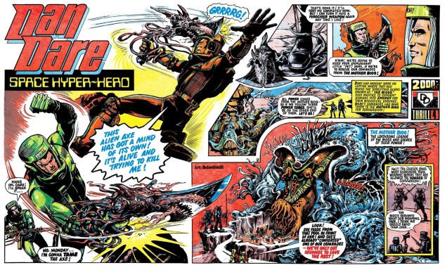
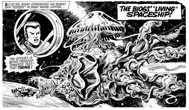
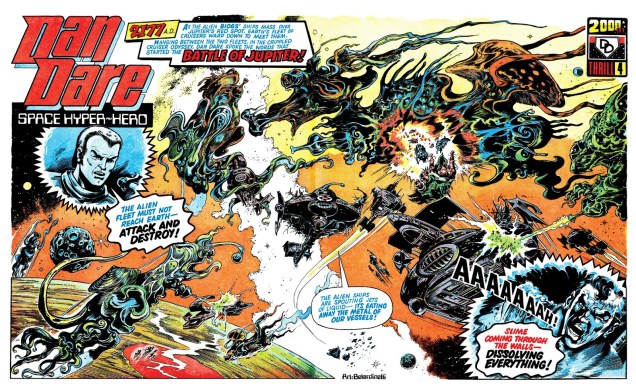
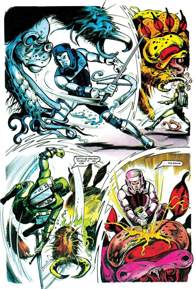
Dan Dare’s early 2000 AD adventures were drawn by Massimo Bellardinelli, who seems to take great delight in adding tentacles hither and thither. Are we expected to believe that every alien and every alien’s ship is be covered in them? Yes? Ah, okay. Please carry on.
The first, self-titled story, published in Programmes 1 to 11. Scripted by Ken Armstrong, Pat Mills and Kelvin Gosnell, and drawn by Massimo Belardinelli.
Hollow World, scripted by Steve Moore with art by Massimo Belardinelli, published in Programmes 12 to 23.
This cutie from Hollow World also wished to say “tally-ho!”:
Belardinelli’s style is often described as “hallucinatory”. Despite Pat Mills’ portrayal of his art as “eye-catching” (although even Mills thought that he made “the hero look awful”), his work on Dan Dare was not very popular. It’s also possible that readers were still sore about Dare’s sacrilegious resuscitation. All I can state with certainty is that it’s not really *my* cup of tea – I prefer my cuppa strong and dark, without excessive flourishes or hallucinations, thank you kindly. For those of you who agree, more… grounded times were coming: with Programme 28, Belardinelli switching over to drawing Harlem Heroes while Dave Gibbons took over Dan Dare, with an occasional hand from Brian Bolland.
Greenworld, scripted by Gerry Finley-Day, art by Dave Gibbons and Brian Bolland., published in Programmes 34 and 35.
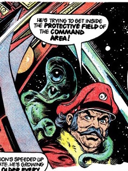
A little trek into the past, back to the hallucinatory tentacles: The Curse of Mytax, drawn by Massimo Belardinelli, published in 2000 AD annual 1978.
Oh Dan, where is your moral compass now? While I love the guys from 2000 AD to bits, I have to grudgingly admit that taking someone else’s character and modifying his raison d’être beyond all recognition is a tad uncouth (and certainly anti-authoritarian, which is, after all, Pat Mills’ leitmotif). Can you imagine how this trigger-happy Dan Dare apparition, some 25 years later, ruffled the feathers of readers who take their heroes seriously? (If we have any readers who have lived through this themselves, please chime in!)
« Indeed, the reader may be forgiven for thinking that the Lost Worlds sector is soon going to be a very quiet sector indeed, just because there’s not going to be much left of it. The frequency with each our heroes resort to violence – sudden, crushing, all-consuming, high-velocity violence that utterly obliterates whatever it’s unleashed upon – – is really quite spectacular. Unidentified species of dodgy appearance? Play safe, fry ’em. Giant-sized aquatic life form? Got to be worth a torpedo or two. Alien intruder? Give it loads. If things get sticky, just do the whole ecosystem. And you know those planet-busters we’ve got in the tail-fins…? »
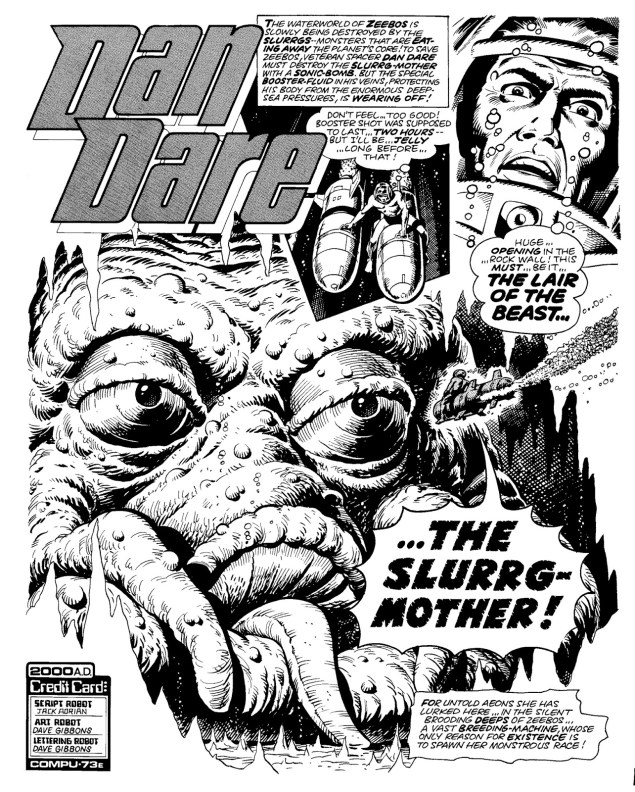
Waterworld, scripted by Chris Lowder (as Jack Adrian), with art by Dave Gibbons. Originally published in Programmes 56 to 60.
Does the Slurrg-Mother have tentacles? Such a silly question…Nightmare Planet, scripted by Chris Lowder (as Jack Adrian), art by Brian Lewis, published in Programmes 61 to 63.Ice Planet – they were really running the gauntlet of planets – is scripted by Gerry Finley-Day, with art by Dave Gibbons. Published in Programmes 64 to 66.Aww, freedom for the tentacled cutie!Garden of Eden is scripted by Chris Lowder with art by Dave Gibbons. Published in Programmes 67 to 72. Naturally, one doesn’t expect anything decent or god-fearing to come out of the Garden of Eden… and nothing does.
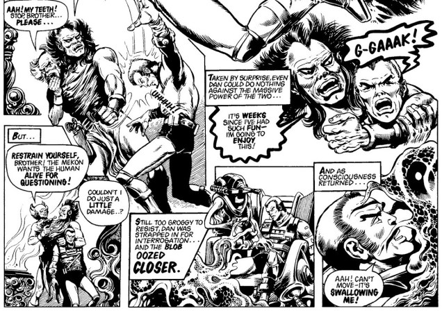
The sprawling Servant of Evil (scripted by Tom Tully and drawn by Dave Gibbons, published in Programmes 100 to 126) was the last Dan Dare story, one that wasn’t even finished. Was it too complex or morally ambiguous for readers of 2000 AD, or simply too rambling? Dan Dare’s exit was probably caused by the confluence of several factors – Dave Gibbons was leaving the strip to work on UK Marvel’s Dr. Who Weekly; the failing comic Tornado needed a new home within an established title, so 2000 AD needed to make room for it by pushing something else out; and let’s face it, Servant of Evil was dragging on, even though fans still bemoan the lack of closure from having all those plotline threads severed so abruptly.
Do you have a couple of hours to spare? You can actually read the full collection of 2000 AD Dan Dare strips here.
« I say let the world go to hell, but I should always have my tea. » — Fyodor Dostoyevsky
A colleague at work labelled me a “tea whore” the other day. I don’t think that’s an official expression (though apparently one can purchase tea mugs with this message), but I’ll take that as a badge of honour. And therein lies my similarity to my beloved octopods: they never say no to a nice cup of tea, either. Evidence, you may ask? I’ve a-plenty of it. Pour yourself a steaming cup of oolong and join me!
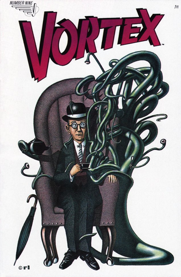
Donald Duck no. 200 (October 1978), cover by Larry Mayer. Incidentally, he has already been part of a Tentacle Tuesday.Surprise: this quintessentially British scene (an umbrella, a cup of tea and a suitably meek accountant) is brought to you by a Canadian comic! This is Vortex no. 9 (May 1984), cover by Ron Lightburn. Vortex was one Canadian Vortex Comics’ titles. Some interesting stuff was published by these guys: Matt Howarth’s Those Annoying Post Bros and Savage Henry, Los Bros Hernandez’s chunk of Mister X, Ted McKeever’s Transit, Chester Brown’s Yummy Fur…
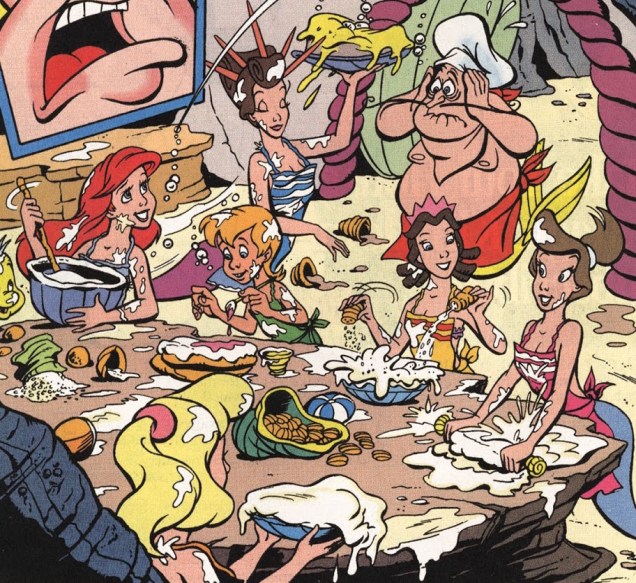
The following pages are from Disney’s The Little Mermaid no. 10 (June 1995). No, no, stick around, it’s worth it. You can read the full issue here.
So far so good, even though this begs some questions (such as “how do you pour a cup of tea underwater?”) But the following dialogue suggests that things other than tea-drinking were on the mind of *this* octopus:
You know how all this ends, don’t you? That’s right:
I tried to make this a purely innocent post, but things didn’t pan out.
Gahan Wilson is always, always good and ready for tentacles. (By the way, he is financially struggling and has dementia, which is both stupefying and depressing. I never cease to be amazed at how someone with such a wide-ranging and fruitful career can end up impoverished… His family raised enough money on GoFundMe – for now – to take care of him, but you should still visit that page for recent pictures and updates about his health.)
Cartoon by Gahan Wilson, published in Playboy’s August 2006 issue.
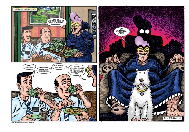
In 1986, British cartoonist David Leach unleashed Psycho Gran upon an unsuspecting world. The « five-foot high, mauve-haired, bespectacled psychotic granny with a pan-dimensional, sentient handbag called Percy, a flying dog called Archie and a pathological loathing of rudeness » first appeared in British children’s comic Oink!, where she lingered for 15 issues, pummeling purse snatchers, clobbering office workers and disciplining rampaging monsters until 1988. In 2011, she came back – her hair more purple than ever, her lust for authoritarianism unabashed – and is currently involved in a four-part mini-series.
And she’s drinking tea with Mr. Cthulhu. I’m jealous.
« We all have grannies. I think there’s something wonderfully exciting, mischievous and dangerous about them, or was that just mine? They’re old and they’re the mum of your mum, plus they spoil you rotten, but they can also tell you what to do, like your own mum does! That seemed so strange when I was a kid, the idea that they could boss not only you but also your mum or dad around. And I think we’re all a little scared of the elderly, no one likes to think that one day they’ll be old themselves, I think we resent them for showing us what we’re going to become. Psycho works because she looks frail and yet she’s super strong and batty. She’s the classic sheep in wolf’s clothing. And there’s something funny about an old granny being lethal and crazy to boot, especially since usually the elderly are portrayed as figures of fun to be mocked and laughed at. » (Look Out, Britain! Psycho Gran is Back!)
And by the way, I wasn’t exaggerating about Psycho Gran’s passion for control (and tea).
Drink tea with your octopus today… and if you don’t have an octopus, borrow one from a friend. I don’t have a dirigeable (that would be a zeppelin for younger people in the audience) , but I manage. Toodle-oo!
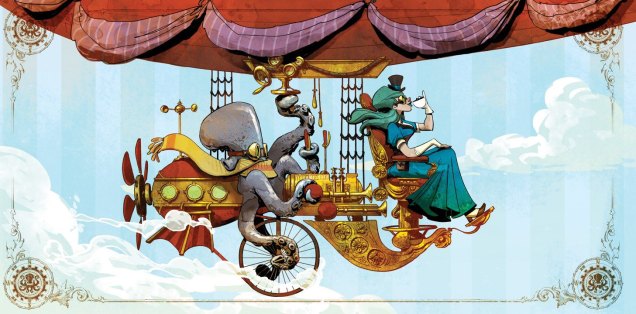
The cover for the 2016 calendar of Otto and Victoria, an adorable steampunk couple created by Brian Kesinger. These two were featured earlier in Tentacle Tuesday: Adopt an Octopus Today!
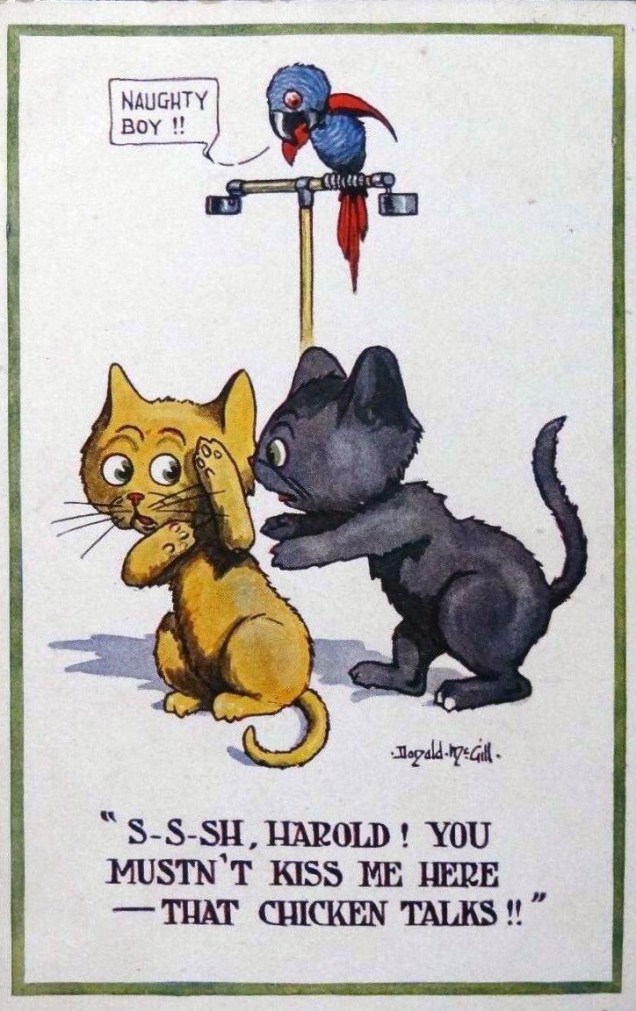
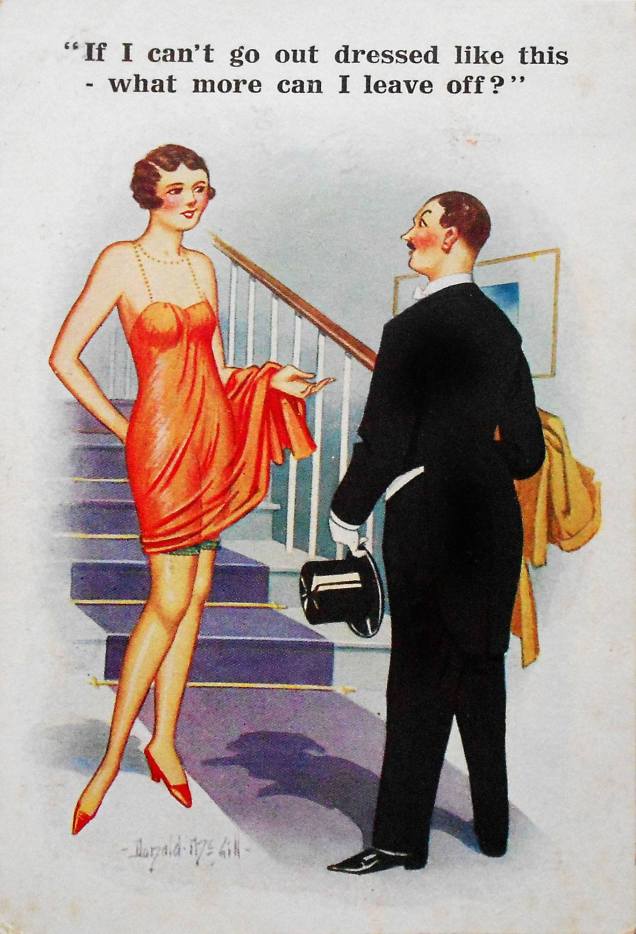
« Won’t you have a little rest when they turn out the lights A nice cup of tea and you’ll be feeling alright Don’t fret, you’ll recover yet you’ll see So keep on sending dirty postcards back to me Back to me, back to me » — James Warren/The Korgis (1980)
London-born Donald McGill (Donald Fraser Gould McGill, to be more precise, 1875-1962), was known for his risqué seaside postcards, sold mostly in souvenir shops in British coastal towns.
He painted the usual figures of fun in the noble tradition of British titillating humour: attractive young ladies, obese men, respectable drunks in the throes of a midlife crisis, cantankerous old ladies, religious personnel, courting couples (a lot of courting couples!), and so on. He painted well, he was prodigiously prolific… and he was not afraid of making jokes so off-colour they could possibly make a sailor blush. (I only have a vague idea of what sailors were like back then, you see.)
McGill ranked his own work according to its vulgarity, classifying it into “mild, medium and strong”. It goes without saying that the “strong” category sold in far greater numbers! Unfortunately (but not surprisingly), McGill’s postcards got him into trouble with upholders of the Moral Good (spoilsports!), culminating with McGill being dragged into court in 1954, when he was almost 80, for breaking the Obscene Publications Act of 1857. The result of this hearing was a hefty fine for McGill, and disaster for the companies producing saucy postcards, with several smaller companies going bankrupt as sales plummeted, cards were destroyed and retailers cancelled orders.
McGill very much died in the saddle: he continued to work until his death in 1962 (and with cartoons for 1963 already prepared). He certainly recycled some jokes, but I think it’s safe to say that he was not about to run out of material. The “king of the saucy postcard” is estimated to have produced around 12 thousand (!) paintings during his career, resulting in the sale of around 200 million postcards… and no royalties for McGill, mind, just his earnings of three guineas per design.
These days, he’s credited with an astute power of social observation and impressive artistic skill. He’s worthy of that praise, but what touches me most is that McGill gave people who surely needed some cheer in their lives a reason to smile, giggle and perhaps even daydream. Hell, some of these postcards made *me* daydream.
Okay, enough theoretical discussion! On to the indecency. I’ve roughly sorted these out by degree of (increasing) “vulgarity”. I honestly didn’t think the jokes would go beyond the “not indecent, but suggestive as hell” category, as per a definition my college best friend coined for something else altogether, yet some of them make surprisingly direct references. Isn’t it lovely to know that our great-grandmothers had their minds in the gutter, too?
In the category of “social commentary”.
I can’t decide whether this is just sweet and innocent or makes a reference to something far more lewd.
This particular postcard holds the world record for selling the most copies (a little over 6 million).
« McGill’s family was steadfastly respectable. He said of his two daughters: ‘They ran like stags whenever they passed a comic postcard shop.’ »
You can also take a gander at some sketches, which were unearthed in someone’s attic in 2015. As the article explains, « drawings feature fat old ladies, big busted women and lusty men. » While you’re at it, brush up on your Brit slang for the bedroom (entirely unnecessary for the current post, but fun!)
« Or… uh, huh… with the severed neck of a dead ostrich… Yow! Tentacles! Long wriggly tentacles! Woo-WOO! »
Ah, Brian Bolland, the British artist that generally comes to mind when one mentions Judge Dredd. This was certainly *my* introduction to him, and my so-called initiation went over with a bang! (Which is to say, I fell in love with his art instantly. It took me a little longer to learn to appreciate Judge Dredd stories illustrated by other artists.) His crisp line adorns many, many comic titles, and I’m not going to enumerate all the pies he’s had his fingers in. I can, however, kill two birds with one stone by combining Wonder Woman Tentacle Tuesday part 2 (part 1 can be found here) with Bolland tentacles along other lines.
Actually, DC’s 1987 Wonder Woman series is a treasure trove of tentacles even without Mr. Bolland. However, some of these covers are frankly too ugly to feature here (I have high standards, in case you hadn’t noticed), while he can be relied on to always provide us with eye candy and an engaging composition.
Wonder Woman no. 75 (June, 1993).
Bolland is reputedly fond of his work on Wonder Woman covers, marking that it was “one of the few occasions he actually sought work rather than being sought for work.”
Wonder Woman no. 86 (May, 1994).
A bonus WW illustration as a special treat, albeit a follicular extension of the definition of a tentacle, I confess. Well, it *is* Movember.
A pin-up published in Wonder Woman no. 120 (April, 1997): Wonder Woman vs Egg Fu!
Moving on from the powerful, intrepid Wonder Woman to smaller crawfish, we have this maiden in an incredibly silly costume, which Bolland managed to somewhat redeem, mostly by hiding the stupid bow and differently-coloured boot on her left leg.
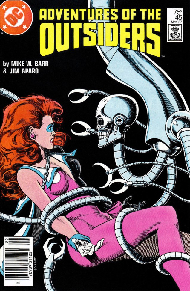
Adventures of the Outsiders no. 45 (May 1987). Mechanical tentacles are all well and good, but it’s Duke of Oil‘s inane grin I like best.
The maiden’s name, by the way, is Looker (!), presumably because the team who created her (Jim Aparo and Mike W. Barr) couldn’t think of a better moniker for a woman who went from a mousy bank teller to a cocotte (oh, sorry, I meant “coquette”) with superpowers. Pardon me going off-topic, but I really must illustrate: here’s what her costume looks (oh, har har) like in its full frontal glory.
Batman and the Outsiders no. 31 (March 1986), cover by Alan Davis.
And a last piece of balderdash:
« Her original costume was manufactured from a material unique to Abyssia; one way fabric, which was invisible from one side. This allowed her to keep her costume handy but not visible. She would turn the clothing out to make it visible. »
Moving on to classic Bolland with creepy-crawlies, fatal beauties and grotesque sub-humans, we have this delightful poster:
And a last madcap entry, amusingly full of non-sequiturs:
A page from « Silver Sweater of the Spaceways », featuring Zirk, and published in Axel Pressbutton no. 1 (November, 1984), scripted by Steve Moore and illustrated by… well, you know.
Finally, Tentacle Tuesday is here, and the tentacles are back with a vengeance! I’ve been waiting all week to spring ’em on you.
This cutie, the Triclopus, kindly agreed to let us use his, err, face to kick off the Tentacle Tuesday festivities.
The Triclopus is a Ken Reid creation from August 31st, 1974. There’s a full list of Creepy Creations (published in the British Shiver and Shake) – with pictures! – over at Kazoop!, a great blog about British humour comics of the 60s and 70s. Go check it out. As for Ken Reid, we’ve previously talked about him here.
Excerpt (or, as the Brits would say, extract) from Alienography by Chris Riddell (2010).
Chris Riddell is a British illustrator, writer of children’s books, acclaimed political cartoonist, talented doodler, etc. His hand-lettering (not at all on display in Alienography, I admit) is sort of Richard Sala, Edward Gorey-ish, as is his somewhat macabre sense of humour. Visit Riddell’s blog here.
This splendid illustration by Roger Langridge (tentacle artist par excellence) was published in Doctor Who Magazine no. 300 (February, 2001) to accompany some-article-or-other about “Spearhead from Space” (a Doctor Who episode, the seventh season opener, if you really must know).
A bit more information about the cool Dr. Langridge-and-Dr. Who pairing:
“Within Doctor Who comics, he can be regarded as effectively the current Doctor Who Magazine “house letterer”, having lettered the overwhelming majority of comics since his debut on DWM 272’s Happy Deathday in late 1998. Almost every issue of DWM published in the 21st century was lettered by Langridge.
He has also occasionally pencilled, inked and even coloured some stories along the way. Deathday, for example, was also his Doctor Who pencil and ink debut, and was followed by artistic duties on TV Action!, the back half of The Glorious Dead (where he was co-credited as penciller with Martin Geraghty), The Autonomy Bug, Where Nobody Knows Your Name, The Green-Eyed Monster, Death to the Doctor!, and Planet Bollywood. He is thus perhaps the only artist to professionally draw all eleven incarnations of the Doctor, even though many of his renderings were obvious parodic in Death. Finally, he coloured Me and My Shadow and Where Nobody Knows Your Name.” [source]
The Wizard, a weekly British publication put out by D.C. Thomson (without a P, though it’s tempting), was created in 1922 and lasted all the way until the late seventies (with periodic interruptions for a merger and several title changes, from “Wizard” to “Rover and Wizard” to “Rover” and then again back to “Wizard” in 1970 until its final demise in 1978).
This edition of The Wizard is from October 26th, 1974, but I unfortunately have no idea who the artist is.
Between WWI and WWII (and sometimes beyond), D.C. Thomson published a number of weekly magazines/papers aimed at boys between 8 and 16. They cost 2 pence, and were thus known as “Tuppenny Bloods”, or the Big Five: Adventure, Rover, Skipper, Hotspur and the aforementioned Wizard. What could one hope to find in a Tuppenny? Short stories with illustrations, some comics, some non-fiction articles…. pretty much everything a growing boy (and girl!) with a lively mind would want.
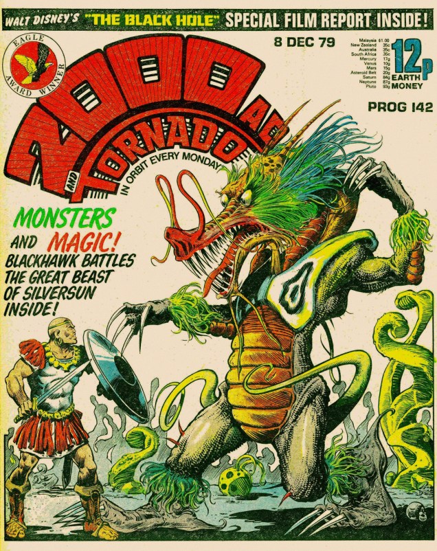
2000 AD no. 142 (1979). I call this the “dragons’n’tentacles” ploy. Other than tentacles on the cover, this issue contains part 3 of Judge Dredd: The Black Plague, which I highly recommend, and some Stainless Steel Rat adventures.
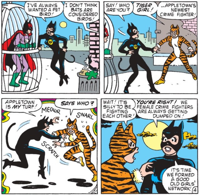
Catfight (noun):A vicious fight between two women that features biting & scratching and often involves clothes being ripped off.
To which I’ll add that if you put two women with different hair colours in one room, it’s like there’s a chemical reaction that makes them instantly aggressive. In comics, at least – and we all know that comics reflect real life accurately, right? The resulting combativeness is especially obvious when the encounter is between a blonde and a brunette. The women involved must also be beauties – presumably, plainer girls resort to verbal assaults when provoked, eschewing physical violence, unlike their flashier counterparts.
Or it could have something to do with the mostly-male audience who actively likes watching belles brawl. (Perhaps “ogle” would be a better description.) Let’s move on to the ogling bit, then!
Err, agreed on the “talking too much” bit. Manhunt no. 9 (Magazine Enterprises, June 1948). That art’s by Ogden Whitney.
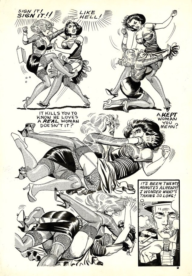
“Jeepers! Baldy’s been skewered through the ticker! He’s defunct!” This charming scene with boob grabbery and skirt rippery (I know, don’t I have a way with words?) is from “Off Stage Kill”, a Dan Turner Hollywood Detective story from Crime Smashers no. 7 (Trojan Magazines, 1951).
Script by Robert Leslie Bellem, pencils and inks by Adolphe Barreaux (who was also the editor). Read the issue here. In case you were wondering, Fifi and Brenda are just acting out a fight scene for a movie, although they do get a little carried away (and accidentally skewer Baldy in the process). How many women have a knife tucked away in their garter belt?
Skipping ahead ten years or so…
Ditko shared a studio in NYC with artist Eric Stanton between 1958 and 1968, and they collaborated on some bondage comics (or at least it’s commonly assumed that they have – for more information on that, dive into a discussion on the Four Realities blog, or read this excerpt from Fantagraphics’ Dripping with Fear: the Steve Ditko Archives Vol. 5.) This page is from a story published in 1966 and entitled “Divorce Agreement”.
The clothes-shredding and breast-mauling (ouch) continues…
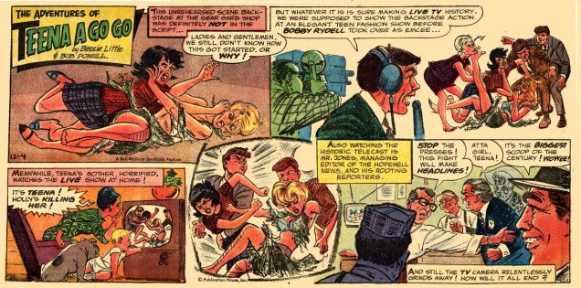
Newspaper comics do it, too! This is Teena A Go Go from December 4th, 1966, written by Bessie Little and illustrated by Bob Powell.
Sometimes Betty and Veronica associations are hard to avoid. These girls also made sure to wear contrasting costumes while fighting, for maximum visual appeal, proving it’s possible to be fashion-conscious even in prehistoric times.
Anthro (the happy teenager watching this scene, and normally a redhead) will marry the victorious maiden… but the fight is a draw, and so he has to marry both in this “The Marriage of Anthro” story. This is Anthro no. 6 (July-Aug. 1969). Pencils by Howard (Howie) Post (who created Anthro, the “first boy”, a Cro-Magnon born to Neanderthal parents) and inks by Wally Wood. Let it be mentioned that Anthro is an immensely fun series, and that I love Howie Post’s art with or without Wood’s beautifying influence.
Women of other cultures aren’t immune from this phenomenon, by the way. Witness Italian chicks fighting:
Maghella no. 13 (Elvifrance, 1975), cover by Averardo Ciriello. ” The title is something like “a scalded pussy doesn’t fear cold water”, a play on “chat échaudé craint l’eau froide“, an idiom that means roughly “twice bitten, once shy” or “a burnt child dreads the fire” and translates literally to “a scalded cat fears cold water”.
Italian erotica can be so entertaining! Maghella means a “young witch” in Italian. “The girl is identified by two braids of black hair and giant breasts with unspecified powers“, reads Wikipedia… Odd, I would have thought that her breasts have very specified powers, indeed. 😉
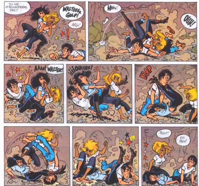
Moving on to French damsels…
Natacha (hôtesse de l’air) is a Franco-Belgian comics series, created by François Walthéry and Gos. This page is from an adventure (one of the final stories scripted by the great Maurice Tillieux) called Le treizième apôtre (The Thirteenth Apostle), published in 1978. The blonde is Natacha, our heroïne.
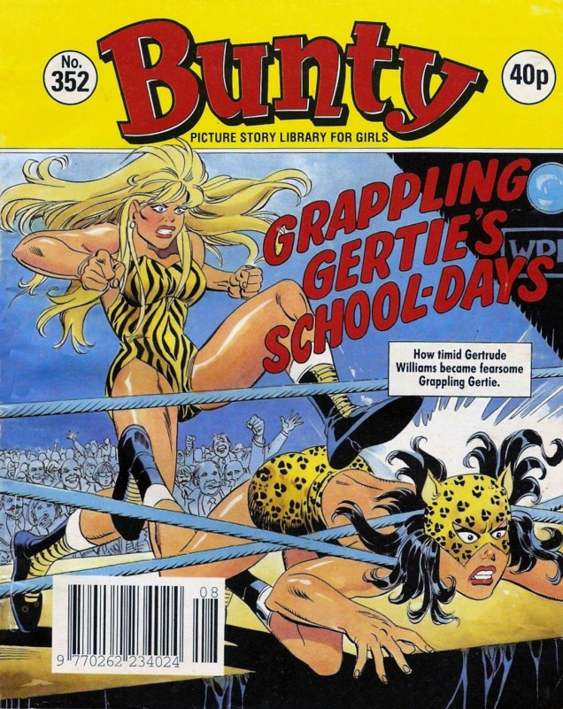
If you want to emphasize the catfight aspect, dress your girls in feline-motif outfits. Oh, I’m sorry – this is no quotidian quarrel, it’s professional wrestling!
Bunty no. 352 (1992) – unfortunately, I don’t know who did the cover. British Picture Story Library was a 62 page a comic digest, published weekly. If you’d like to know how Leopard Lily overcame Tiger Tina, visit Assorted Thoughts from an Unsorted Mind.
I think we need one even more literal interpretation of “cat fight”:
A snippet from “Meow Row”, published in Betty and Veronica no. 59 (January 1993). Script by George Gladir, pencils by Dan DeCarlo, inks by Alison Ford. Now guess who is who. (It’s obvious: Tiger Girl is Betty, and Veronica gets Meow Girl’s sexier costume.)
This is a fairly inexhaustible topic, but one must quit sometime. Cold shower, anyone?
« That minuscule ogre on the throne must be the King. What a peculiar little man. »
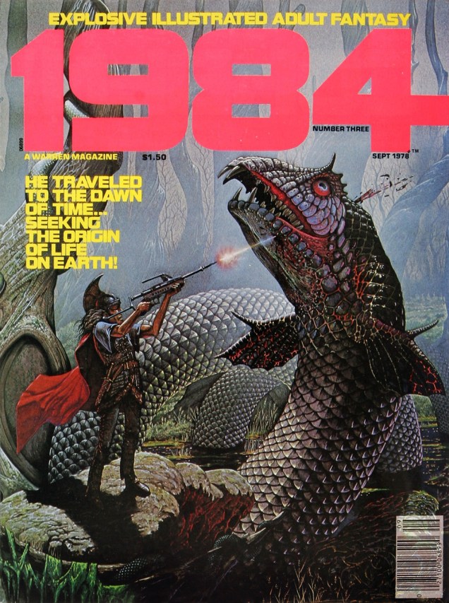
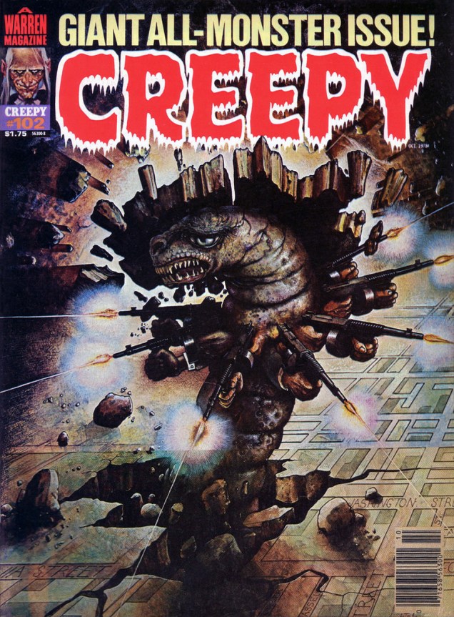
In 1978-79, the rightly-celebrated English fantasy artist Patrick James Woodroffe (b. Halifax, West Yorkshire, on October 27, 1940; d. May 10, 2014), fresh from his high-profile paperback (much Moorcock!) and album cover assignments (including Judas Priest’s splendid Sad Wings of Destiny), hired out his talented brush with Warren Publishing long enough to produce ten covers, a varied, eye-catching and often unusual lot. Let’s make the rounds, shall we?
« He isn’t a *bad* sort. He just lets his temperamental gonads get the best of him! » Using a laser rifle on a dragon? Hardly seems sporting, does it?
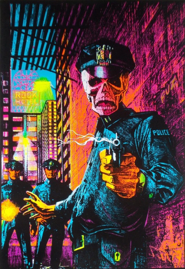
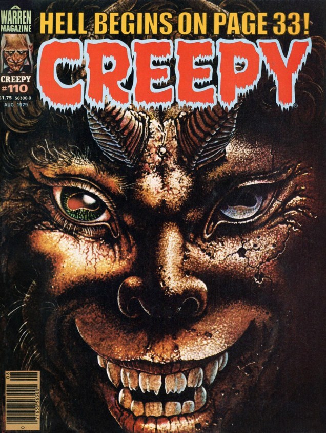
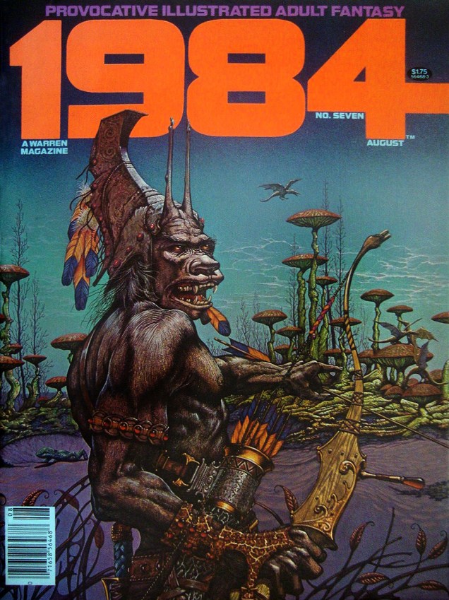
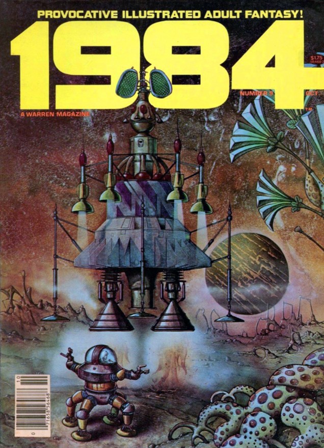
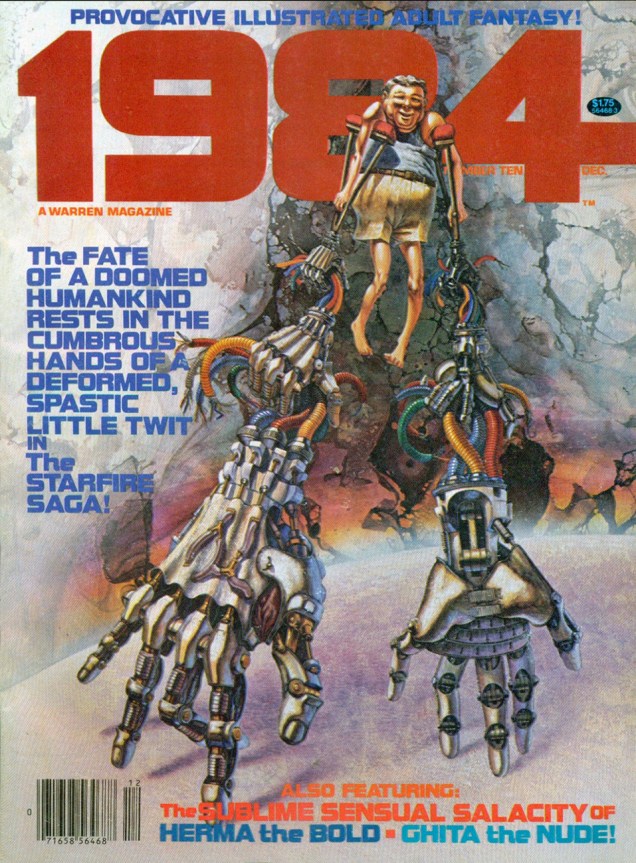
Here we make the acquaintance of a memorably omnidextrous lepidopteran gunner. This is Creepy no. 102 (October, 1978). Read the entire issue here: https://archive.org/stream/warrencreepy-102/Creepy_102#page/n91/mode/2upOne of Warren’s post-Star Wars, all-reprint cash grabs of the era… but it’s got a Woodroffe cover.Eerie no. 98 (January, 1979) Likely the darkest of the set in terms of subject matter. Visually, it certainly brings to mind the visual vibe of John Carpenter’s They Live, still nearly a decade away.Interestingly, the piece has also made the rounds, in a modified version (flipped, for one thing), as a “black light” poster titled « In the Name of the Law ». Speaking of the law, was the artist duly compensated?Don’t mess with the Surly Smurf! This dusky scene is dated 1975, so it’s safe to assume it wasn’t created expressly for this publication. This is Warren’s 1984 no. 5 (February, 1979.) Aside from the usual sex fantasies and space operetta from the usual suspects, the issue holds a single nonpareil gem, Nicola Cuti’s « I Wonder Who’s Squeezing Her Now? », gorgeously brought to life by Ernie Colón and Wally Wood. Bear with me, we’ll return to it in due time.« You may think this all strange nonsense; it may be strange, but it is true, and the ancients knew what lifting the veil means. They called it seeing the god Pan. » — Arthur Machen With his second and final Creepy cover (no. 110, August, 1979), Woodroffe lifts the veil, and how, on a troubling closeup of a gleefully sinister Greek God of the Wild.« Well, if that ain’t about the unfriendliest thing I’ve ever heard of… » 1984 no. 7 (August, 1979.)Aw, missed your ride home. This is 1984 no. 9 (October, 1979.)As it turns out, one couldn’t have picked a better artist to depict « the cumbrous hands of a deformed, spastic little twit », though he seems like a sweetheart, really. On this whimsical note ends our survey of Mr. Woodroffe’s Warren covers. This is also the last issue of 1984 under that title; it would leap a decade ahead to “1994” and carry on for another nineteen issues.